Page type
Say whether it is a dashboard,
form, landing page, or detail view
form, landing page, or detail view
Practical design-prompt patterns for the AI Manager: brief real UI goals, describe hierarchy and states, and review the outcome in Wappler.
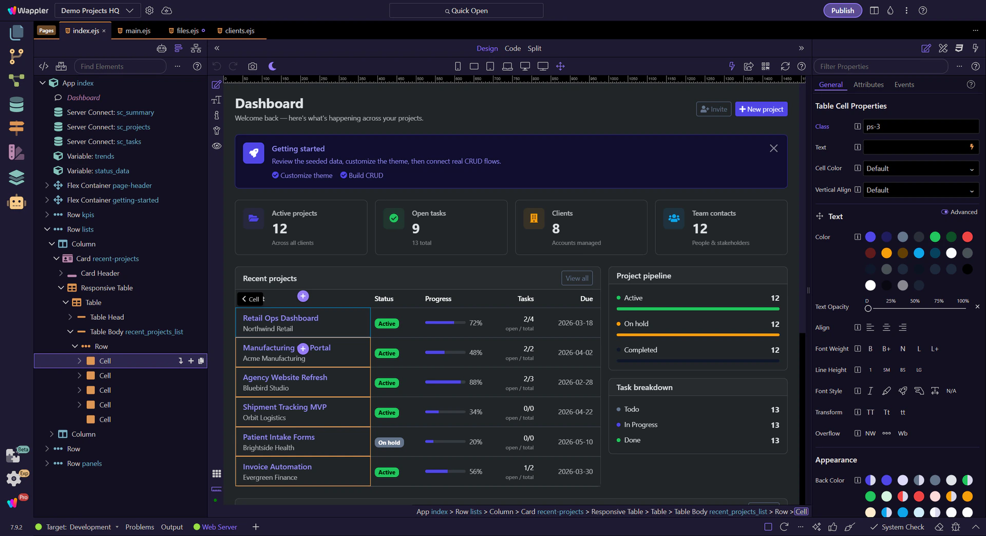
Strong design prompts tell the AI Manager what the page needs to do for a real user. Instead of asking for something that feels “modern,” give it a concrete assignment. For example, ask for a Bootstrap 5 feedback dashboard for a support team: summary cards at the top, a filter row, a table of submissions, an empty state when nothing matches, and a detail panel or action area for reviewing one item.
Weak design prompt
"Make this page more modern."
Stronger design prompt
“Design a Bootstrap 5 feedback dashboard for a support team. Show summary cards for new and resolved feedback, a compact filter row, a responsive table of submissions, an empty state when no results match, and a detail area for reviewing one selected item. Keep the structure editable in Wappler and avoid decorative sections that do not help the workflow.”
The AI Manager does better UI work when you describe the page as a system of sections and states, not just a look. For the feedback dashboard, that means saying which elements dominate first, which filters stay visible, what the empty state should explain, and how mobile layout should collapse.
Structure-focused prompt
"Keep the dashboard in four clear layers: header and page purpose, summary cards, filter/search controls, then the submissions table. Add an empty state message below the filter row when no submissions match. On mobile, stack the cards and let the table scroll horizontally instead of collapsing important columns away."

Visual direction is useful when it stays inside the framework, density, and reuse rules the project can actually support. In Wappler, ask for stronger hierarchy, spacing, contrast, and component tone, but keep the request tied to Bootstrap 5, reusable sections, and responsive behavior.
Visual direction prompt
"Use a professional Bootstrap 5 admin tone with clean contrast, compact filters, and generous spacing around the summary cards. Keep the table readable rather than decorative, use badges for status, and preserve a structure that is easy to refine in Design View and Properties."

After a design pass, review the generated page in the real Wappler surfaces that own it. Use Design View to check the visual flow, Structure to verify the section hierarchy, and Properties to refine the selected component without reprompting the whole page. Then give the AI Manager one narrow follow-up based on what you actually saw.
Good review follow-up
"Keep the current dashboard structure. Tighten the spacing in the filter row, make the empty state more obvious, and improve the selected-row emphasis in the table. After the pass, tell me which components changed so I can inspect them in Structure and Properties."

Move into standards, planning, or the wider builder route depending on what the next design request needs.
Continue with the related tours that add stronger constraints, standards, or execution control to the next design pass.
