Conditional display
Show/hide/if based on state (toggle, variable, form state).
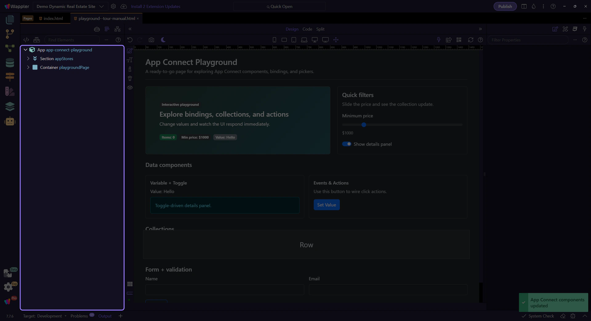
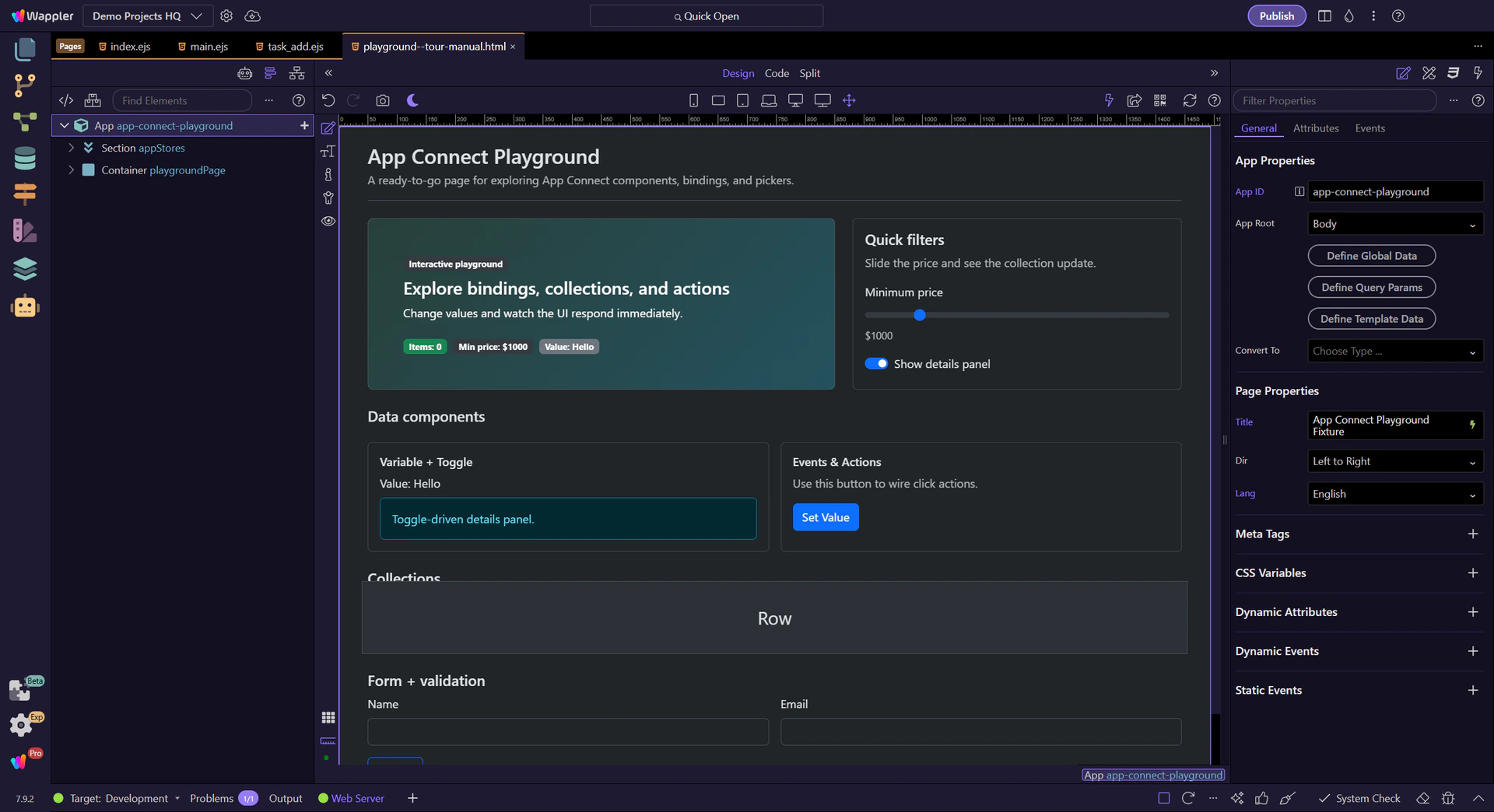
Use show/hide/if and repeaters to render UI from data — configured visually in Wappler.
Build reactive UI by showing/hiding sections and repeating elements from a dataset — configured visually in Wappler (no manual code required for the common cases).
Most dynamic UI on the page comes down to: conditional display, binding text/attributes to data, and repeating UI for lists.

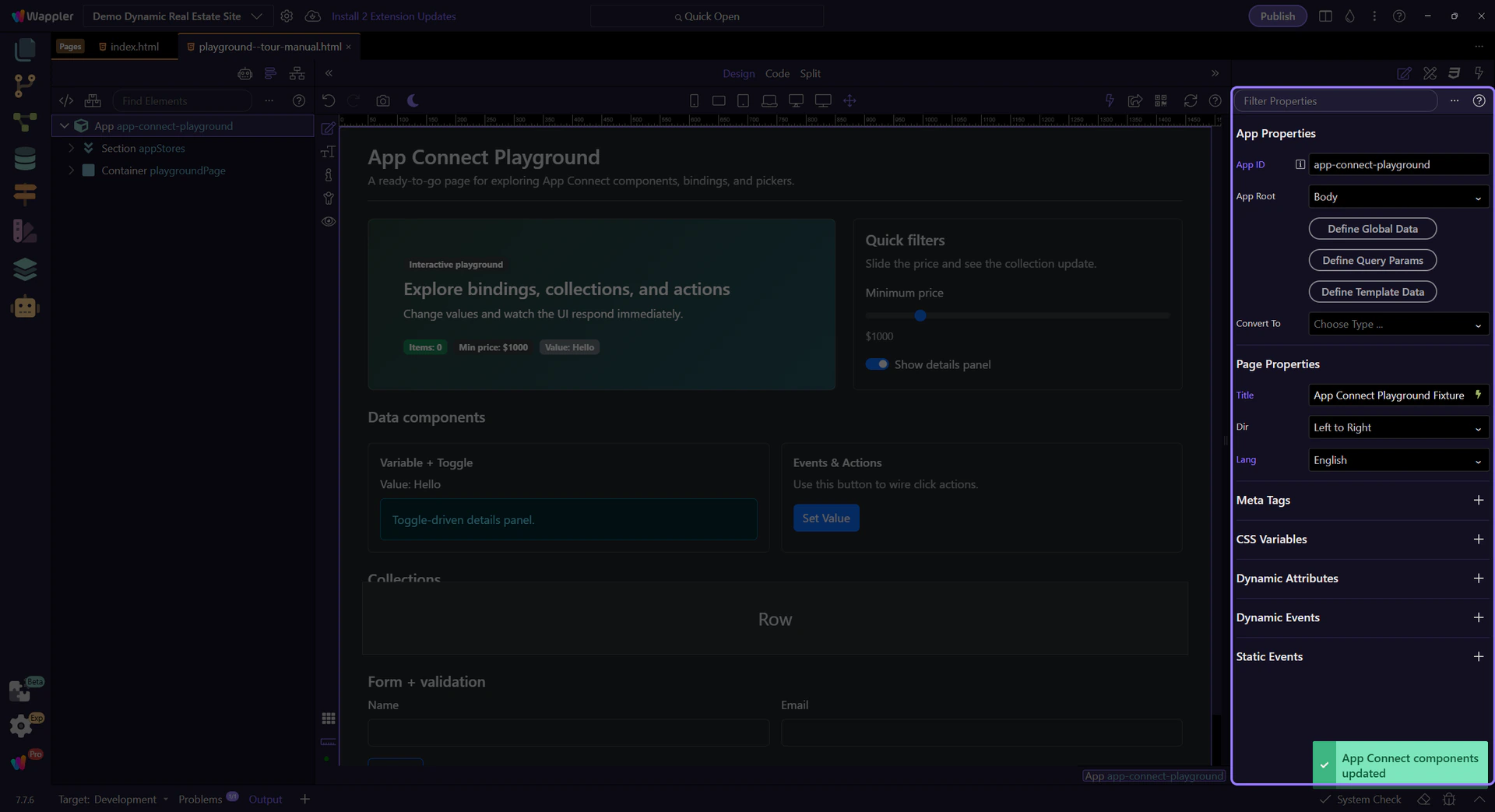
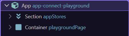
Select the element in App Structure, then use Properties to configure show/hide/if, repeat, and bindings.
Control when an element is visible and whether it exists in the DOM.
Use show/hide when you want to keep the element in the DOM but toggle visibility based on state (a Toggle, Variable, form state, etc.).
tip: Show/hide is great for UI switches where layout stays stable.
Use if when you want the element removed from the DOM when false (often better for performance and for components that should not exist).
important: If removes the element from the DOM when false. Nested bindings and events won’t run because the element isn’t there.

Prefer show/hide for simple visibility, and if for expensive UI (repeaters, complex components, large sections).

Connect what users see to your data using bindings (instead of manual string concatenation).
When you bind text content, prefer dmx-text (or the text binding option in Properties) for stable updates and less flicker than raw template text.

Use bindings for attributes like src/href/value and conditional classes/styles. This is how Wappler maps to dmx-bind:* without you writing raw attributes.
tip: Use the binding picker to select the right field/formatter for src/href/value/classes — it’s scope-aware and avoids typos.
When a field supports bindings, use the picker to browse available components and methods in the current scope.
tip: If a binding looks wrong, re-check what’s selected in App Structure — scope is selection-driven.
Repeat UI from an array, Data View, Data Store, or API result.
App Connect supports two repeat patterns. In Wappler you’ll pick the one that matches your desired HTML structure.
Repeaters can be driven by Arrays, Data Store records, Data View output, or API results. The picker will show you what’s available in scope.

Inside a repeat, bindings resolve against the current item. Select a repeated element in App Structure to see the right fields in the picker.
tip: If you can’t see a field, ensure you’re selecting the repeated node (not just the parent wrapper).
Next, practice with Data View and events/actions, then learn formatters.
Continue learning App Connect.
