Bindings
dmx-bind:value and input.value
Use common form controls as live App Connect data sources in Wappler, and learn how bindings, events, and type conversion interact while users type, select, and toggle values.
This tour uses real form controls to explain how App Connect reads and reacts to user input. You will inspect where values come from, how bindings expose those values in Wappler, and where event timing or string conversion changes the result you see.
This tour explains how real form controls behave once App Connect is involved: where their values come from, when those values are strings, how grouped inputs expose a shared result, and which bindings you reach for in day-to-day form work.
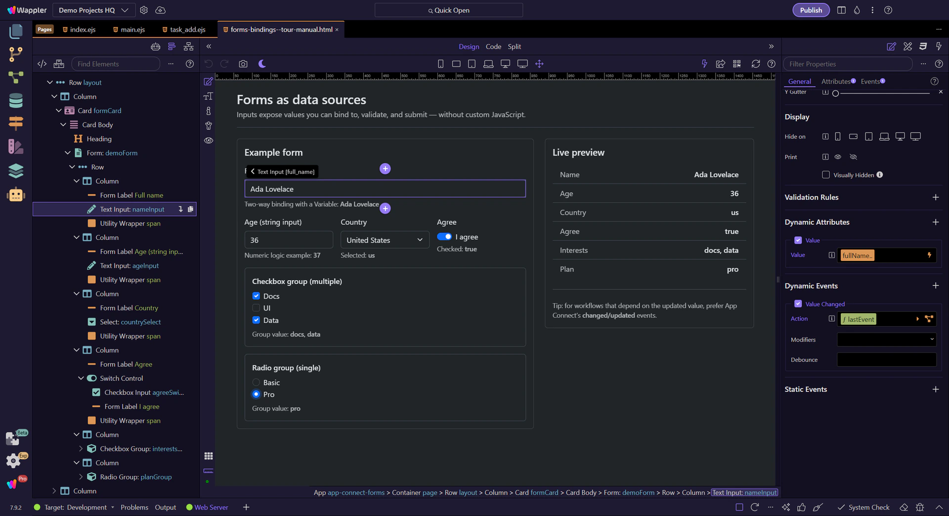
This tour selects a real form field and then highlights its binding and event controls in Properties (so you know exactly where to configure it).
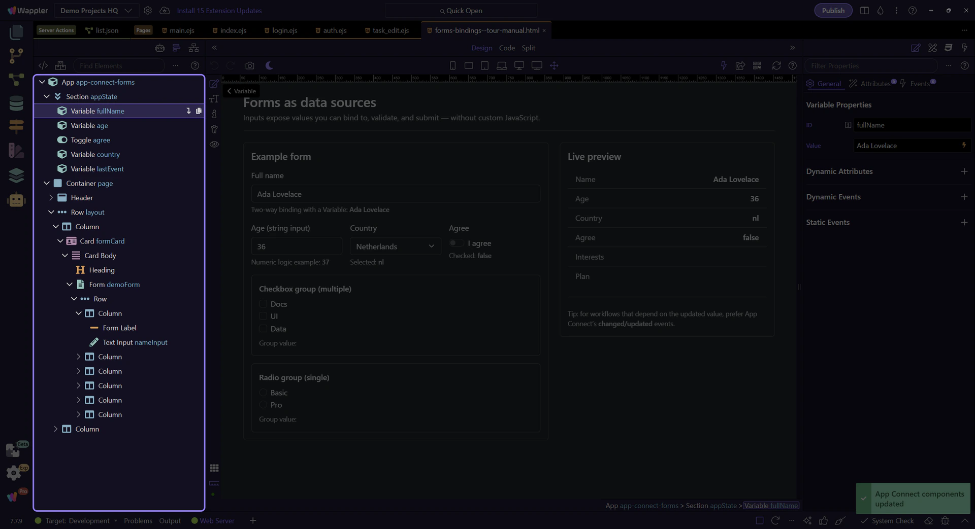
A common pattern: store form state in a Variable, then bind an input to it.
This Variable holds the value used by the input binding.
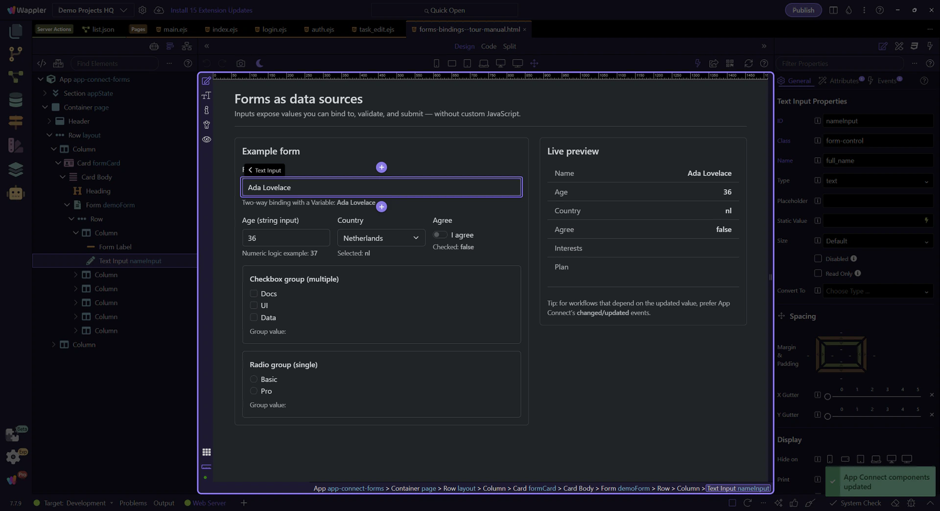
Inputs expose their current value as inputId.value, and can also be bound to App Connect state.
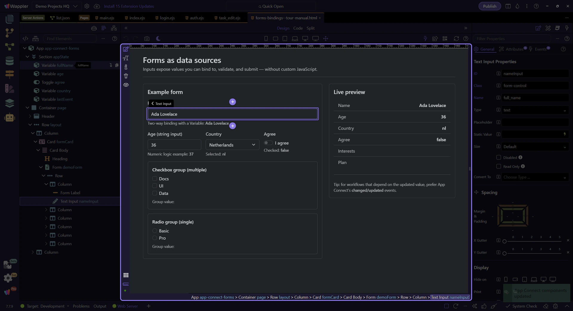
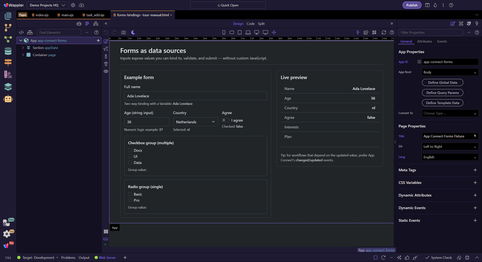
Start with the wider context in the Properties panel so the next control makes sense in the full workflow. In the next step, you will focus on Value binding (dmx-bind:value) and see how it fits into this area.
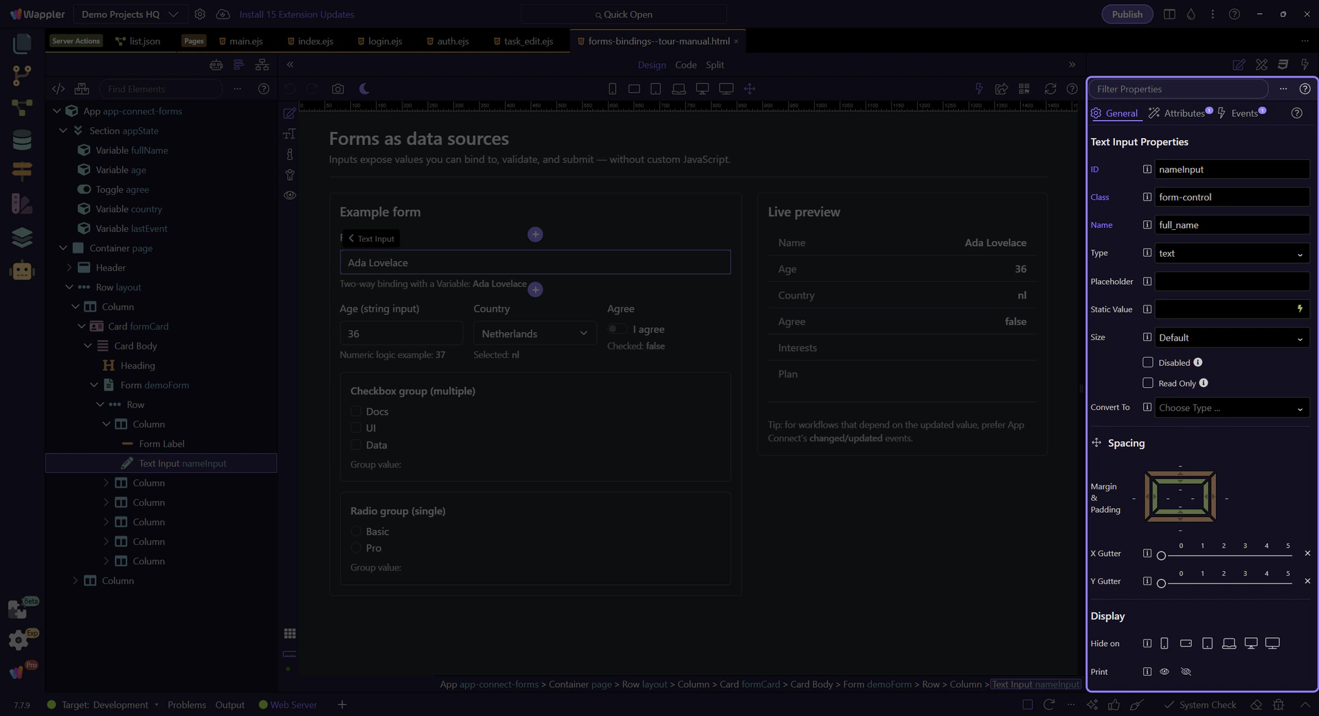
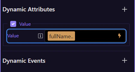
This field’s value binding is configured visually in Properties. Use the picker to insert a valid expression.
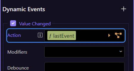
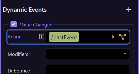
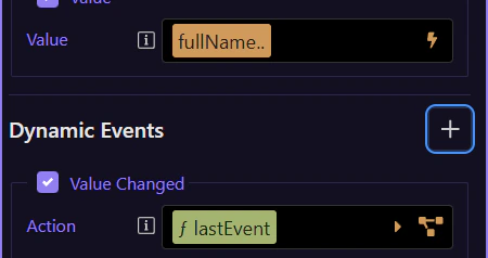
This event is where you attach actions that should run after the value updates. This step matters because Changed event action is part of Selection Panels Properties Changedvalue, and understanding that context makes the next action easier to repeat in your own project.
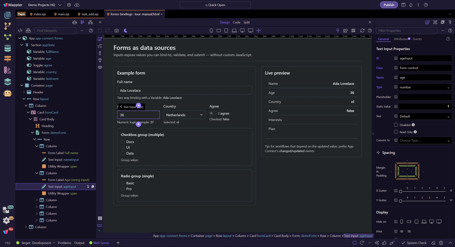
Form inputs are strings by default. Convert to numbers explicitly when doing math or comparisons.
This number input is still a string value in expressions until you convert it.
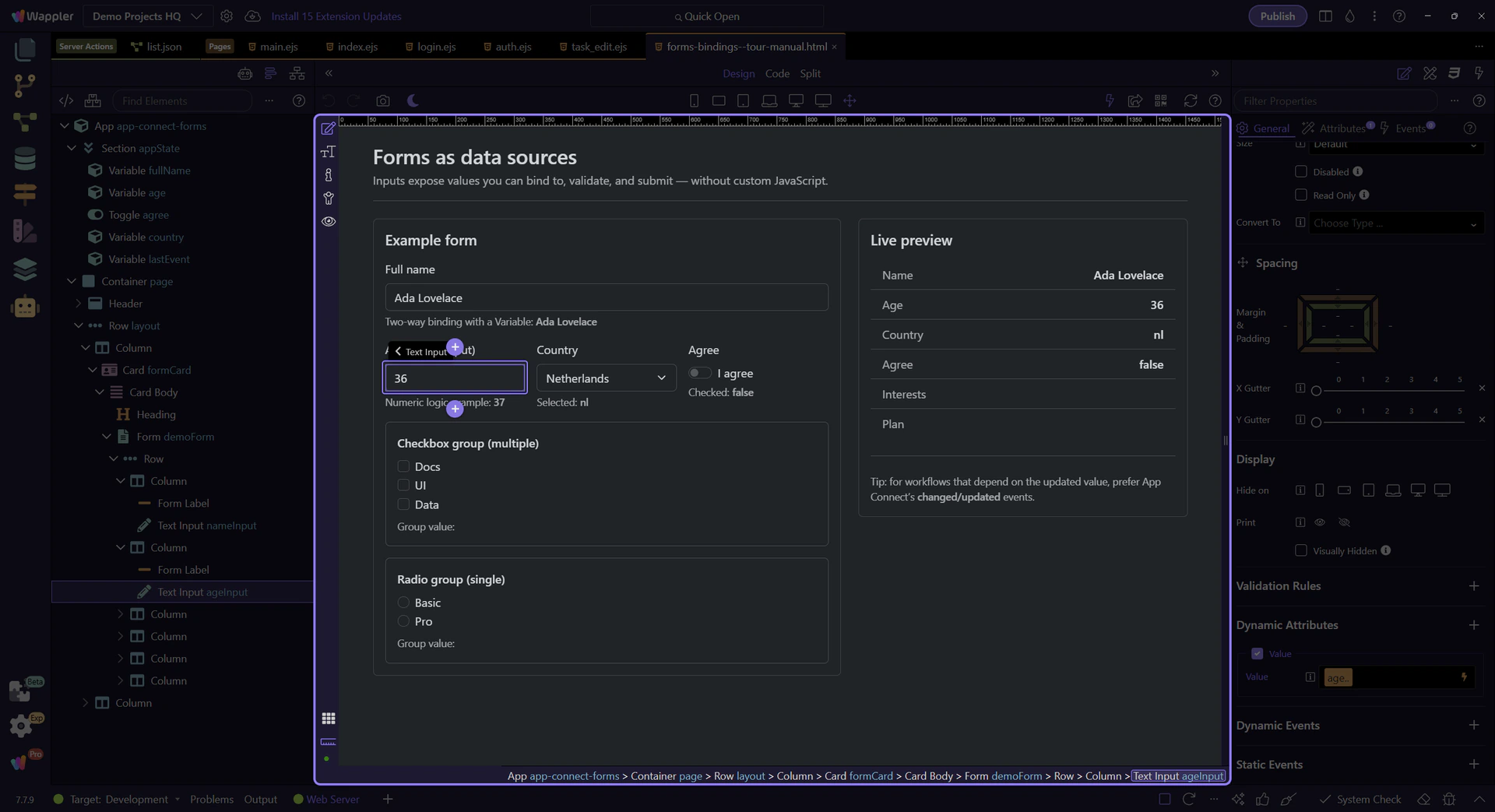
Convert strings to numbers to avoid surprising results (like ‘2’ + 1 → ‘21’).
important: When you read a value from an input or from Query Manager, treat it as a string unless you convert it.
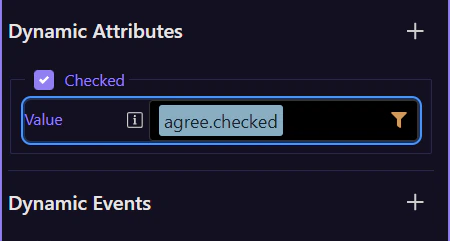
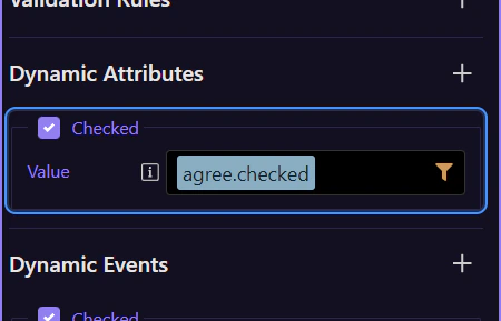
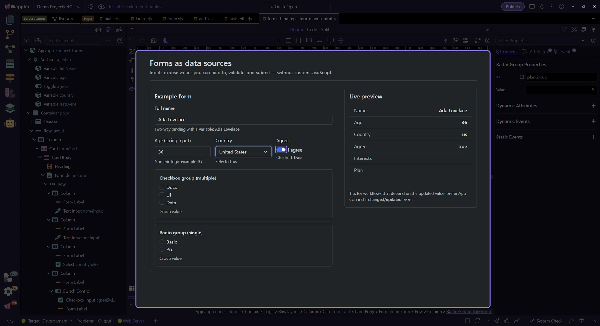
Checkbox inputs expose a boolean checked state. Bind to checked when you want true/false.
This switch uses dmx-bind:checked to sync with App Connect state.
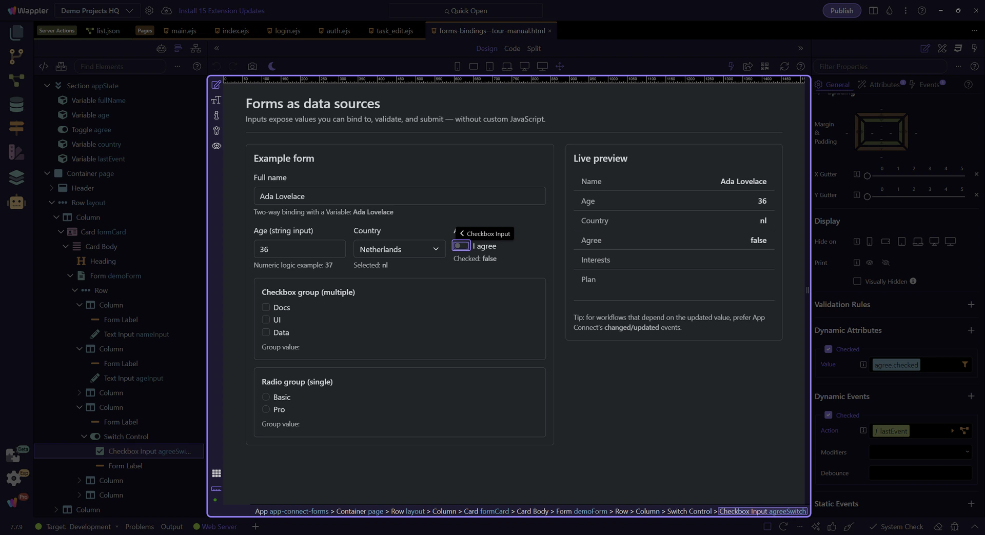
This binding controls the checkbox checked state using an expression (true/false). This step matters because Checked binding (dmx-bind:checked) is part of Selection Panels Properties Checkedvalue, and understanding that context makes the next action easier to repeat in your own project.
Use the Checked event to run actions when the user toggles the checkbox. This step matters because Checked event action is part of Selection Panels Properties Checked, and understanding that context makes the next action easier to repeat in your own project.
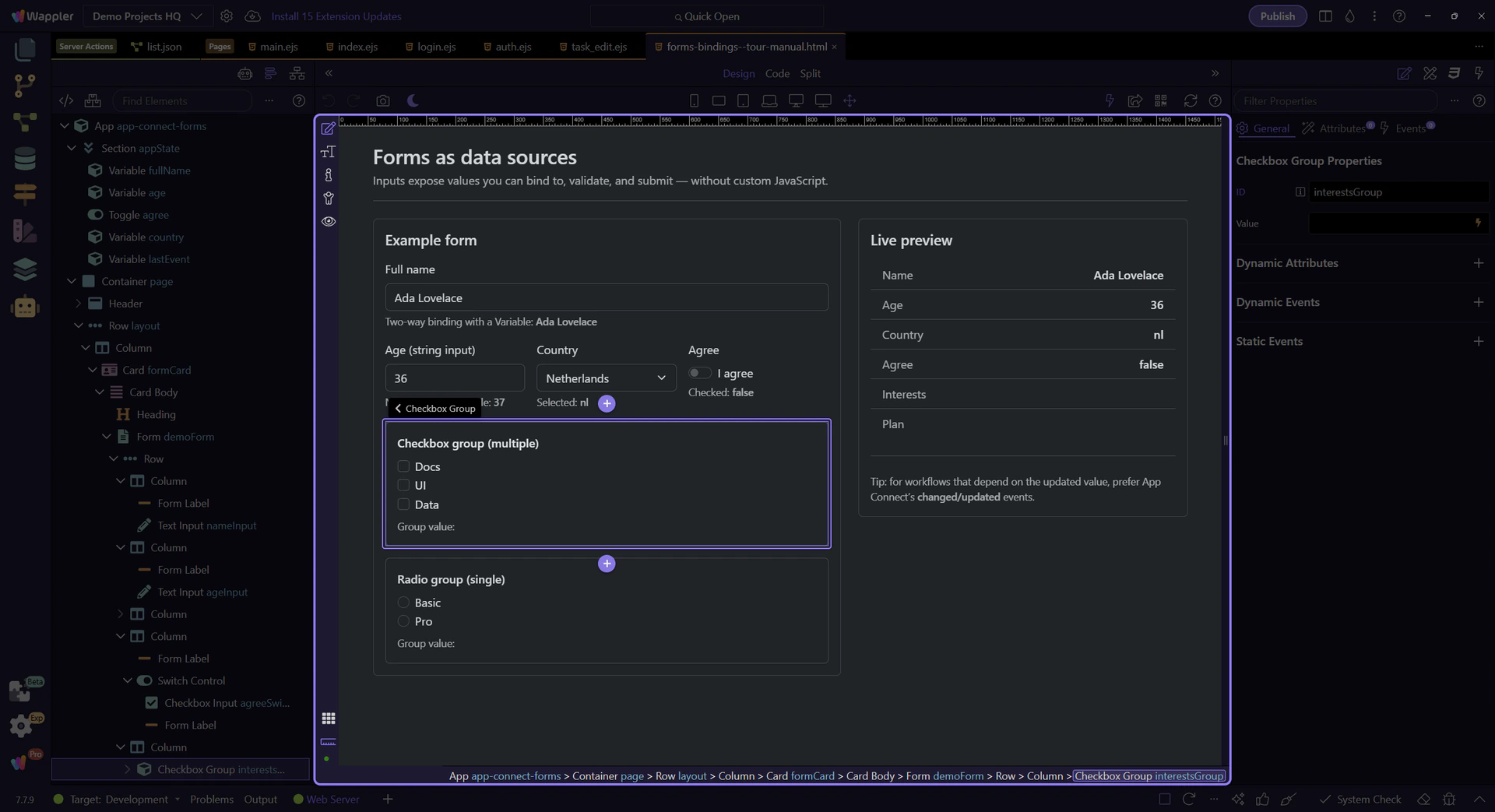
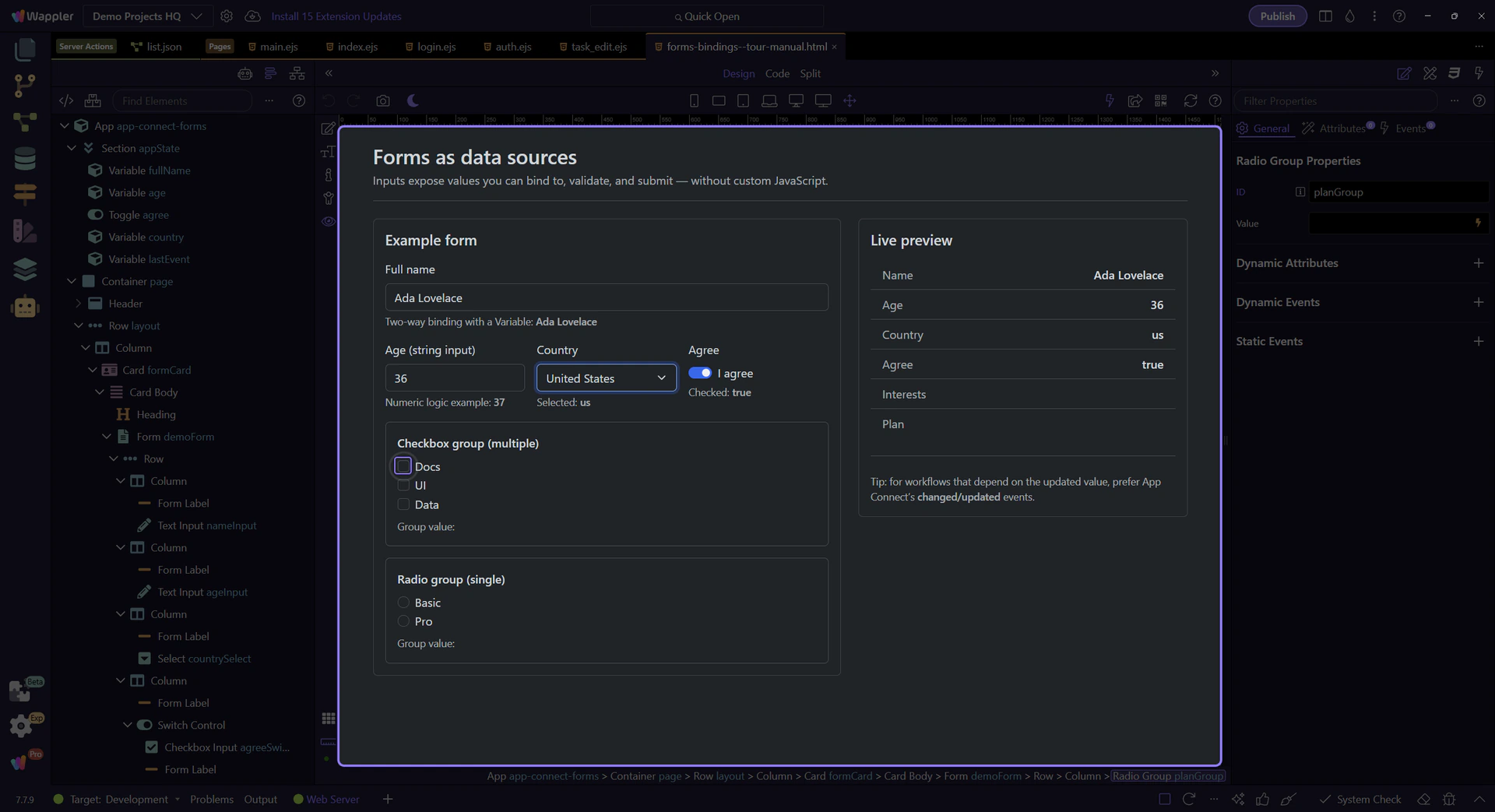
Use a Checkbox Group wrapper to treat a set of checkboxes as one value source.
tip: In Wappler, use the Checkbox Group component so you can bind to one group value and keep the structure clean.
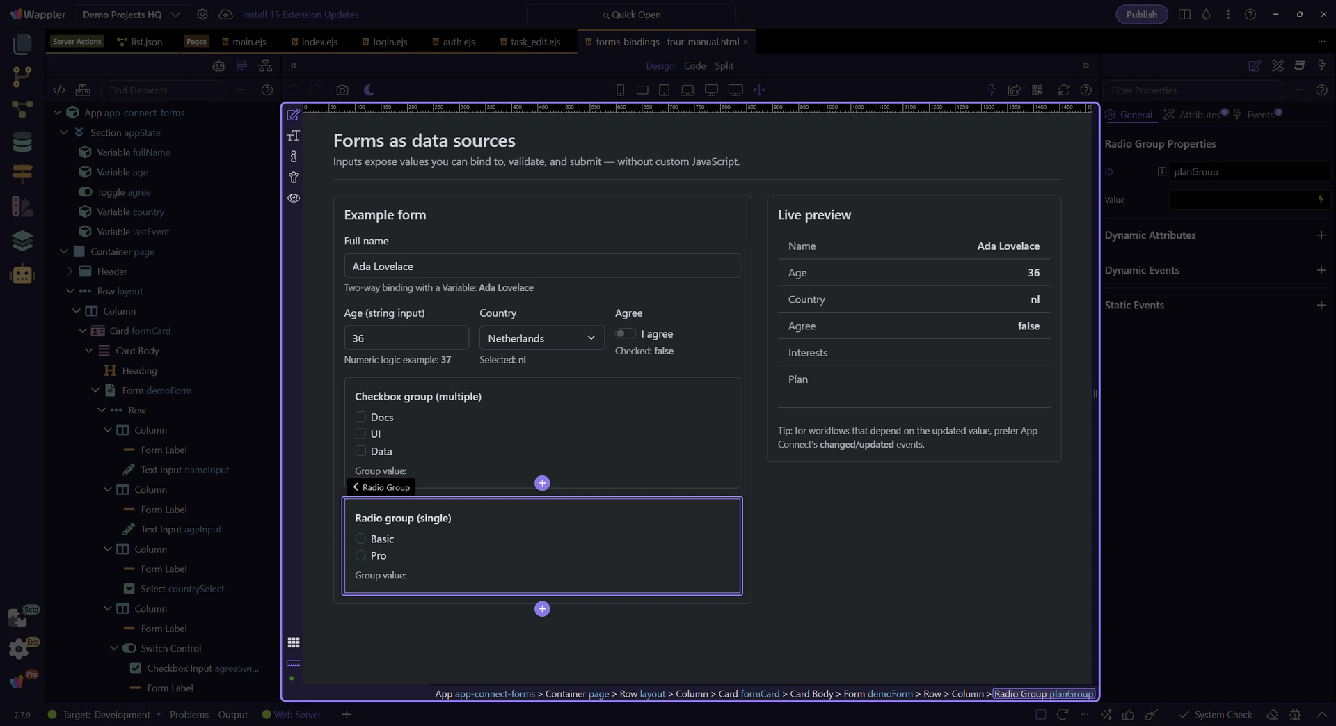
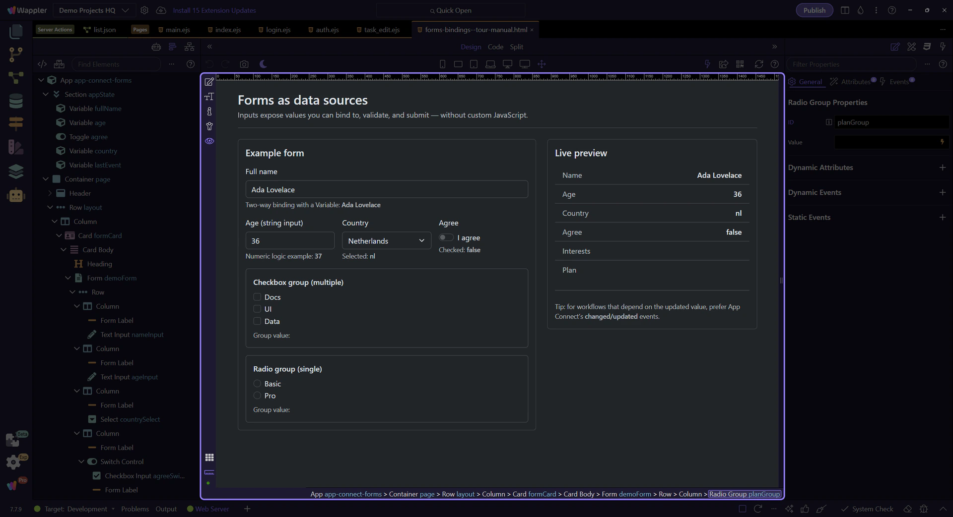
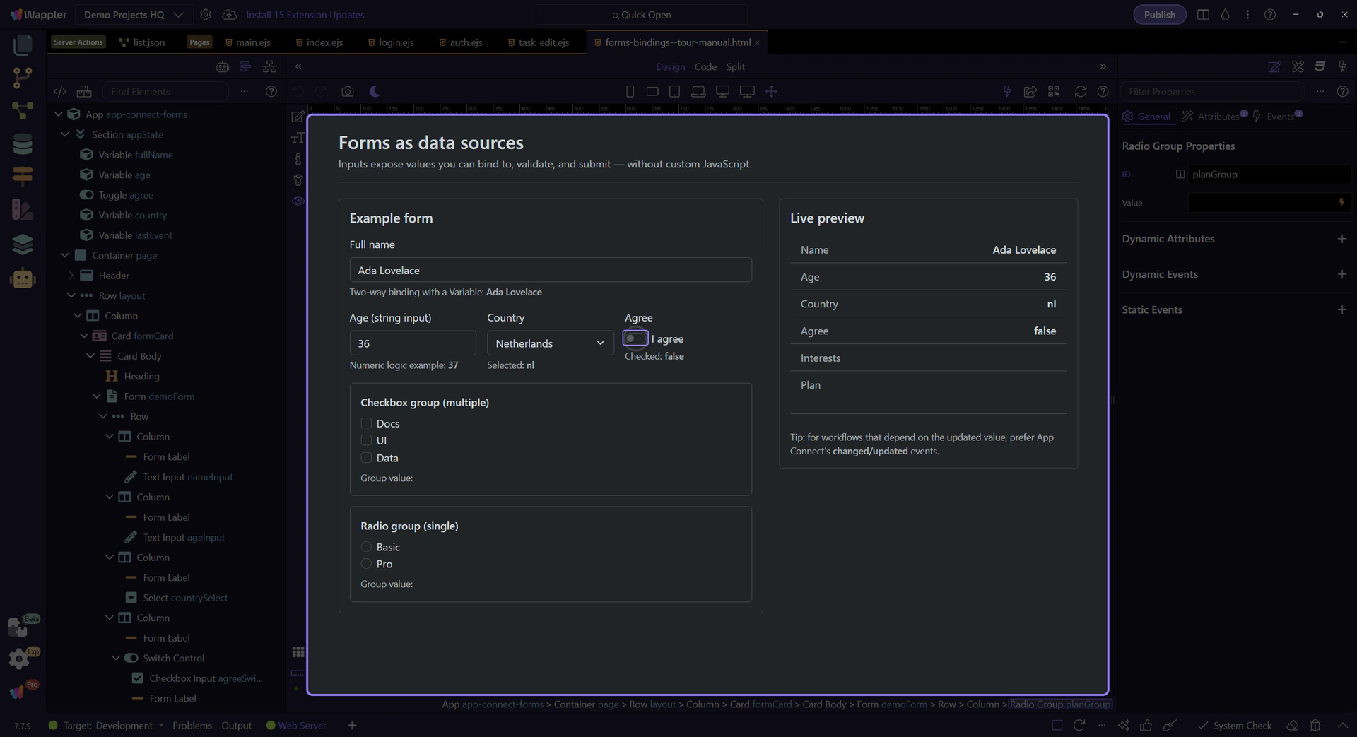
Select and Radio Group controls are common for single-choice input.
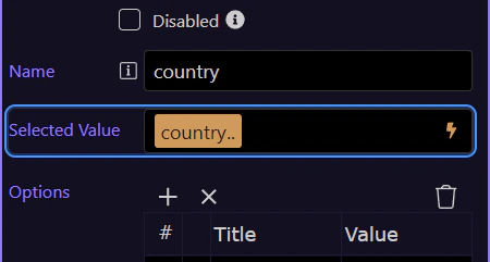
A select control exposes the currently selected value as selectId.value.
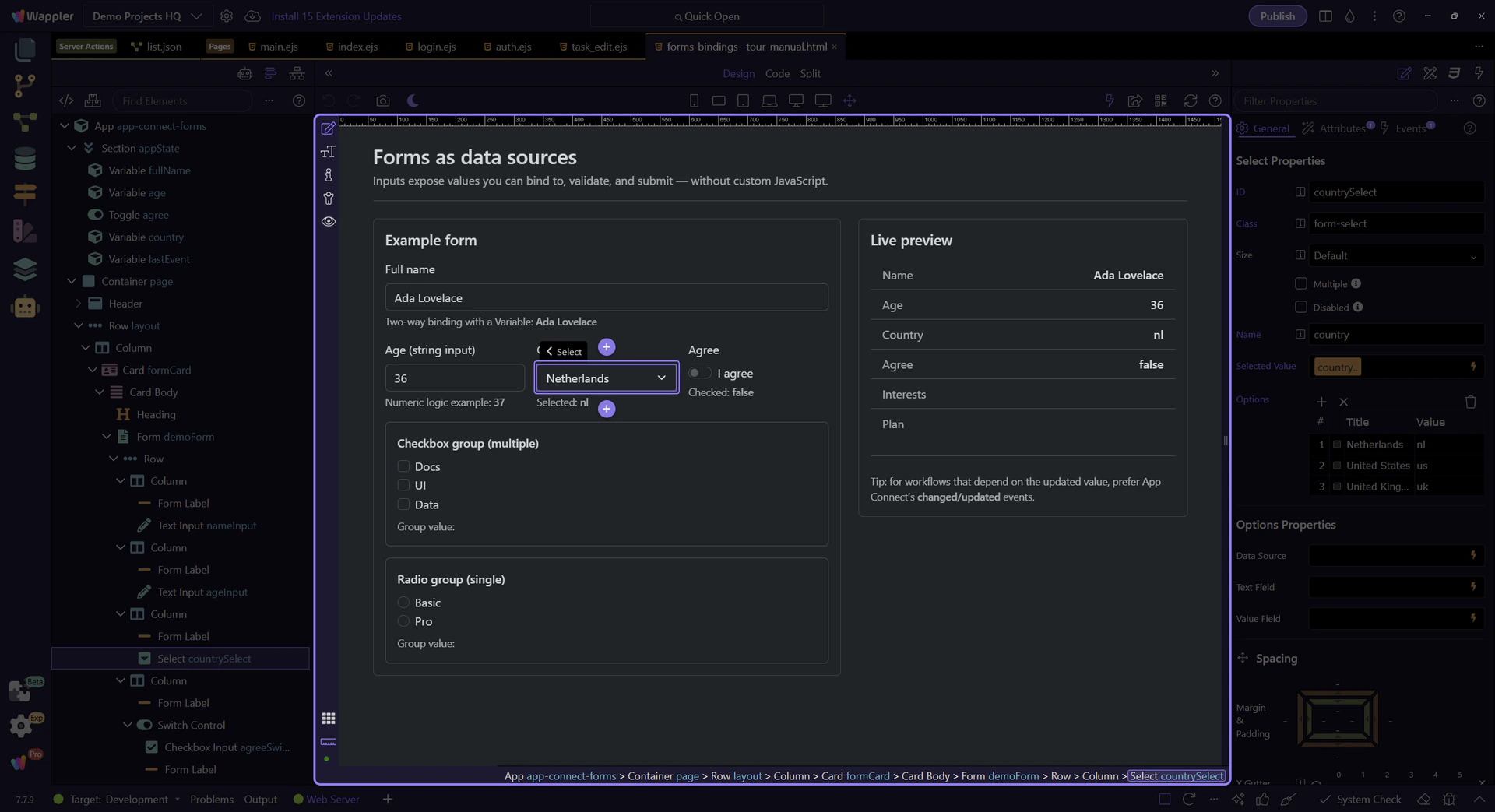
This binding controls the select’s selected value using an expression. This step matters because Selected value binding (dmx-bind:value) is part of Selection Panels Properties Selectvalue, and understanding that context makes the next action easier to repeat in your own project.
Attach actions here when you need to react to the newly selected value. This step matters because Changed event action (select) is part of Selection Panels Properties Changedvalue, and understanding that context makes the next action easier to repeat in your own project.
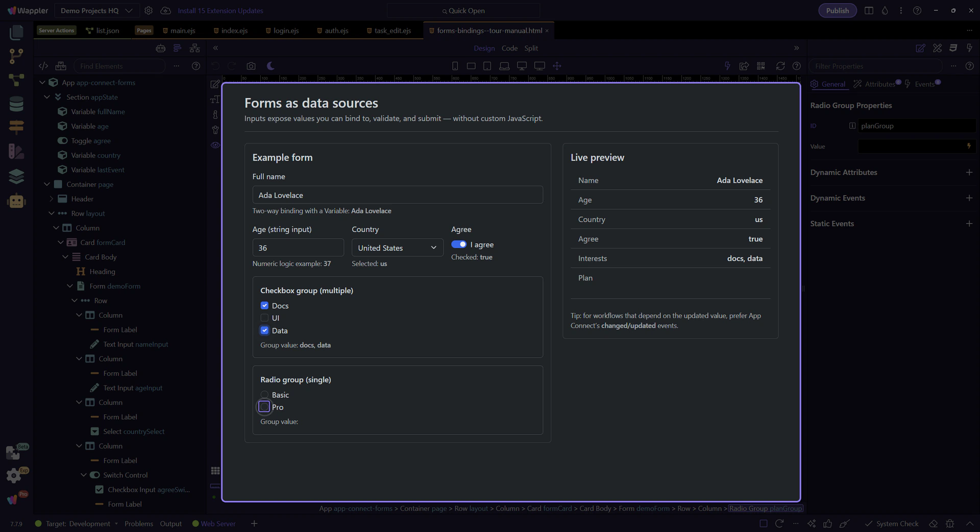
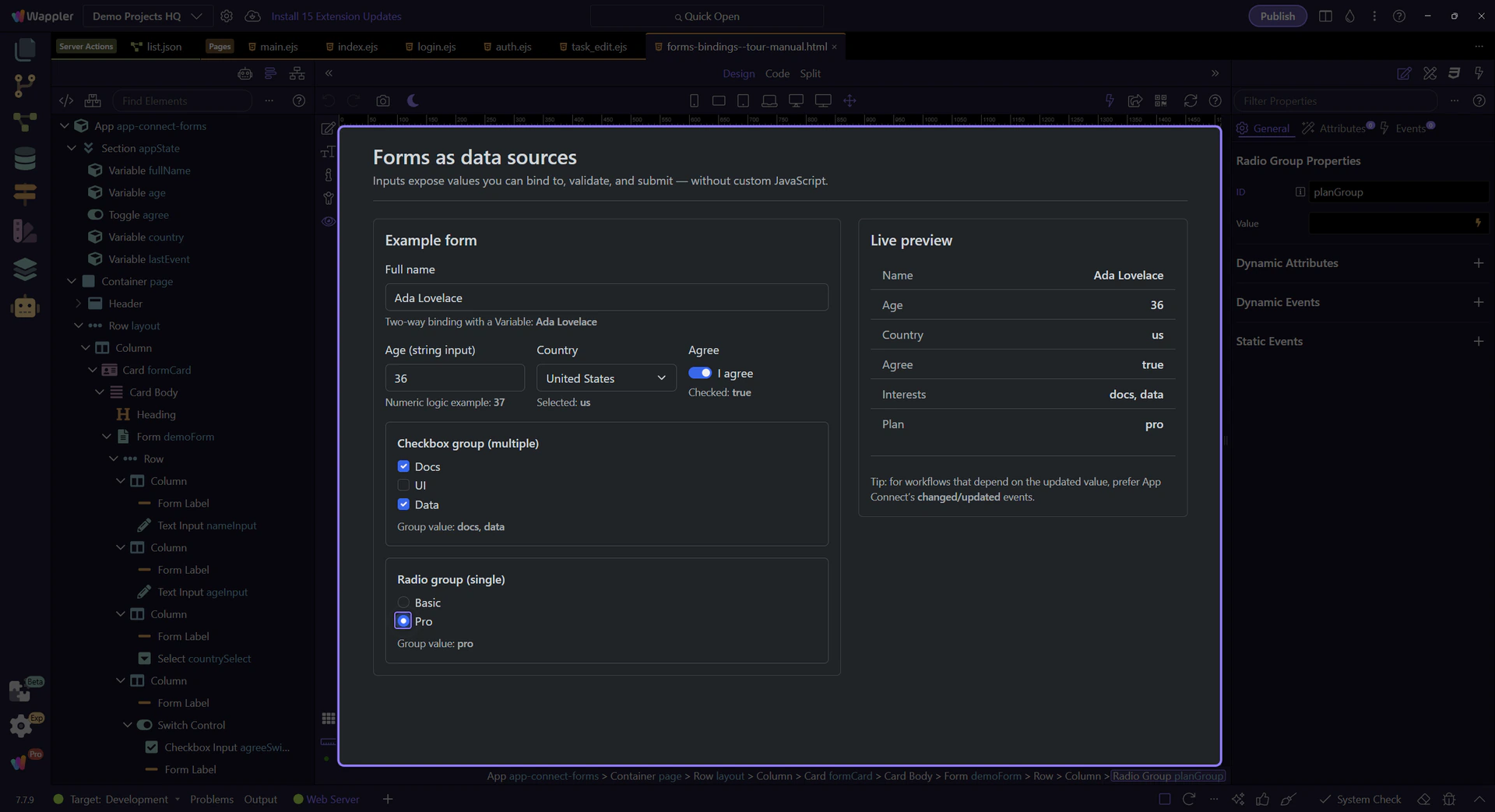
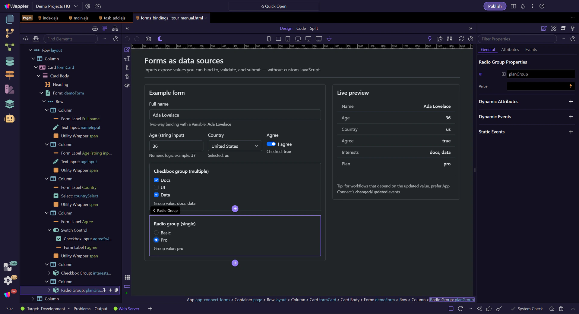
Use a Radio Group wrapper for a set of radios so you can read one group value.
Switch to Preview mode and change a few controls. The Live preview card updates immediately via bindings.
Switch to Preview mode now so you can test the form inputs live in the next step instead of only inspecting the setup.
Wait for the page to finish switching modes.
We’ll toggle the Agree switch. Notice how demoForm.agreeSwitch.checked updates in the Live preview.
The tour selects another Country value so you can see demoForm.countrySelect.value update in the Live preview.
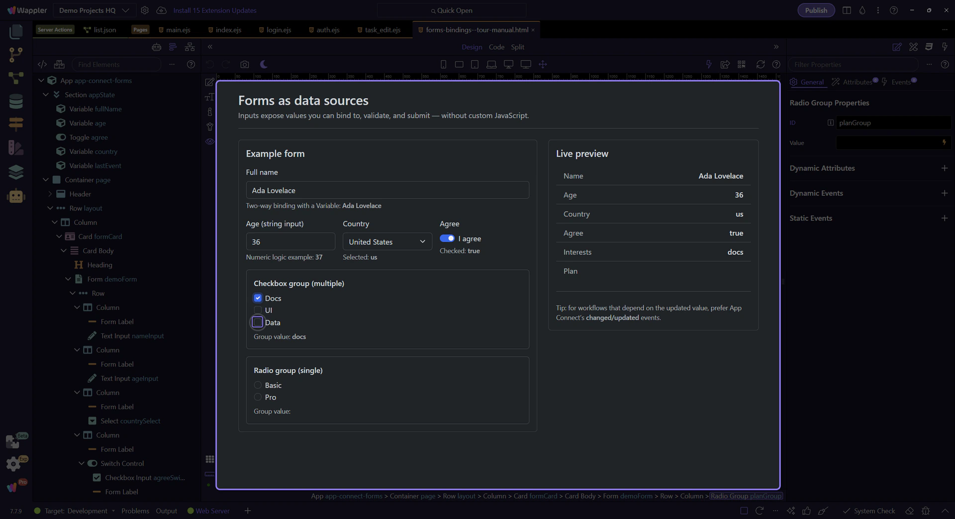
The checkbox group aggregates checked items into one array value (demoForm.interestsGroup.value).
Selecting another interest appends another value to the group array.
We’ll pick a plan option. demoForm.planGroup.value reflects the selected radio.
Edit the Full name field and watch both fullName.value and demoForm.nameInput.value change in the preview panels.
Return to Edit mode so you can continue shaping the form after confirming its live binding behavior.

When you run actions based on input changes, prefer App Connect’s changed/updated events when you need the updated value.
If you attach actions to input events, ensure you’re using the event that runs after the new value is in state.
tip: Common workflow: dmx-on:changed → set value / run validations / trigger data reload.
Attach actions on the selected field (or on the form) in Properties. This step highlights the Dynamic Events section, where dmx-on:changed is a common choice for “latest value” workflows.
Next, validate inputs and submit them to the server.
Pick a related tour to continue.