Visibility control
Understand whether the modal is driven by direct actions, bound state, or a combination of both.
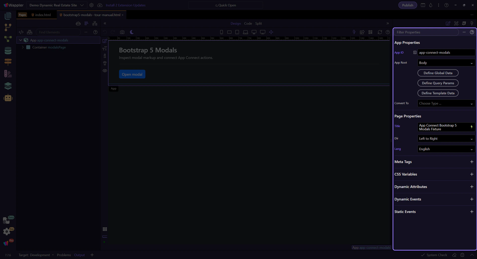
Control Bootstrap 5 modals reactively with App Connect: bind visibility, call show/hide actions, and handle modal events.
This tour introduces Bootstrap 5 modals as reactive UI components inside App Connect. You will look at how the modal is represented in Structure, which bindings and actions control its visibility, and how modal events fit into a larger client-side workflow.
By the end of this tour, you should be able to explain the full modal control loop in Wappler: what opens the modal, what closes it, which state or event drives that change, and where you inspect those bindings and actions in the UI.
Use App Structure to select modal elements and Properties to configure bindings, events, and actions.
Review what you did and choose a next tour.
Pick a related tour to continue.
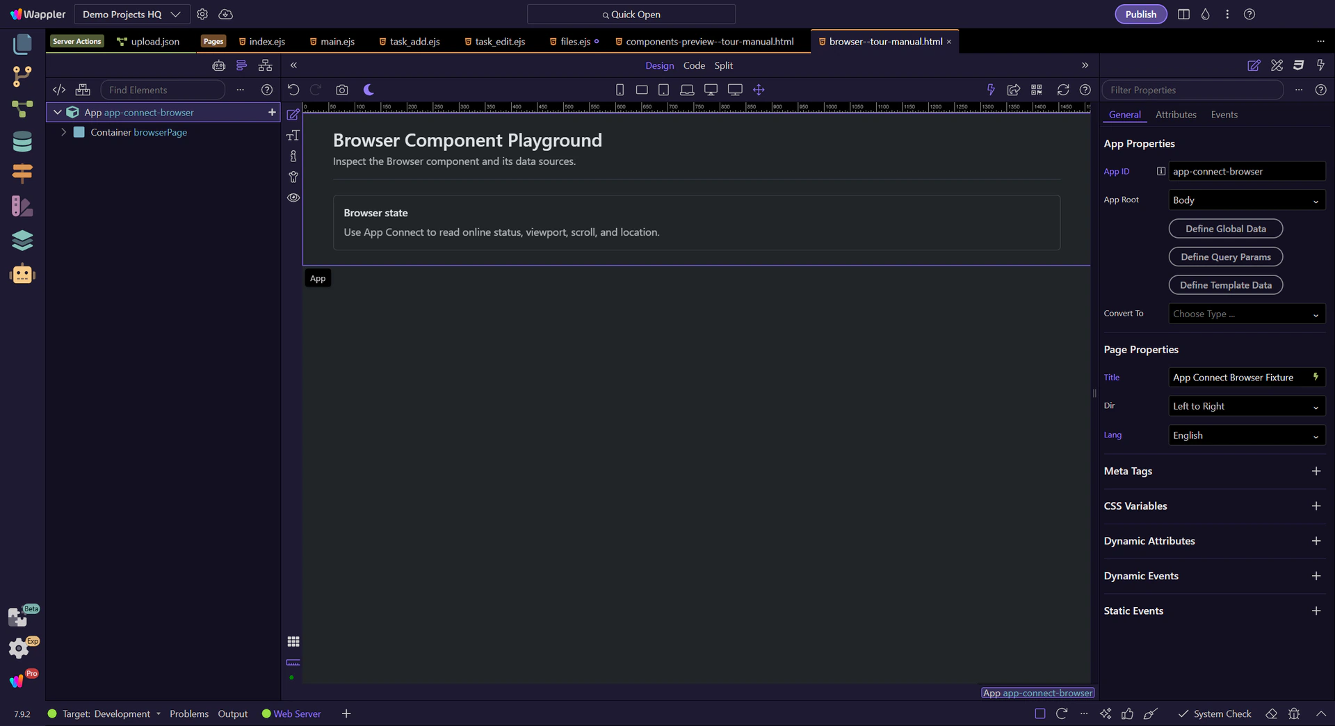
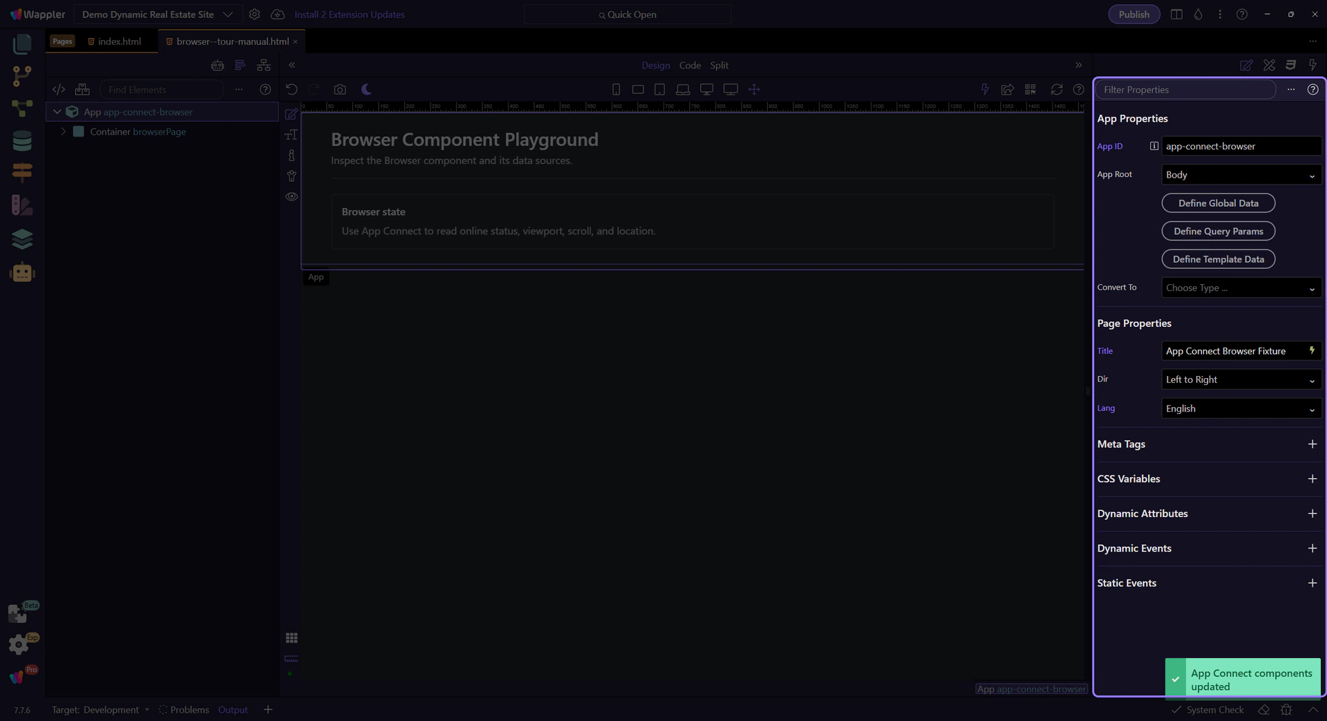
Use the Browser component for navigation, online/offline state, viewport, scroll, and history events.
This tour positions the Browser component as App Connect’s bridge to client-side browser state. You will review which events and properties it exposes, how those values become usable in bindings, and when it is the right source for navigation, viewport, online status, and history-driven behavior.
The goal is to understand the Browser component as a shared context provider for the page, not just a list of random browser APIs. By the end, you should know which kinds of UI behavior belong here and how to inspect those events and values in Wappler.
Configure Browser events and state in Properties, and use it as a UI-level source for navigation and viewport data.
Review what you did and choose a next tour.
Pick a related tour to continue.

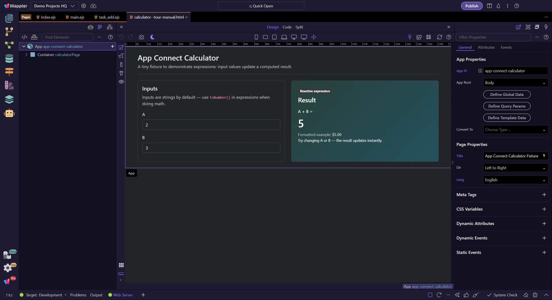
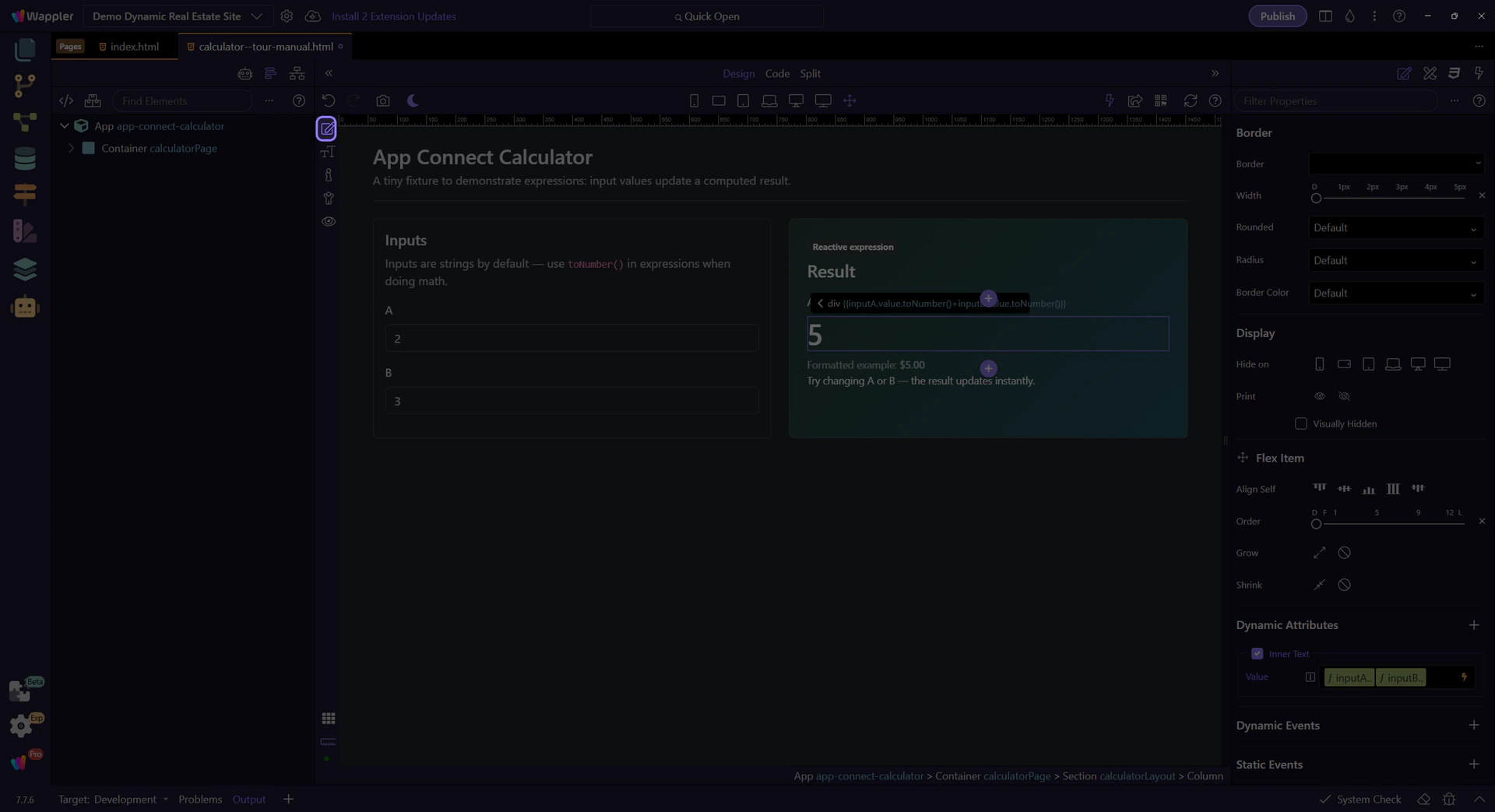
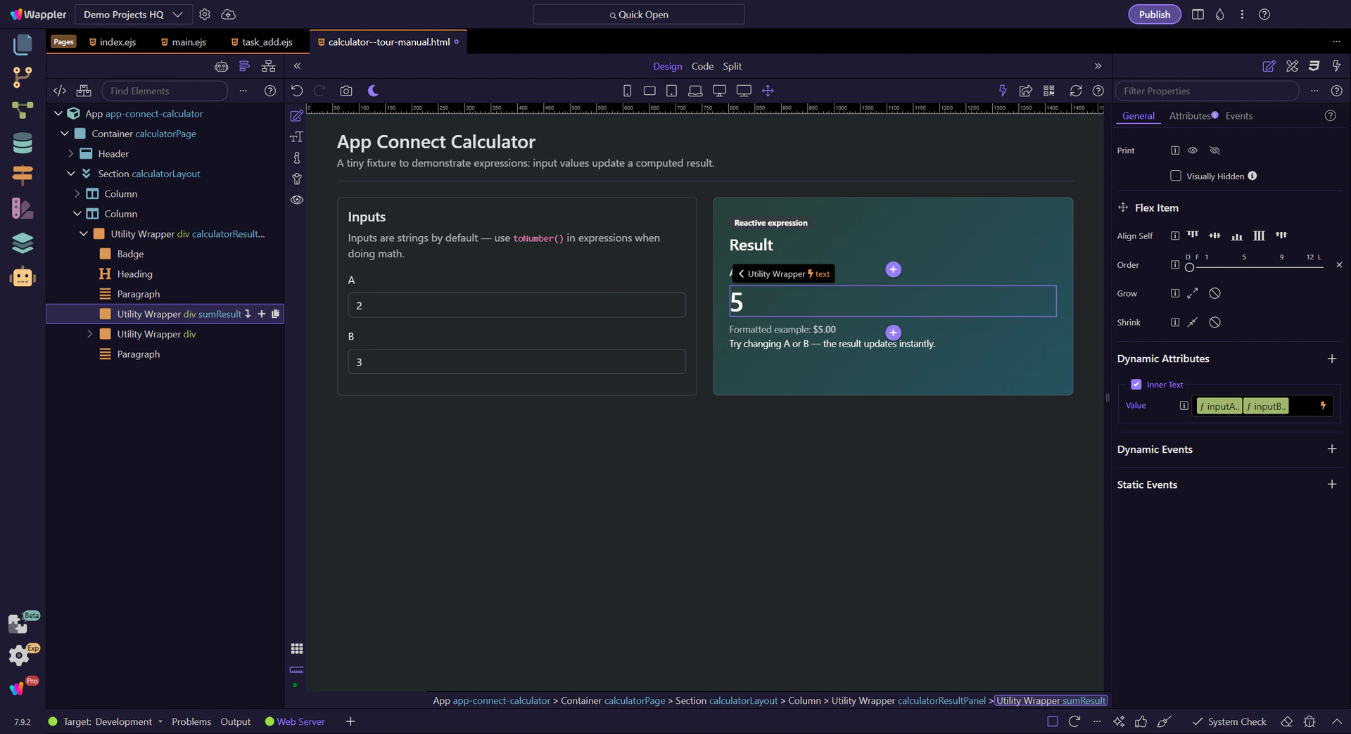
Build a small reactive calculator in Wappler and use it to understand expressions, input scope, and why toNumber() is essential before doing numeric math in bindings.
This tour uses a two-input calculator to show how App Connect expressions evaluate in real time. You will inspect the result binding, follow where each value comes from, and see where type conversion prevents string-math bugs.
You will learn the whole expression workflow, not just the final formula: which inputs are in scope, how the Data Bindings Picker helps assemble the expression safely, and where to apply toNumber() so the result behaves like real arithmetic.
note: HTML input values are strings by default. Use toNumber() before doing math (A.value.toNumber() + B.value.toNumber()).
This tour opens a sample App Connect page in Design View. Keep Page Panels (Structure) and Selection Panels (Properties) visible.
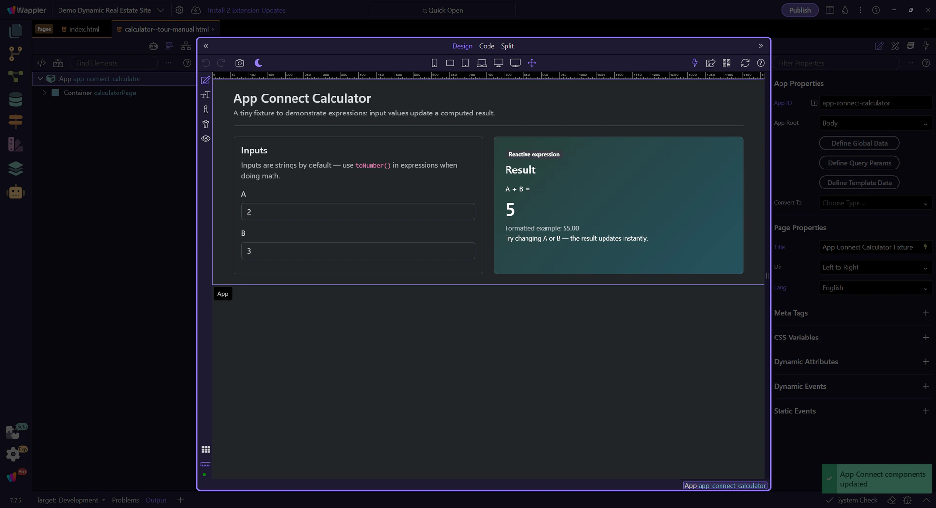
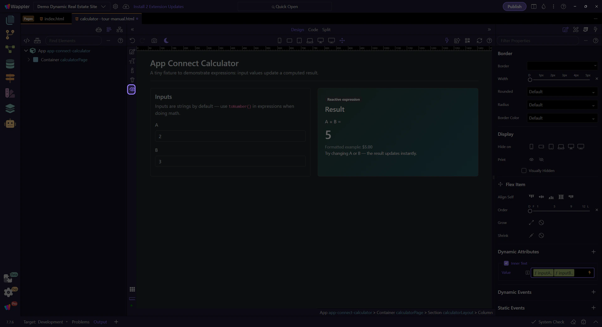
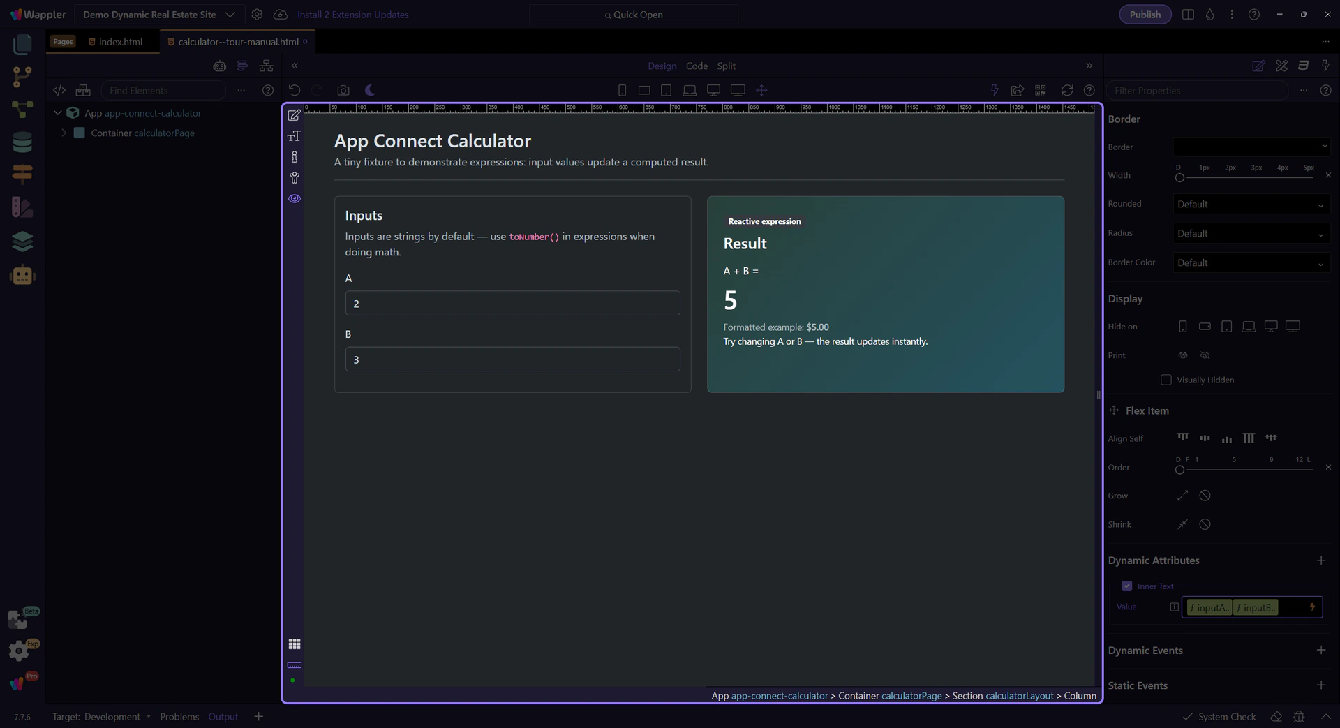
The result is computed from two inputs. No click action is needed — the expression is reactive.
Inspect the result text binding — it shows the computed sum expression. (The result text is selected for you.)
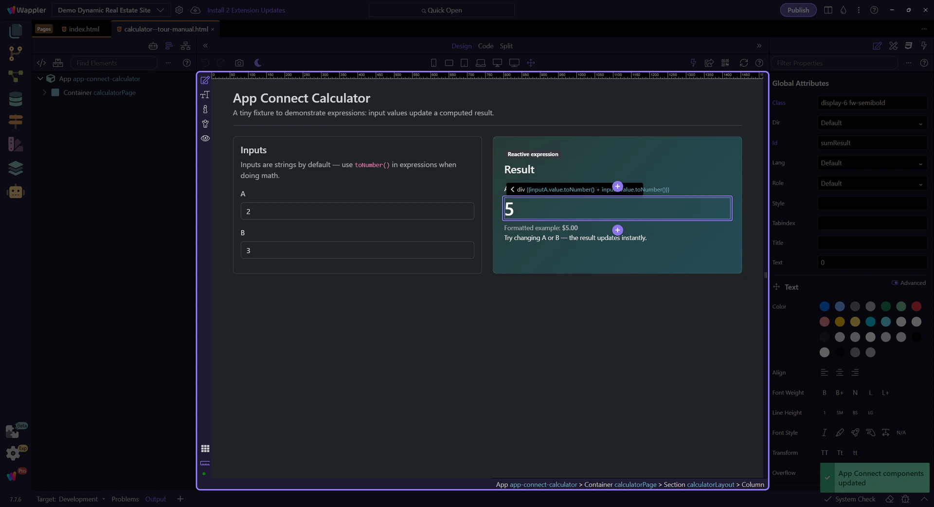
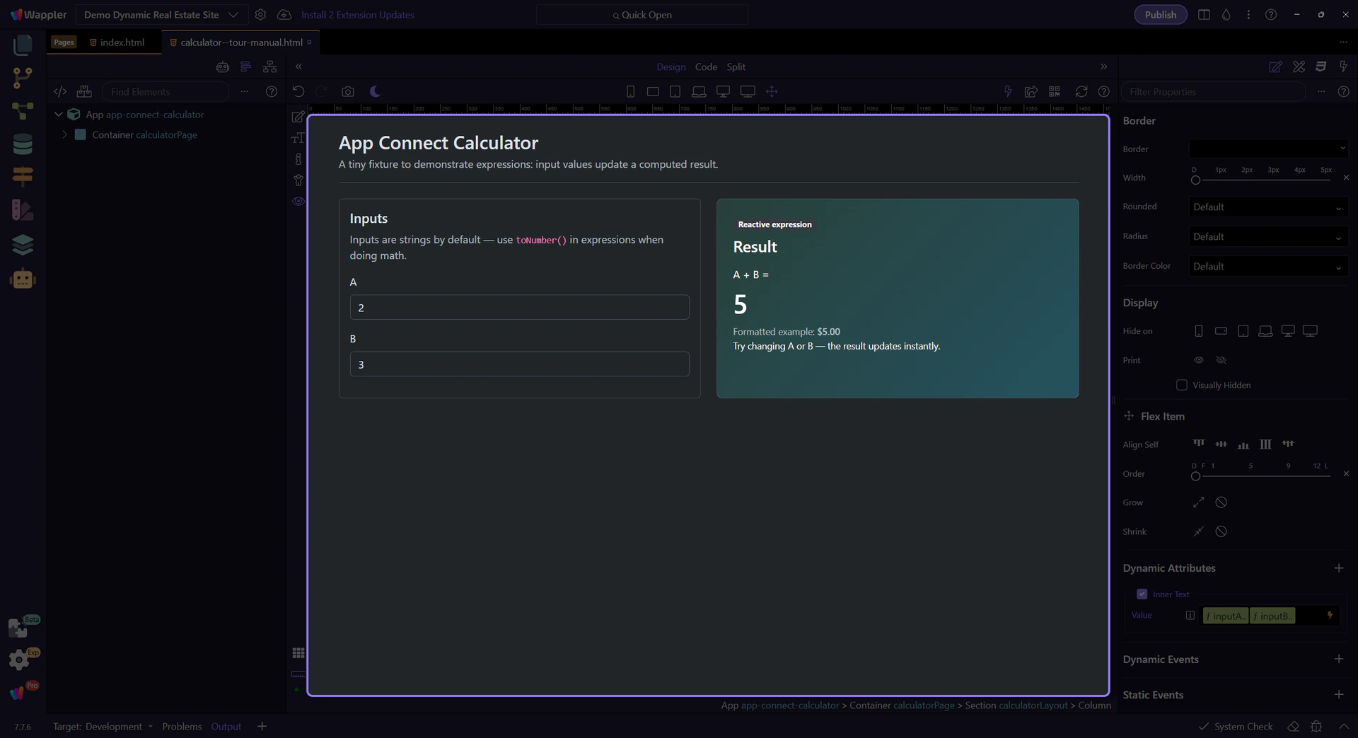
Start with the wider context in the Properties panel so the next control makes sense in the full workflow. In the next step, you will focus on Text binding expression and see how it fits into this area.
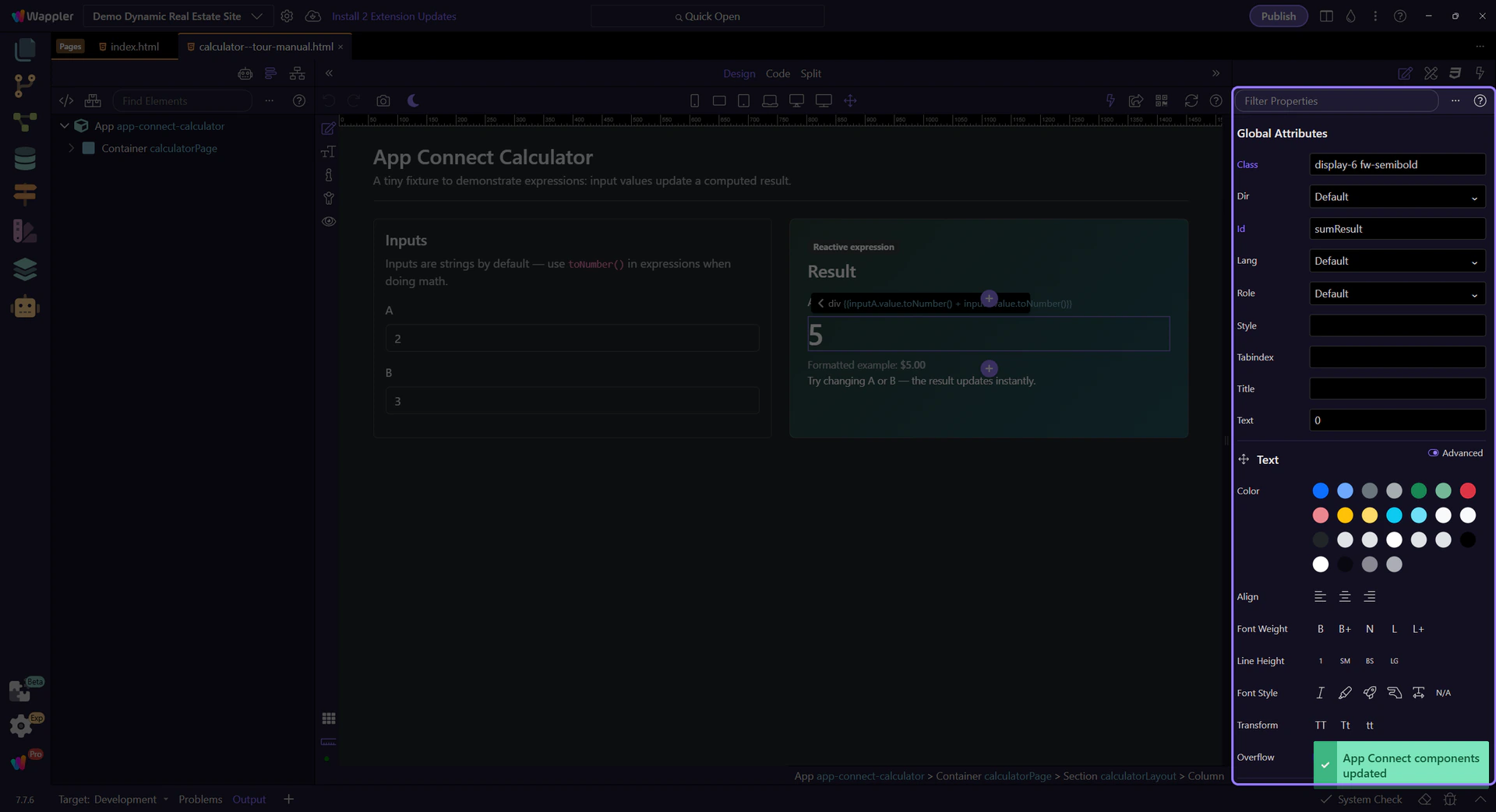
This field contains the expression that computes the sum. It uses toNumber() so math works correctly.
note: App Connect input values are strings by default. Use toNumber() before doing math (A.value.toNumber() + B.value.toNumber()).
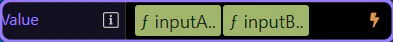
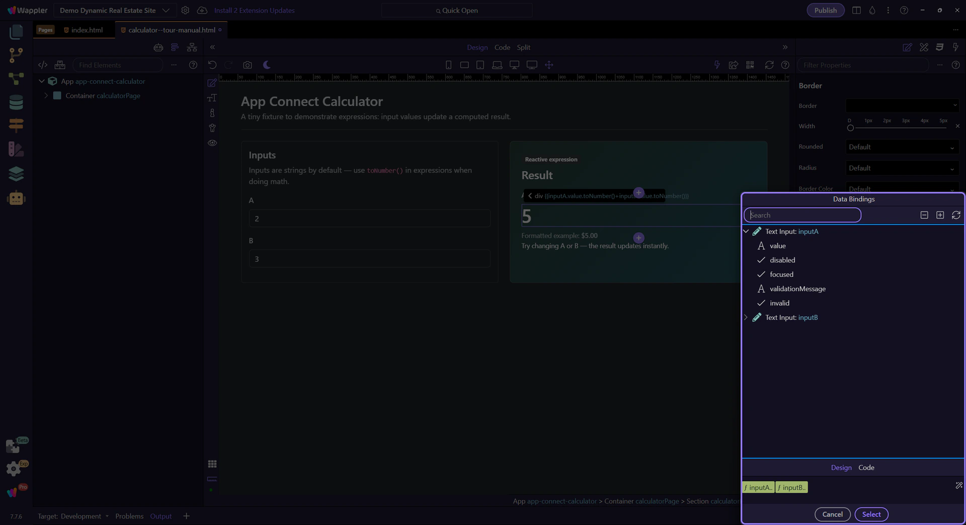
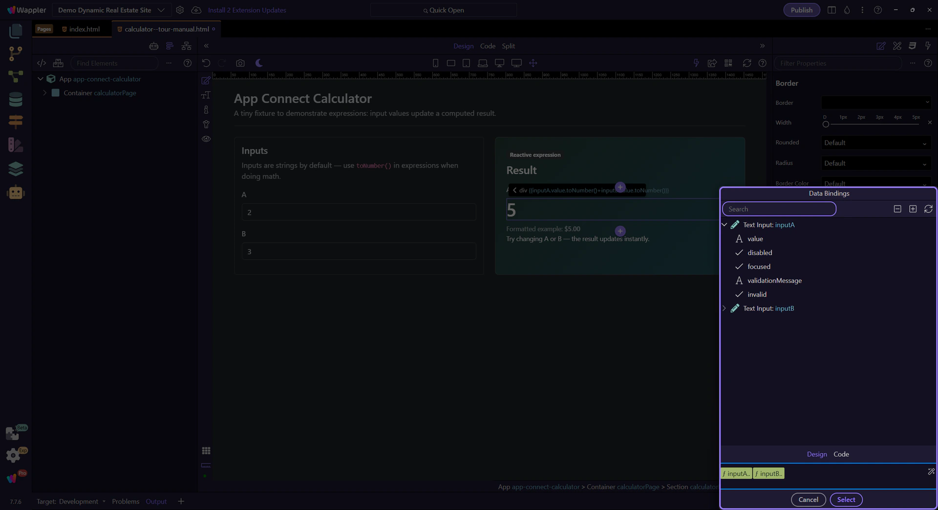
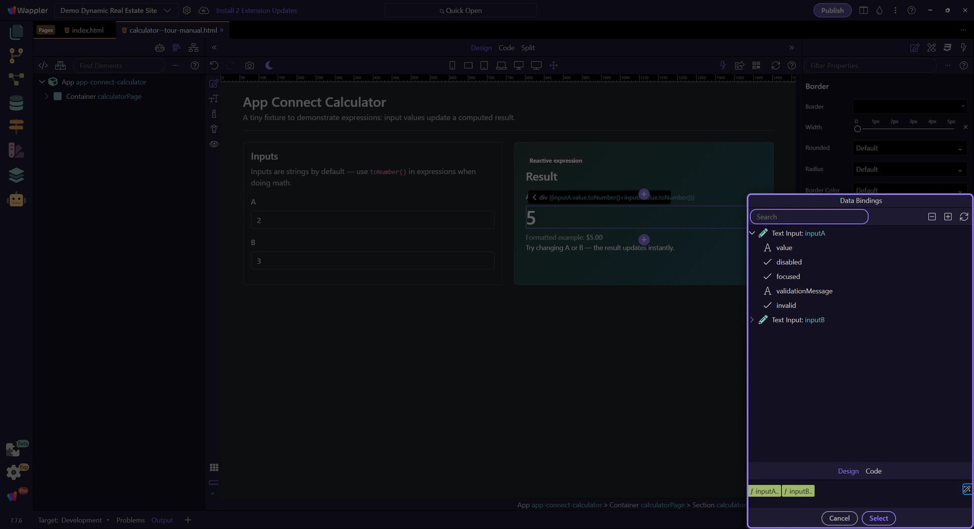
The picker icon opens the Data Bindings Picker so you can explore what’s in scope and see how the expression is built.
tip: Prefer the Data Bindings Picker over typing raw expressions — it keeps your bindings valid.
Use the Data Bindings Picker to select inputs and formatters from a tree and insert them into the binding field.
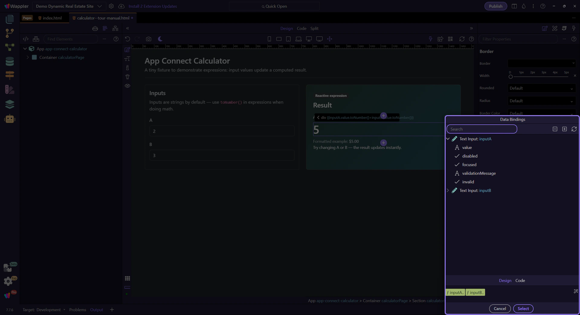
You’ll see the input components and their properties in the tree. Select their value properties to build expressions.
This preview shows the full expression that will be inserted back into the text binding field.
This icon opens the Data Formatter for advanced formatter chains such as number, currency, date, and text formatting. You can explore that popup in the dedicated Data Formatter tour.
Close the Data Bindings Picker to return to Properties. This step matters because Close Data Bindings Picker is part of Popup Databindingspickup Button Cancel, and understanding that context makes the next action easier to repeat in your own project.

Switch to Preview mode and change the input values. The result updates immediately.
Switch to Preview mode now so you can test the calculator live in the next step instead of only reading the setup in Design view.
Wait for the page to finish switching modes.
Type new numbers in A and B. The result updates instantly (no button required).
Return to Edit mode so you can keep building after confirming the live calculator behavior in Preview.
You’ve practiced expressions and type conversion. Next, learn the bigger workflow: components, properties, events, and actions.
Continue learning App Connect gradually.
Use show/hide/if and repeaters to render UI from data — configured visually in Wappler.
Build reactive UI by showing/hiding sections and repeating elements from a dataset — configured visually in Wappler (no manual code required for the common cases).
Most dynamic UI on the page comes down to: conditional display, binding text/attributes to data, and repeating UI for lists.

Select the element in App Structure, then use Properties to configure show/hide/if, repeat, and bindings.
Control when an element is visible and whether it exists in the DOM.
Use show/hide when you want to keep the element in the DOM but toggle visibility based on state (a Toggle, Variable, form state, etc.).
tip: Show/hide is great for UI switches where layout stays stable.

Use if when you want the element removed from the DOM when false (often better for performance and for components that should not exist).
important: If removes the element from the DOM when false. Nested bindings and events won’t run because the element isn’t there.

Prefer show/hide for simple visibility, and if for expensive UI (repeaters, complex components, large sections).

Connect what users see to your data using bindings (instead of manual string concatenation).
When you bind text content, prefer dmx-text (or the text binding option in Properties) for stable updates and less flicker than raw template text.

Use bindings for attributes like src/href/value and conditional classes/styles. This is how Wappler maps to dmx-bind:* without you writing raw attributes.
tip: Use the binding picker to select the right field/formatter for src/href/value/classes — it’s scope-aware and avoids typos.
When a field supports bindings, use the picker to browse available components and methods in the current scope.
tip: If a binding looks wrong, re-check what’s selected in App Structure — scope is selection-driven.
Repeat UI from an array, Data View, Data Store, or API result.
App Connect supports two repeat patterns. In Wappler you’ll pick the one that matches your desired HTML structure.

Repeaters can be driven by Arrays, Data Store records, Data View output, or API results. The picker will show you what’s available in scope.

Inside a repeat, bindings resolve against the current item. Select a repeated element in App Structure to see the right fields in the picker.
tip: If you can’t see a field, ensure you’re selecting the repeated node (not just the parent wrapper).
Next, practice with Data View and events/actions, then learn formatters.
Continue learning App Connect.

Use the real contact add page to see how App Connect combines lookup data, submission state, and the success handoff into the new contact detail page.
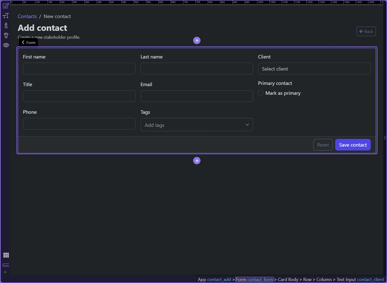
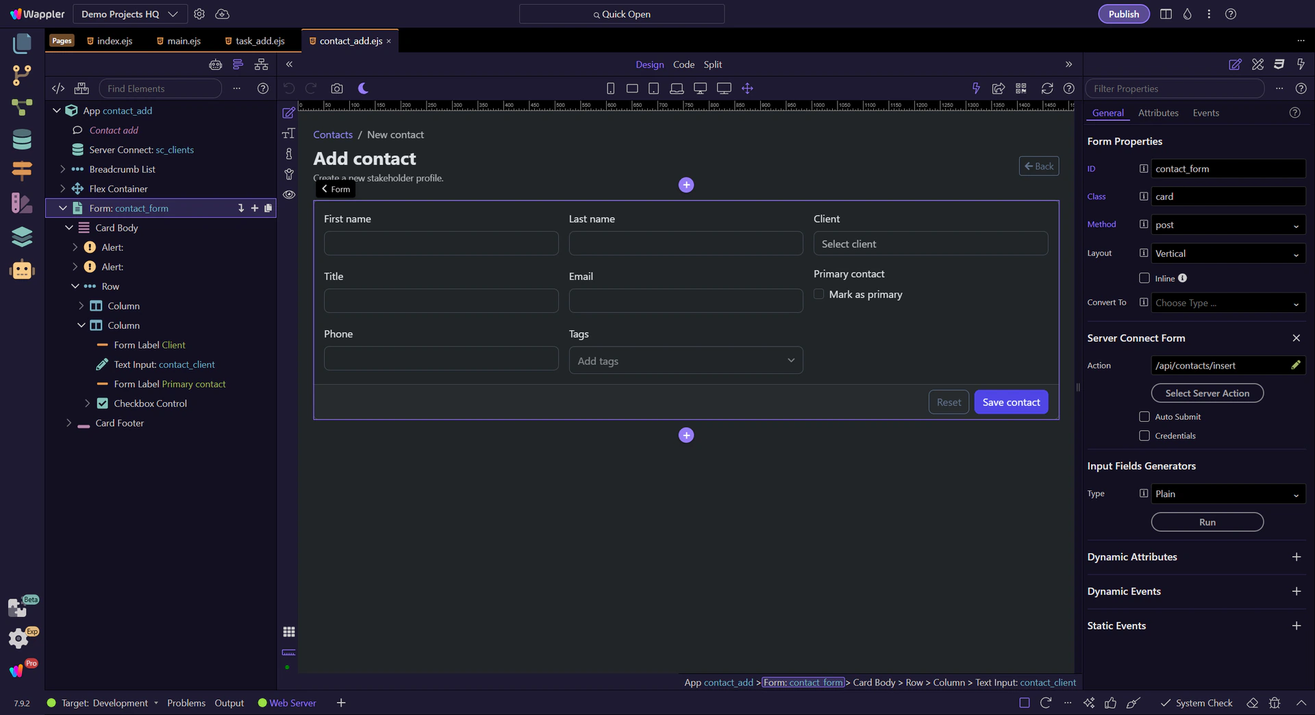
The contact add page is a useful App Connect example because it starts from an empty form but still depends on live data and clear success state. The page loads client choices, submits a new contact through one form, and turns the insert result into a direct handoff to the new detail page.
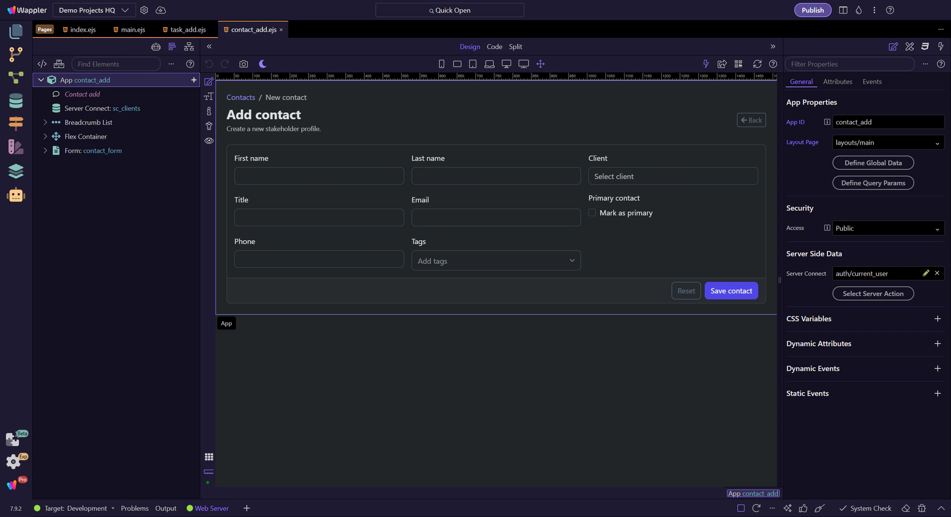
The contact add page shows that create forms still need App Connect structure even without an existing record to restore. Client lookup data is loaded first, the form exposes executing and error state, and the insert result becomes the page’s success handoff.
Start on the real contact add page so the lookup loader, empty form fields, and submission feedback live in one context. The page works because App Connect still owns lookup data and request state even when there is no existing record yet.
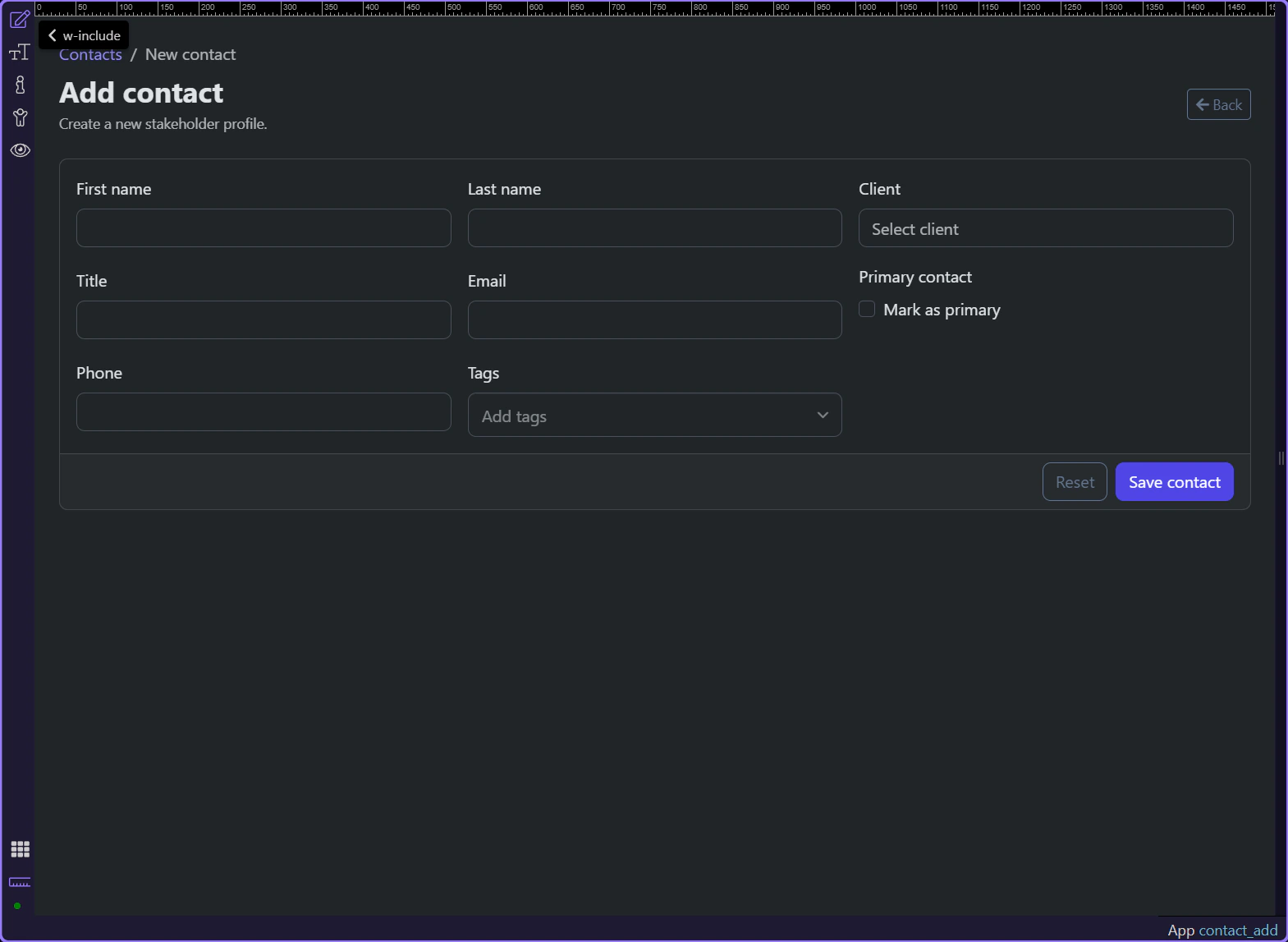
#contact_client binds to sc_clients.data.clients, so the new contact can still be attached to a real client without hard-coded options. The field also accepts query.client_id, which makes preselected client context possible when the page is opened from elsewhere.
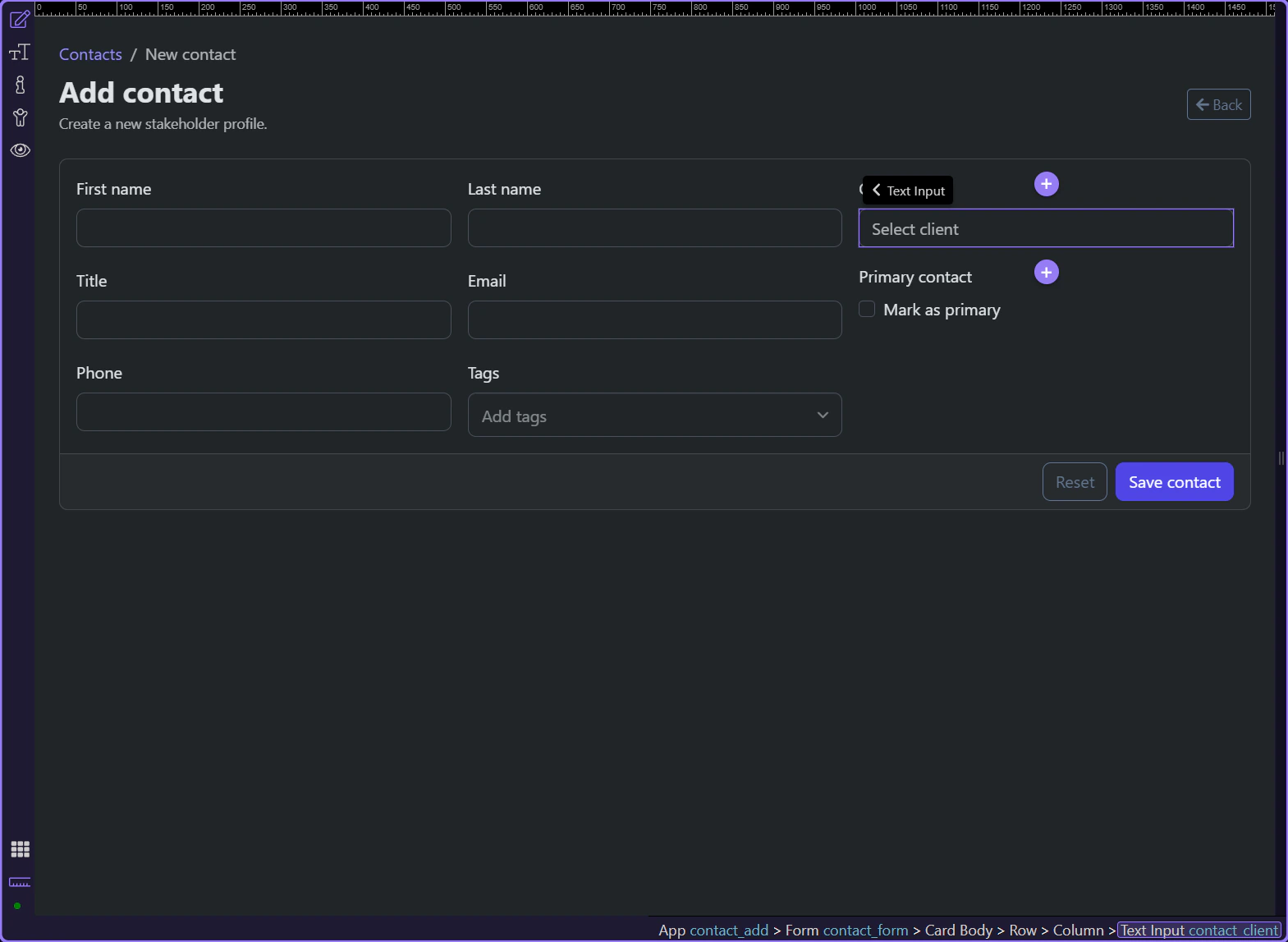
#contact_form posts to /api/contacts/insert, exposes executing and lastError state, and returns insert_contact when the record is created. That output is what lets the page stay declarative about success instead of manually building navigation state.

The success alert links to /contact/ plus contact_form.data.insert_contact.identity, so the create flow ends with a concrete destination. That keeps the user oriented because the new record becomes immediately inspectable instead of disappearing behind a generic success message.
The contact create page stays understandable because App Connect makes the create lifecycle explicit. Lookup data arrives before the field needs it, the form exposes request state while saving, and the insert result hands the user straight into the new record.
Use the real contact edit page to see how App Connect keeps the destructive delete flow explicit with confirmation, request state, and a return-to-contacts handoff.
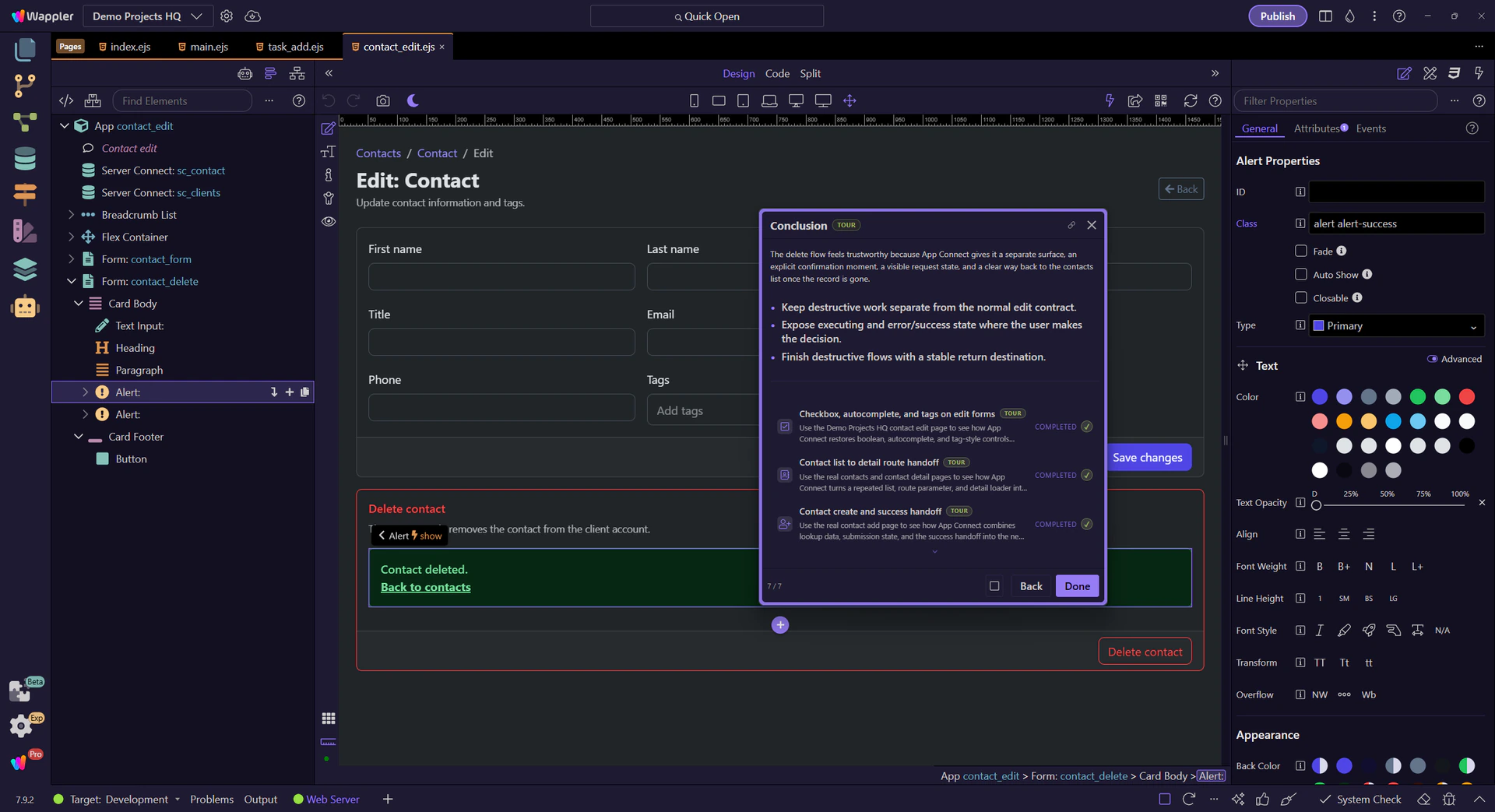
The contact edit page does something important with destructive actions: it keeps delete separate from normal editing. App Connect makes the delete path legible by giving it its own form, confirmation moment, request state, and a clear route back to the contacts list after success.
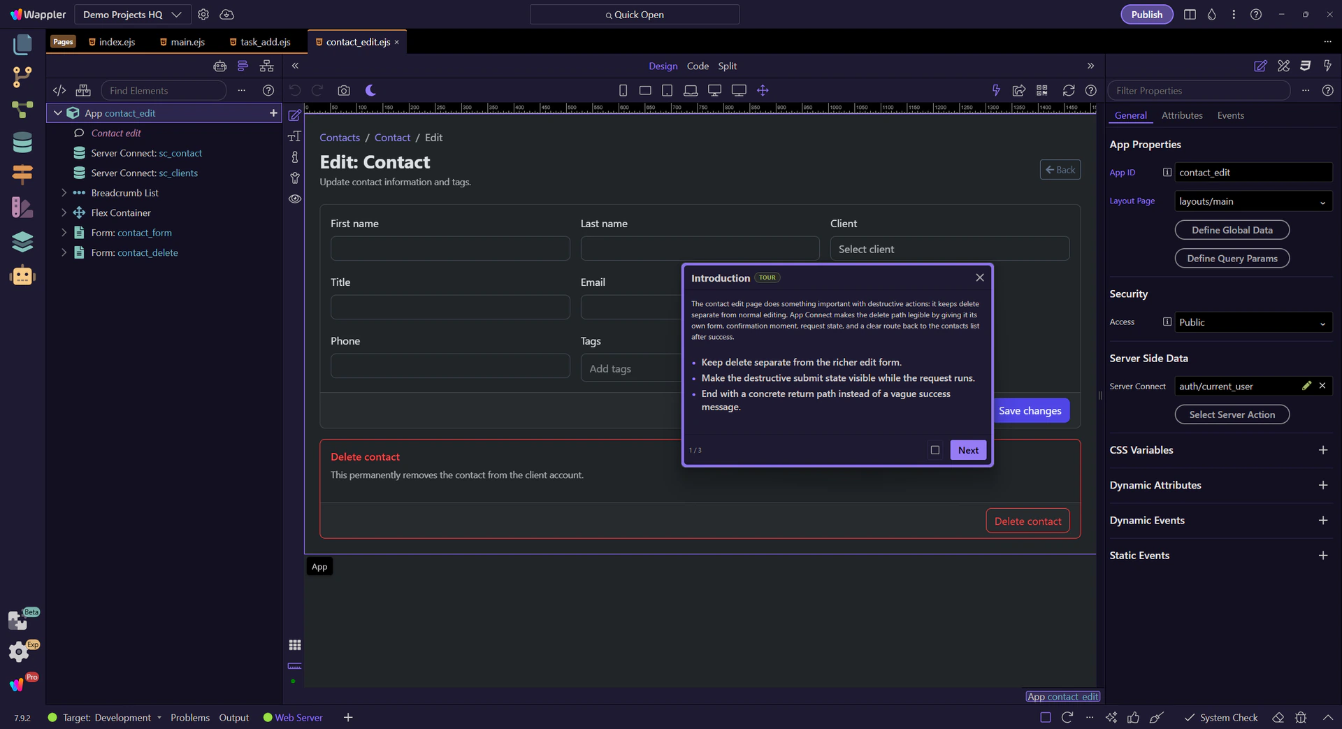
The contact edit page keeps the destructive workflow understandable by separating delete from update. That gives the page room to show the warning, request state, and success/error outcome without overloading the normal edit form.
Start on the real contact edit page so the two forms are visible together. The page makes a clear distinction between updating the current contact and permanently removing it.
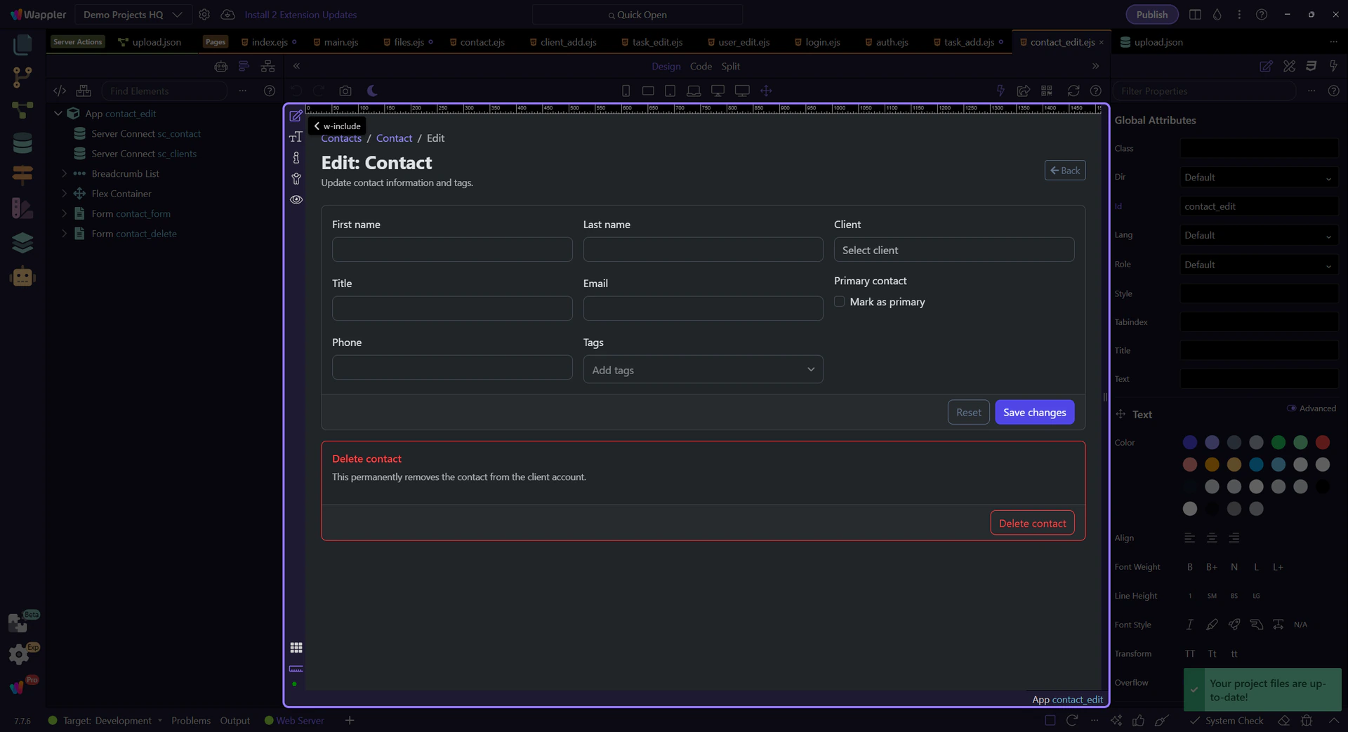
#contact_delete has its own action, hidden id input, success state, and error state. That separation matters because destructive work should not disappear inside the richer update form contract.
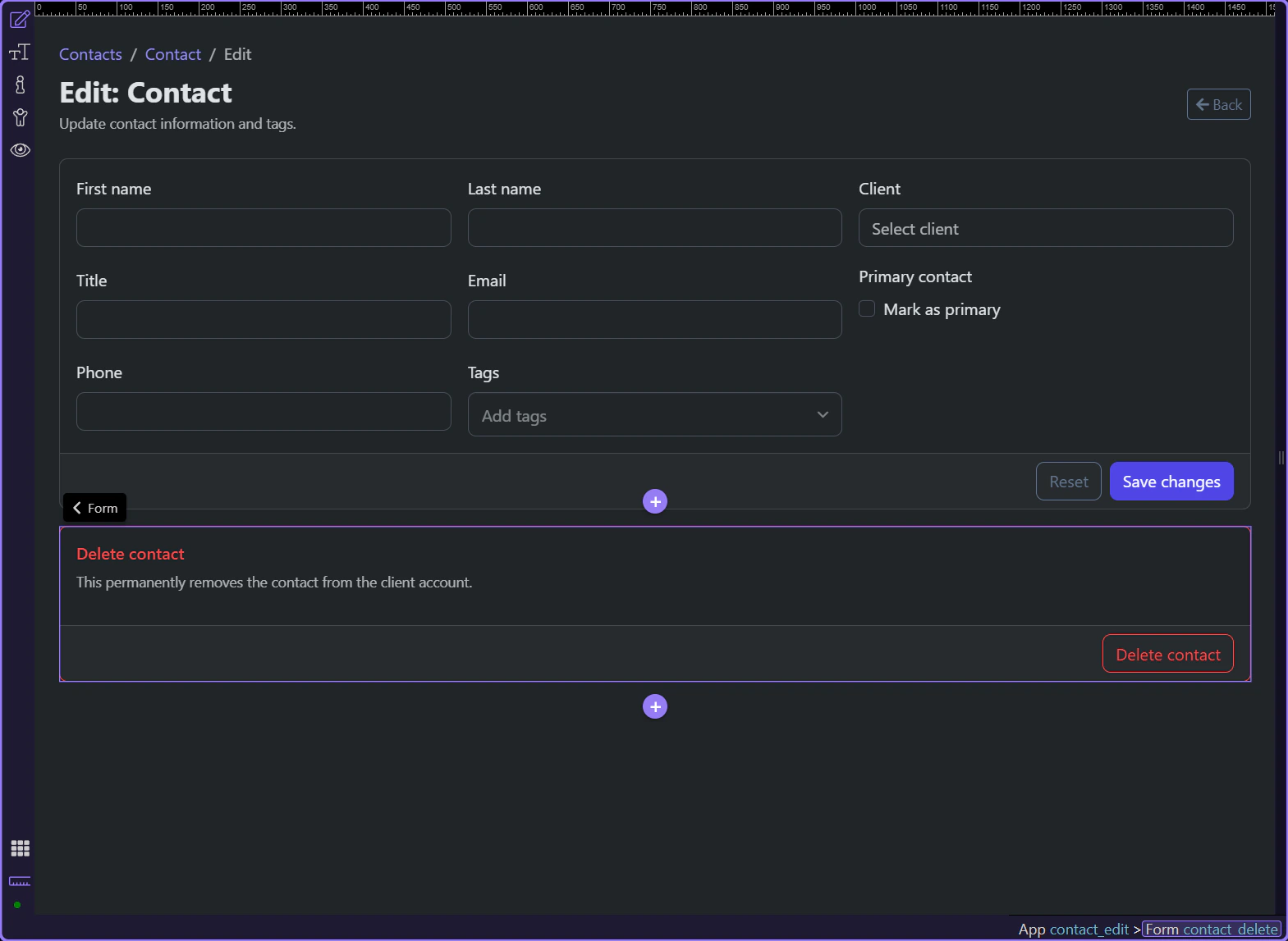
The delete button does two practical things before the record disappears: it asks for browser confirmation, and it disables itself while contact_delete.state.executing is true. That gives the user one last check and prevents accidental double submits.
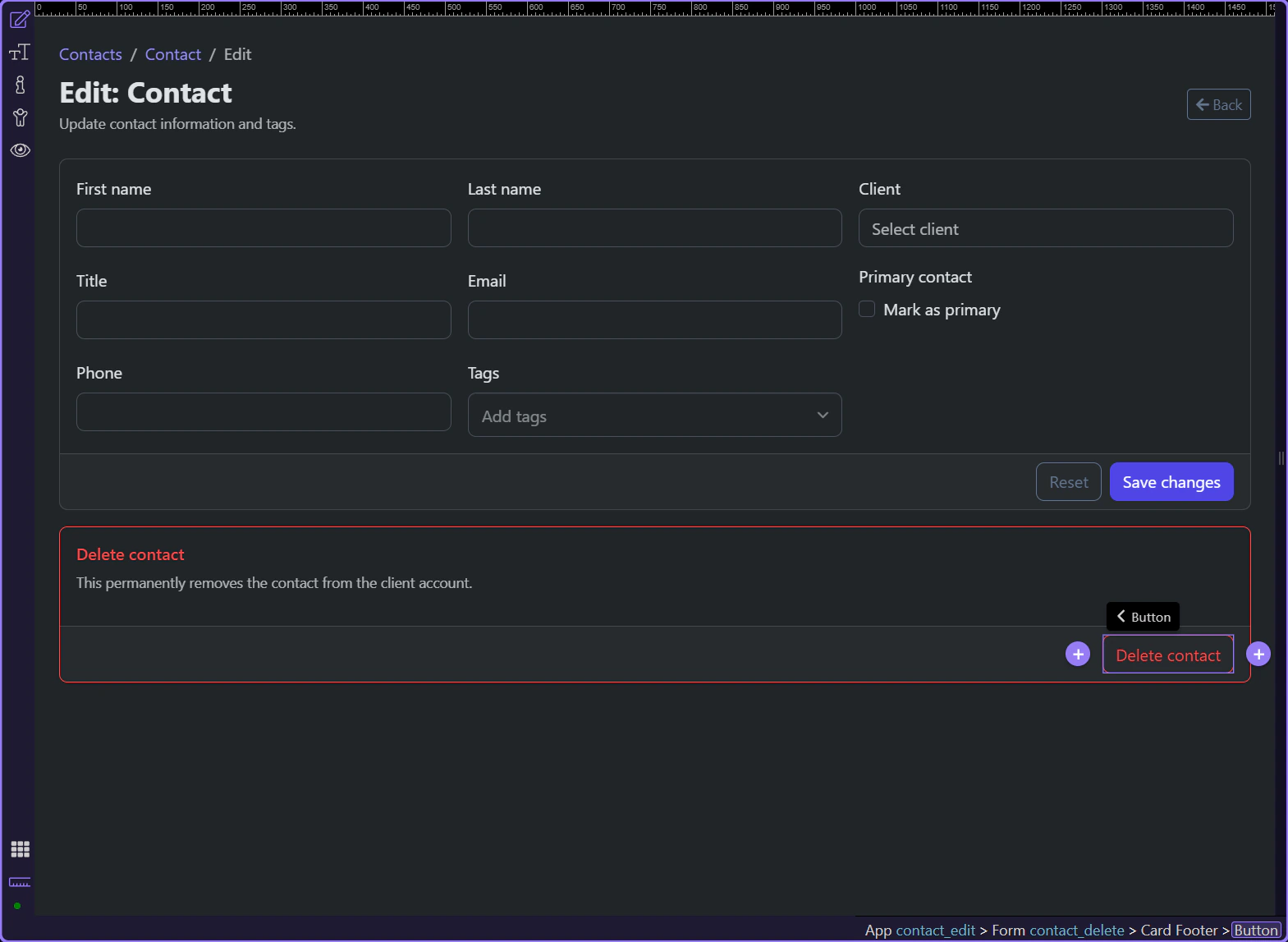
After a successful delete, the page does not leave the user stranded on a now-invalid record. The success alert exposes a direct return link to /contacts, so the destructive flow ends in a safe list view instead of a broken detail context.
The delete flow feels trustworthy because App Connect gives it a separate surface, an explicit confirmation moment, a visible request state, and a clear way back to the contacts list once the record is gone.
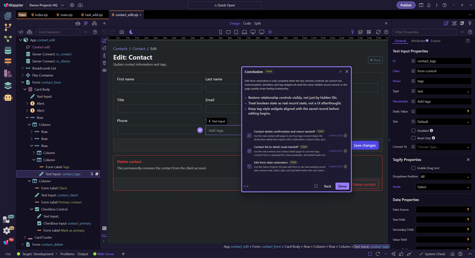
Use the Demo Projects HQ contact edit page to see how App Connect restores boolean, autocomplete, and tag-style controls before editing starts.
The contact edit page fills a gap that many edit-form examples skip: not every restored control is a plain text box. This page restores a related client in autocomplete, a boolean primary-contact state, and tag-style metadata before the editor makes any changes.
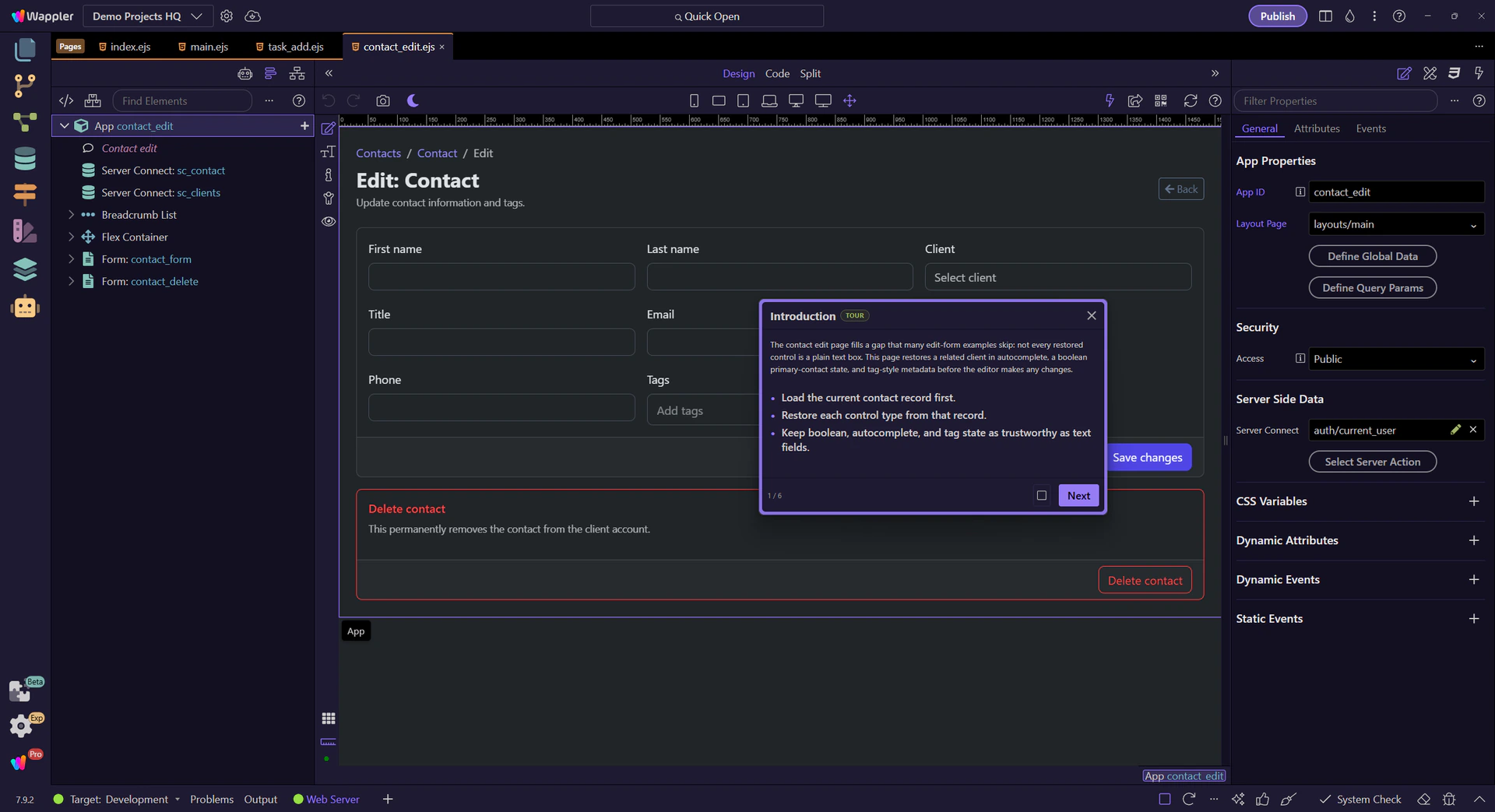
sc_contact provides the saved record, and sc_clients supplies the client options that the autocomplete control can resolve against. That pairing is what makes the whole page restorable instead of leaving each control to guess its own state.
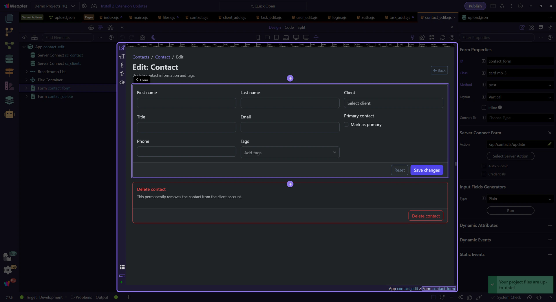
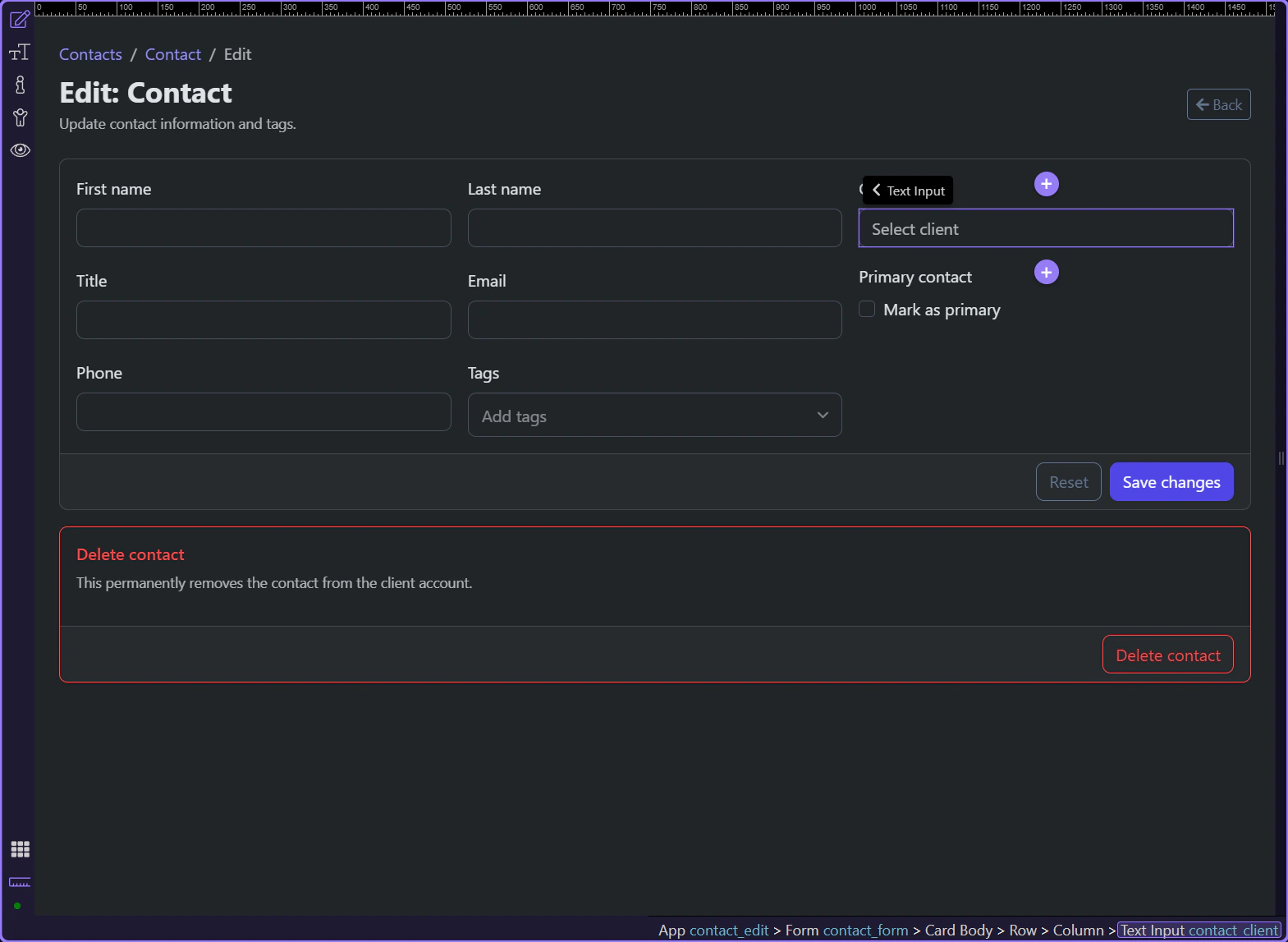
#contact_client shows why relationship fields need more than a hidden value. The stored client_id has to resolve back into a human-readable client option so the editor can confirm the right relationship before making changes.
#contact_primary is the clean boolean example. The page keeps both the hidden fallback value and the checkbox, but the visible control still has to reflect the saved is_primary state before the editor decides whether this contact stays primary.
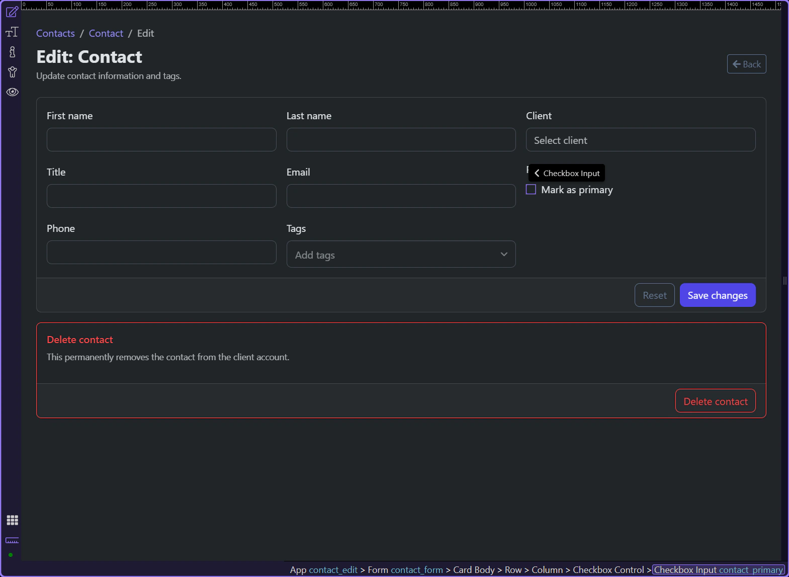
#contact_tags is a reminder that widget-style controls are still edit fields. The Tagify input has to start from the saved contact tags so the user is refining the existing metadata instead of rebuilding it from memory.
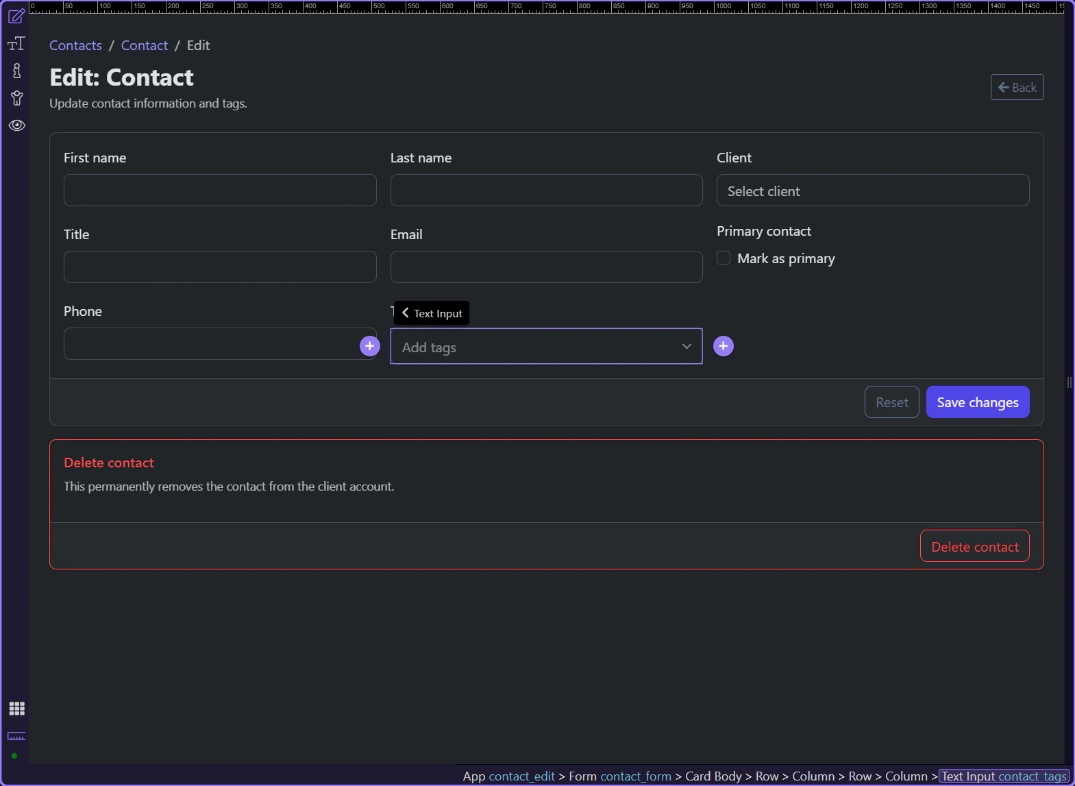
Edit-form restoration is only complete when the less obvious controls are correct too. Autocomplete, checkbox, and tag widgets all need the same reliable source record, or the page quietly stops feeling trustworthy.
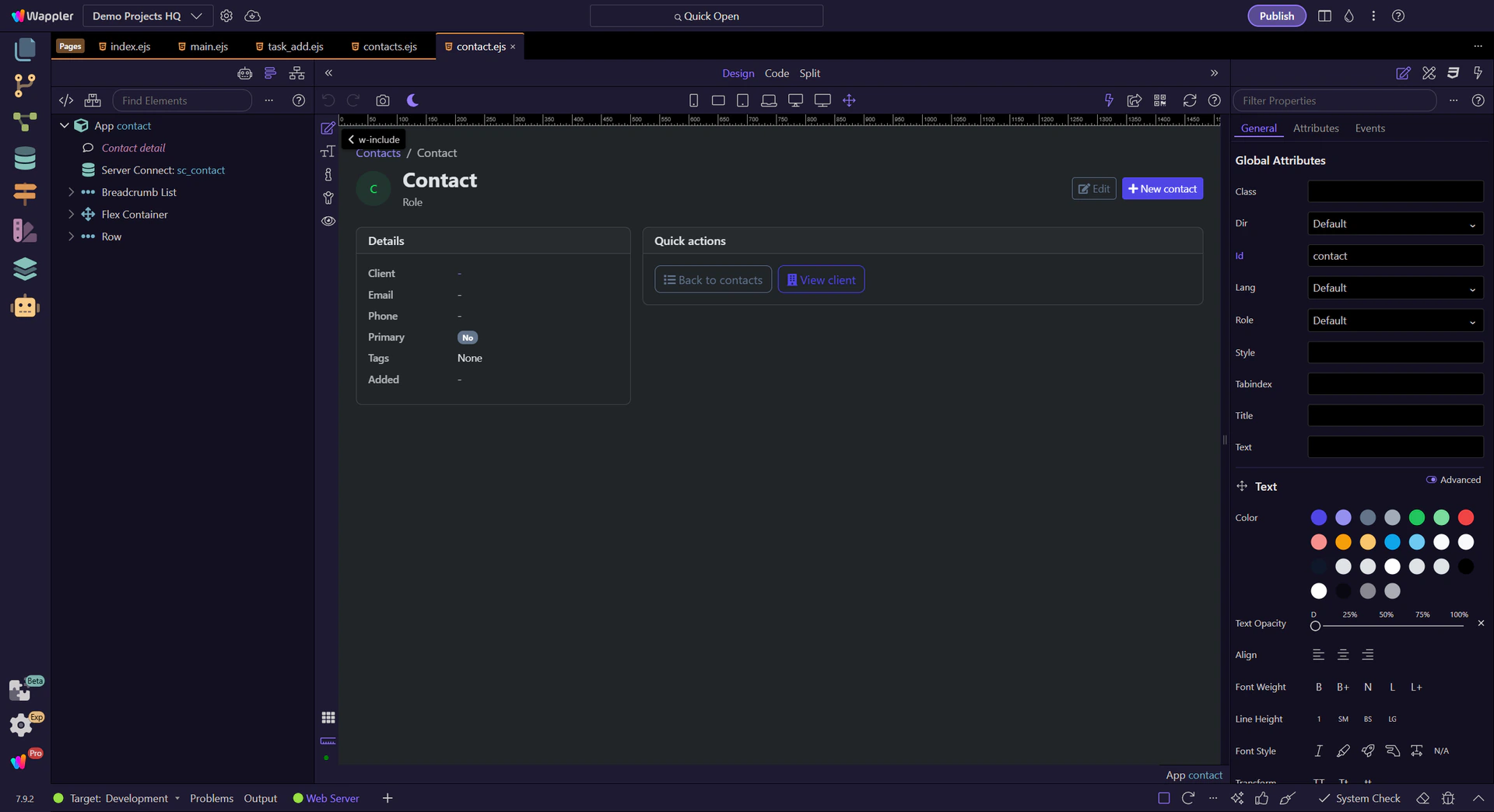
Use the real contacts and contact detail pages to see how App Connect turns a repeated list, route parameter, and detail loader into one continuous record flow.
The contacts pages are useful App Connect examples because they turn one continuous data flow into two readable pages. A repeated contacts list links to a route-aware detail page, and the detail page resolves that route value into one loaded record without custom glue code.
The contacts page stays readable because one loader feeds one repeated table. The list does not copy record state around manually; it binds the contacts dataset directly into rows and links.
Start on the real contacts page so the loader and repeated table stay visible together. The page works because one Server Connect component supplies the contact rows and the UI binds to that shared result instead of duplicating record state.
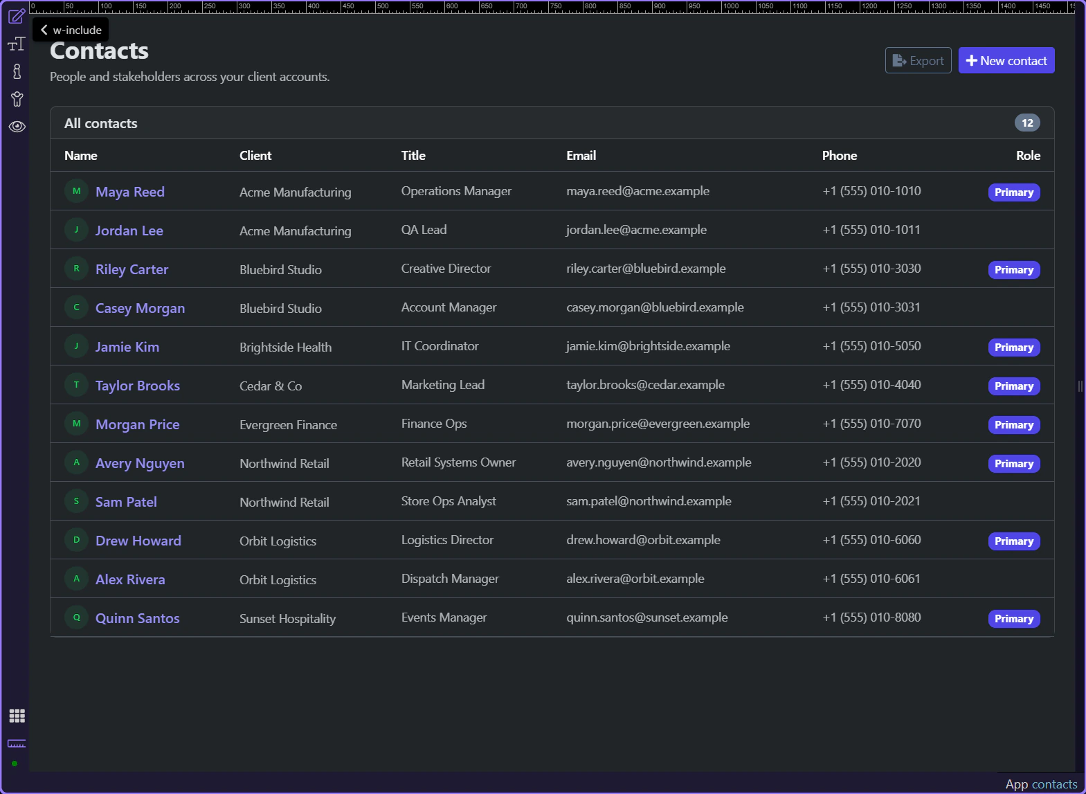
#contacts_list repeats over sc_contacts.data.contacts, which keeps the list declarative. Each visible row is just a bound view of the contacts dataset, not a separate client-side copy to keep in sync.
The contact name link binds /contact/ + id, so the selected record identity stays explicit in navigation. That route handoff is what lets the next page reconstruct the same record without hidden browser state.
The detail page takes over once the selected record id is in the URL. Its Server Connect component resolves that route context into one contact object, and the page binds the object into cards, badges, and follow-up links.
The real contact detail page is now visible, so the route-aware page and its bindings can be inspected in context. This is the page that receives the selected record identity and turns it back into one loaded contact object.
Switch to Design view before inspecting the route-aware bindings so the next steps can focus on the live page structure instead of editor setup.
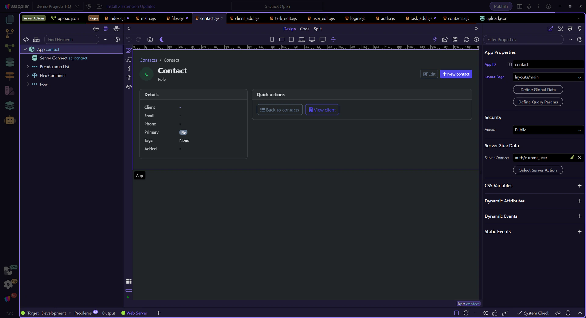
The detail page uses the /contact/:id route and passes the query id into sc_contact, so one selected record becomes one loaded contact object. That is the App Connect handoff from route context to usable page data.
The detail page stays readable because the cards, badges, and action links all bind back to sc_contact.data.contact. Client name, primary badge, tags, and edit navigation all come from the same loaded record object.
The contacts flow stays understandable because the handoff is explicit at every stage. The list repeats one dataset, the row link carries the record id in the route, and the detail page reloads that exact record into one bound object.
Understand App Connect’s reactive model, expression rules, scoping, and how to use Wappler’s data/action pickers to build bindings visually.
App Connect is declarative and reactive: you declare what the UI should show and when actions should run, and App Connect keeps the page in sync.
In Wappler, most dynamic behavior is configured in Properties using bindings and actions. Use the Data Picker and Expression Builder to select data and functions from a tree, so you can build expressions quickly and safely.

Most App Connect work happens in two places: App Structure (select components) and Properties (configure bindings and events).
A quick, low-friction example: bind a single value, then format it as currency. This is the “happy path” for most bindings — fast, safe, and picker-driven.
In Properties, open the picker for a bindable field (for example Text/Value). Select a single value (not an array), like a product price or variable value. The picker inserts a valid expression for you.
tip: If you only need a simple path (like
product.price), picking is faster and avoids typos.

With the value selected, apply a number formatter like formatCurrency() so the UI shows a readable price (e.g. $1,234.56) without changing the underlying data.
note: For one-off formatting, the picker is enough. Use the Data Formatter popup when you want to build longer formatter chains visually.

Use the Visual Expression Builder for logic and conditions (operators, comparisons, grouped rules). It’s still scope-aware, but it’s built for expressions like filters and if conditions rather than simple data paths.
tip: Rule of thumb: Data Bindings Picker for “pick a value”, Expression Builder for “build logic”.

A binding connects a property to data. When the data changes, the property updates automatically.
When a field supports bindings, Wappler offers a picker so you can select data sources and methods instead of typing everything by hand.
tip: If you’re unsure what’s available, use the picker to explore the current data scope.
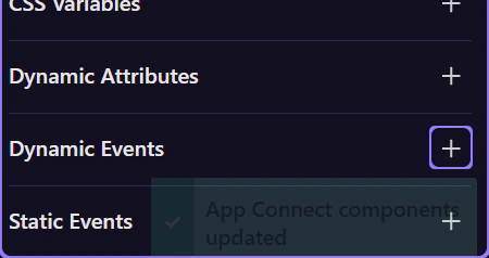
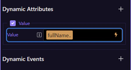
Not every binding starts as a field. In the Dynamic Attributes section, use the ( + ) button to add new App Connect attributes to the selected element. The list is generated from the component’s HTML rules and filtered by what’s allowed on that element (via each rule’s allowedOn).
tip: If you don’t see a specific attribute, try selecting a different element or inserting the related component first.

The Dynamic Attributes menu is context-aware: selecting a different element changes the list because different HTML_RULES match, and allowedOn decides where each rule can be applied (for example, some rules only allow a Google Maps attribute on a dmx-google-maps element).

What you can bind to depends on what’s in scope (which components exist on the page and where they are in the structure). In Wappler, this is why selecting the correct node in App Structure matters.
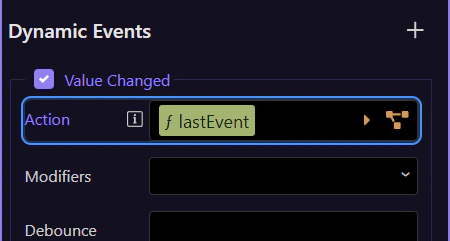
Events are configured in Properties. You enable an event and choose an action to execute.
Choose an action from the Actions Picker (for example: set a value, insert/update a record, navigate, reload data), then configure its parameters in Properties.
tip: If you can’t find an action, check the selected component and the event type — available actions are context-aware.

Modifiers like prevent/stop/once help you control default browser behavior and event propagation without manual code.

Next, take a hands-on tour or jump straight to collections and filtering.
Choose a focused tour based on what you want to build.

A compact App Connect starter in Wappler: a Variable stores state, a button updates it, and a bound text label reflects the new value immediately.
You will walk through the smallest App Connect feedback loop in Wappler: select the Variable that holds state, inspect the button action that changes it, and confirm how the bound label redraws instantly.
By the end, you should be able to explain the whole reactive chain in plain language: where the state lives, which event triggers the update, which action changes the value, and why the UI refreshes without manual DOM code.
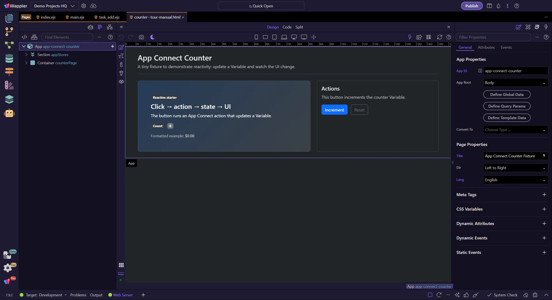
Keep Page Panels (Structure) and Selection Panels (Properties) visible.
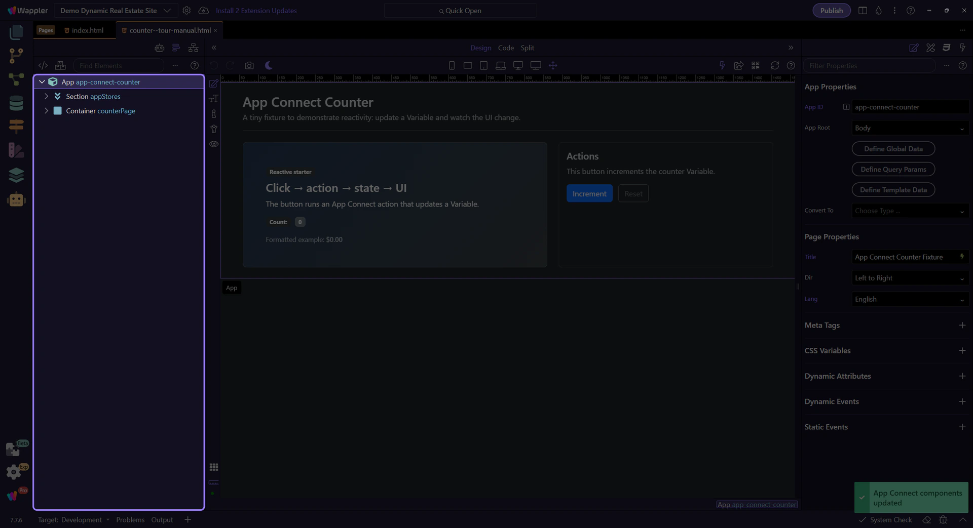
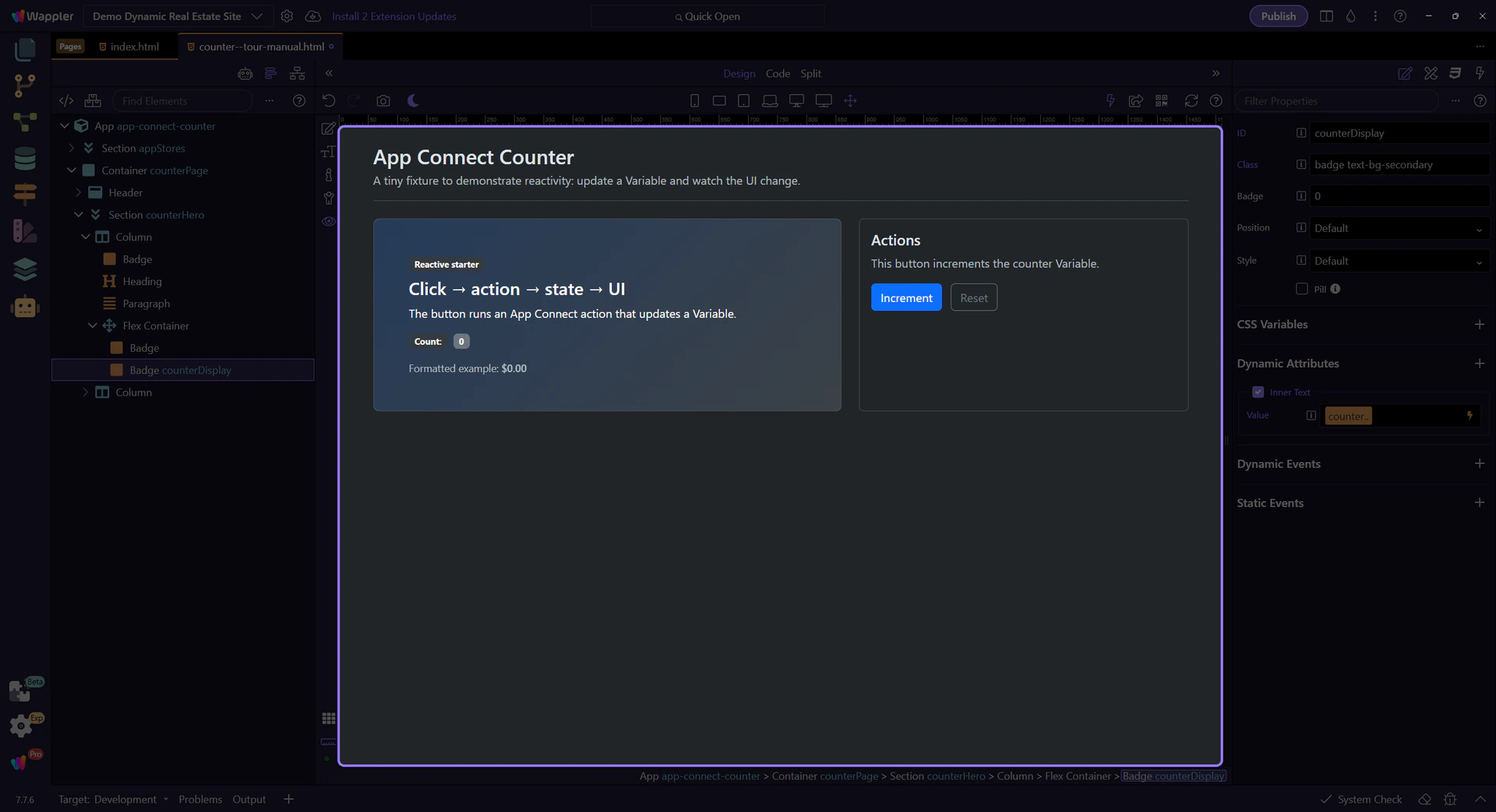
A Variable stores a value you can bind to and update through actions.
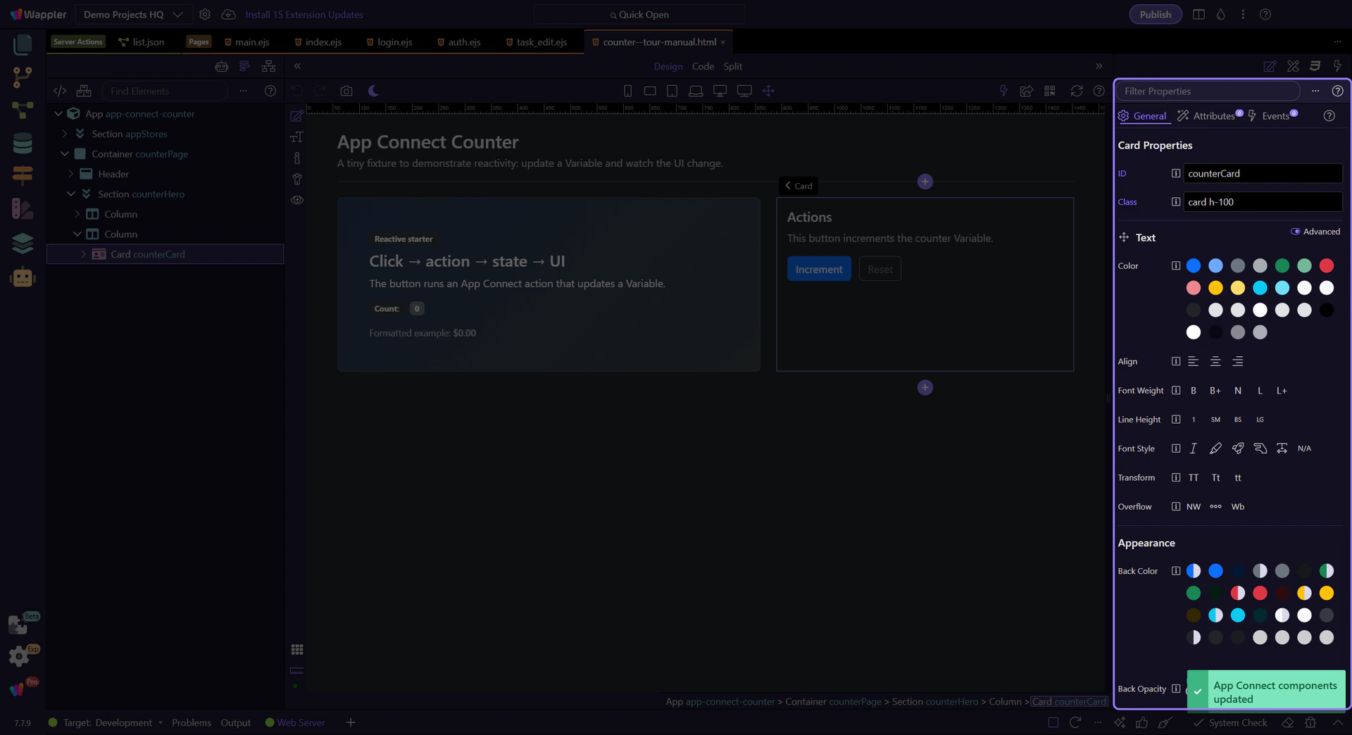
The Variable stores the counter state. We’ll select it to review its properties. This step matters because Variable component is part of the Structure panel, and understanding that context makes the next action easier to repeat in your own project.
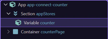
Start with the wider context in the Properties panel so the next control makes sense in the full workflow. In the next step, you will focus on Review the component ID and see how it fits into this area.
The ID is how you reference the Variable in bindings and actions (for example: counter.value, counter.setValue(…)).

For Variables, prefer binding the initial value as an expression (dmx-bind:value=“0”) so it’s a real number, not an HTML string. Convert toNumber() mainly when values come from HTML inputs where the user types.
tip: App Connect expressions are declarative. Don’t use JavaScript callbacks/functions inside dmx-* expressions.

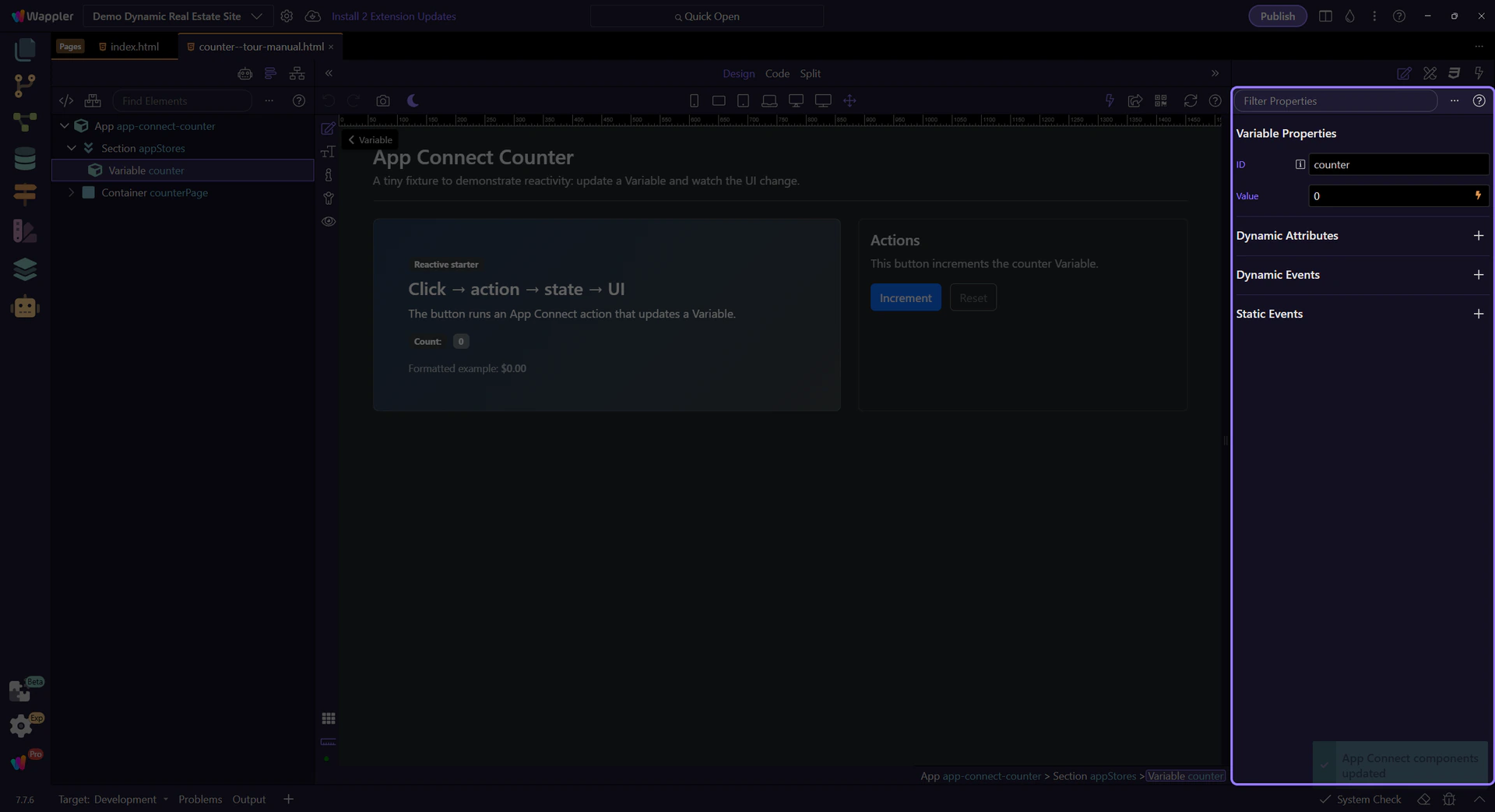
Events trigger actions. The action updates state, and bindings react automatically.
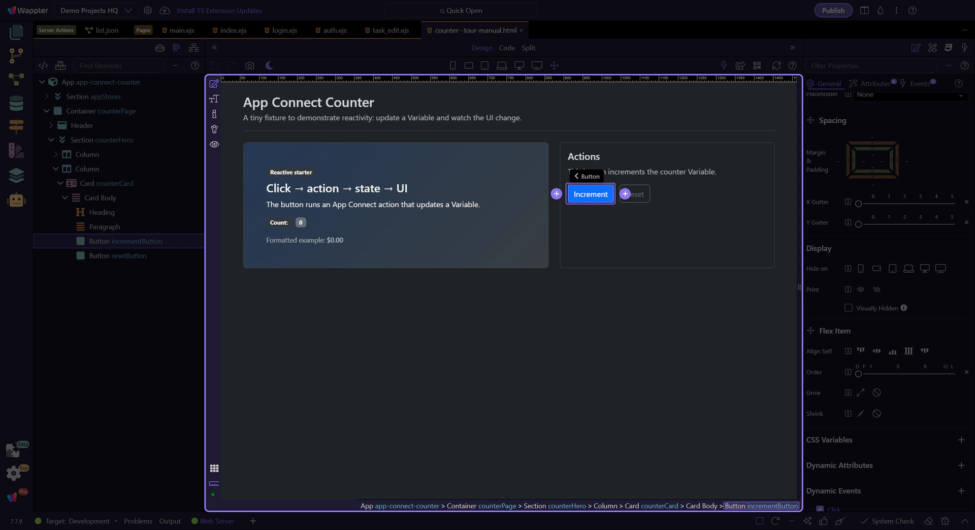
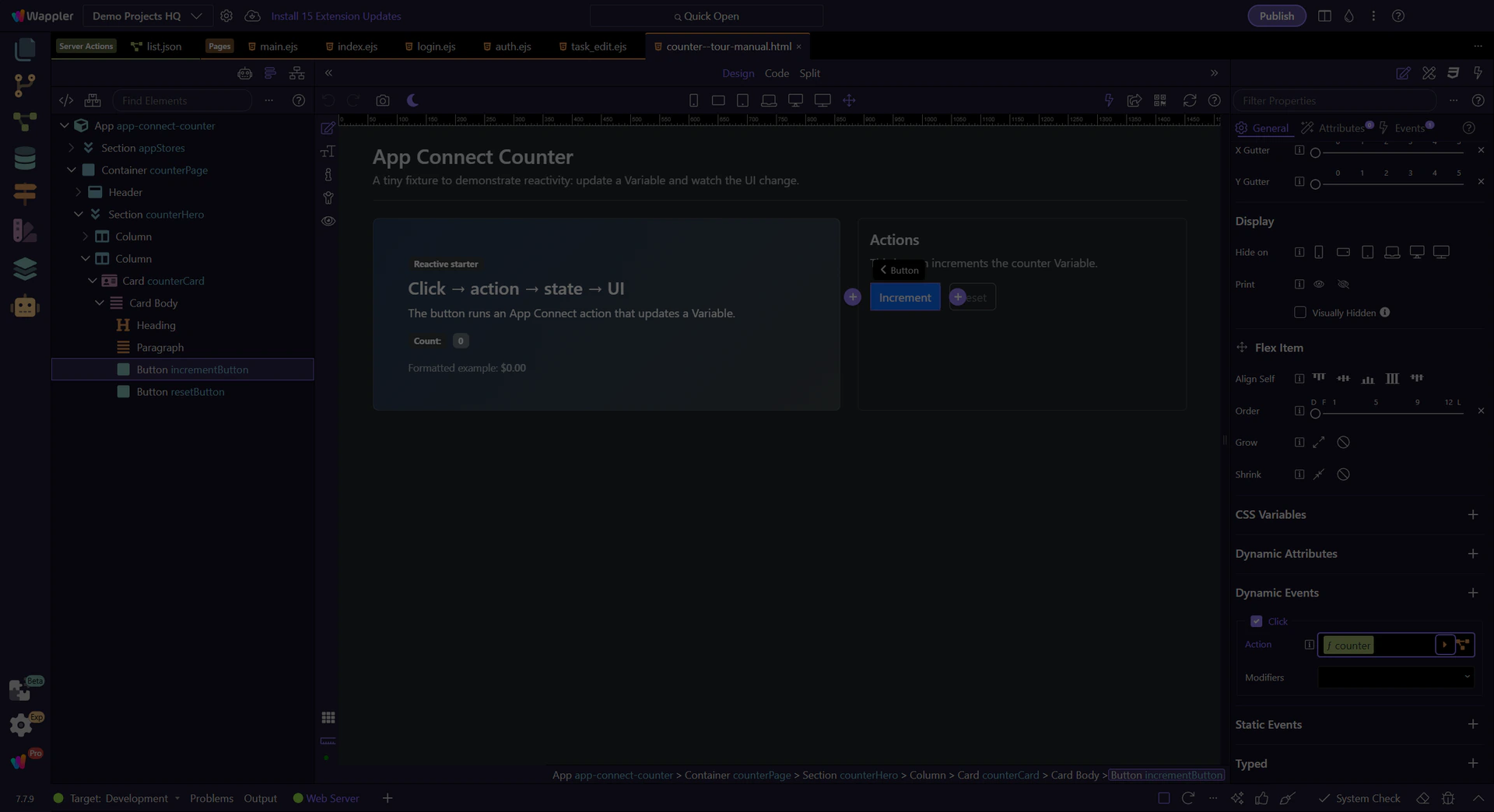
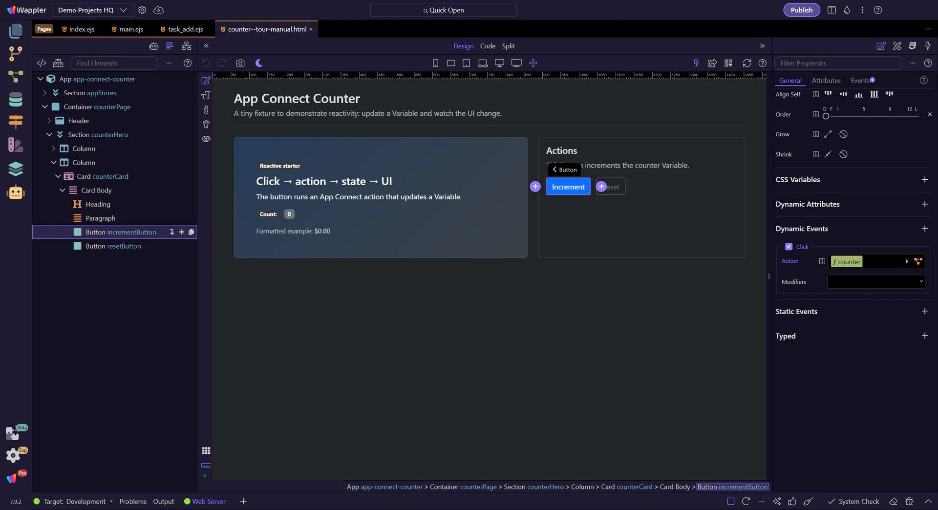
This button increments the counter by running the Click action. We’ll select it to inspect the event.
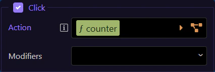
The Click event row in Properties is where this button’s event action is configured. Here it runs an action list that calls counter.setValue(…) to update state, and bindings update the UI automatically.
tip: Open the Actions Picker to explore the action list and configure action inputs instead of hand-typing expressions.
This step opens the Actions Picker from the Click event row so the popup can show the event action list in its own focused flow.
tip: Use the Actions Picker to add actions and fill their inputs safely, without hand-typing long expressions.
The Actions Picker lets you choose actions (like setValue) and builds the Click event’s action list for you.
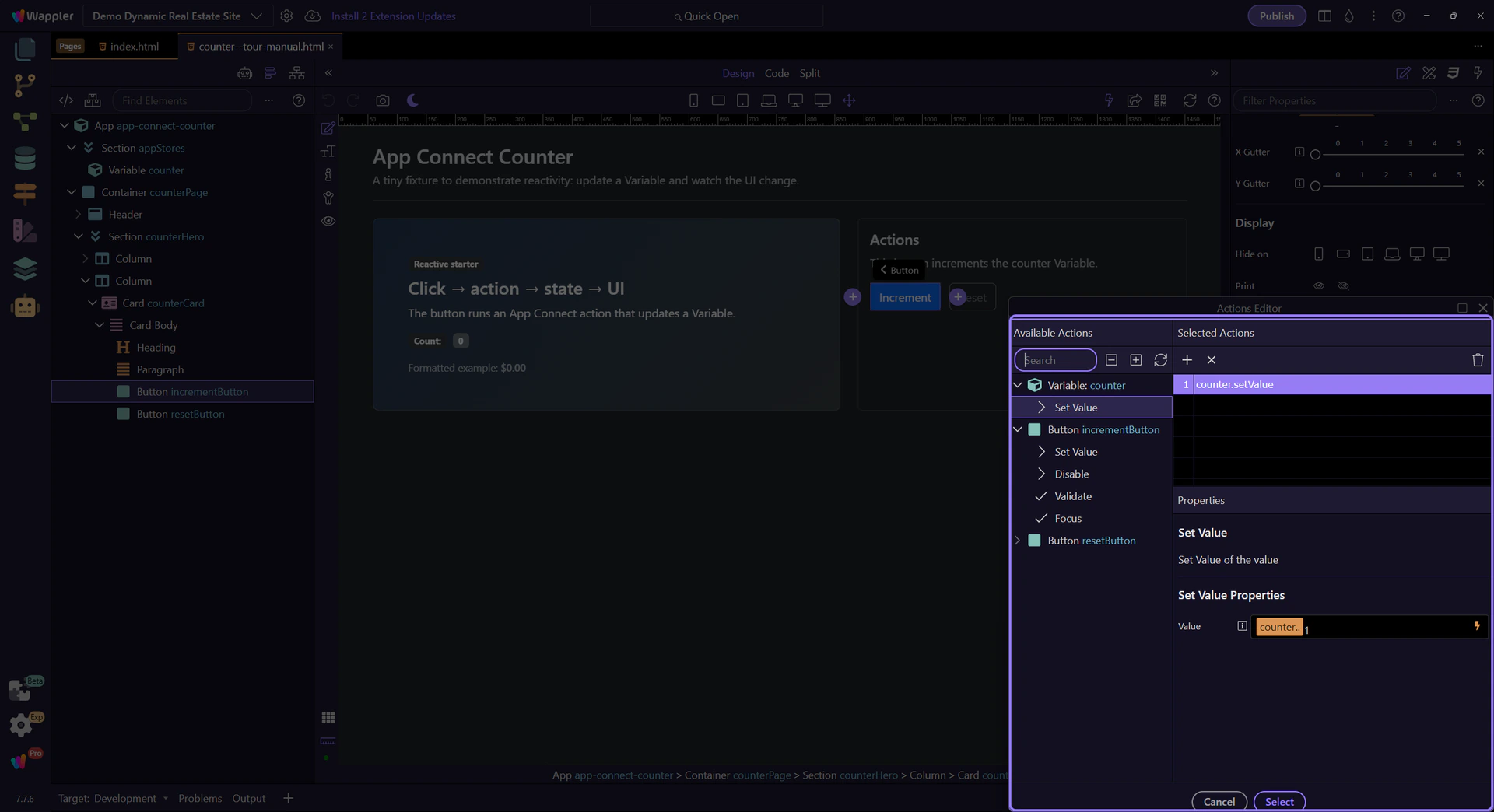
Use the Available Actions area to browse categories, search, and use the quick navigation controls along the top to move through long action lists faster. This step matters because this is the main browsing surface of the Actions Picker before you focus on the selected action list and action inputs.
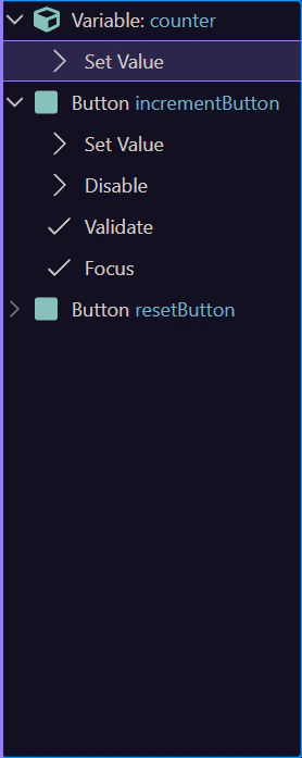
Select the existing action now so you can inspect the real logic behind this Click event instead of treating the picker as an empty template. The next steps use that selected action to explain how the counter value is updated and where its inputs are configured.
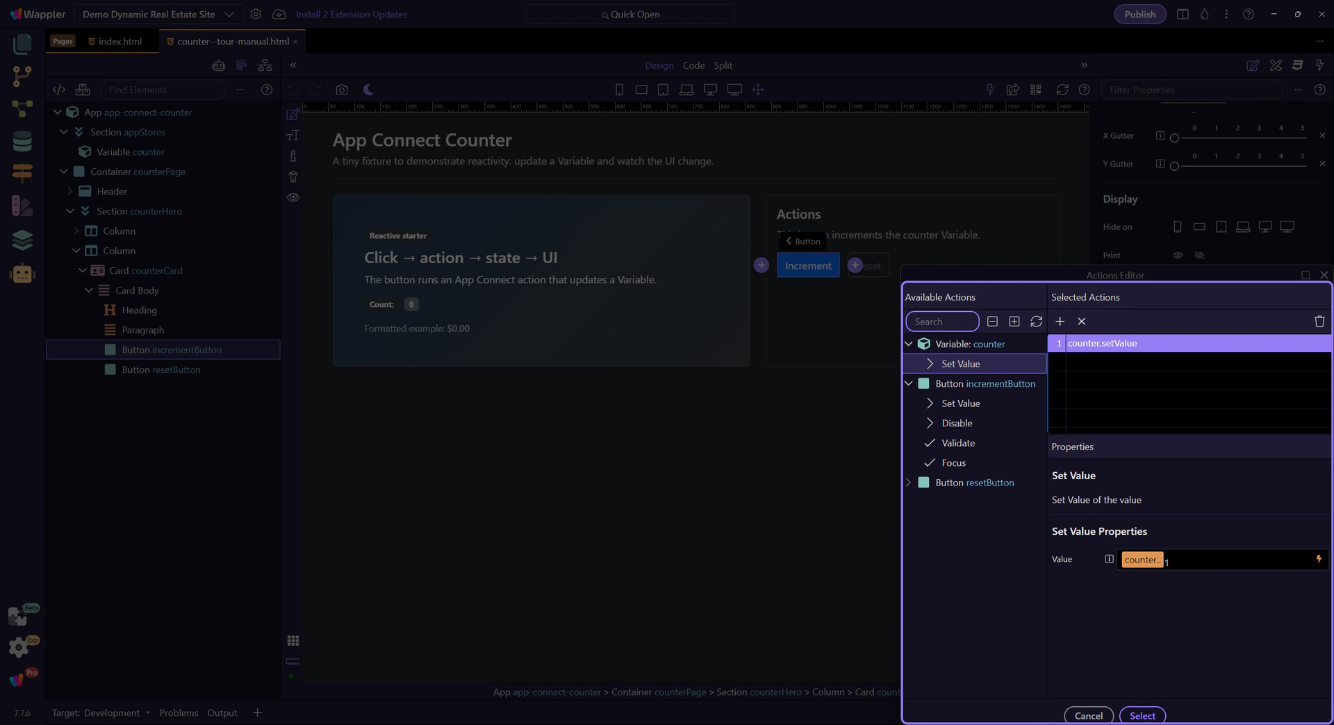
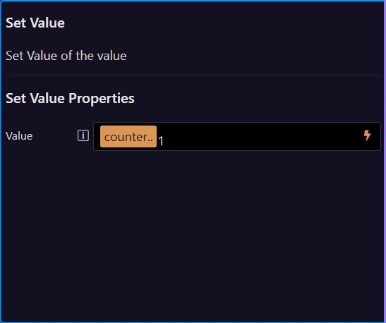
Select an action in the list to configure its inputs here (for example, the value you pass into setValue(…)). This step matters because Action Properties (right) is part of Popup Actionspickup Layout Layout Panel Preview, and understanding that context makes the next action easier to repeat in your own project.
Close the Actions Picker to return to Properties. Use Cancel or the window close button to return to the Properties panel.

Bindings connect UI properties to data. When data changes, the UI updates automatically.
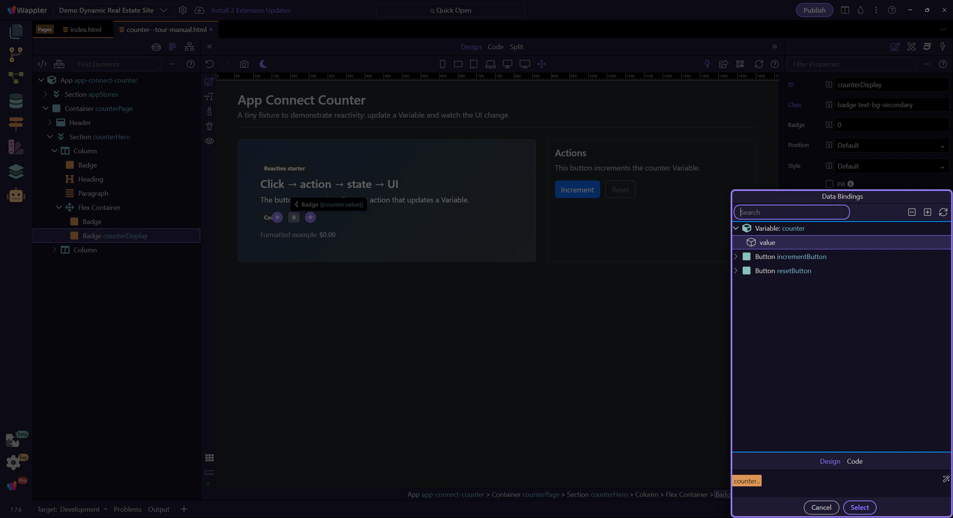
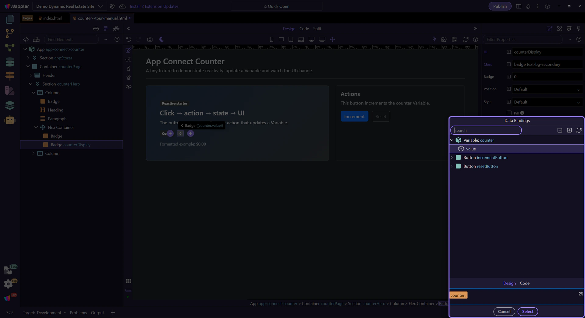
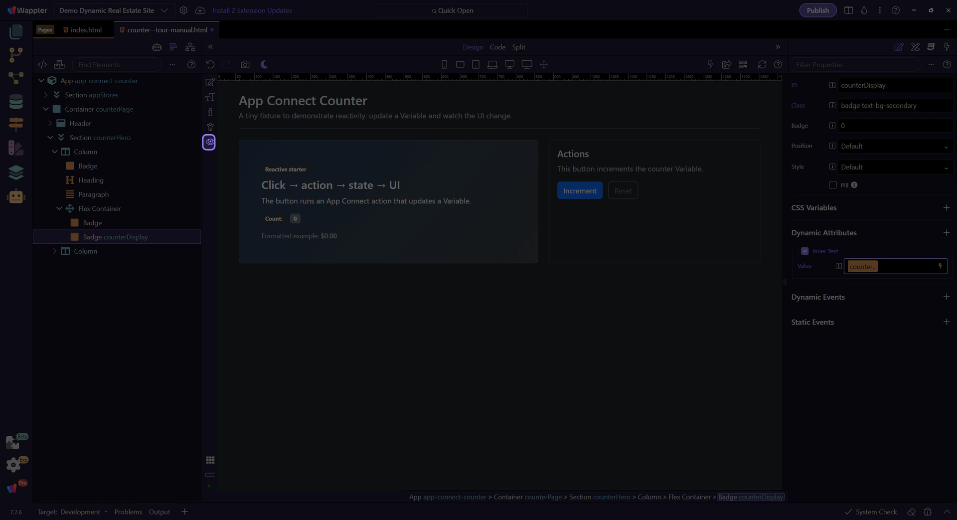
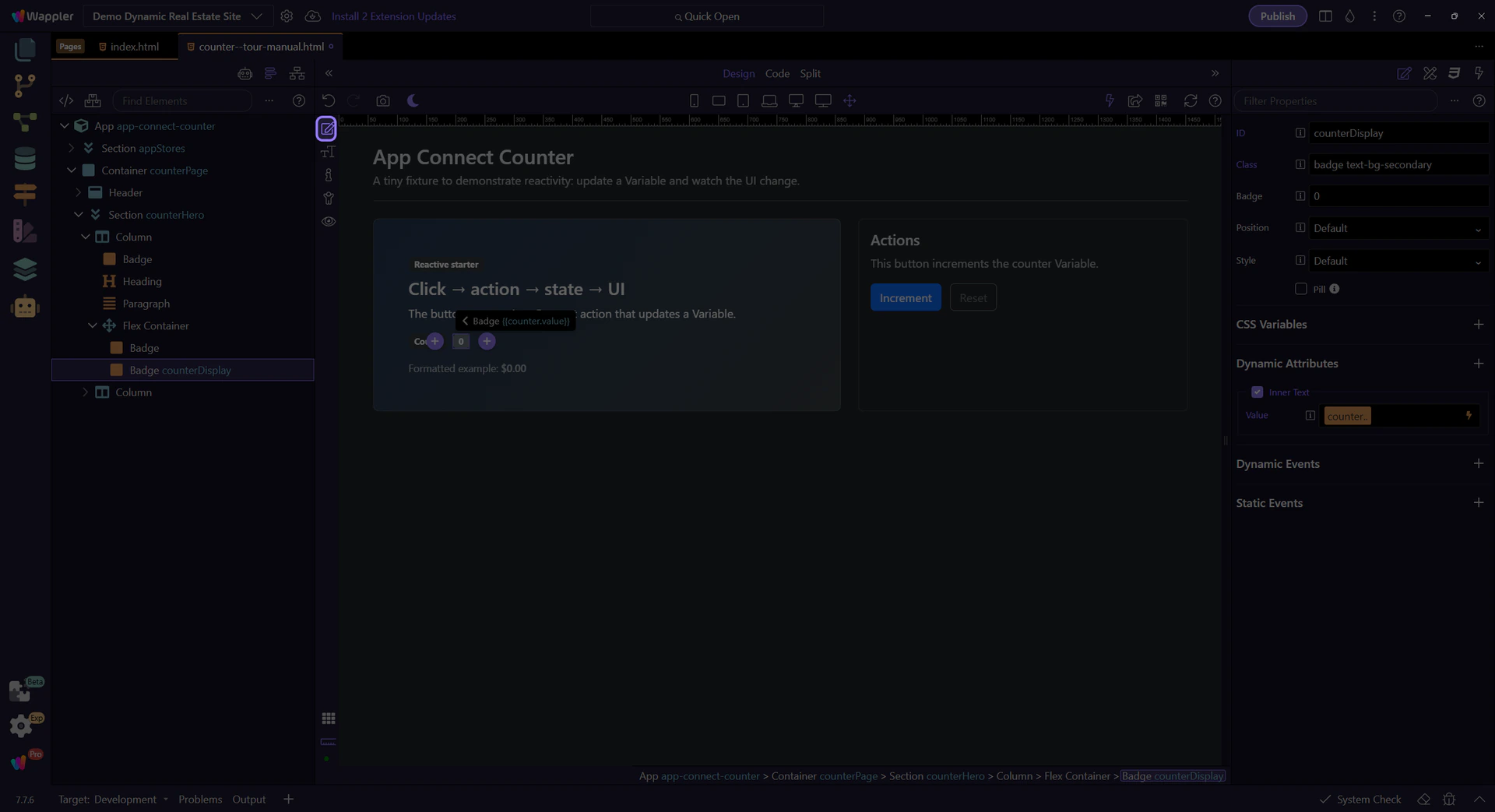
This label is bound to the counter value. We’ll select it to inspect its text binding expression.
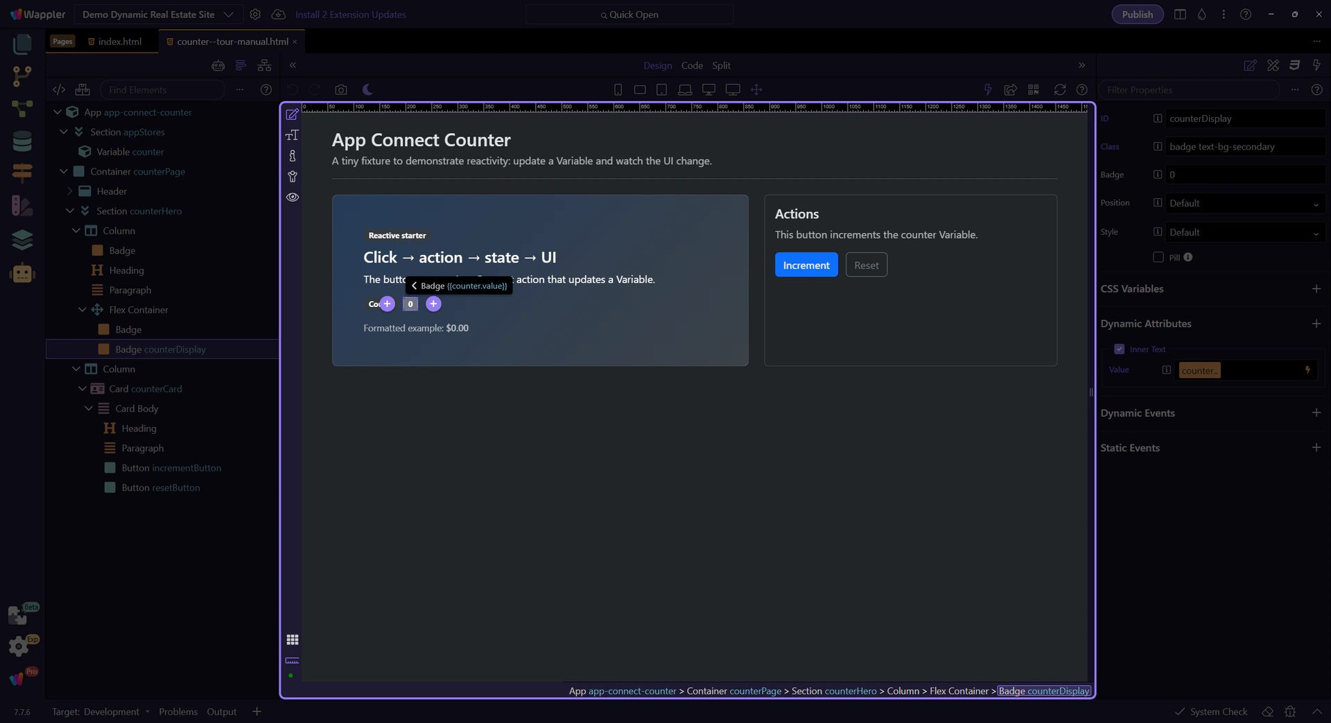
This field contains the expression that fills the text (counter.value). Click the picker icon to inspect it with the Data Picker.
tip: Use the Data Picker to avoid typos and stay within the correct scope.
The Data Bindings Picker shows what’s in scope and lets you insert valid expressions into the field.
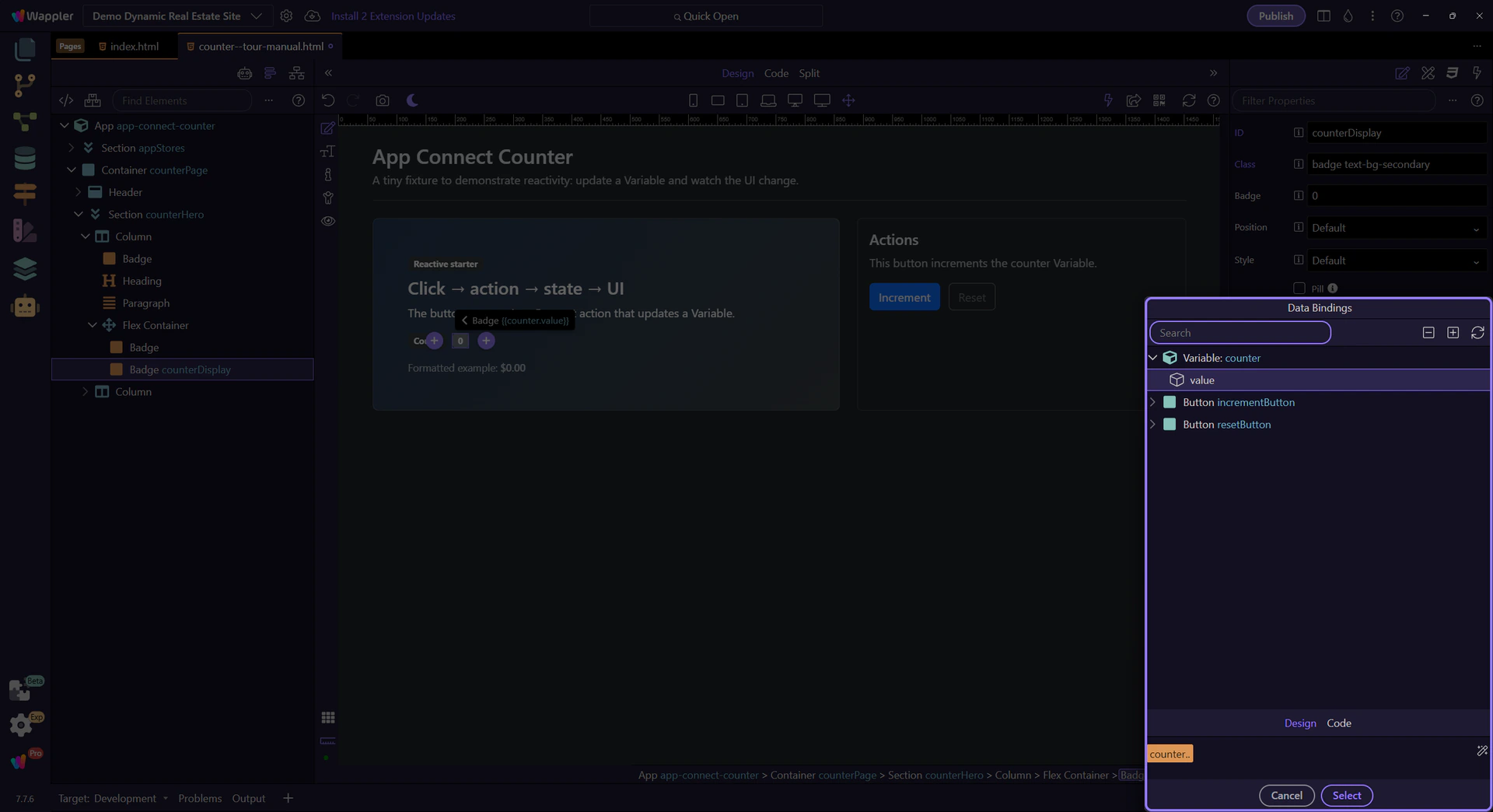
Expand nodes to browse components and their properties. Selecting an item builds the expression for you.
Use the preview to confirm that the picker built the exact expression you expect before you apply it. That check matters because the next step closes the popup and returns you to Properties with confidence that the binding is correct.
Close the Data Picker to return to Properties. This step matters because Close Data Picker is part of Popup Databindingspickup Button Cancel, and understanding that context makes the next action easier to repeat in your own project.

Switch to Preview mode and click the button to watch the UI update.
Switch to Preview mode now so you can click the button live in the next step and watch the counter react.
Click the Increment button a few times. The Variable updates, and the bound text updates instantly.
Return to Edit mode so you can continue configuring the example after verifying the live counter behavior.
Now that you’ve seen the simplest reactive loop, continue with a slightly richer example or the full App Connect overview.
Continue learning App Connect gradually.
Deep dive into Wappler’s Data Bindings Picker and Visual Expression Builder: scope tree, Design vs Code view editing, preview, and inserting expressions safely.
This tour uses a dedicated App Connect tour page so you can explore bindings and pickers safely. You’ll learn how Wappler builds expressions visually, how scope affects what you can pick, and how Design vs Code view affects how you edit bindings.
Wappler’s binding workflow is picker-driven: select data from a tree and let Wappler generate the correct expression for you.
This step auto-selects a repeating element in Design View so the picker has real data in scope.
Start with the wider context in the Properties panel so the next control makes sense in the full workflow. In the next step, you will focus on Data Bindings Picker and see how it fits into this area.
The picker icon opens the Data Bindings Picker for the Repeat expression. This step matters because Data Bindings Picker is part of Selection Panels Properties Repeatexpression, and understanding that context makes the next action easier to repeat in your own project.
tip: When in doubt, open the picker: it shows only valid items for the current scope.

The Data Bindings Picker shows data/components/methods available in the current scope. Selecting an item builds the correct expression and previews what will be inserted back into Properties.
This popup is the central workflow for building bindings safely. Use it whenever you see a picker icon next to a bindable field.
Expand nodes to browse components and their data. This is your current scope — it changes depending on what’s selected in App Structure.
Use this toolbar when you need to change how you browse or insert expressions, because those controls shape what you can pick next.
This preview shows the full expression that will be inserted into the originating field when you pick items from the tree.
Depending on the picker mode, the preview area can offer helper controls for editing or refining the expression before inserting it.

When a binding supports mixed content, Wappler offers two editing modes. Design view helps you visually build a combined value (text + picked expressions) without worrying about quoting/escaping. Code view shows the raw expression/text, so you can fine-tune it directly when needed. You can switch between them, but it’s usually safest to stay in Design view and let Wappler generate valid syntax.

Close the picker to return to Properties. This step matters because Close the Data Bindings Picker is part of Popup Databindingspickup Button Cancel, and understanding that context makes the next action easier to repeat in your own project.

Some properties use the Visual Expression Builder. It’s still scope-aware, but focused on building logic (operators, conditions) rather than just picking a data path.
This step selects a Data View so you can see the Expression Builder flow.
The Data View Filter picker opens the Visual Expression Builder so you can build conditions visually.

This popup helps you build valid expressions with operators and grouped conditions, while staying in the correct scope.
Just like the Data Bindings Picker, the Expression Builder exposes scope. Use it to pick data sources and methods while constructing logic.

This preview shows the full expression that will be inserted back into the originating field when you apply/close the popup.
If the expression builder shows mixed content, you can switch between Design (visual) and Code (raw) editing. Design view is preferred because Wappler handles quoting/escaping and keeps the expression valid; Code view is there when you need to tweak the raw expression.
This step closes the Expression Builder so the next step can finish back in the main Properties panel.

You’ve seen how Wappler builds bindings safely with pickers, how scope affects what’s available, and how Design vs Code view lets you choose between visual editing and raw expression editing.
Continue with a deeper formatting tour or review formatters at a high level.
Explore App Connect data components—Variable, Array, and Toggle—and the key Properties you’ll configure for each.
This tour introduces the small set of App Connect components that create client-side state before the rest of the page consumes it. You will compare Variable, Array, and Toggle as foundational building blocks, then connect each choice to the bindings, actions, and UI patterns it supports best.
This tour helps you choose the right state primitive before you start wiring the page. Instead of memorizing three components separately, you will learn the decision rule for each one, how they appear in Structure, and how their values are typically consumed by bindings and actions.

Insert the component via App Structure, then configure ID + bindings in Properties.

A Variable stores a single value you can reference in bindings and set via actions.
The ID is how you reference the component in bindings and action pickers. This step matters because ID is part of Selection Panels Properties Theid, and understanding that context makes the next action easier to repeat in your own project.

Value is the initial data stored in the Variable. Use the expression picker to select data and formatters.

Most pages use an event (like click) to run setValue on a Variable. This keeps state changes visual and consistent.
Array stores a list of items and offers actions to add/remove/update list entries.
Name it for what it holds (for example: products, tags, steps). This step matters because ID is part of Selection Panels Properties Theid, and understanding that context makes the next action easier to repeat in your own project.

Items defines the initial list (binding). In practice, Arrays are often filled/changed by actions.
tip: If you need filtering, sorting, or paging, use a Data View on top of your source data.

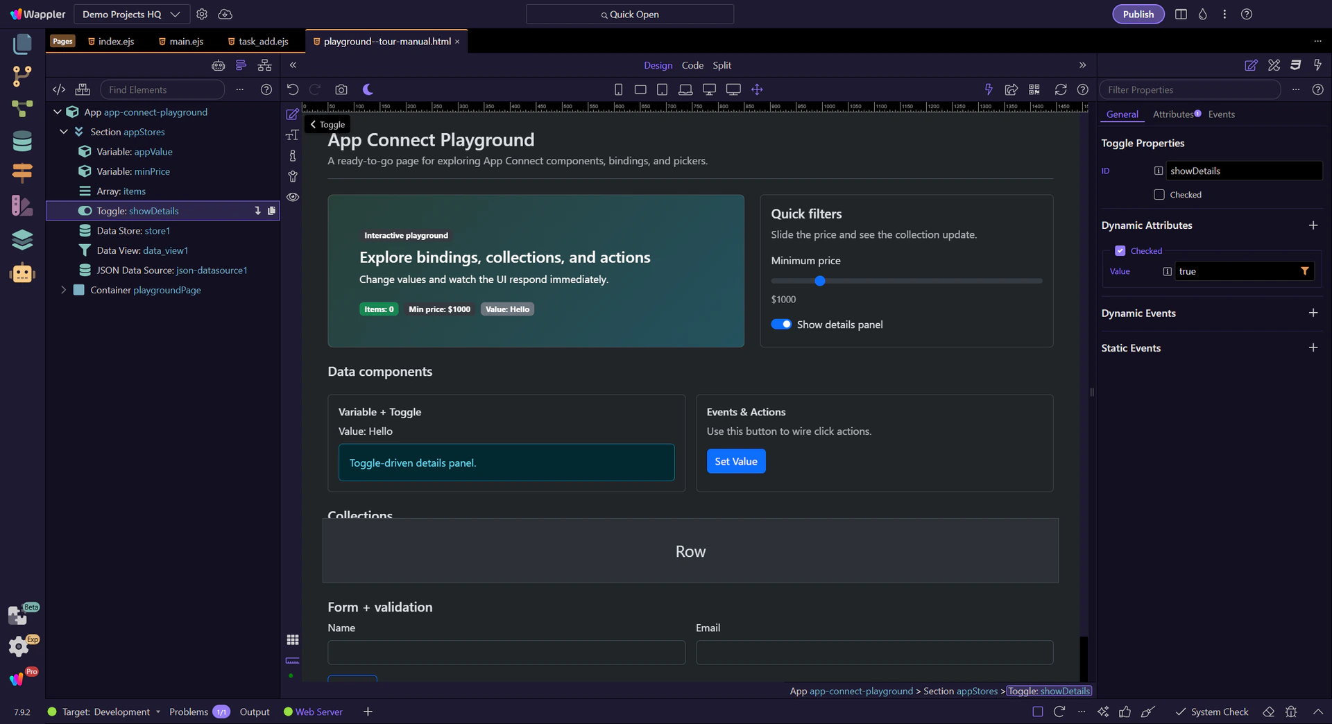
Toggle holds a boolean state. It’s ideal for showing/hiding UI or enabling/disabling actions.
Set a clear ID so it’s obvious what the toggle represents (for example: showDetails). This step matters because ID is part of Selection Panels Properties Theid, and understanding that context makes the next action easier to repeat in your own project.

Checked controls the initial on/off state. You can bind it to other data, or set it through actions.

Next, learn collections and traversal: Data Store and Data View.
Choose a focused tour based on what you want to build.
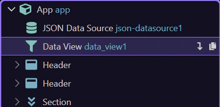
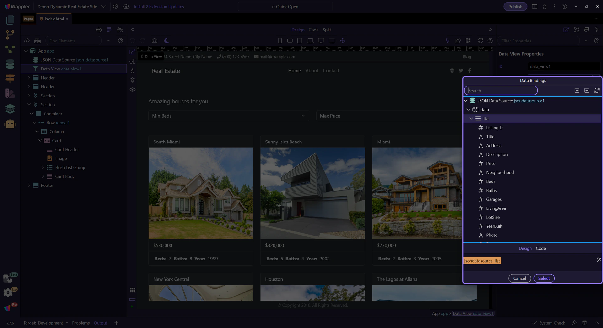
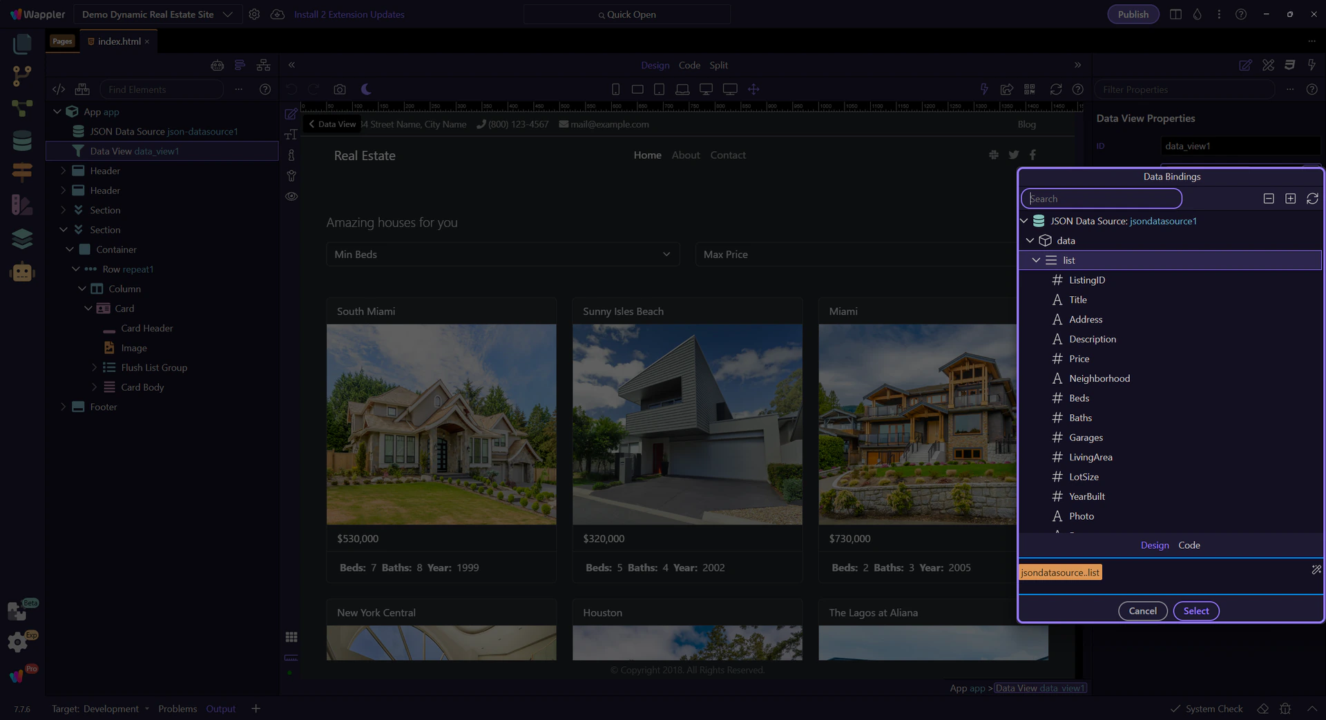
Use Data View to filter, sort, and paginate any dataset without mutating the original source.
This tour frames Data View as the layer between raw collections and the version of that data the user actually sees. You will look at how search, sort, and paging reshape a dataset declaratively while leaving the original source untouched for other components or workflows.
It keeps your original collection stable while letting UI controls (search/sort/paging) reshape what’s displayed.

You’ll usually combine Data View with UI controls (search input, selects, sort buttons, paging). Those controls update the view, and anything repeating the view updates instantly.

These are the properties you’ll configure most often.
Start with the wider context in the Properties panel so the next control makes sense in the full workflow. In the next step, you will focus on ID and see how it fits into this area.
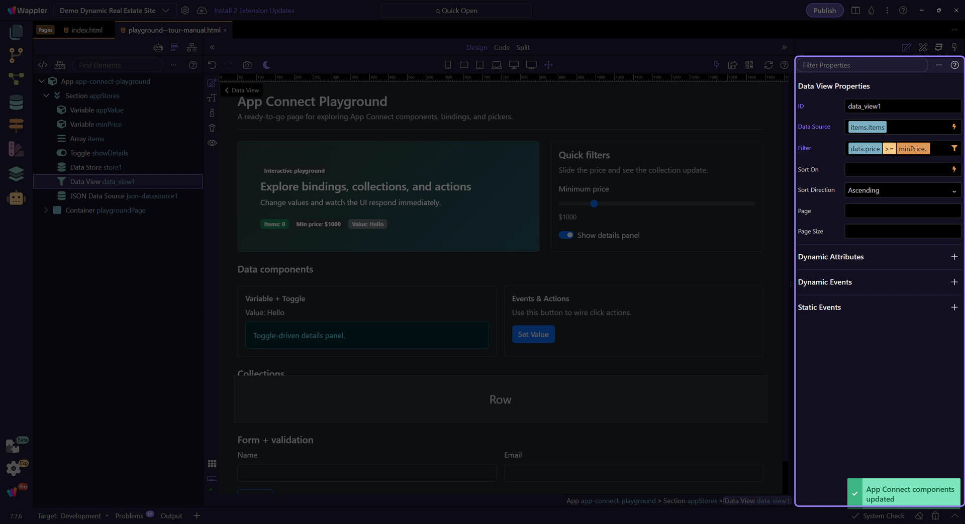
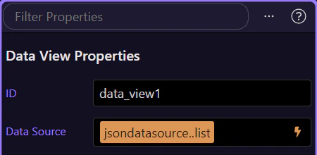
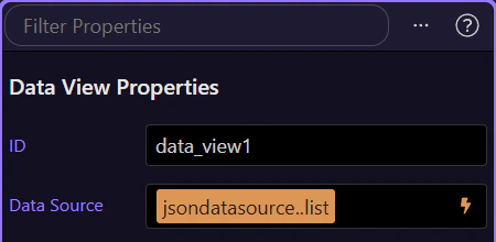
Name it so it’s obvious what the view represents. This step matters because ID is part of Selection Panels Properties Dataviewid, and understanding that context makes the next action easier to repeat in your own project.

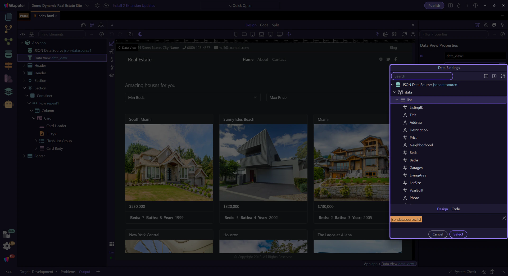
The source field controls which dataset the Data View reads (array, Data Store items, API results, etc.).
tip: The Data Bindings Picker only shows items in the current scope, so it’s hard to pick something invalid.

The Data Bindings Picker opens as a popup. Use it to browse available data and insert a valid source expression.
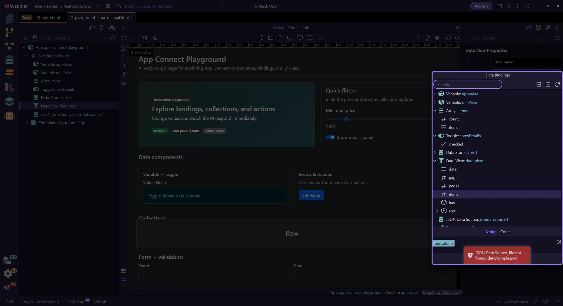
Expand nodes to find the list you want to view. Selecting an item inserts it into the Source field.
Check the preview before applying it so you know exactly which source expression Data View will use next.

Close the Data Bindings Picker to return to Properties. This step matters because Close Data Bindings Picker is part of Popup Databindingspickup Button Cancel, and understanding that context makes the next action easier to repeat in your own project.

Define a filter expression for search and user-controlled filtering. Click the picker icon to open the Visual Expression Builder.

The Visual Expression Builder opens as a popup. It helps you build valid expressions with operators, functions, and data sources in scope.

This area lets you compose filter logic visually (fields, operators, and values) instead of typing everything manually.
Each rule is composed of a Field, an Operator, and a Value. Use pickers to bind values from scope instead of typing constants.

Use groups to combine multiple rules with AND/OR for more complex filters. This step matters because AND / OR groups (optional) is part of Popup Expressionbindingspickup Query, and understanding that context makes the next action easier to repeat in your own project.
This field shows the final expression that will be inserted back into Properties when you apply the popup.
This icon opens the Data Formatter for advanced formatter chains inside the filter expression. You can explore that popup in the dedicated Data Formatter tour.
Close the Visual Expression Builder to return to Properties. This step matters because Close Visual Expression Builder is part of Popup Expressionbindingspickup Button Cancel, and understanding that context makes the next action easier to repeat in your own project.

Configure sort field and direction. This step matters because Sort is part of Selection Panels Properties Dataviewsorton, and understanding that context makes the next action easier to repeat in your own project.

The sort direction controls ascending vs descending ordering. This step matters because Sort direction is part of Selection Panels Properties Dataviewsortdir, and understanding that context makes the next action easier to repeat in your own project.

Use Page and Page Size to paginate displayed results. This step matters because Paging is part of Selection Panels Properties Dataviewpage, and understanding that context makes the next action easier to repeat in your own project.

How many items to show per page. This step matters because Page size is part of Selection Panels Properties Dataviewpagesize, and understanding that context makes the next action easier to repeat in your own project.

Next, connect UI events (click/submit/keyup) to actions.
Continue with events and actions.
Guided walkthrough of the renewed Real Estate demo: Server Connect APIs, App Connect Data Views, filters, map, and repeated listings.
We start from the live Demo Dynamic Real Estate Site so the walkthrough tracks the real Node.js and SQLite sample, not an older static snapshot.
Projects Manager appears automatically so the walkthrough begins from the same project-switching workflow users use elsewhere in Wappler.

The renewed sample becomes the active project so the walkthrough can follow the live EJS pages, Server Connect APIs, and App Connect surfaces that now power the demo.
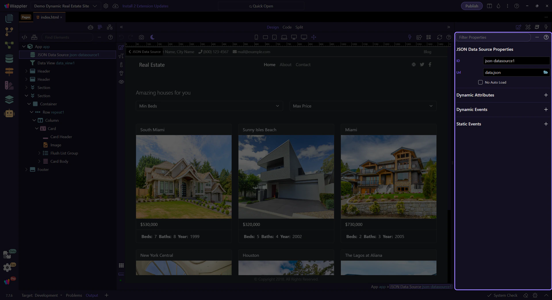
The renewed home page lives at views/index.ejs. It uses Server Connect to load listing data and App Connect to shape that data into featured home-page UI.

The home page is now the active HTML editor surface, so the Structure and Properties panels can reflect the live page context correctly.
On the home page, Server Connect loads the catalog and App Connect reshapes it into a featured subset for cards and sliders.
sc_summary loads the high-level counts shown in the hero statistics row, so the headline metrics come from real server data instead of fixed markup.
sc_featured calls /api/listings/list. This is the raw server collection the page uses before App Connect filters it down for the home-page presentation.

featured_listings is the shaping layer. It reads sc_featured.data.listings, keeps only featured records, and sorts them before the UI repeats them.
This section is the practical result of that data flow: the server collection feeds the Data View, and the Data View feeds the cards and slider users actually see.
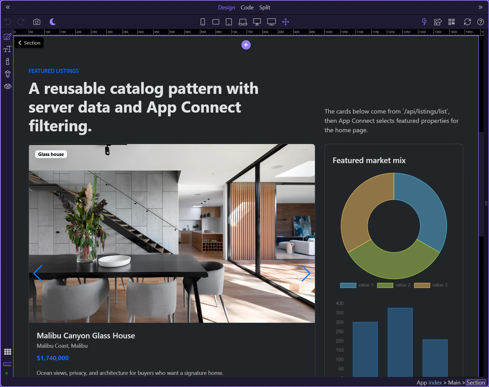
The repeat region turns the shaped featured_listings.data collection into individual property cards, keeping the UI declarative and driven by live data.

The listings page shows the full pattern more clearly: a server collection feeds a Data View, the Data View reacts to filters, and multiple outputs stay synchronized.
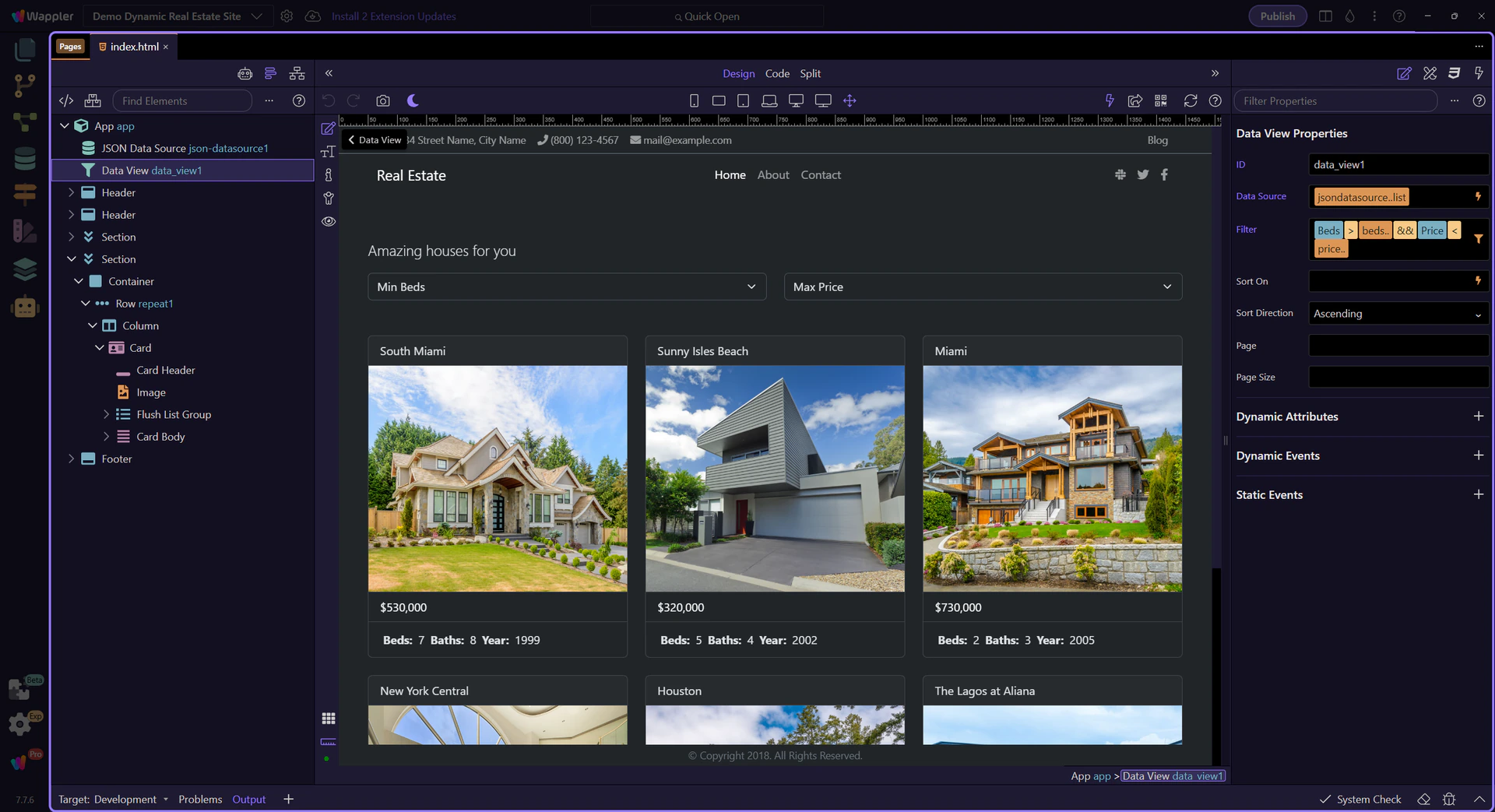
views/listings.ejs is where the renewed demo makes the filter pipeline explicit. This page shows how App Connect reshapes live API data in place.
sc_listings loads the full listing collection from /api/listings/list. It is the authoritative source collection for this page.
listing_results is the page’s shaping layer. It reads the API result, filters against the UI controls, and sorts using the current sort-direction input.
These controls are the inputs the Data View reacts to. App Connect does not replace the UI here; it connects the UI values directly into the filter expression.
inp_beds is one of the live inputs inside the filter expression. Changing it narrows the results without needing another request.

inp_sort_dir shows that the same Data View also owns sorting, not just filtering. The shaped collection updates and every bound output follows it.
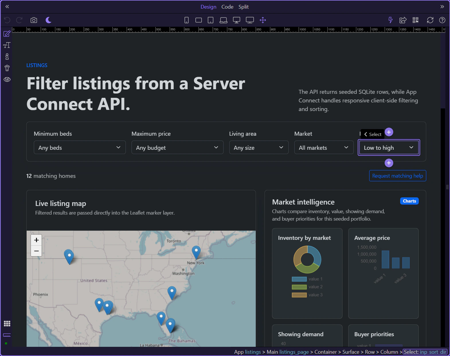
The Leaflet map reads the filtered listing_results.data collection directly, so the map and the card list stay synchronized from the same shaped dataset.
The repeat region is the second consumer of listing_results.data. This is the core App Connect pattern in the renewed demo: one shaped collection, multiple synchronized outputs.
You have now followed the renewed demo’s real architecture: Server Connect loads the catalog, Data Views shape the collections, and the UI binds those shaped results into cards, sliders, filters, and maps.
Continue with the broader Data View guidance or return to the App Connect tour index from here.
Dynamic Events overview: preview the ( + ) menu, open the Actions Picker for an existing event, and understand common modifiers.
Dynamic Events connect user interactions (click, submit, keyup, …) to actions. You configure them visually in Properties.
You’ll preview the ( + ) menu (categories → submenus), then inspect an existing Click event and open its Actions Picker.

This tour opens a small counter page so you can inspect an event/action flow.
Dynamic Events are added from Properties via ( + ). Available events depend on the selected element.
A real element with no existing Dynamic Events is auto-selected so you can see the full ( + ) menu.
Start with the wider context in the Properties panel so the next control makes sense in the full workflow. In the next step, you will focus on Dynamic Events menu and see how it fits into this area.
This ( + ) menu lists the available event handlers for the selected element, grouped into categories and, in some cases, submenus.
Now the tour selects a button that already has a dmx-on:click event, so you can inspect its Actions Picker without adding anything new.
Events run an ordered list of actions. The Actions Picker builds and edits that list.
The Actions Picker shows what runs on Click so you can inspect and edit the action list. This step matters because Actions Picker (Click) is part of Selection Panels Properties Click, and understanding that context makes the next action easier to repeat in your own project.
Pick actions from the left tree, then configure action inputs on the right.

Select the existing action so you can read the real event flow instead of a generic picker example. The next steps use that selection to explain what already happens on this event and where you would refine or extend it.
Close the Actions Picker to return to Properties. This step matters because Close Actions Picker is part of Popup Actionspickup Button Cancel, and understanding that context makes the next action easier to repeat in your own project.

Modifiers let you control default behavior and propagation without writing manual code.
Modifiers change behavior (prevent default, stop propagation, capture, once) and can add key/button conditions. The tour opens a dropdown so the options are visible while explaining.
note: Modifiers are a quick way to express common patterns (prevent default, run once, only on Enter, etc.).
Examples: use prevent + stop for links/buttons, once for one-time actions, and key modifiers to run only on Enter (for key events).

Next: learn how events and dynamic attributes work together.
Continue with related tours.
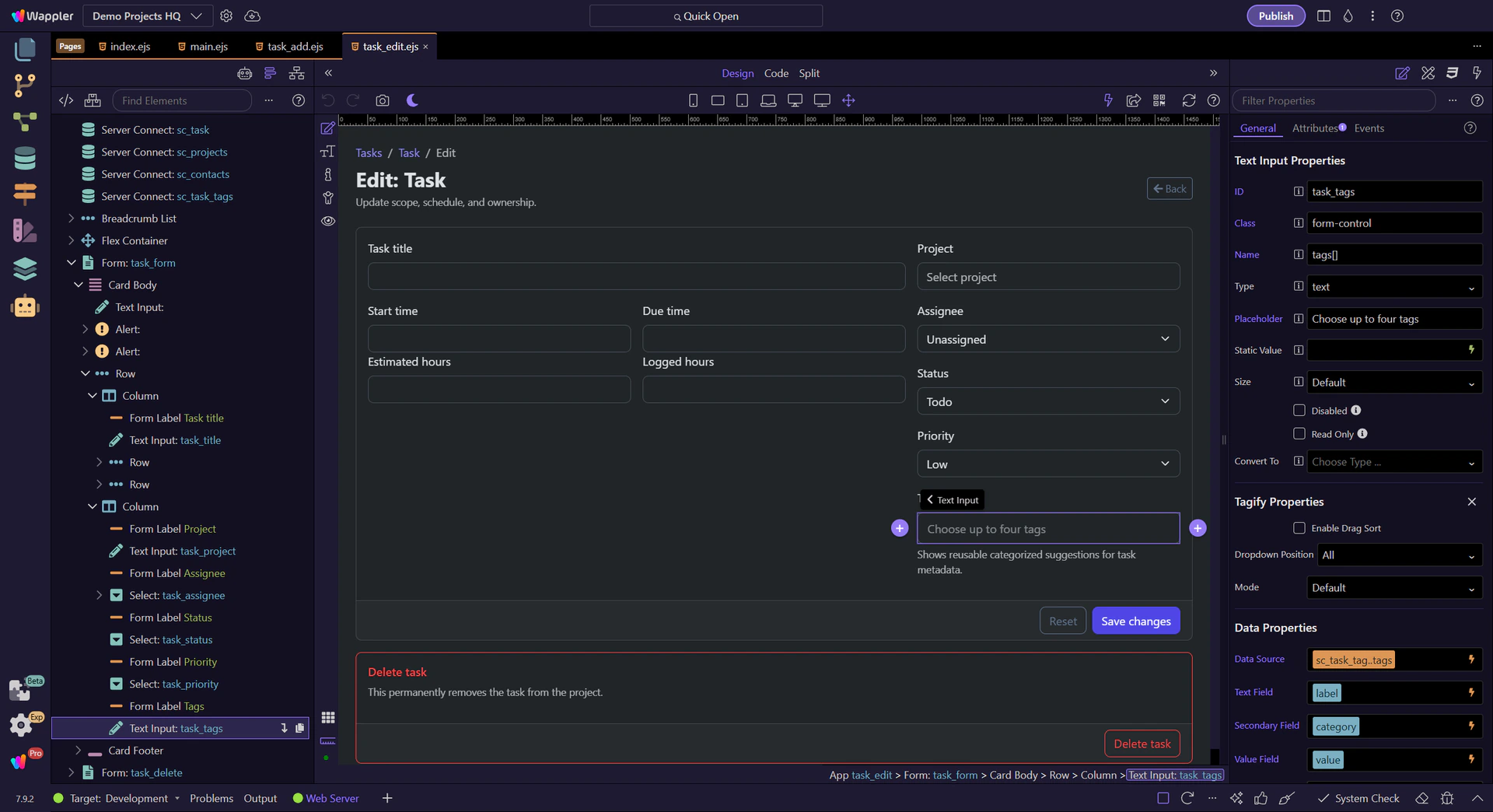
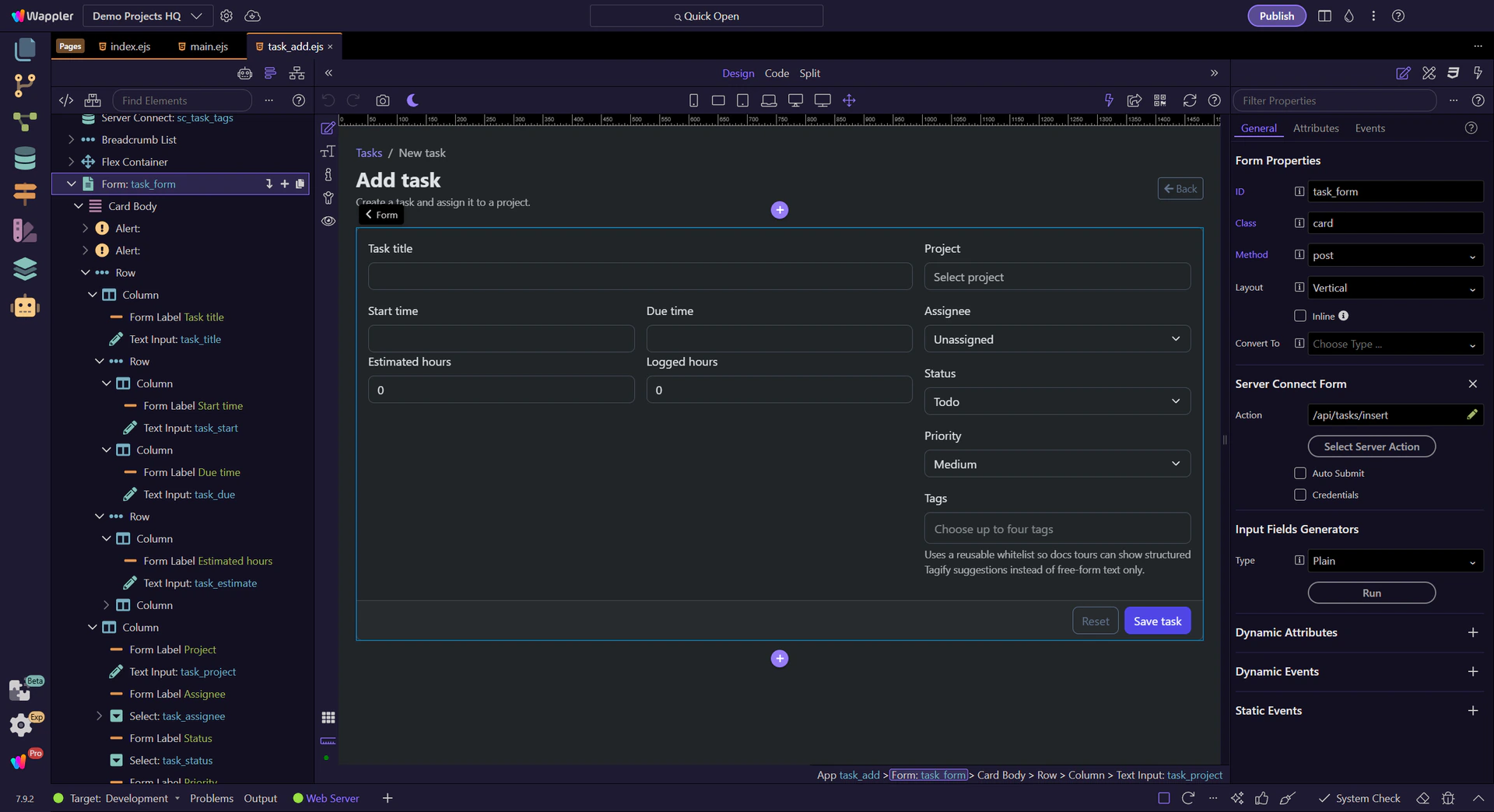
Use the Demo Projects HQ task edit form to see how existing record data restores text, select, date, and tag fields before the user starts editing.
The task edit page shows the real difference between create and edit forms. On an edit page, controls should already reflect the stored record so the user is correcting or extending data, not rebuilding it from memory. App Connect bindings make that restoration explicit.
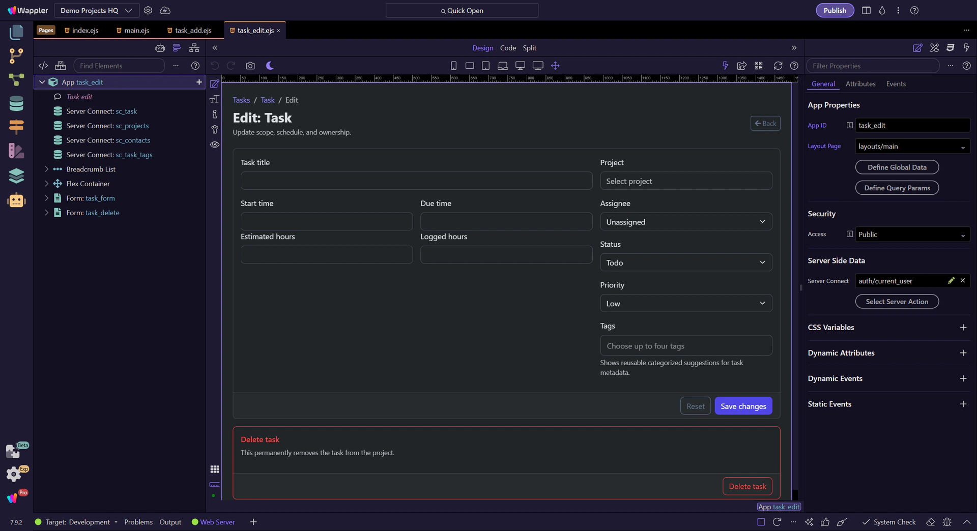
The task edit form works because sc_task loads the current record first, then the rest of the form binds against that source. Without a stable record source, the edit page would have no reliable state to restore.
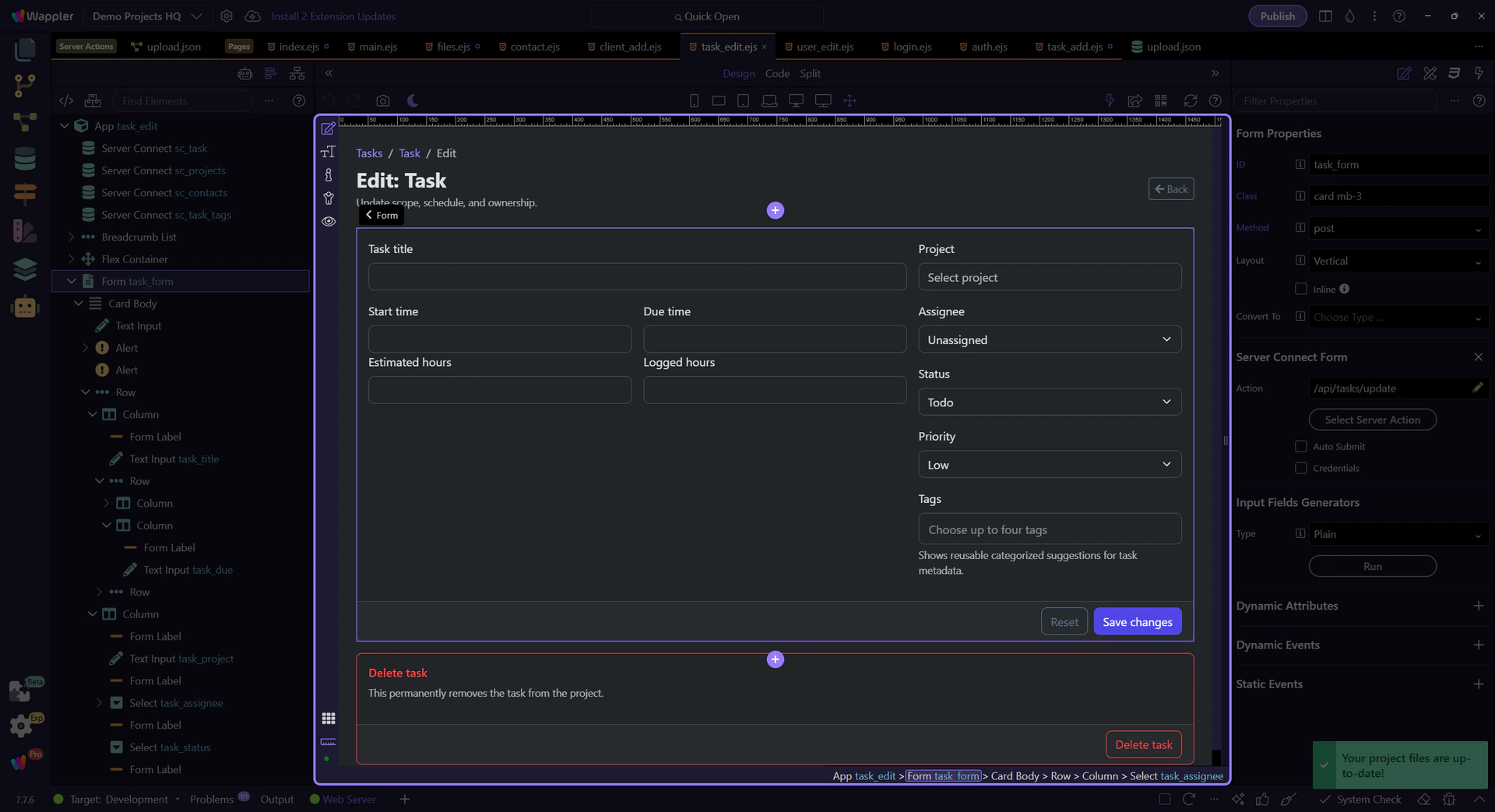
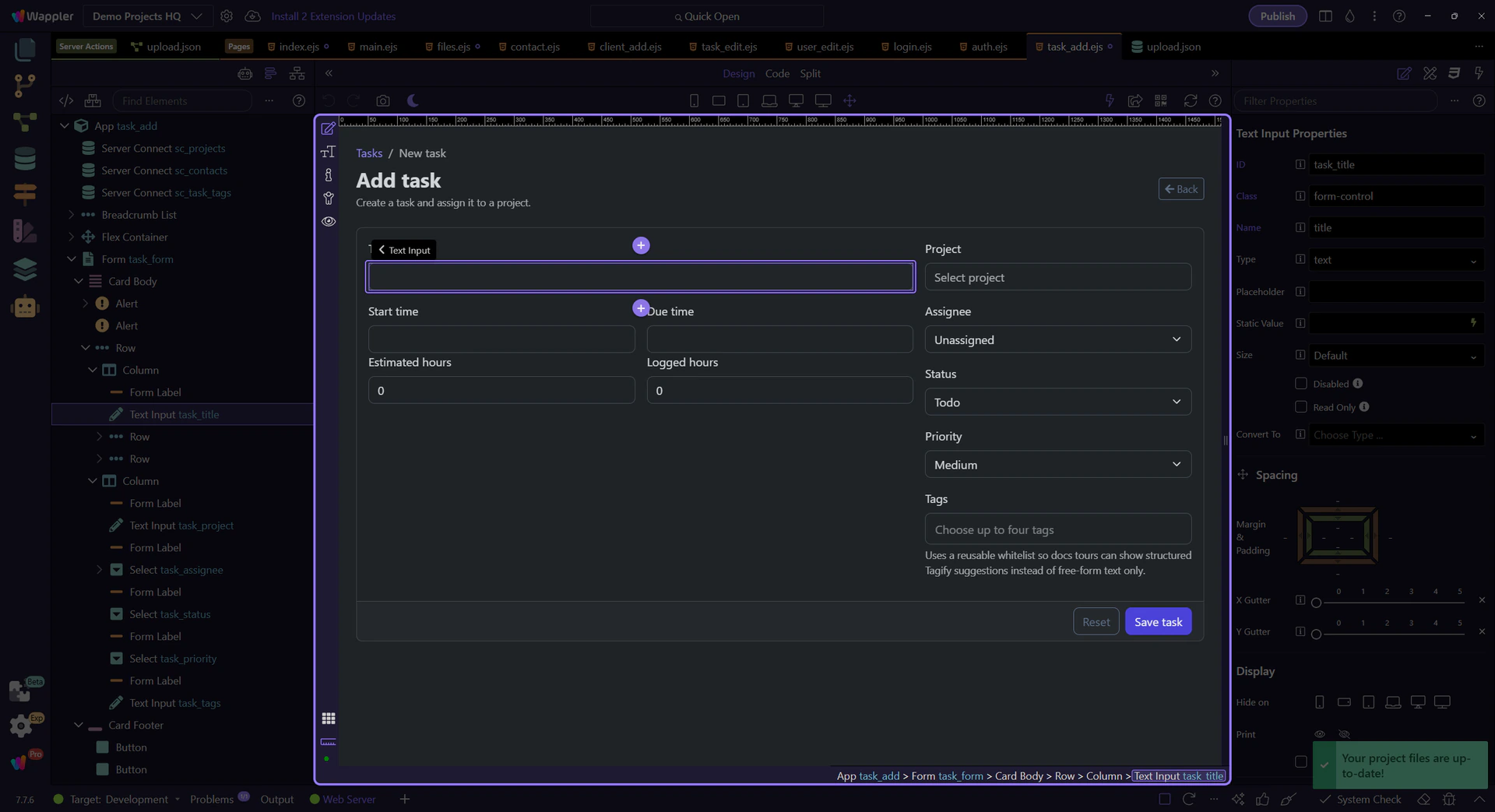
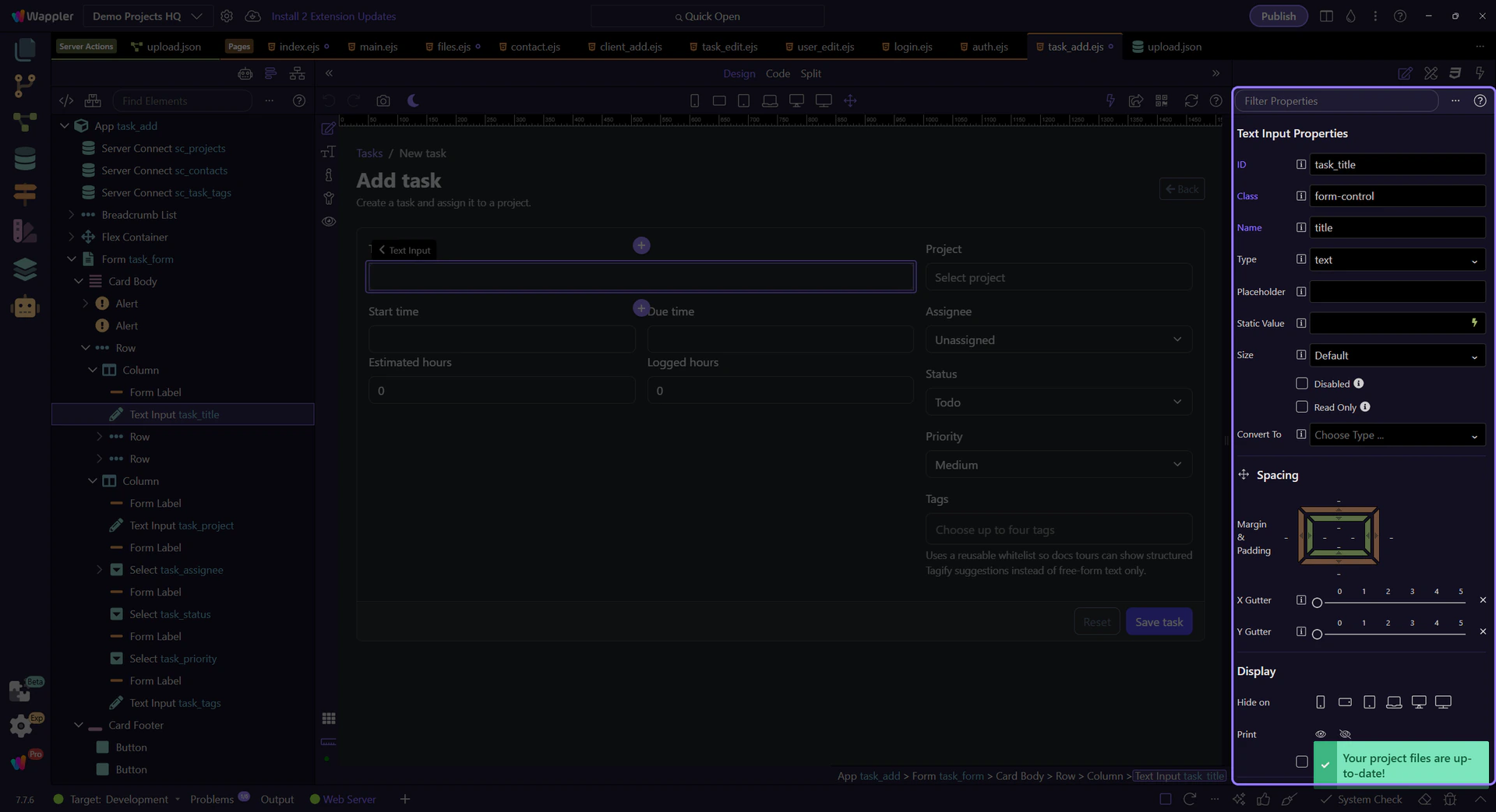
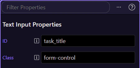
#task_title is the simplest restoration example. The field does not ask the editor to remember the old value or reload it manually. App Connect binds the stored title straight back into the control before editing begins.
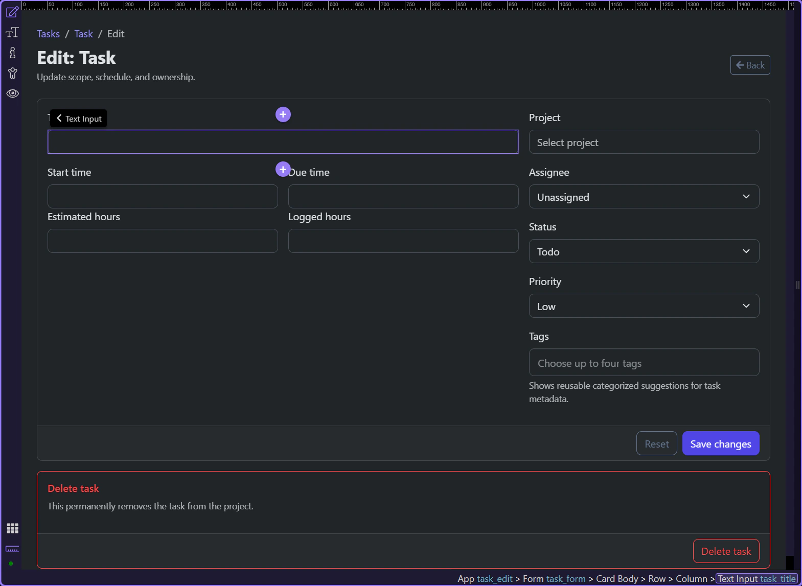
#task_assignee, #task_status, and #task_priority are edit-state proof that restoration is not just for text boxes. The visible control has to reflect the saved relationship or status before the user changes it, or the edit form stops being trustworthy.
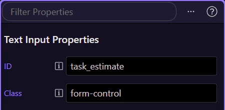
#task_start, #task_due, and #task_tags show the more advanced side of restoration. Complex controls still need a current value before the editor interacts with them, otherwise the page silently turns an edit workflow back into a create-from-scratch workflow.
An edit form is trustworthy only when the visible controls already match the saved record. Once that restoration pattern is clear, field editing, validation, and submit logic all become easier to reason about.
Learn how App Connect turns user interactions into declarative behavior: choose an event, attach one or more actions, apply modifiers, and let bindings react to the updated state.
This tour builds the event-to-action mental model that underpins most App Connect interactions. You will trace how a user event is configured in Properties, how Wappler stores the action list behind that event, and how the rest of the page reacts when the action runs.
The goal is to read an event configuration like a simple sentence: when this happens, run these actions, then let bindings and components respond. Once that clicks, click, submit, and keyup handlers all follow the same pattern.

Events, actions, and modifiers are configured in the Properties panel for the selected component.
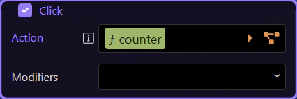
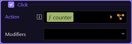
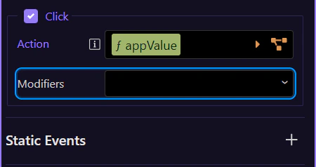
The Click event is the most common event. Modifiers control default behavior and add conditions.
The Actions Picker is attached to the Click property. Read it as the action list for this selected element: when the click event fires, the configured actions run in order.
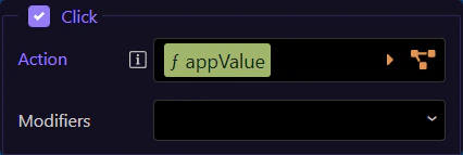
Use prevent/stop/once/capture and key/button modifiers to control behavior without manual code. This step matters because Use modifiers is part of Selection Panels Properties Clickmods, and understanding that context makes the next action easier to repeat in your own project.
Next, go deeper into collections and traversal.
Continue learning App Connect.
Use the real files page to see how App Connect turns loaded file rows into summary cards, outbound file links, and project-navigation links.
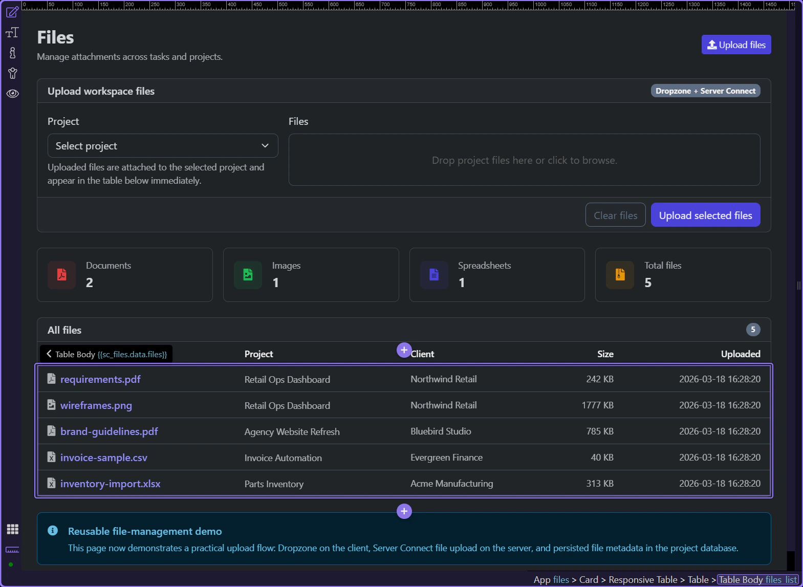
The files page is a good App Connect example because it does more than repeat rows. It turns one loaded files dataset plus one summary dataset into dashboard cards, outbound file links, and internal project navigation that stay readable after every upload.

App Connect makes the files page practical because one dataset can feed several UI layers at once. The same loaded file rows support the stats cards, the repeated table, direct file links, and project-navigation links without duplicating fetch logic.
Start on the real files page so the whole surface is visible before narrowing into the cards and table. This page is where recent uploads become a usable library instead of disappearing into backend-only state.
The quick stats cards mix sc_files and sc_summary to give the page an immediate read on document types and total volume. That keeps the page informative before the user scans the row-level library below.
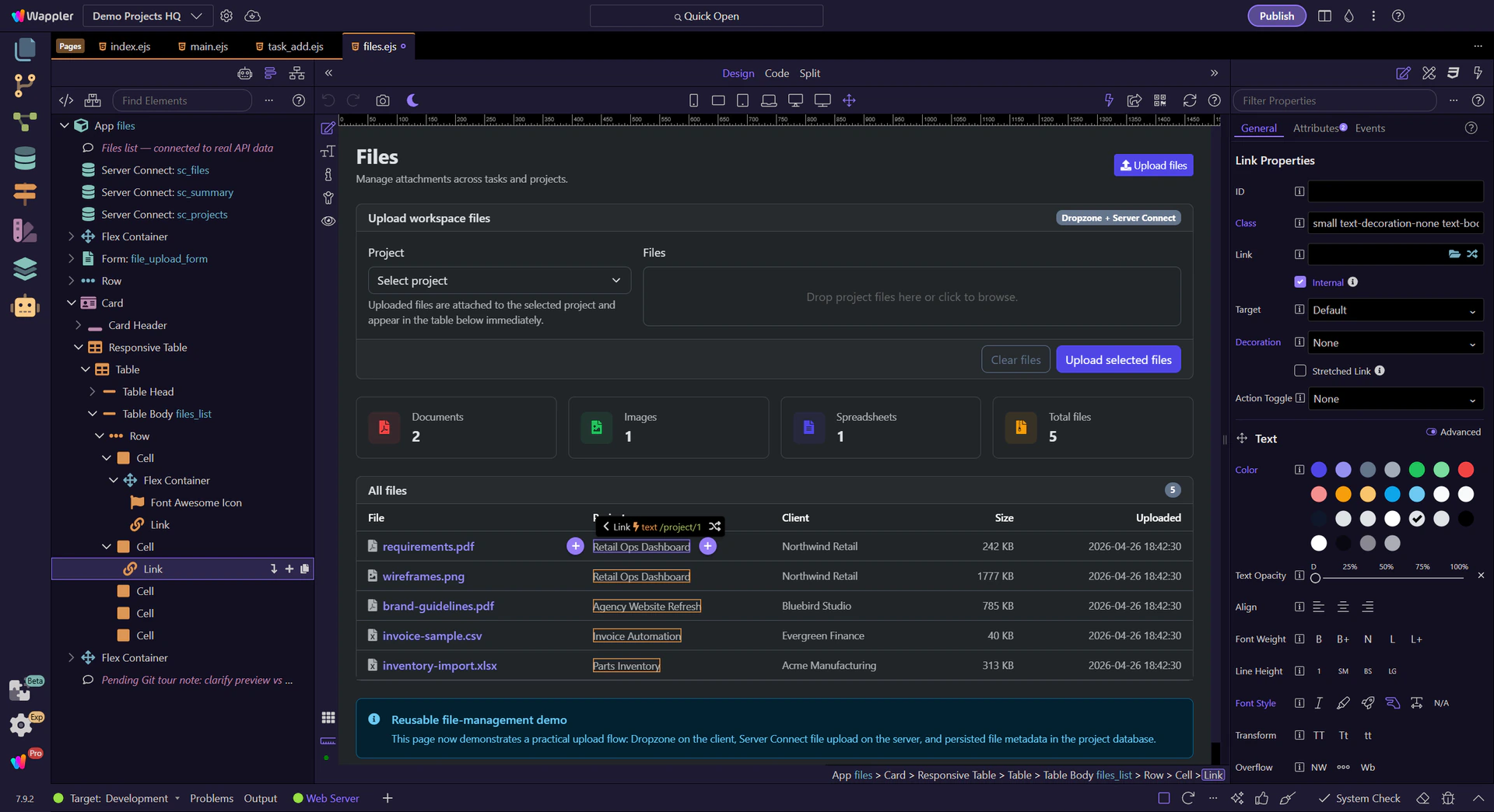
#files_list repeats the loaded sc_files rows directly, so every record keeps its filename, project, client, size, and uploaded timestamp together. That is the App Connect handoff from loaded data to a browseable library view.
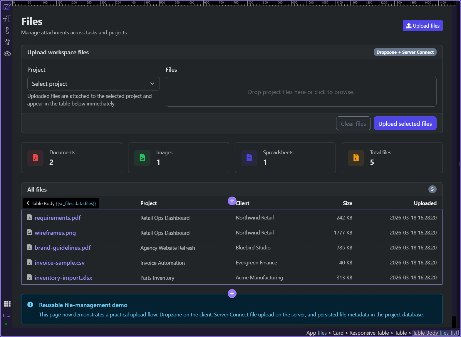
Inside each repeated row, the filename link binds directly to url and opens in a new tab. That keeps the library practical because a stored file becomes immediately inspectable or downloadable without extra controller logic on the page.
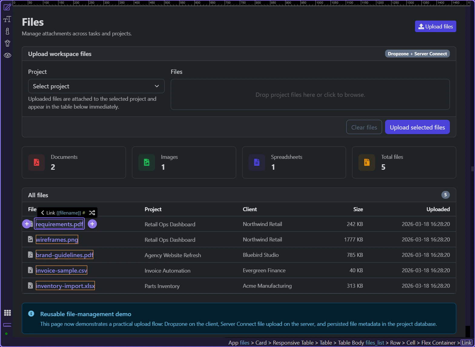
The project cell binds an internal route to /project/ plus project_id, so the same row can move the user from a file artifact back into the project that owns it. That is a second handoff path coming from the same loaded record.
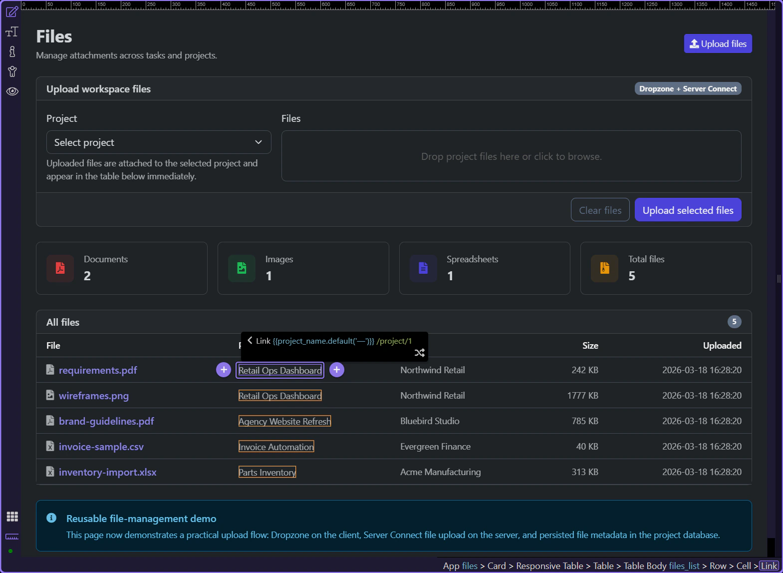
The files page works as a usable library because App Connect keeps the loaded data reusable. The page can summarize the dataset, repeat it into readable rows, and hand the user either out to the file itself or into the related project without asking for another mental model.
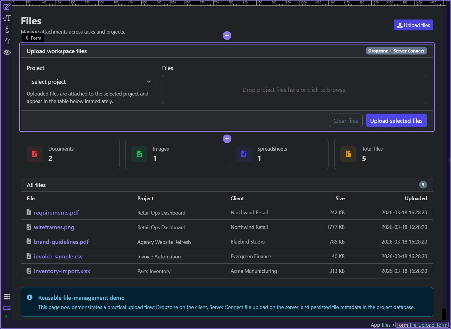
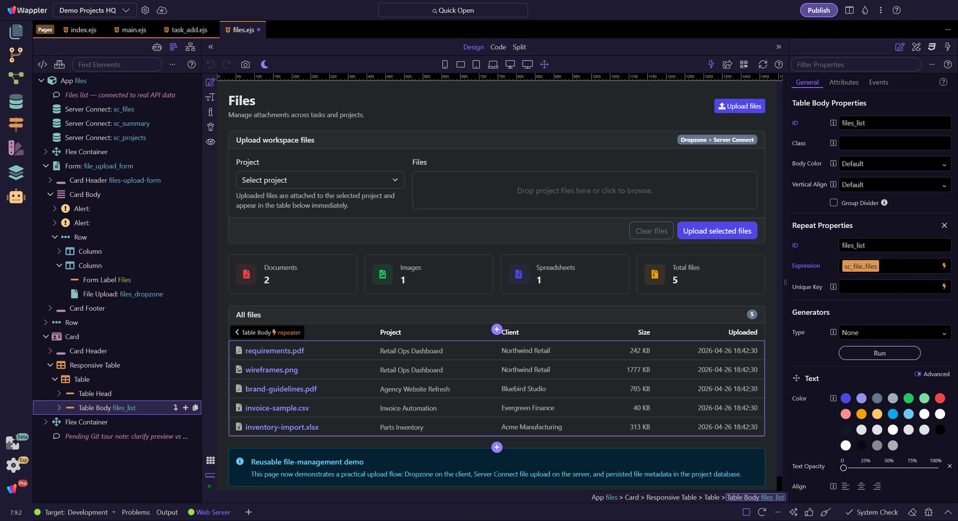
Use the Demo Projects HQ files page to see how App Connect form state, live data reloads, and repeated file listings stay in sync during uploads.
The Demo Projects HQ files page is a practical App Connect upload example because the page does not stop at submitting a form. It tracks request state, shows success feedback, reloads live datasets, and immediately reflects the uploaded files in repeated UI.
The files page keeps App Connect responsibilities explicit. Server Connect components load the existing files and project choices, the upload form exposes request state, and the page binds those outputs back into alerts, buttons, and repeated data.
Start on the real files page so the loader components, upload form, and repeated file list stay visible in one context. This page is useful because upload state and visible results live together instead of being split across separate screens.
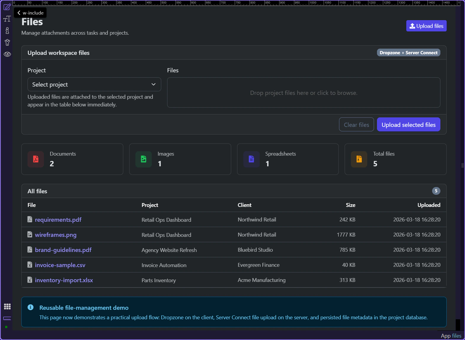
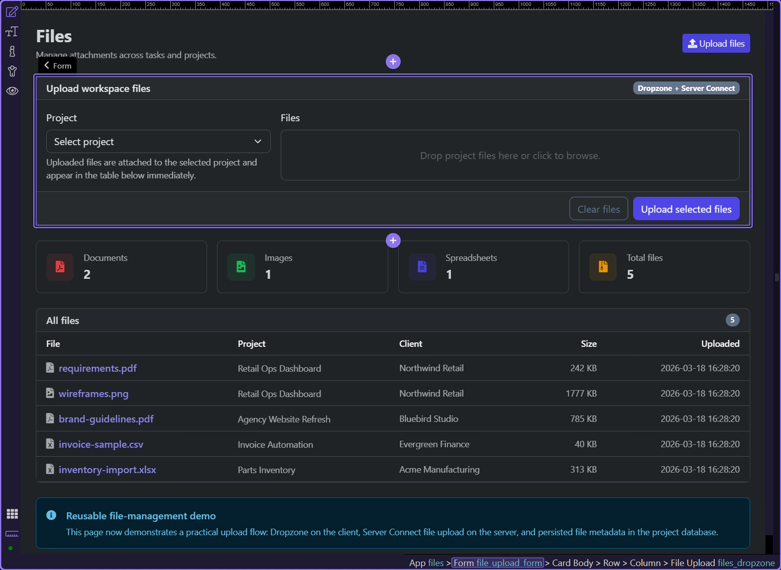
#file_upload_form is more than a submit surface. It posts to /api/files/upload, exposes executing and lastError state, and returns save_uploads output that the page can use for success feedback without custom response parsing.
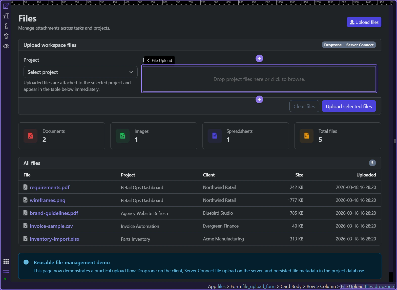
#upload_project_id and #files_dropzone belong to the same App Connect form state. The selected project travels with the uploaded files, so the page can treat one submission as both file transfer and project-specific context.
The form success hook resets the Dropzone and calls sc_files.load() plus sc_summary.load(). That refresh loop is what makes the UI feel immediate: the page asks the same loaders for fresh data instead of guessing what changed.
#files_list repeats over sc_files.data.files, so new rows appear when the loader refreshes after a successful upload. That keeps the visible library tied to one authoritative dataset rather than to ad hoc DOM updates.
The files upload page works well because App Connect keeps each phase visible. The form exposes request state, the success handler refreshes the dependent datasets, and the page simply rebinds to the refreshed outputs.
Learn when App Connect flows are worth introducing, how they differ from a single event → action handler, and how to think about multi-step client workflows before building them.
This introduction sets the decision rule for flows before you start building one. You will compare a simple event handler with a staged workflow, identify the kinds of UI tasks that benefit from multiple ordered steps, and see how flows keep that logic readable as it grows.
By the end of this tour, you should be able to decide whether a feature needs a flow at all, describe the sequence of steps the flow must coordinate, and recognize the parts of the Wappler UI where you inspect and maintain that workflow.

Flows are useful for multi-step UI workflows where you want a clear sequence; simple interactions can stay as a single event → action.
Review what you did and choose a next tour.
Pick a related tour to continue.

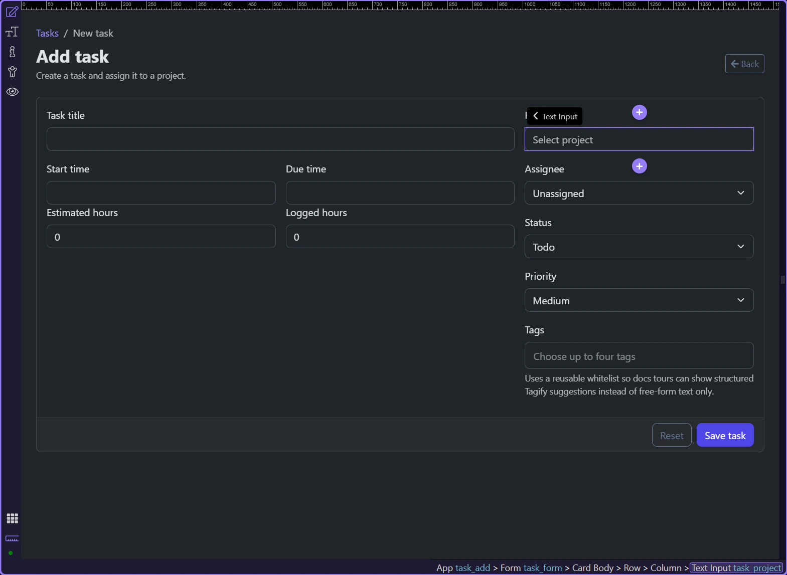
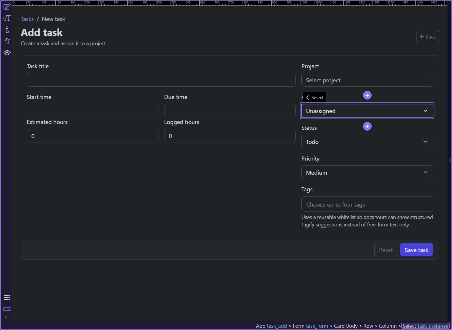
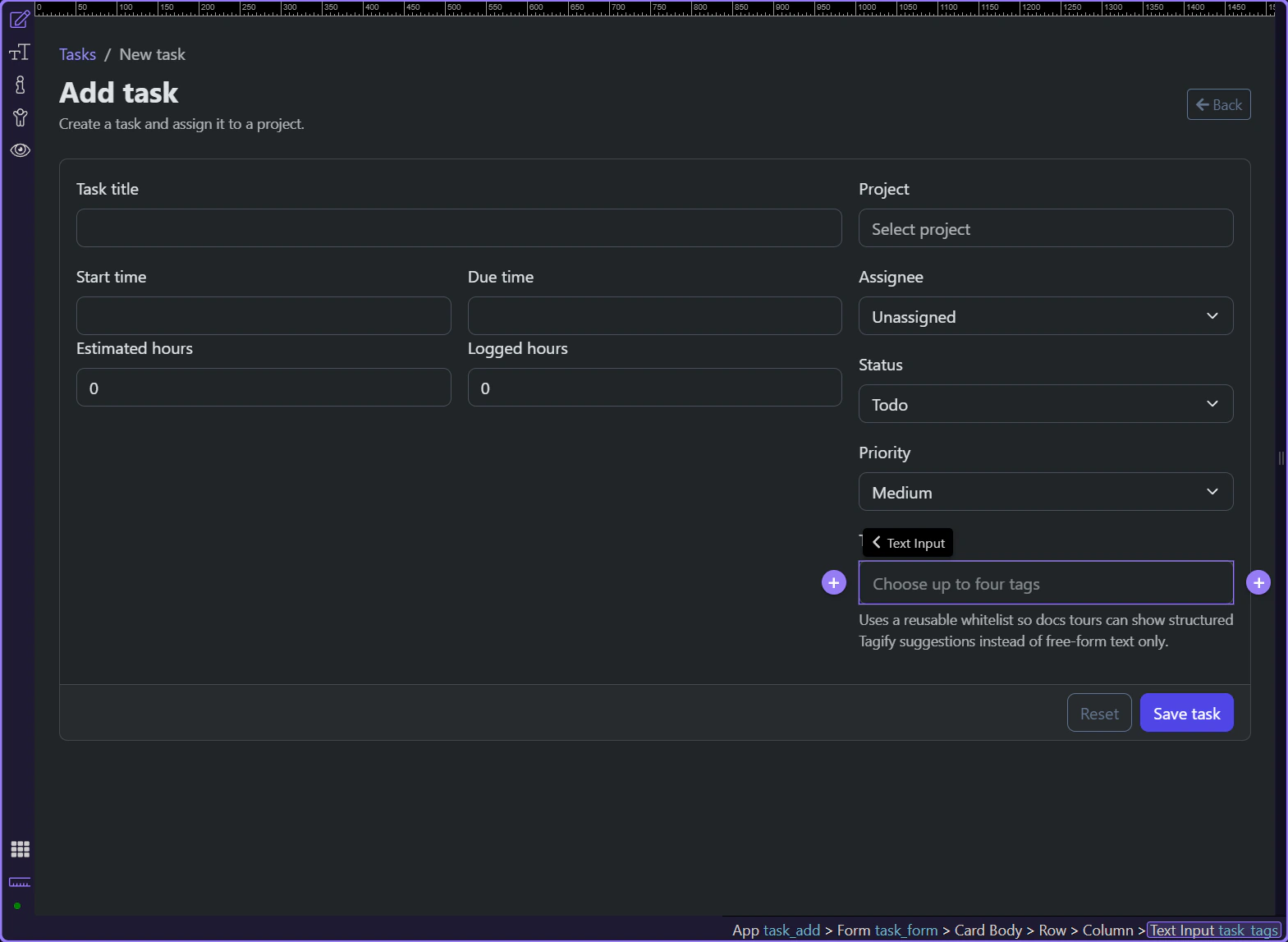
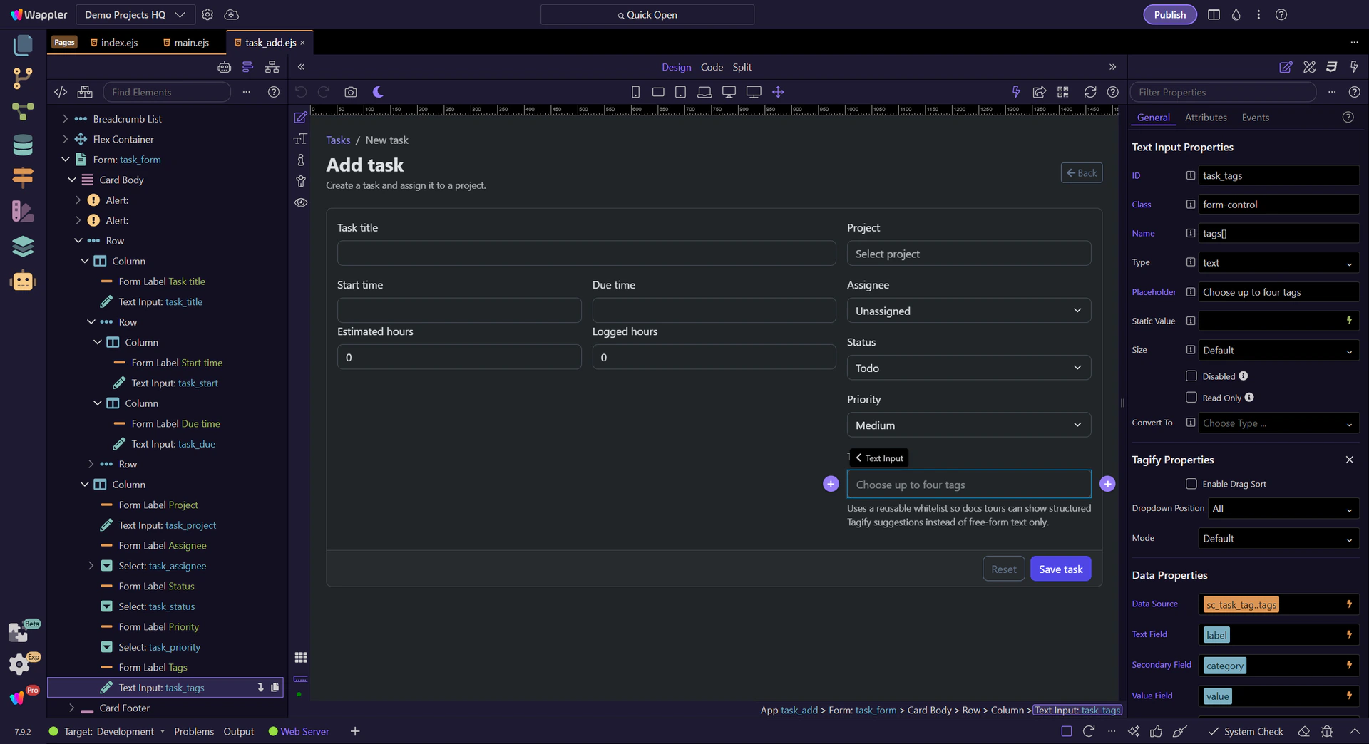
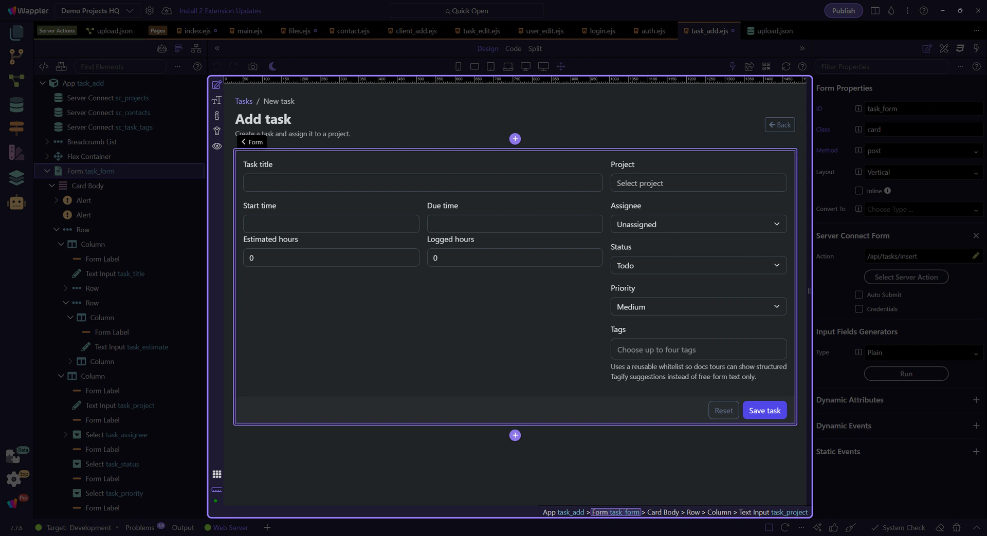
Use the Demo Projects HQ task form to see how App Connect and Server Connect data sources feed projects, contacts, and tag choices into real form controls.
The new-task page is not driven by static markup alone. Projects, contacts, and tag suggestions all arrive through data components first, then feed the controls users actually interact with. This tour stays on that page so the data-to-field relationship stays concrete.

The task form is useful because it depends on multiple upstream datasets at once. Projects, contacts, and tag suggestions are all loaded before their controls can behave properly, so the page becomes a good map of data-source responsibilities.
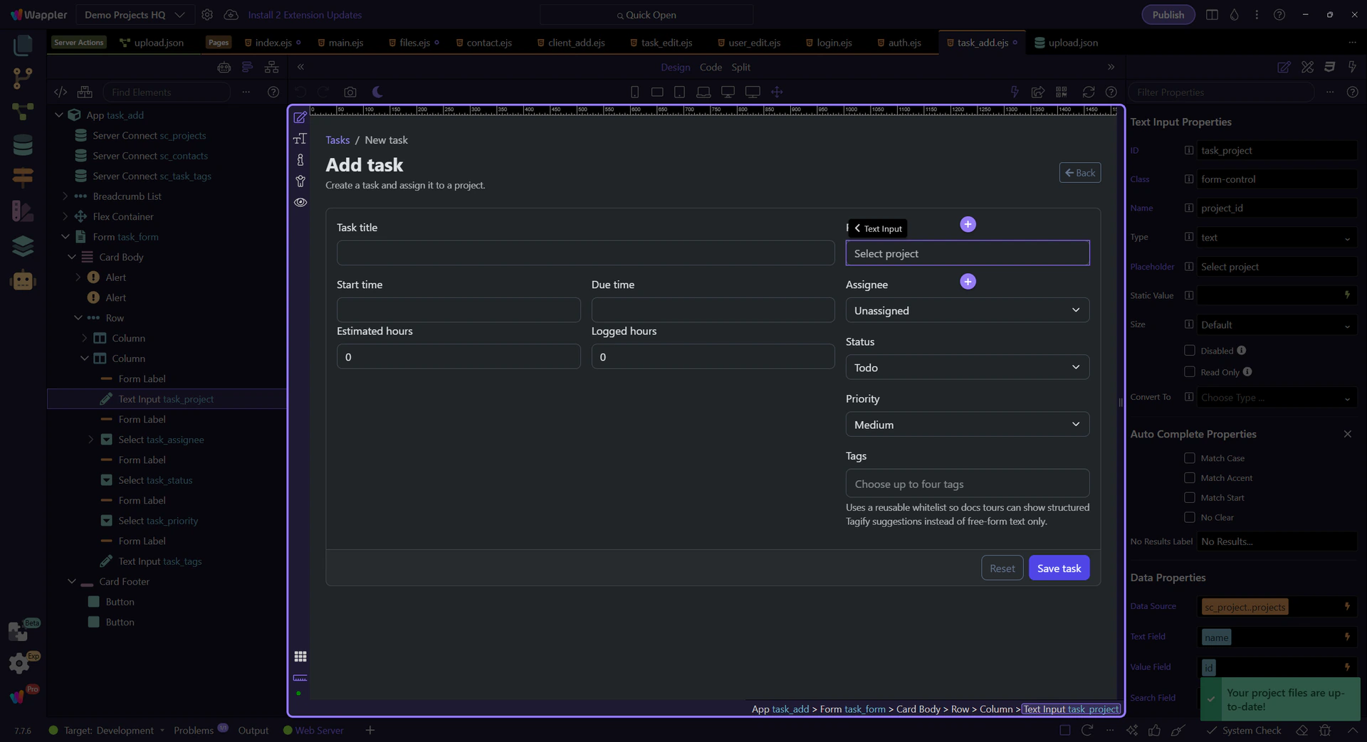
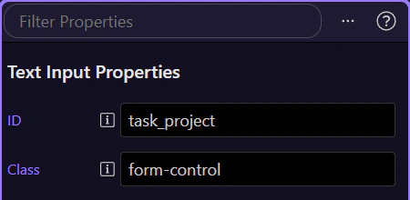
#task_project depends on the projects dataset, not on hard-coded option rows. That is what lets the same field stay useful as projects change over time without rewriting the control itself.
#task_assignee is a separate control, but the same principle applies: the form stays flexible because the contact options come from data that already belongs to the page, not from a duplicated static list inside the markup.
#task_tags shows that richer widgets still follow the same source-data rule. Tagify only feels guided because the suggestions are loaded first and then mapped into the control, rather than being invented at interaction time.
The task form becomes much easier to reason about when you separate where option data comes from from how the control presents it. That is the bridge from ordinary form markup into practical App Connect form work.

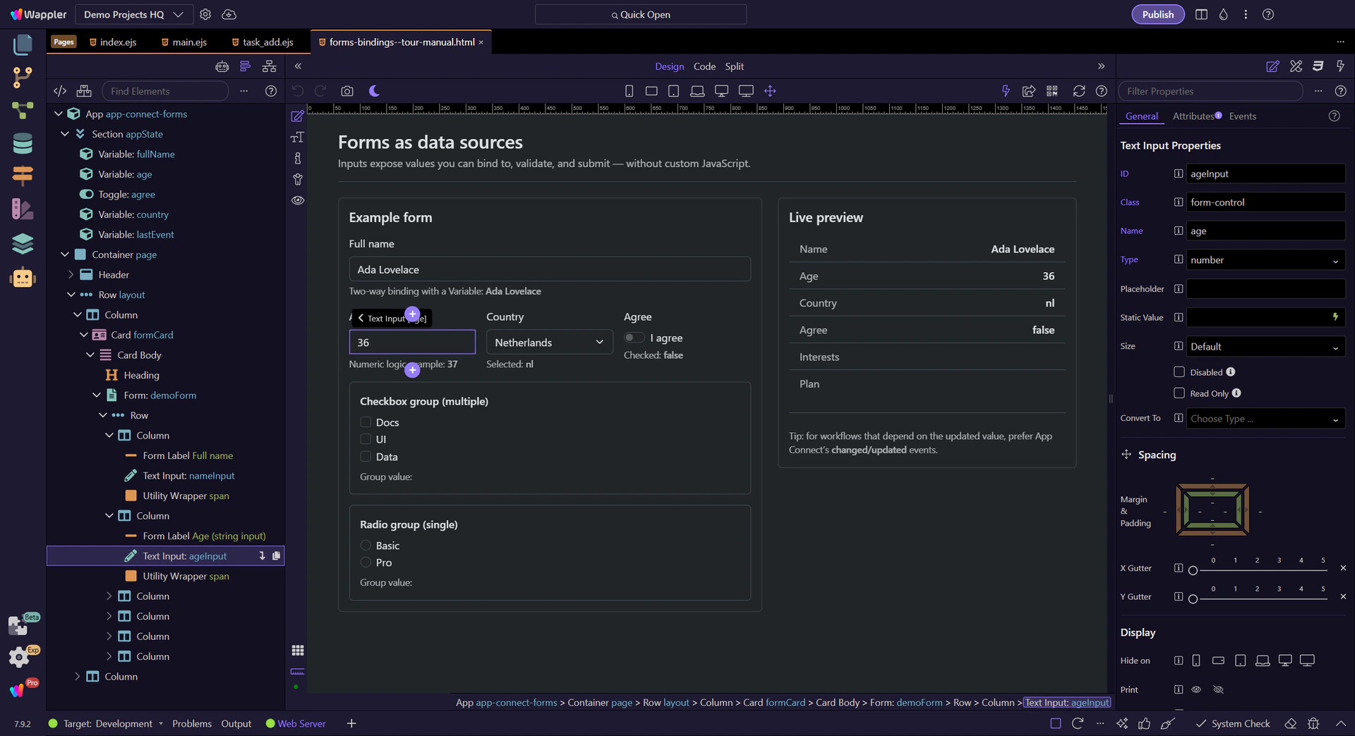
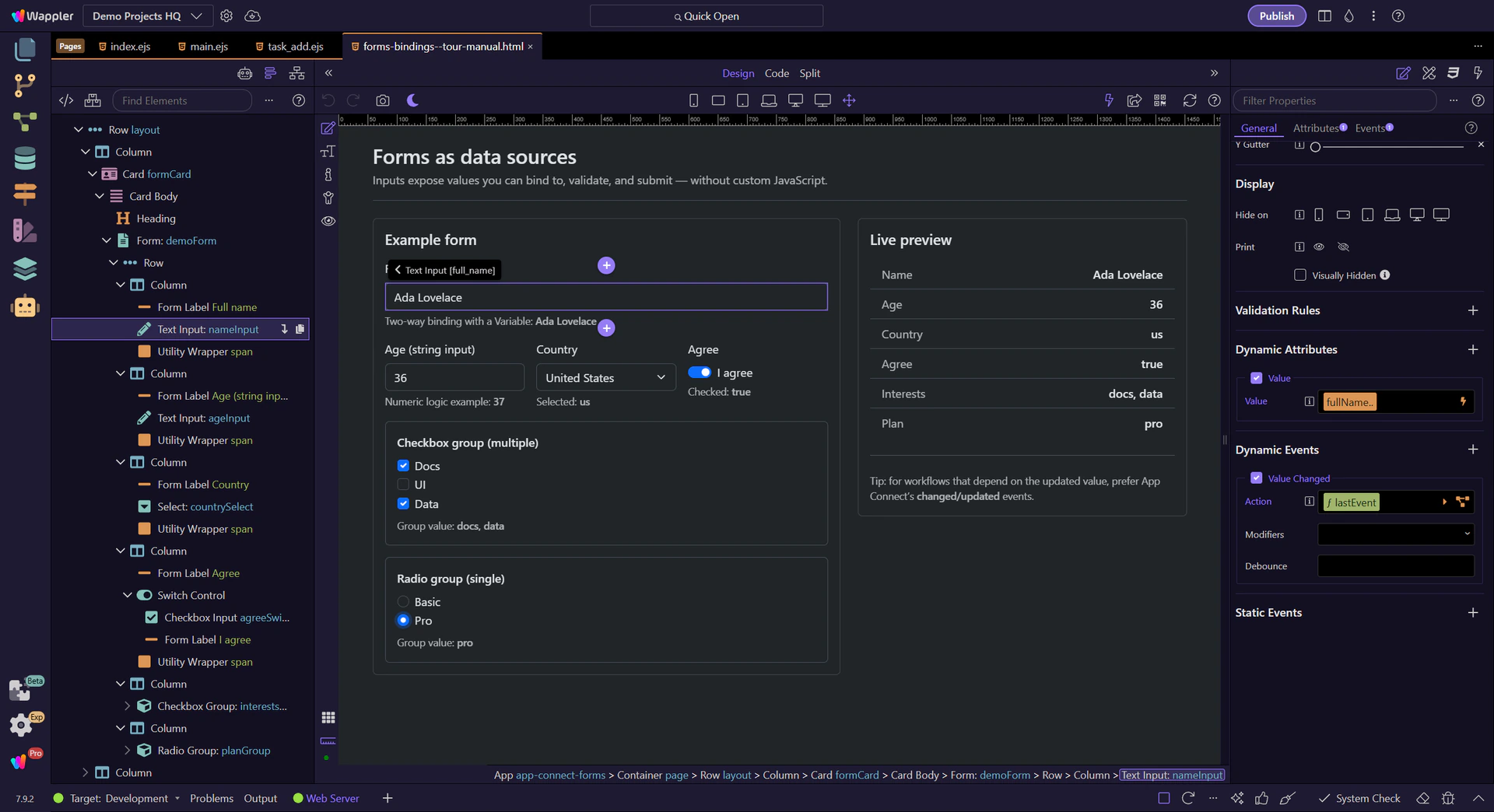
Use common form controls as live App Connect data sources in Wappler, and learn how bindings, events, and type conversion interact while users type, select, and toggle values.
This tour uses real form controls to explain how App Connect reads and reacts to user input. You will inspect where values come from, how bindings expose those values in Wappler, and where event timing or string conversion changes the result you see.
This tour explains how real form controls behave once App Connect is involved: where their values come from, when those values are strings, how grouped inputs expose a shared result, and which bindings you reach for in day-to-day form work.
This tour selects a real form field and then highlights its binding and event controls in Properties (so you know exactly where to configure it).
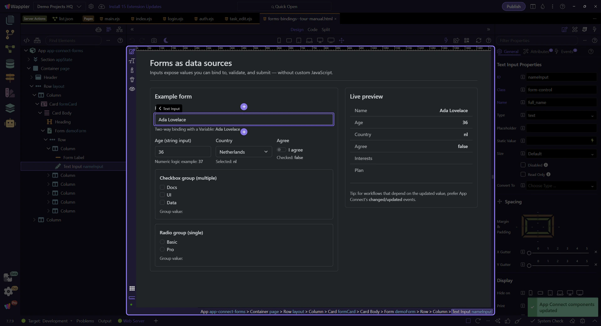
A common pattern: store form state in a Variable, then bind an input to it.
This Variable holds the value used by the input binding.
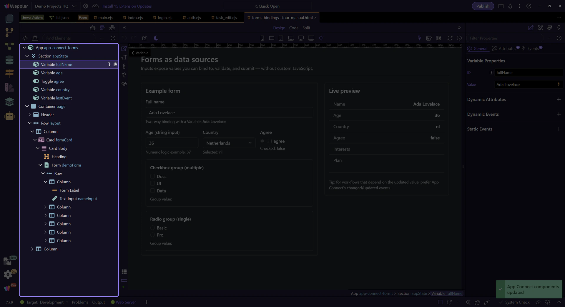
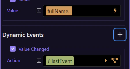
Inputs expose their current value as inputId.value, and can also be bound to App Connect state.
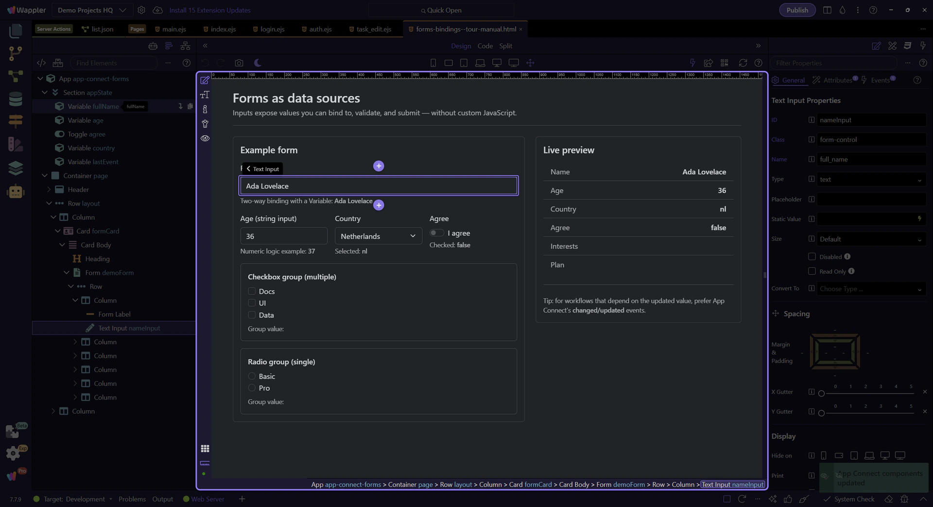
Start with the wider context in the Properties panel so the next control makes sense in the full workflow. In the next step, you will focus on Value binding (dmx-bind:value) and see how it fits into this area.
This field’s value binding is configured visually in Properties. Use the picker to insert a valid expression.
This event is where you attach actions that should run after the value updates. This step matters because Changed event action is part of Selection Panels Properties Changedvalue, and understanding that context makes the next action easier to repeat in your own project.
Form inputs are strings by default. Convert to numbers explicitly when doing math or comparisons.
This number input is still a string value in expressions until you convert it.
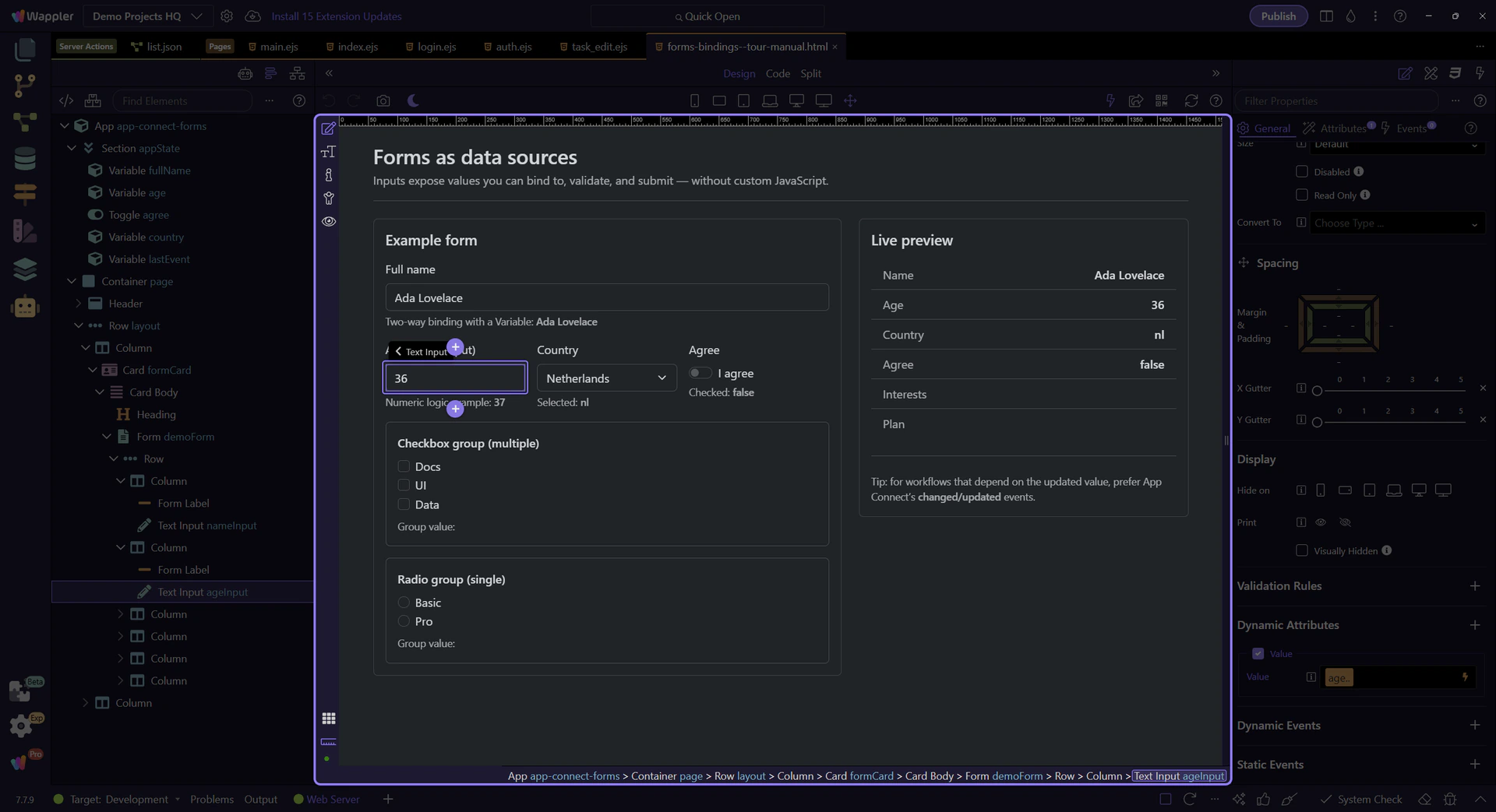
Convert strings to numbers to avoid surprising results (like ‘2’ + 1 → ‘21’).
important: When you read a value from an input or from Query Manager, treat it as a string unless you convert it.
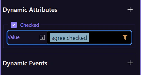
Checkbox inputs expose a boolean checked state. Bind to checked when you want true/false.
This switch uses dmx-bind:checked to sync with App Connect state.
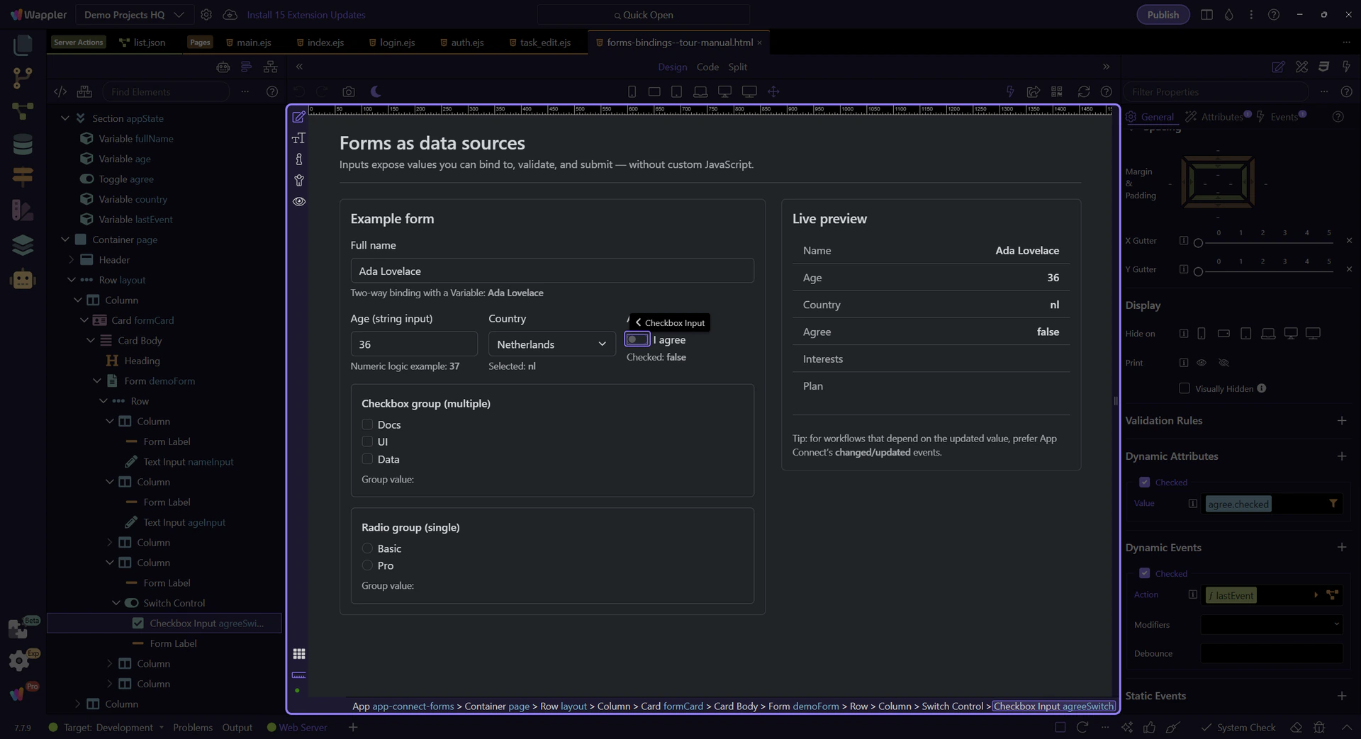
This binding controls the checkbox checked state using an expression (true/false). This step matters because Checked binding (dmx-bind:checked) is part of Selection Panels Properties Checkedvalue, and understanding that context makes the next action easier to repeat in your own project.
Use the Checked event to run actions when the user toggles the checkbox. This step matters because Checked event action is part of Selection Panels Properties Checked, and understanding that context makes the next action easier to repeat in your own project.
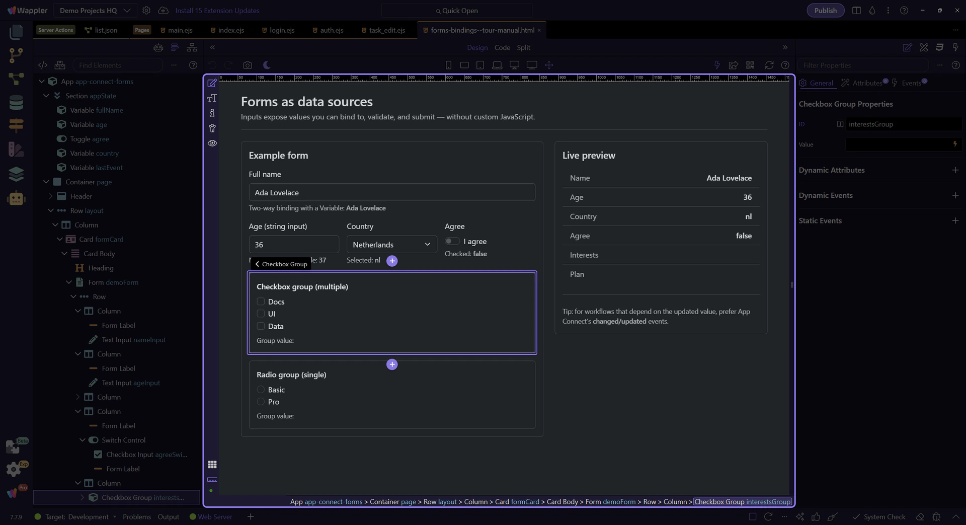
Use a Checkbox Group wrapper to treat a set of checkboxes as one value source.
tip: In Wappler, use the Checkbox Group component so you can bind to one group value and keep the structure clean.
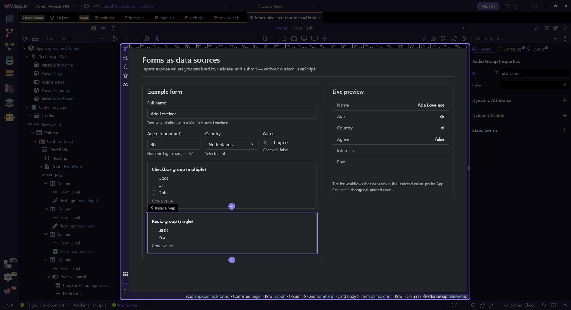
Select and Radio Group controls are common for single-choice input.
A select control exposes the currently selected value as selectId.value.
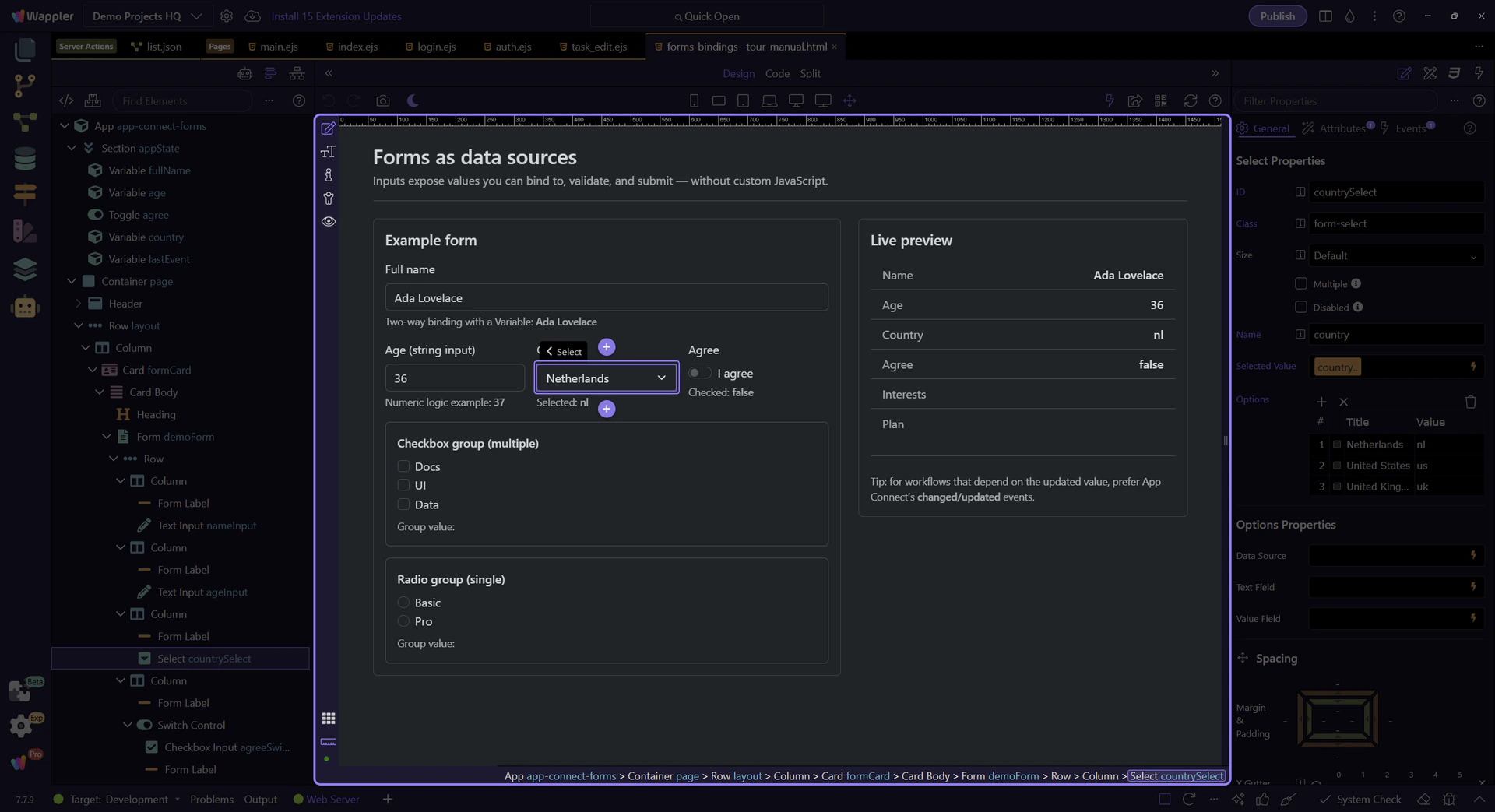
This binding controls the select’s selected value using an expression. This step matters because Selected value binding (dmx-bind:value) is part of Selection Panels Properties Selectvalue, and understanding that context makes the next action easier to repeat in your own project.
Attach actions here when you need to react to the newly selected value. This step matters because Changed event action (select) is part of Selection Panels Properties Changedvalue, and understanding that context makes the next action easier to repeat in your own project.
Use a Radio Group wrapper for a set of radios so you can read one group value.
Switch to Preview mode and change a few controls. The Live preview card updates immediately via bindings.
Switch to Preview mode now so you can test the form inputs live in the next step instead of only inspecting the setup.

Wait for the page to finish switching modes.
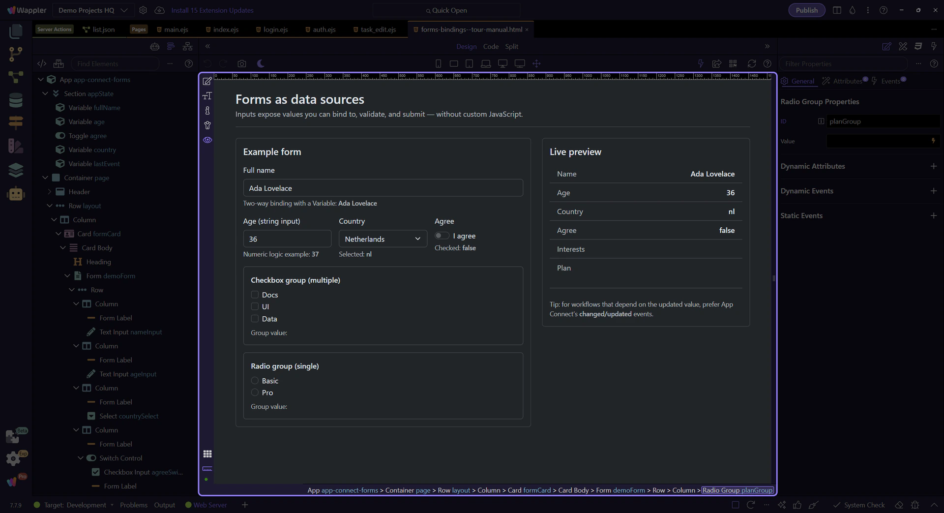
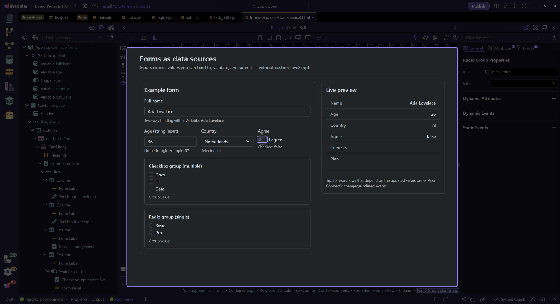
We’ll toggle the Agree switch. Notice how demoForm.agreeSwitch.checked updates in the Live preview.
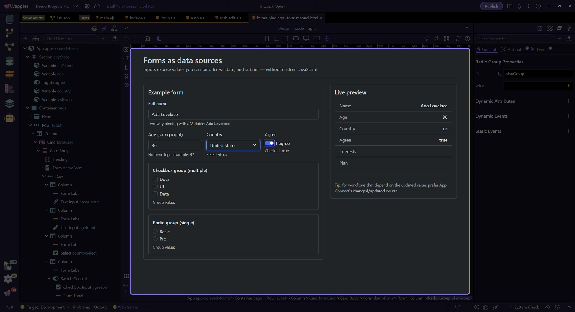
The tour selects another Country value so you can see demoForm.countrySelect.value update in the Live preview.
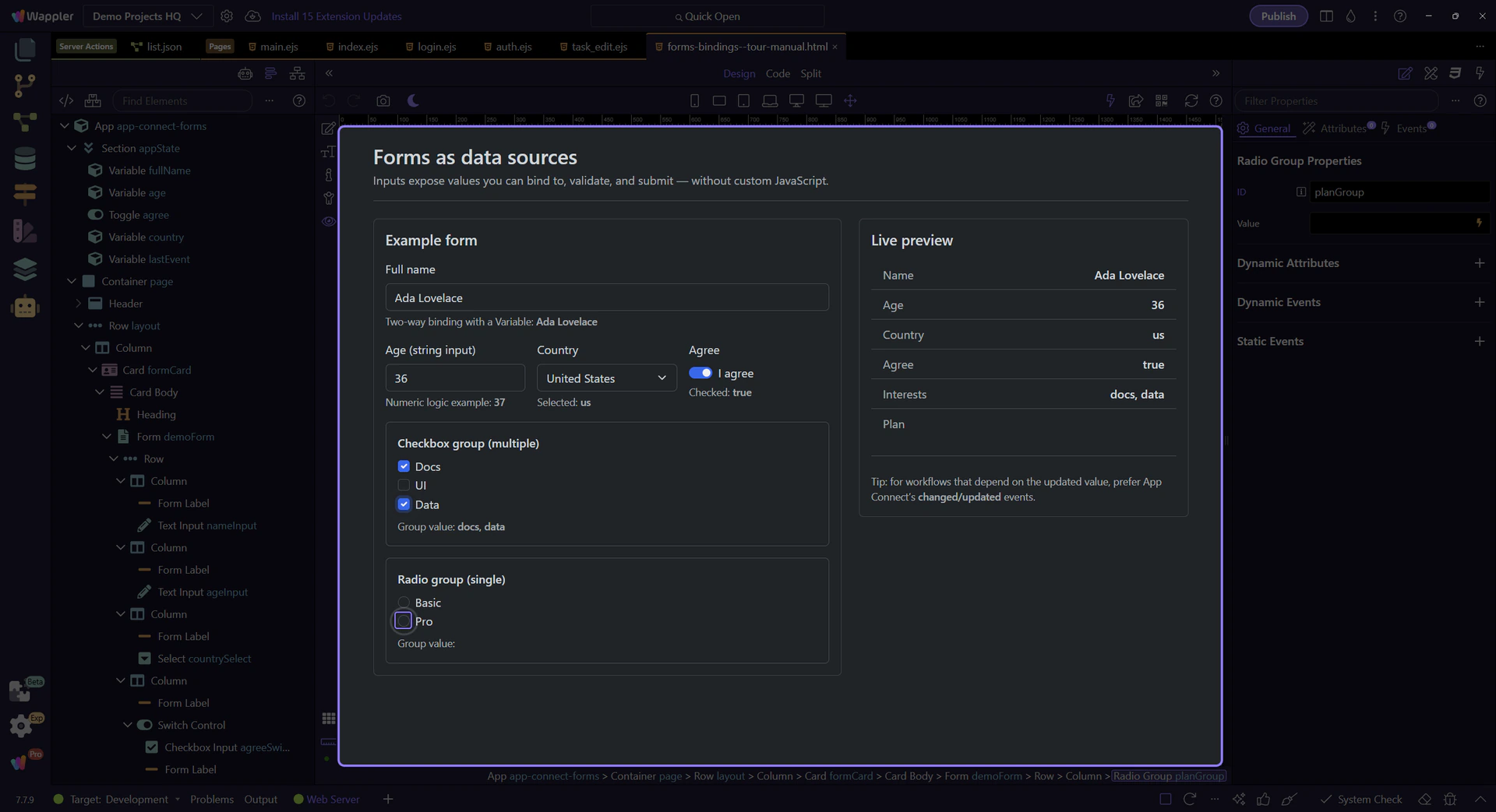
The checkbox group aggregates checked items into one array value (demoForm.interestsGroup.value).
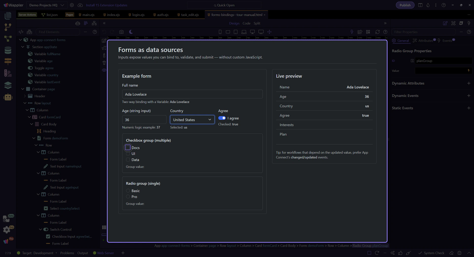
Selecting another interest appends another value to the group array.
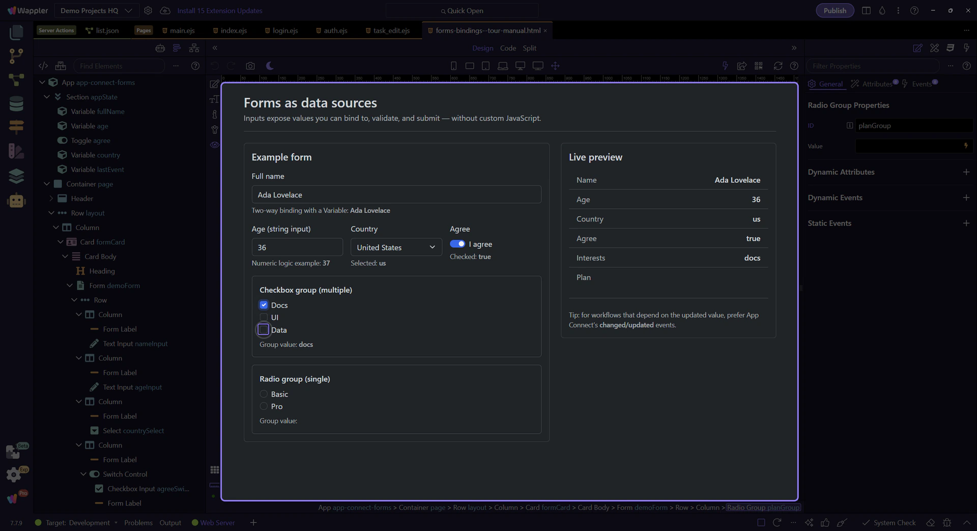
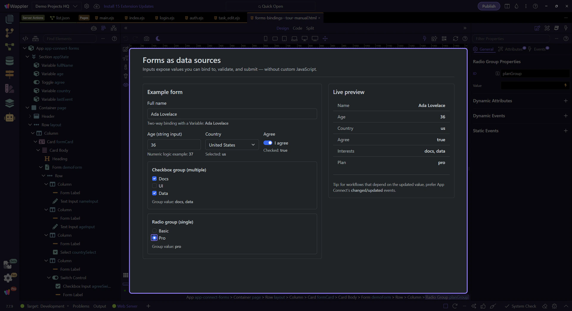
We’ll pick a plan option. demoForm.planGroup.value reflects the selected radio.
Edit the Full name field and watch both fullName.value and demoForm.nameInput.value change in the preview panels.
Return to Edit mode so you can continue shaping the form after confirming its live binding behavior.

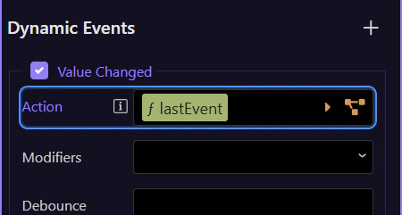
When you run actions based on input changes, prefer App Connect’s changed/updated events when you need the updated value.
If you attach actions to input events, ensure you’re using the event that runs after the new value is in state.
tip: Common workflow: dmx-on:changed → set value / run validations / trigger data reload.
Attach actions on the selected field (or on the form) in Properties. This step highlights the Dynamic Events section, where dmx-on:changed is a common choice for “latest value” workflows.
Next, validate inputs and submit them to the server.
Pick a related tour to continue.
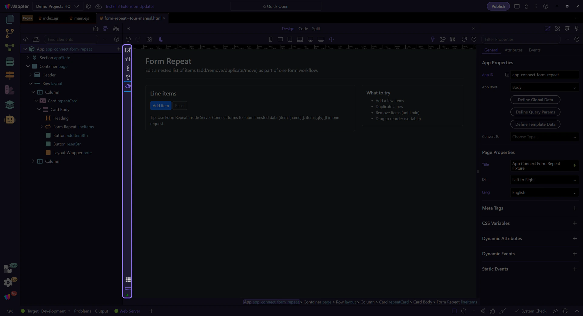
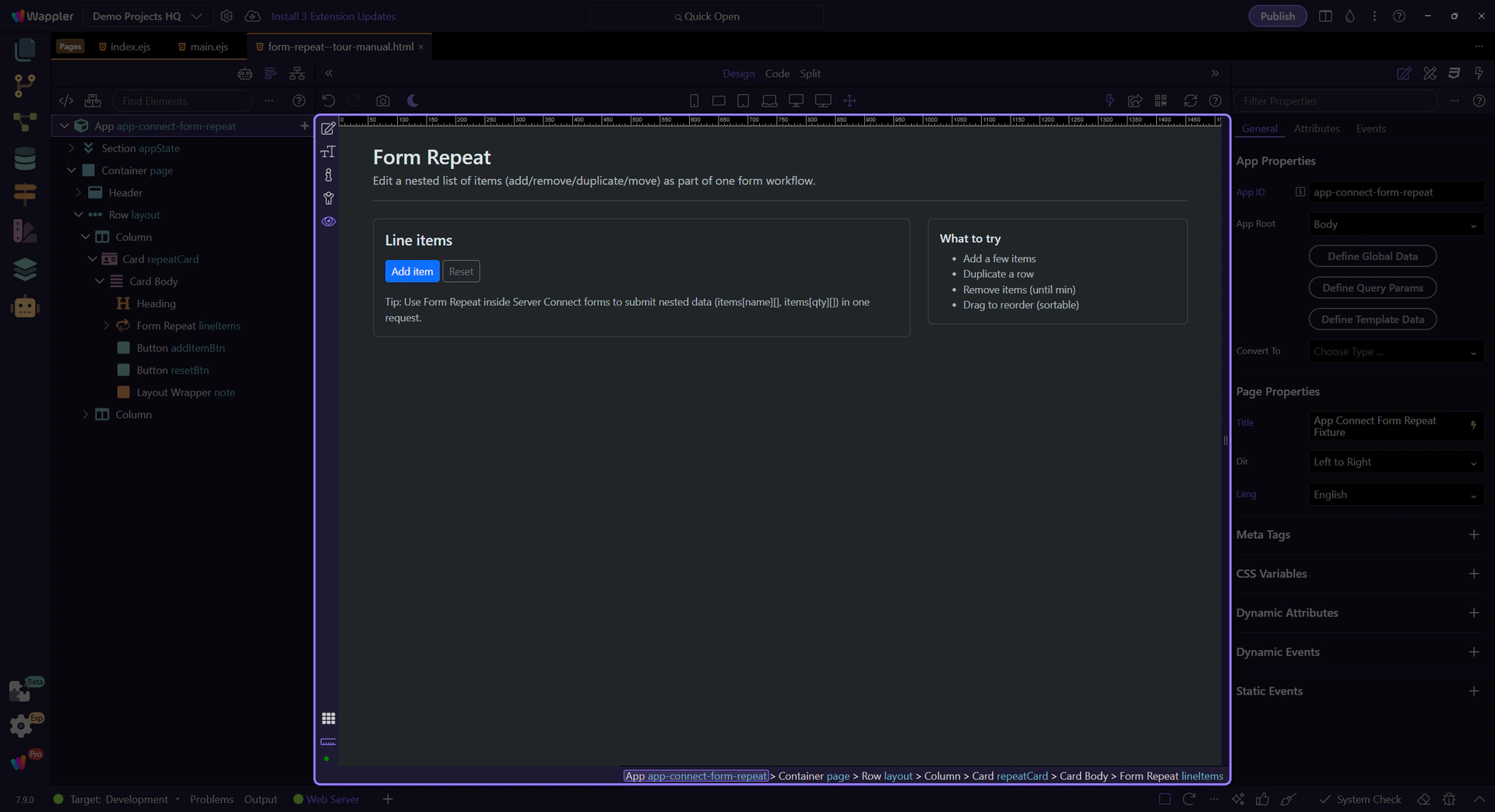
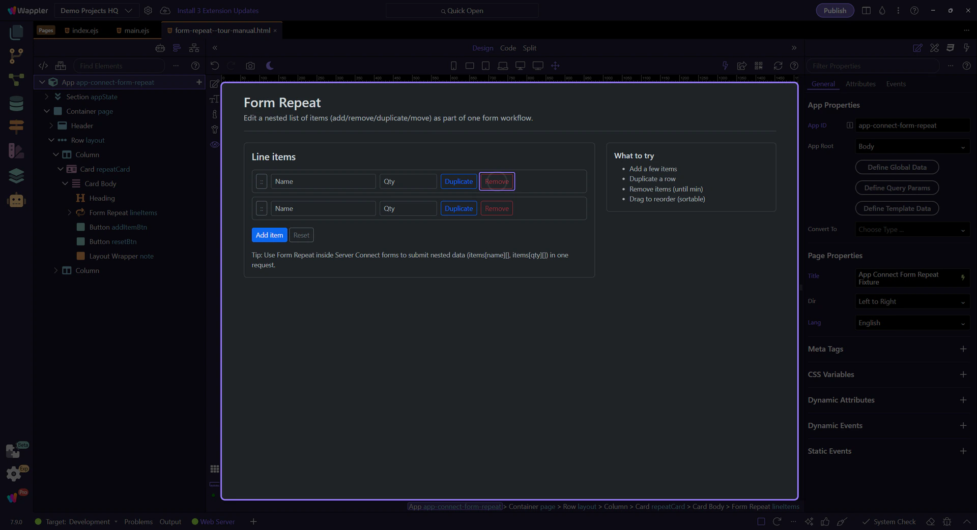
Learn how Form Repeat structures nested form rows in Wappler so users can add, remove, reorder, and submit repeated data as one coherent request.
This tour explains both the UI problem and the data model behind Form Repeat. You will look at how repeated rows are defined, which controls manage those rows, and how Wappler turns the repeated inputs into structured data the server can process.
By the end, you should recognize when Form Repeat is the right tool: whenever users need to manage a variable number of related entries in one form and you want Wappler to keep the repeated fields, controls, and submitted payload aligned.
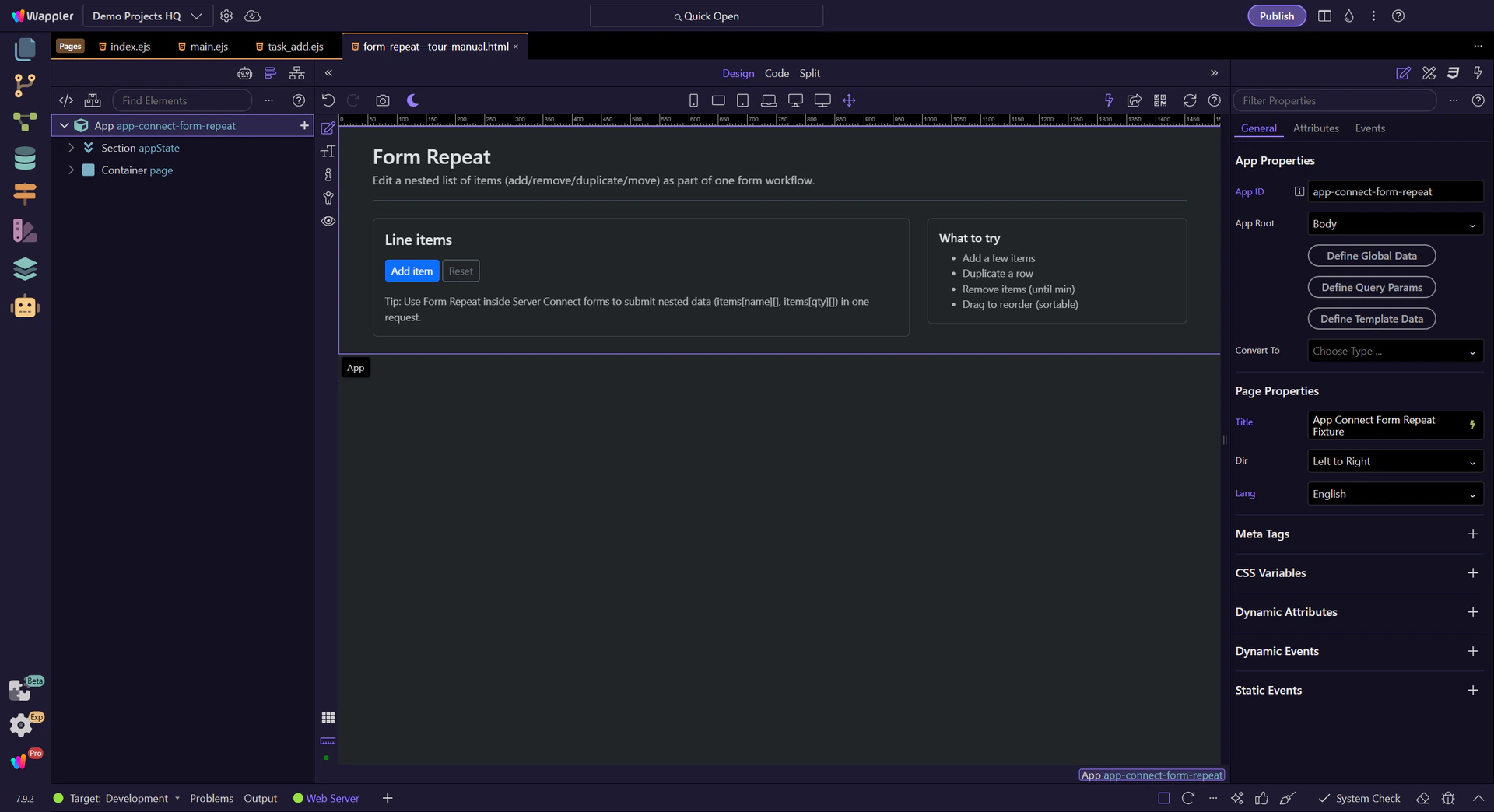
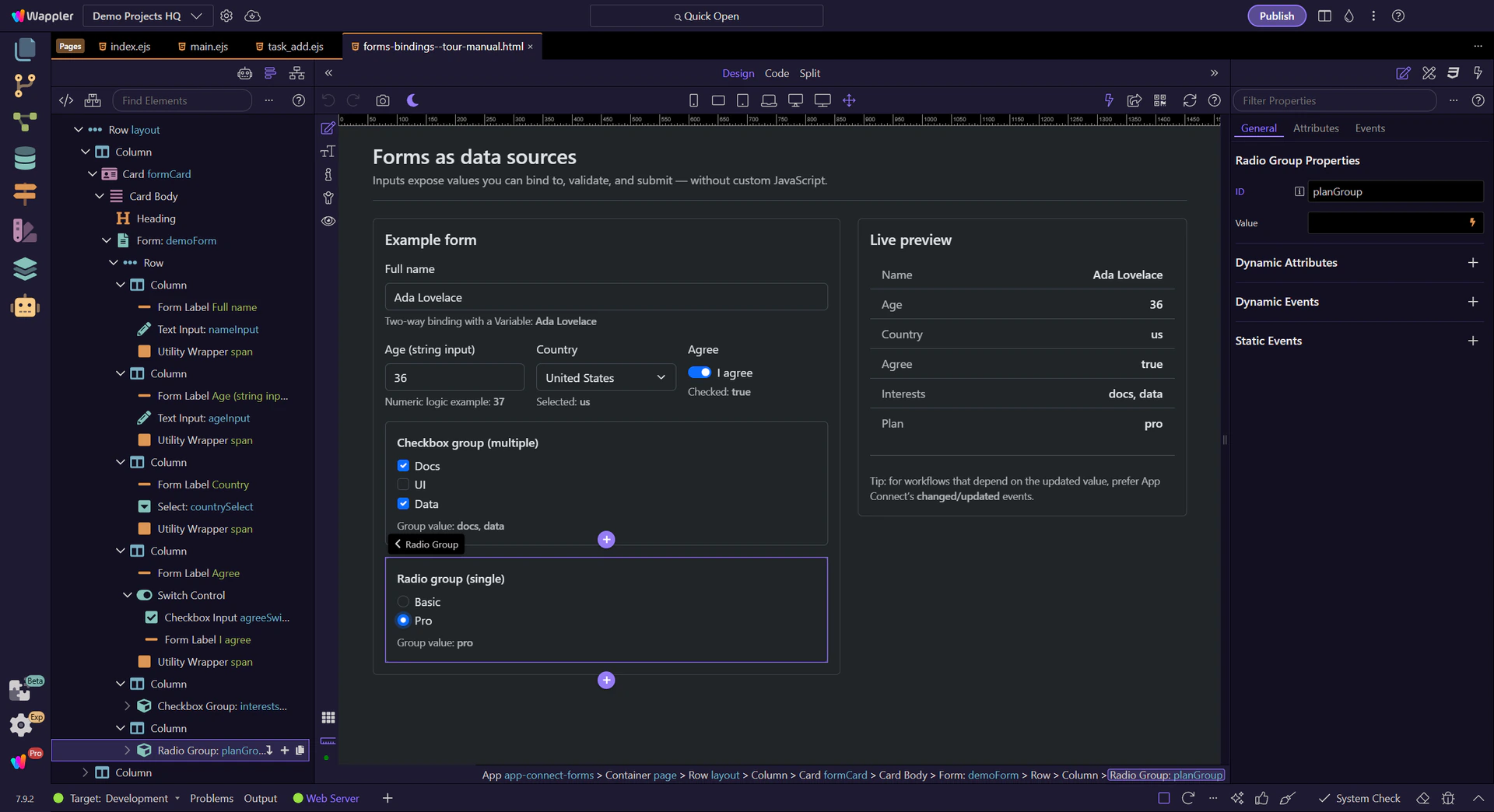
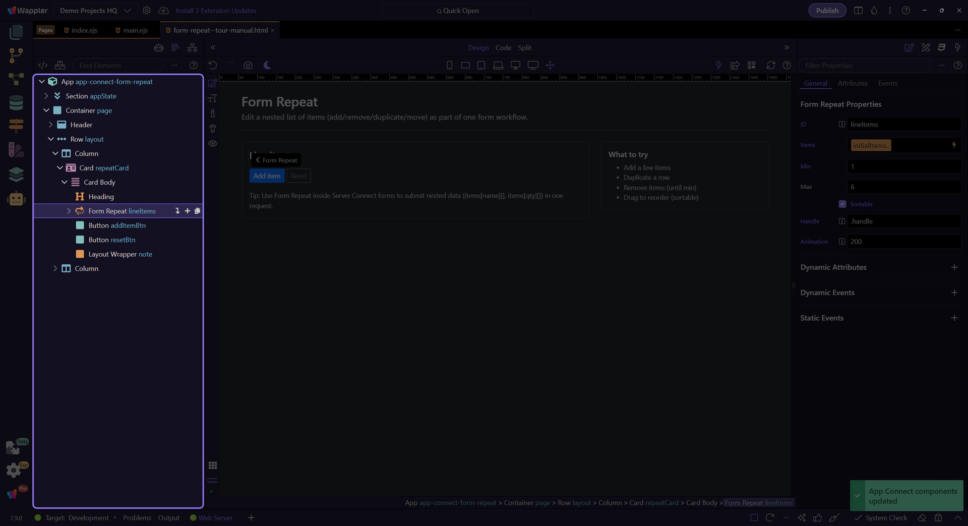
This tour selects the Form Repeat component in App Structure and then inspects its Items/min/max/sortable properties in Properties.
Configure what repeats and how it behaves.
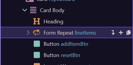
This component repeats a block of form fields for each item. This step matters because Form Repeat component is part of the Structure panel, and understanding that context makes the next action easier to repeat in your own project.
Start with the wider context in the Properties panel so the next control makes sense in the full workflow. In the next step, you will focus on Items (what repeats) and see how it fits into this area.
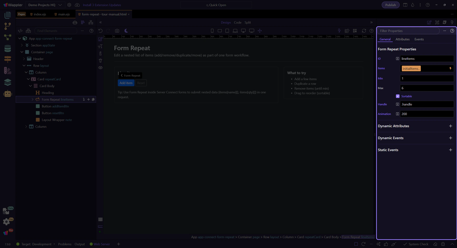
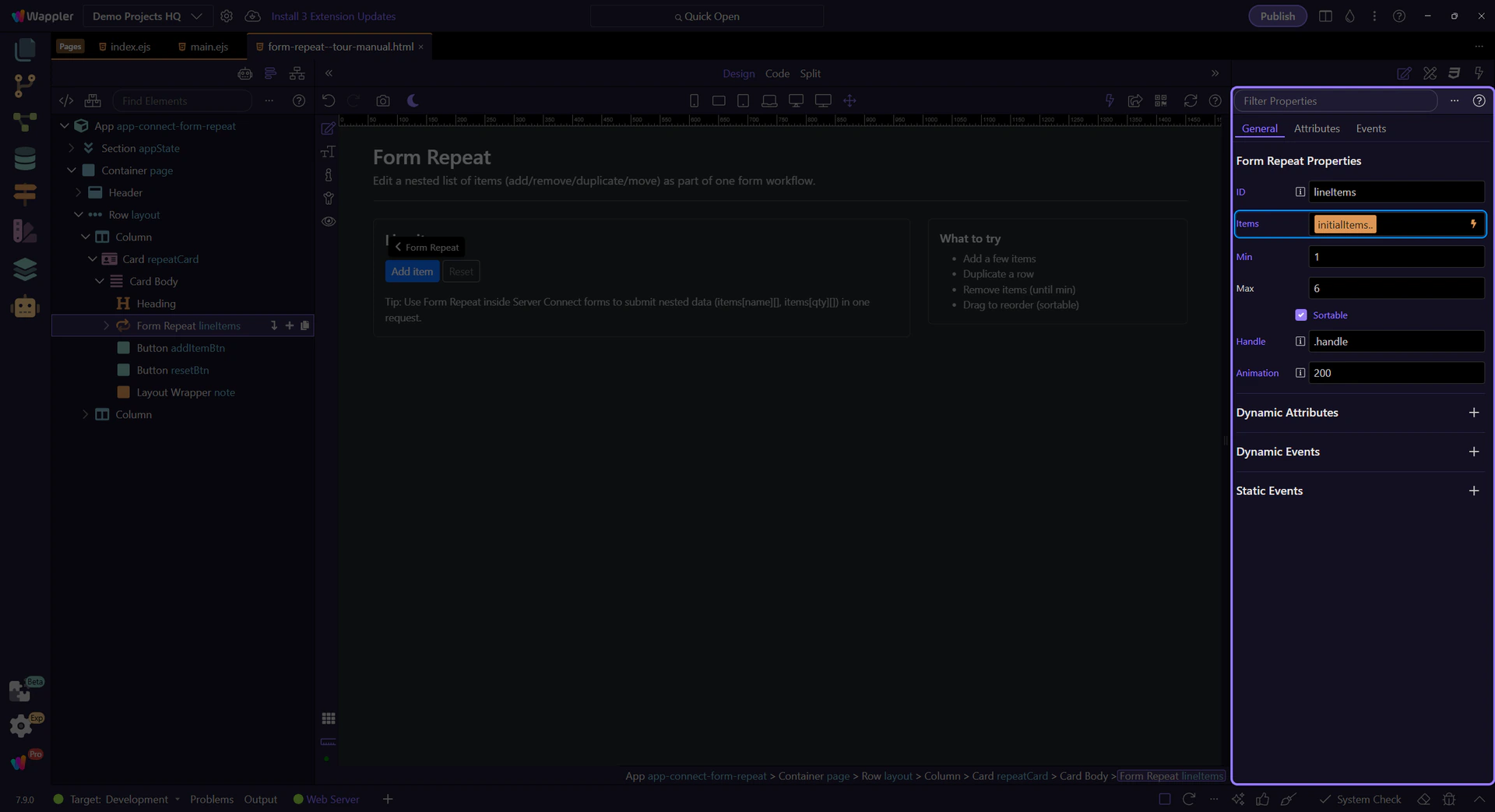
Items is bound to an array source. Each row gets its own scope (name/qty in this example). This step matters because Items (what repeats) is part of Selection Panels Properties Formrepeatitems, and understanding that context makes the next action easier to repeat in your own project.
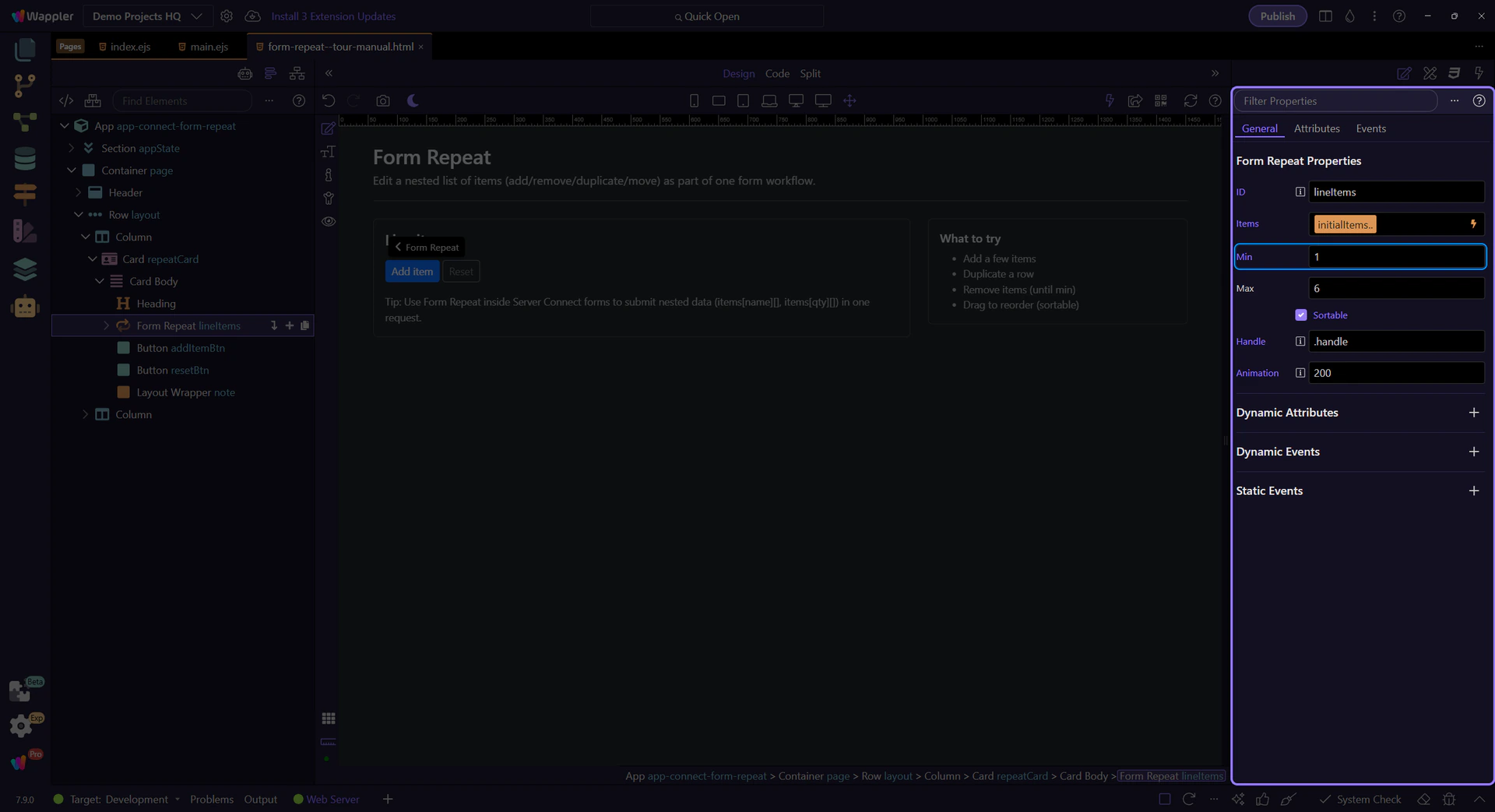
Min prevents removing rows below a required count. Use canAdd/canRemove to keep buttons in sync.
tip: Bind disabled to lineItems.canAdd / lineItems.canRemove so controls stay in sync with min/max.
Max prevents adding too many rows. Pair it with canAdd so the Add button disables at the limit.
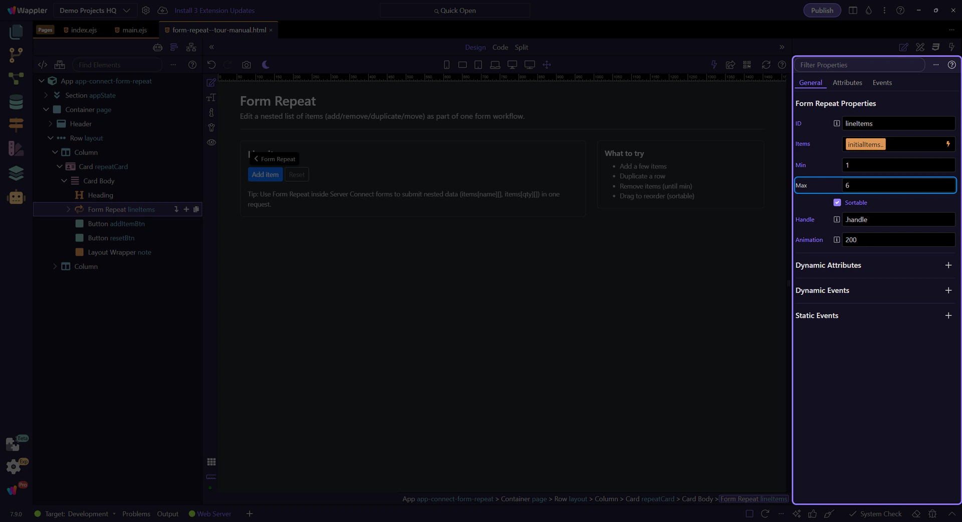
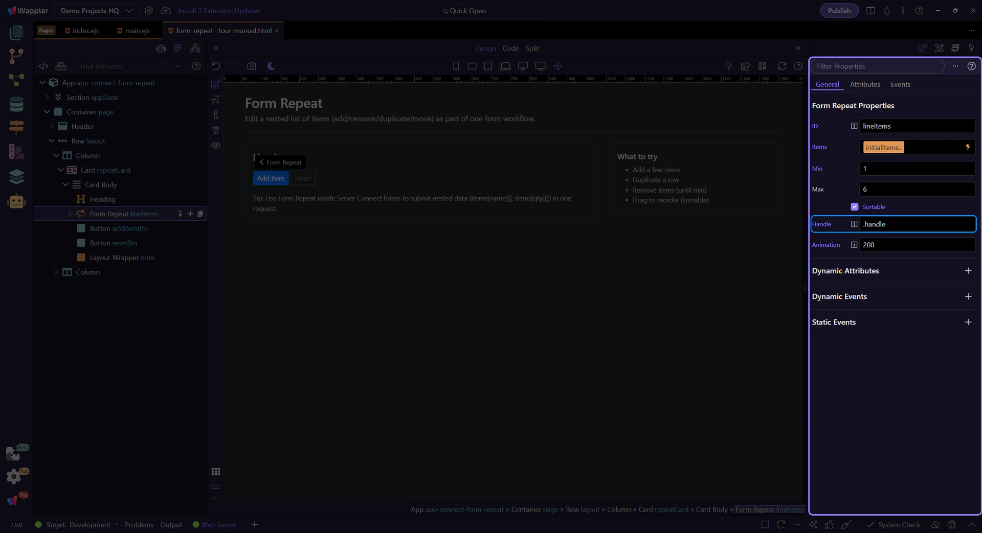
Enable sortable for drag reordering, and set a handle selector so only a handle can drag.
important: Use a handle (like .handle) so inputs remain easy to edit without accidental drags.

Handle is the CSS selector that defines the drag grip (so editing inputs doesn’t start dragging).
tip: In this page, the drag button uses the class .handle, so Handle is set to .handle.
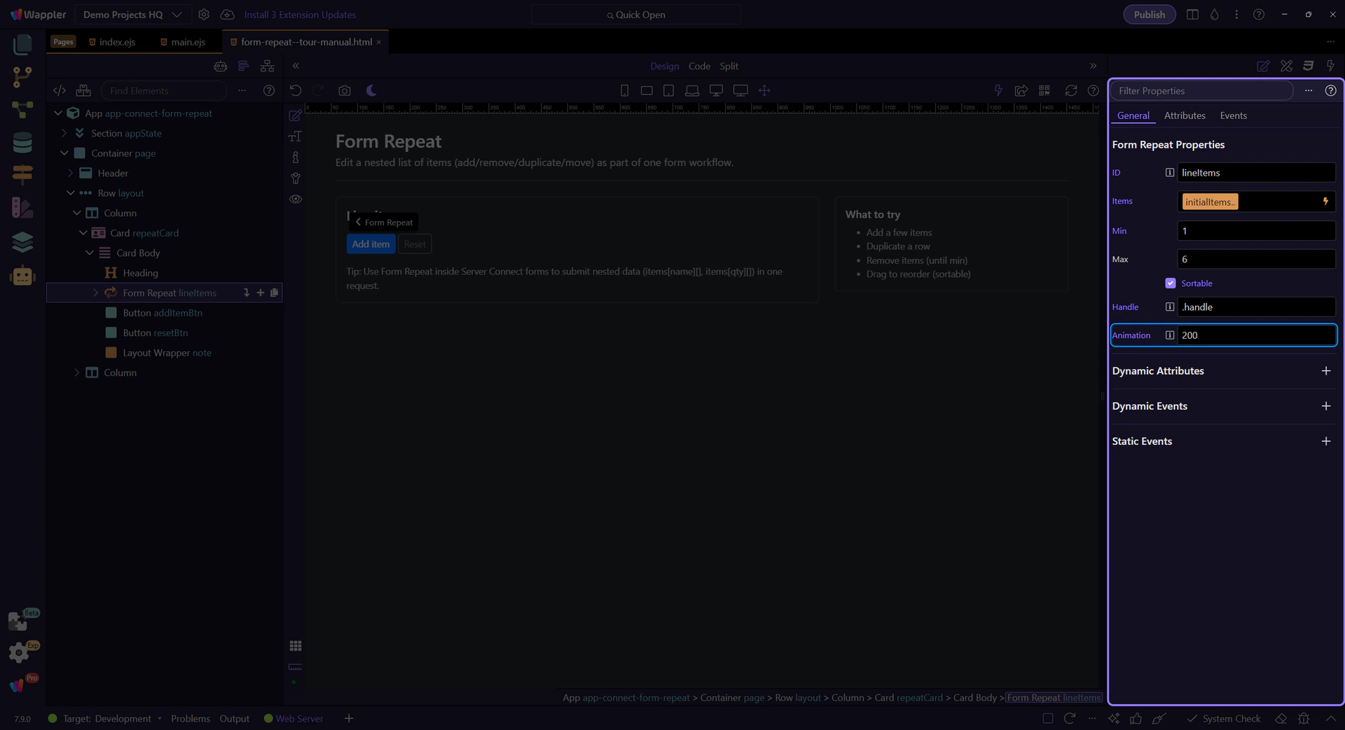
Animation controls how long the drag reorder animation runs (in milliseconds).
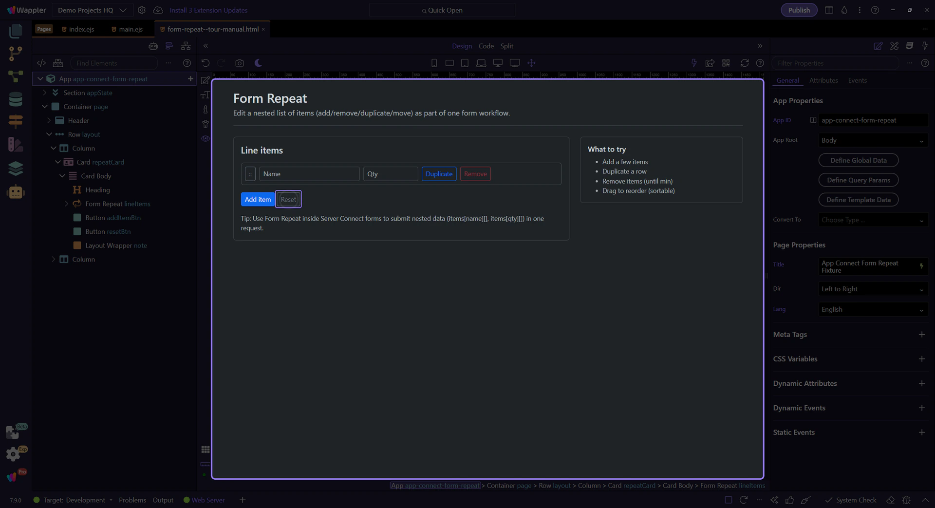
Form Repeat includes actions for adding, removing, moving, duplicating, and resetting rows.
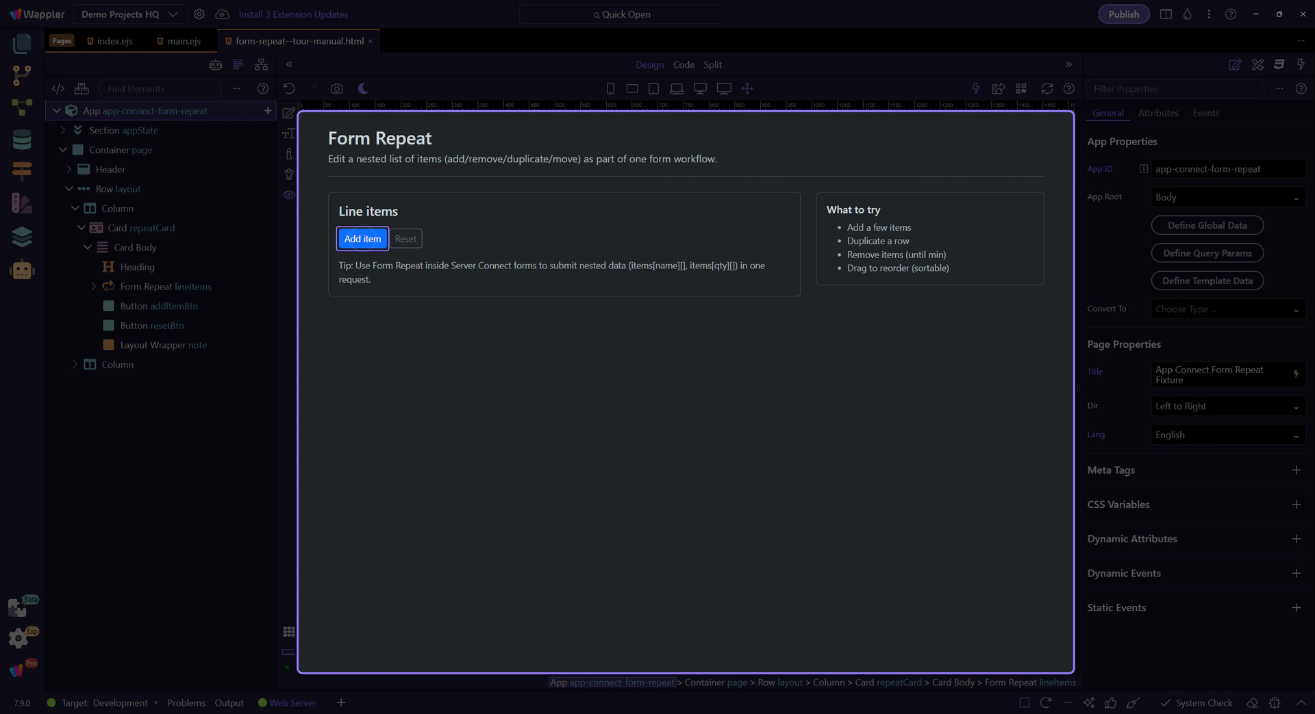
Attach these actions to button click events via the Actions Picker.

Listen to lifecycle events like added/removed/moved when you need to trigger follow-up logic.
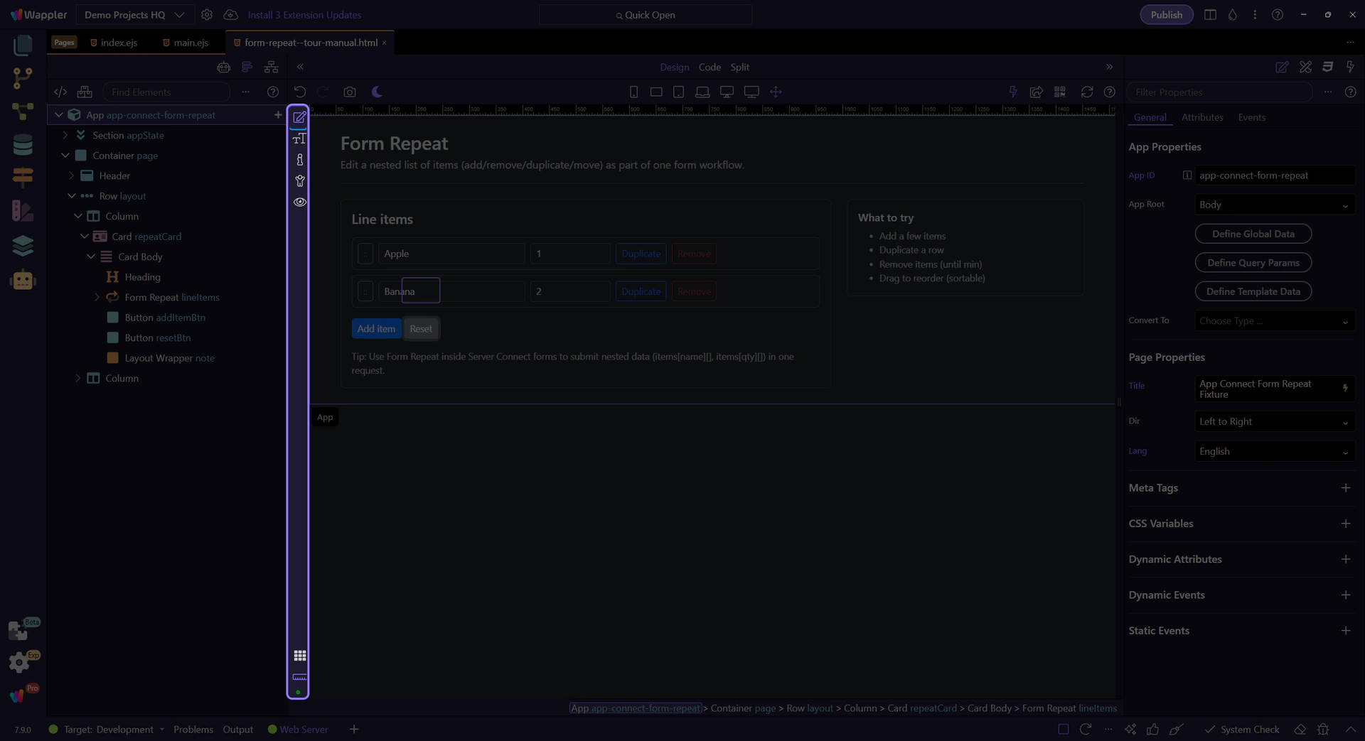
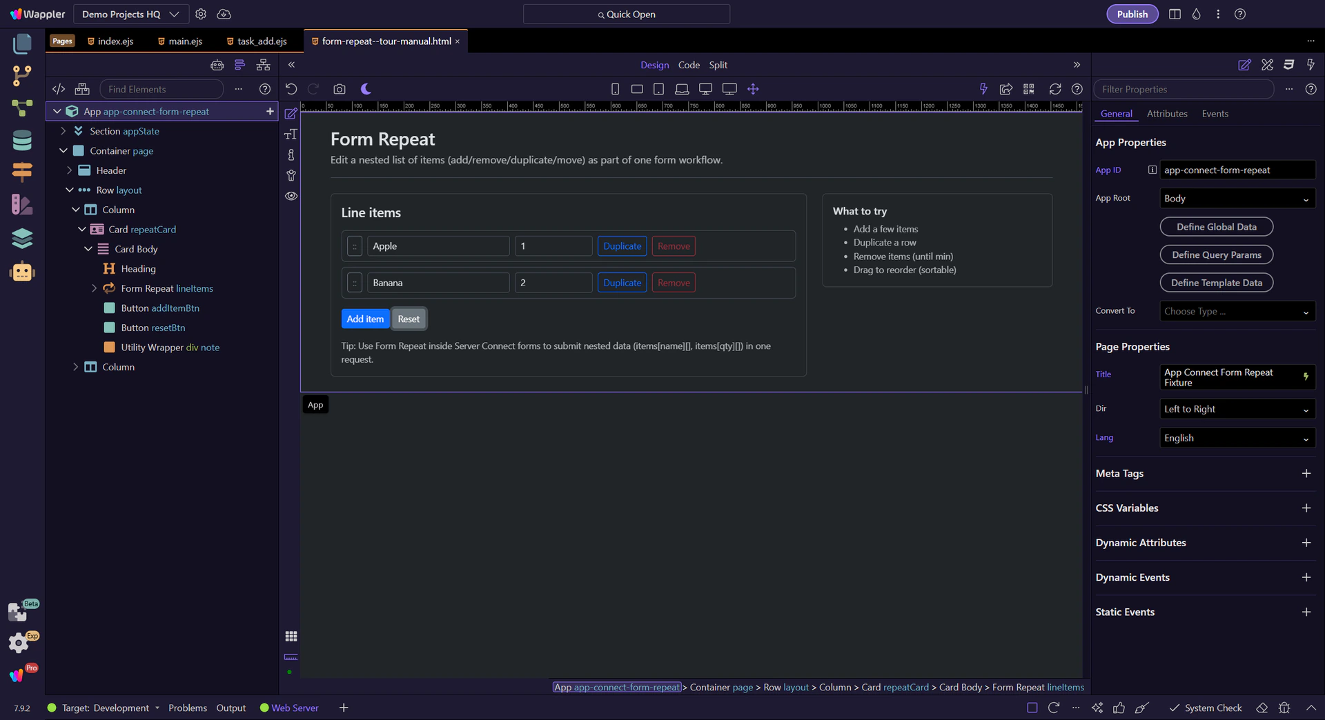
Switch to Preview mode and use the controls to add/duplicate/remove rows. This shows how repeat actions drive the UI.
Switch to Preview mode now so you can test the repeated form output live in the next step instead of only inspecting the configuration.
Wait for the page to finish switching modes.
We’ll click Add item to append a new row (until max).
Duplicate copies the row values into a new item.
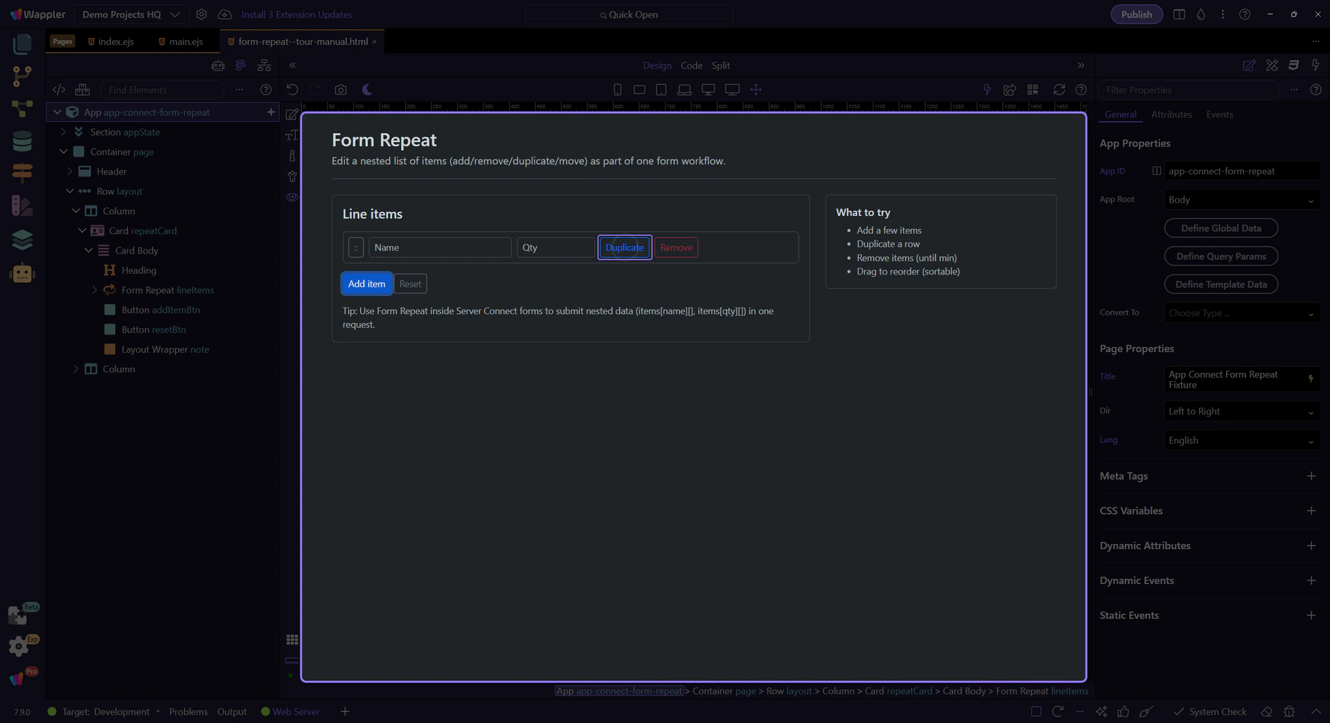
Remove deletes a row. When you hit min, the button disables via lineItems.canRemove.
Edit the Name/Qty inputs, then duplicate a row to see the values carry over.

Reset restores the original array so you can try again.
Return to Edit mode so you can keep refining the repeated form after checking the live result.
Next, connect the repeated fields to a Server Connect form for nested inserts/updates.
Pick a related tour to continue.
Client-side form validation: configure App Connect Validator and integrate with Bootstrap validation feedback and classes.
Demo Projects HQ already uses App Connect Validator on real forms, so there is no need to explain validation from an isolated sample. The new-task form combines required text fields, number rules, select validation, and Server Connect feedback in one page. This tour stays on that concrete form so you can see how validation rules, messages, and request-state feedback cooperate in an actual workflow.
This title field is a concrete validation example from Demo Projects HQ. It is required, it enforces a minimum length, and it keeps its guidance close to the field instead of hiding the rule somewhere else in the page.
With the title field selected, the Properties panel exposes the validation contract in one place: required state, value limits, and the messages that explain failures back to the user. That is the pattern to preserve as your forms grow.
The task form does not stop at a bare required flag. Demo Projects HQ also adds a minimum length and a matching message, which means the field can tell the editor both that a title is missing and that a one-character placeholder is not enough. That combination makes validation feel intentional instead of punitive.
Estimated hours uses numeric validation and a minimum boundary, with messages that explain both invalid numbers and values below zero. This is the same validator workflow, just applied to a different input type. The important point is that the field still declares its rules locally instead of depending on custom click handlers.
Project is not a freeform text box, but it still needs validation. Demo Projects HQ marks the project picker as required and supplies a clear message so the user understands why the task cannot be saved until a project relationship exists. That is a good reminder that Validator belongs on the whole form, not just on simple text fields.
The task form also shows success, request-state, and server-error feedback through task_form.data, task_form.state, and task_form.lastError. Client-side validation should stop obviously bad submissions early, but the complete user experience still includes request progress and server responses after the form is allowed to submit.
important: Do not treat Validator as a replacement for server-side checks. In Demo Projects HQ it works alongside the real submit action and its response state.
The Demo Projects HQ task form shows the validator pattern clearly: keep each field’s rules close to the field, pair them with plain-language messages, and let the form’s real submit state complete the feedback loop. That gives you a reusable baseline for every other App Connect form in the project.
Use App Connect formatters to transform values (date, currency, text, collections) using Wappler’s expression picker.
Formatters transform values for display and simple data manipulation, without changing the source data — applied visually via the expression picker.
A formatter is a method-like helper you chain in an App Connect expression (for example: text case, date formatting, currency). In Wappler you typically pick them from the expression picker.

Using formatters requires the formatter extension/component folder to be present (dmxFormatter). If you don’t see formatters in the picker, check your installed frameworks/extensions.
tip: In practice, Wappler project templates typically include the needed App Connect packages. Missing formatters often means a missing/disabled extension.

In Wappler, formatters are easiest to apply via the expression picker in any bindable field.
Look for fields with an expression/binding picker (Value fields, text bindings, filters, class bindings, etc.). That’s where you can apply formatters.
Use formatters to transform strings, numbers, dates, and collections right where you display them.

Avoid common mistakes and keep expressions readable.
Use the formatter names shown in the picker (lowercase/uppercase/titlecase, etc.) so you get valid results at runtime.
important: If something doesn’t appear in the picker, it’s usually not a valid formatter for that value. Prefer picking over typing.

If a value is a string but you need numeric/date formatting, convert first (toNumber/toDate), then format.

Formatters are great for display and small transforms, but avoid using collection filtering formatters as a replacement for real filtering and paging on large datasets.
warning: If you notice slow UI updates, move filtering out of the browser and into Server Connect or Data View.

Formatters help you keep data clean and UI readable — applied right where you display values.
Continue with validations or filtering.

Learn when Local Manager is the right persistence layer for Wappler UI state, and how to store settings that should survive reloads without going to the server.
This tour positions Local Manager as client-side persistence for everyday UX settings. You will look at what kinds of data belong here, how Wappler reads and writes those values in bindings and actions, and where the limits and security boundaries are.
You are not just learning that local storage persists data. You are learning the decision rule: use it for convenience settings and cached UI preferences that should remain on the same browser, but never for secrets or security-sensitive state.

Local Manager can store complex objects; they’re serialized/deserialized automatically.
important: Local storage is readable by client-side code. Don’t store secrets or tokens here.

Bind UI to local values, and update them on events.
Use local.set(key, value) to persist a setting, and local.remove/removeAll to reset.

Use local.key in expressions to set classes, default values, and visibility.
Bind form controls to local values and save changes with a single submit action.
Next, decide whether your state belongs in local/session/cookie or in the URL.
Pick a related tour to continue.

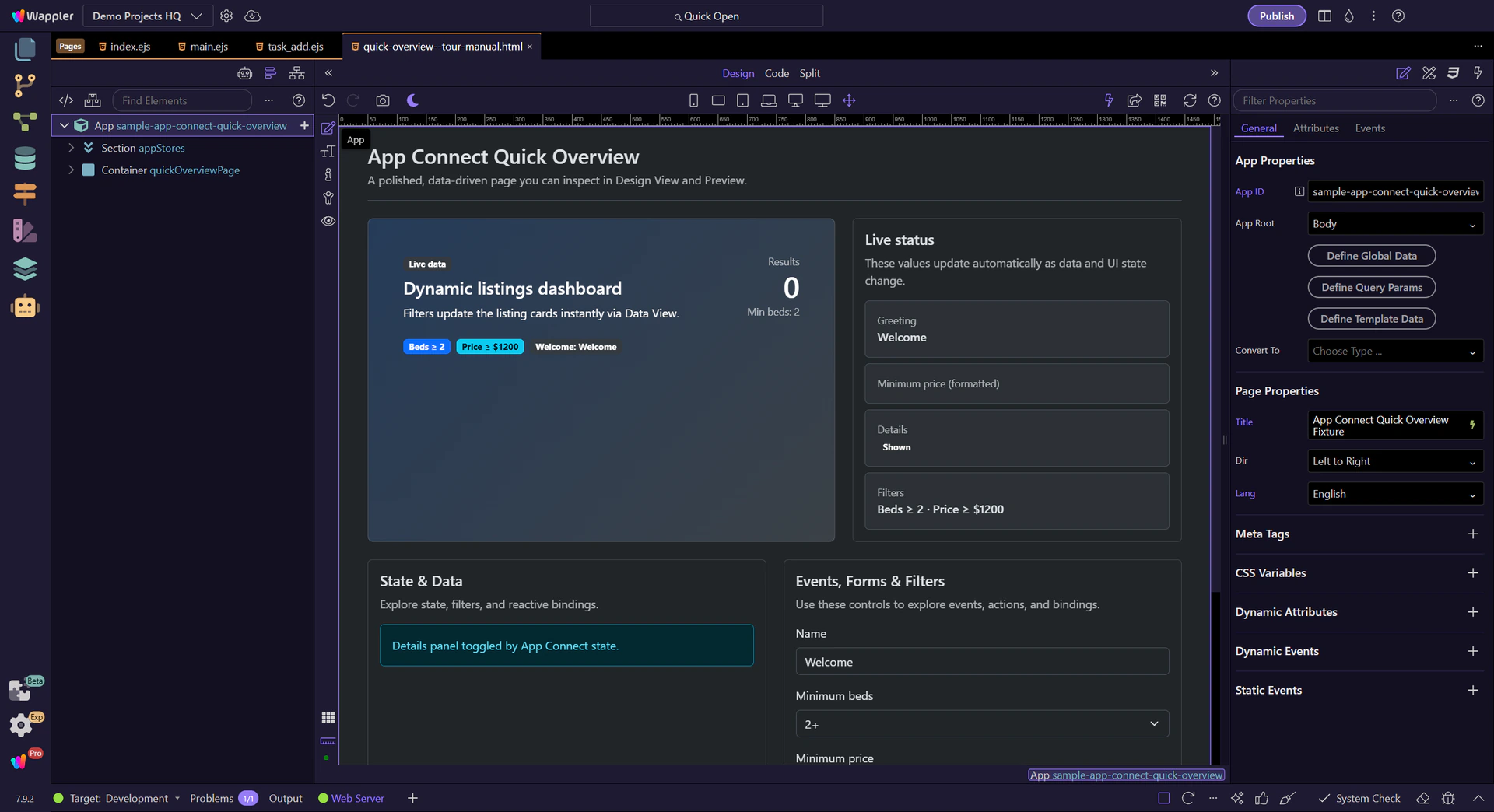
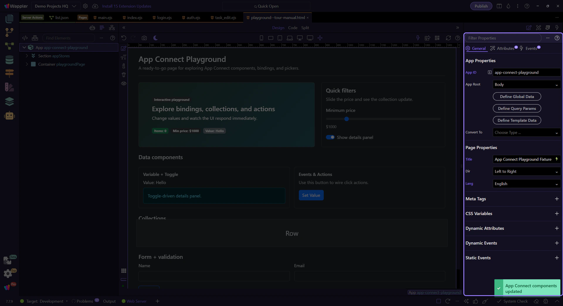
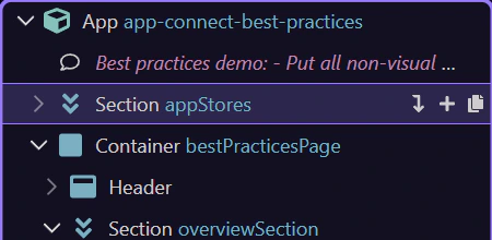
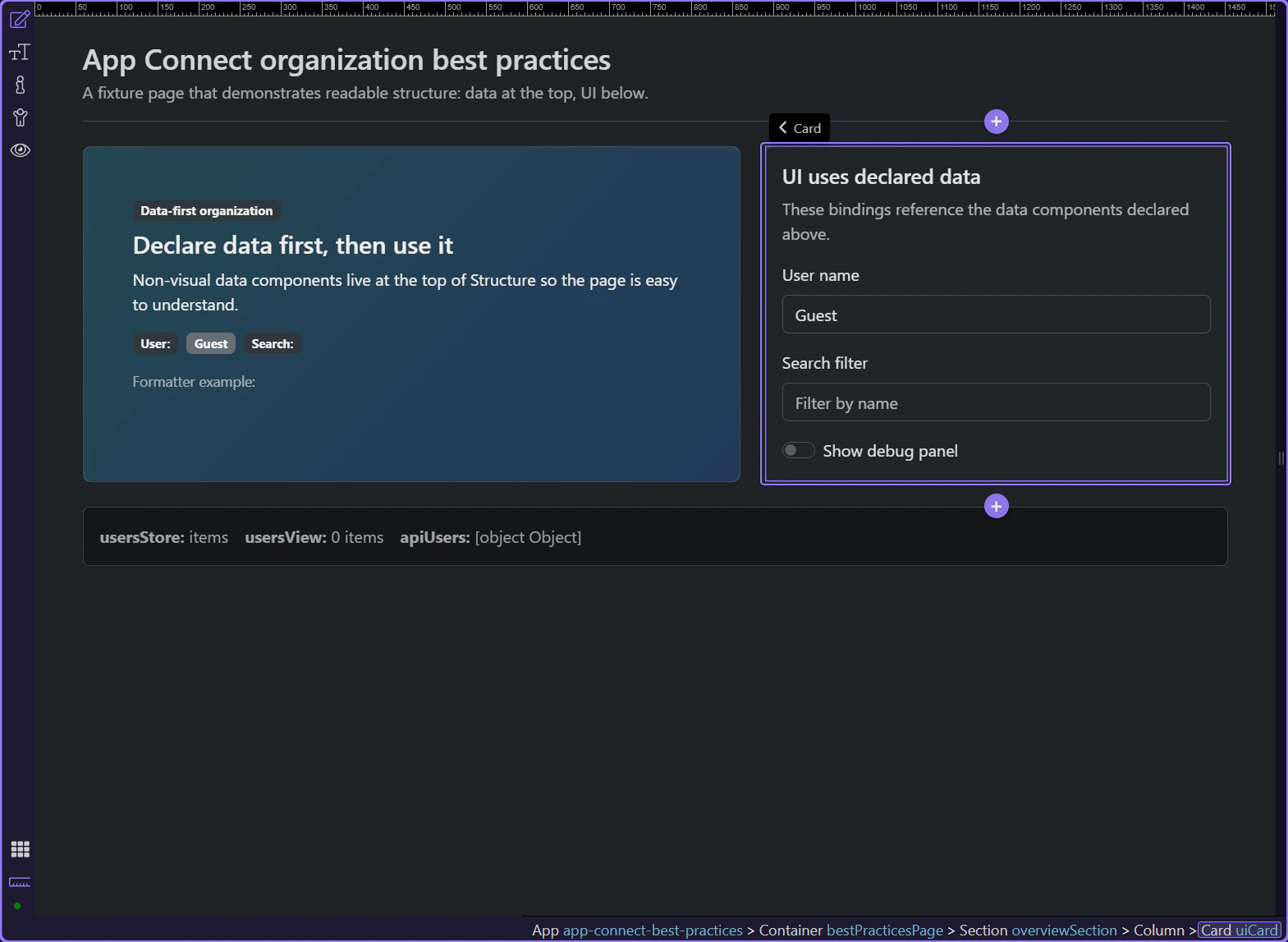
Keep App Connect pages readable and fast: organize non-visual data components (Variables, Data Stores, Server Connect) at the top, named and grouped before UI usage.
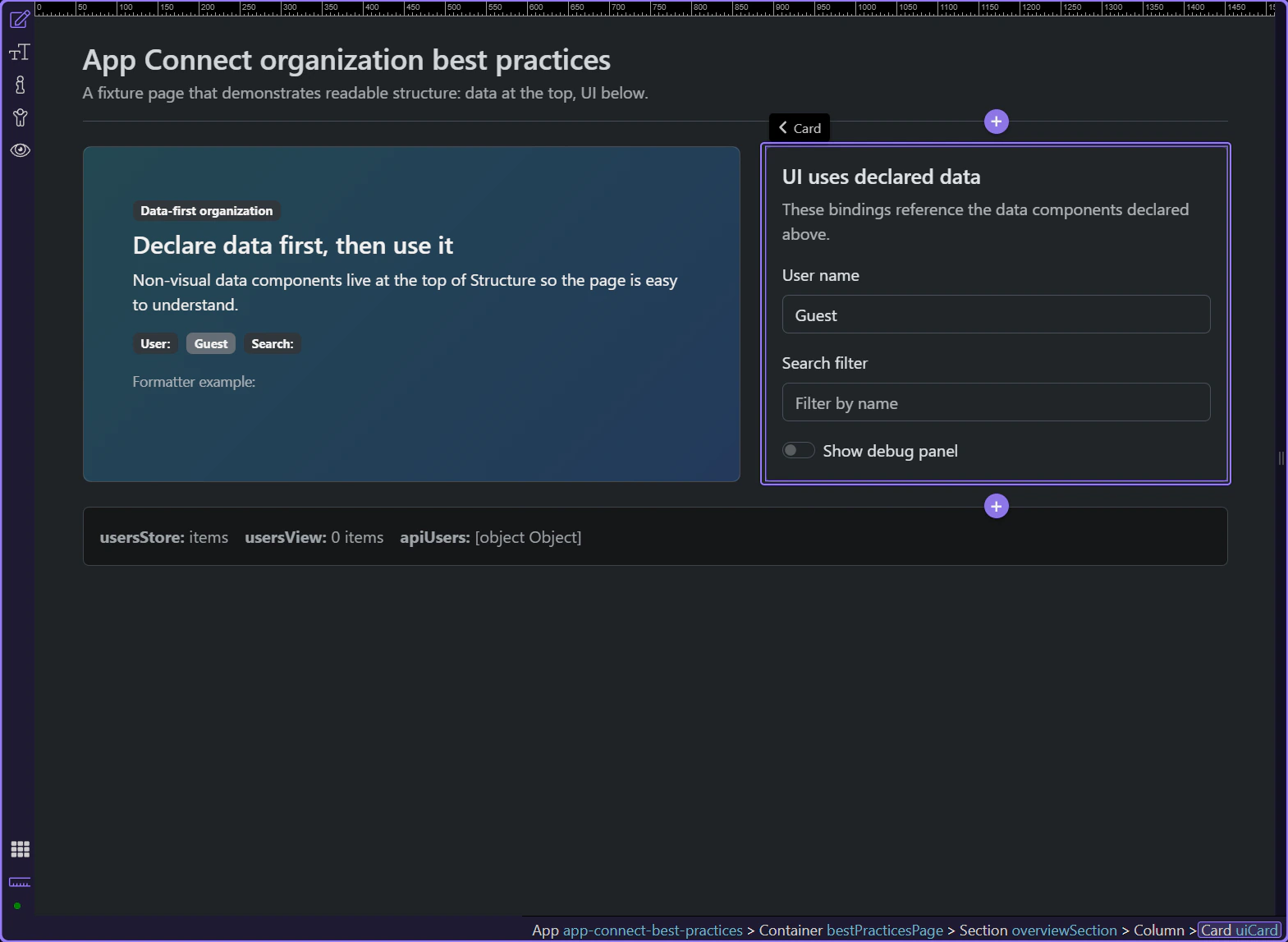
This tour opens a deliberately organized App Connect page so you can inspect the pattern directly in Wappler: non-visual data components first, UI below, and only one place to look when you need to understand where a binding comes from.
The page shows the organizational rule in one glance. The hero explains the data-first approach, and the card on the right consumes those values through bindings. That is the first best practice: the page should make it obvious that data is declared before the UI starts using it.

This card is useful because it shows the page behavior that Structure has to support: text inputs and a toggle reference named App Connect values instead of hiding state in ad hoc code. The layout already tells you what belongs in the data layer and what belongs in the UI layer.
Once the page is open, Structure should let you scan state, collections, and API sources before you inspect any visual section.
This top section gathers the page’s non-visual pieces in one place. That makes the dependency chain easy to read: state values first, then collections derived from those values, then server-side sources.
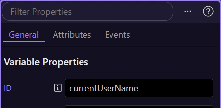
Selecting a value like currentUserName makes the naming rule concrete. Good IDs explain what they hold and read naturally in expressions, which is why currentUserName.value is easier to maintain than a generic value1.value.
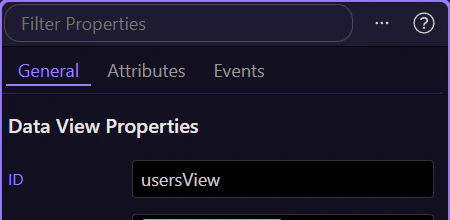
The Data View belongs near the Data Store because it is the readable layer that filters, sorts, or pages that collection. When those two sit together in Structure, it is much easier to see where a list comes from and where to adjust the filtering rule.
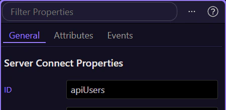
This Server Connect component is easy to find because it stays in the data layer instead of being buried inside a card or repeat region. That is the practical rule: centralize API sources so UI sections bind to the result instead of creating duplicate requests all over the page.
A good structure is not just tidy. It also makes bindings easier to trace and optional UI easier to render efficiently.
This badge is a good reality check for the whole pattern. When you select it, the Properties panel shows the binding that reads from the named value you just saw in the data layer, so the page stays understandable without hunting through unrelated sections.
This debug panel is the concrete performance example on the page. It only exists when the debug toggle is enabled, which is the right pattern for optional or heavier UI: keep shared data at the top, but place conditional-only regions behind a real conditional so they are not always rendered.
This example page gives you the practical rule set. Shared state and shared collections stay at the top. A Data View owns interactive reshaping of a collection. Conditional-only UI stays behind a conditional region. And very large datasets should still be filtered or paged on the server instead of forcing the browser to do all the work.
important: Use Data View for client-side filtering, sorting, and paging of manageable datasets. For very large datasets, filter and page in Server Connect and return only what the UI needs.
You now have a concrete data-first App Connect layout to reuse: declare and name non-visual state first, keep related collections together, centralize API loaders, and let optional UI own its own rendering cost.
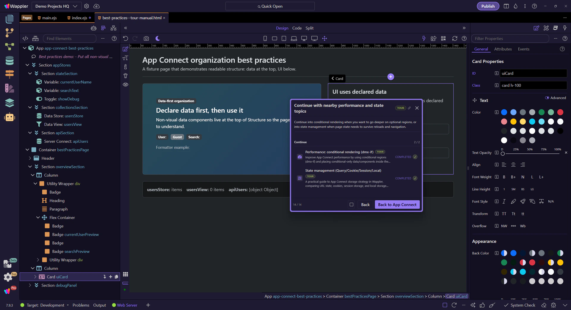
Continue into conditional rendering when you want to go deeper on optional regions, or into state management when page state needs to survive reloads and navigation.
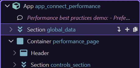
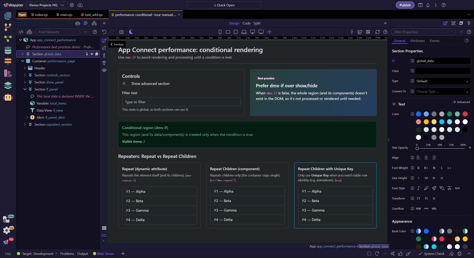
Improve App Connect performance by using conditional regions (dmx-if) and placing conditional-only data/components inside them so they don’t render or process until needed.
This tour uses a focused example page to explain a practical App Connect performance decision: when to avoid rendering work entirely instead of merely hiding UI. You will compare conditional regions with show/hide behavior, then connect that choice to component scope, repeated DOM cost, and page readability.
Improve performance by rendering less: use conditional regions (dmx-if) for UI that depends on a condition, and place conditional-only data/components inside that region so they don’t exist until the condition becomes true.
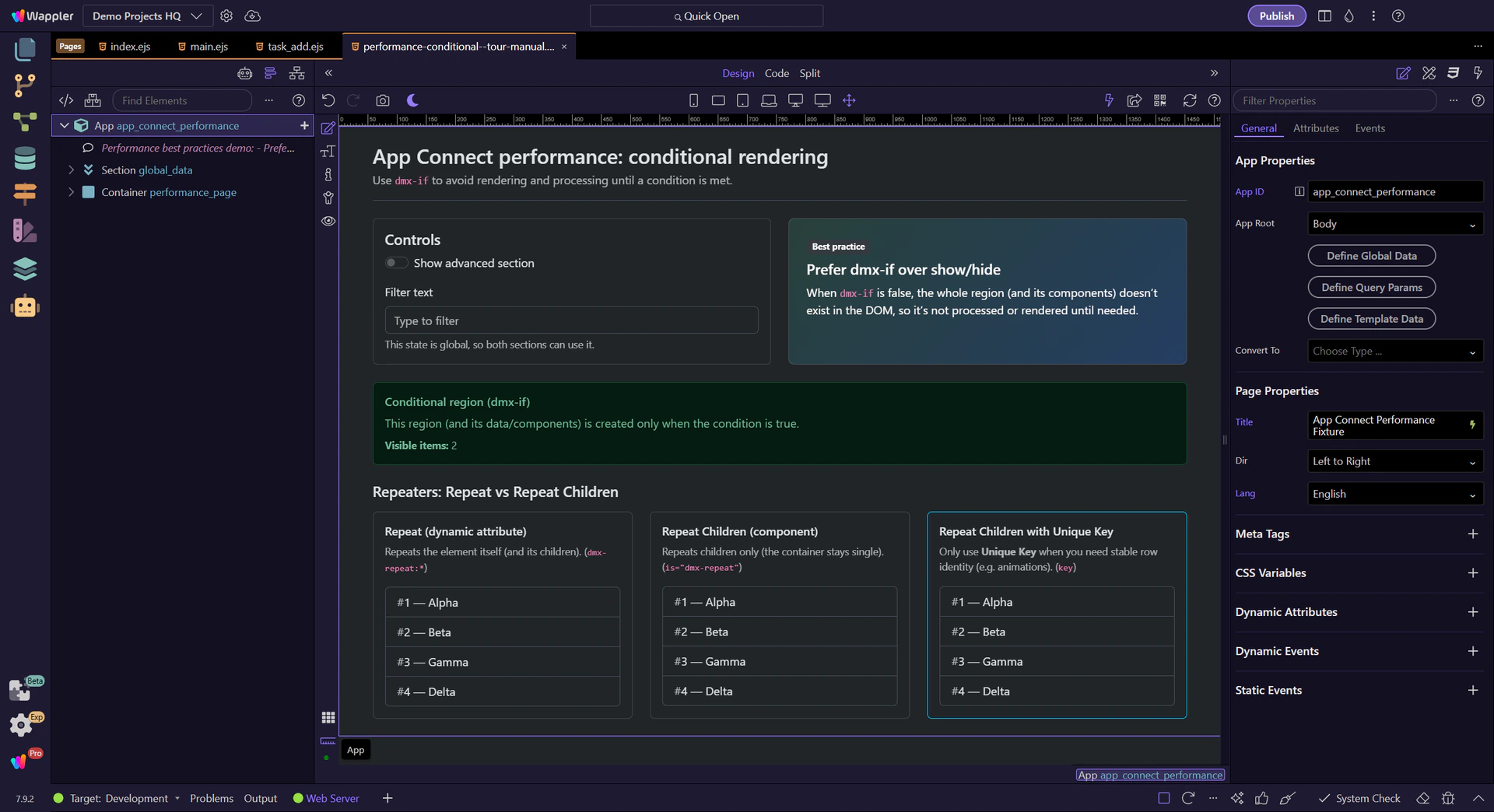
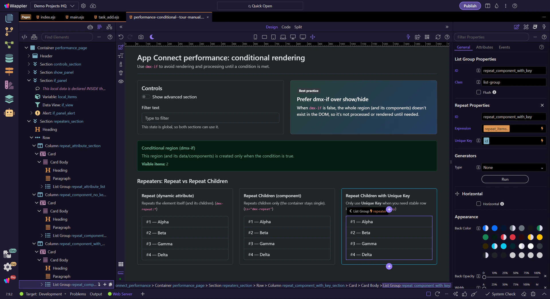
Repeaters can generate a lot of DOM. Prefer the simplest repeater that matches your layout, and only set Unique Key when you truly need it (it slows down the repeater).

Understand why dmx-if is recommended for performance and how it changes what gets rendered.
Use a Conditional Region (dmx-if) when a part of the page depends on a condition or isn’t needed right away.
important: Best performance: use Conditional Region (dmx-if) for conditional UI, not Show/Hide dynamic attributes.

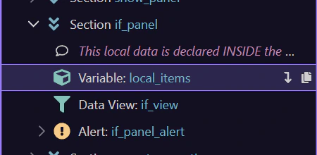
This section uses a Conditional Region (dmx-if), so it only exists when the condition is true.
If a Data View, Data Store, or Server Connect component is used only inside a section that’s shown conditionally, declare it inside that Conditional Region (dmx-if) so it isn’t processed until needed.
tip: When the condition is false, the Conditional Region and its child components don’t exist at all.
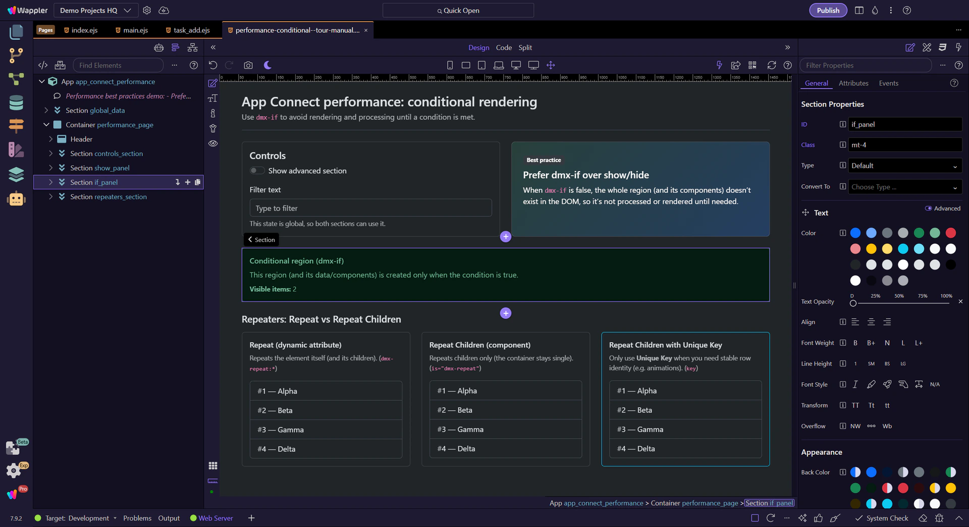
This section uses the Show dynamic attribute (dmx-show), so it stays in the page structure and its child components exist even when hidden.
warning: Show/Hide dynamic attributes are visibility toggles (CSS). They do not prevent rendering/processing of the region’s components.
This data component lives inside the Conditional Region. Keeping conditional-only data/components inside a Conditional Region (dmx-if) avoids always-on work.
tip: Rule of thumb: global for shared page-wide state; local for conditional-only sections.
Shared state and data that multiple regions use can stay at the top for readability and reuse.
Repeaters can generate lots of DOM. Learn when to use each repeater style, and when to avoid the key field for better performance.
Repeaters can create many DOM nodes. Choose the simplest repeater that matches your layout needs.
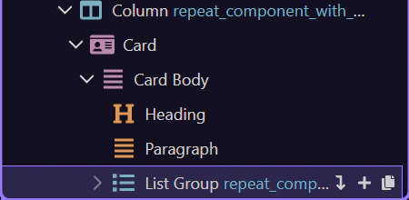
This example uses Repeat (dynamic attribute). It repeats the element itself. Great for simple repeated elements, but can lead to extra wrapper DOM if you repeat large containers. (dmx-repeat:*)
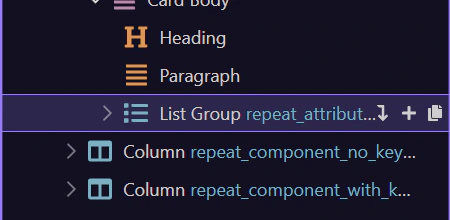
This example uses Repeat Children (component). It repeats only the children, so your layout container stays single and clean when building grids/cards. (is=“dmx-repeat”)
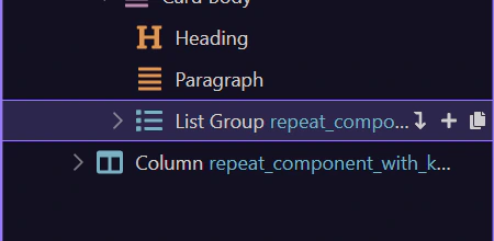
This Repeat Children repeater sets a Unique Key. Only do this when you need stable row identity (animations, or DOM identification).
warning: Choose the unique key field to identify the repeater’s record. Only needed when you want to use animations or need to identify repeater’s rows in DOM. Do not use if not needed as it will slow down the repeater.
Review what you did and choose a next tour.
Pick a related tour to continue.
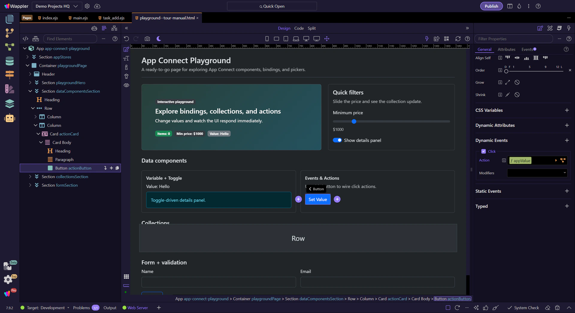
A hands-on intro to App Connect in Wappler: review key components, configure Properties, and attach an event action.
App Connect makes pages reactive by connecting UI to data and events. You build it visually with components + Properties.
App Connect is a reactive layer: components hold data, UI reads that data, and events trigger actions that update data. When data changes, the UI updates automatically.
important: Use Wappler’s Data Bindings Picker and Actions Picker to select data and actions from a tree. This keeps your bindings consistent with what’s in scope.

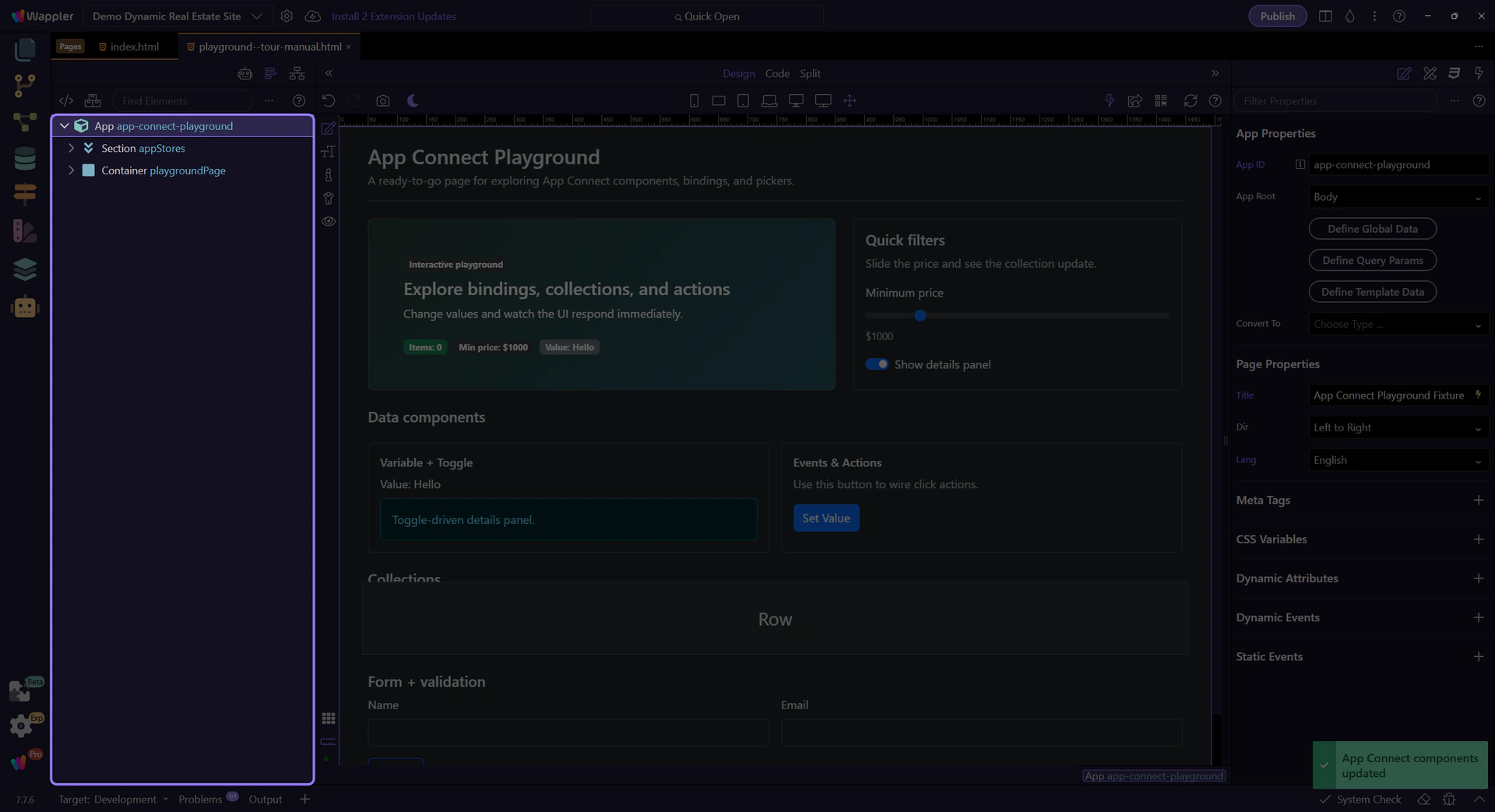
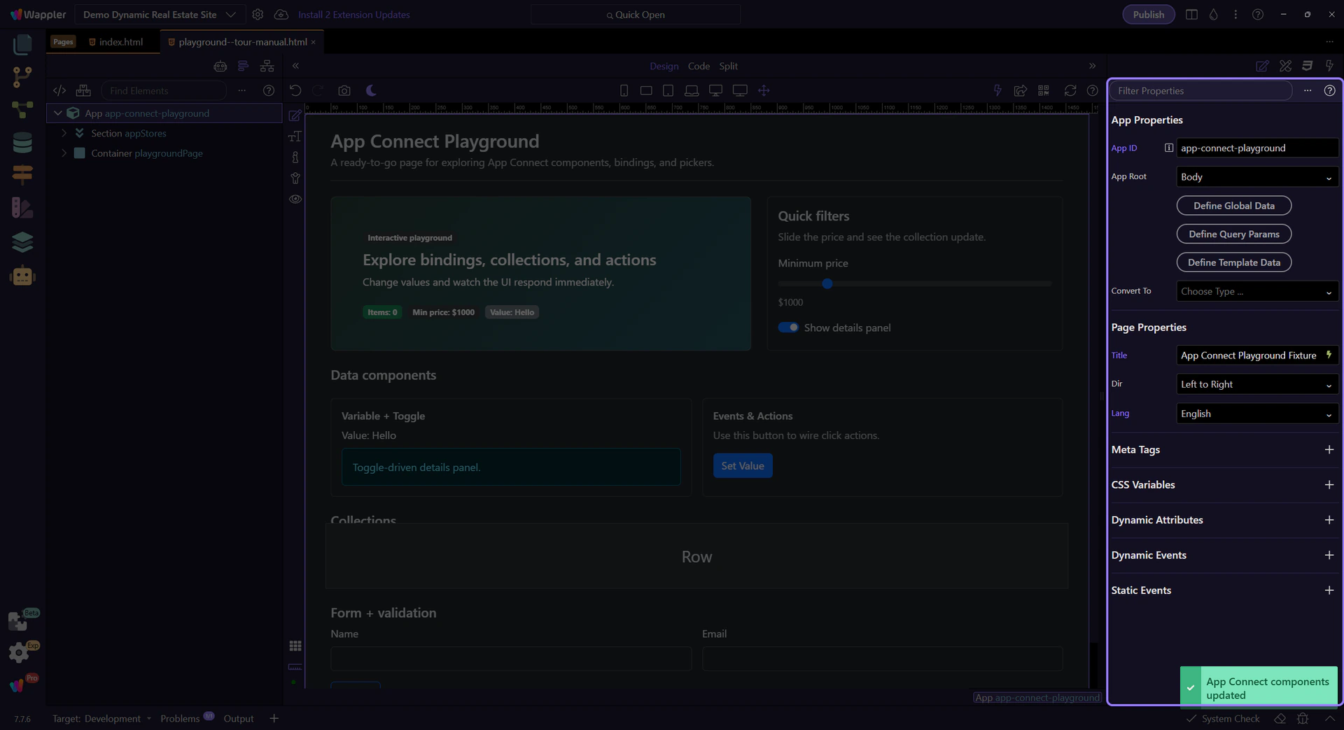
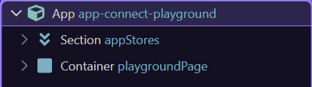
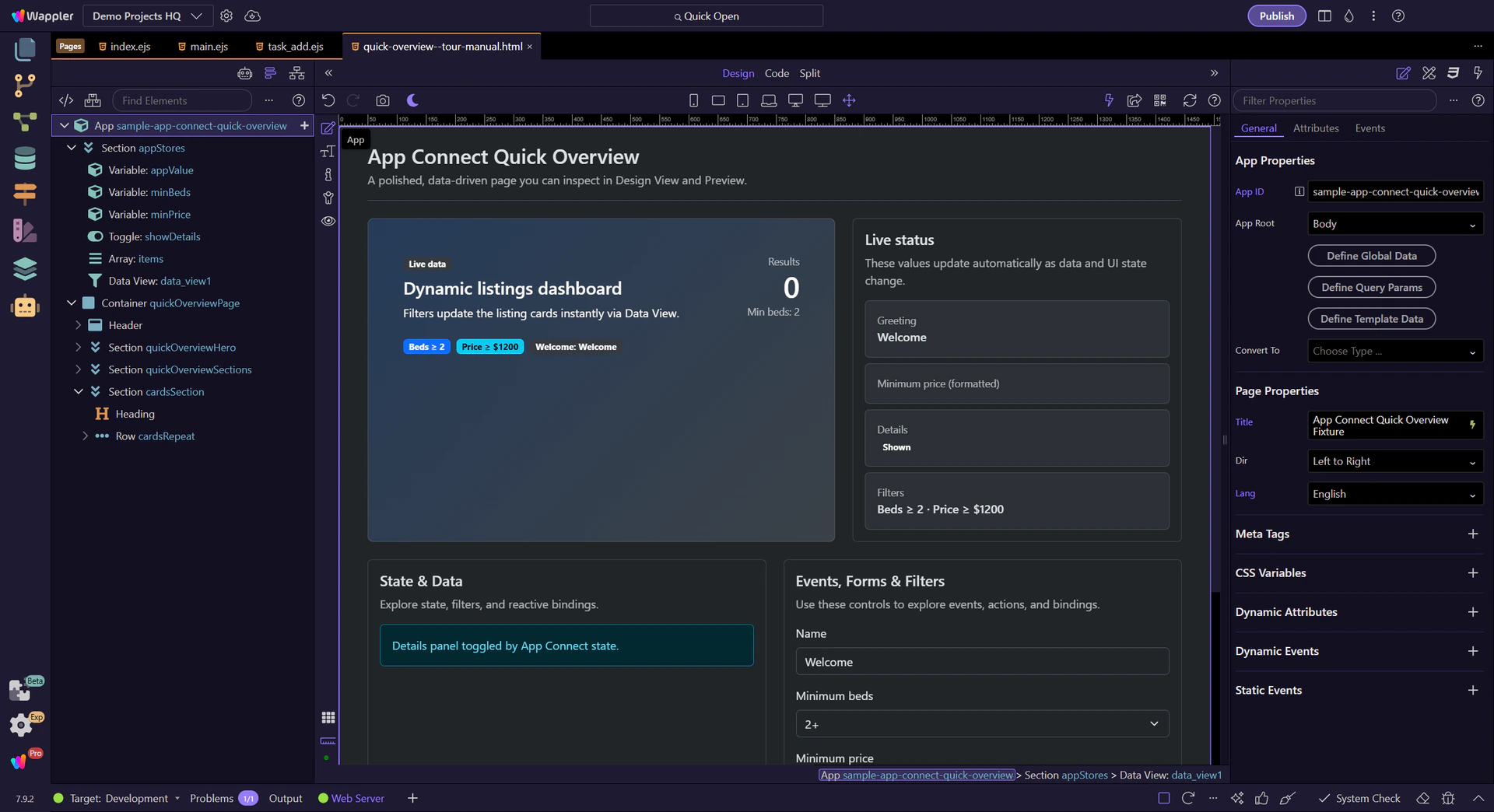
This tour opens a sample App Connect page in Design View. Keep Page Panels (Structure) and Selection Panels (Properties) visible.
Start with a simple text binding and see how currency formatting works. Next, inspect the repeater’s repeat expression, then open the Visual Expression Builder used by the Data View filter. Finally, review a Show/Hide binding.
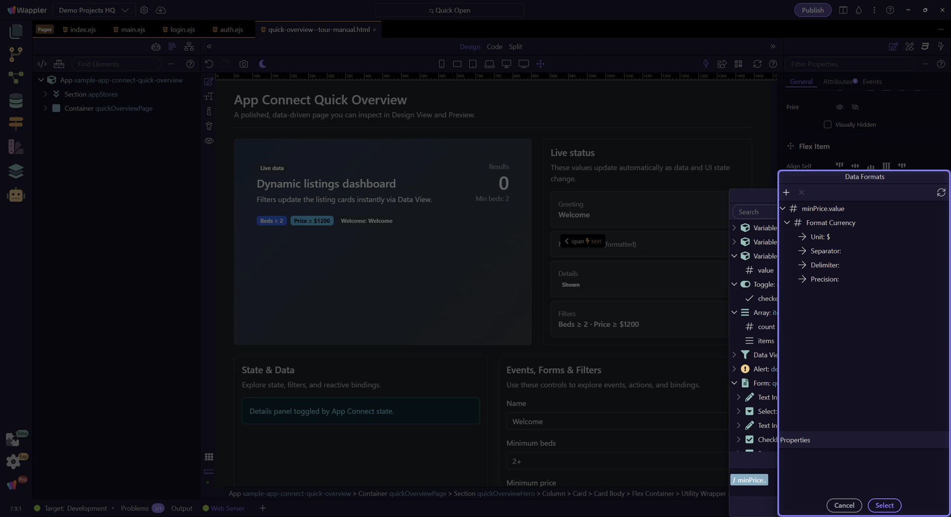
This value uses a binding expression that formats as currency: minPrice.value.formatCurrency('$').
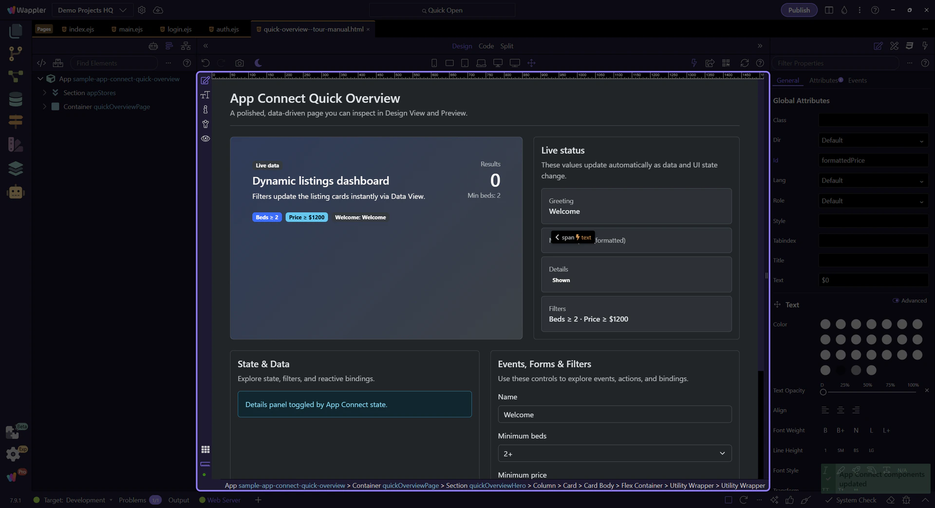
Start with the wider context in the Properties panel so the next control makes sense in the full workflow. In the next step, you will focus on Text binding expression and see how it fits into this area.
This field contains the expression for the selected element. This step matters because Text binding expression is part of Selection Panels Properties Innertextvalue, and understanding that context makes the next action easier to repeat in your own project.
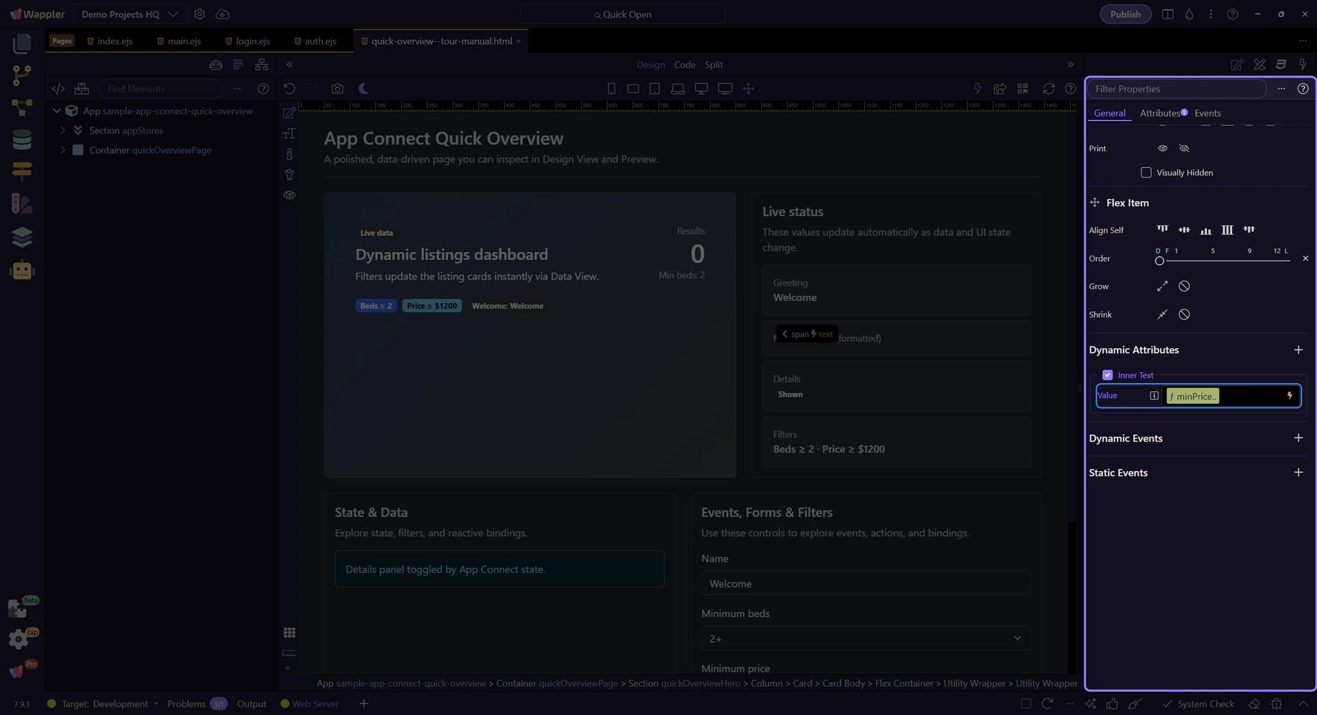
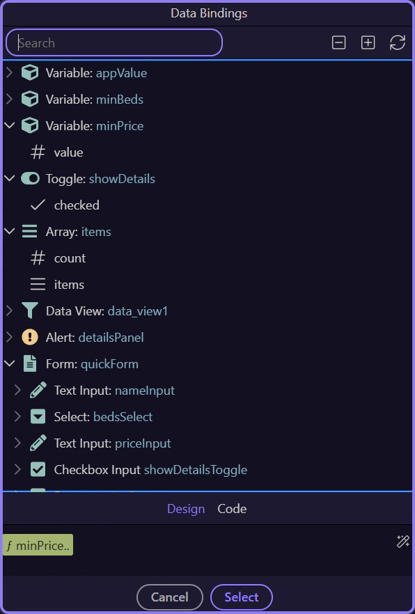
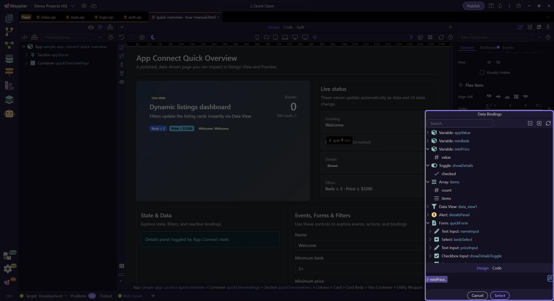
We’ll open the Data Bindings Picker so you can browse what’s in scope and insert valid expressions without typing everything.

Browse what’s in scope for this field. Since the current expression uses minPrice.value, you should see minPrice (Variable) and its value here.
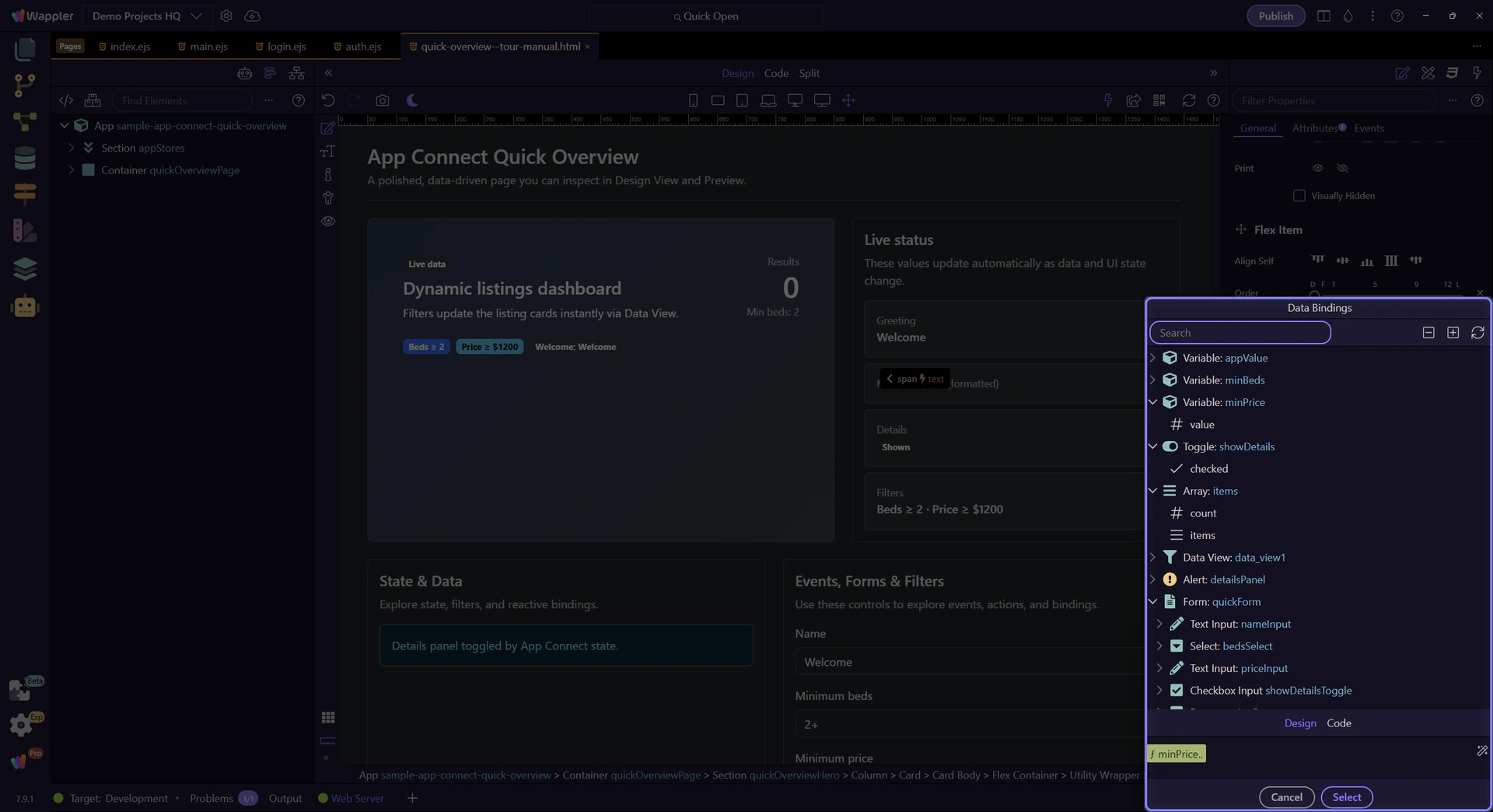
In the tree, expand minPrice and select its value. That’s the value being formatted as currency in the field.
note: Scope matters: the picker only shows data that’s valid for the current selection.
The formatter button applies to the active tag. We’ll focus the expression tag so formatting targets the right expression.

The formatter opens from this control so the flow can move from a raw price binding to a readable display format. The next steps stay inside the formatter popup and show how the final formatting chain is assembled.
The Data Formatter lets you build a formatter chain (pipeline) visually and insert it back into the field.
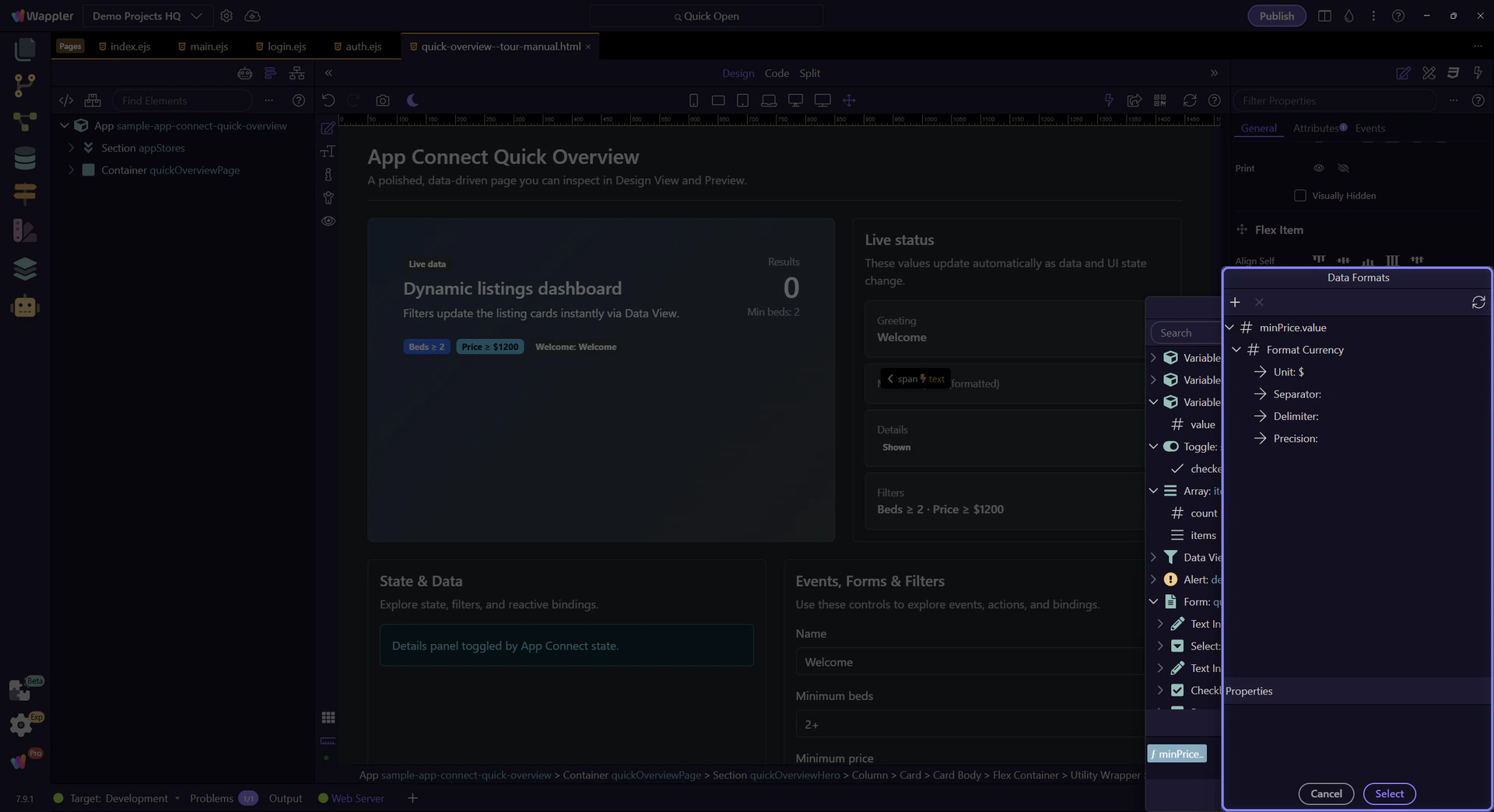
This tree represents your formatter chain. Select a formatter to edit its settings in Properties.
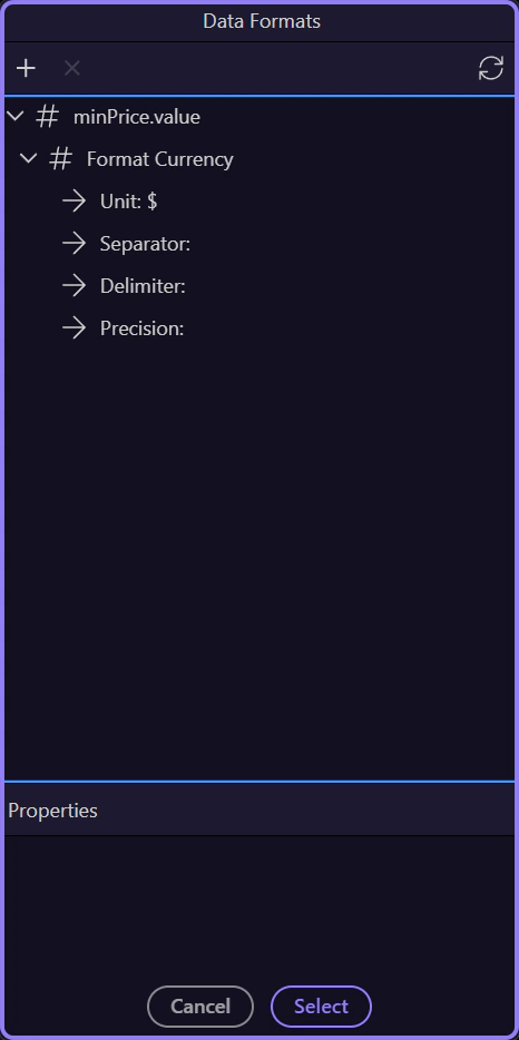
These properties matter because the selected formatter changes the final output, and the next step closes the popup after you understand that effect.
Close the formatter once you understand the chain so you can return to the picker and continue the broader App Connect flow.
Close the Data Bindings Picker to return to Properties. This step matters because Close Data Bindings Picker is part of Popup Databindingspickup Button Cancel, and understanding that context makes the next action easier to repeat in your own project.

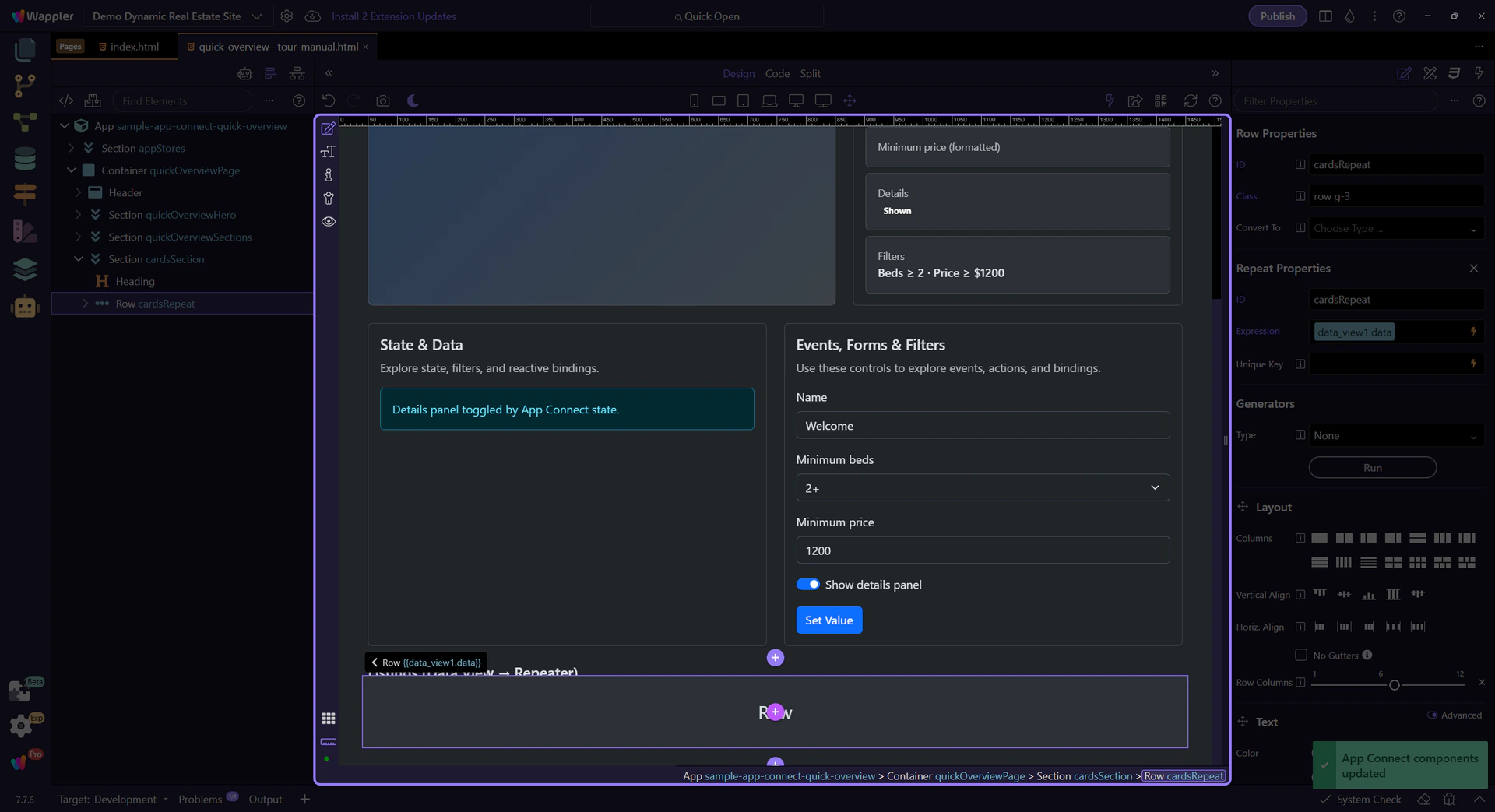
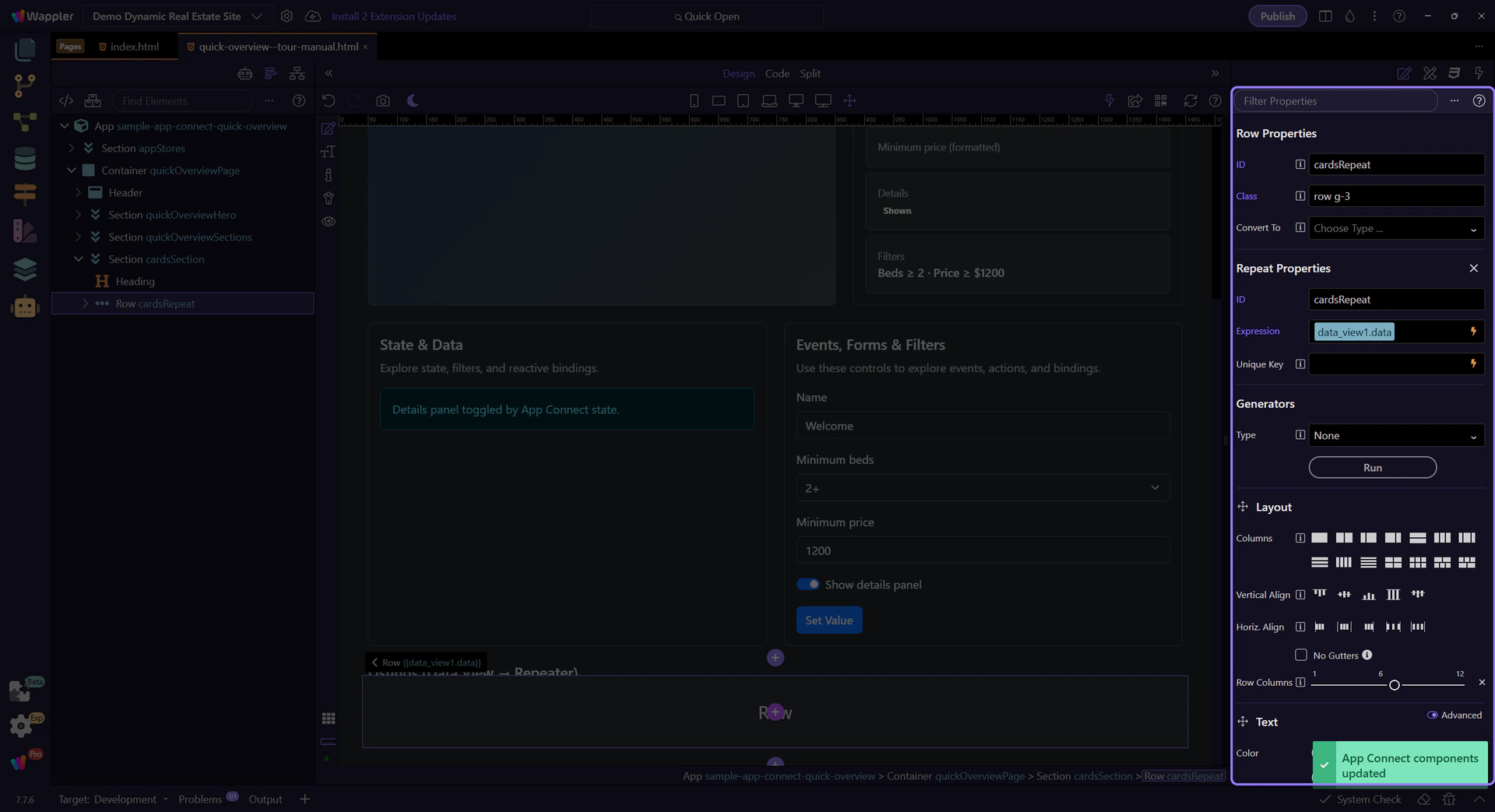
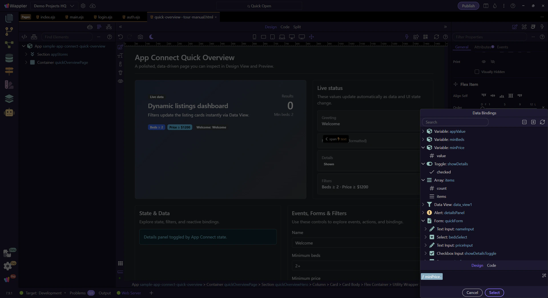
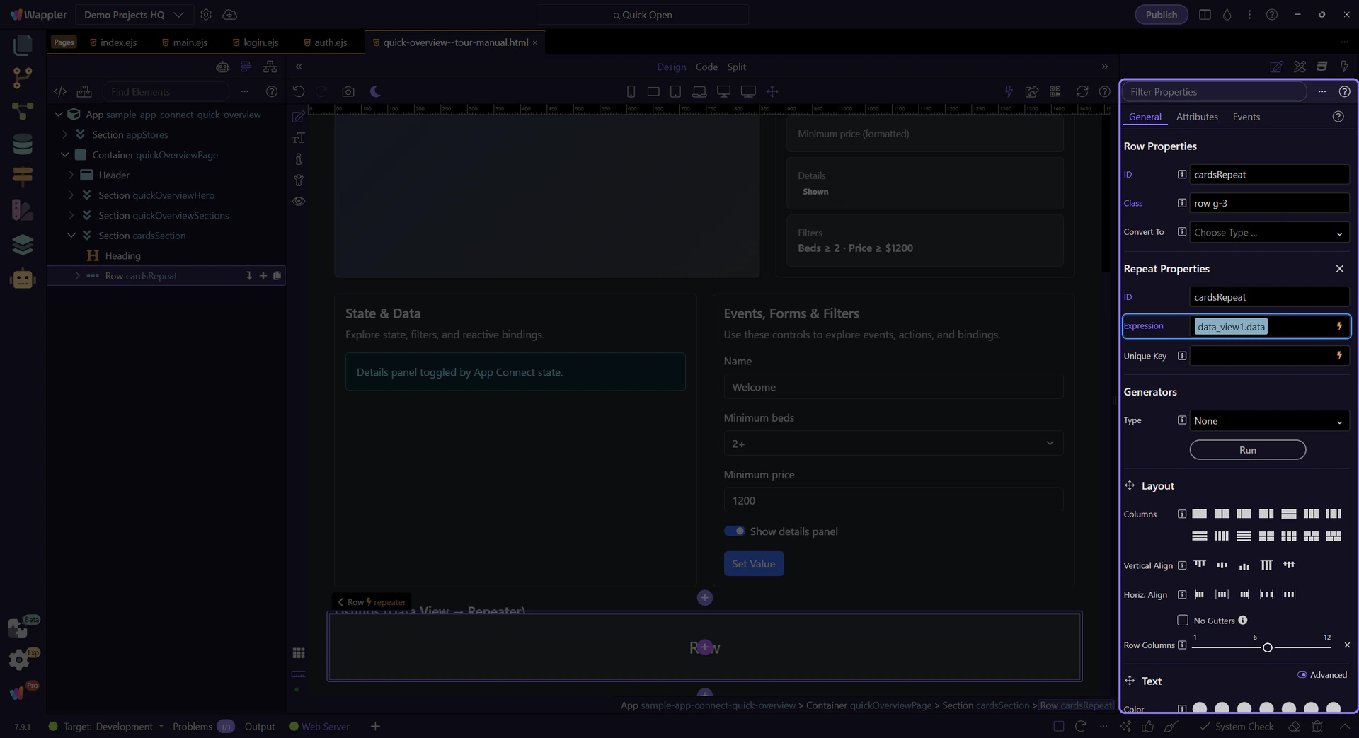
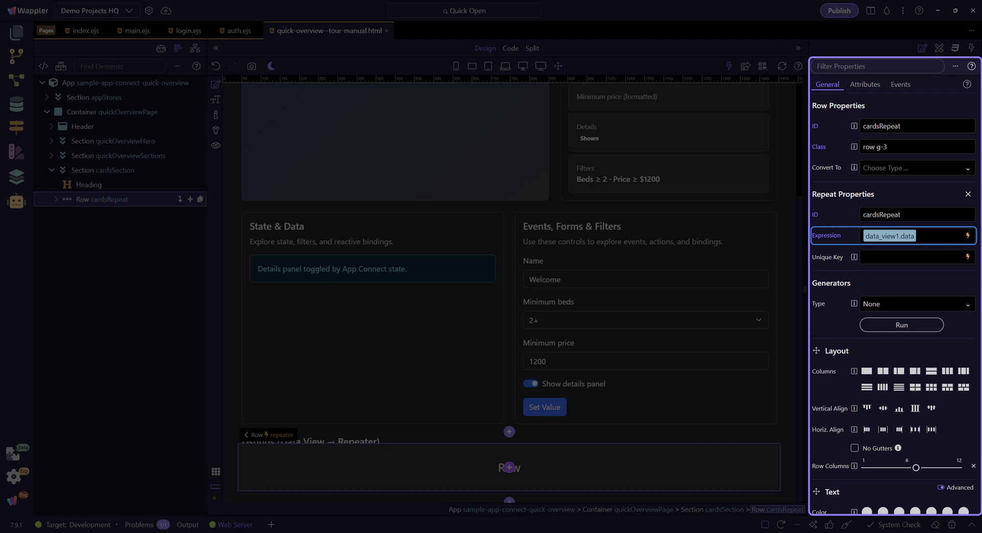
The repeater displays the Data View results as cards.
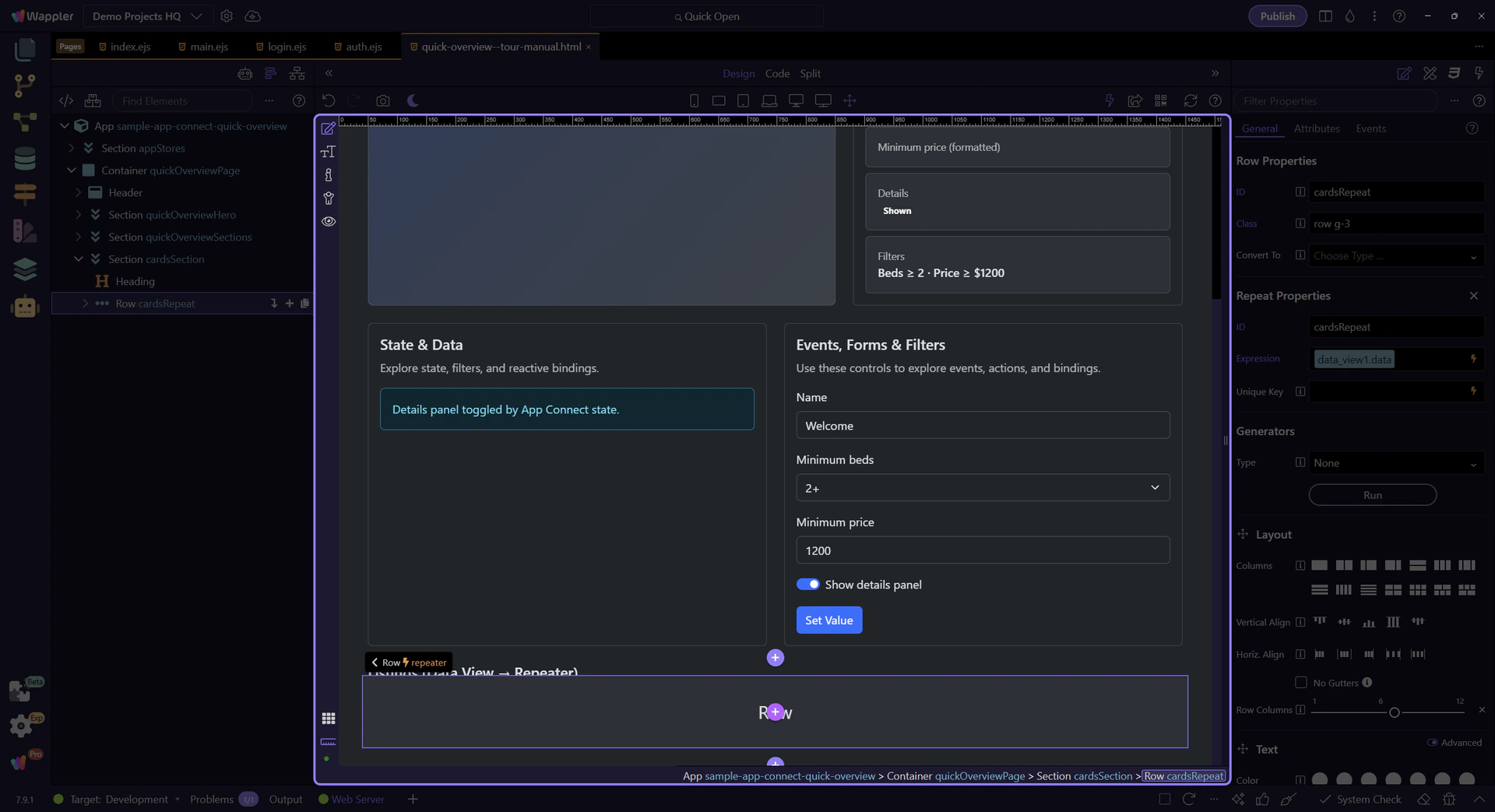
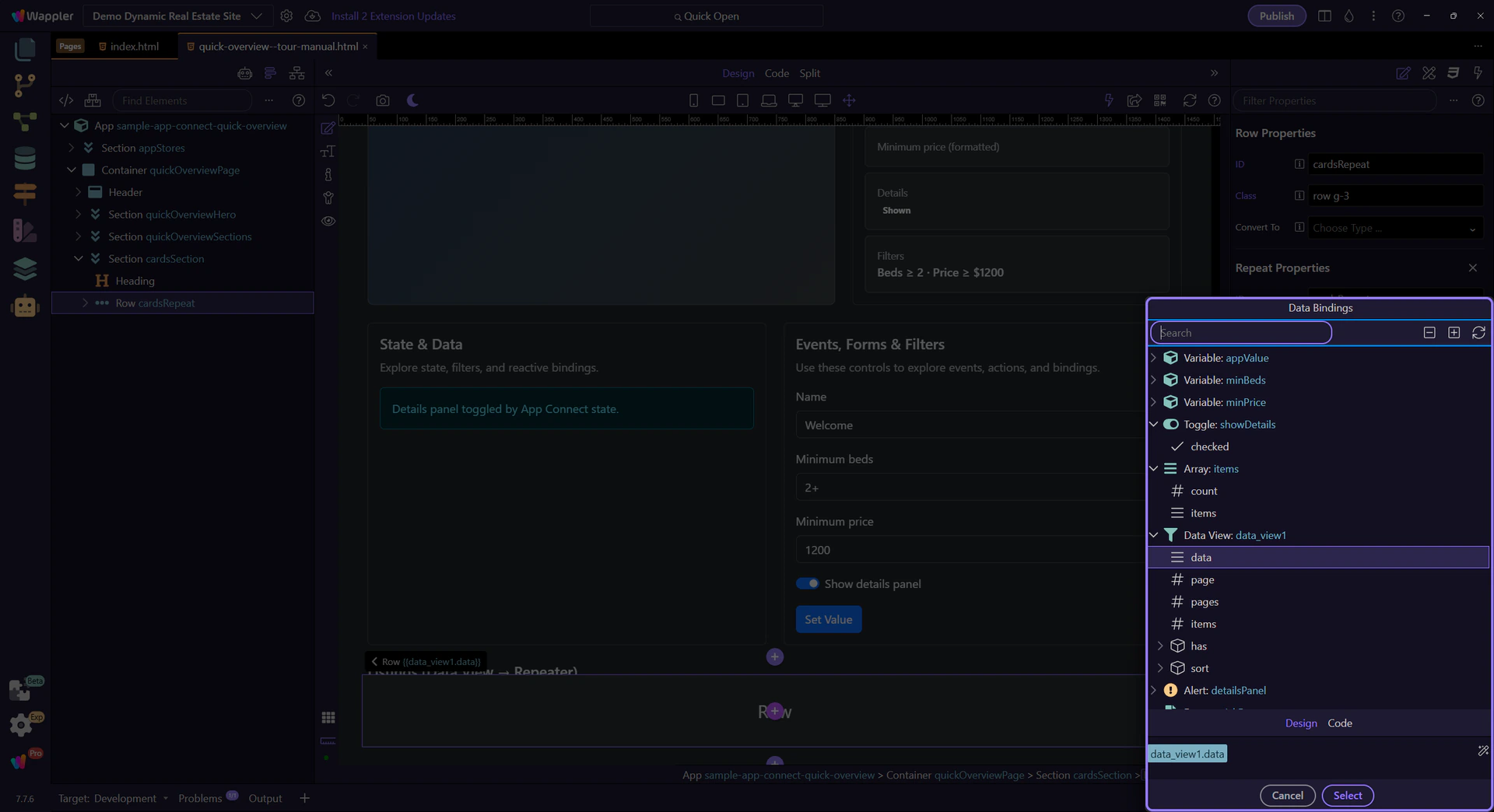
This property points to the collection being repeated (Data View results). This step matters because Repeat expression is part of Selection Panels Properties Control Repeatexpression, and understanding that context makes the next action easier to repeat in your own project.
tip: Use the Data Bindings Picker here to explore the full path (for example:
data_view1.data).
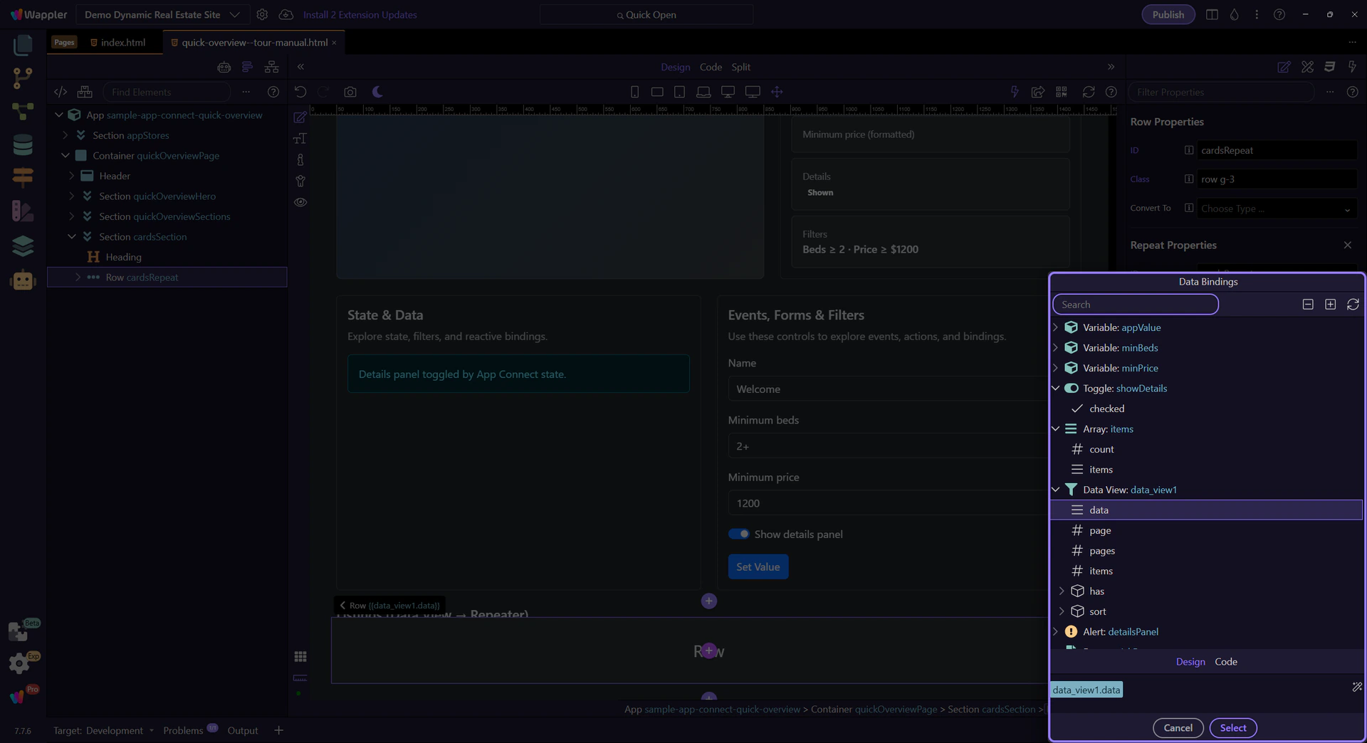
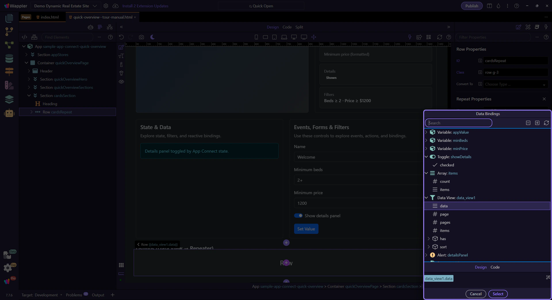
We’ll open the Data Bindings Picker so you can inspect the repeat expression in context. This step matters because Opening Data Bindings Picker (repeat) is part of Selection Panels Properties Control Repeatexpression, and understanding that context makes the next action easier to repeat in your own project.
This picker is scoped to the repeater. You’ll see item-level fields like title, beds, and price here too.
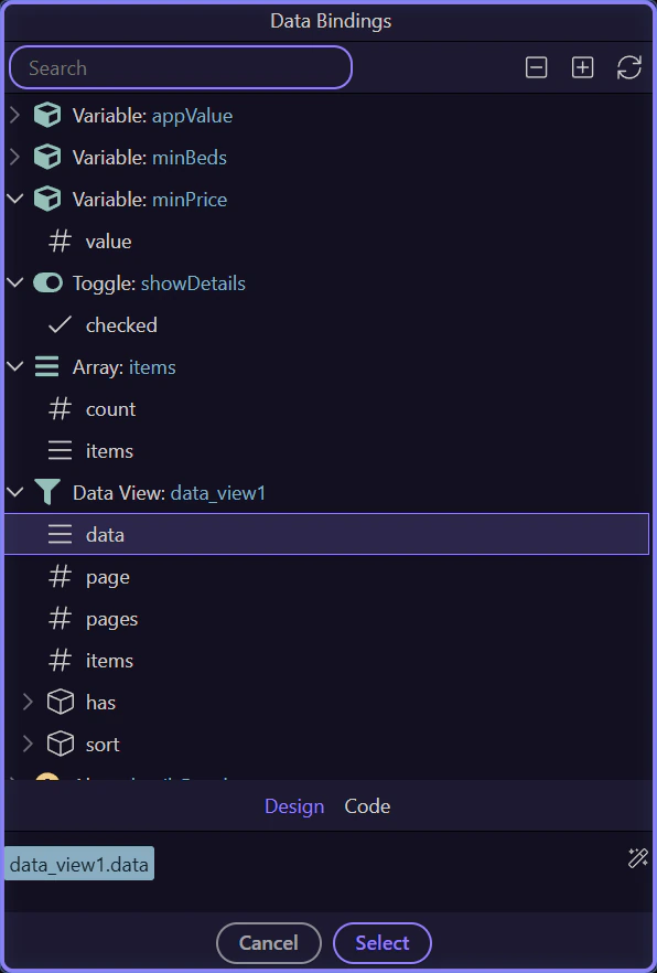
Close the Data Bindings Picker to continue. This step matters because Close Data Bindings Picker is part of Popup Databindingspickup Button Cancel, and understanding that context makes the next action easier to repeat in your own project.

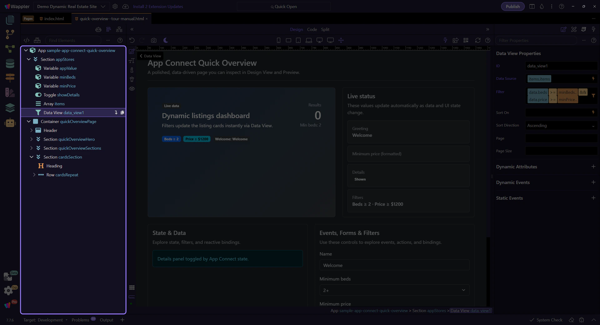
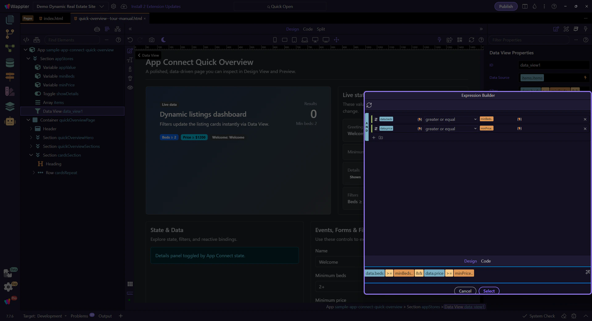
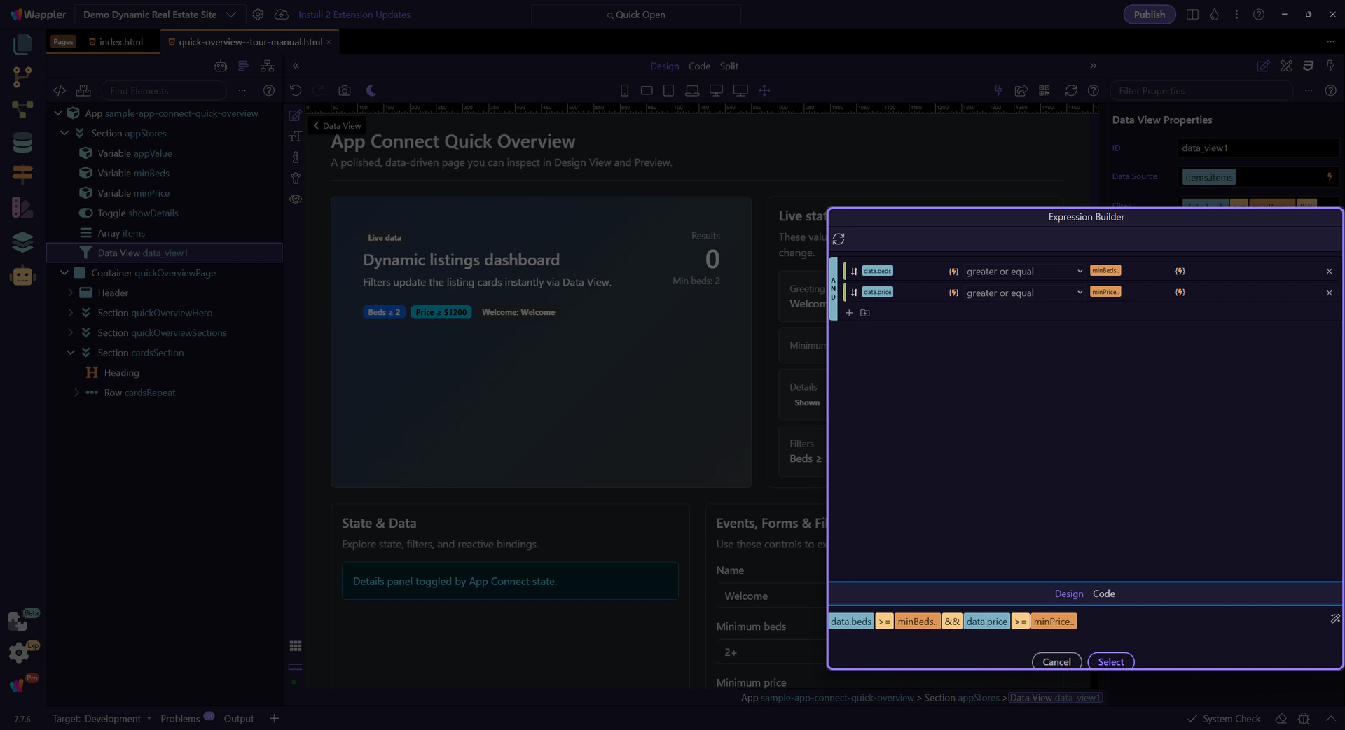
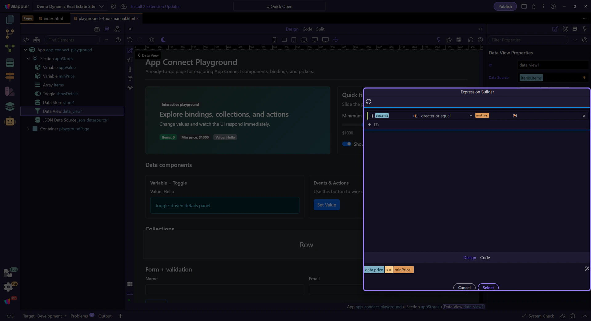
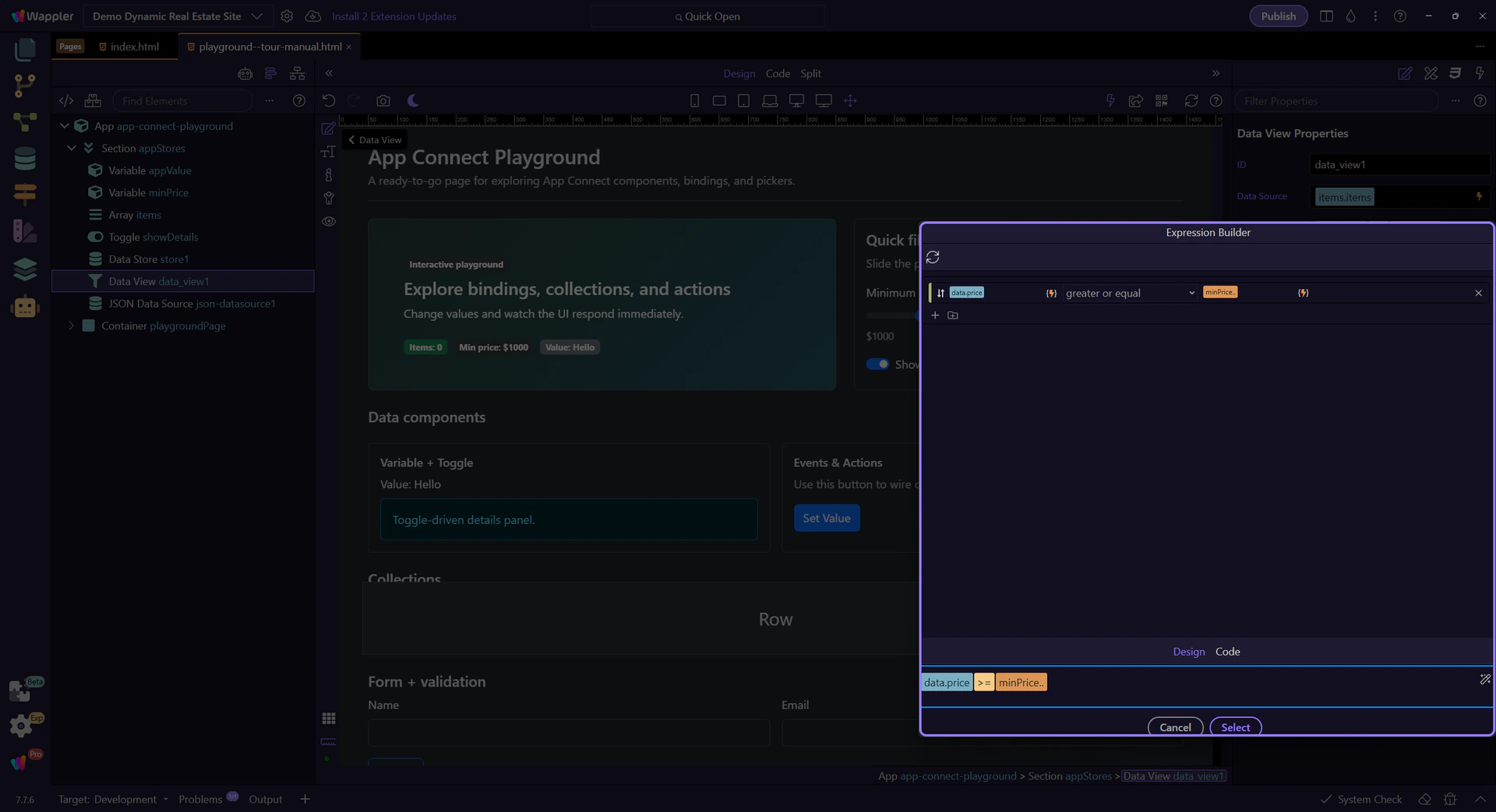
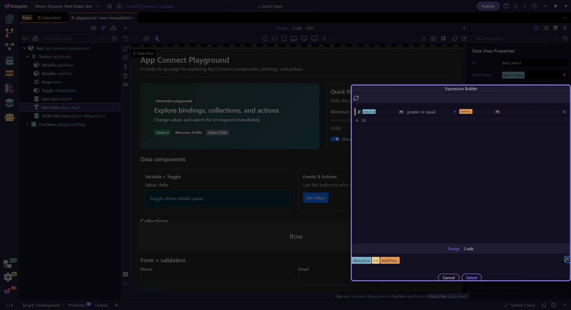
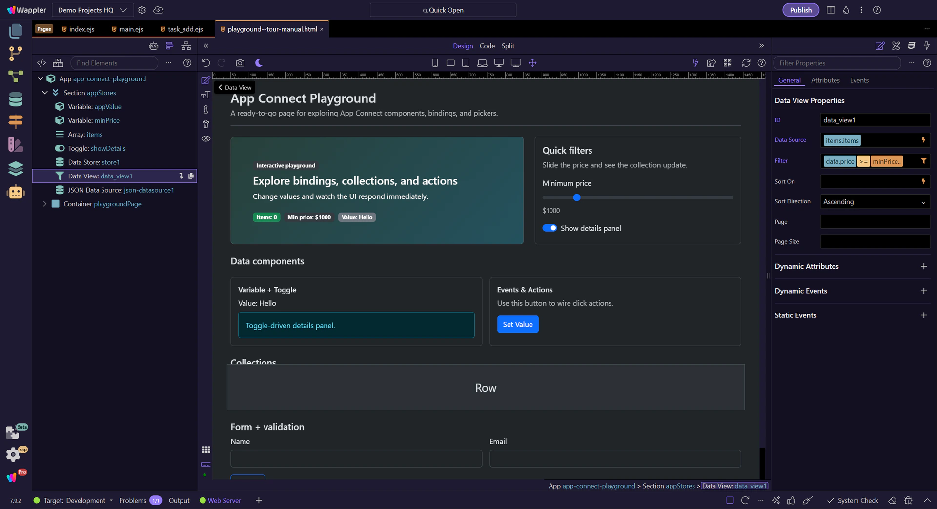
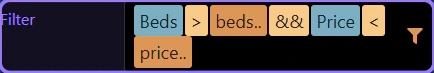
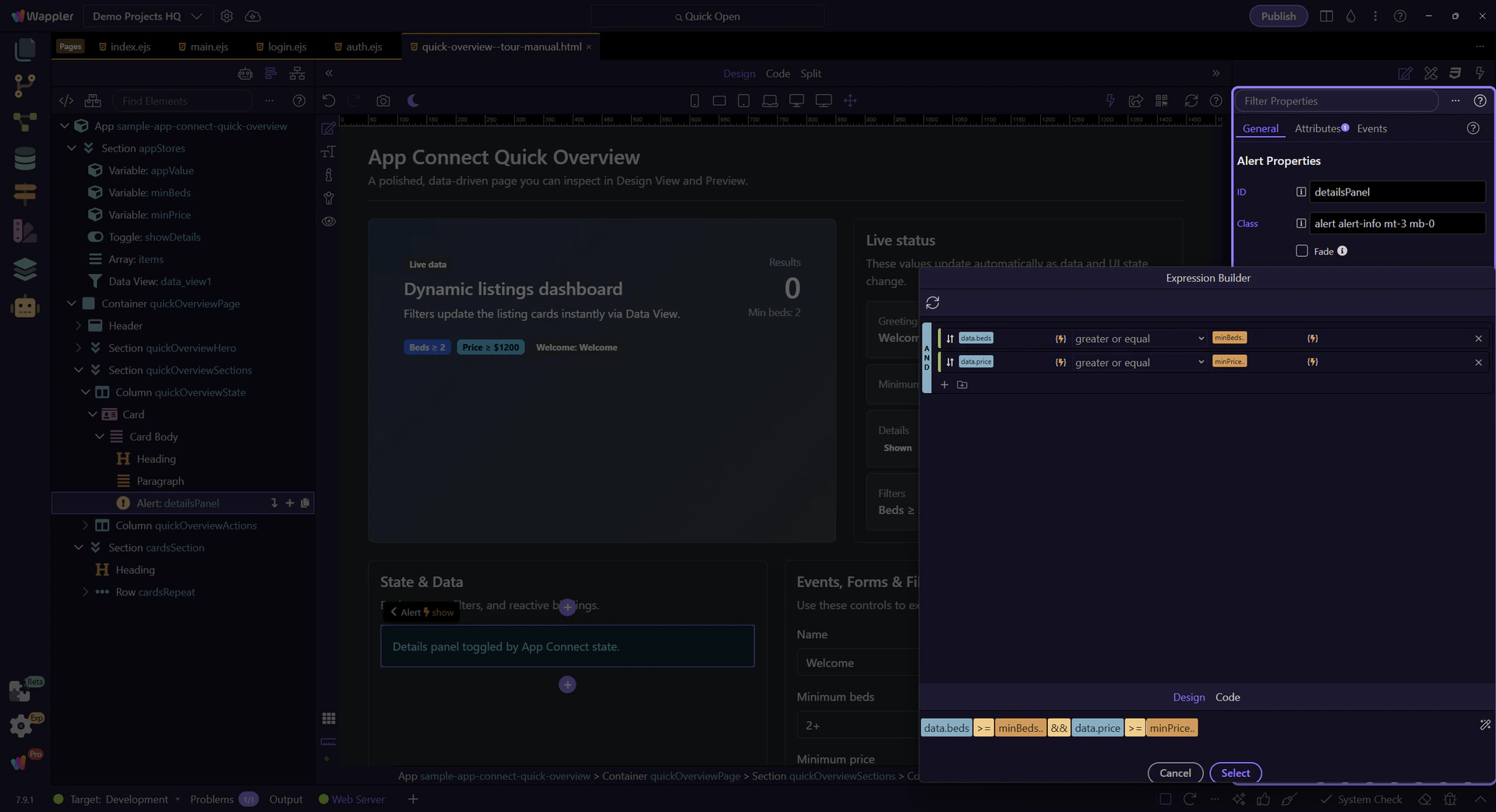
The Data View defines which records appear. We’ll select data_view1 so you can inspect its filter expression.
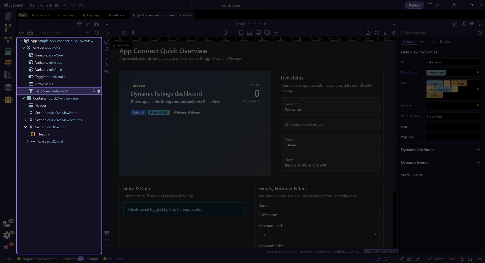
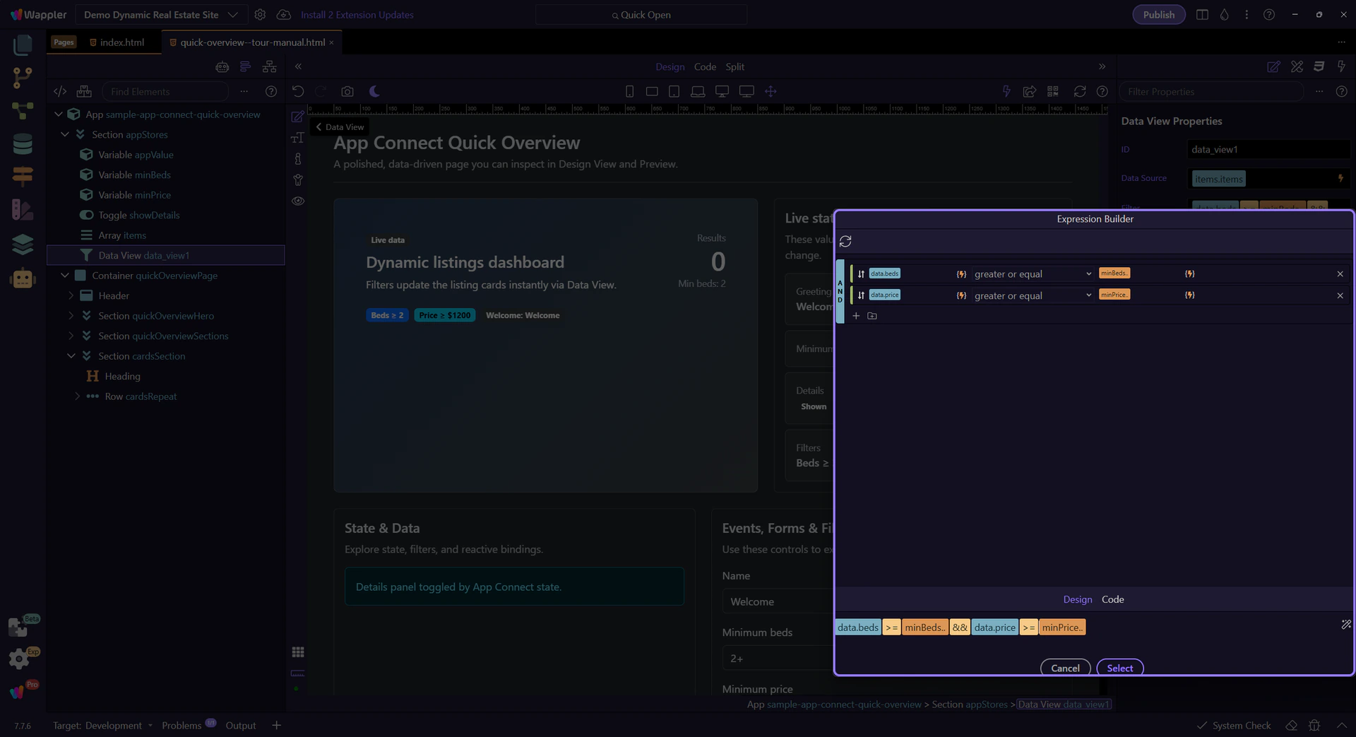
The filter is a rule-based expression. We’ll open it in the Visual Expression Builder so you can inspect the logic.
tip: Use the Visual Expression Builder for logical expressions (filter rules, AND/OR groups). Use the Data Formatter for formatting pipelines.
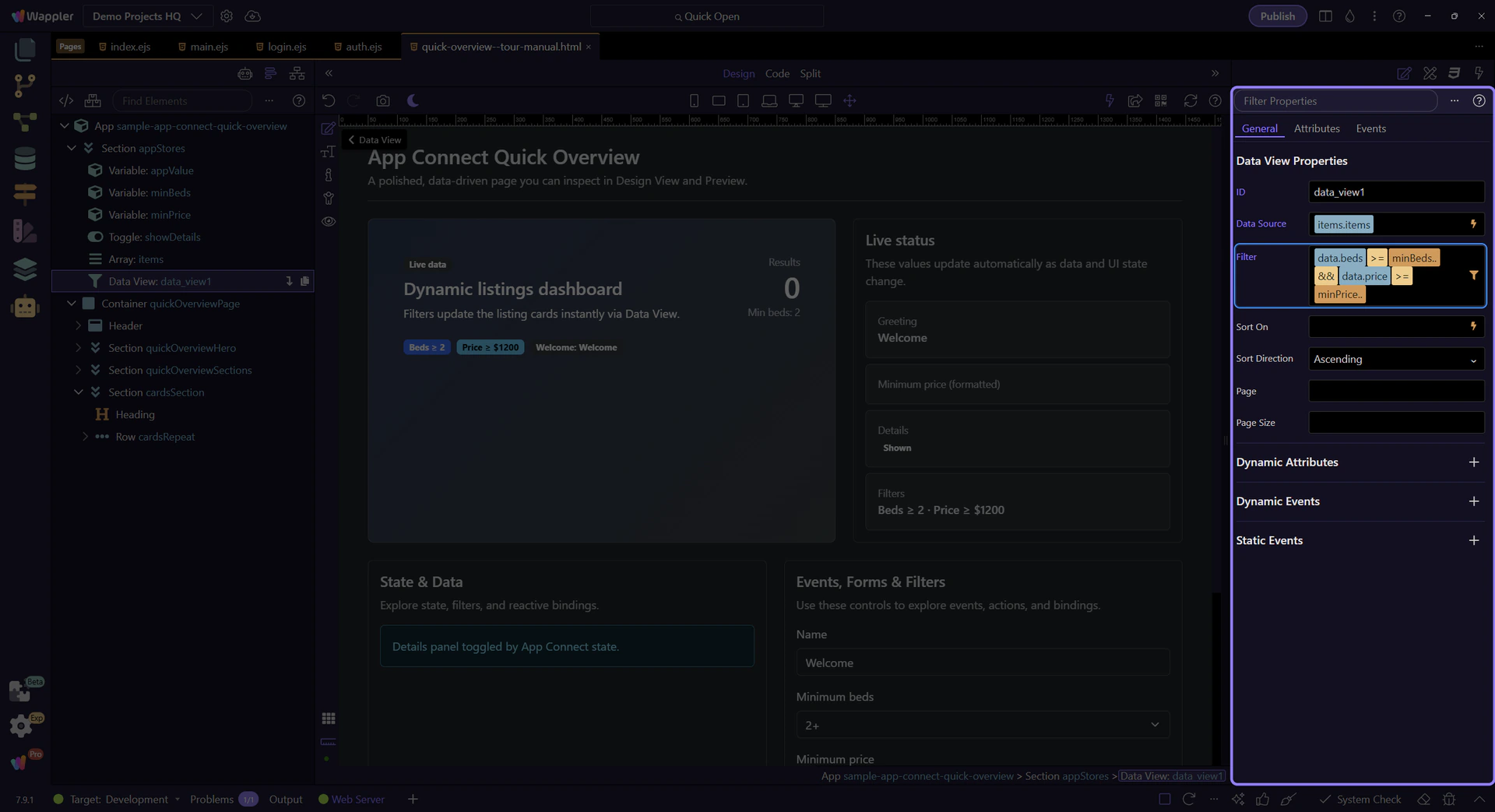
The Visual Expression Builder helps you build valid expressions with operators, functions, and data sources in scope.
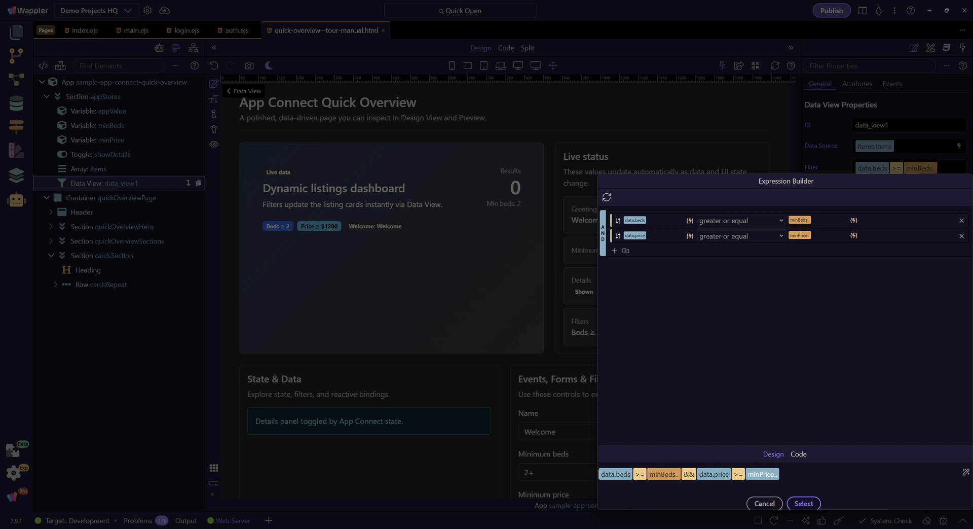
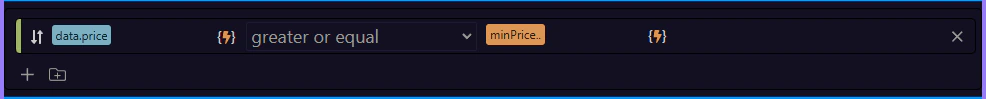
Each row is Field + Operator + Value. This is how you define filter rules without typing the full expression.
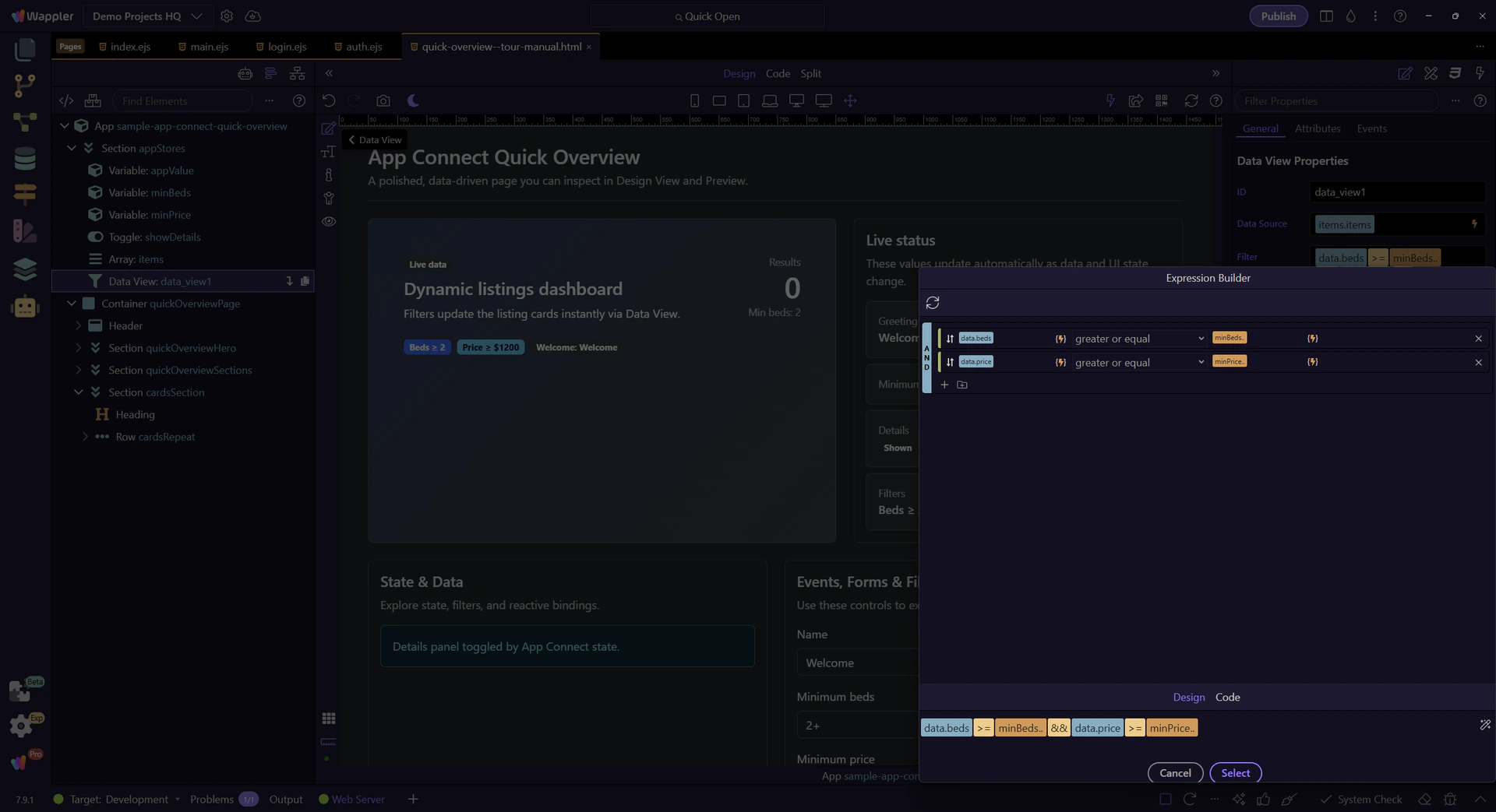
Use AND or OR here to decide how multiple filter rules should combine, because that choice changes the meaning of the final expression. The next step previews the result, so this is the moment where the logic of the filter becomes clear.
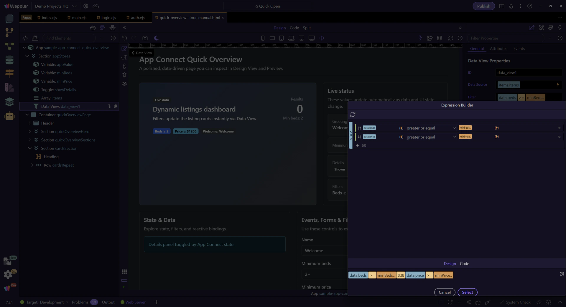
This shows the final expression that goes back into the filter field when you apply/close the popup.

Review the full Visual Expression Builder one last time. Press Next to close it and return to the Data View properties.

This panel uses a simple binding to show/hide itself: dmx-show="showDetails.checked".
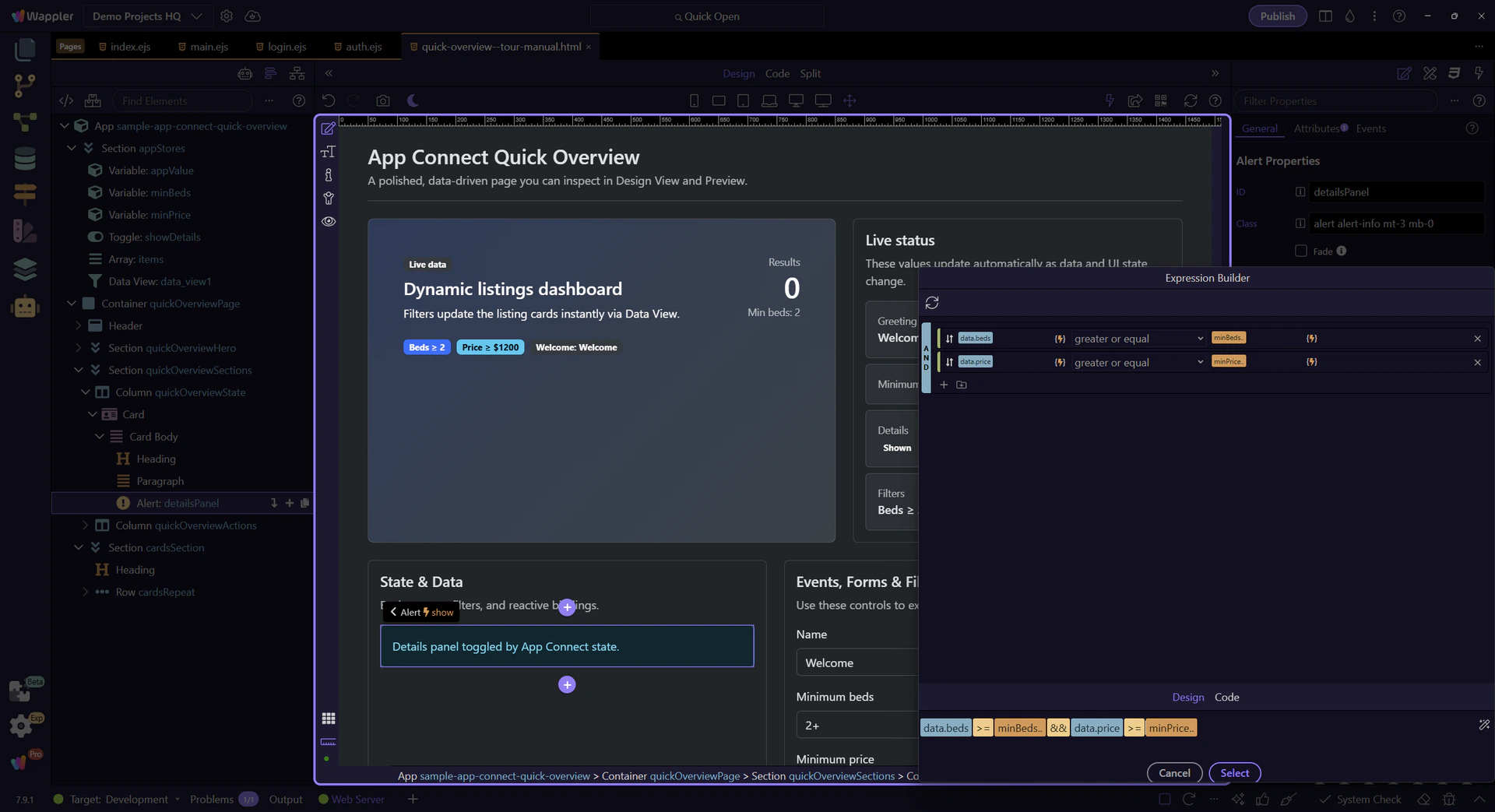
This is the expression behind dmx-show (Show → When). It uses the same Data Bindings Picker and scope rules as your other bindings.
tip: For complex conditions, open the picker and build the expression visually.
Switch to Preview mode and interact with the controls to see bindings update instantly.
Switch to Preview mode now so you can test the finished App Connect example live in the next step.
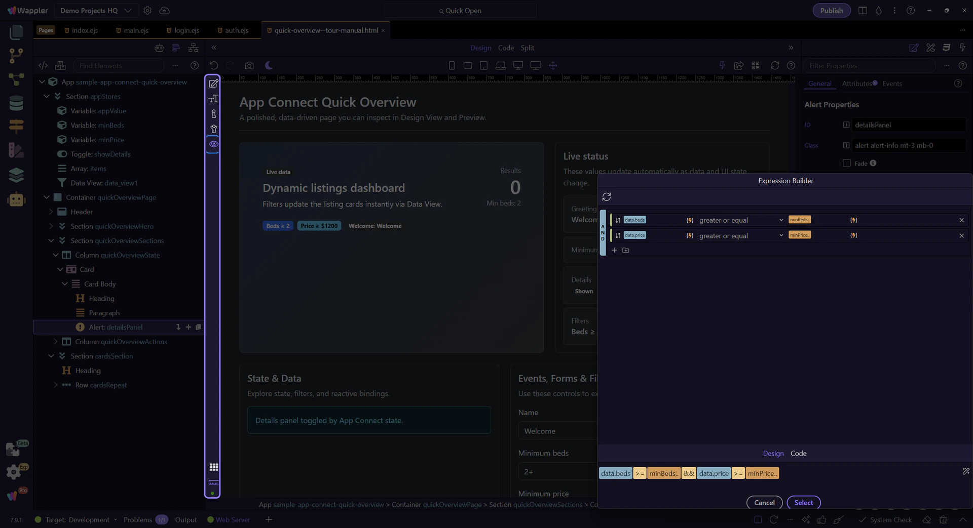
Wait for the page to finish switching modes.
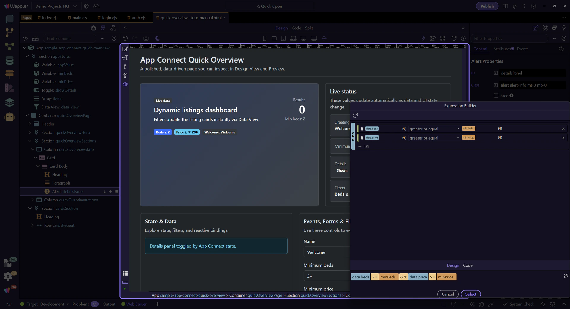
We’ll open the Beds dropdown so you can change the minimum beds filter.
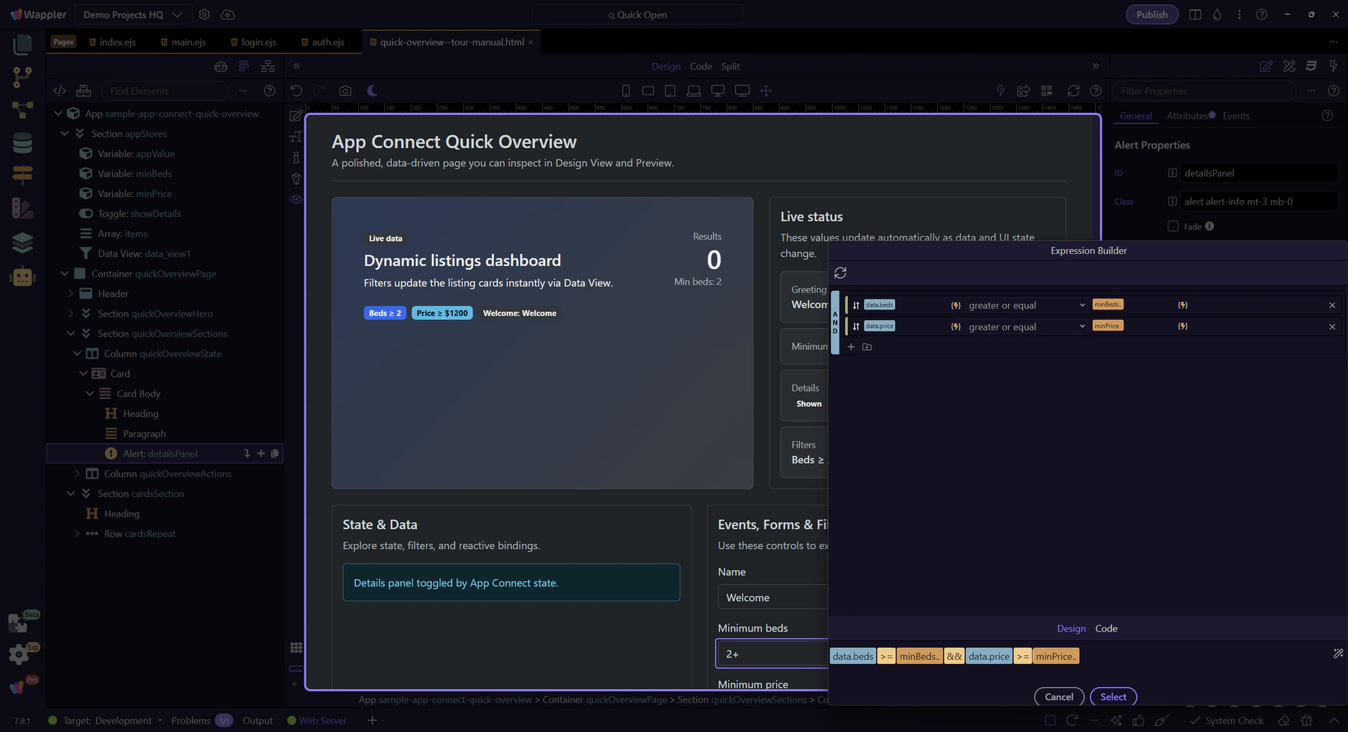
This dropdown value updates the filter. We’ll pick a higher minimum beds value to narrow the list.

This button runs an action that updates greeting state. We’ll click it to demonstrate state-driven UI updates.
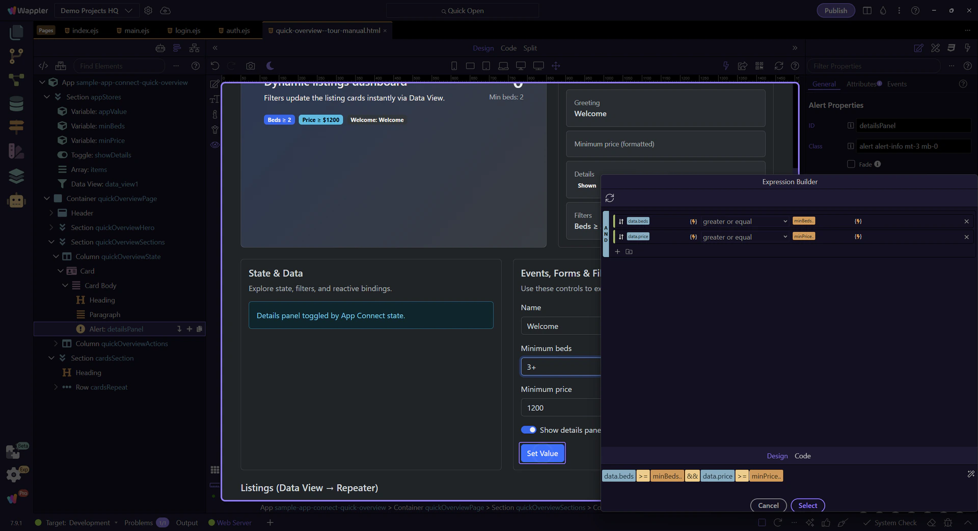
The listing cards and summary badges update immediately when state changes.
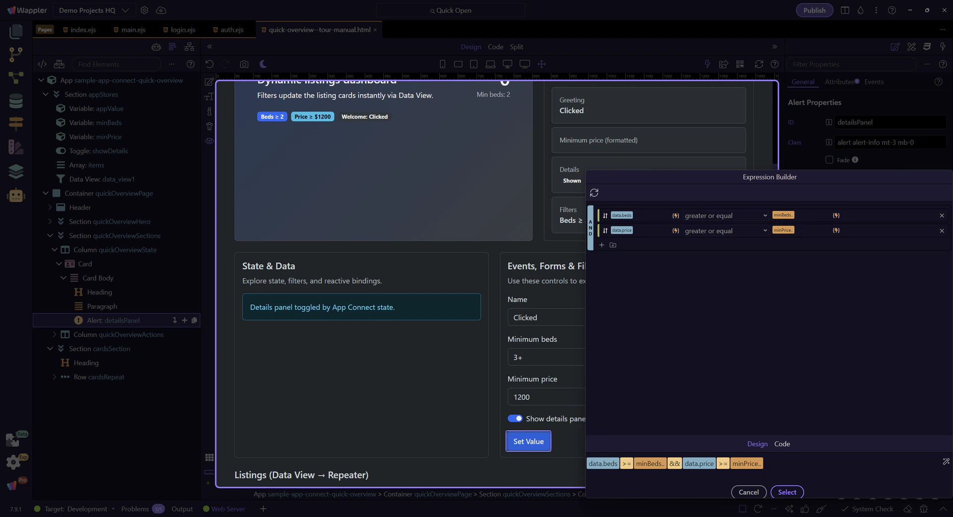
Return to Edit mode so you can keep exploring the setup after confirming the live behavior.
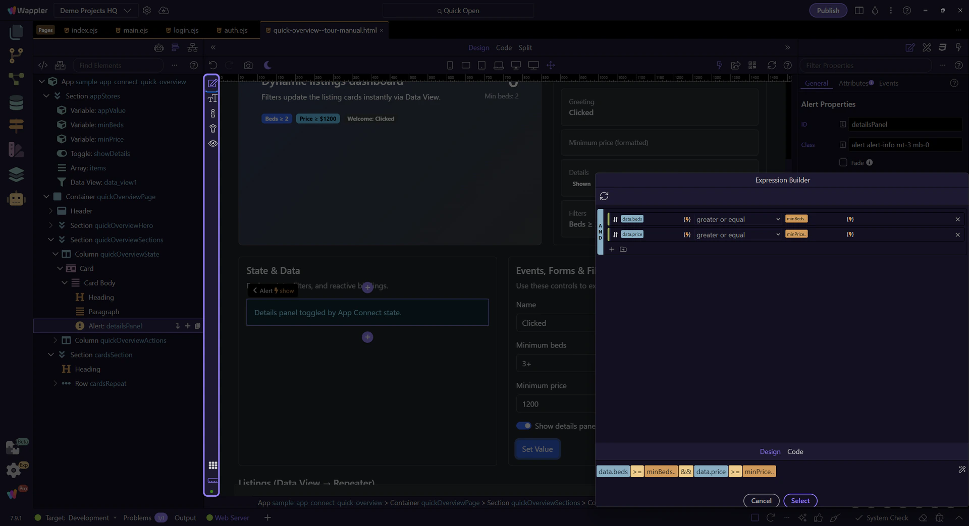
Events are where interactivity starts. You pick an event (click/submit/keyup/…) and assign an action.
This button is where we’ll attach a Click event. We’ll select actionButton so you can inspect its event and action settings.
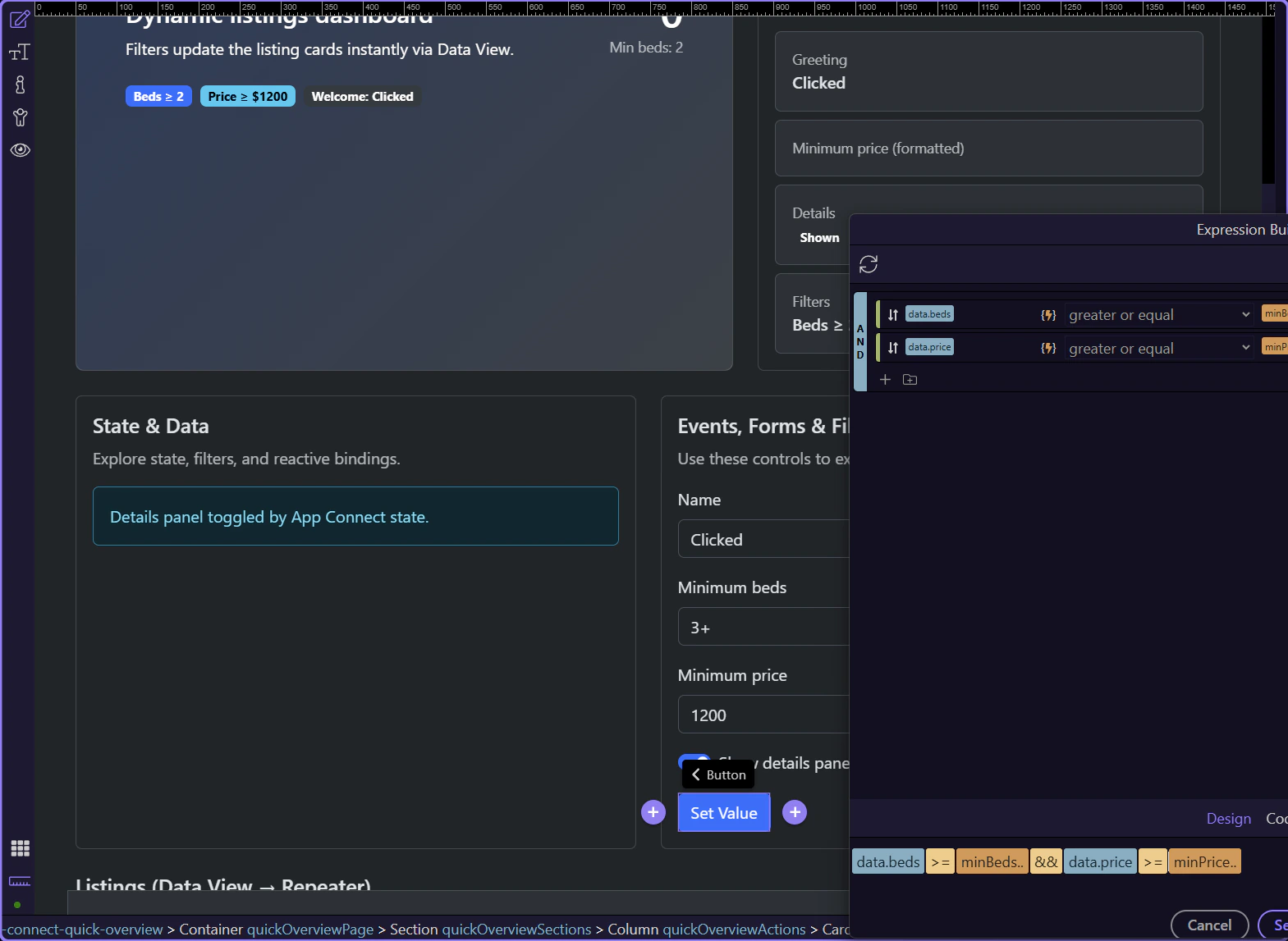
In Properties → Events, enable Click and choose an action. Actions are picked visually (you don’t type raw code for common tasks).
tip: Look for an Action picker (it will help you choose a component action like “Set Value”, “Insert Record”, etc.).

Modifiers change behavior (prevent default, stop propagation, capture, once) and can add key/button conditions.
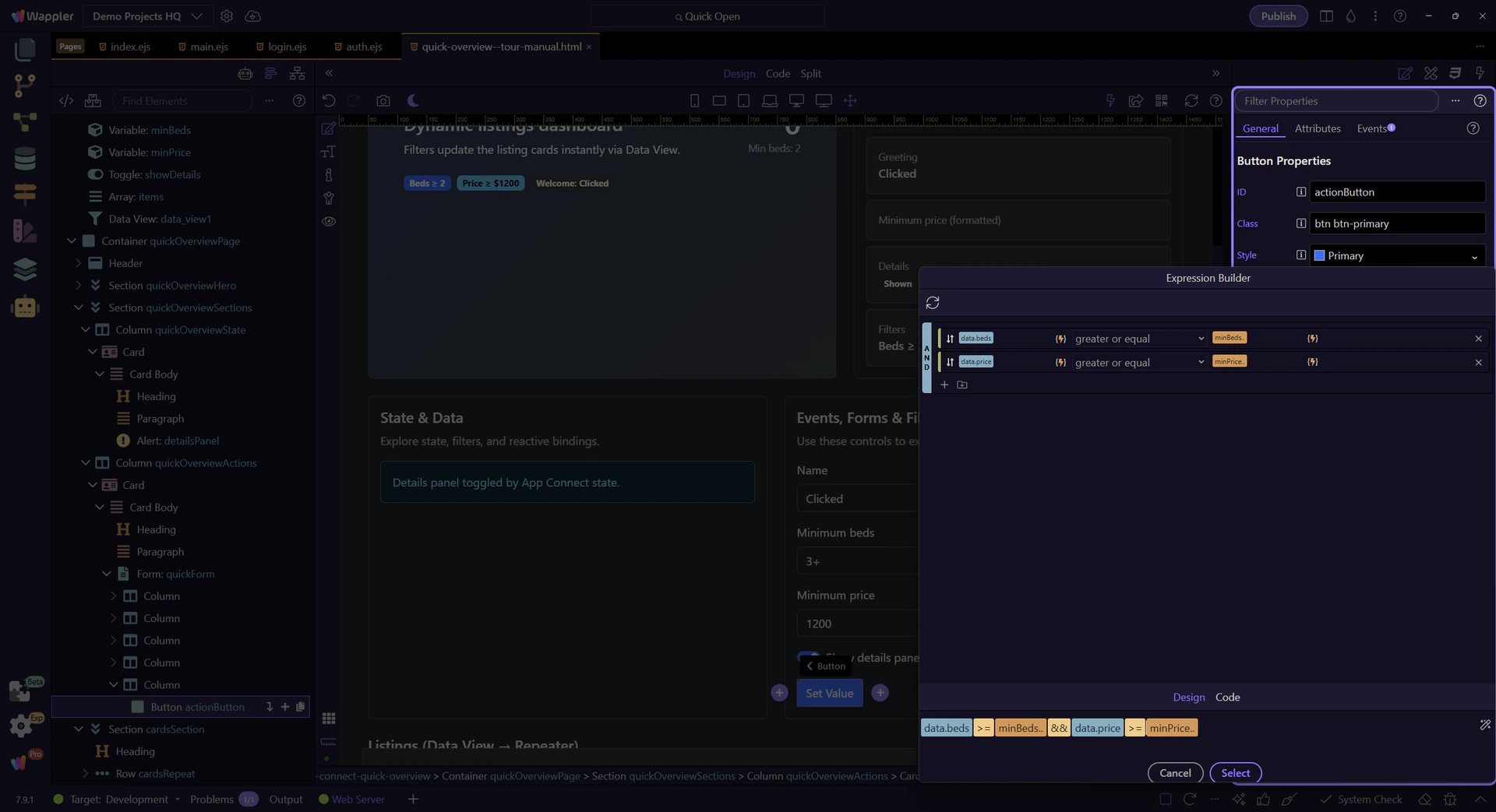
You’ve seen the core workflow: inspect components, configure Properties, and wire an event to an action.
Continue with deeper tours on expressions, collections, and filtering.
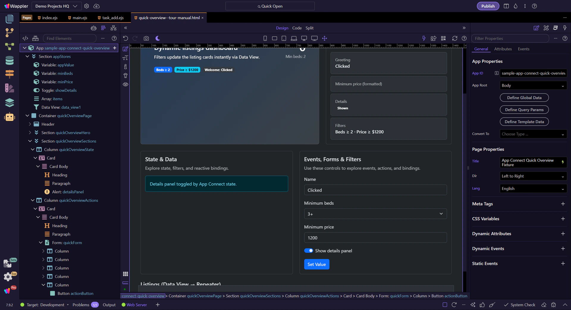
A beginner-friendly mental model for App Connect: how data, bindings, events, actions, and Dynamic Attributes combine into reactive UI updates.
Build a visual model for how selection, scope, loaded data, bindings, and actions fit together before you start wiring App Connect features.
This view avoids “expression syntax” and focuses on the visual principles:

Selection defines scope → loading fills data → bindings keep UI + state in sync.

If you prefer a “loop” mental model, this is the same concept in a simpler sketch:

The key takeaway stays the same: change data → App Connect re-evaluates bindings → the UI stays in sync.
Use App Structure to select what you’re working on. The selection determines what data and actions are “in scope” for pickers.

Most reactive setup happens in Properties: bindings, expressions, events, and actions. Look for picker buttons to select data and actions visually.
Bindings connect UI properties to data. When the data changes, App Connect re-evaluates expressions and updates the UI.
A binding connects a property to an expression (often a data value). When any input changes, App Connect re-evaluates and updates the UI automatically.
note: You usually don’t need “refresh UI” actions. Updating data is enough.
When a field supports bindings, click its picker button and choose data from the tree. This keeps you in the correct scope and avoids typos.
tip: If you can’t find a value in the picker, change your selection in App Structure first (scope).

The Data Picker is context-aware. Selecting a different component or changing where you are in the hierarchy changes which data and methods are available.
User interactions trigger event handlers. Those handlers run actions that update your state (variables/stores) and refresh the UI.
Interactive pages follow a simple loop:

Most of the time, your job is just: wire the event and pick the action. The UI updates when the data changes.

This is the most common production pattern in Wappler apps:

The form doesn’t talk to the database directly — it calls a Server Connect action, which validates input and writes/reads the database.
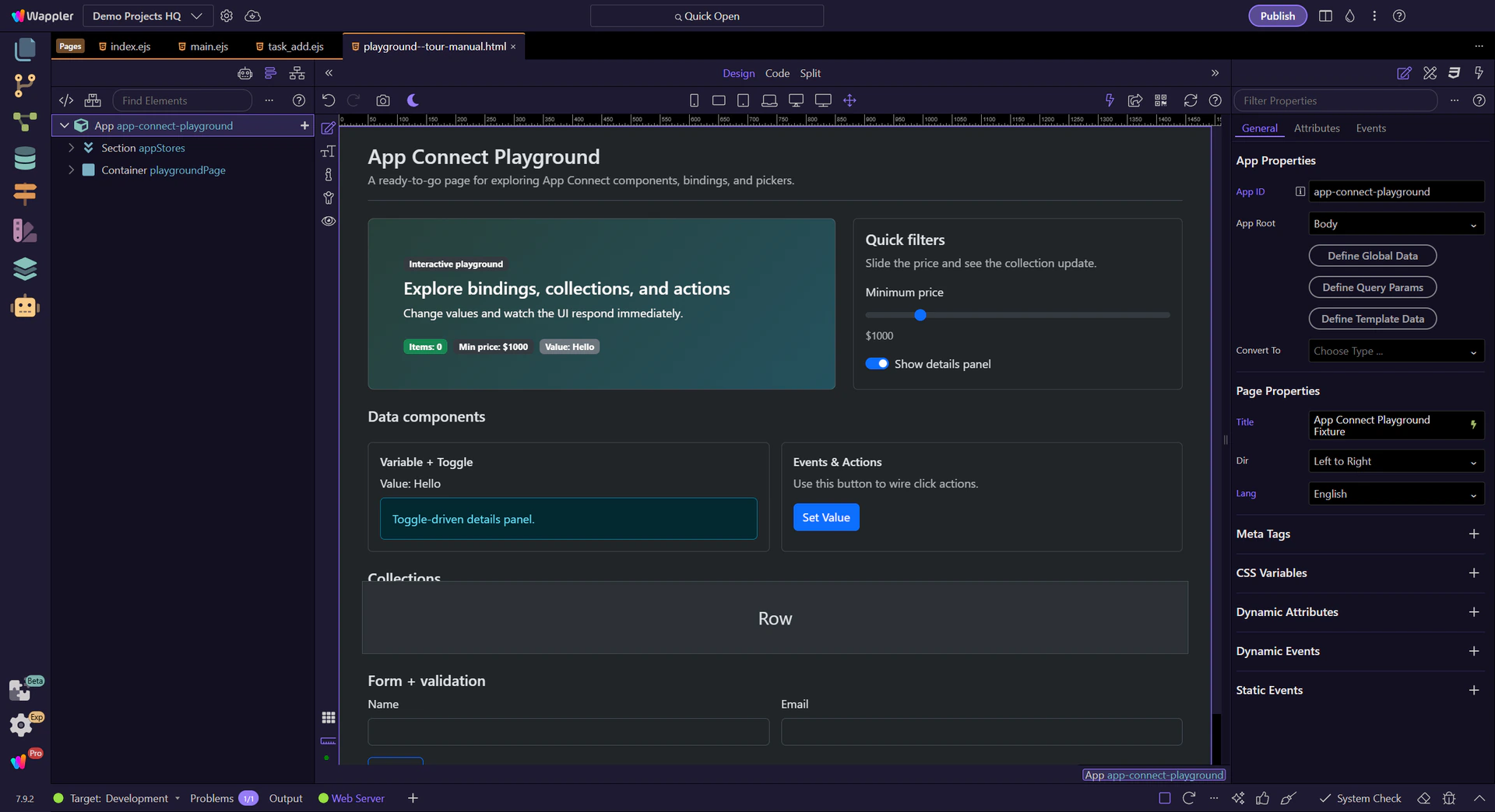
Events are attached to the selected component (button, form, input, etc.). Select the element first, then configure its events in Properties.

The Actions Picker lets you choose what should happen (setValue, toggle, load, insert, update…) and then wire its inputs from the Data Picker.
tip: A good workflow: pick an action first, then wire its inputs from the Data Picker.
Some reactive behavior is added as attributes and events via the ( + ) button, not as a pre-defined property field.
Some bindings are added as attributes (like show/hide, class, repeat, on click, …). In the Dynamic Attributes section, use the ( + ) button to add them to the selected element.
tip: If you don’t see the Dynamic Attributes section, try selecting a different element (or insert a component that supports those attributes).


The Dynamic Attributes list is context-aware: it changes based on the selected element and the installed component rules. If you don’t see an attribute, try selecting a different element or inserting the related component first.
Recap the mental model and pick a next tour.
If you keep this loop in mind, App Connect becomes predictable and easy to debug.

Choose a focused tour to practice the loop (data → UI) and the pickers.

Understand Wappler’s modern hybrid routing: routes, layouts, content pages, and route-aware links.
Use this bridge to understand where App Connect fits into modern Wappler routing. The recommended workflow is not inline dmx-route components. Instead, Routing Manager stores the generated route definitions, Pages Manager shows the routed layout and content files, and the layout renders the selected content page through dmx-view as partial content.
App Connect still matters in this flow, but in a different role: it powers the interactive page once the route has already selected the correct layout and content page. Internal links and route-aware components should align with the generated route map rather than reintroducing deprecated inline routing patterns.
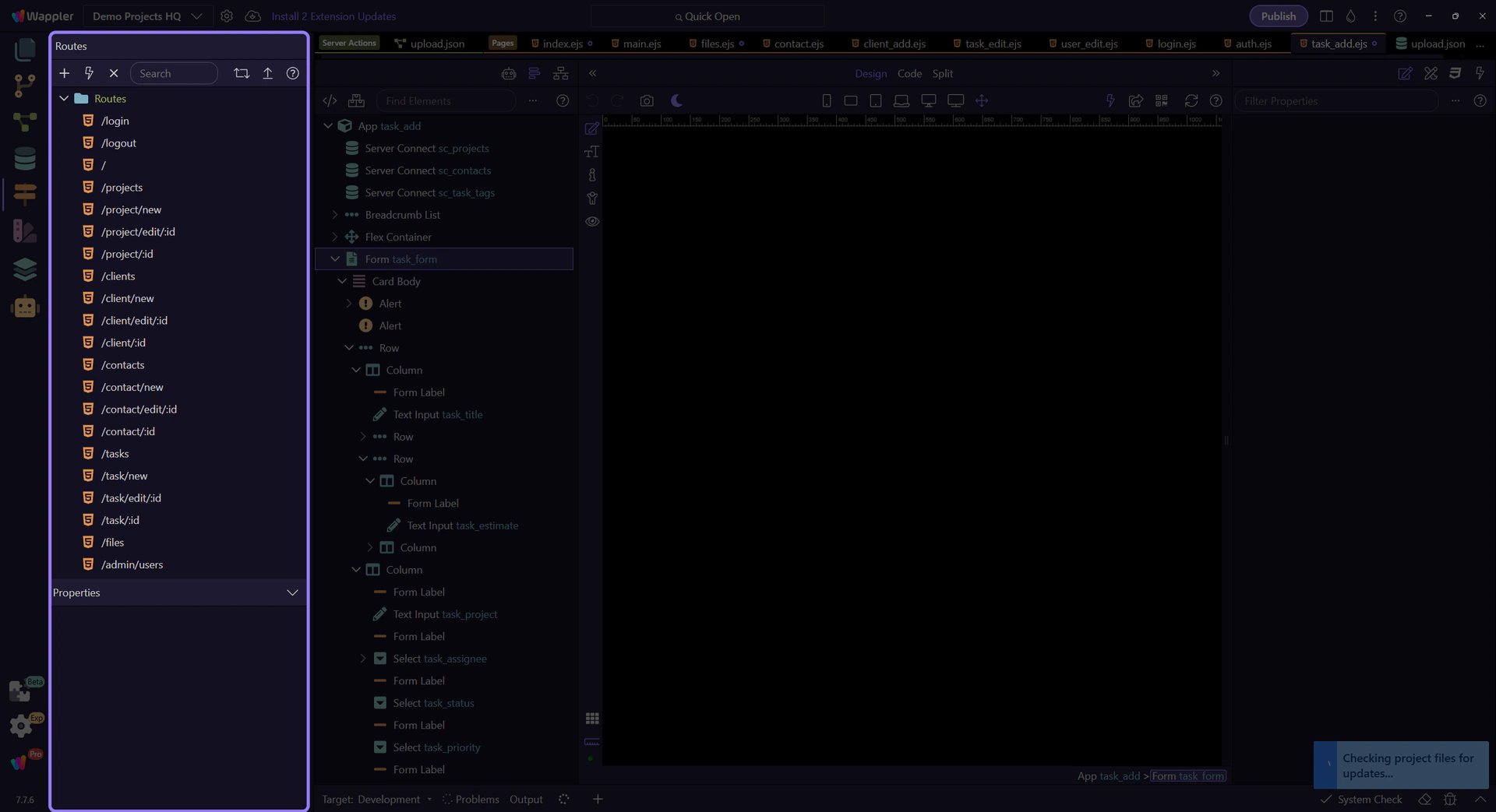
Start with the live Routing Manager map in Demo Projects HQ. This is the source of truth for route-aware App Connect work, because links and routed content should follow the real generated route tree instead of reviving old inline dmx-route patterns.

Keep the full Pages Manager surface in view before focusing on a specific node. This is the second half of the routing picture: the generated route map points to real layout and content files that live here.
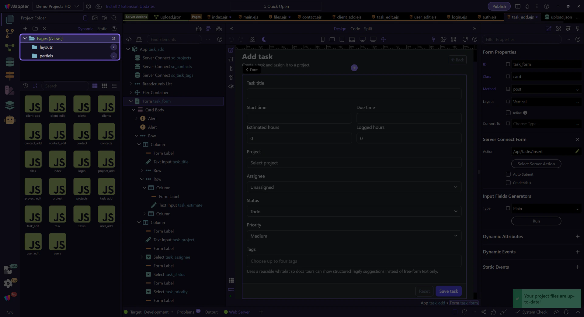
After the route map is clear, switch to the real Pages Manager structure. In Demo Projects HQ, that is where the actual layout and content files behind those routes become visible and selectable.

Load data and submit forms via Server Connect components, using built-in state (executing/lastError/data).
This tour introduces the App Connect components that talk to your server actions. You will see how Wappler models requests, responses, execution state, and errors in the page, and how those component outputs become the inputs for bindings, loading indicators, and follow-up actions.
By the end, you should understand the whole client-to-server loop in Wappler: which component sends the request, where request state is exposed during execution, how returned data becomes available to the page, and where error handling fits into the same declarative workflow.
Use App Structure to select your API Form / API Action components and Properties to bind inputs, outputs, and actions.
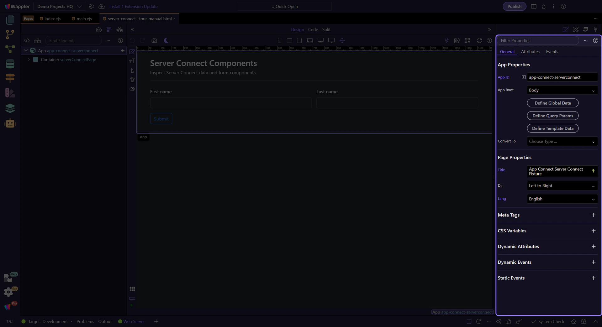
Review what you did and choose a next tour.
Pick a related tour to continue.
Store temporary workflow state for the current tab using Session Manager; cleared when the tab closes.
Session Manager stores per-tab state for the lifetime of the tab/session. It’s great for wizards and temporary workflow data.
This tour teaches the decision rule for session storage, not just the API. Use it when workflow state should survive refreshes in the current tab but disappear when that tab’s session ends, which makes it a strong fit for wizards, short-lived progress, and temporary UI context that should not bleed into other tabs.

Session Manager can store complex objects; they are serialized/deserialized automatically.
tip: Even with objects, keep stored values small and focused.

Bind UI to session values, and update them on events.
Use session.set(key, value) in submit/click handlers to store the user’s progress or inputs.

Use session.key in expressions to prefill fields, show status text, or conditionally render UI.
Store each step’s data in session storage so refreshes don’t lose progress. Clear on final submit.

Next, pick the right persistence level for your app.
Pick a related tour to continue.

A practical guide to App Connect storage strategy in Wappler, comparing URL state, cookies, session storage, and local storage through real UI scenarios.
This tour gives you a practical storage decision framework instead of four disconnected components. You will compare URL-based state with browser storage options, understand what each one is best at, and connect that choice back to the App Connect actions you actually configure in Wappler.
Instead of memorizing four components separately, you will learn the decision logic behind them: which storage belongs to shareable links, which one survives restarts, which one stays tab-scoped, and how each option feeds bindings and actions on the page.

These components are configured like any other App Connect component: select in App Structure, set properties, then call actions from events.
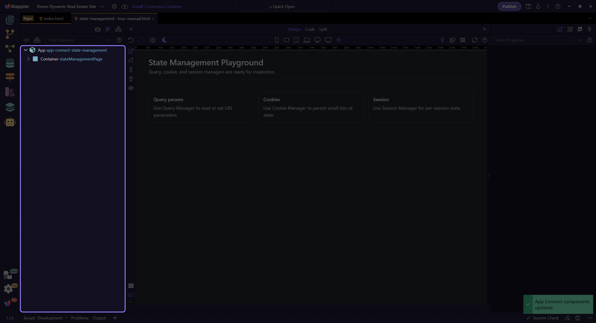
Use this mental model to avoid accidental UX bugs (state that resets when it shouldn’t, or sticks when it shouldn’t).
Best when state should be shareable and bookmarkable (filters/search/sort/page/selection).

Best for lightweight preferences and consent flags that should persist across sessions.

Best for per-tab workflows (wizards, temporary drafts) that should survive refresh but clear when the tab closes.
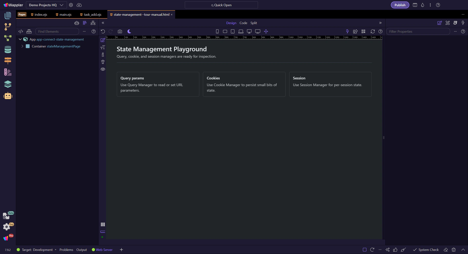
Best for non-sensitive settings that should “stick” without cookie overhead.

Now pick a deep dive for the storage type you need.
Choose a focused tour to continue.

Your guided index of App Connect tours: reactive model, data components, bindings, events/actions, and common workflows — explained visually in Wappler’s panels and pickers.
Use this hub when you are building reactive behavior with App Connect. Start with the first-step tours, then move into categories, forms, state, interactions, and reference hubs.
Focused walkthrough of the renewed Real Estate listings page: Server Connect source, Data View filters, synchronized map, charts, and repeated listing cards.
The listings page is the clearest App Connect page in the renewed demo. A Server Connect action loads the catalog, a Data View reshapes it, and several outputs stay synchronized from that one shaped collection.

The listings walkthrough starts on views/listings.ejs, where the renewed demo shows the full filter pipeline on one page.

The listings page is now active in Design View, so the Structure and Properties panels can follow the live page context.
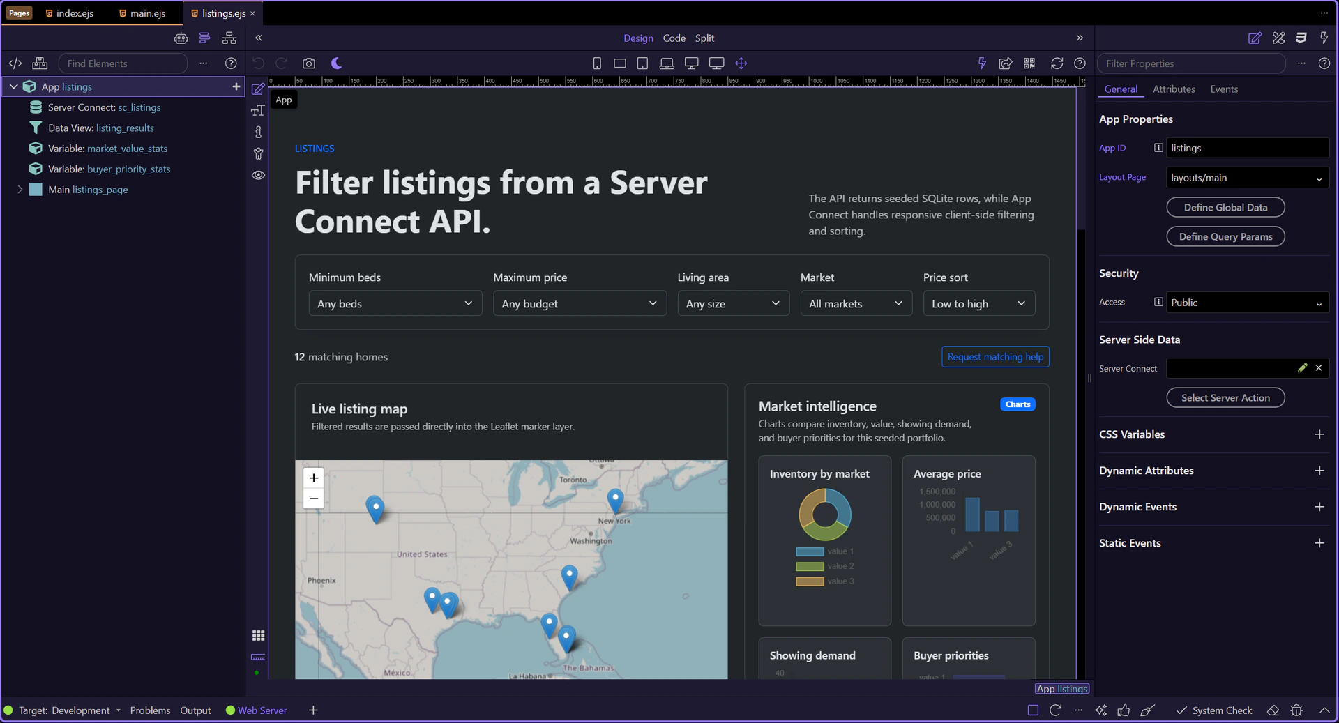
sc_listings calls /api/listings/list and exposes the raw collection for the page. Everything else on this screen builds on that server response.
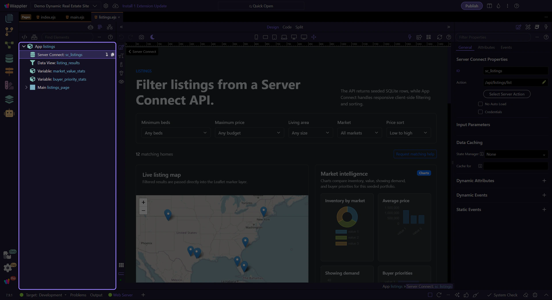
listing_results is the shaping layer. It reads the API result, reacts to the input controls, and owns the current filtered and sorted result set.
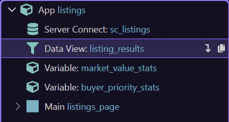
This filter bar is where App Connect becomes practical for users: the controls are ordinary inputs, but their values feed the Data View expression directly.
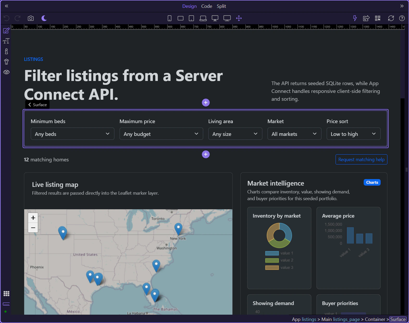
inp_market is one of the controls inside the Data View filter. It narrows the result set without another request because the filtered collection already lives on the page.
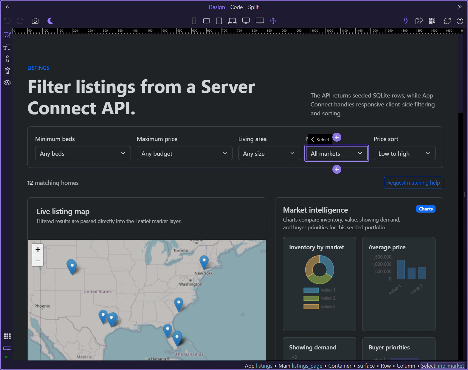
inp_sort_dir shows that the Data View also owns sorting. The page does not need separate card and map logic for sort order because both outputs read the same shaped collection.
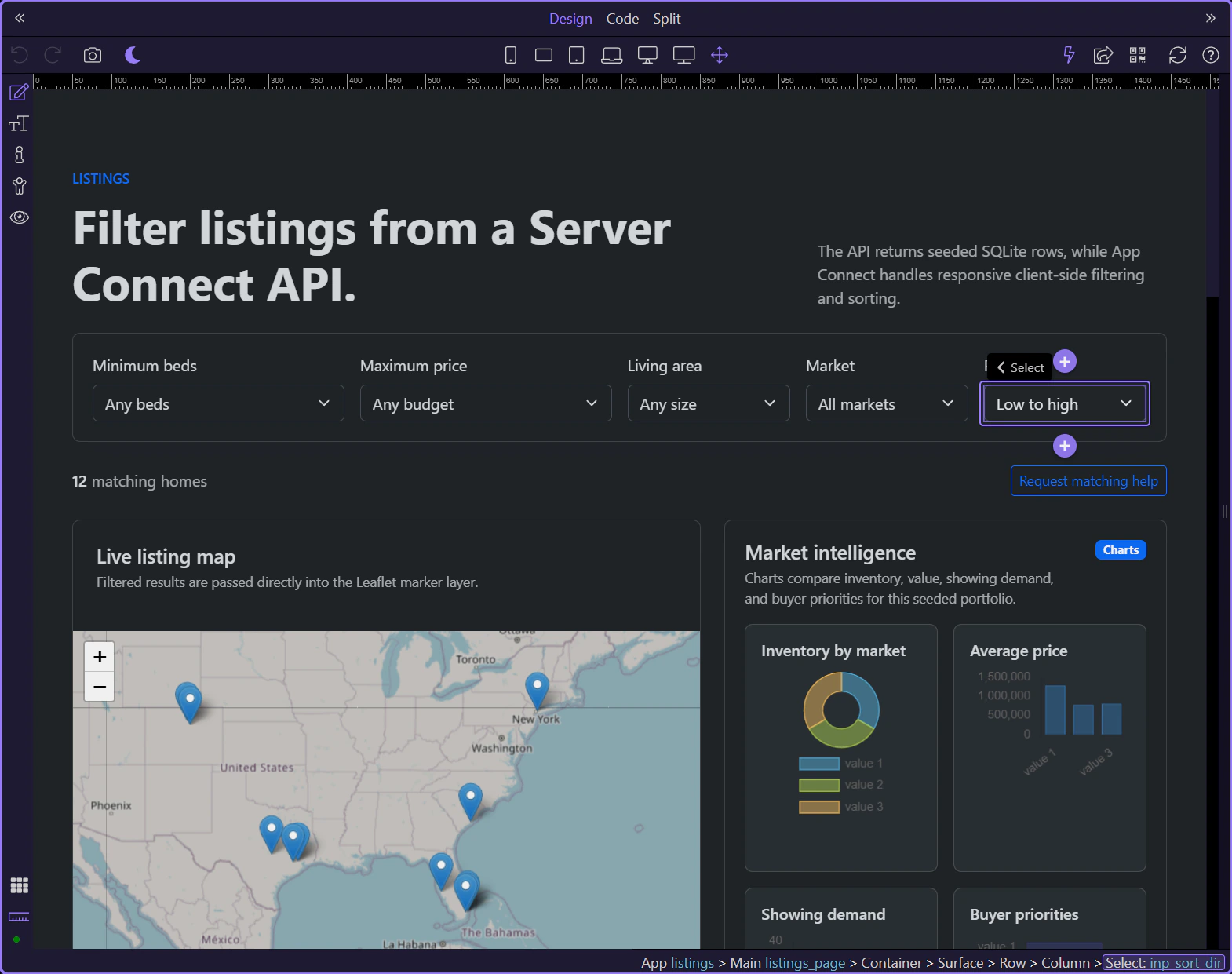
The listings page mixes shaped result outputs with supporting value components and charts, which makes it a strong example of App Connect feeding multiple visual layers at once.
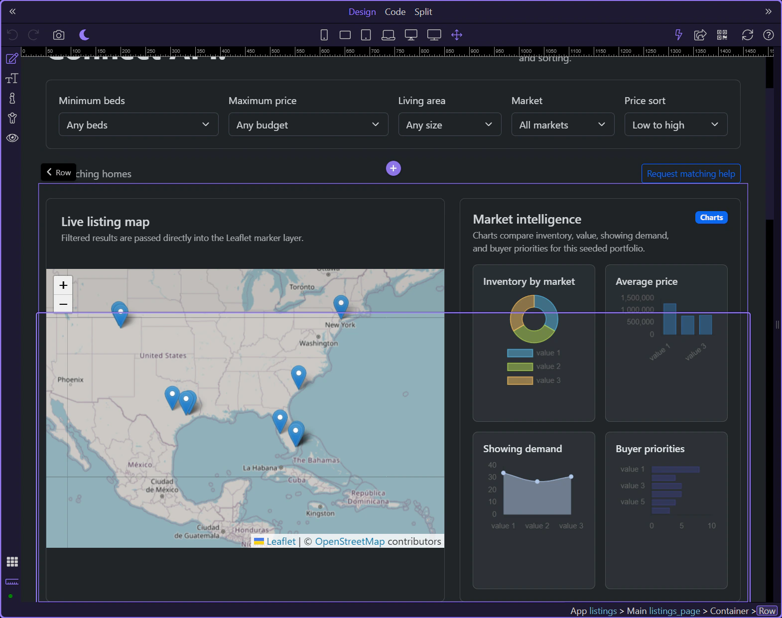
listing_map reads listing_results.data directly, so map markers stay synchronized with the same filtered dataset that drives the visible cards.
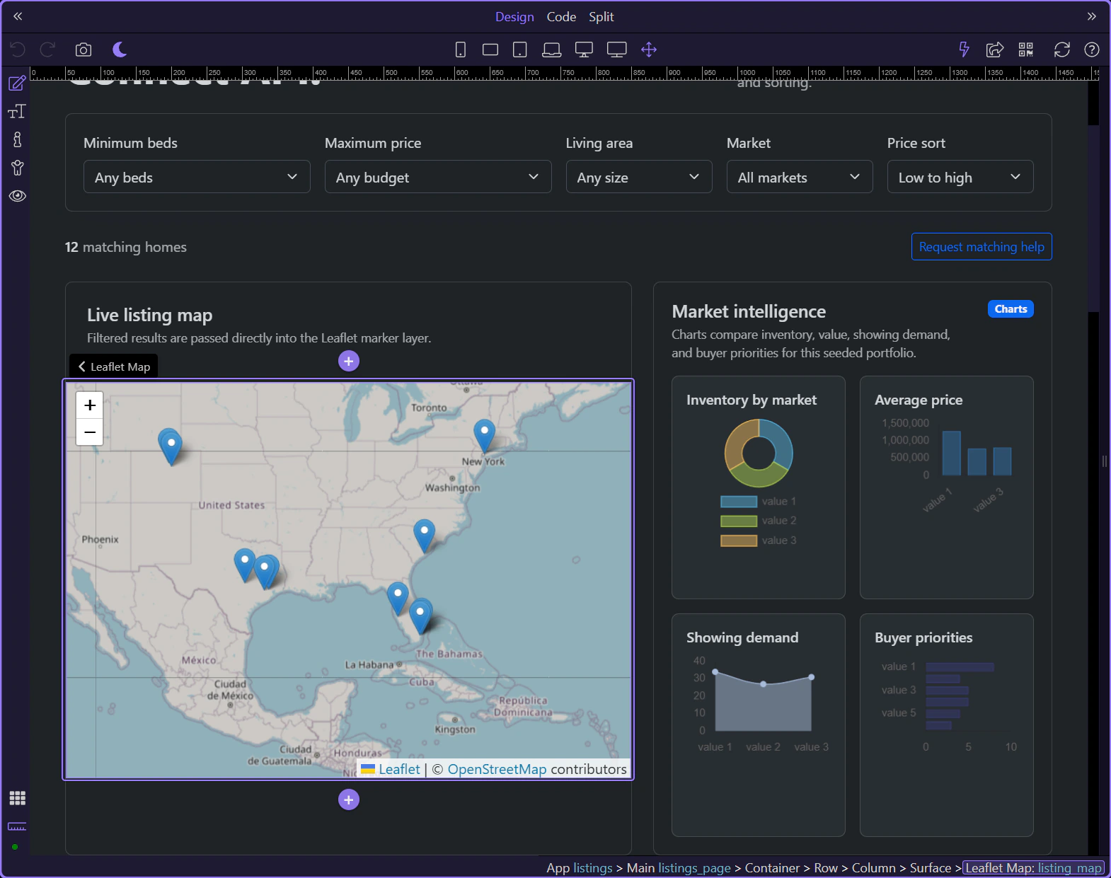
repeat_listings is the second consumer of the shaped collection. This is the page’s core lesson: one Data View can drive multiple outputs cleanly.
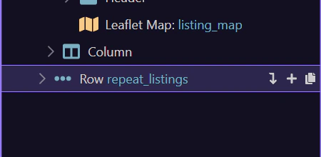
The listings page turns the renewed demo into a reusable pattern: load once from Server Connect, shape once through Data View, then let several UI outputs consume the same result.
Continue into the detail page, the inquiry form, or the broader App Connect tours from here.
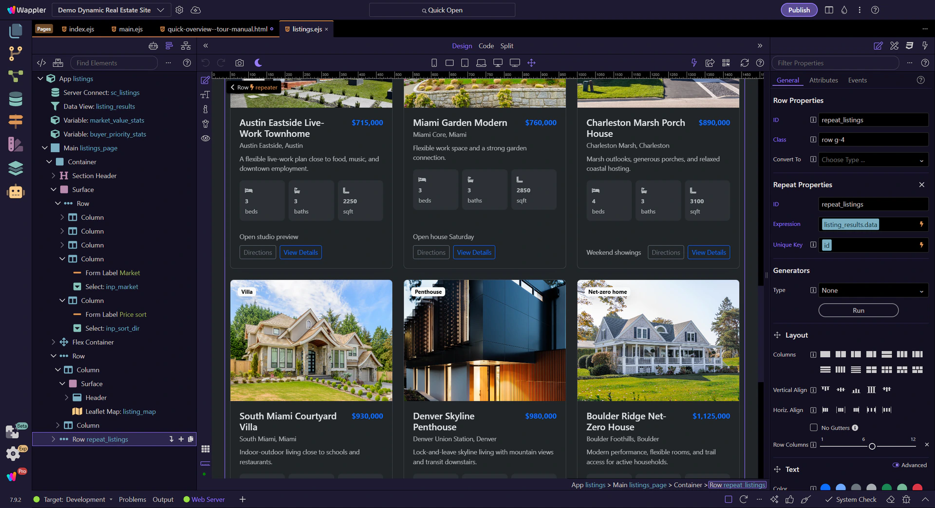
Focused walkthrough of the renewed listing detail page: route-driven Server Connect loading, gallery and lightbox, related repeats, map, and inquiry call-to-action bindings.
The listing detail page shows how the renewed demo handles one routed record. A route parameter loads the listing, then App Connect binds that detailed record into galleries, repeated sections, maps, and call-to-action links.

The walkthrough starts on views/listing.ejs, where the renewed demo turns one routed listing record into a complete detail page.
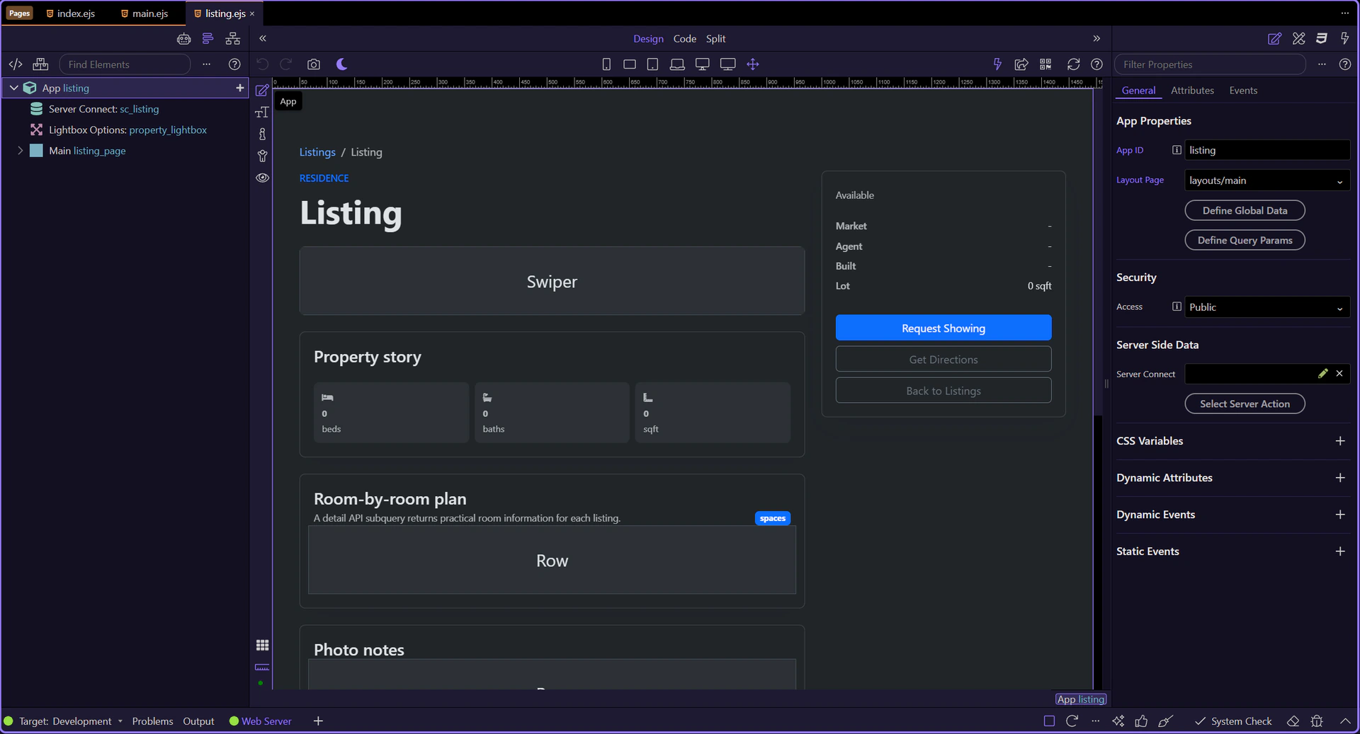
The detail page is now active in Design View, so the Structure and Properties panels can follow the live page context.

sc_listing calls /api/listings/get and binds query.id into the request, which is how the detail page resolves one record from the routed URL.
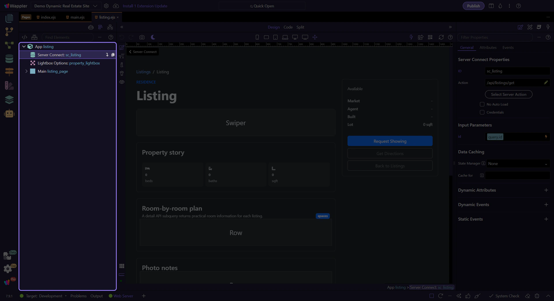
property_lightbox is a good example of page-level App Connect infrastructure: several gallery links can reuse it without duplicating popup logic.
The swiper uses the loaded record’s listing_images collection, so one API record can immediately power a richer presentation component.
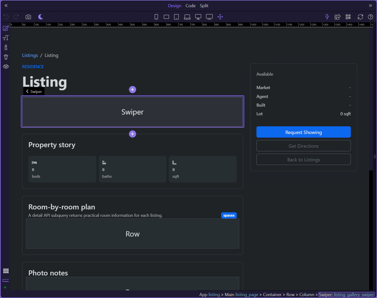
listing_rooms shows a common detail-page pattern: subquery data from the main record becomes a repeat region for structured secondary content.
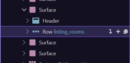
gallery_notes turns the same image collection into a second presentation. This is the same App Connect lesson as elsewhere in the demo: one collection can feed multiple UI layers.
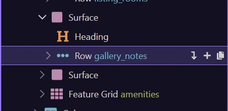
detail_map binds one listing’s coordinates into a focused Leaflet map and marker, which keeps the location tied directly to the loaded record.
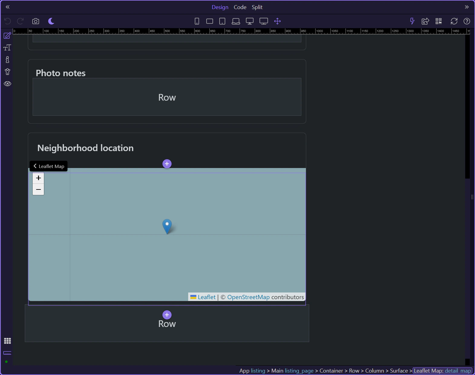
amenities is another repeated slice from the same loaded record, reinforcing how the detail page decomposes one record into several focused UI sections.
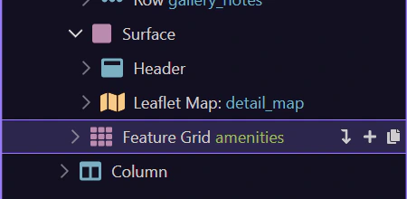
The Request Showing button passes the current listing id into the inquiry page. That is the workflow bridge between this routed detail page and the form page.
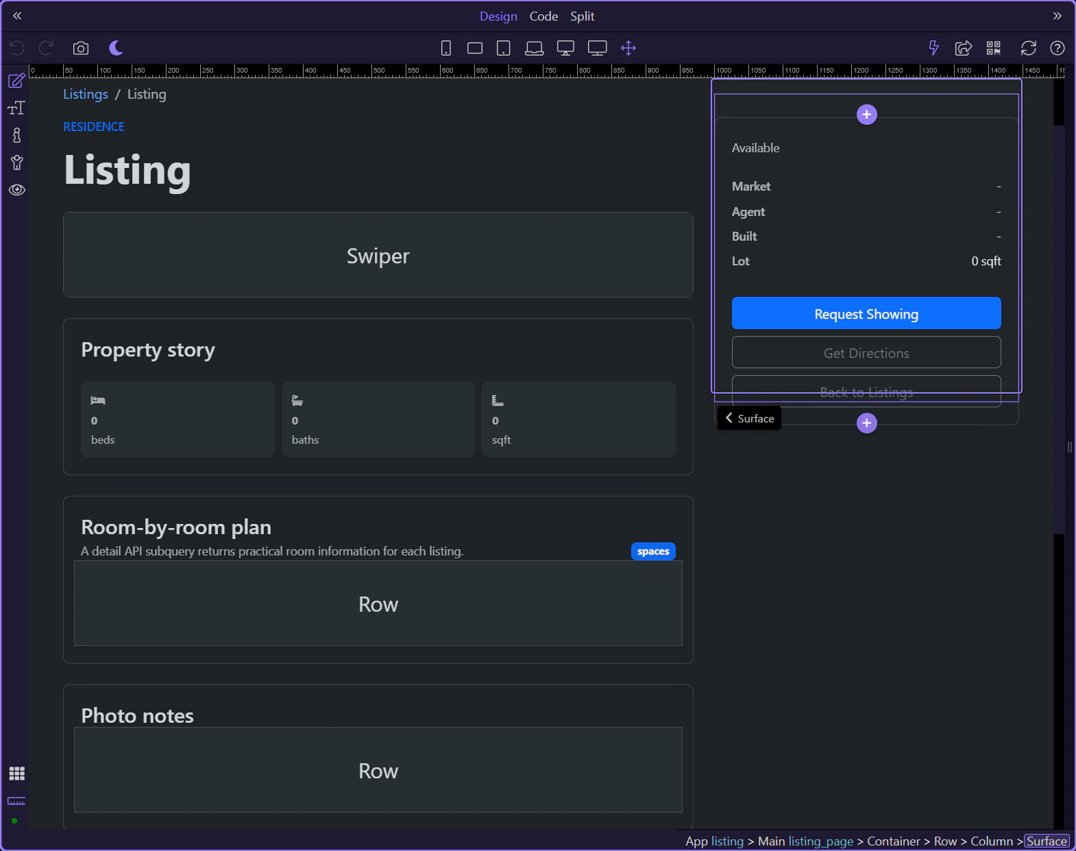
The detail page completes the renewed demo pattern: route-driven loading, one detailed record, and several App Connect consumers built on top of it.
Continue into the inquiry workflow, back to the listings page, or the wider App Connect index.
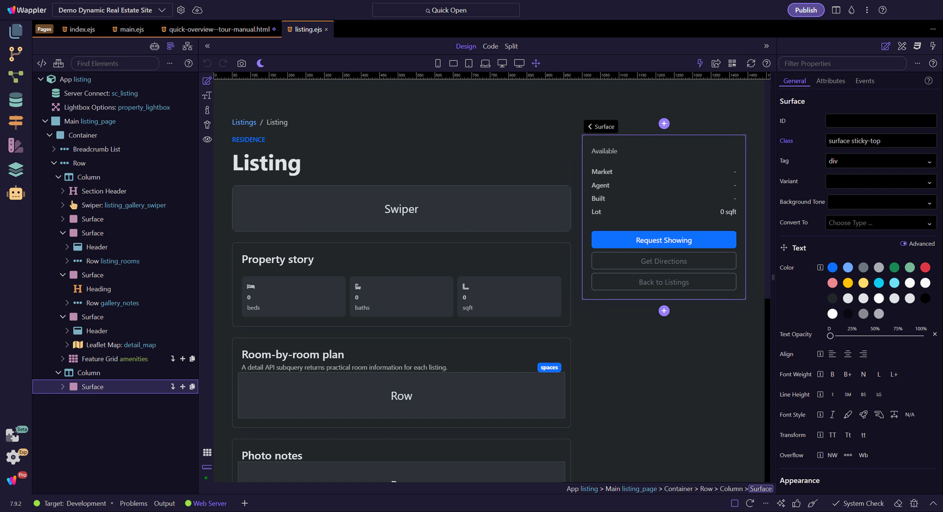
Focused walkthrough of the renewed inquiry page: Server Connect form posting, listing picker, calendar availability, validation, and success feedback.
The inquiry page is the demo’s form workflow example. It combines page-level data, availability helpers, and a Server Connect form that posts into the SQLite-backed inquiry pipeline.
The walkthrough starts on views/inquiry.ejs, where the renewed demo combines calendar guidance with a Server Connect form workflow.

The inquiry page is now active in Design View, so the Structure and Properties panels can follow the live page context.
sc_listings loads the available listings so the form can present a live property picker instead of hard-coded options.
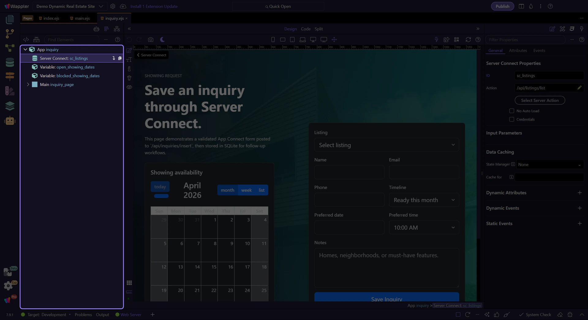
The calendar gives users immediate context about availability before they fill the form, which makes the page feel guided instead of blank.
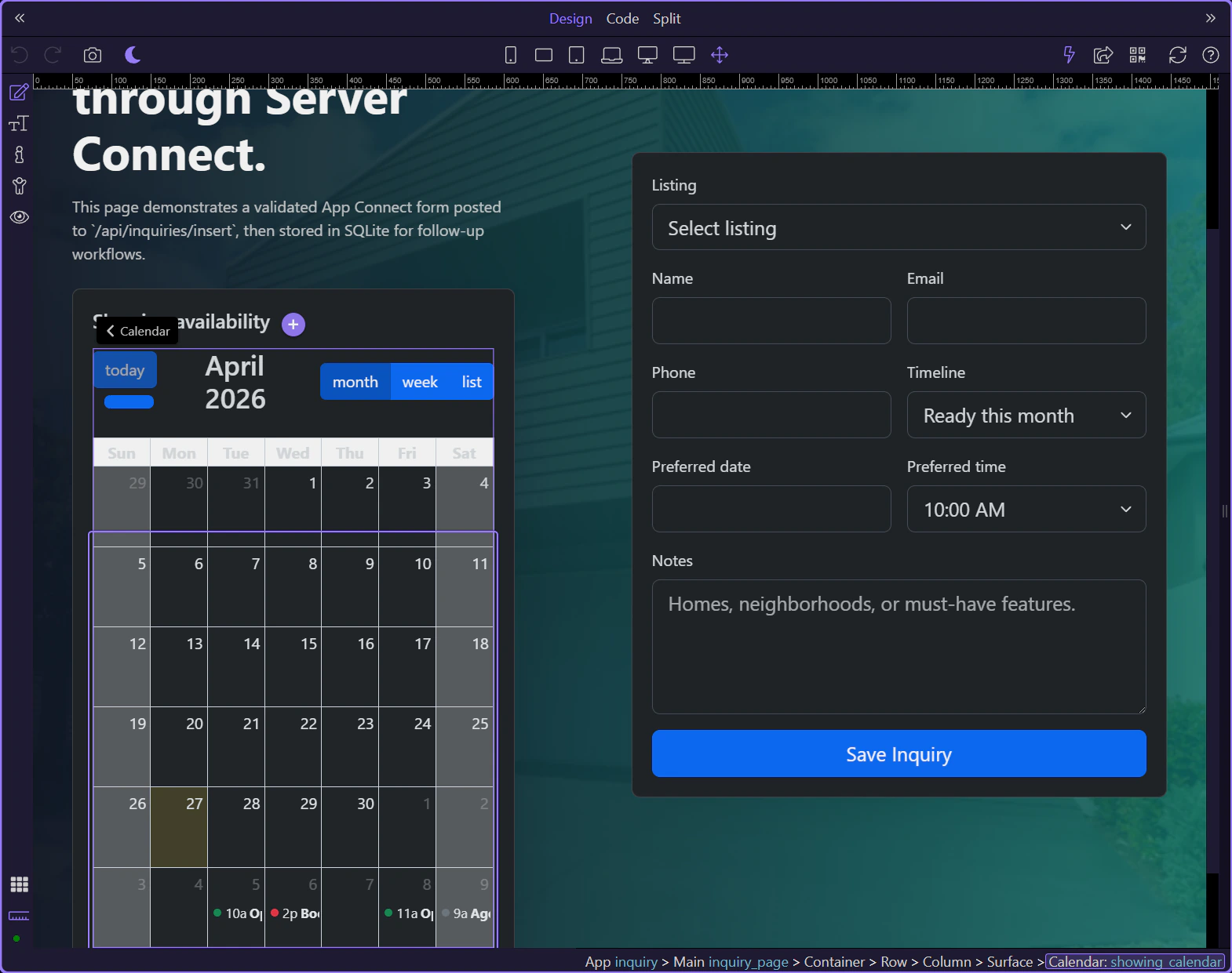
inquiry_form is the page’s main workflow component. It posts to /api/inquiries/insert and exposes execution and feedback state directly to the UI.
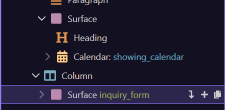
inp_listing_id shows how the form reuses the loaded listing collection to generate live select options and also accepts a prefilled query value from other pages.
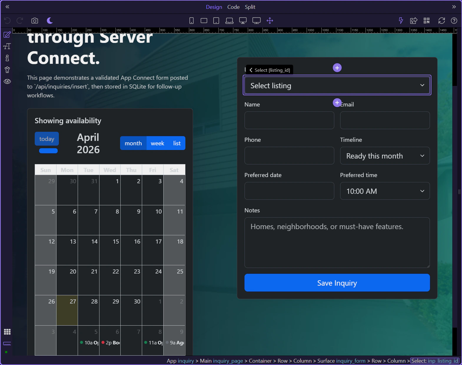
The date picker mixes custom available dates and blocked dates, which is a practical example of App Connect enriching input controls with page-level data.
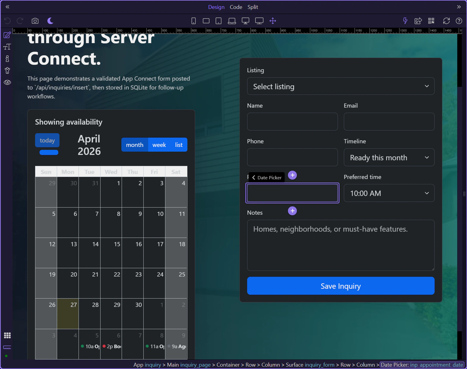
The submit button reacts to inquiry_form.state.executing, while the alert blocks above the form reflect success or failure after submission. That keeps the whole workflow visible on one page.
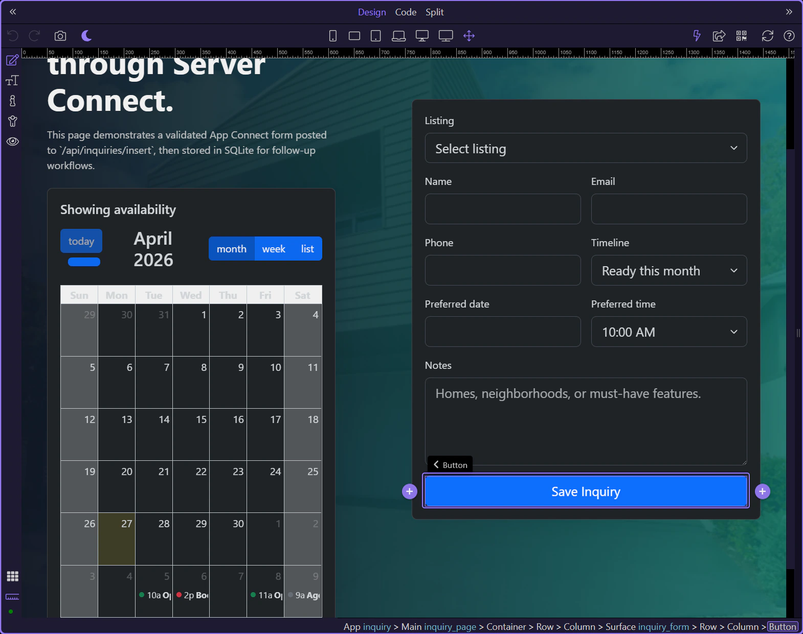
The inquiry page completes the renewed demo’s workflow chain: browse listings, inspect a property, then save an inquiry through a guided App Connect form.
Continue back to the detail page, the listings page, or the wider App Connect index.
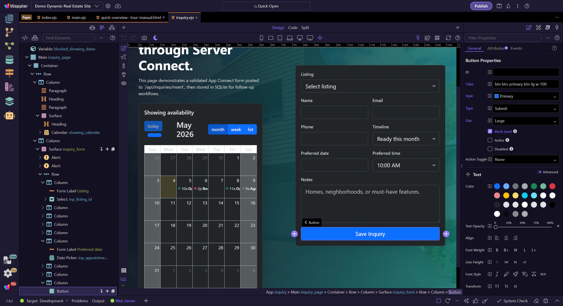
Bind form inputs, configure validation, and build repeatable sections using concrete Demo Projects HQ pages where possible.
Use this hub when you are building forms with real inputs, validation, or repeated fields. Start with the Demo Projects HQ-backed examples, then move into isolated form patterns.
A short Demo Projects HQ tour used to capture the 7.8.0 newsletter clip for the updated Properties panel workflow.
Use the real Demo Projects HQ files page to show how the updated Properties panel surfaces Dynamic Attributes and Dynamic Events on one practical element.
Begin with the selected Clear files button and the full Properties panel in view. This gives the clip the wider context before it moves into the new secondary toolbar sections.

The button already uses a real App Connect dynamic attribute: dmx-bind:disabled tied to the upload form state. Focus the Dynamic Attributes section so the clip shows where those bindings now live.
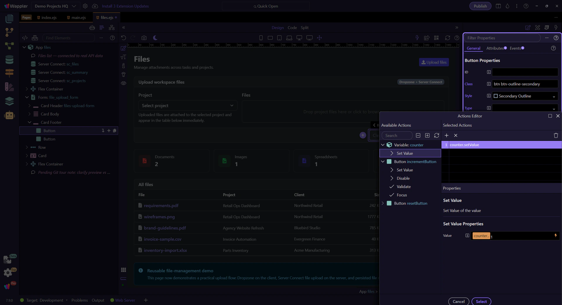
Stay on the same button and move slightly deeper into the Dynamic Attributes area so the recorded clip catches the existing binding instead of only the add control.

The same button also has a real App Connect click event: dmx-on:click=“files_dropzone.reset()”. This Properties panel view keeps the updated event workflow readable, so you can see both where the event lives and how it relates to the selected button.
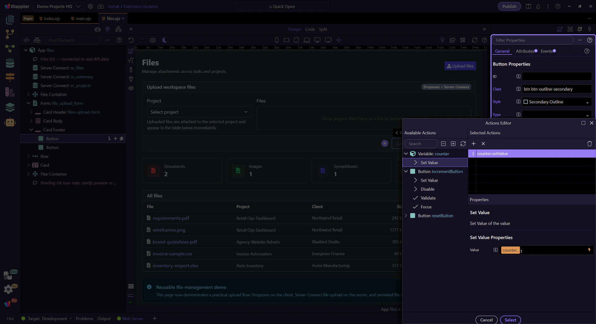
Data-oriented building blocks: data components and common data sources.
Use this hub when you need App Connect’s core data building blocks. Start with Variables, Arrays, and Toggles, then move into Data Store, Data View, Data Detail, and list-state patterns.
Expressions, bindings, pickers, and formatter chains for display-ready values.
Use this hub when you need to turn data into display-ready UI. Start with bindings and pickers, then move into expression building, formatter chains, and table formatting.
Wire events to actions, and work with Dynamic Events/Attributes.
Use this hub when user interaction should trigger behavior. Start with events and actions, then move into Dynamic Events, Dynamic Attributes, and show-or-hide patterns.