Two parts: trigger + panel
Offcanvas is a trigger element plus a separate offcanvas panel (header/body) that slides in.
Use Offcanvas as a slide-in panel for navigation or tools, and learn the key behaviors: placement, backdrop, and responsive usage.
In this tour you’ll learn how Bootstrap offcanvas works in Wappler: the trigger/target wiring, placement, and the key Properties to control behavior.
This offcanvas sample shows how Bootstrap can reveal secondary content without taking the user to another page or stacking everything in the main layout. It is useful for menus, filters, and contextual tools, and it helps to understand the whole interaction before inspecting individual options.
tip: Offcanvas is often a better mobile menu than a full-screen modal because it keeps context and supports scrolling.
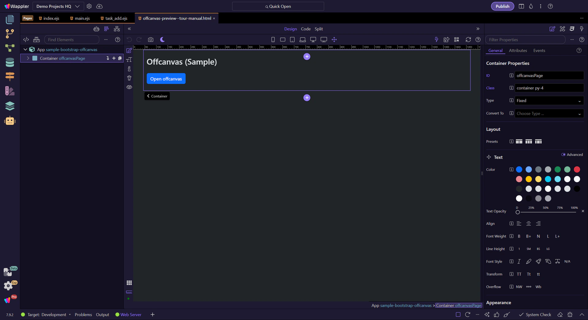
Offcanvas is a separate element from its trigger. App Structure helps you select the trigger and the offcanvas container independently.
If clicking your trigger does nothing, it’s usually a missing/incorrect target ID or toggle type.
tip: Most issues come down to the trigger target and the offcanvas id not matching.
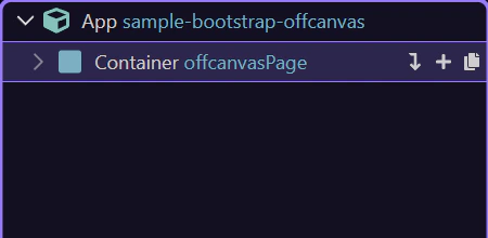
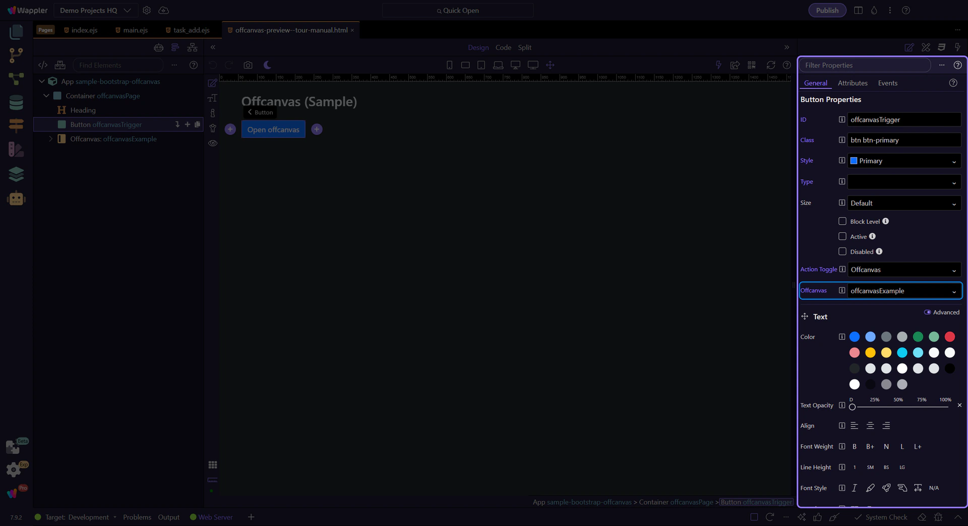
Now we’ll select the trigger button and the offcanvas element, and highlight the key Properties to review.
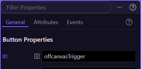
The trigger button is where the toggle type and target are configured. This step matters because Trigger button is part of Design View, and understanding that context makes the next action easier to repeat in your own project.
tip: Triggers are usually Buttons, Links, or Navbar togglers.
Start with the wider context in the Properties panel so the next control makes sense in the full workflow. In the next step, you will focus on Trigger: Toggle type and see how it fits into this area.
In Properties, set the trigger Toggle type to Offcanvas. This step matters because Trigger: Toggle type is part of Selection Panels Properties Btndatatooggle, and understanding that context makes the next action easier to repeat in your own project.
important: Toggle type + target must match the offcanvas element id.

In Properties, set the trigger Target to the offcanvas element id. This step matters because Trigger: Target is part of Selection Panels Properties Btntoggletargetoffcanvas, and understanding that context makes the next action easier to repeat in your own project.
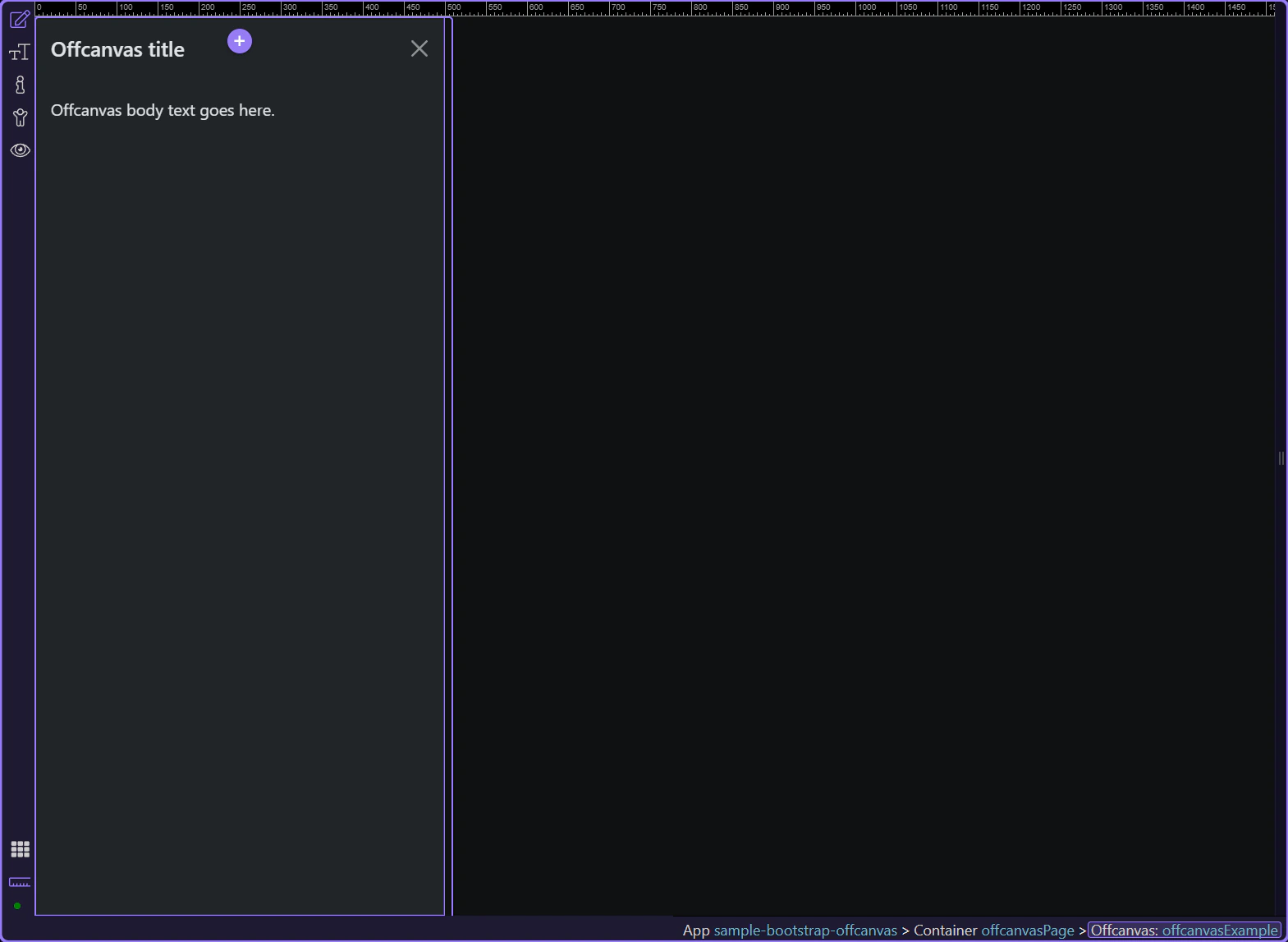
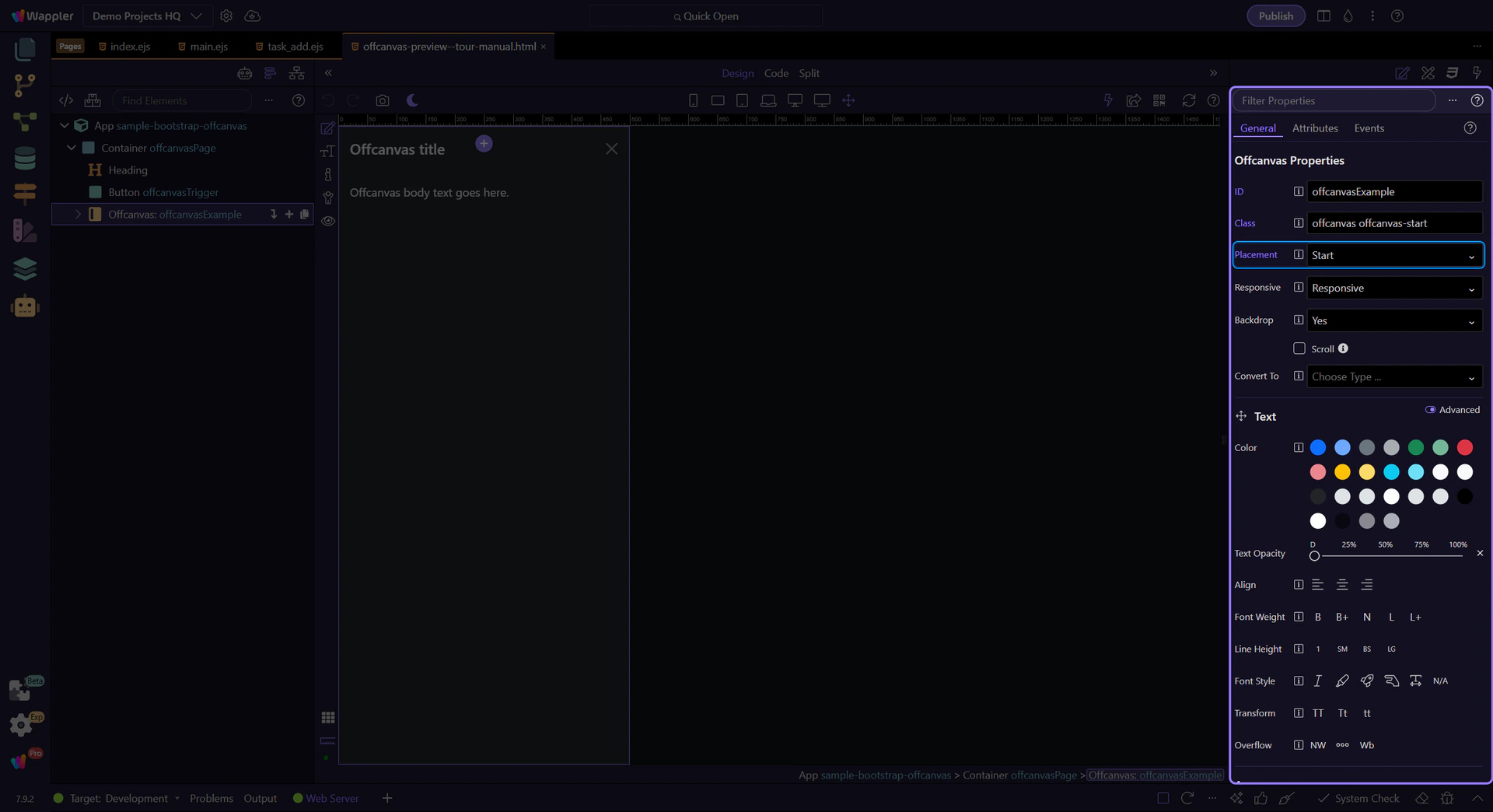
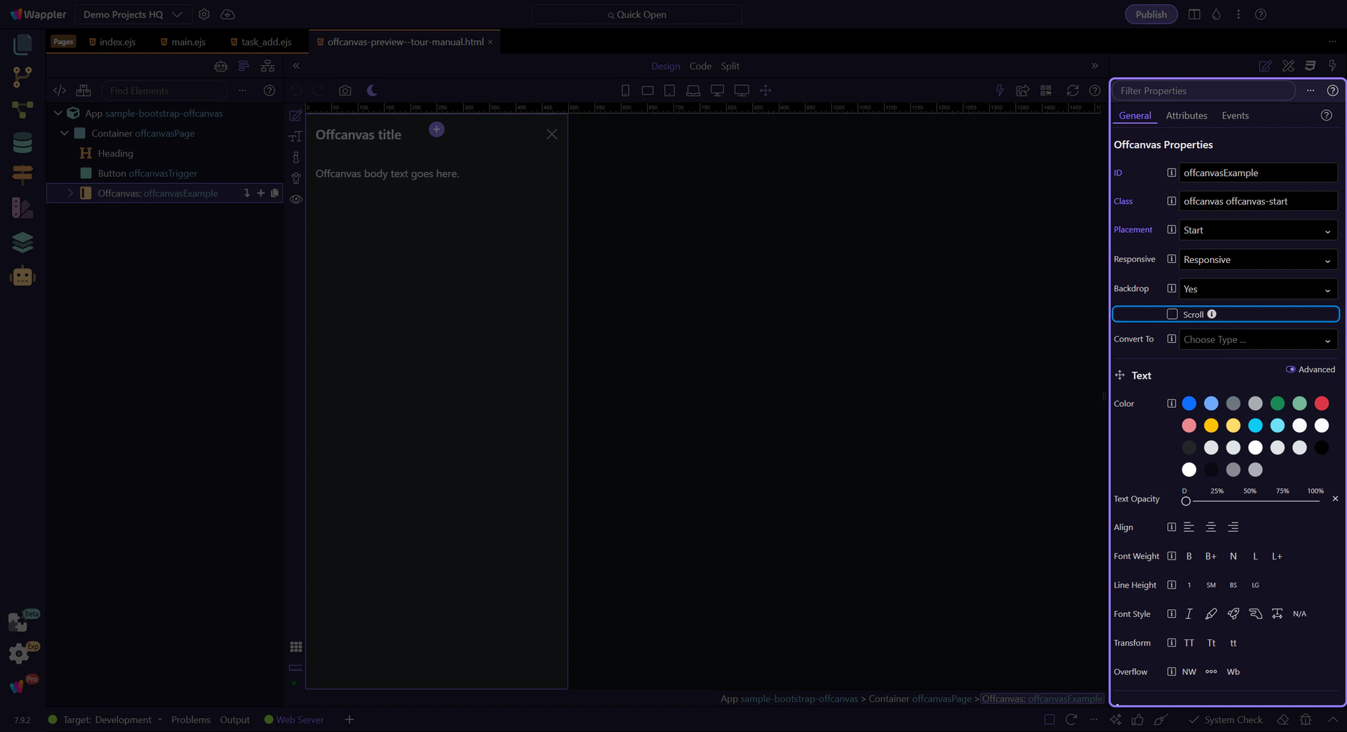
The offcanvas element is where you configure placement and behavior. This step matters because Offcanvas element is part of Design View, and understanding that context makes the next action easier to repeat in your own project.
tip: Offcanvas can slide from start/end/top/bottom and can optionally allow body scrolling.
In Properties, set Placement (start/end/top/bottom) based on how you want the panel to slide in.
Backdrop controls the overlay behind the offcanvas. Disable it only when you have a clear dismissal pattern.
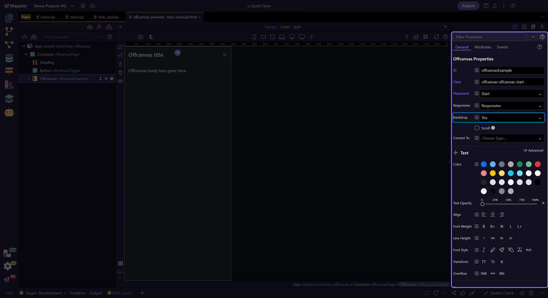
Scroll controls whether the body can scroll while the offcanvas is open (when supported). This step matters because Offcanvas: Scroll is part of Selection Panels Properties Offcanvasscroll, and understanding that context makes the next action easier to repeat in your own project.
tip: Keep content inside offcanvas-body for consistent padding and scrolling.
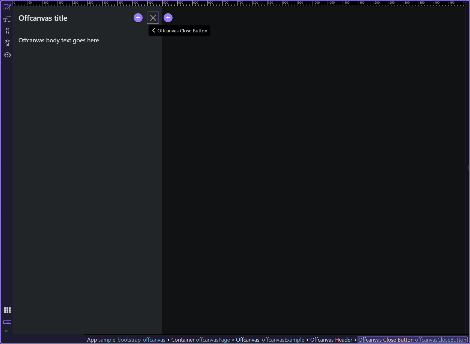
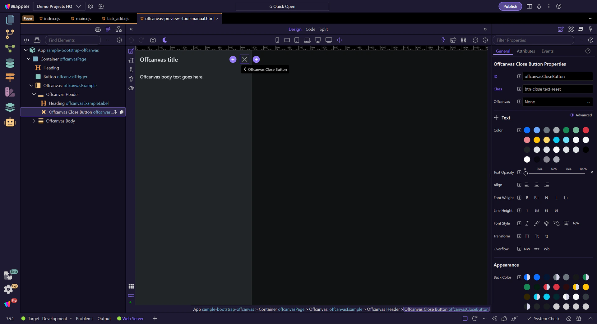
In App Structure, check the header/title/close button are inside the offcanvas header for consistent UX.
Offcanvas headers typically include a Close button (.btn-close) with data-bs-dismiss="offcanvas" and an aria-label.
Offcanvas works like a trigger + a separate panel element. Most issues come down to the trigger target and the offcanvas id not matching.
Common patterns:
Continue with a related tour or go back to the Bootstrap tours index.
