Scope-aware
The picker only shows what’s in scope.
Deep dive into Wappler’s Data Bindings Picker and Visual Expression Builder: scope tree, Design vs Code view editing, preview, and inserting expressions safely.
This tour uses a dedicated App Connect tour page so you can explore bindings and pickers safely. You’ll learn how Wappler builds expressions visually, how scope affects what you can pick, and how Design vs Code view affects how you edit bindings.
Wappler’s binding workflow is picker-driven: select data from a tree and let Wappler generate the correct expression for you.
This step auto-selects a repeating element in Design View so the picker has real data in scope.
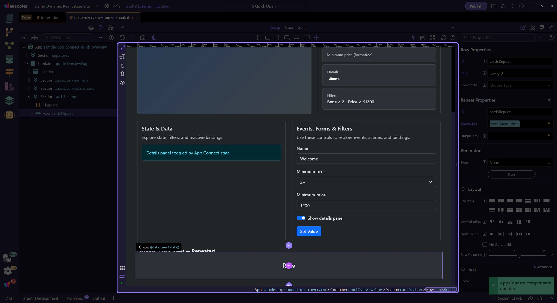
Start with the wider context in the Properties panel so the next control makes sense in the full workflow. In the next step, you will focus on Data Bindings Picker and see how it fits into this area.
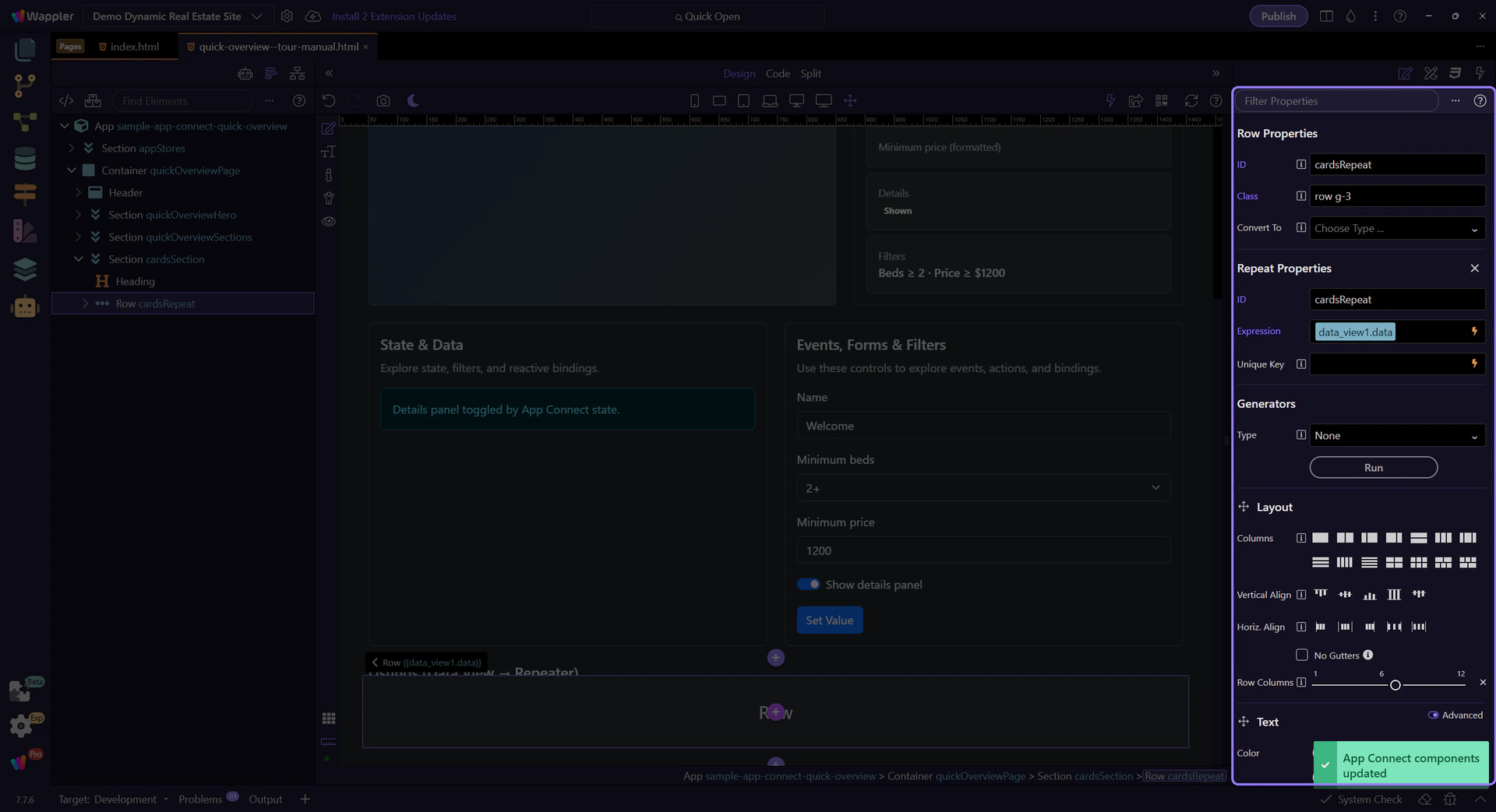
The picker icon opens the Data Bindings Picker for the Repeat expression. This step matters because Data Bindings Picker is part of Selection Panels Properties Repeatexpression, and understanding that context makes the next action easier to repeat in your own project.
tip: When in doubt, open the picker: it shows only valid items for the current scope.

The Data Bindings Picker shows data/components/methods available in the current scope. Selecting an item builds the correct expression and previews what will be inserted back into Properties.
This popup is the central workflow for building bindings safely. Use it whenever you see a picker icon next to a bindable field.
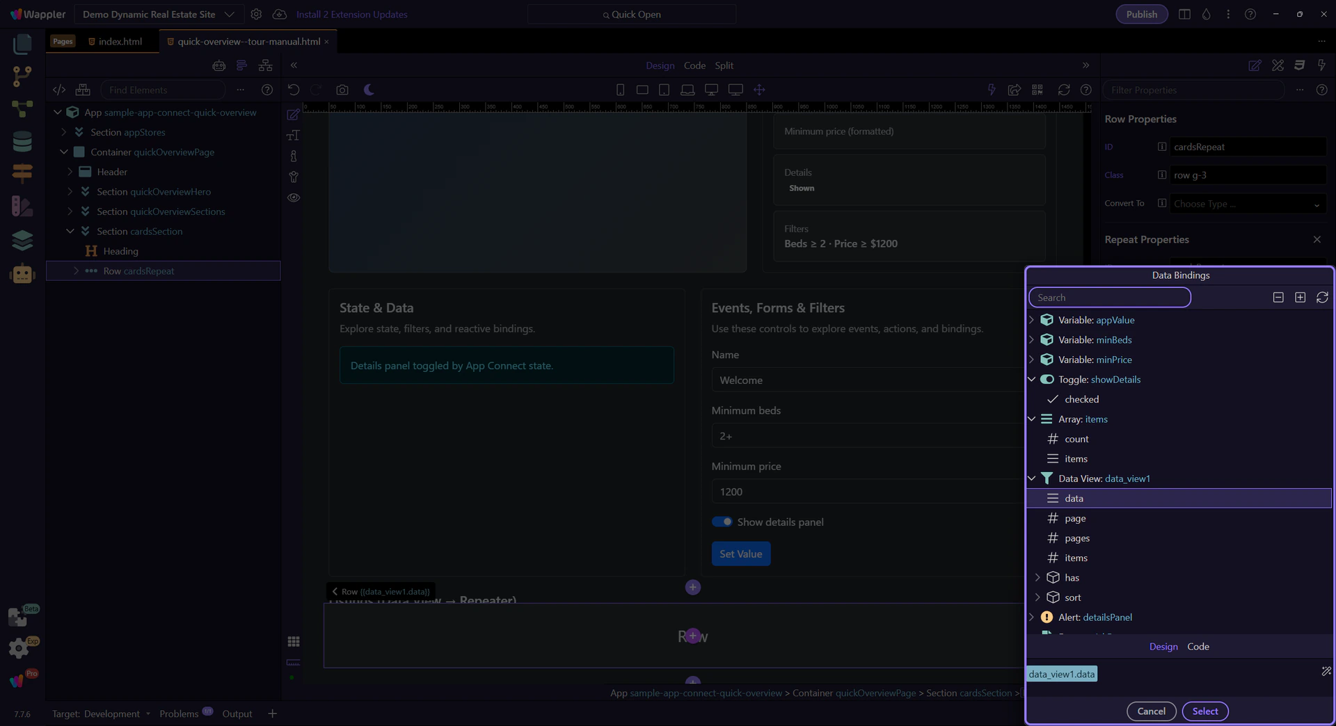
Expand nodes to browse components and their data. This is your current scope — it changes depending on what’s selected in App Structure.
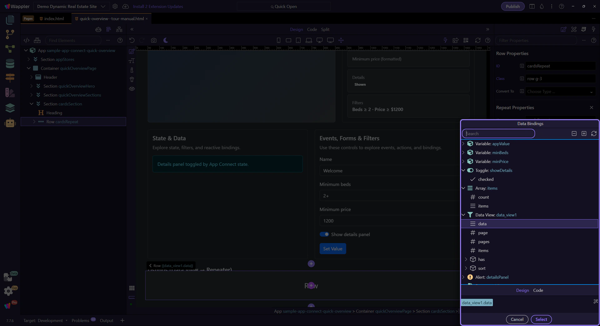
Use the toolbar to search and navigate large scopes quickly (expand/collapse, search, etc.).
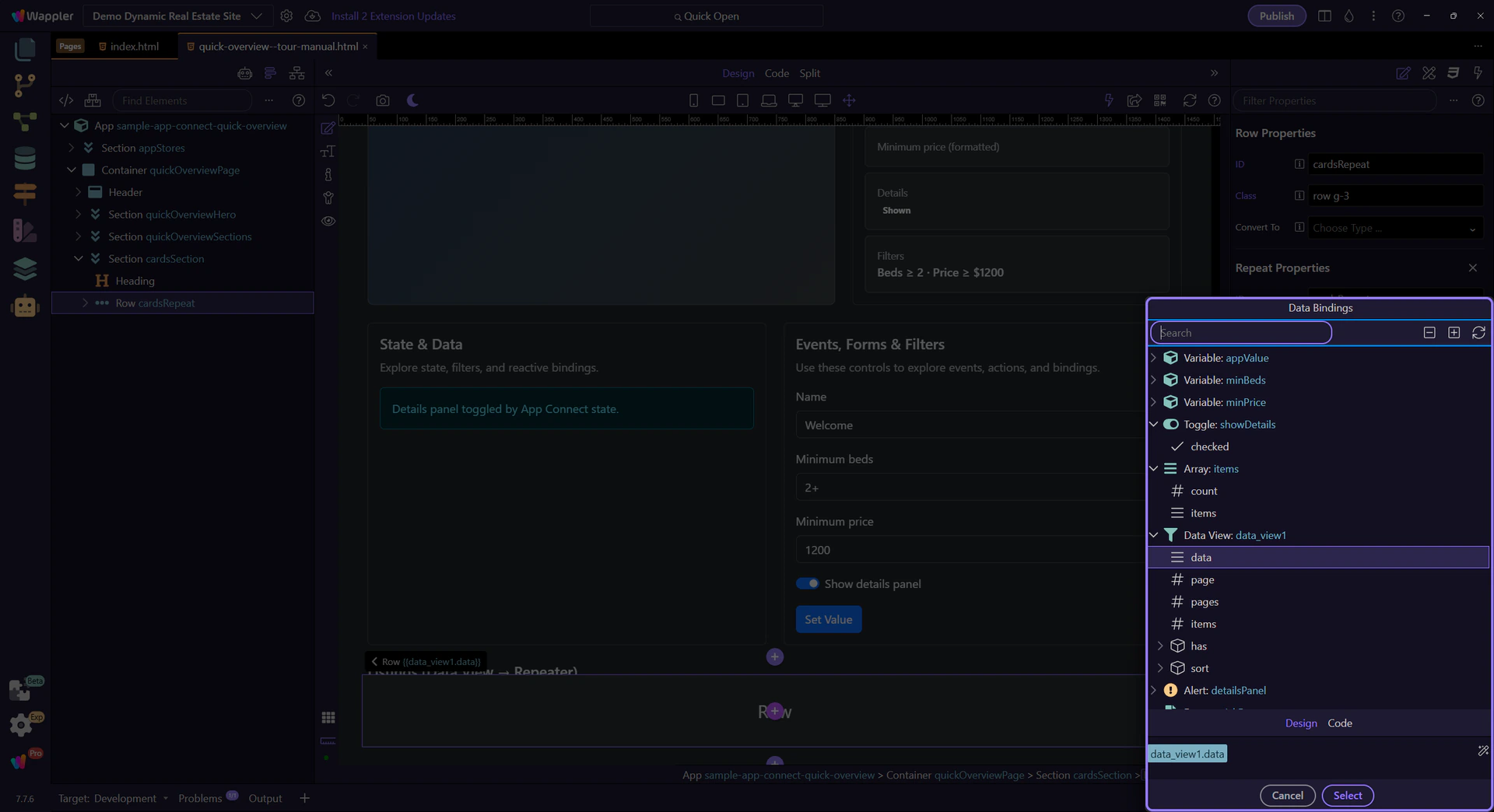
This preview shows the full expression that will be inserted into the originating field when you pick items from the tree.
Depending on the picker mode, the preview area can offer helper controls for editing or refining the expression before inserting it.

When a binding supports mixed content, Wappler offers two editing modes. Design view helps you visually build a combined value (text + picked expressions) without worrying about quoting/escaping. Code view shows the raw expression/text, so you can fine-tune it directly when needed. You can switch between them, but it’s usually safest to stay in Design view and let Wappler generate valid syntax.

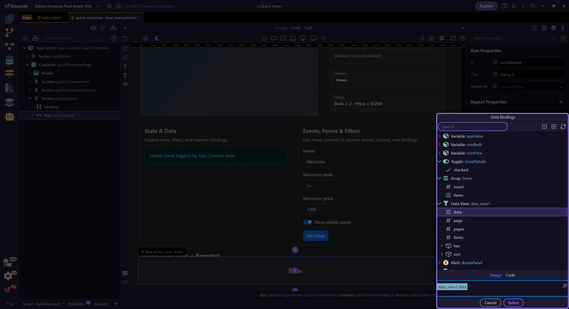
Close the picker to return to Properties. This step matters because Close the Data Bindings Picker is part of Popup Databindingspickup Button Cancel, and understanding that context makes the next action easier to repeat in your own project.

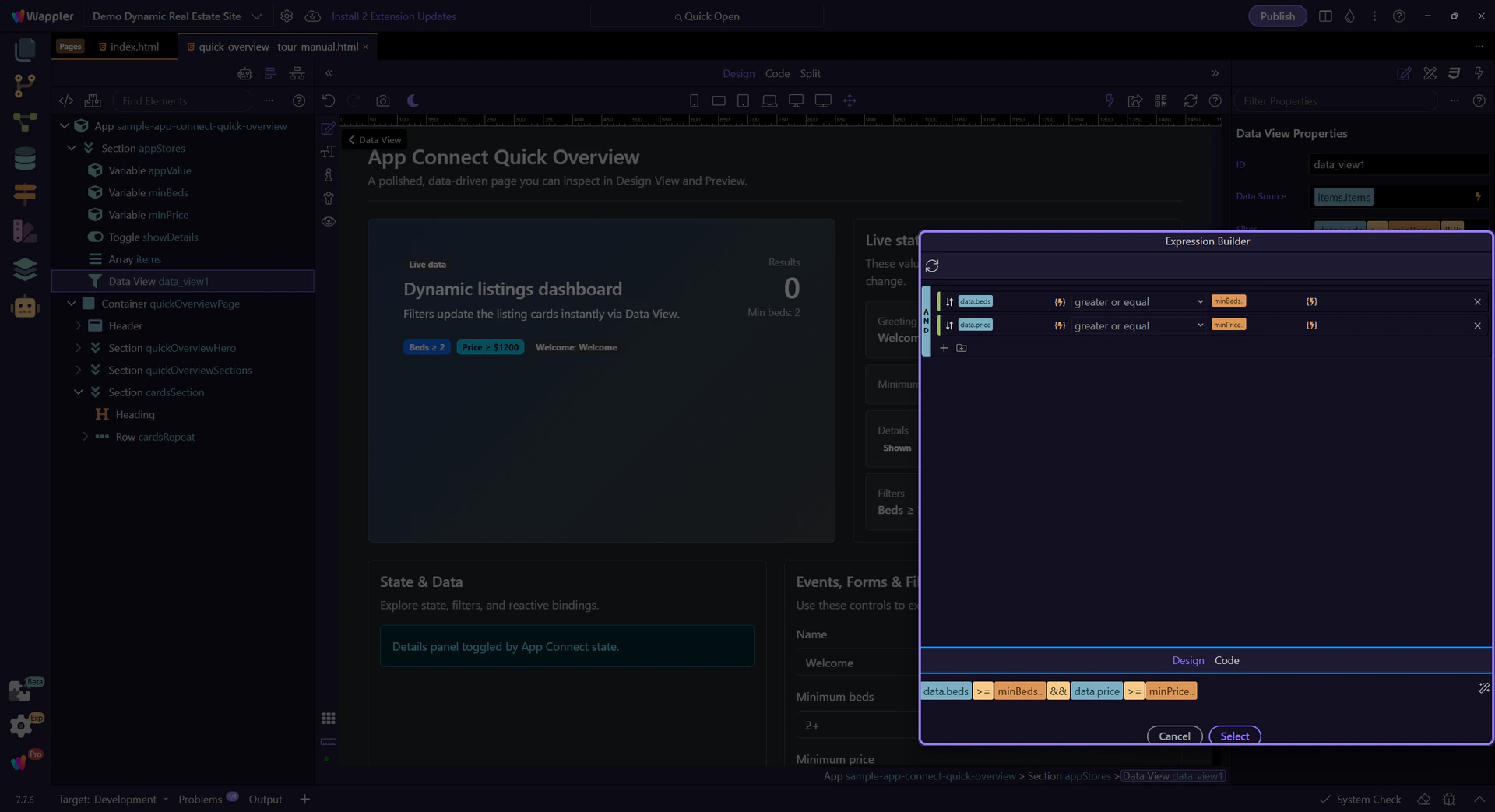
Some properties use the Visual Expression Builder. It’s still scope-aware, but focused on building logic (operators, conditions) rather than just picking a data path.
This step selects a Data View so you can see the Expression Builder flow.
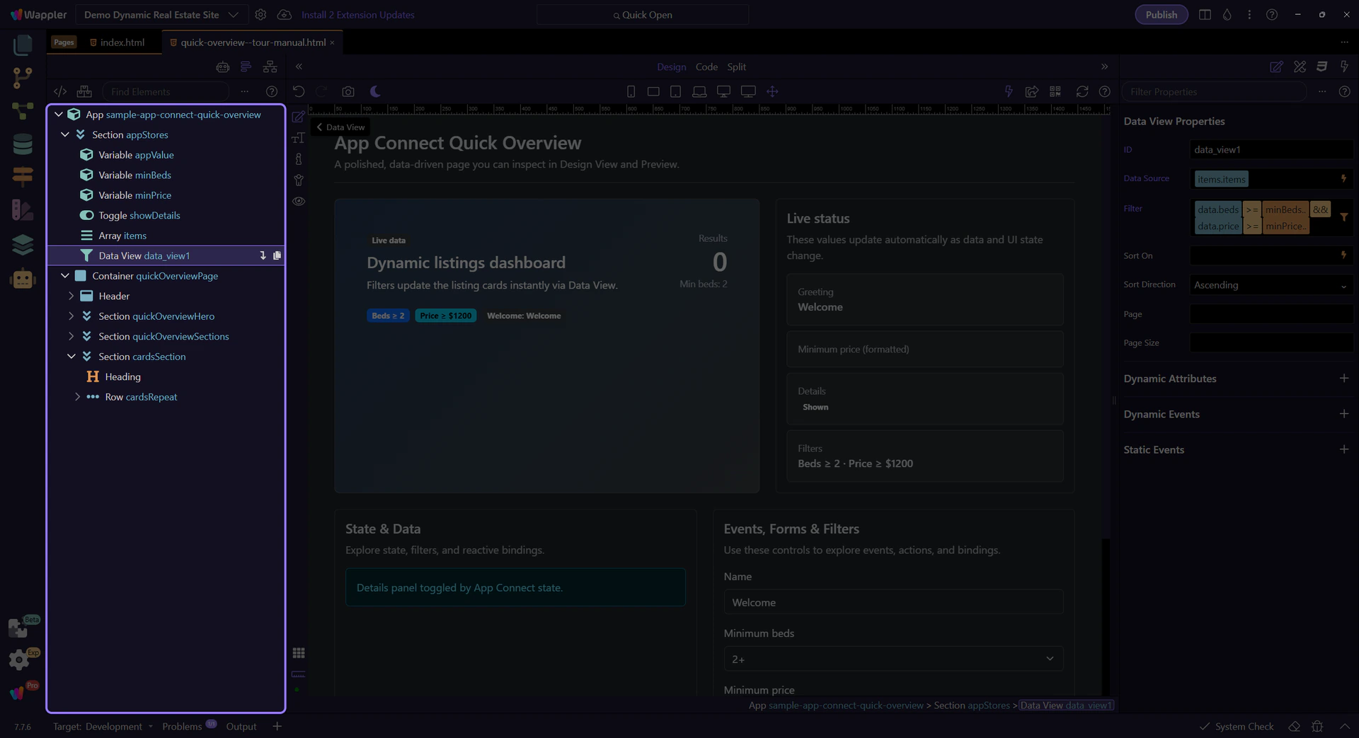
The Data View Filter picker opens the Visual Expression Builder so you can build conditions visually.

This popup helps you build valid expressions with operators and grouped conditions, while staying in the correct scope.
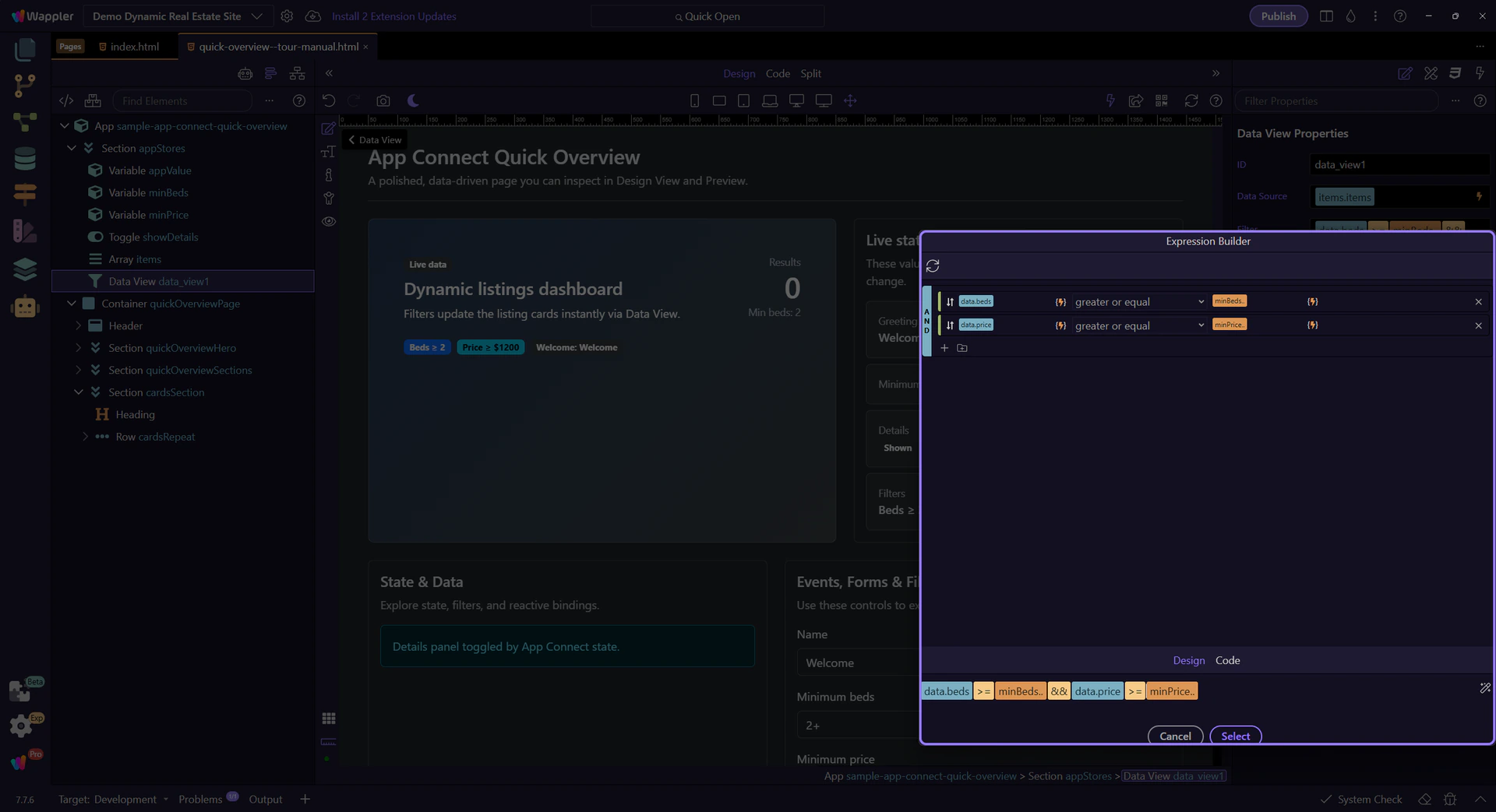
Just like the Data Bindings Picker, the Expression Builder exposes scope. Use it to pick data sources and methods while constructing logic.

This preview shows the full expression that will be inserted back into the originating field when you apply/close the popup.
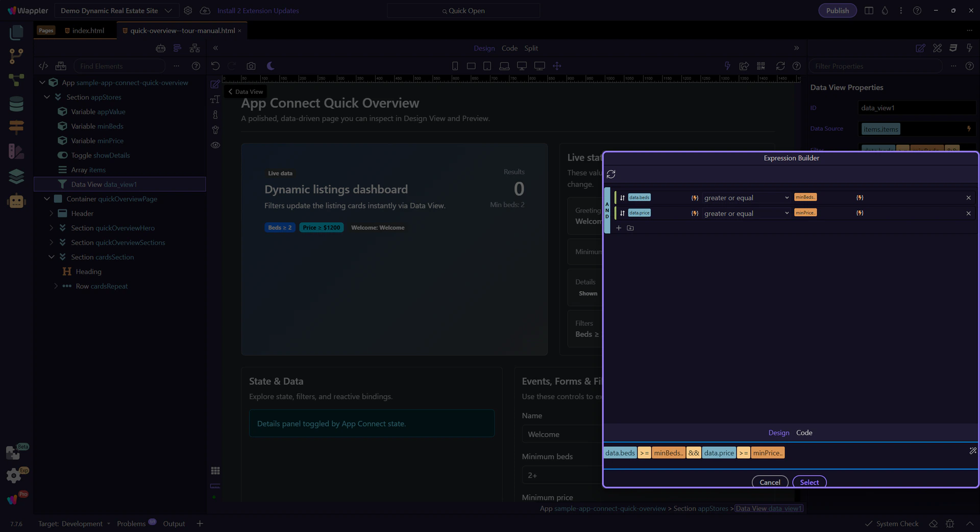
If the expression builder shows mixed content, you can switch between Design (visual) and Code (raw) editing. Design view is preferred because Wappler handles quoting/escaping and keeps the expression valid; Code view is there when you need to tweak the raw expression.
Close the popup to return to Properties. This step matters because Close the Visual Expression Builder is part of Popup Expressionbindingspickup Button Cancel, and understanding that context makes the next action easier to repeat in your own project.

You’ve seen how Wappler builds bindings safely with pickers, how scope affects what’s available, and how Design vs Code view lets you choose between visual editing and raw expression editing.
Continue with a deeper formatting tour or review formatters at a high level.