State
Use Data components (Variable, Array, Toggle) and collections (Data Store) to hold state.
A hands-on intro to App Connect in Wappler: review key components, configure Properties, and attach an event action.
App Connect makes pages reactive by connecting UI to data and events. You build it visually with components + Properties.
App Connect is a reactive layer: components hold data, UI reads that data, and events trigger actions that update data. When data changes, the UI updates automatically.
important: Use Wappler’s Data Bindings Picker and Actions Picker to select data and actions from a tree. This keeps your bindings consistent with what’s in scope.
This tour opens a sample App Connect page in Design View. Keep Page Panels (Structure) and Selection Panels (Properties) visible.
Start with a simple text binding and see how currency formatting works. Next, inspect the repeater’s repeat expression, then open the Visual Expression Builder used by the Data View filter. Finally, review a Show/Hide binding.
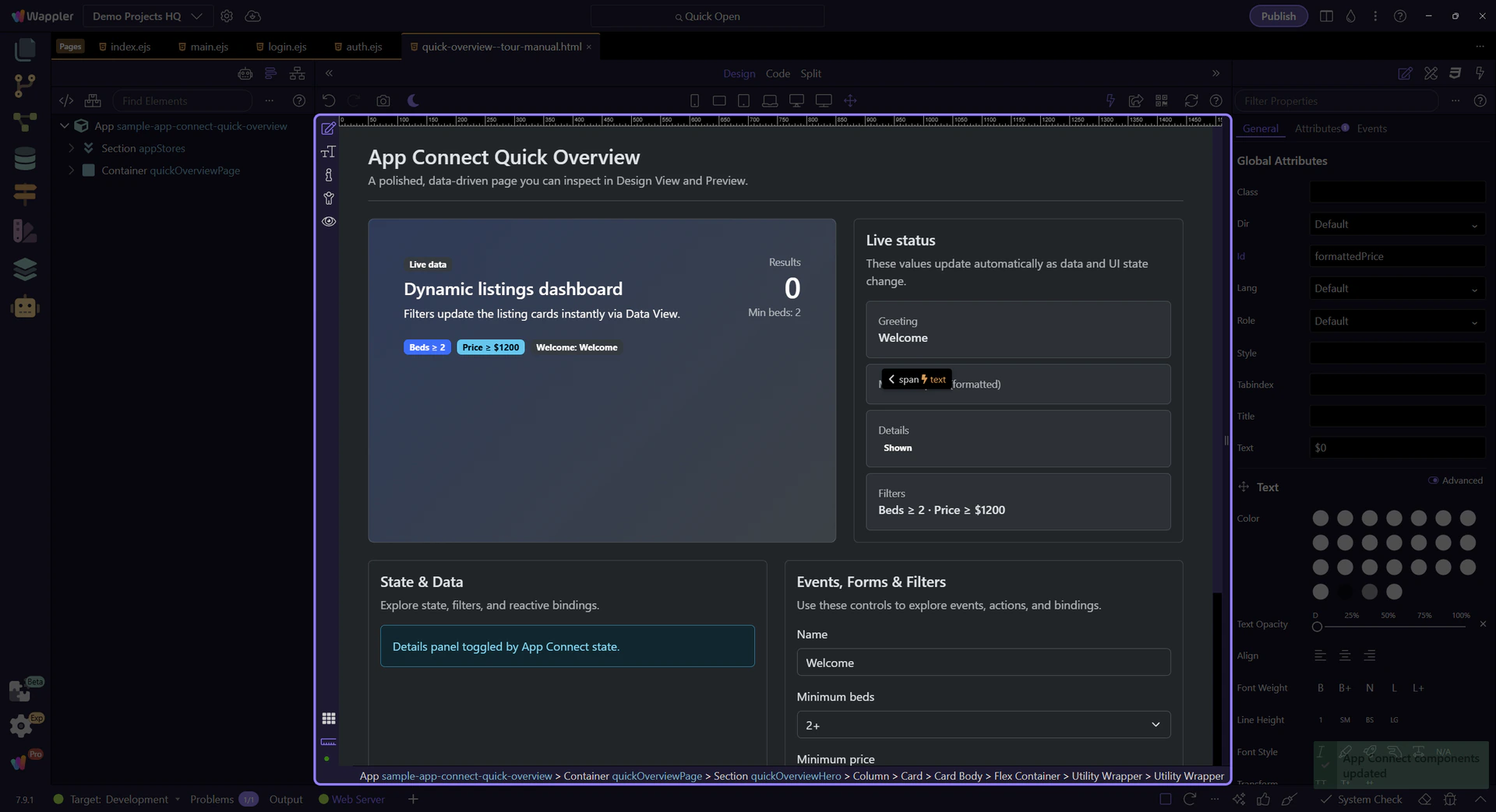
This value uses a binding expression that formats as currency: minPrice.value.formatCurrency('$').
Start with the wider context in the Properties panel so the next control makes sense in the full workflow. In the next step, you will focus on Text binding expression and see how it fits into this area.
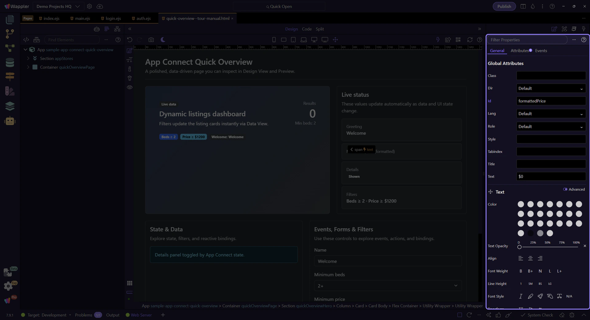
This field contains the expression for the selected element. This step matters because Text binding expression is part of Selection Panels Properties Innertextvalue, and understanding that context makes the next action easier to repeat in your own project.
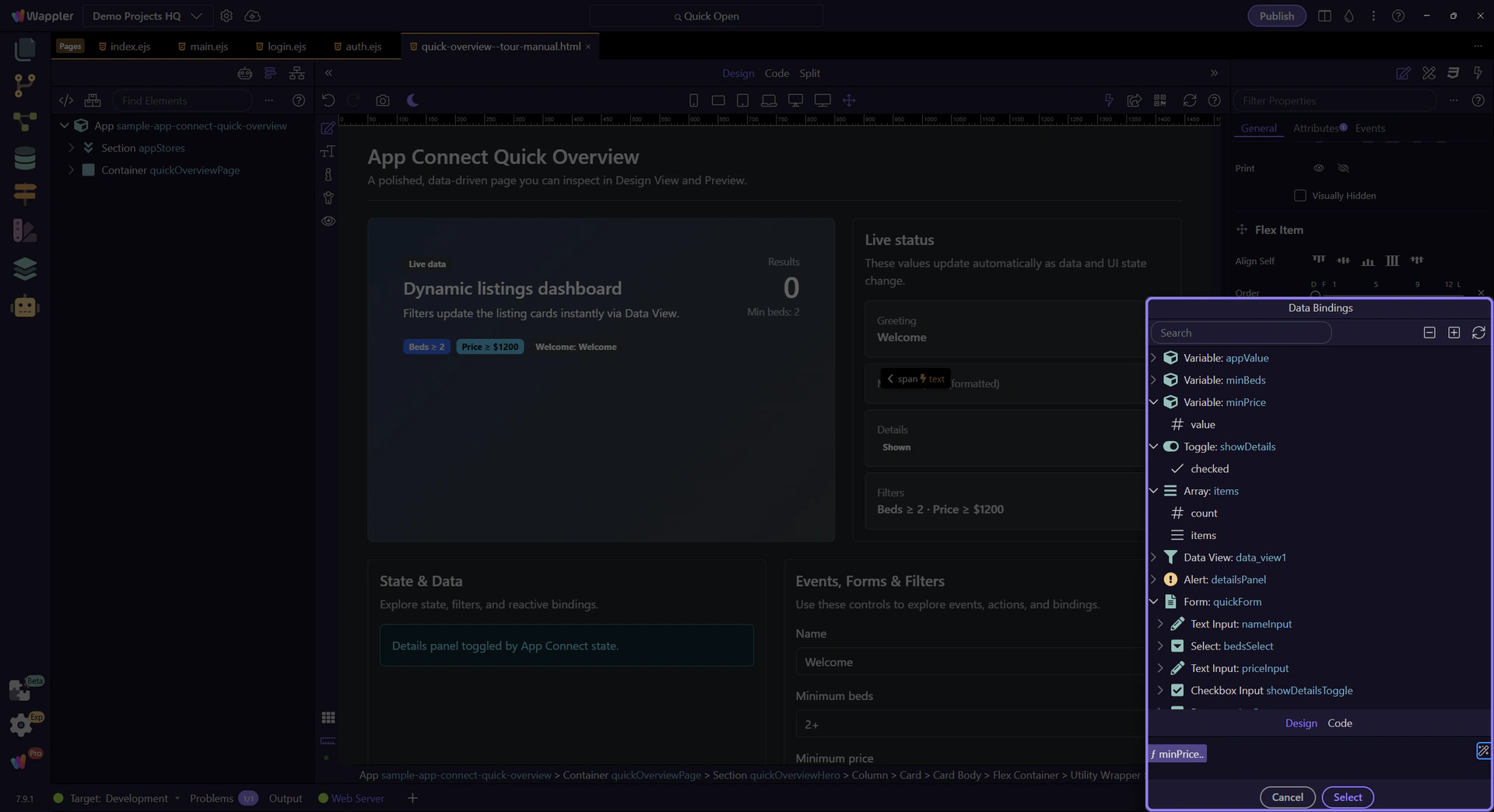
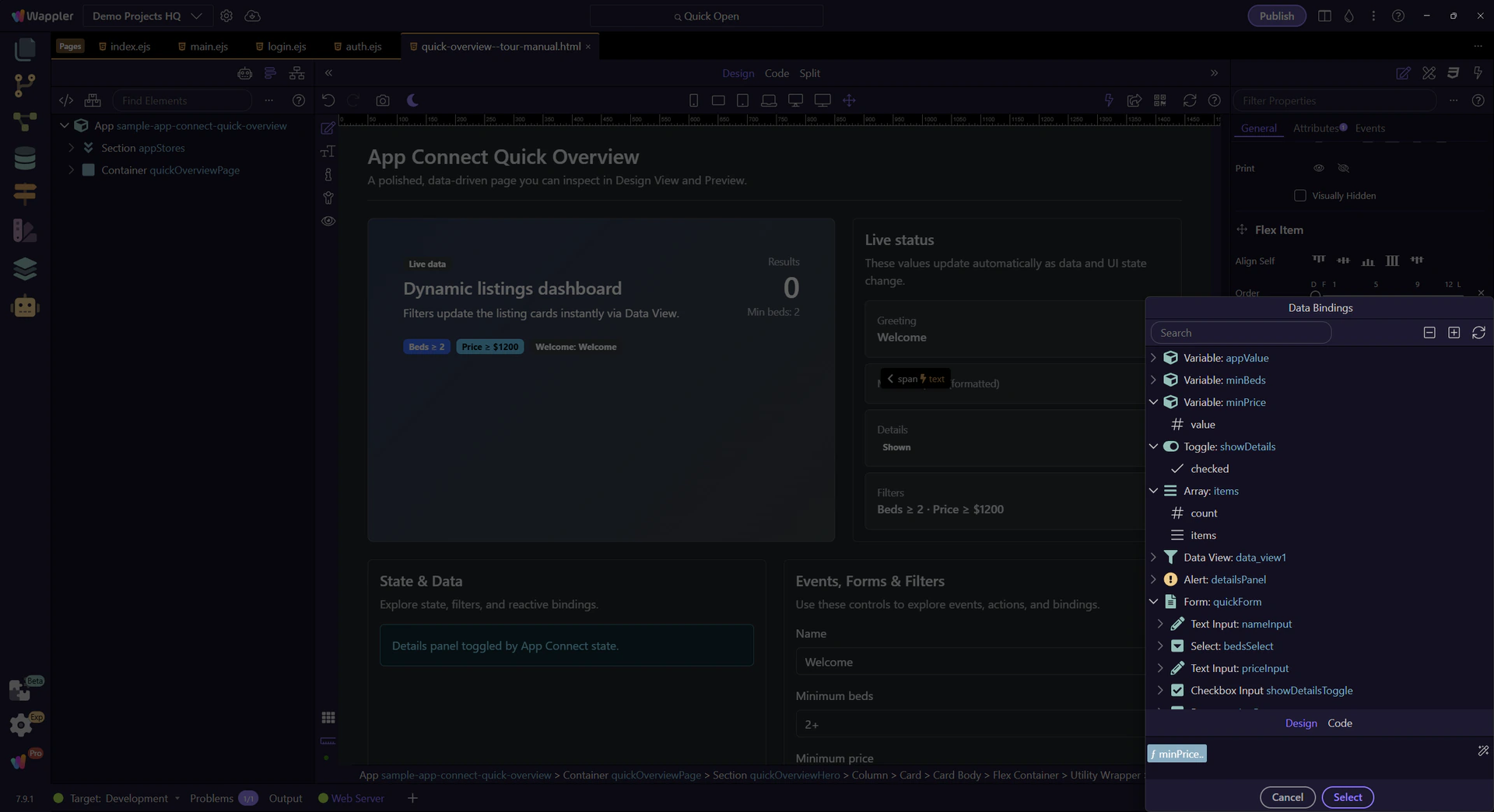
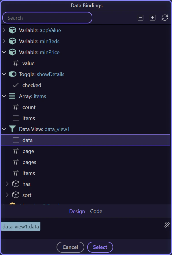
We’ll open the Data Bindings Picker so you can browse what’s in scope and insert valid expressions without typing everything.

Browse what’s in scope for this field. Since the current expression uses minPrice.value, you should see minPrice (Variable) and its value here.
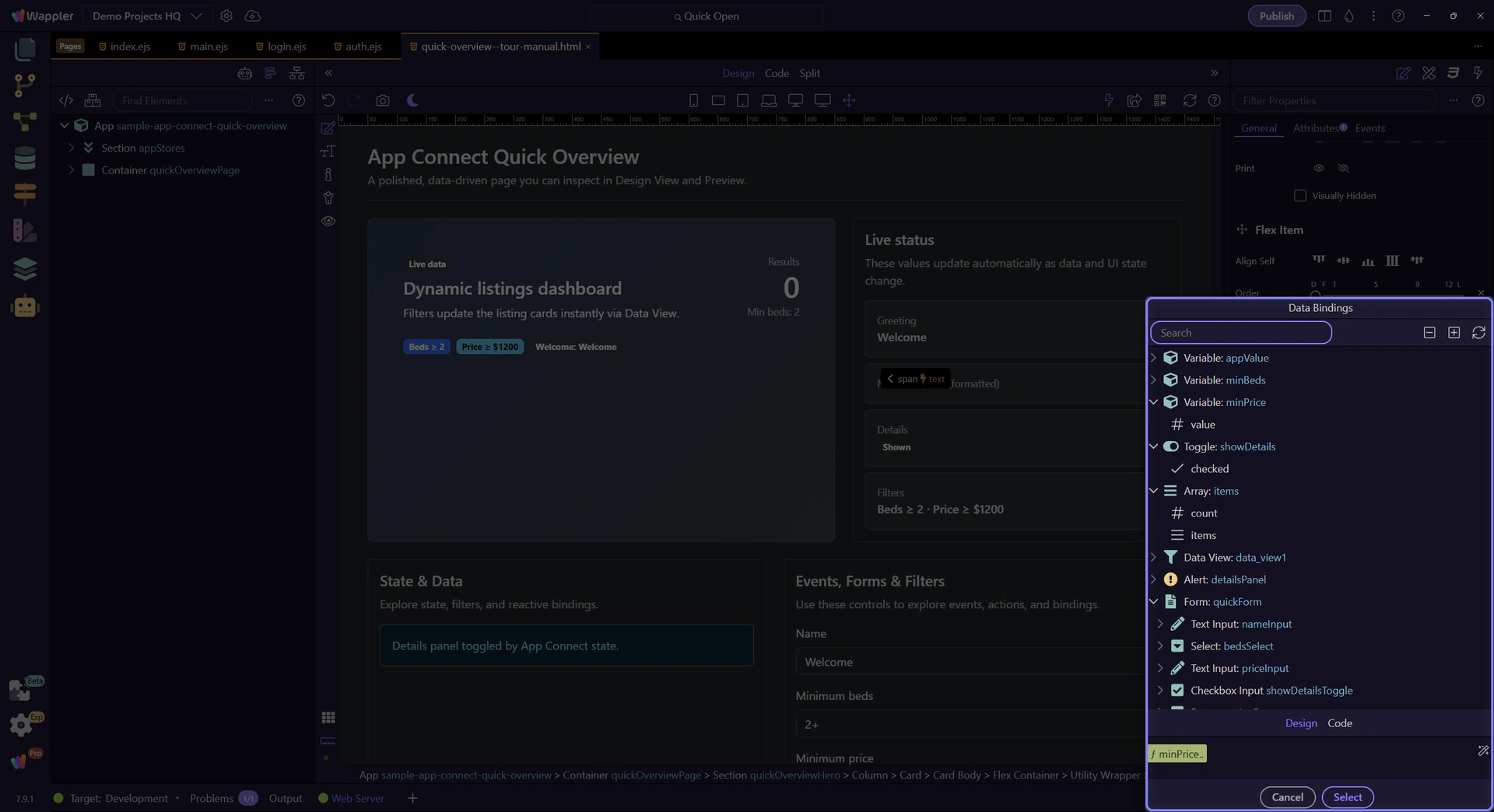
In the tree, expand minPrice and select its value. That’s the value being formatted as currency in the field.
note: Scope matters: the picker only shows data that’s valid for the current selection.
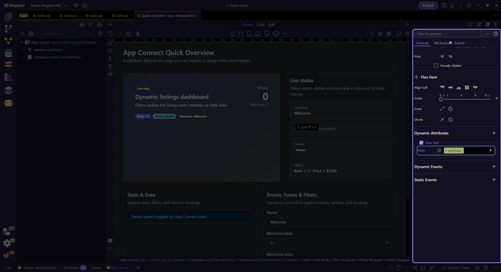
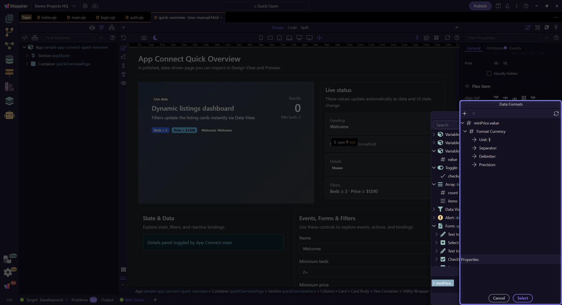
The formatter button applies to the active tag. We’ll focus the expression tag so formatting targets the right expression.

The formatter opens from this control so the flow can move from a raw price binding to a readable display format. The next steps stay inside the formatter popup and show how the final formatting chain is assembled.
The Data Formatter lets you build a formatter chain (pipeline) visually and insert it back into the field.
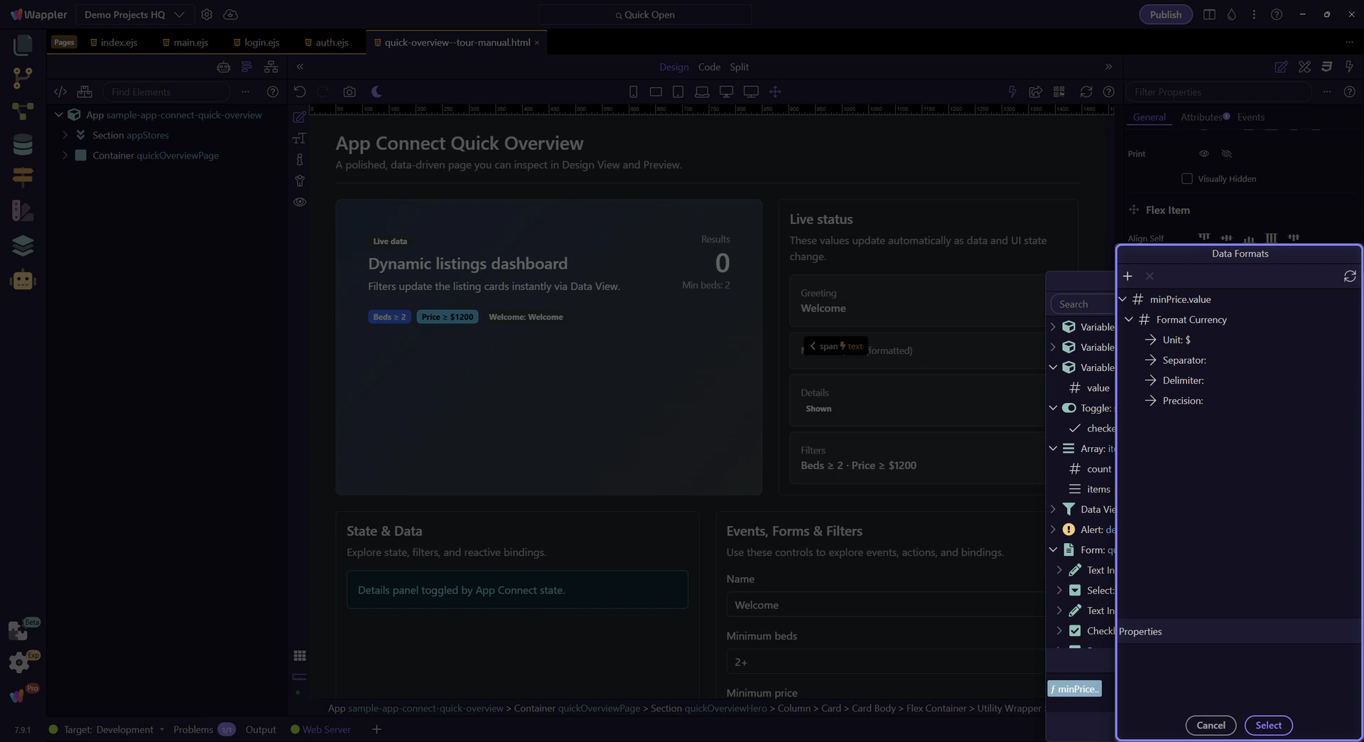
This tree represents your formatter chain. Select a formatter to edit its settings in Properties.
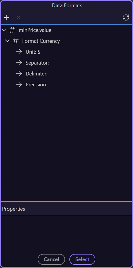
These properties matter because the selected formatter changes the final output, and the next step closes the popup after you understand that effect.
Close the formatter once you understand the chain so you can return to the picker and continue the broader App Connect flow.
Close the Data Bindings Picker to return to Properties. This step matters because Close Data Bindings Picker is part of Popup Databindingspickup Button Cancel, and understanding that context makes the next action easier to repeat in your own project.

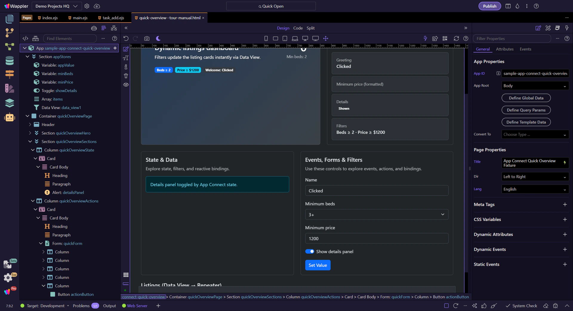
The repeater displays the Data View results as cards.
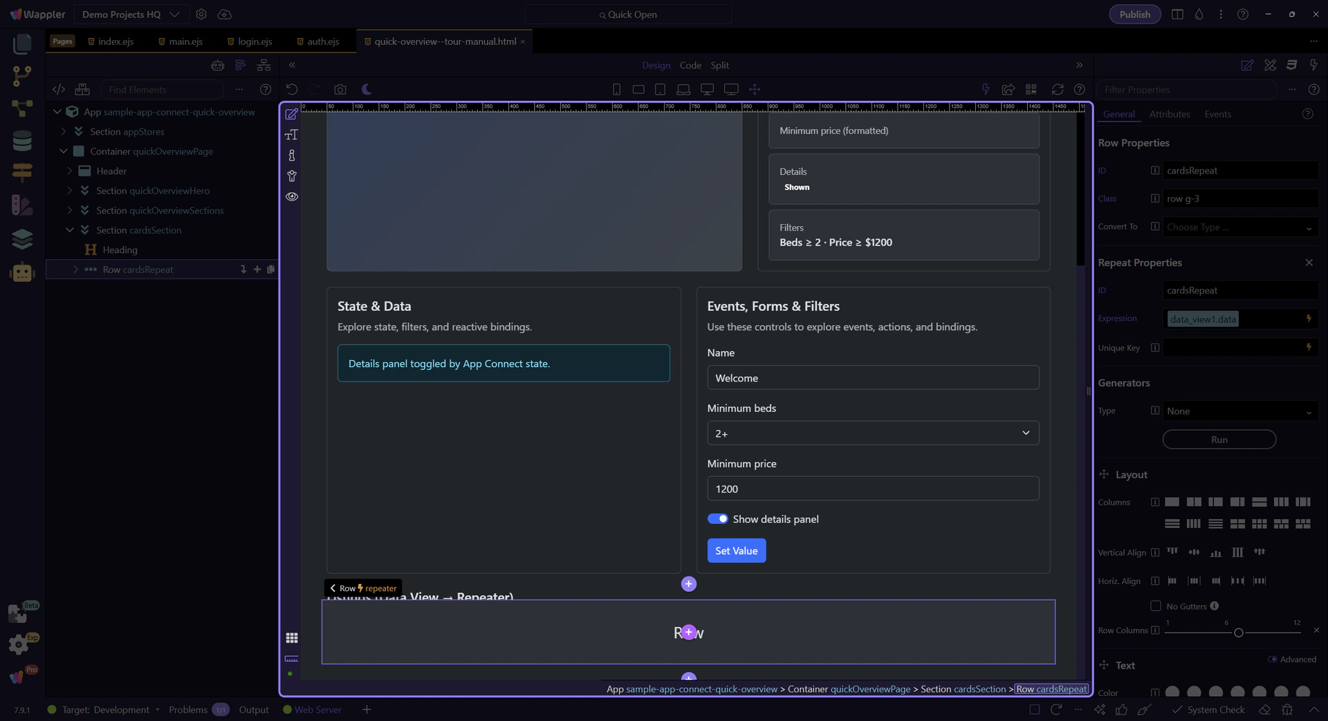
This property points to the collection being repeated (Data View results). This step matters because Repeat expression is part of Selection Panels Properties Control Repeatexpression, and understanding that context makes the next action easier to repeat in your own project.
tip: Use the Data Bindings Picker here to explore the full path (for example:
data_view1.data).
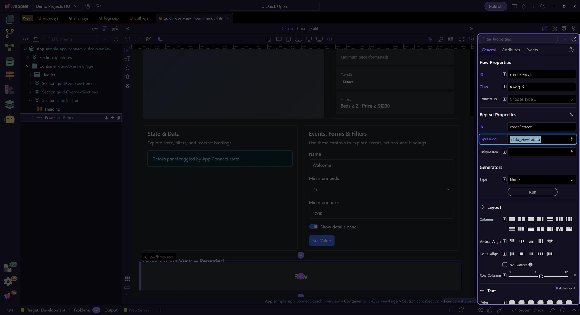
We’ll open the Data Bindings Picker so you can inspect the repeat expression in context. This step matters because Opening Data Bindings Picker (repeat) is part of Selection Panels Properties Control Repeatexpression, and understanding that context makes the next action easier to repeat in your own project.
This picker is scoped to the repeater. You’ll see item-level fields like title, beds, and price here too.
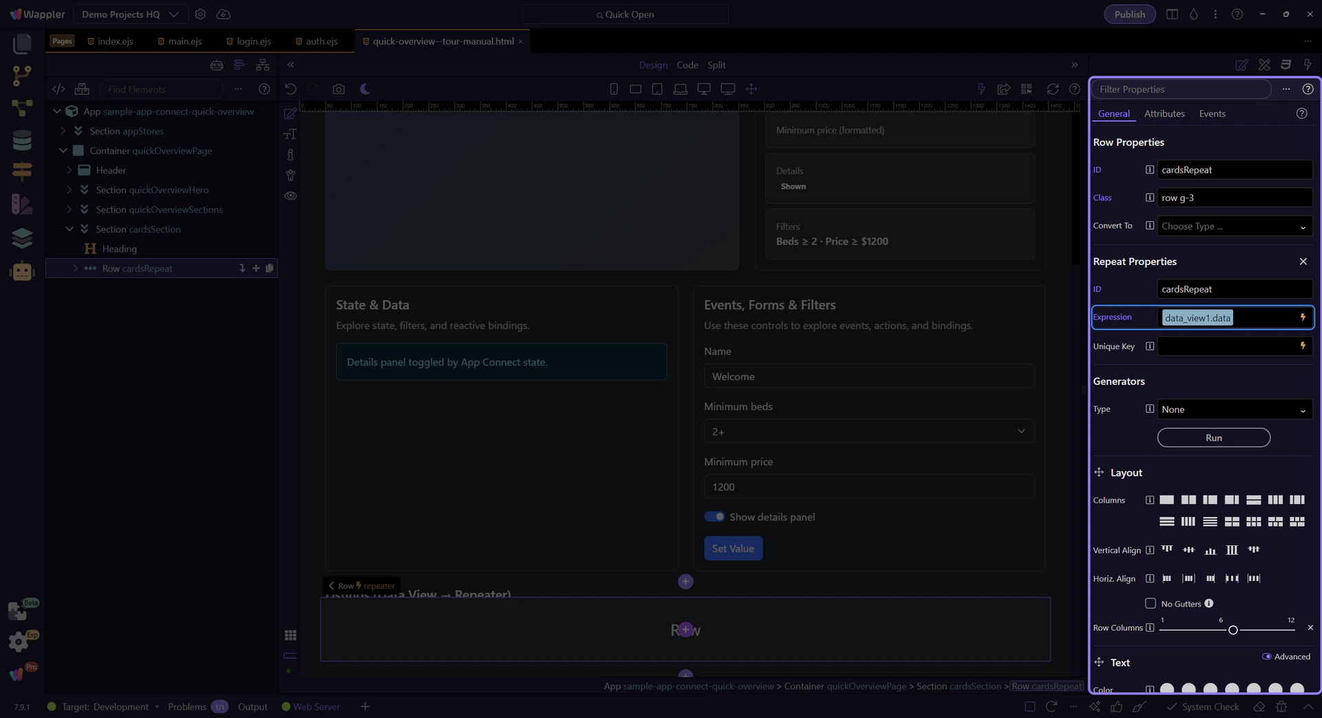
Close the Data Bindings Picker to continue. This step matters because Close Data Bindings Picker is part of Popup Databindingspickup Button Cancel, and understanding that context makes the next action easier to repeat in your own project.

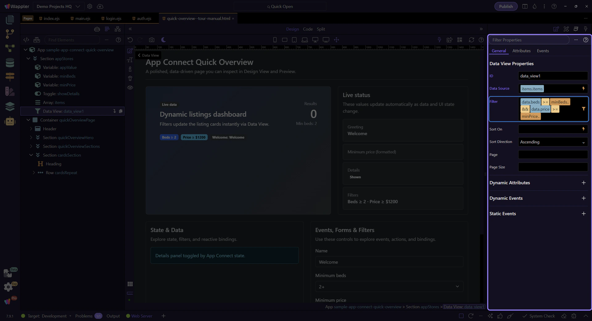
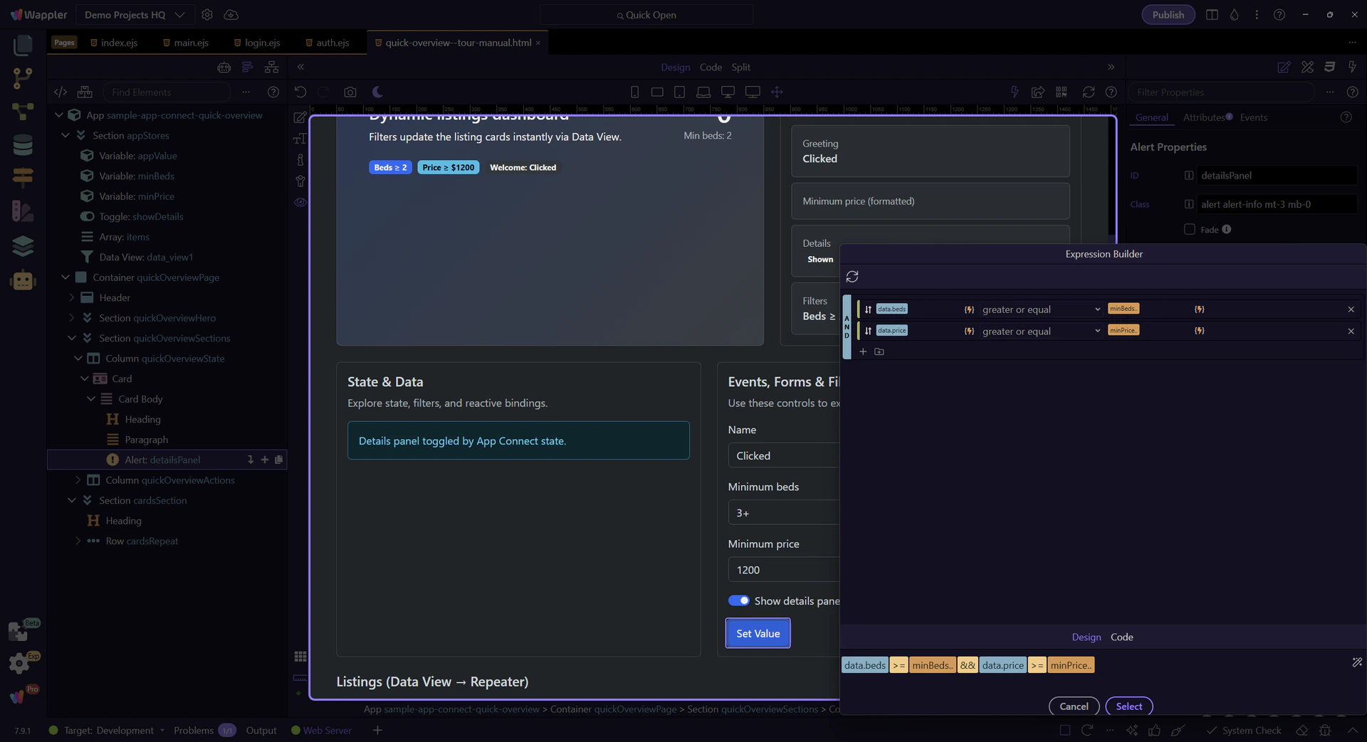
The Data View defines which records appear. We’ll select data_view1 so you can inspect its filter expression.
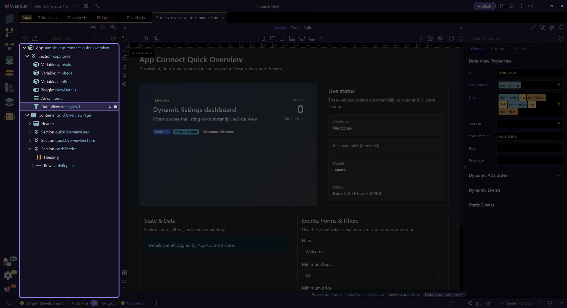
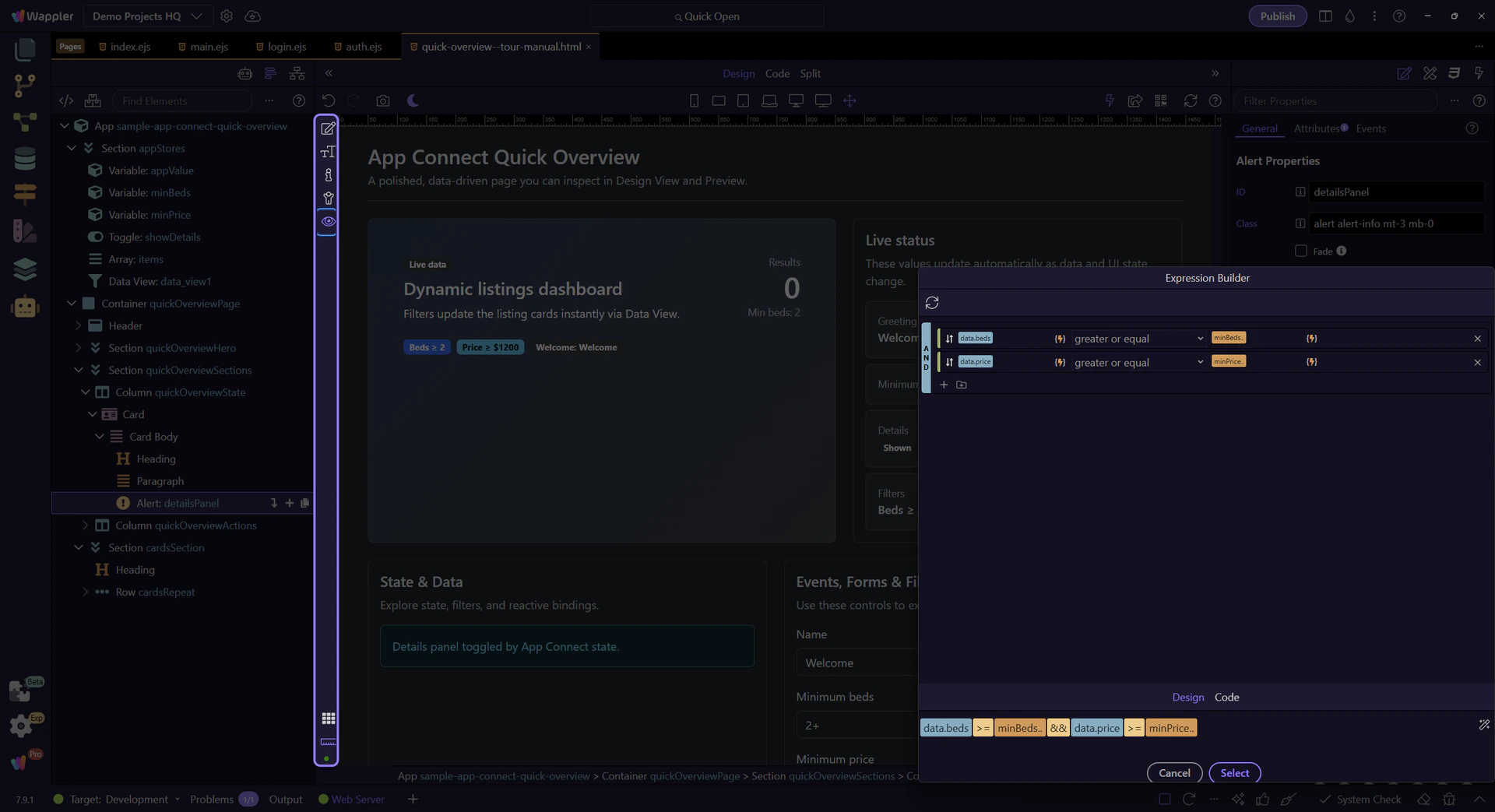
The filter is a rule-based expression. We’ll open it in the Visual Expression Builder so you can inspect the logic.
tip: Use the Visual Expression Builder for logical expressions (filter rules, AND/OR groups). Use the Data Formatter for formatting pipelines.
The Visual Expression Builder helps you build valid expressions with operators, functions, and data sources in scope.
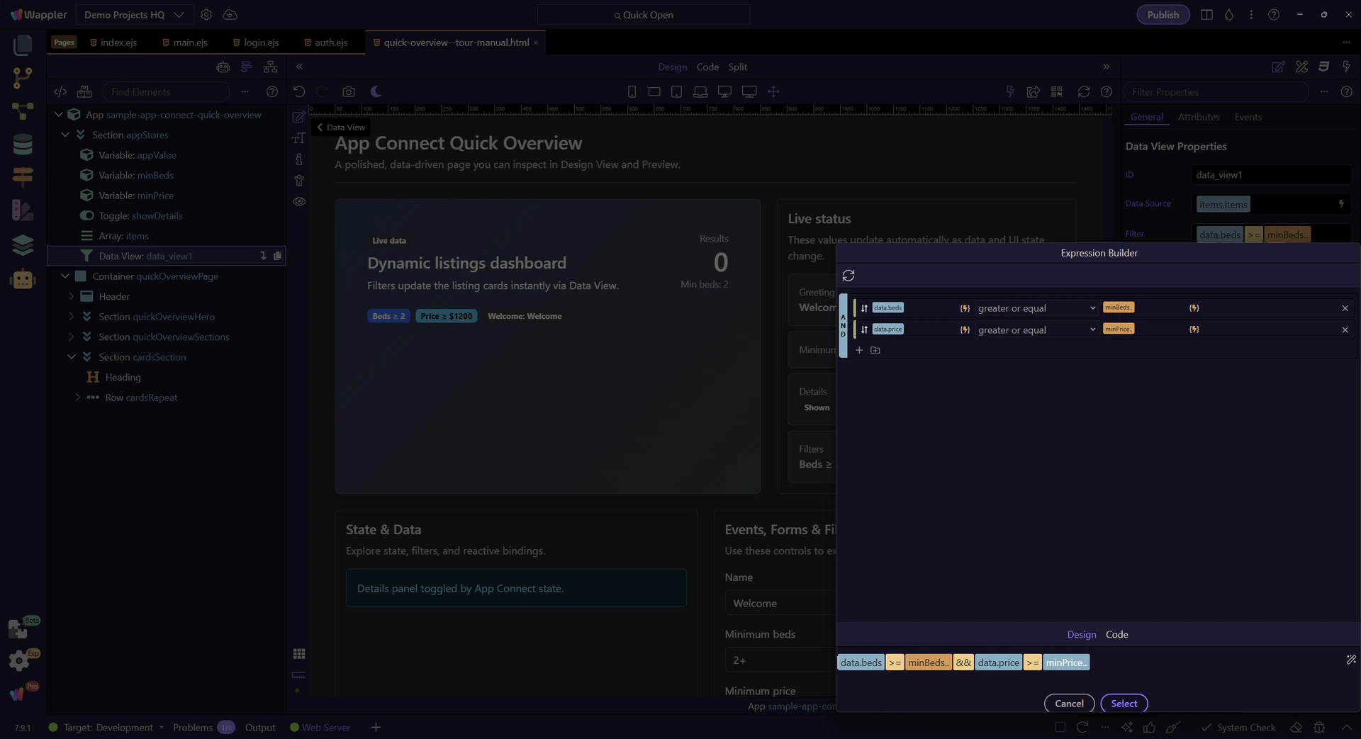
Each row is Field + Operator + Value. This is how you define filter rules without typing the full expression.
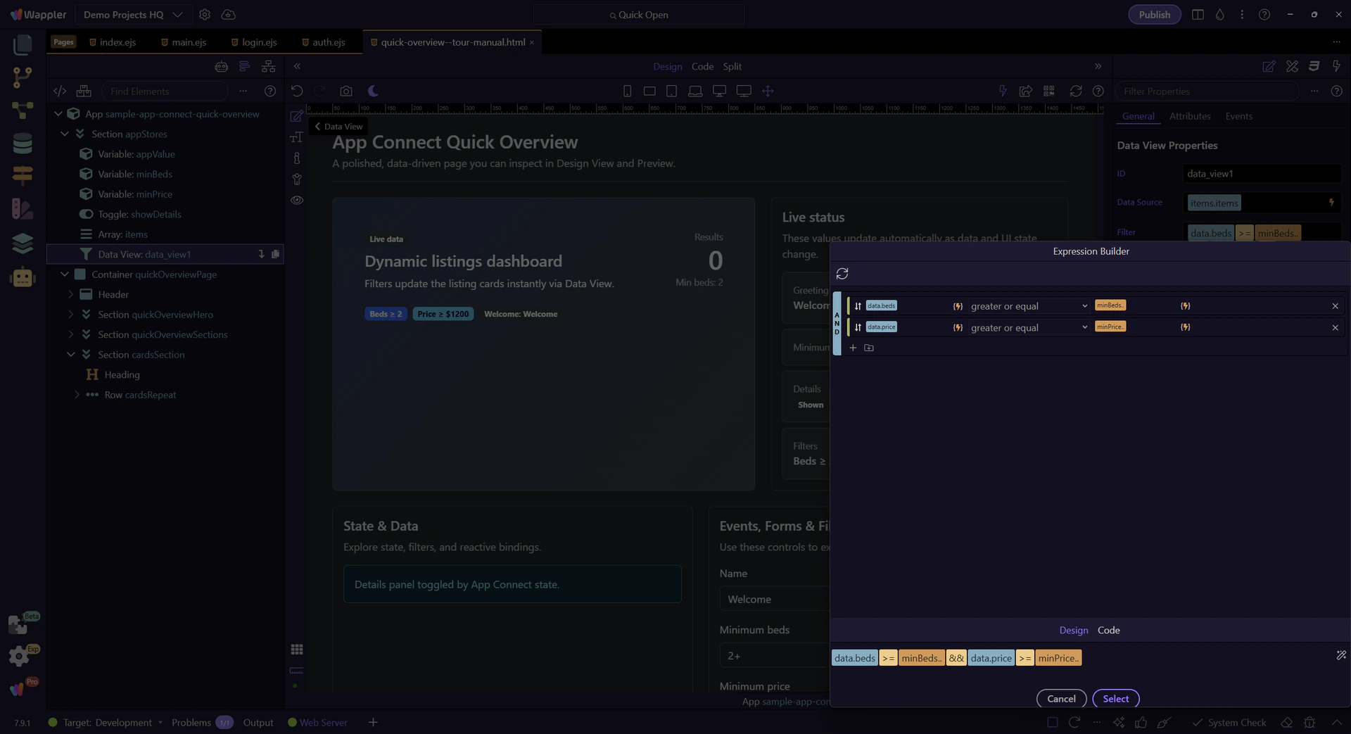
Use AND or OR here to decide how multiple filter rules should combine, because that choice changes the meaning of the final expression. The next step previews the result, so this is the moment where the logic of the filter becomes clear.
This shows the final expression that goes back into the filter field when you apply/close the popup.

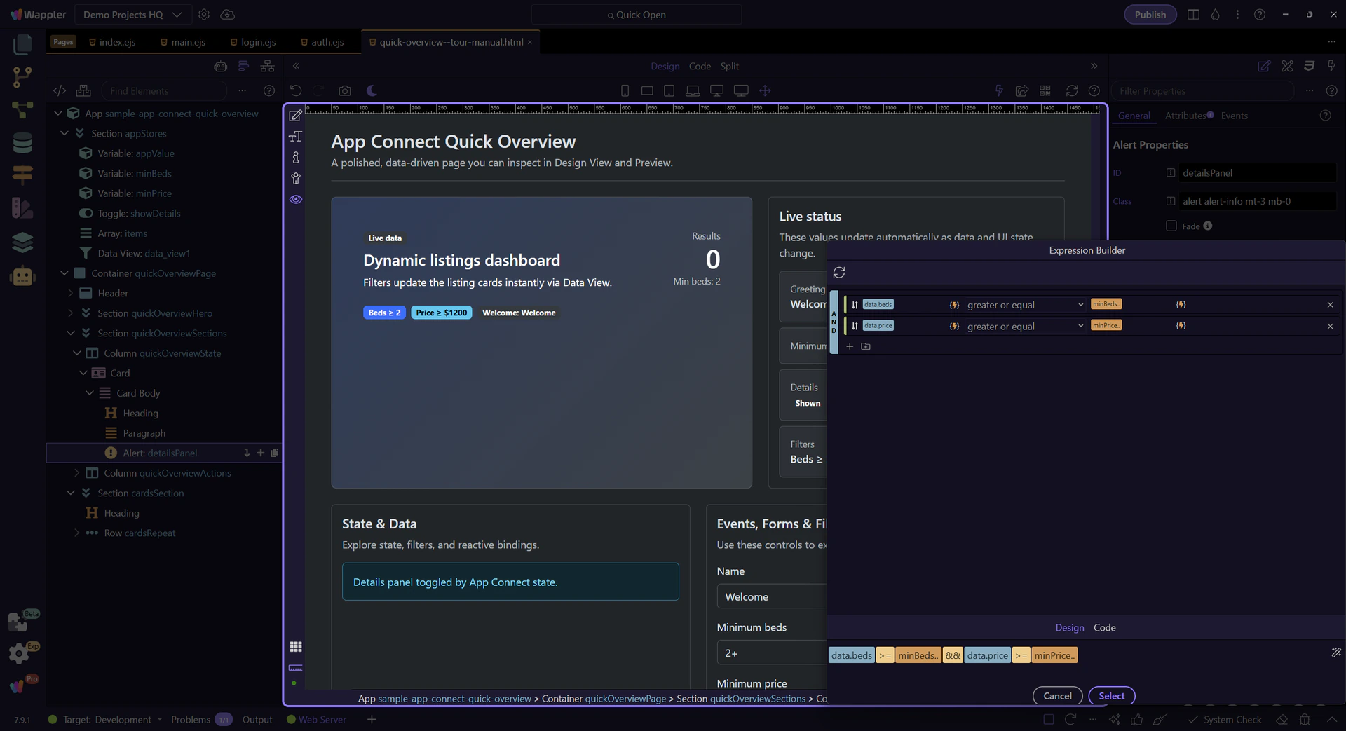
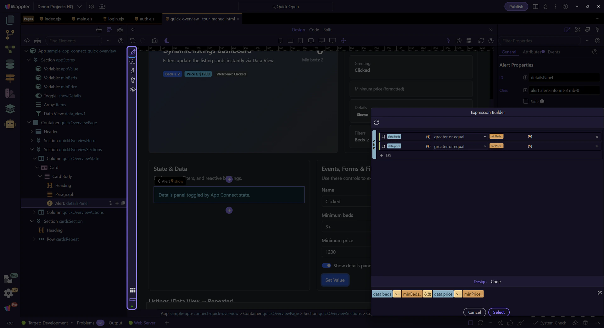
Review the full Visual Expression Builder one last time. Press Next to close it and return to the Data View properties.

This panel uses a simple binding to show/hide itself: dmx-show="showDetails.checked".
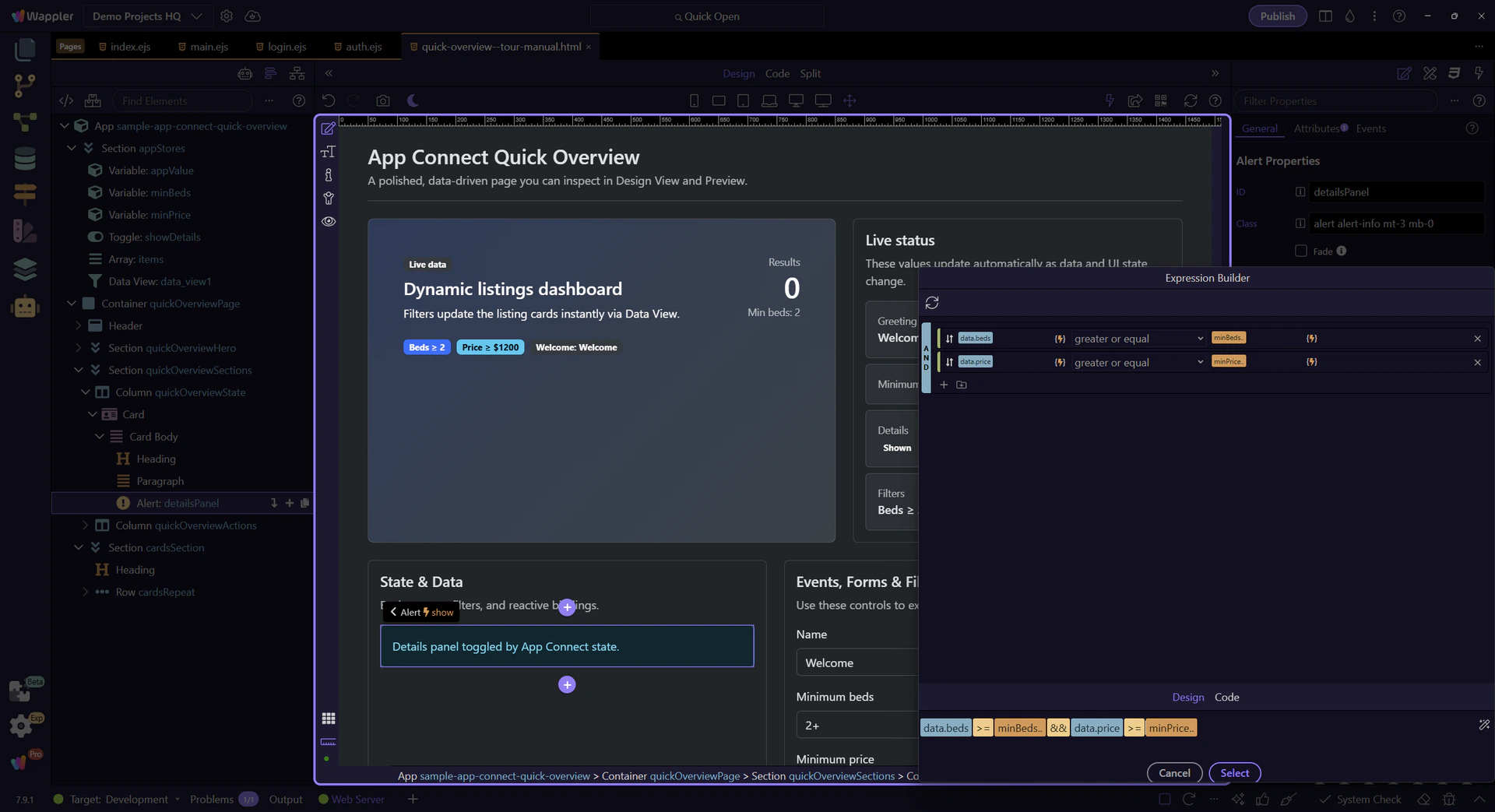
This is the expression behind dmx-show (Show → When). It uses the same Data Bindings Picker and scope rules as your other bindings.
tip: For complex conditions, open the picker and build the expression visually.
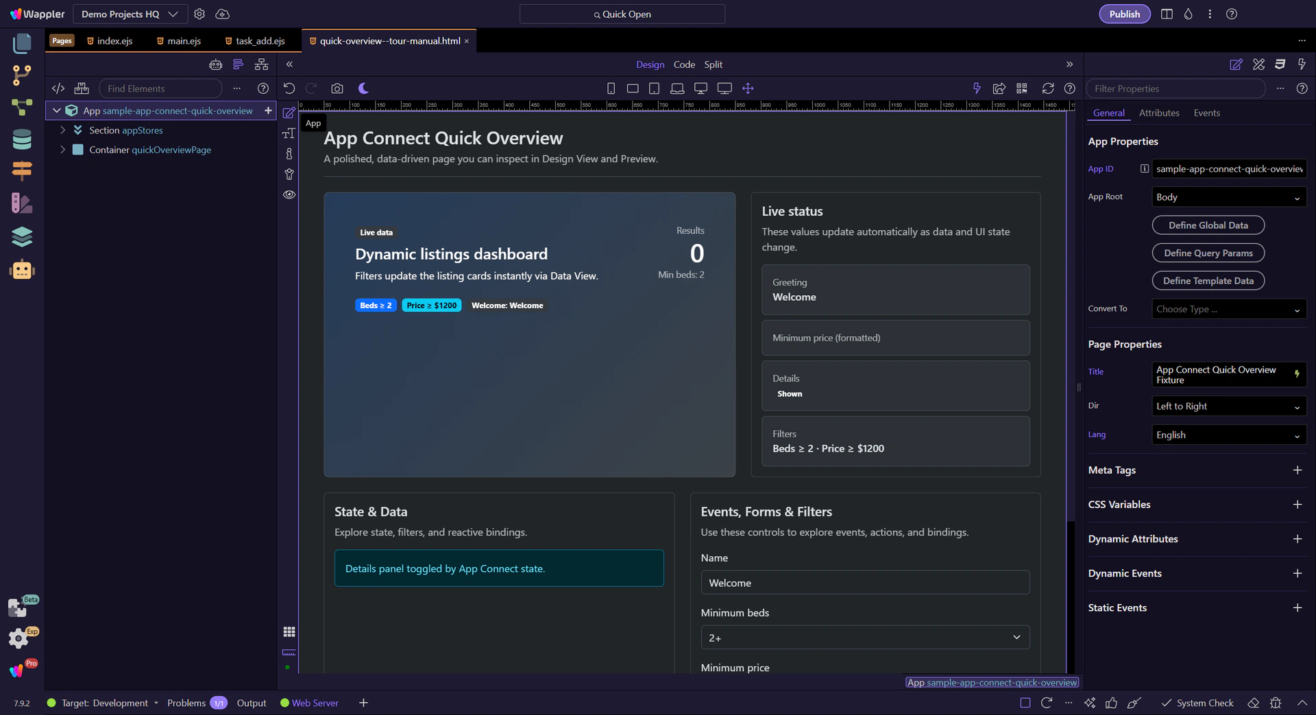
Switch to Preview mode and interact with the controls to see bindings update instantly.
Switch to Preview mode now so you can test the finished App Connect example live in the next step.
Wait for the page to finish switching modes.
We’ll open the Beds dropdown so you can change the minimum beds filter.
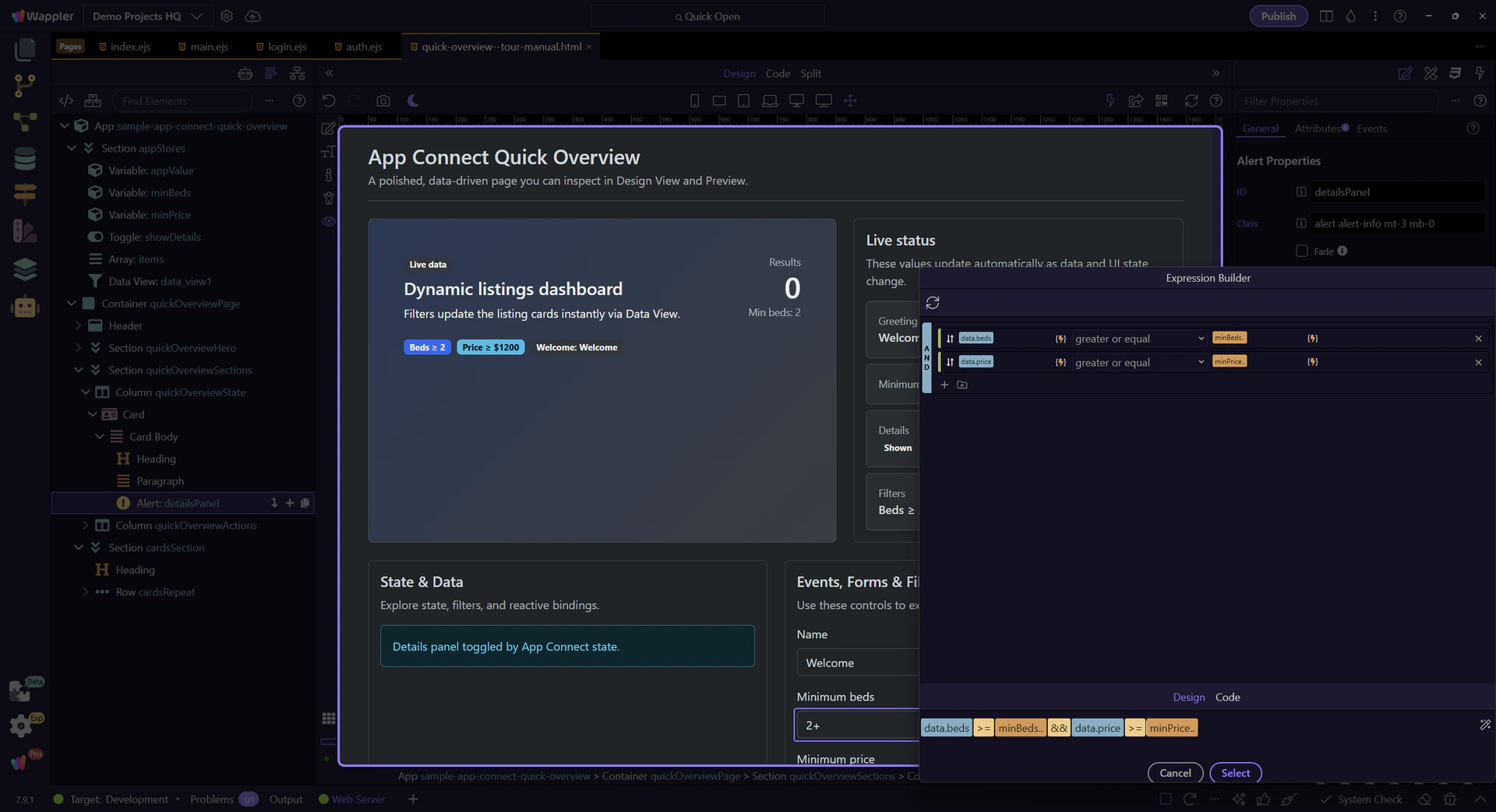
This dropdown value updates the filter. We’ll pick a higher minimum beds value to narrow the list.

This button runs an action that updates greeting state. We’ll click it to demonstrate state-driven UI updates.
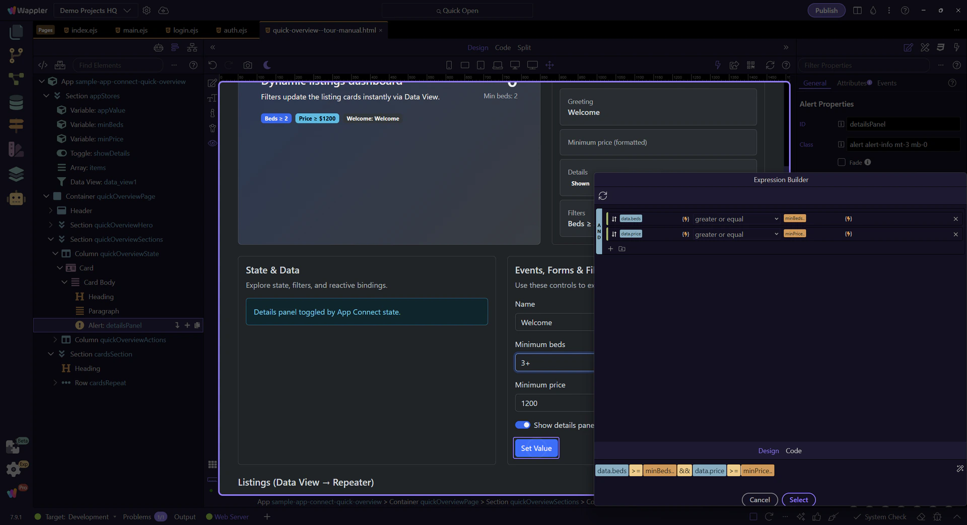
The listing cards and summary badges update immediately when state changes.
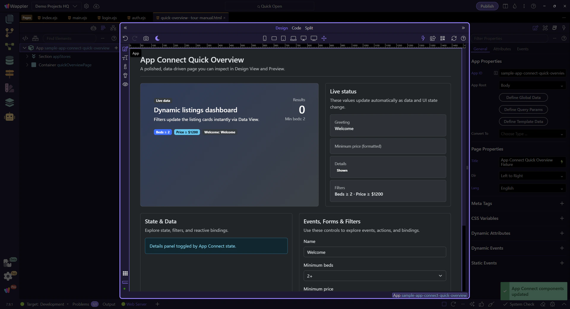
Return to Edit mode so you can keep exploring the setup after confirming the live behavior.
Events are where interactivity starts. You pick an event (click/submit/keyup/…) and assign an action.
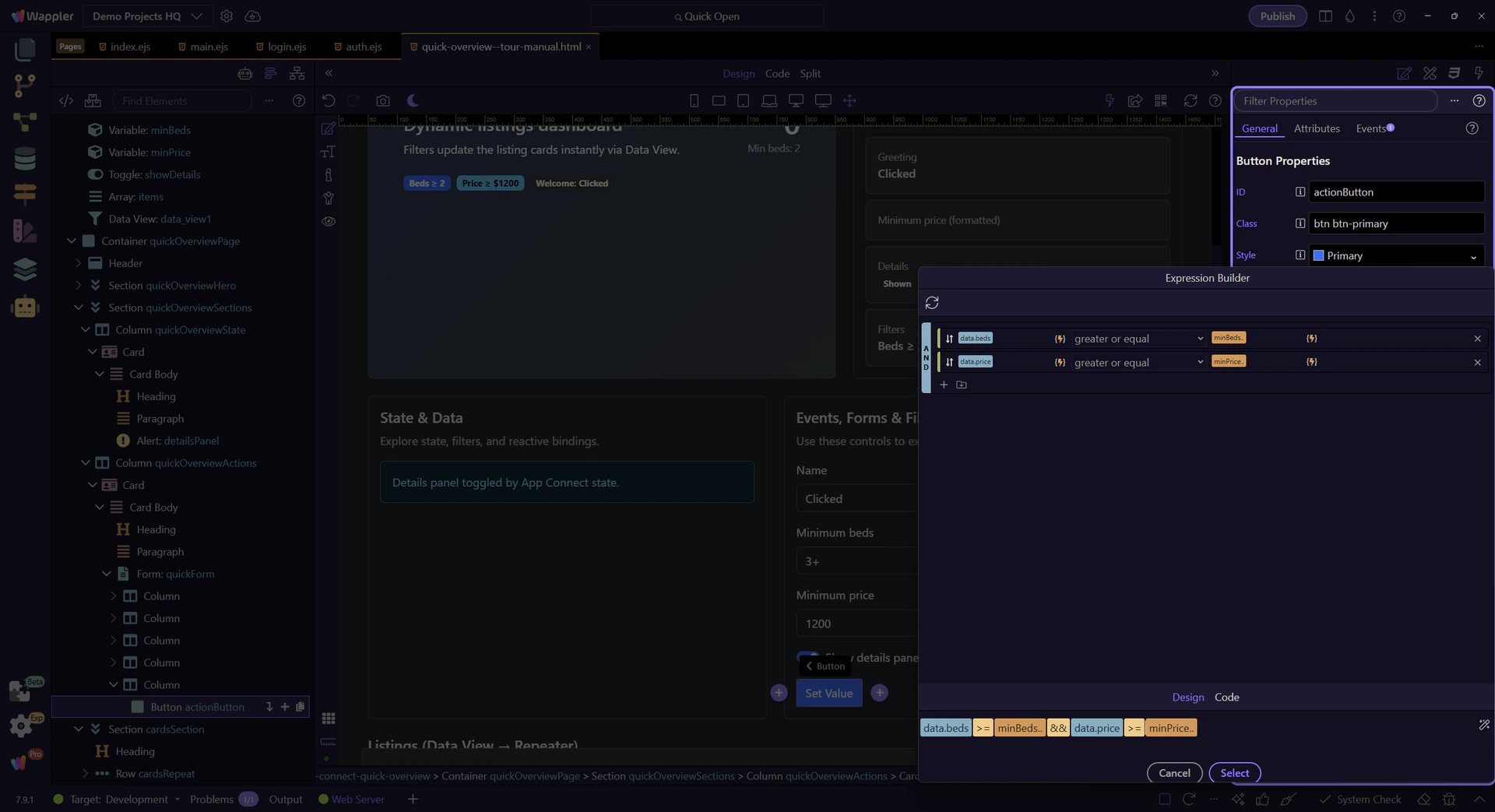
This button is where we’ll attach a Click event. We’ll select actionButton so you can inspect its event and action settings.
In Properties → Events, enable Click and choose an action. Actions are picked visually (you don’t type raw code for common tasks).
tip: Look for an Action picker (it will help you choose a component action like “Set Value”, “Insert Record”, etc.).

Modifiers change behavior (prevent default, stop propagation, capture, once) and can add key/button conditions.
You’ve seen the core workflow: inspect components, configure Properties, and wire an event to an action.
Continue with deeper tours on expressions, collections, and filtering.