Pick the right container
Most alignment comes from the flex container (nav list / collapse container), not individual links.
Align and position navigation items quickly using Bootstrap utility classes and common alignment recipes.
In this tour you’ll learn practical alignment patterns for Bootstrap navigation: flex alignment, spacing utilities, and common “push/right/center” recipes.
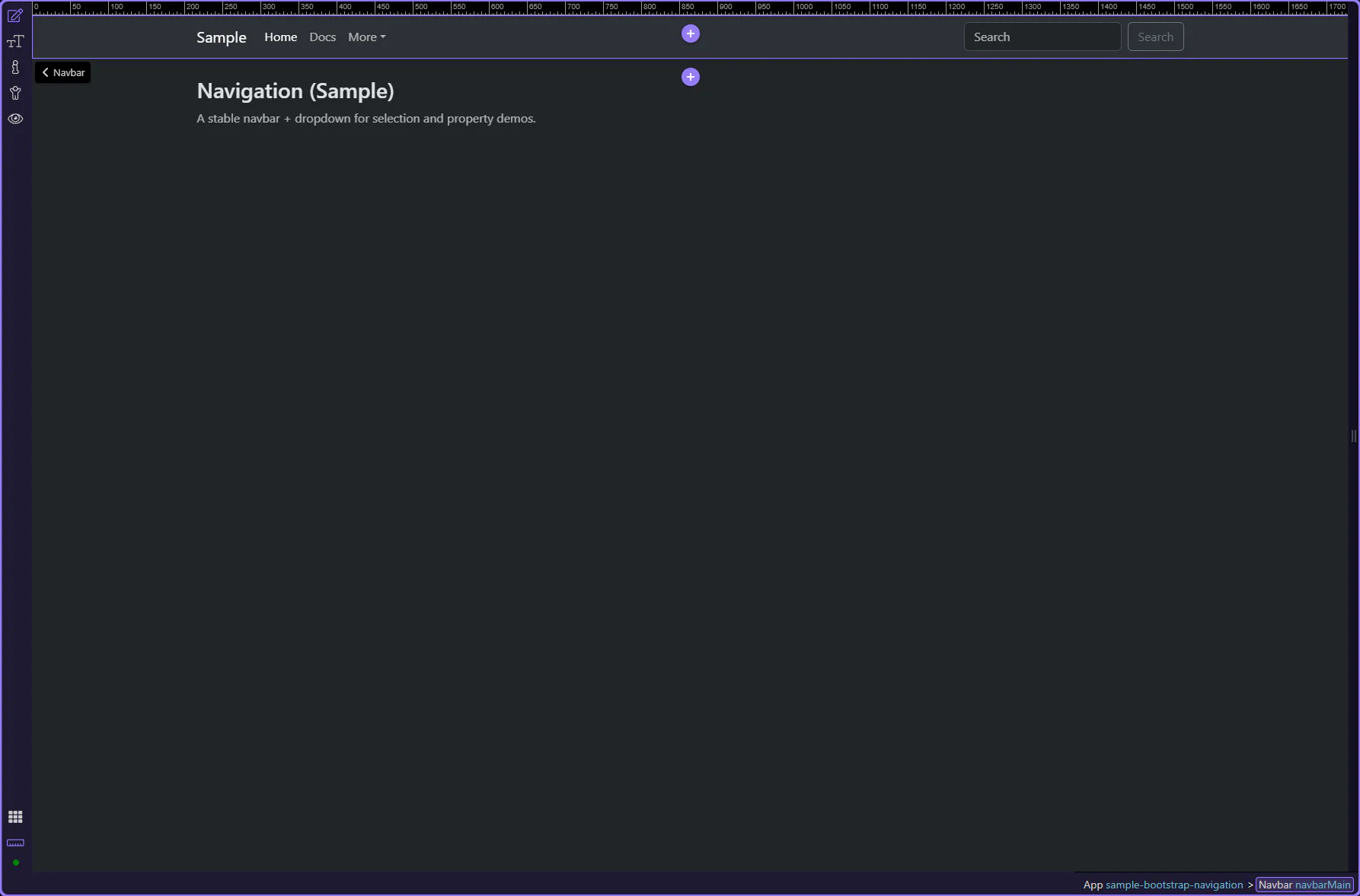
A navigation example is loaded so you can focus on alignment and spacing utilities. This step matters because Navigation sample is part of Design View, and understanding that context makes the next action easier to repeat in your own project.
tip: Alignment problems are usually solved on the parent container (Nav list or Collapse), not on each individual link.
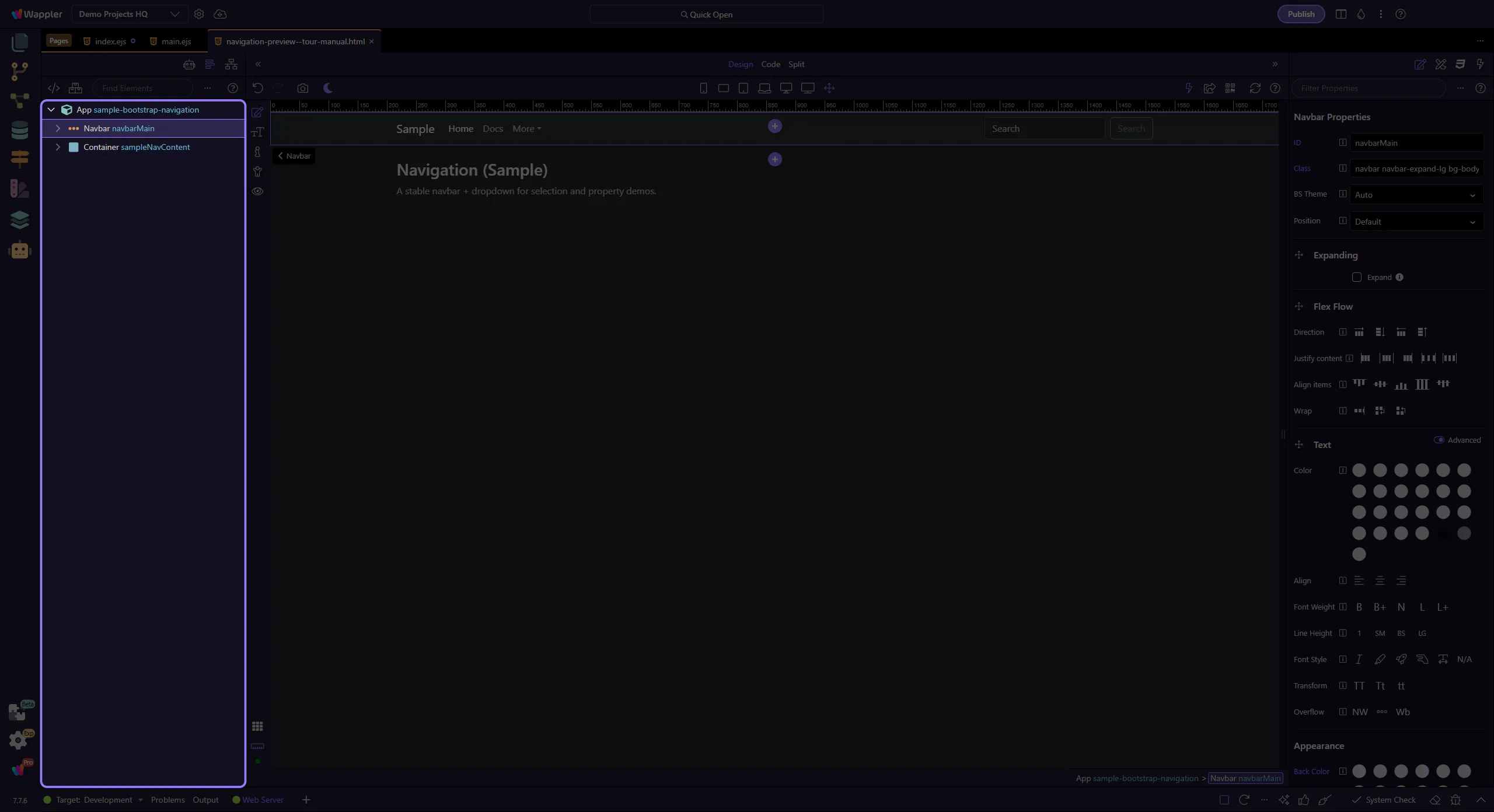
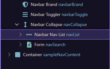
Navigation is nested (navbar → collapse → nav list → items). App Structure makes it easy to pick the right parent for alignment changes.
When you want to align nav links, the important nodes are usually the Collapse container and the nav list inside it.
important: If alignment “does nothing”, you’re probably applying utilities on the wrong element.
We’ll select key navigation elements and highlight the alignment utilities you’ll use most often.
The navbar root controls brand/background and the breakpoint behavior (expand). This step matters because Navbar is part of Design View, and understanding that context makes the next action easier to repeat in your own project.
tip: Alignment of links usually happens inside the collapse/nav list, not on the navbar root.
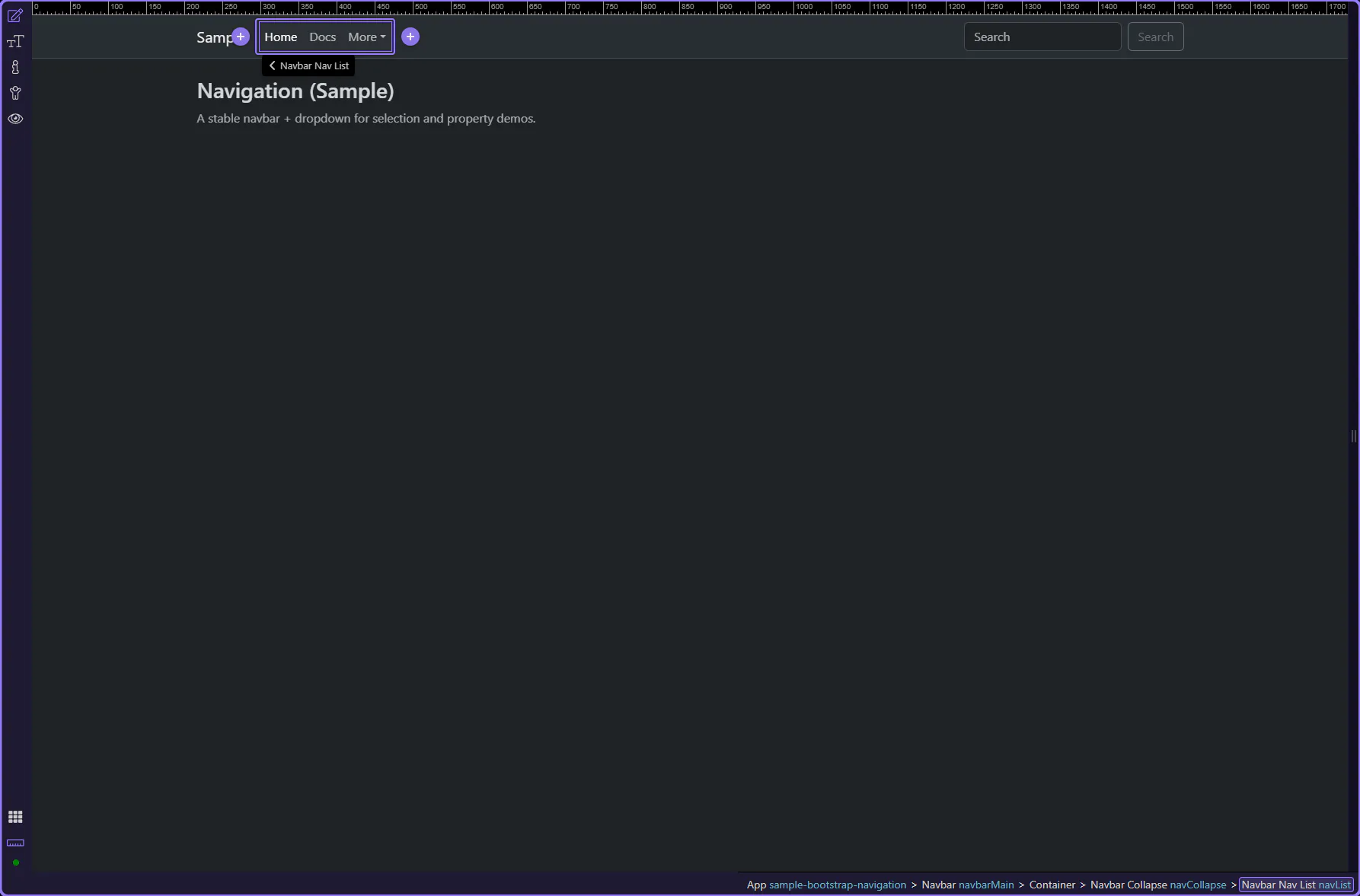
The nav list is a great place for alignment utilities. This step matters because Nav list is part of Design View, and understanding that context makes the next action easier to repeat in your own project.
tip: Common alignment utilities: me-auto/ms-auto, justify-content-, gap-, flex-wrap.
Alignment is usually solved by applying utilities on the nav list container. This step matters because Nav List: What to Look For is part of the Structure panel, and understanding that context makes the next action easier to repeat in your own project.
For navigation alignment, think in flex containers: align groups on the parent (nav list or collapse) using utilities like ms-auto/me-auto and justify-content-*.
Common patterns:
Continue with a related tour or go back to the Bootstrap tours index.