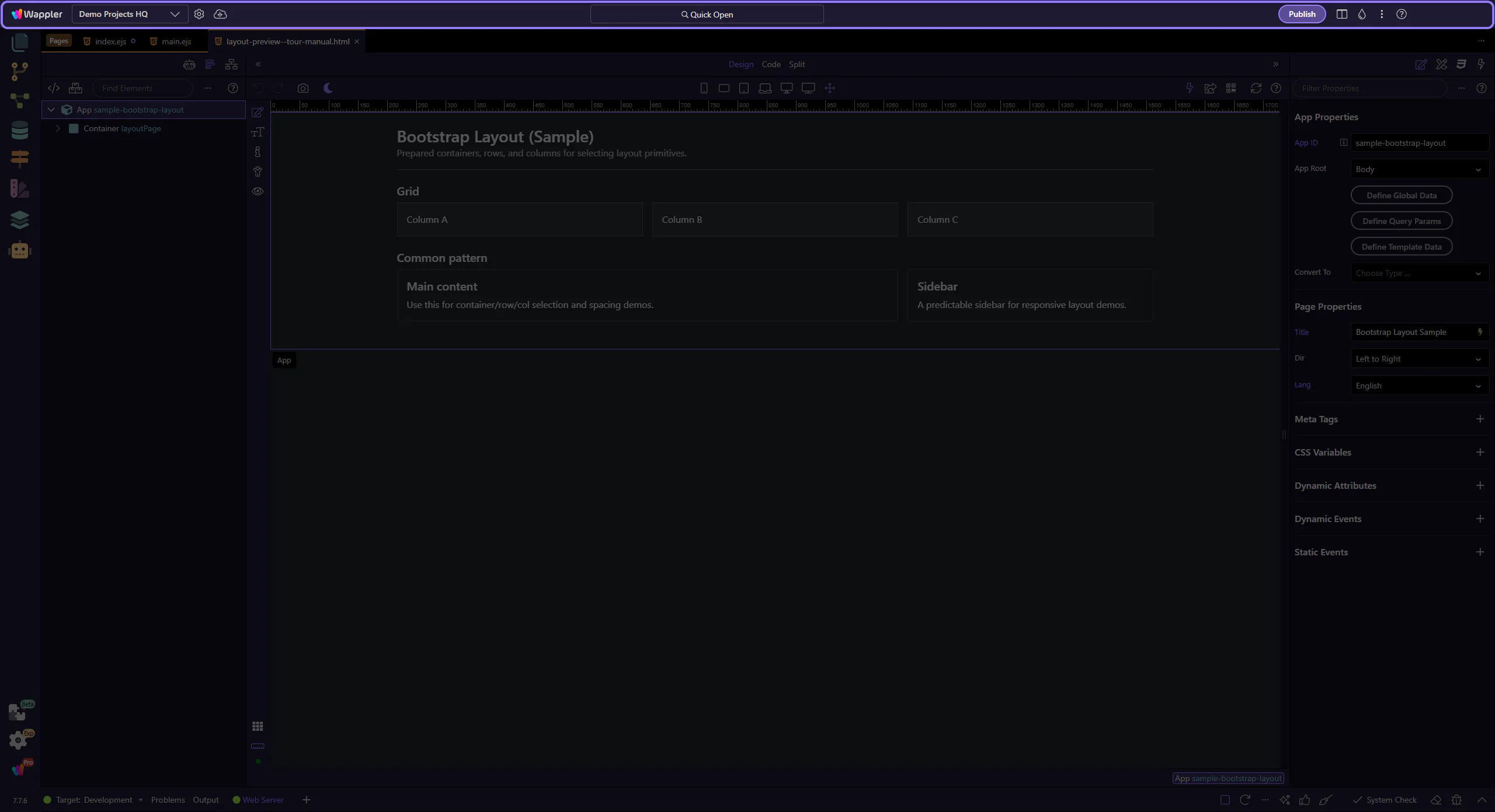
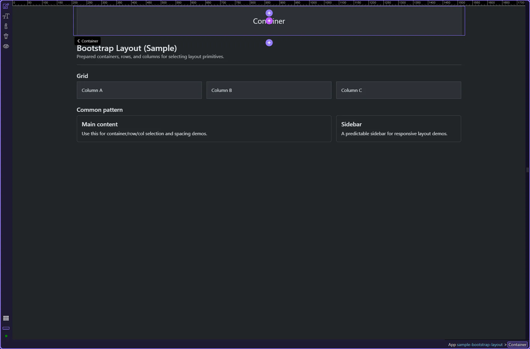
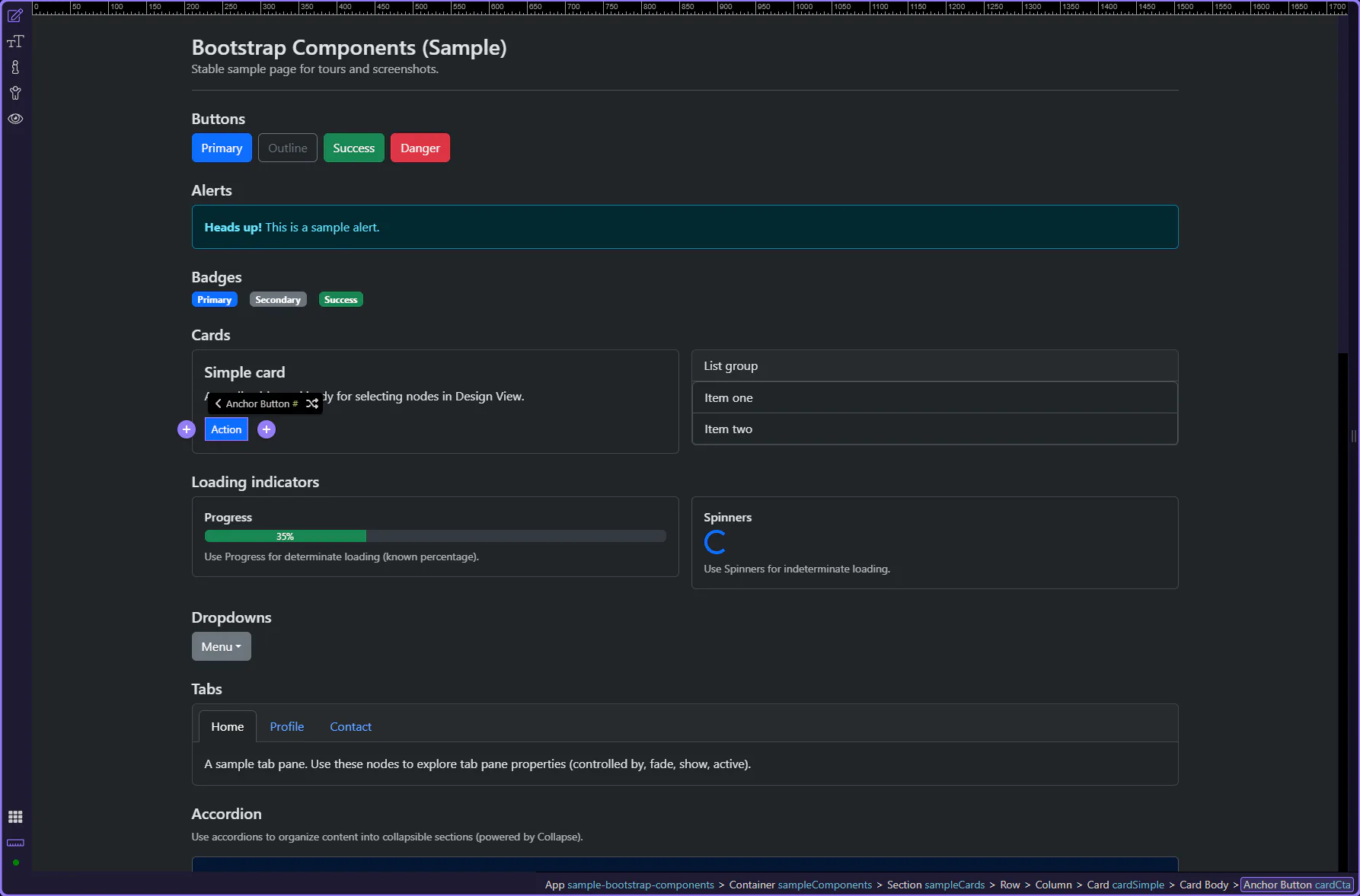
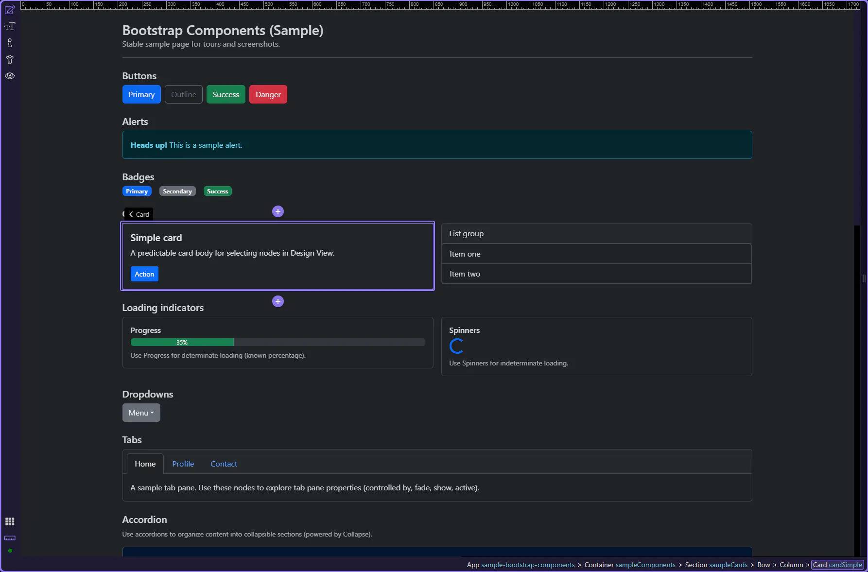
You’re looking at a real grid
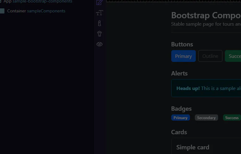
This page uses a simple Bootstrap layout so you can explore structure + Properties without distractions.
Build Bootstrap pages in Wappler: add the framework, use the grid, drop components, and style with utilities and generators.
Build Bootstrap pages in Wappler: add the framework, use the grid, drop components, and style with utilities and generators.
Choose a Bootstrap guide to start. Most guides are hands-on and will insert real components using the normal UI workflow.
Quick overview of Bootstrap in Wappler: add the framework, use the grid, drop components, and style with utilities.
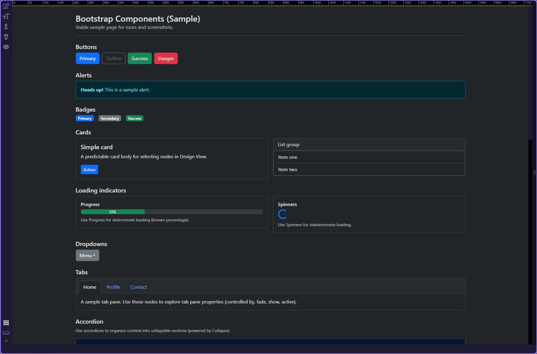
You’re looking at a simple Bootstrap layout so you can explore structure and Properties without distractions.
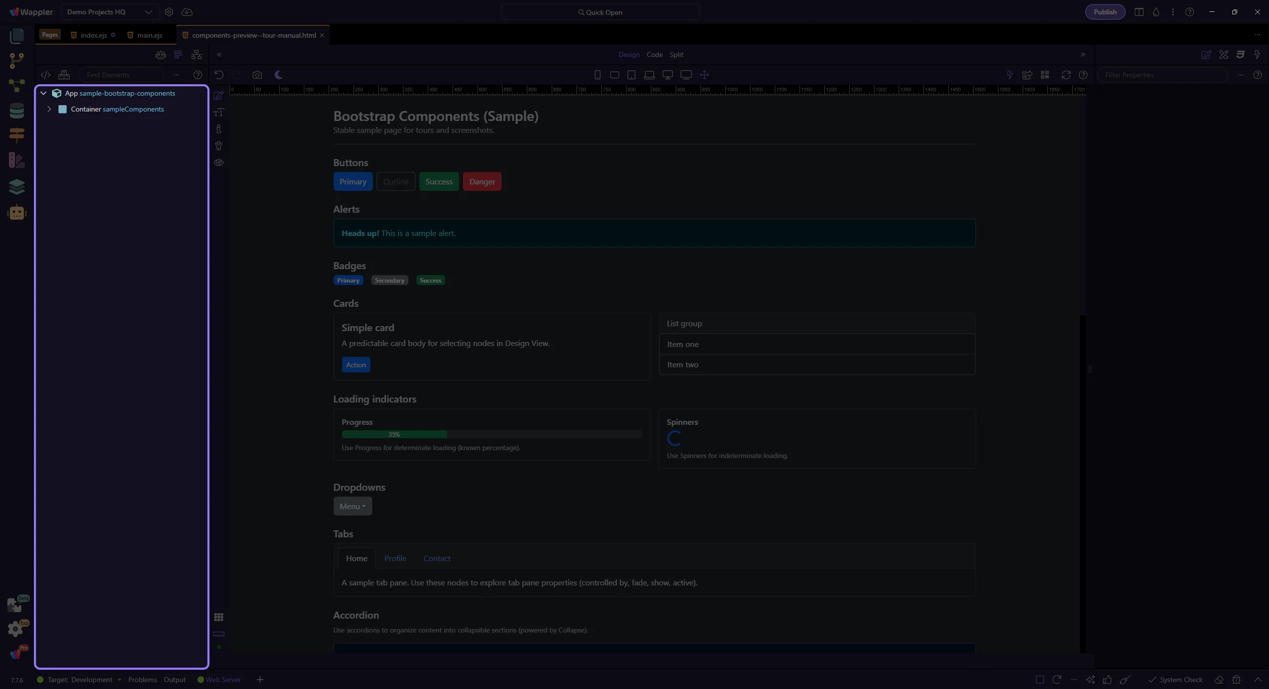
A layout is loaded so we can focus on how Wappler represents Bootstrap structures.
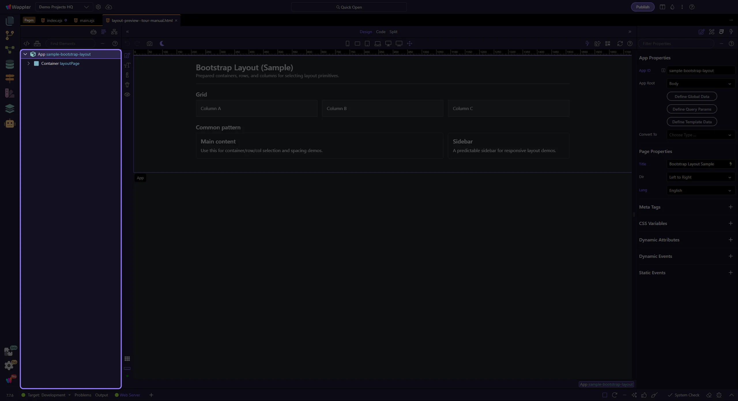
tip: If something is hard to click in the canvas, use App Structure to jump to the exact element.
This tour uses App Structure selection and the Components picker. Keep these panels visible so you always know what will be inserted where.
tip: If a step feels “off”, click the intended node in App Structure first, then retry the insert.
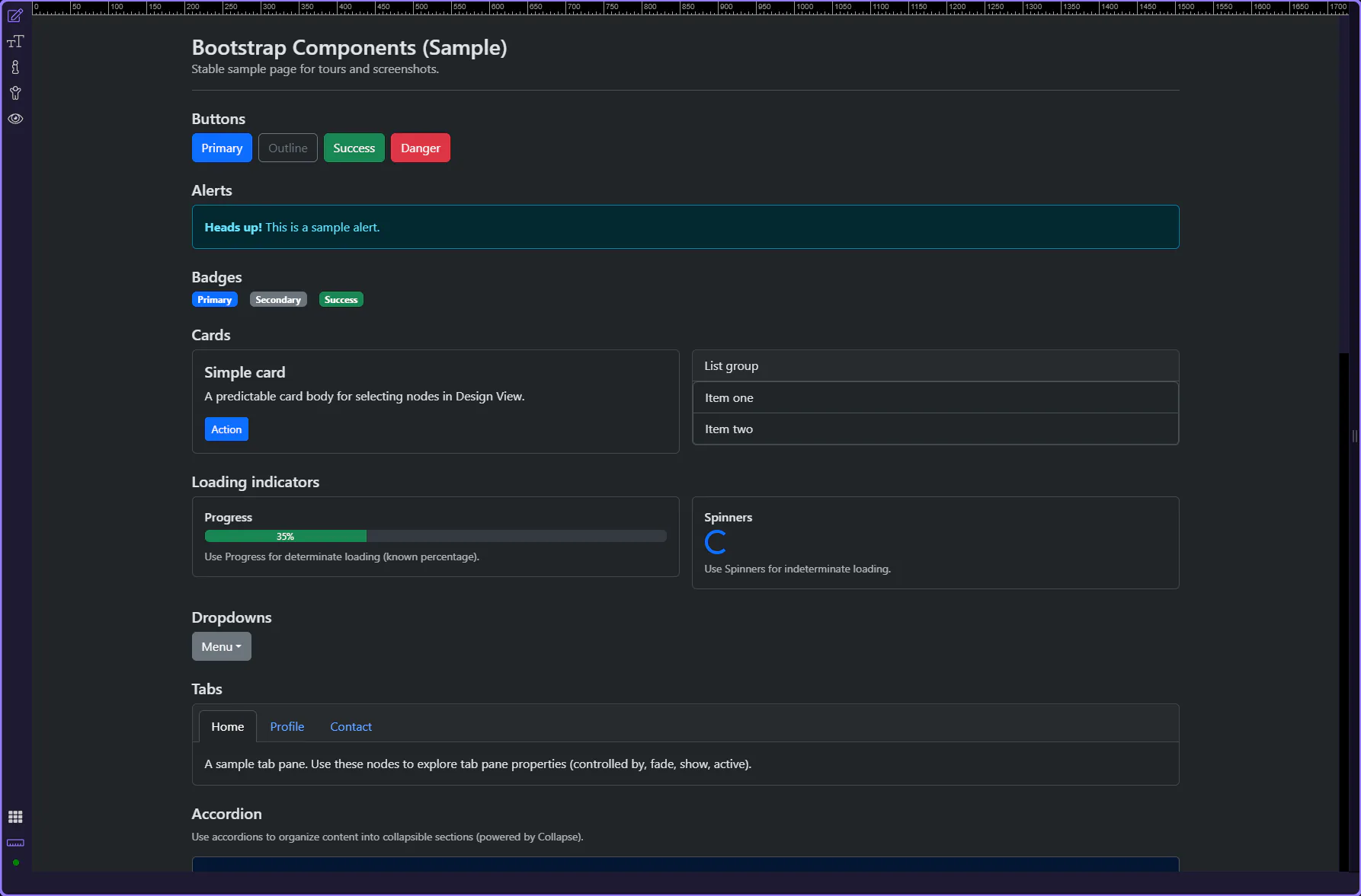
Bootstrap is a popular front-end framework for responsive, mobile-first websites. In Wappler you insert Bootstrap components visually and configure them in Properties (no manual markup required for most tasks).
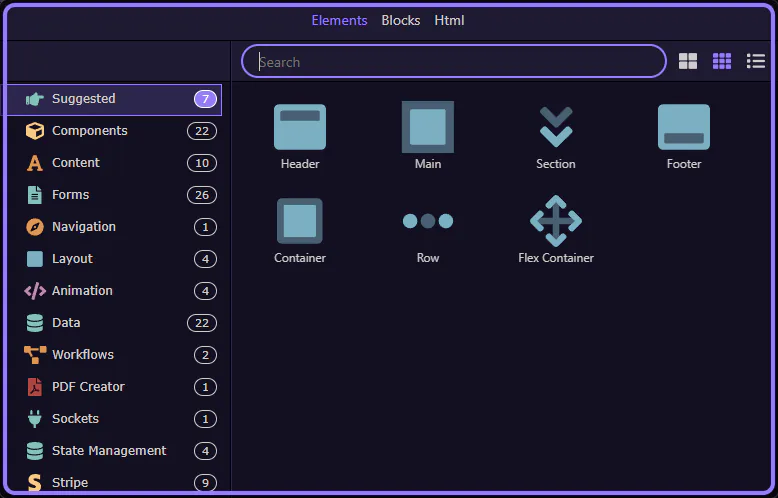
This quick overview inserts a single Bootstrap Container using the same UI path you use every day (App Structure → right-click → Insert Child → Components Panel).
tip: Keep the App Structure panel visible during inserts; it makes selection and placement predictable.
Start with the wider context in the top toolbar so the next control makes sense in the full workflow. In the next step, you will focus on Make Sure Bootstrap Is Enabled and see how it fits into this area.
If you don’t see Bootstrap components in the Components Panel, enable Bootstrap for your project/page first (Frameworks).
important: If Bootstrap isn’t enabled, searches like “Container” may show different (non-Bootstrap) results.
Bootstrap uses a 12-column grid system. Layouts are typically built with a Container that holds Rows, and Rows that hold Columns.
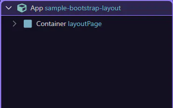
The App Root is a stable insert location (it’s always present, so the tour won’t depend on what you already have on the page).
tip: After insertion, the new element is auto-selected in Structure. Follow-up inserts should use the current selection to avoid drifting into existing layout.
Insert Child opens the Components picker for adding a child under the current selection. This step matters because Insert Child picker is part of the Structure panel, and understanding that context makes the next action easier to repeat in your own project.
The Components search filters the list so you can quickly find what you want to insert. This step matters because Components search is part of Components Popup Anchor Right, and understanding that context makes the next action easier to repeat in your own project.
tip: If multiple results appear, choose the one under “Bootstrap”.

A Bootstrap Container is a common starting point for layout. This step matters because Insert Container is part of Components Popup Anchor Right, and understanding that context makes the next action easier to repeat in your own project.

You now have a real starting point for Bootstrap layouts. Next you can add a Row and Columns inside it (see the “Layout” tour).
tip: Tip: use Rows for horizontal structure; use spacing utilities (gap/margin/padding) for fine tuning.
You now know the core insertion workflow (Structure → Insert Child → Components picker). Next, build a full grid (container → row → columns) and start adding real components.
You now know the core insertion workflow (Structure → Insert Child → Components picker).
Next, build a full grid (container → row → columns) and start adding real components.
tip: Tip: if the wrong component appears, clear search and pick the Bootstrap category explicitly.
Select a tour to continue.
Choose a Bootstrap guide to start. Most guides are hands-on and will insert real components using the normal UI workflow.
Enable Bootstrap in a Wappler project and get oriented: frameworks, templates, and where components and utilities come from.
Start here to enable Bootstrap in your project and learn the Wappler workflow for inserting and configuring components.
Use Bootstrap utilities to quickly style layout and UI: spacing, colors, borders, text, and display/flex helpers.
Many Bootstrap elements share the same generic Properties groups in Wappler, like Appearance, Spacing, Border, Display, and Flex. Learn these once and reuse them everywhere.
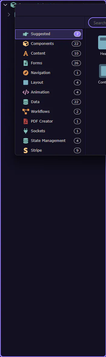
Browse Bootstrap components in Wappler and jump into focused tours for each component type.
Bootstrap components are UI building blocks (buttons, alerts, navigation, cards, forms, modals, and more). Pick a focused tour.
Bootstrap generators in Wappler: use scaffolding tools to build forms, tables, and UI patterns faster.
Pick a generator tour to start. The overview tour explains how to find the Generators category in the Components picker; the focused tours walk through each generator dialog.
Build responsive navigation UIs in Wappler using Nav, Navbar, and collapse/toggler patterns.
Navigation components help users move through your app. Choose a focused tour.
Bootstrap content basics: style tables, images, and description lists for clean, readable layouts.
Bootstrap content is the foundation: typography, images, and tables. Pick a focused tour.
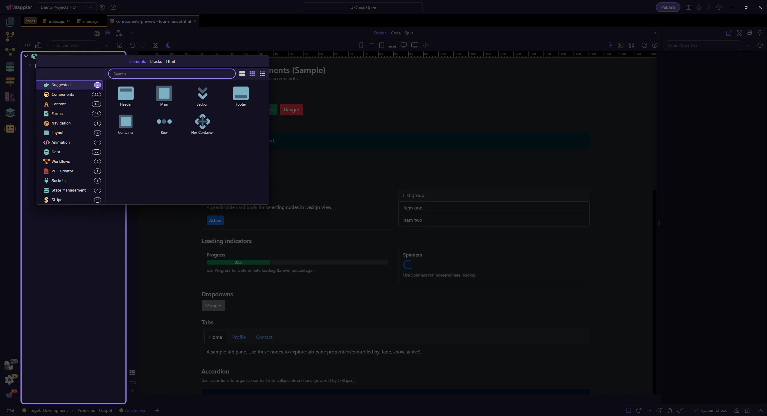
Explore Bootstrap components in Wappler: learn what’s available and how to use common UI building blocks.
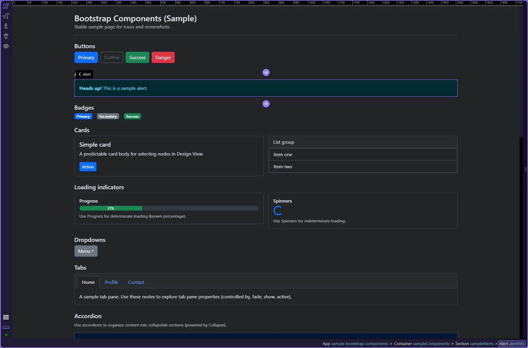
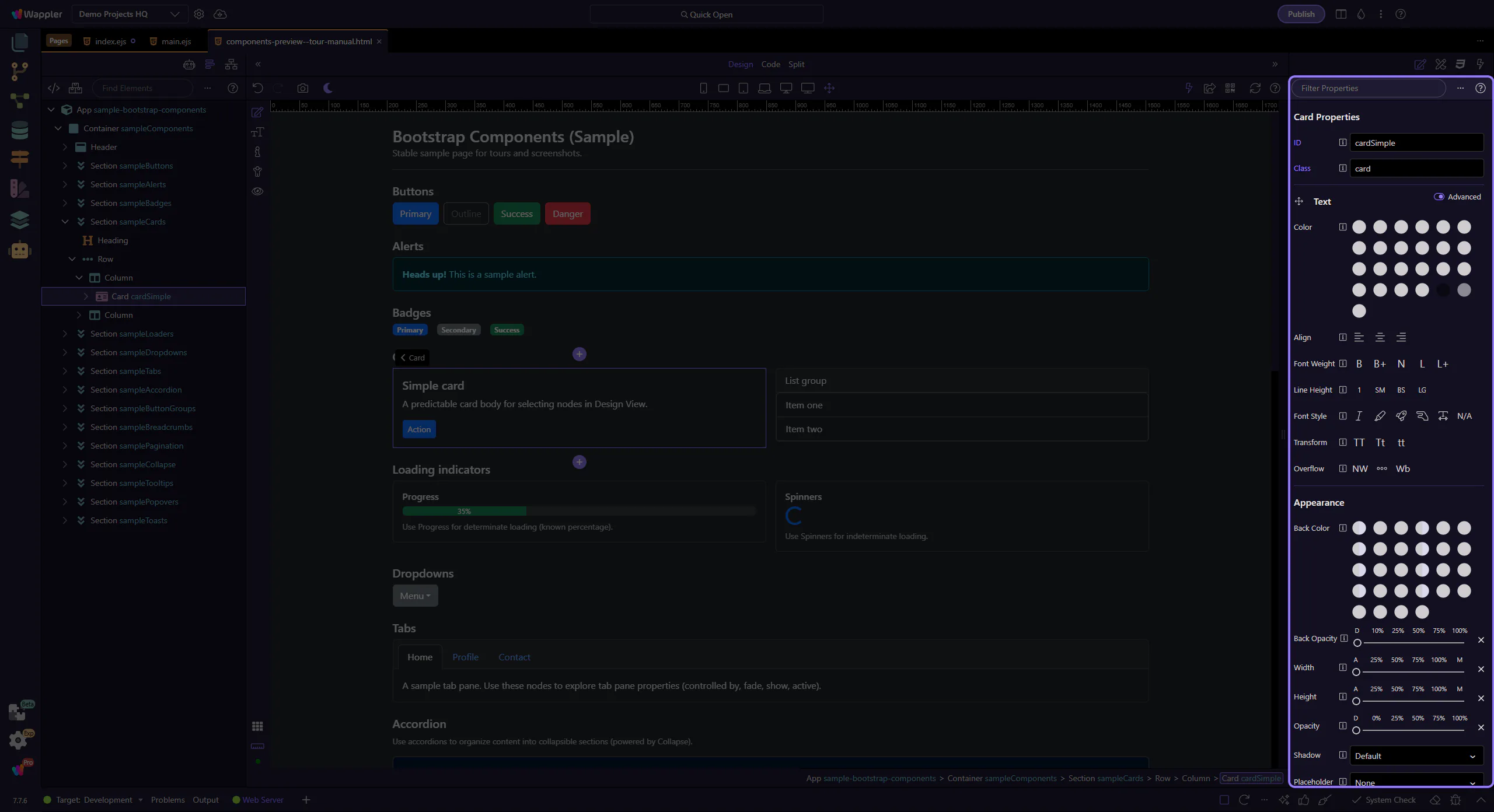
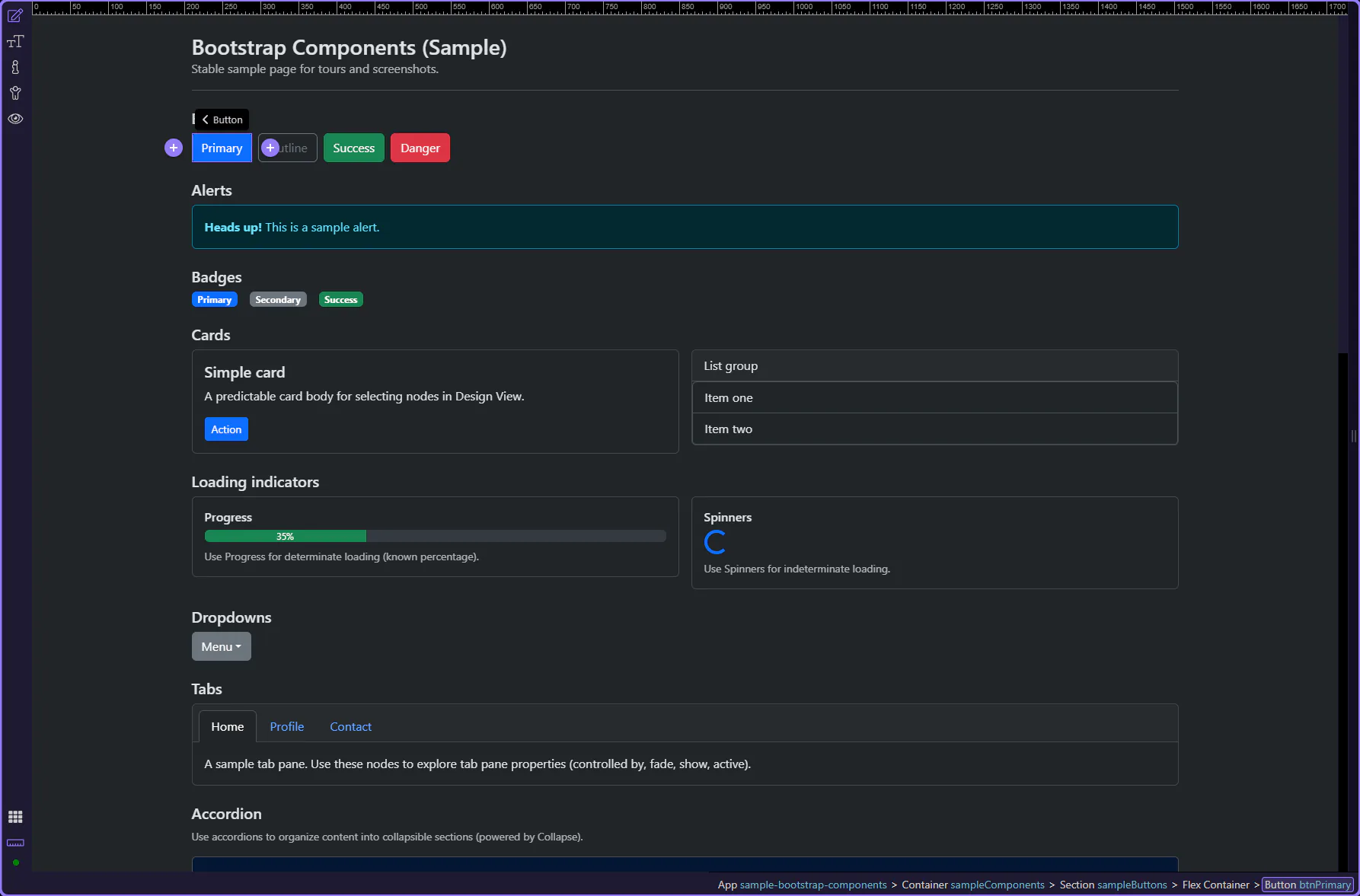
This tour uses a small set of common Bootstrap components to build a practical mental model for how Wappler exposes them in Design View and Properties. Start by seeing each example as a reusable pattern, then follow the properties that most often change appearance, behavior, and structure in real projects.
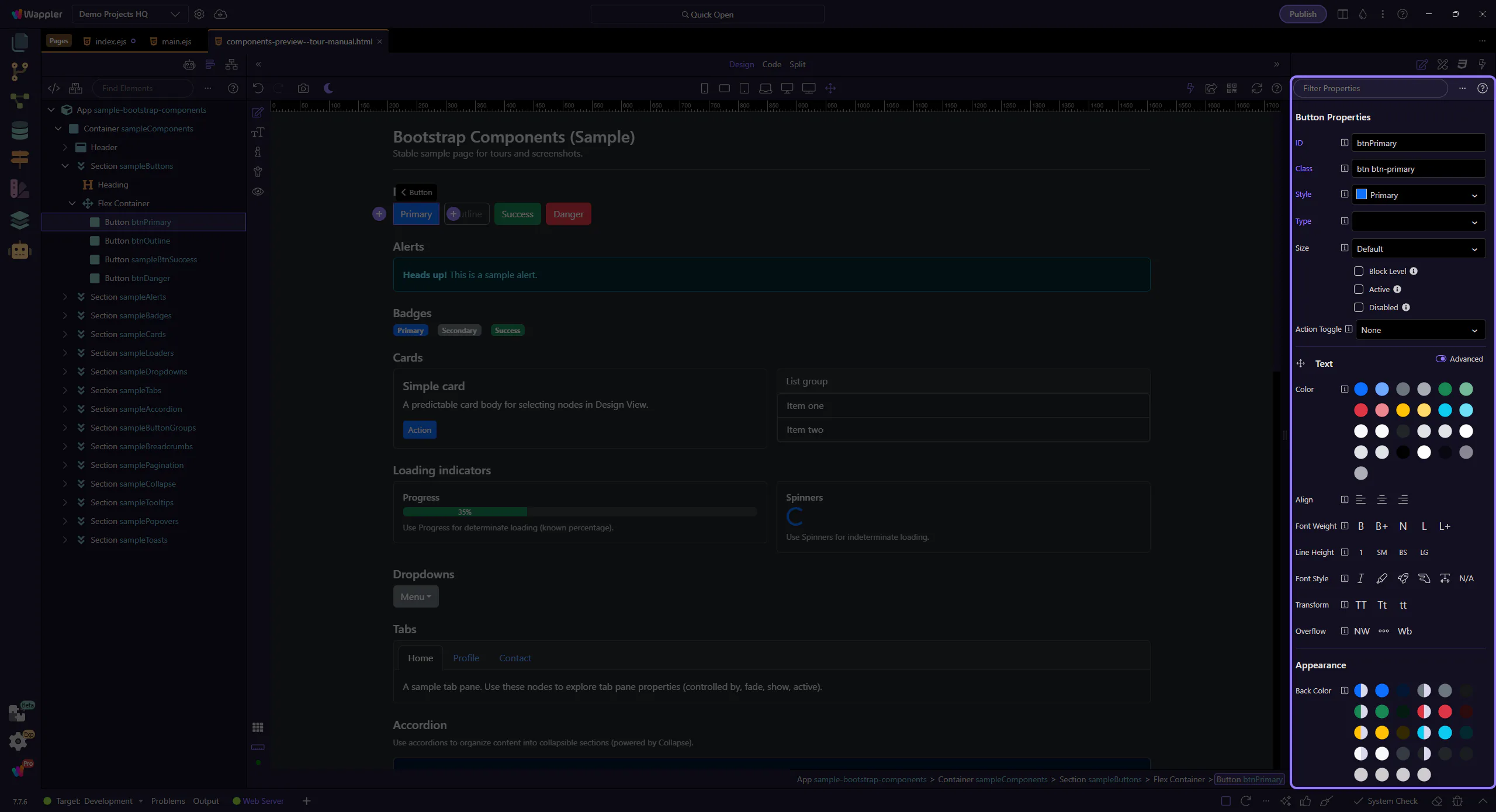
Buttons trigger actions like submit, save, and navigation. Let’s start with a primary button and review the key options that shape its look and behavior.
tip: Use clear, descriptive labels (verb + object) so the action is obvious.

Start with the wider context in the Properties panel so the next control makes sense in the full workflow. In the next step, you will focus on Button: ID and see how it fits into this area.

Use ID to give the button a stable identifier (useful for CSS/JS targeting and deterministic tours). This step matters because Button: ID is part of Selection Panels Properties Theid, and understanding that context makes the next action easier to repeat in your own project.
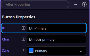
Use Style to pick the button variant (primary/secondary/outline-*, etc.). This step matters because Button: Style is part of Selection Panels Properties Btnbtnstyle, and understanding that context makes the next action easier to repeat in your own project.

Inside forms, the type attribute matters. Use button for non-submit actions and submit when the button should submit the form.

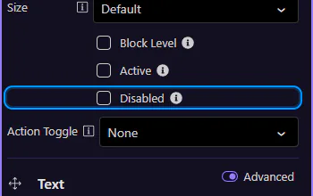
Use Disabled for loading/locked states so users can’t click multiple times. This step matters because Button: Disabled is part of Selection Panels Properties Btndisabled, and understanding that context makes the next action easier to repeat in your own project.
Outline variants keep visual weight low and work well for secondary actions. This step matters because Button variants is part of Design View, and understanding that context makes the next action easier to repeat in your own project.
tip: If two buttons should be aligned and spaced consistently, set spacing on the parent container when possible.

Use the danger variant sparingly and only for actions that are genuinely destructive (delete, remove, revoke). This step matters because Destructive variant is part of Design View, and understanding that context makes the next action easier to repeat in your own project.

Alerts communicate status messages—success, warnings, errors, or neutral information. This step matters because Alert example is part of Design View, and understanding that context makes the next action easier to repeat in your own project.
tip: Choose the variant that matches severity, and keep the message short and actionable.
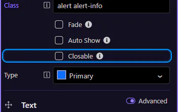
Use Type to control the alert variant (info/success/warning/danger). This step matters because Alert: Type is part of Selection Panels Properties Alerttype, and understanding that context makes the next action easier to repeat in your own project.
tip: Keep alert messages short and actionable. For more complex content, consider a card or a toast.
Use Closable to add a close button so users can dismiss the alert. This step matters because Alert: Closable is part of Selection Panels Properties Alertclosable, and understanding that context makes the next action easier to repeat in your own project.

Badges are compact labels for counts, status, and short metadata. This step matters because Badge example is part of Design View, and understanding that context makes the next action easier to repeat in your own project.
tip: Use badges for small, scannable metadata—not for long text.

Use Style to control the badge background color. This step matters because Badge: Style is part of Selection Panels Properties Bgbtnstyle, and understanding that context makes the next action easier to repeat in your own project.
Use Text to change the label or count shown. This step matters because Badge: Text is part of Selection Panels Properties Badgetext, and understanding that context makes the next action easier to repeat in your own project.
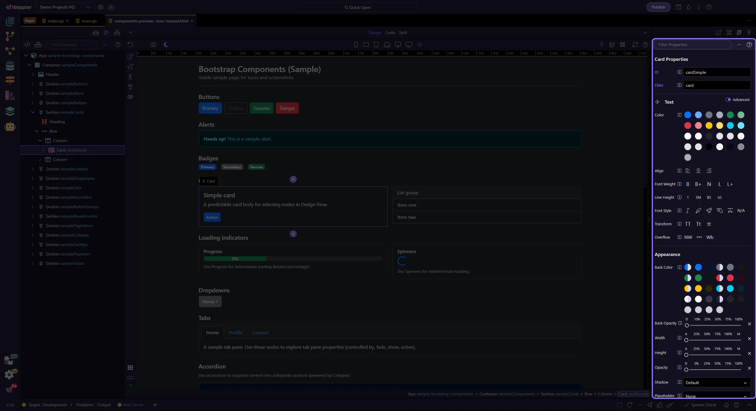
Cards often contain nested content like links, buttons, and lists. Let’s look at a call-to-action link inside a card body.
tip: Aim for one clear primary action per card when possible.
Cards group related content into a single surface, with optional header/body/footer sections.
tip: Use the header/footer for repeated structure, and keep the body focused on the content.
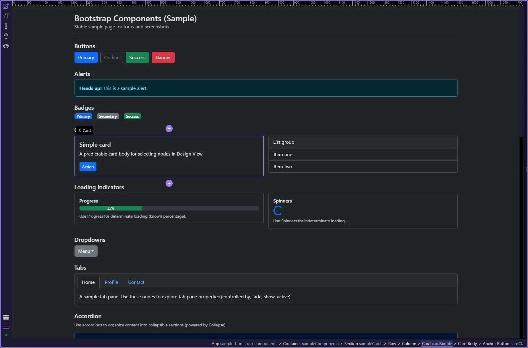
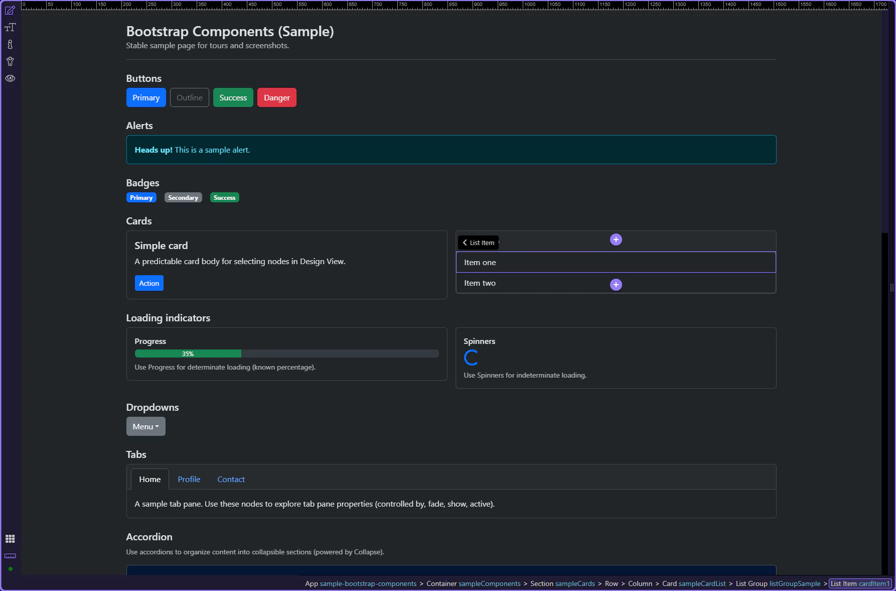
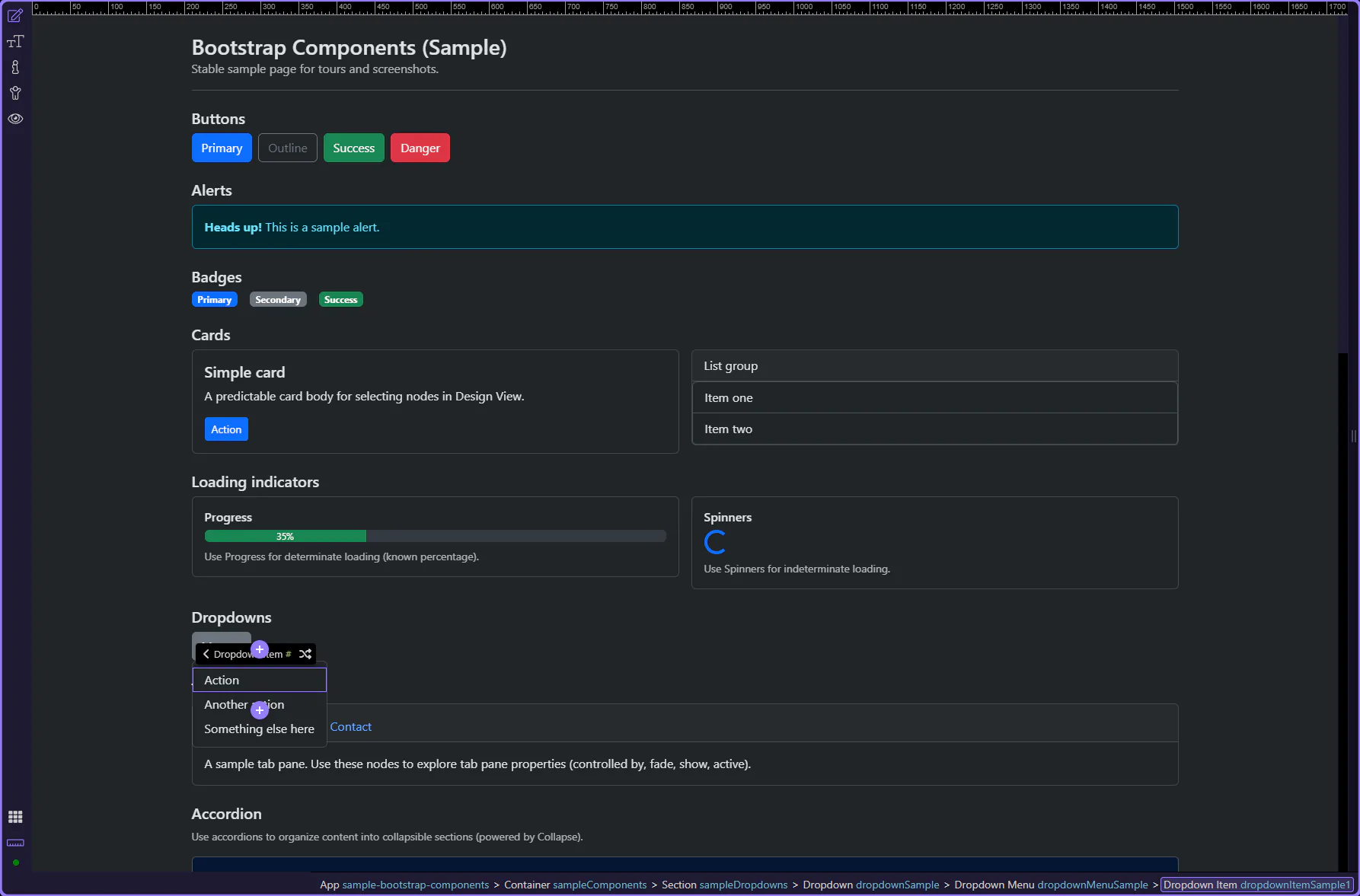
List groups present a vertical series of related items and are often used inside cards for menus, results, and settings.
tip: List group items are great for menus, settings lists, and compact content blocks.
Use Active to mark the current/selected item. This step matters because List group item: Active is part of Selection Panels Properties Listgroupitemactive, and understanding that context makes the next action easier to repeat in your own project.
Use Disabled to make the item non-interactive. This step matters because List group item: Disabled is part of Selection Panels Properties Listgroupitemdisabled, and understanding that context makes the next action easier to repeat in your own project.

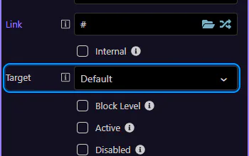
Calls-to-action in cards are usually links or buttons that lead to detail pages or start a primary workflow.

Use Link to control where the CTA navigates. This step matters because Card CTA: href is part of Selection Panels Properties Anchorbtnhref, and understanding that context makes the next action easier to repeat in your own project.
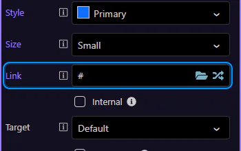
Use target to open in the same tab or a new tab/window. This step matters because Card CTA: target is part of Selection Panels Properties Anchorbtntarget, and understanding that context makes the next action easier to repeat in your own project.
Continue with a focused component tour, or go back to the Components index to browse the full list. For layout and styling patterns that apply everywhere, use the Utilities tours.
Navigate Wappler’s Bootstrap 5 semantic role system, from parent shells and sections to the child components that make editing predictable.
Bootstrap 5 semantic components give Wappler a role-first vocabulary for building sections, shells, cards, and forms. Instead of styling anonymous wrappers, you work with parents like app-shell, content-area, page-section, feature-grid, pricing-card, and login-form, then insert the children each parent is designed to hold.
See how the latest Bootstrap 5 starter blocks assemble polished pages and why their semantic roles matter after insertion.
Starter blocks are the fastest way to land on a polished Bootstrap page shape. They are more than pretty snippets: they combine layout, hierarchy, and semantic roles so you begin from a coherent composition instead of from an empty canvas.
A strong starter block gives you three things at once: a usable page section, a visual rhythm that already works, and a semantic structure you can still edit intelligently after insertion.
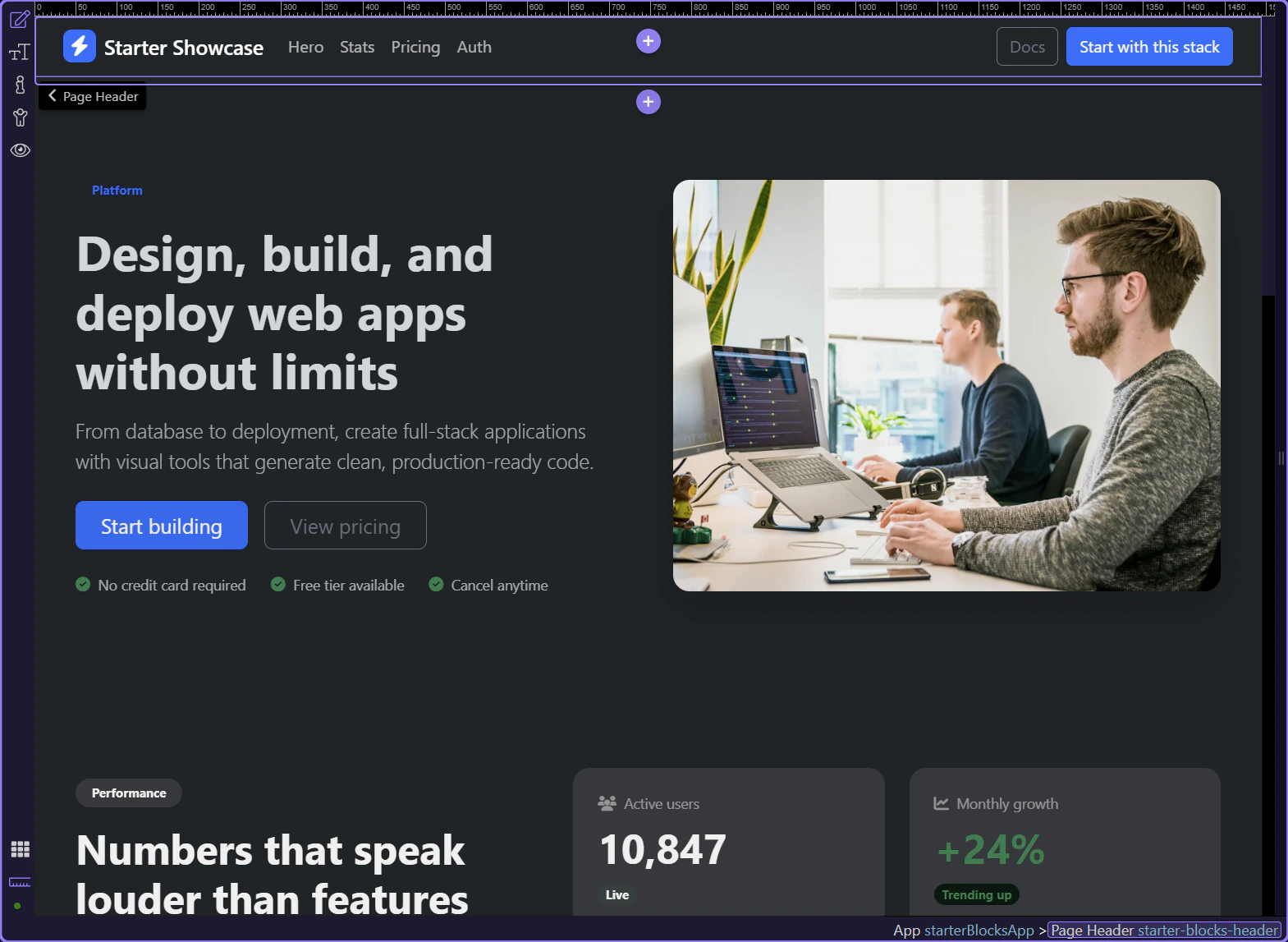
The top header area establishes the page tone immediately. In real starter pages, this often combines brand, navigation, and a first action path before the hero even begins.
This guided page strings together several real block patterns. Seeing them in sequence is useful because most production pages are not one block deep; they are a negotiated flow from opening promise to proof, offer, conversion, and footer.
The hero gives the page its opening promise. This split-layout variant shows how image, headline, proof points, and primary actions can land together without you hand-assembling the rhythm first.
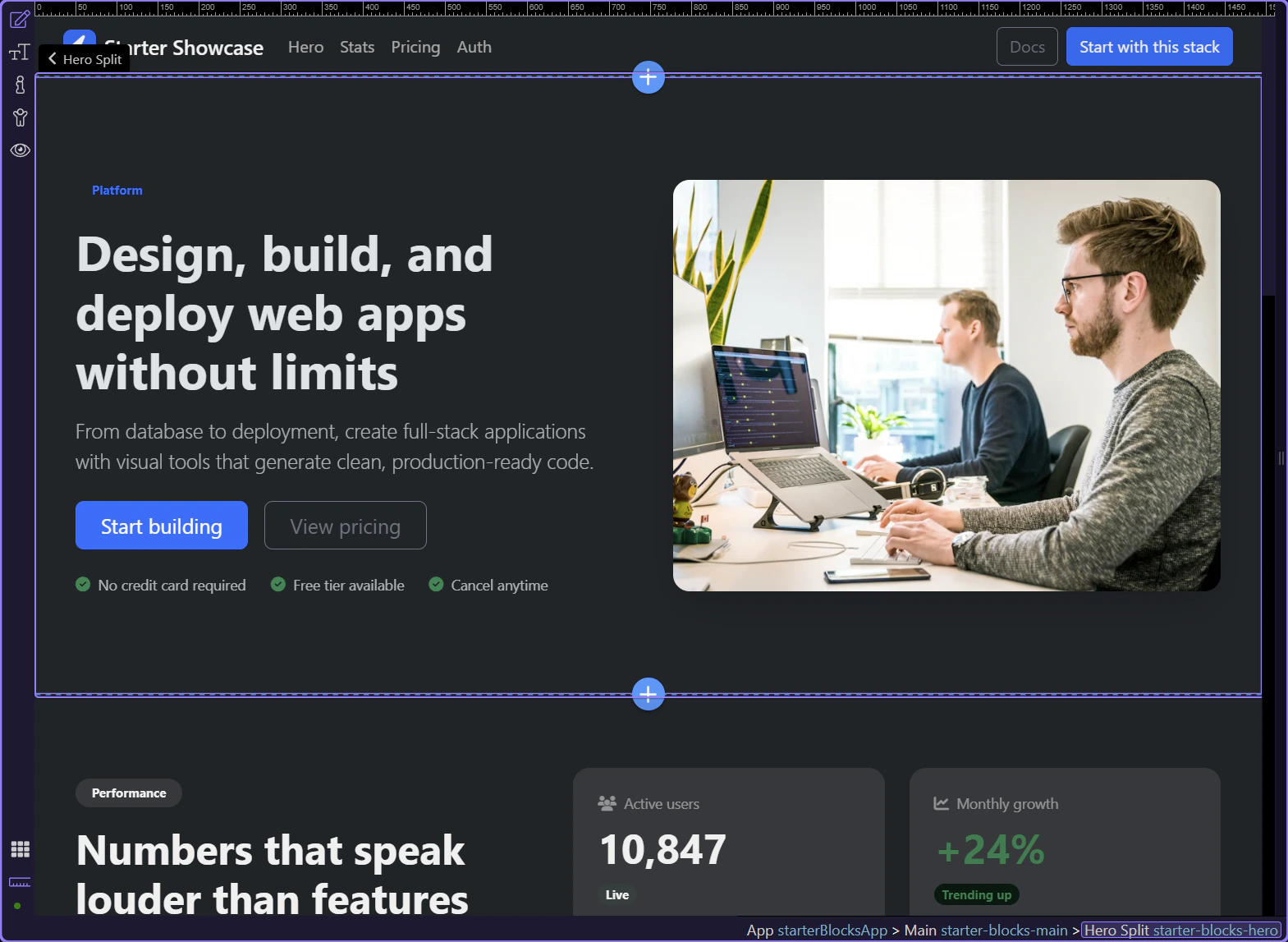
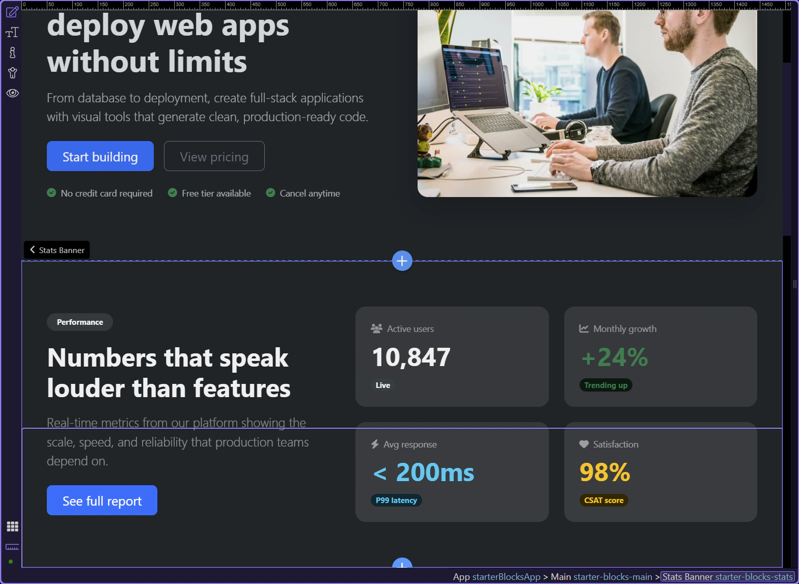
A stats or proof banner works well after the hero because it converts positioning into evidence. It is a small section, but it often decides whether the page feels credible.
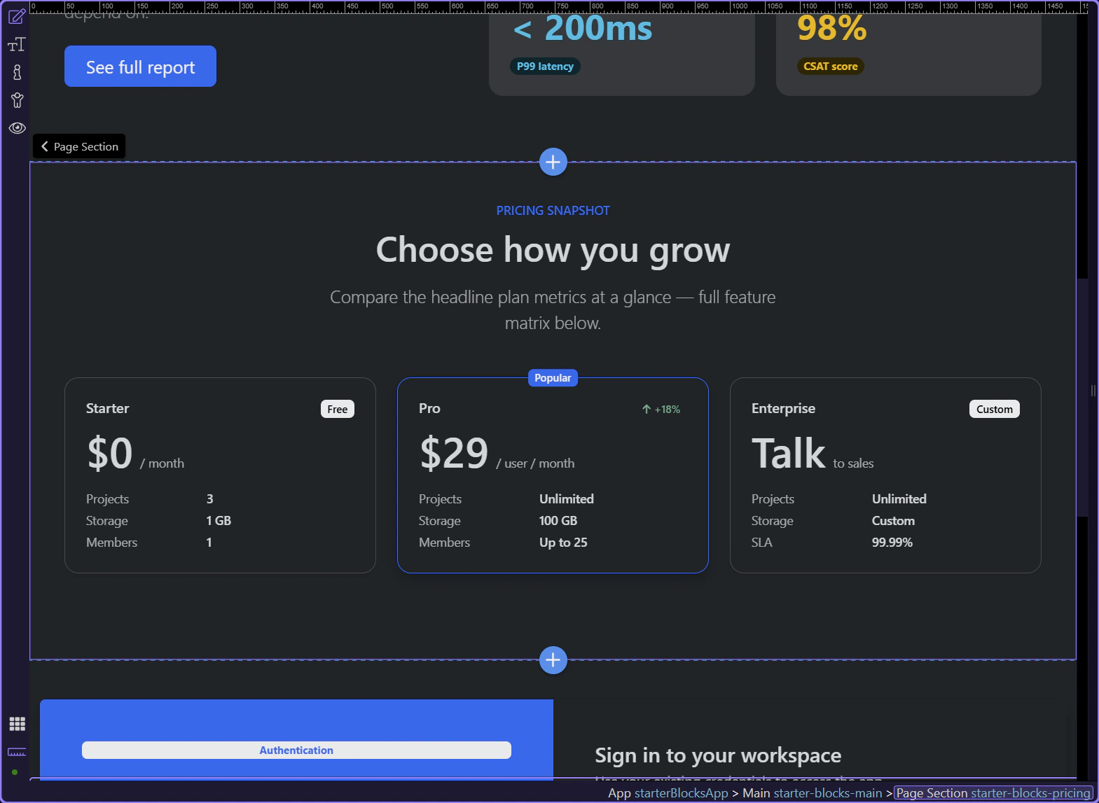
Pricing sections are a good stress test for starter quality because they combine repeated cards, emphasis states, supporting copy, and clear CTAs. If a block handles pricing well, it usually scales well in real projects.
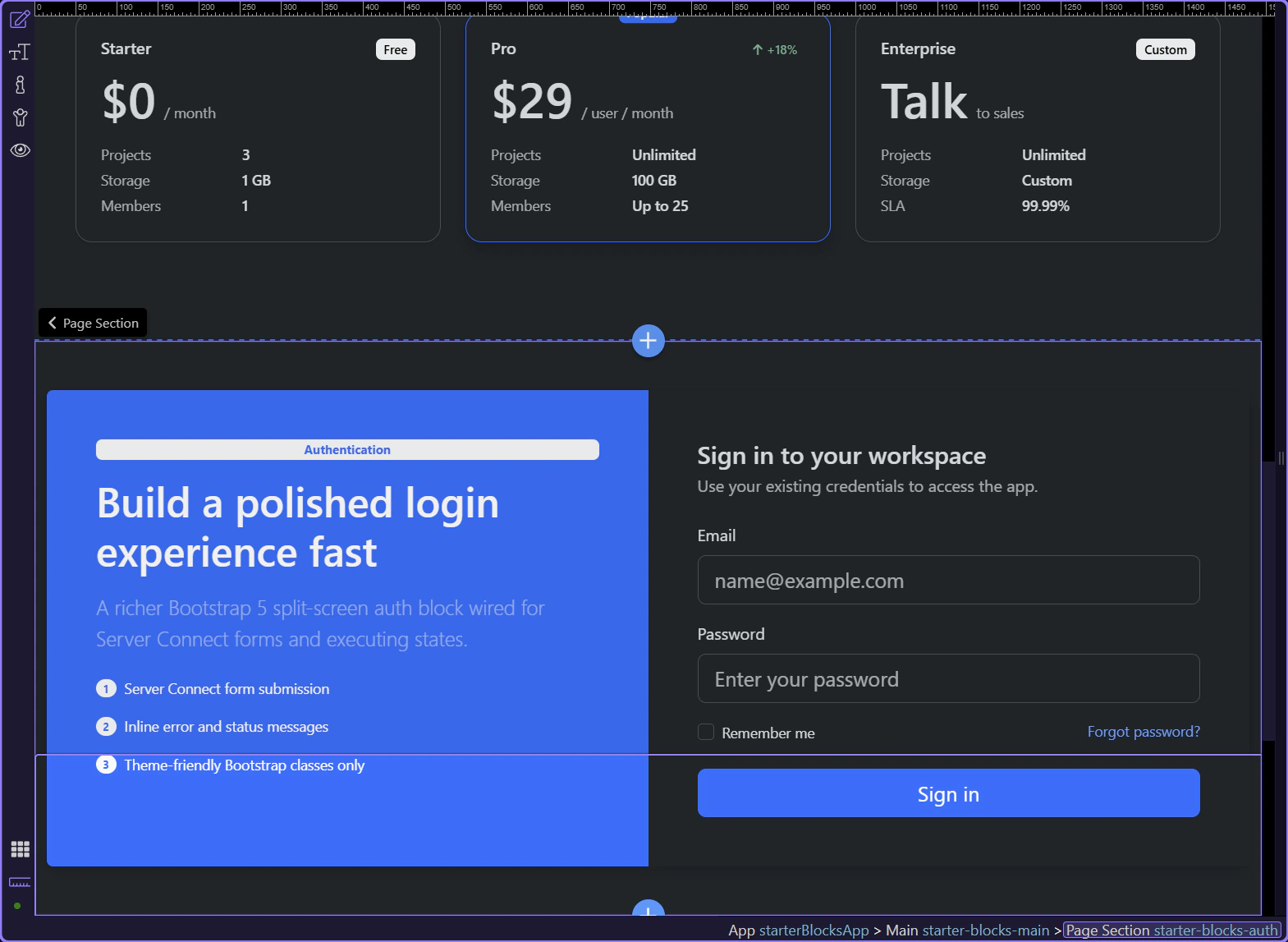
Starter blocks are not only for marketing pages. Auth sections like this login split save time on interior workflows too, and they still keep the form structure legible in Structure and Properties.
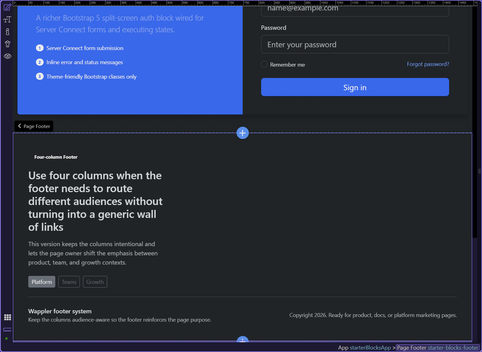
Footers are often repetitive to build by hand, which makes them ideal starter material. A ready-made footer gives you link grouping, spacing, and legal/brand framing immediately.
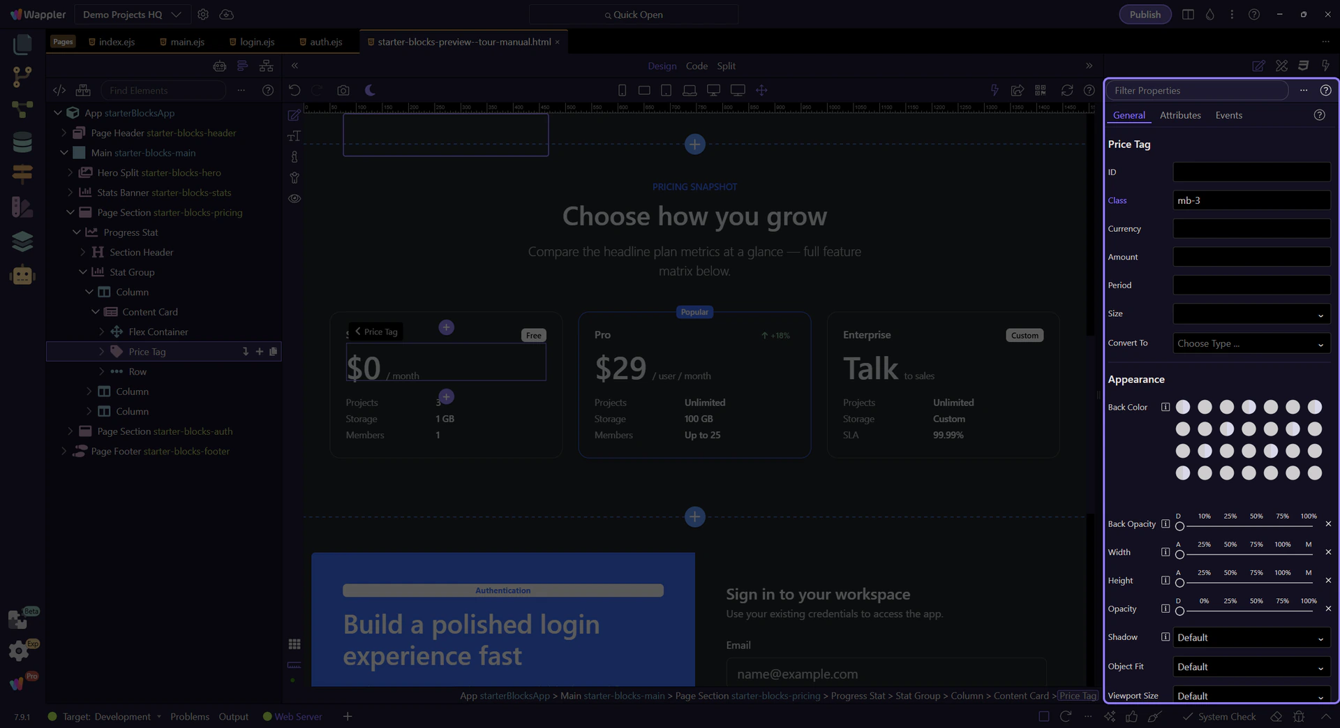
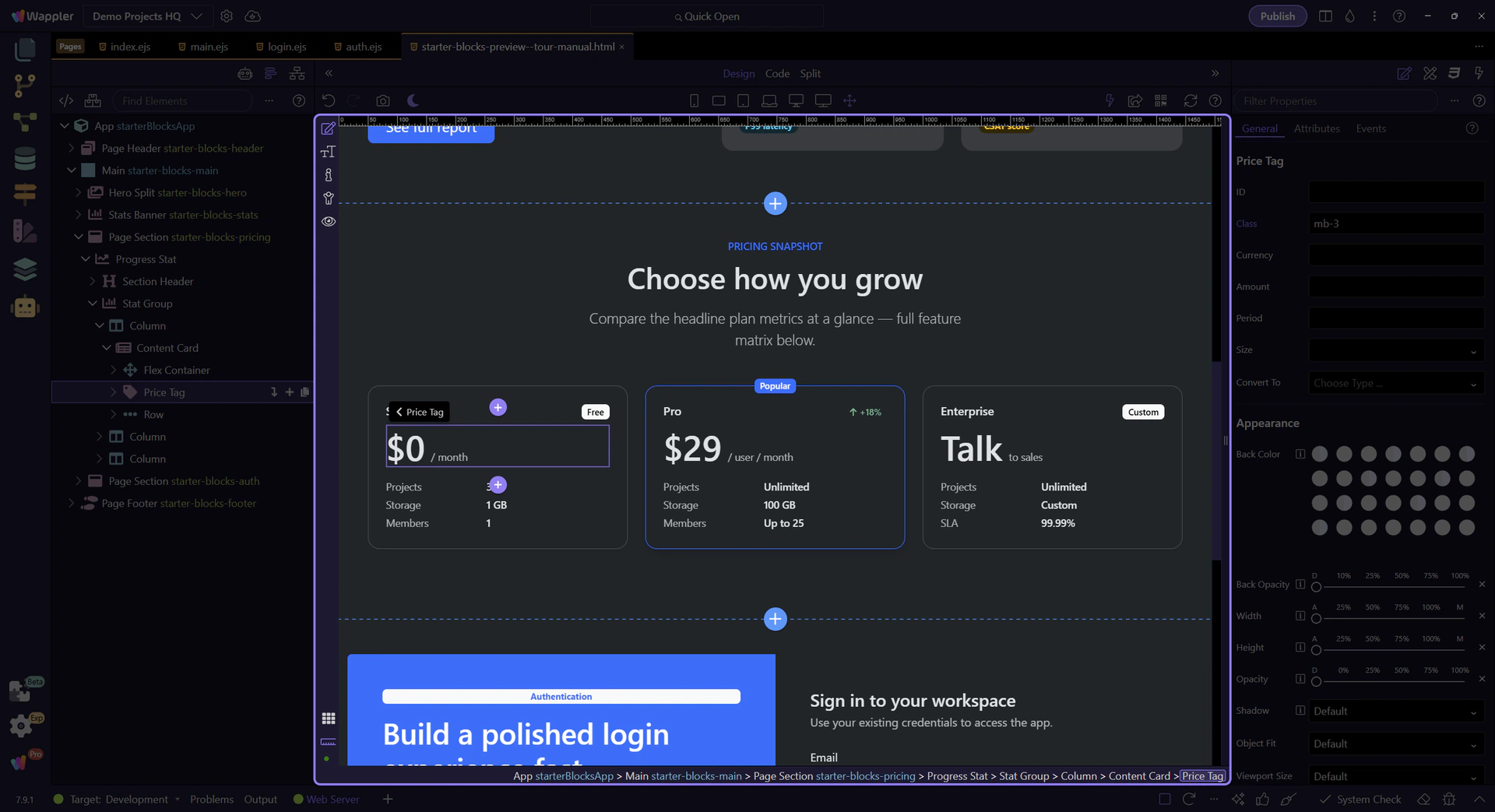
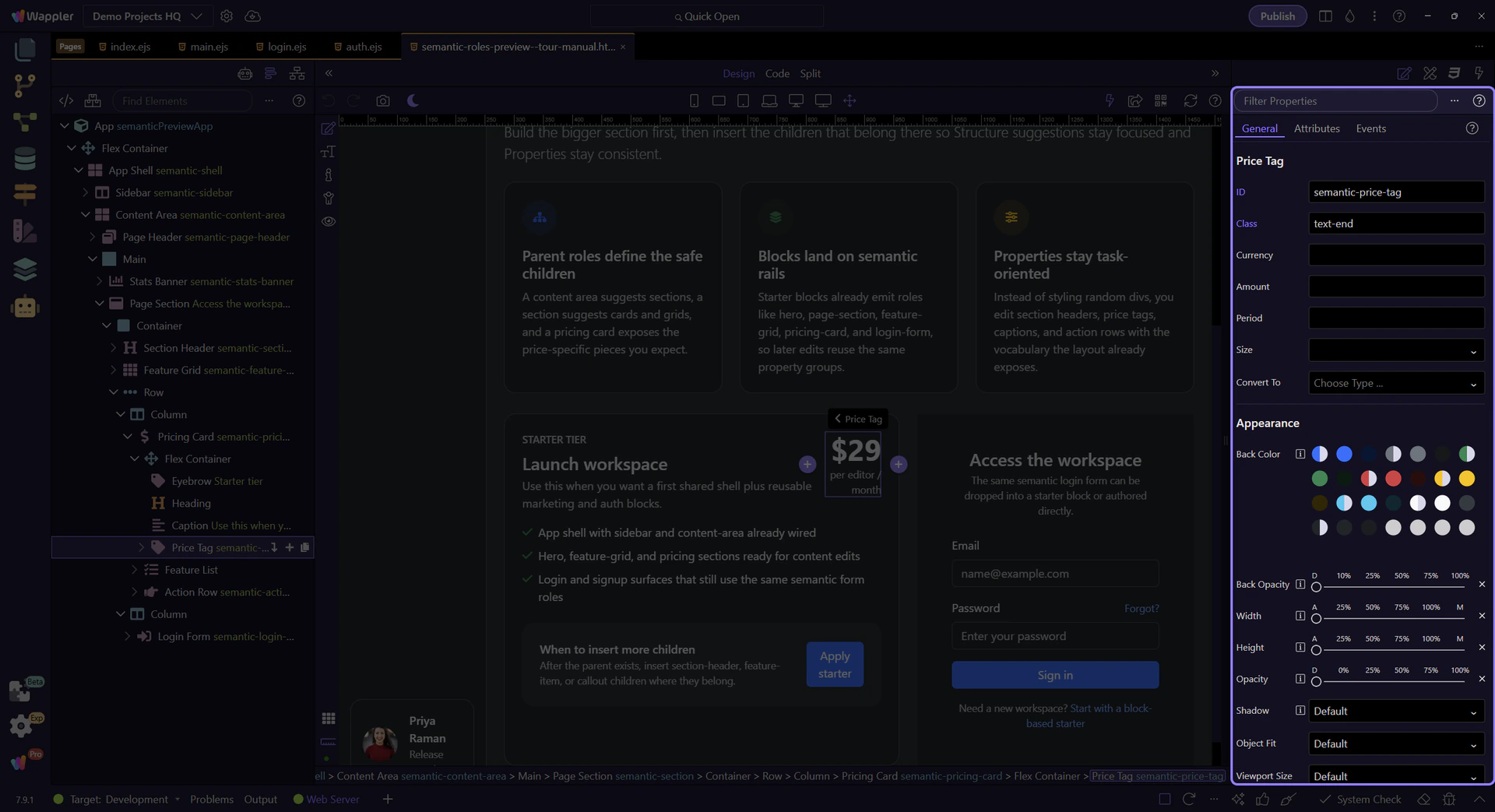
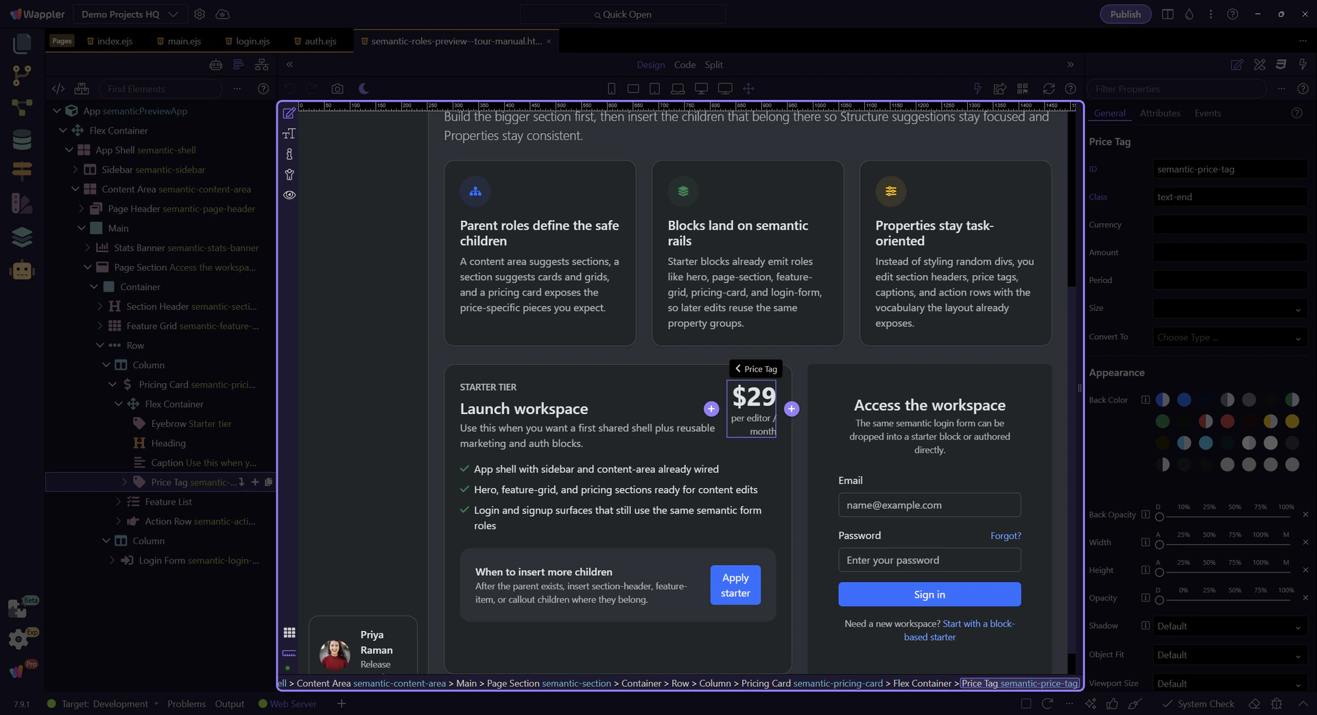
Starter blocks are faster because they arrive assembled, but the semantic roles are what keep them editable. Selecting a specialized child like a price tag shows that the Properties panel still understands what the element is for.
Starter blocks solve the first-composition problem. From here, the two useful directions are creating starter-backed pages from Pages Manager, or going back into manual semantic insertion when you need finer control.
Use Pages Manager next if you want to see where whole page starters come from. Go back to the semantic insertion tours if you want to hand-assemble or heavily customize a page after block insertion.
Explore how Bootstrap 5 semantic parents, sections, cards, and forms fit together in a real page composition.
This tour uses a dedicated semantic page so you can read the hierarchy without unrelated project noise. The goal is to see the semantic parents, how they nest, and why starter blocks stay easier to edit once they emit the same roles.
A semantic page is easier to reason about because each layer carries intent. Shells hold navigation and workspace chrome, content areas hold sections, sections hold cards or grids, and specialized children like price tags or captions keep the property model focused.
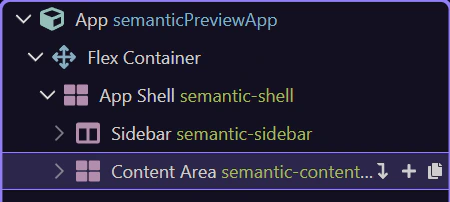
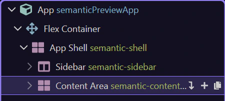
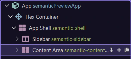
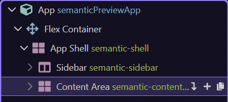
The app shell is the full workspace frame. It exists to coordinate larger chrome like sidebars, headers, and the main content surface instead of acting like just another styling wrapper.

Inside the shell, the sidebar owns brand, navigation, quick status, and other persistent navigation helpers. That matters because Insert Child here can offer sidebar-specific children instead of the whole component library.
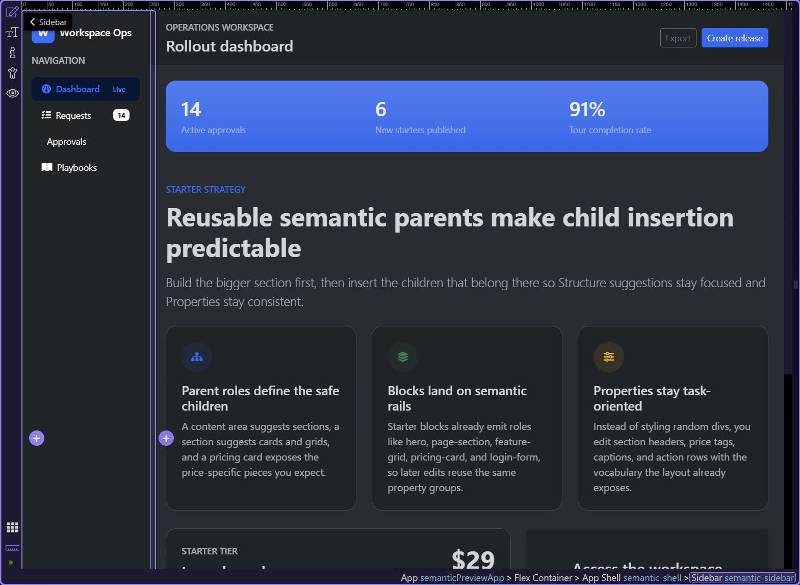
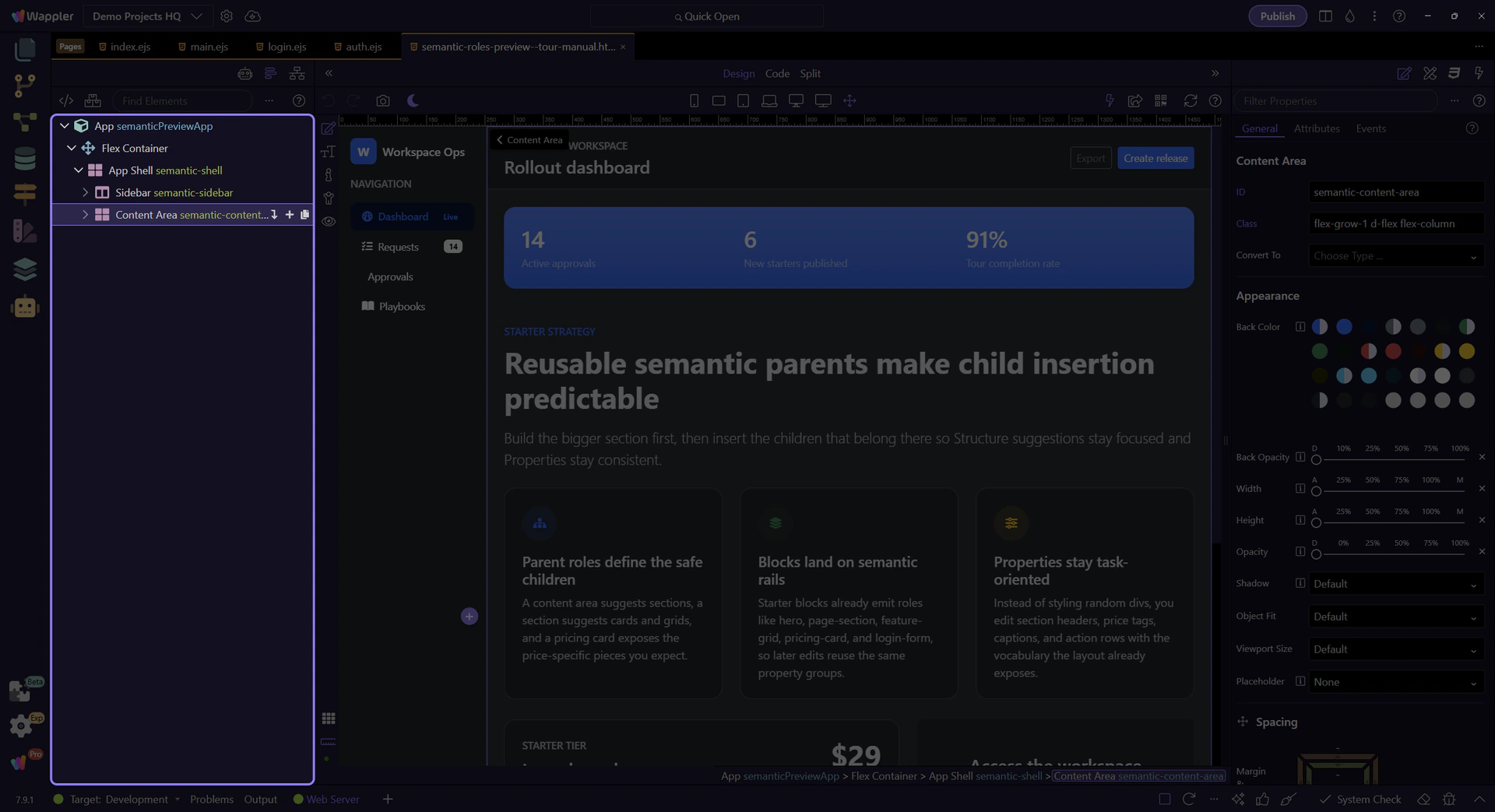
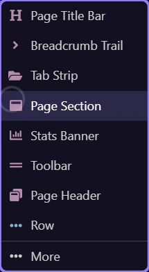
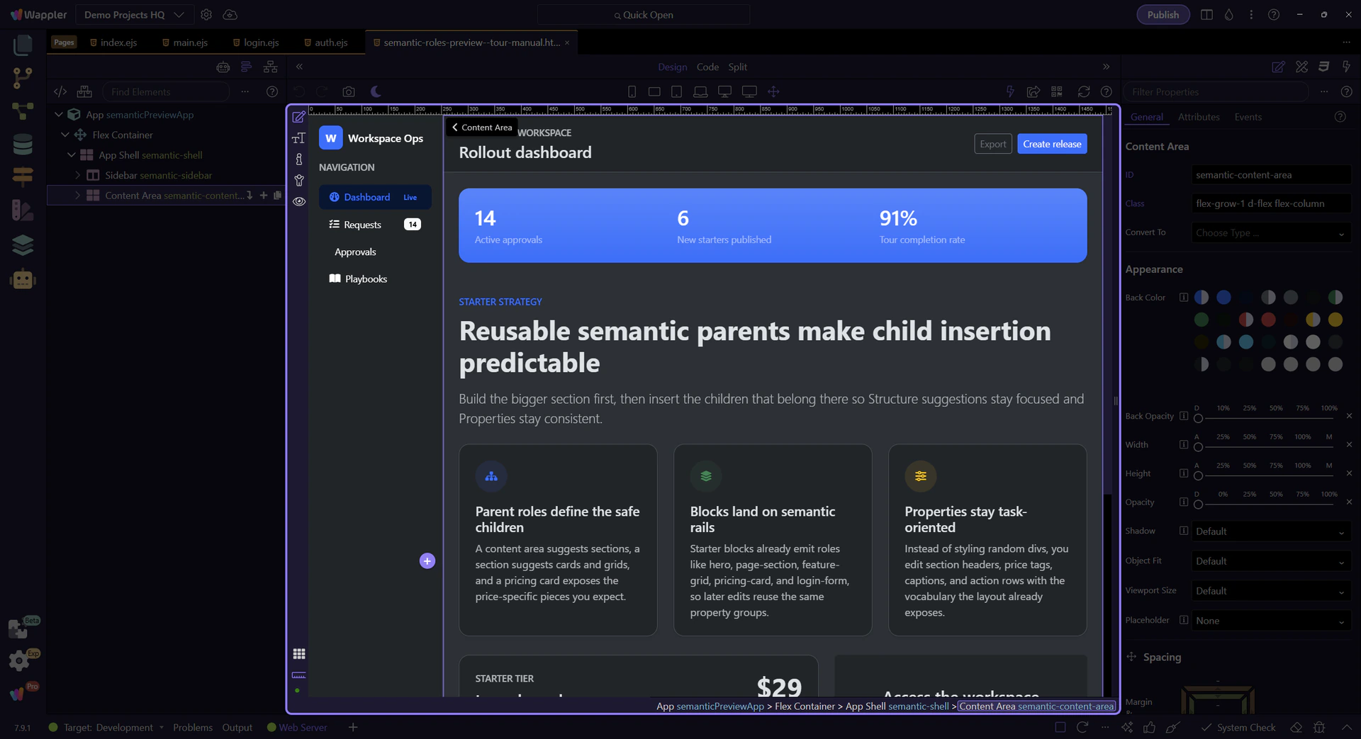
The content area is the main parent for page-level information. It is where sections, toolbars, page headers, and other work surfaces belong.
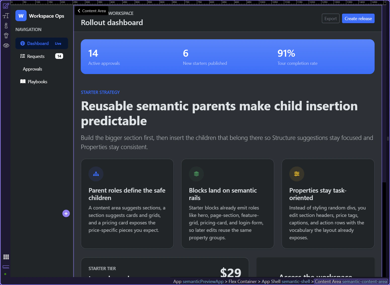
Once you move inside the content area, the hierarchy becomes more task-oriented: banner or header first, then reusable sections, then the specialized children that describe the content inside those sections.
A page header frames the current workspace or route. It usually combines the page title with an action row or supporting metadata.

A stats banner is a specialized section-like surface for high-signal metrics. It gives you a reusable pattern for status-heavy dashboards without losing semantic intent.

Page sections are the main narrative or workflow blocks of a page. They create a safe parent for section headers, grids, cards, callouts, and other editorial or product content.
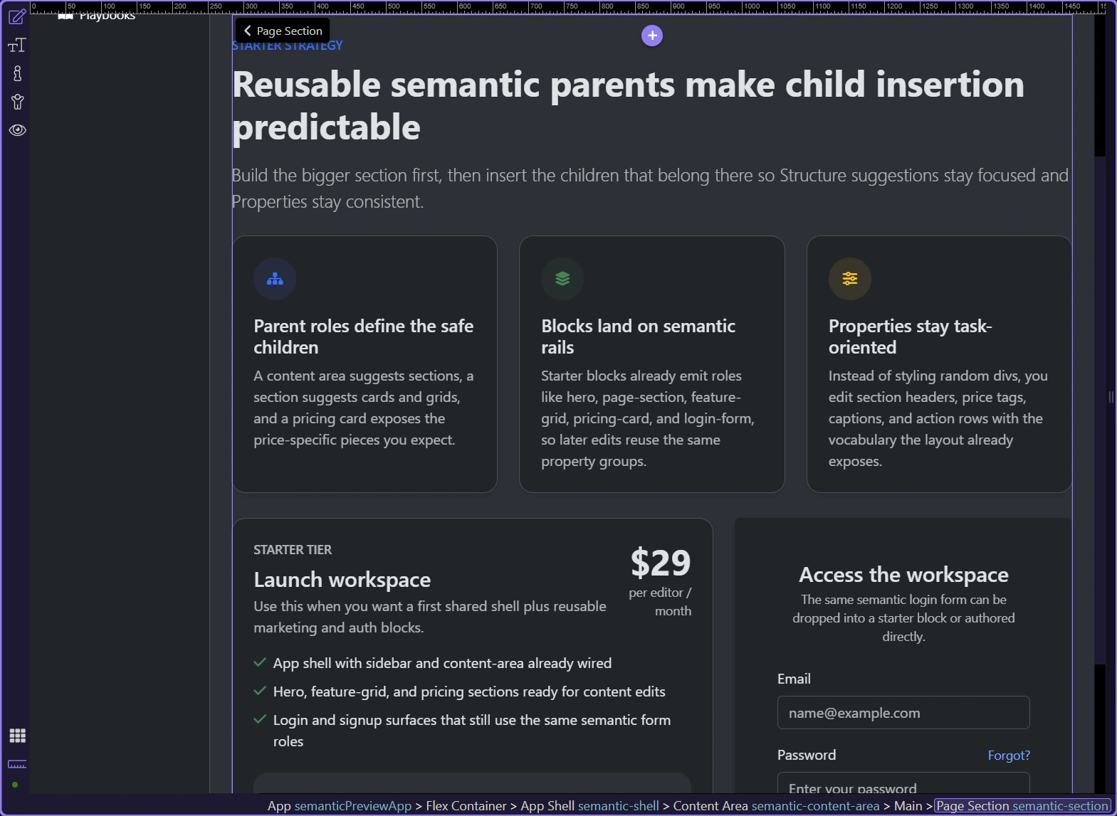
The section header groups the eyebrow, title, and lead paragraph into one reusable editorial pattern. That is why the Properties panel can present section-copy controls instead of generic text styling only.
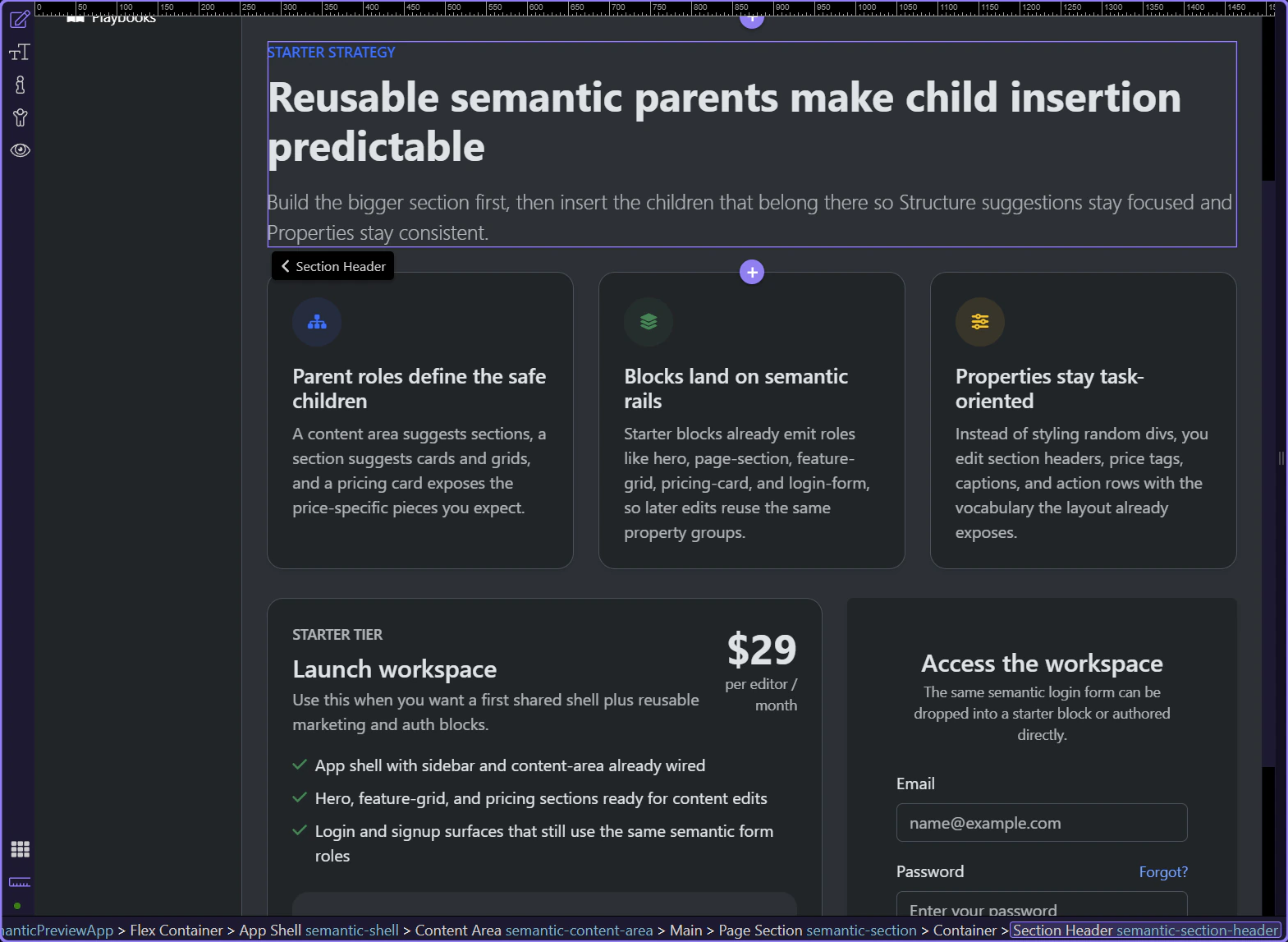
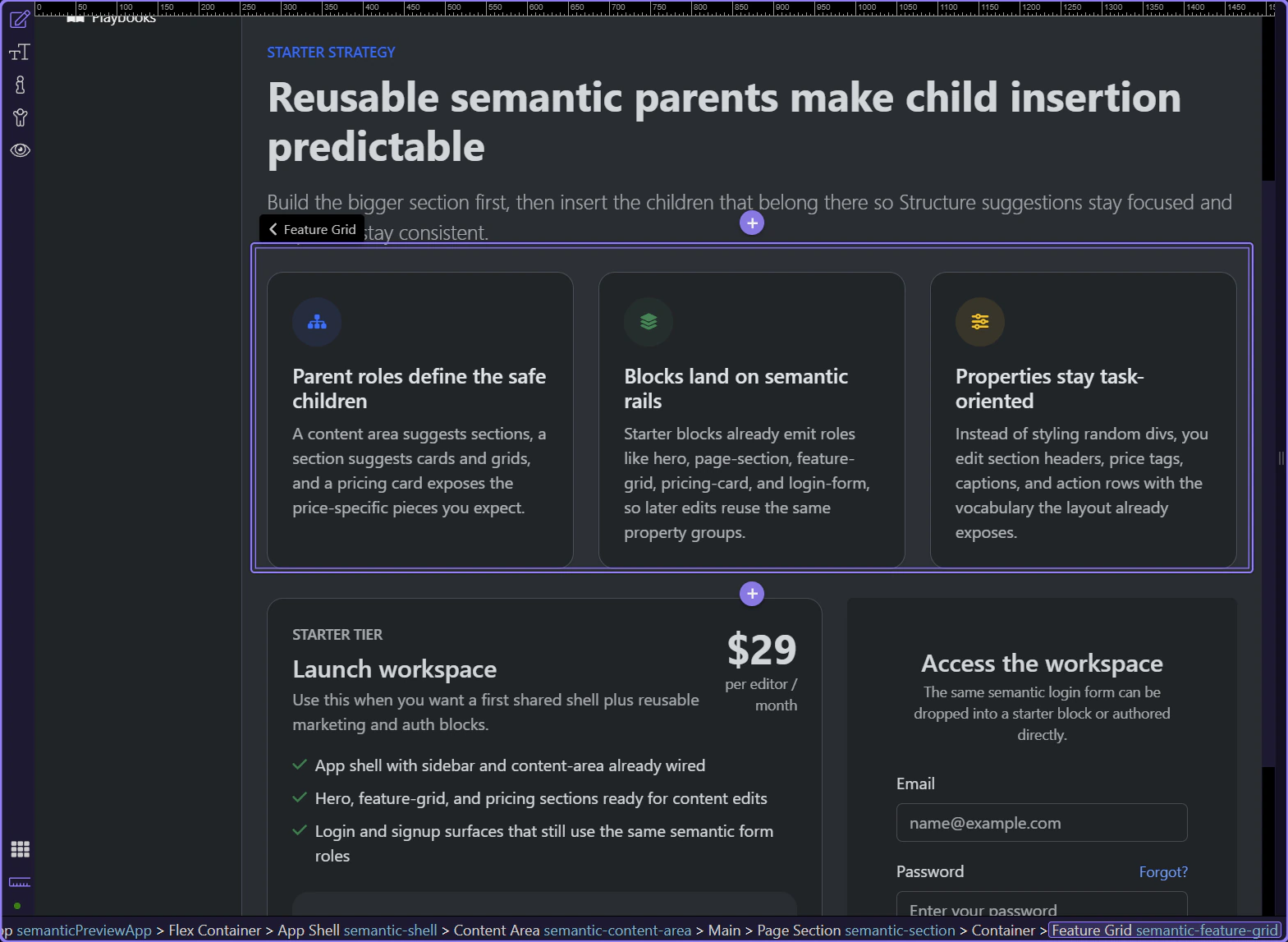
Feature grids are section children that hold repeating feature items. They are useful when one parent idea needs multiple equal-weight supporting points.
Pricing cards are more specialized than a plain content card because they expect pieces like price tags, captions, benefit lists, and action rows. This is where semantic naming starts paying off in Properties.
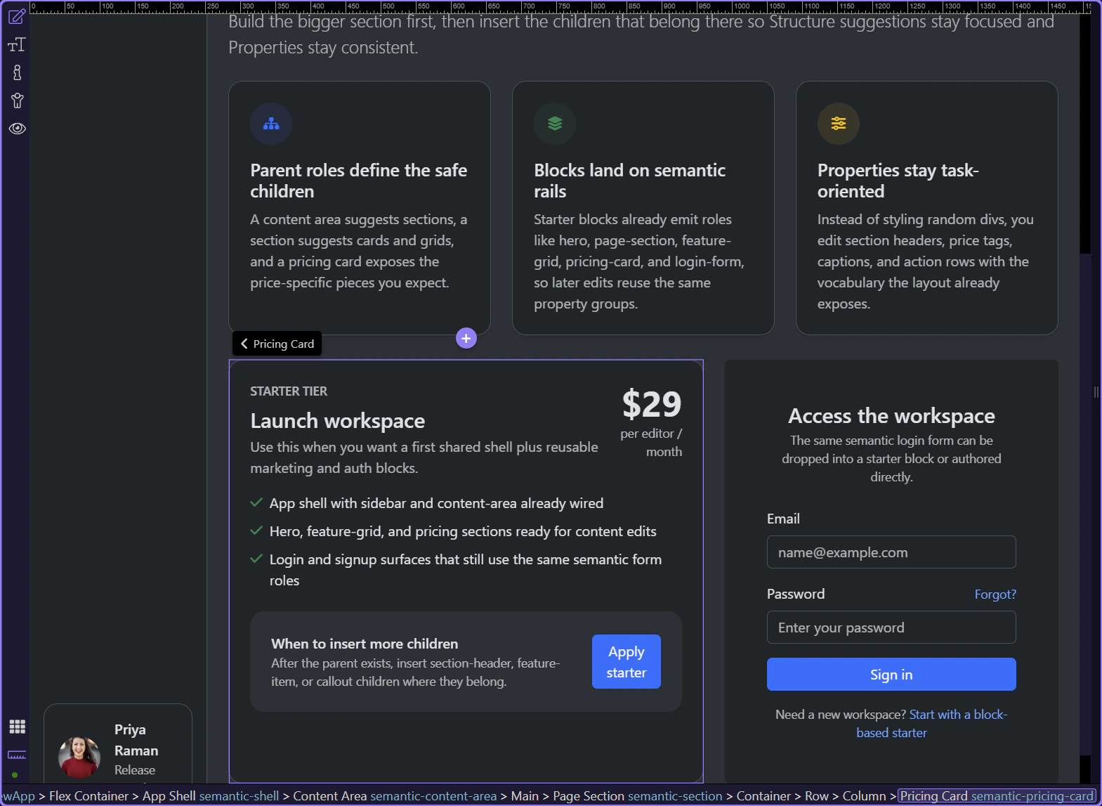
Login form is another specialized semantic surface. Even when it arrives from a starter block, it still exposes the same role-aware identity inside Structure and Properties.

Selecting a specialized child like a price tag shows why the role system matters: the Properties panel can focus on the thing the element means, not just on raw classes.
Now that the hierarchy is visible, the next practical step is to insert the same children through Structure so you feel how the parent-child suggestions narrow the choices.
Next, use the Structure panel to insert semantic children in sequence, then compare that editing flow with starter blocks that already arrive role-first.
See how semantic children flow through the Structure panel so each parent narrows the right next building block.
This tour starts from a purpose-built semantic page, but the goal is practical: select a semantic parent in Structure, then use the inline Insert Inside action at the end of that tree row. That quick menu is the main usability win of the semantic system because it starts with the parent’s direct suggested children before you ever need the broader picker.
You’ll extend the preview by inserting a new page section, then a feature grid inside that section, then a feature item inside the grid. The sequence matters because each parent should offer the next semantic child directly from the Structure row actions instead of forcing you through the full component catalog.
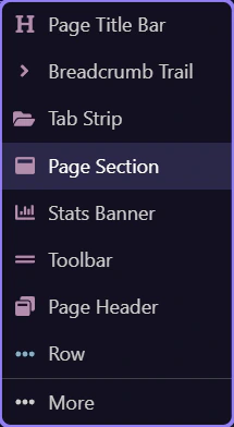
The content area is the right parent because new sections belong to the main working surface, not inside the sidebar or another specialized child. It is also the row whose inline Insert Inside action you want to use for the fastest semantic workflow.
A page section is a strong first child because it creates a clean container for a thematic slice of the page. The Structure row’s inline Insert Inside menu should already surface that kind of section-level child directly, so this is where the quick semantic workflow becomes obvious.
Re-select the content area in the Structure panel before opening the inline insert action. This keeps the next click anchored to the real semantic parent instead of relying on whatever was selected earlier.
Use the highlighted plus action at the end of the selected Structure row. The row reveals these actions on hover, so this step calls out the exact Insert Inside icon first. Click Next to press that icon and open the quick insert menu from the current row.

Because the content area is a semantic parent, the quick insert menu already shows section-level children like Page Section directly. Hover the option in the menu to see that this list is already narrowed to likely structural children before you click.
Insert the section directly from this quick menu. The important outcome is that the tree selection should move onto the newly inserted row without leaving the Structure-panel workflow.
The new section is now the active semantic parent. At this point you stop thinking about the content area and start thinking about what belongs inside this specific section, using the same inline row action again.
Now the section becomes the parent for a grid, and the grid becomes the parent for a single feature item. This cascading pattern is what makes semantic editing feel composed instead of chaotic, especially when you stay on the Structure row actions instead of reopening the broader picker.
The new section should already be the active semantic parent. Confirm that row selection before opening Insert Inside again so the next popup belongs to the correct parent.
Use the highlighted plus action at the end of the section row. These row actions only show on hover, so the step points at the exact Insert Inside icon before the click happens. Click Next to press that icon and open the quick insert menu with the narrower section-level choices.

Feature Grid is a good section child because it expects repeated feature items underneath it. Hover it in the menu to make the narrowed section-level suggestions visible before insertion.

Insert the Feature Grid directly from this quick menu. The important outcome is that the tree selection should move onto the newly inserted grid row without leaving the Structure-panel workflow.

The new grid should now be the active semantic parent. Confirm that row selection before opening Insert Inside again so the next popup stays on the correct row.
Use the highlighted plus action at the end of the grid row. Because these row actions appear on hover, this step isolates the exact Insert Inside icon before the click. Click Next to press that icon and open the quick insert menu as the choices narrow down to item-level content.

Feature Item is the natural child of the grid because the grid is responsible for arranging repeated items. Hover it in the menu so the item-level suggestion is visible before insertion.
This final insertion completes the parent-child chain in the same Structure-first workflow, so you can read the result directly from the tree without switching mental models.

This is the outcome you want to internalize. Each parent created the right home for the next child, and the Structure panel stayed readable because each level used the same inline Insert Inside workflow.

Once you know this parent-child pattern, starter blocks become easier to customize because you recognize the same semantic roles after they land on the page.
Next, compare this manual insertion workflow with ready-made starter blocks and Pages Manager starter pages. The same role system is there; you are just entering the workflow later.
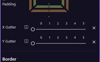
Use border utilities for rounding, borders, and subtle separators in your UI.
Borders are great for subtle separation, emphasis, and shape. Borders & rounding are shared across many Bootstrap components, so you can apply them consistently.
Cards are a good way to review shared Border and rounding utilities, since they often need subtle separation and shape. The card is selected so Border utilities are visible in Properties.

Start with the wider context in the Properties panel so the next control makes sense in the full workflow. In the next step, you will focus on Border & rounding and see how it fits into this area.
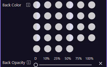
Use the Border group to toggle borders and choose rounding/radius. Pair this with color and spacing to quickly style components.
tip: This maps to Bootstrap classes like
border,border-0,rounded-*, andborder-*-subtle.

Next, learn responsive display and flex item utilities.
Use text utilities for alignment, wrapping, truncation, and emphasis.
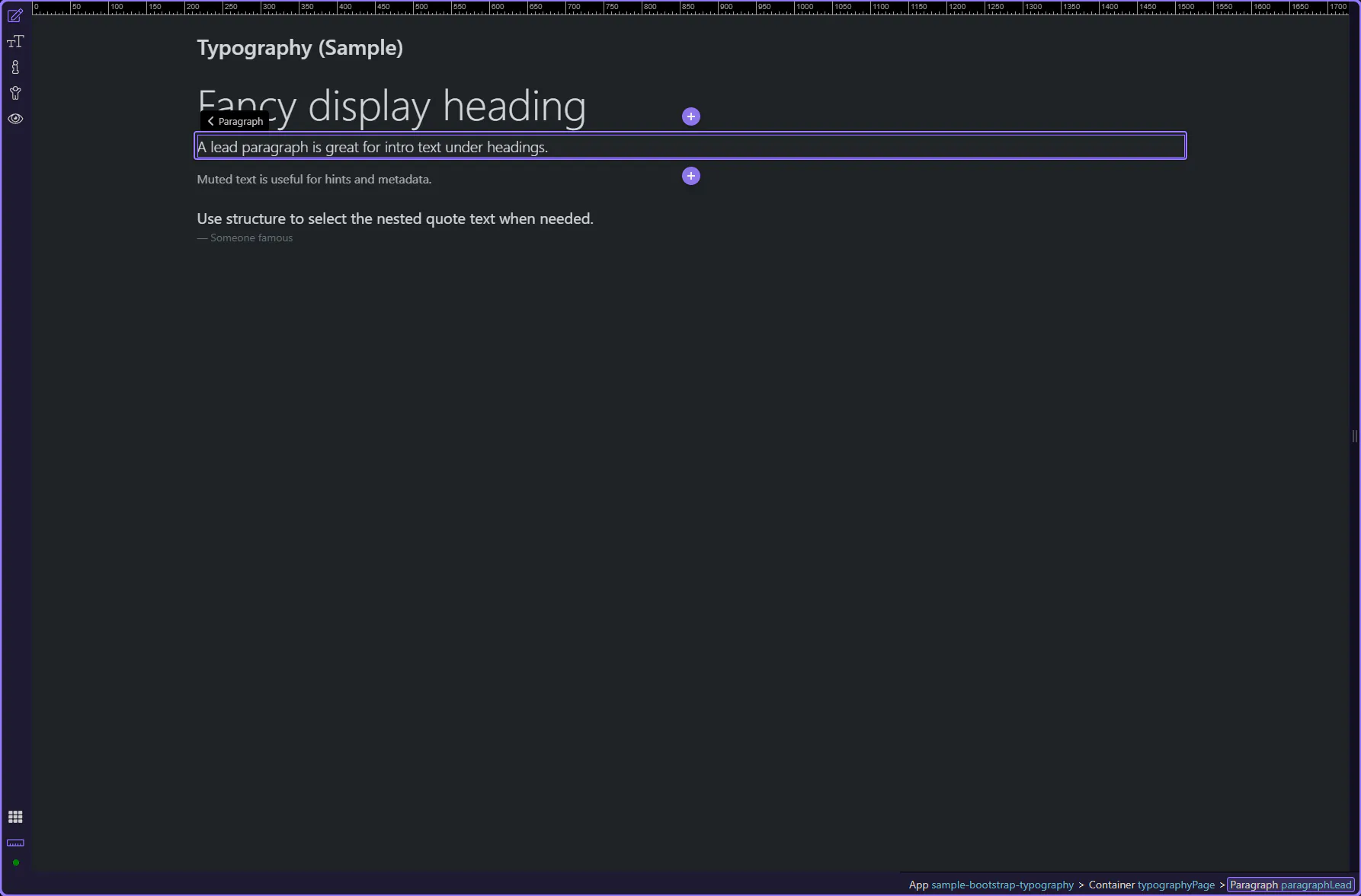
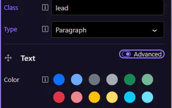
Text utilities are easiest to review on a paragraph. A lead paragraph is selected so the most common Text Formatting properties are visible.
Text utilities help you adjust alignment, wrapping, emphasis, and readability without changing semantics. The lead paragraph is selected so you can immediately see the Text Formatting options. Tip: if selection is tricky, use App Structure to jump to the exact text node.
Start with the wider context in the Properties panel so the next control makes sense in the full workflow. In the next step, you will focus on Text: Color and see how it fits into this area.
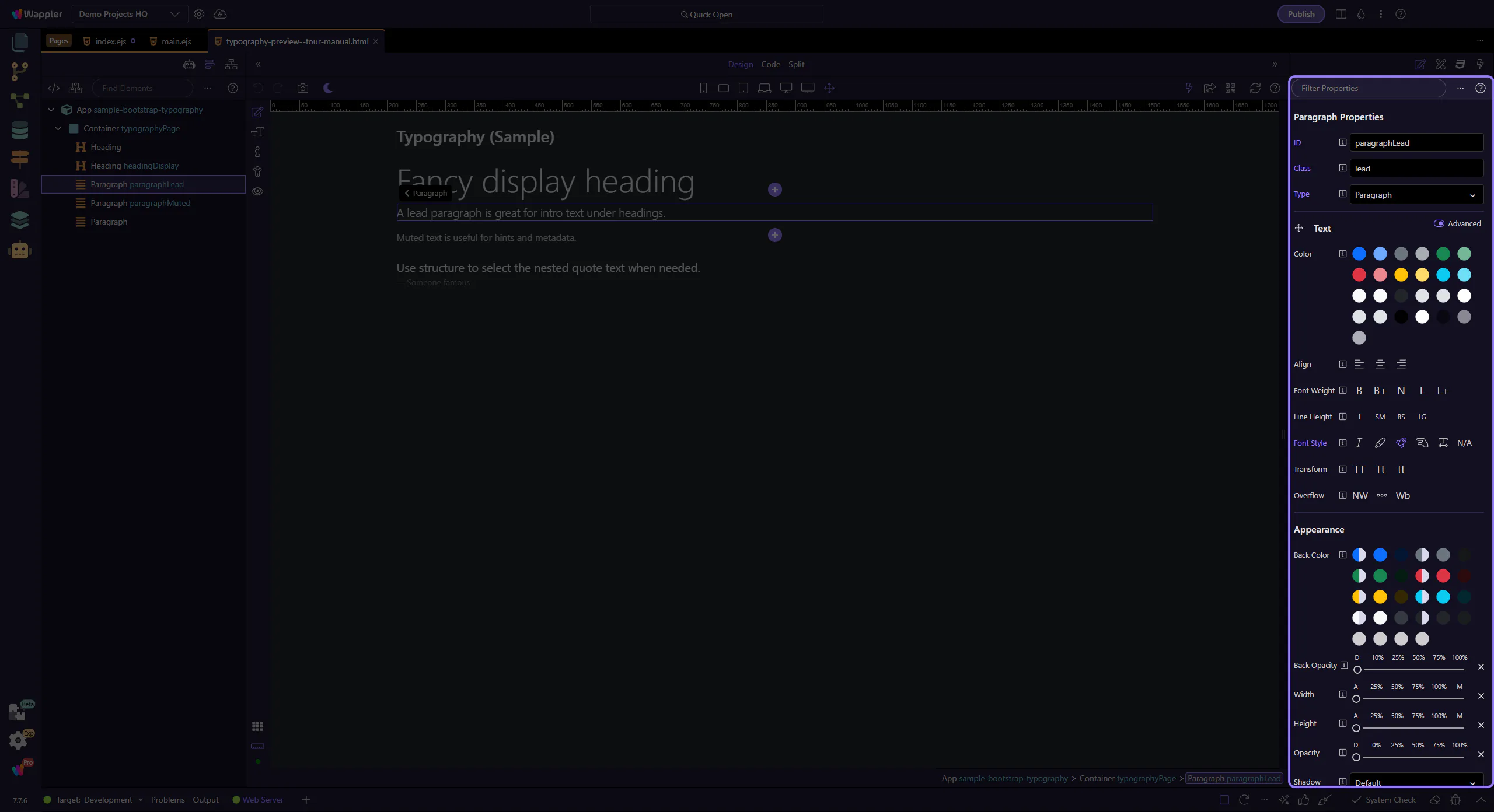
Use Color for text-* utilities (including the new *-emphasis variants). This step matters because Text: Color is part of Selection Panels Properties Textelementcolor, and understanding that context makes the next action easier to repeat in your own project.
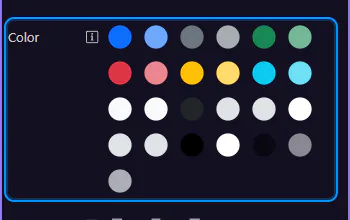
Use Align for text-start, text-center, and text-end. This step matters because Text: Alignment is part of Selection Panels Properties Textalign, and understanding that context makes the next action easier to repeat in your own project.
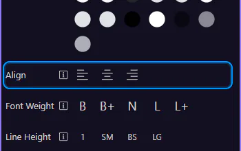
Use Font Weight and Line Height to tune hierarchy without custom CSS. This step matters because Text: Weight & line height is part of Selection Panels Properties Textfontweight, and understanding that context makes the next action easier to repeat in your own project.
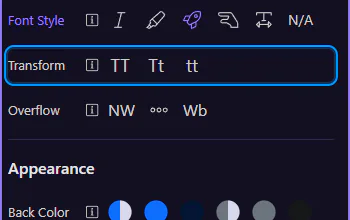
Some Text utilities are tucked behind the Advanced toggle to keep the inspector concise. When you don’t see an option you expect, enable Advanced.
Turn on Advanced to reveal additional Text options. This step matters because Enable Advanced is part of Selection Panels Properties Text Advanced Layout, and understanding that context makes the next action easier to repeat in your own project.

With Advanced enabled, Transform becomes available for uppercase/capitalize/lowercase. This step matters because Text: Transform is part of Selection Panels Properties Texttransform, and understanding that context makes the next action easier to repeat in your own project.
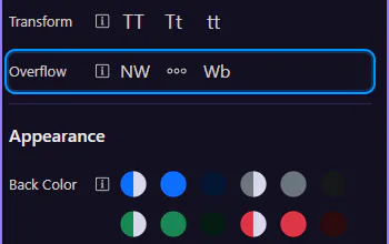
More options appear under Advanced, including Overflow for nowrap/truncate/text-break. This step matters because Text: Overflow is part of Selection Panels Properties Textoverflow, and understanding that context makes the next action easier to repeat in your own project.
Continue with other Utilities tours or go back to the Utilities menu.
Apply Bootstrap color utilities for text, backgrounds, and emphasis states.
Color utilities help communicate meaning (status, emphasis) and improve readability. The Appearance group is shared across many Bootstrap components so you can set background, opacity, shadow, and sizing consistently.
Cards are a useful target for Appearance utilities because they’re common containers used across many layouts. The card is selected so the Appearance group is visible in Properties.
Start with the wider context in the Properties panel so the next control makes sense in the full workflow. In the next step, you will focus on Background color and see how it fits into this area.

Use Appearance → Back Color to apply Bootstrap background utility classes (including subtle/background-only variants). This step matters because Background color is part of Selection Panels Properties Appearanceelementcolor, and understanding that context makes the next action easier to repeat in your own project.
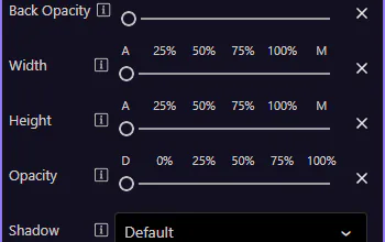
Use Back Opacity, Opacity, and Shadow to fine-tune how the element looks without writing custom CSS. This step matters because Opacity & shadow is part of Selection Panels Properties Appearanceshadow, and understanding that context makes the next action easier to repeat in your own project.
note: These map to Bootstrap utility classes like
bg-opacity-*,opacity-*, andshadow-*.
Use Width and Height to apply sizing utilities like w-* and h-*. This step matters because Width & height is part of Selection Panels Properties Appearancewidth, and understanding that context makes the next action easier to repeat in your own project.
Next, learn borders and responsive display/flex utilities.
Use display and flex utilities for responsive layouts, alignment, and spacing.
Flexbox utilities control alignment, wrapping, and ordering. Display is a shared group used across many Bootstrap components so you can hide/show elements per breakpoint and control display mode.
Cards are a practical example for Display utilities because they appear across many pages and are often shown/hidden at different breakpoints. The card is selected so Display options are visible in Properties.
Start with the wider context in the Properties panel so the next control makes sense in the full workflow. In the next step, you will focus on Hide on breakpoints and see how it fits into this area.
Use Display → Hide on to hide an element on specific device sizes. This produces Bootstrap d-*-none classes. This step matters because Hide on breakpoints is part of Selection Panels Properties Carddisplayhide, and understanding that context makes the next action easier to repeat in your own project.

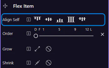
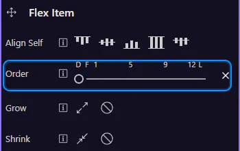
When an element sits inside a flex container, the Flex Item group lets you control alignment and ordering.
Use Flex Item → Align Self to override cross-axis alignment for this one item. This step matters because Align self is part of Selection Panels Properties Cardflexalignself, and understanding that context makes the next action easier to repeat in your own project.
Use Order to reorder items without changing your HTML structure. This step matters because Order is part of Selection Panels Properties Cardorder, and understanding that context makes the next action easier to repeat in your own project.
That’s the core set of shared utilities. Next, revisit the Utilities menu or continue with a components tour.
Use Bootstrap buttons: variants, sizes, states, icons, and common button patterns.
Bootstrap buttons are about clarity and hierarchy. Start by choosing a variant (primary/secondary/etc.), then size/state based on context.
Buttons are interactive controls for actions. This example uses the primary variant to represent a main action.
Start with the wider context in the Properties panel so the next control makes sense in the full workflow. In the next step, you will focus on Button: Style and see how it fits into this area.
Use Style to switch between solid, outline, and semantic variants (primary, secondary, success, etc.). This step matters because Button: Style is part of Selection Panels Properties Btnbtnstyle, and understanding that context makes the next action easier to repeat in your own project.
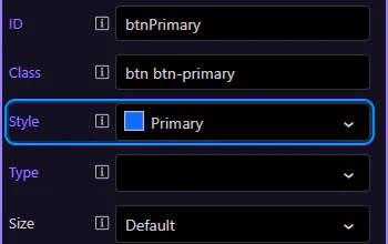
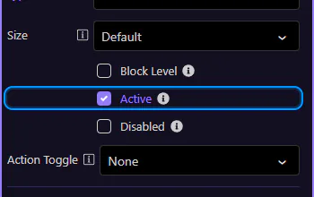
Use Size for compact toolbars or prominent primary actions. This step matters because Button: Size is part of Selection Panels Properties Btnsizen, and understanding that context makes the next action easier to repeat in your own project.
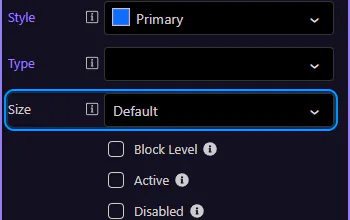
Use Block Level to make a button span the full width of its container (great for mobile layouts). This step matters because Button: Block level is part of Selection Panels Properties Btnblocklevel, and understanding that context makes the next action easier to repeat in your own project.
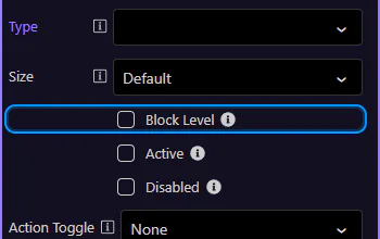
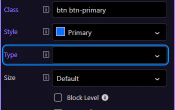
Use Type to control form behavior. Use button for normal actions, and submit only when the button should submit a form. This step matters because Button: Type (forms) is part of Selection Panels Properties Buttontype, and understanding that context makes the next action easier to repeat in your own project.
Use Disabled when an action is not available. Prefer disabled states over hiding actions when users need to understand what’s possible.
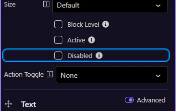
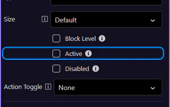
Use Active when a button represents a selected state (for example, toggle buttons or segmented controls). This step matters because Tip: Active state is part of Selection Panels Properties Btnactive, and understanding that context makes the next action easier to repeat in your own project.
Continue with other Components tours or return to the Components menu.
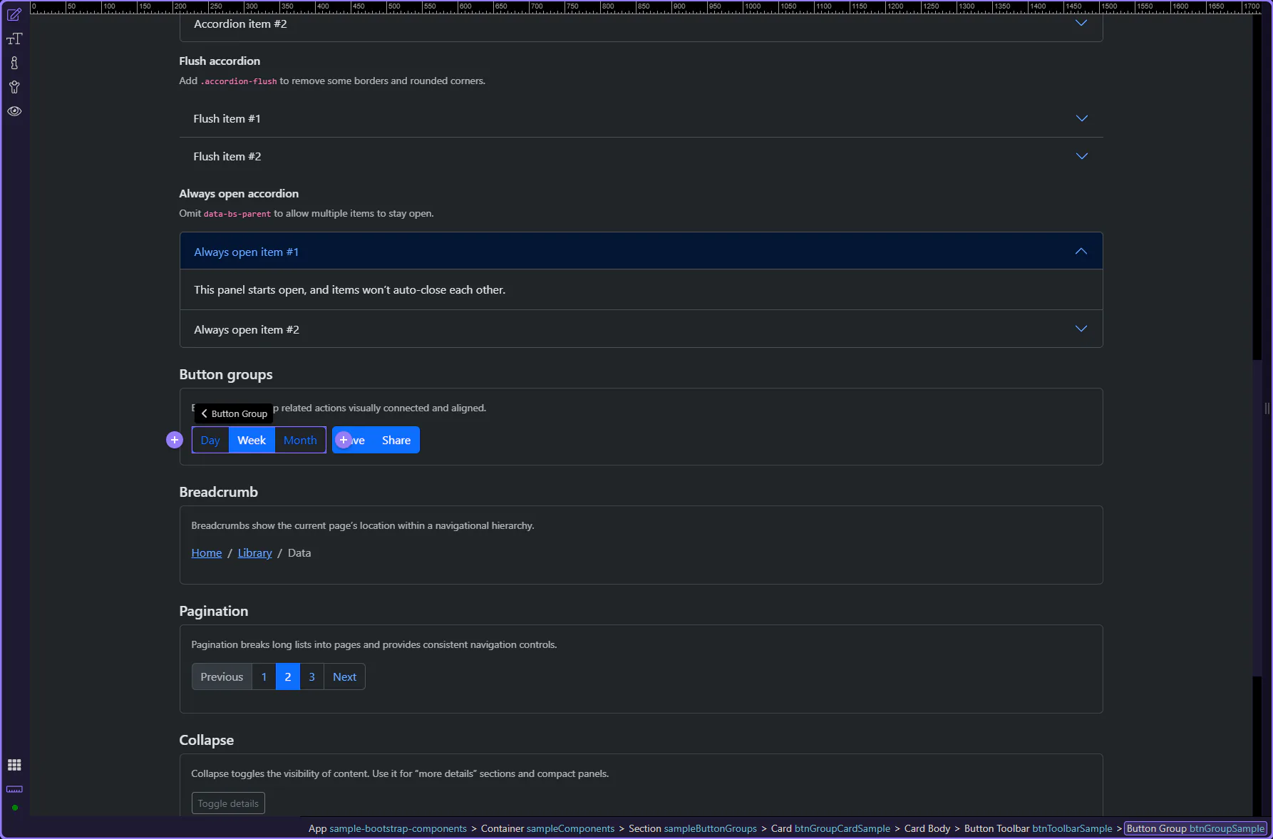
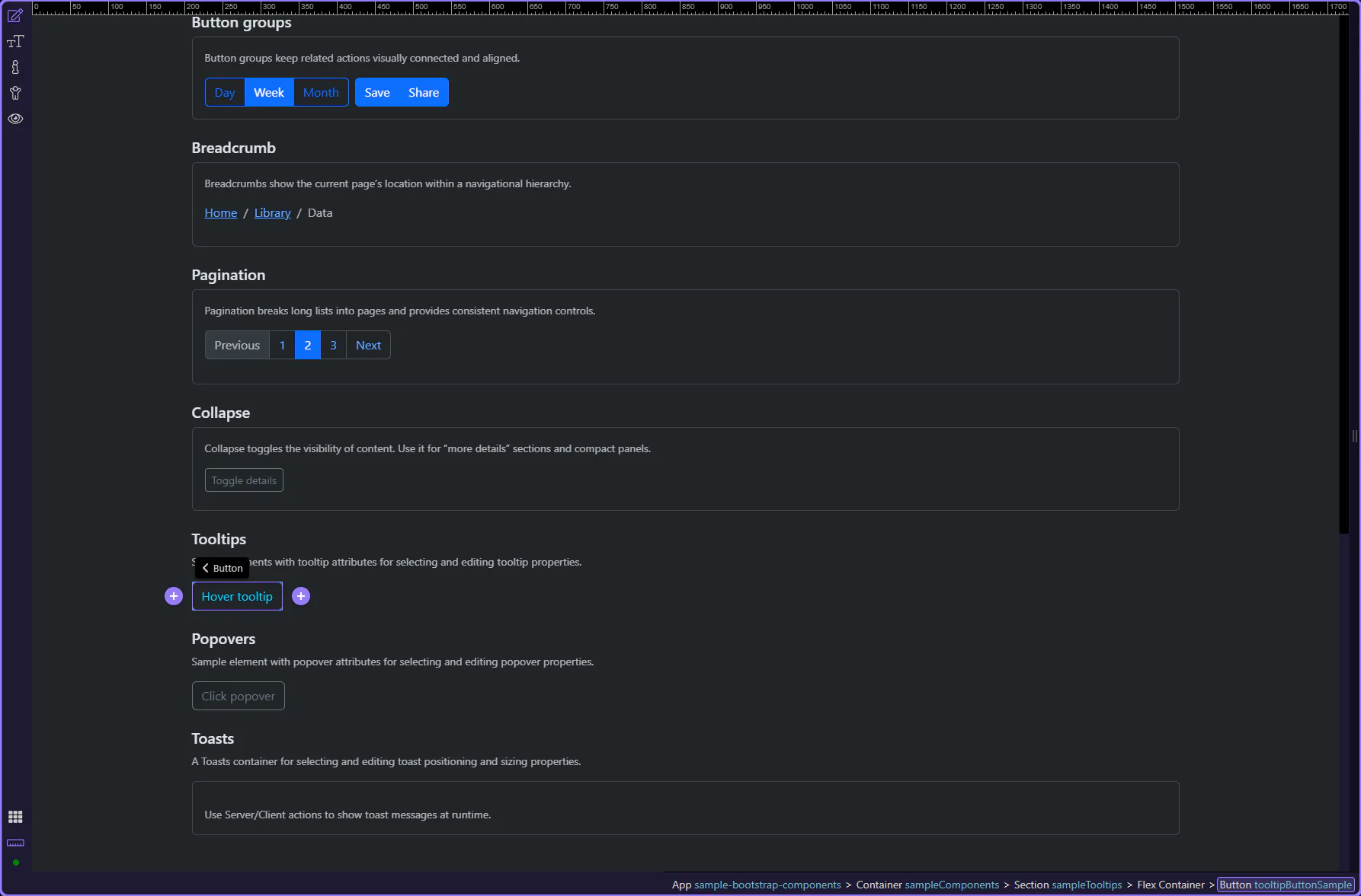
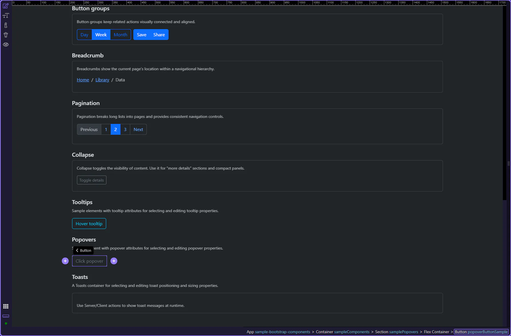
Group related actions with button groups and toolbars, including sizing and alignment.
Use button groups to combine related actions into a single connected control, keeping spacing and alignment consistent.
Button groups combine related actions into a single connected control. The wrapper controls layout; the buttons inside control styling and states.
Start with the wider context in the Properties panel so the next control makes sense in the full workflow. In the next step, you will focus on Group: Size and see how it fits into this area.
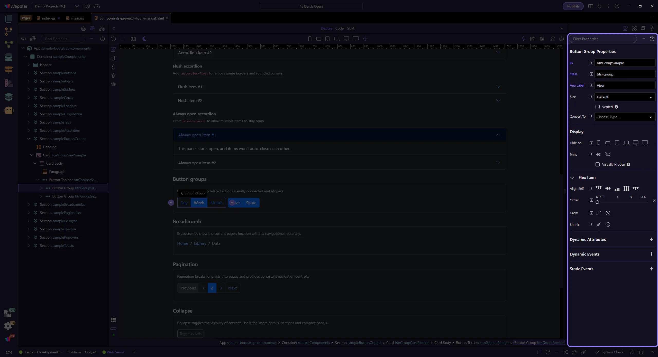
Use Size to make the whole group larger or smaller. This matches Bootstrap’s sizing guidelines (sm / default / lg). This step matters because Group: Size is part of Selection Panels Properties Btngroupsize, and understanding that context makes the next action easier to repeat in your own project.
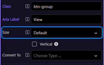
Enable Vertical when you want stacked buttons (useful for narrow sidebars or compact tool panels).
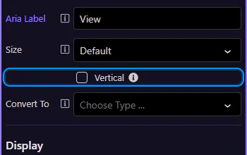
Use Aria Label to describe what the group represents (for example, “View mode” or “Text alignment”). This step matters because Accessibility: Aria Label is part of Selection Panels Properties Btngrouparialabel, and understanding that context makes the next action easier to repeat in your own project.
Button groups handle layout; you still style each button (variant, size, disabled/active) like a normal button.
Buttons inside a group still behave like normal buttons—this is where you review variant and state options.
Use Style to switch between solid/outline variants and semantic colors (primary, secondary, success, etc.). This step matters because Button: Style is part of Selection Panels Properties Btnbtnstyle, and understanding that context makes the next action easier to repeat in your own project.
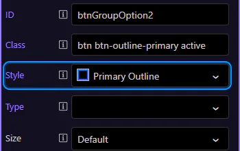
Use Active when the button represents the currently selected option (for example, “Week” in a Day/Week/Month switcher). This step matters because Tip: Active state is part of Selection Panels Properties Btnactive, and understanding that context makes the next action easier to repeat in your own project.
Continue with other Components tours or return to the Components menu.
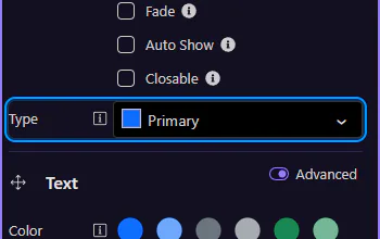
Use badges for counts and status labels, including pill styles and contextual colors.
Badges are small labels for counts or statuses. Keep them short and readable, and use color to reinforce meaning (not replace it).
Badges are compact labels for counts, status, and short metadata. This step matters because Badge example is part of Design View, and understanding that context makes the next action easier to repeat in your own project.

Start with the wider context in the Properties panel so the next control makes sense in the full workflow. In the next step, you will focus on Badge: Text and see how it fits into this area.
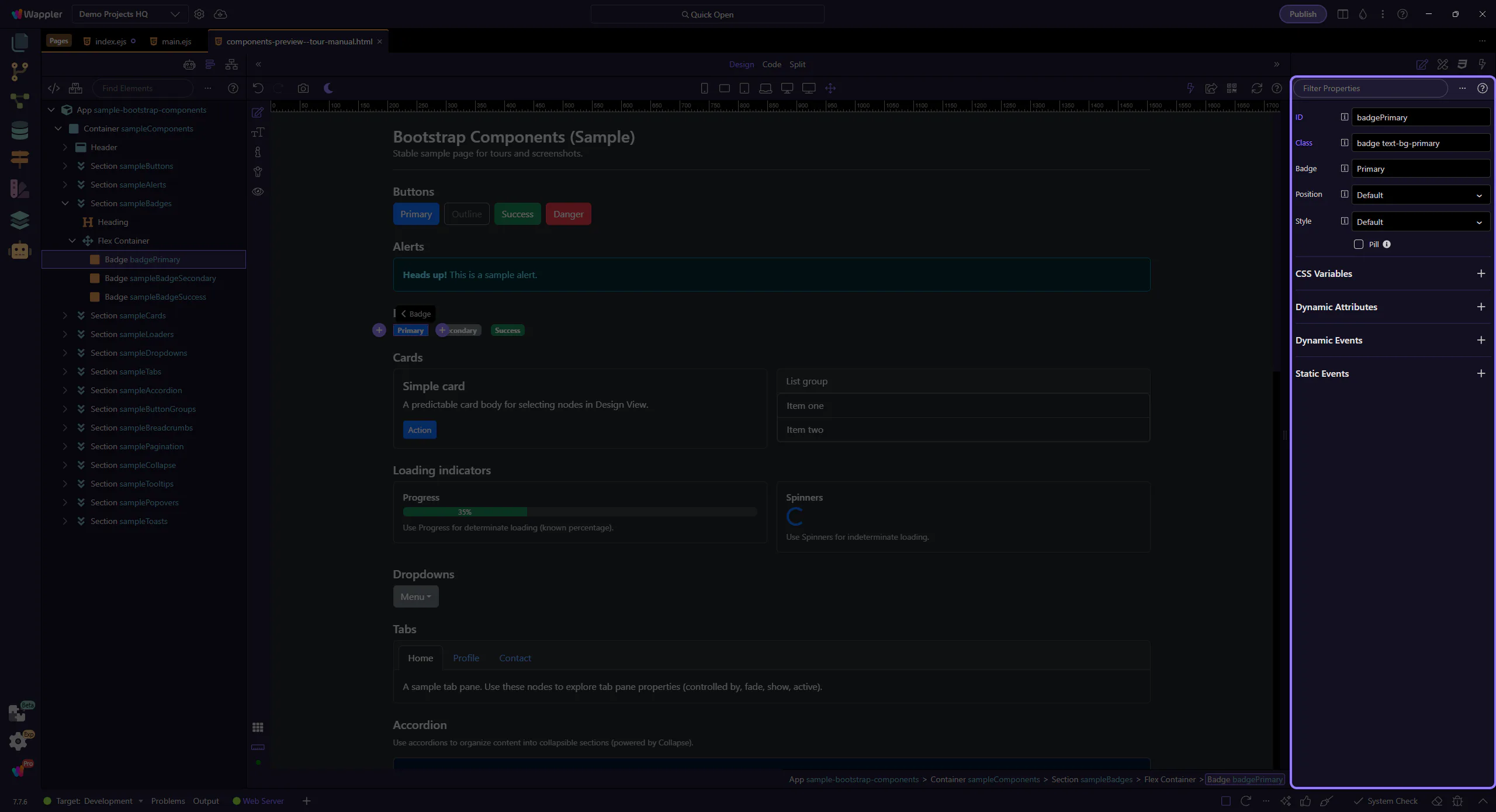
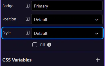
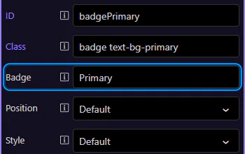
Use Text to change the badge label. Keep it short (for example, a count or a single word status). This step matters because Badge: Text is part of Selection Panels Properties Badgetext, and understanding that context makes the next action easier to repeat in your own project.

Use Position to place the badge before or after neighboring content. This step matters because Badge: Position is part of Selection Panels Properties Badgepos, and understanding that context makes the next action easier to repeat in your own project.
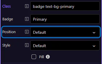
Use Style to choose the badge’s variant. Prefer variants with good contrast (Bootstrap’s text-bg-* styles handle text/background contrast for you).
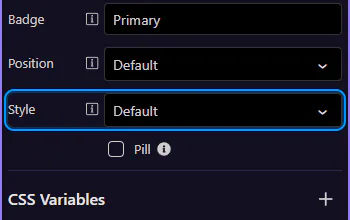
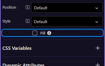
Use Pill for a rounded badge style. This step matters because Badge: Pill is part of Selection Panels Properties Badgepill, and understanding that context makes the next action easier to repeat in your own project.
Continue with other Components tours or return to the Components menu.
Use alerts for feedback messages, including dismissible alerts and contextual states.
Alerts communicate important status changes. Keep the message concise, and use variants (info/success/warning/danger) consistently across your UI.
Alerts communicate status messages—success, warnings, errors, or neutral information. This step matters because Alert example is part of Design View, and understanding that context makes the next action easier to repeat in your own project.

Start with the wider context in the Properties panel so the next control makes sense in the full workflow. In the next step, you will focus on Alert: Type and see how it fits into this area.
Use Type to change the alert variant (info, warning, danger, success, etc.). This step matters because Alert: Type is part of Selection Panels Properties Alerttype, and understanding that context makes the next action easier to repeat in your own project.

Enable Closable to show a close button so users can dismiss the message. Use this for non-critical or informational alerts.
Enable Auto Show when the alert visibility is driven by data or logic. You can bind it to a condition to show/hide the alert automatically.
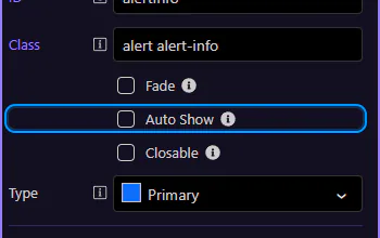
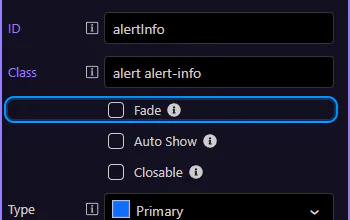
Enable Fade for a subtle enter/exit transition. Combine this with Auto Show for smooth dynamic alerts.
Continue with other Components tours or return to the Components menu.
Build dropdown menus in Wappler and learn the practical options: alignment, sizing, split buttons, and nav dropdown patterns.
A dropdown is made of a wrapper, a toggle button, and a menu with items. Use dropdowns for short, contextual lists of actions.
This dropdown example shows more than a button with a menu attached. It demonstrates how Wappler combines a trigger, menu container, and menu items into a compact interaction pattern that is useful for grouped actions, secondary navigation, and actions that should stay hidden until needed.
The toggle button is the trigger that opens the menu. This step matters because Toggle button is part of Design View, and understanding that context makes the next action easier to repeat in your own project.

Start with the wider context in the Properties panel so the next control makes sense in the full workflow. In the next step, you will focus on Toggle button: Style and see how it fits into this area.
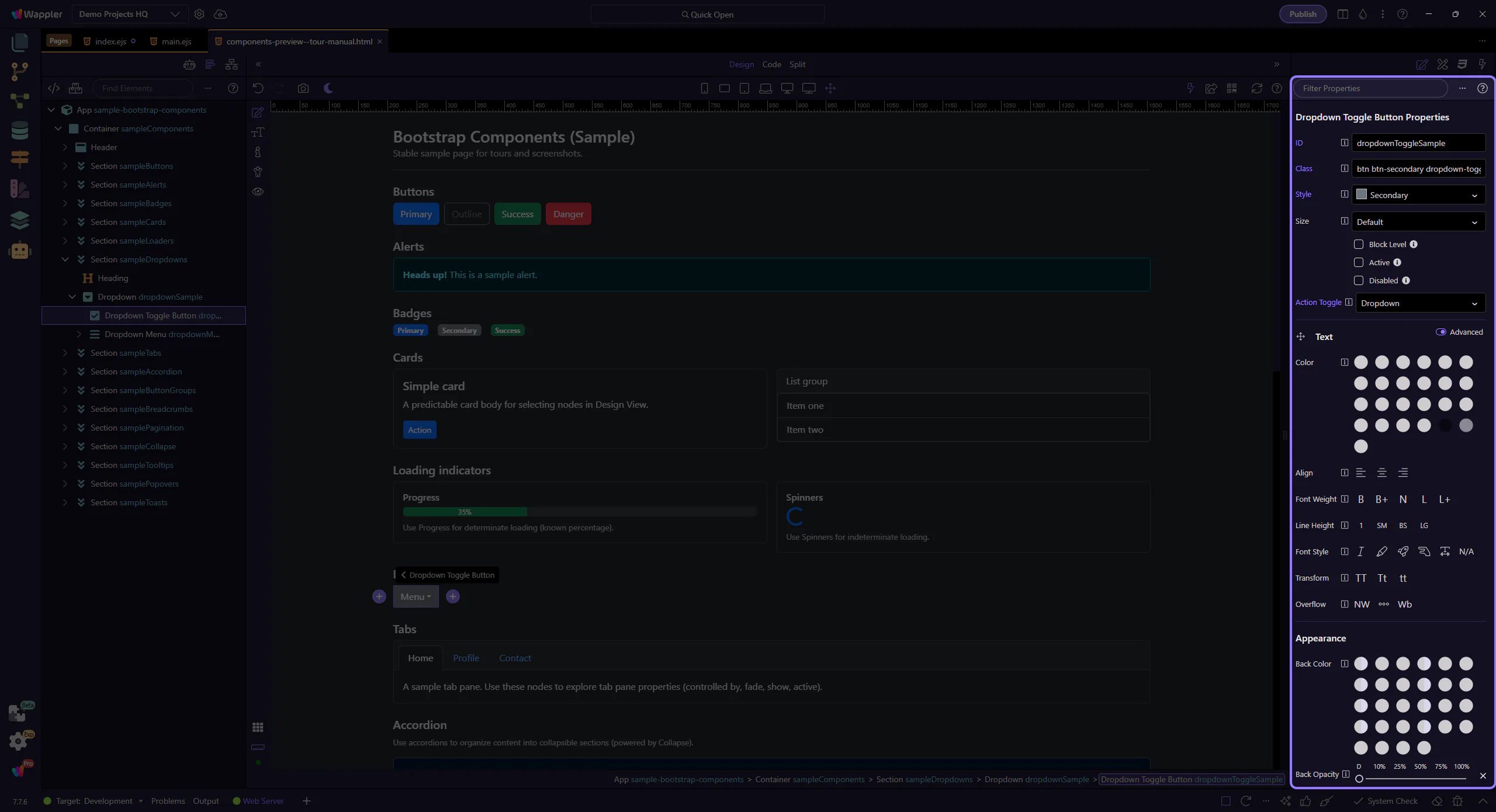
Use Style to choose the toggle button’s variant. This step matters because Toggle button: Style is part of Selection Panels Properties Btnbtnstyle, and understanding that context makes the next action easier to repeat in your own project.
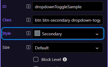
The menu container holds the list of dropdown items. This step matters because Dropdown menu is part of Design View, and understanding that context makes the next action easier to repeat in your own project.
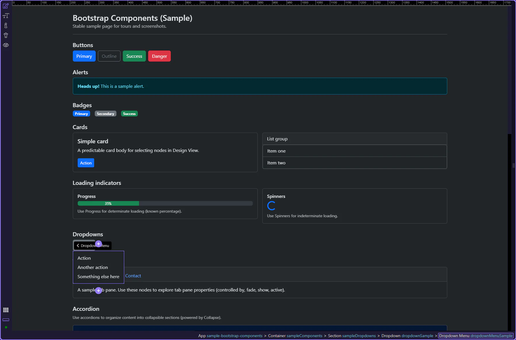
Enable Align End to align the dropdown menu to the right edge (useful near the right side of the viewport).
Dropdown items represent the actions and destinations in the menu. This step matters because Dropdown item is part of Design View, and understanding that context makes the next action easier to repeat in your own project.
Use Disabled for options that aren’t currently available. This step matters because Dropdown item: Disabled is part of Selection Panels Properties Dropdownitemdisabled, and understanding that context makes the next action easier to repeat in your own project.
Continue with other Components tours or return to the Components menu.
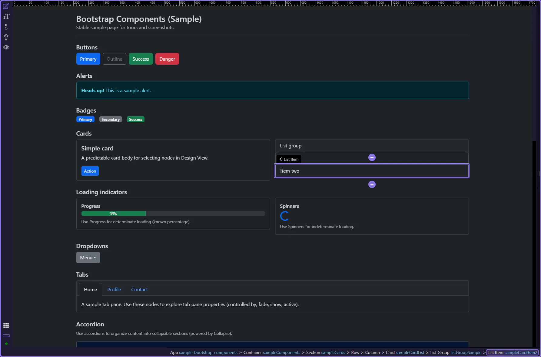
Use list groups for structured lists, selection states, and grouped content.
A list group is a container plus one or more items. It’s great for navigation, selectable lists, and simple summaries.
This list group example shows how Bootstrap can turn a plain stack of items into a clearer, more structured UI pattern. Watch how repeated items share consistent styling, spacing, and emphasis, and why list groups are useful for navigation, summaries, or selectable collections inside a page section.

Start with the wider context in the Properties panel so the next control makes sense in the full workflow. In the next step, you will focus on List group: Flush and see how it fits into this area.
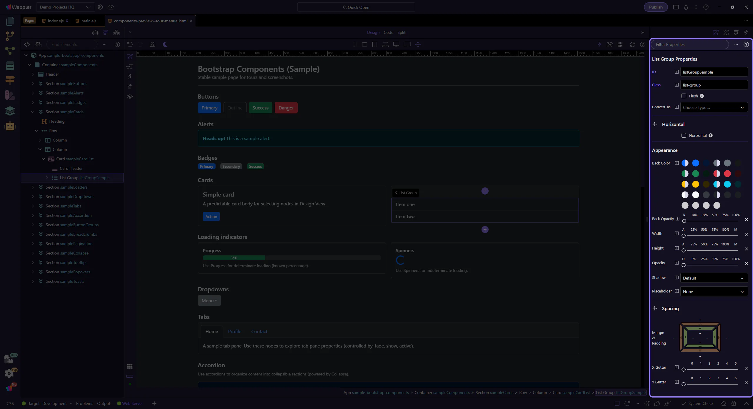
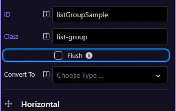
Enable Flush to remove outer borders and rounded corners (useful inside cards). This step matters because List group: Flush is part of Selection Panels Properties Listgroupflush, and understanding that context makes the next action easier to repeat in your own project.
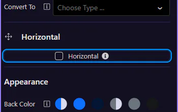
Enable Horizontal to display items side-by-side (responsive variants are available). This step matters because List group: Horizontal is part of Selection Panels Properties Horizontal, and understanding that context makes the next action easier to repeat in your own project.
Select a list item to adjust per-item state.
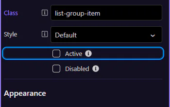
List group items can be marked active or disabled to reflect navigation and availability. This step matters because List group item is part of Design View, and understanding that context makes the next action easier to repeat in your own project.
Use Active to highlight the current/selected item. This step matters because List item: Active is part of Selection Panels Properties Listgroupitemactive, and understanding that context makes the next action easier to repeat in your own project.
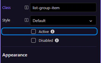
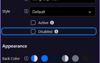
Use Disabled when an item is not selectable. This step matters because List item: Disabled is part of Selection Panels Properties Listgroupitemdisabled, and understanding that context makes the next action easier to repeat in your own project.
Continue with other Components tours or return to the Components menu.
Build tabbed navigation and content panes, including active states and accessibility basics.
A tabbed interface pairs a set of tab buttons with related content panes so users can switch context without leaving the page. In this tour, start by understanding the full relationship between the tab list and the panes, because the later properties only make sense once that shared structure is clear.
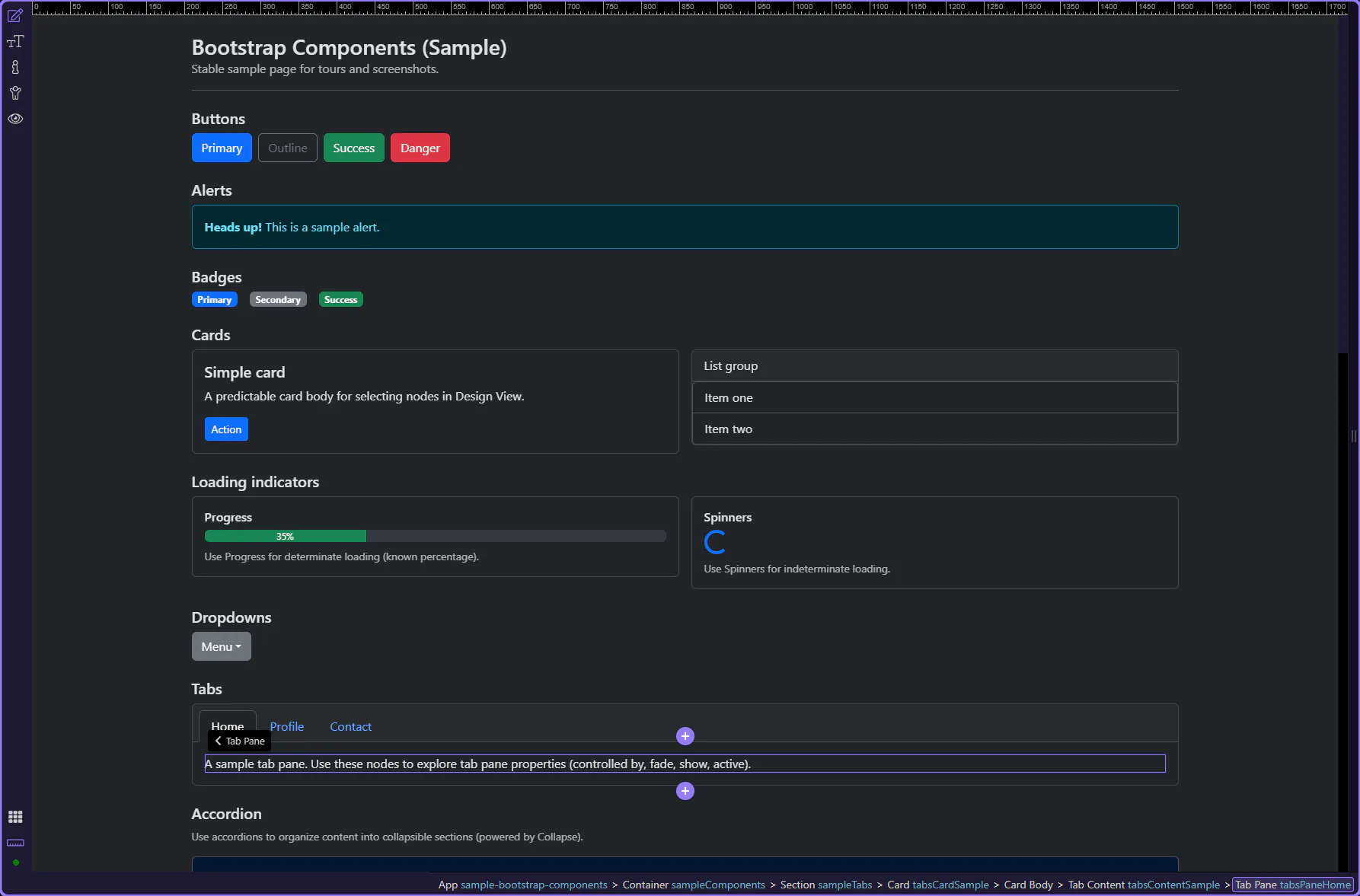
Tabs help you switch between related content panes without navigating away. This step matters because Tabs example is part of Design View, and understanding that context makes the next action easier to repeat in your own project.
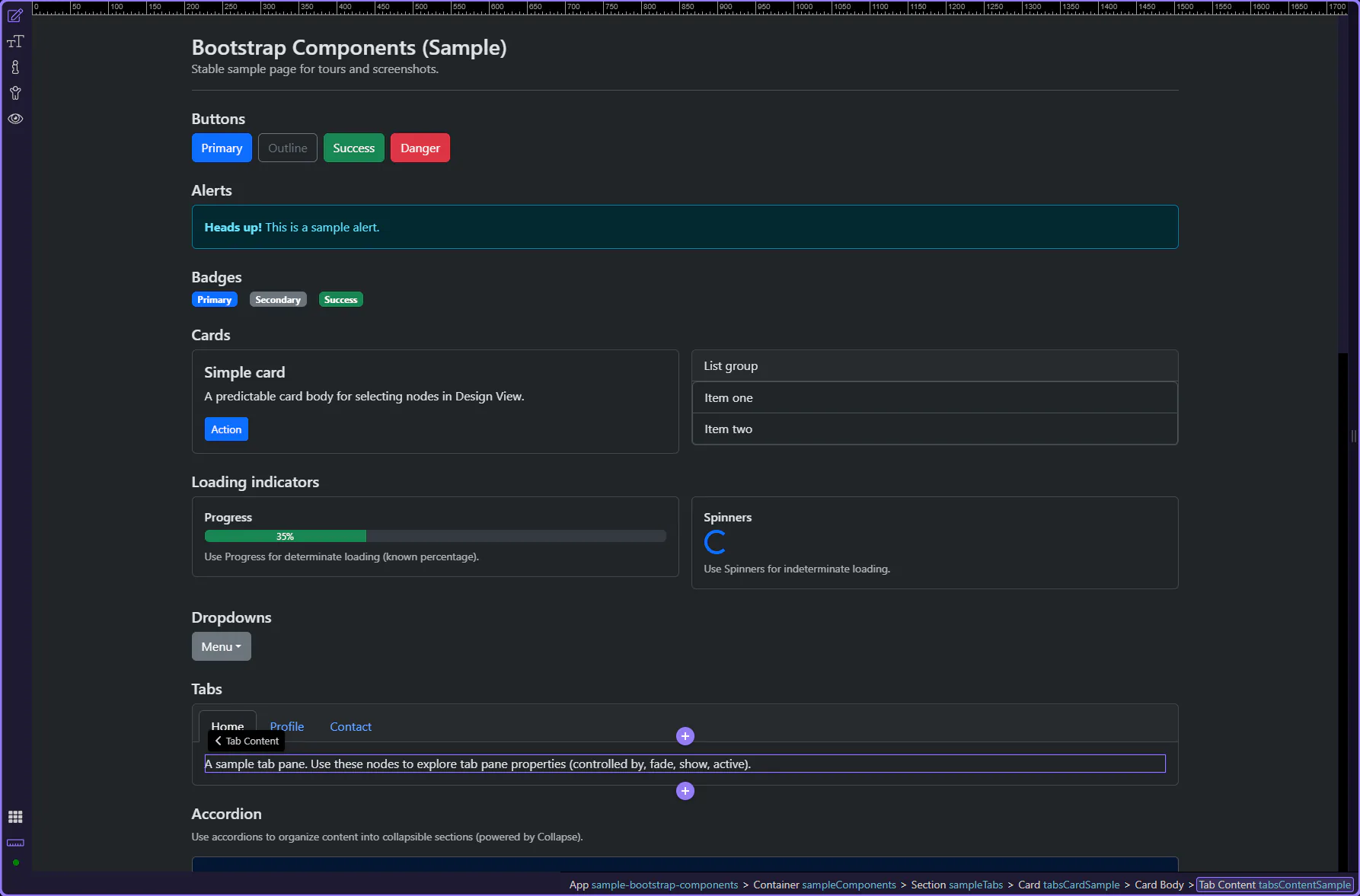
Each tab button controls a specific pane. Let’s review the active pane options. This step matters because Active tab pane is part of Design View, and understanding that context makes the next action easier to repeat in your own project.
Start with the wider context in the Properties panel so the next control makes sense in the full workflow. In the next step, you will focus on Tab pane: Controlled by and see how it fits into this area.
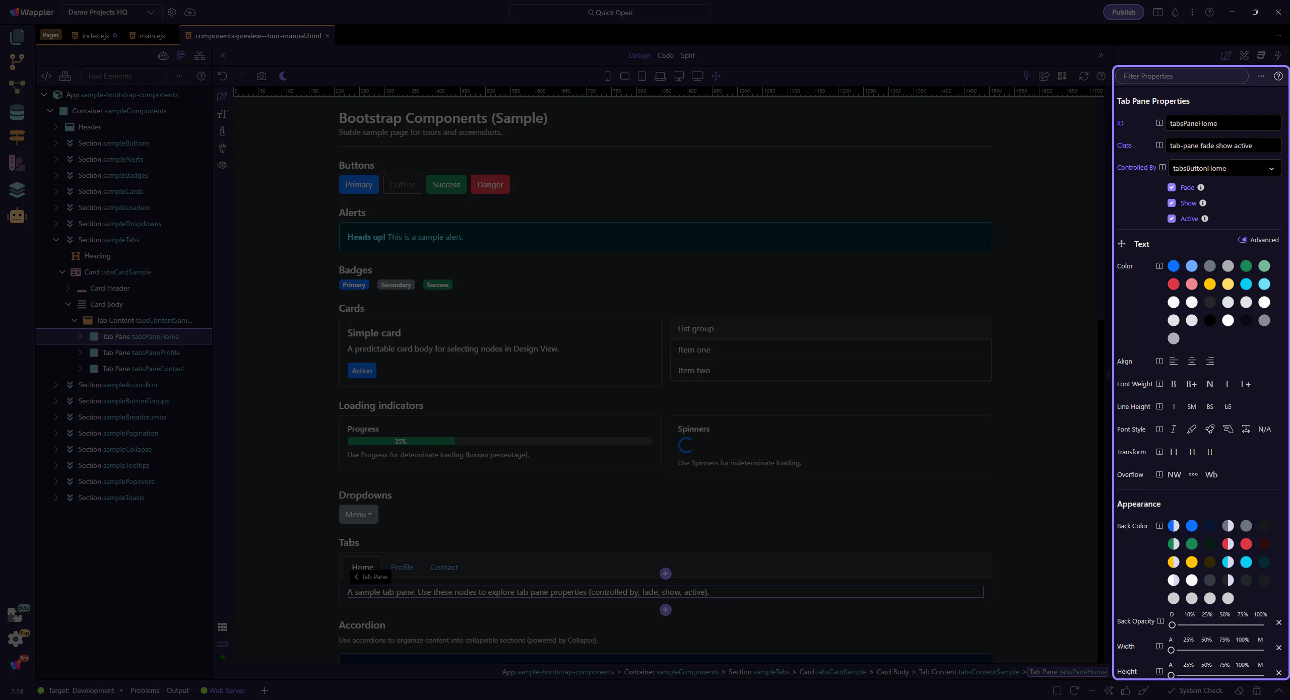
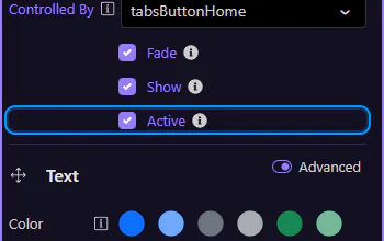
Use Controlled By to link a pane to a specific tab button (by ID). This keeps the ARIA attributes consistent. This step matters because Tab pane: Controlled by is part of Selection Panels Properties Tabpanecontroller, and understanding that context makes the next action easier to repeat in your own project.
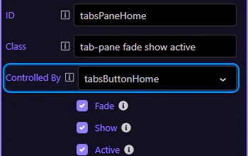
Enable Fade for a smooth transition effect. This step matters because Tab pane: Fade is part of Selection Panels Properties Tabpanefade, and understanding that context makes the next action easier to repeat in your own project.
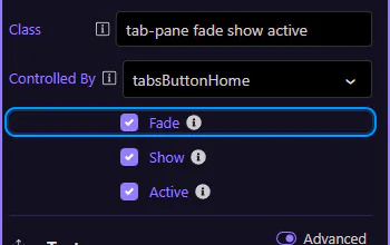
Use Show and Active to control which pane is visible initially. This step matters because Tab pane: Show and Active is part of Selection Panels Properties Tabpaneactive, and understanding that context makes the next action easier to repeat in your own project.
Continue with other Components tours or return to the Components menu.
Build Bootstrap breadcrumbs in Wappler, including separators and the active page state for accessible navigation.
Breadcrumbs show the current page’s location within a navigational hierarchy. They should reflect structure (not history).
Breadcrumbs show hierarchy and help users understand where they are in a site structure. This step matters because Breadcrumb example is part of Design View, and understanding that context makes the next action easier to repeat in your own project.
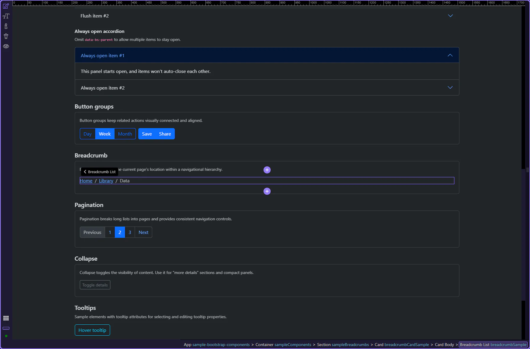
In Bootstrap docs, the current page is typically the last breadcrumb item and should not be a link.
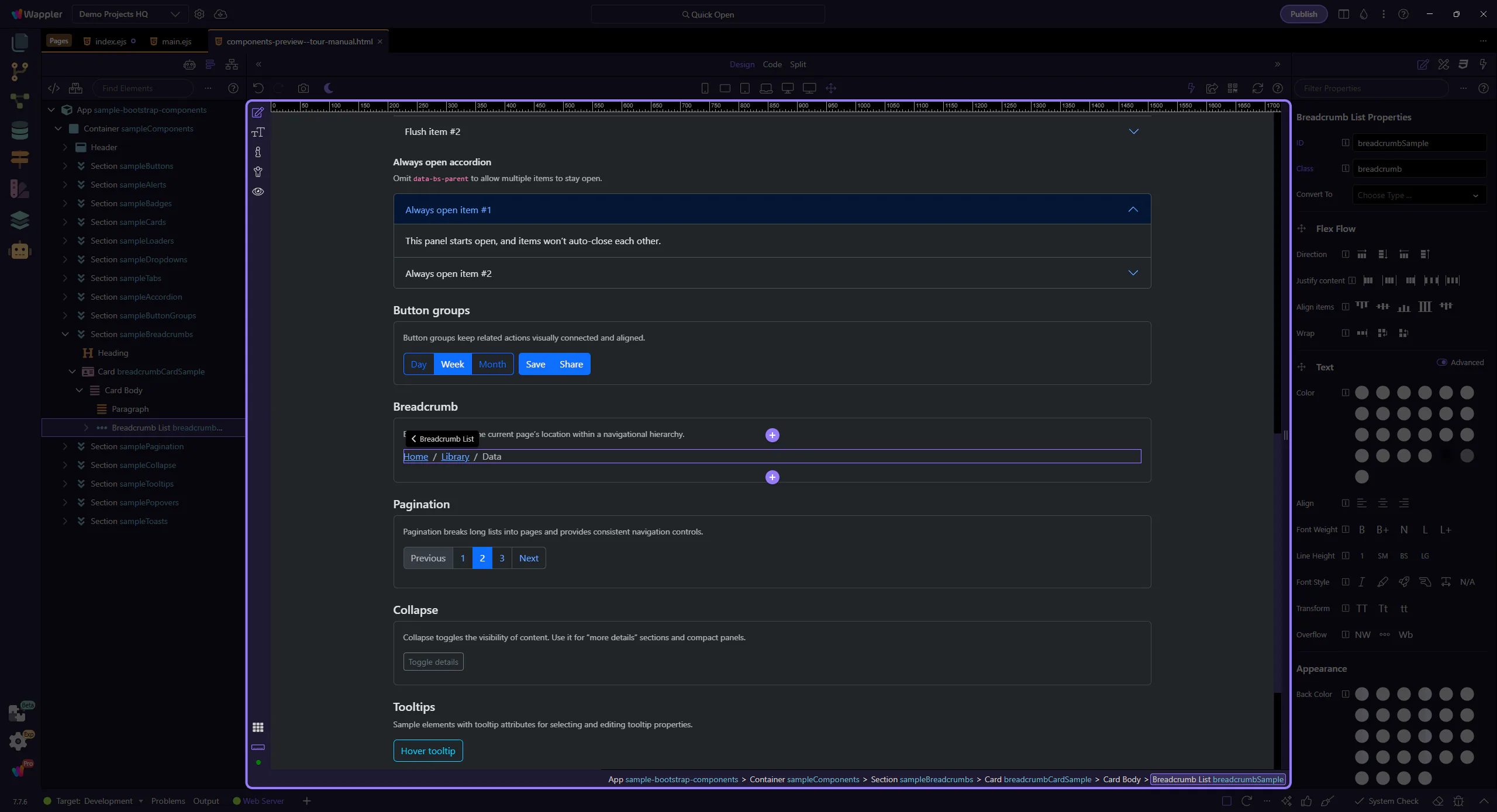
Use breadcrumb items for the hierarchy levels, and links for the navigable levels.
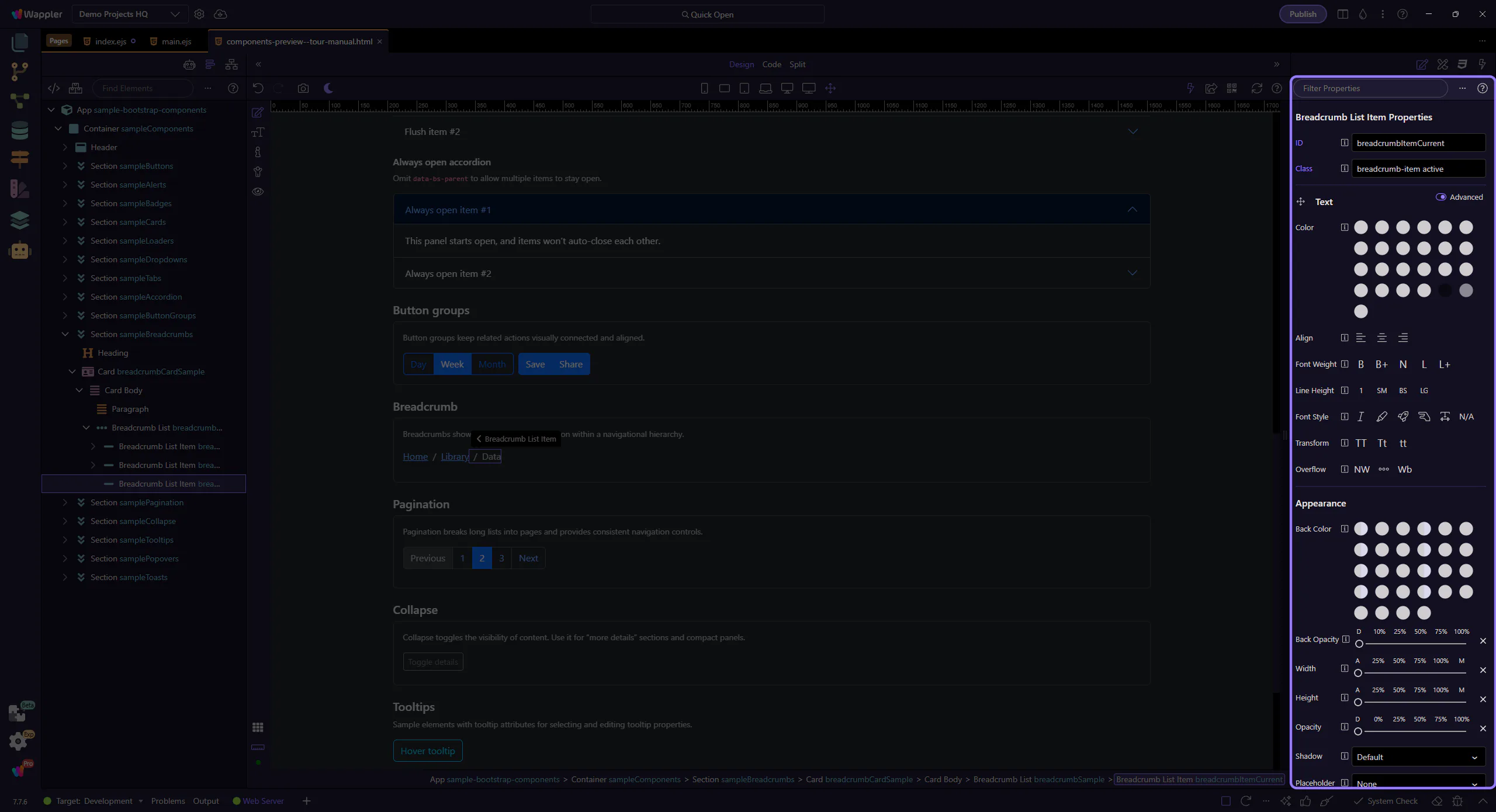
The last breadcrumb item typically represents the current page. This step matters because Current breadcrumb item is part of Design View, and understanding that context makes the next action easier to repeat in your own project.
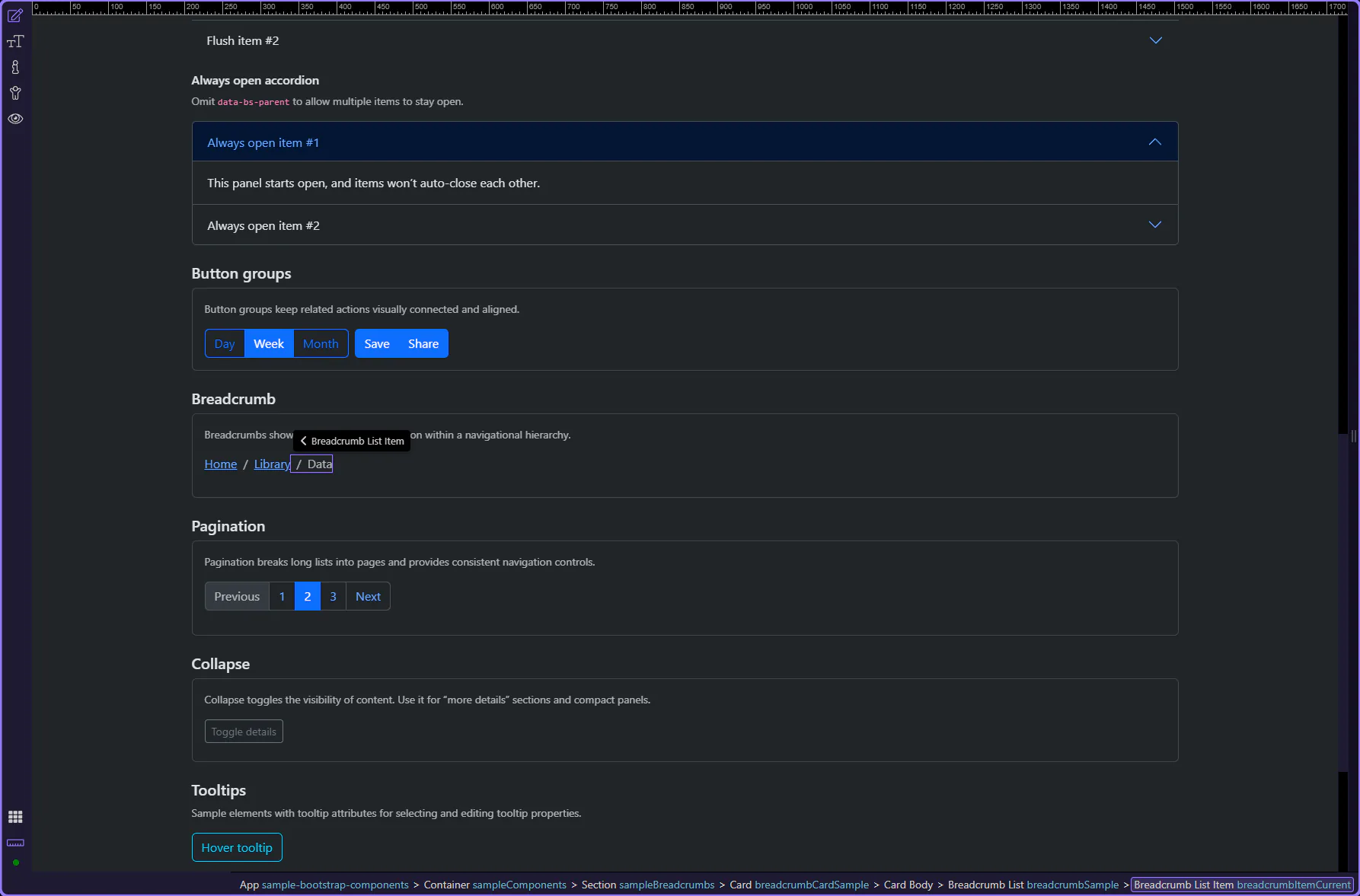
Use Active for the current page. This matches the Bootstrap pattern of marking the current level.
Breadcrumb links represent navigable hierarchy levels (for example, “Home”). This step matters because Breadcrumb link item is part of Design View, and understanding that context makes the next action easier to repeat in your own project.
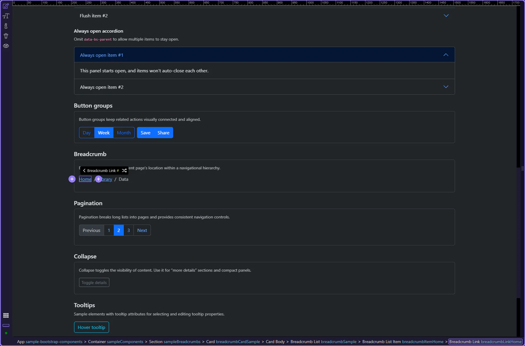
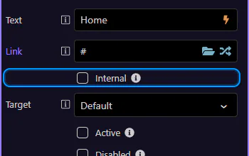
Use Text to change the label and Link to pick a route or file. Keep breadcrumb labels short and descriptive. This step matters because Breadcrumb link: Text and Link is part of Selection Panels Properties Breadcrumblinktext, and understanding that context makes the next action easier to repeat in your own project.
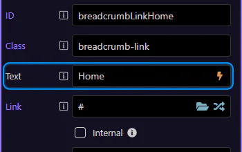
If you’re using Wappler partial loads, enable Internal so the route loads inside the current view.
Continue with other Components tours or return to the Components menu.
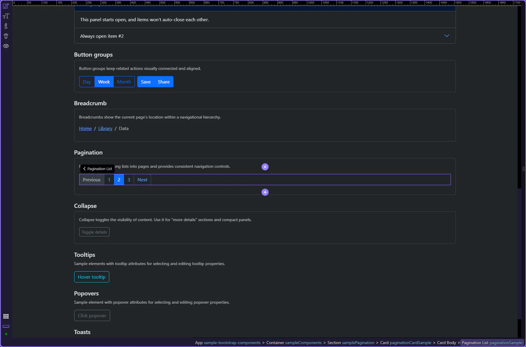
Understand Bootstrap pagination patterns and build paging controls that fit common list and table layouts.
Pagination helps users move between pages of content. In Bootstrap, it’s built from a pagination container plus page items and links.
Pagination is highlighted. Pagination provides navigable links across multiple pages of content, with clear active and disabled states.
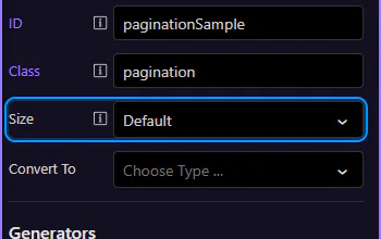
Start with the wider context in the Properties panel so the next control makes sense in the full workflow. In the next step, you will focus on Pagination: Size and see how it fits into this area.
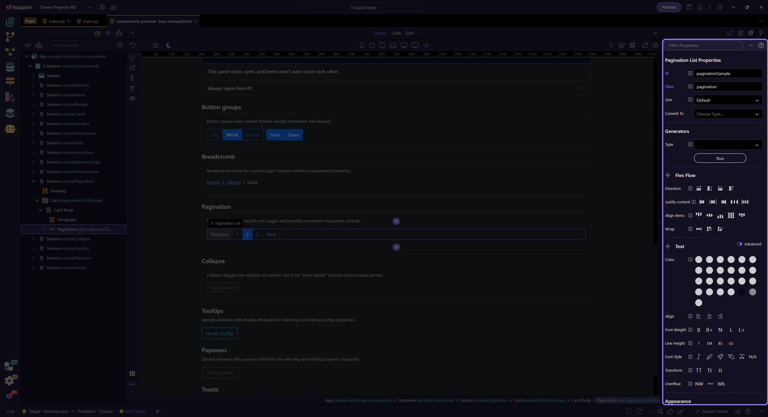
Use Size to choose a larger or smaller pagination control. Keep it consistent with surrounding UI density. This step matters because Pagination: Size is part of Selection Panels Properties Paginationsize, and understanding that context makes the next action easier to repeat in your own project.
Page items hold state (active/disabled). Page links hold the clickable label and destination.
Active and disabled states live on the page item. Let’s review the current page state. This step matters because Active page item is part of Design View, and understanding that context makes the next action easier to repeat in your own project.
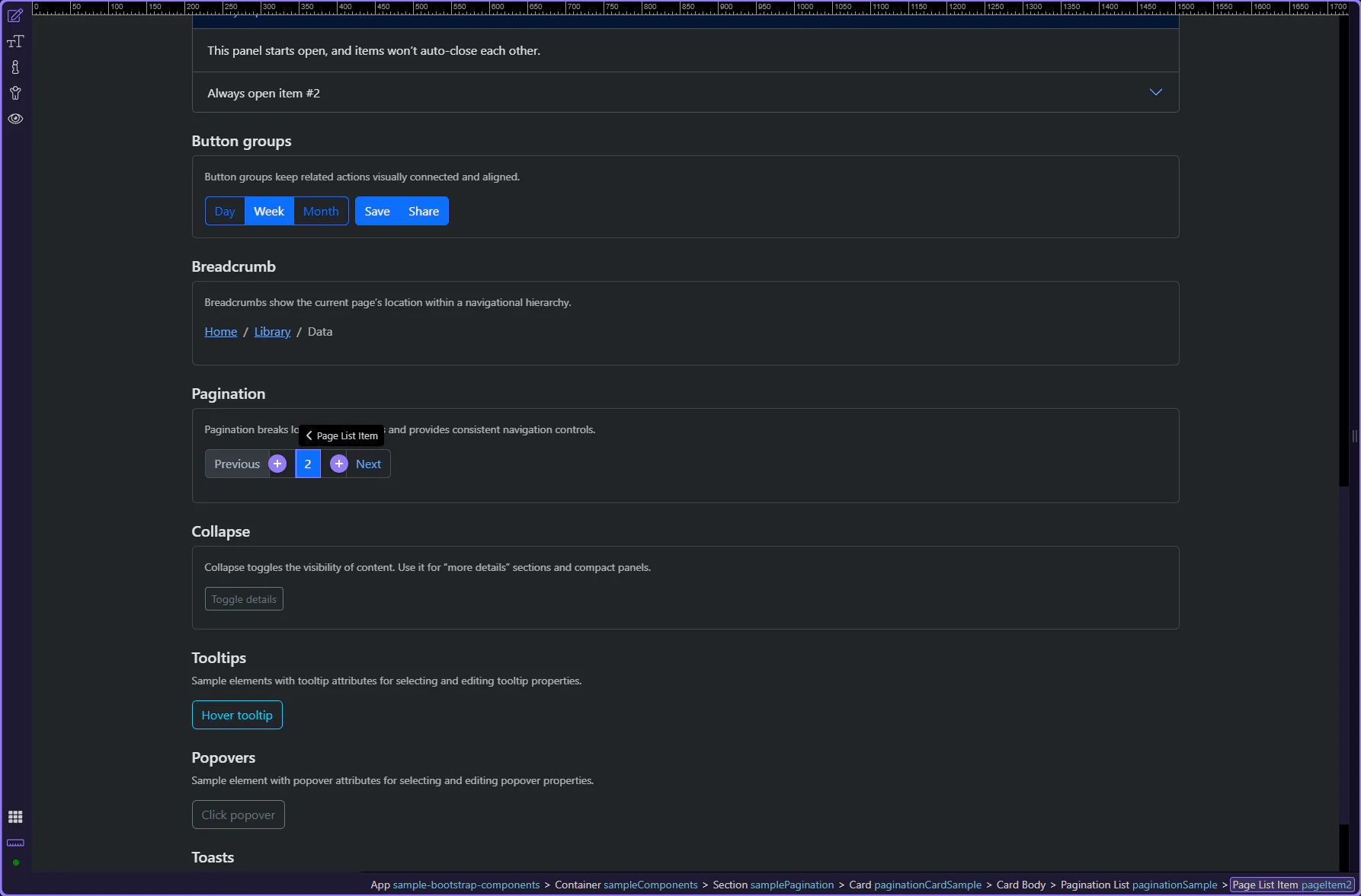
Use Active for the current page. This step matters because Page item: Active is part of Selection Panels Properties Pageitemactive, and understanding that context makes the next action easier to repeat in your own project.
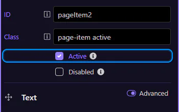
Use Disabled for items that aren’t available (for example, “Previous” on the first page). This step matters because Page item: Disabled is part of Selection Panels Properties Pageitemdisabled, and understanding that context makes the next action easier to repeat in your own project.
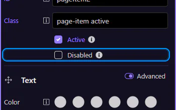
Page links control the visible label and navigation destination. This step matters because Page link is part of Design View, and understanding that context makes the next action easier to repeat in your own project.

Use Text to change the label and Link to choose a route or file. Keep numeric pagination consistent (1, 2, 3 …) and use words/icons for previous/next.
Continue with other Components tours or return to the Components menu.
Use toasts for non-blocking notifications, including stacking and dismiss behavior.
Toasts are lightweight notifications that appear over the page. In Wappler you usually add a Toasts container once, then trigger toast messages from actions.
This Toasts container controls where toast messages appear. It is selected so you can review its key properties.
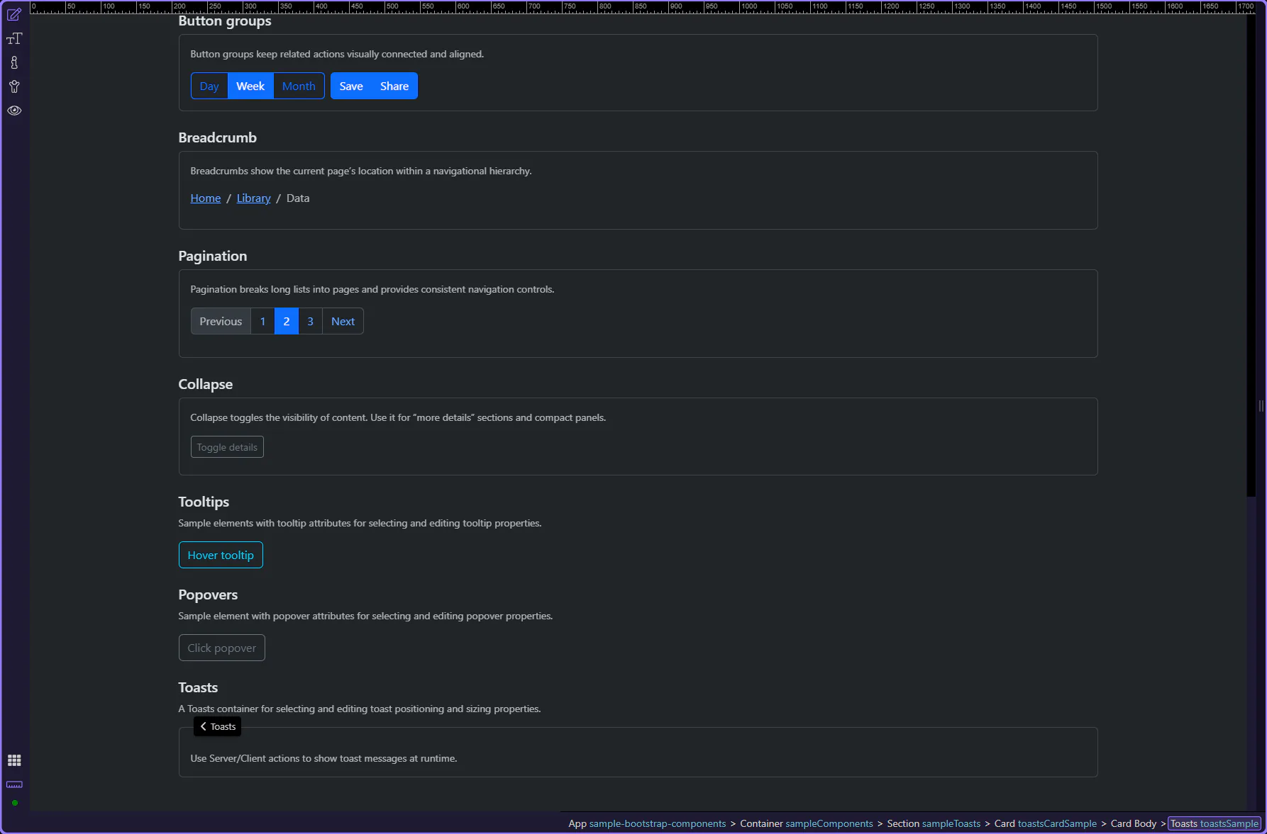
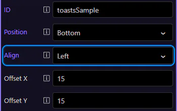
Start with the wider context in the Properties panel so the next control makes sense in the full workflow. In the next step, you will focus on Toasts: Position and see how it fits into this area.
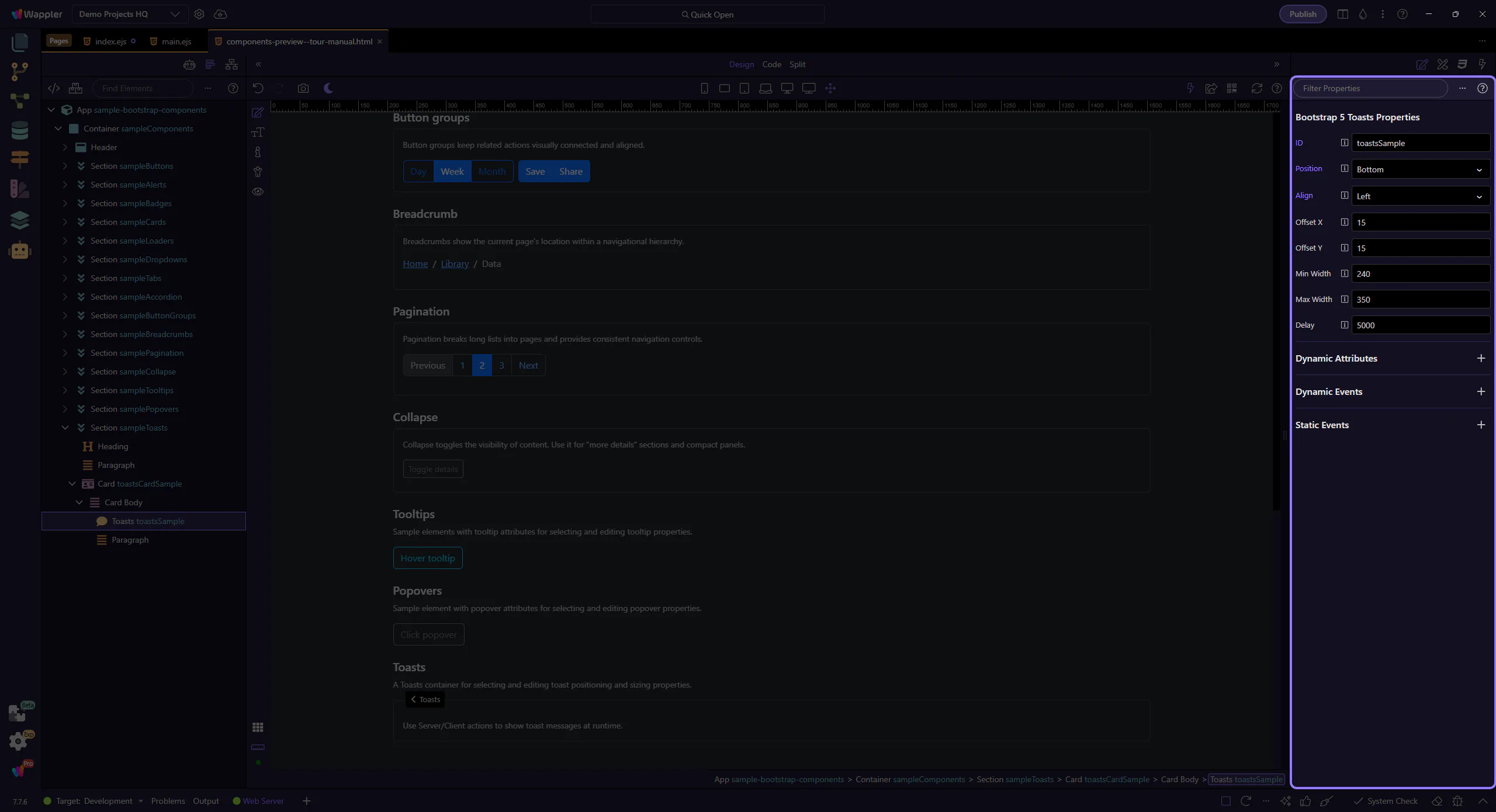
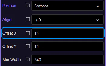
Use Position to choose whether toasts appear at the top or bottom edge of the viewport. This step matters because Toasts: Position is part of Selection Panels Properties Toastspos, and understanding that context makes the next action easier to repeat in your own project.
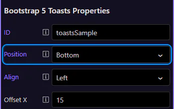
Use Align to anchor toasts left or right. This step matters because Toasts: Align is part of Selection Panels Properties Toastsalign, and understanding that context makes the next action easier to repeat in your own project.
Use Offset X and Offset Y to keep toasts away from the edges (helpful when you have fixed navbars or safe areas). This step matters because Toasts: Offsets is part of Selection Panels Properties Toastsoffsetx, and understanding that context makes the next action easier to repeat in your own project.
Offset Y controls the vertical spacing from the chosen edge. This step matters because Toasts: Offset Y is part of Selection Panels Properties Toastsoffsety, and understanding that context makes the next action easier to repeat in your own project.
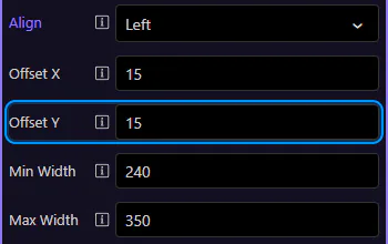
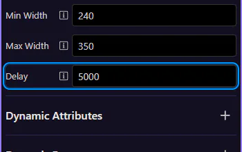
Use Min Width and Max Width to keep toast messages readable without covering too much of the UI. This step matters because Toasts: Width constraints is part of Selection Panels Properties Toastsminwidth, and understanding that context makes the next action easier to repeat in your own project.
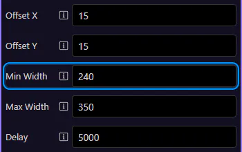
Max Width caps the toast size for long messages. This step matters because Toasts: Max Width is part of Selection Panels Properties Toastsmaxwidth, and understanding that context makes the next action easier to repeat in your own project.
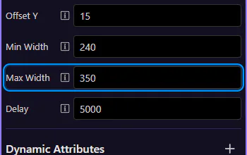
Use Delay to control how long a toast stays visible (in milliseconds). This is the default when you trigger toasts from actions.
Continue with other Components tours or return to the Components menu.
Tooltips provide compact help text. Learn how to use them in Wappler, including trigger behavior and placement.
Tooltips add short contextual hints. In Wappler you enable a tooltip on an element, then configure its content and behavior from the Properties panel.
This sample button is selected so you can explore tooltip settings. This step matters because Tooltip example is part of Design View, and understanding that context makes the next action easier to repeat in your own project.
Start with the wider context in the Properties panel so the next control makes sense in the full workflow. In the next step, you will focus on Tooltip: Title and see how it fits into this area.
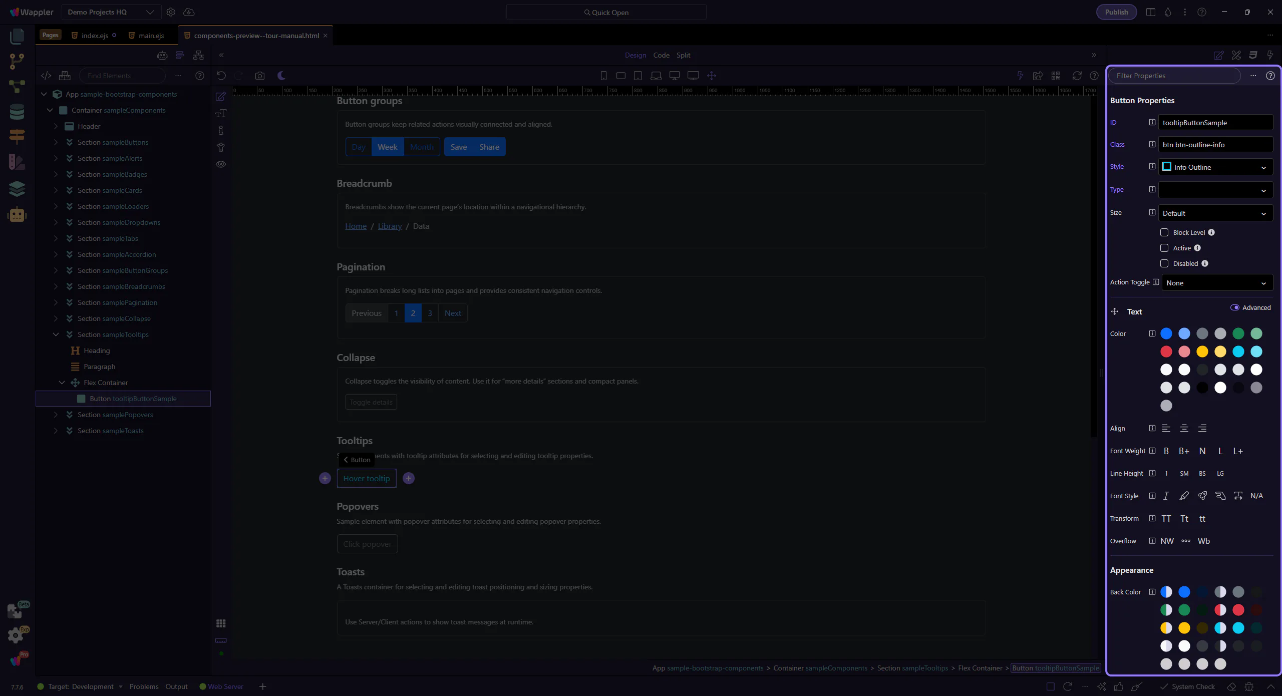
Use Title to define what the tooltip shows. It can be plain text or a dynamic data binding. This step matters because Tooltip: Title is part of Selection Panels Properties Titlevalue, and understanding that context makes the next action easier to repeat in your own project.

Use Trigger to control when the tooltip appears: hover, click, or focus. This step matters because Tooltip: Trigger is part of Selection Panels Properties Tooltiptrigger, and understanding that context makes the next action easier to repeat in your own project.
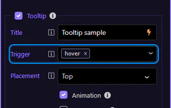
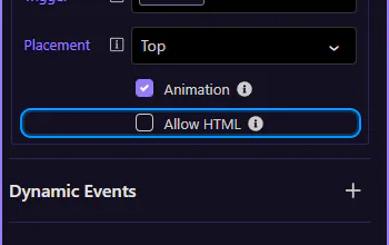
Use Placement to position the tooltip relative to the element. This step matters because Tooltip: Placement is part of Selection Panels Properties Tooltipplacement, and understanding that context makes the next action easier to repeat in your own project.
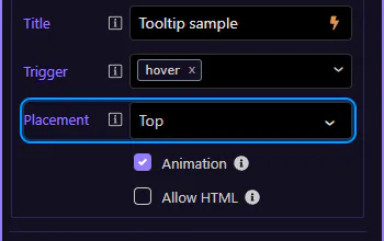
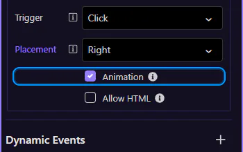
Use Animation to enable/disable the default Bootstrap animation. This step matters because Tooltip: Animation is part of Selection Panels Properties Tooltipanimation, and understanding that context makes the next action easier to repeat in your own project.
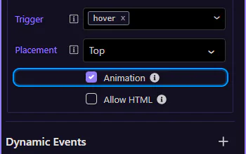
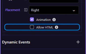
Use Allow HTML if your tooltip content includes HTML (use carefully; keep it readable). This step matters because Tooltip: Allow HTML is part of Selection Panels Properties Tooltiphtml, and understanding that context makes the next action easier to repeat in your own project.
Continue with other Components tours or return to the Components menu.
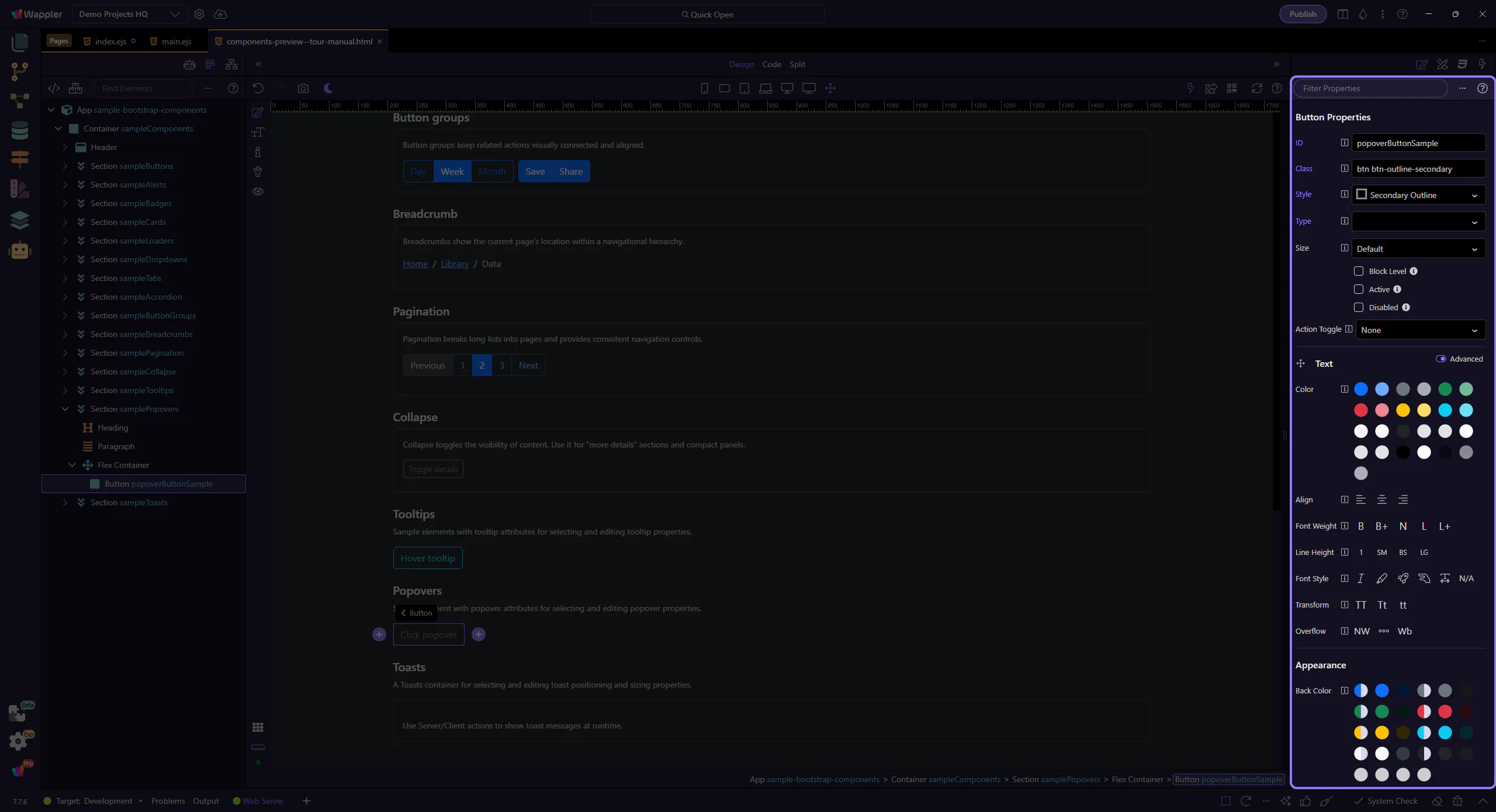
Use popovers for richer contextual help, including placement and trigger options.
Popovers are like tooltips, but can hold more content (title + body). In Wappler you enable a popover on an element, then configure its content and behavior from the Properties panel.
This sample button is selected so you can explore popover settings. This step matters because Popover example is part of Design View, and understanding that context makes the next action easier to repeat in your own project.
Start with the wider context in the Properties panel so the next control makes sense in the full workflow. In the next step, you will focus on Popover: Title and see how it fits into this area.
Use Title for the popover header. It can be plain text or a dynamic data binding. This step matters because Popover: Title is part of Selection Panels Properties Titlevalue, and understanding that context makes the next action easier to repeat in your own project.

Use Content for the main popover text. This step matters because Popover: Content is part of Selection Panels Properties Contentvalue, and understanding that context makes the next action easier to repeat in your own project.
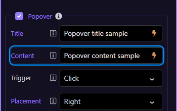
Use Trigger to control how the popover opens (click, focus, hover, or manual). This step matters because Popover: Trigger is part of Selection Panels Properties Popovertrigger, and understanding that context makes the next action easier to repeat in your own project.
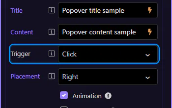
Use Placement to position the popover relative to the element. This step matters because Popover: Placement is part of Selection Panels Properties Popoverplacement, and understanding that context makes the next action easier to repeat in your own project.
Use Animation to enable/disable the default Bootstrap animation. This step matters because Popover: Animation is part of Selection Panels Properties Popoveranimation, and understanding that context makes the next action easier to repeat in your own project.
Use Allow HTML if your popover content includes HTML (use carefully; keep it readable). This step matters because Popover: Allow HTML is part of Selection Panels Properties Popoverhtml, and understanding that context makes the next action easier to repeat in your own project.
Continue with other Components tours or return to the Components menu.
Use accordions to organize content into collapsible sections with smooth navigation.
An accordion is a container plus collapsible panels. The panels can be linked to the accordion so only one is open at a time.
This accordion example is best understood as a reusable layout pattern rather than a single widget on the page. Watch how related sections are grouped into one container, how each header controls reveal and collapse behavior, and why accordions work well when you need dense content without forcing a long scrolling page.
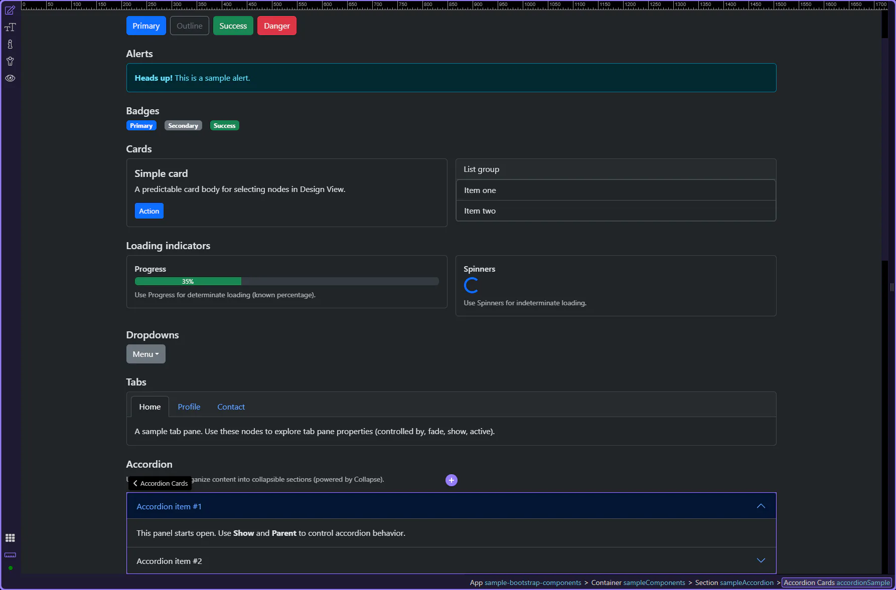
Let’s explore a collapsible panel and how its initial expanded state is controlled. This step matters because Collapsible panel is part of Design View, and understanding that context makes the next action easier to repeat in your own project.
Start with the wider context in the Properties panel so the next control makes sense in the full workflow. In the next step, you will focus on Collapse: Show and see how it fits into this area.
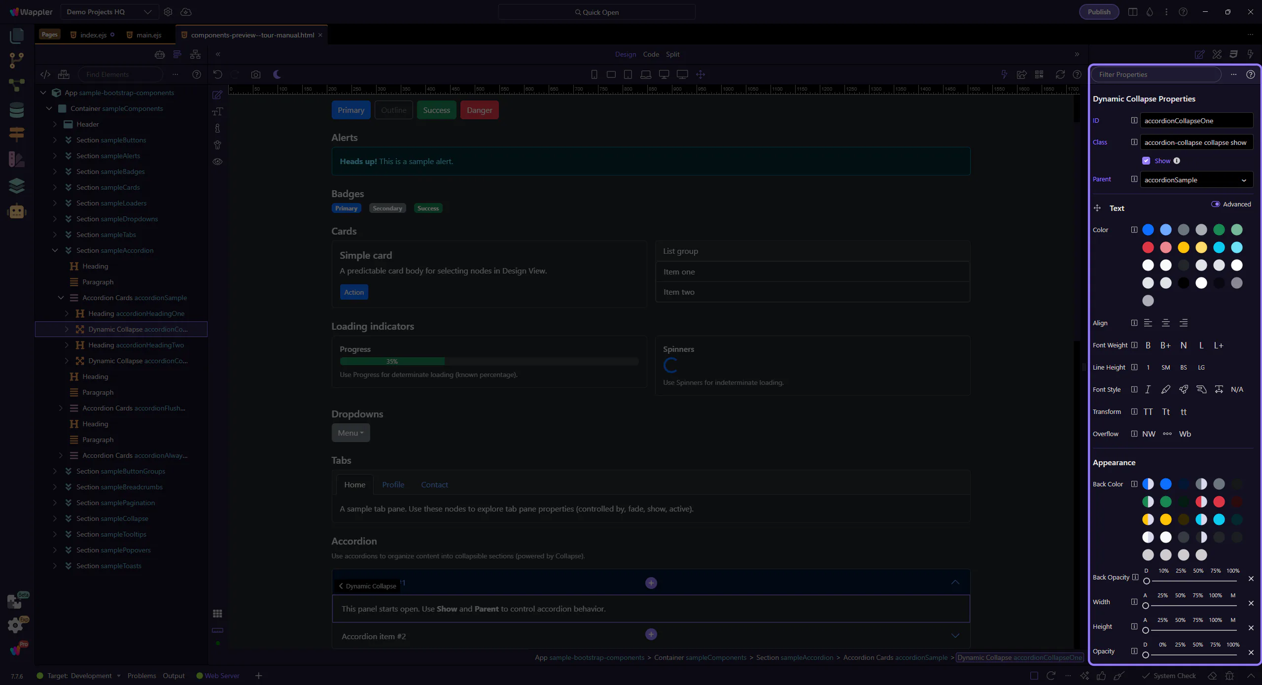
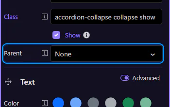
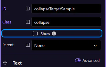
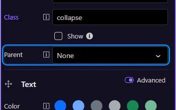
Use Show to control whether the panel starts expanded. This step matters because Collapse: Show is part of Selection Panels Properties Collapseshow, and understanding that context makes the next action easier to repeat in your own project.
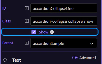
Use Parent to link the panel to the accordion container. This is what makes it behave like an accordion (one open at a time).
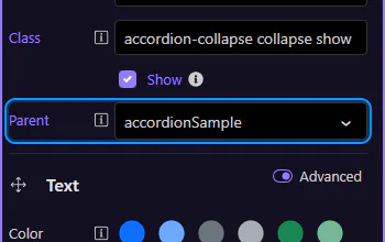
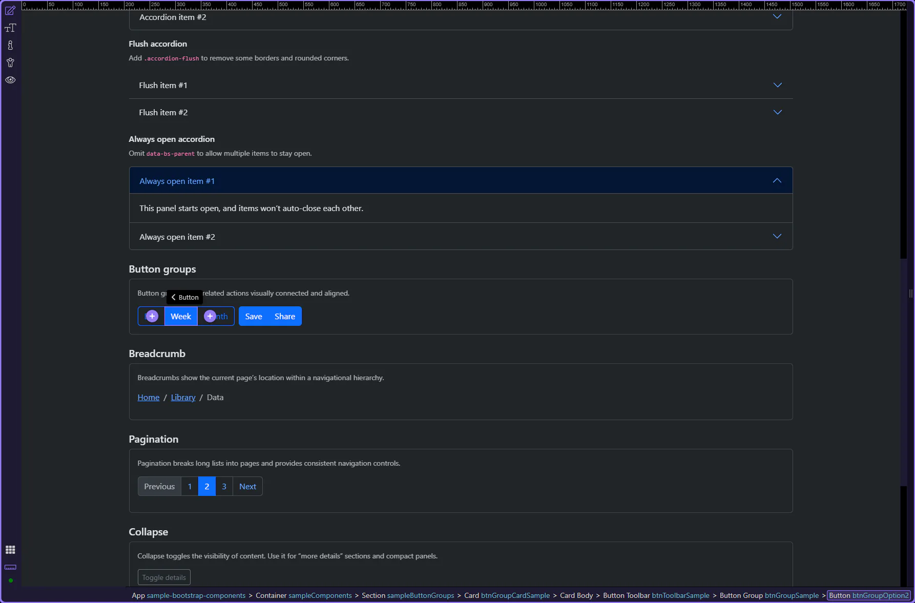
Bootstrap accordions support variants like flush styling and always open behavior.
Add the .accordion-flush class to the accordion container to remove some borders and rounded corners, rendering it edge-to-edge with its parent.
To allow multiple items to stay open, omit the parent reference on each collapse panel (no data-bs-parent).
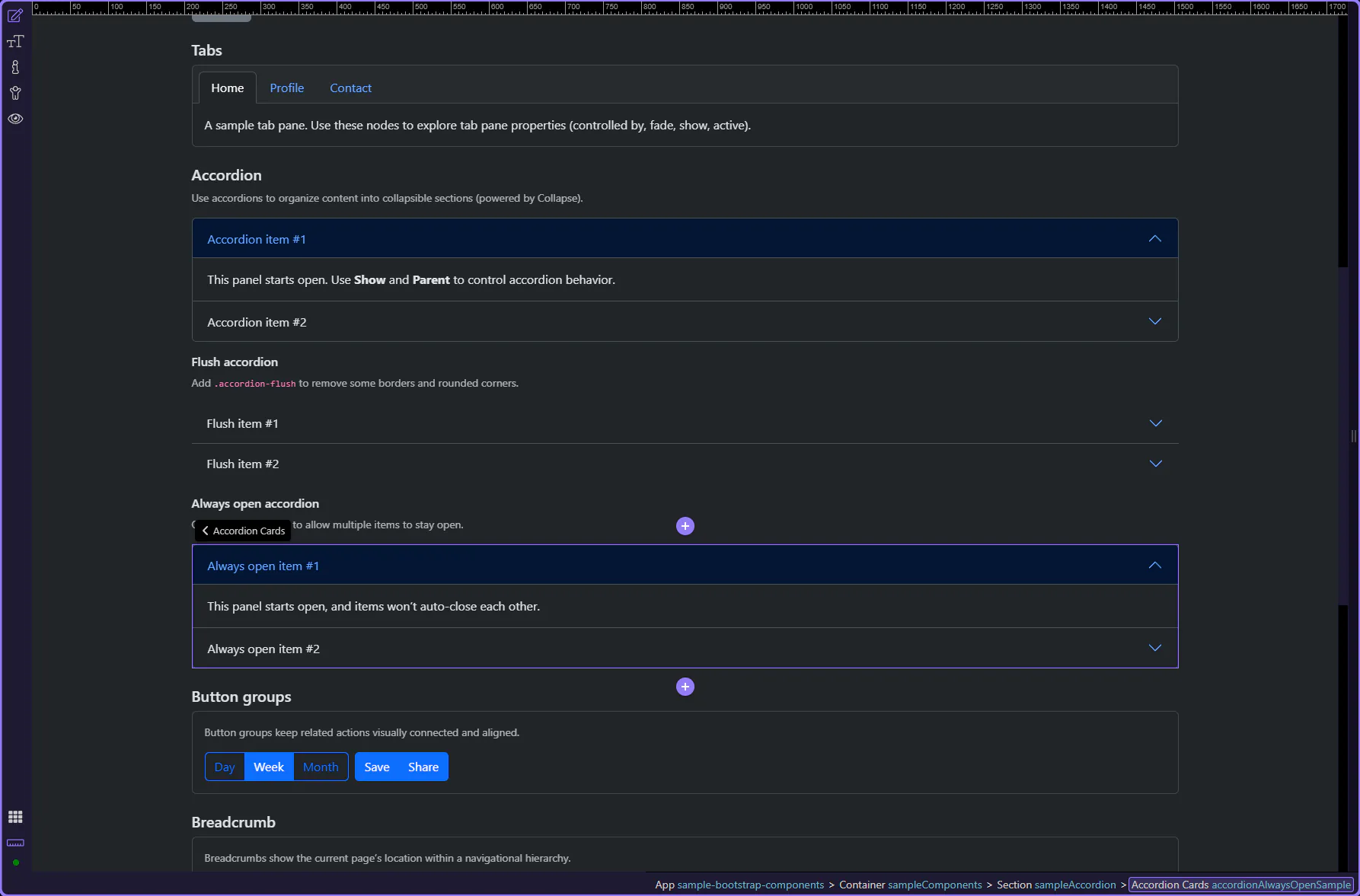
Clear Parent to make a collapse panel independent. With no parent, opening one item won’t close the others.
Continue with other Components tours or return to the Components menu.
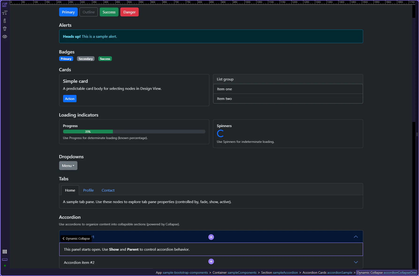
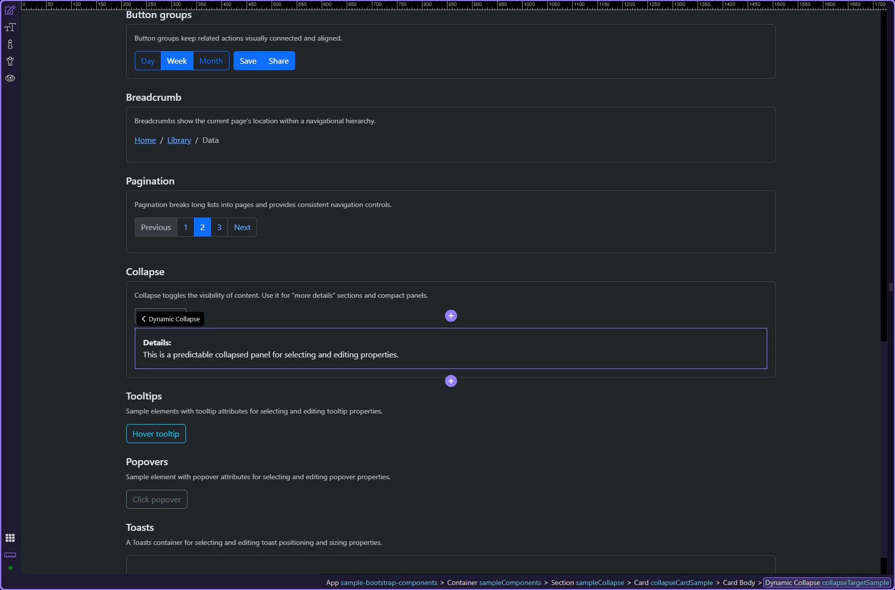
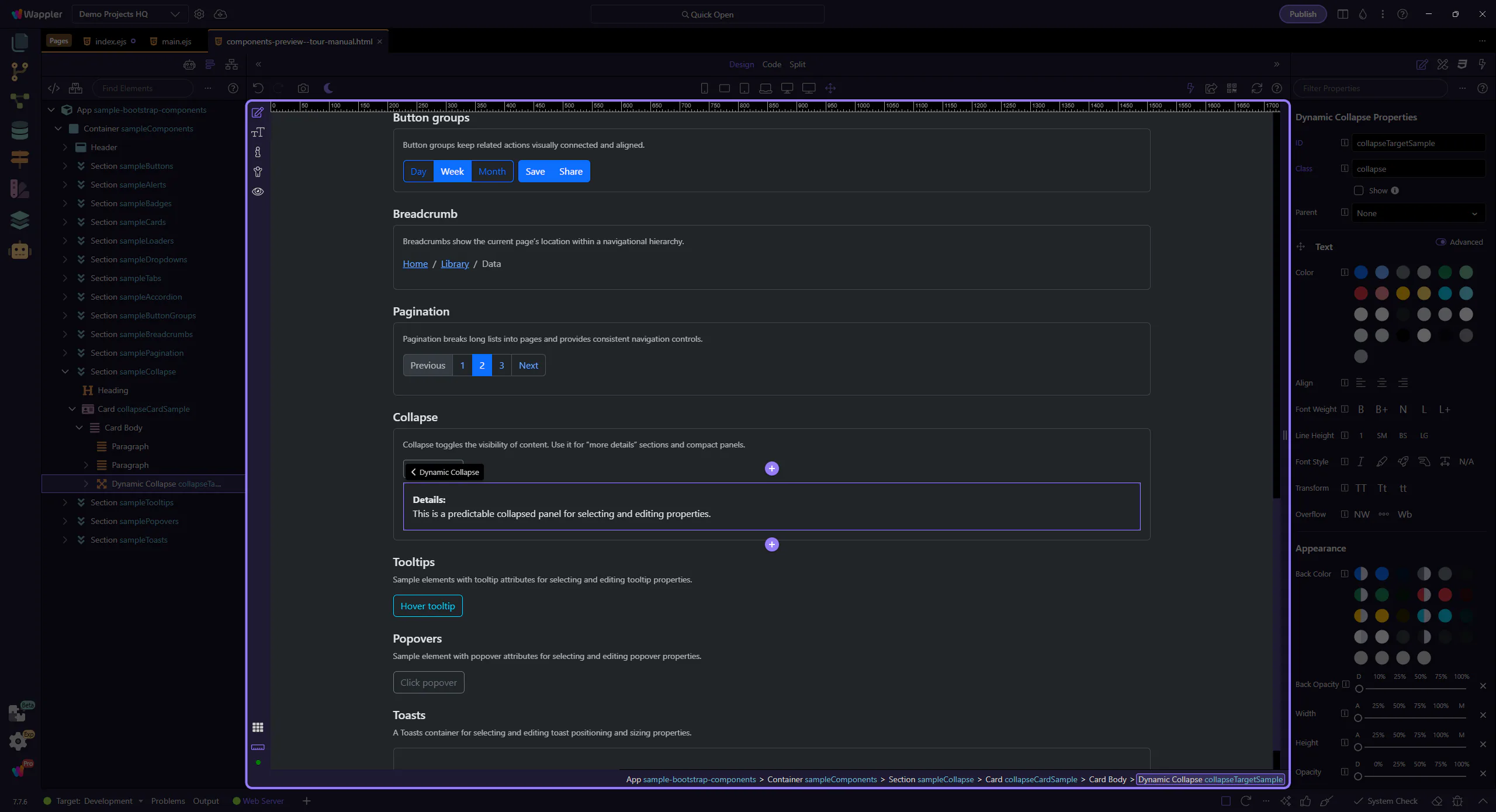
Use collapse for show/hide sections with toggles and smooth transitions.
Collapse is a lightweight way to show and hide content without leaving the page. It’s a great fit for “details” sections, compact filters, and progressive disclosure—especially when you want the page to stay scannable.
The collapsible panel is now highlighted. A Collapse pattern has two parts: a trigger (usually a button or link) and a target panel that expands/collapses.
tip: Collapse works best when the trigger and the target are clearly named (IDs) and the intent is obvious from the UI label.
Start with the wider context in the Properties panel so the next control makes sense in the full workflow. In the next step, you will focus on Collapse: Show and see how it fits into this area.
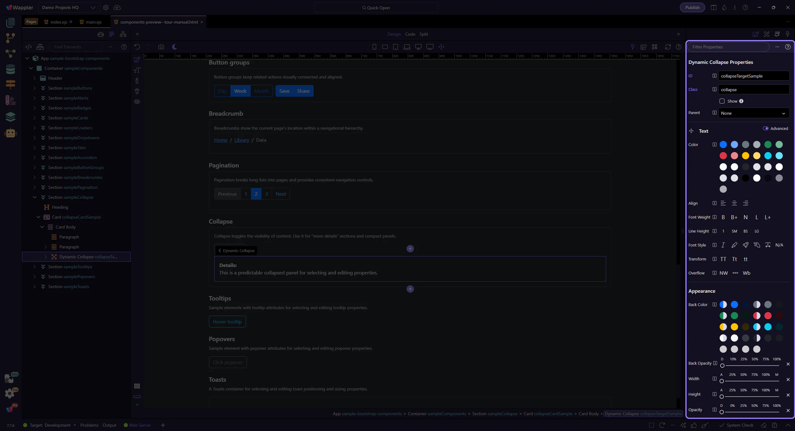
The Show option controls whether the panel starts expanded. In documentation-like UIs, starting collapsed is a sensible default: the page stays shorter, and users can opt in to the extra detail.
note: If the content is required to complete a task, prefer keeping it visible and using Collapse only for truly optional sections.
Behind the scenes, a trigger element (often a button or link) uses data-bs-toggle="collapse" plus a data-bs-target that points to the collapse panel’s ID. This keeps the behavior predictable and makes it easier for assistive technologies to understand the relationship.
tip: If toggling behaves oddly, the first thing to verify is that the target ID is unique and matches exactly.
Collapse can also participate in an accordion pattern—useful when you want only one panel open at a time.
Accordion behavior is a UX choice: it trades free exploration (multiple panels open) for a tighter, guided layout (one panel open). It’s common for FAQs, settings groups, and compact navigation-like panels.
important: If users might want to compare sections side-by-side, avoid forcing one-at-a-time behavior.
The Parent option links this collapse panel to an accordion container. With a parent set, opening one panel can automatically close other panels within the same accordion.
Collapse is ideal for optional content and progressive disclosure. For accordion-style layouts, link panels to a parent so behavior stays consistent.
Use spinners and loading indicators to communicate progress and improve perceived performance.
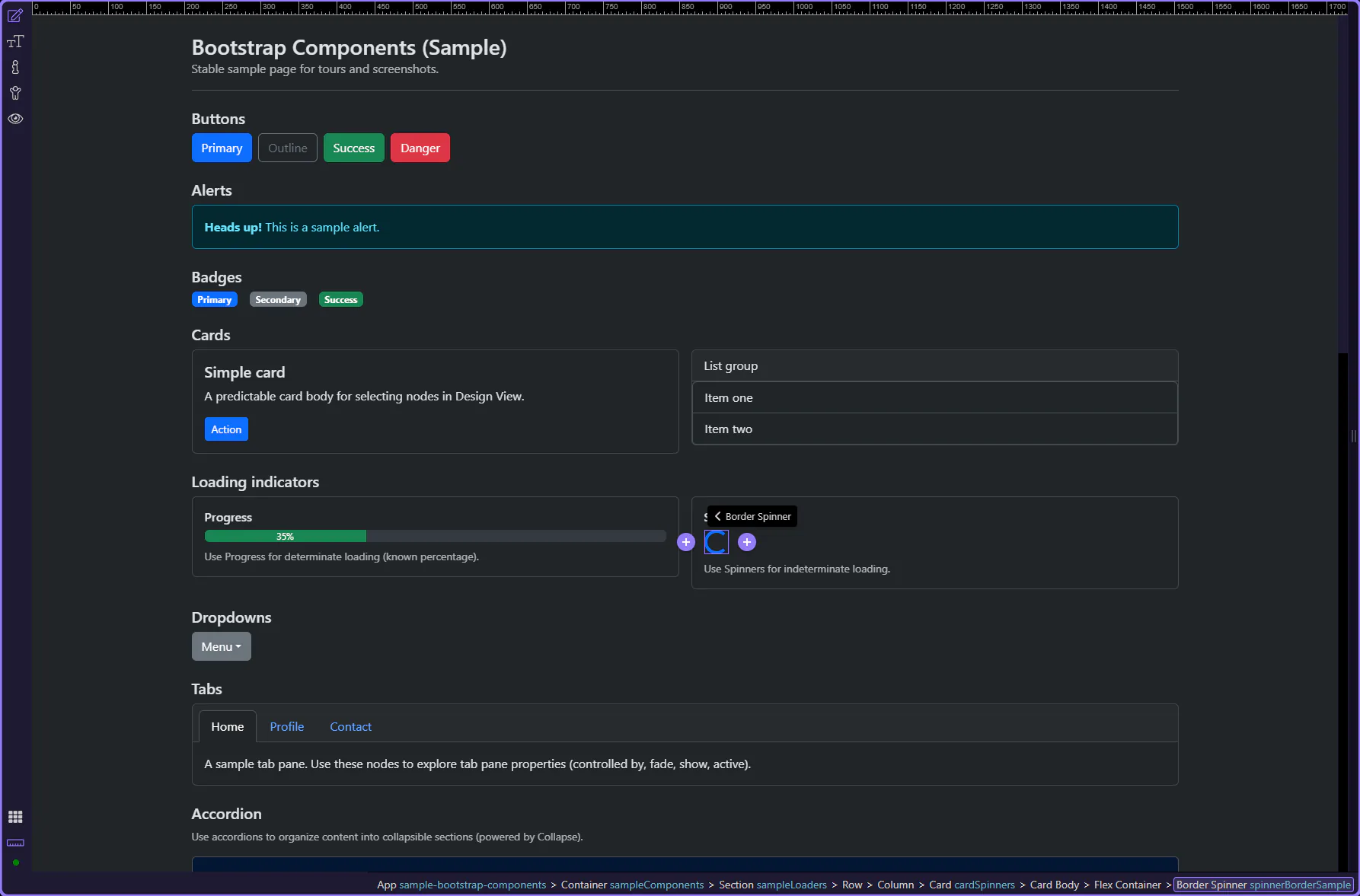
Use progress bars when you know the percentage. A progress bar is made of a container (.progress) and a bar element (.progress-bar).
Use progress bars and spinners to indicate loading, processing, or completion. This step matters because Progress example is part of Design View, and understanding that context makes the next action easier to repeat in your own project.
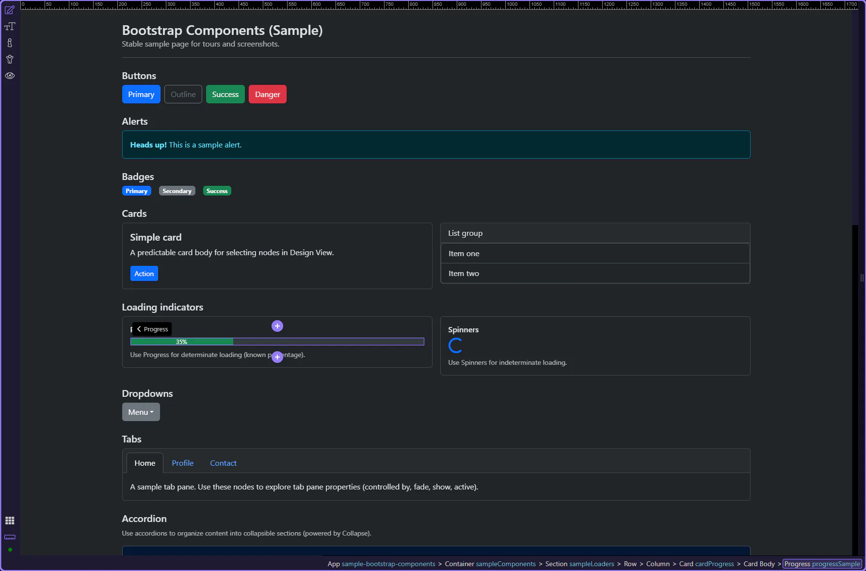
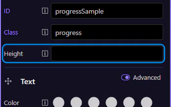
Start with the wider context in the Properties panel so the next control makes sense in the full workflow. In the next step, you will focus on Progress: Height and see how it fits into this area.
Use Height to make thicker or thinner progress bars. This step matters because Progress: Height is part of Selection Panels Properties Progressheight, and understanding that context makes the next action easier to repeat in your own project.
The inner .progress-bar element controls the fill amount and variant styling. This step matters because Progress bar element is part of Design View, and understanding that context makes the next action easier to repeat in your own project.
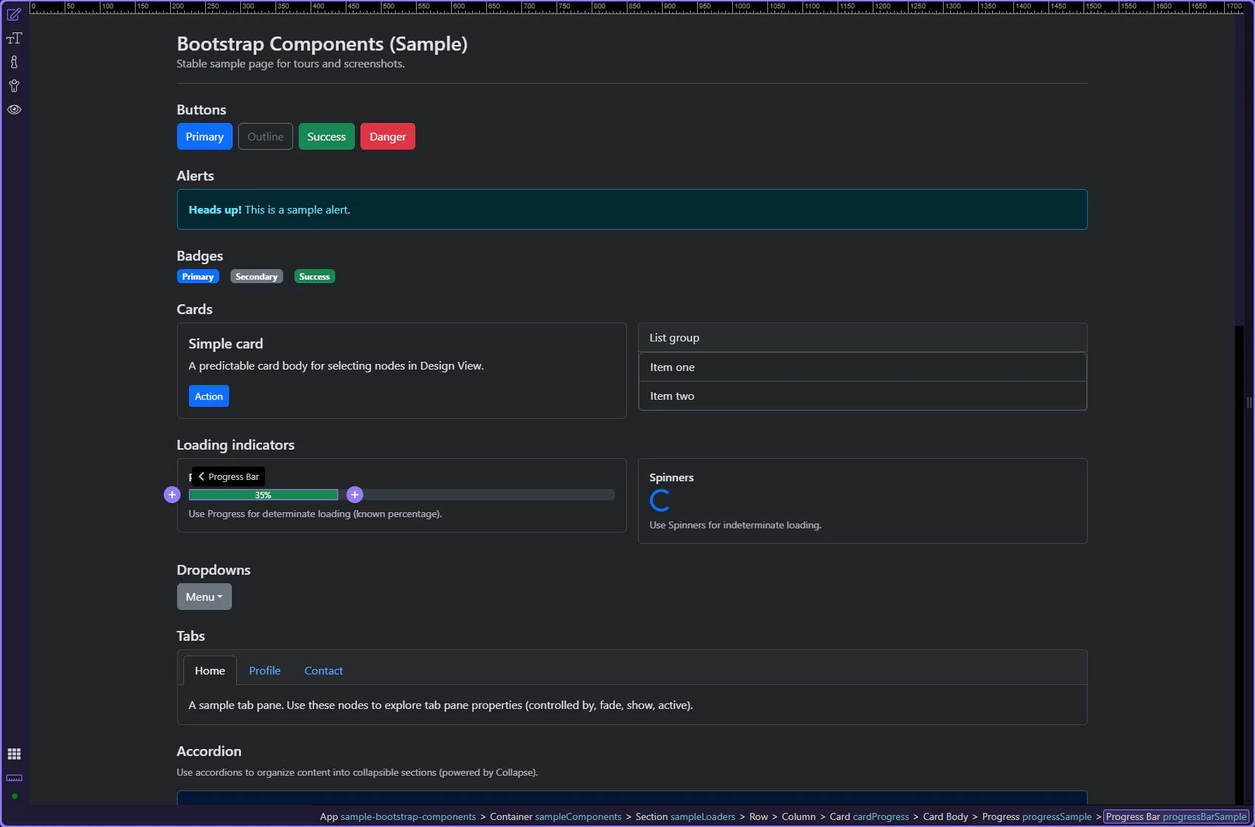
Set Width to control the percentage fill. In production, you’ll typically bind this to data.
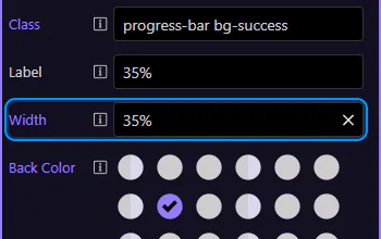
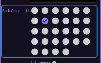
Use Back Color to set the bar’s color variant. This step matters because Progress Bar: Background is part of Selection Panels Properties Progressbarelementcolor, and understanding that context makes the next action easier to repeat in your own project.
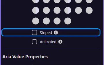
Use Striped and Animated for visual emphasis during long operations. This step matters because Progress Bar: Striped & animated is part of Selection Panels Properties Progressbarstriped, and understanding that context makes the next action easier to repeat in your own project.
Spinners are best when you don’t know the percentage (indeterminate loading).
Border spinners are a compact indicator for indeterminate loading. This step matters because Border spinner is part of Design View, and understanding that context makes the next action easier to repeat in your own project.
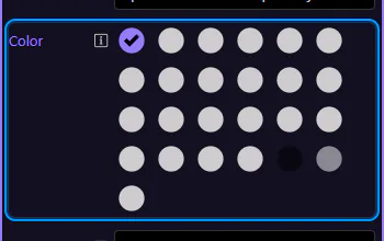
Use Color to set the spinner variant. This step matters because Spinner: Color is part of Selection Panels Properties Spinnerelementcolor, and understanding that context makes the next action easier to repeat in your own project.
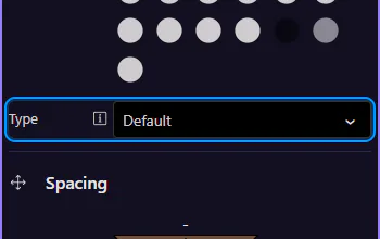
Use Type to switch between default and small sizes. This step matters because Spinner: Size is part of Selection Panels Properties Spinnertype, and understanding that context makes the next action easier to repeat in your own project.
Growing spinners are a softer, pulsing alternative to border spinners. This step matters because Growing spinner is part of Design View, and understanding that context makes the next action easier to repeat in your own project.

Continue with other Components tours or return to the Components menu.
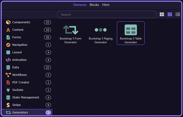
Use Wappler generators to scaffold Bootstrap UI quickly (forms, tables, paging) and customize afterwards.
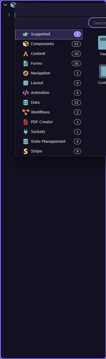
Generators scaffold larger chunks of UI (for example, a data-driven table, a form, or pagination). You start them from the Components picker.
The Components picker is the right place to start when you want Wappler to scaffold a more complex Bootstrap pattern for you. This step explains how generator-driven components differ from simple inserts and why choosing the correct starting tool saves time when the final component needs structure as well as styling.
The Components picker lets you browse by category and insert components and generators. This step matters because Components picker is part of Components Popup Root, and understanding that context makes the next action easier to repeat in your own project.

The Generators category is now selected, showing the available generators. This step matters because Generators category selected is part of Components Popup Anchor Right, and understanding that context makes the next action easier to repeat in your own project.
tip: If you don’t see Bootstrap generators, make sure Bootstrap 5 is enabled for the page/frameworks.

This closes the Components picker so you can continue working in the editor. Start a focused tour from the Generators index to walk through a specific generator dialog.
Pick a focused generator tour, or return to the Bootstrap tours index.
Generate a Bootstrap table quickly with Wappler, then customize columns, styling, and responsive behavior.
The Bootstrap 5 Table Generator scaffolds a Bootstrap table wired to a data source. It can optionally generate sortable headers and bindings.
The table generator is easiest to understand when you begin at the Components picker, because that is where Wappler turns a data-display goal into a scaffolded UI pattern. This step frames what gets generated for you and why the first choice affects the markup and table options you inspect next.

The generator inserts table markup and App Connect bindings. You can refine columns, classes and bindings afterwards.

Open the Components picker, select the Generators category, then choose Bootstrap 5 Table Generator.
The Insert Child command opens the Components picker. This step matters because Components picker opens is part of the Structure panel, and understanding that context makes the next action easier to repeat in your own project.
Use categories to find generators quickly. This step matters because Components picker is part of Components Popup Root, and understanding that context makes the next action easier to repeat in your own project.
The Generators category is now selected. This step matters because Generators category selected is part of Components Popup Anchor Right, and understanding that context makes the next action easier to repeat in your own project.

Bootstrap 5 Table Generator is now selected and its dialog opens. This step matters because Table Generator selected is part of Components Popup Root, and understanding that context makes the next action easier to repeat in your own project.
The generator opens in a popup dialog.
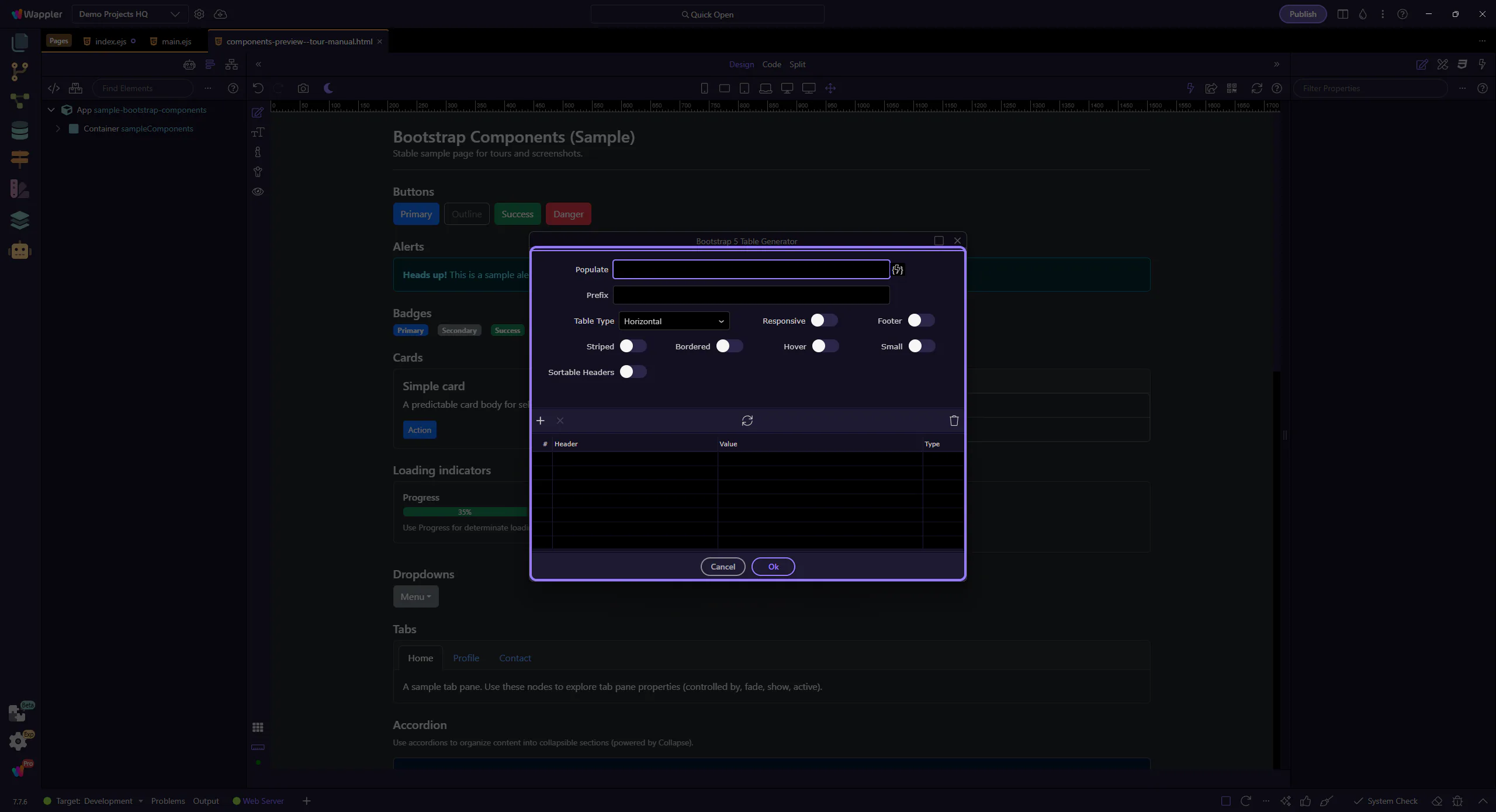
Start by configuring how the table gets its rows.
Populate is the expression that provides table rows (for example, an array from a data source).

Prefix is used when generating bindings for each column (for example, item). This step matters because Prefix is part of Popup Bootstrap5tablegenerator Form Fieldsform Field Dataprefix Input, and understanding that context makes the next action easier to repeat in your own project.

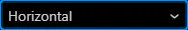
The table layout can be horizontal or vertical. This step matters because Table Type is part of Popup Bootstrap5tablegenerator Form Fieldsform Field Tabletype Input, and understanding that context makes the next action easier to repeat in your own project.
These toggles add common Bootstrap table options.
Enable Responsive to wrap the table in a responsive container. Enable Footer to generate a tfoot section.

Toggle the most common Bootstrap table styles. This step matters because Striped / Bordered / Hover / Small is part of Popup Bootstrap5tablegenerator Form Fieldsform Field Tablestriped Input, and understanding that context makes the next action easier to repeat in your own project.

Use the columns grid to define headers and bindings.
Each row represents a table column (header label and the binding/expression used for cell values).
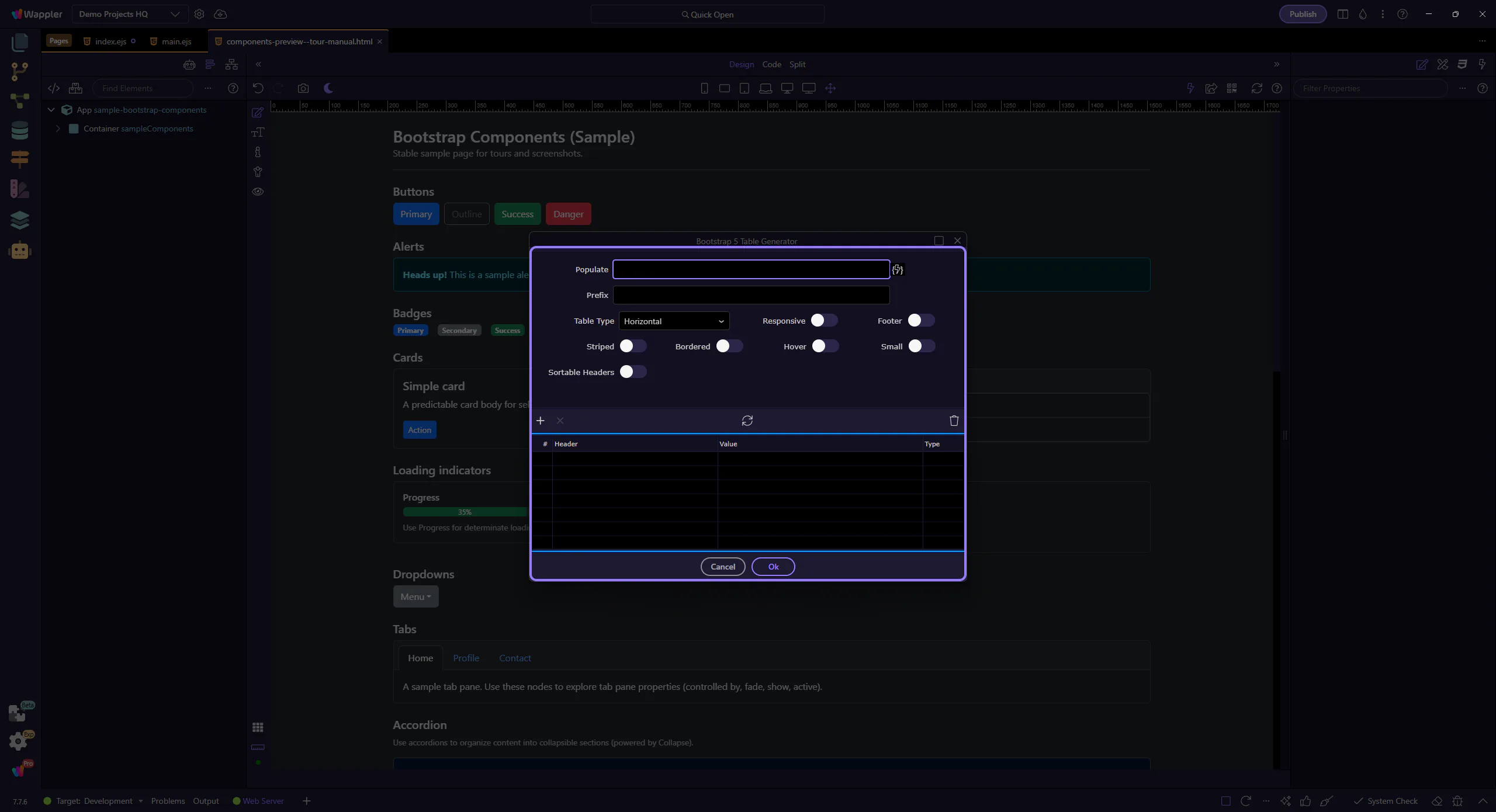
Enable Sortable Headers to generate click-to-sort behavior. Additional sorting fields may appear after enabling it.

When you’re happy with the settings, generate the table.
Selecting Ok inserts the generated table into the page at the selected insertion point. This step matters because Ok is part of Popup Bootstrap5tablegenerator Button Ok, and understanding that context makes the next action easier to repeat in your own project.

Selecting Cancel closes the dialog without inserting anything. This step matters because Cancel is part of Popup Bootstrap5tablegenerator Button Cancel, and understanding that context makes the next action easier to repeat in your own project.

Continue with other generator tours, or return to the Bootstrap tours index.
Generate Bootstrap forms quickly with Wappler, then customize layout, labels, and validation feedback.
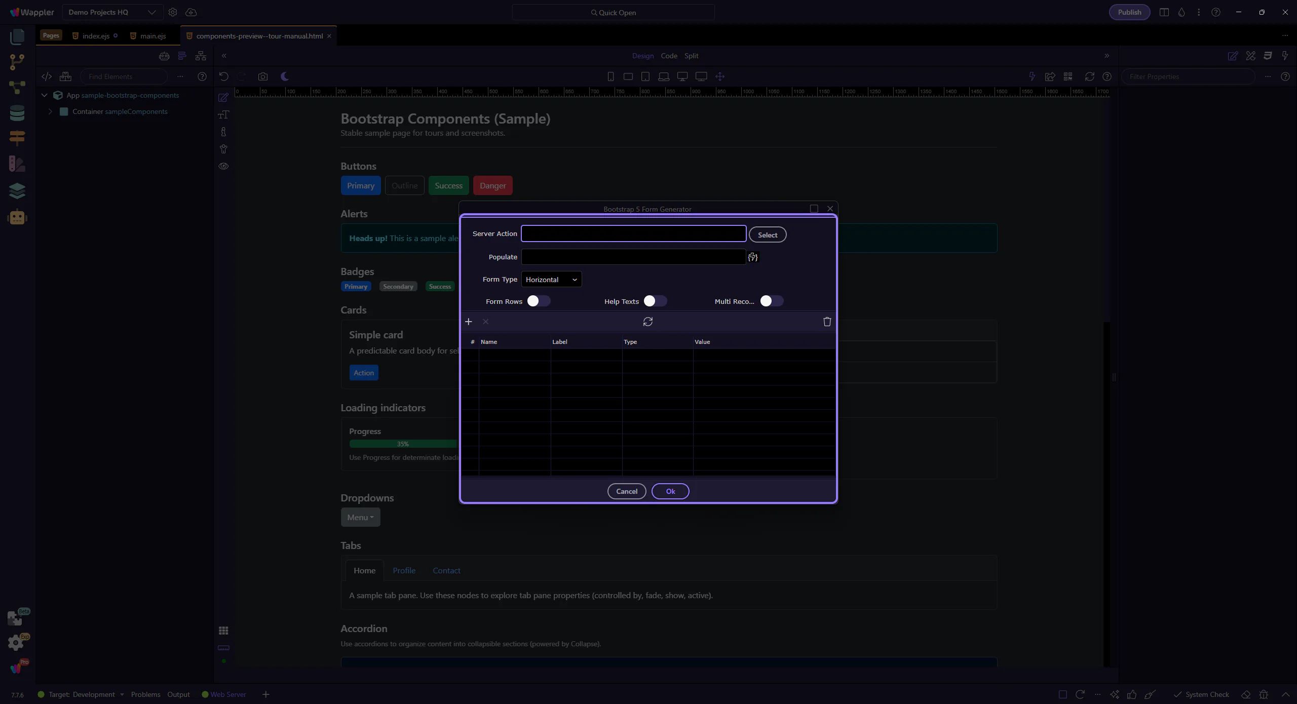
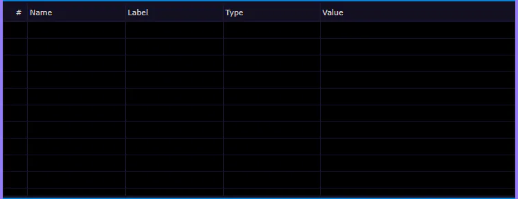
The Bootstrap 5 Form Generator scaffolds a Bootstrap form wired to a Server Connect action. It can auto-generate inputs based on the action schema.
The generator inserts the form markup plus bindings for values, validation and submit behavior (depending on your selected action and options).
You’ll get the best results when you already have a Server Connect action (for example, insert/update/select) and its input/output schema is known.

Open the Components picker, select the Generators category, then choose Bootstrap 5 Form Generator.
The Components picker is now open (via Insert Child). This step matters because Components picker opened is part of the Structure panel, and understanding that context makes the next action easier to repeat in your own project.
Use categories to find generators quickly. This step matters because Components picker is part of Components Popup Root, and understanding that context makes the next action easier to repeat in your own project.

The Generators category is now selected. This step matters because Generators category selected is part of Components Popup Anchor Right, and understanding that context makes the next action easier to repeat in your own project.

Bootstrap 5 Form Generator is now selected and its dialog opens. This step matters because Form Generator selected is part of Components Popup Root, and understanding that context makes the next action easier to repeat in your own project.

The generator opens in a popup dialog.
Pick which Server Connect action this form should be wired to.
Use Select to choose a Server Connect action. The generator can infer fields from the action schema. This step matters because Server Action is part of Popup Bootstrap5formgenerator Form Fieldsform Field Serveractionname Input, and understanding that context makes the next action easier to repeat in your own project.

If the action returns data (for example, select a record), Populate can be used to bind default values into the form.

Choose the Bootstrap form layout style and helper options.
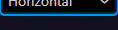
The layout preset controls whether the form is horizontal, vertical, inline, or uses floating labels.
Enable Form Rows to wrap fields in row markup. Enable Help Texts to include Bootstrap help text blocks per field.

Enable Multi Record when you want a repeatable form section for array-like inputs. This step matters because Multi Record is part of Popup Bootstrap5formgenerator Form Fieldsform Field Multirecord Input, and understanding that context makes the next action easier to repeat in your own project.

Use the fields grid to choose and configure the inputs to generate.
Each row represents a form field. Use it to decide which fields to include and how to label them.
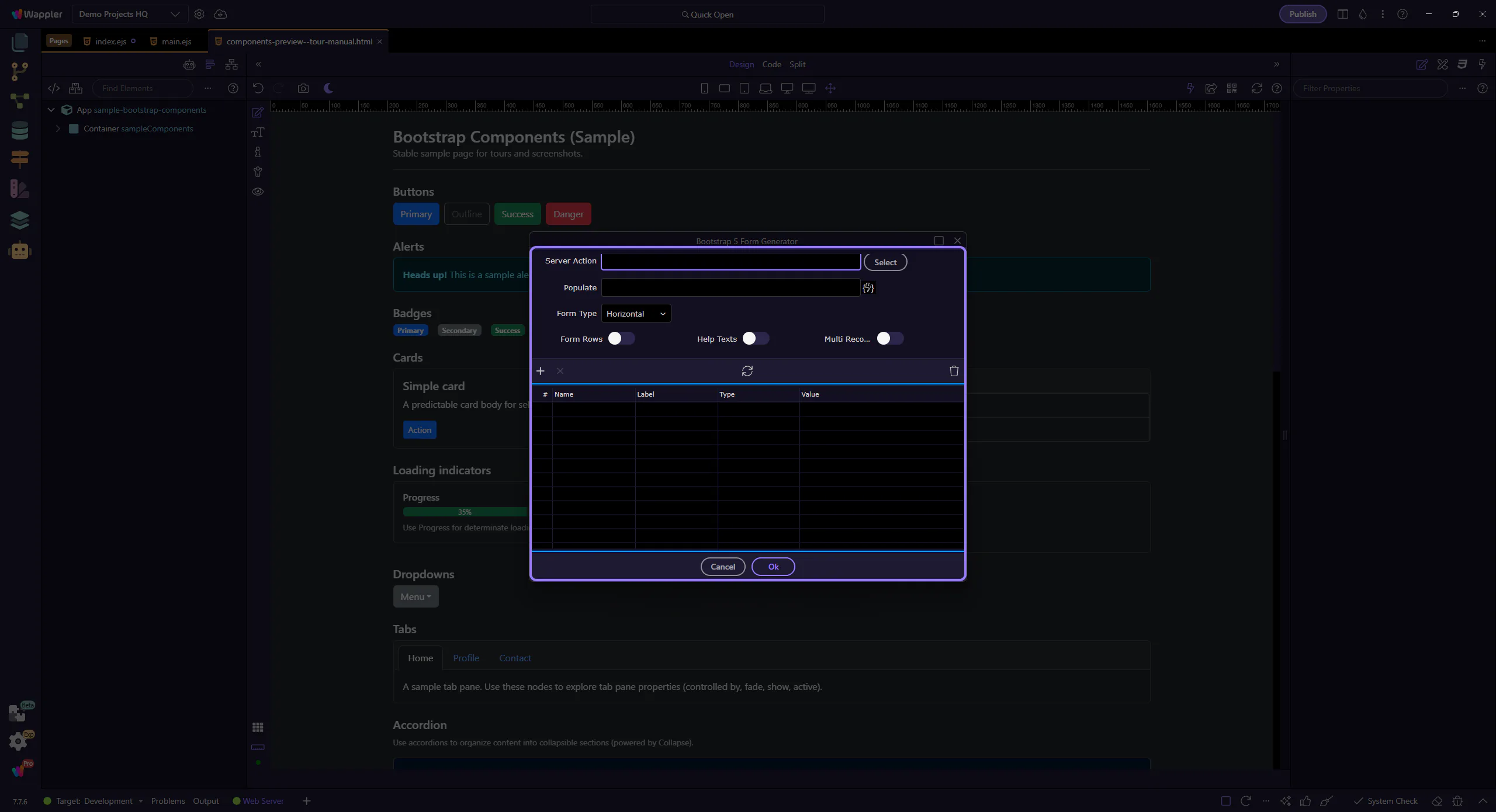
The generator uses these fields to create input names, labels and data bindings. You can fine-tune them after generation in the Properties panel.
When you’re happy with the settings, generate the form.
Selecting Ok inserts the generated form into the page. This step matters because Ok is part of Popup Bootstrap5formgenerator Button Ok, and understanding that context makes the next action easier to repeat in your own project.

Selecting Cancel closes the dialog without inserting anything. This step matters because Cancel is part of Popup Bootstrap5formgenerator Button Cancel, and understanding that context makes the next action easier to repeat in your own project.

Continue with other generator tours, or return to the Bootstrap tours index.
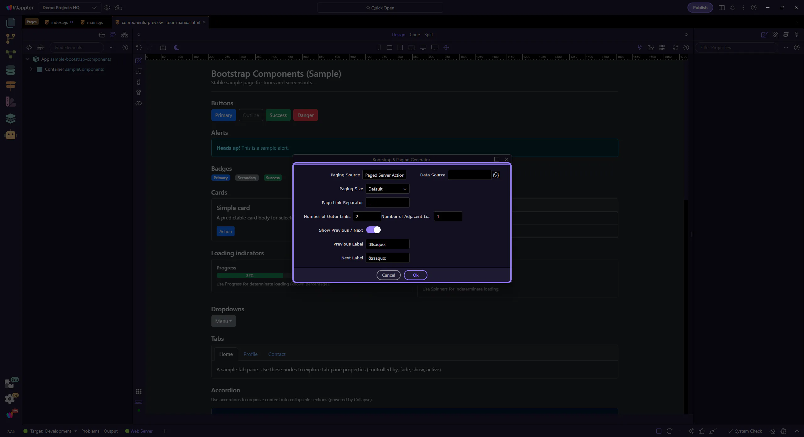
Generate paging controls quickly and wire them to your data flow for smooth list navigation.
The Bootstrap 5 Paging Generator scaffolds Bootstrap pagination UI and binds it to a data source that supports paging.
Start by looking at what the paging generator actually builds before you think about customization. This output shows the navigation structure, active state, and previous-next behavior Wappler scaffolds for you, which makes the later property choices easier to understand and adjust with confidence.
Use this when your data source is paged (for example: a database query with paging, or an API that returns page + total information).
Open the Components picker, select the Generators category, then choose Bootstrap 5 Paging Generator.
The Insert Child command opens the Components picker. This step matters because Components picker opens is part of the Structure panel, and understanding that context makes the next action easier to repeat in your own project.

Use categories to find generators quickly. This step matters because Components picker is part of Components Popup Root, and understanding that context makes the next action easier to repeat in your own project.

The Generators category is now selected. This step matters because Generators category selected is part of Components Popup Anchor Right, and understanding that context makes the next action easier to repeat in your own project.

Bootstrap 5 Paging Generator is now selected and its dialog opens. This step matters because Paging Generator selected is part of Components Popup Root, and understanding that context makes the next action easier to repeat in your own project.
The generator opens in a popup dialog.
Choose where paging information comes from.
The paging source determines whether paging comes from a paged Server Action, a Data View, or a Flow Action.
The data source field links paging to the provider that exposes paging state (current offset/page, total records, etc.).

Configure how the pagination looks.
The size variant controls the Bootstrap paging size (default, large, or small). This step matters because Paging Size is part of Popup Bootstrap5paginggenerator Form Fieldsform Field Pagingsize Input, and understanding that context makes the next action easier to repeat in your own project.
Outer Links and Adjacent Links control how many page links are shown. This step matters because Outer / Adjacent links is part of Popup Bootstrap5paginggenerator Form Fieldsform Field Outerlinks Input, and understanding that context makes the next action easier to repeat in your own project.

Enable or disable first/prev/next/last controls and configure their labels.
Toggle whether Previous and Next buttons are shown. This step matters because Previous / Next is part of Popup Bootstrap5paginggenerator Form Fieldsform Field Showprevnext Input, and understanding that context makes the next action easier to repeat in your own project.
Toggle whether First and Last buttons are shown. This step matters because First / Last is part of Popup Bootstrap5paginggenerator Form Fieldsform Field Showfirstlast Input, and understanding that context makes the next action easier to repeat in your own project.

Customize labels for the paging controls. This step matters because Labels is part of Popup Bootstrap5paginggenerator Form Fieldsform Field Prevlabel Input, and understanding that context makes the next action easier to repeat in your own project.

Optionally persist paging state using a state manager.
Enable this if you want paging state reflected in a state manager (useful for URL sync and persistence).

The state manager selection defines where paging state and offset are stored. This step matters because State Manager is part of Popup Bootstrap5paginggenerator Form Fieldsform Field Statemanager Input, and understanding that context makes the next action easier to repeat in your own project.
When you’re happy with the settings, generate the pagination component.
Selecting Ok inserts the generated pagination component into the page. This step matters because Ok is part of Popup Bootstrap5paginggenerator Button Ok, and understanding that context makes the next action easier to repeat in your own project.

Selecting Cancel closes the dialog without inserting anything. This step matters because Cancel is part of Popup Bootstrap5paginggenerator Button Cancel, and understanding that context makes the next action easier to repeat in your own project.

Continue with other generator tours, or return to the Bootstrap tours index.
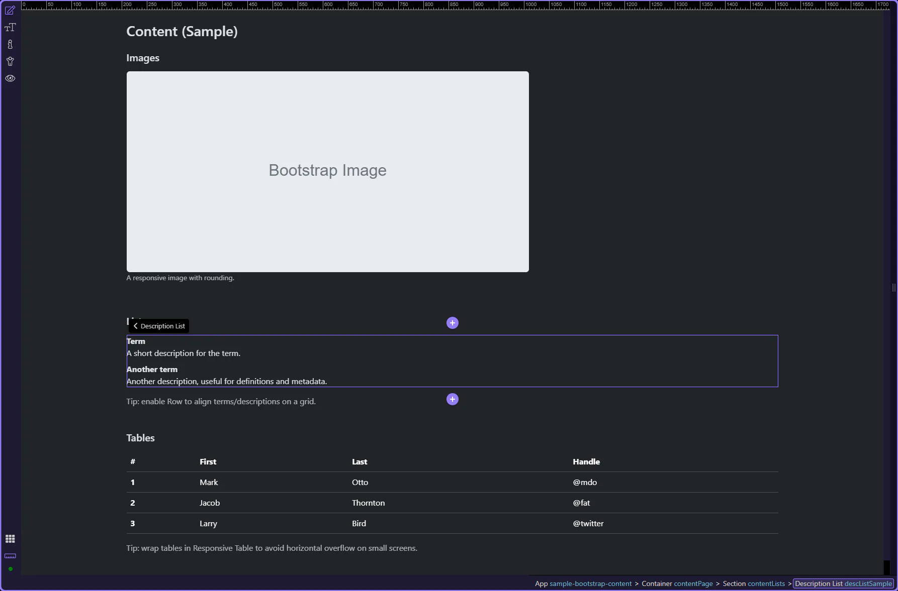
Use Bootstrap description lists for key/value layouts, with responsive alignment helpers.
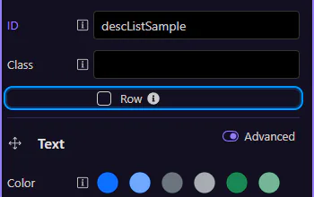
Description lists pair terms (dt) with definitions (dd)—ideal for metadata blocks and compact summaries. Let’s review the container options first.
This description list example shows how Bootstrap can present paired labels and values in a way that is easier to scan than a plain paragraph. It is useful for metadata, profile details, and admin summaries where the relationship between each term and its value should stay visually obvious.
Start with the wider context in the Properties panel so the next control makes sense in the full workflow. In the next step, you will focus on Row layout and see how it fits into this area.
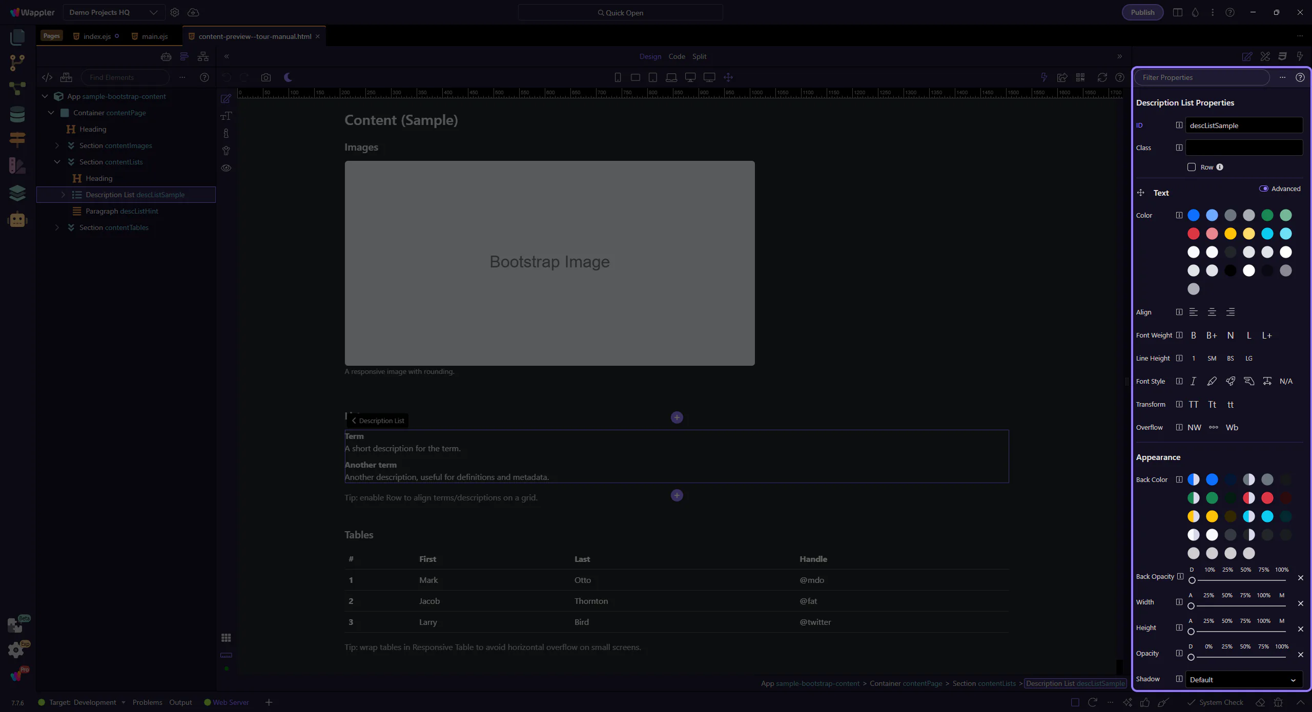
Enable Row to align terms and descriptions using Bootstrap’s grid. This step matters because Row layout is part of Selection Panels Properties Desclistrow, and understanding that context makes the next action easier to repeat in your own project.
Each row is made of a term (dt) and a description (dd). Let’s look at how you edit each one.
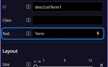
Terms (dt) are the labels—short and scannable. This step matters because Term (dt) is part of Design View, and understanding that context makes the next action easier to repeat in your own project.

Edit the Text field to change the term content. This step matters because Term text is part of Selection Panels Properties Desclisttermtext, and understanding that context makes the next action easier to repeat in your own project.
Descriptions (dd) hold the value text and can be longer if needed. This step matters because Description (dd) is part of Design View, and understanding that context makes the next action easier to repeat in your own project.
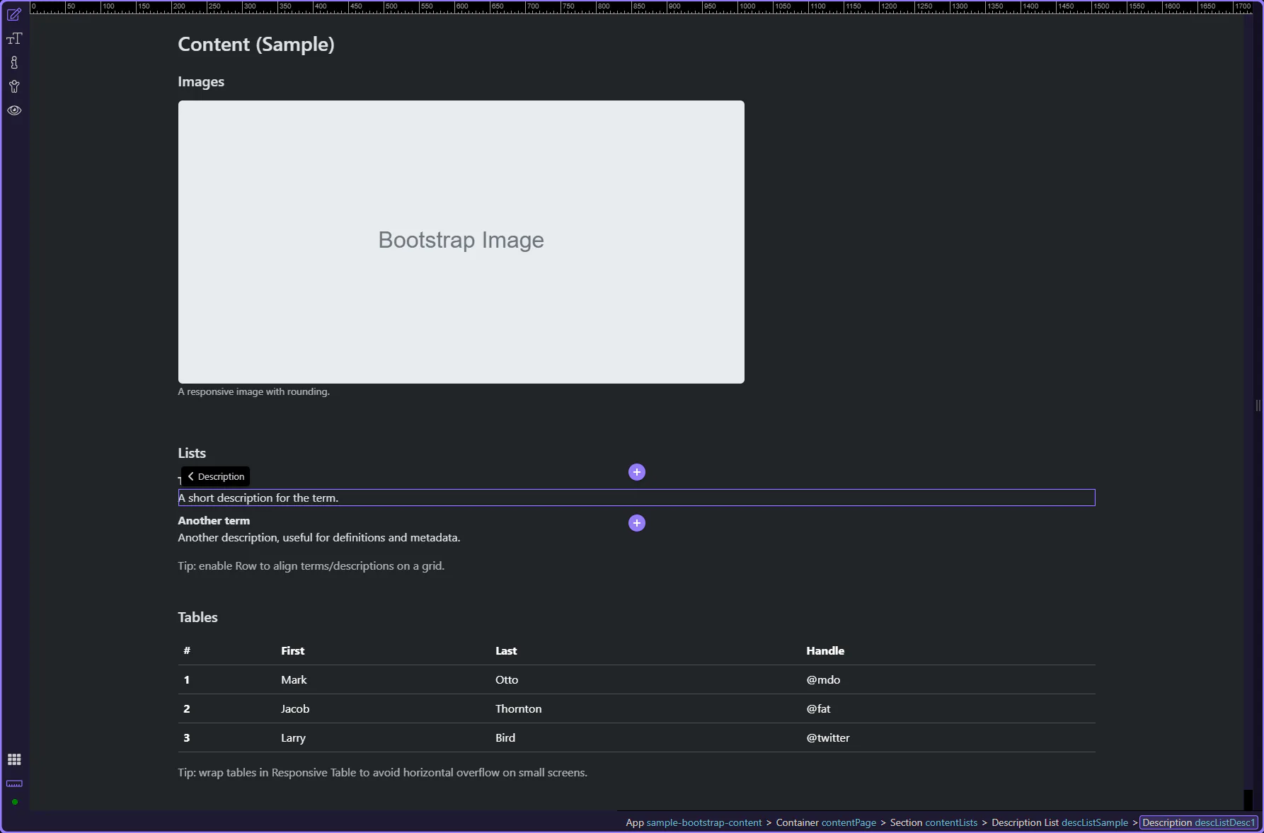
Edit the Text field to change the description content. This step matters because Description text is part of Selection Panels Properties Desclistdesctext, and understanding that context makes the next action easier to repeat in your own project.
Continue with other Content topics or return to the Content menu.
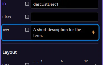
Work with responsive images: fluid sizing, thumbnails, alignment, and common image helpers.
Images often need responsive sizing, correct alt text, and consistent rounding/alignment. Let’s review the key image options.
Bootstrap image options focus on responsiveness, alignment, and subtle presentation patterns like figures and captions.
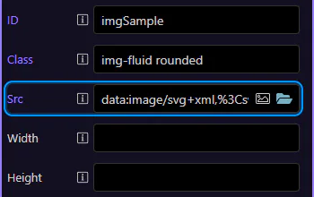
Start with the wider context in the Properties panel so the next control makes sense in the full workflow. In the next step, you will focus on Image: Src and see how it fits into this area.
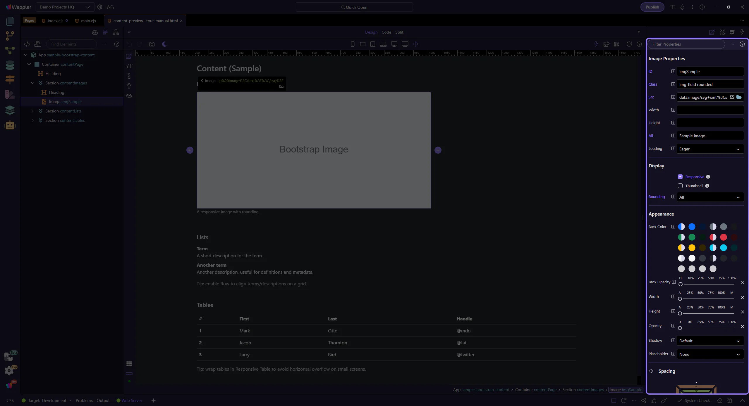
Use Src to choose the image file. This step matters because Image: Src is part of Selection Panels Properties Imgsrc, and understanding that context makes the next action easier to repeat in your own project.
Use Alt for accessibility and SEO. Write descriptive alt text for meaningful images. This step matters because Image: Alt (accessibility) is part of Selection Panels Properties Imgalt, and understanding that context makes the next action easier to repeat in your own project.
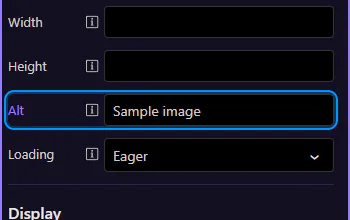
Use Loading to enable lazy loading for below-the-fold images. This step matters because Image: Loading is part of Selection Panels Properties Imgloading, and understanding that context makes the next action easier to repeat in your own project.
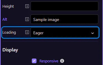
Use Responsive to add img-fluid so the image scales with the container. This step matters because Image: Responsive is part of Selection Panels Properties Imgresponsive, and understanding that context makes the next action easier to repeat in your own project.
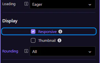
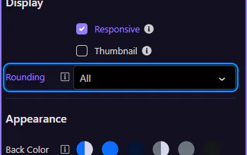
Use Rounding for rounded corners or circle images. This step matters because Image: Rounding is part of Selection Panels Properties Imgelementrounding, and understanding that context makes the next action easier to repeat in your own project.
Continue with tables or return to the Content menu.
Style tables with Bootstrap classes: borders, hover/striped, responsive wrappers, and alignment.
Bootstrap tables add readability (striping, hover, borders) and can be wrapped for responsive scrolling. Let’s review the key table options.
Tables are deeply nested (thead/tbody/tr/td), so it’s common to style the table itself while editing content inside rows and cells.
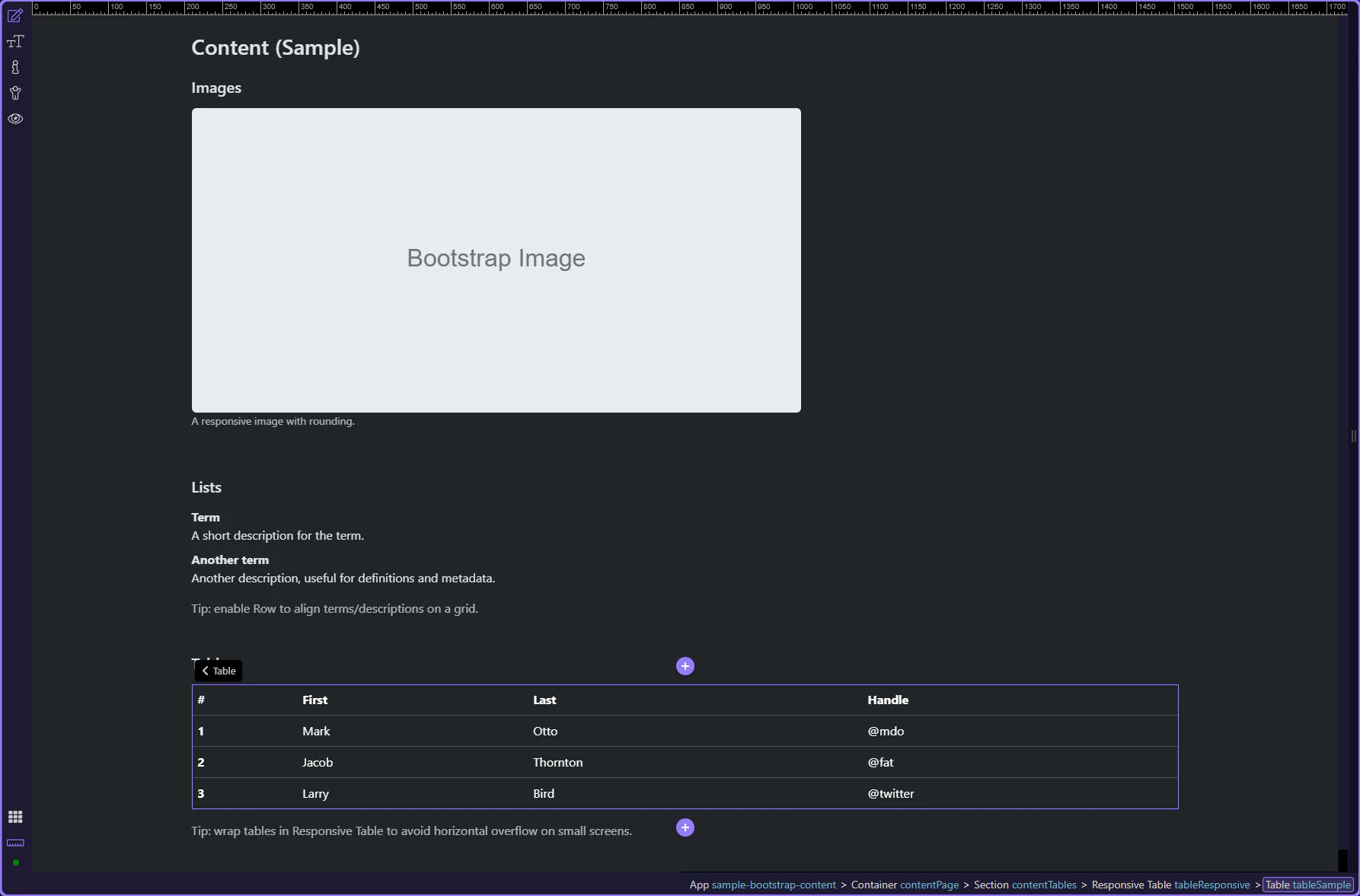
Start with the wider context in the Properties panel so the next control makes sense in the full workflow. In the next step, you will focus on Table: Theme and see how it fits into this area.
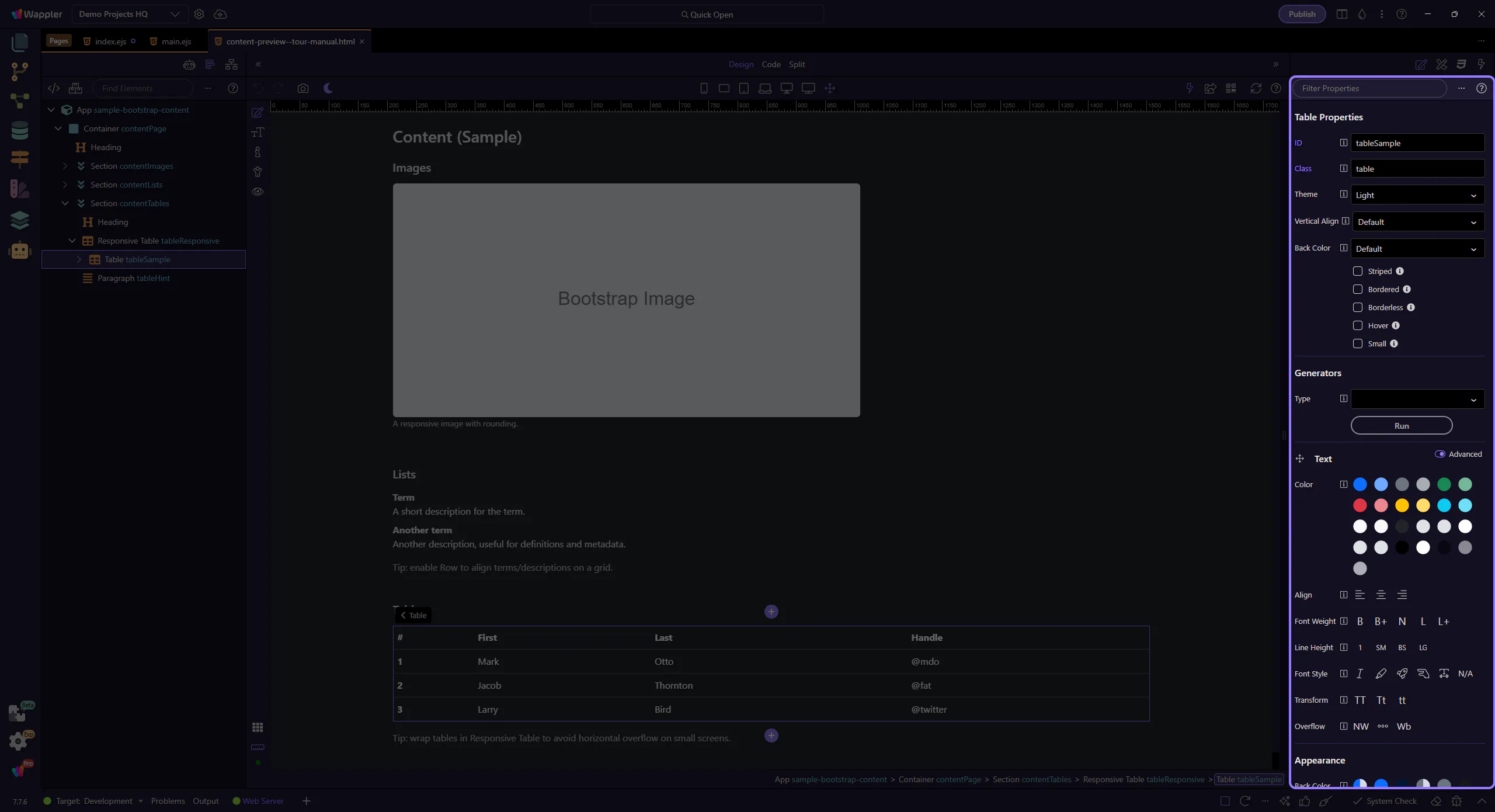
Use Theme for light/dark tables. This step matters because Table: Theme is part of Selection Panels Properties Tabletheme, and understanding that context makes the next action easier to repeat in your own project.
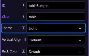
Use Back Color for contextual table variants (primary/success/etc.). This step matters because Table: Background variant is part of Selection Panels Properties Tableelementcolor, and understanding that context makes the next action easier to repeat in your own project.
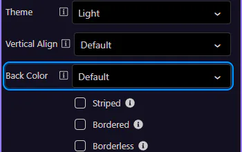
Use Striped, Hover, and Small for common table density and interaction patterns. This step matters because Table: Striped / Hover / Small is part of Selection Panels Properties Tablestriped, and understanding that context makes the next action easier to repeat in your own project.
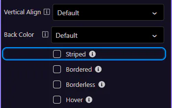
Use Bordered and Border Color when you need stronger table separation. This step matters because Table: Bordered + border color is part of Selection Panels Properties Tablebordered, and understanding that context makes the next action easier to repeat in your own project.
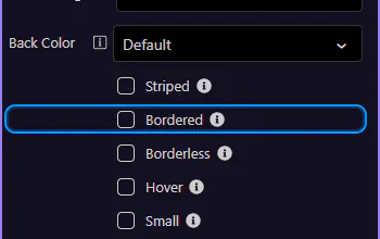
Responsive wrappers add horizontal scrolling on smaller screens, without breaking the table layout.
The .table-responsive wrapper controls when scrolling is enabled (not the table itself). This step matters because Responsive wrapper is part of Design View, and understanding that context makes the next action easier to repeat in your own project.
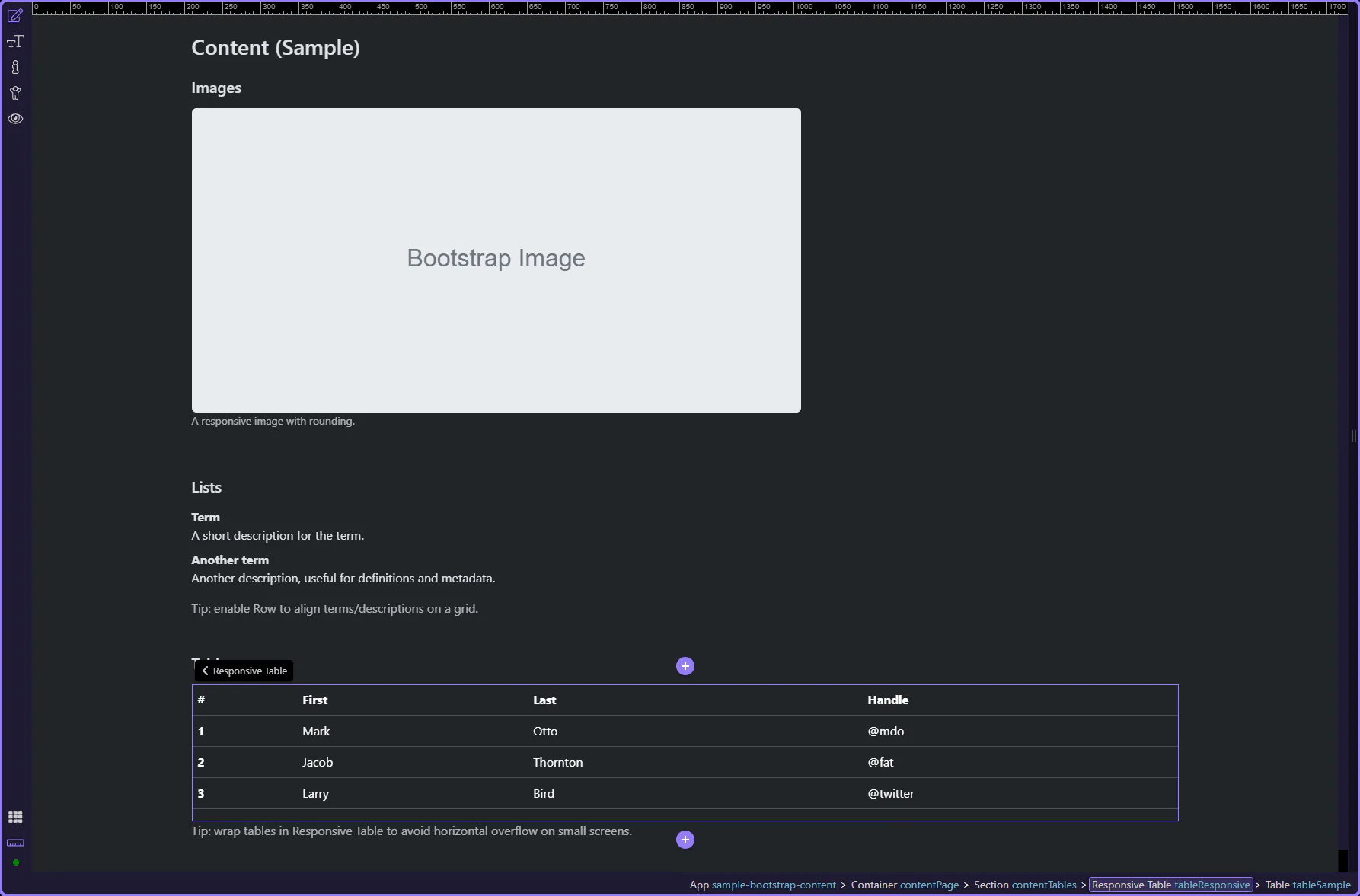
Use Responsive to choose if the table should scroll horizontally always, or only up to a specific breakpoint. This step matters because Responsive: Breakpoint behavior is part of Selection Panels Properties Tableresponsivetype, and understanding that context makes the next action easier to repeat in your own project.
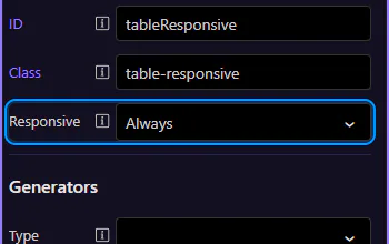
Continue with other Content topics or return to the Content menu.