Predictable parents
Content areas, sections, grids, and cards each own a specific part of the page shape.
Explore how Bootstrap 5 semantic parents, sections, cards, and forms fit together in a real page composition.
This tour uses a dedicated semantic page so you can read the hierarchy without unrelated project noise. The goal is to see the semantic parents, how they nest, and why starter blocks stay easier to edit once they emit the same roles.
A semantic page is easier to reason about because each layer carries intent. Shells hold navigation and workspace chrome, content areas hold sections, sections hold cards or grids, and specialized children like price tags or captions keep the property model focused.
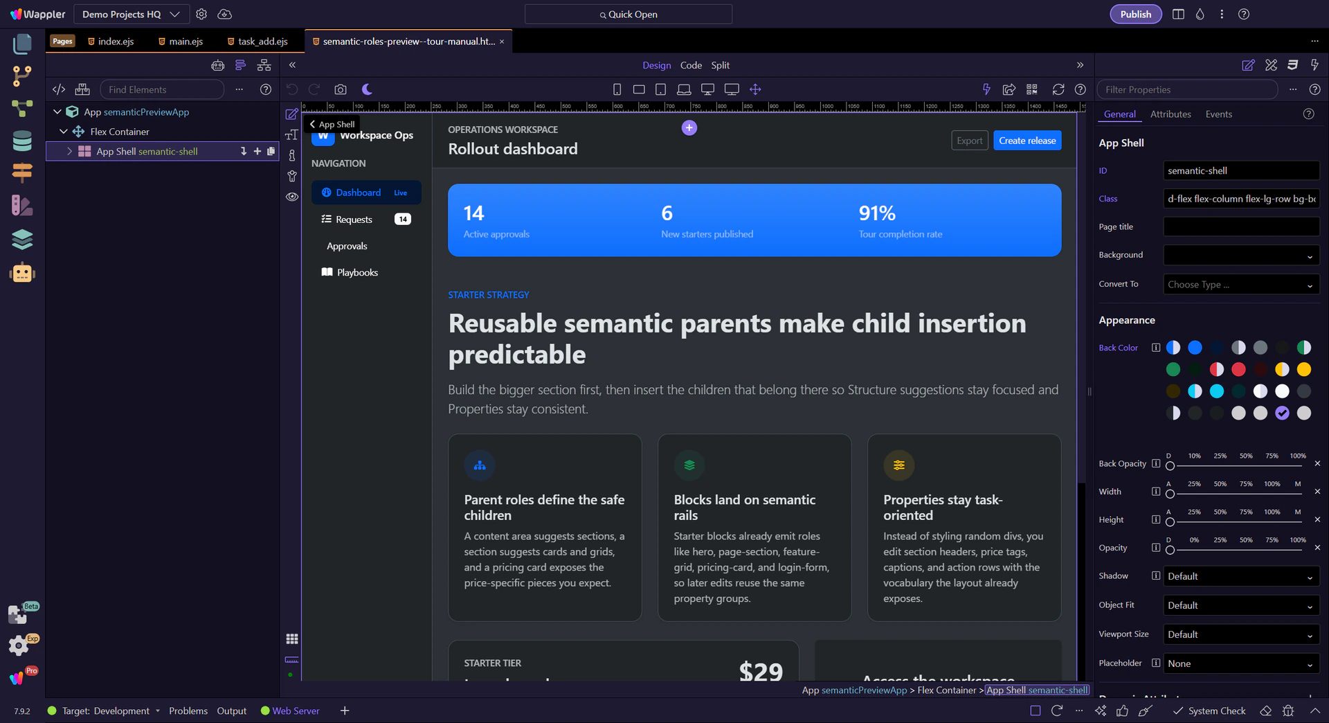
The app shell is the full workspace frame. It exists to coordinate larger chrome like sidebars, headers, and the main content surface instead of acting like just another styling wrapper.

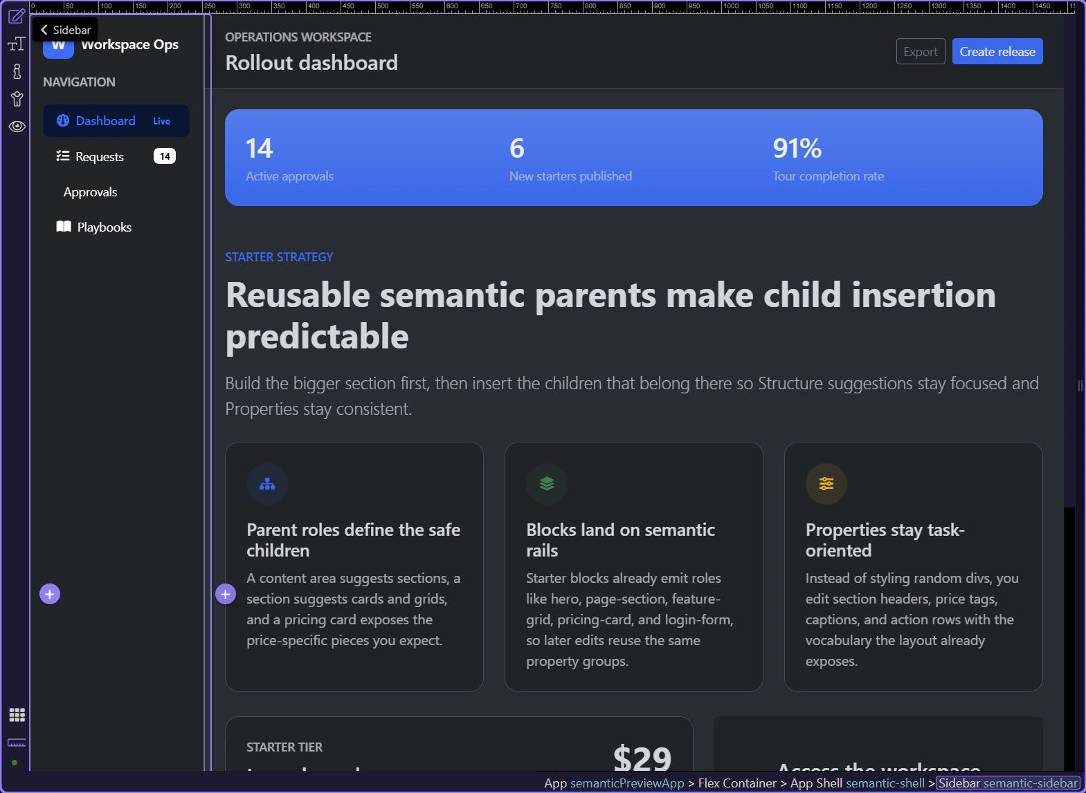
Inside the shell, the sidebar owns brand, navigation, quick status, and other persistent navigation helpers. That matters because Insert Child here can offer sidebar-specific children instead of the whole component library.
The content area is the main parent for page-level information. It is where sections, toolbars, page headers, and other work surfaces belong.
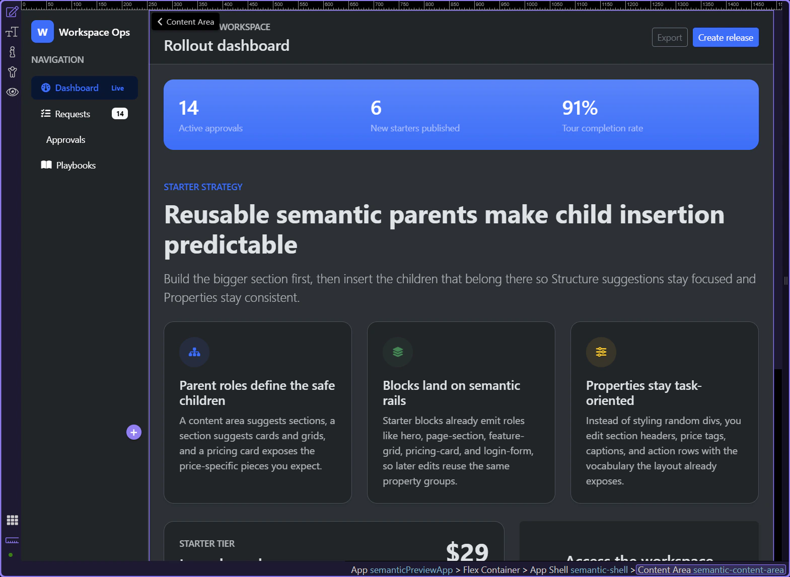
Once you move inside the content area, the hierarchy becomes more task-oriented: banner or header first, then reusable sections, then the specialized children that describe the content inside those sections.
A page header frames the current workspace or route. It usually combines the page title with an action row or supporting metadata.

A stats banner is a specialized section-like surface for high-signal metrics. It gives you a reusable pattern for status-heavy dashboards without losing semantic intent.

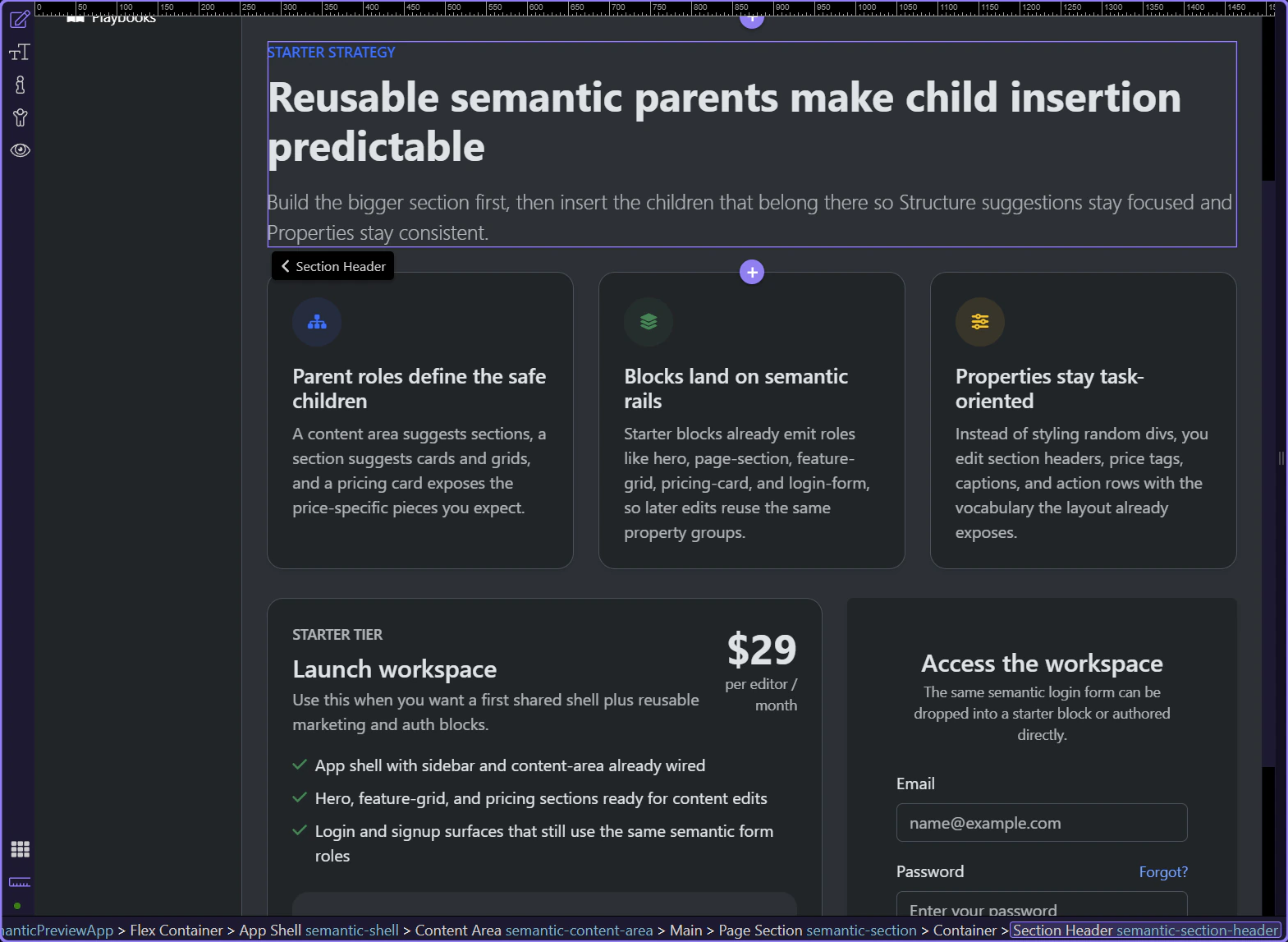
Page sections are the main narrative or workflow blocks of a page. They create a safe parent for section headers, grids, cards, callouts, and other editorial or product content.
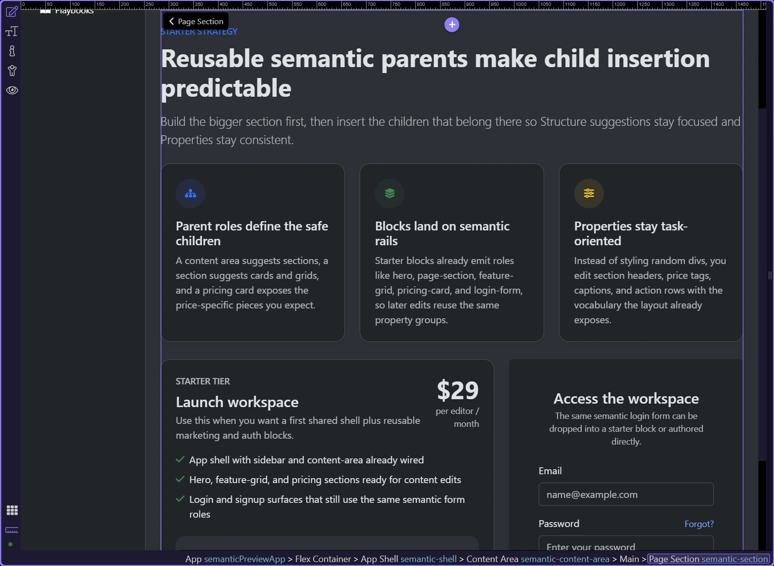
The section header groups the eyebrow, title, and lead paragraph into one reusable editorial pattern. That is why the Properties panel can present section-copy controls instead of generic text styling only.
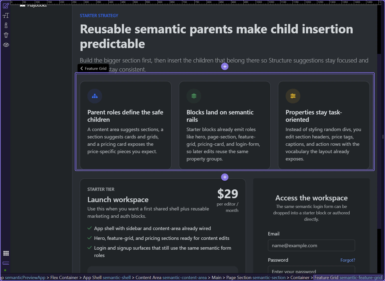
Feature grids are section children that hold repeating feature items. They are useful when one parent idea needs multiple equal-weight supporting points.
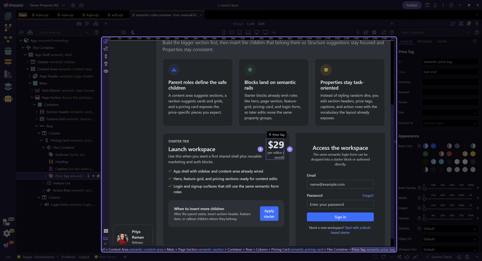
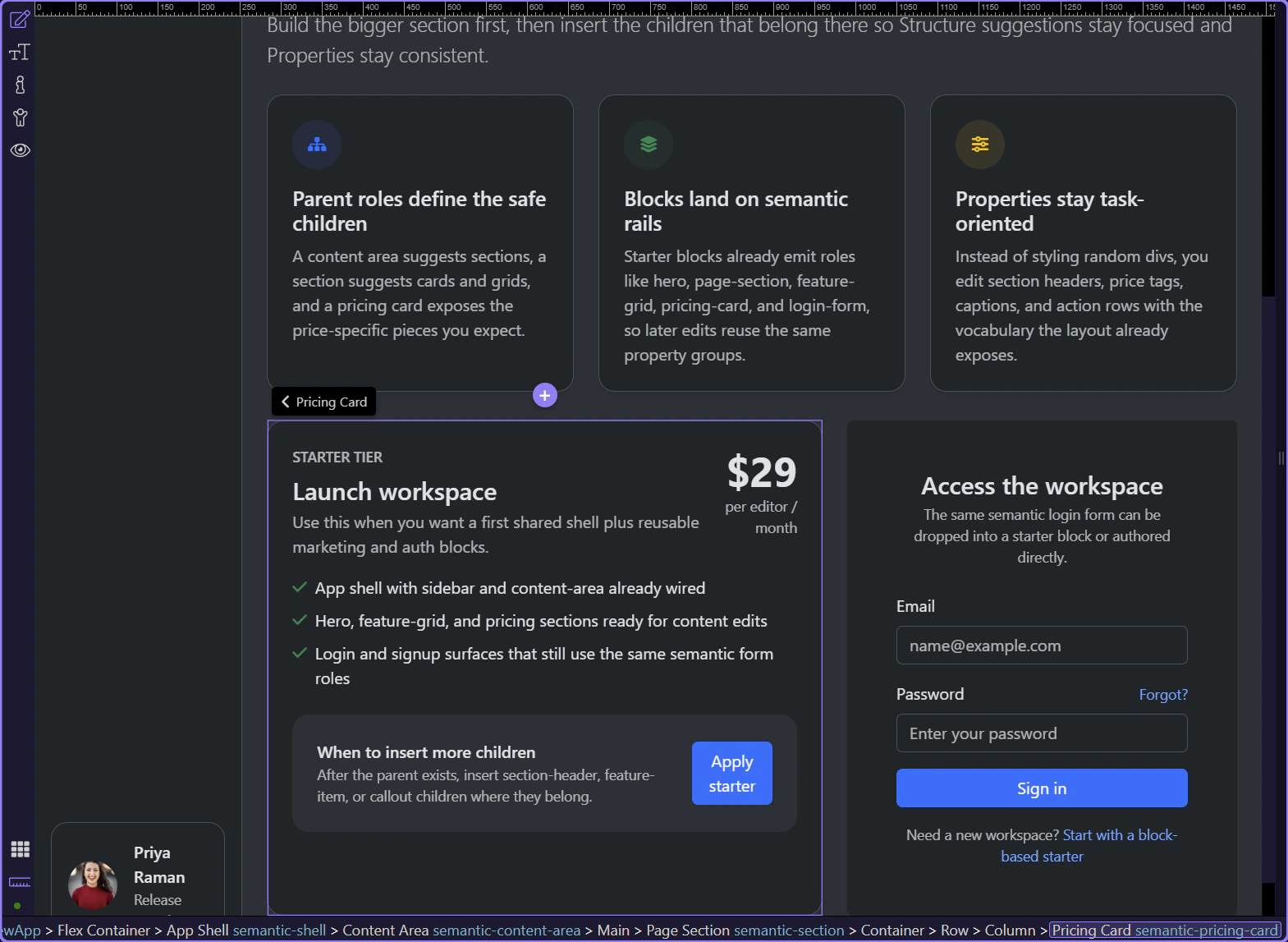
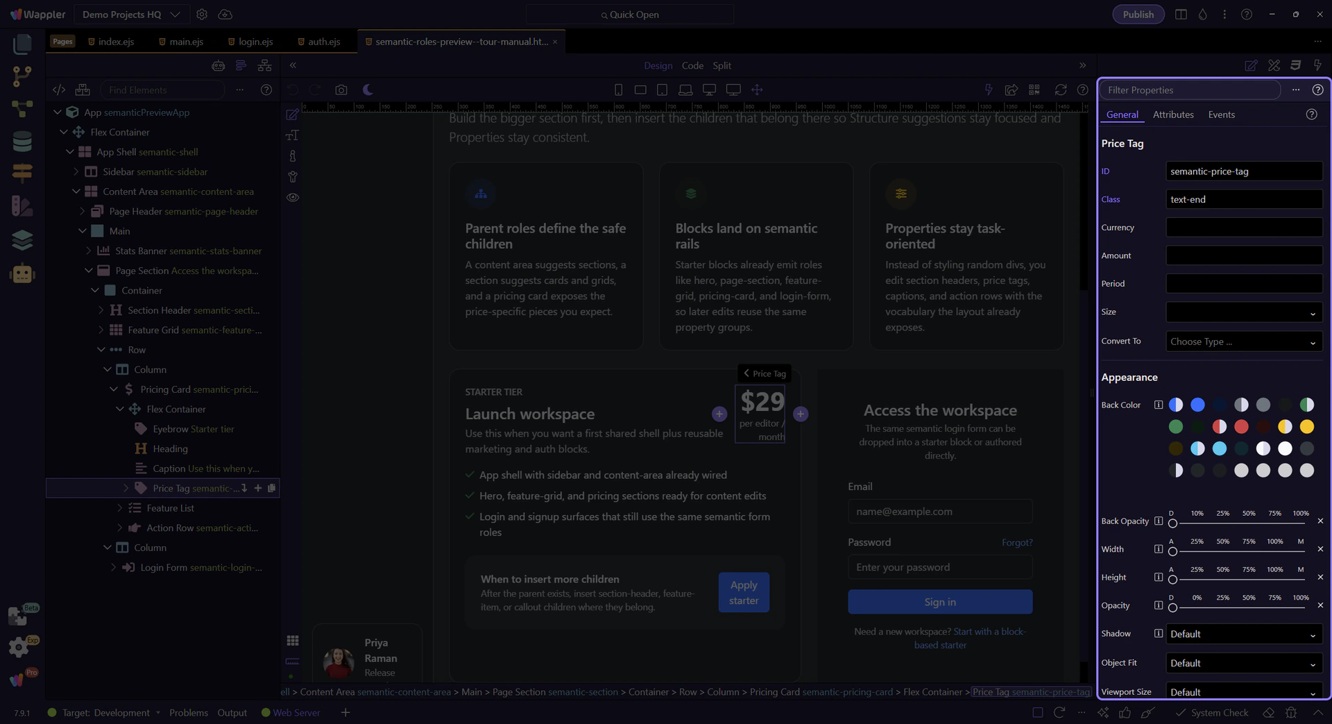
Pricing cards are more specialized than a plain content card because they expect pieces like price tags, captions, benefit lists, and action rows. This is where semantic naming starts paying off in Properties.
Login form is another specialized semantic surface. Even when it arrives from a starter block, it still exposes the same role-aware identity inside Structure and Properties.

Selecting a specialized child like a price tag shows why the role system matters: the Properties panel can focus on the thing the element means, not just on raw classes.
Now that the hierarchy is visible, the next practical step is to insert the same children through Structure so you feel how the parent-child suggestions narrow the choices.
Next, use the Structure panel to insert semantic children in sequence, then compare that editing flow with starter blocks that already arrive role-first.