Pick the right version
Make sure your project/page uses the same Bootstrap major version your templates/components expect.
Understand Bootstrap framework integration in Wappler: versions, layers, common issues, and how to choose the right setup.
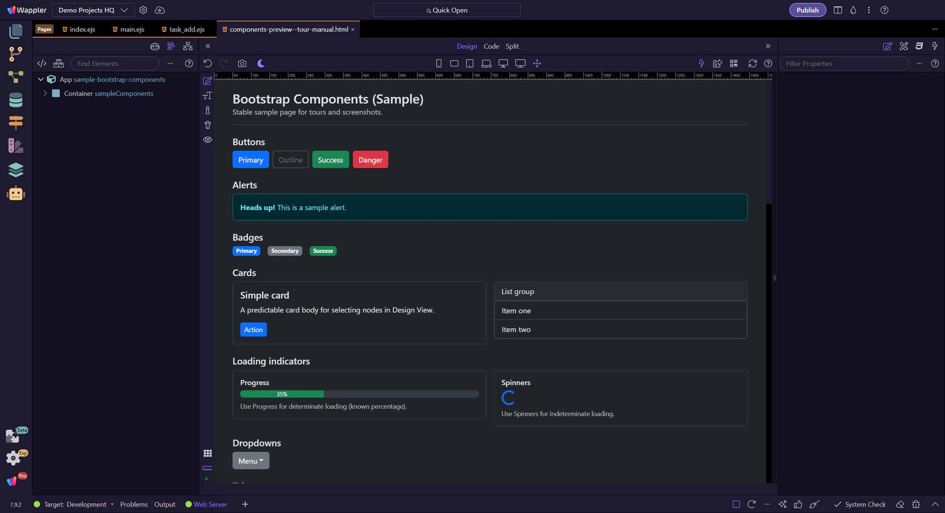
Bootstrap is the world’s most popular front-end framework, providing a responsive grid system and a wide range of prebuilt components.
With Wappler’s visual tools, you can build valid Bootstrap pages and generate clean, semantic HTML.
Bootstrap integration starts with knowing which framework versions Wappler can work with in a predictable way. This step explains why version support matters, how it affects available components and settings, and what to confirm first before you spend time building on the wrong foundation.
tip: If you don’t see Bootstrap components in the Components Panel, it’s almost always a framework selection issue (project or page).

You’ll learn:

When starting a new project, Bootstrap 5 is typically added to new pages by default. You can change this and fine-tune it in two places.
Think of frameworks in two layers:
tip: If a Bootstrap option/variant isn’t available in Properties, double-check the page frameworks and Bootstrap version.
If you run into issues, these quick checks usually resolve them:
important: For troubleshooting, Page Frameworks are the source of truth: they control what the browser actually loads on that page.

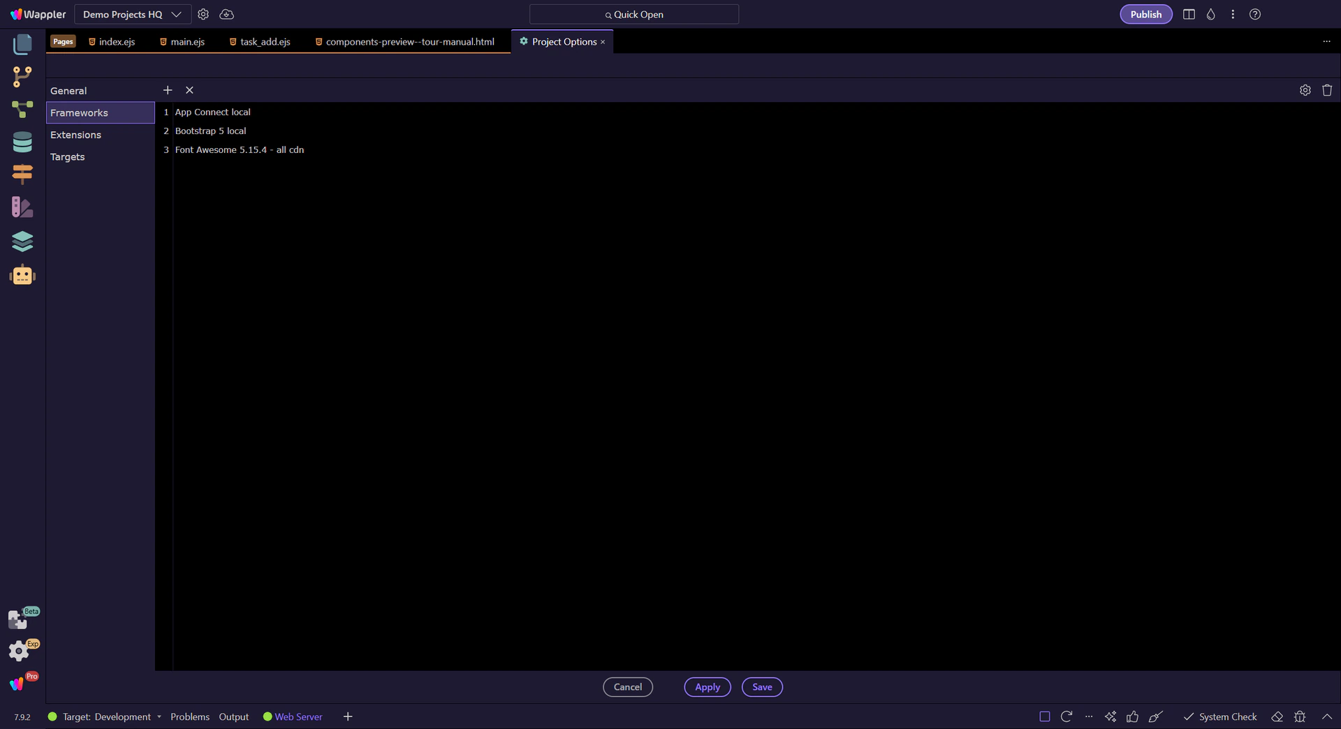
Per project you can add/remove default frameworks and choose what’s available across your project. This is where you set the default Bootstrap framework for new pages.
Start with the wider context in the top toolbar so the next control makes sense in the full workflow. In the next step, you will focus on Project Settings button and see how it fits into this area.
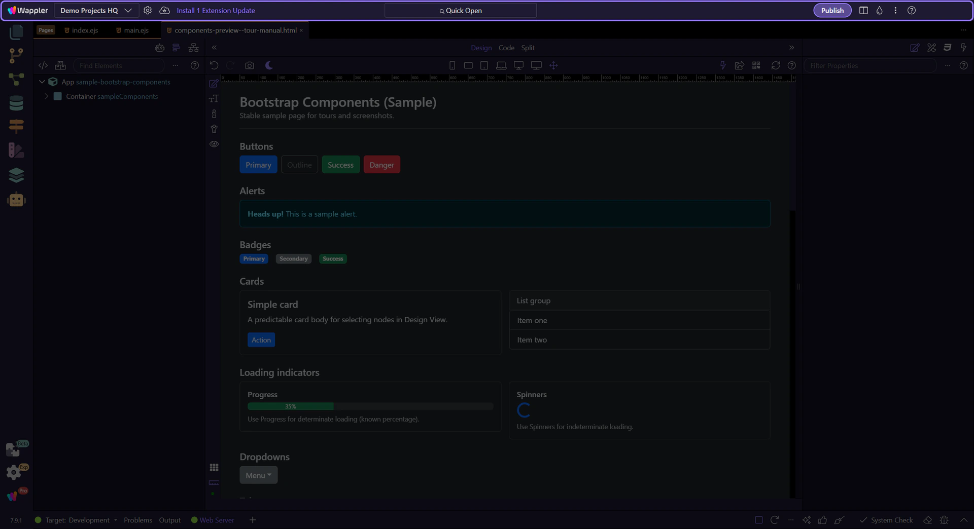
The next step opens Project Options and jumps directly to the Frameworks section. This step matters because Project Settings button is part of App Toolbar Project Settings, and understanding that context makes the next action easier to repeat in your own project.
tip: This is where you manage project-wide defaults like Frameworks.
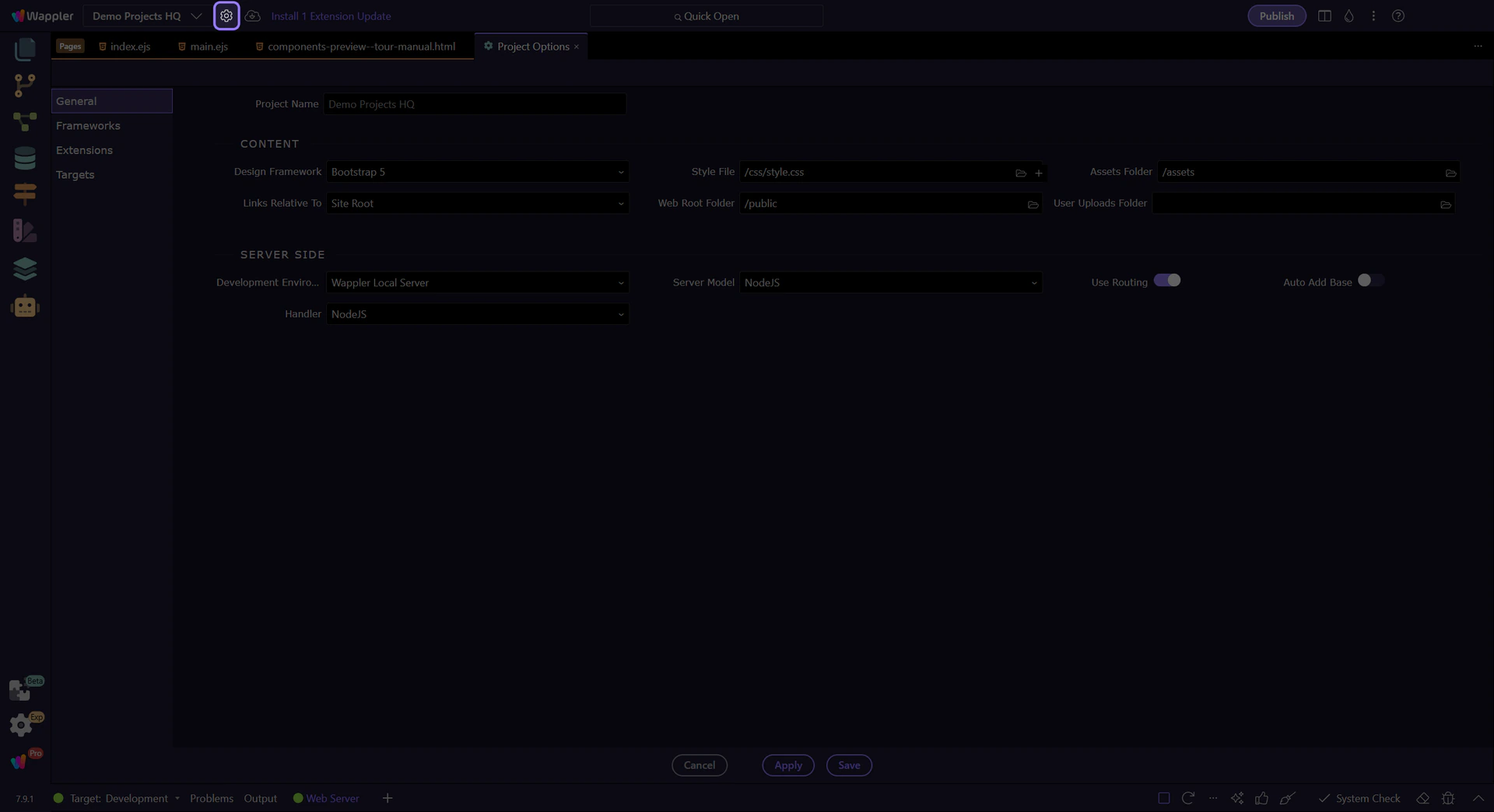
Here you can add or remove default frameworks for your project.
Typical tasks:
tip: Project frameworks define defaults and availability. Page frameworks control what’s actually included on a given page.
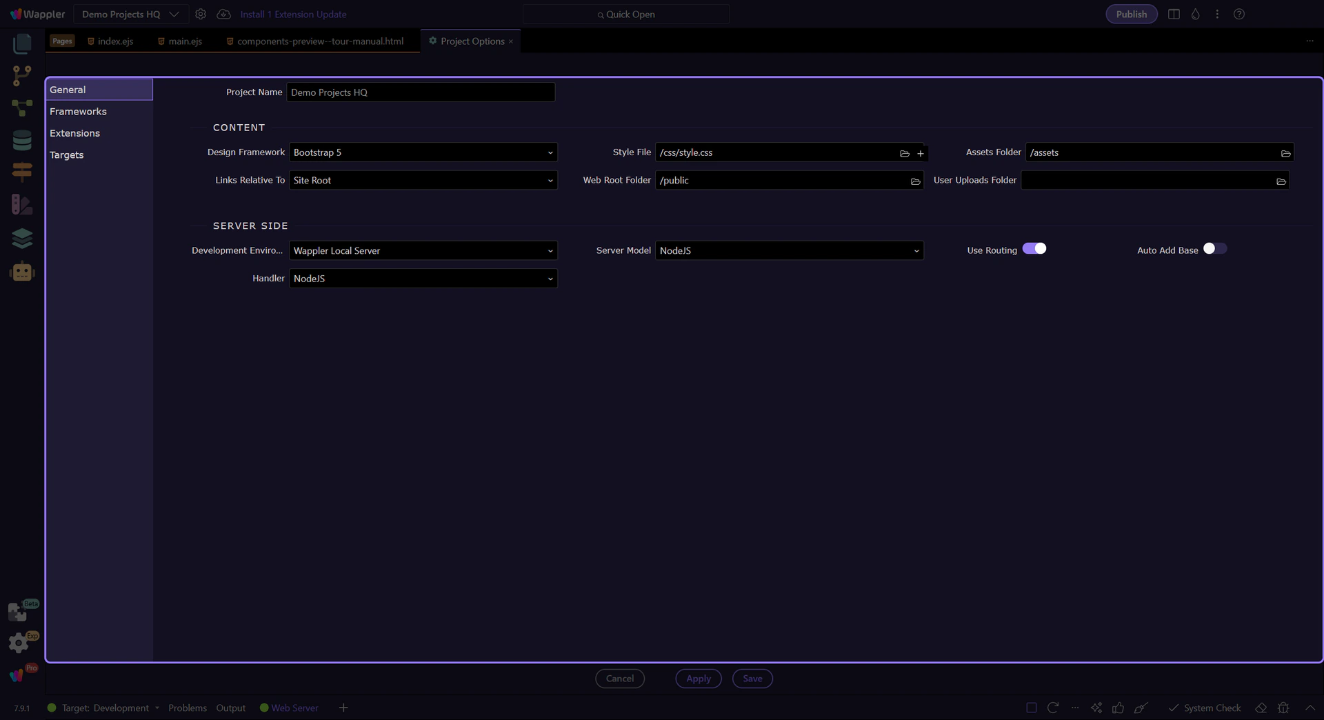
Use the sidebar to navigate between different project settings sections.
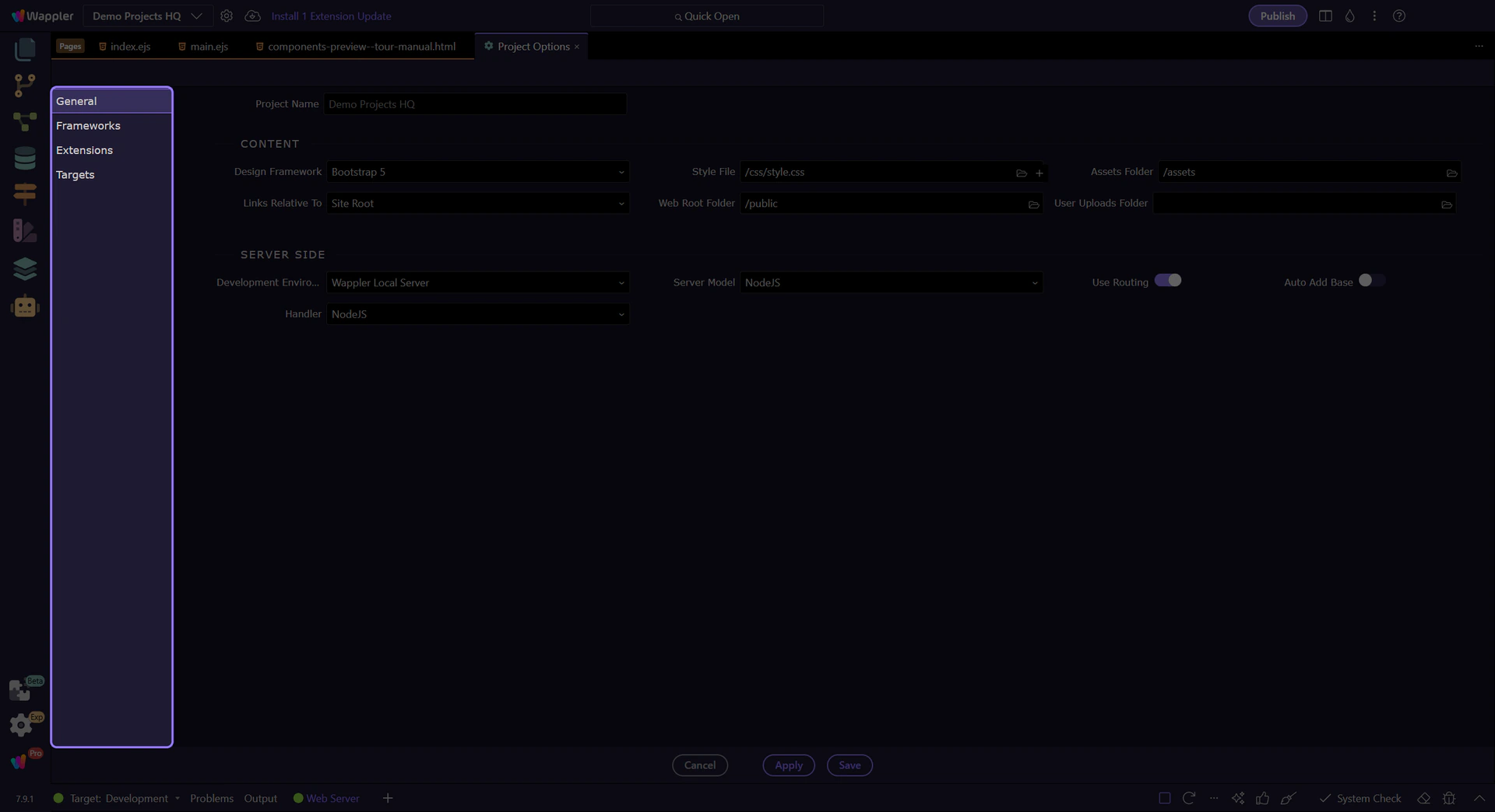
The Frameworks section is where you manage default frameworks used for your project and for new pages.
tip: If your page already exists, you still need to include Bootstrap per page (next section).
You can also include Bootstrap per page. This is where you pick the Bootstrap version for the current page and optionally select a Bootswatch theme.
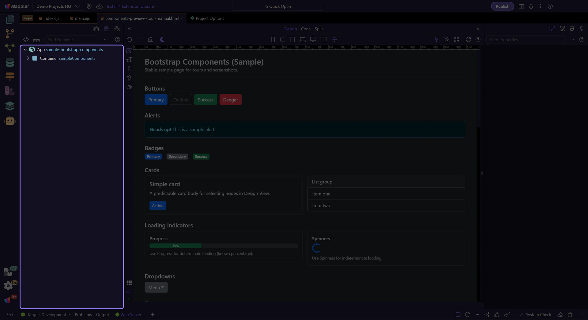
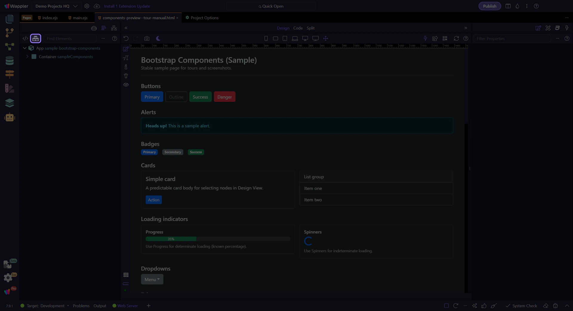
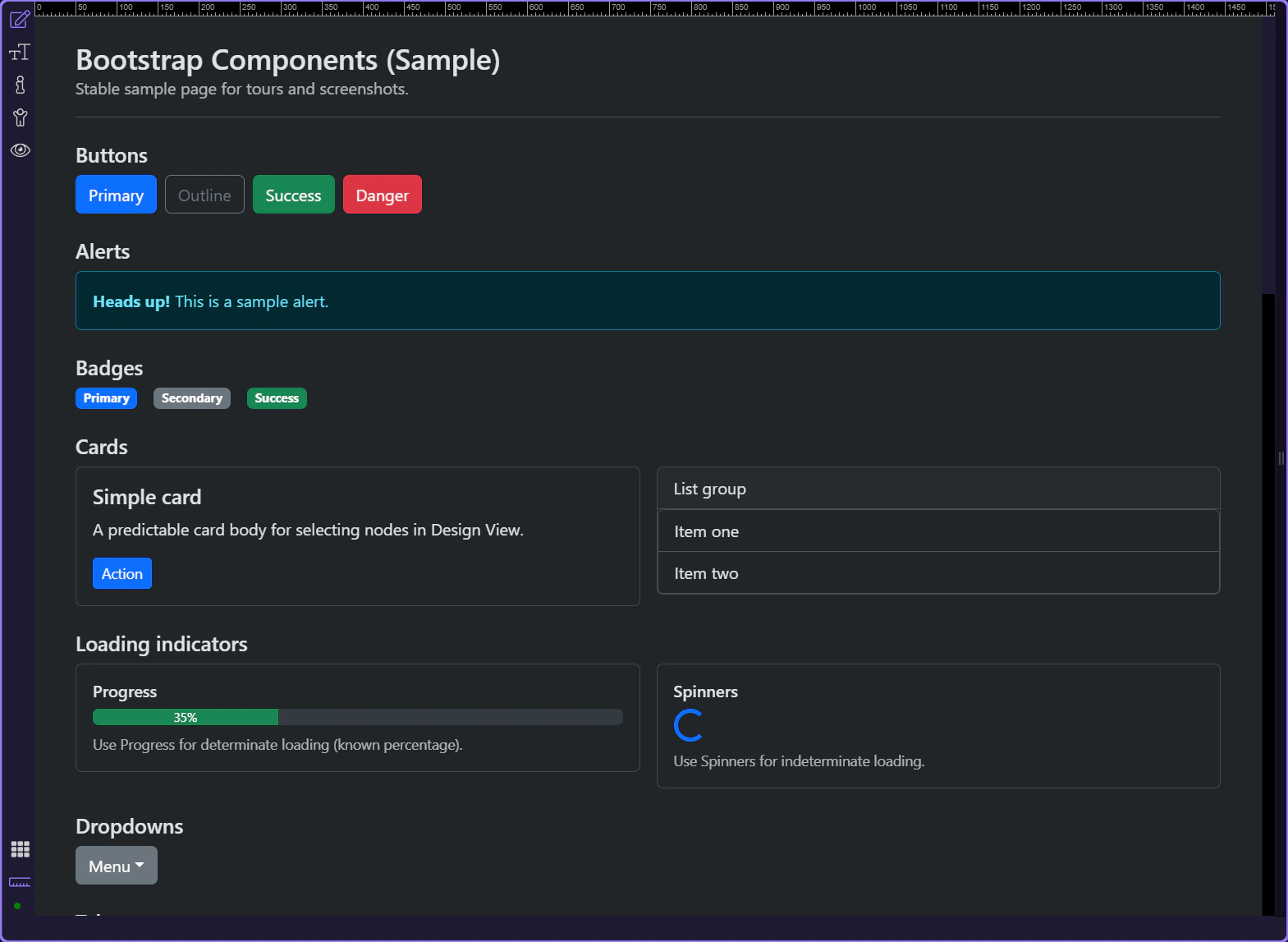
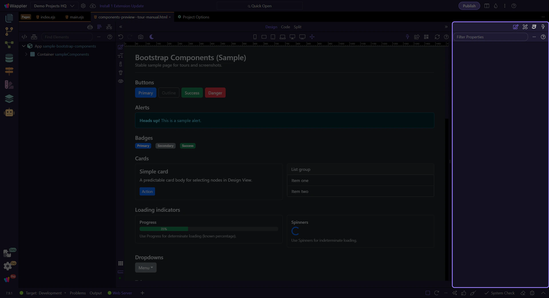
This tour uses a page with a few Bootstrap components so per-page Frameworks and visual tools have something concrete to work with.
tip: This keeps the focus on frameworks/settings, not on your project’s current page.
Use the page-level Frameworks button to include Bootstrap on this page and choose:
tip: If you’re using a purchased template with vendor folders, local/CDN aren’t enough — use “Custom Bootstrap Paths” (advanced) instead.

Start with the wider context in the Structure panel so the next control makes sense in the full workflow. In the next step, you will focus on Page frameworks button and see how it fits into this area.
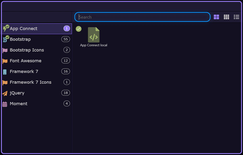
The next step opens the page-level Frameworks picker from the current page so you can choose the actual Bootstrap include for this page.
The Frameworks picker uses the same UI as the Components picker, with a left menu for filtering what can be included.
Filtering the picker to Bootstrap shows the framework includes and optional themes you can add for this page.
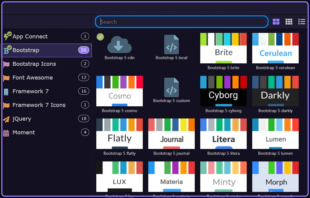
You can include a local version of Bootstrap or one hosted on a CDN (Content Delivery Network). Both are valid — choose based on your workflow and deployment needs.
Local:
CDN:
tip: You can switch between Local and CDN later from the Frameworks settings.
The next step closes the picker so you can continue.

Wappler makes working with Bootstrap easy — no need to look up classes in the documentation. Everything you need to build Bootstrap websites is available visually.
Build your Bootstrap layout visually using the layout builder tools.
Start with the standard structure:
tip: You can resize column widths visually per breakpoint using the handles in the Design canvas.
Add components to your pages visually using the smart context panel. It suggests only the components that are suitable for your current selection.
Typical flow:
tip: If the picker doesn’t show Bootstrap components, re-check project + page frameworks.
Use the Properties Inspector (Selection Panels) to style selected elements and configure Bootstrap options visually.
Examples:
tip: If you don’t see the Properties panel, open it from the Selection Panels area.
Use these focused tours next:
With Bootstrap integrated you can start building responsive layouts and adding components visually in Wappler.
Quick checklist:
tip: If something looks wrong visually, verify the included Bootstrap version and whether the page is using Local/CDN as intended.

You’ve connected Bootstrap to your project and learned where to control project vs page frameworks. Next, build confidence with hands-on tours.
Pick a focused tour based on what you want to build next.

You can return to the Bootstrap tours index to pick another topic anytime.
