
Diagnose layout issues quickly
Most “broken grid” problems come down to container/row/column nesting or conflicting spacing utilities—check those first.
Build responsive layouts with containers, rows, and columns, and learn the common Bootstrap grid pitfalls to avoid.
In this tour we’ll review the key Bootstrap layout primitives (container → row → columns) and what matters in Properties. Then we’ll finish with a quick “common pitfalls” checklist.
Layout is mostly about choosing the right parents (container → row → columns). Containers set the page width and align content.
tip: Start with a container, then add rows, then columns.
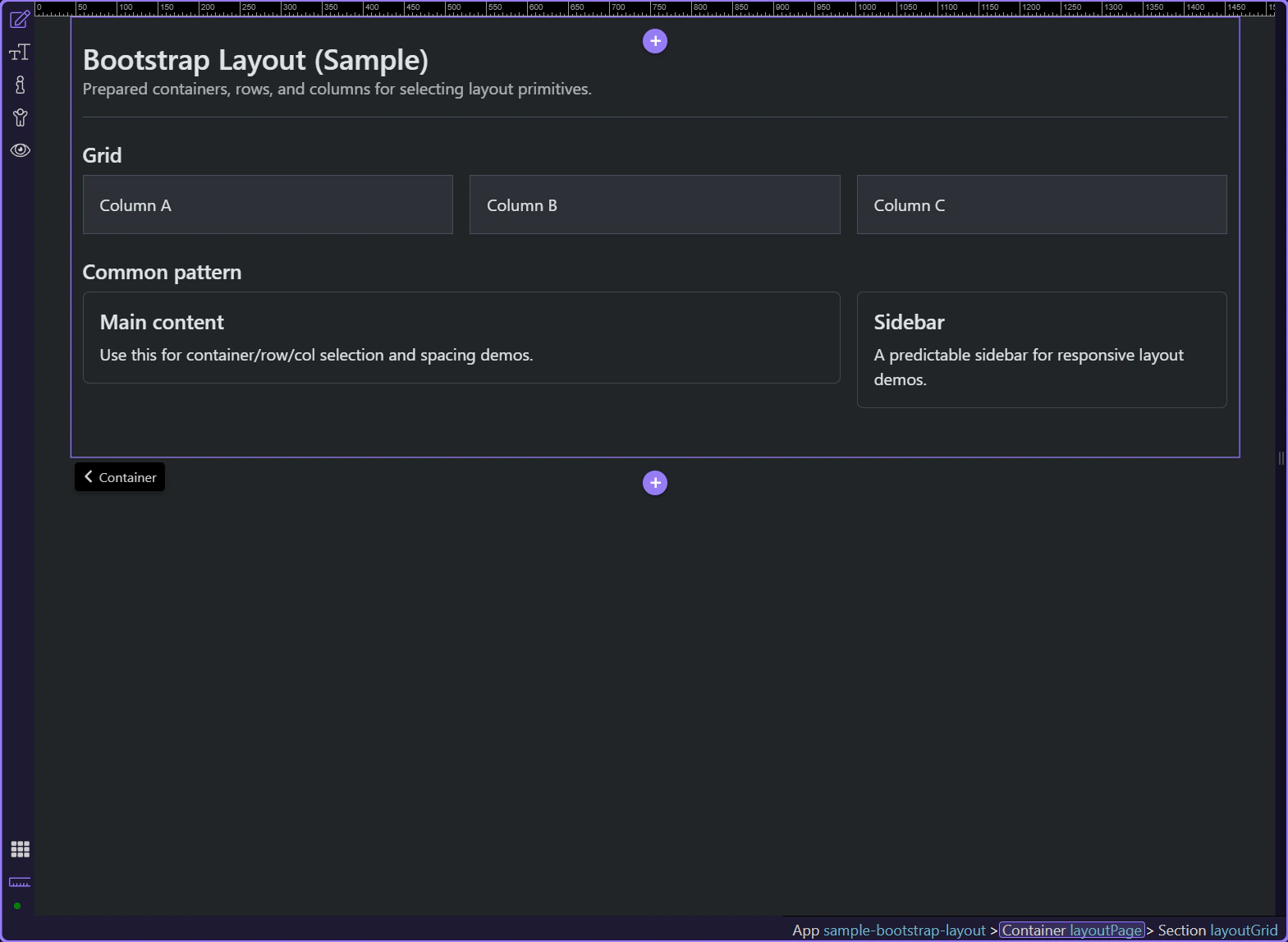
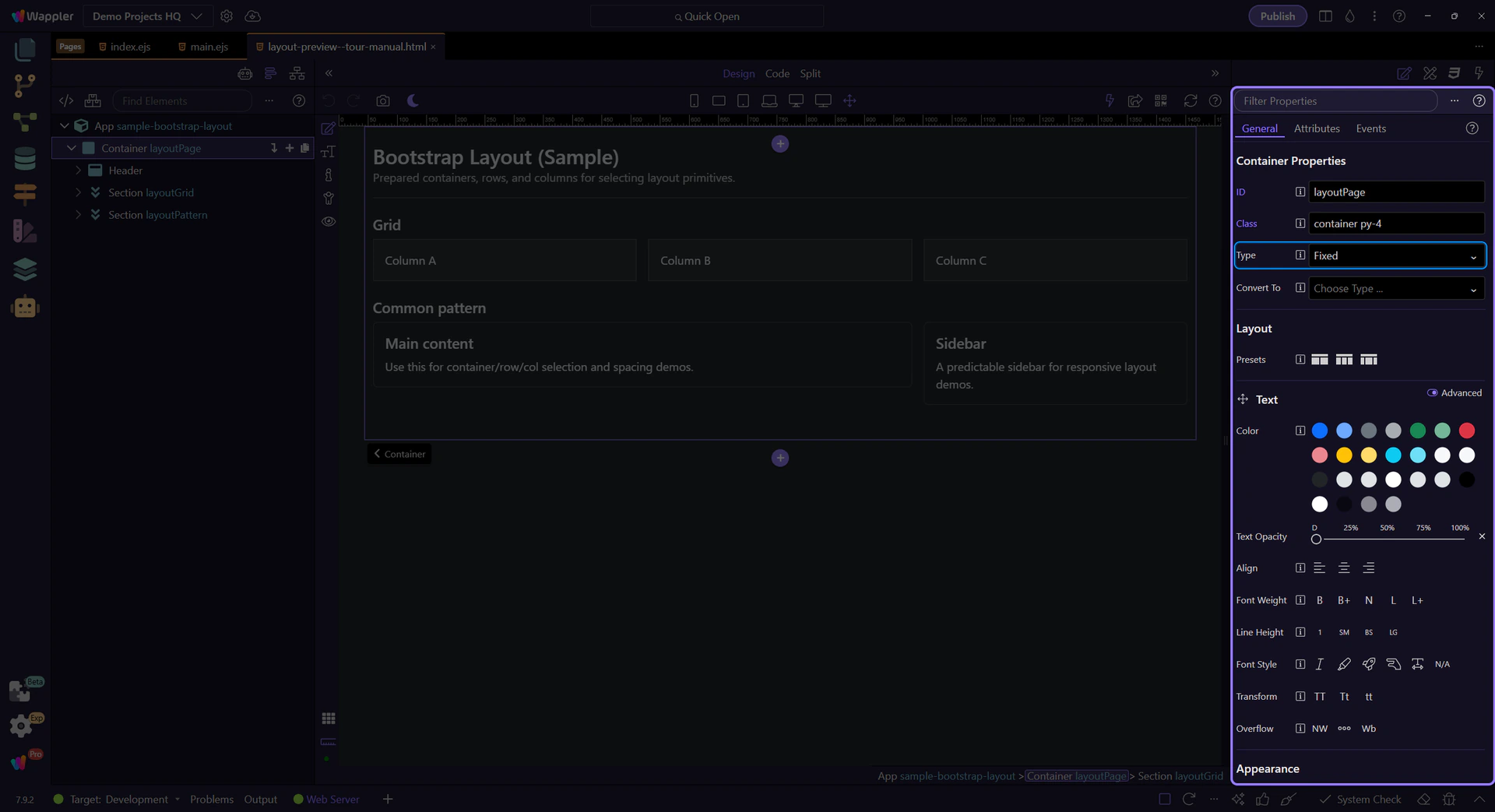
In Properties, use Type to switch between a fixed container and a fluid container.
tip: If your layout feels too wide/narrow, start by checking container vs container-fluid.
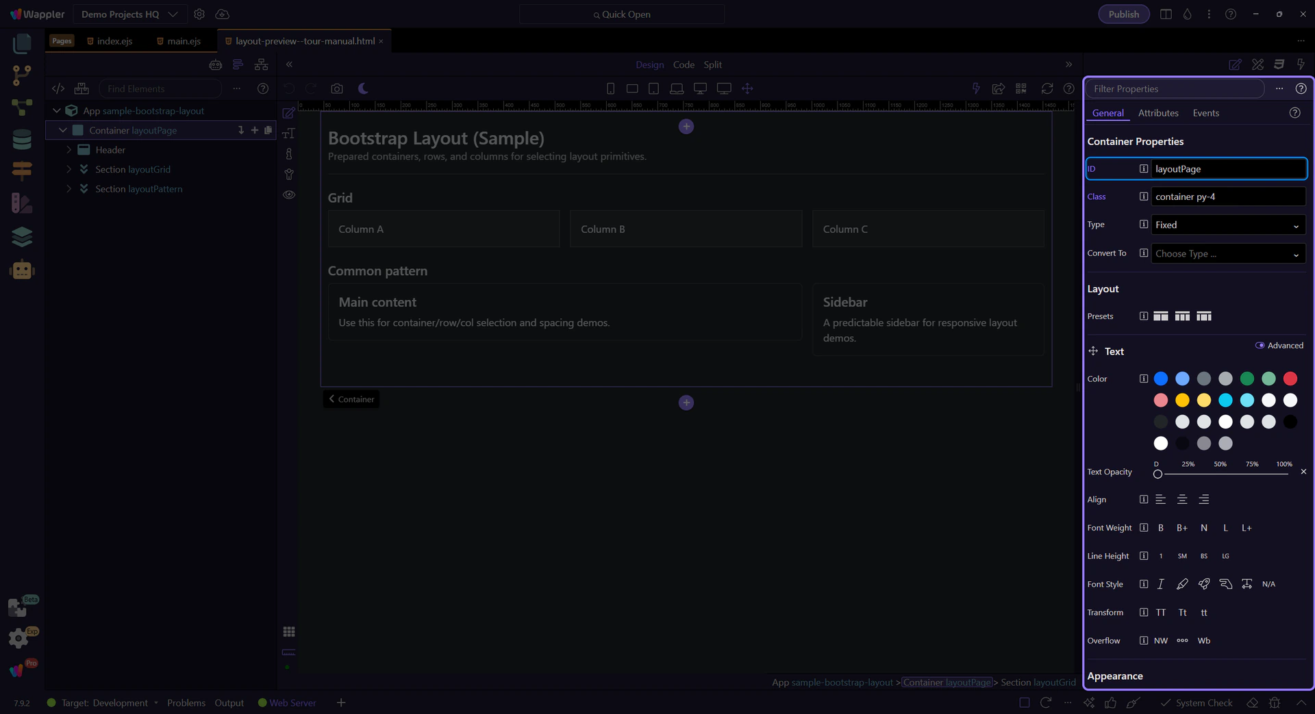
Use ID for stable hooks (testing/JS) and deterministic selection.
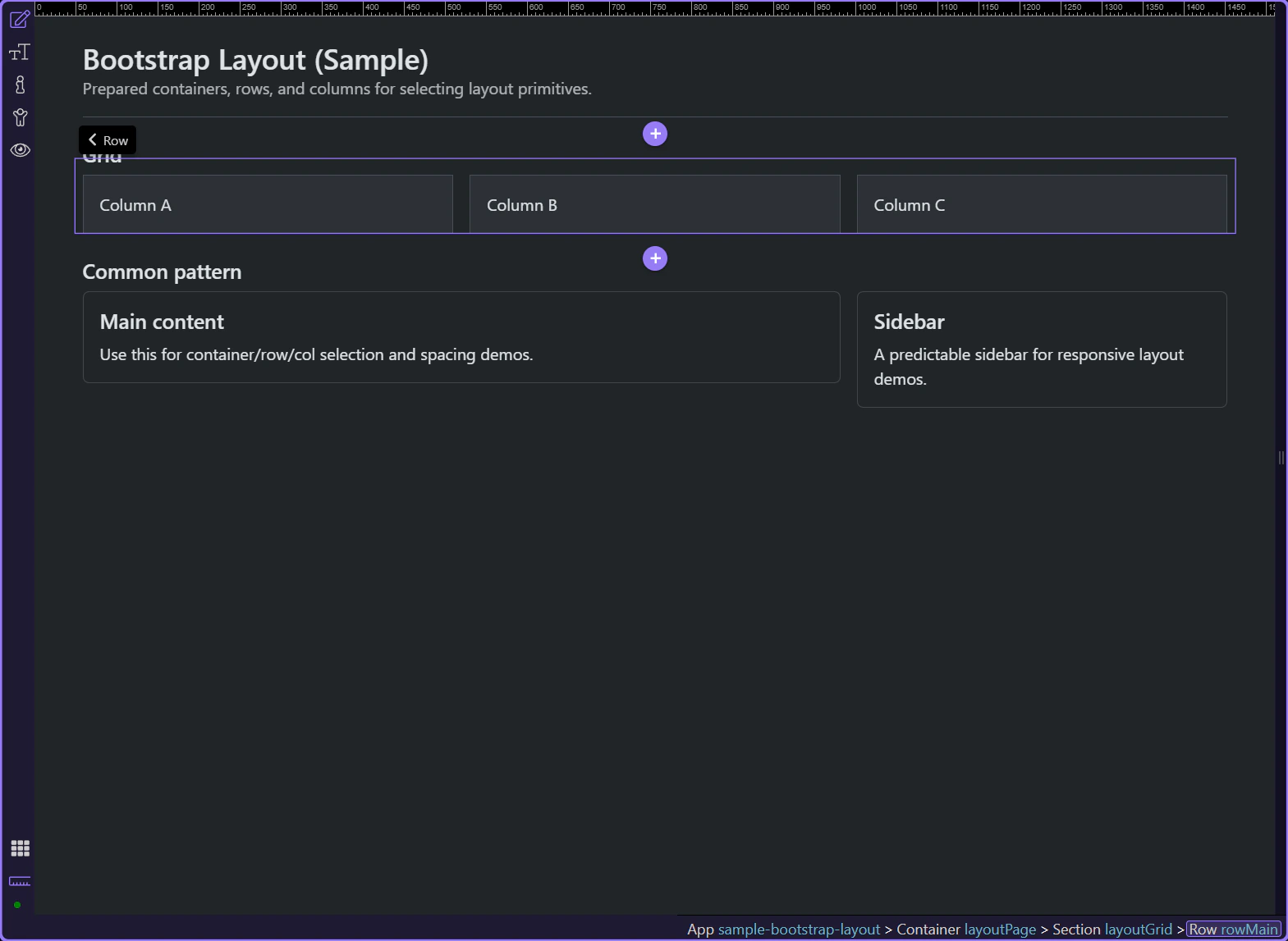
Rows group columns and define gutters between them.
tip: Rows are about grouping and gutters; columns are where you define widths.
Use the Columns presets to quickly generate a common column layout.
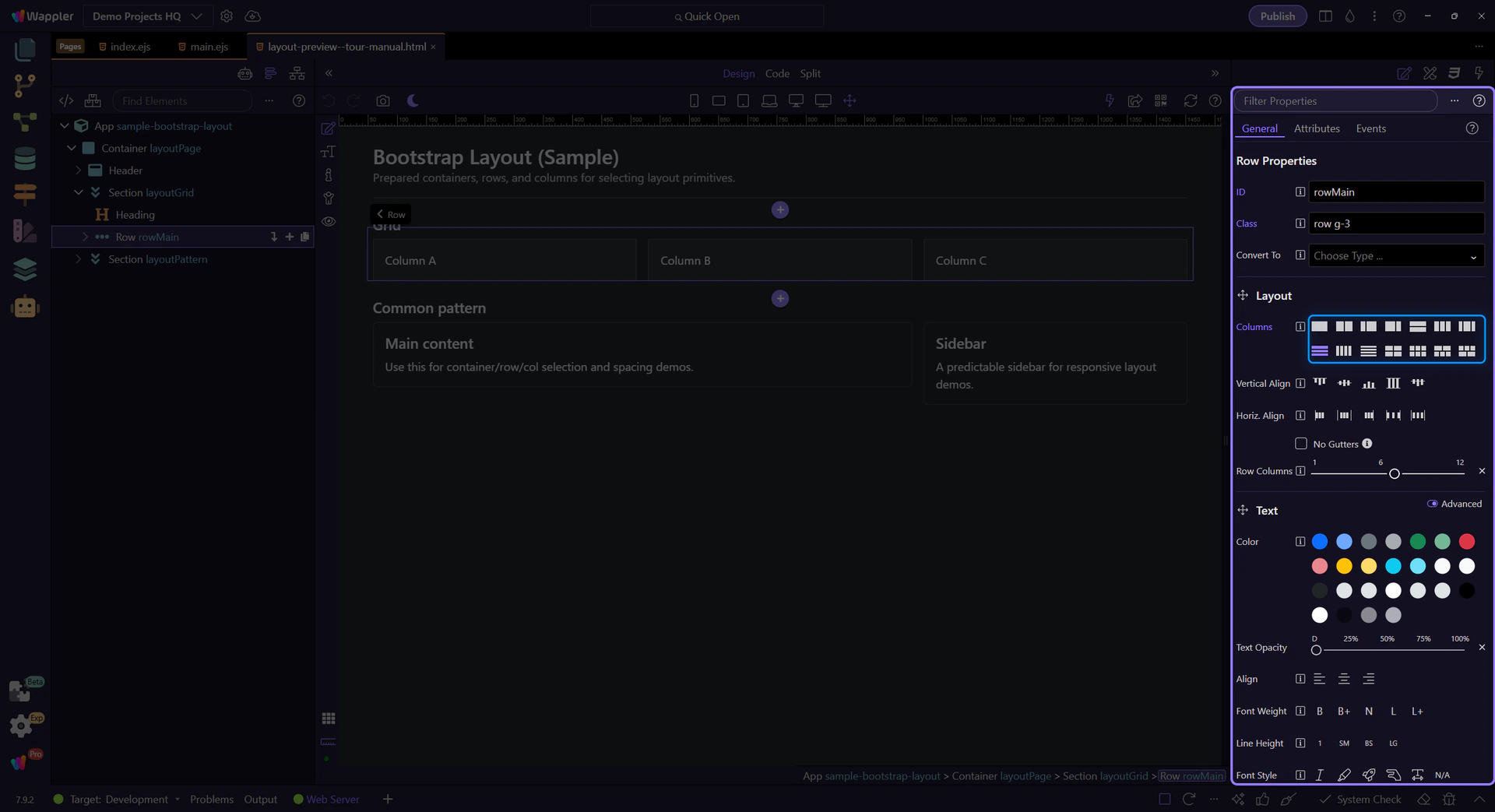
Columns define responsive widths (for example, full width on mobile and split on desktop).
tip: Mobile-first: start with col-12, then override at md/lg/xl only when needed.
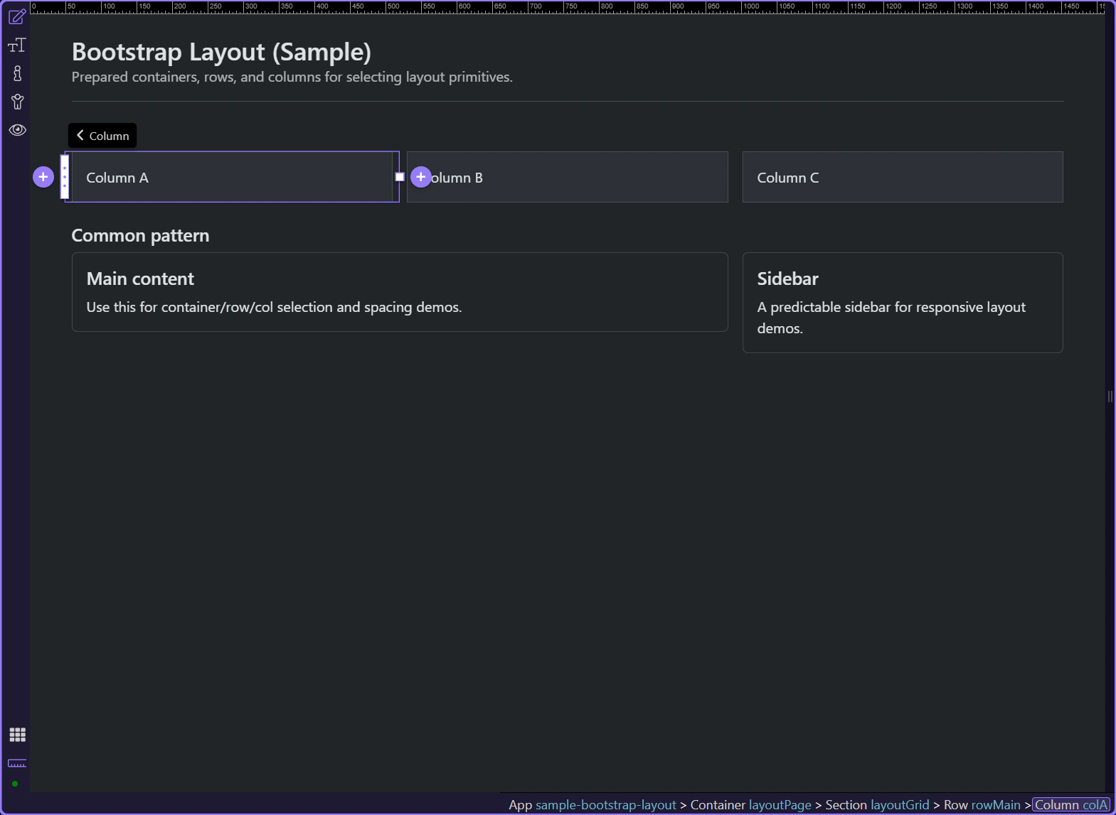
Real UI goes inside columns. Style and configure the actual content elements (text, buttons, cards) inside the column.
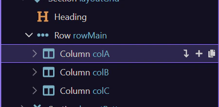
Bootstrap layout is about the hierarchy: container → row → columns. Get that right first, then use utilities to fine-tune spacing and alignment.
Use this checklist when the grid looks wrong or spacing feels inconsistent.
tip: Tip: design mobile-first; add md/lg overrides only when needed.
Continue with a related tour or go back to the Bootstrap tours index.