
Toggler ↔ Collapse wiring
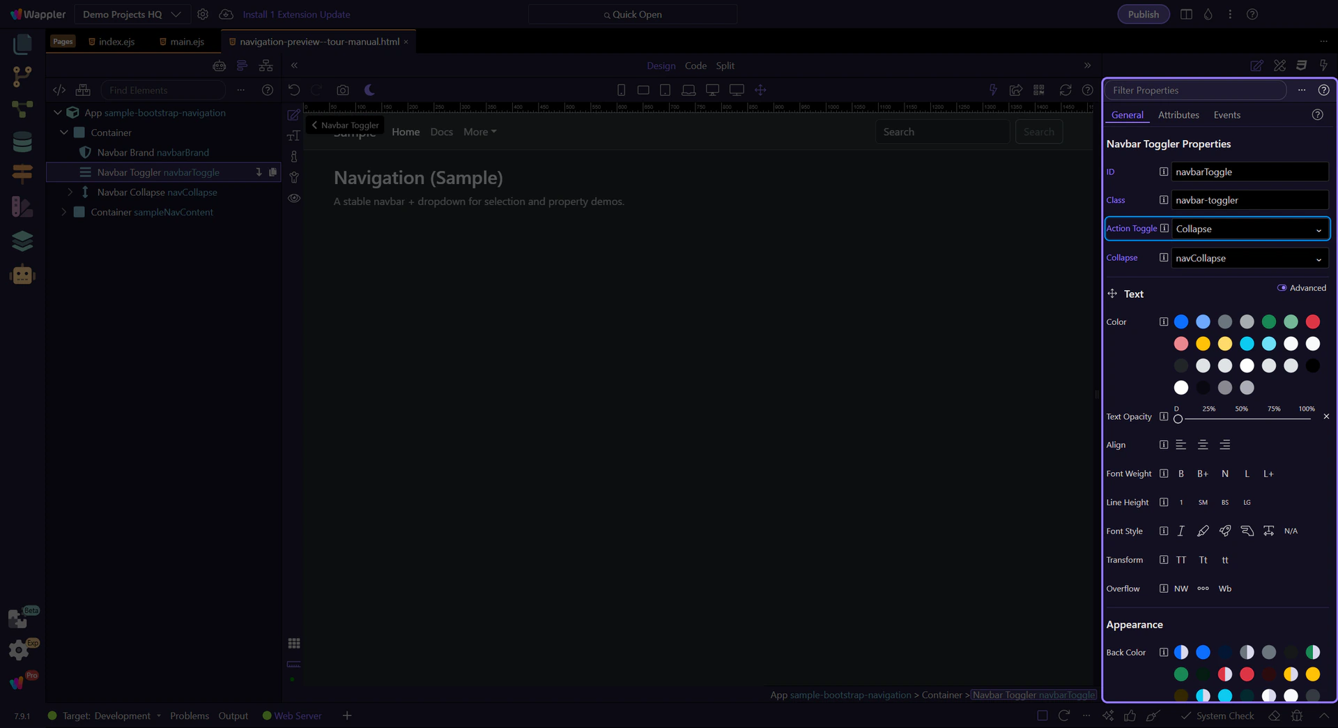
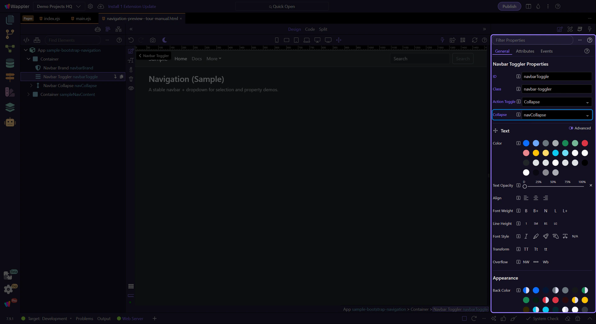
The toggler must point to the collapse container id, and the collapse must have the matching id.
Build a responsive Bootstrap navbar with brand, menus, toggler, collapse behavior, and alignment options.
In this tour you’ll build a practical mental model for Bootstrap navbars: the main navbar, toggler/collapse wiring, and the key Properties to control layout and behavior.
Navbars combine branding, navigation, and responsive behavior (collapse/expand). They’re built from a few nested parts that each have their own responsibilities.
tip: Most global navbar styling is on the
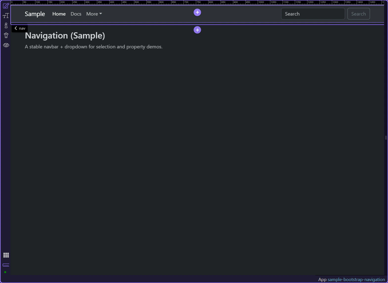
Navbar theme styling is controlled from the selected navbar in Properties and maps to Bootstrap’s data-bs-theme behavior when exposed. Select the navbar and review the available theming and styling options on the component.
tip: Most global navbar styling is on the
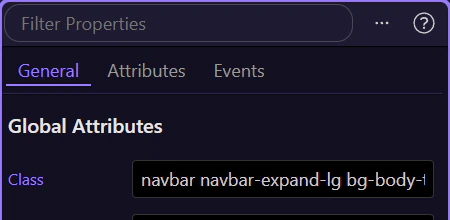
Use the selected navbar in Properties to review how it expands and collapses across breakpoints. This is where you confirm the responsive expansion behavior for the main navigation.
tip: If collapse behavior is wrong, inspect the toggler button together with the collapse container IDs and targets.
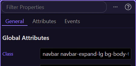
Review the selected navbar in Properties to control how it behaves in the page flow, including standard, fixed, and sticky positioning options.
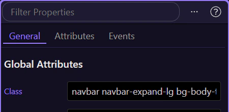
Use the selected navbar in Properties to confirm or assign a stable ID when you need reliable targeting for scripts, testing, or linked behaviors.
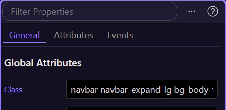
The typical structure is: brand + toggler + collapse + nav list. Configure each part in Properties to get the behavior you want.
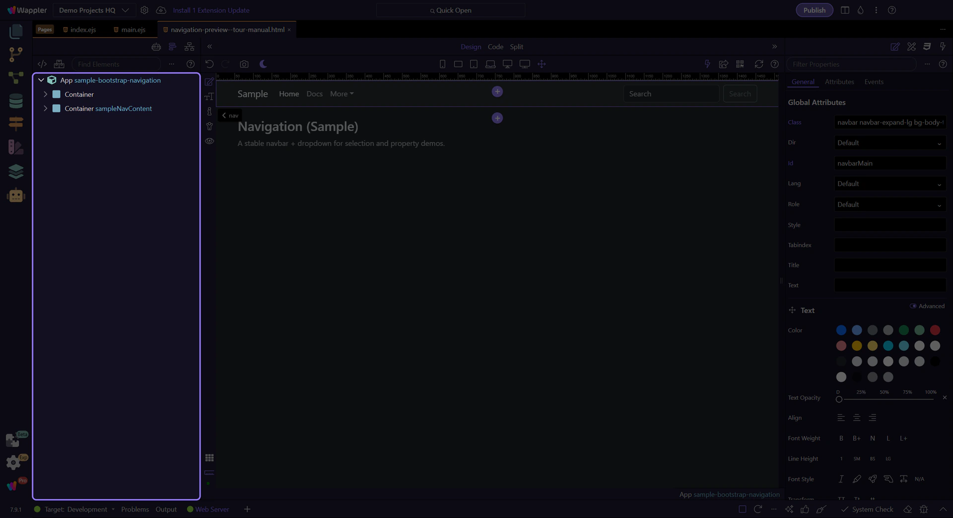
The brand link is the logo/title area and is often the primary route back to home.
tip: Brand is usually a normal link; focus on href, text, and optional image/icon.
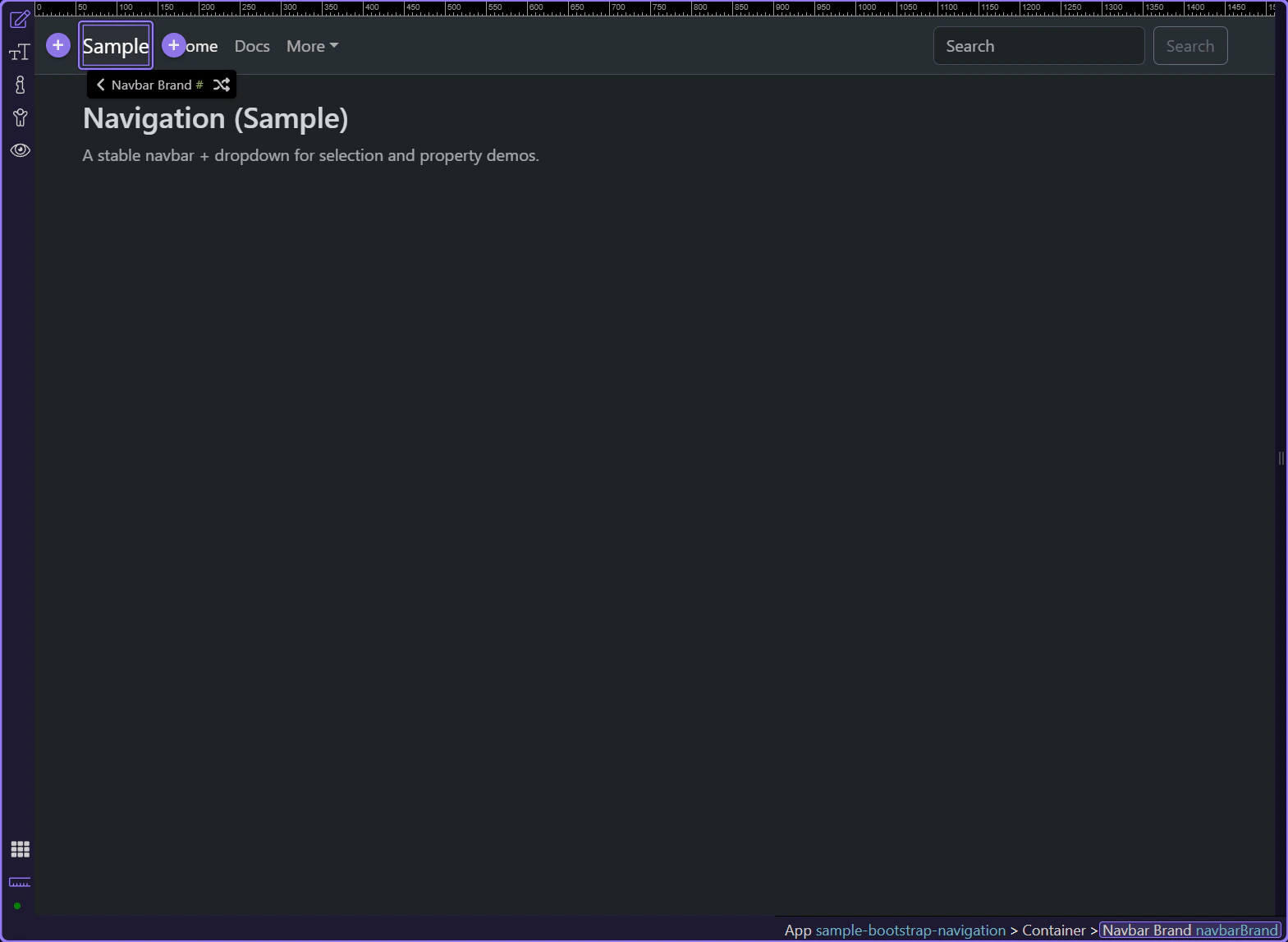
Use Link (navbarBrandHref) to set the destination for the brand.
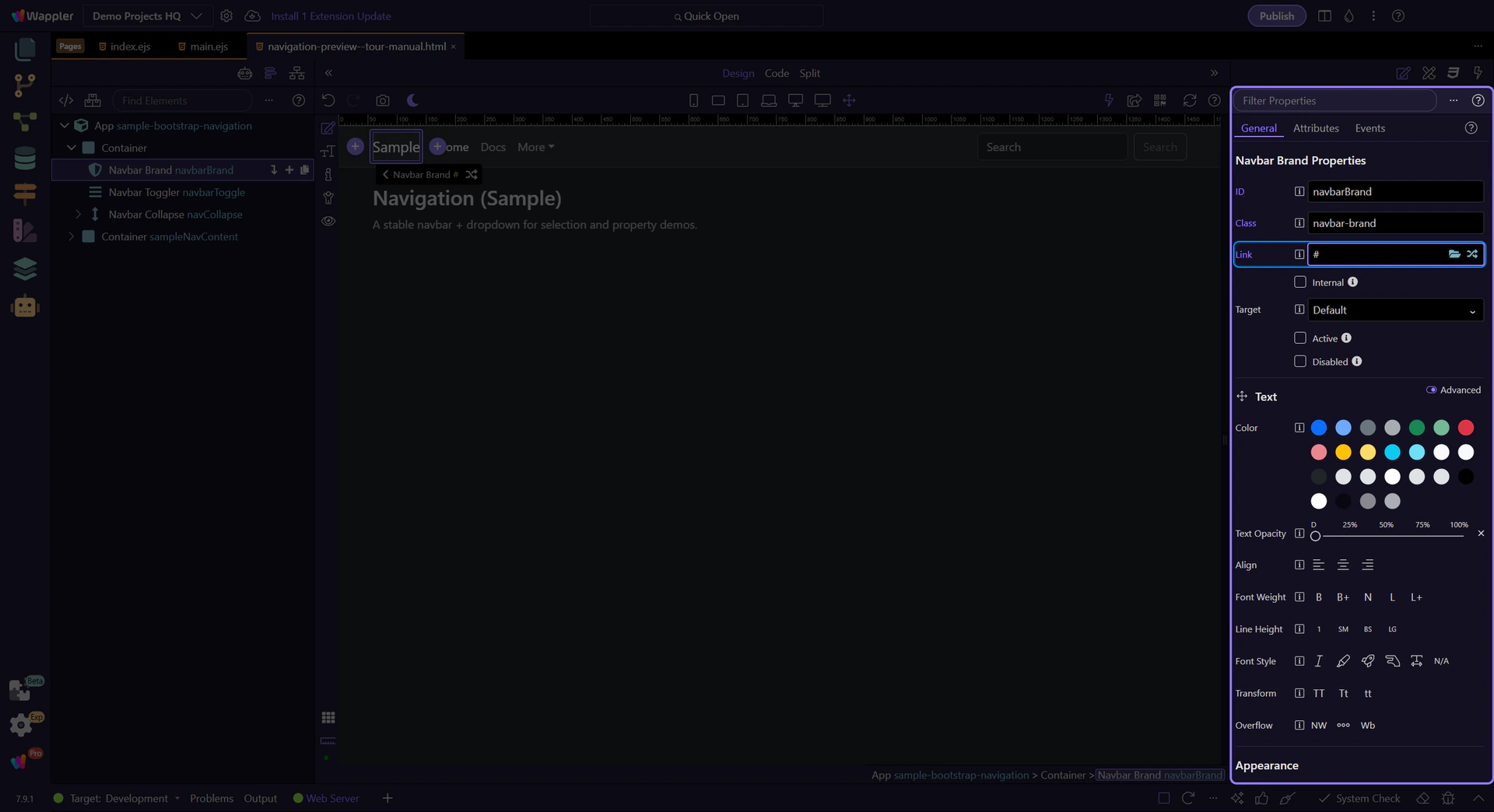
Use Target (navbarBrandTarget) when you want to open the link in a new tab/window.
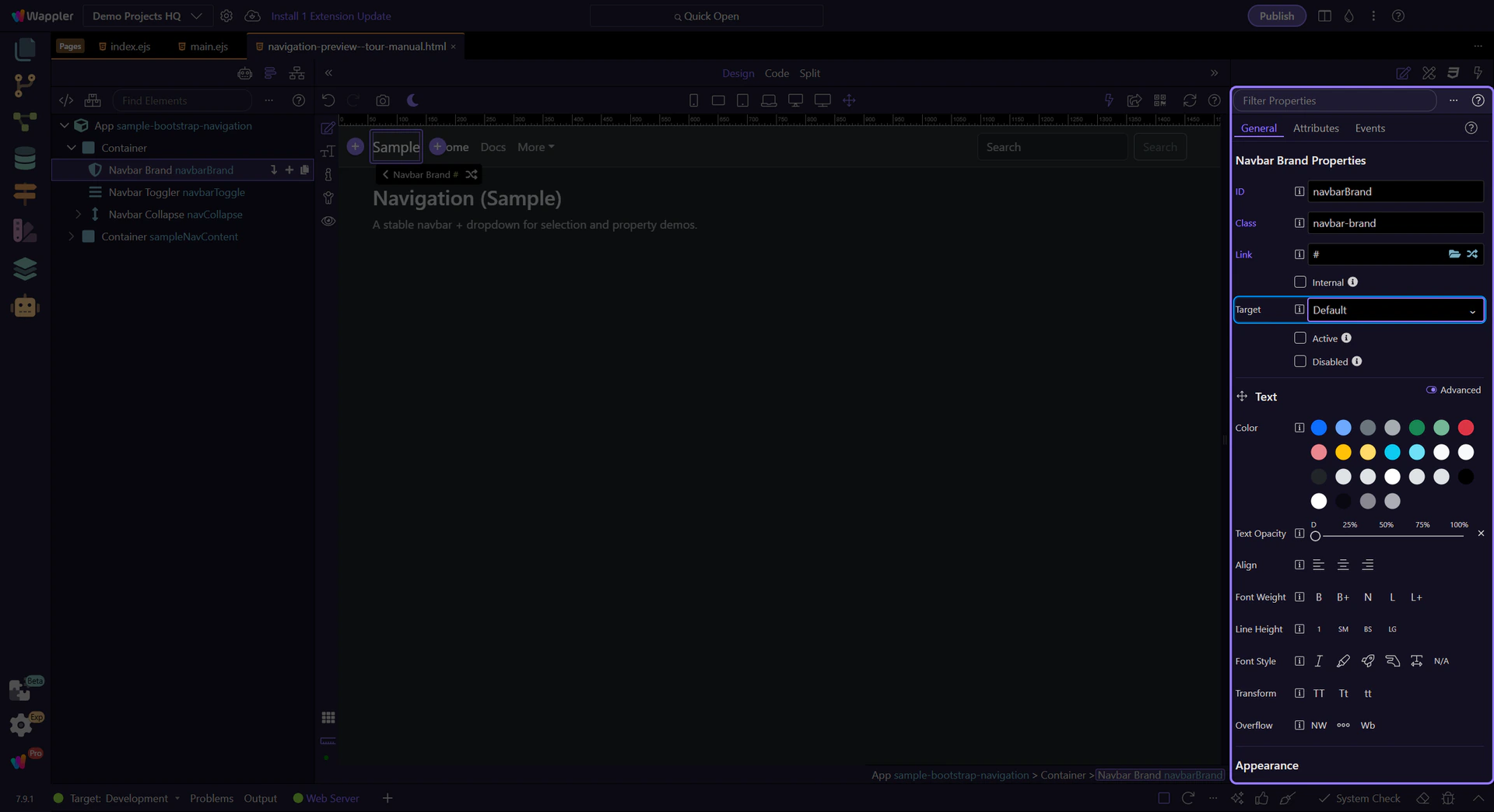
The toggler controls the collapse behavior at smaller widths.
important: The toggler must point to the collapse element via data-bs-target / aria-controls.
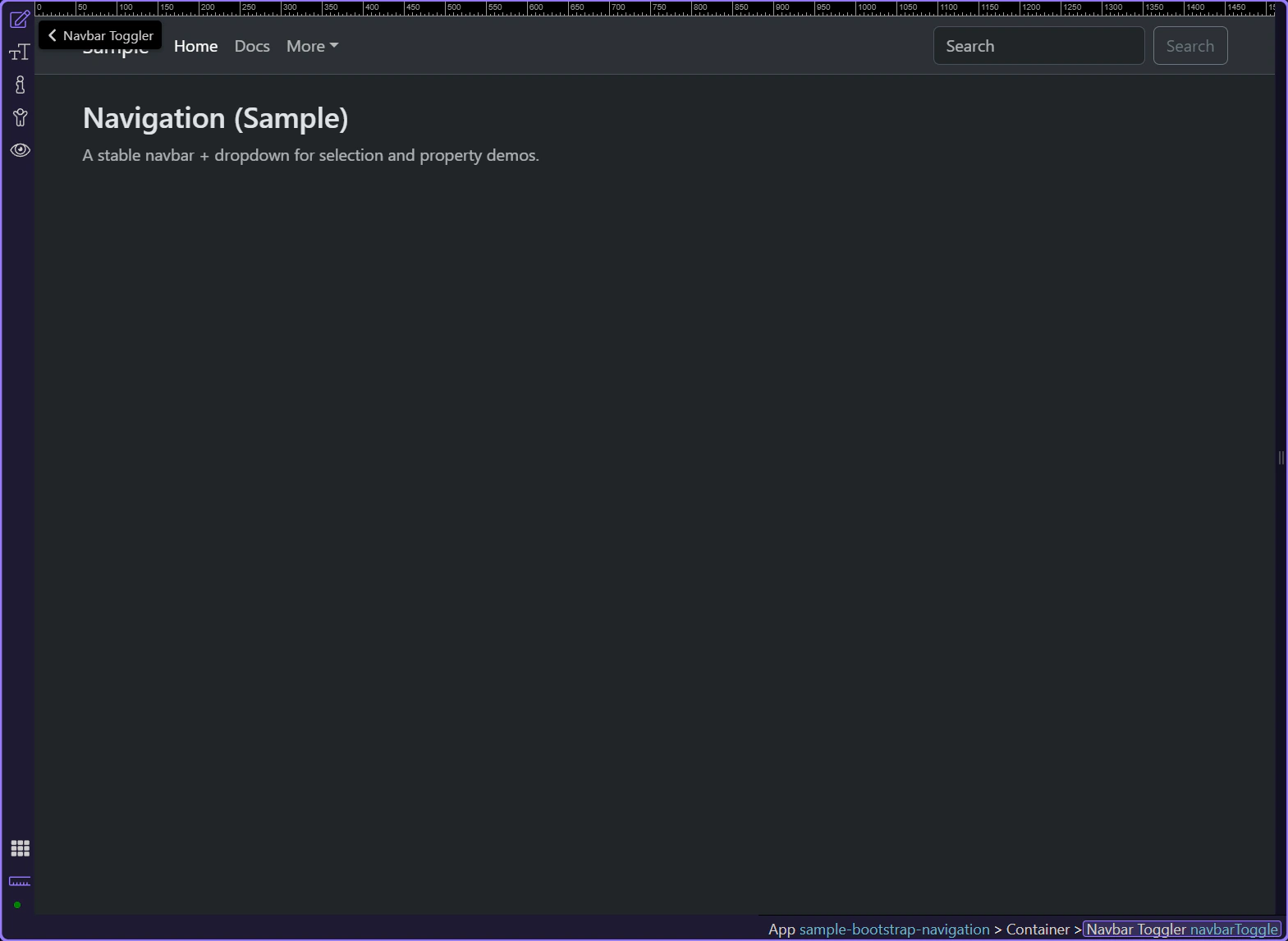
Use Action Toggle (btnDataTooggle) to ensure the button is configured for Collapse.
Use Collapse (btnToggleTargetCollapse) to point the button at the correct collapse container.
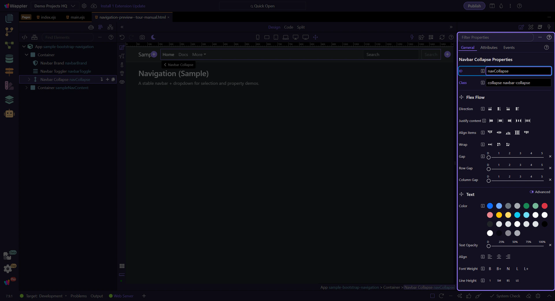
The collapse container holds the navigation items that are shown/hidden at smaller widths. Its ID must match the toggler’s collapse target.
important: Collapse ID (
theId) and toggler target (btnToggleTargetCollapse) must match.
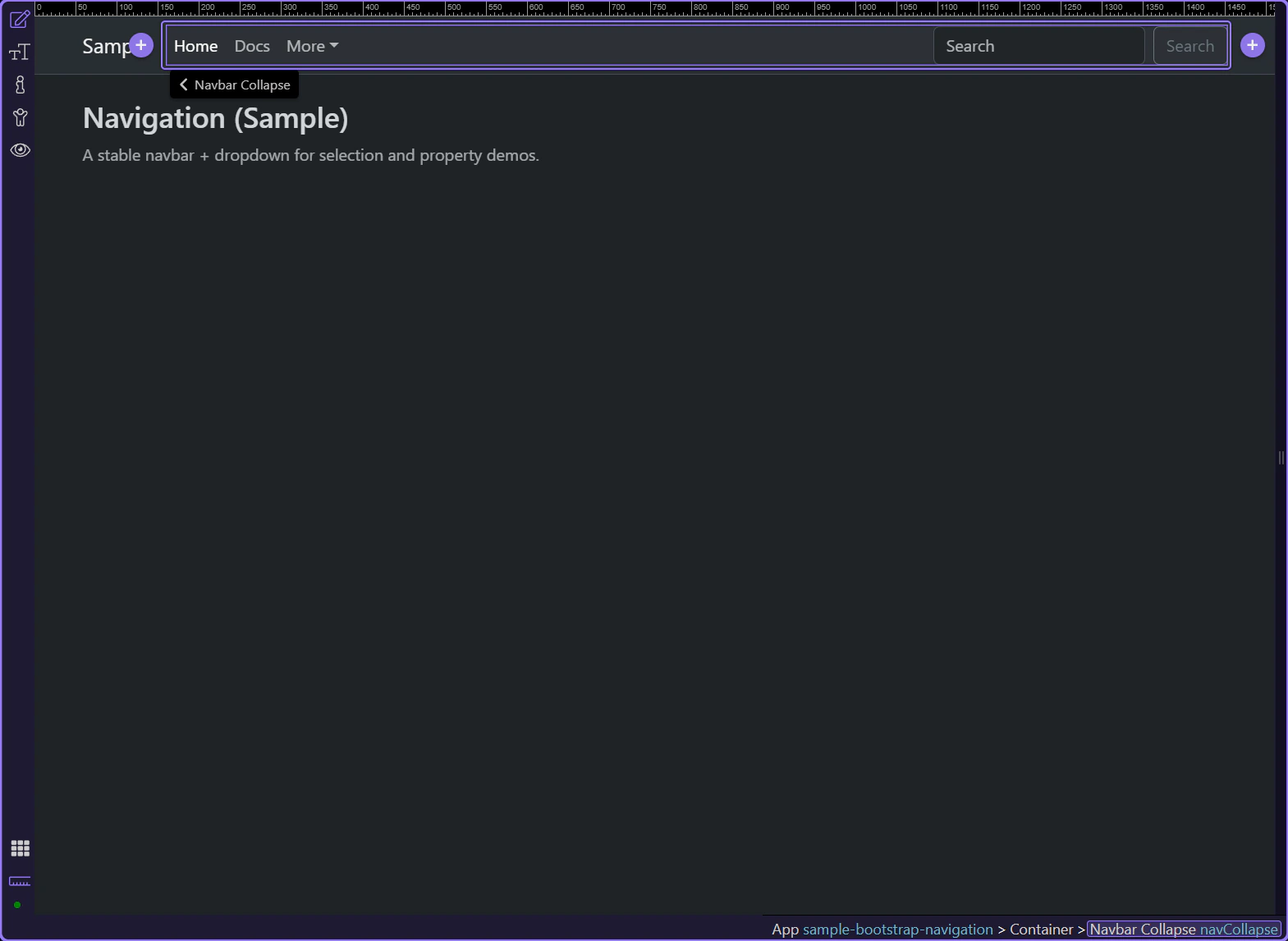
Use ID (theId) to set the collapse element identifier.
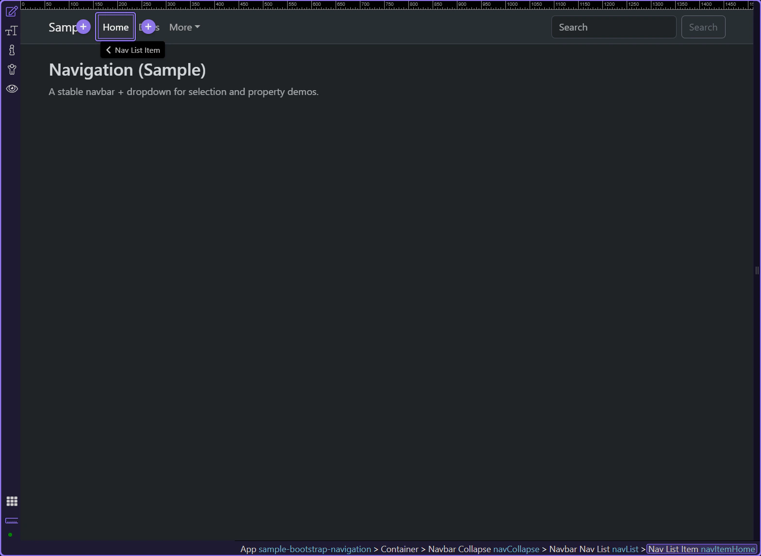
Nav items represent the destinations in your navbar. This is typically where you control active state and link destination.
tip: Apply spacing/alignment at the list/container level so all items stay consistent.
Navbars work best when each part has a clear role: a brand link, a toggler, a collapse container, and a nav list. Use responsive settings and alignment utilities to match your layout.
If the navbar doesn’t behave as expected, check:
Continue with a related tour or go back to the Bootstrap tours index.