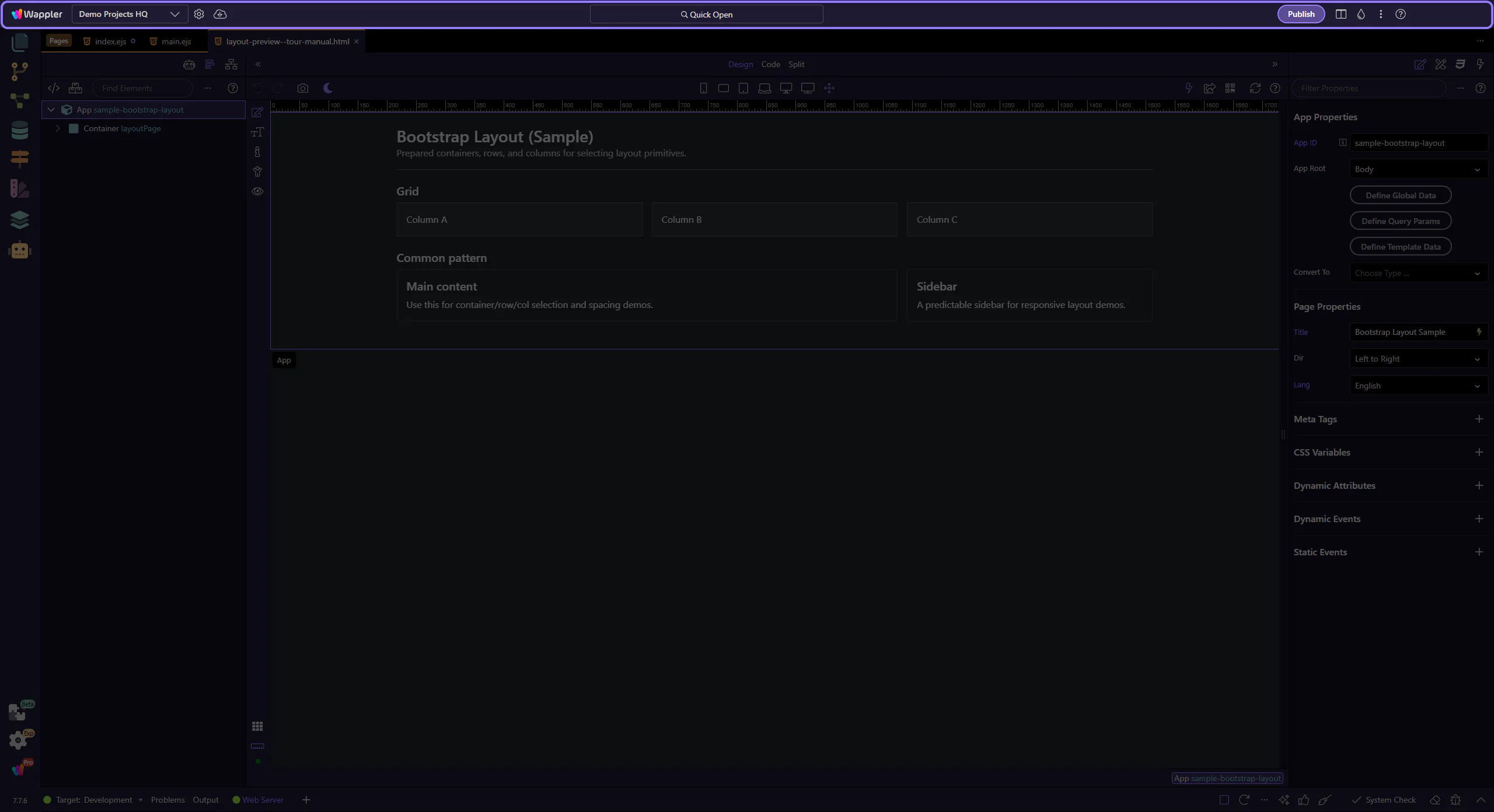
You’re looking at a real grid
This page uses a simple Bootstrap layout so you can explore structure + Properties without distractions.
Quick overview of Bootstrap in Wappler: add the framework, use the grid, drop components, and style with utilities.
You’re looking at a simple Bootstrap layout so you can explore structure and Properties without distractions.
A layout is loaded so we can focus on how Wappler represents Bootstrap structures.
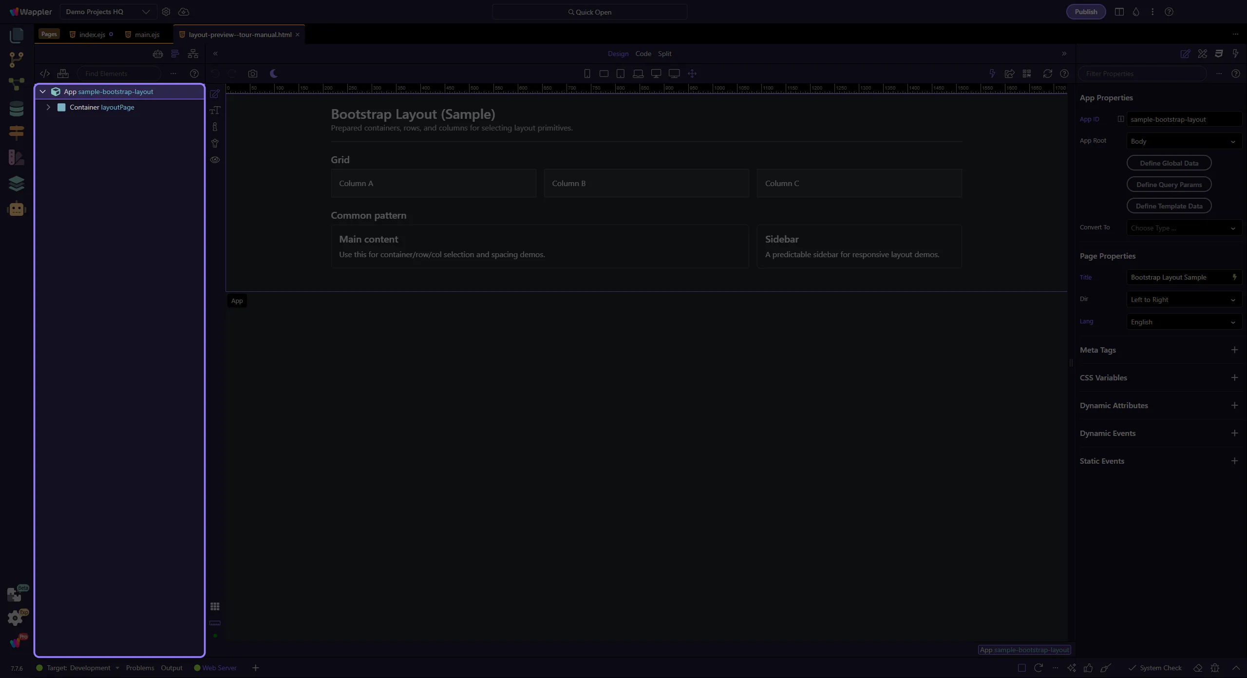
tip: If something is hard to click in the canvas, use App Structure to jump to the exact element.
This tour uses App Structure selection and the Components picker. Keep these panels visible so you always know what will be inserted where.
tip: If a step feels “off”, click the intended node in App Structure first, then retry the insert.
Bootstrap is a popular front-end framework for responsive, mobile-first websites. In Wappler you insert Bootstrap components visually and configure them in Properties (no manual markup required for most tasks).
This quick overview inserts a single Bootstrap Container using the same UI path you use every day (App Structure → right-click → Insert Child → Components Panel).
tip: Keep the App Structure panel visible during inserts; it makes selection and placement predictable.
Start with the wider context in the top toolbar so the next control makes sense in the full workflow. In the next step, you will focus on Make Sure Bootstrap Is Enabled and see how it fits into this area.
If you don’t see Bootstrap components in the Components Panel, enable Bootstrap for your project/page first (Frameworks).
important: If Bootstrap isn’t enabled, searches like “Container” may show different (non-Bootstrap) results.
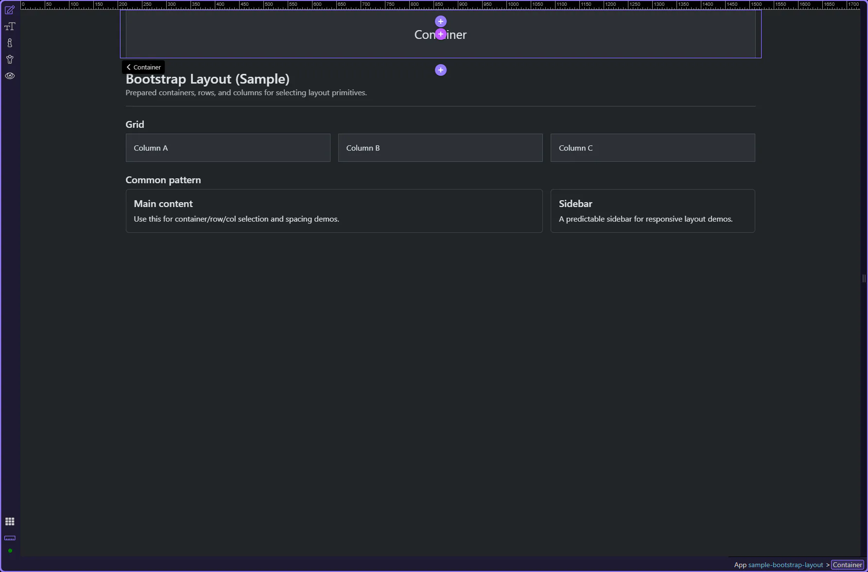
Bootstrap uses a 12-column grid system. Layouts are typically built with a Container that holds Rows, and Rows that hold Columns.
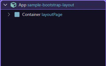
The App Root is a stable insert location (it’s always present, so the tour won’t depend on what you already have on the page).
tip: After insertion, the new element is auto-selected in Structure. Follow-up inserts should use the current selection to avoid drifting into existing layout.
Insert Child opens the Components picker for adding a child under the current selection. This step matters because Insert Child picker is part of the Structure panel, and understanding that context makes the next action easier to repeat in your own project.
The Components search filters the list so you can quickly find what you want to insert. This step matters because Components search is part of Components Popup Anchor Right, and understanding that context makes the next action easier to repeat in your own project.
tip: If multiple results appear, choose the one under “Bootstrap”.

A Bootstrap Container is a common starting point for layout. This step matters because Insert Container is part of Components Popup Anchor Right, and understanding that context makes the next action easier to repeat in your own project.

You now have a real starting point for Bootstrap layouts. Next you can add a Row and Columns inside it (see the “Layout” tour).
tip: Tip: use Rows for horizontal structure; use spacing utilities (gap/margin/padding) for fine tuning.
You now know the core insertion workflow (Structure → Insert Child → Components picker). Next, build a full grid (container → row → columns) and start adding real components.
You now know the core insertion workflow (Structure → Insert Child → Components picker).
Next, build a full grid (container → row → columns) and start adding real components.
tip: Tip: if the wrong component appears, clear search and pick the Bootstrap category explicitly.
Select a tour to continue.