Swiper
Use App Connect Swiper for curated sequences where navigation, pagination, autoplay, and responsive slide counts all support one deliberate story.
Introduction
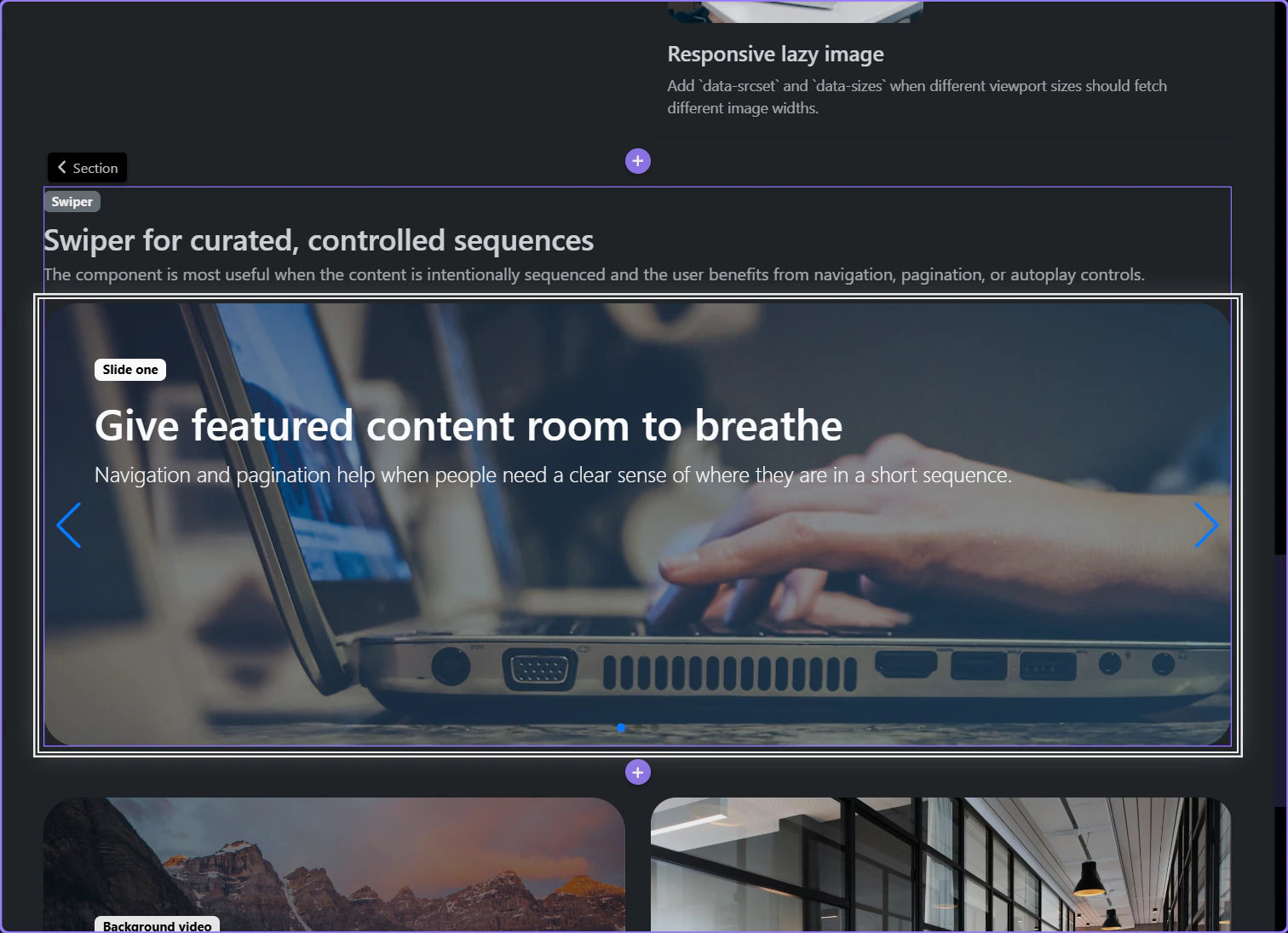
The preview below shows the result first: one curated sequence, visible navigation, and a controlled next step instead of free browsing.
Use Swiper when the content benefits from an intentional sequence
This section is not trying to show many records at once. It is built to walk the user through a short sequence of featured messages. That is the practical use case for Swiper inside Wappler: a curated stream where next, previous, pagination, and autoplay all help the user stay oriented instead of getting in the way.
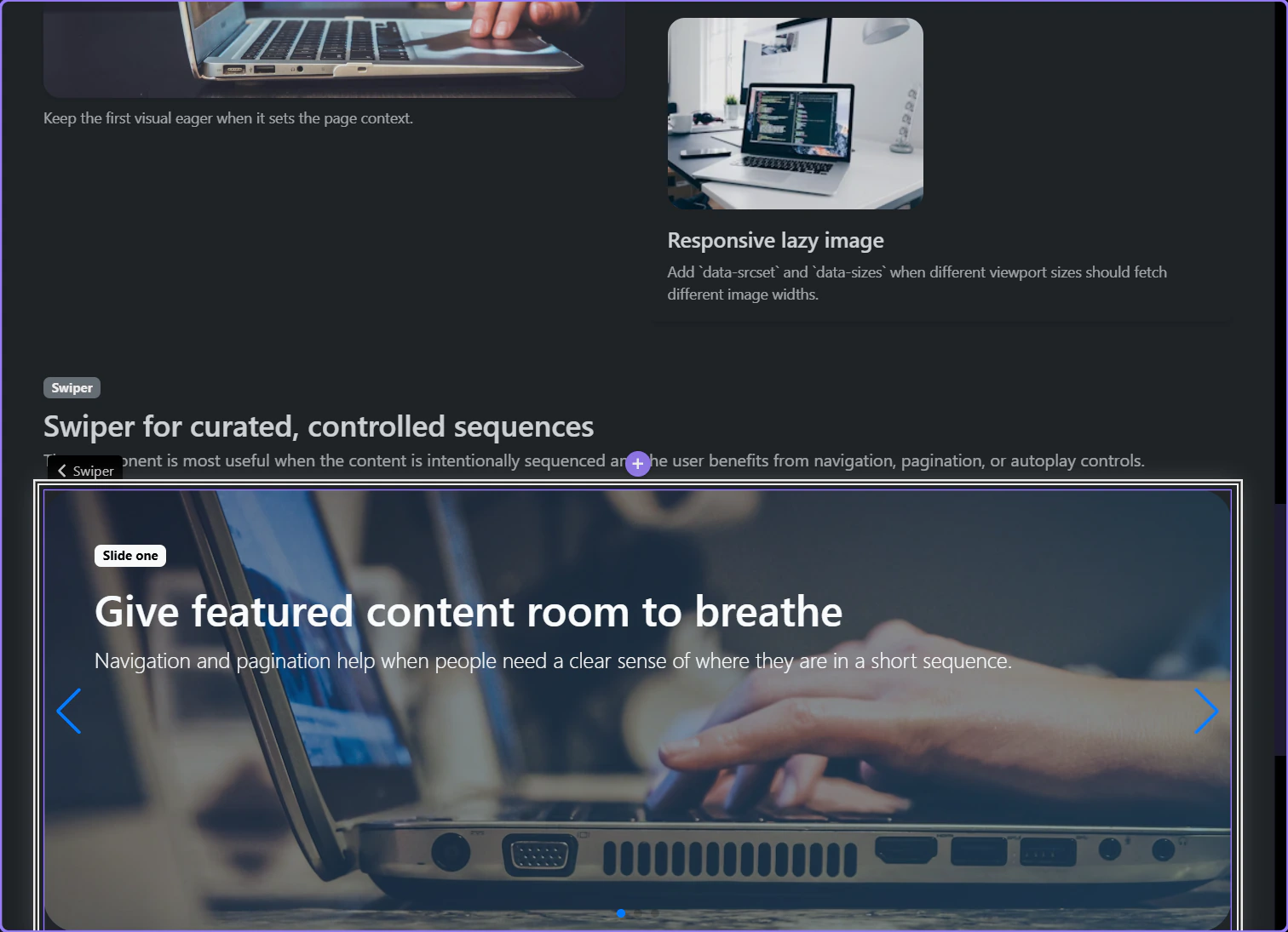
The slideshow section becomes the component parent
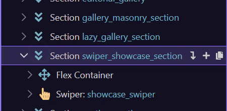
Swiper is a real component, so the surrounding section is chosen first. This showcase section is the honest parent because the slider belongs to the whole curated story block, not to a tiny inner fragment.
The full Components picker starts from Structure
This step opens the Structure panel’s full Components picker for a page-level component such as Swiper; the row’s quick Insert Inside menu remains reserved for likely structural children.
Search the full picker for Swiper
The searchable Components picker narrows to Swiper and highlights the page-level sequencing component before you return to the configured example.
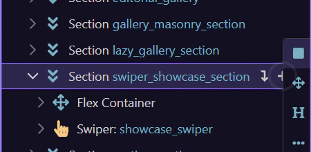
Return to the configured Swiper
Close the picker without inserting a duplicate so the next steps can inspect the real Swiper already configured in the prepared page.
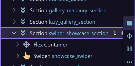
Working in Wappler
Once the Swiper is selected, the important decisions are the overall browsing model and the breakpoint behavior that keeps the sequence readable on smaller screens.
The main Swiper component owns navigation, pagination, autoplay, and loop
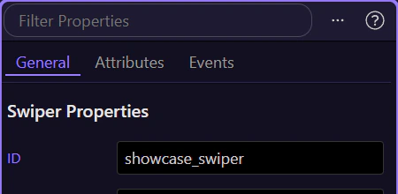
When the Swiper itself is selected, the Properties panel exposes the controls that define the overall browsing model: effect, slide delay, Auto Play, Loop, Pagination, Navigation, Per View, Per Group, and Parallax. This is where you decide how much chrome and motion the slider should own before you start styling individual slides.
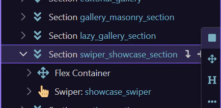
Responsive slide settings live on the component, not as an afterthought
The Swiper component includes breakpoint-specific controls for Space Between, Per View, and Per Group. Use those responsive settings to reduce simultaneous slides and spacing on smaller screens before you reach for custom CSS, so the sequence still reads clearly on every device.
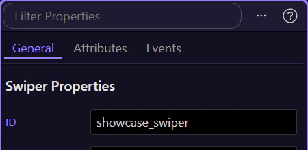
Slide content can add restrained parallax without hiding the message
Inside each slide, this content block is configured for restrained parallax movement so the caption layer travels at a slightly different rate from the background. The important rule is restraint: use slide-level motion only when it helps the sequence feel layered, and keep it light enough that users still read the message immediately.
Conclusion
You now have the concrete Swiper workflow in Wappler: use the component for short curated sequences, set the main browsing controls on the Swiper itself, and tune breakpoint behavior before adding decorative motion inside the slides.
Continue into adjacent media decisions
Continue into Lightbox when users need free browsing instead of a fixed sequence, or return to the media hub to choose the next media component workflow.