Explore real styles
Use this page as a live reference for headings, paragraphs, and text utilities.
Apply Bootstrap typography styles: headings, lead text, lists, and text utilities for consistent content styling.
In this tour you’ll review Bootstrap typography basics in Wappler: headings, paragraphs, and common text utilities.
Typography settings matter because they shape readability, hierarchy, and emphasis before any component-specific styling begins. This sample gives you a concrete visual context for headings, body text, and spacing, so the later controls make sense as deliberate readability choices rather than random tweaks.
tip: Prefer Bootstrap utilities (e.g. text-center, fw-bold, text-muted) before writing custom CSS.
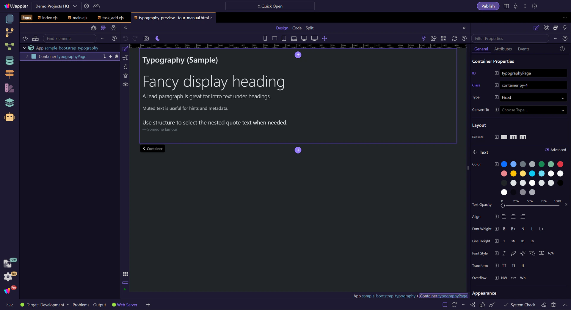
Before styling, make sure you’ve selected the correct node in App Structure (or the canvas) so Properties updates the right element.
Now we’ll select a heading and some paragraphs and review the key Properties you’ll use most often.
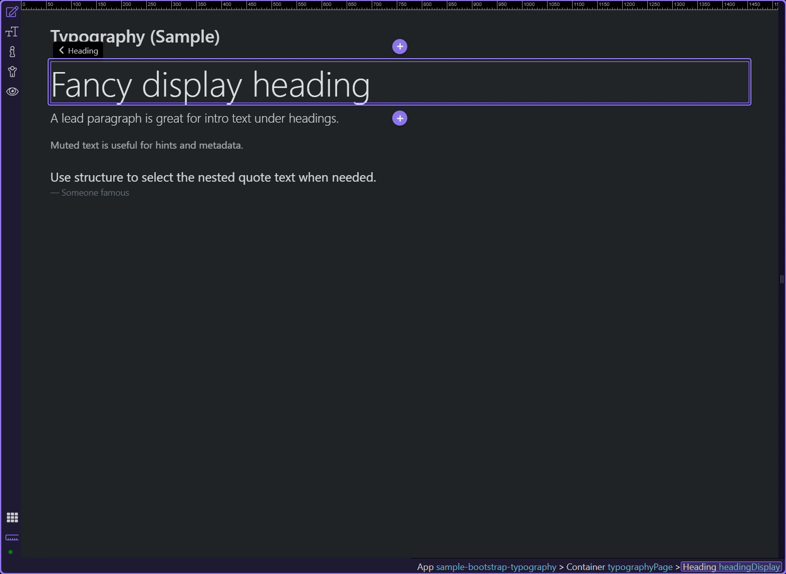
Headings set hierarchy. This example is a display-style heading. This step matters because Display heading is part of Design View, and understanding that context makes the next action easier to repeat in your own project.
Start with the wider context in the Properties panel so the next control makes sense in the full workflow. In the next step, you will focus on Heading: Tag name and see how it fits into this area.
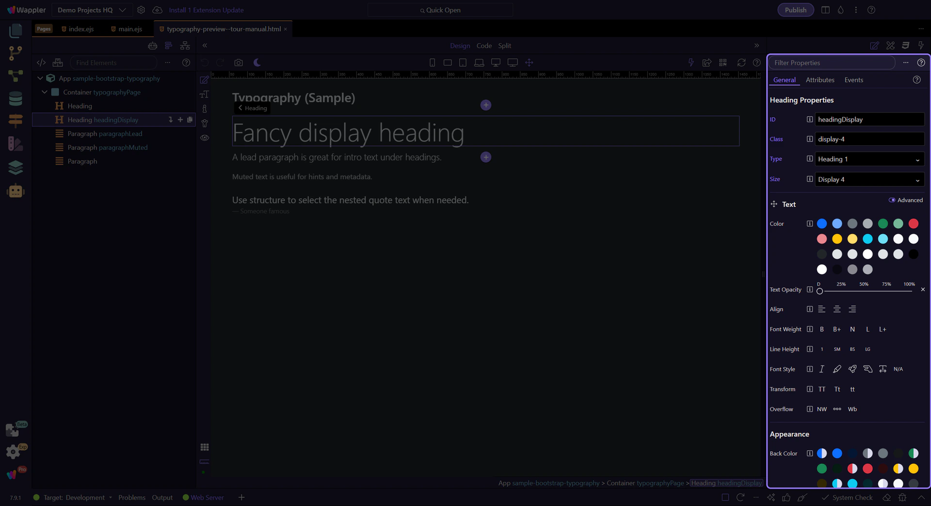
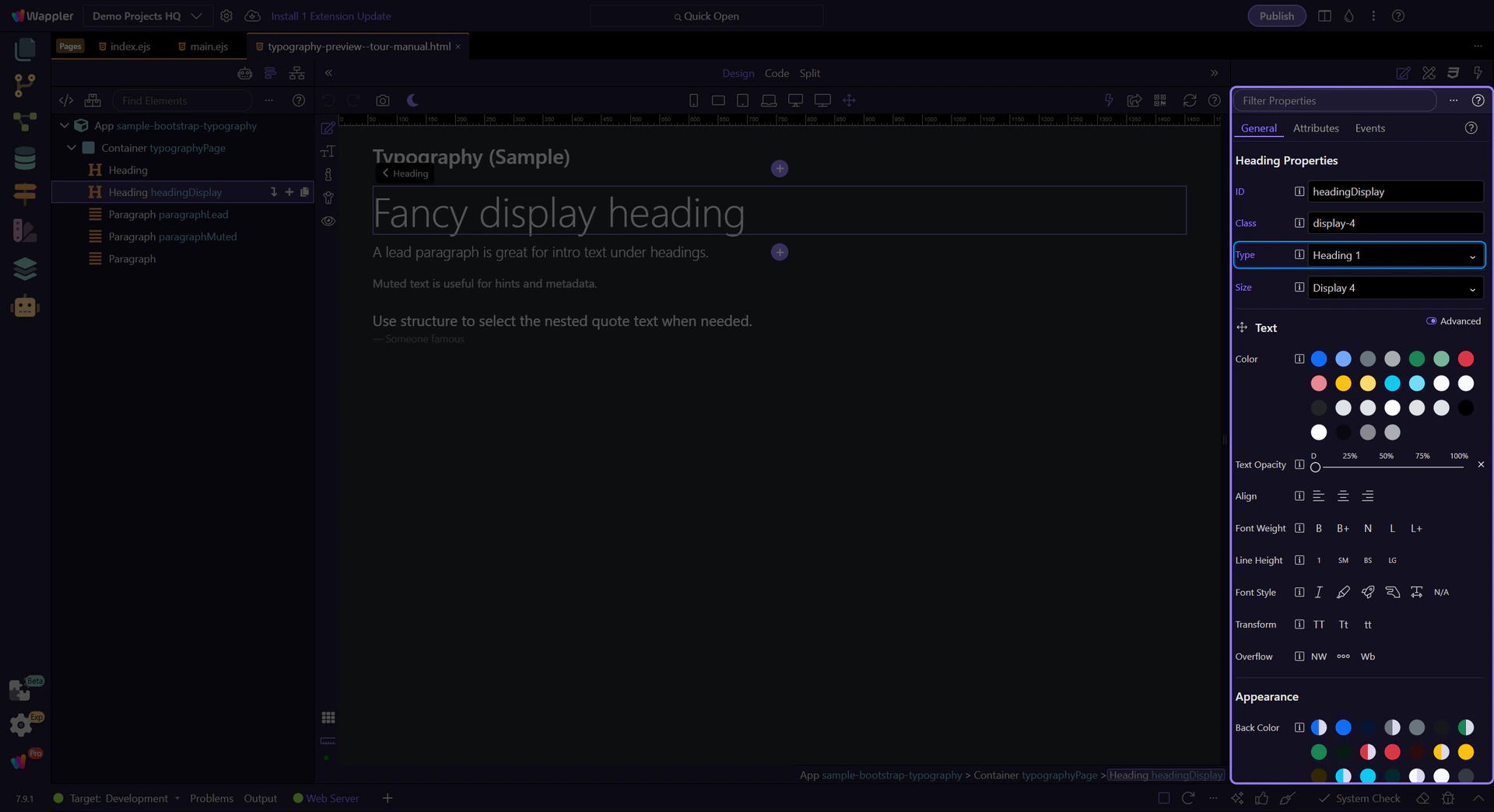
In Properties, set Tag name (titleType) for semantic structure (h1/h2/…). This step matters because Heading: Tag name is part of Selection Panels Properties Titletype, and understanding that context makes the next action easier to repeat in your own project.
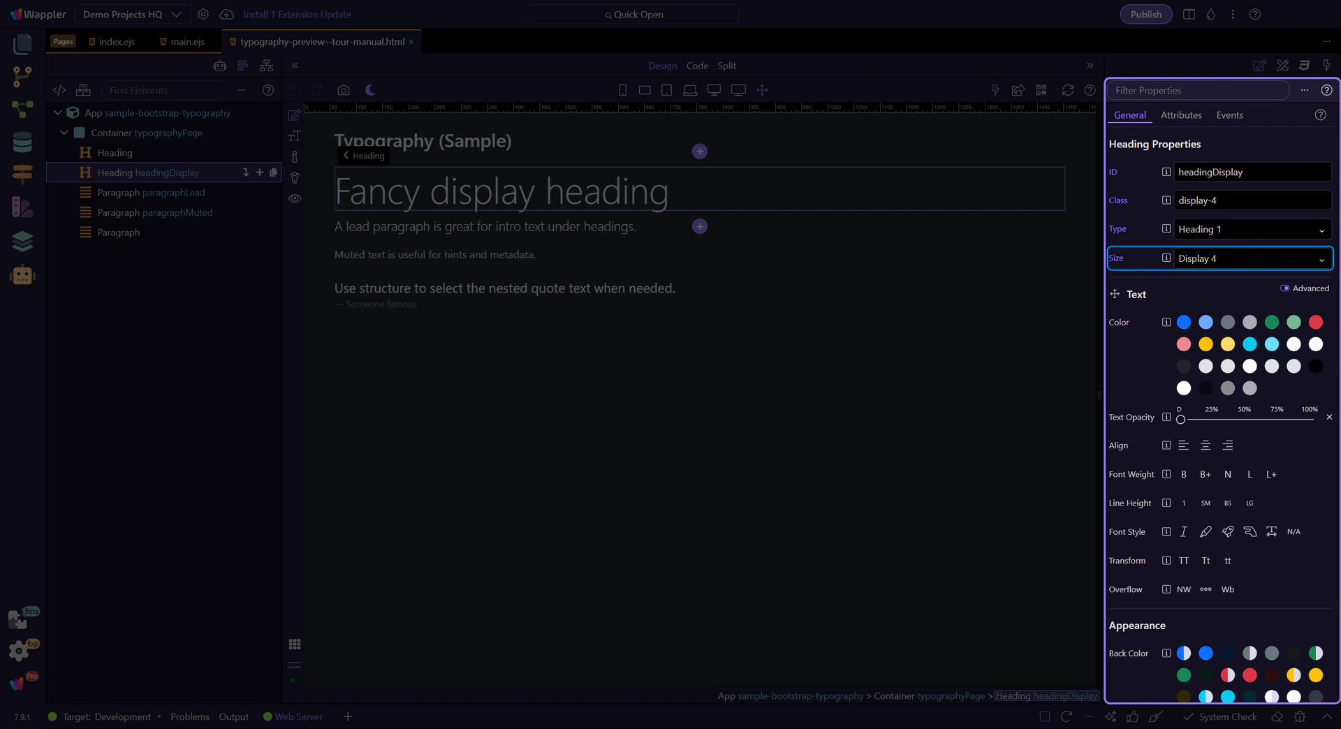
Set the visual size (titleSize) without changing the semantic tag. This step matters because Heading: Size is part of Selection Panels Properties Titlesize, and understanding that context makes the next action easier to repeat in your own project.
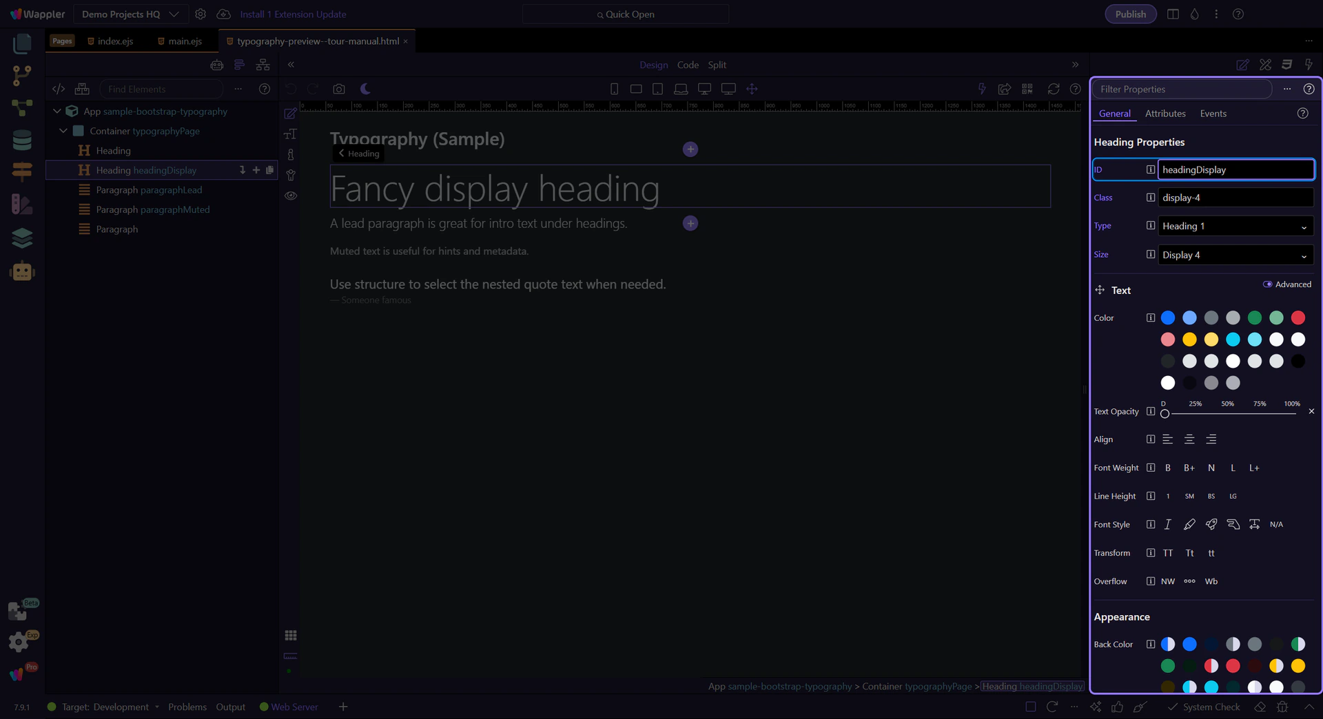
Use ID (theId) when you need a unique identifier for links, scripts, or tests. This step matters because Heading: ID is part of Selection Panels Properties Theid, and understanding that context makes the next action easier to repeat in your own project.
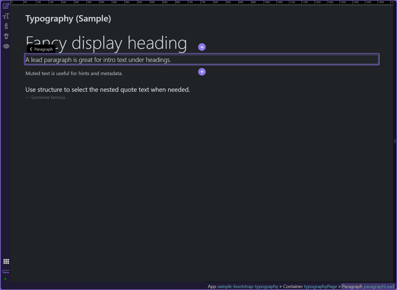
Lead paragraphs create emphasis for introductions and section summaries. This step matters because Lead paragraph is part of Design View, and understanding that context makes the next action easier to repeat in your own project.
Use Alignment (textAlign) for text-start, text-center, and text-end. This step matters because Text: Alignment is part of Selection Panels Properties Textalign, and understanding that context makes the next action easier to repeat in your own project.
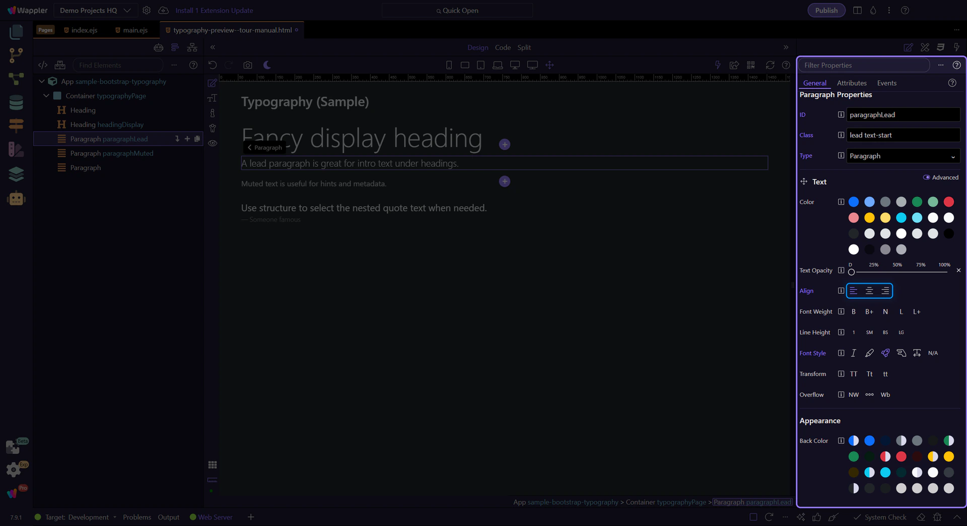
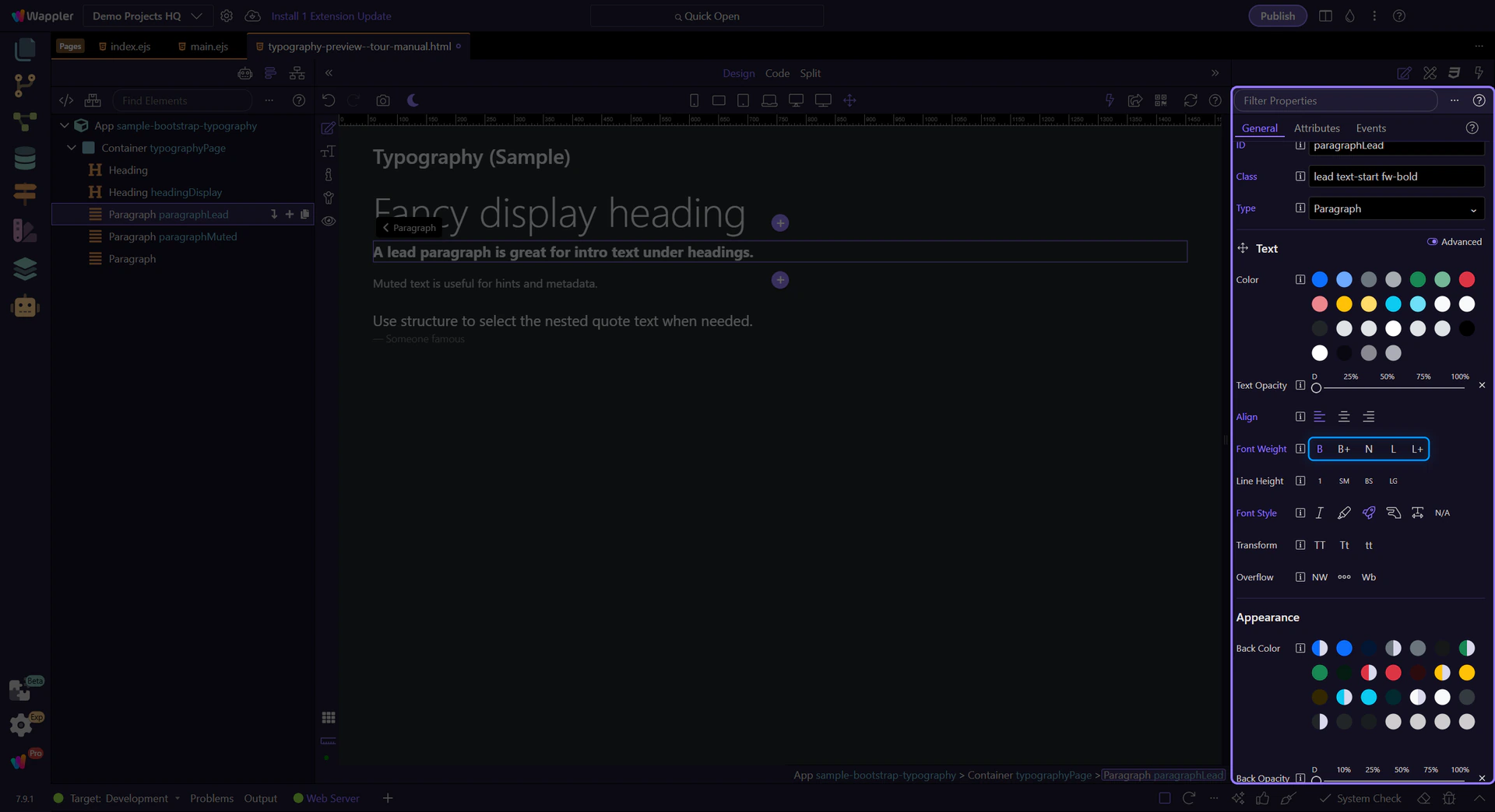
Use Font Weight (textFontWeight) for fw-bold, fw-normal, and fw-light. This step matters because Text: Weight is part of Selection Panels Properties Textfontweight, and understanding that context makes the next action easier to repeat in your own project.
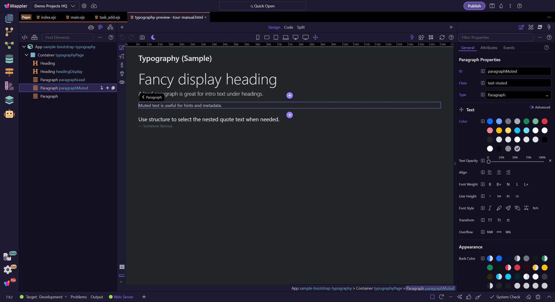
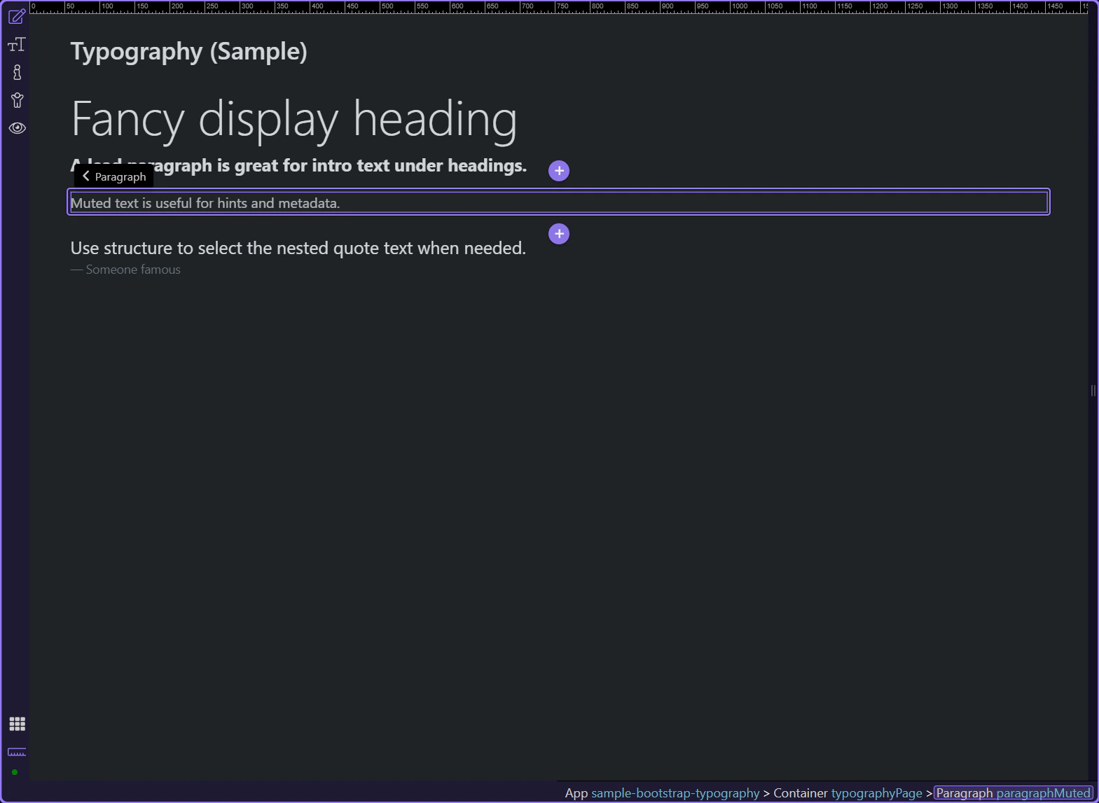
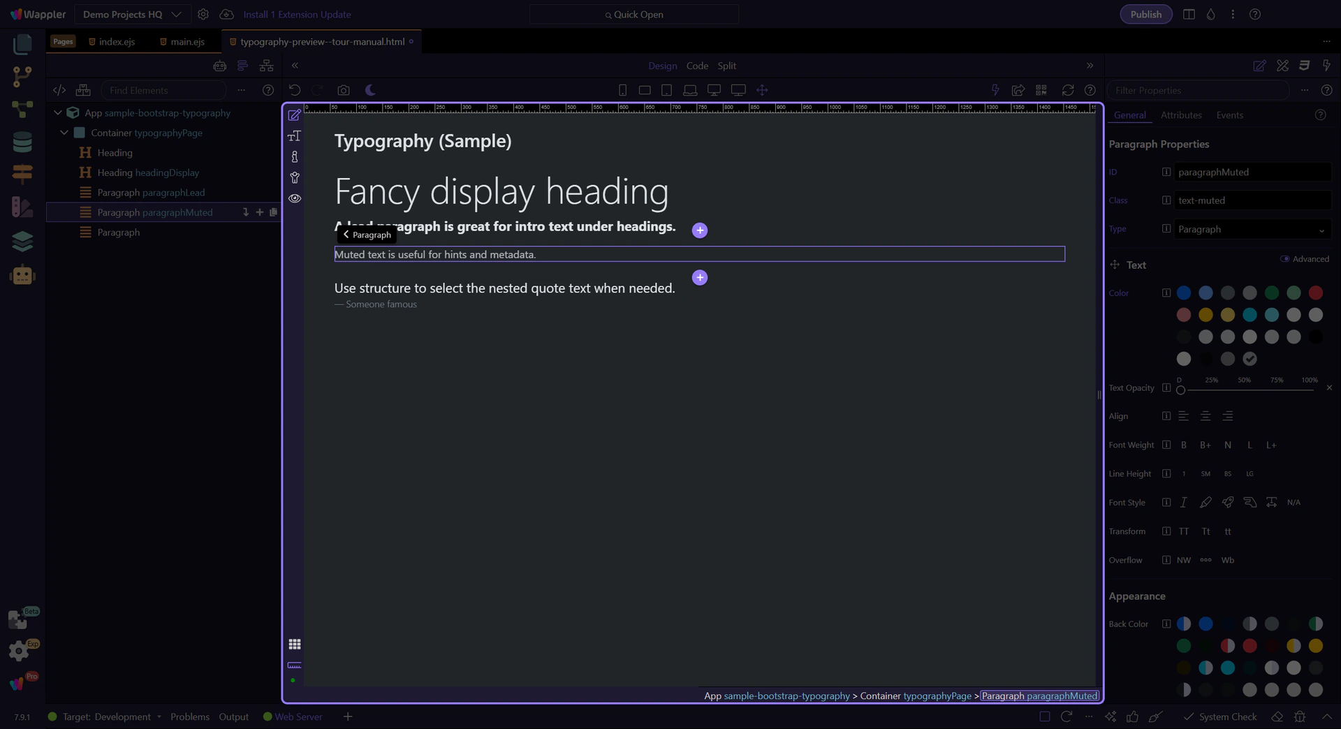
Muted text is useful for secondary information and helper text. This step matters because Muted paragraph is part of Design View, and understanding that context makes the next action easier to repeat in your own project.
Typography is often nested (figure → blockquote → paragraph). If you need to style a nested node you can’t easily click, use App Structure as a fallback to select the exact element.
Typography is a mix of semantics (the right tag) and utilities (alignment, weight, color). Keep your typography consistent across a section.
When typography feels inconsistent, this short checklist usually helps:
Continue with a related tour or go back to the Bootstrap tours index.