Images
Work with responsive images: fluid sizing, thumbnails, alignment, and common image helpers.
Review image properties
Images often need responsive sizing, correct alt text, and consistent rounding/alignment. Let’s review the key image options.
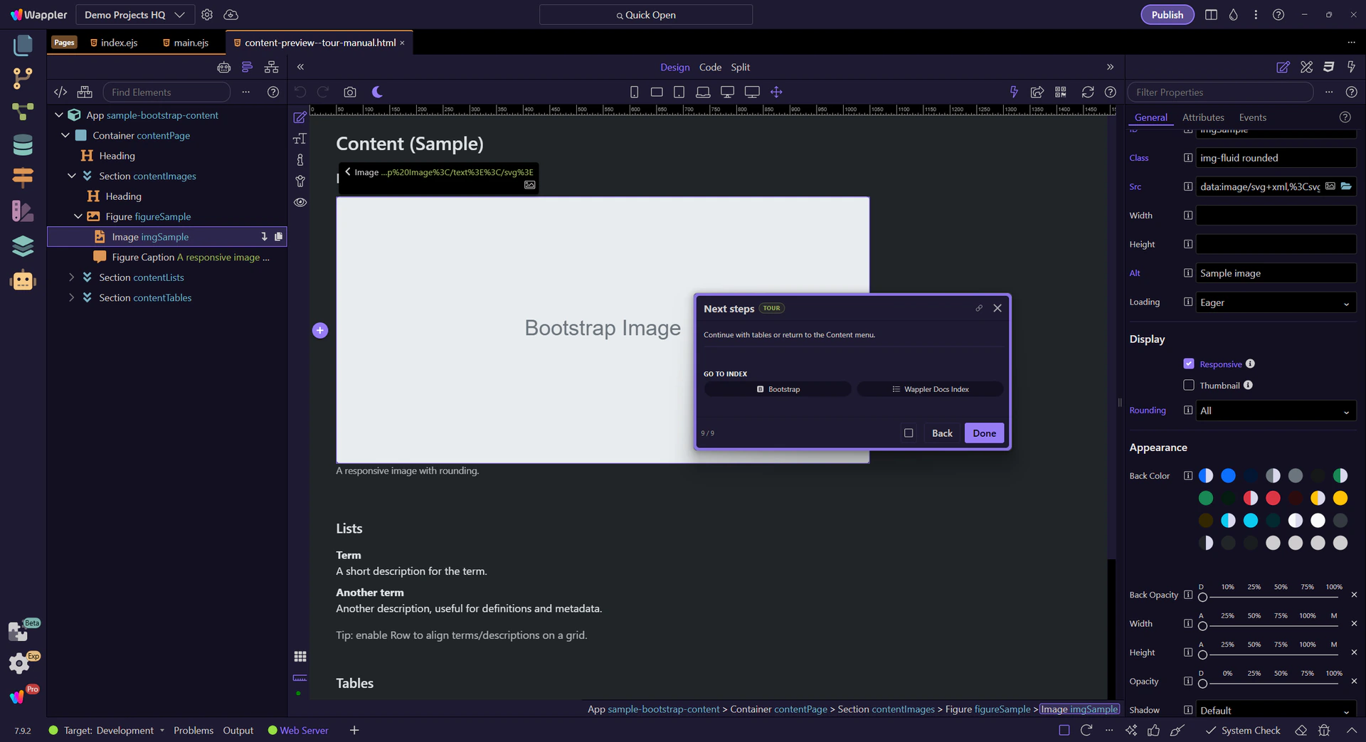
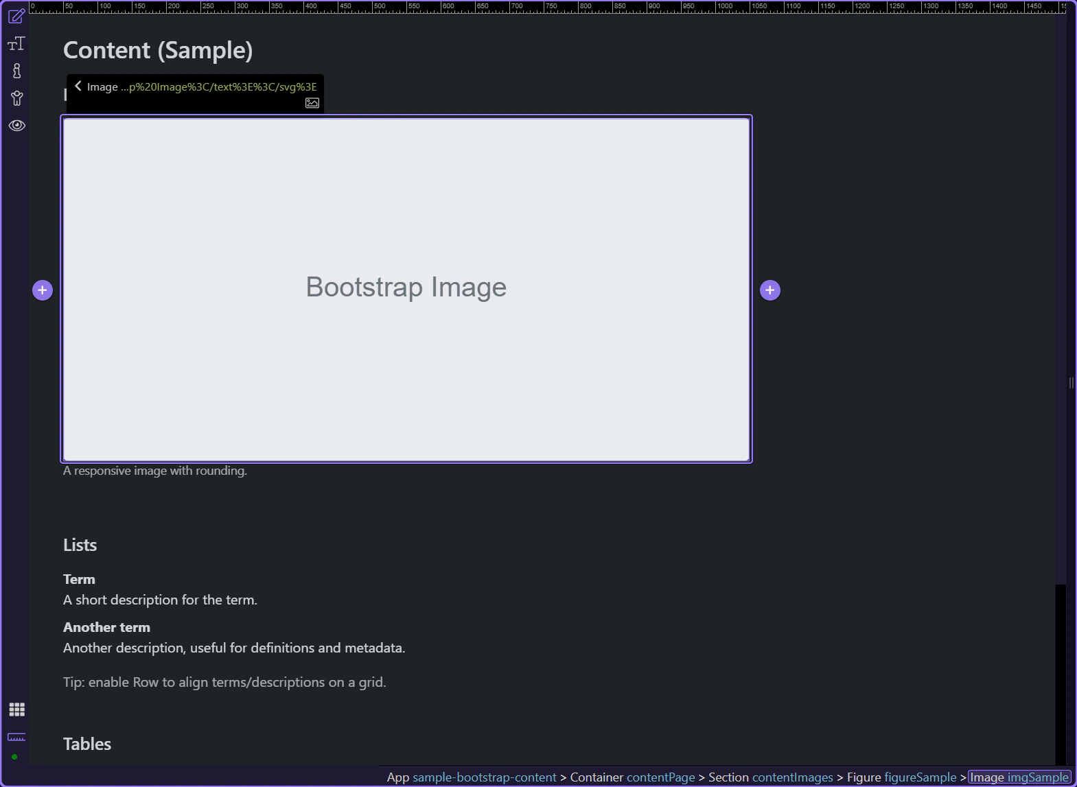
Image example
Bootstrap image options focus on responsiveness, alignment, and subtle presentation patterns like figures and captions.
Orient yourself in Properties panel
Start with the wider context in the Properties panel so the next control makes sense in the full workflow. In the next step, you will focus on Image: Src and see how it fits into this area.
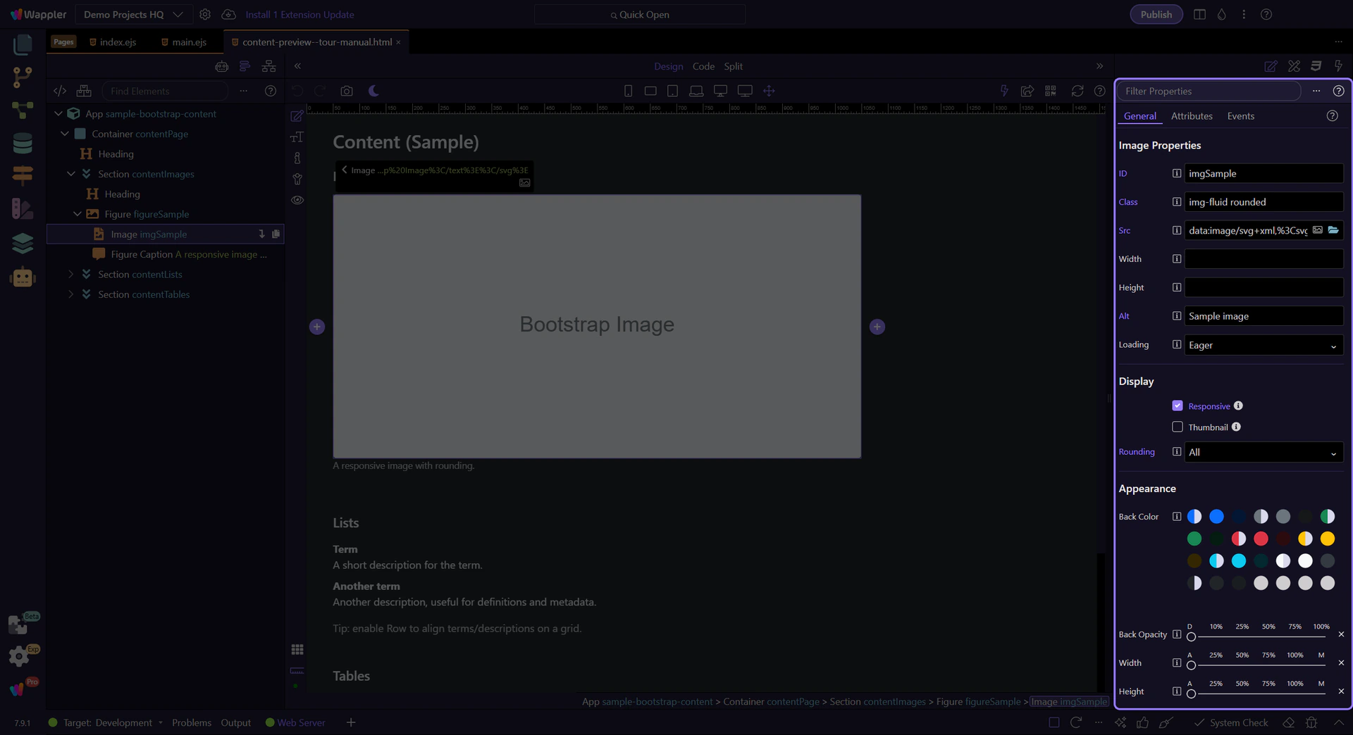
Image: Src
Use Src to choose the image file. This step matters because Image: Src is part of Selection Panels Properties Imgsrc, and understanding that context makes the next action easier to repeat in your own project.
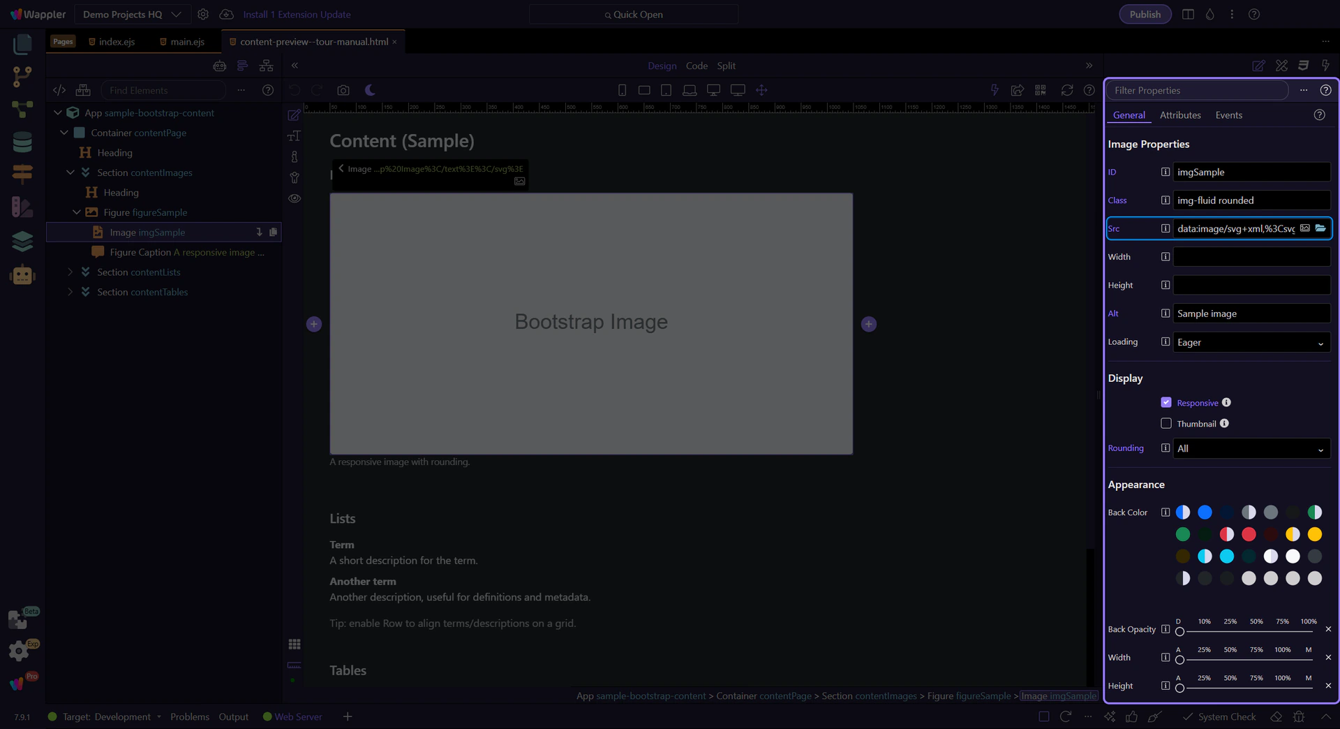
Image: Alt (accessibility)
Use Alt for accessibility and SEO. Write descriptive alt text for meaningful images. This step matters because Image: Alt (accessibility) is part of Selection Panels Properties Imgalt, and understanding that context makes the next action easier to repeat in your own project.
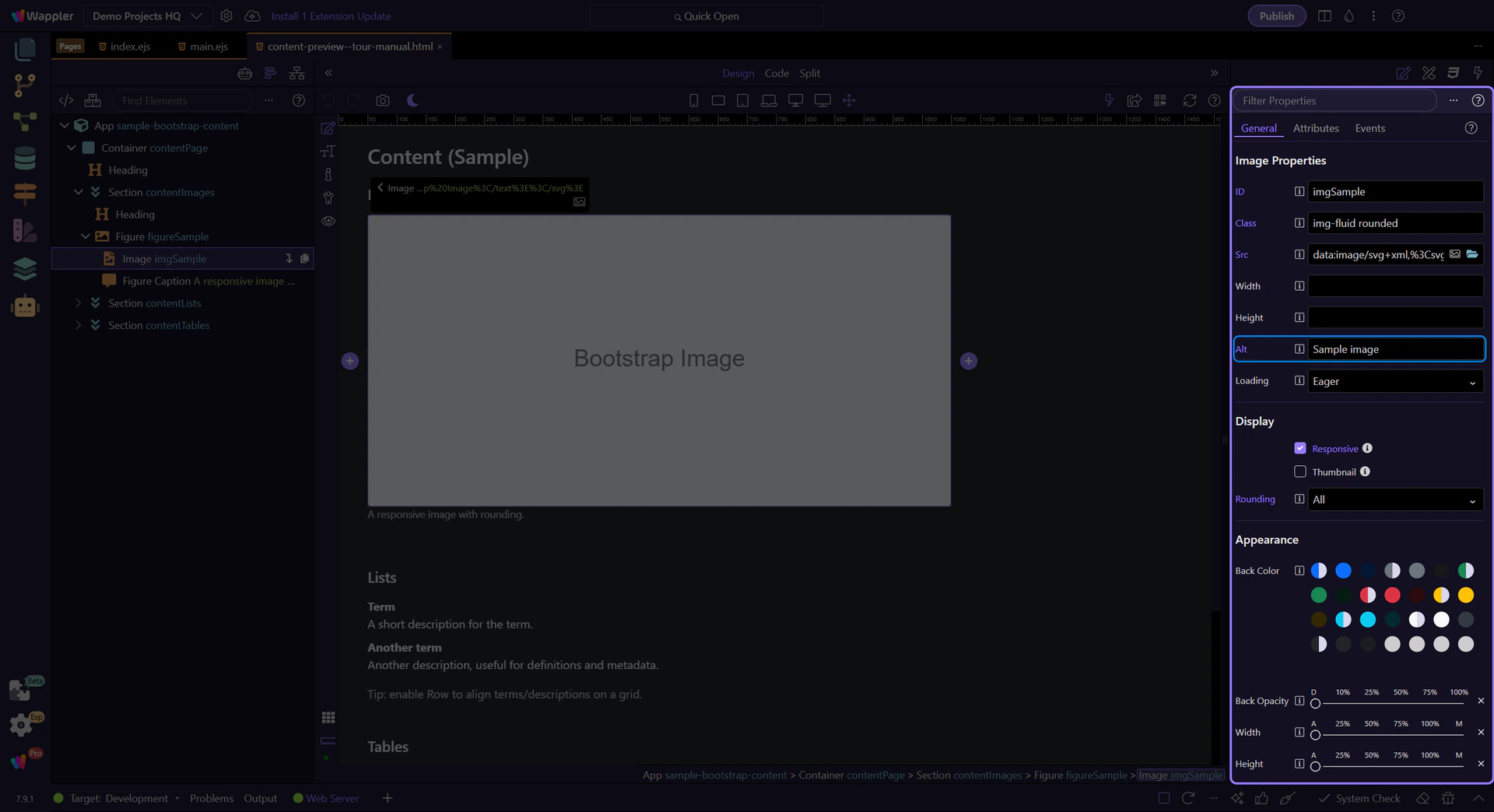
Image: Loading
Use Loading to enable lazy loading for below-the-fold images. This step matters because Image: Loading is part of Selection Panels Properties Imgloading, and understanding that context makes the next action easier to repeat in your own project.
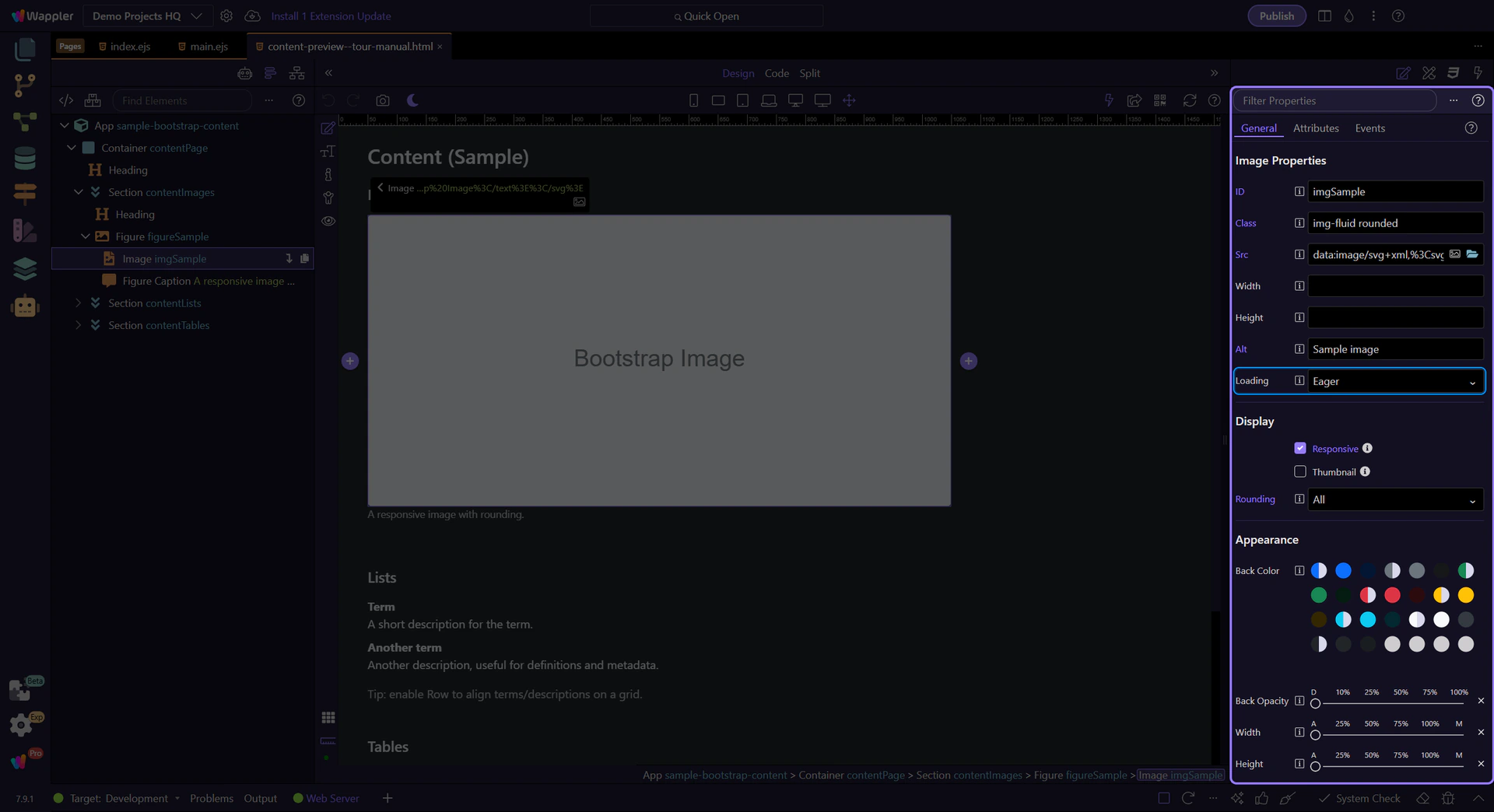
Image: Responsive
Use Responsive to add img-fluid so the image scales with the container. This step matters because Image: Responsive is part of Selection Panels Properties Imgresponsive, and understanding that context makes the next action easier to repeat in your own project.
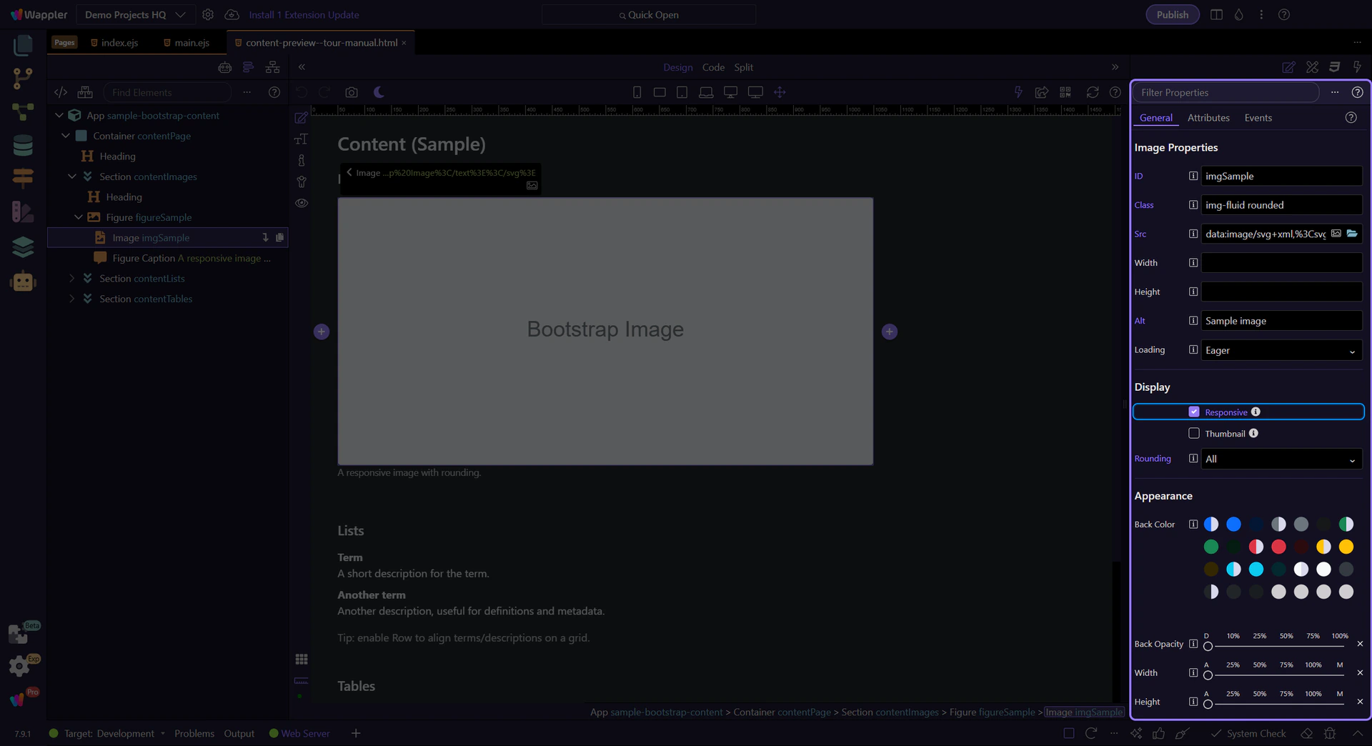
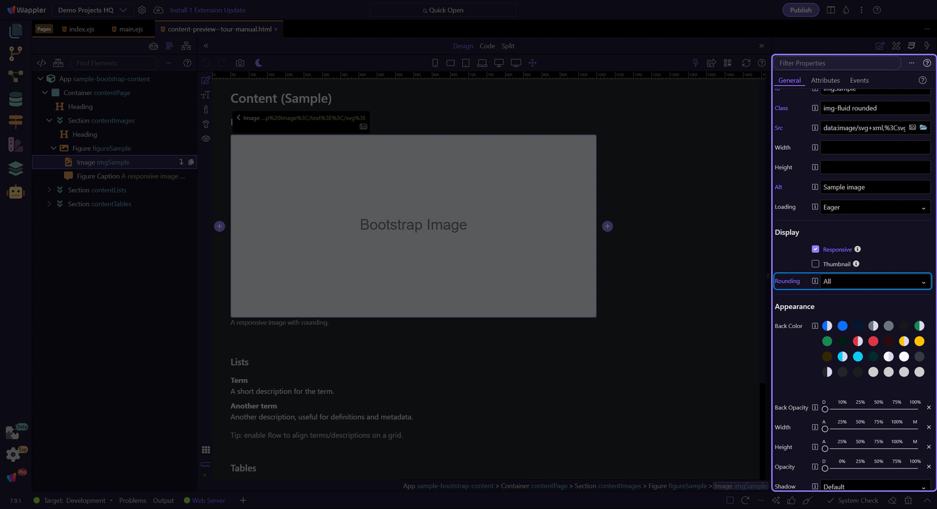
Image: Rounding
Use Rounding for rounded corners or circle images. This step matters because Image: Rounding is part of Selection Panels Properties Imgelementrounding, and understanding that context makes the next action easier to repeat in your own project.
Next steps
Continue with tables or return to the Content menu.