Tables
Style tables with Bootstrap classes: borders, hover/striped, responsive wrappers, and alignment.
Table styling
Bootstrap tables add readability (striping, hover, borders) and can be wrapped for responsive scrolling. Let’s review the key table options.
Table example
Tables are deeply nested (thead/tbody/tr/td), so it’s common to style the table itself while editing content inside rows and cells.
Orient yourself in Properties panel
Start with the wider context in the Properties panel so the next control makes sense in the full workflow. In the next step, you will focus on Table: Theme and see how it fits into this area.
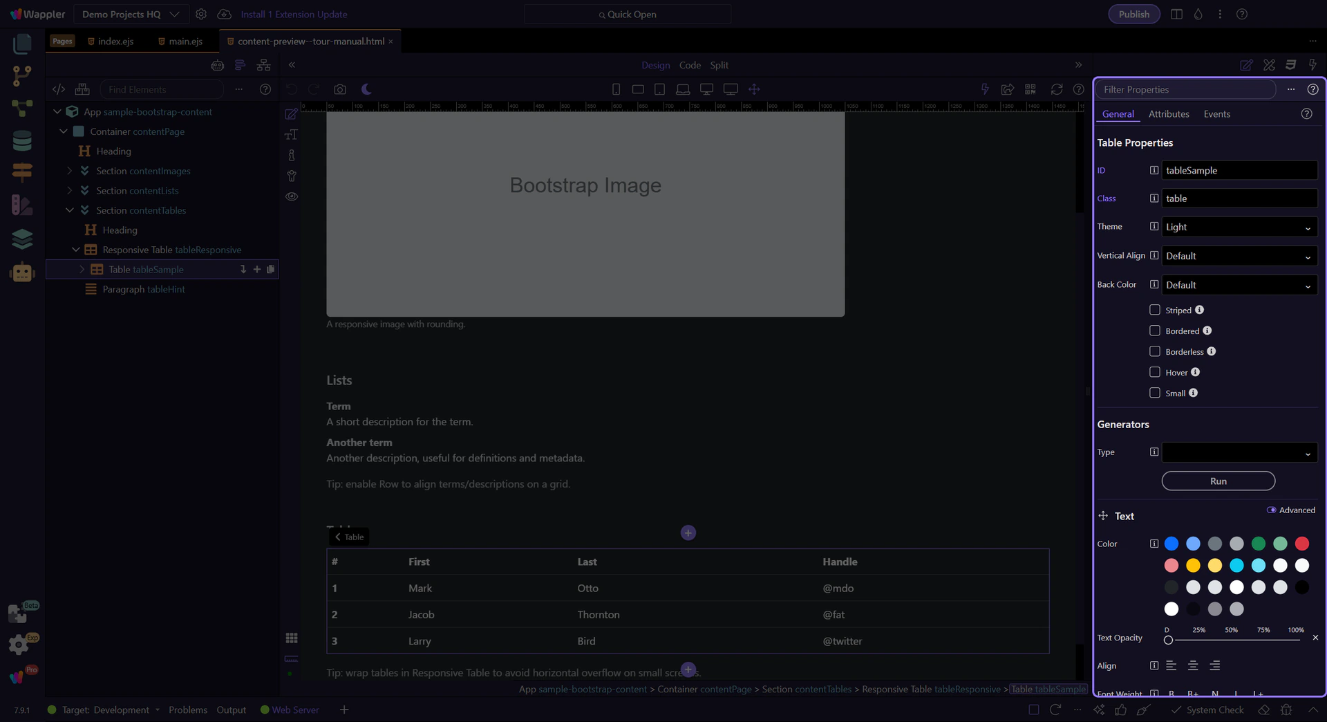
Table: Theme
Use Theme for light/dark tables. This step matters because Table: Theme is part of Selection Panels Properties Tabletheme, and understanding that context makes the next action easier to repeat in your own project.
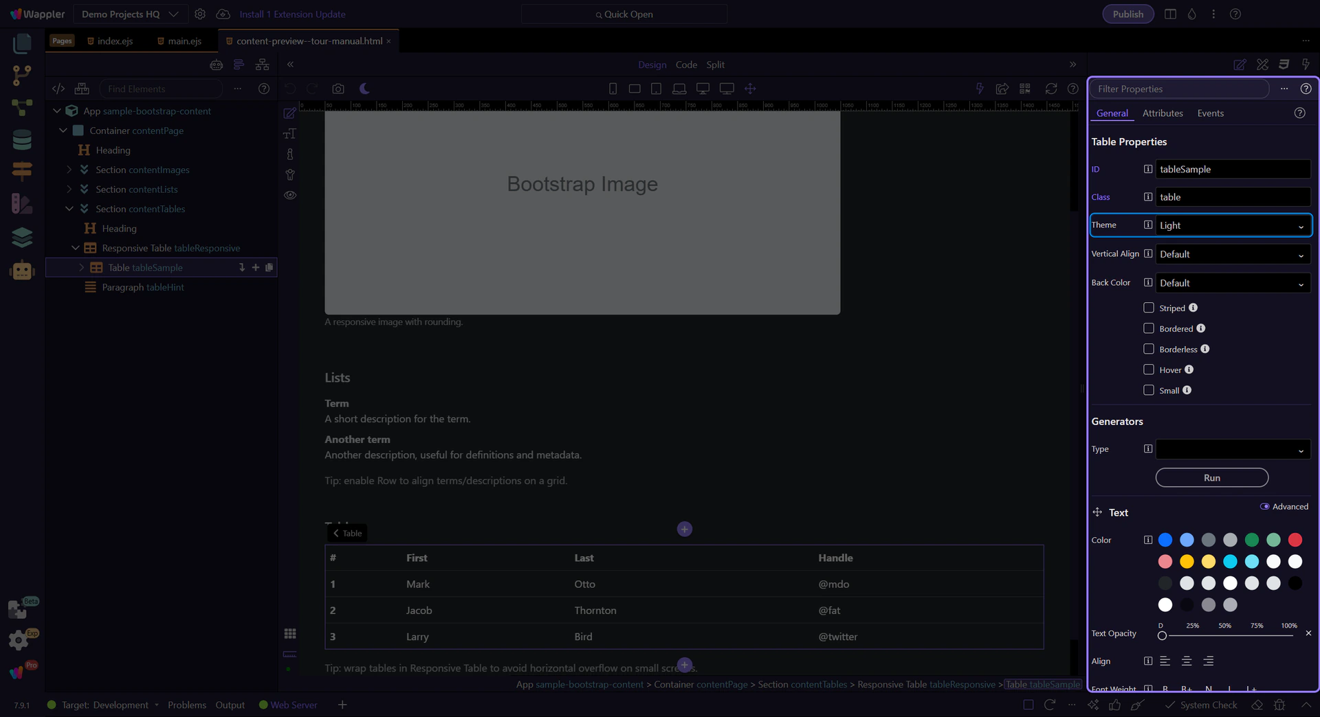
Table: Background variant
Use Back Color for contextual table variants (primary/success/etc.). This step matters because Table: Background variant is part of Selection Panels Properties Tableelementcolor, and understanding that context makes the next action easier to repeat in your own project.
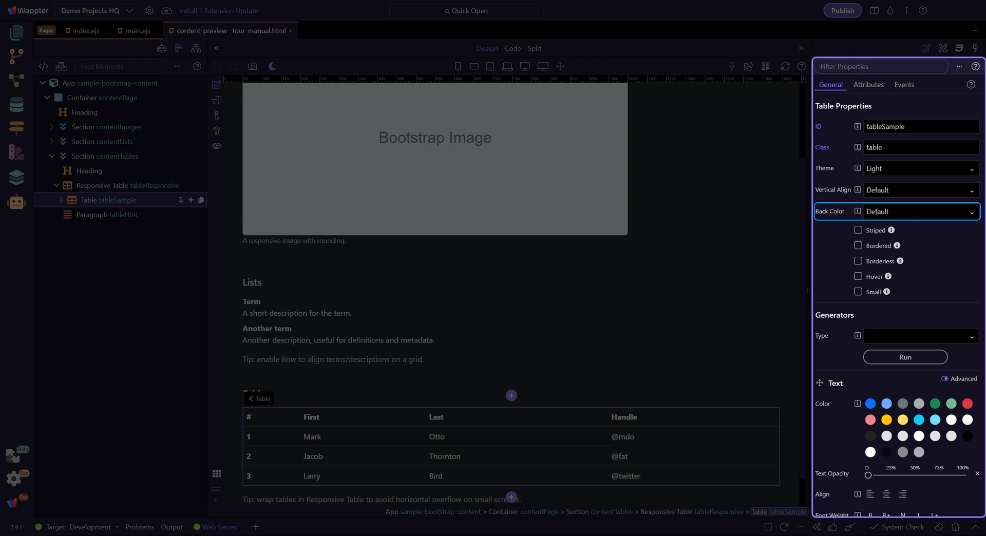
Table: Striped / Hover / Small
Use Striped, Hover, and Small for common table density and interaction patterns. This step matters because Table: Striped / Hover / Small is part of Selection Panels Properties Tablestriped, and understanding that context makes the next action easier to repeat in your own project.
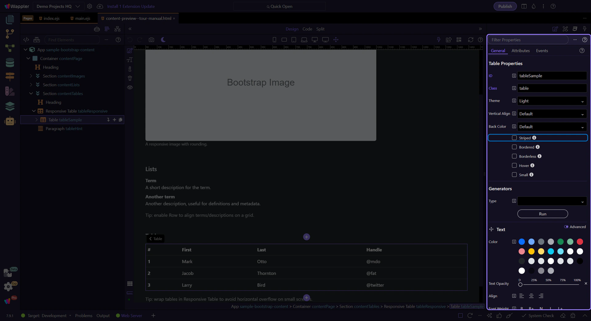
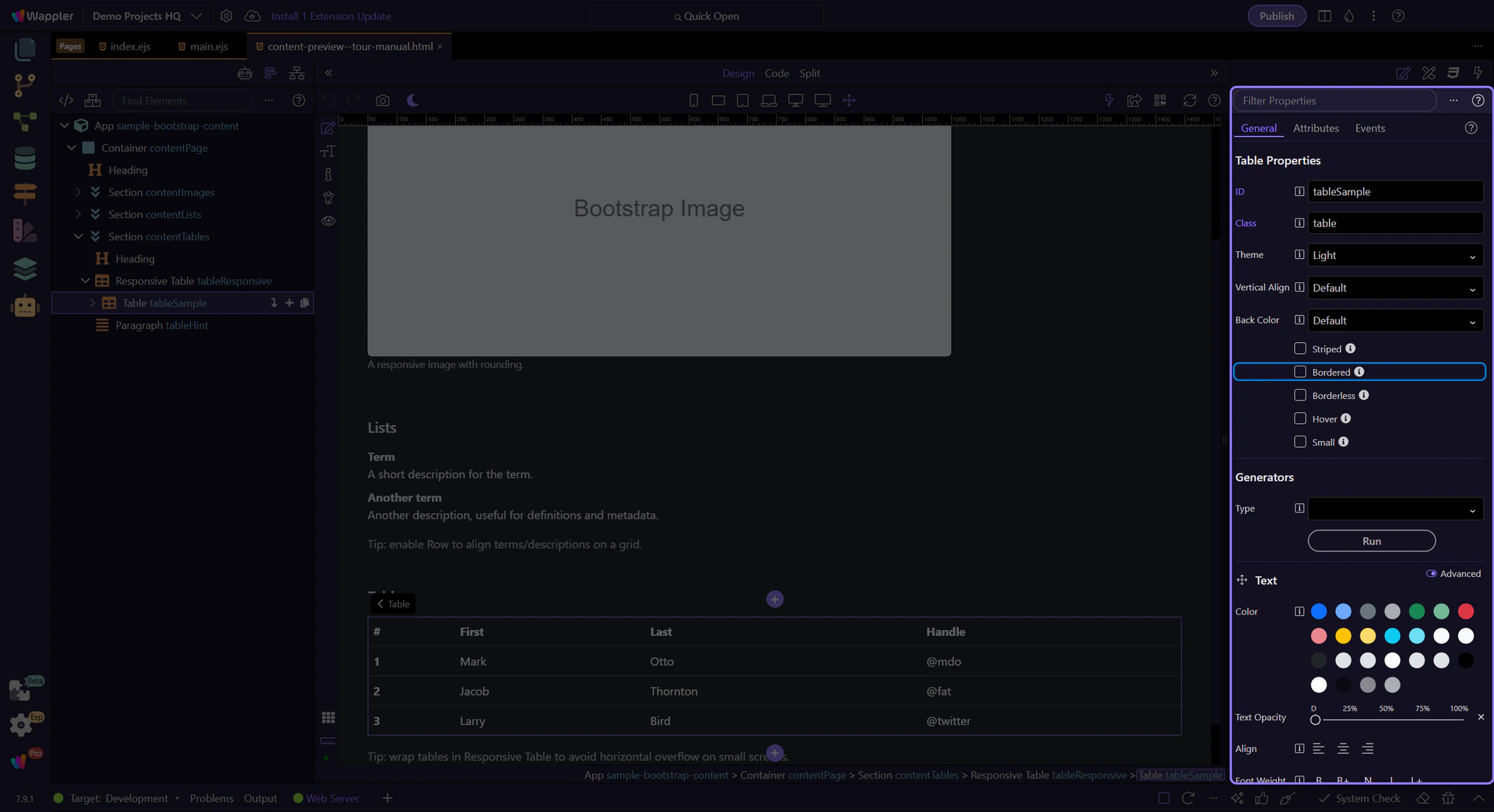
Table: Bordered + border color
Use Bordered and Border Color when you need stronger table separation. This step matters because Table: Bordered + border color is part of Selection Panels Properties Tablebordered, and understanding that context makes the next action easier to repeat in your own project.
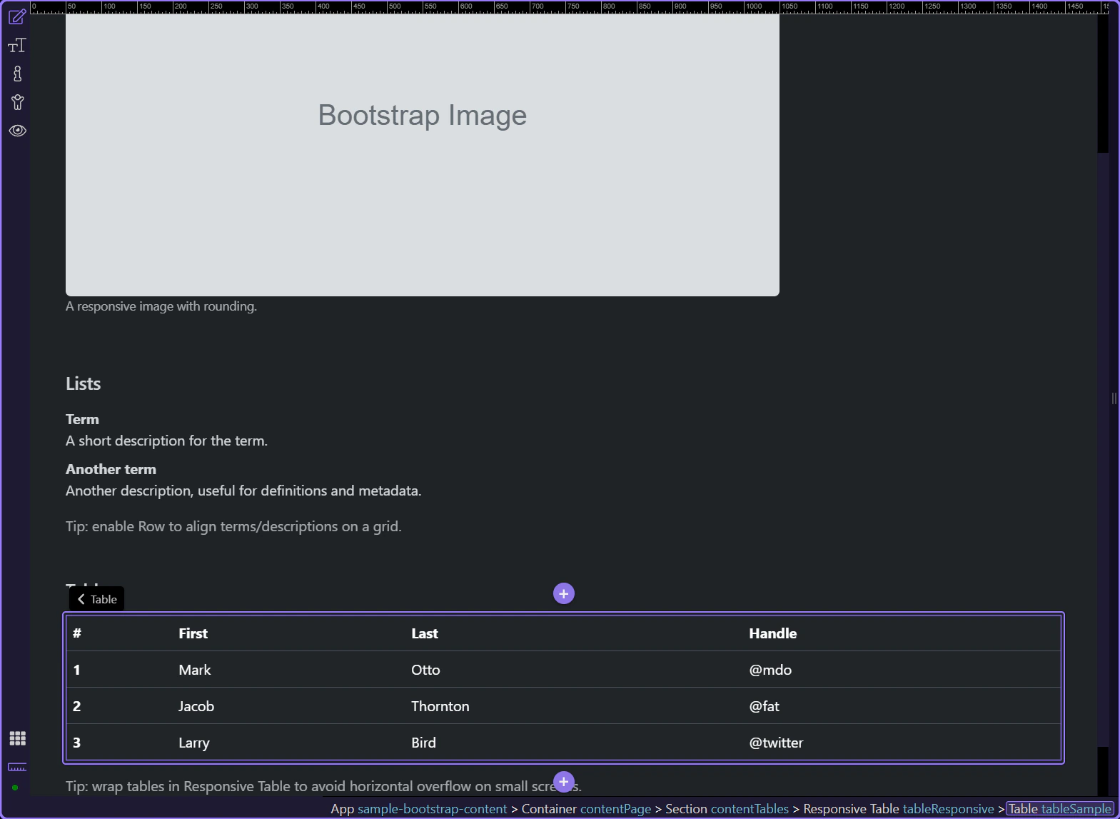
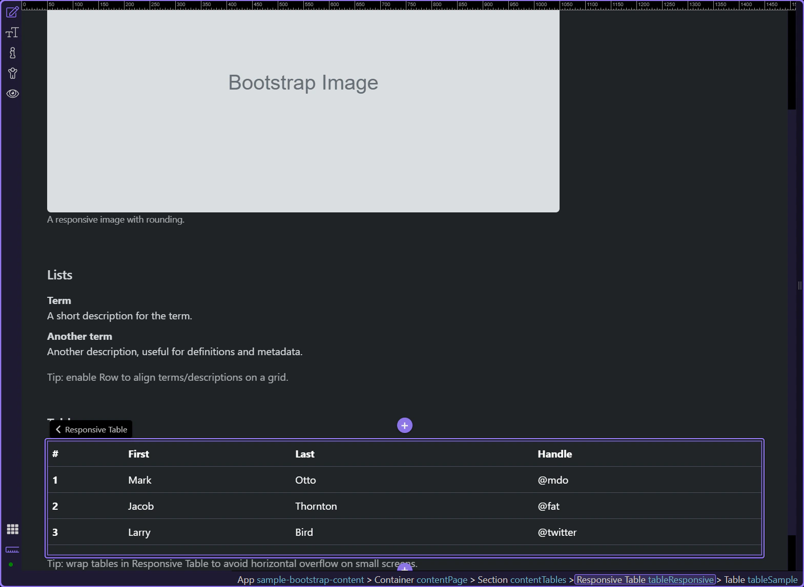
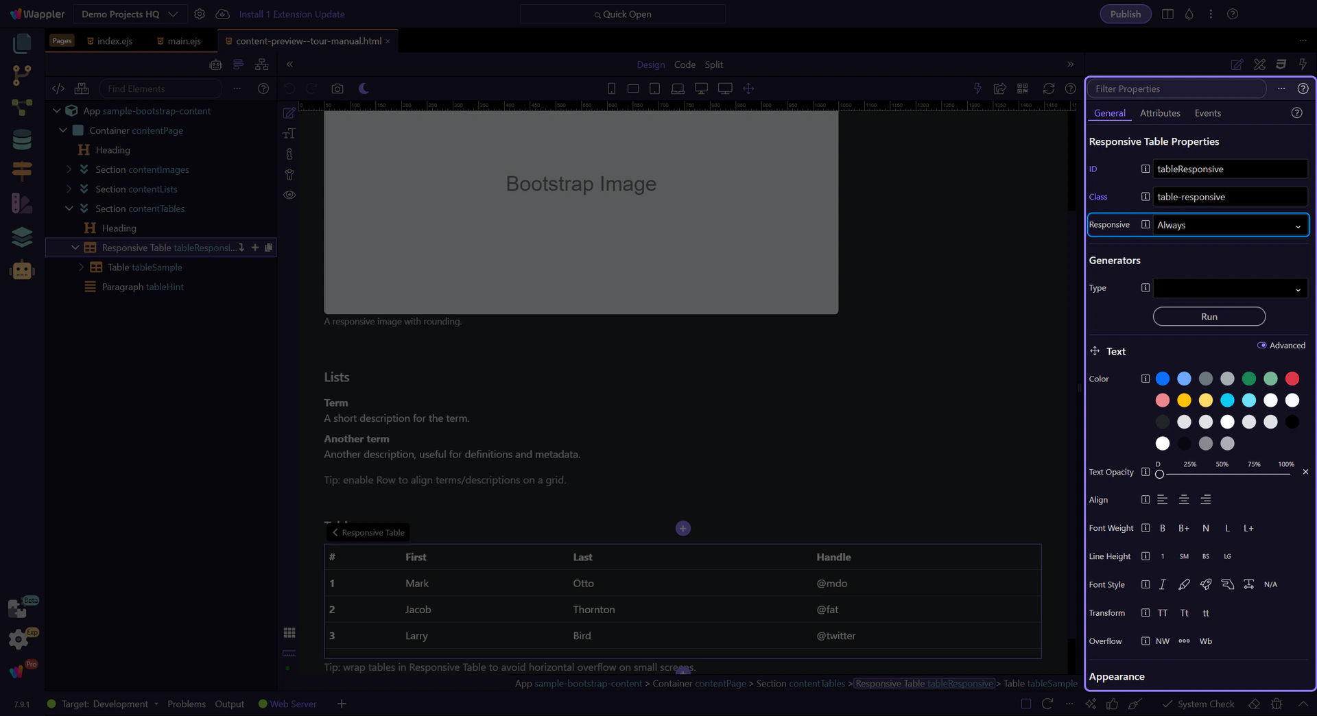
Responsive wrapper
Responsive wrappers add horizontal scrolling on smaller screens, without breaking the table layout.
Responsive wrapper
The .table-responsive wrapper controls when scrolling is enabled (not the table itself). This step matters because Responsive wrapper is part of Design View, and understanding that context makes the next action easier to repeat in your own project.
Responsive: Breakpoint behavior
Use Responsive to choose if the table should scroll horizontally always, or only up to a specific breakpoint. This step matters because Responsive: Breakpoint behavior is part of Selection Panels Properties Tableresponsivetype, and understanding that context makes the next action easier to repeat in your own project.
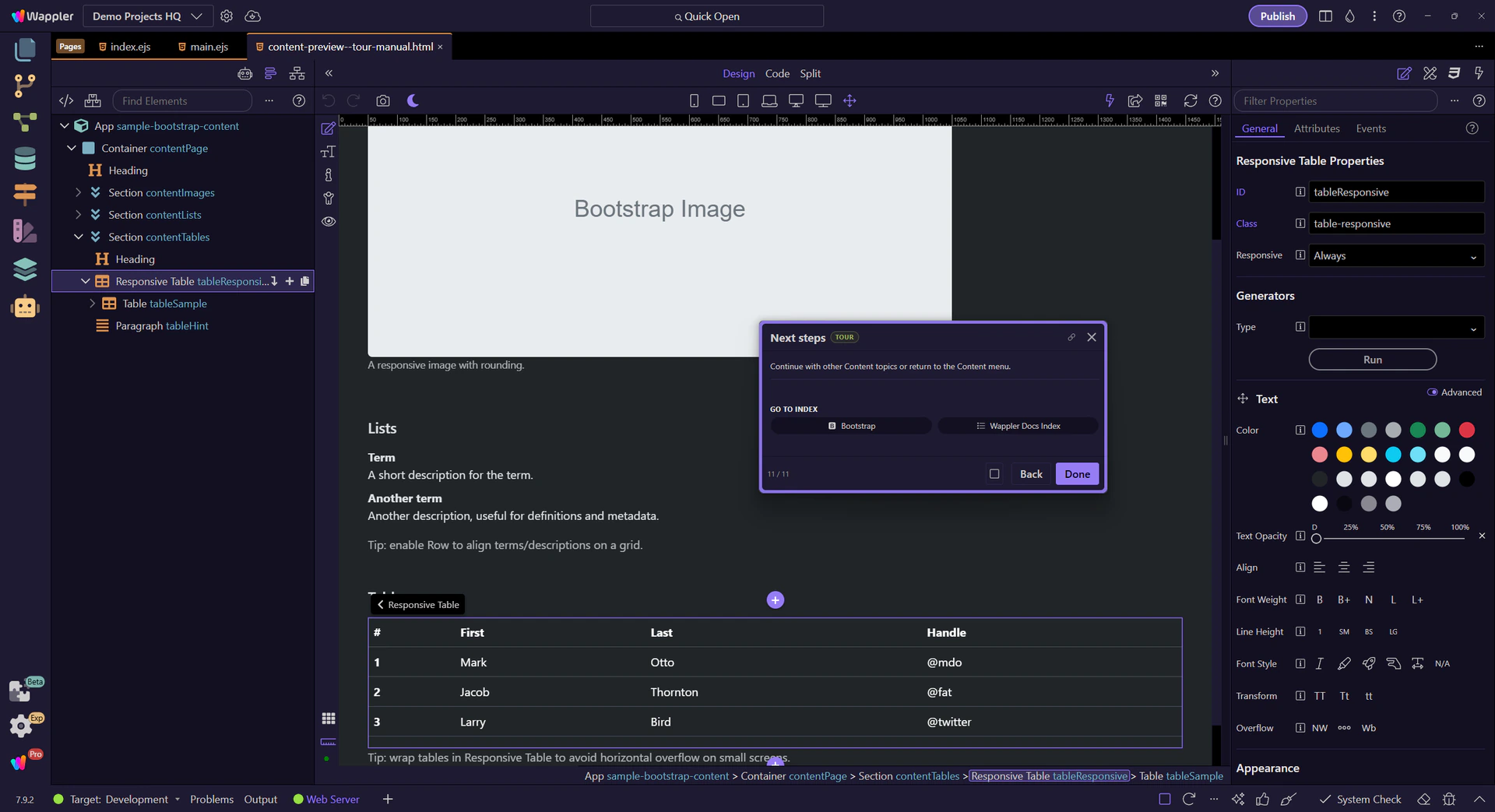
Next steps
Continue with other Content topics or return to the Content menu.