Bootstrap 4 Layout Basics
Open your HTML file, and add App Connect and Bootstrap 4 frameworks to your page. Please check the How To Guide of the documentation to see how to include them. First, let’s add a container. Container
Step 1
Section titled “Step 1”Open your HTML file, and add App Connect and Bootstrap 4 frameworks to your page. Please check the How To Guide of the documentation to see how to include them.
First, let’s add a container. Containers are the most basic layout element in Bootstrap and are required when using its grid system. Click on the add element button on your page:

Select Container:
Section titled “Select Container:”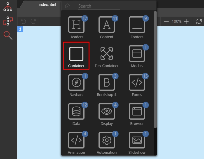
Then, click the insert inside button:
Section titled “Then, click the insert inside button:”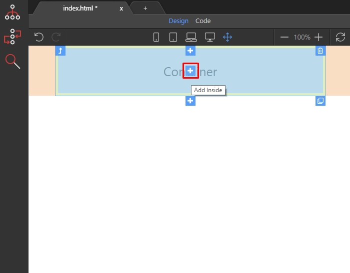
Step 4
Section titled “Step 4”The smart insert element dialog suggests you the most suitable elements to add inside the container. In order to create a multi-column layout using the Bootstrap grid, we should add a row inside the container:
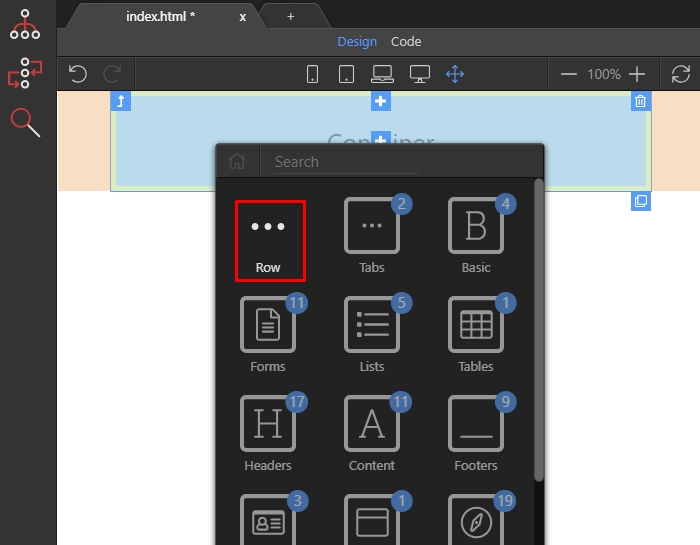
Then, inside the row we should nest the columns. Click the add inside button:
Section titled “Then, inside the row we should nest the columns. Click the add inside button:”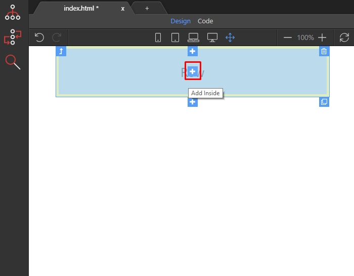
And select column:
Section titled “And select column:”
Step 7
Section titled “Step 7”And now we have the column inserted in the row, on our page. You can see the column bot on the page, and in the App Structure Tree. Select it by clicking it either in Design view or in the App Structure tree:
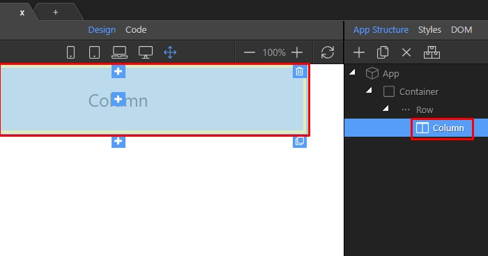
Step 8
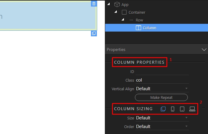
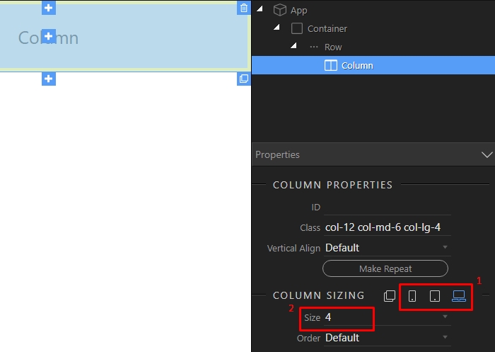
Section titled “Step 8”In order to change the default column size check the properties inspector and under Column Properties (1) you will see the Column Sizing options (2). Here you can assign different column sizes for all device sizes or define a specific size for each of them:
Step 9
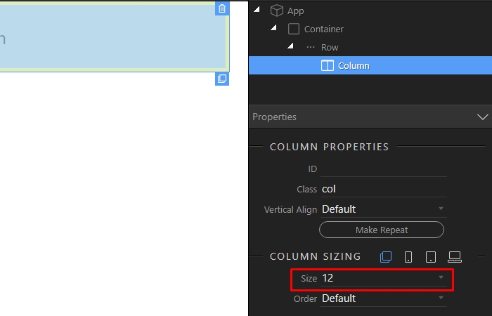
Section titled “Step 9”We set the default size to 12. This means that if no specific size is defined for any of the screen sizes the column will always take 100% of the row width:
Step 10
Section titled “Step 10”However if you wan want to have the column width to change on different devices, click on the device icons (1) and set specific column sizes (2) for each of them:
You can nest your content inside the columns. Let’s add something simple inside. Click the add inside button:
Section titled “You can nest your content inside the columns. Let’s add something simple inside. Click the add inside button:”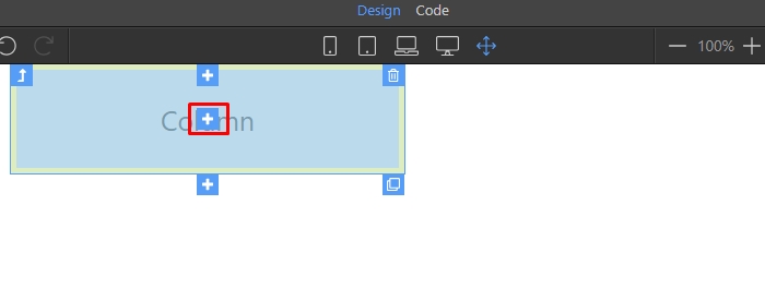
Open the basic elements category:
Section titled “Open the basic elements category:”
And select paragraph:
Section titled “And select paragraph:”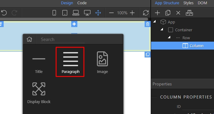
Double click and edit the paragraph - just add whatever text you like inside.
Section titled “Double click and edit the paragraph - just add whatever text you like inside.”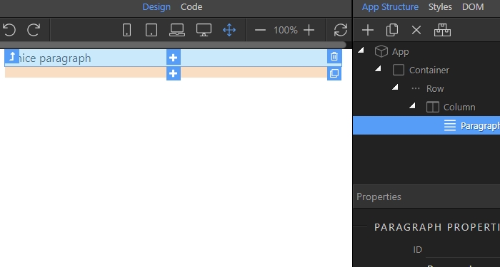
Step 15
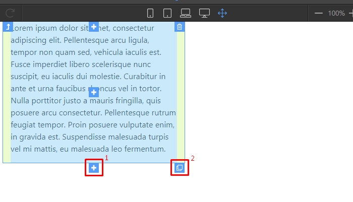
Section titled “Step 15”You can add more columns, inside the row either by selecting the Insert After button (1) or by duplicating the current column, its properties and its contents using the Duplicate button (2):
Step 16
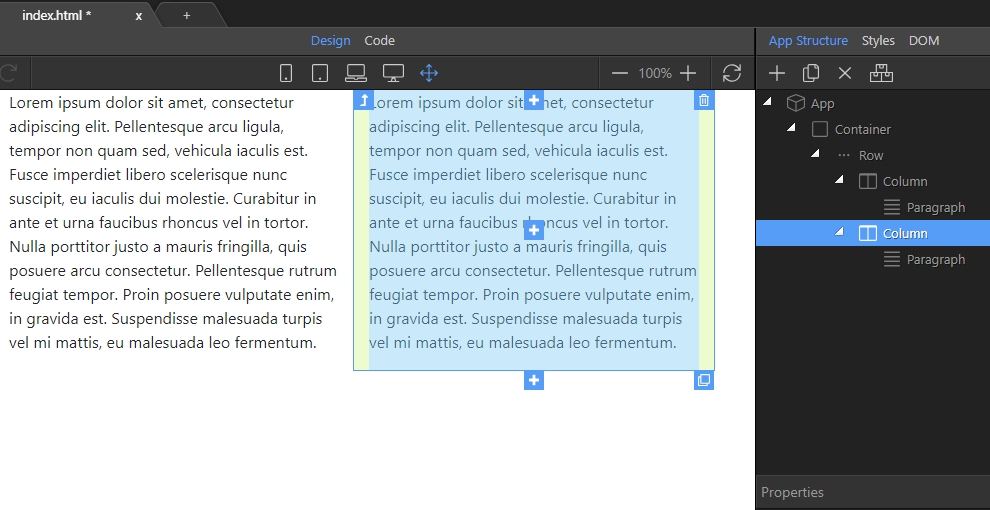
Section titled “Step 16”We just duplicate the current column and you can see the new column in Design View and in the App Structure tree: