Bootstrap 4 Cards
A card is a flexible and extensible content container. It includes options for headers and footers, a wide variety of content, contextual background colors, and powerful display options. We will show
We have an empty column, so we select insert inside:
Section titled “We have an empty column, so we select insert inside:”A card is a flexible and extensible content container. It includes options for headers and footers, a wide variety of content, contextual background colors, and powerful display options.
We will show you how to insert cards in your layout.
We have an empty column, so we select insert inside:
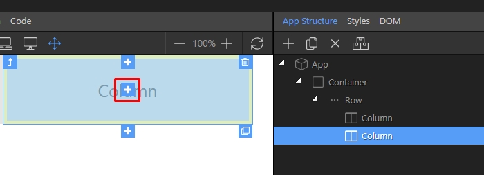
Open the Cards category:
Section titled “Open the Cards category:”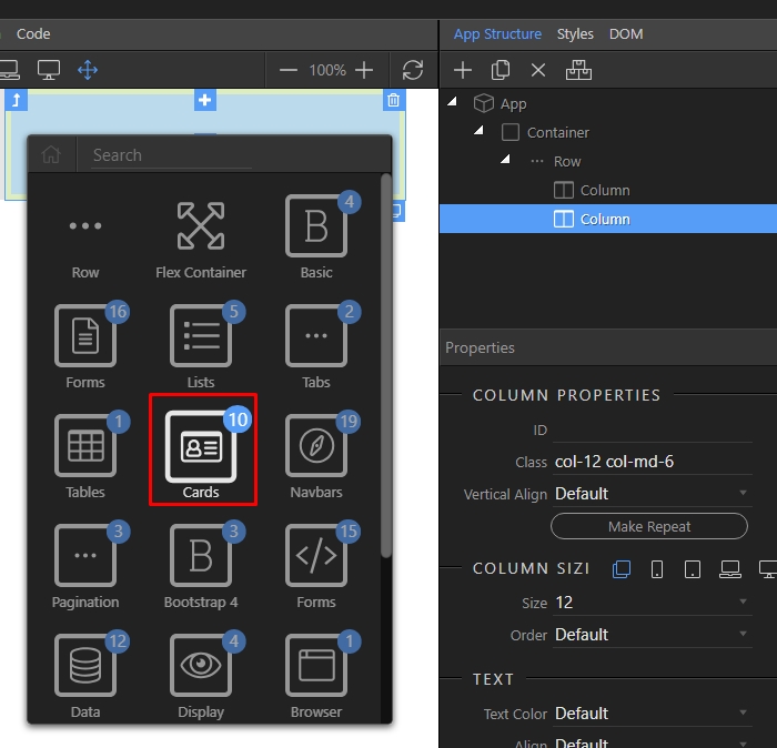
You can find different Card layout templates here. Just select the one you need:
Section titled “You can find different Card layout templates here. Just select the one you need:”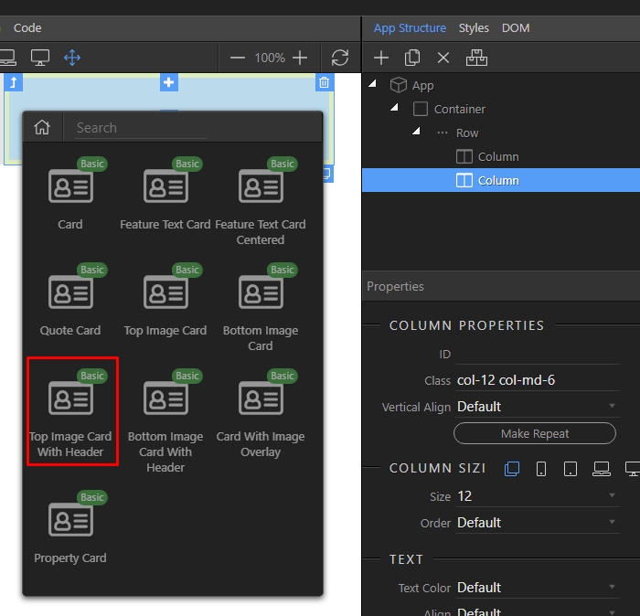
Step 4
Section titled “Step 4”You can see the card added in on the page, and you can also explore its features in the App Structure, where you can also add content to it, remove elements and style it:
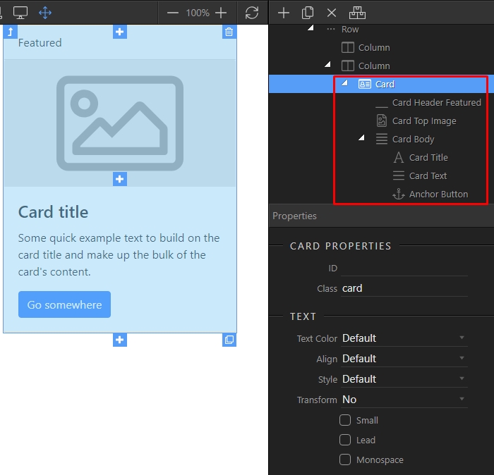
Let’s select an image for the card. Click the card image element and browse to an image source:
Section titled “Let’s select an image for the card. Click the card image element and browse to an image source:”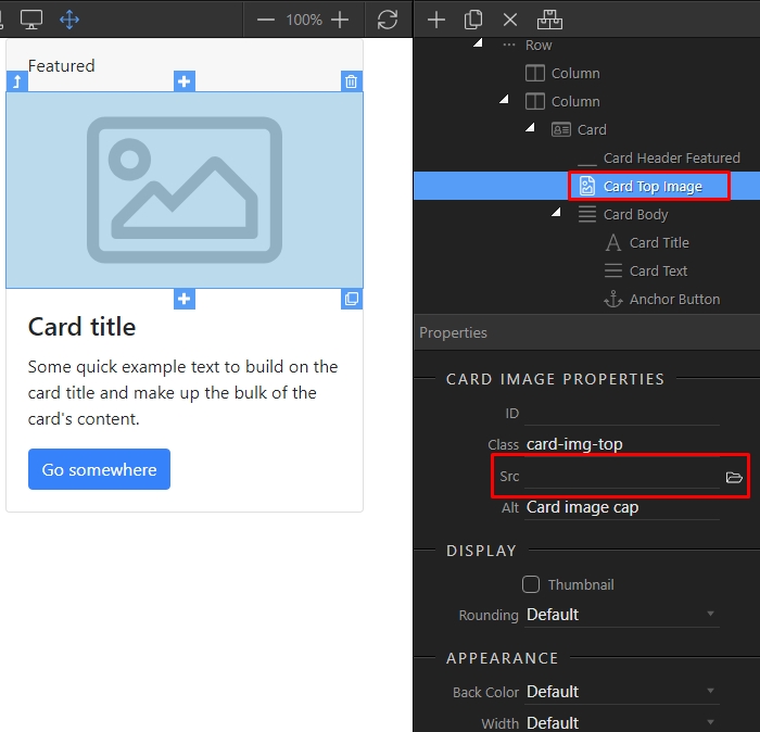
Then, you can double click the Card header and change the default text:
Section titled “Then, you can double click the Card header and change the default text:”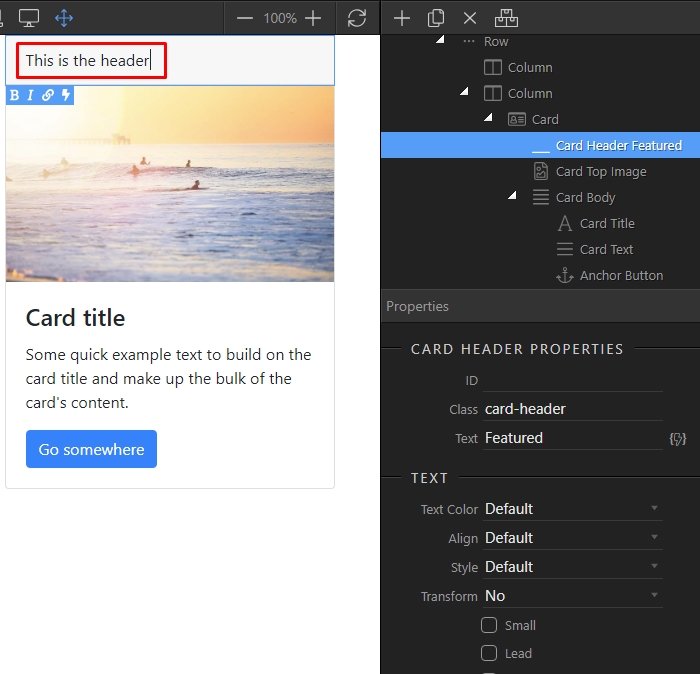
You can add a footer to the Card, by selecting its body and clicking the add after button:
Section titled “You can add a footer to the Card, by selecting its body and clicking the add after button:”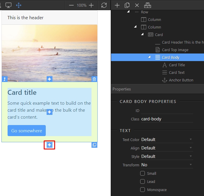
You can see that the most suitable elements are suggested in the insert dialog. Select card footer:
Section titled “You can see that the most suitable elements are suggested in the insert dialog. Select card footer:”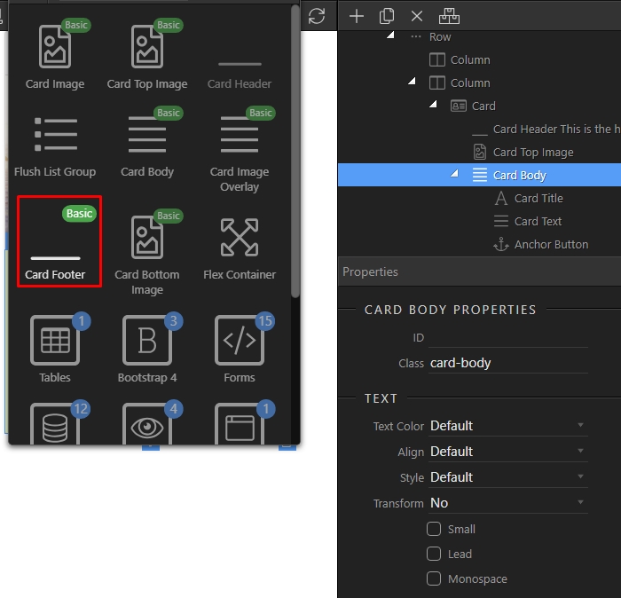
You can add some content in the footer, just click the add inside button:
Section titled “You can add some content in the footer, just click the add inside button:”
Step 10
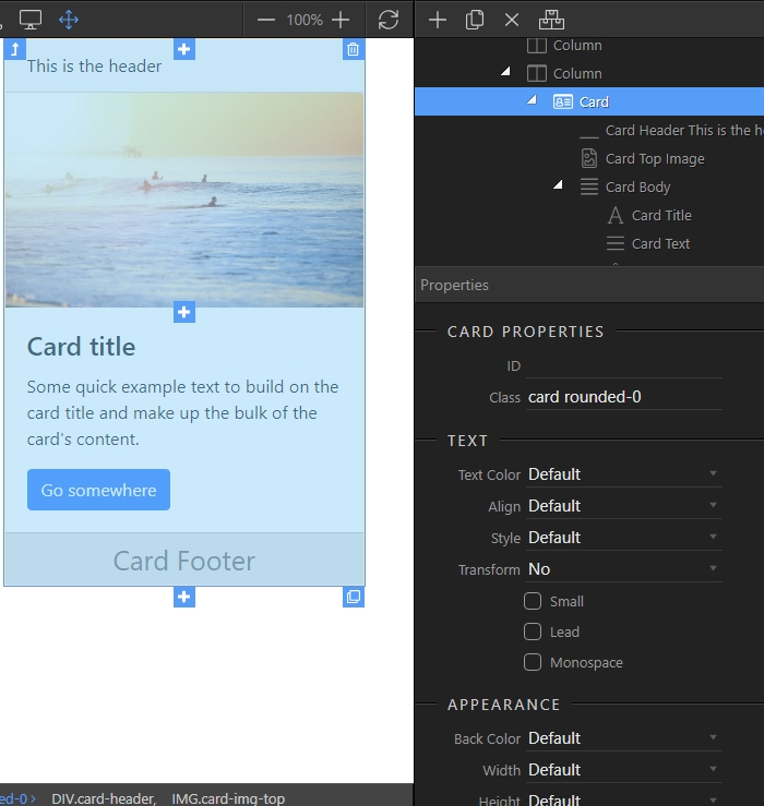
Section titled “Step 10”Editing a card and its elements’ properties is easy. Just select the card (or any of its elements) and you will see all of the available properties in the properties inspector:
Step 11
Section titled “Step 11”