
Bootstrap Integration
Bootstrap and Wappler's visual integration Bootstrap is the world’s most popular front-end framework, providing a responsive grid system and a wide range of prebuilt components. With the help of Wappl
Bootstrap and Wappler's visual integration
Section titled “Bootstrap and Wappler's visual integration”Bootstrap is the world’s most popular front-end framework, providing a responsive grid system and a wide range of prebuilt components.
With the help of Wappler's visual tools, you can build valid Bootstrap pages and generate clean and semantic HTML. Supported versions are Bootstrap 4 and Bootstrap 5.
Including Bootstrap on your Pages
Section titled “Including Bootstrap on your Pages”By default, when starting a new project Bootstrap 5 will be added to all the pages, which you create inside Wappler.
Per Project
Section titled “Per Project”You can change the default frameworks for your project, by clicking the project settings button:
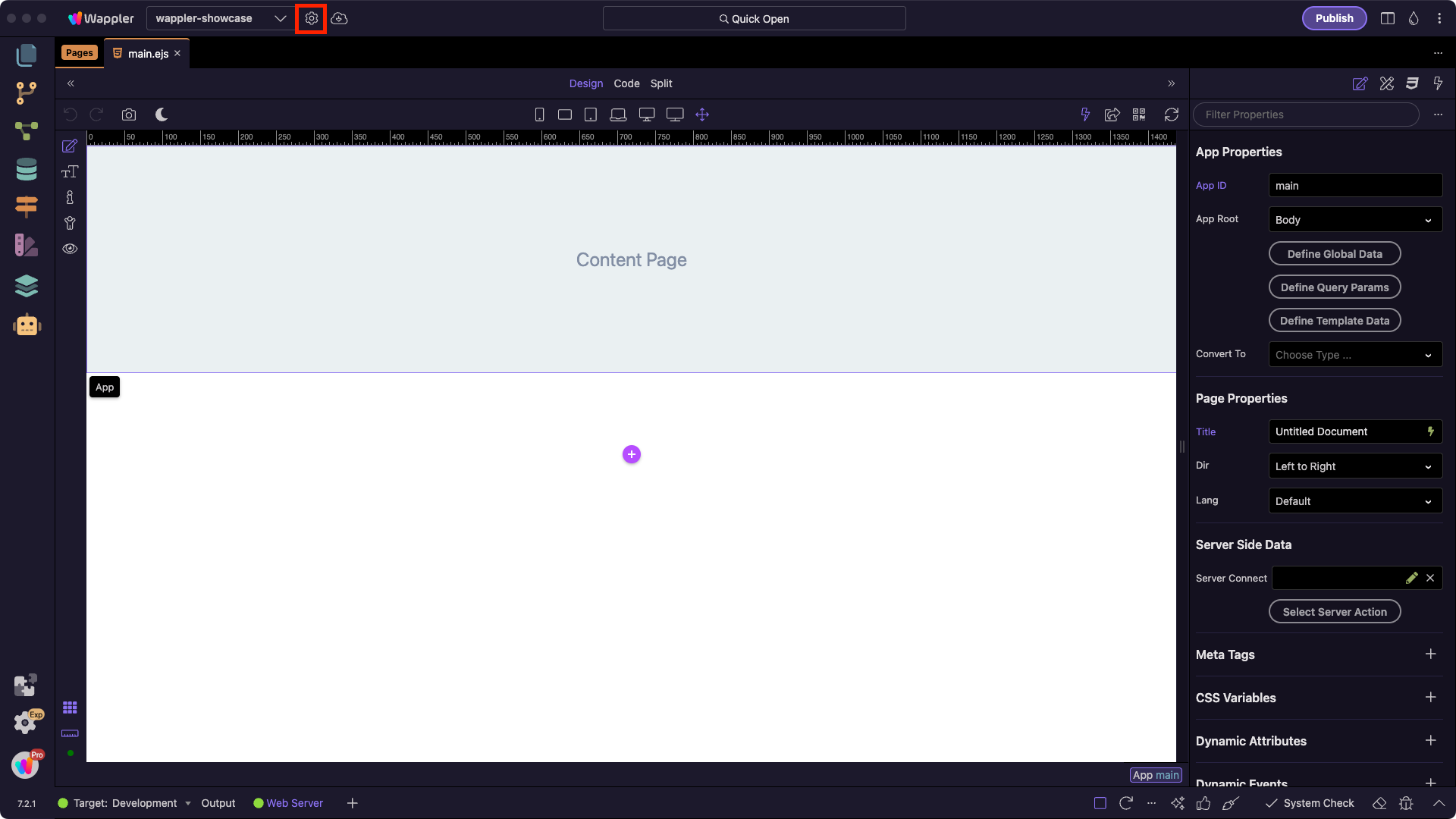
Then go to Frameworks:
Section titled “Then go to Frameworks:”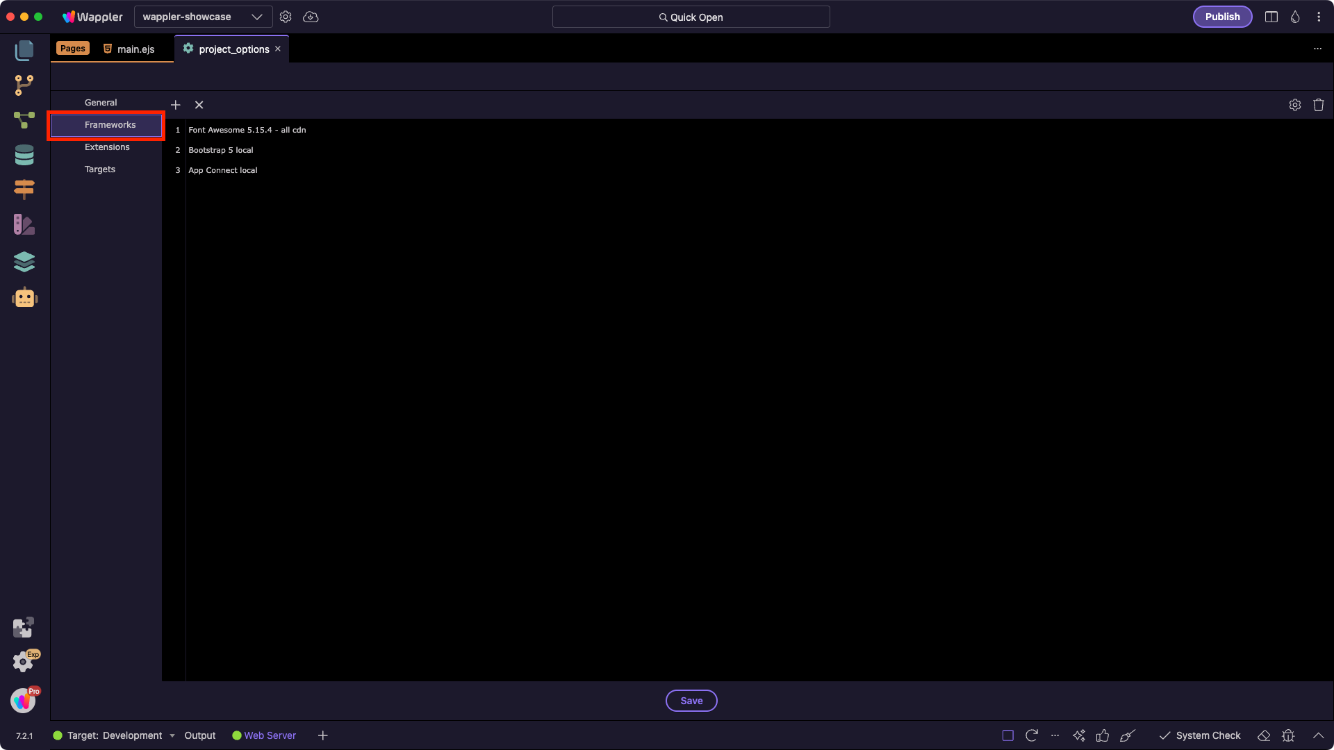
Step 5
Section titled “Step 5”Here you can add or remove the default frameworks that you want to be added on any new page you create in your project:
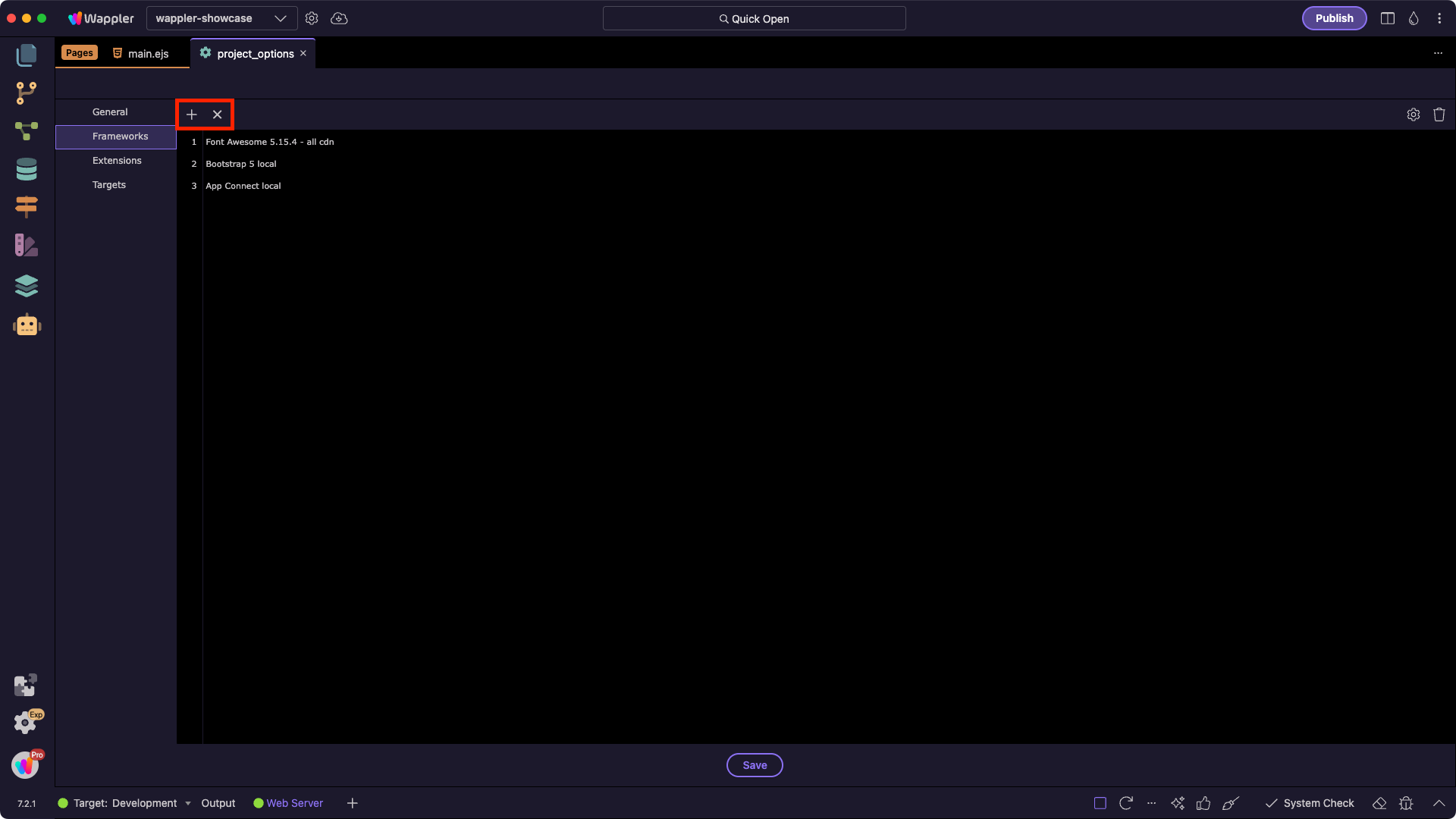
Per Page
Section titled “Per Page”You can also add Bootstrap per page, using the Frameworks menu:
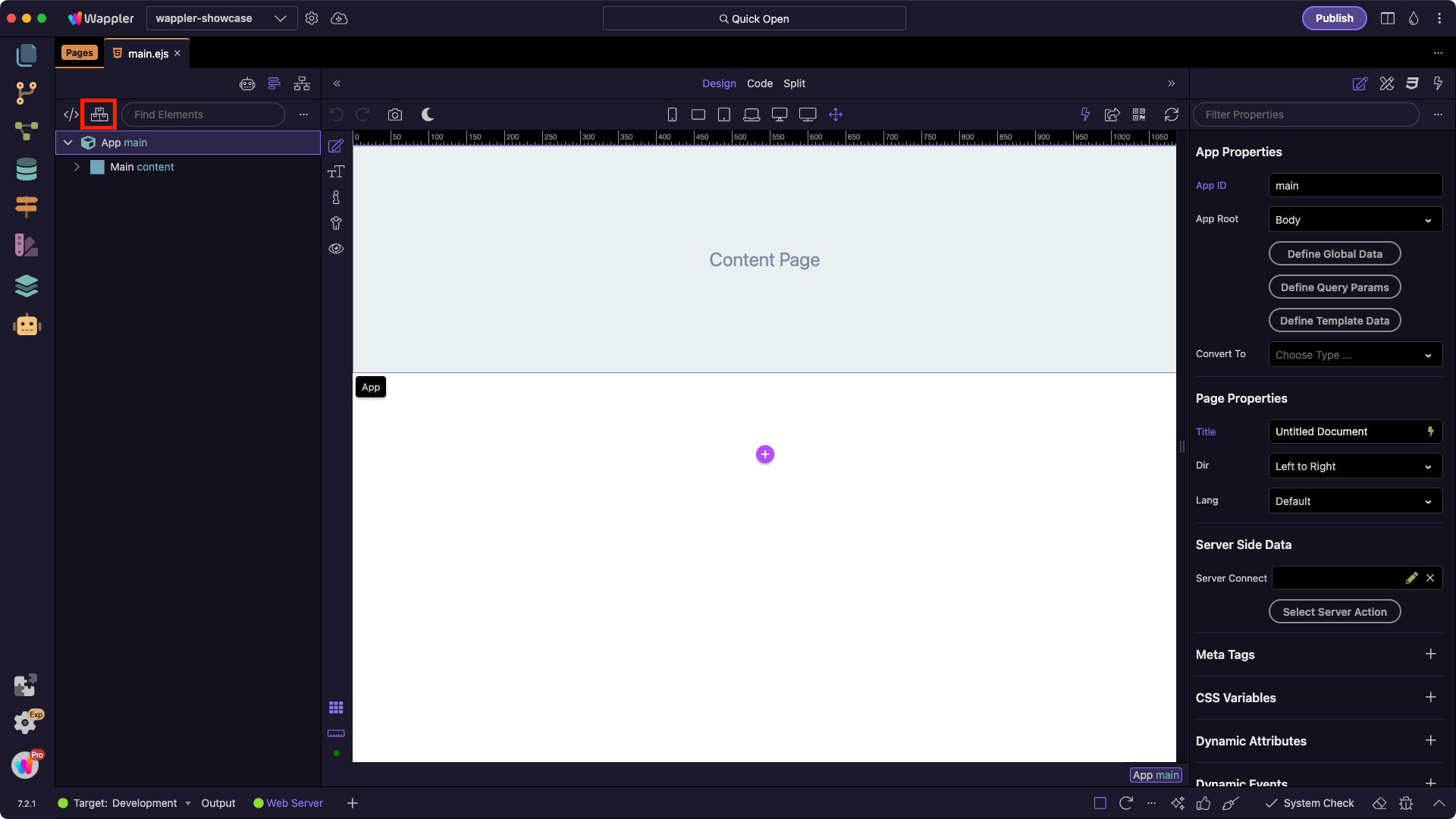
Select Bootstrap and you can see the supported Bootstrap versions and the available custom Bootswatch themes:
Section titled “Select Bootstrap and you can see the supported Bootstrap versions and the available custom Bootswatch themes:”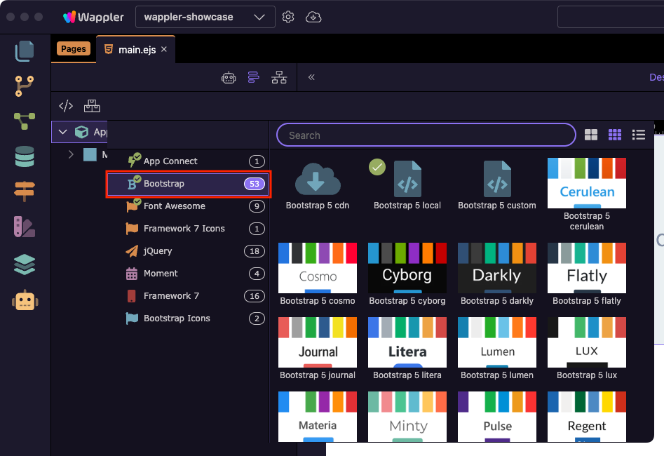
When you select a Bootstrap version, Wappler adds it to your page.
Section titled “When you select a Bootstrap version, Wappler adds it to your page.”Local vs CDN
Section titled “Local vs CDN”You can include a local version of Bootstrap or the one hosted on a CDN (content delivery network).
When using a CDN, Bootstrap files are served from fast global servers close to your visitors, which can improve loading times. With a local setup, the files are hosted on your own server — useful if you want full control or need offline development.
When you select Bootstrap local, the Bootstrap core css and js files are stored on your server and served to the site visitors from your server.
Visual Tools
Section titled “Visual Tools”Wappler makes working with Bootstrap easy — no need to look up classes in the documentation. Everything you need to build fully functional Bootstrap websites is available visually.
Layout
Section titled “Layout”Build your Bootstrap layout visually using the layout builder tools.
Start with the standard Bootstrap structure: Container → Row → Columns:
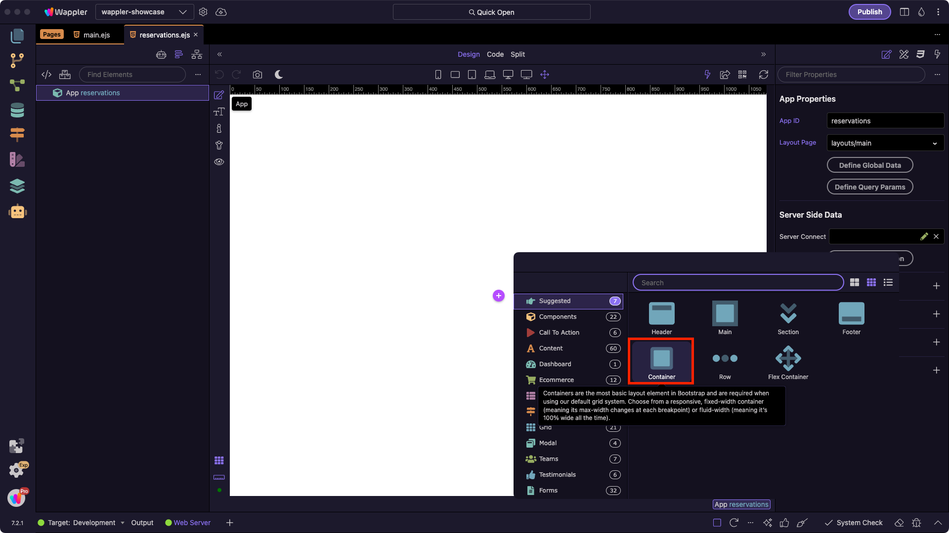
And visually resize the columns widths for the selected breakpoints:
Section titled “And visually resize the columns widths for the selected breakpoints:”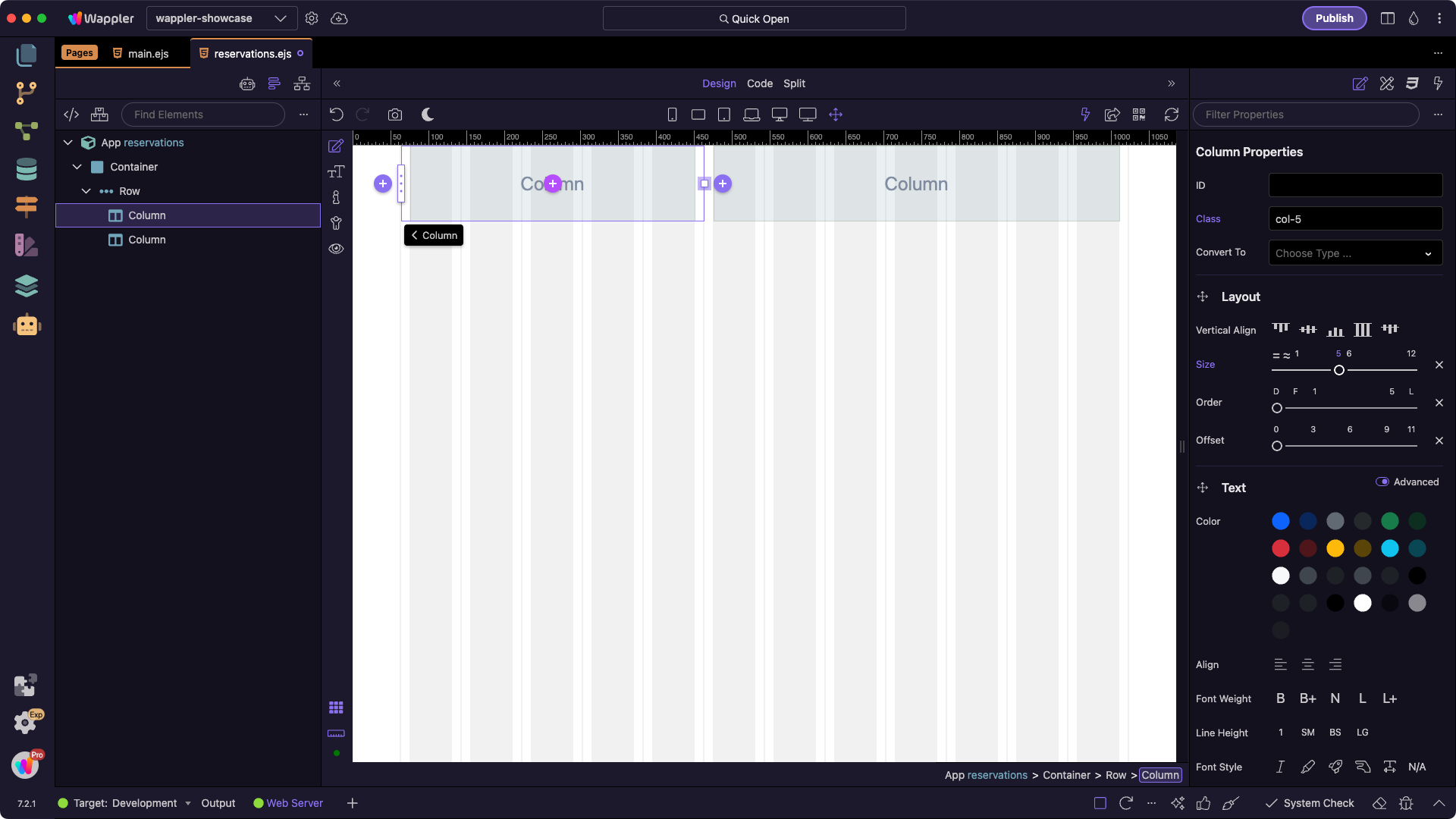
Components
Section titled “Components”Add components to your pages visually using the smart context panel. It suggests only the elements that are suitable for your current selection:
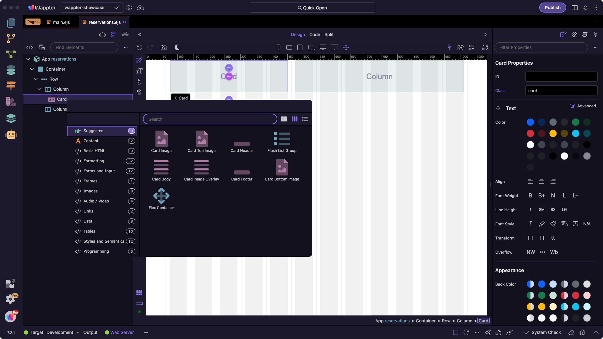
Properties
Section titled “Properties”Use the Properties Inspector in the App Structure panel to style selected elements. Adjust colors, borders, margins, and padding with just a few clicks:

Step 18
Section titled “Step 18”With Bootstrap integrated, you can now start building responsive layouts and adding components visually in Wappler.