
Reusable Partials and Includes
A guided Node.js workflow for reusable partial pages, shared shell sections, and the layouts that include them.
Partials keep repeated interface sections in one place
Section titled “Partials keep repeated interface sections in one place”A partial is a reusable server-rendered fragment: navigation, a sidebar, a footer, or another section that several layouts or pages should share. Demo Projects HQ provides a complete working example, so this tour moves from Pages Manager into the real partial files and then into the layout that assembles them.
One workflow from creation to composition
Section titled “One workflow from creation to composition”You’ll see where partials live, how the Create Page dialog recognizes the partials folder, how a partial stays editable in Design and Code views, and how EJS include statements compose the final layout.
Use a partial for a reusable fragment, not a route
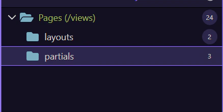
Section titled “Use a partial for a reusable fragment, not a route”Regular content pages own route-specific content. Layouts own the broad page shell. Partials own focused reusable fragments inside that shell. Keeping those roles separate makes shared UI easy to update without duplicating markup across pages.
Create and organize partials in Pages Manager
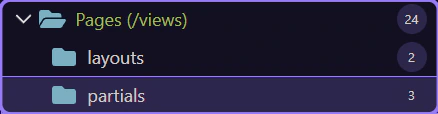
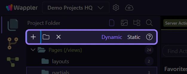
Section titled “Create and organize partials in Pages Manager”Pages Manager understands the role of the selected folder. In a Node.js project, choosing partials before Create Page makes the page type explicit and keeps reusable fragments together.
The `partials` folder is selected
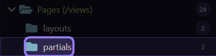
Section titled “The `partials` folder is selected”This is the dedicated home for reusable EJS fragments in Demo Projects HQ. Selecting it filters the file tiles and gives the Create Page flow the correct folder context.
The project already has a practical partial library
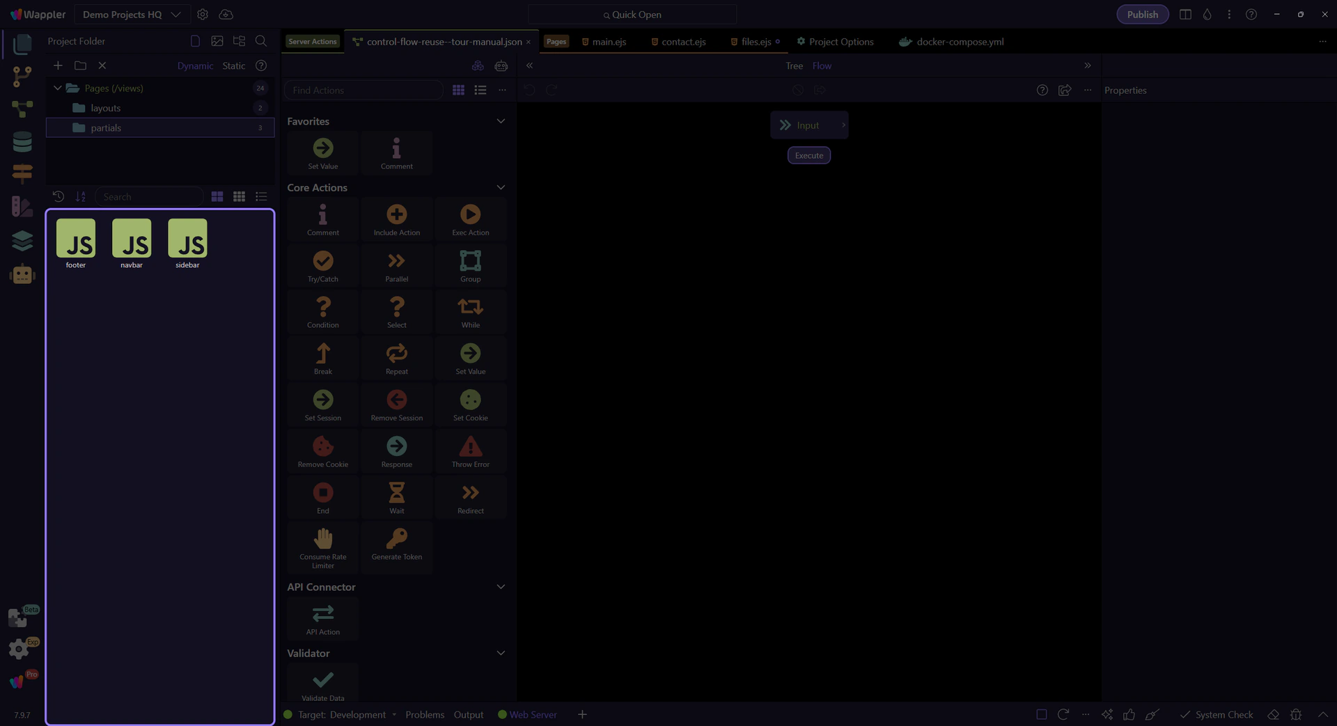
Section titled “The project already has a practical partial library”navbar.ejs, sidebar.ejs, and footer.ejs are independent fragments with clear responsibilities. This organization makes direct access easy: open only the shared section you need to change.
Create Page opens from the partials folder
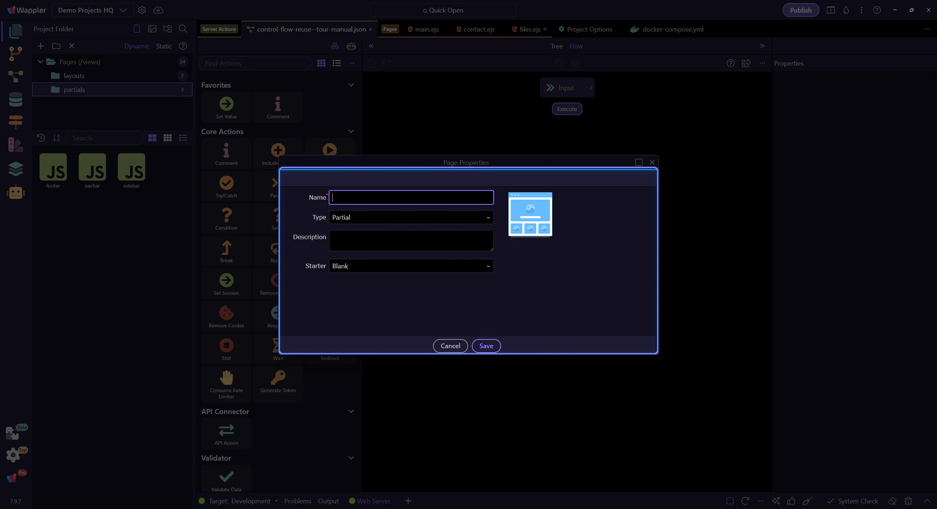
Section titled “Create Page opens from the partials folder”Use Next to open the real Page Properties dialog. Because the partials folder is selected, Wappler carries that context into the dialog automatically.
Page Properties keeps the partial context visible
Section titled “Page Properties keeps the partial context visible”The full dialog brings the file name, page role, layout relationship, and starter choice into one creation surface. The selected folder has already supplied the role for this workflow.
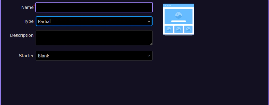
Page Type is already set to Partial
Section titled “Page Type is already set to Partial”The selected folder and Page Type agree, so the new file will be created as a reusable fragment rather than a routed page or layout. Give the partial a responsibility-based name such as account-menu or order-summary, then choose a starter only when it matches the fragment you need.
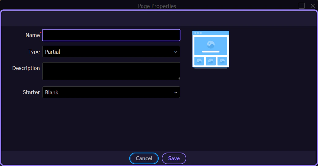
Close without creating a throwaway file
Section titled “Close without creating a throwaway file”The creation path is now clear. This tour cancels the dialog and opens the project’s existing sidebar partial, preserving the demo while continuing with a fully implemented example.
Edit a partial with the normal HTML Editor tools
Section titled “Edit a partial with the normal HTML Editor tools”Partials are not a separate editor mode. Once opened, they use the same Design, Structure, Properties, and Code workflow as other page files, while their include metadata keeps them connected to the correct shell.
Choose the focused fragment from the partial library
Section titled “Choose the focused fragment from the partial library”The Pages Manager content panel shows the available partial files together. The sidebar.ejs tile provides direct access to the reusable application navigation and is a strong example because its responsibility is obvious before the file opens.
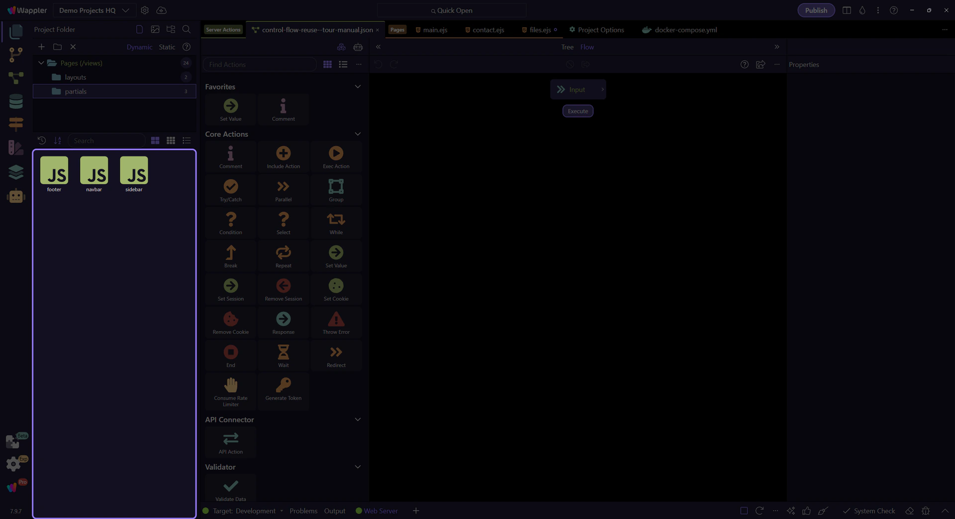
The real `sidebar.ejs` partial opens
Section titled “The real `sidebar.ejs` partial opens”The tour hands off from Pages Manager into the existing sidebar partial. It is a useful example because it contains several reusable navigation sections and stable element IDs you can inspect visually.
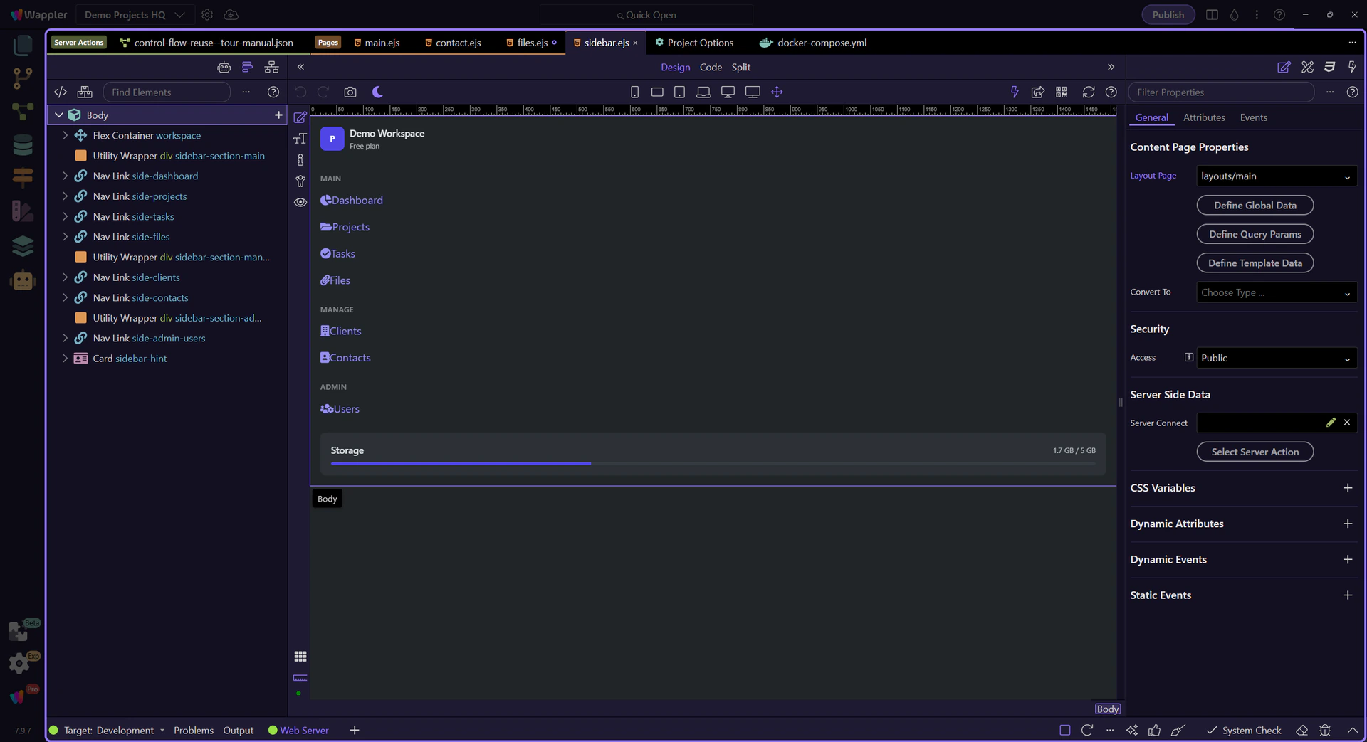
The sidebar partial is active in the HTML Editor
Section titled “The sidebar partial is active in the HTML Editor”The manager-to-editor handoff is complete. The normal HTML Editor workspace is now the focus, ready for the partial’s visual structure and code to be inspected.
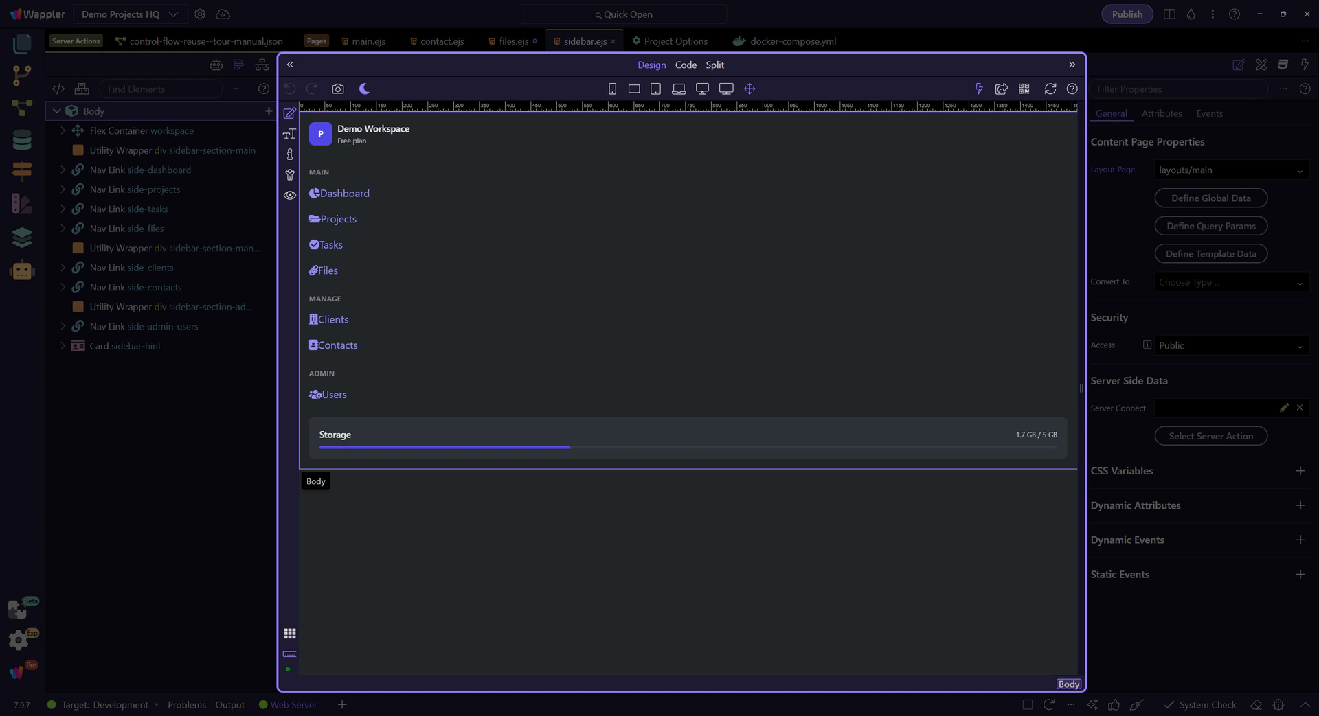
Design View renders the reusable fragment in context
Section titled “Design View renders the reusable fragment in context”The sidebar partial is now open in Design View. Wappler uses its head-page metadata to provide the surrounding layout context, so you can select and refine the shared navigation visually instead of editing an isolated text fragment.
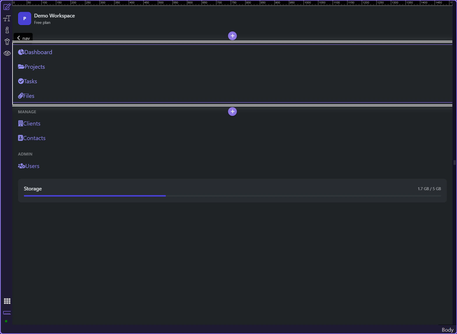
Page Structure maps the reusable fragment
Section titled “Page Structure maps the reusable fragment”The Structure panel provides the component-level outline for this partial. Start with the full panel before focusing on the fragment tree itself.
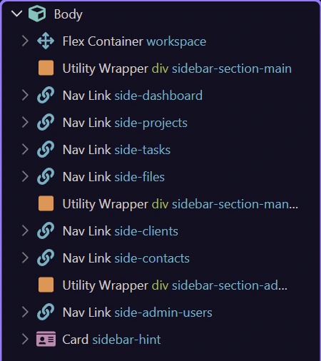
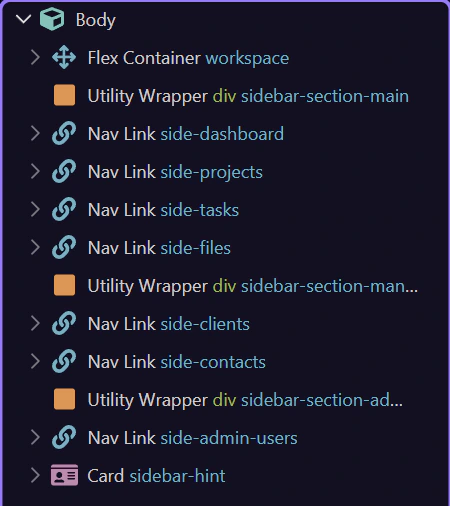
Structure keeps the partial editable as components
Section titled “Structure keeps the partial editable as components”Use Structure to navigate the fragment’s headings, navigation groups, links, and status card. A good partial remains focused enough that its component tree is easy to scan and safe to reuse.
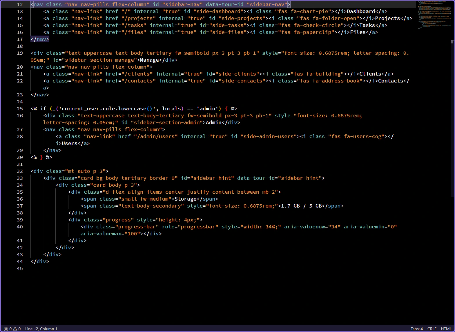
Code View shows the layout context declaration
Section titled “Code View shows the layout context declaration”The Wappler include header records which layout and frameworks provide editing context for this fragment. Keep it intact when reusing or refactoring a partial so Design View can continue to render it correctly.
<!-- Wappler include head-page="layouts/main" appConnect="local" bootstrap5="local" fontawesome_5="cdn" -->
A layout composes the partials into one shared shell
Section titled “A layout composes the partials into one shared shell”The reusable payoff appears in main.ejs: the layout includes each focused fragment once, then every routed content page inherits that assembled shell.
`main.ejs` opens for composition
Section titled “`main.ejs` opens for composition”The real layout is now open. Its include calls are the composition boundary between shared fragments and the route-specific content slot.
The main layout is active in the HTML Editor
Section titled “The main layout is active in the HTML Editor”The second file handoff is complete. The editor workspace now owns main.ejs, and the next step can focus on its include statements without skipping the transition.
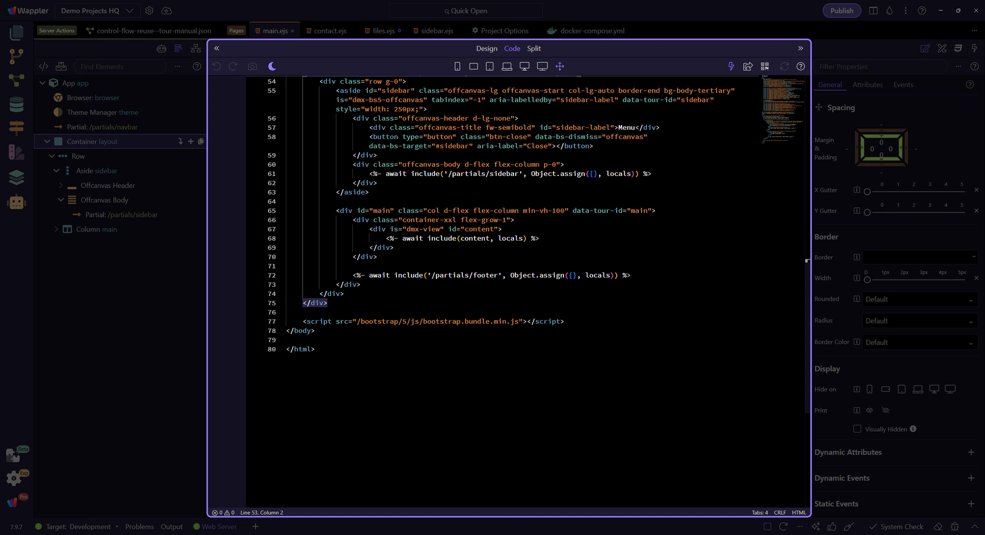
Each include names one reusable responsibility
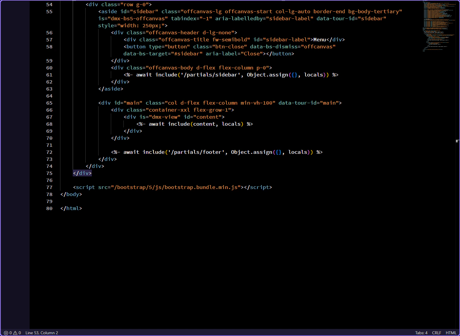
Section titled “Each include names one reusable responsibility”The layout includes the navbar, sidebar, and footer by their /partials/... paths and passes the current local context. The separate content include remains the route-specific slot. Editing any named partial updates every page that uses this layout.
<%- await include('/partials/navbar', Object.assign({}, locals)) %>
<%- await include('/partials/sidebar', Object.assign({}, locals)) %>
<%- await include(content, locals) %>
<%- await include('/partials/footer', Object.assign({}, locals)) %>
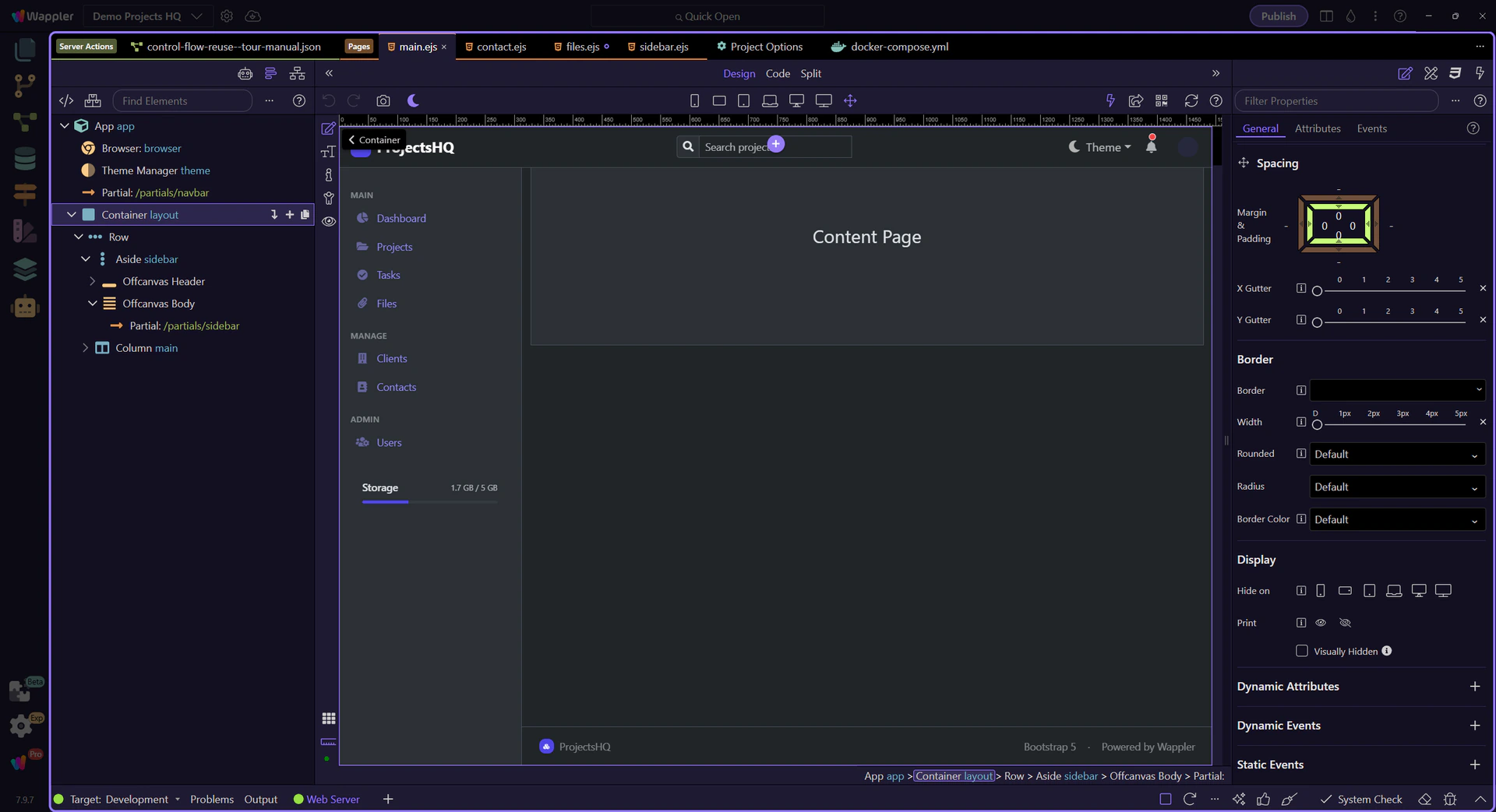
Design View assembles the shared shell
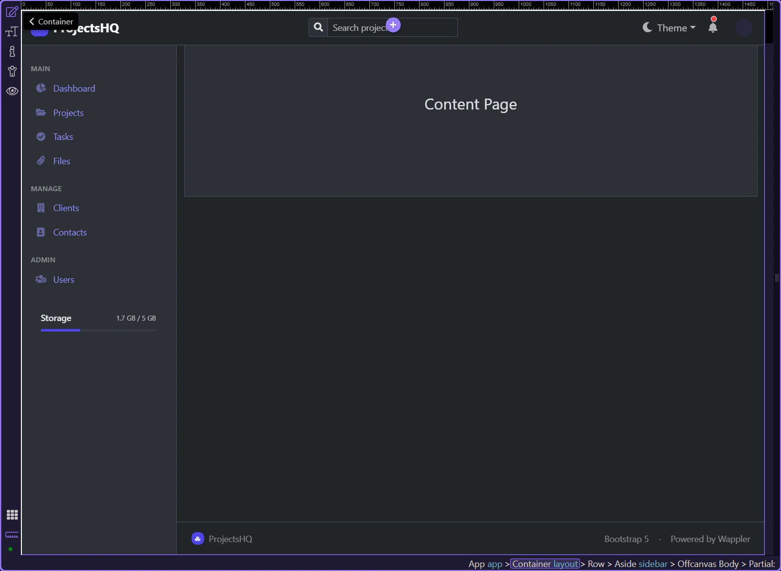
Section titled “Design View assembles the shared shell”Switching back to Design View renders the navbar, sidebar, routed content slot, and footer as one working shell.
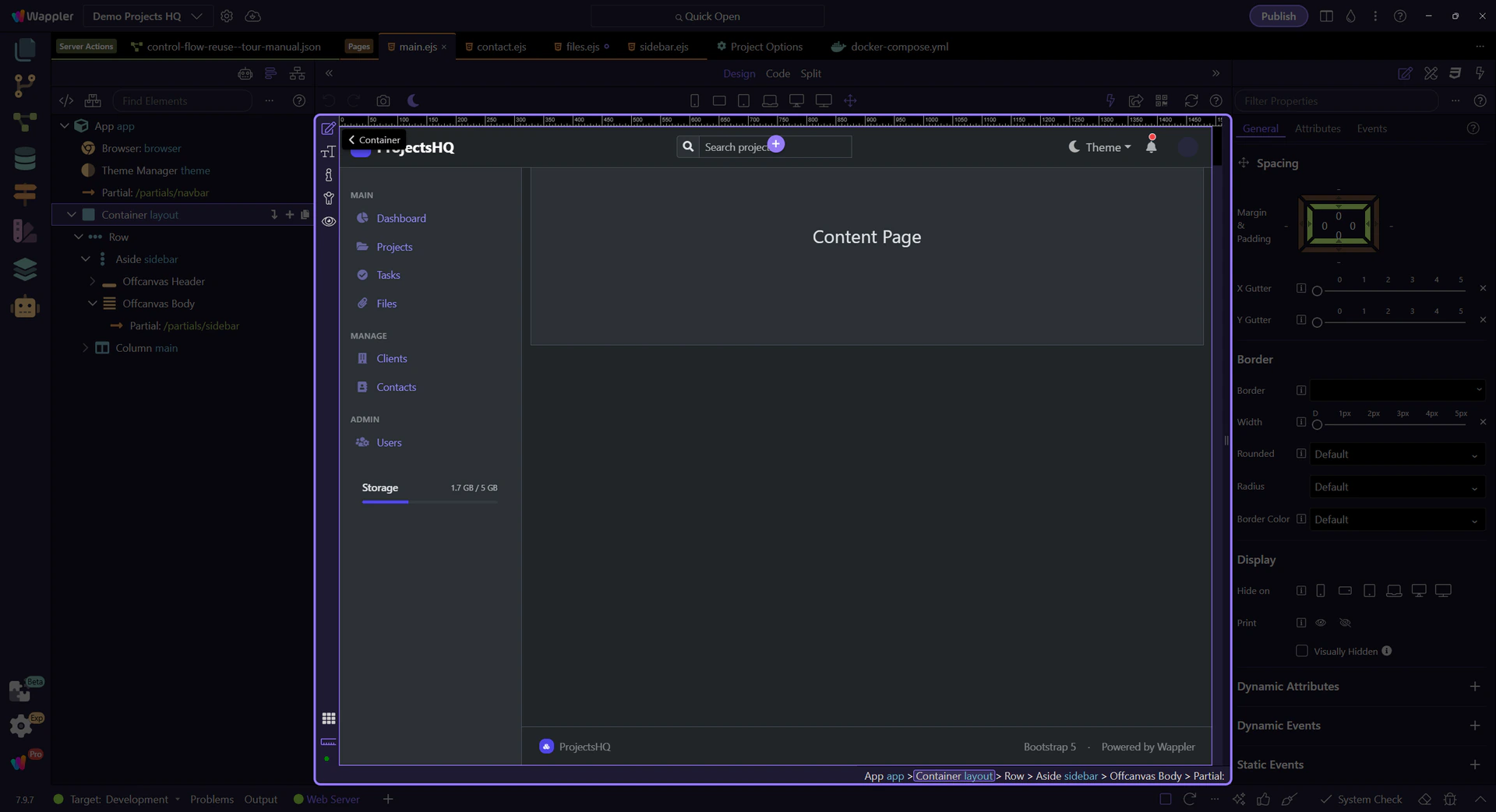
The composed layout remains visually editable
Section titled “The composed layout remains visually editable”The selected layout now shows every shared region together. This is why partials are valuable: each fragment stays independently maintainable while the layout remains easy to understand as a composition.
Build shared UI as a small, navigable partial library
Section titled “Build shared UI as a small, navigable partial library”Create partials from the dedicated folder, name each one after a focused responsibility, edit them with the normal HTML Editor tools, and include them from the layout that needs them. That gives beginners a gradual workflow while experienced builders can jump directly to the fragment or layout they need.