Demo walkthrough: Dynamic Real Estate Site
Guided walkthrough of the Demo Dynamic Real Estate Site, focusing on App Connect data loading, filtering, and UI bindings.
Open the demo project
Section titled “Open the demo project”We will open the demo project so you can see how App Connect connects data to the UI without writing code.
Projects Manager opens
Section titled “Projects Manager opens”The Projects Manager is the first piece of context for this walkthrough because it anchors the demo in a real Wappler project. You will open the sample app from the same place users manage other projects, then use that running project to trace how App Connect data sources, filters, and bindings work together on an actual page.

Demo project tile
Section titled “Demo project tile”We’ll open the Demo Dynamic Real Estate Site sample project. It already has data and App Connect components wired, so we can focus on how they work.
Opening the home page
Section titled “Opening the home page”We open index.html in Design View. This page renders the listings and uses App Connect bindings to show data.

Data loading (source → UI)
Section titled “Data loading (source → UI)”Next we find where the data comes from and how App Connect prepares it before anything shows on the page.
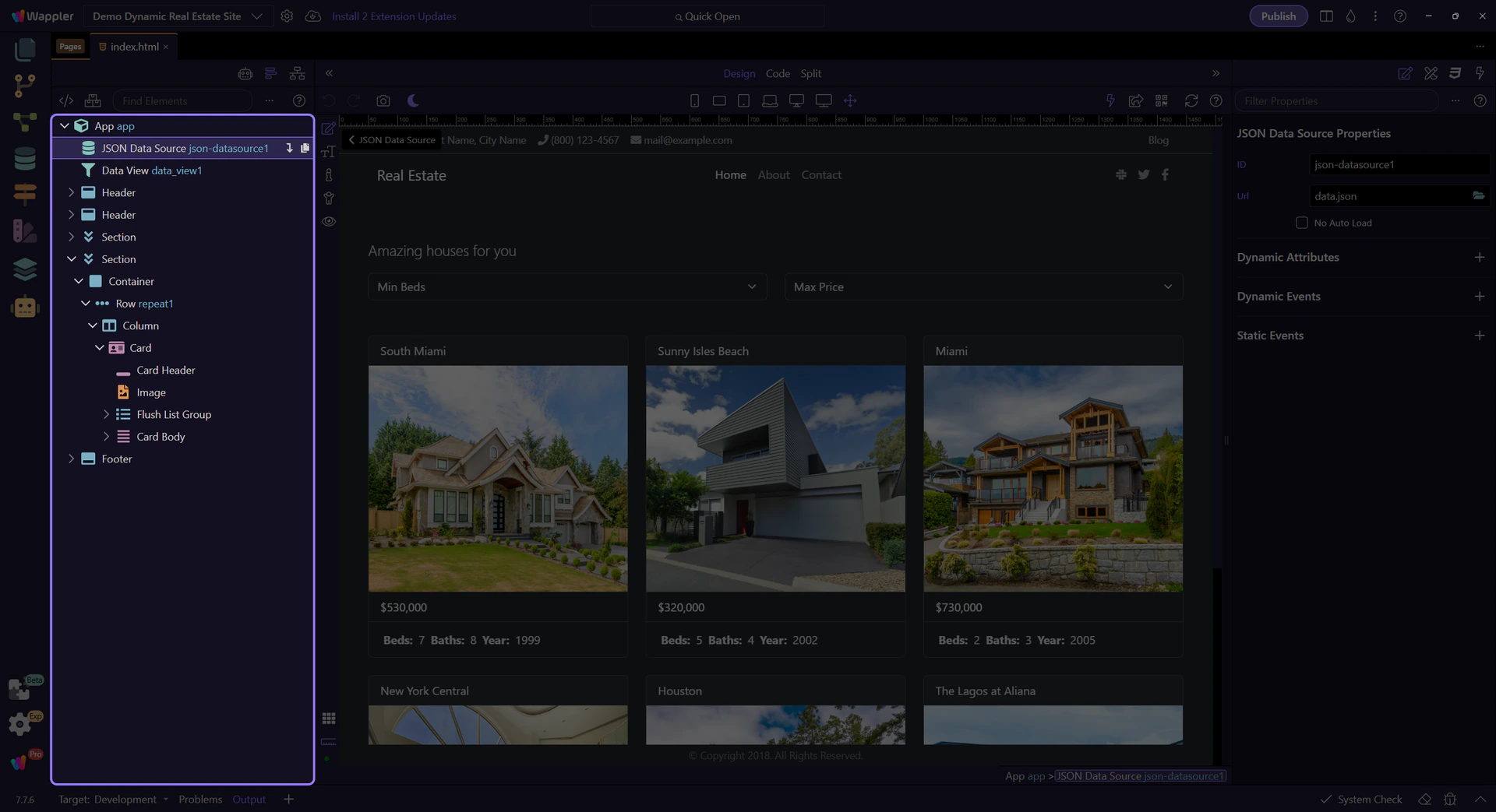
JSON data source
Section titled “JSON data source”The JSON data source downloads data.json and exposes it to the page. Think of it as the data loader.
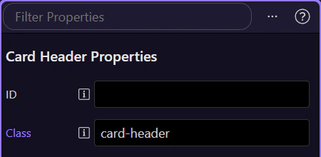
Orient yourself in Properties panel
Section titled “Orient yourself in Properties panel”Start with the wider context in the Properties panel so the next control makes sense in the full workflow. In the next step, you will focus on Data source settings and see how it fits into this area.
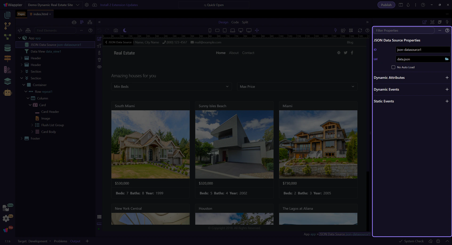
Data source settings
Section titled “Data source settings”Properties show the URL and the name of the data collection. Other components read from this.

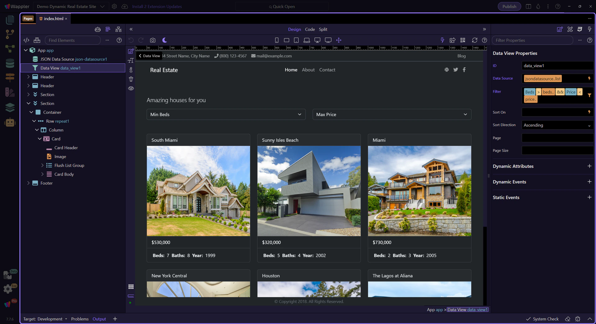
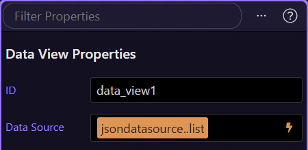
Data View component
Section titled “Data View component”Data View is a smart list. It takes the raw data and lets you filter, sort, or paginate it.
Data Picker (Data View source)
Section titled “Data Picker (Data View source)”We will use the Data Picker to connect the Data View to the JSON data source.
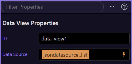
Data View source field
Section titled “Data View source field”This property tells the Data View which data collection to use. This step matters because Data View source field is part of Selection Panels Properties Dataviewsource, and understanding that context makes the next action easier to repeat in your own project.

Data Picker icon
Section titled “Data Picker icon”The lightning icon opens the Data Picker so you can choose data without typing. This step matters because Data Picker icon is part of Selection Panels Properties Dataviewsource, and understanding that context makes the next action easier to repeat in your own project.

Data Picker opens
Section titled “Data Picker opens”We open the Data Picker to pick the data collection for the Data View. This step matters because Data Picker opens is part of Selection Panels Properties Dataviewsource, and understanding that context makes the next action easier to repeat in your own project.
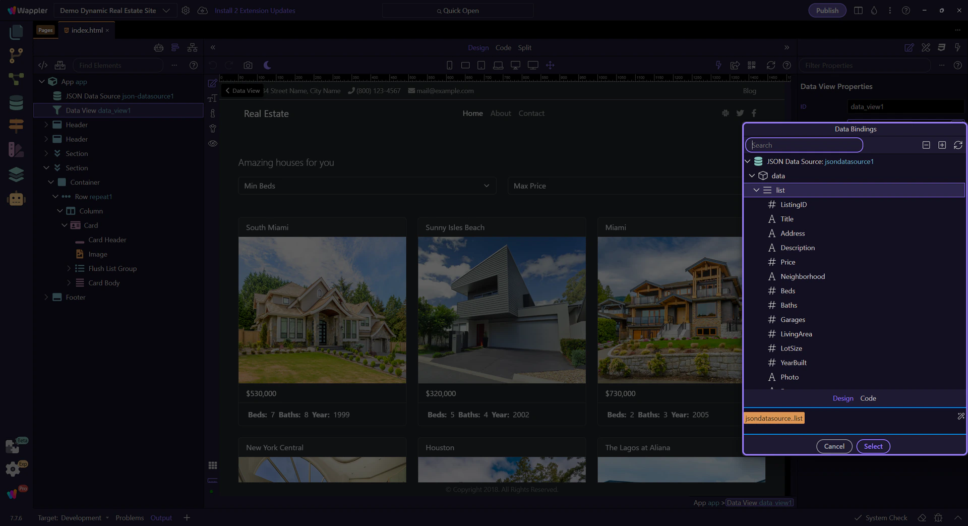
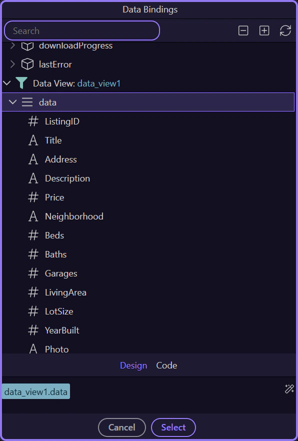
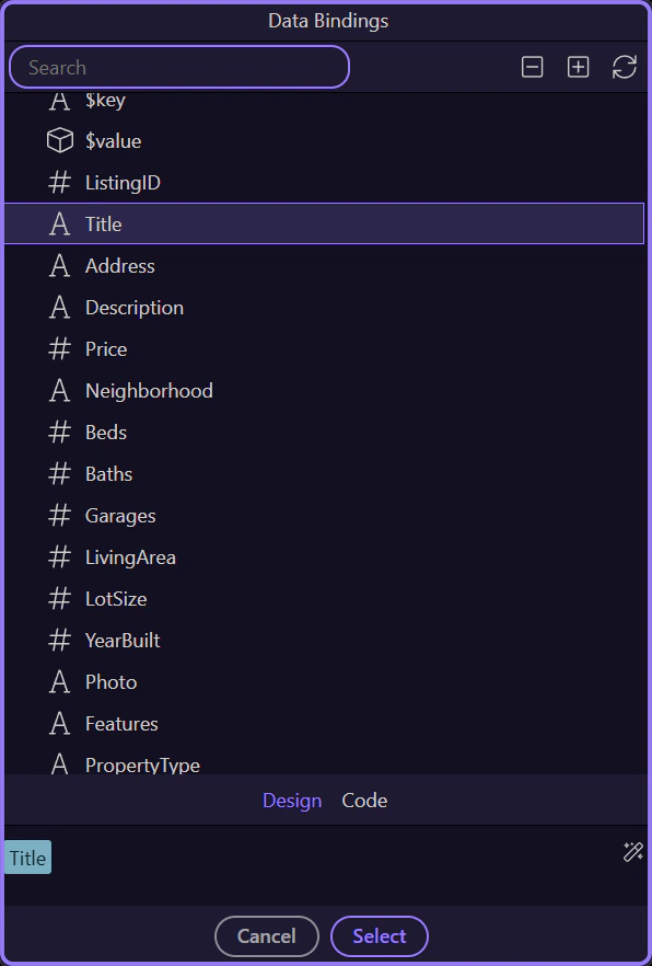
Data Picker overview
Section titled “Data Picker overview”Choose json-datasource1.data as the source list. This powers the Data View.
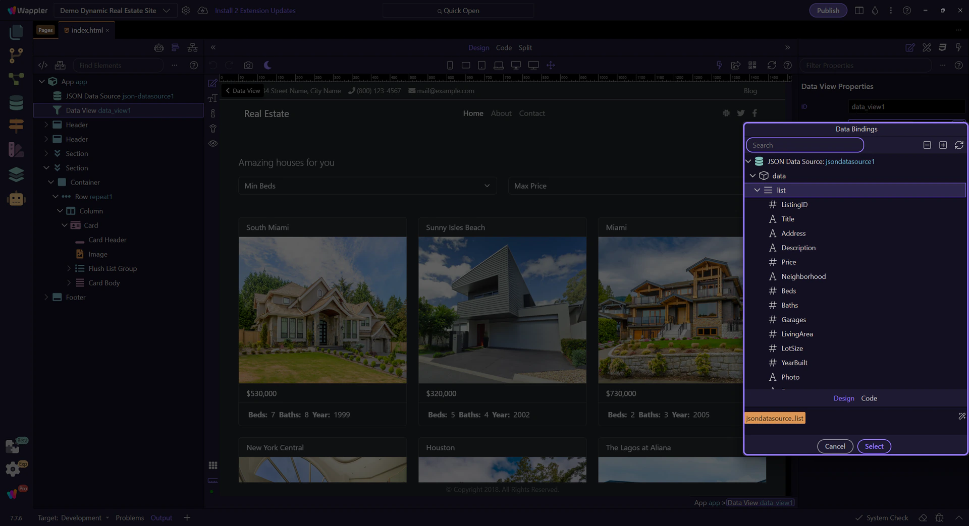
Data hierarchy tree
Section titled “Data hierarchy tree”Expand json-datasource1 → data to see available fields you can bind.
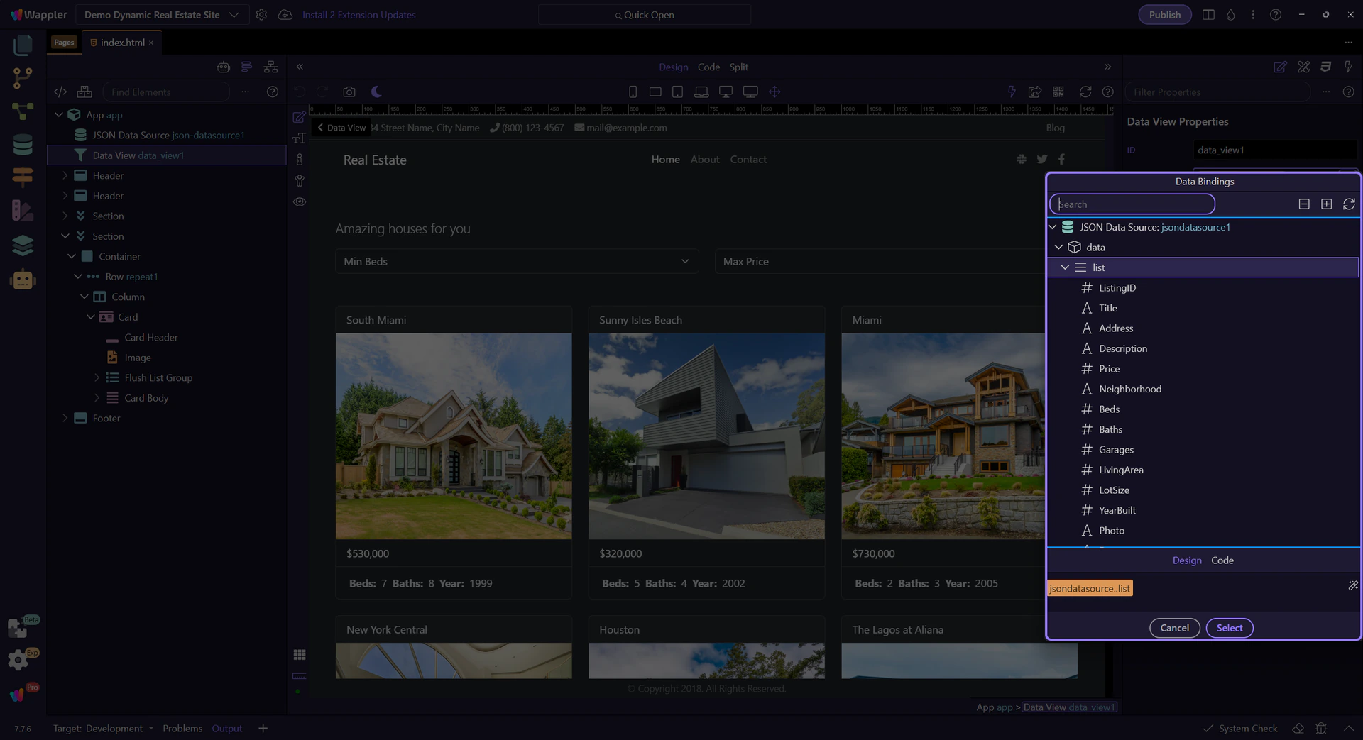
Selection preview
Section titled “Selection preview”This preview shows the expression that will be inserted into the property.
Back to Properties
Section titled “Back to Properties”We’ll close the picker and return to the Properties panel. This step matters because Back to Properties is part of Popup Databindingspickup Button Cancel, and understanding that context makes the next action easier to repeat in your own project.

Expression Builder (Data View filter)
Section titled “Expression Builder (Data View filter)”We will build a filter visually so the Data View only shows certain listings.
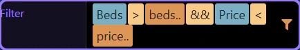
Filter field
Section titled “Filter field”This property stores the filter expression used by the Data View. This step matters because Filter field is part of Selection Panels Properties Dataviewfilter, and understanding that context makes the next action easier to repeat in your own project.
Expression Builder icon
Section titled “Expression Builder icon”The filter icon opens the Expression Builder. This step matters because Expression Builder icon is part of Selection Panels Properties Dataviewfilter, and understanding that context makes the next action easier to repeat in your own project.
Expression Builder opens
Section titled “Expression Builder opens”We open the Expression Builder to see and edit the filter rules. This step matters because Expression Builder opens is part of Selection Panels Properties Dataviewfilter, and understanding that context makes the next action easier to repeat in your own project.

Expression Builder
Section titled “Expression Builder”The Expression Builder turns filter rules into an App Connect expression.
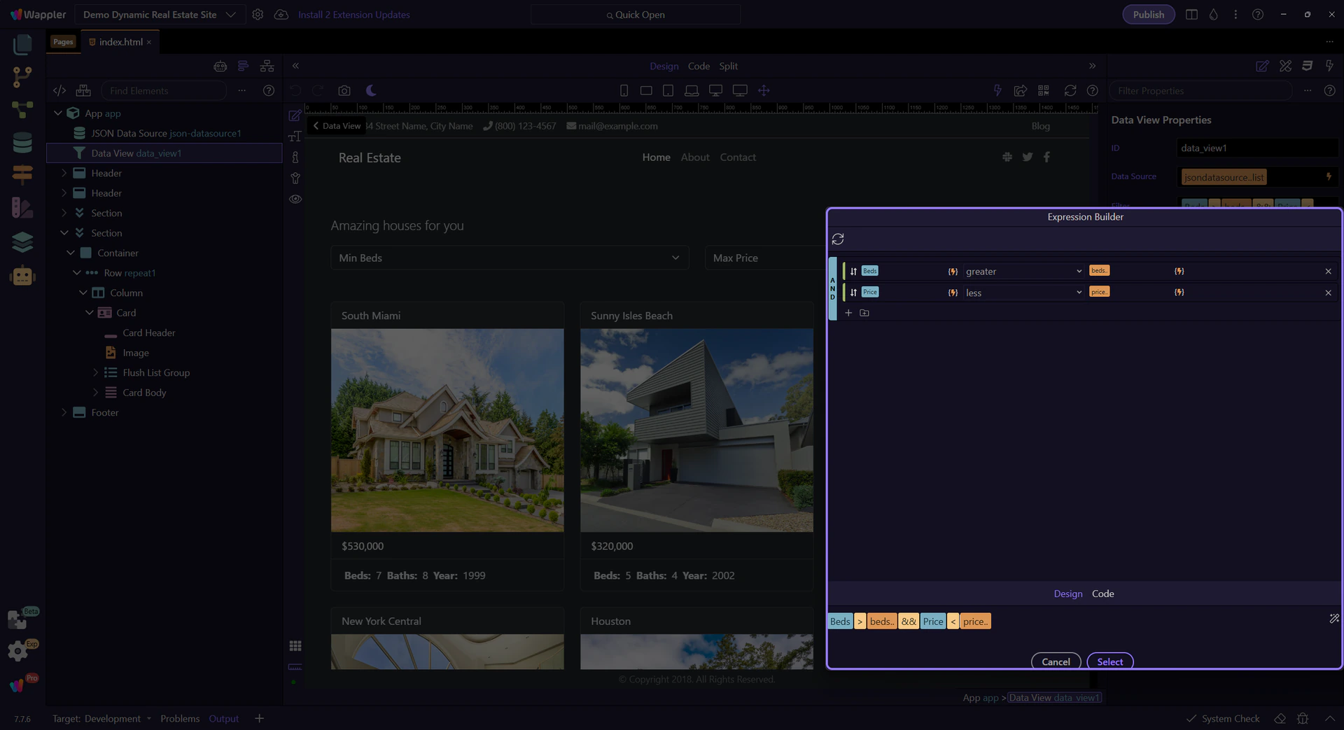
Query builder
Section titled “Query builder”Each row is Field + Operator + Value. That is how you define a rule.
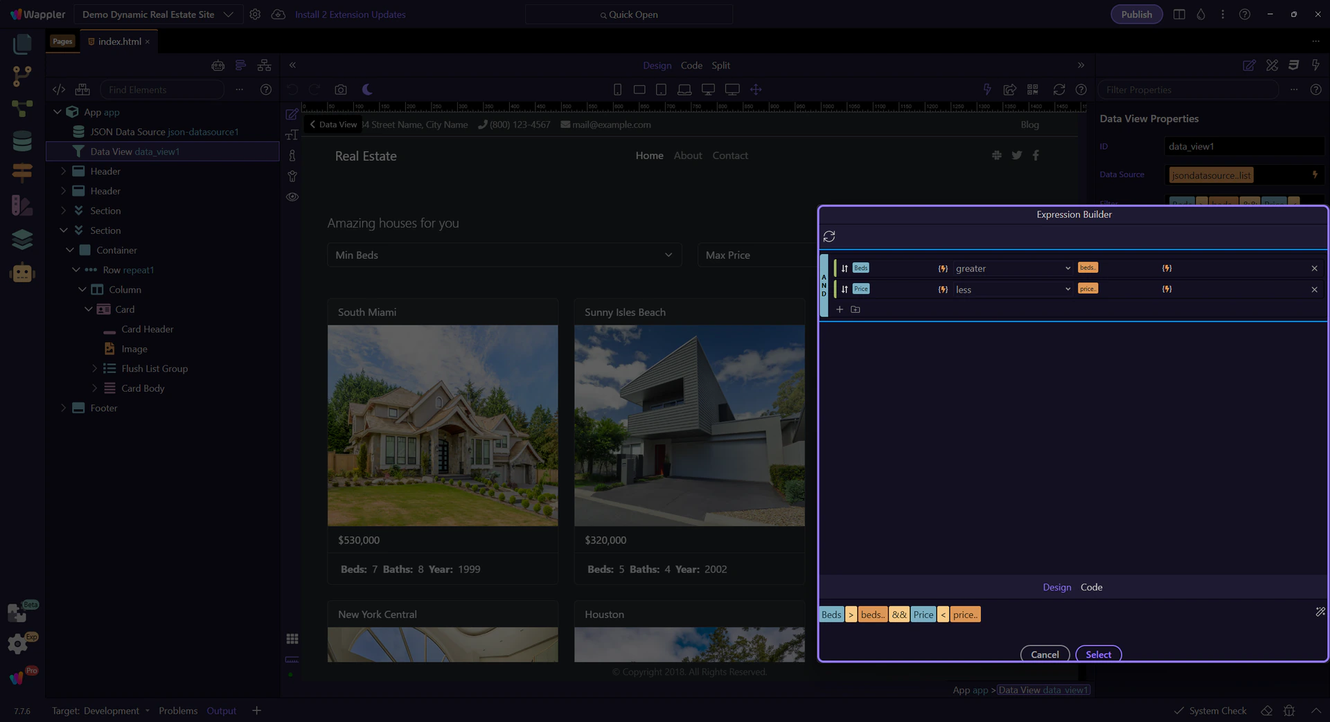
Rule parts
Section titled “Rule parts”Use the value picker when you want to bind to data instead of typing a fixed value.
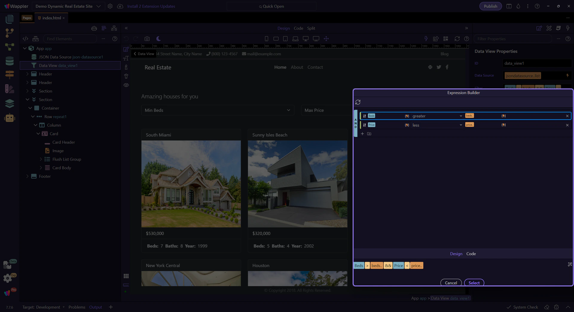
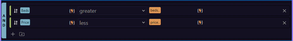
AND / OR groups
Section titled “AND / OR groups”Groups let you combine rules with AND/OR for more complex filters. This step matters because AND / OR groups is part of Popup Expressionbindingspickup Query, and understanding that context makes the next action easier to repeat in your own project.
Expression preview
Section titled “Expression preview”This shows the generated expression that goes back into the filter field.
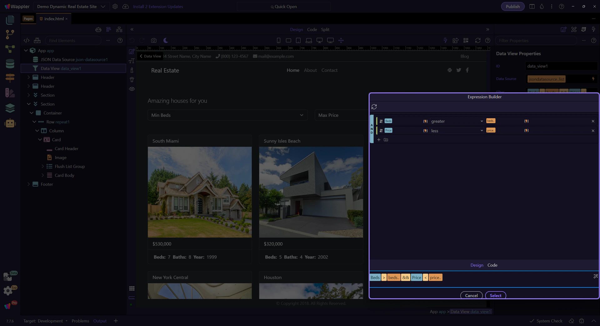
Back to Properties
Section titled “Back to Properties”We’ll close the builder and return to the Properties panel. This step matters because Back to Properties is part of Popup Expressionbindingspickup Button Cancel, and understanding that context makes the next action easier to repeat in your own project.

Filtering and display
Section titled “Filtering and display”Now we see how UI controls update the filter and how the repeater displays the filtered data.
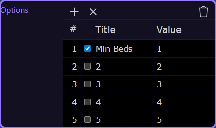
Min Beds filter
Section titled “Min Beds filter”This dropdown chooses the minimum beds value (for example 1, 2, 3+). The selected value feeds the Data View filter.
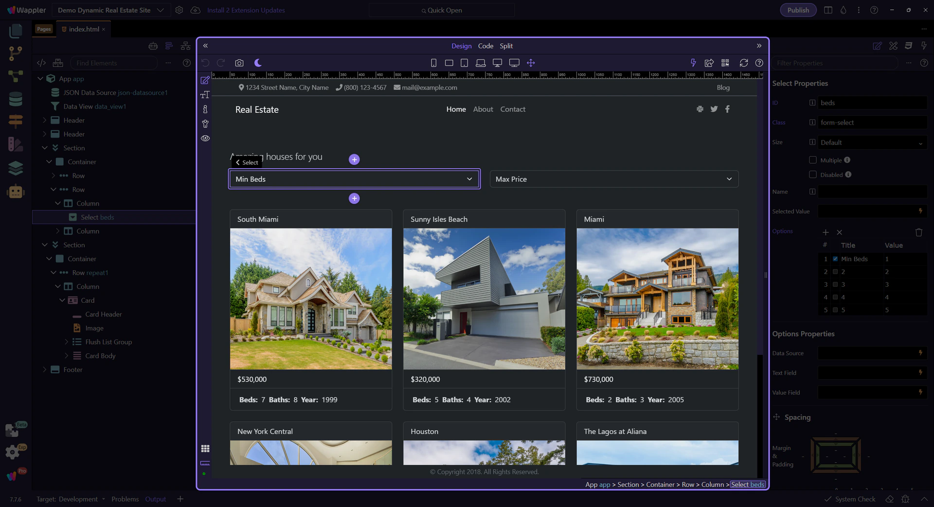
Explore the Beds properties
Section titled “Explore the Beds properties”Key properties: Options (list of bed counts), Label/Value mapping (what users see vs. what the filter uses), and the binding that connects to the Data View filter.
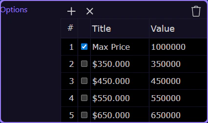
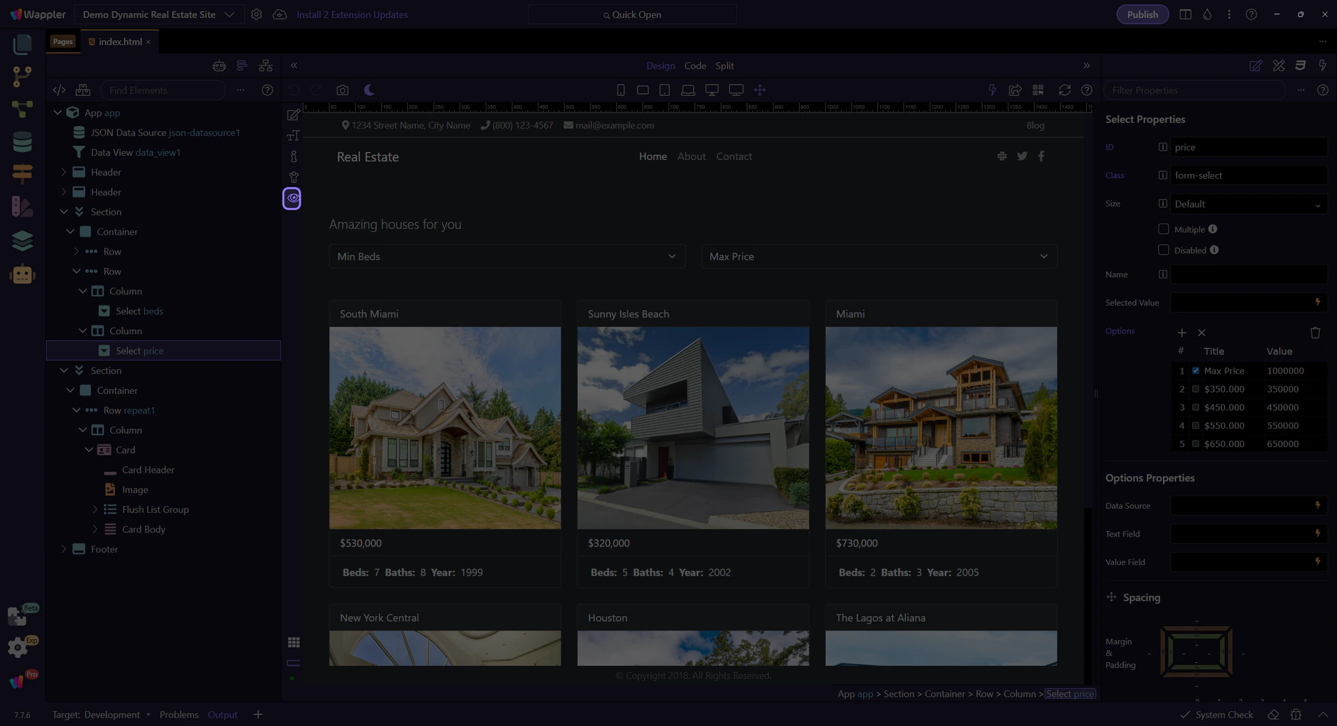
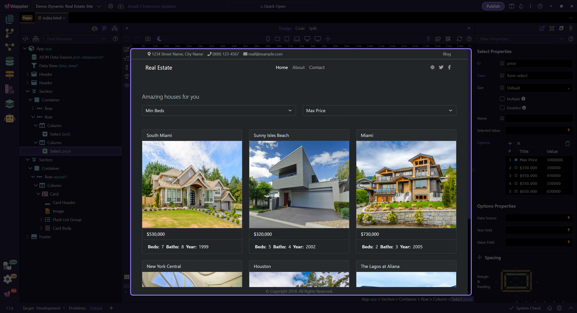
Max Price filter
Section titled “Max Price filter”This dropdown picks a maximum price range. The chosen value updates the Data View filter.
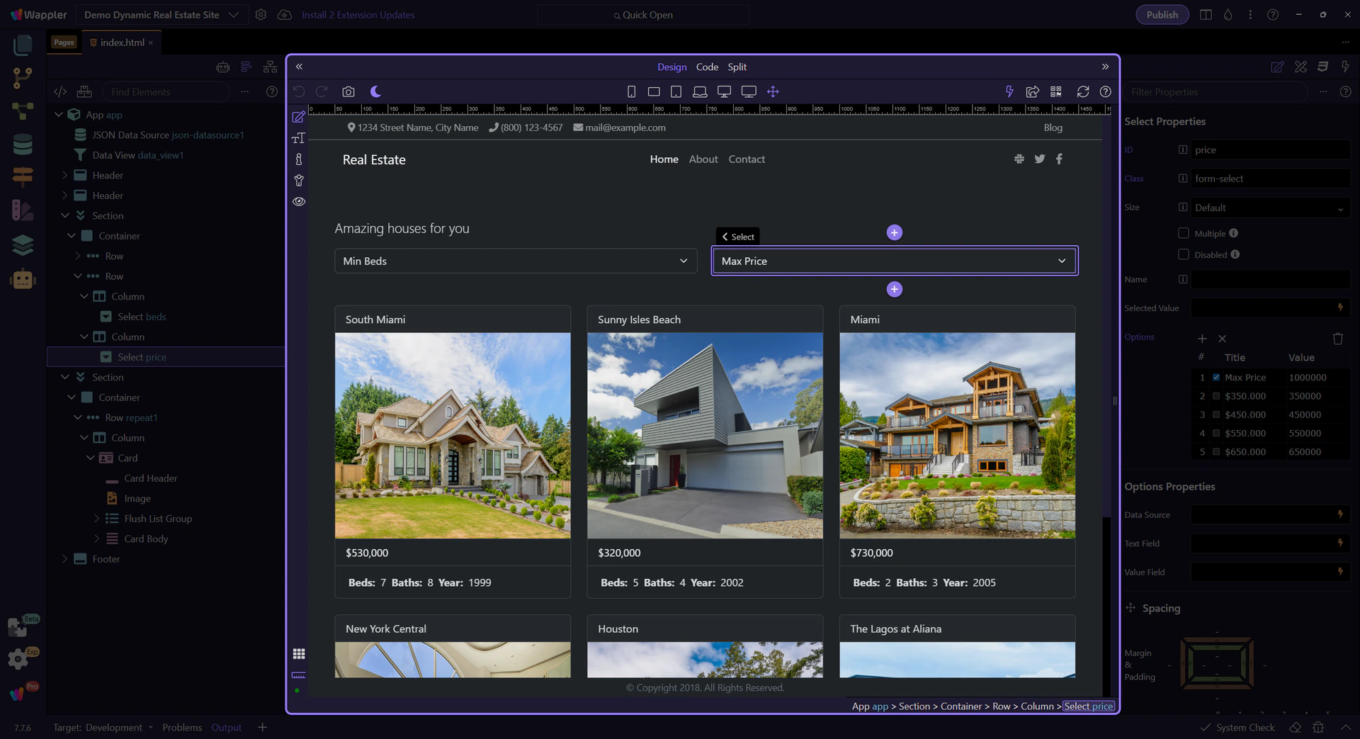
Explore the Price properties
Section titled “Explore the Price properties”Key properties: Options (price ranges), Label/Value mapping, and the binding that feeds the Data View filter.
Preview the filters in action
Section titled “Preview the filters in action”Switch to Preview mode and try the dropdowns to see the card list update in real time.
Switch to Preview mode
Section titled “Switch to Preview mode”Preview mode makes the page interactive so you can click the controls as a user.
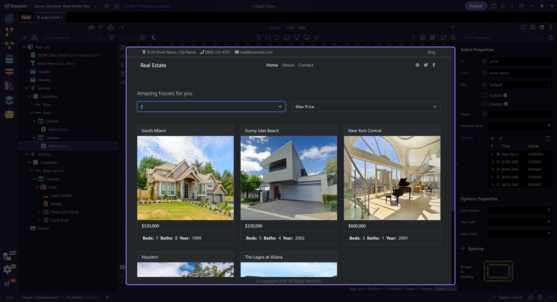
Min Beds dropdown
Section titled “Min Beds dropdown”Try choosing different values to watch the listing cards filter instantly.
Example Min Beds value
Section titled “Example Min Beds value”We set a value so the filter updates immediately.
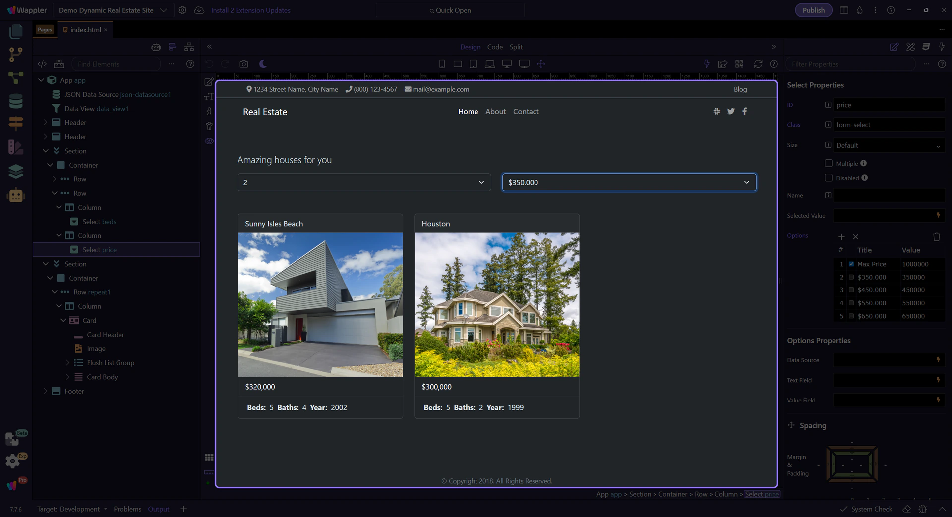
Max Price dropdown
Section titled “Max Price dropdown”Try choosing a lower range to see fewer cards.

Example Max Price value
Section titled “Example Max Price value”We set a lower price range so you see fewer cards.

See the cards update
Section titled “See the cards update”The listing cards update instantly when the filters change.
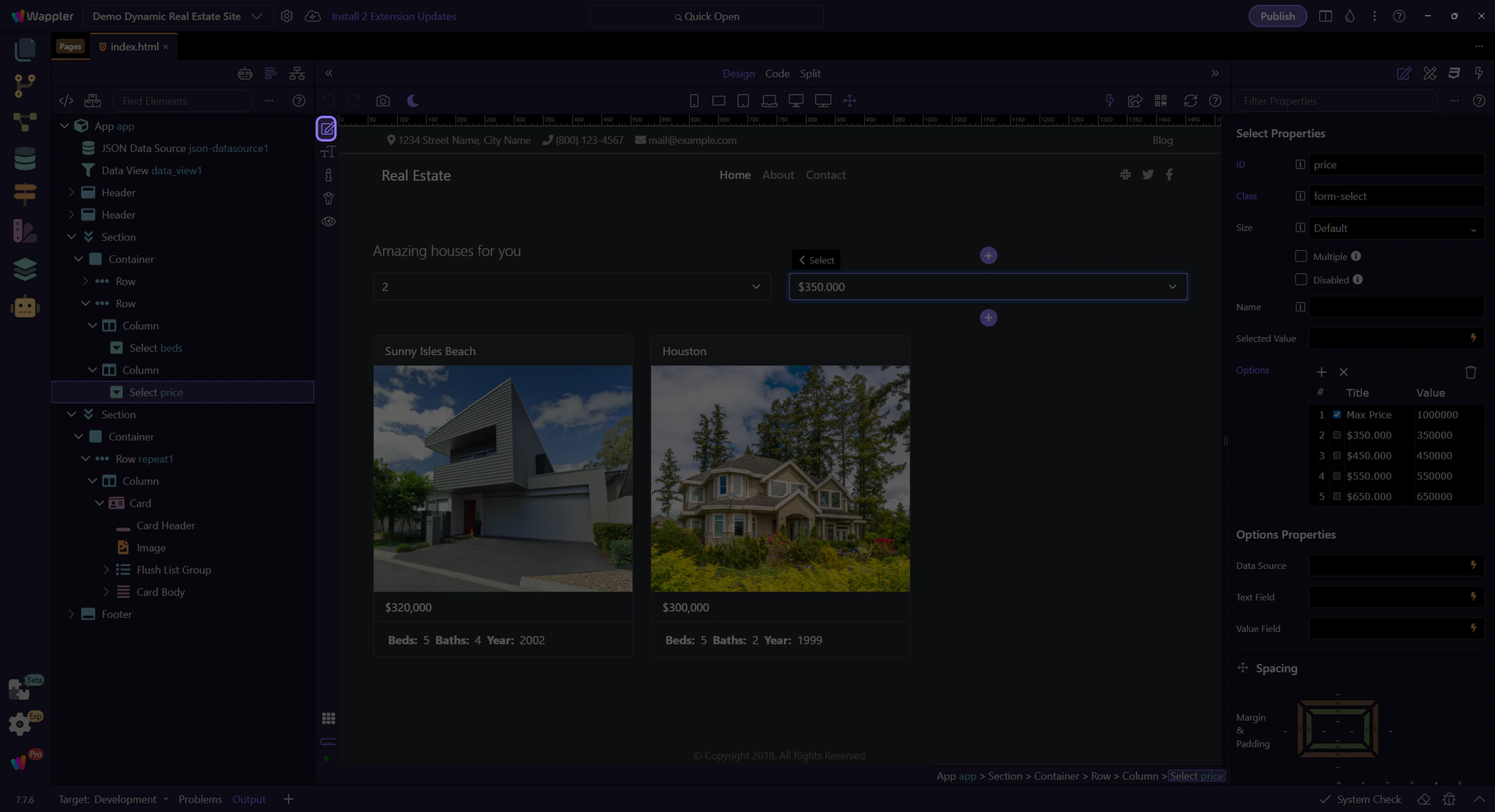
Return to Edit mode
Section titled “Return to Edit mode”Switch back to Edit mode so we can keep inspecting components.
Explore the Data Repeater
Section titled “Explore the Data Repeater”Let’s explore how the data is being repeated
Repeating card list
Section titled “Repeating card list”This repeating row renders one card per item in the Data View list.
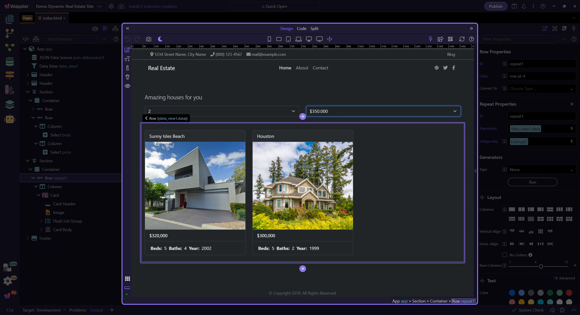
Explore the repeat properties
Section titled “Explore the repeat properties”Properties show which list is repeated and how each item is referenced. This step matters because Explore the repeat properties is part of the Properties panel, and understanding that context makes the next action easier to repeat in your own project.
Repeat expression field
Section titled “Repeat expression field”This tells the repeater which collection to loop over. This step matters because Repeat expression field is part of Selection Panels Properties Repeatexpression, and understanding that context makes the next action easier to repeat in your own project.

Data Picker icon
Section titled “Data Picker icon”The picker icon opens the Data Picker so you can select the collection. This step matters because Data Picker icon is part of Selection Panels Properties Repeatexpression, and understanding that context makes the next action easier to repeat in your own project.

Data Picker opens
Section titled “Data Picker opens”We open the Data Picker for the repeat expression. This step matters because Data Picker opens is part of Selection Panels Properties Repeatexpression, and understanding that context makes the next action easier to repeat in your own project.

Data Picker (repeat source)
Section titled “Data Picker (repeat source)”Pick data_view1.data so each card represents a Data View item. This step matters because Data Picker (repeat source) is part of Popup Databindingspickup, and understanding that context makes the next action easier to repeat in your own project.
Back to Properties
Section titled “Back to Properties”We’ll close the picker and return to the Properties panel. This step matters because Back to Properties is part of Popup Databindingspickup Button Cancel, and understanding that context makes the next action easier to repeat in your own project.

Text binding element
Section titled “Text binding element”This text element displays data from each item (like Title or Beds).
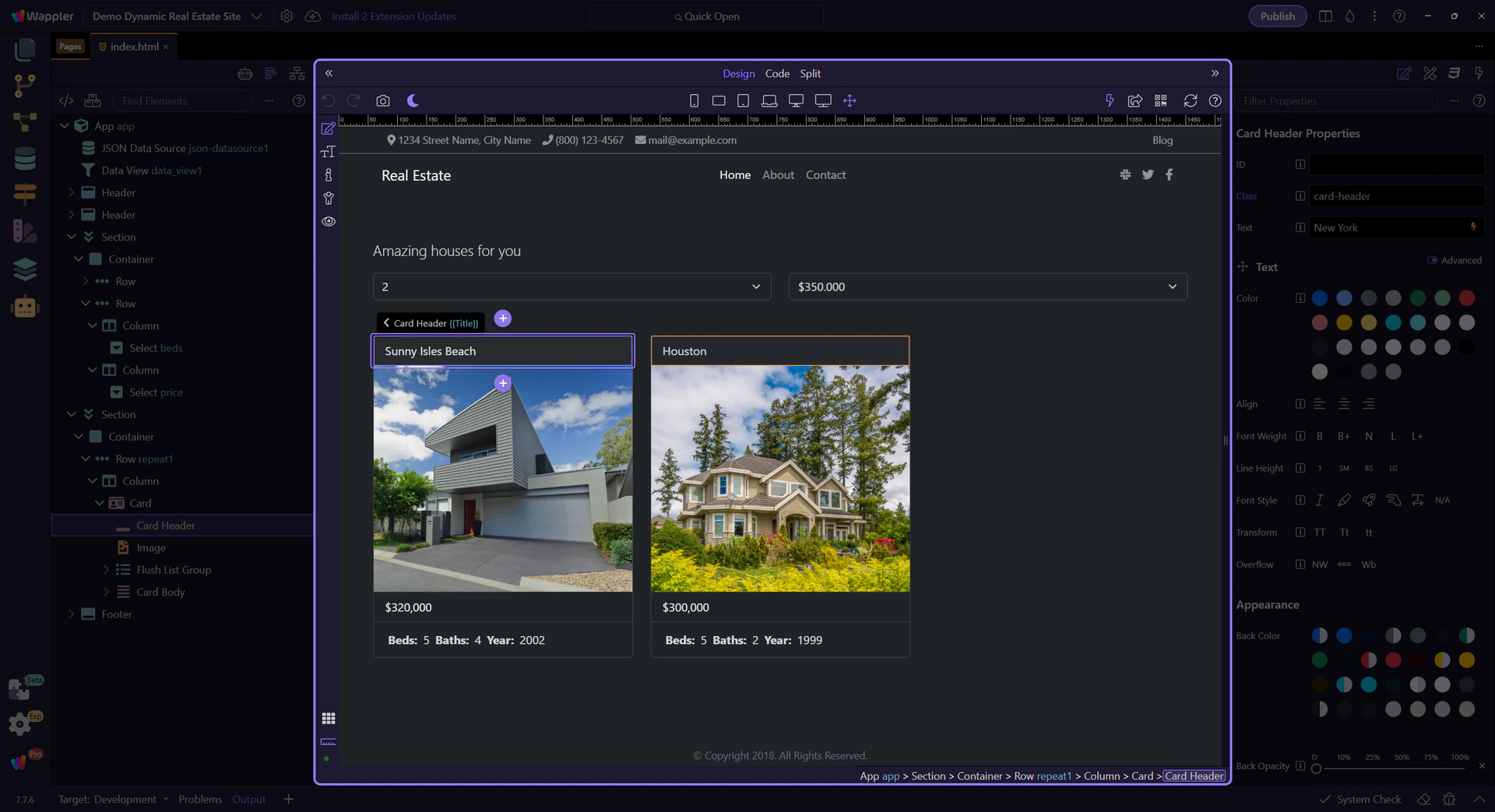
Explore the text binding properties
Section titled “Explore the text binding properties”Properties show the text binding expression. This step matters because Explore the text binding properties is part of the Properties panel, and understanding that context makes the next action easier to repeat in your own project.
Text binding field
Section titled “Text binding field”This field contains the expression that fills the text. This step matters because Text binding field is part of Selection Panels Properties Innertextvalue, and understanding that context makes the next action easier to repeat in your own project.

Data Picker icon
Section titled “Data Picker icon”The picker icon opens the Data Picker so you can choose a field without typing. This step matters because Data Picker icon is part of Selection Panels Properties Innertextvalue, and understanding that context makes the next action easier to repeat in your own project.

Data Picker opens
Section titled “Data Picker opens”We open the Data Picker for the text binding. This step matters because Data Picker opens is part of Selection Panels Properties Innertextvalue, and understanding that context makes the next action easier to repeat in your own project.

Data Picker (text binding)
Section titled “Data Picker (text binding)”Choose a field like Title, or format a value (for example, Price.formatCurrency). This step matters because Data Picker (text binding) is part of Popup Databindingspickup, and understanding that context makes the next action easier to repeat in your own project.
Back to Properties
Section titled “Back to Properties”We’ll close the picker and return to the Properties panel. This step matters because Back to Properties is part of Popup Databindingspickup Button Cancel, and understanding that context makes the next action easier to repeat in your own project.

Wrap-up
Section titled “Wrap-up”You saw how App Connect loads data, filters it with a Data View, and binds it to UI elements — all without writing code.
Continue learning
Section titled “Continue learning”Pick a focused App Connect tour to go deeper.