State
A Variable holds the count.
A compact App Connect starter in Wappler: a Variable stores state, a button updates it, and a bound text label reflects the new value immediately.
You will walk through the smallest App Connect feedback loop in Wappler: select the Variable that holds state, inspect the button action that changes it, and confirm how the bound label redraws instantly.
By the end, you should be able to explain the whole reactive chain in plain language: where the state lives, which event triggers the update, which action changes the value, and why the UI refreshes without manual DOM code.
Keep Page Panels (Structure) and Selection Panels (Properties) visible.
A Variable stores a value you can bind to and update through actions.
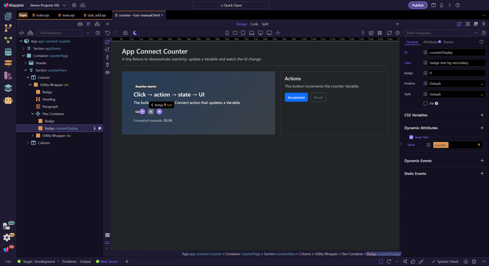
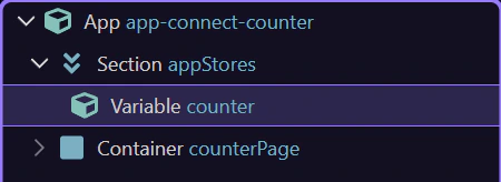
The Variable stores the counter state. We’ll select it to review its properties. This step matters because Variable component is part of the Structure panel, and understanding that context makes the next action easier to repeat in your own project.
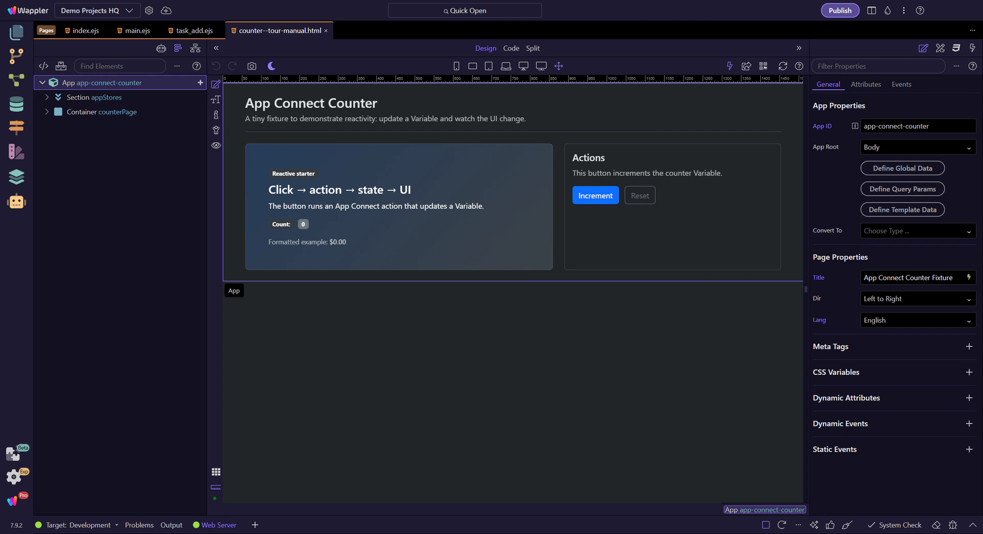
Start with the wider context in the Properties panel so the next control makes sense in the full workflow. In the next step, you will focus on Review the component ID and see how it fits into this area.
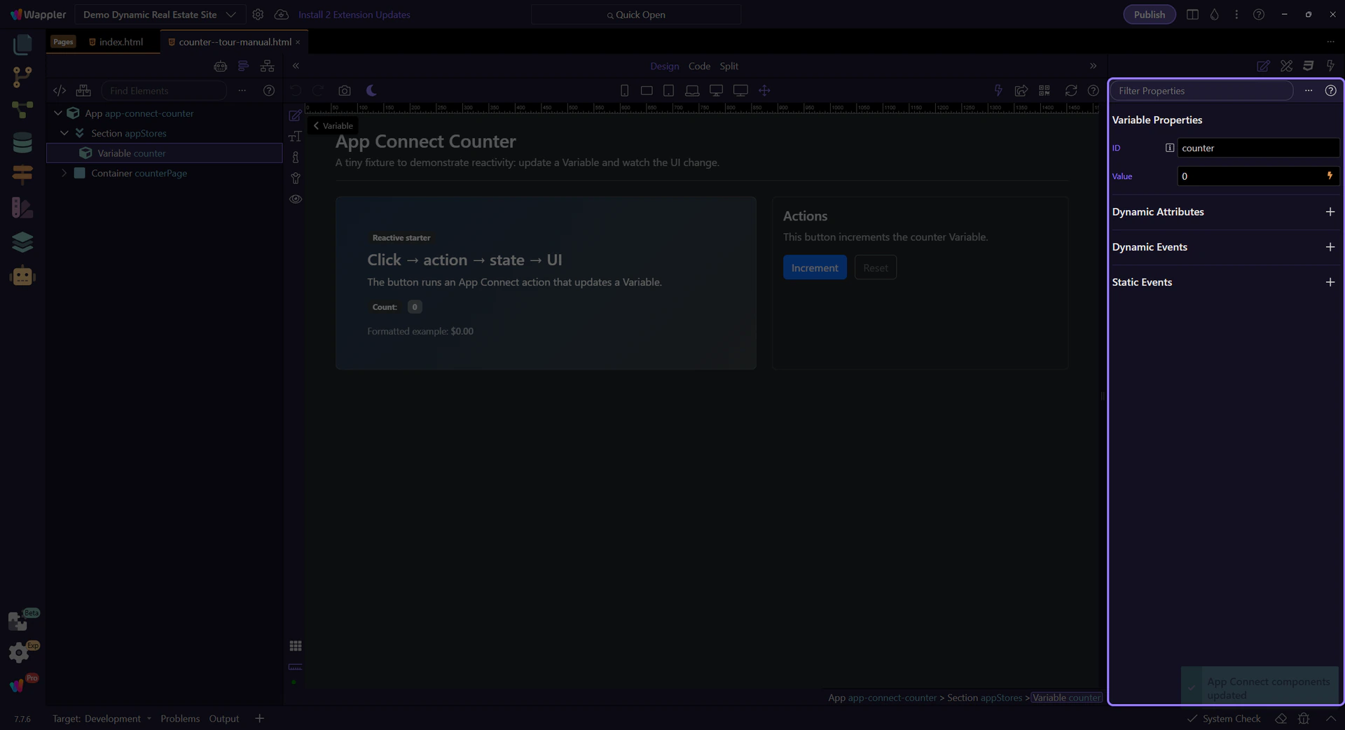
The ID is how you reference the Variable in bindings and actions (for example: counter.value, counter.setValue(…)).

For Variables, prefer binding the initial value as an expression (dmx-bind:value=“0”) so it’s a real number, not an HTML string. Convert toNumber() mainly when values come from HTML inputs where the user types.
tip: App Connect expressions are declarative. Don’t use JavaScript callbacks/functions inside dmx-* expressions.

Events trigger actions. The action updates state, and bindings react automatically.
This button increments the counter by running the Click action. We’ll select it to inspect the event.
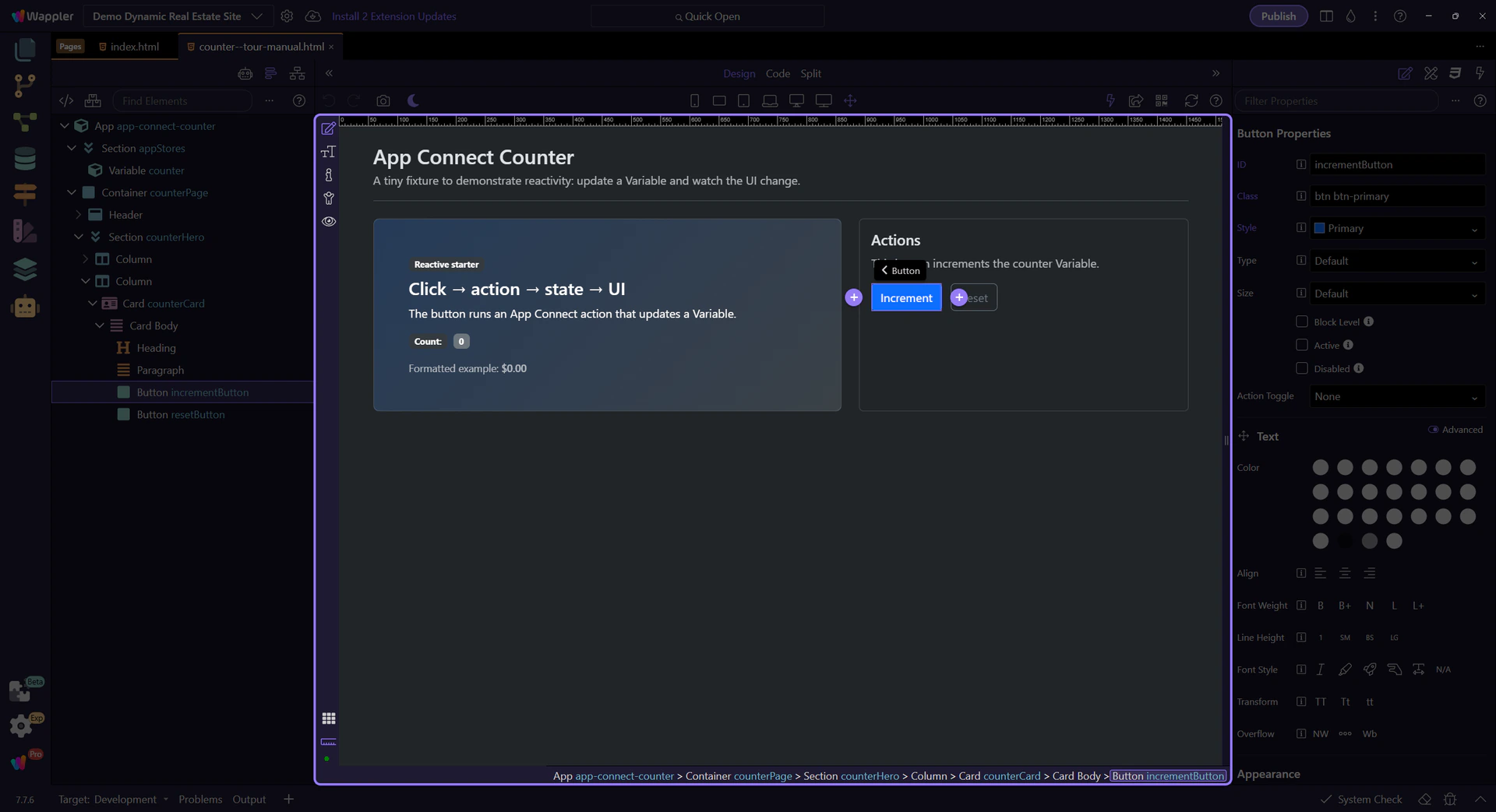
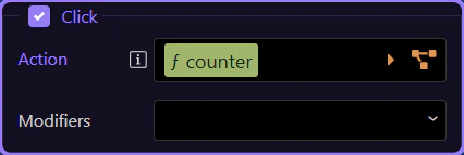
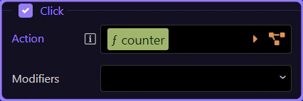
The Click event row in Properties is where this button’s event action is configured. Here it runs an action list that calls counter.setValue(…) to update state, and bindings update the UI automatically.
tip: Open the Actions Picker to explore the action list and configure action inputs instead of hand-typing expressions.
This step opens the Actions Picker from the Click event row so the popup can show the event action list in its own focused flow.
tip: Use the Actions Picker to add actions and fill their inputs safely, without hand-typing long expressions.
The Actions Picker lets you choose actions (like setValue) and builds the Click event’s action list for you.
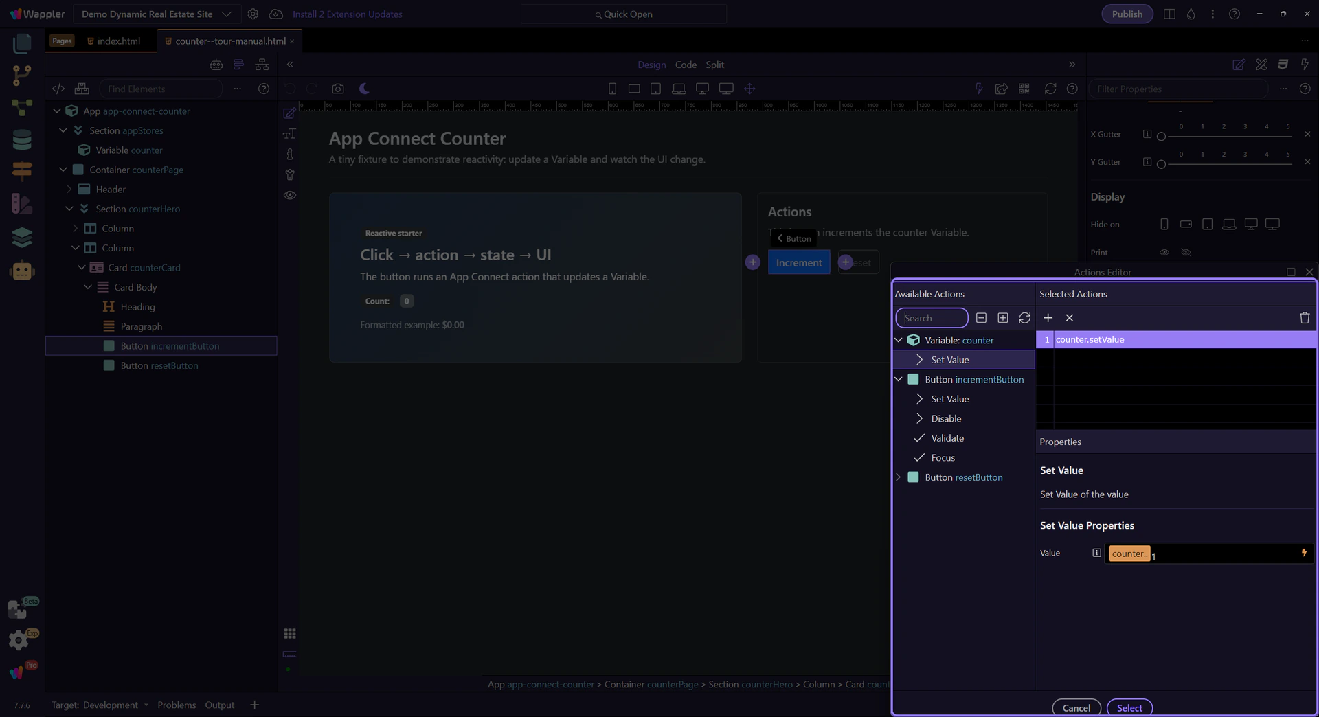
Use the Available Actions area to browse categories, search, and use the quick navigation controls along the top to move through long action lists faster. This step matters because this is the main browsing surface of the Actions Picker before you focus on the selected action list and action inputs.
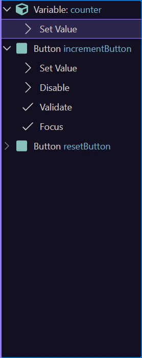
Select the existing action now so you can inspect the real logic behind this Click event instead of treating the picker as an empty template. The next steps use that selected action to explain how the counter value is updated and where its inputs are configured.
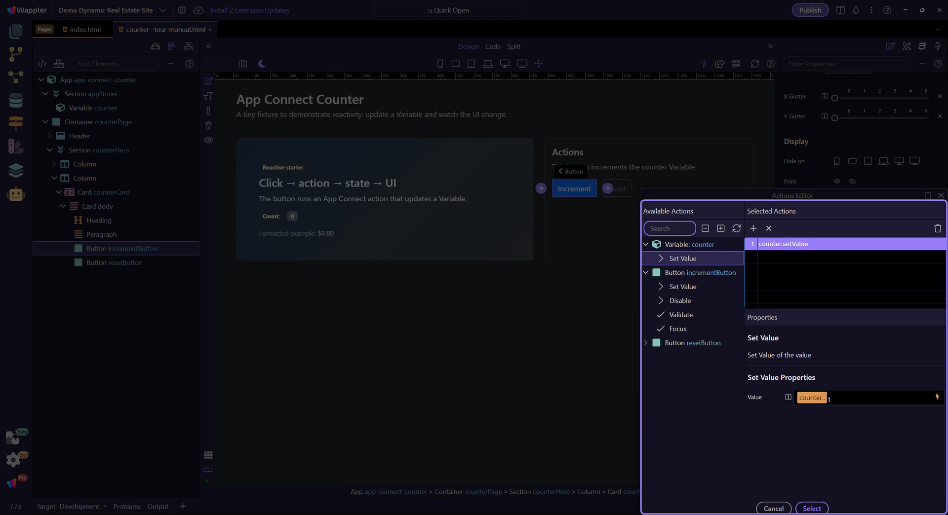
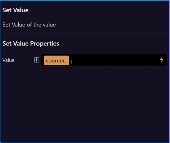
Select an action in the list to configure its inputs here (for example, the value you pass into setValue(…)). This step matters because Action Properties (right) is part of Popup Actionspickup Layout Layout Panel Preview, and understanding that context makes the next action easier to repeat in your own project.
Close the Actions Picker to return to Properties. Use Cancel or the window close button to return to the Properties panel.

Bindings connect UI properties to data. When data changes, the UI updates automatically.
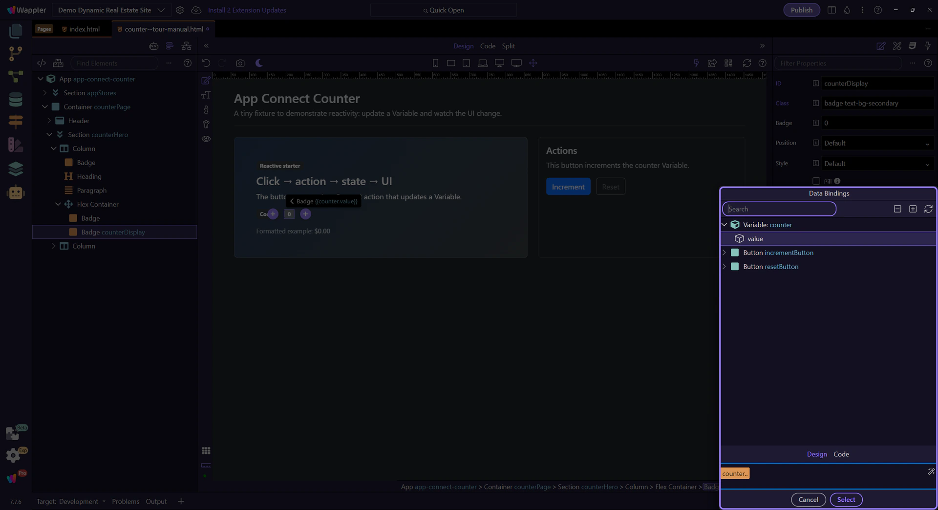
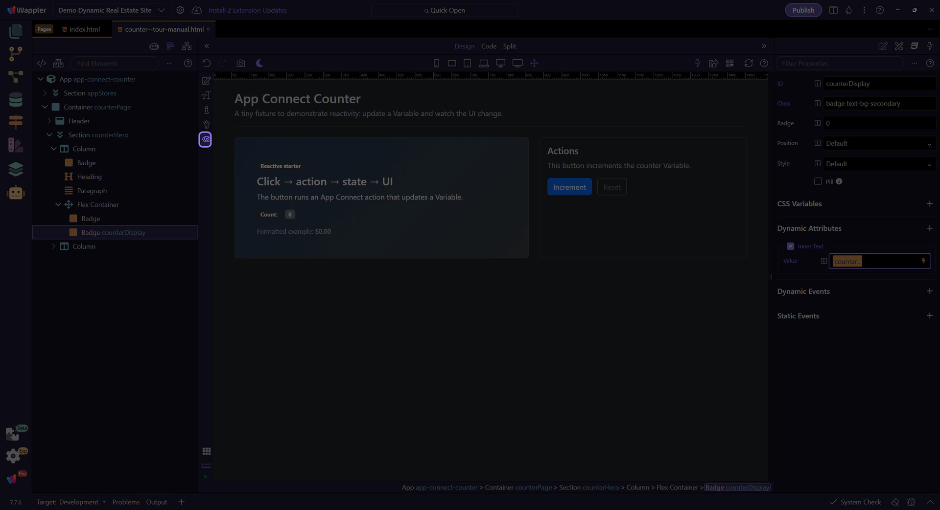
This label is bound to the counter value. We’ll select it to inspect its text binding expression.
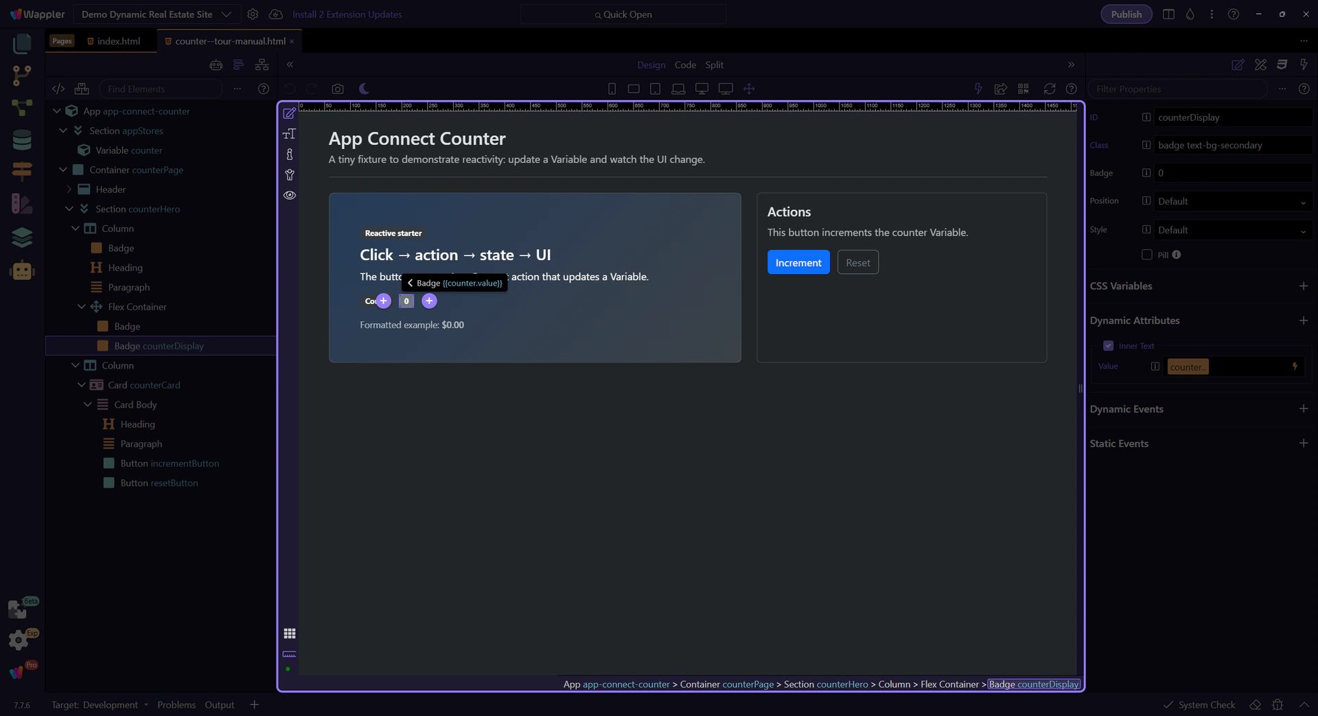
This field contains the expression that fills the text (counter.value). Click the picker icon to inspect it with the Data Picker.
tip: Use the Data Picker to avoid typos and stay within the correct scope.
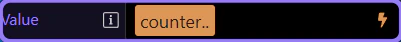
The Data Bindings Picker shows what’s in scope and lets you insert valid expressions into the field.
Expand nodes to browse components and their properties. Selecting an item builds the expression for you.
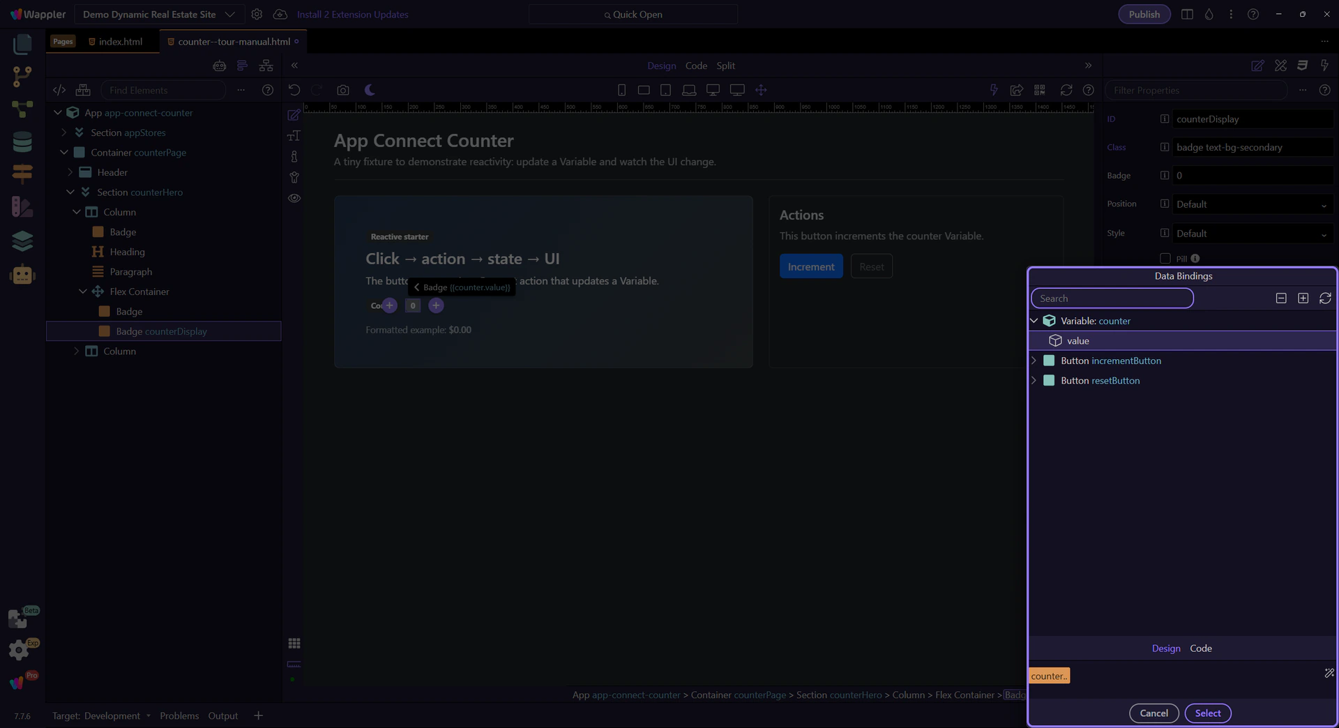
Use the preview to confirm that the picker built the exact expression you expect before you apply it. That check matters because the next step closes the popup and returns you to Properties with confidence that the binding is correct.
Close the Data Picker to return to Properties. This step matters because Close Data Picker is part of Popup Databindingspickup Button Cancel, and understanding that context makes the next action easier to repeat in your own project.

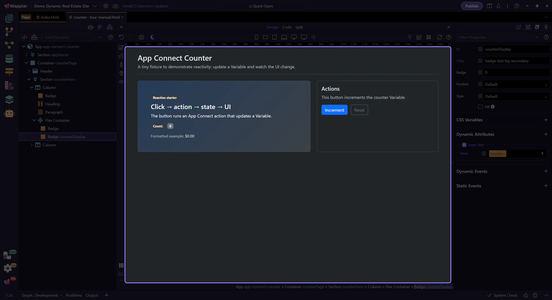
Switch to Preview mode and click the button to watch the UI update.
Switch to Preview mode now so you can click the button live in the next step and watch the counter react.
Click the Increment button a few times. The Variable updates, and the bound text updates instantly.
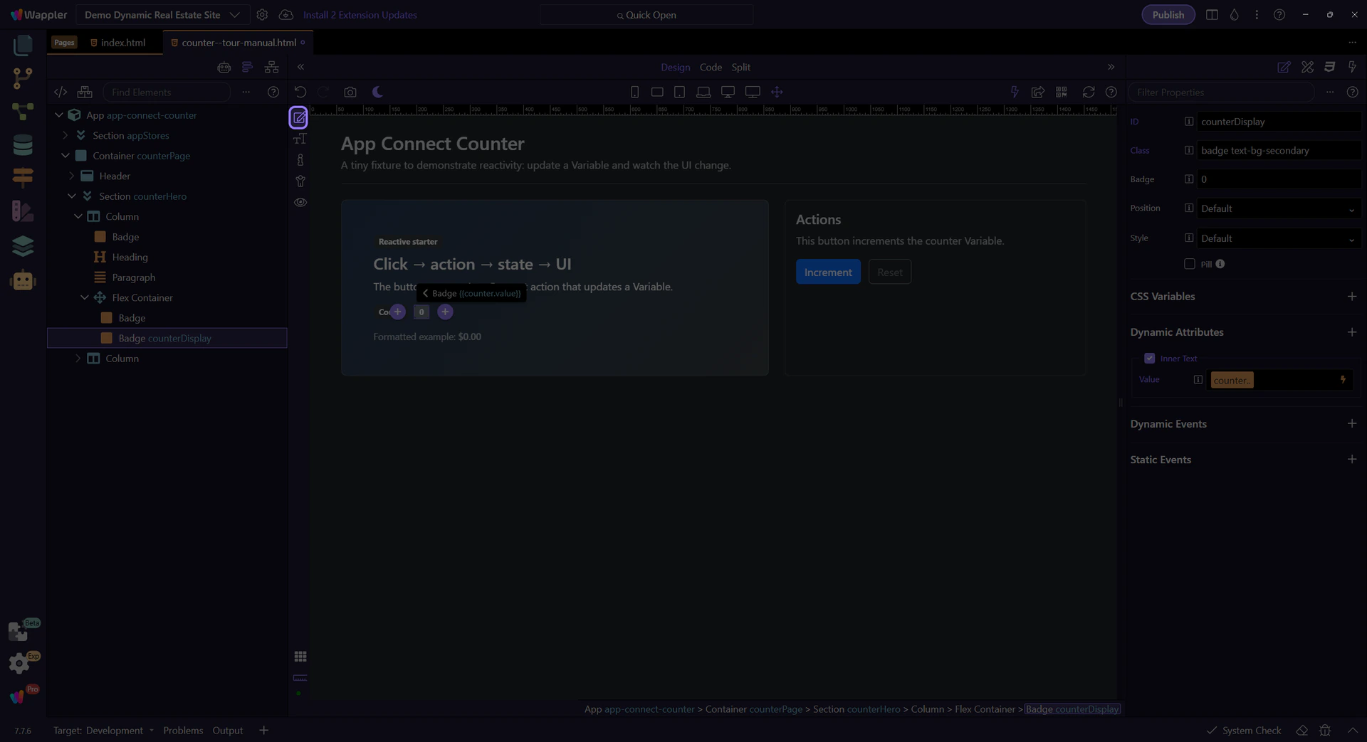
Return to Edit mode so you can continue configuring the example after verifying the live counter behavior.
Now that you’ve seen the simplest reactive loop, continue with a slightly richer example or the full App Connect overview.
Continue learning App Connect gradually.