Add
Use ( + ) to add a dynamic attribute allowed on the selected element.
Dynamic Attributes overview: use Properties ( + ) to add attributes, then inspect and bind values with picker icons and valid expressions.
Dynamic Attributes let you add reactive behavior to an element as attributes (show/hide, bind:class, repeat, and more) without typing raw markup.
You’ll locate the Dynamic Attributes section, preview the ( + ) menu (categories → submenus), then inspect an existing attribute on a real element.
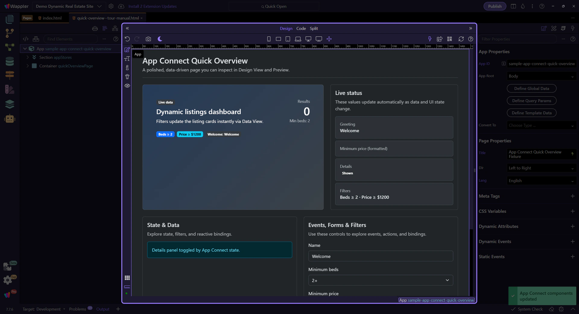
This tour opens a dedicated tour page so you can experiment safely.
Dynamic Attributes are added from Properties via the ( + ) menu. The menu changes based on the selected element.
A real element is auto-selected in Design View so Properties can show element-specific Dynamic Attributes.
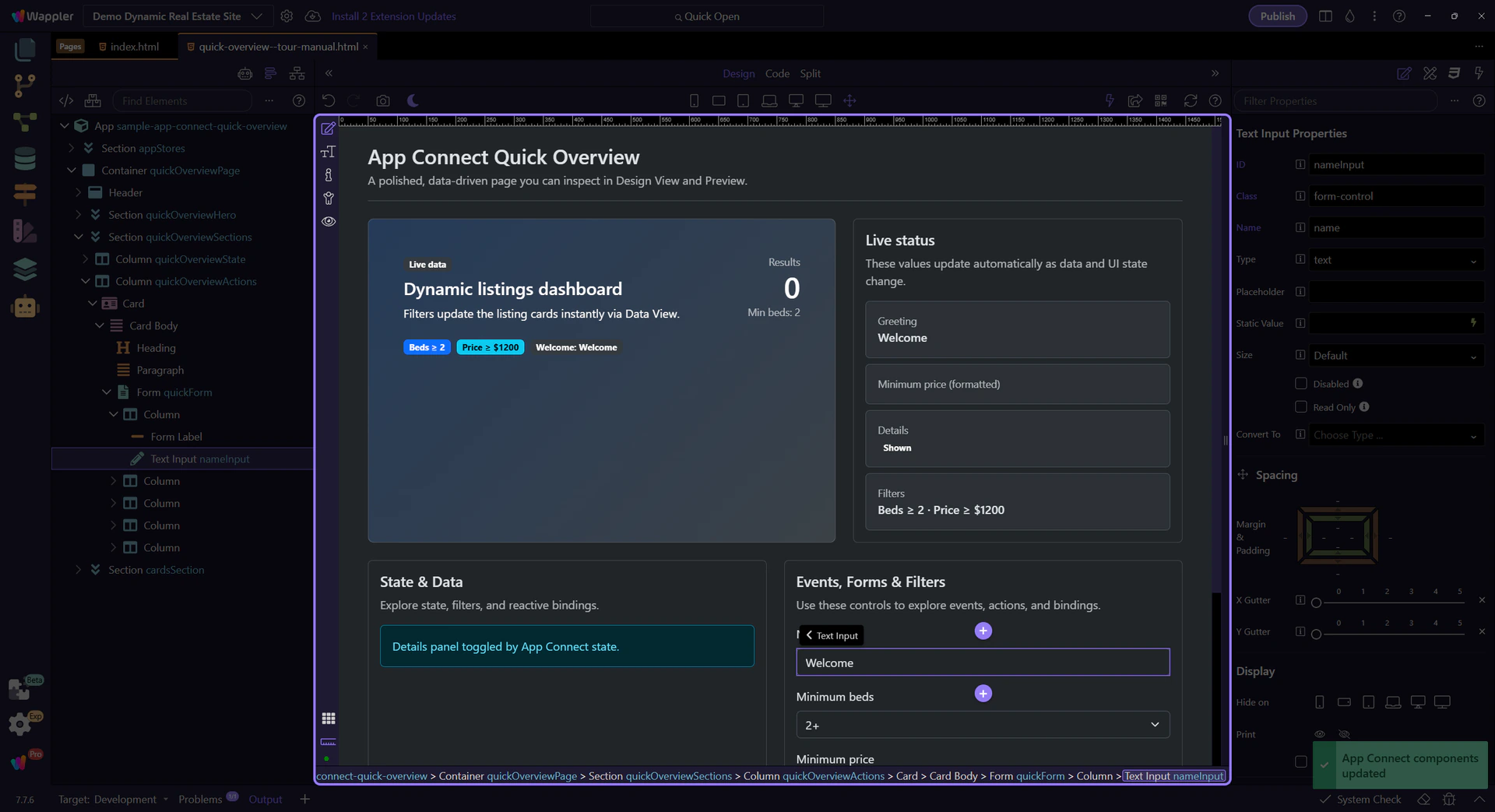
Start with the wider context in the Properties panel so the next control makes sense in the full workflow. In the next step, you will focus on Dynamic Attributes menu and see how it fits into this area.
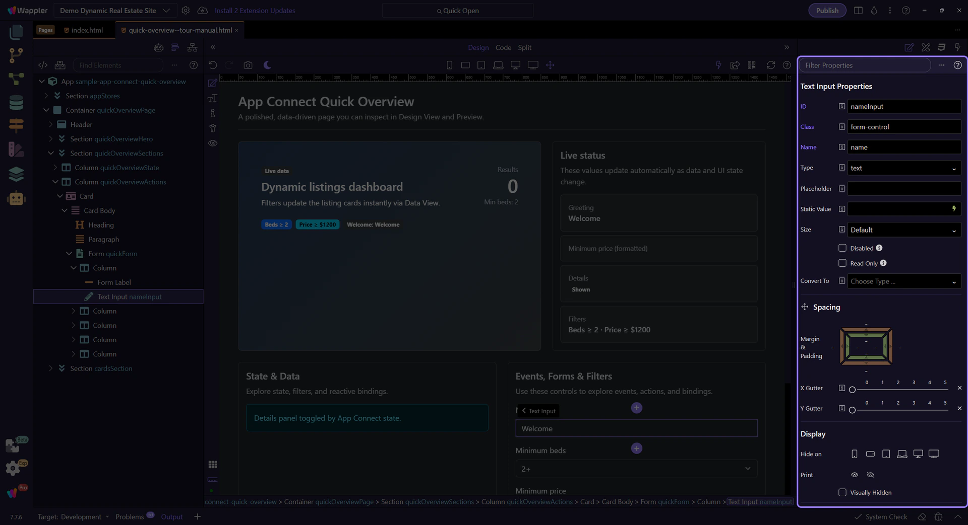
This ( + ) menu lists the available Dynamic Attributes for the selected element, grouped into categories and, in some cases, submenus.

This input already has a binding (dmx-bind:value). You can review and adjust it here, and use the picker icon to insert valid expressions instead of typing.
note: Dynamic Attributes and binding fields share the same expression rules and scope. If the picker doesn’t show something, it’s usually a scope issue.

These are the Dynamic Attributes you’ll use most often across projects.
Use show/hide attributes for simple visibility toggles based on state and data.
warning: Show/Hide toggles visibility but doesn’t prevent processing. For performance, use Conditional Region (dmx-if) when appropriate.
Bind classes and styles to reflect state (active, disabled, error) without writing conditional code by hand.
Use repeat attributes for simple lists. Use Data View + Repeater for larger datasets, filtering, sorting, and paging.
Next: learn Dynamic Events and the Actions Picker.
Continue with related tours.