Readability
Find state, collections, and API calls instantly.
Keep App Connect pages readable and fast: organize non-visual data components (Variables, Data Stores, Server Connect) at the top, named and grouped before UI usage.
This tour uses a deliberately structured page to show why App Connect projects stay easier to maintain when data comes first. You will compare the visual layout with the non-visual components that feed it, then use that example to build a stronger mental model for grouping, naming, and placing state and data sources in Structure.
Make complex pages easier to read and faster to reason about by organizing non-visual data components (state, collections, API) at the top — before any UI uses them.
This example page is intentionally organized with non-visual components first, then UI sections below that only consume those data sources.
Non-visual data components (state, collections, API) belong at the top of the page so everything below can reference them clearly.
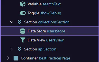
This top section contains the page’s non-visual data components (state, collections, API). We’ll select it so you can see how it’s organized.
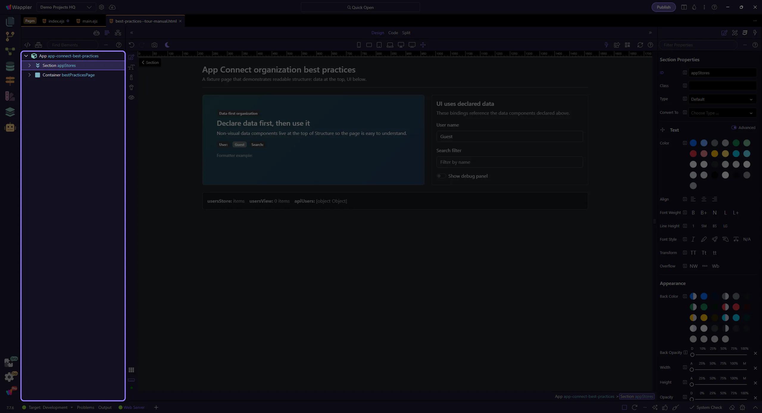
Keeping non-visual components at the top makes pages easier to read: you can scan state, collections, and API endpoints before looking at UI bindings.
Keeping data components at the top is a great default — but if a dataset is used only inside a view that is loaded conditionally, declare that data inside the conditional region so it isn’t always processed.
The same idea applies to repeaters: pick the repeater style that avoids extra wrappers, and only set the key field when you truly need it (animations / stable DOM row identity), because it slows down the repeater.
Important exception: inside Repeaters and Data Detail areas, prefer dmx-show/dmx-hide for empty/selected UI so the DOM stays stable (and inputs don’t reset).
important: Best performance: isolate optional/heavy sections with a Conditional Region (dmx-if) so their child components don’t render until the condition is met. Exception: inside Repeaters and Data Detail, prefer dmx-show/dmx-hide to keep the DOM stable.
When a page grows, performance problems often come from loading or processing too much data on the client. Keep UI expressions light, and push heavy filtering/paging to the right layer.
important: Treat client-side filtering formatters as a convenience, not a replacement for Data View or Server Connect filtering on large datasets.
Use IDs that read like purpose: what it stores/loads (usersStore, usersView, apiUsers) rather than generic names (store1, data_view1).
tip: Good IDs become self-documenting in expressions: usersStore.items, usersView.data, apiUsers.data, currentUserName.value.
Select a few data components and see how their IDs are used by bindings below.
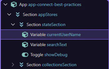
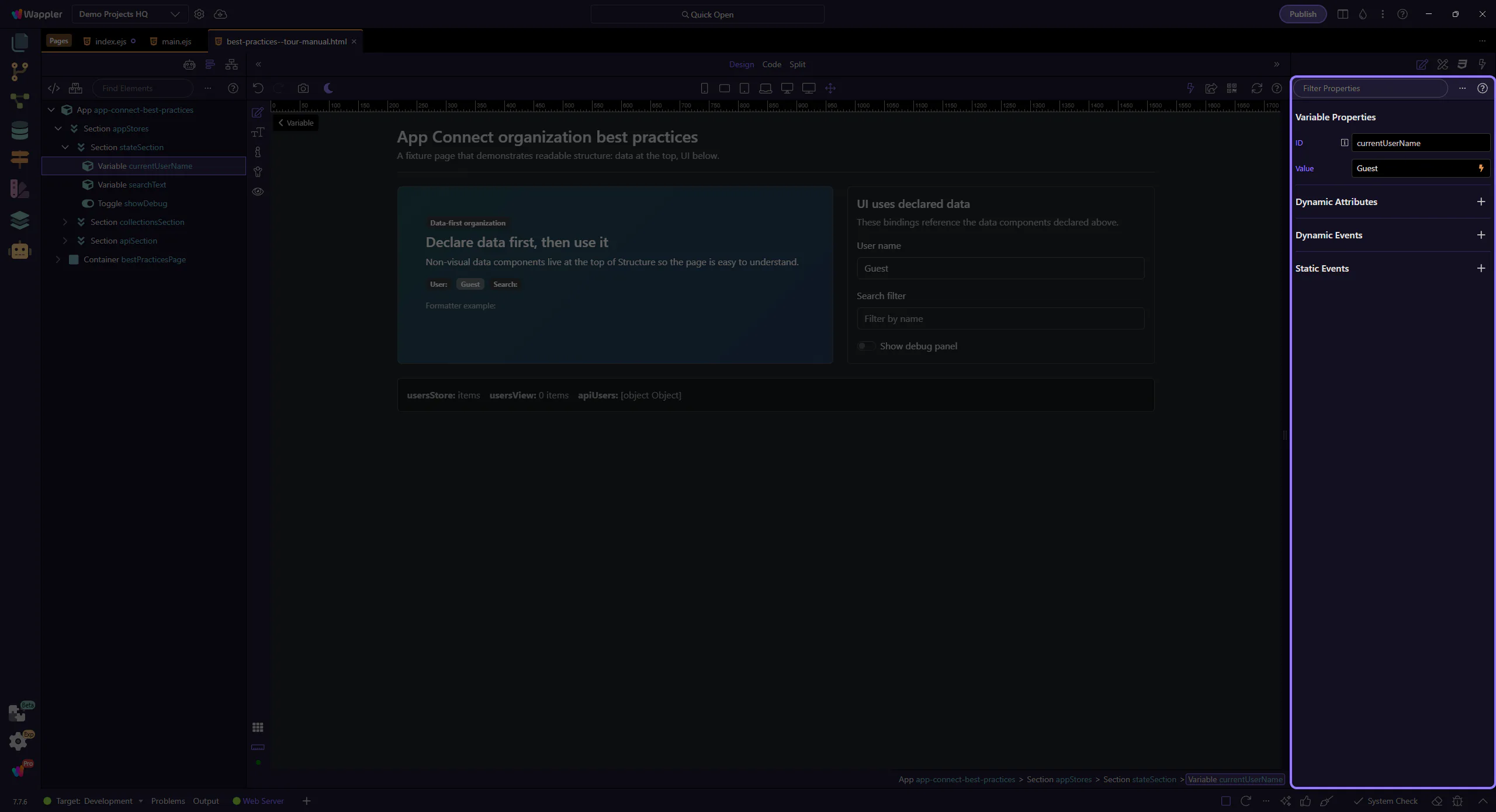
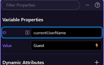
This Variable holds a piece of state used in bindings (for example: currentUserName.value). We’ll select it to review its ID and value.
Start with the wider context in the Properties panel so the next control makes sense in the full workflow. In the next step, you will focus on ID drives expressions and see how it fits into this area.
When IDs are clear, bindings read like plain English. This is why naming + organization matter.
A Data Store holds a collection of records. We’ll select it and keep related Data Views nearby so it’s always clear where UI lists come from.
tip: Put collections on top (Data Store, Query, API results) and keep UI repeats/tables below them.
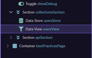
A Data View is a read-only lens over a collection (filters, sorting, paging). We’ll select it to see how it stays close to its data source.
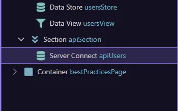
This Server Connect component loads data from the server. We’ll select it so it’s easy to find, review, and avoid duplicating API calls in UI sections.
important: Best practice: don’t place Server Connect components inside repeats/cards. Keep them centralized and bind UI to their results.
With data components declared first, UI bindings stay simple and easy to understand.
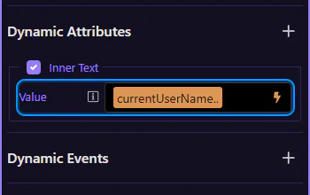
This badge’s text comes from a binding (for example: currentUserName.value). We’ll select it and then inspect the binding in Properties.
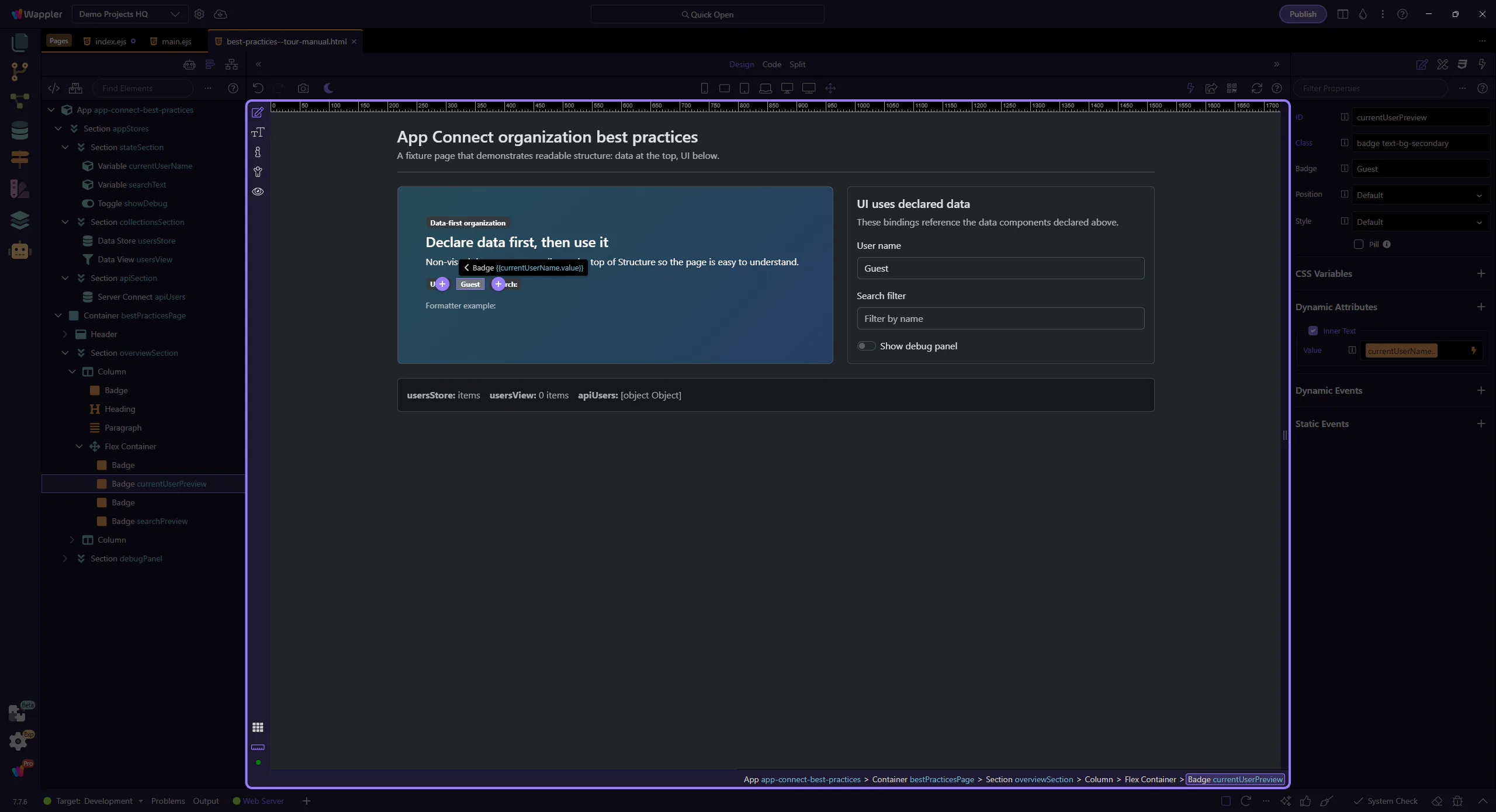
This is where you see (and edit) the expression used for the selected element’s text. This step matters because Inspect the binding in Properties is part of Selection Panels Properties Innertextvalue, and understanding that context makes the next action easier to repeat in your own project.
tip: When data components are clearly named, bindings stay short and readable.
Review what you did and choose a next tour.
Pick a related tour to continue.