Bootstrap 5 Table Generator
Generate a Bootstrap table quickly with Wappler, then customize columns, styling, and responsive behavior.
Table Generator
Section titled “Table Generator”The Bootstrap 5 Table Generator scaffolds a Bootstrap table wired to a data source. It can optionally generate sortable headers and bindings.
Start from the Components picker
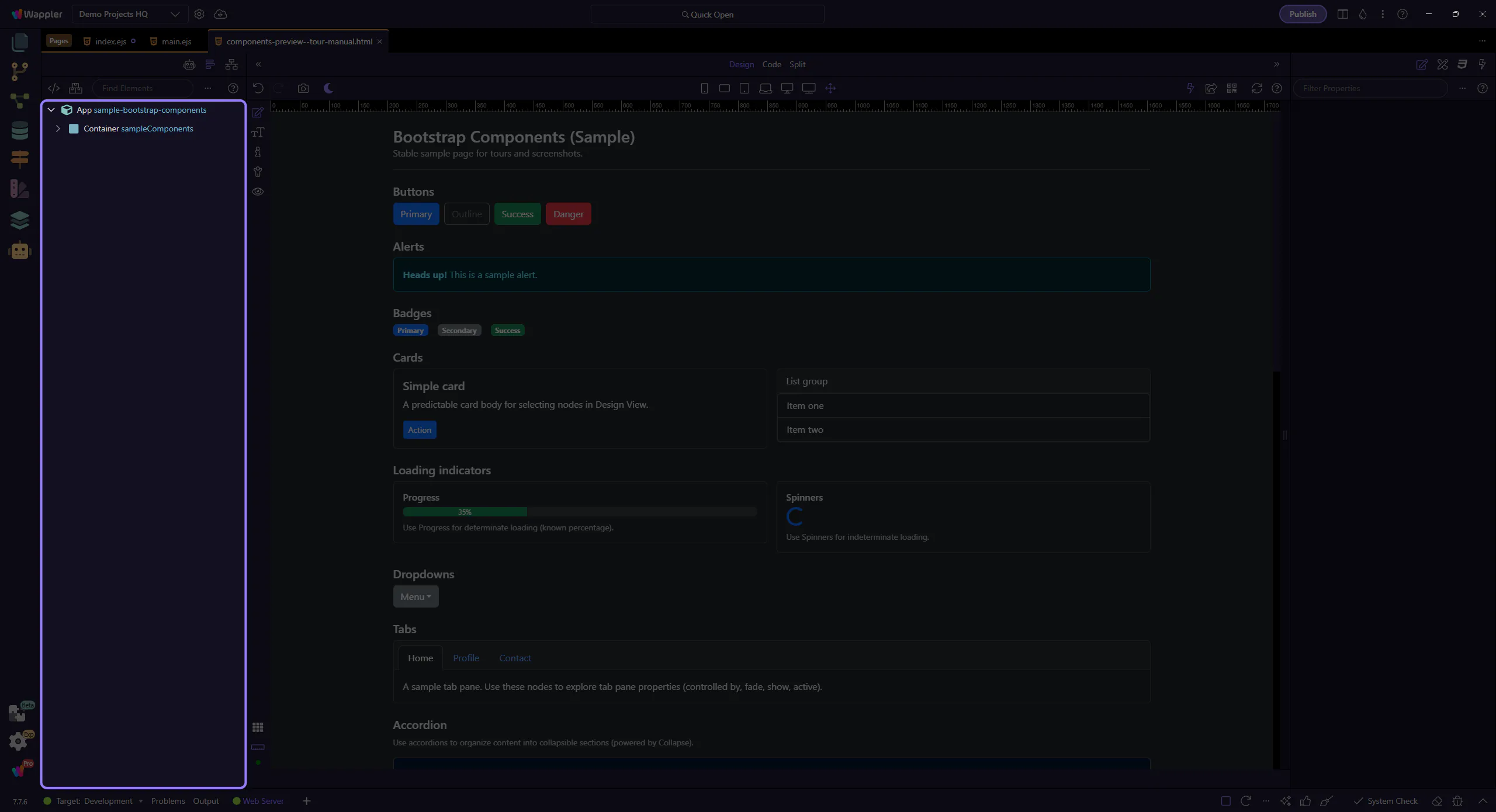
Section titled “Start from the Components picker”The table generator is easiest to understand when you begin at the Components picker, because that is where Wappler turns a data-display goal into a scaffolded UI pattern. This step frames what gets generated for you and why the first choice affects the markup and table options you inspect next.
Generated result
Section titled “Generated result”The generator inserts table markup and App Connect bindings. You can refine columns, classes and bindings afterwards.
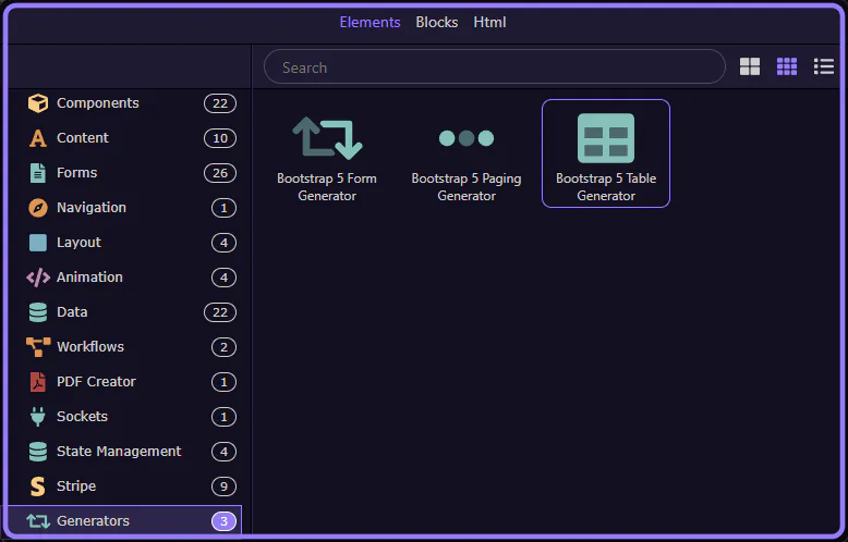
Open the generator
Section titled “Open the generator”Open the Components picker, select the Generators category, then choose Bootstrap 5 Table Generator.
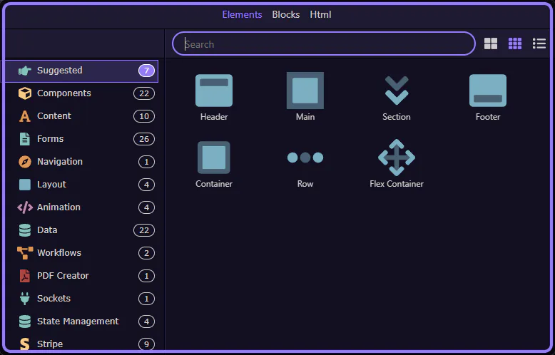
Components picker opens
Section titled “Components picker opens”The Insert Child command opens the Components picker. This step matters because Components picker opens is part of the Structure panel, and understanding that context makes the next action easier to repeat in your own project.
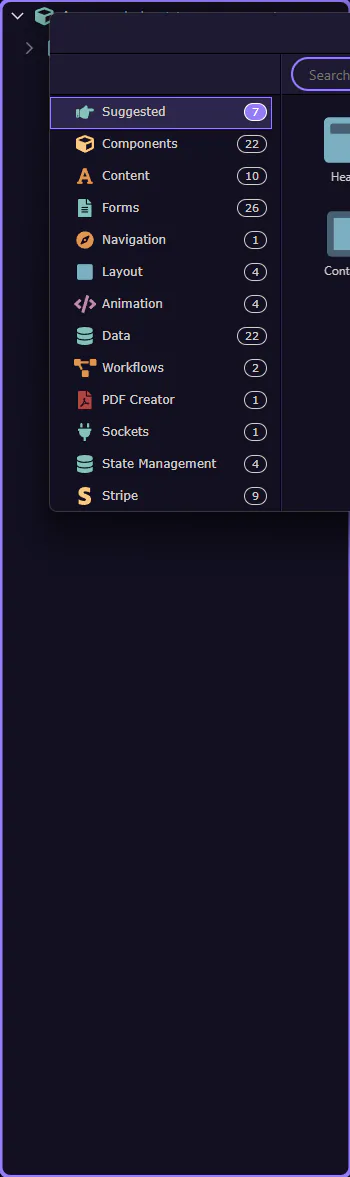
Components picker
Section titled “Components picker”Use categories to find generators quickly. This step matters because Components picker is part of Components Popup Root, and understanding that context makes the next action easier to repeat in your own project.
Generators category selected
Section titled “Generators category selected”The Generators category is now selected. This step matters because Generators category selected is part of Components Popup Anchor Right, and understanding that context makes the next action easier to repeat in your own project.

Table Generator selected
Section titled “Table Generator selected”Bootstrap 5 Table Generator is now selected and its dialog opens. This step matters because Table Generator selected is part of Components Popup Root, and understanding that context makes the next action easier to repeat in your own project.
Generator dialog
Section titled “Generator dialog”The generator opens in a popup dialog.
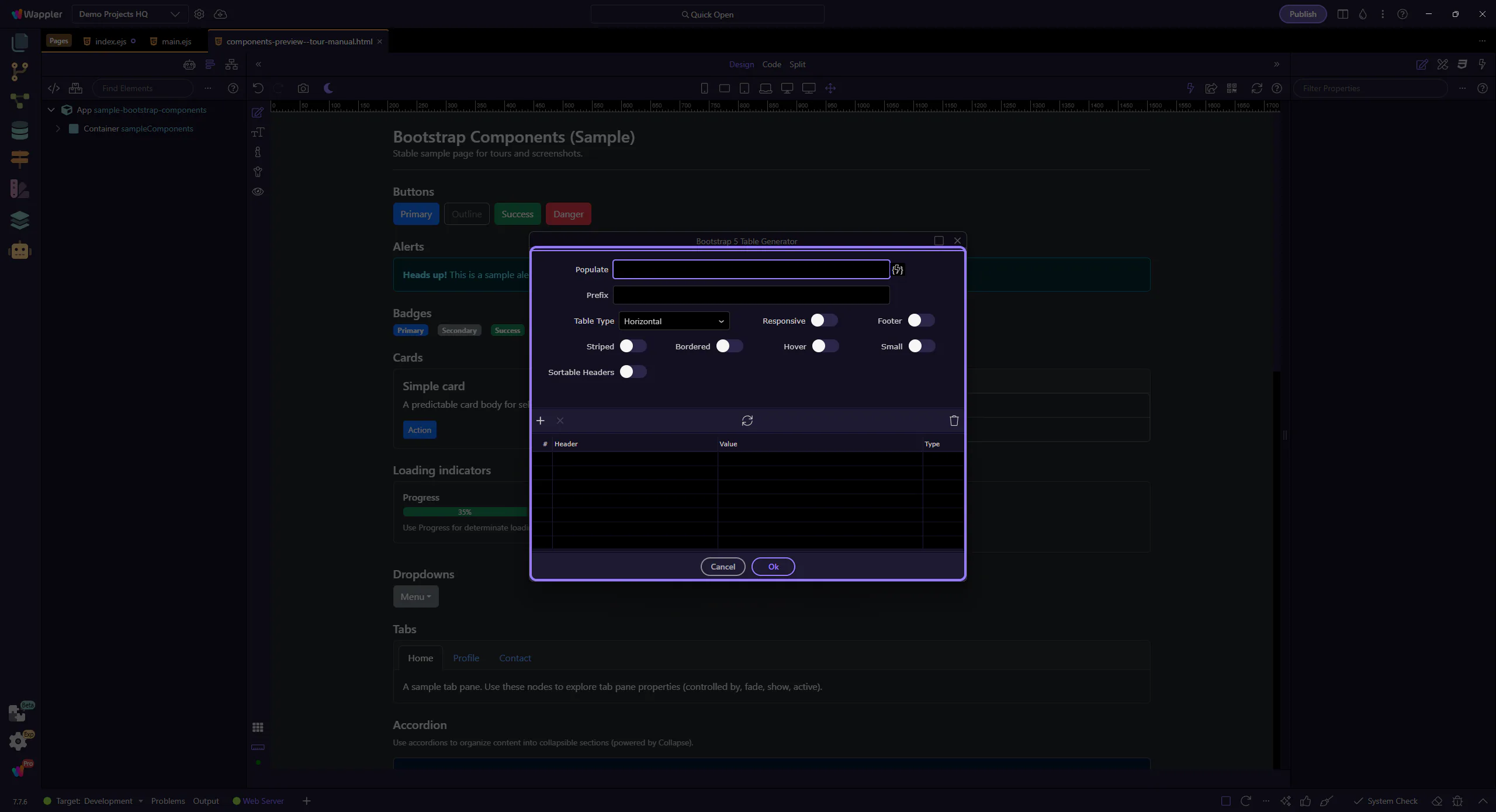
Data settings
Section titled “Data settings”Start by configuring how the table gets its rows.
Populate
Section titled “Populate”Populate is the expression that provides table rows (for example, an array from a data source).

Prefix
Section titled “Prefix”Prefix is used when generating bindings for each column (for example, item). This step matters because Prefix is part of Popup Bootstrap5tablegenerator Form Fieldsform Field Dataprefix Input, and understanding that context makes the next action easier to repeat in your own project.

Table Type
Section titled “Table Type”The table layout can be horizontal or vertical. This step matters because Table Type is part of Popup Bootstrap5tablegenerator Form Fieldsform Field Tabletype Input, and understanding that context makes the next action easier to repeat in your own project.

Style toggles
Section titled “Style toggles”These toggles add common Bootstrap table options.
Responsive / Footer
Section titled “Responsive / Footer”Enable Responsive to wrap the table in a responsive container. Enable Footer to generate a tfoot section.

Striped / Bordered / Hover / Small
Section titled “Striped / Bordered / Hover / Small”Toggle the most common Bootstrap table styles. This step matters because Striped / Bordered / Hover / Small is part of Popup Bootstrap5tablegenerator Form Fieldsform Field Tablestriped Input, and understanding that context makes the next action easier to repeat in your own project.

Columns
Section titled “Columns”Use the columns grid to define headers and bindings.
Columns grid
Section titled “Columns grid”Each row represents a table column (header label and the binding/expression used for cell values).
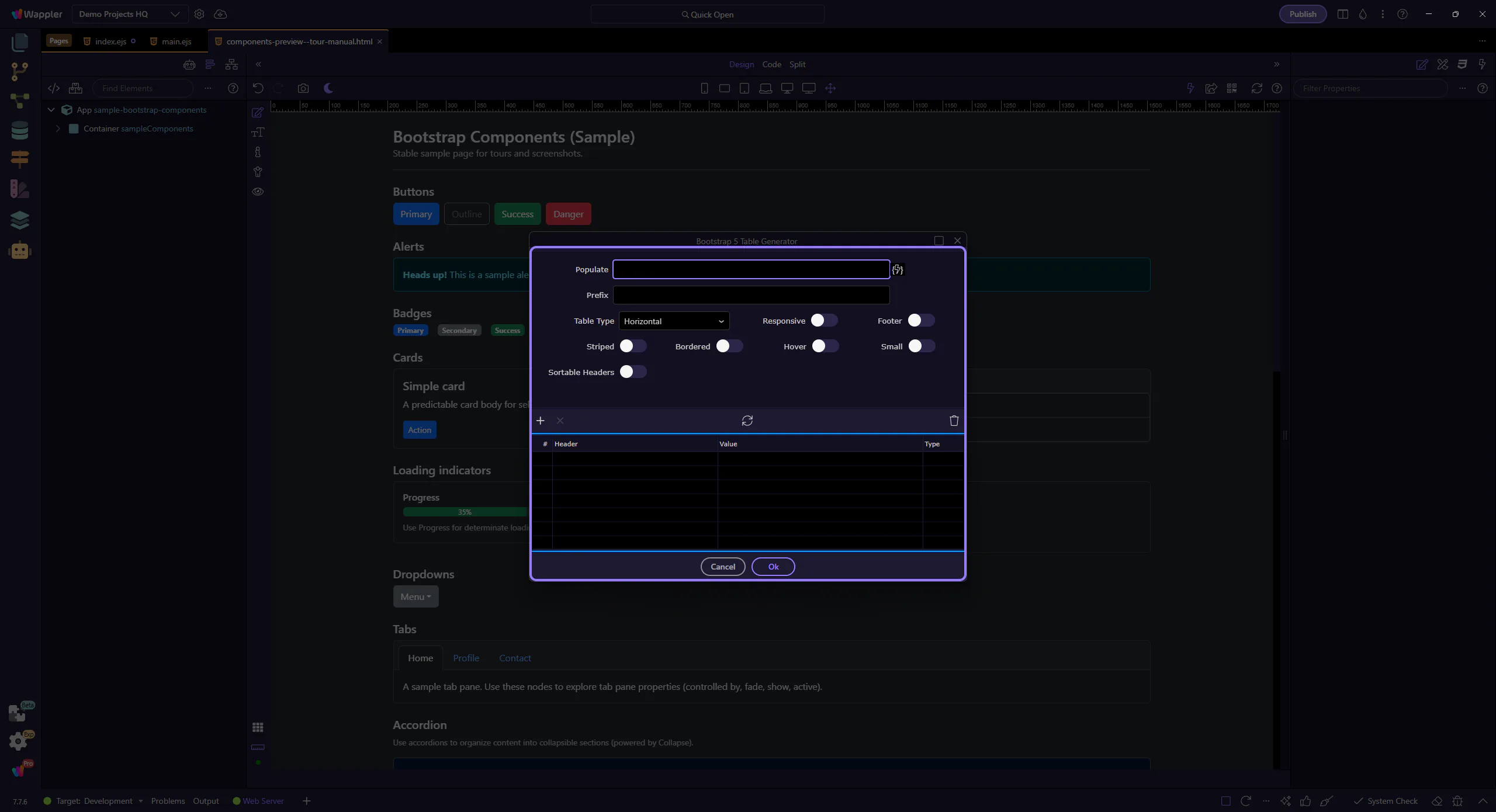
Sortable headers (optional)
Section titled “Sortable headers (optional)”Enable Sortable Headers to generate click-to-sort behavior. Additional sorting fields may appear after enabling it.

Generate
Section titled “Generate”When you’re happy with the settings, generate the table.
Selecting Ok inserts the generated table into the page at the selected insertion point. This step matters because Ok is part of Popup Bootstrap5tablegenerator Button Ok, and understanding that context makes the next action easier to repeat in your own project.

Cancel
Section titled “Cancel”Selecting Cancel closes the dialog without inserting anything. This step matters because Cancel is part of Popup Bootstrap5tablegenerator Button Cancel, and understanding that context makes the next action easier to repeat in your own project.

Next steps
Section titled “Next steps”Continue with other generator tours, or return to the Bootstrap tours index.