
Bootstrap 5 Paging Generator
Generate paging controls quickly and wire them to your data flow for smooth list navigation.
Paging Generator
Section titled “Paging Generator”The Bootstrap 5 Paging Generator scaffolds Bootstrap pagination UI and binds it to a data source that supports paging.
What it generates
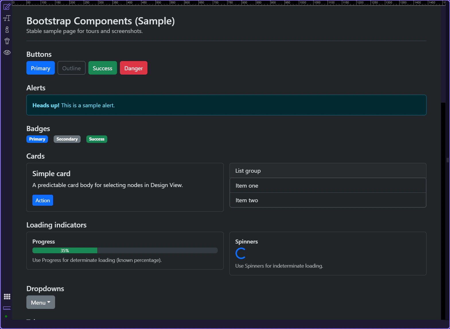
Section titled “What it generates”Start by looking at what the paging generator actually builds before you think about customization. This output shows the navigation structure, active state, and previous-next behavior Wappler scaffolds for you, which makes the later property choices easier to understand and adjust with confidence.
When to use it
Section titled “When to use it”Use this when your data source is paged (for example: a database query with paging, or an API that returns page + total information).
Open the generator
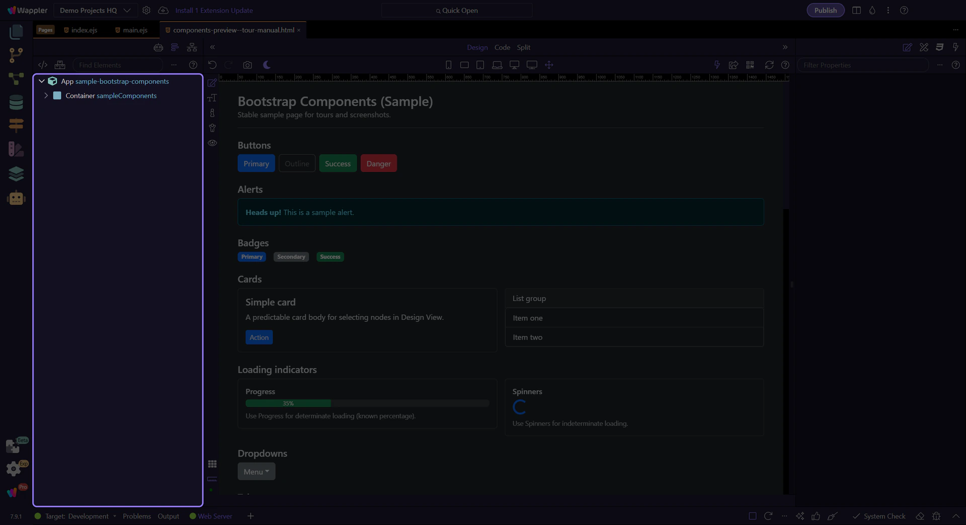
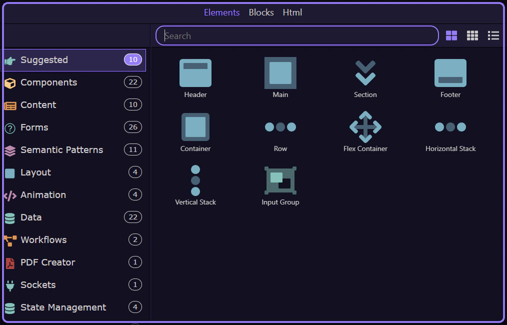
Section titled “Open the generator”Open the Components picker, select the Generators category, then choose Bootstrap 5 Paging Generator.
Components picker opens
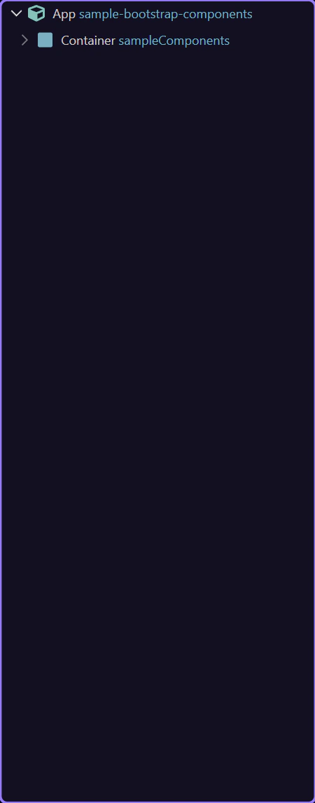
Section titled “Components picker opens”The Insert Child command opens the Components picker.
Components picker
Section titled “Components picker”Use categories to find generators quickly.
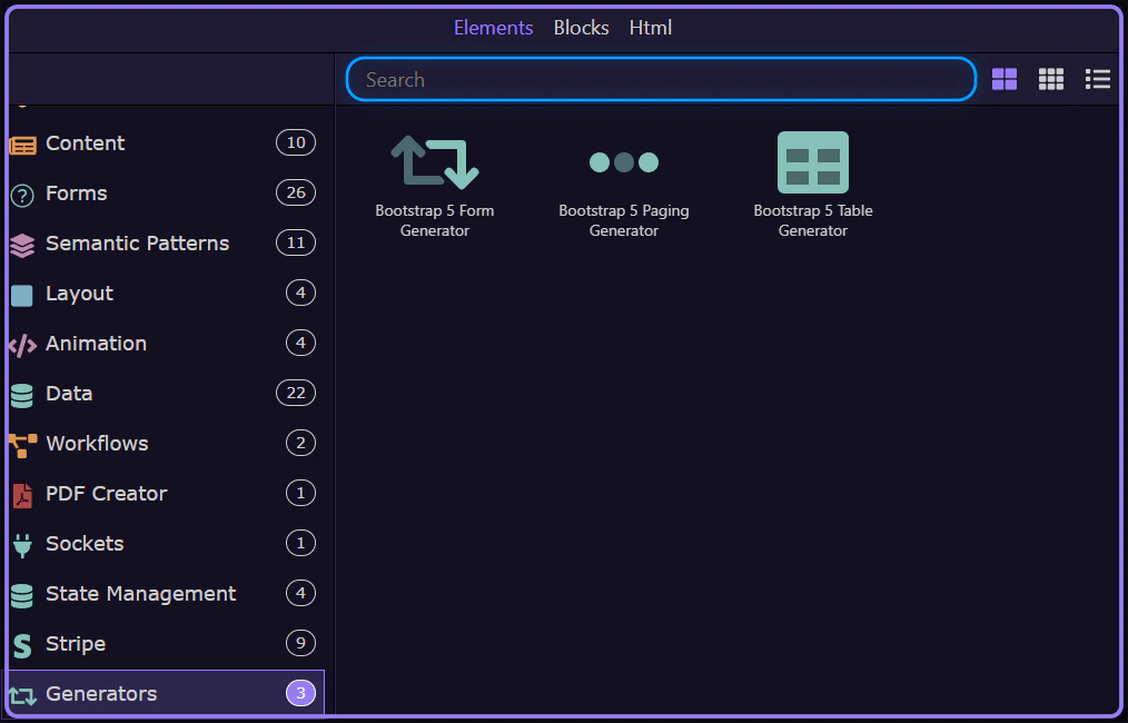
Generators category selected
Section titled “Generators category selected”The Generators category is now selected.
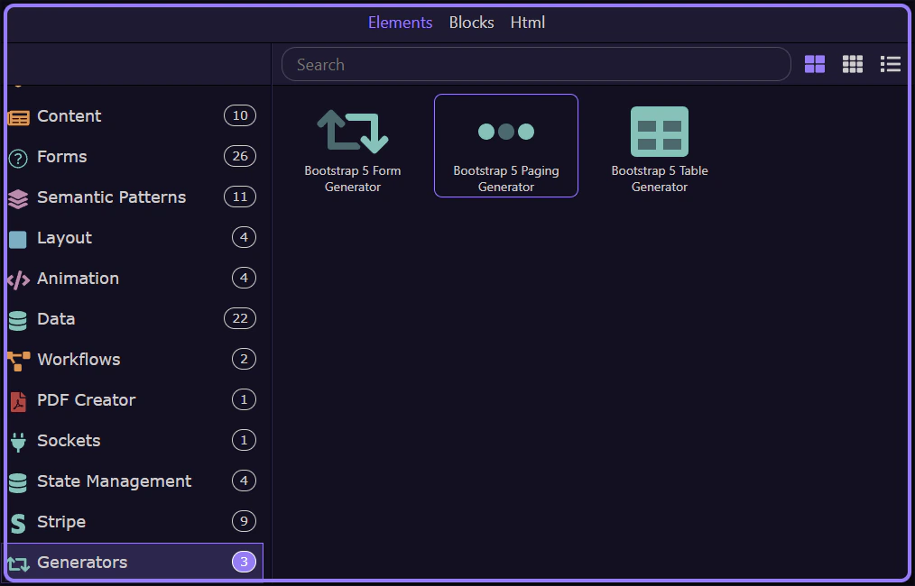
Paging Generator selected
Section titled “Paging Generator selected”Bootstrap 5 Paging Generator is now selected and its dialog opens.
Generator dialog
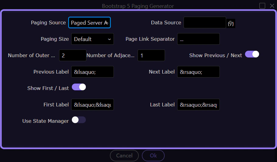
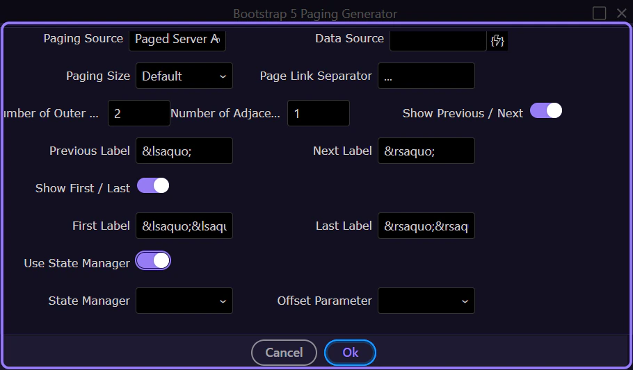
Section titled “Generator dialog”The generator opens in a popup dialog.
Paging source
Section titled “Paging source”Choose where paging information comes from.
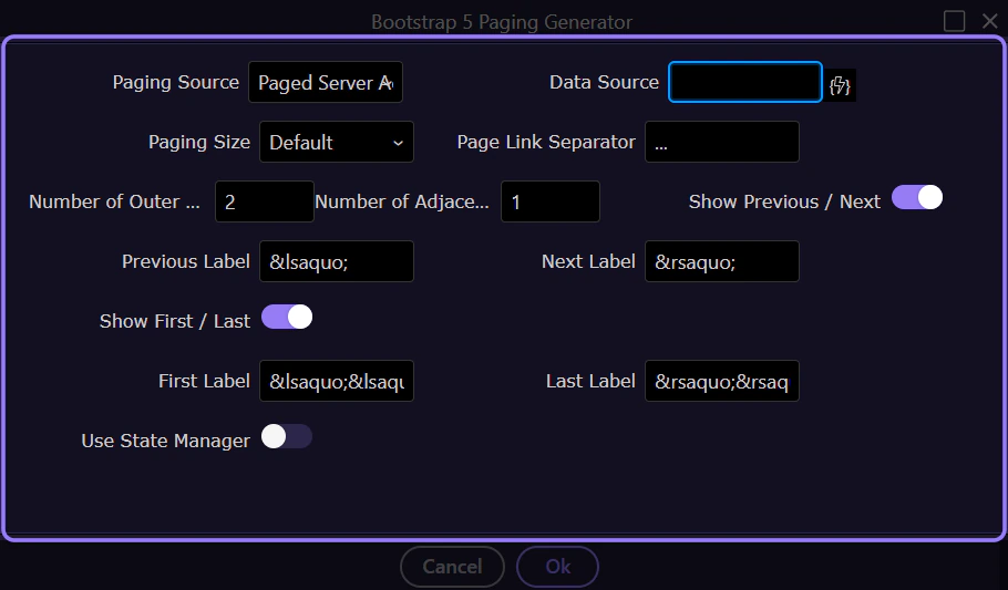
Paging Source
Section titled “Paging Source”The paging source determines whether paging comes from a paged Server Action, a Data View, or a Flow Action.
Data Source / Data View
Section titled “Data Source / Data View”The data source field links paging to the provider that exposes paging state (current offset/page, total records, etc.).
Layout
Section titled “Layout”Configure how the pagination looks.
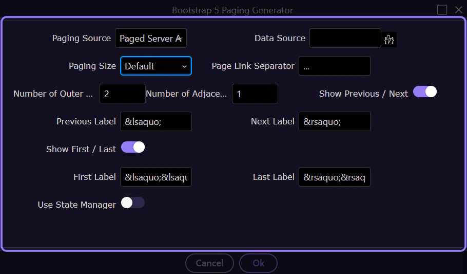
Paging Size
Section titled “Paging Size”The size variant controls the Bootstrap paging size (default, large, or small).
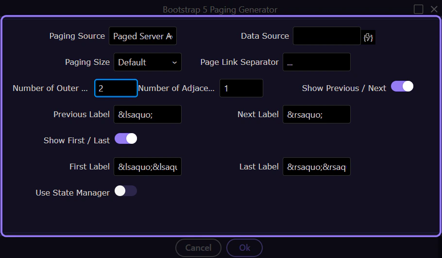
Outer / Adjacent links
Section titled “Outer / Adjacent links”Outer Links and Adjacent Links control how many page links are shown.
Controls
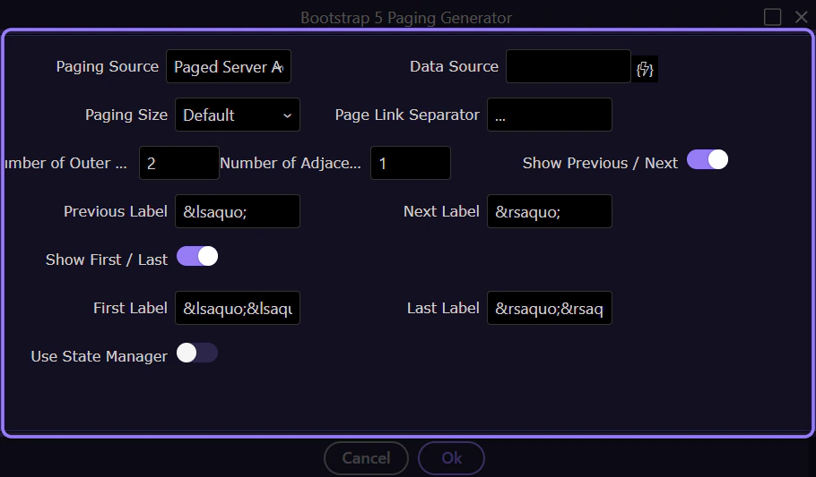
Section titled “Controls”Enable or disable first/prev/next/last controls and configure their labels.
Previous / Next
Section titled “Previous / Next”Toggle whether Previous and Next buttons are shown.
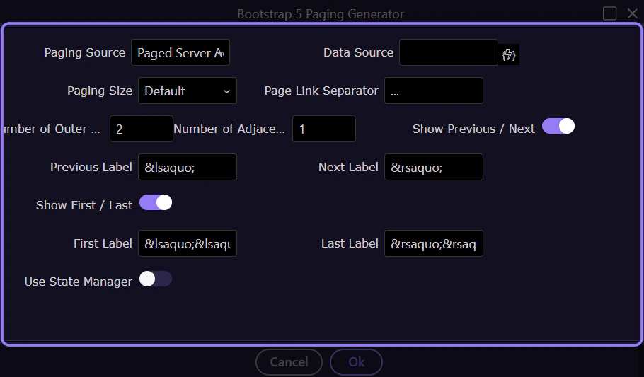
First / Last
Section titled “First / Last”Toggle whether First and Last buttons are shown.
Labels
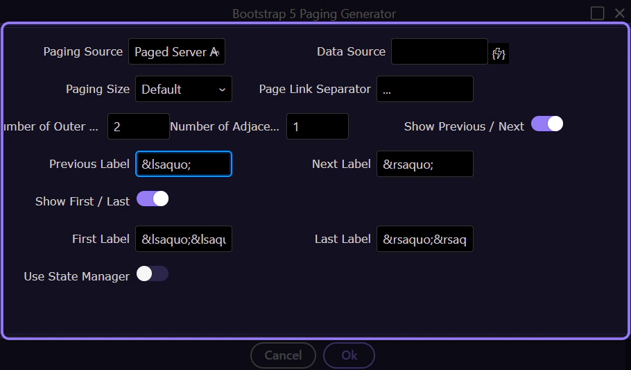
Section titled “Labels”Customize labels for the paging controls.
State manager (optional)
Section titled “State manager (optional)”Optionally persist paging state using a state manager.
Use State Manager
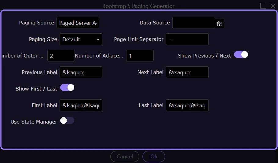
Section titled “Use State Manager”Enable this if you want paging state reflected in a state manager (useful for URL sync and persistence).
State Manager
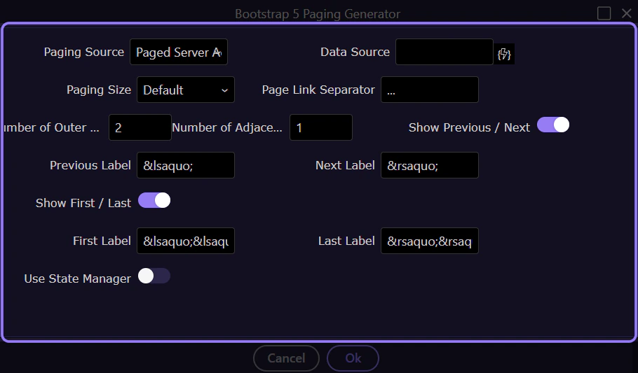
Section titled “State Manager”The state manager selection defines where paging state and offset are stored.
Generate
Section titled “Generate”When you’re happy with the settings, generate the pagination component.
Selecting Ok inserts the generated pagination component into the page.
Cancel
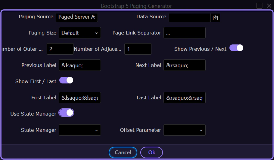
Section titled “Cancel”Selecting Cancel closes the dialog without inserting anything.
Next steps
Section titled “Next steps”Continue with other generator tours, or return to the Bootstrap tours index.