One control represents one scheduling moment
The UI is easier to trust when date and time are configured as one coherent value instead of two loosely related fragments.
Combine date and time picking when users need one coherent schedule value instead of disconnected inputs.
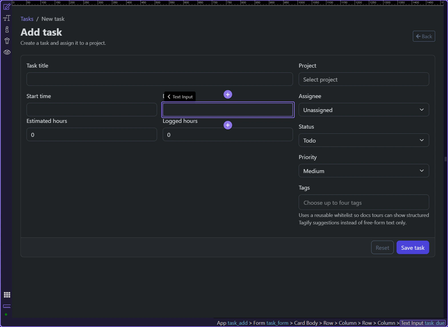
On the Demo Projects HQ task form, the Start and Due fields use the same date-time picker pattern: one control captures a scheduling moment, while the server later validates the posted value. That makes this a concrete inspector tour rather than a generic date-picker overview. You can select the real field in Design View and then inspect the exact properties that control formatting, time selection, 24-hour behavior, and minute precision.
This is the Start field on the task form. In Design View it appears as a normal form control, but its behavior comes from the date picker component configured on the page.
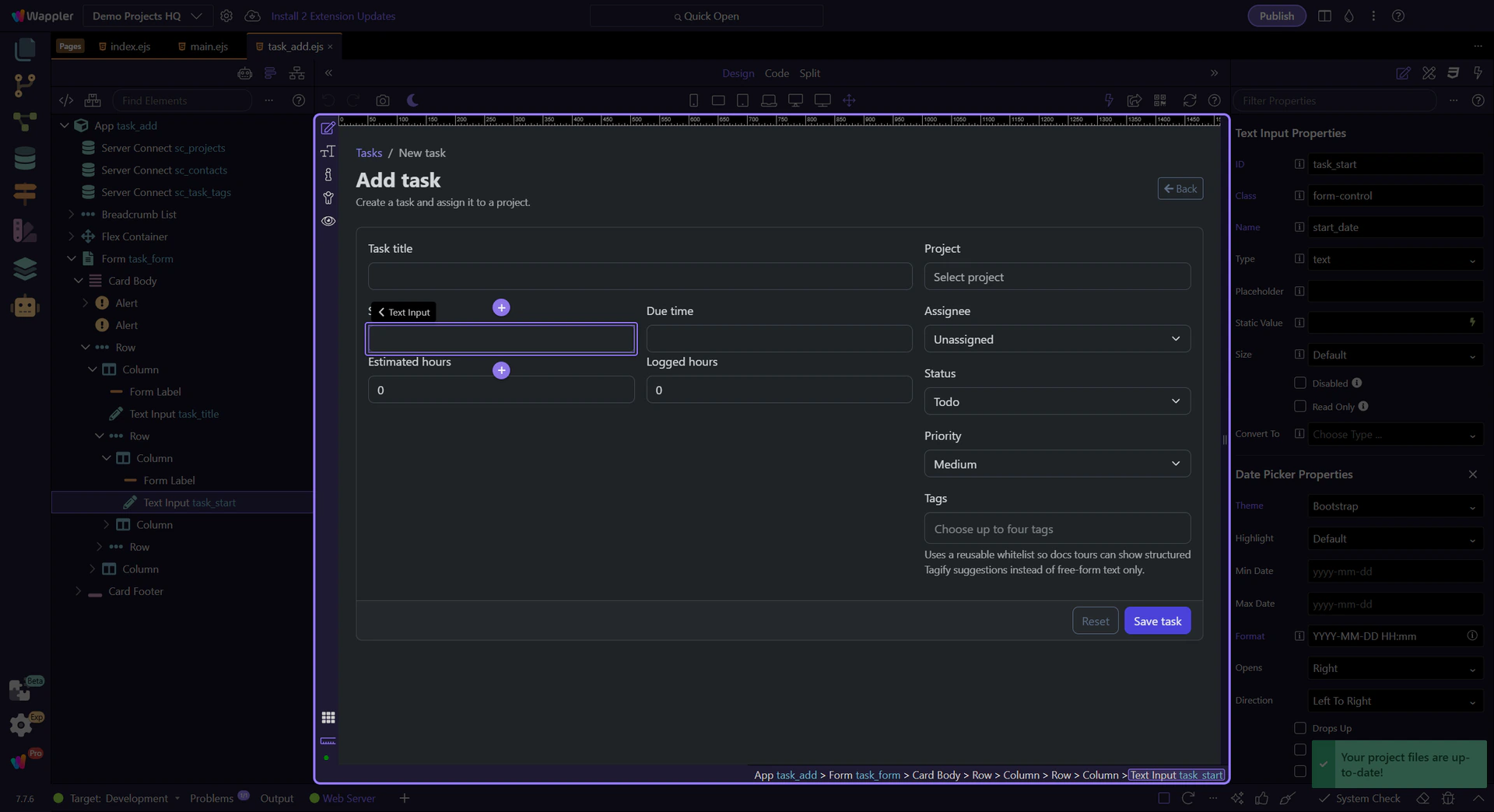
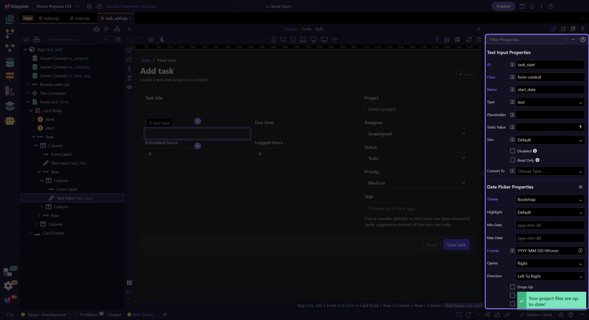
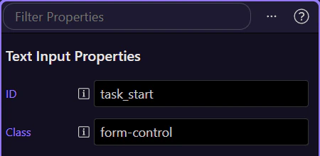
With the Start field selected, the Properties panel shows the full date-time contract for the task form. This is where the combined format, the time-picker mode, the 24-hour convention, the minute precision, and the final form-posting identity all stay aligned.
The Format property is one of the key settings on this page. Demo Projects HQ uses a combined date-and-time mask so the field captures a full scheduling value instead of a date-only placeholder. This is where you decide how much information the editor sees and edits directly.
This field is not just choosing a calendar day. Time Picker is enabled so the control captures a concrete task moment. That is the property that shifts the component from date-only intent into real scheduling behavior.
Use 24 Hours keeps the task form aligned with the way the schedule is meant to be read on this project. It removes AM or PM ambiguity and makes the captured value easier to compare with server-side validation and later formatted displays.
Not every workflow needs minute-by-minute freedom. On this task form, Minutes Increment controls how fine-grained the time choice should feel. That is a product decision as much as a UI one, because it tells users how precise the schedule is expected to be.
The Due field uses the same date-time setup so both ends of the task schedule follow one consistent model. That consistency matters because users should not have to reinterpret the picker rules when they move from Start to Due.
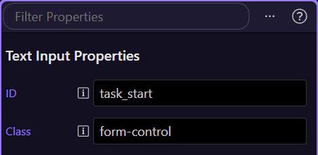
Even with a rich picker UI, this is still a normal form input that has to post cleanly through the task form. The Name property is where the control stays connected to the server-side workflow that validates and persists the scheduling value.

The Demo Projects HQ task form shows the practical date-time pattern clearly: Design View gives you a familiar form field, the Properties panel explains exactly why the picker behaves the way it does, and the final posted value still flows into normal server-side validation. That is the point of combining date and time in Wappler: one trustworthy schedule value with inspector settings that make the behavior explicit.