Inline scanning stays fast
The page keeps its compact reading flow while users browse several thumbnails.
Use App Connect Lightbox to keep media browsing inline until the user asks for a larger preview, then control the overlay from one shared page-level component.
The preview below shows the result first: inline gallery thumbnails, one shared lightbox, and a clean handoff into larger browsing only when the user asks for it.
This gallery section is still the first layer. Users can scan thumbnails and captions in the page itself before they decide whether any asset deserves the larger overlay.
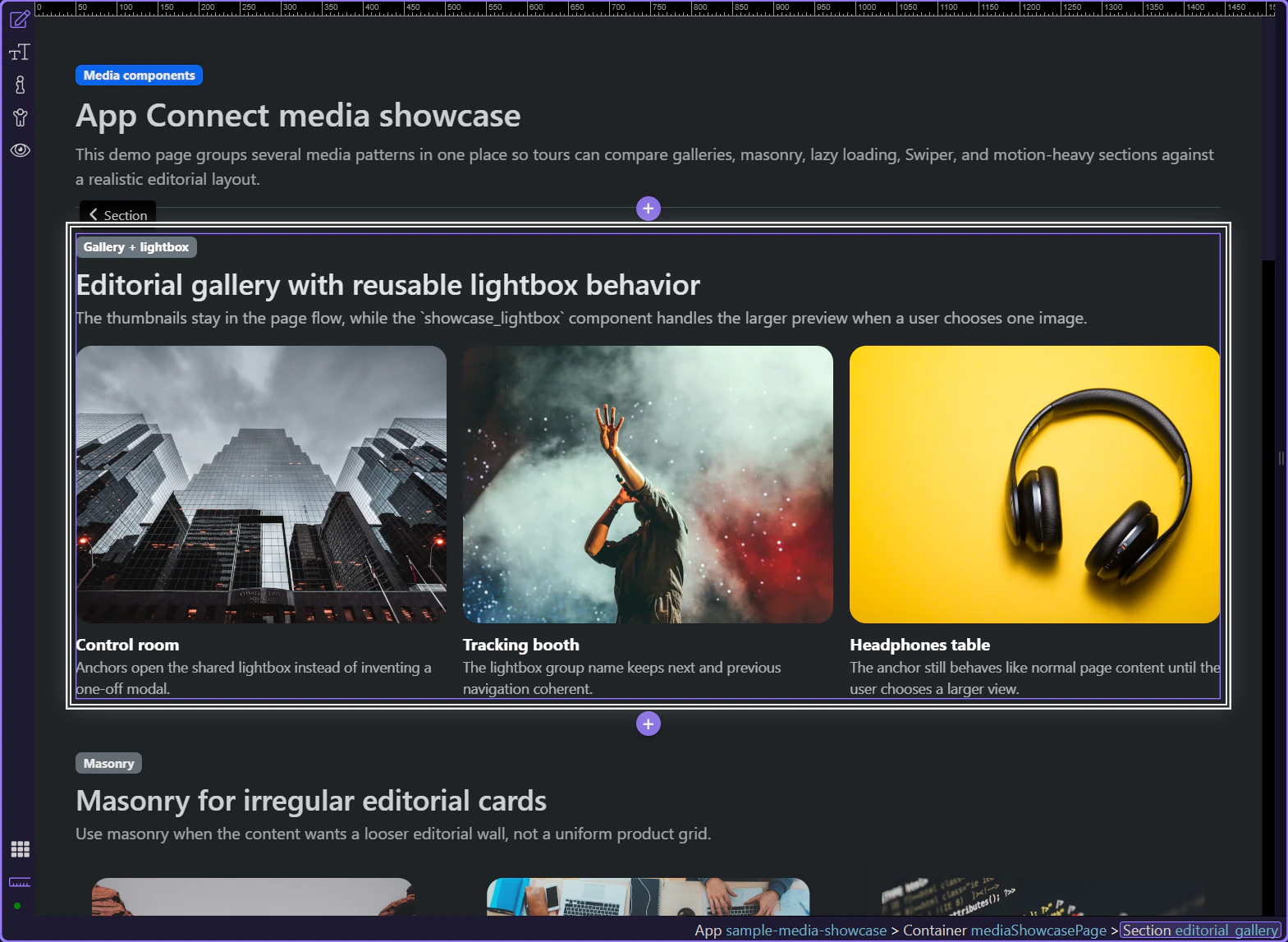
This pattern is strongest when a page has several media items but only some need close inspection. Keep the gallery inline for fast scanning, use Lightbox for one larger asset at a time, and prefer a slideshow instead when the content needs a forced sequence instead of free browsing.

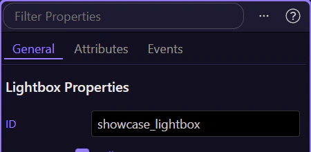
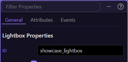
Start by selecting one thumbnail link in Design View. The lightbox behavior is added to that link in Properties, because the link is what opens the larger media preview.
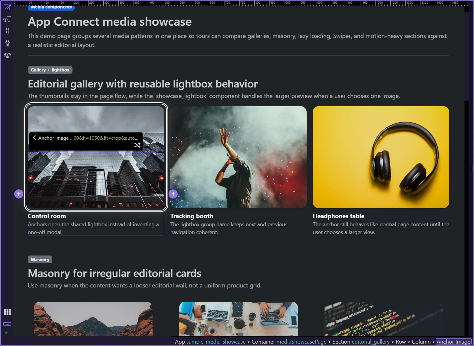
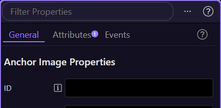
Keep the thumbnail link selected and look at the Properties panel on the right. This is where the link settings stay visible, and the next control you need is Dynamic Attributes (+), where the lightbox behavior is added.
The Dynamic Attributes (+) menu for the selected thumbnail link includes Open in Lightbox. This connects that gallery item to the shared lightbox overlay before you fine-tune the group and related options.
Insert Lightbox Options once near the top of the page structure, just below the app root or body. It owns fullscreen behavior, spinner style, animation, and buttons for every gallery item instead of repeating those settings on each link.
This is the placement to remember. Lightbox Options is a general page-level component, so it usually appears near the top of Structure under the app root or body, not as something you add repeatedly inside the gallery itself.
If you need to add it, think of this as one page-level setup step rather than a quick gallery-item insert. The gallery links themselves are configured later with Dynamic Attributes, while Lightbox Options stays as the single shared controller for the overlay.
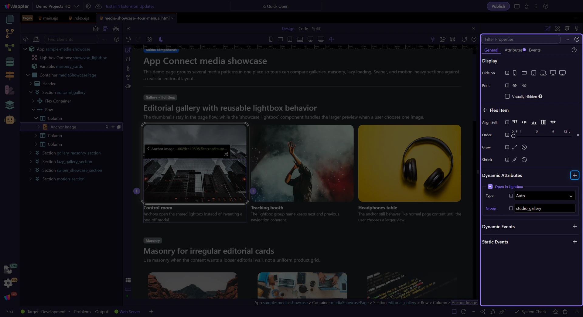
Once the shared Lightbox Options component exists near the top of the page, go back to the gallery links. Each anchor gets its own Open in Lightbox relationship and optional group name, which is the actual connection between the thumbnail and the shared overlay.
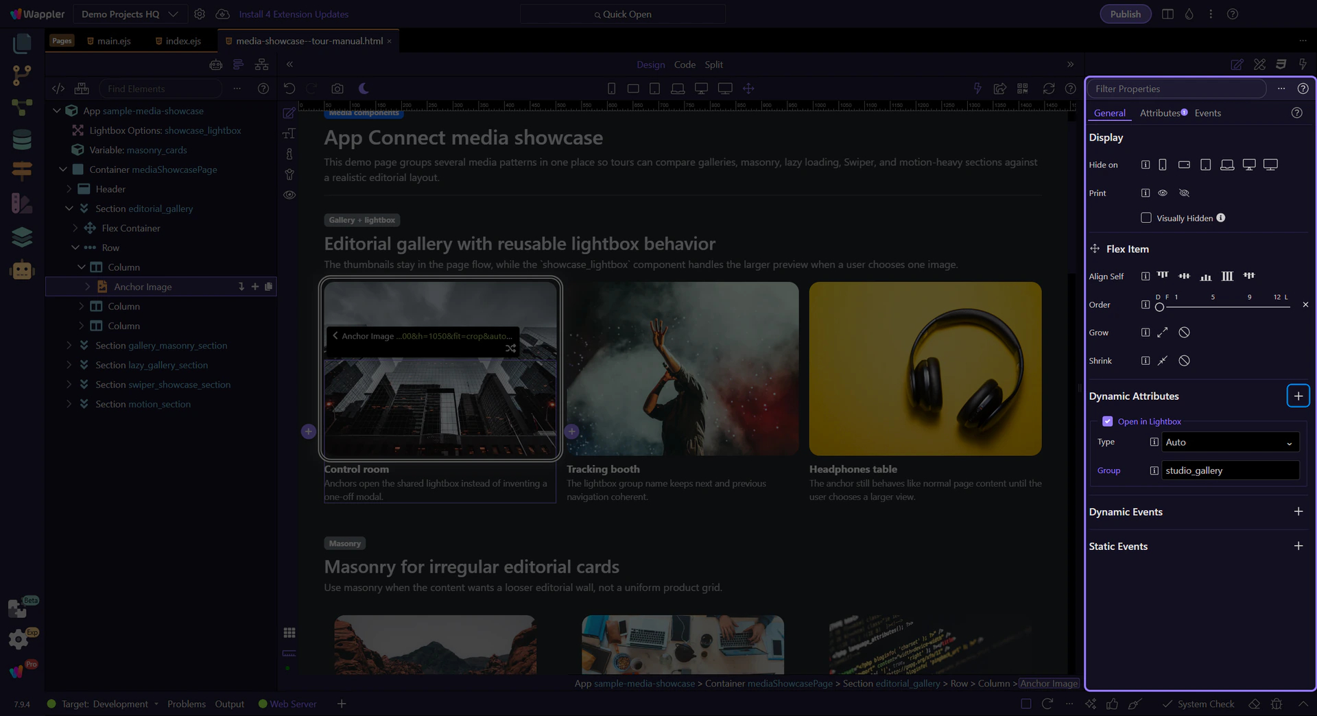
When the thumbnail link is selected, the Properties panel shows the part that matters: the anchor still behaves like normal page content, but its dmx-lightbox:studio_gallery relationship tells Wappler which shared lightbox group should open when the thumbnail is clicked.

Once the media page is open, inspect the two Lightbox layers that matter in Wappler: the shared Lightbox Options component that owns the overlay behavior and the anchor-level relationship that sends each thumbnail into the shared viewer.
The page-level Lightbox Options component is where fullscreen behavior, spinner style, animation, and visible buttons are configured once for the page. The gallery anchors do not duplicate those controls. They simply feed images into the shared overlay, which keeps the gallery markup light and the popup behavior consistent.
With the shared Lightbox Options component selected, the Properties panel is where you decide whether the overlay opens fullscreen, which loading spinner appears, which transition animation is used, and whether the navigation buttons stay visible. These are page-level viewing rules, so set them once here instead of repeating them on every gallery link.
You now have the concrete Lightbox workflow in Wappler: keep the thumbnails in normal page layout, attach Open in Lightbox on the anchor, and centralize the overlay behavior in one shared Lightbox Options component.
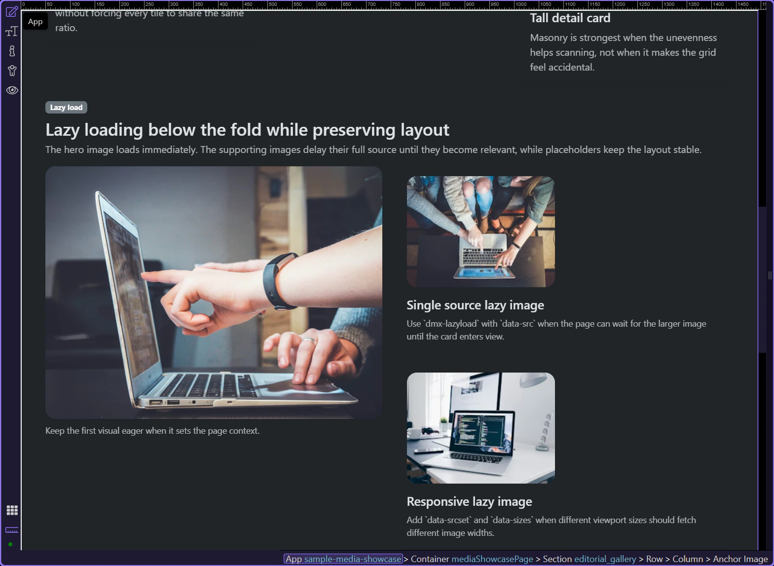
If the same page needs a looser editorial wall, continue into Masonry next. If the gallery assets start getting heavy, continue into Lazy Load Images so the page stays fast.
