Irregular cards stay intentional
Different card heights can still read as one wall instead of looking broken.
Use App Connect Masonry to convert a Bootstrap row into an editorial wall while keeping column, gutter, and order control in Wappler.
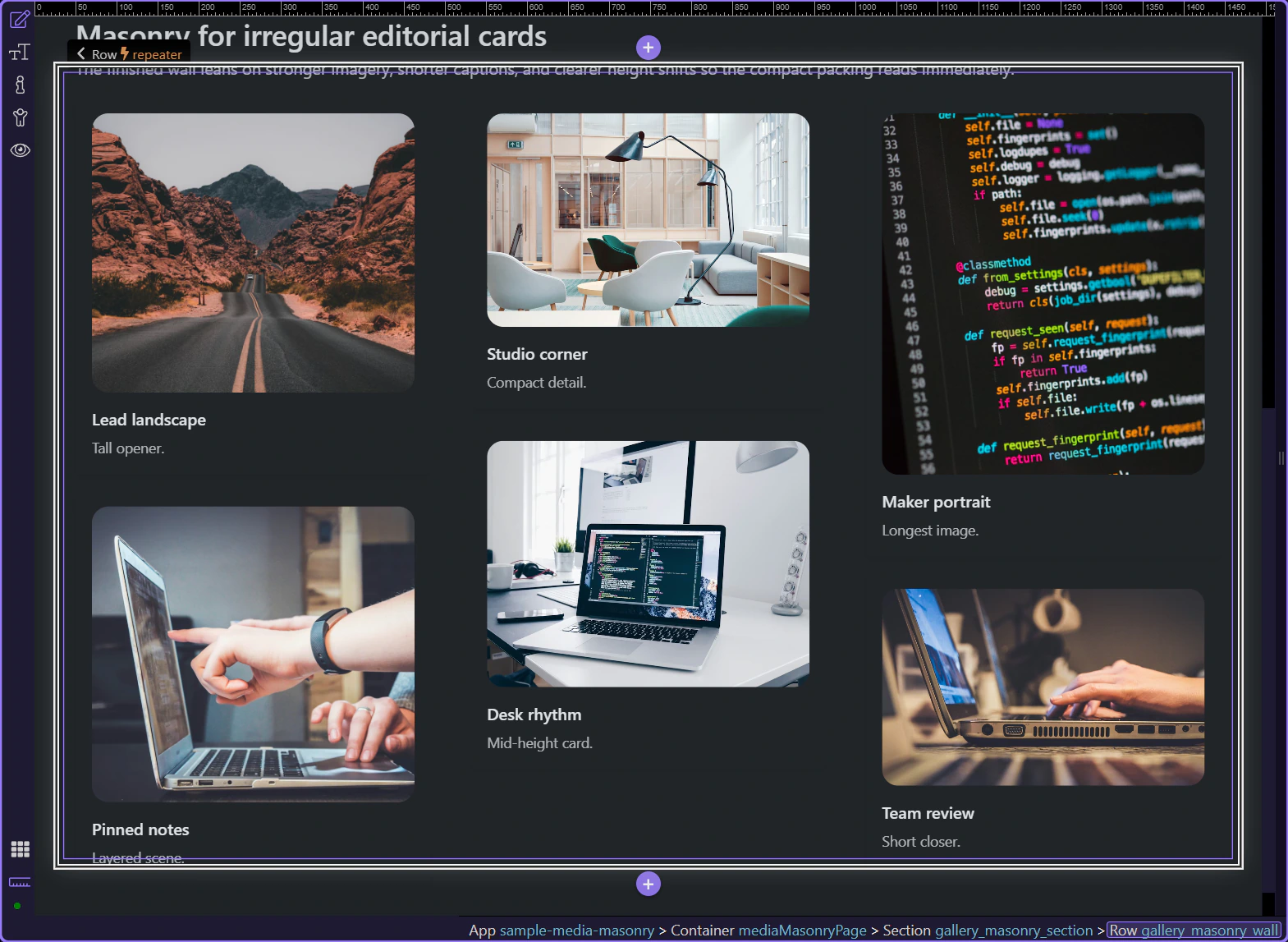
The preview below shows the result first: an uneven editorial wall that still feels intentional because the component is controlling columns, gutters, and item flow.
This section works because the cards are not pretending to be a strict product grid. The uneven image ratios and copy lengths make the wall easier to scan when the content should feel curated instead of mechanical.
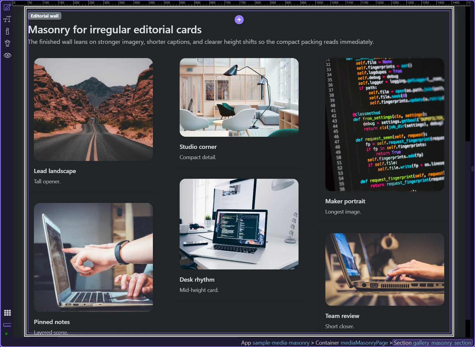
Use Masonry when the wall should absorb different image ratios and copy lengths without wasting vertical space. It is strongest for editorial highlights, stories, portfolios, and mixed card summaries where the content should feel curated rather than perfectly uniform.

The real Masonry component is the wall container with is="dmx-masonry". Select that container first so the Properties panel shows the layout controls that belong to the wall instead of the content inside each card.

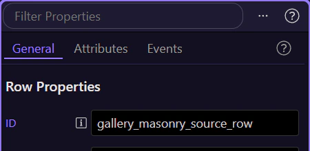
In Structure, start from the plain Bootstrap row that already contains your cards. Rows such as this one expose automatic conversion choices, so this is the right place to switch the layout instead of rebuilding the content from scratch.
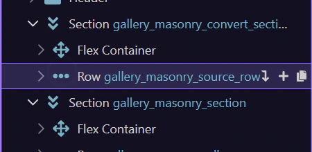
Let’s use the Convert To control that appears in the Properties panel for this Bootstrap row. That keeps the workflow anchored to the element you already built instead of sending you back to the component picker.
Masonry is the Convert To option that turns the existing row into an editorial wall. The cards can stay in place while the row gains the layout behavior and properties that control columns, gutters, breakpoints, and order.
Once the row has been converted, Masonry becomes the layout owner for the wall. The remaining steps stay on the finished wall so you can inspect the controls that shape the packed layout.
After the picker closes, return to the real wall already on the page so the rest of the tour can inspect the component that is actually driving the editorial layout.

Once the Masonry wall is selected, the important decisions are how the layout should balance order versus compactness, and how many columns and gaps the wall should expose at each breakpoint.
The Masonry component exposes its layout and data wiring on the wall itself. This is where Wappler lets you connect a repeat expression when the wall becomes dynamic, decide whether order should be preserved, and turn on animation only when reflow changes actually need to be emphasized.
The Columns, Gutter, and Breakpoints groups are the real layout controls for Masonry. Tune how many columns appear at each size, keep enough gutter so the cards do not blur together, and only tighten the wall when the content still feels readable on smaller screens.
You now have the concrete Masonry workflow in Wappler: choose the wall container intentionally, use Masonry when uneven content helps scanning, and tune columns, gutters, and ordering on the component instead of faking the layout with custom CSS.
Continue into Lightbox when the same page should open larger previews on demand, or return to the media hub to choose the next media component workflow.
