Master → detail
Pick an item from a list; show details elsewhere.
Single-record selection from an array source by key, exposing a stable detail.data object for bindings.
Data Detail selects a single record from an array (or array-like source) so you can bind UI to one “current item”.
This tour explains the selection pattern behind Data Detail, not just the component itself. You will follow how a list chooses a record key, how Data Detail resolves that key to one current item, and why that makes detail panels easier to bind and maintain than copying data by hand.
You’ll work mainly in two places:
Then you’ll select a master list item and inspect its Repeat + Click event, which drives the Data Detail selection.
First select the Data Detail component in App Structure and verify its ID, Data Source, and Key. Then inspect the master list item’s Repeat + Click event that calls select(id).
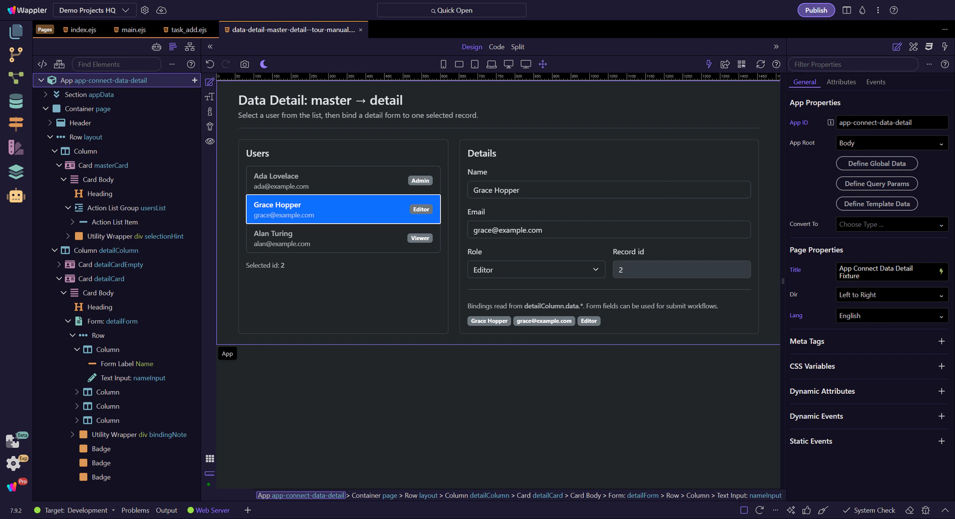
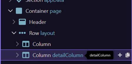
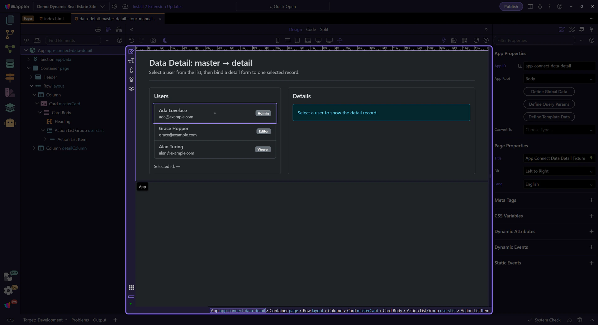
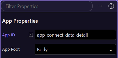
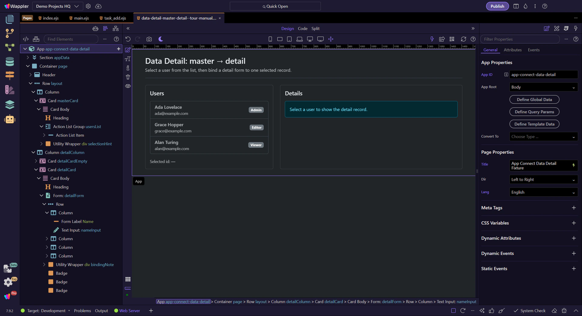
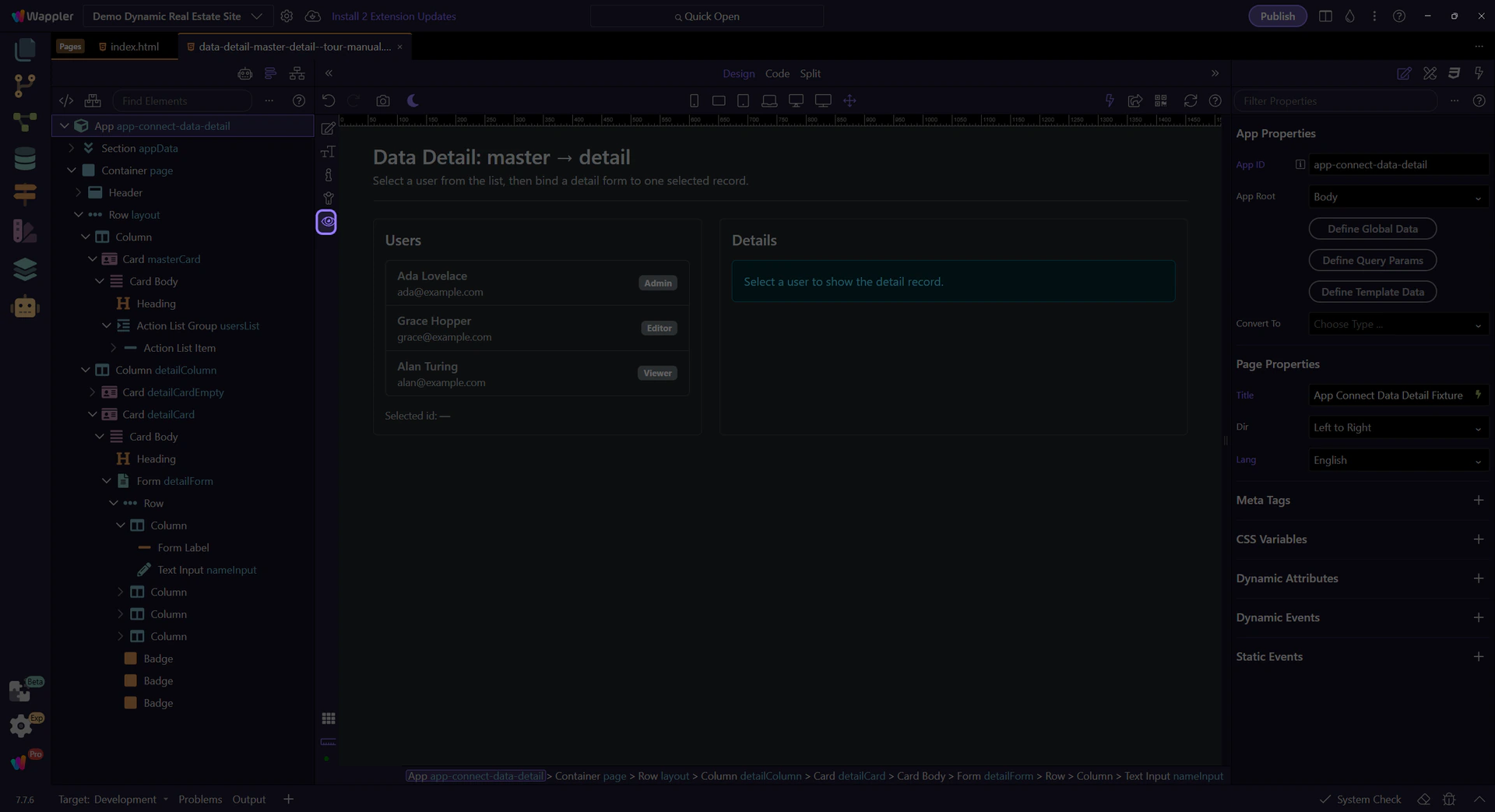
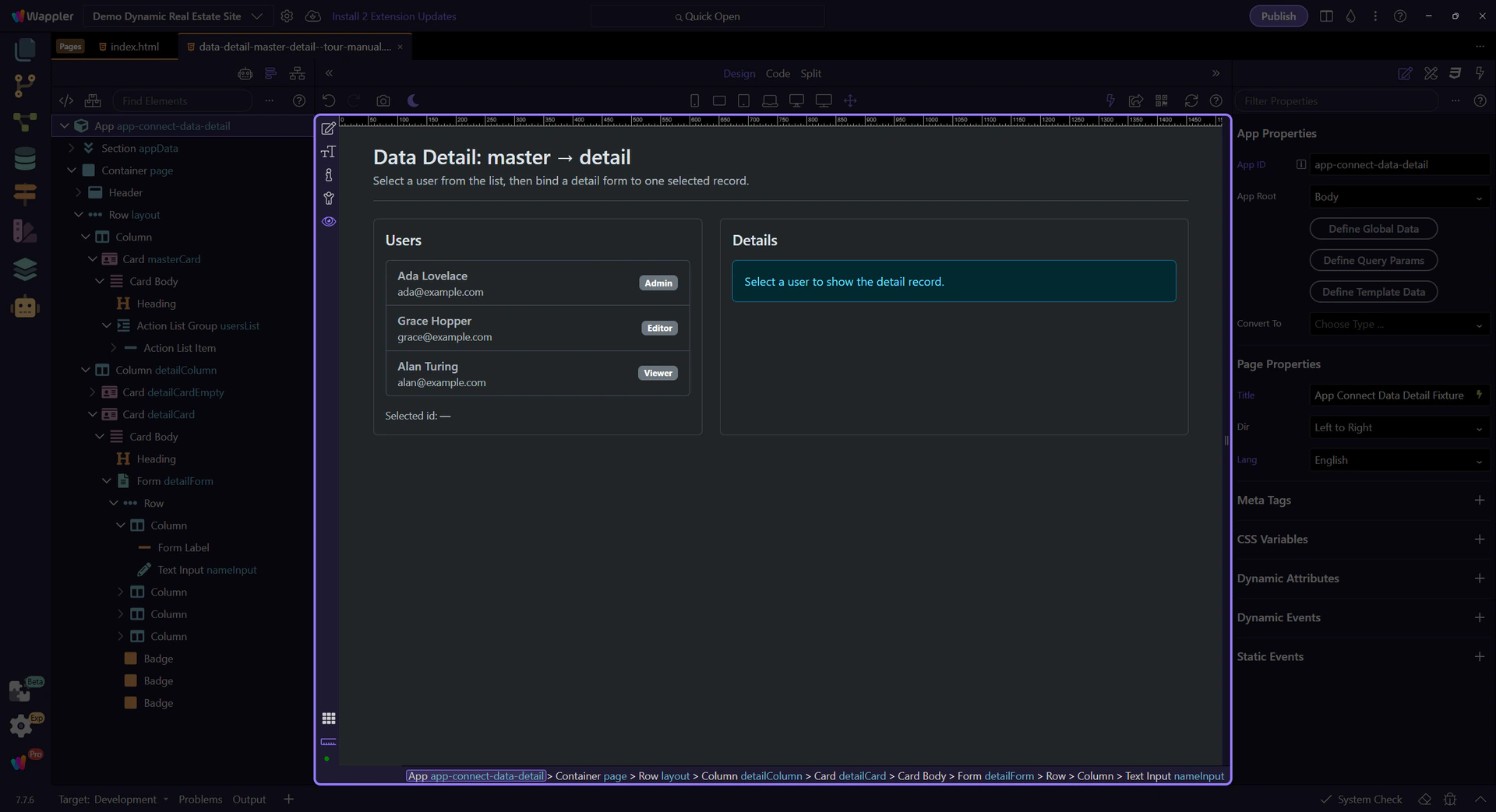
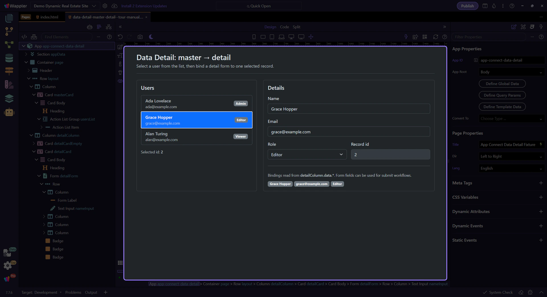
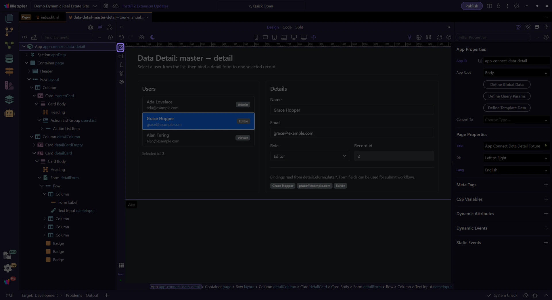
The tour selects the Data Detail wrapper in App Structure. This is the component that will hold the selected record and expose it as detailColumn.data.
Start with the wider context in the Properties panel so the next control makes sense in the full workflow. In the next step, you will focus on Data Detail ID and see how it fits into this area.
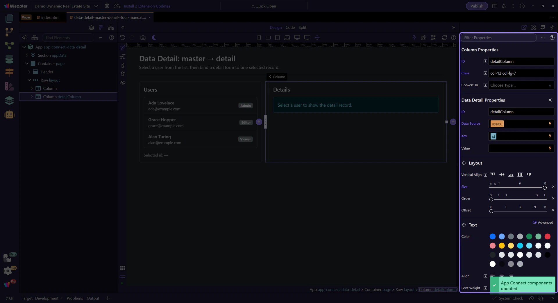
This ID becomes the component name you use in expressions and actions (for example: detailColumn.data.name and detailColumn.select(id)).

The Data Source is the array of records that Data Detail can select from. On this demo page it’s bound to users.value.
Use the picker to choose a dataset (Data View result, Data Store, API output, or a simple array).
tip: When you pass values from inputs or query params into select(), remember they are strings unless you convert them (use toNumber() for numeric ids).

Key is the field name in the Data Source used to identify each record (for example: id).
Important: this is not a dynamic expression like {{id}} — it’s the literal field name that Data Detail uses to match the value you pass to detailColumn.select(...).
important: Query parameters are strings. Convert numeric keys with toNumber() when needed (for example: query.id.toNumber()).

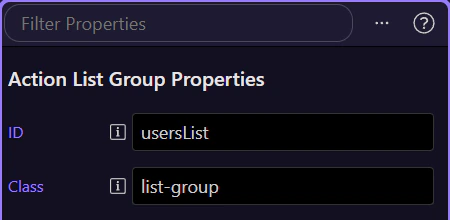
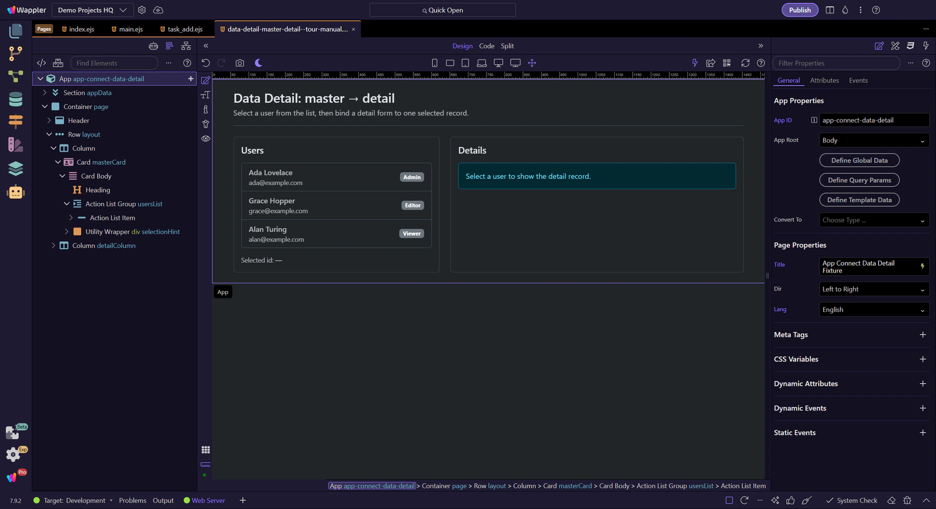
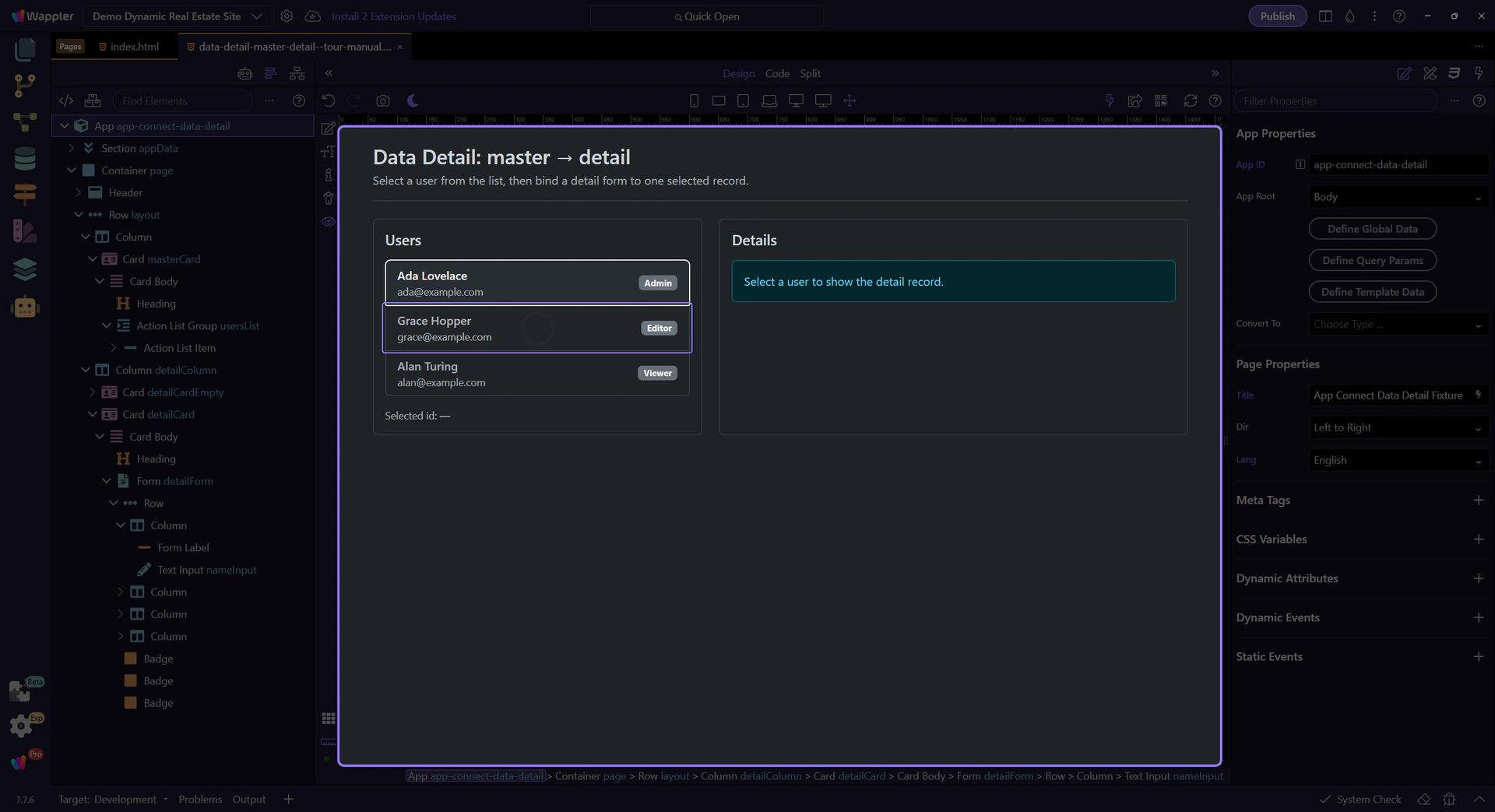
The master list uses a Repeat over users.value on the list container. Select the repeater so the Properties panel can show that Repeat expression in a stable, readable export view.
The click event row in Properties calls Data Detail’s select(id) action. Data Detail keeps its own selected state and exposes the selected record as detailColumn.data.
tip: In Wappler, attach this via Events → Click → Actions picker → Data Detail → Select (and pass the item id).

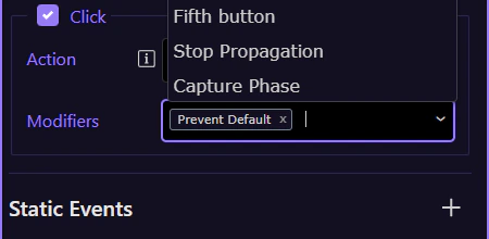
The Click event modifiers live alongside the event row in Properties. Here the setup uses prevent because the item is an , and this wider panel view keeps those controls readable in the export.
Once selected, Data Detail exposes one object in a stable shape you can bind to.
The selected record is available as detailId.data. Use it in bindings like detailId.data.title or detailId.data.price.formatCurrency(’$’).
For empty/selected UI inside Data Detail, prefer dmx-show/dmx-hide so your detail form stays in the DOM and doesn’t reset state.
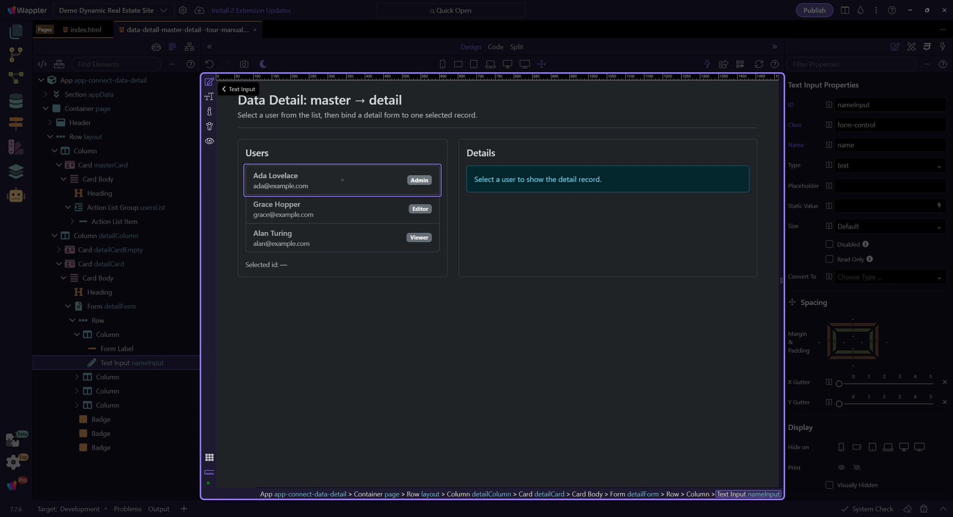
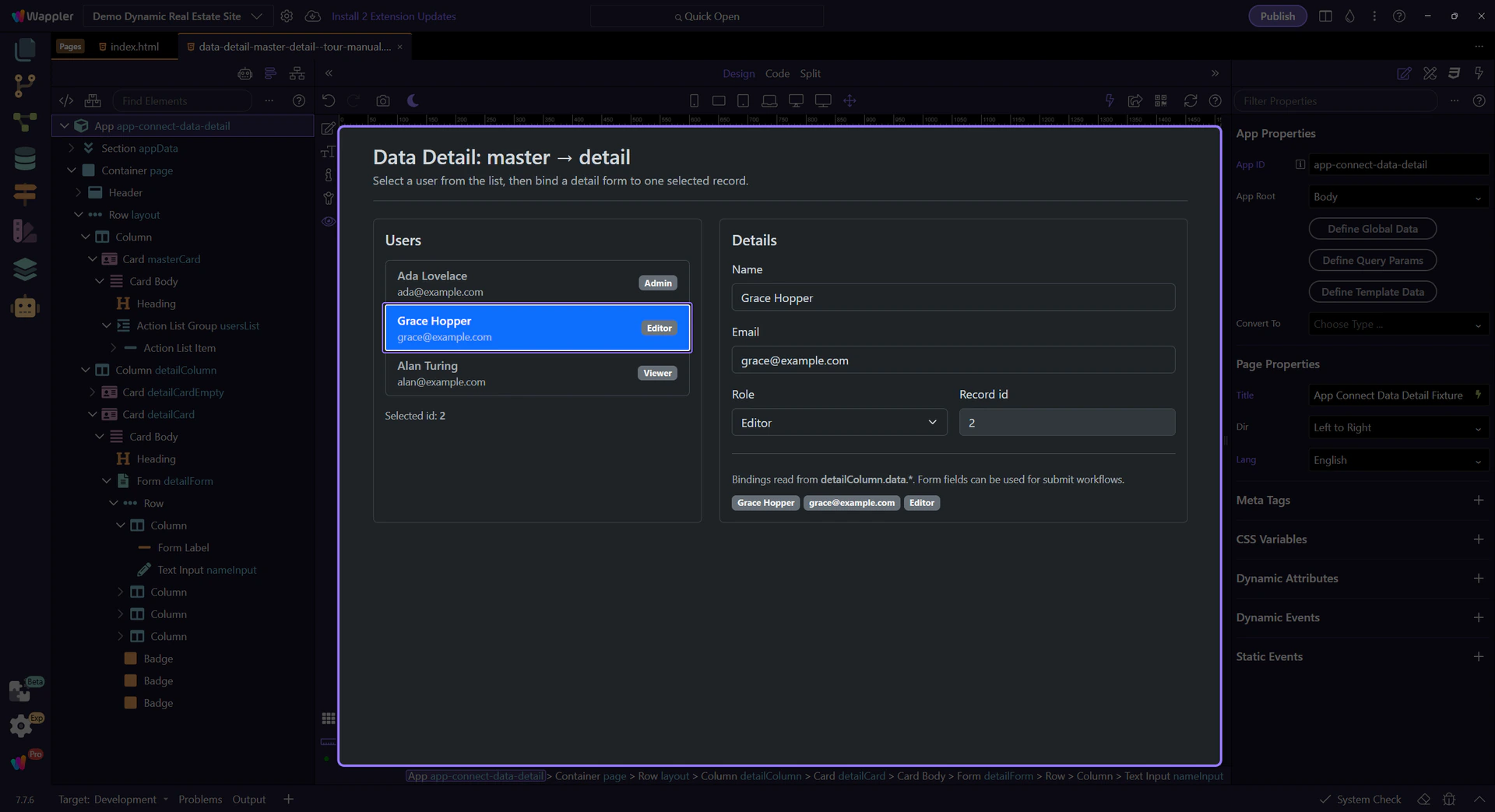
The tour selects a record so the detail fields are visible for inspection.
The form fields bind to the selected record (detailColumn.data.*), so the UI always reflects the current selection.
Use events/actions (click/submit/change) to call detailId.select(key). This updates the selection and the UI reacts. This step matters because Selecting a record (actions) is part of the Properties panel, and understanding that context makes the next action easier to repeat in your own project.
tip: A common pattern is: click a card → select(record.id) → navigate (optional) or reveal the details panel.
For shareable pages, store the selected key in Query Manager. Then let Data Detail select based on that query param.
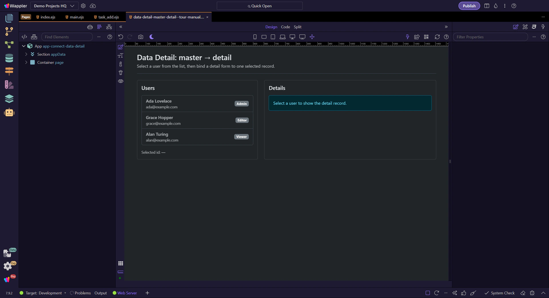
Switch to Preview mode and interact with the master list. The detail form updates because it’s bound to detailColumn.data.*.
Switch to Preview mode now so you can confirm the detail view reacts to a real selection in the next step.
Wait for the page to finish switching modes.
We’ll click a user in the master list. This runs a click event that calls detailColumn.select(id).
The fields and preview badges update because they’re bound to detailColumn.data.*.
Edit the Name or Email field and watch the preview badges update. This demonstrates that inputs are reactive value sources.
Return to Edit mode so you can keep refining the detail setup after confirming the live result.
Next, connect selection to navigation and interactions.
Pick a related tour to continue.