Data View (filter/sort/page)
Use Data View to filter, sort, and paginate any dataset without mutating the original source.
Data View
Section titled “Data View”This tour frames Data View as the layer between raw collections and the version of that data the user actually sees. You will look at how search, sort, and paging reshape a dataset declaratively while leaving the original source untouched for other components or workflows.
Why Data View matters
Section titled “Why Data View matters”It keeps your original collection stable while letting UI controls (search/sort/paging) reshape what’s displayed.
Where you’ll use it
Section titled “Where you’ll use it”You’ll usually combine Data View with UI controls (search input, selects, sort buttons, paging). Those controls update the view, and anything repeating the view updates instantly.
Core Properties
Section titled “Core Properties”These are the properties you’ll configure most often.
Orient yourself in Properties panel
Section titled “Orient yourself in Properties panel”Start with the wider context in the Properties panel so the next control makes sense in the full workflow. In the next step, you will focus on ID and see how it fits into this area.
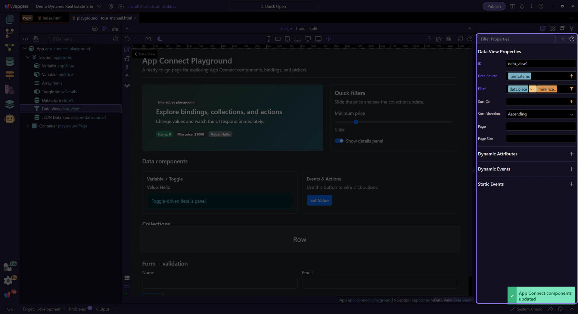
Name it so it’s obvious what the view represents. This step matters because ID is part of Selection Panels Properties Dataviewid, and understanding that context makes the next action easier to repeat in your own project.

Source
Section titled “Source”The source field controls which dataset the Data View reads (array, Data Store items, API results, etc.).
tip: The Data Bindings Picker only shows items in the current scope, so it’s hard to pick something invalid.

Data Bindings Picker popup
Section titled “Data Bindings Picker popup”The Data Bindings Picker opens as a popup. Use it to browse available data and insert a valid source expression.
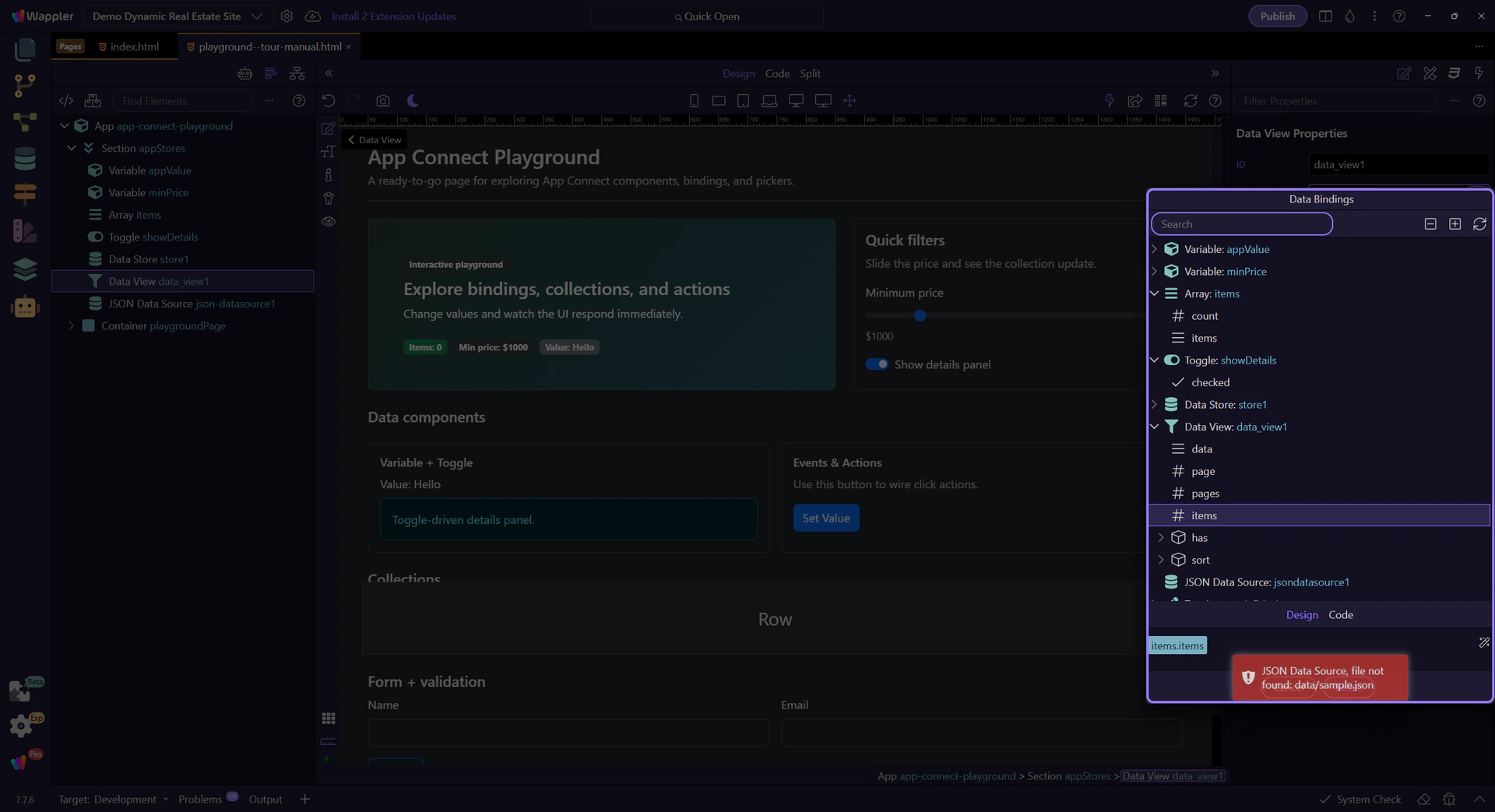
Data hierarchy tree
Section titled “Data hierarchy tree”Expand nodes to find the list you want to view. Selecting an item inserts it into the Source field.
Selection preview
Section titled “Selection preview”This preview shows the expression that will be inserted into the Source field.

Close Data Bindings Picker
Section titled “Close Data Bindings Picker”Close the Data Bindings Picker to return to Properties. This step matters because Close Data Bindings Picker is part of Popup Databindingspickup Button Cancel, and understanding that context makes the next action easier to repeat in your own project.

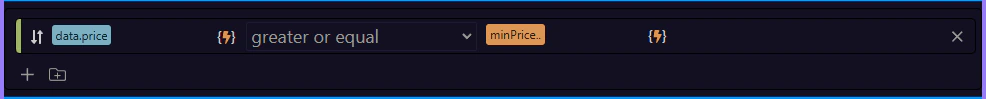
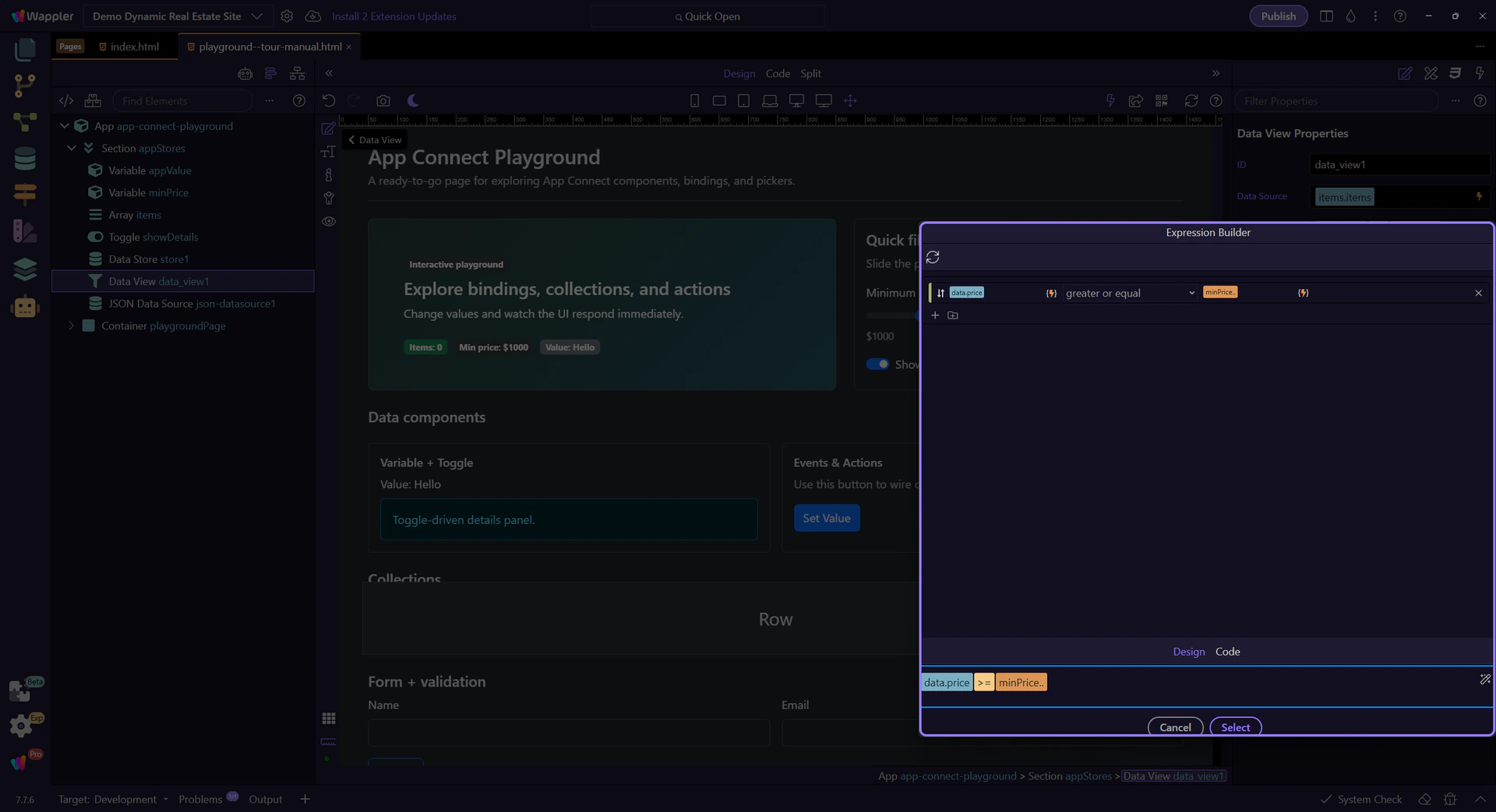
Filter
Section titled “Filter”Define a filter expression for search and user-controlled filtering. Click the picker icon to open the Visual Expression Builder.

Visual Expression Builder popup
Section titled “Visual Expression Builder popup”The Visual Expression Builder opens as a popup. It helps you build valid expressions with operators, functions, and data sources in scope.

Query builder
Section titled “Query builder”This area lets you compose filter logic visually (fields, operators, and values) instead of typing everything manually.
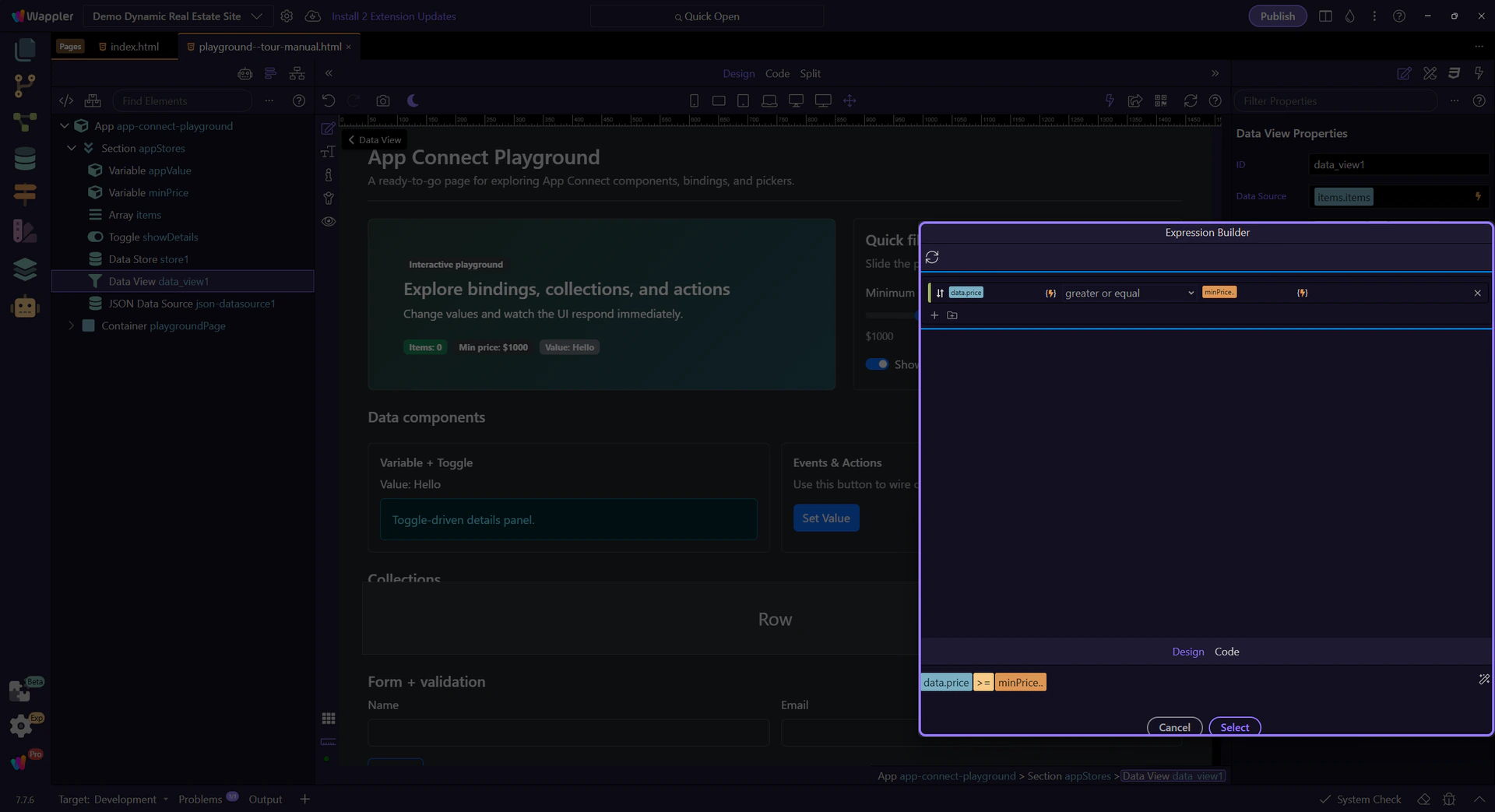
Rule parts (optional)
Section titled “Rule parts (optional)”Each rule is composed of a Field, an Operator, and a Value. Use pickers to bind values from scope instead of typing constants.

AND / OR groups (optional)
Section titled “AND / OR groups (optional)”Use groups to combine multiple rules with AND/OR for more complex filters. This step matters because AND / OR groups (optional) is part of Popup Expressionbindingspickup Query, and understanding that context makes the next action easier to repeat in your own project.
Expression preview
Section titled “Expression preview”This field shows the final expression that will be inserted back into Properties when you apply the popup.
Formatter icon
Section titled “Formatter icon”This icon opens the Data Formatter for advanced formatter chains inside the filter expression. You can explore that popup in the dedicated Data Formatter tour.
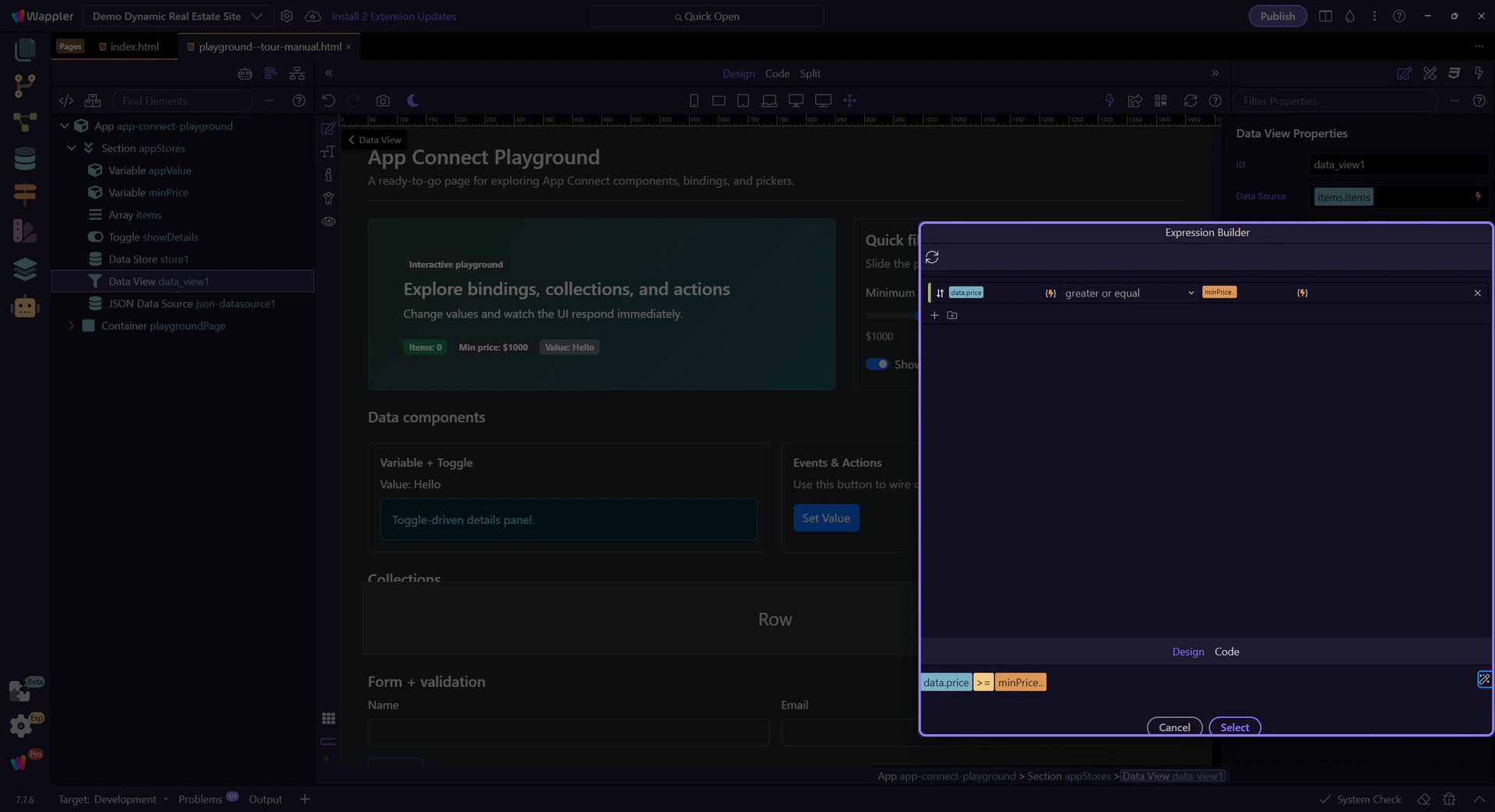
Close Visual Expression Builder
Section titled “Close Visual Expression Builder”Close the Visual Expression Builder to return to Properties. This step matters because Close Visual Expression Builder is part of Popup Expressionbindingspickup Button Cancel, and understanding that context makes the next action easier to repeat in your own project.

Configure sort field and direction. This step matters because Sort is part of Selection Panels Properties Dataviewsorton, and understanding that context makes the next action easier to repeat in your own project.

Sort direction
Section titled “Sort direction”The sort direction controls ascending vs descending ordering. This step matters because Sort direction is part of Selection Panels Properties Dataviewsortdir, and understanding that context makes the next action easier to repeat in your own project.

Paging
Section titled “Paging”Use Page and Page Size to paginate displayed results. This step matters because Paging is part of Selection Panels Properties Dataviewpage, and understanding that context makes the next action easier to repeat in your own project.

Page size
Section titled “Page size”How many items to show per page. This step matters because Page size is part of Selection Panels Properties Dataviewpagesize, and understanding that context makes the next action easier to repeat in your own project.

Conclusion
Section titled “Conclusion”Next, connect UI events (click/submit/keyup) to actions.
Pick your next tour
Section titled “Pick your next tour”Continue with events and actions.