Nested data
Submit arrays of fields (items[name][], items[qty][])
Learn how Form Repeat structures nested form rows in Wappler so users can add, remove, reorder, and submit repeated data as one coherent request.
This tour explains both the UI problem and the data model behind Form Repeat. You will look at how repeated rows are defined, which controls manage those rows, and how Wappler turns the repeated inputs into structured data the server can process.
By the end, you should recognize when Form Repeat is the right tool: whenever users need to manage a variable number of related entries in one form and you want Wappler to keep the repeated fields, controls, and submitted payload aligned.
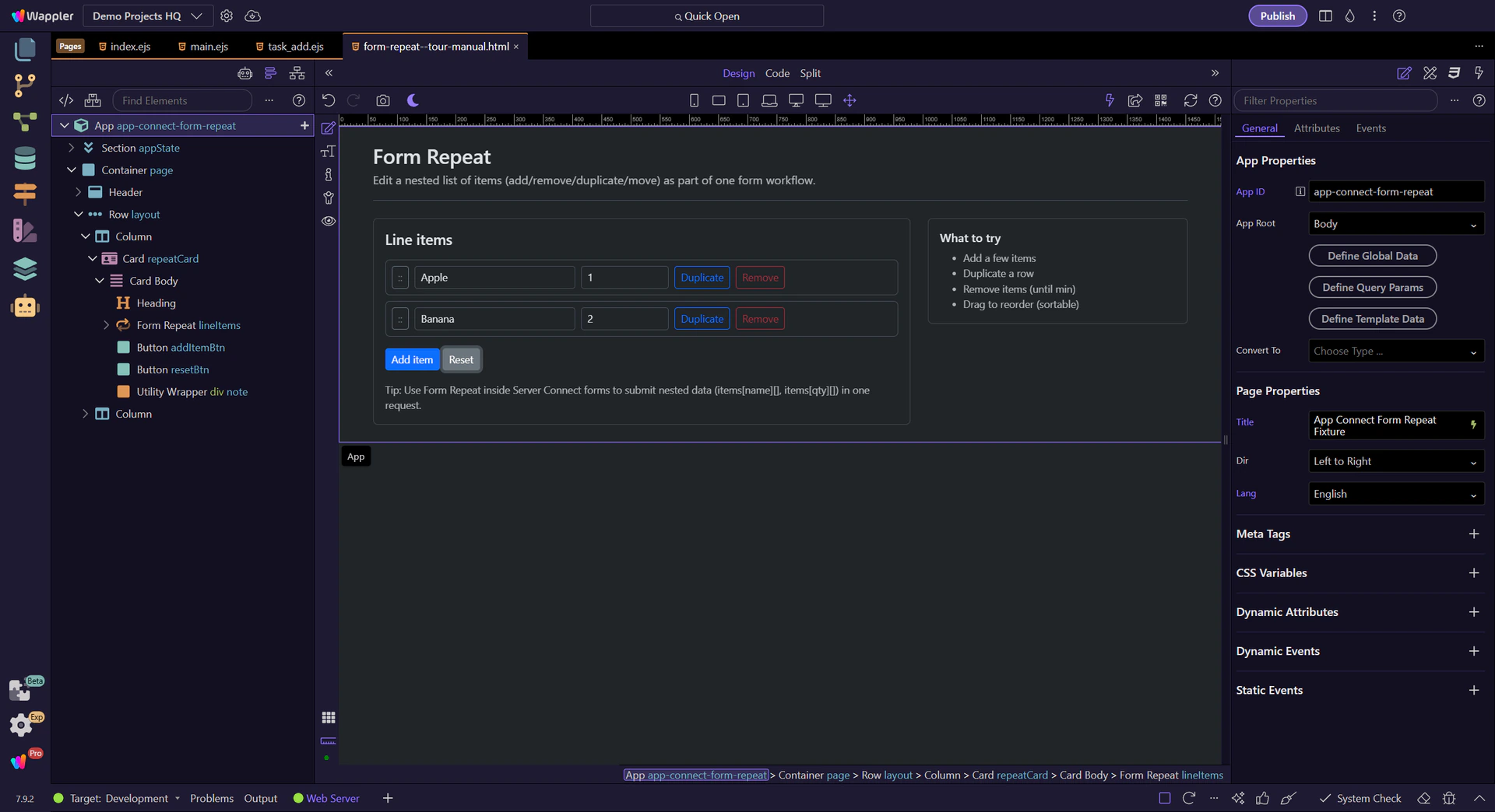
This tour selects the Form Repeat component in App Structure and then inspects its Items/min/max/sortable properties in Properties.
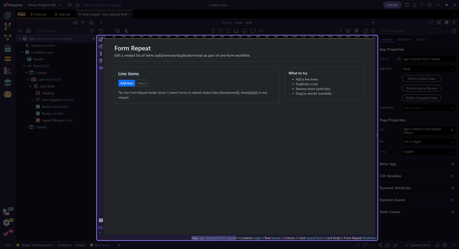
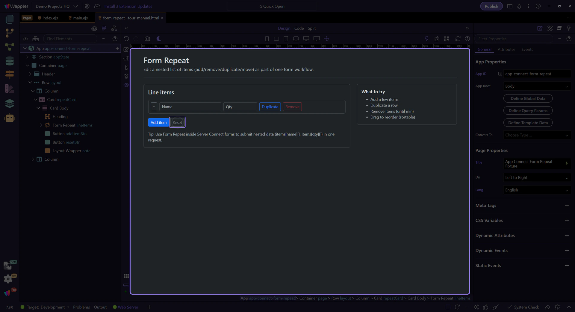
Configure what repeats and how it behaves.
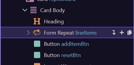
This component repeats a block of form fields for each item. This step matters because Form Repeat component is part of the Structure panel, and understanding that context makes the next action easier to repeat in your own project.
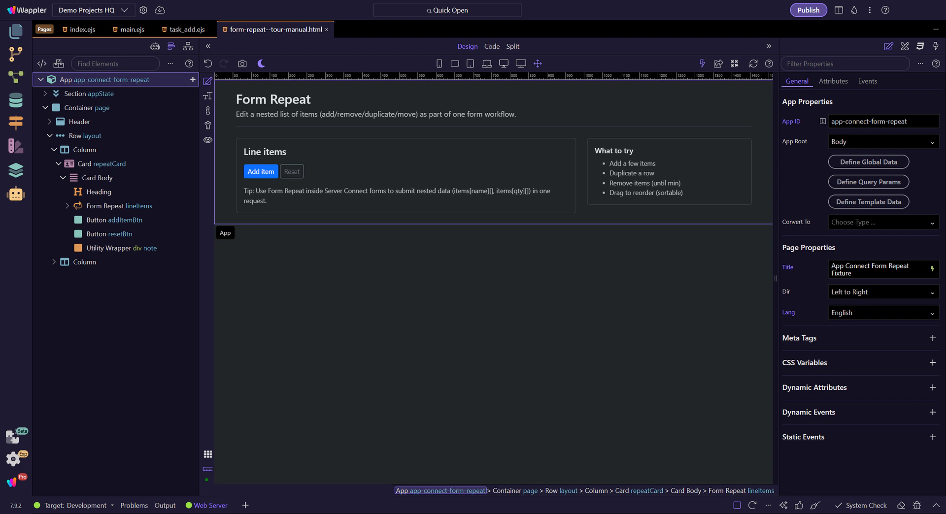
Start with the wider context in the Properties panel so the next control makes sense in the full workflow. In the next step, you will focus on Items (what repeats) and see how it fits into this area.
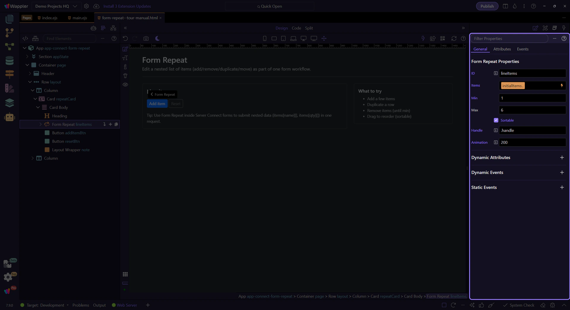
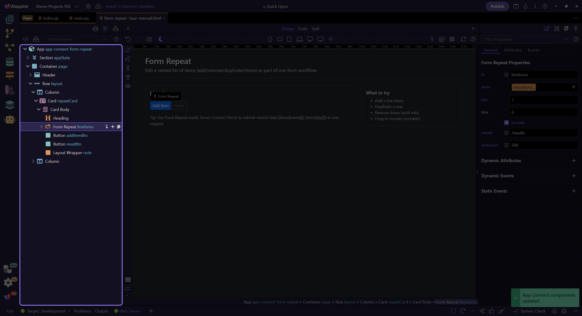
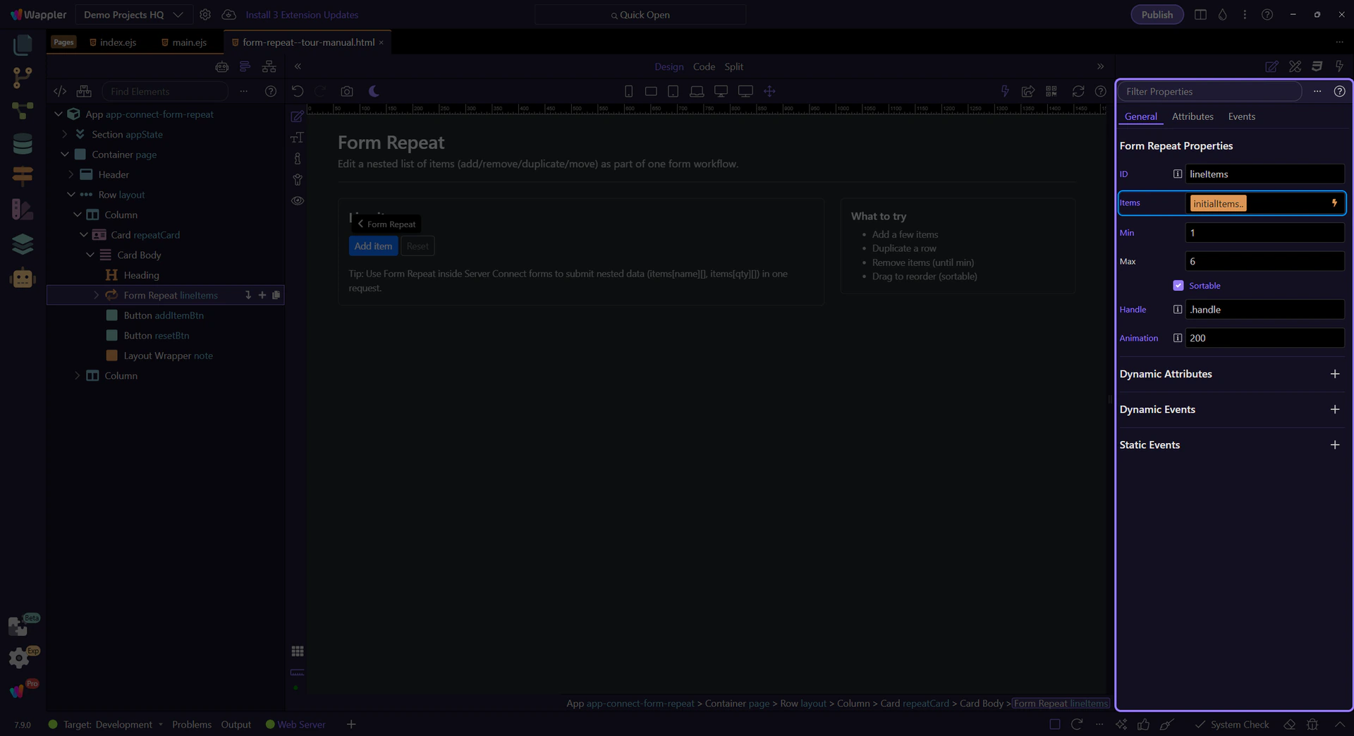
Items is bound to an array source. Each row gets its own scope (name/qty in this example). This step matters because Items (what repeats) is part of Selection Panels Properties Formrepeatitems, and understanding that context makes the next action easier to repeat in your own project.
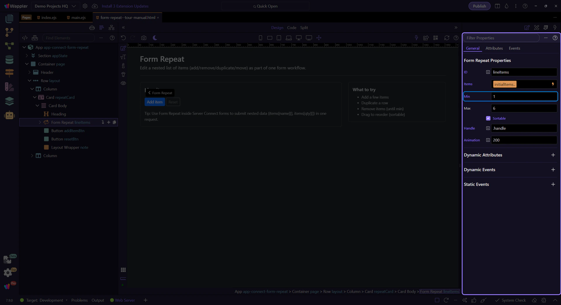
Min prevents removing rows below a required count. Use canAdd/canRemove to keep buttons in sync.
tip: Bind disabled to lineItems.canAdd / lineItems.canRemove so controls stay in sync with min/max.
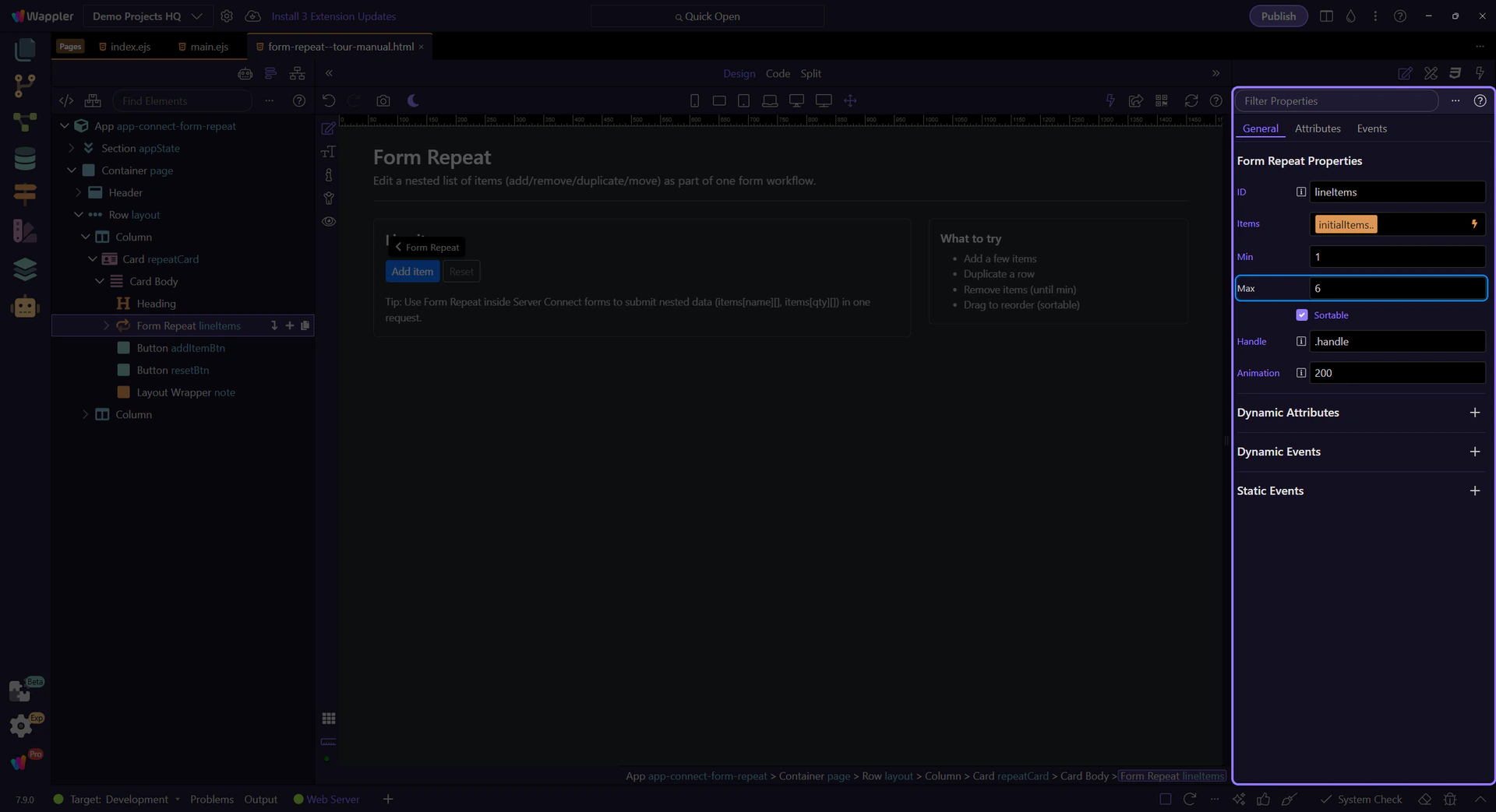
Max prevents adding too many rows. Pair it with canAdd so the Add button disables at the limit.
Enable sortable for drag reordering, and set a handle selector so only a handle can drag.
important: Use a handle (like .handle) so inputs remain easy to edit without accidental drags.

Handle is the CSS selector that defines the drag grip (so editing inputs doesn’t start dragging).
tip: In this page, the drag button uses the class .handle, so Handle is set to .handle.
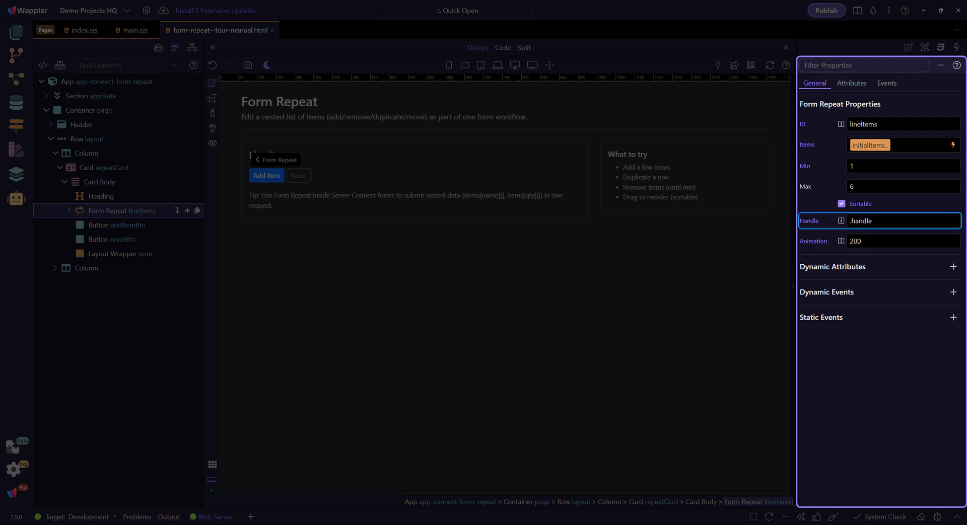
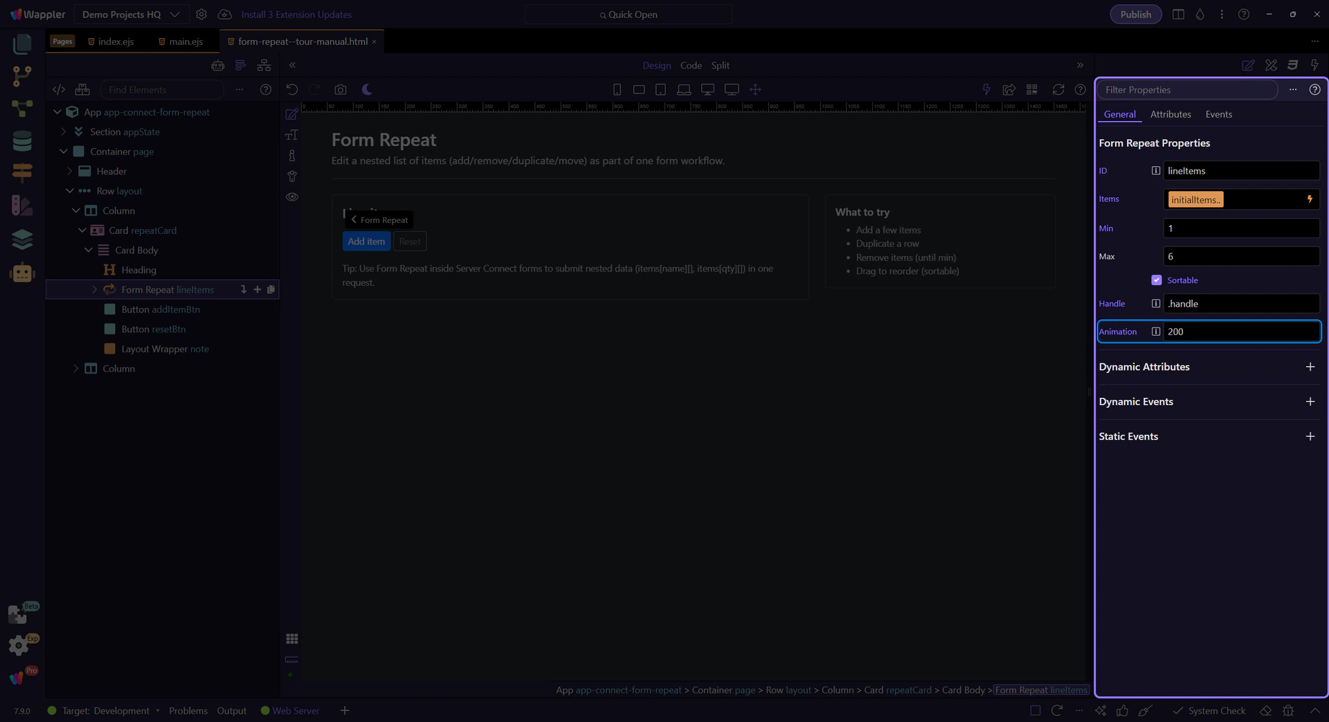
Animation controls how long the drag reorder animation runs (in milliseconds).
Form Repeat includes actions for adding, removing, moving, duplicating, and resetting rows.
Attach these actions to button click events via the Actions Picker.

Listen to lifecycle events like added/removed/moved when you need to trigger follow-up logic.
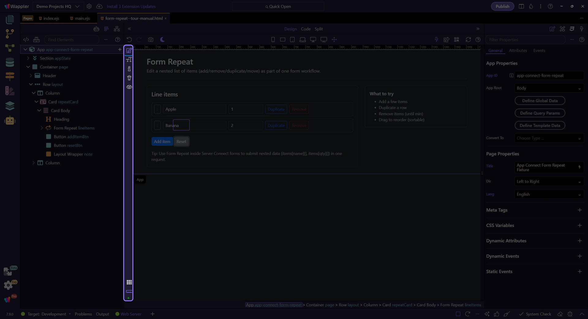
Switch to Preview mode and use the controls to add/duplicate/remove rows. This shows how repeat actions drive the UI.
Switch to Preview mode now so you can test the repeated form output live in the next step instead of only inspecting the configuration.
Wait for the page to finish switching modes.
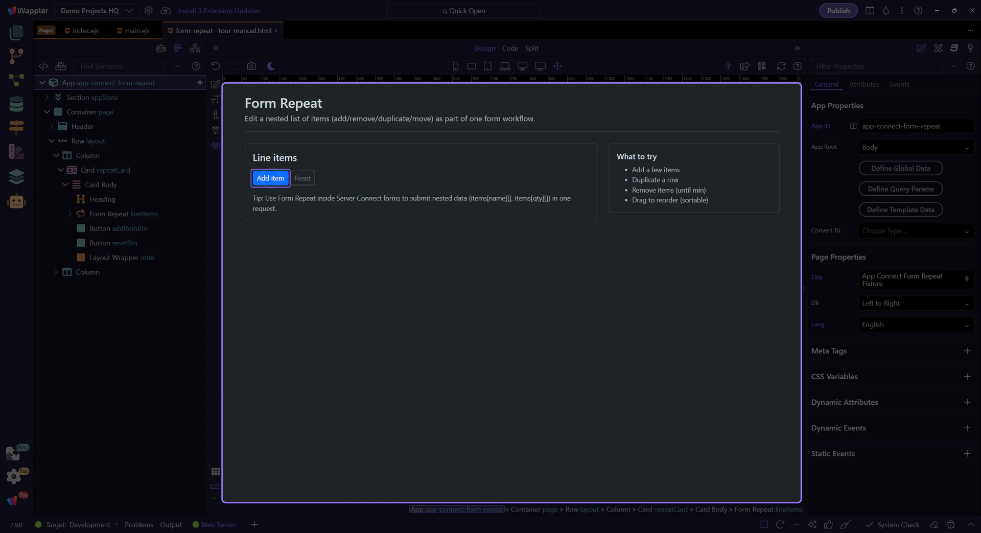
We’ll click Add item to append a new row (until max).
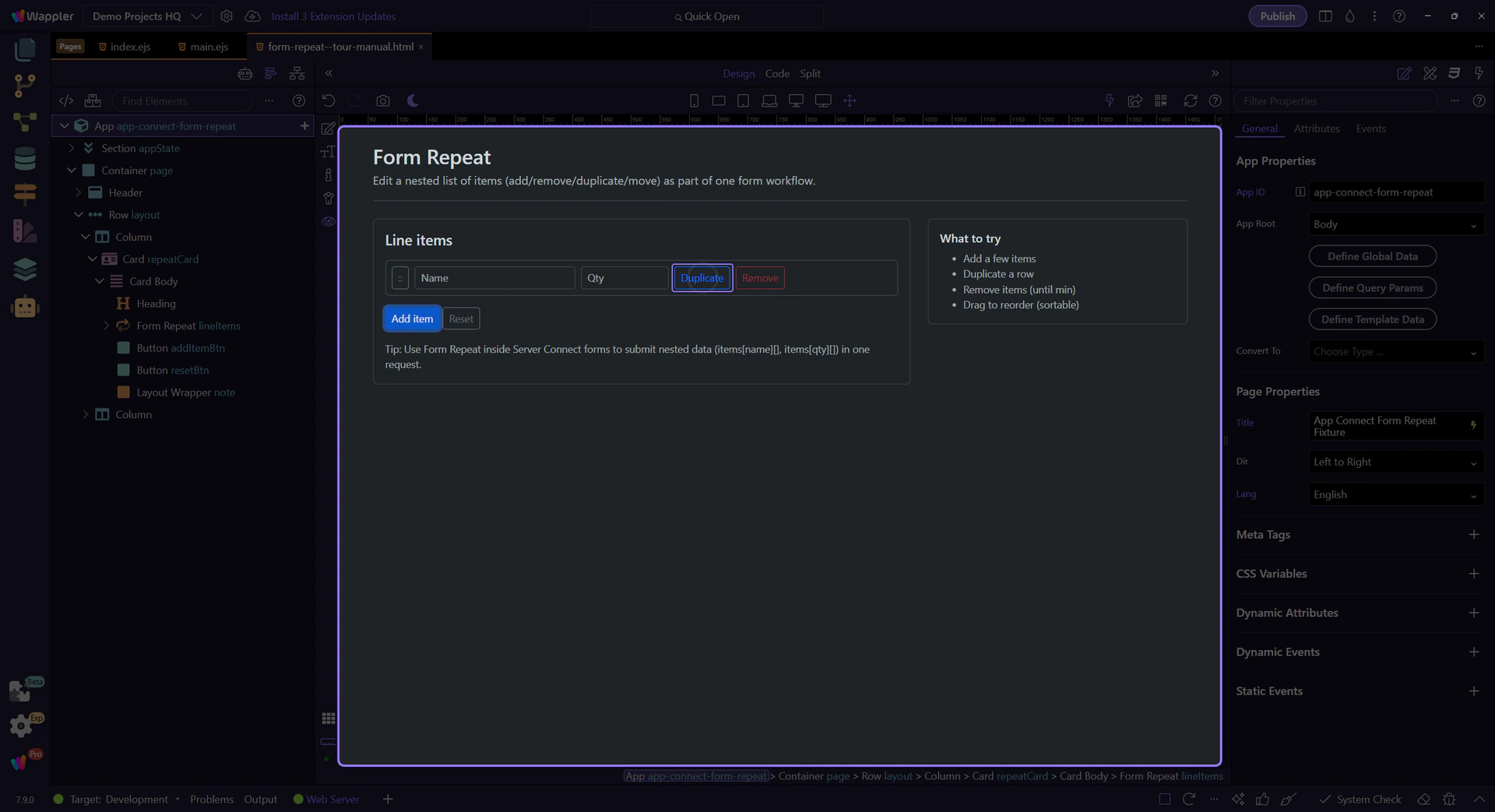
Duplicate copies the row values into a new item.
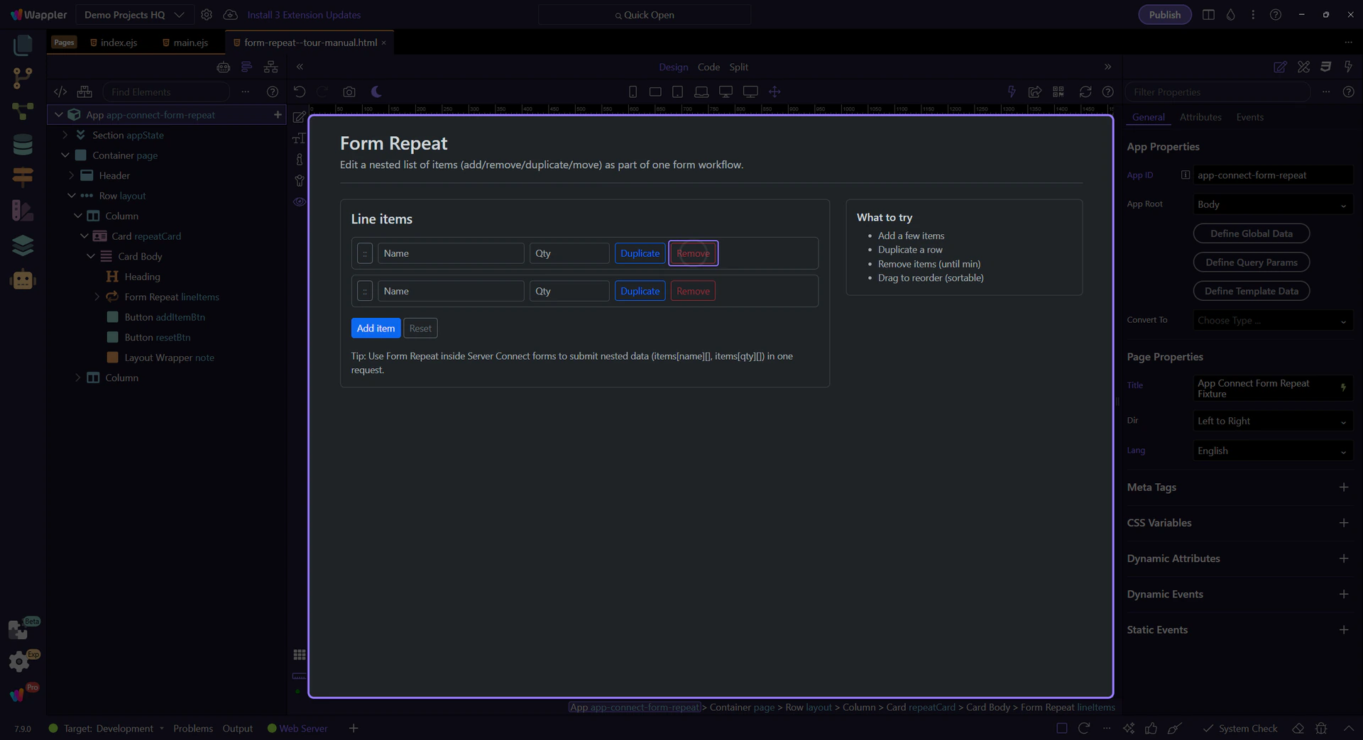
Remove deletes a row. When you hit min, the button disables via lineItems.canRemove.
Edit the Name/Qty inputs, then duplicate a row to see the values carry over.

Reset restores the original array so you can try again.
Return to Edit mode so you can keep refining the repeated form after checking the live result.
Next, connect the repeated fields to a Server Connect form for nested inserts/updates.
Pick a related tour to continue.