Using the Lightbox Component
Intro The Lightbox component allows you to display images or a collection of images or videos in a simple and elegant pop-up window. Lightbox Options In order to setup the Lightbox component options,
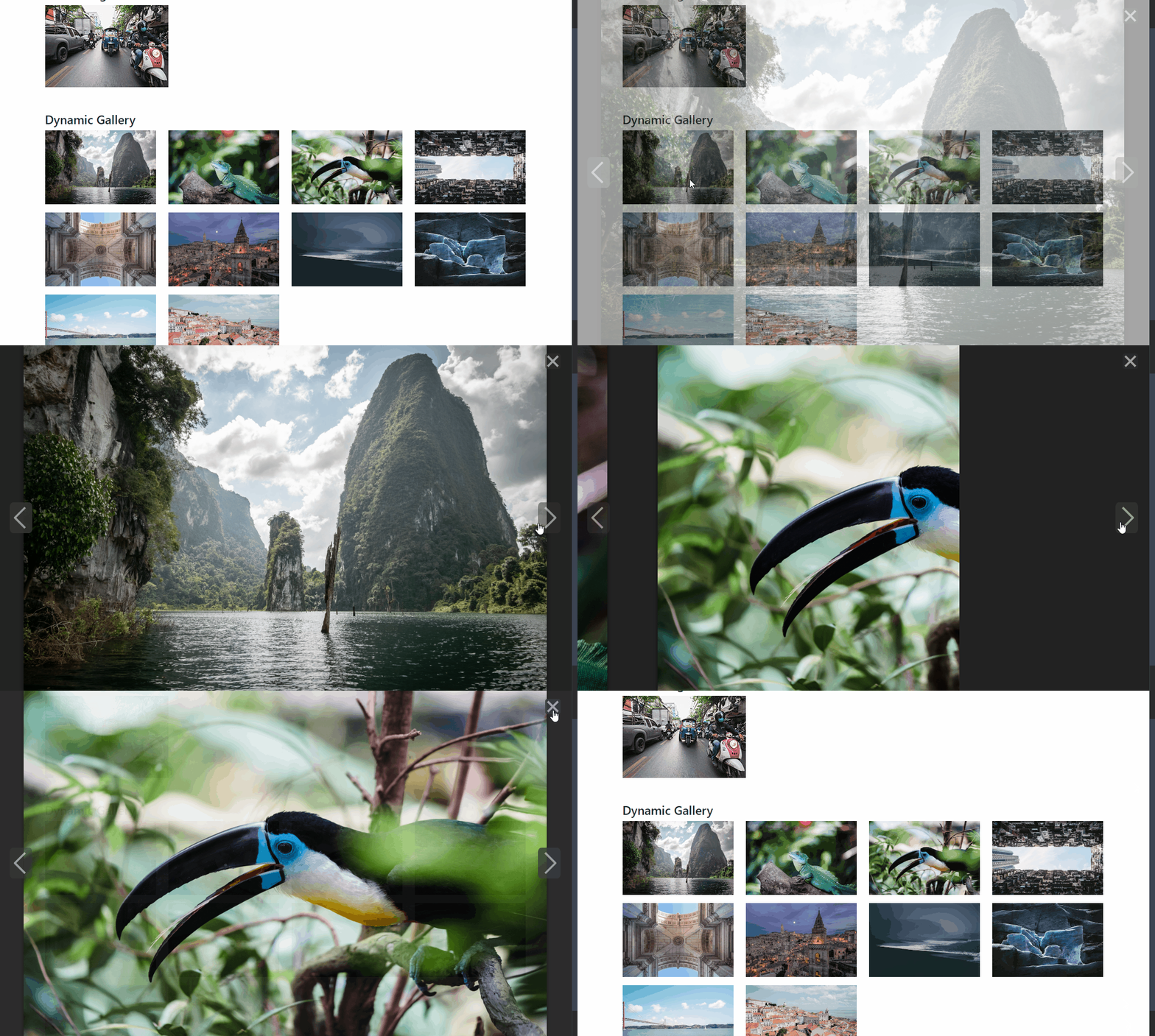
The Lightbox component allows you to display images or a collection of images or videos in a simple and elegant pop-up window.
Lightbox Options
Section titled “Lightbox Options”In order to setup the Lightbox component options, we need to add it on our page first.
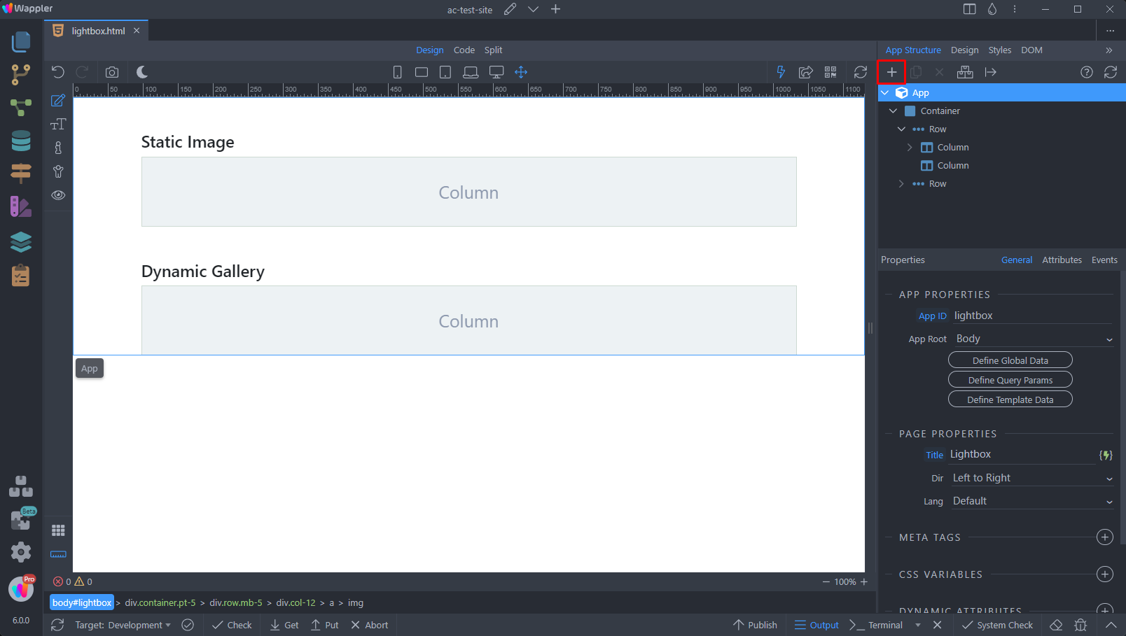
Add new component in the App Structure:
Open the Animations category and select Lightbox Options:
Section titled “Open the Animations category and select Lightbox Options:”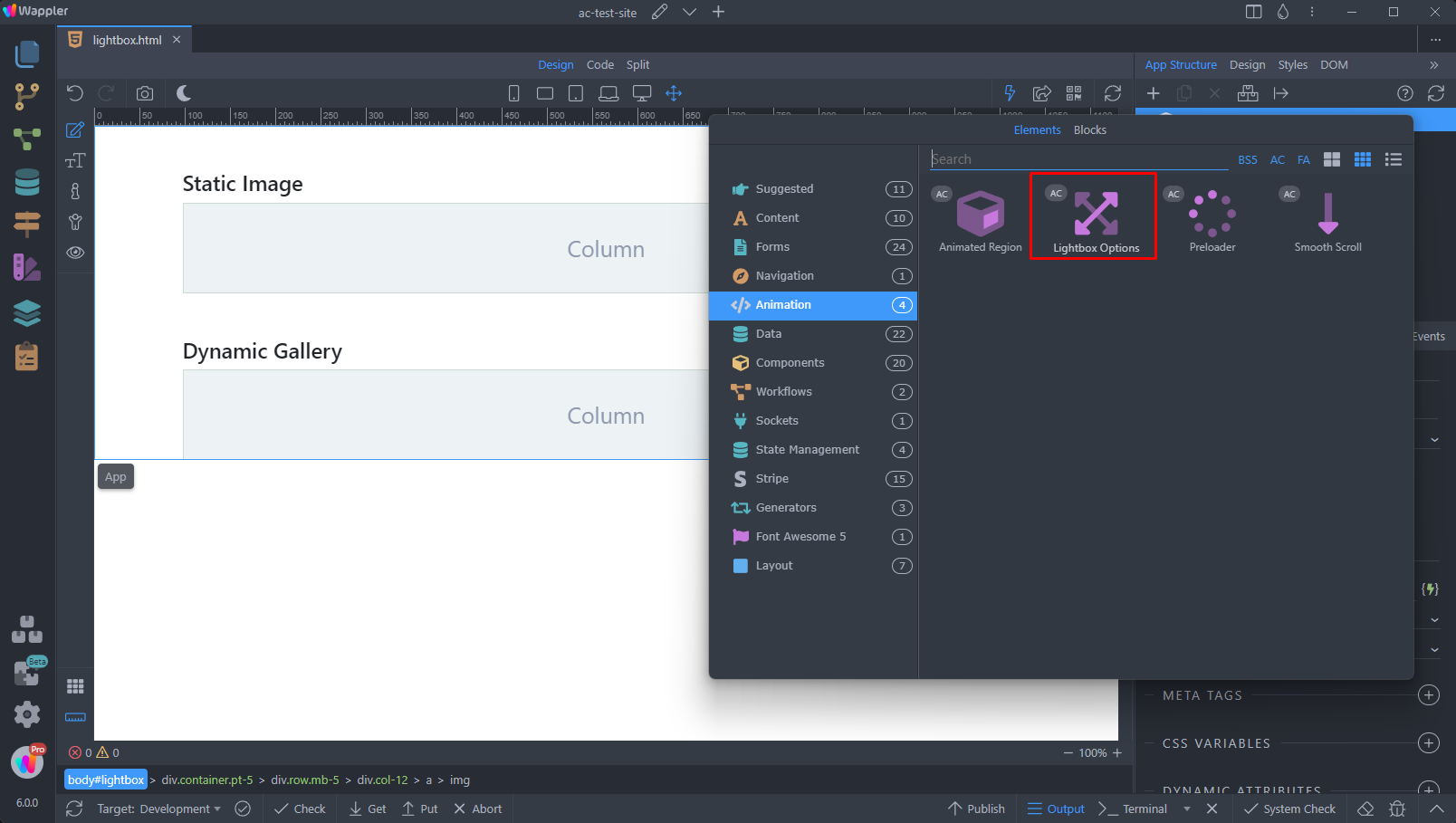
Once you add the component on the page, you can customize its options:
Section titled “Once you add the component on the page, you can customize its options:”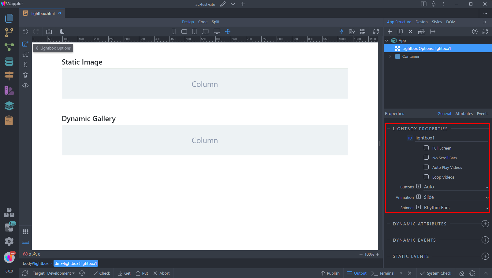
Step 6
Section titled “Step 6”Full Screen - Enable full screen mode
No Scroll Bars - Hide scrollbars when the gallery is displayed
Auto Play Videos - Auto play videos when displayed in the Lightbox
Loop Videos - Loop videos, when finished
Buttons - Display buttons inside the Lightbox pop-up window. When set to Auto the buttons will be hidden on touch-enabled devices or when only one image is available.
Animation - Set the animation type between the images in a gallery
Spinner - Select the loading spinner type
Static Images
Section titled “Static Images”You can use the Lightbox component with static images on your site. The easiest way to do this is to use the Anchor Image element, which shows an image thumbnail and when clicked it loads the full-sized image in a Lightbox pop-up window.
Add a new element on your page:
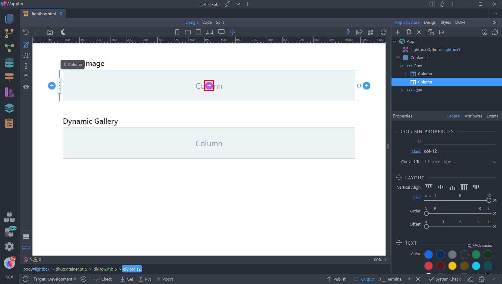
Select Anchor Image:
Section titled “Select Anchor Image:”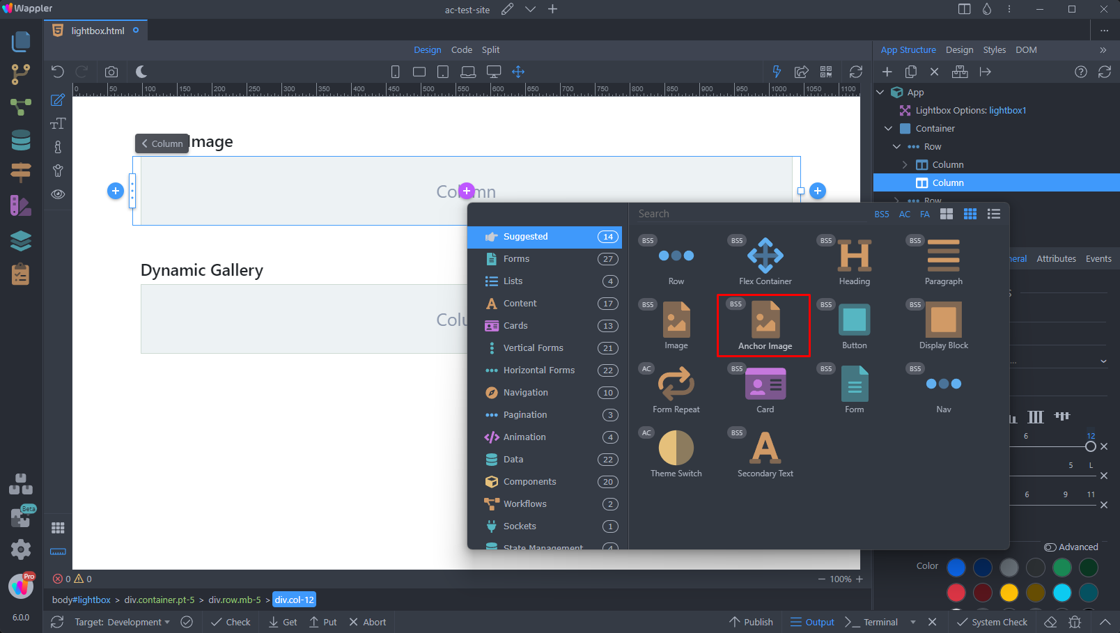
Step 9
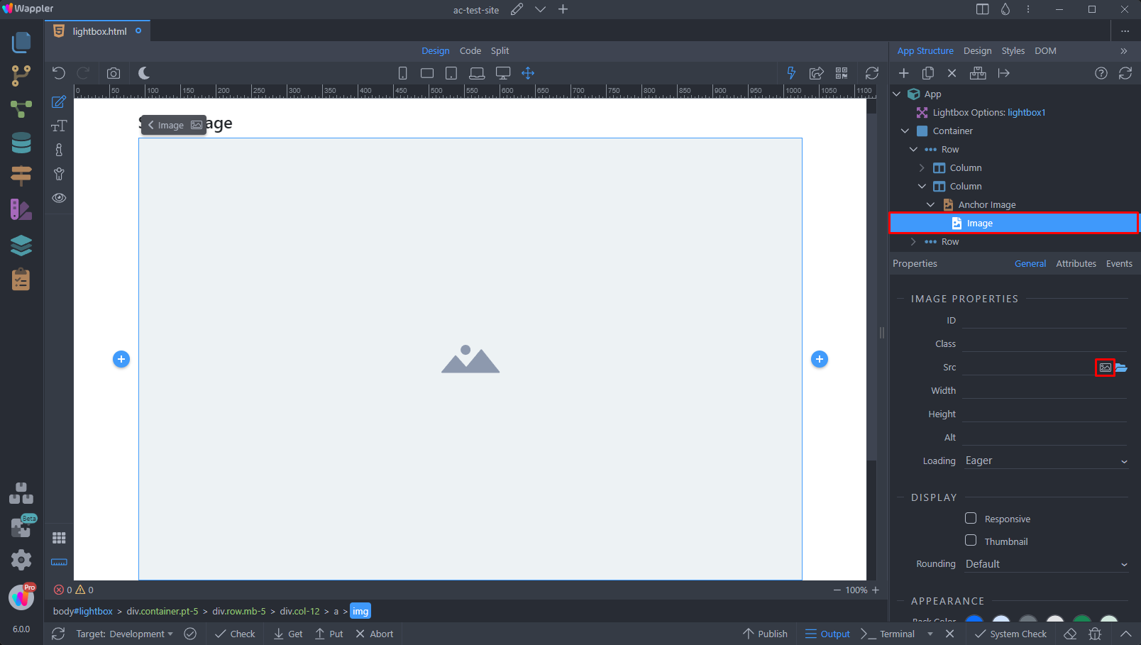
Section titled “Step 9”The Anchor Image element is simply an image wrapped in an <a> (anchor) tag.
Select the image image element inside the anchor and then click the image source picker icon:
Select the thumbnail that you want to show on the page:
Section titled “Select the thumbnail that you want to show on the page:”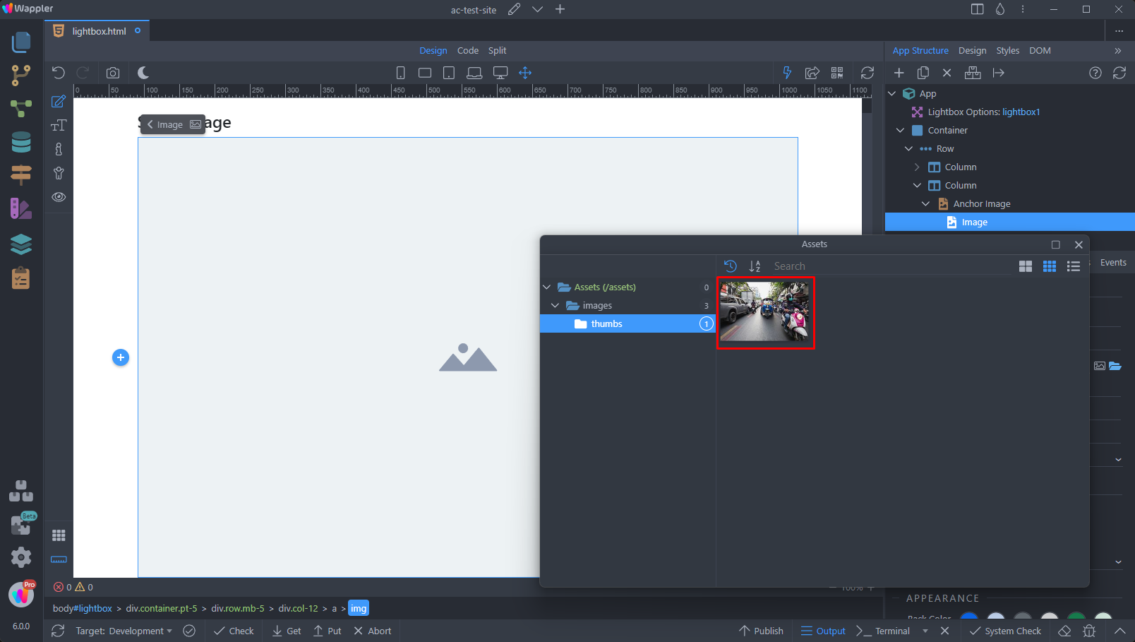
Then select the anchor element and pick a link for it:
Section titled “Then select the anchor element and pick a link for it:”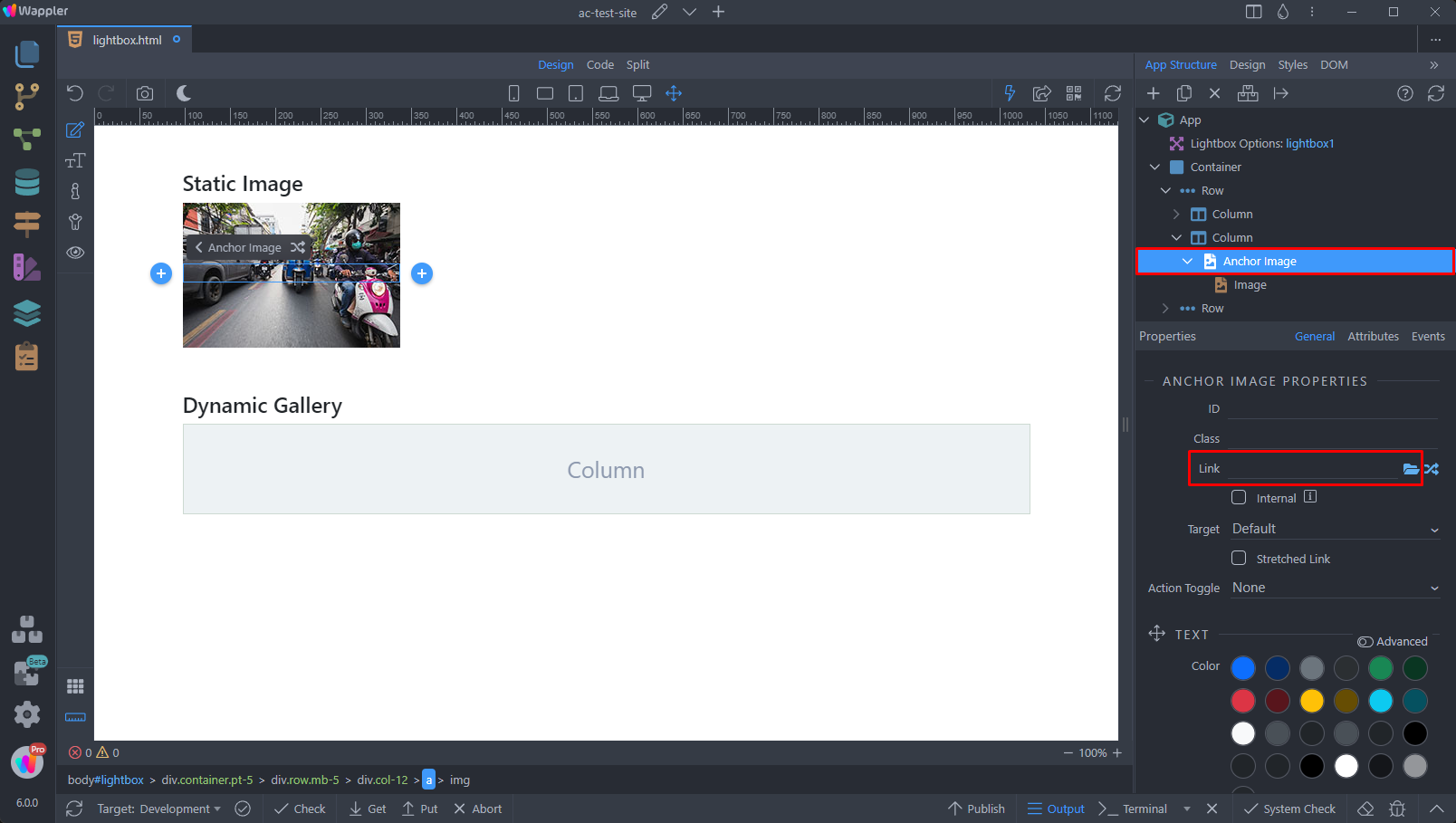
The link needs to be the full sized image, that you want to display in the lightbox popup:
Section titled “The link needs to be the full sized image, that you want to display in the lightbox popup:”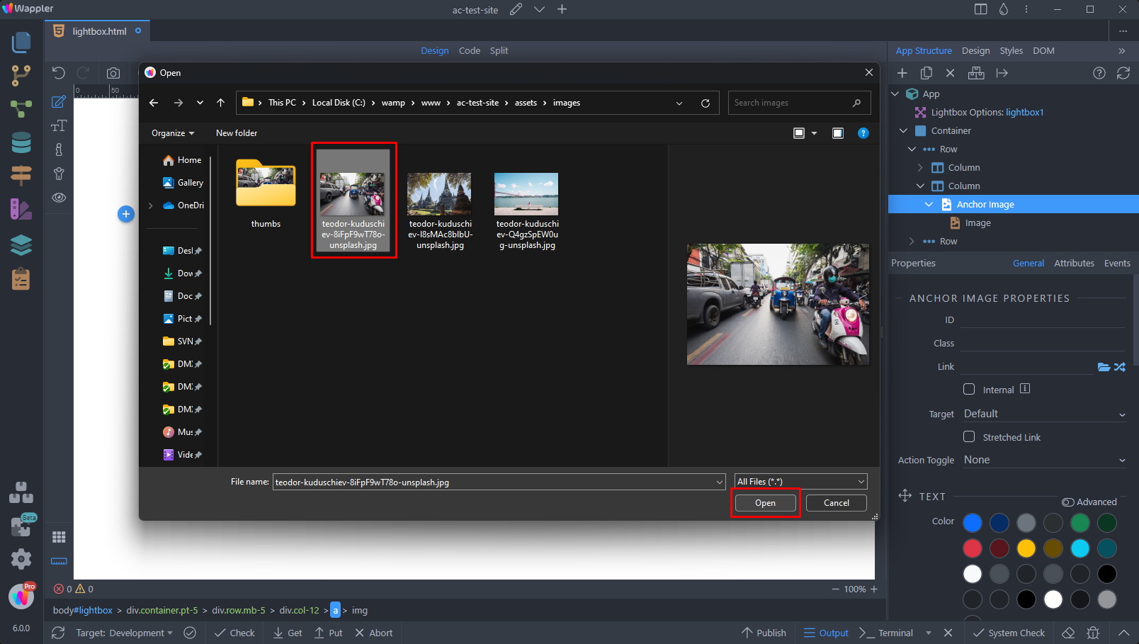
With the anchor element still selected, scroll down the properties panel and add a new dynamic attribute:
Section titled “With the anchor element still selected, scroll down the properties panel and add a new dynamic attribute:”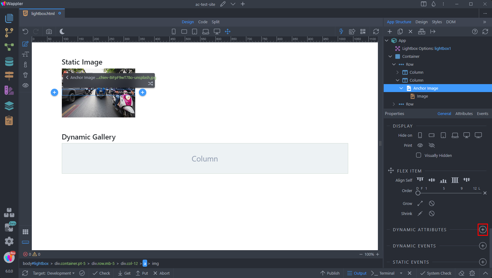
Step 14
Section titled “Step 14”Open the Display menu and select Open in Lightbox. This will open the link (i.e. your full sized image) in a Lightbox pop-up:
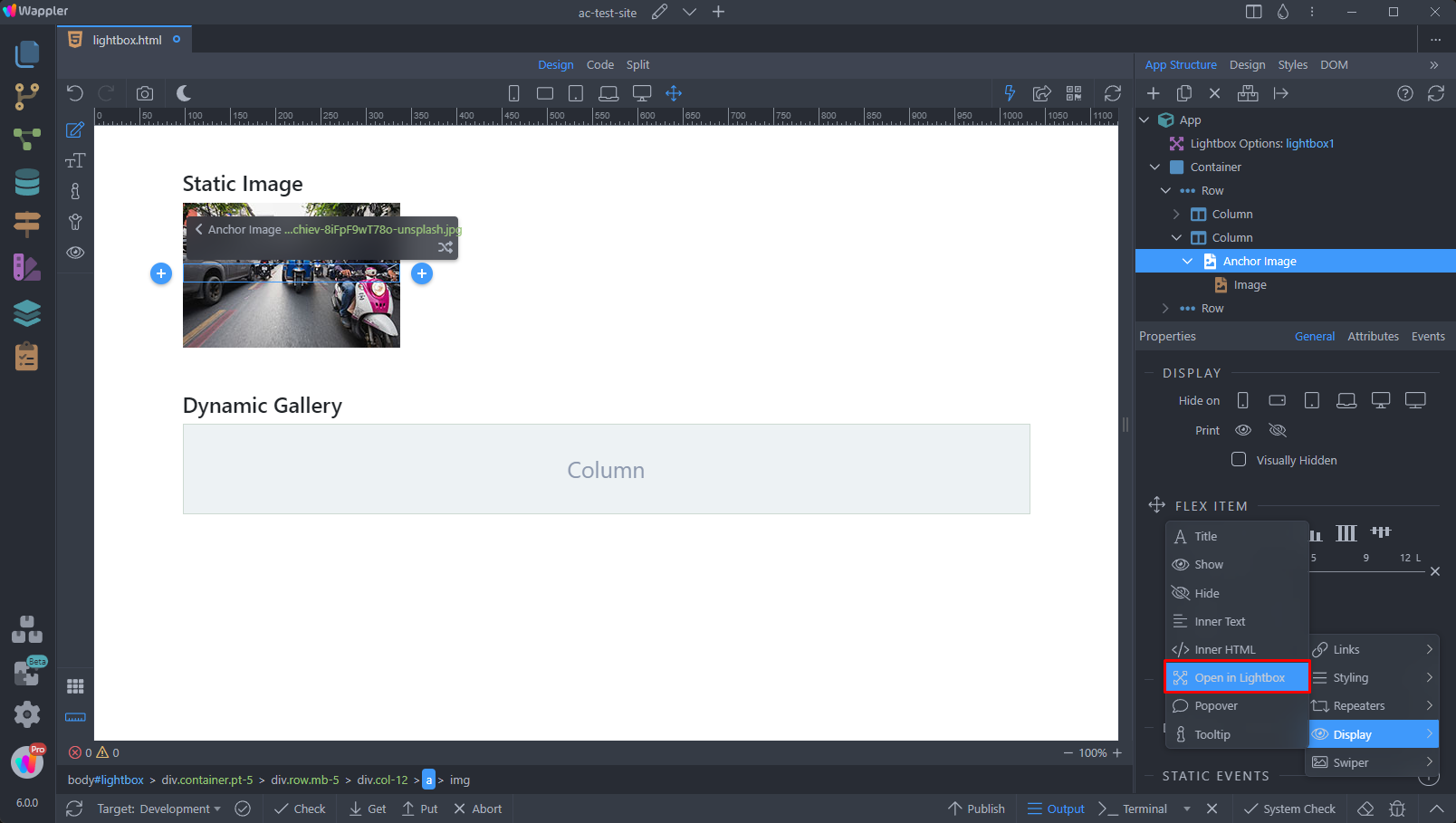
We leave these options to their defaults:
Section titled “We leave these options to their defaults:”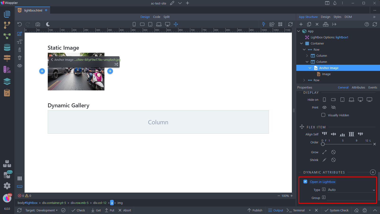
And we are done. You can preview the results:
Section titled “And we are done. You can preview the results:”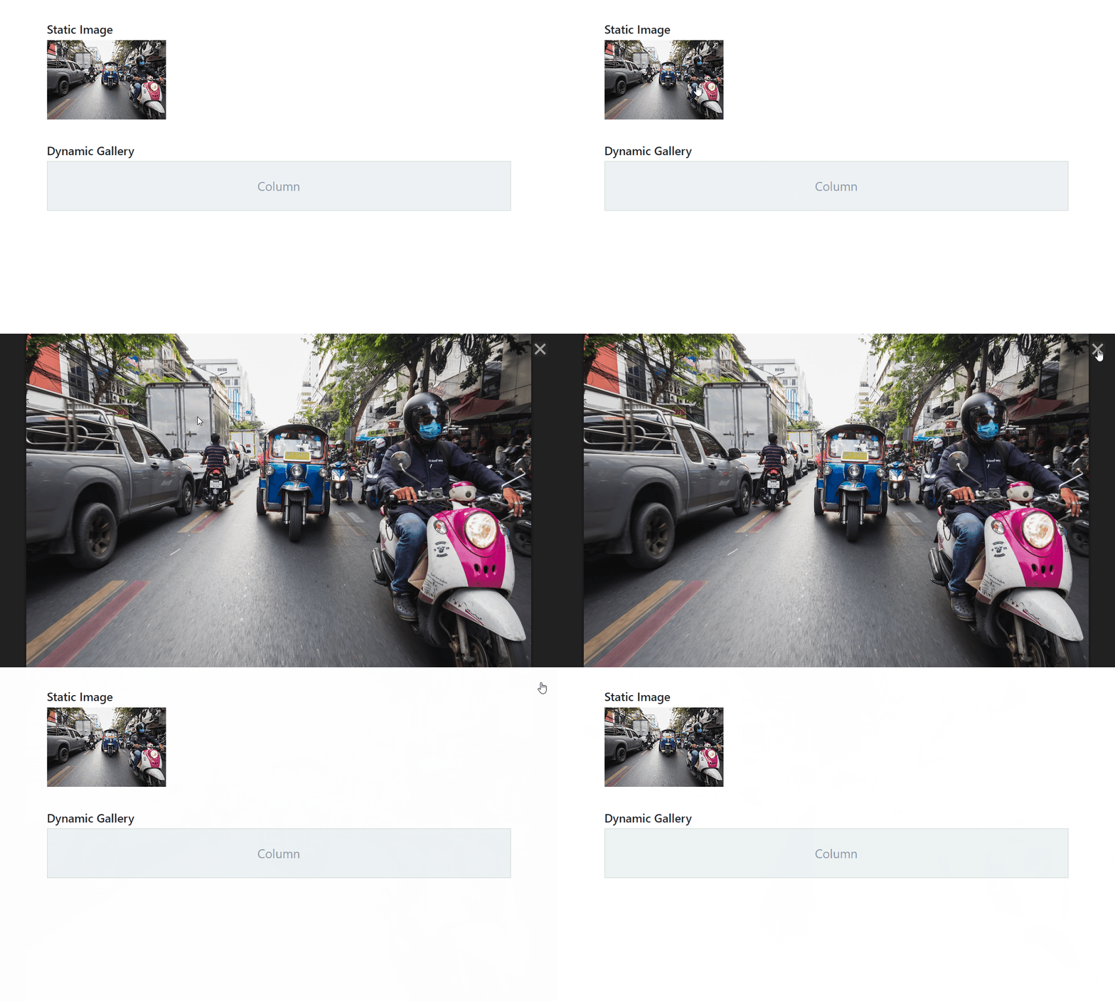
Dynamic Images
Section titled “Dynamic Images”You can also use the Lightbox component with dynamic images. We will show you how to create a scrollable Lightbox gallery using a dynamic data source.
We added a dynamic data source on our page - a server action, that returns our images. We used the same layout as the static image example, but added a repeat region that repeats the anchor image element:
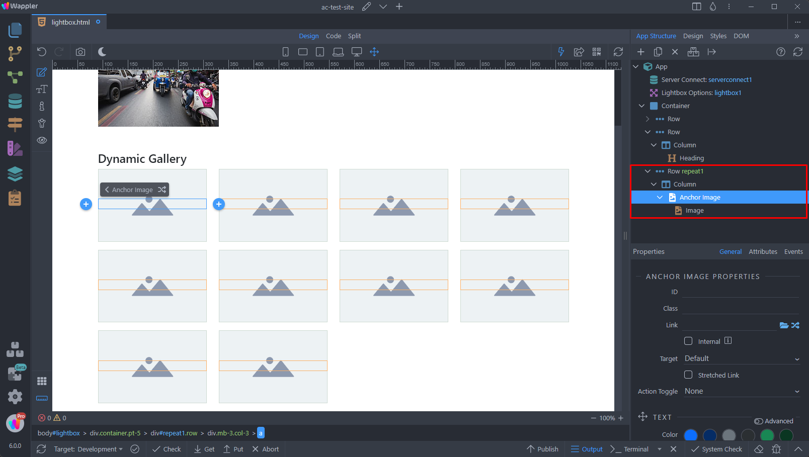
Select the image inside the anchor image element and add a new dynamic attribute:
Section titled “Select the image inside the anchor image element and add a new dynamic attribute:”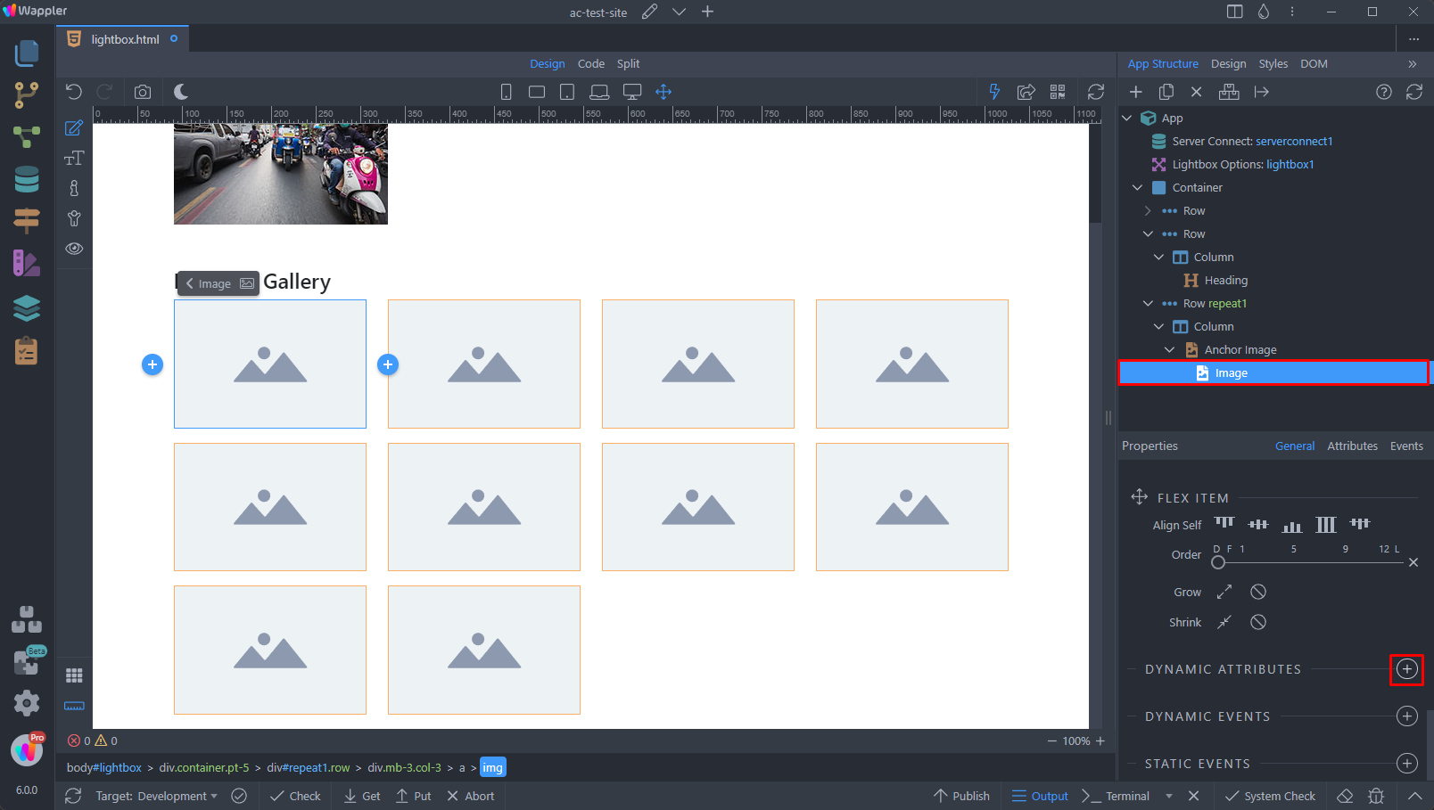
Open the Images menu and select Image Source:
Section titled “Open the Images menu and select Image Source:”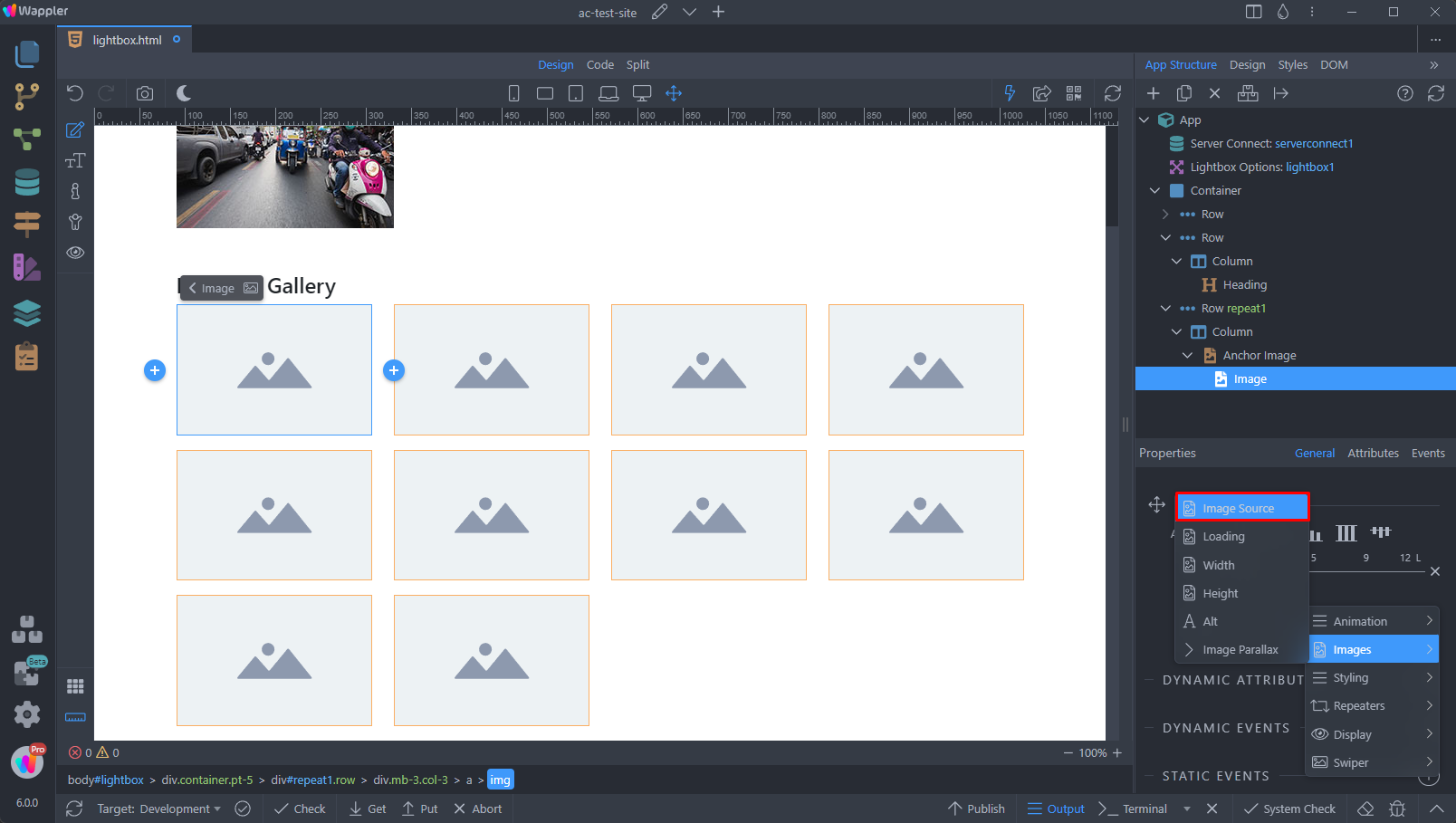
Then click the dynamic data picker:
Section titled “Then click the dynamic data picker:”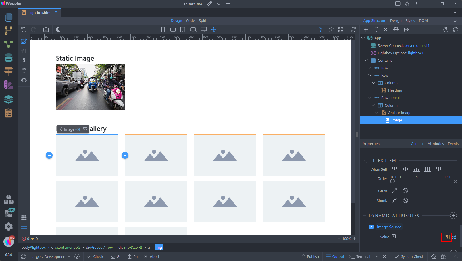
And select the dynamic binding, which returns the path/url to your thumbnails:
Section titled “And select the dynamic binding, which returns the path/url to your thumbnails:”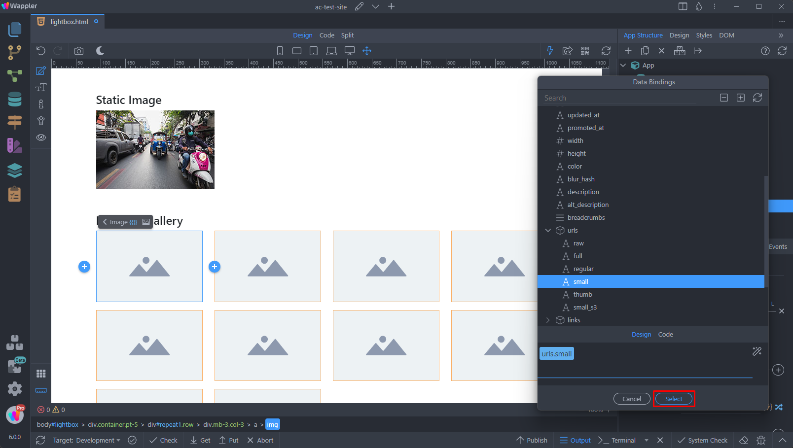
You can see our thumbnails are now rendered:
Section titled “You can see our thumbnails are now rendered:”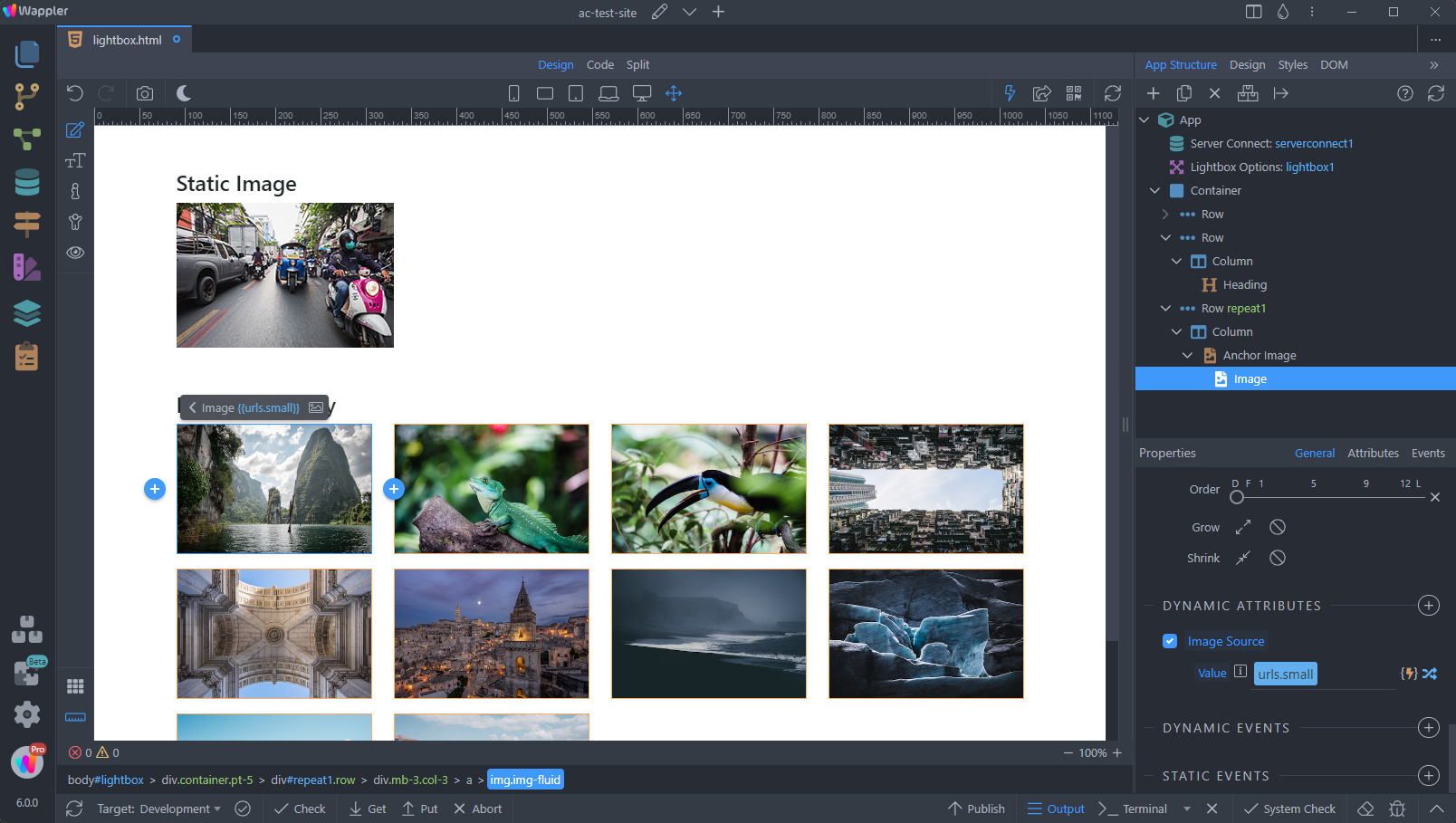
Next, select the anchor element of the anchor image and add new dynamic attribute:
Section titled “Next, select the anchor element of the anchor image and add new dynamic attribute:”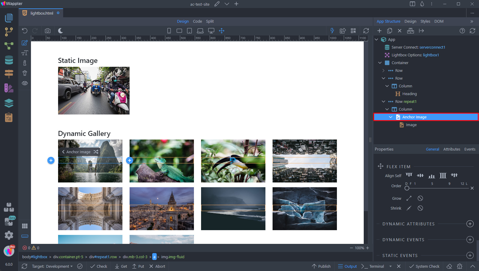
Select Links > Link:
Section titled “Select Links > Link:”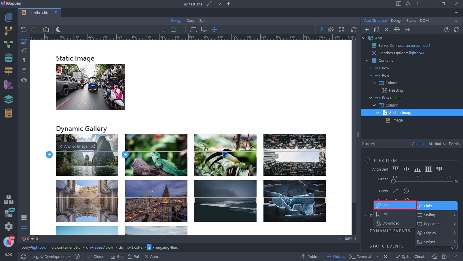
And click the dynamic data picker icon:
Section titled “And click the dynamic data picker icon:”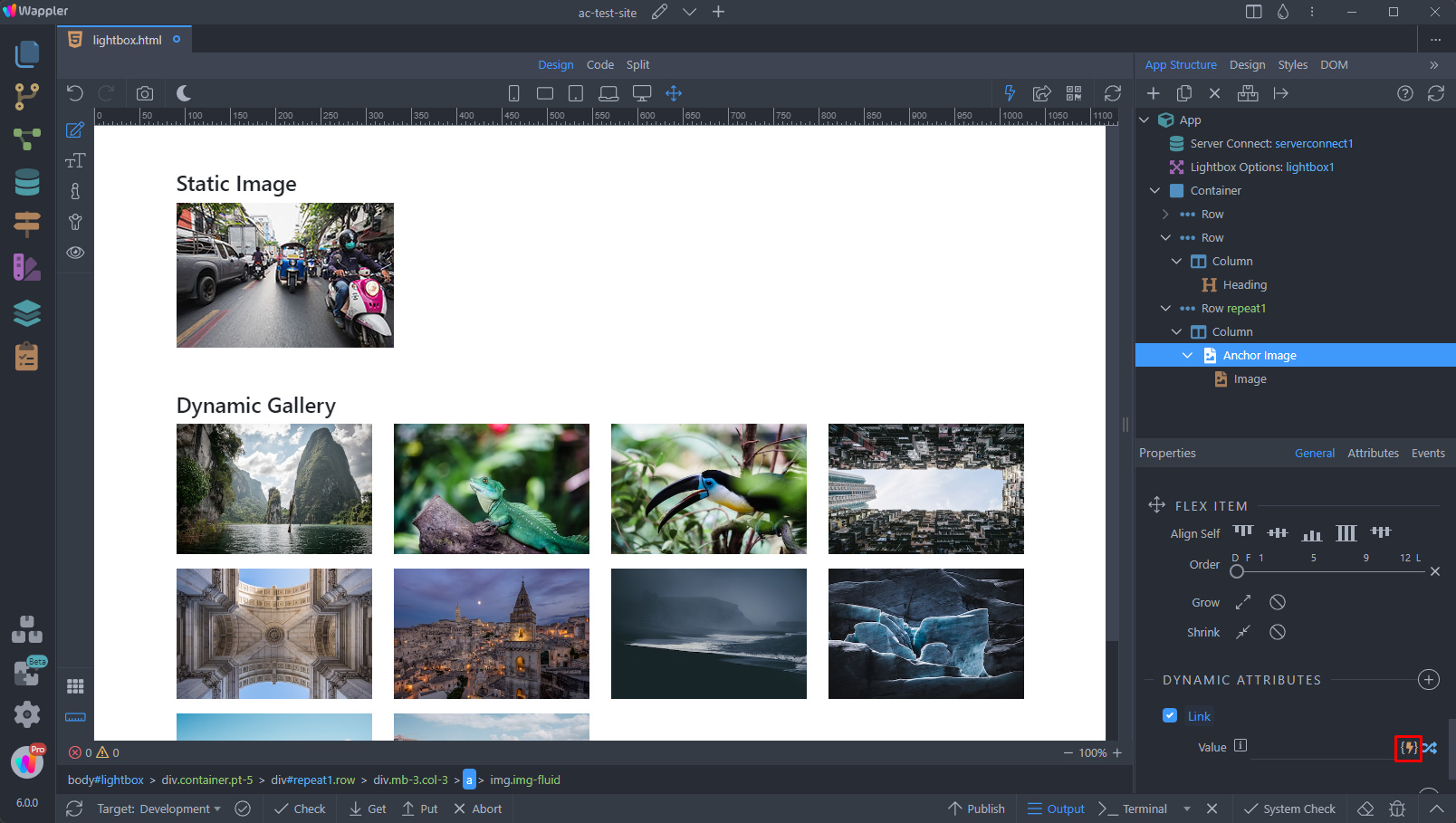
Select the dynamic binding, which returns the path/url to your full sized image:
Section titled “Select the dynamic binding, which returns the path/url to your full sized image:”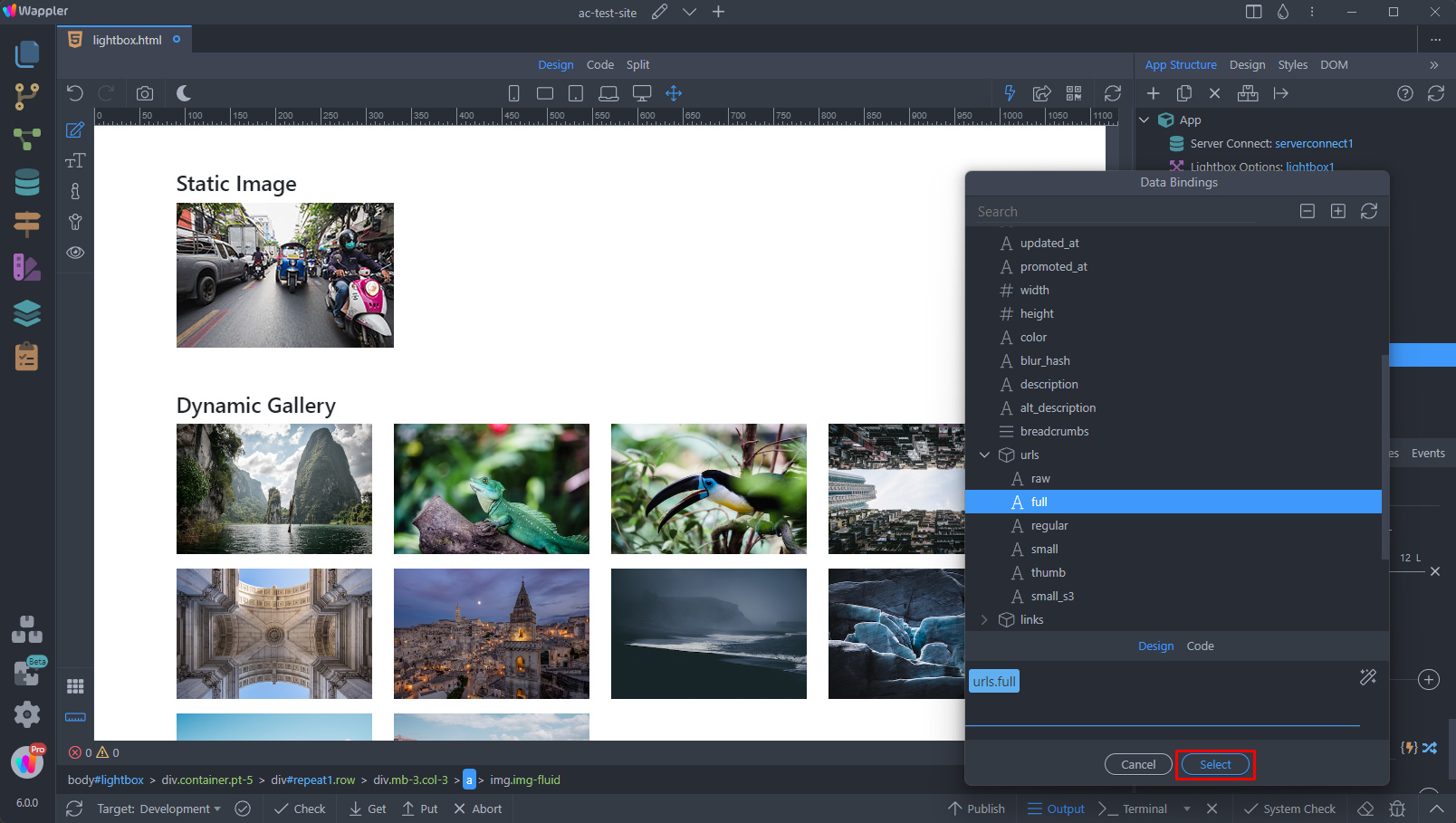
Then add a new dynamic attribute:
Section titled “Then add a new dynamic attribute:”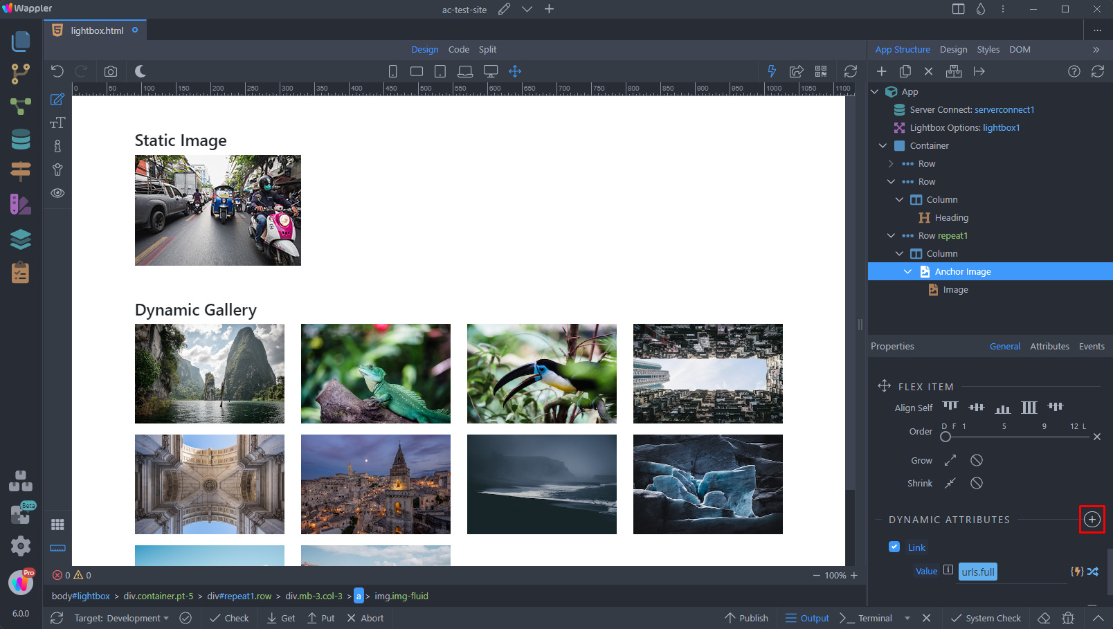
Same as we did for the static images - select Display > Open in Lightbox:
Section titled “Same as we did for the static images - select Display > Open in Lightbox:”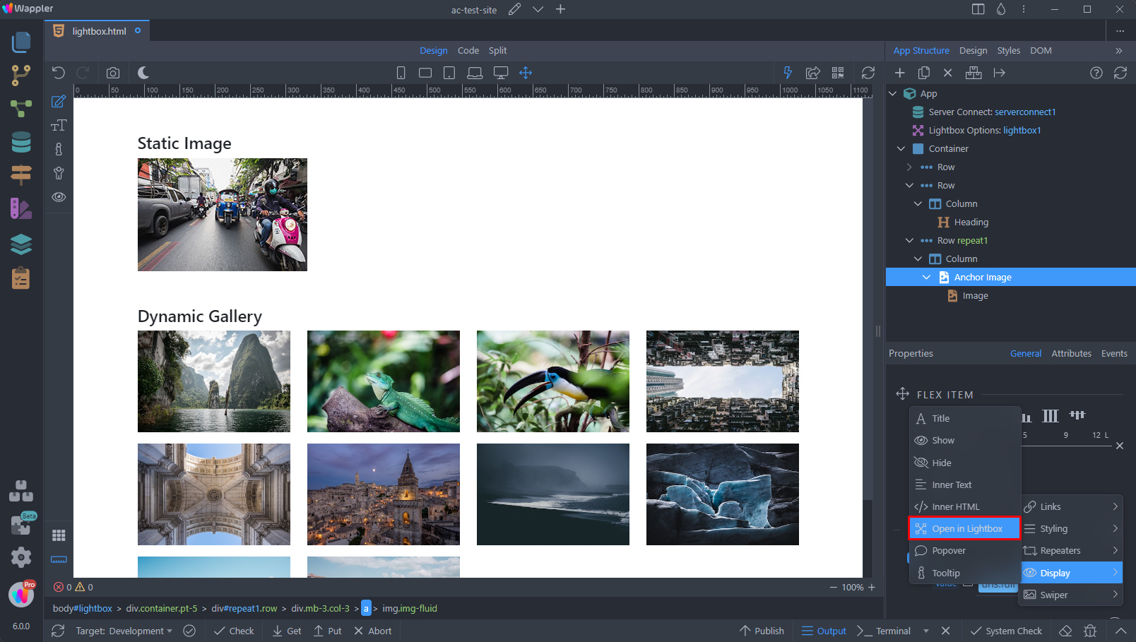
Step 30
Section titled “Step 30”Here, we can add a gallery name, so our images can be scrolled through inside the lightbox, using the previous and next buttons:
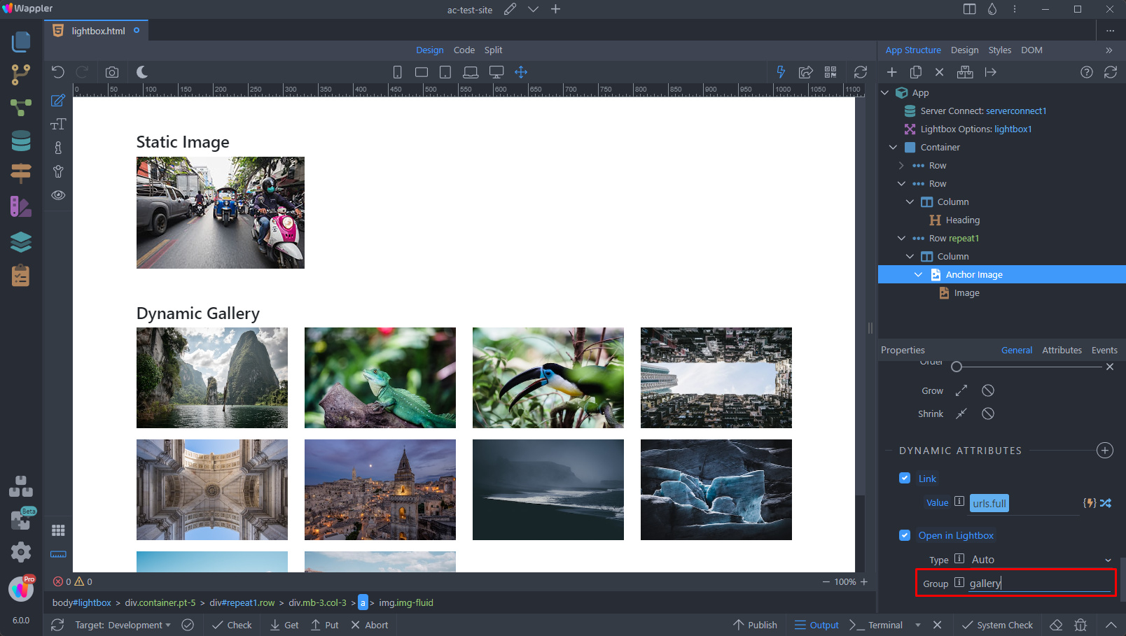
You can see the results:
Section titled “You can see the results:”