
Structure first
Build the card’s structure (header/body/footer/list-group) first, then style the correct node.
Build card-based UI blocks with headers, images, lists, and layout combinations for dashboards and content.
In this tour we’ll look at common Bootstrap card patterns and the key Properties to configure (structure first, then style).
Cards are flexible content containers. A card can include header/body/footer sections and media, and works well for grouped content like a product, article, or settings block.
tip: Cards are often paired with grid columns; manage layout on the parent column, and styling on the card.
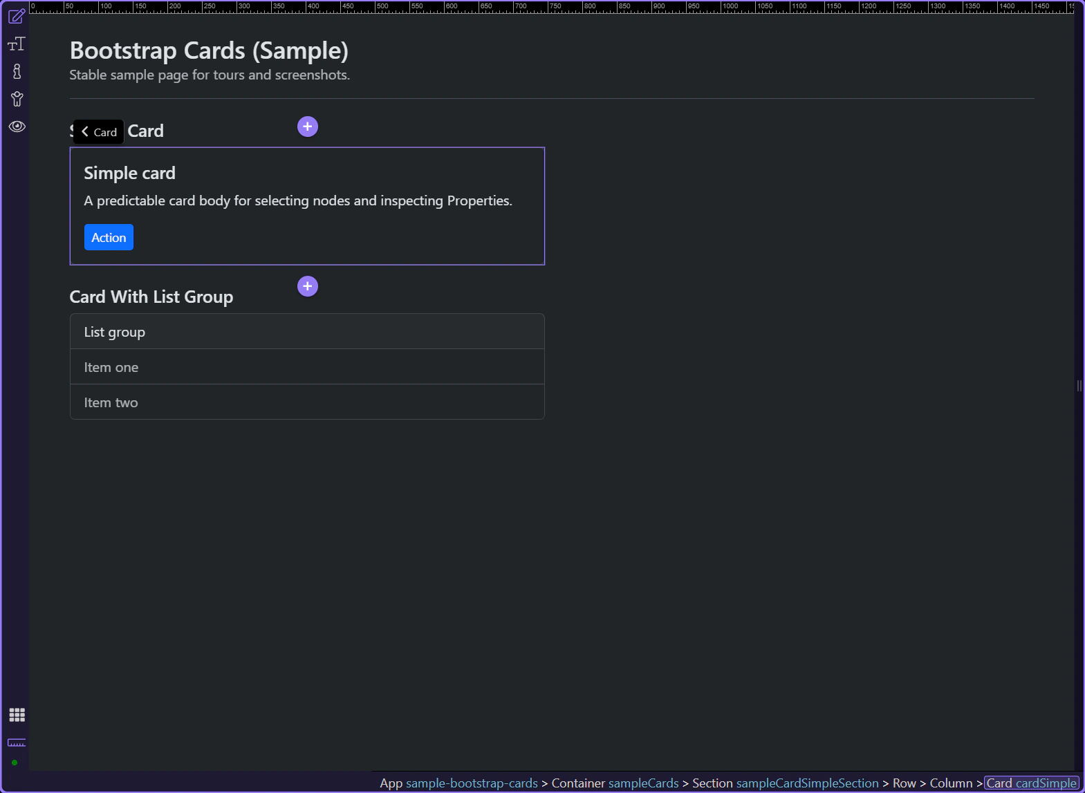
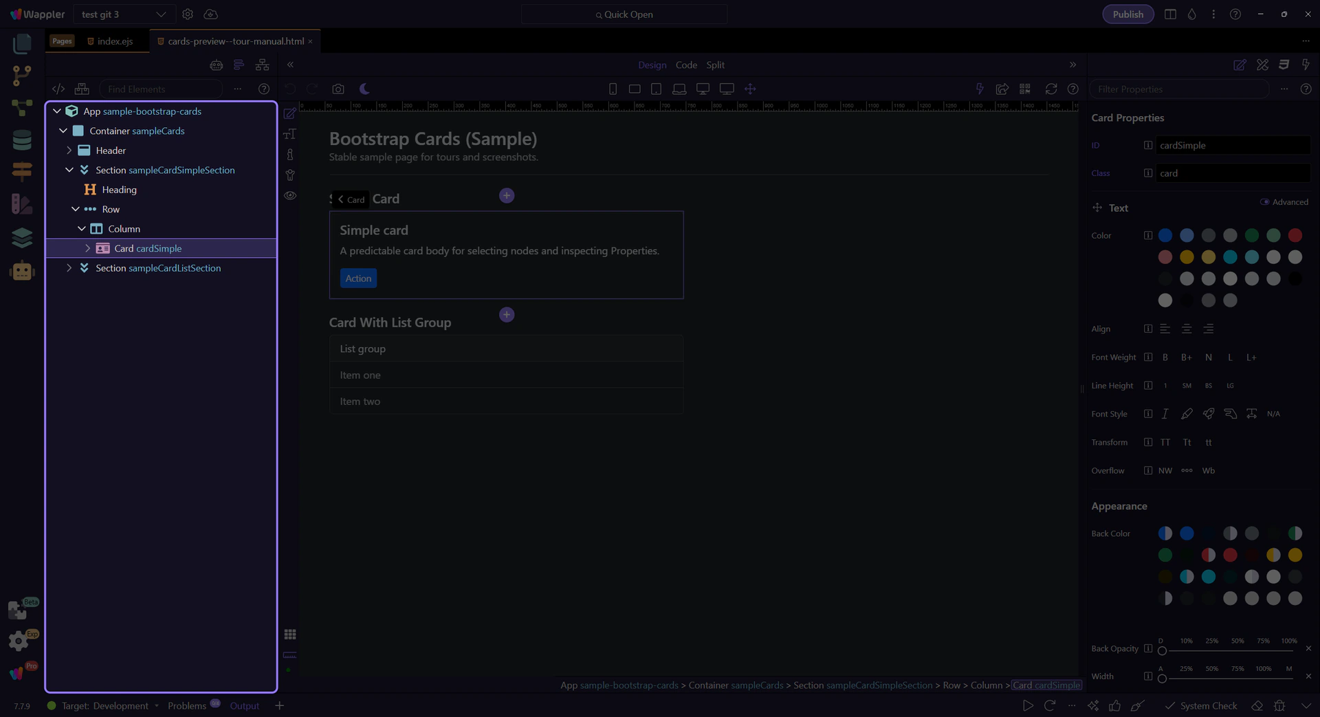
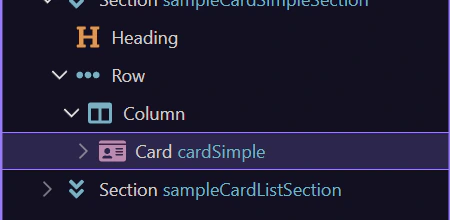
In App Structure, note the typical layout: card → header/body/footer. Select the correct node before styling.
tip: If you want padding/spacing, select
card-body.
Cards often contain nested components: list-groups and buttons/links inside the body. Always select the nested component to configure its own Properties.
tip: Set a good-looking default card first, then bind dynamic data into it.
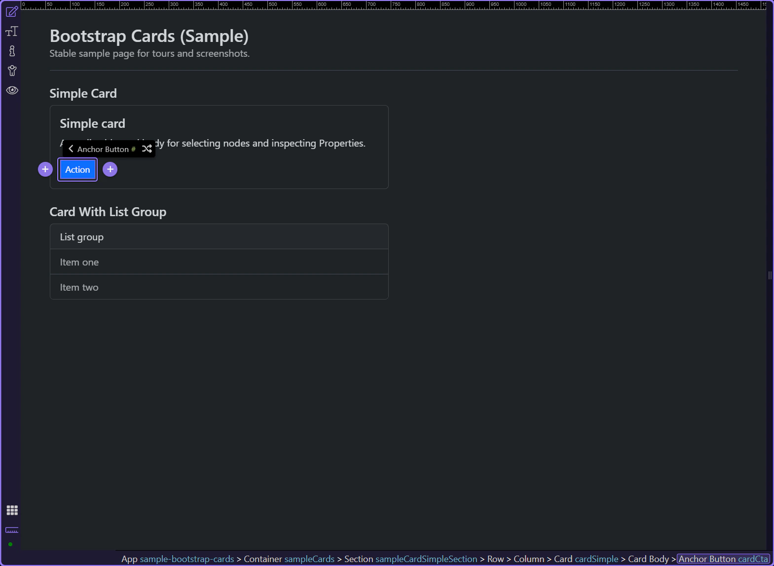
Buttons inside cards behave like any other Bootstrap button. This is where you configure variant, size, and disabled state.
tip: Buttons inside cards are still regular Bootstrap buttons—configure them like any other button.
Use Style to pick the button variant (primary/secondary/outline-*, etc.).
tip: Prefer variants over hard-coded styles so Theme Manager can theme your UI consistently.

Use Size to switch between default, small, and large buttons.

Use Link to pick where the button navigates (page/file/route).

To change the button label, edit the text content in Design View (double-click the button/link text).
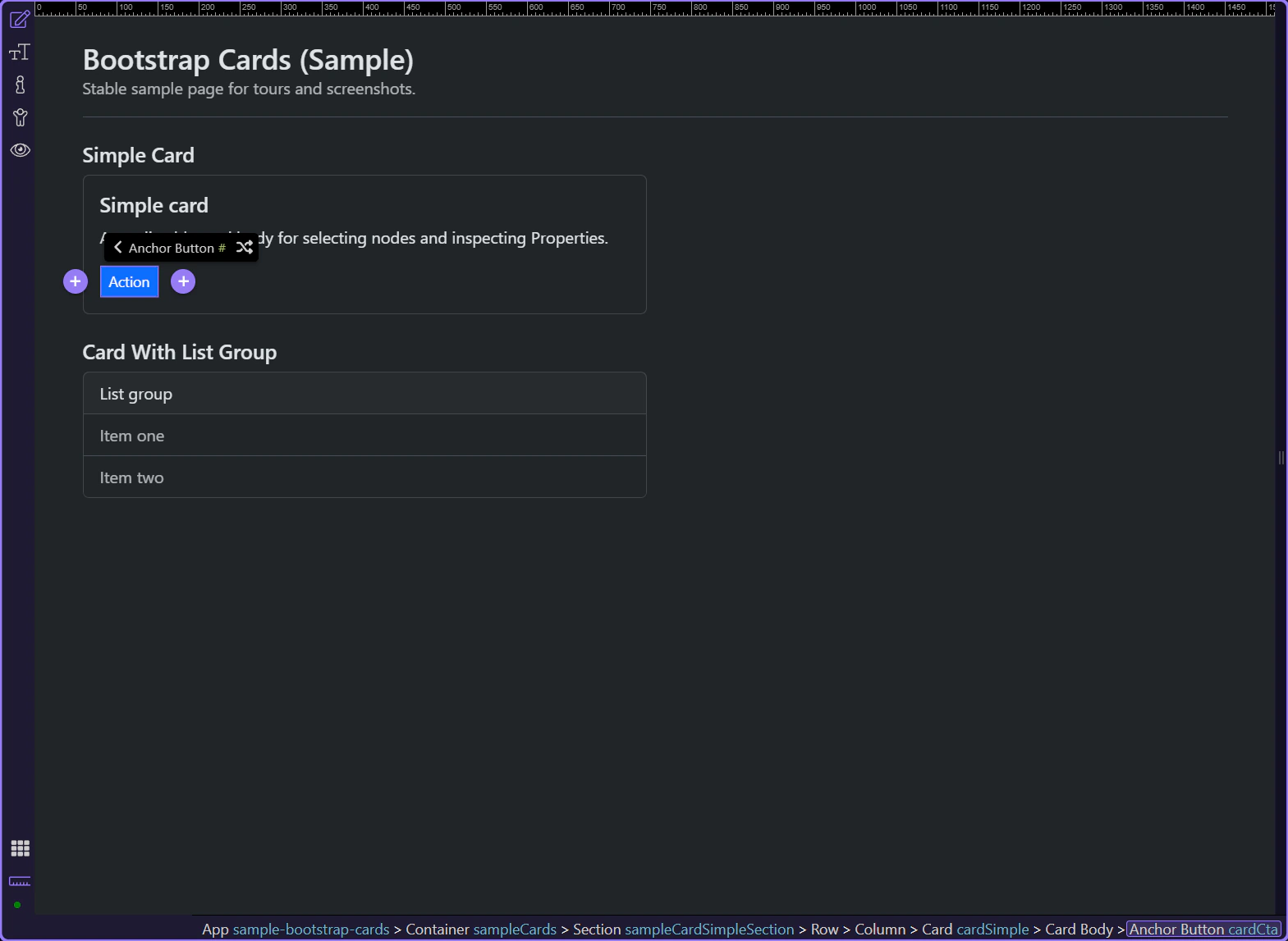
List groups inside cards are a common pattern for “card with selectable items”, like menus, results, and settings lists.
tip: Keep each item’s label short and scannable; put details on the destination page or in a secondary line.
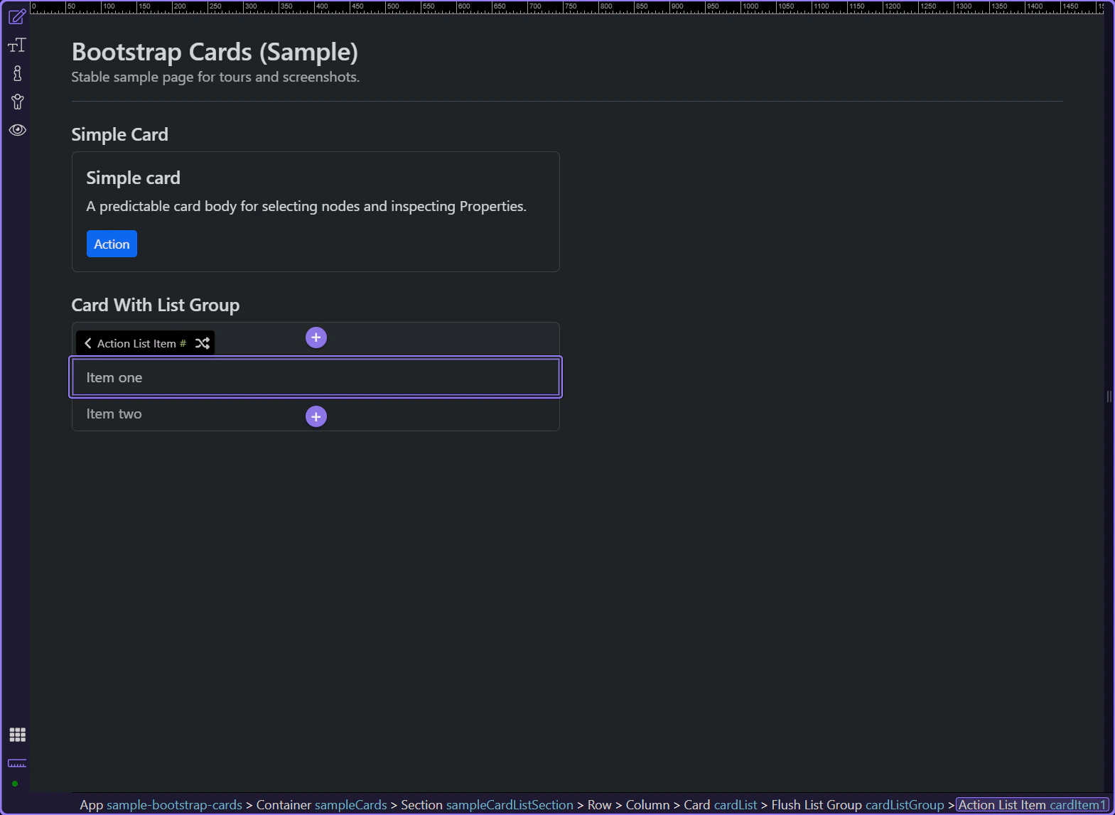
Edit the list item content in Design View (double-click the text). Use Properties mainly for state + styling options.
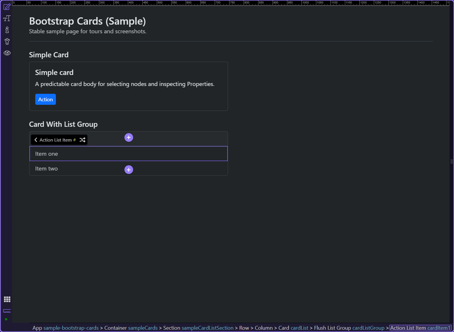
Use Active to mark the current/selected item.
tip: For consistent spacing, apply spacing utilities on the card or list container rather than every item.
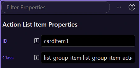
Use Disabled to make the item non-interactive.
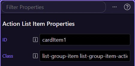
When you need to control flush/borders/spacing, select the list-group container (parent) in App Structure instead of the item.
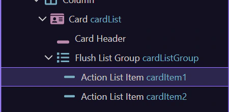
Cards are a composition pattern: build structure first (header/body/footer/list-group), then fine-tune styling with utilities.
Next, pick a related tour or go back to the Bootstrap tours index.
Before you move on, keep these rules of thumb:
tip: If you plan to bind data, design one good-looking static card first, then add repeat bindings.
Choose what you want to learn next.