Accordion
Use accordions to organize content into collapsible sections with smooth navigation.
Accordion structure
An accordion is a container plus collapsible panels. The panels can be linked to the accordion so only one is open at a time.
Accordion example
This accordion example is best understood as a reusable layout pattern rather than a single widget on the page. Watch how related sections are grouped into one container, how each header controls reveal and collapse behavior, and why accordions work well when you need dense content without forcing a long scrolling page.
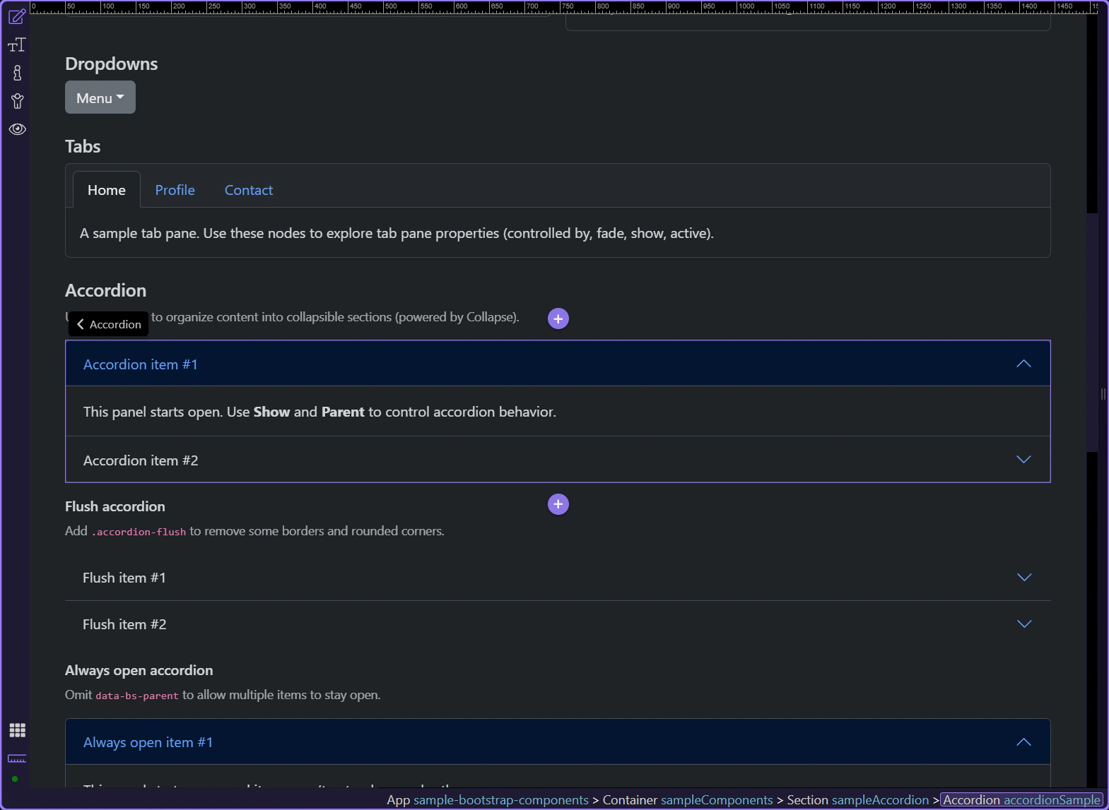
Collapsible panel
Let’s explore a collapsible panel and how its initial expanded state is controlled. This step matters because Collapsible panel is part of Design View, and understanding that context makes the next action easier to repeat in your own project.
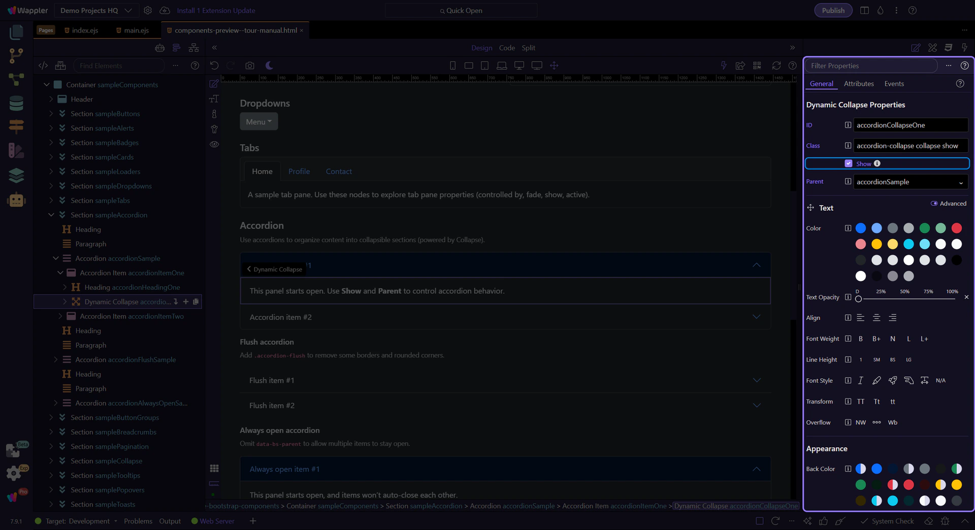
Orient yourself in Properties panel
Start with the wider context in the Properties panel so the next control makes sense in the full workflow. In the next step, you will focus on Collapse: Show and see how it fits into this area.
Collapse: Show
Use Show to control whether the panel starts expanded. This step matters because Collapse: Show is part of Selection Panels Properties Collapseshow, and understanding that context makes the next action easier to repeat in your own project.
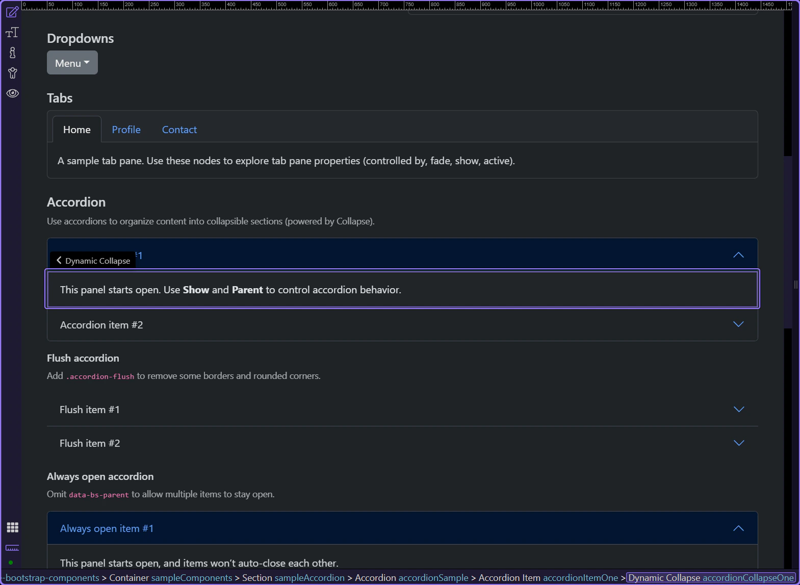
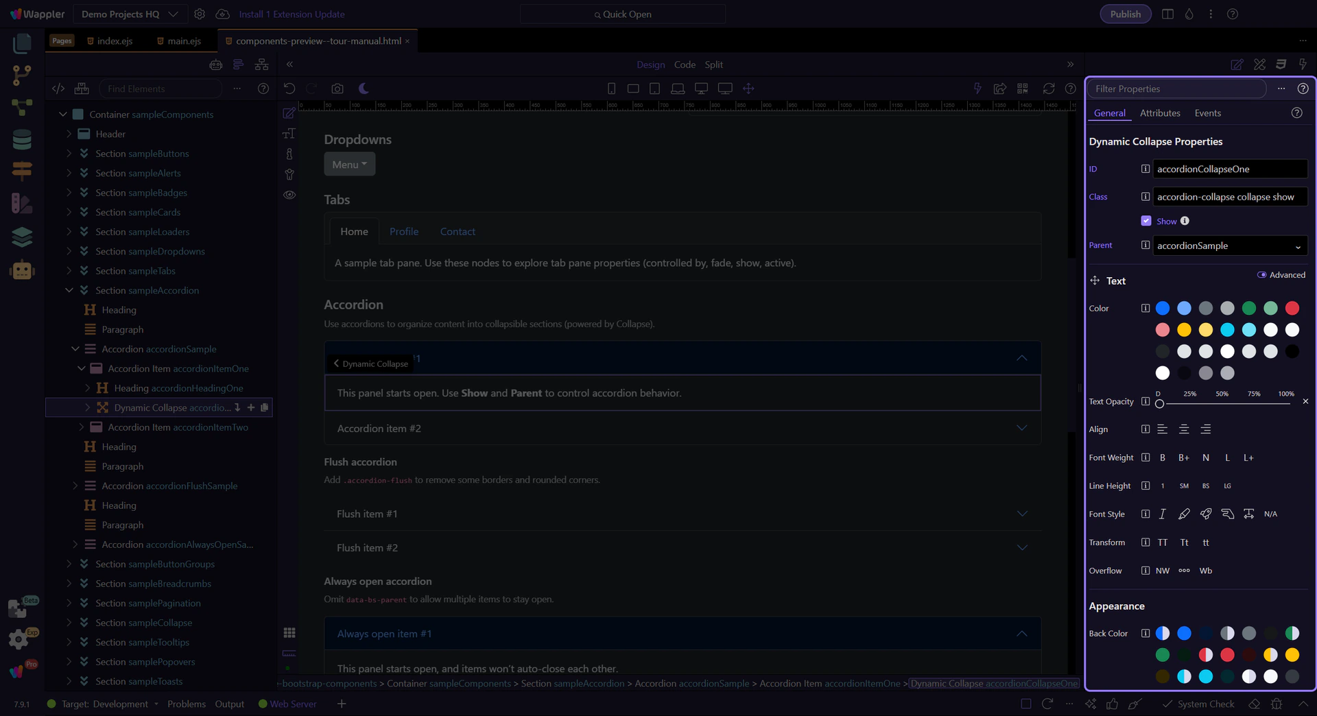
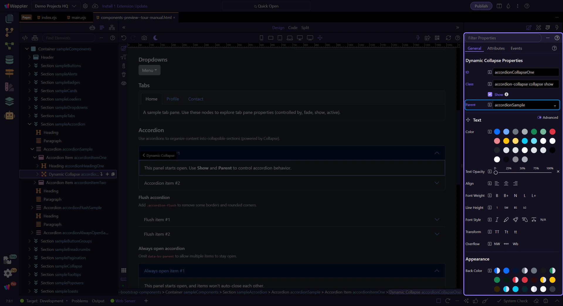
Collapse: Parent
Use Parent to link the panel to the accordion container. This is what makes it behave like an accordion (one open at a time).
Accordion variants
Bootstrap accordions support variants like flush styling and always open behavior.
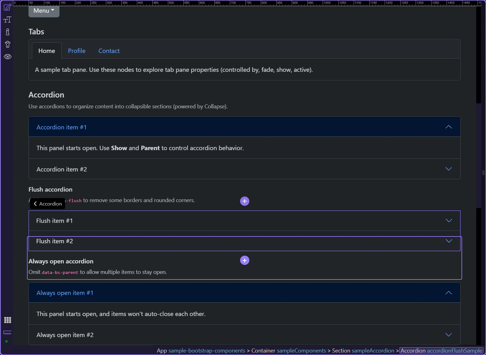
Flush accordion
Add the .accordion-flush class to the accordion container to remove some borders and rounded corners, rendering it edge-to-edge with its parent.
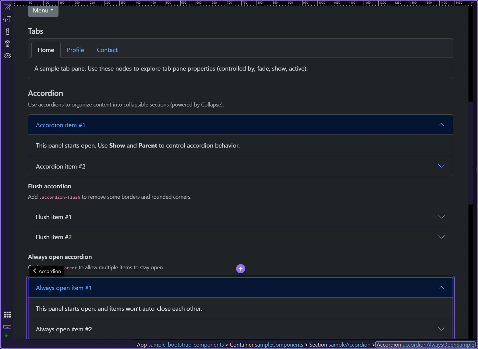
Always open accordion
To allow multiple items to stay open, omit the parent reference on each collapse panel (no data-bs-parent).
Collapse: Parent (optional)
In the always-open variant, the collapse panel stays independent because the Parent reference is omitted. Confirm that this collapse item is selected in Properties and note that there is no accordion parent binding forcing single-open behavior.

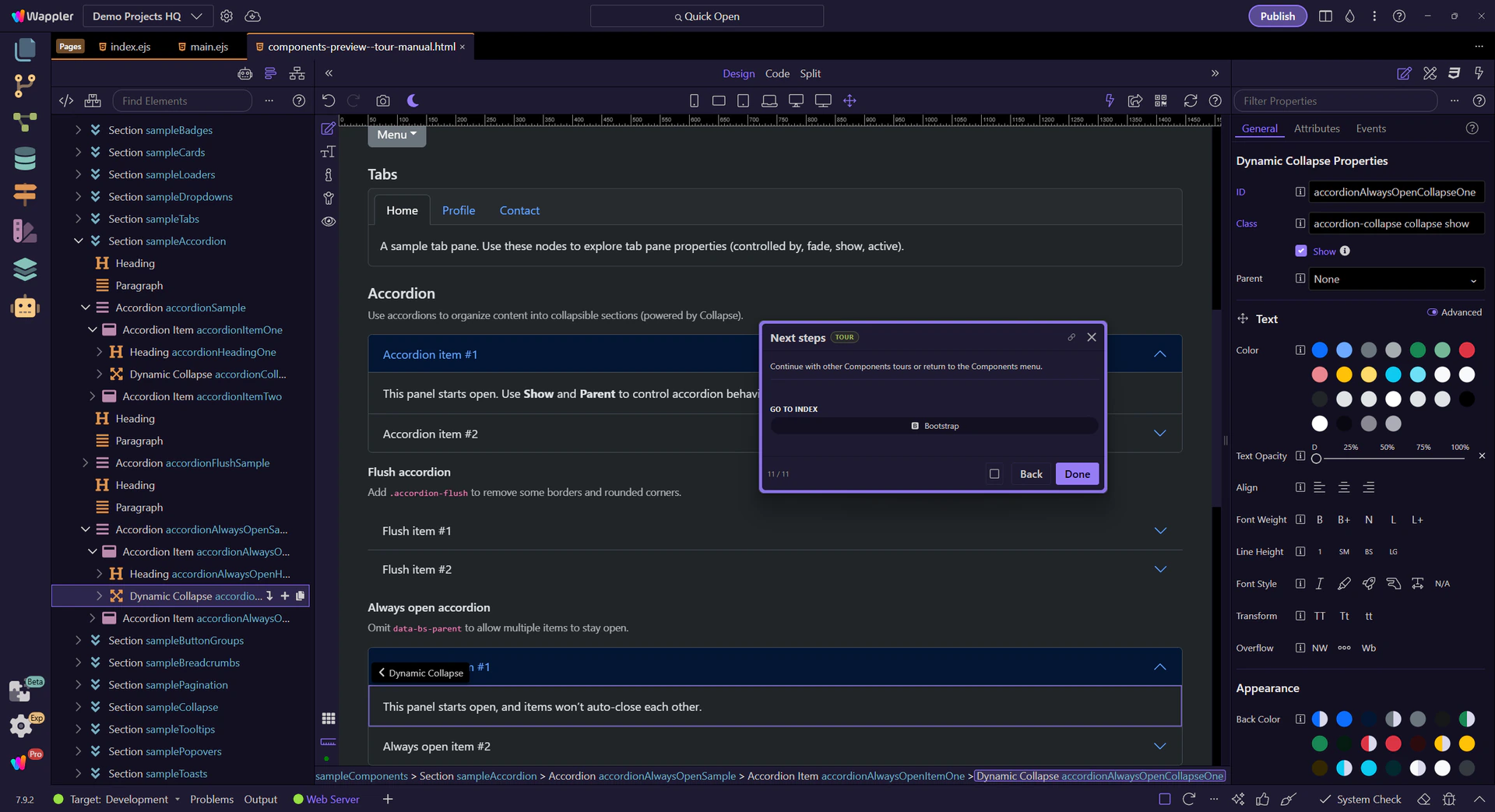
Next steps
Continue with other Components tours or return to the Components menu.