
Alerts
Use alerts for feedback messages, including dismissible alerts and contextual states.
Alert options
Section titled “Alert options”Alerts communicate important status changes. Keep the message concise, and use variants (info/success/warning/danger) consistently across your UI.
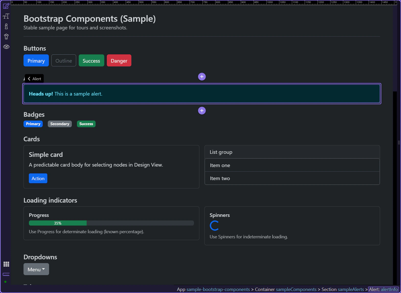
Alert example
Section titled “Alert example”Alerts communicate status messages—success, warnings, errors, or neutral information.
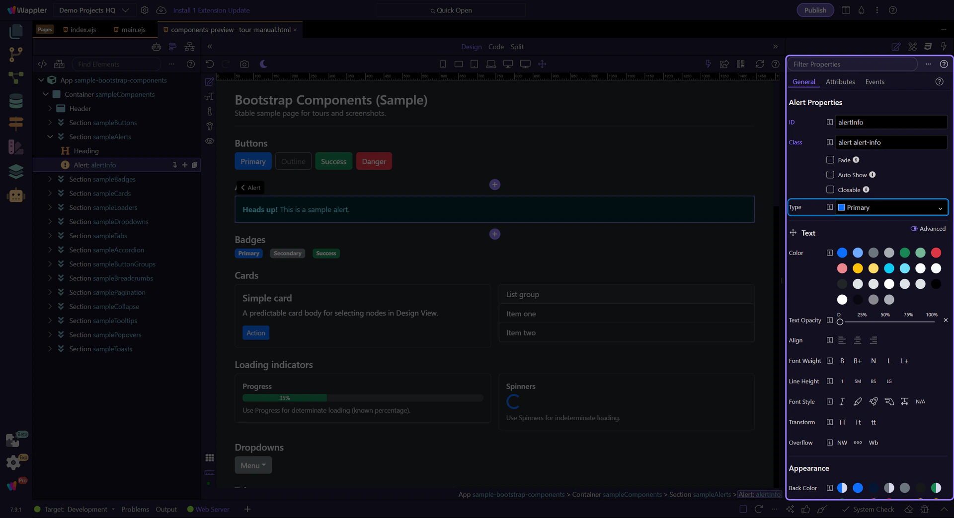
Alert: Type
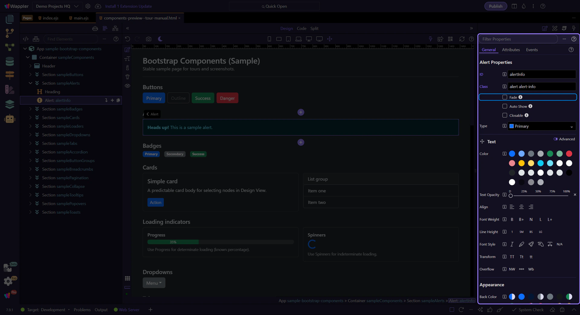
Section titled “Alert: Type”Use Type to change the alert variant (info, warning, danger, success, etc.).
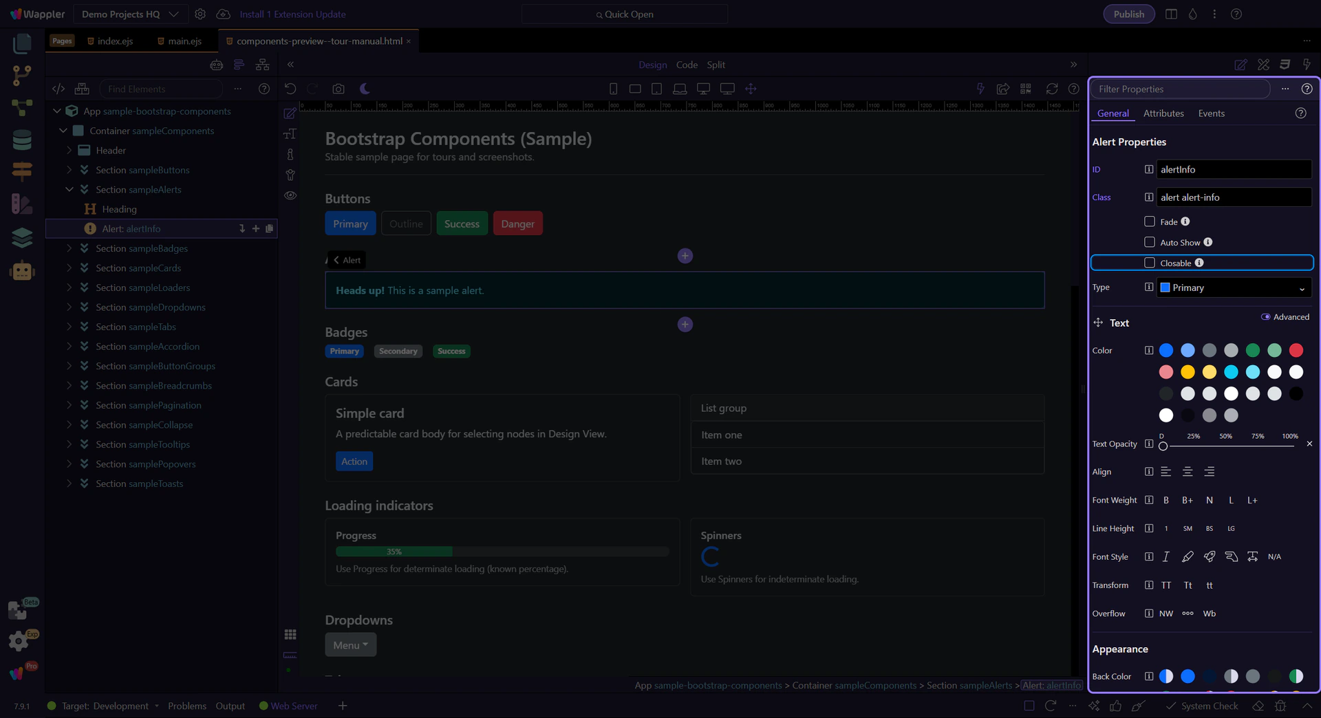
Alert: Closable
Section titled “Alert: Closable”Enable Closable to show a close button so users can dismiss the message. Use this for non-critical or informational alerts.
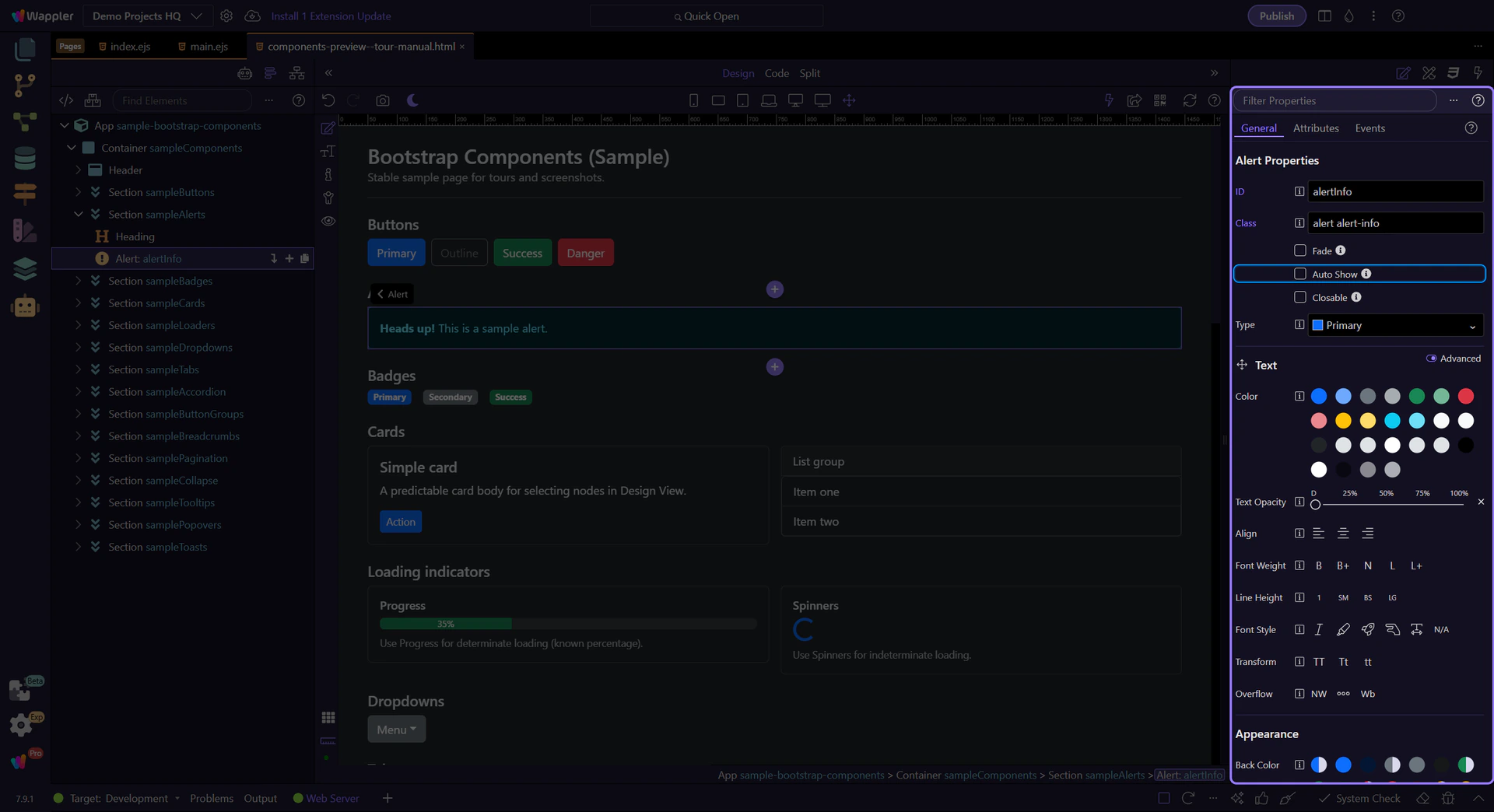
Alert: Auto Show (dynamic)
Section titled “Alert: Auto Show (dynamic)”Enable Auto Show when the alert visibility is driven by data or logic. You can bind it to a condition to show/hide the alert automatically.
Alert: Fade animation
Section titled “Alert: Fade animation”Enable Fade for a subtle enter/exit transition. Combine this with Auto Show for smooth dynamic alerts.
Next steps
Section titled “Next steps”Continue with other Components tours or return to the Components menu.