Badges
Use badges for counts and status labels, including pill styles and contextual colors.
Badge basics
Badges are small labels for counts or statuses. Keep them short and readable, and use color to reinforce meaning (not replace it).
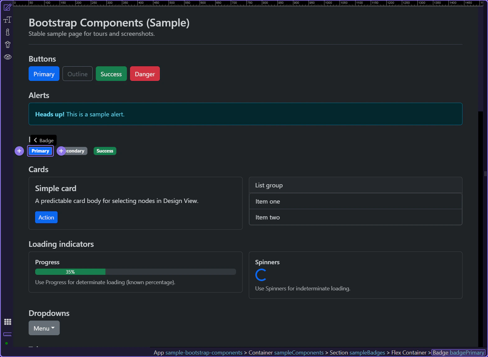
Badge example
Badges are compact labels for counts, status, and short metadata. This step matters because Badge example is part of Design View, and understanding that context makes the next action easier to repeat in your own project.
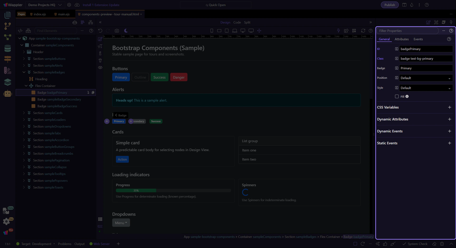
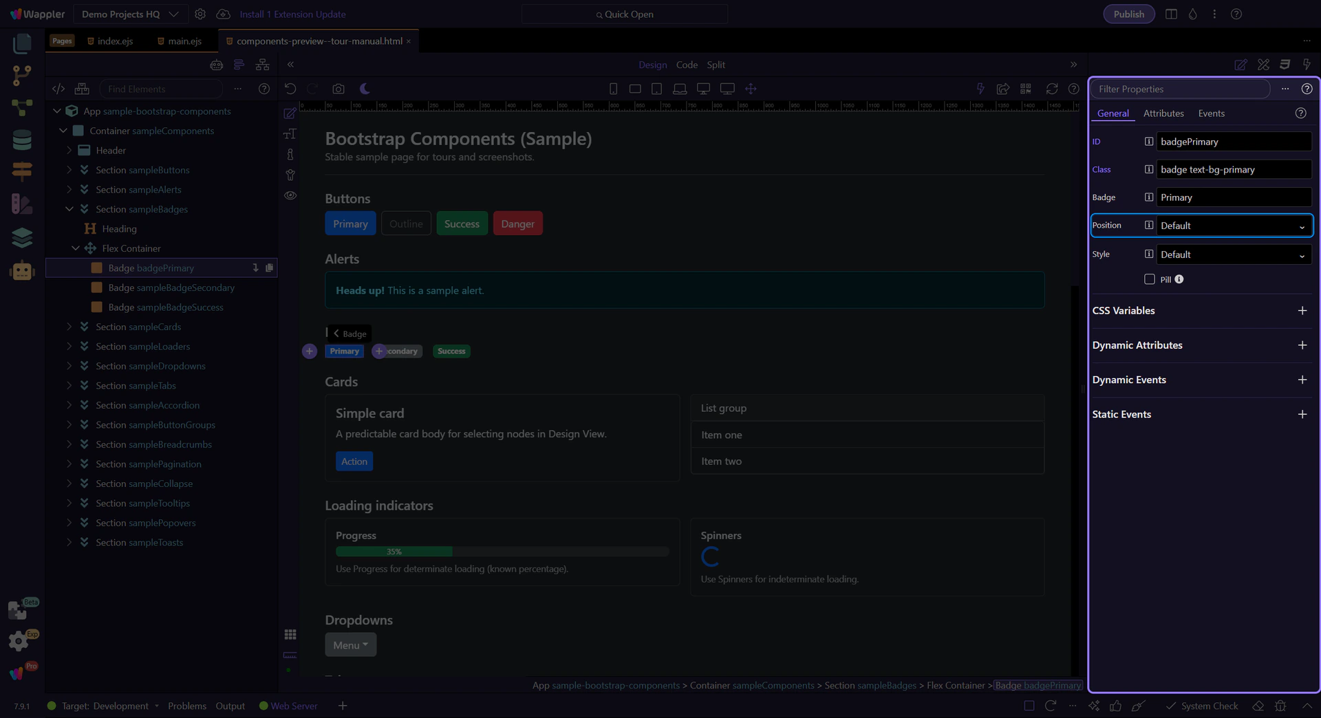
Orient yourself in Properties panel
Start with the wider context in the Properties panel so the next control makes sense in the full workflow. In the next step, you will focus on Badge: Text and see how it fits into this area.
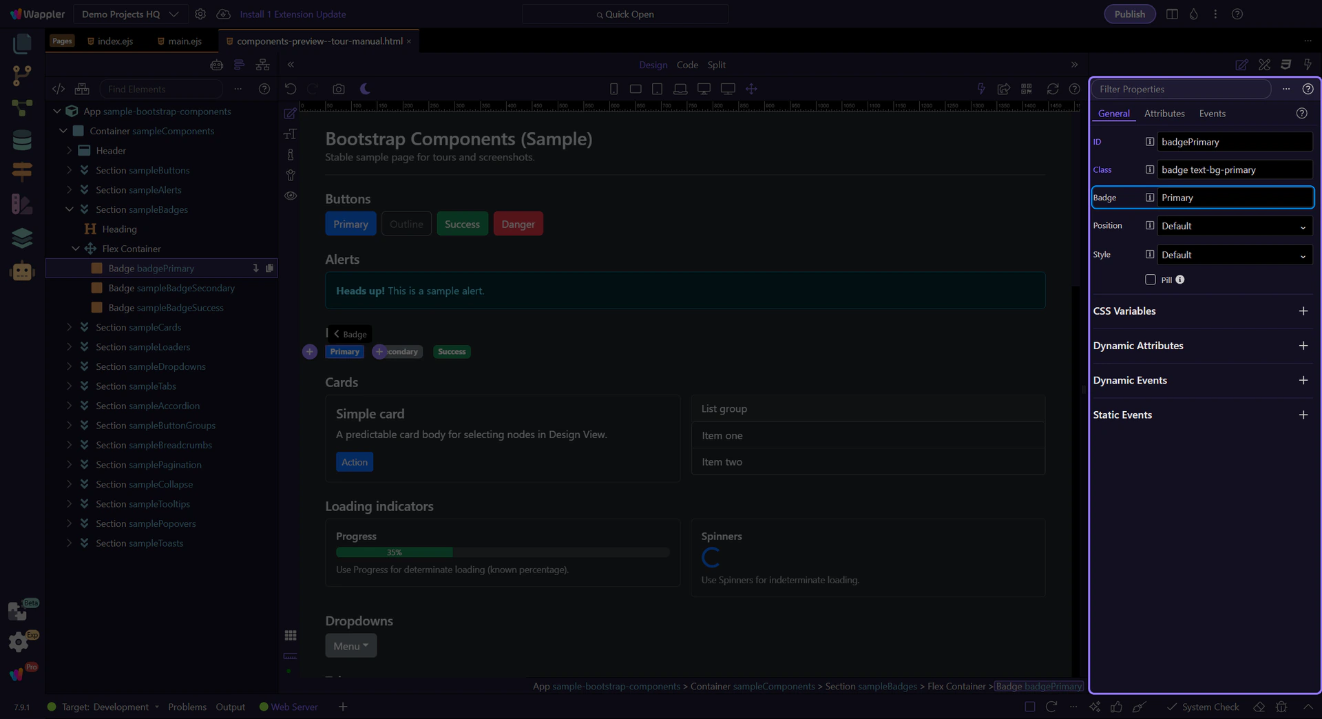
Badge: Text
Use Text to change the badge label. Keep it short (for example, a count or a single word status). This step matters because Badge: Text is part of Selection Panels Properties Badgetext, and understanding that context makes the next action easier to repeat in your own project.
Badge: Position
Use Position to place the badge before or after neighboring content. This step matters because Badge: Position is part of Selection Panels Properties Badgepos, and understanding that context makes the next action easier to repeat in your own project.
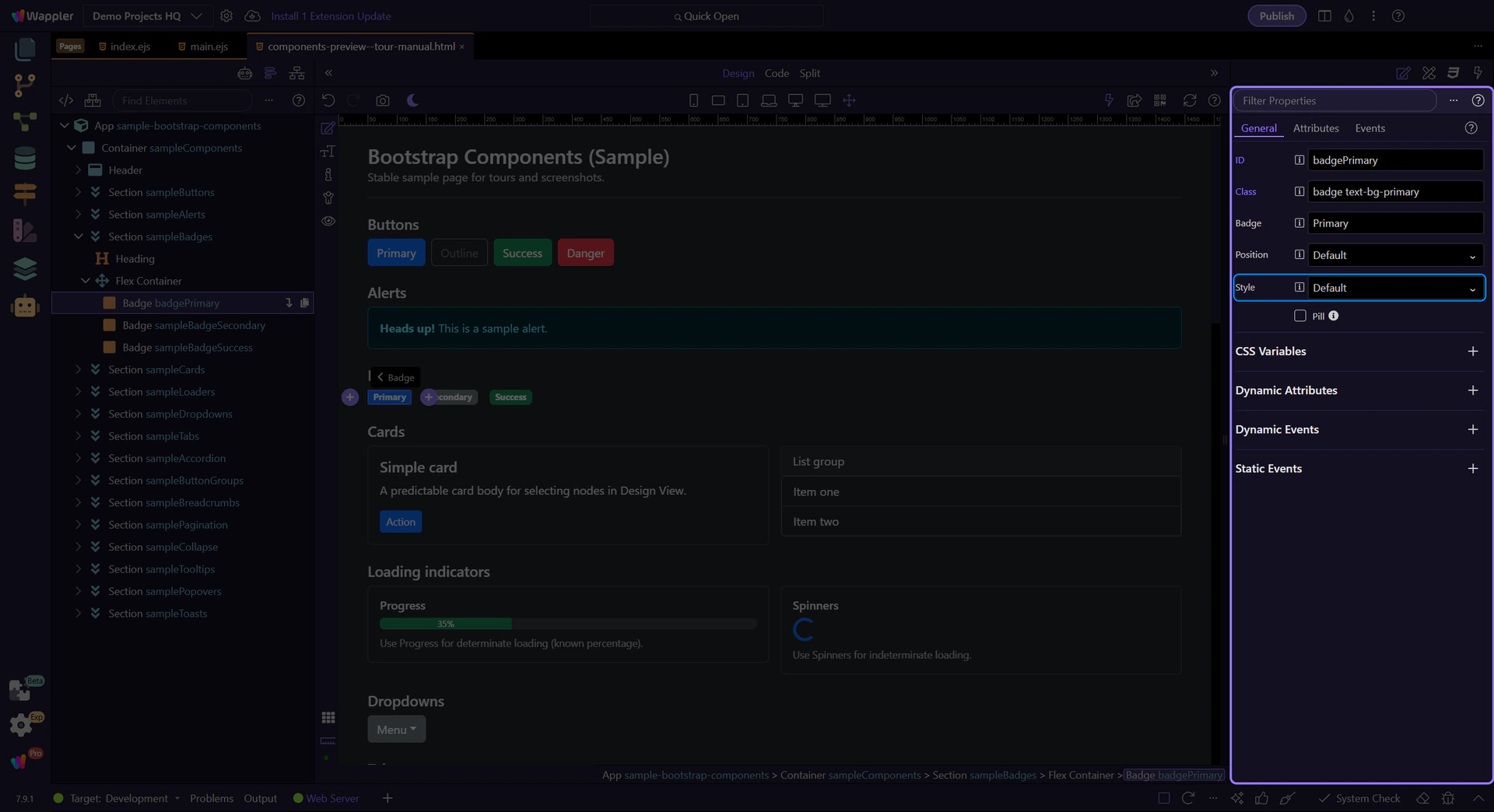
Badge: Style
Use Style to choose the badge’s variant. Prefer variants with good contrast (Bootstrap’s text-bg-* styles handle text/background contrast for you).
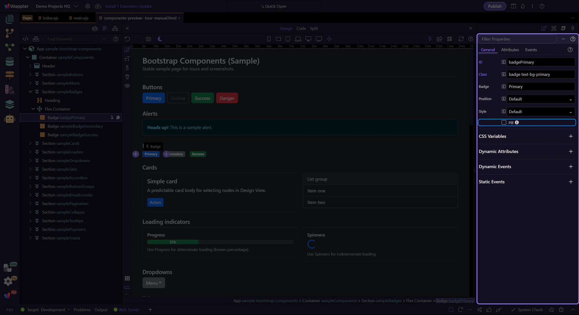
Badge: Pill
Use Pill for a rounded badge style. This step matters because Badge: Pill is part of Selection Panels Properties Badgepill, and understanding that context makes the next action easier to repeat in your own project.
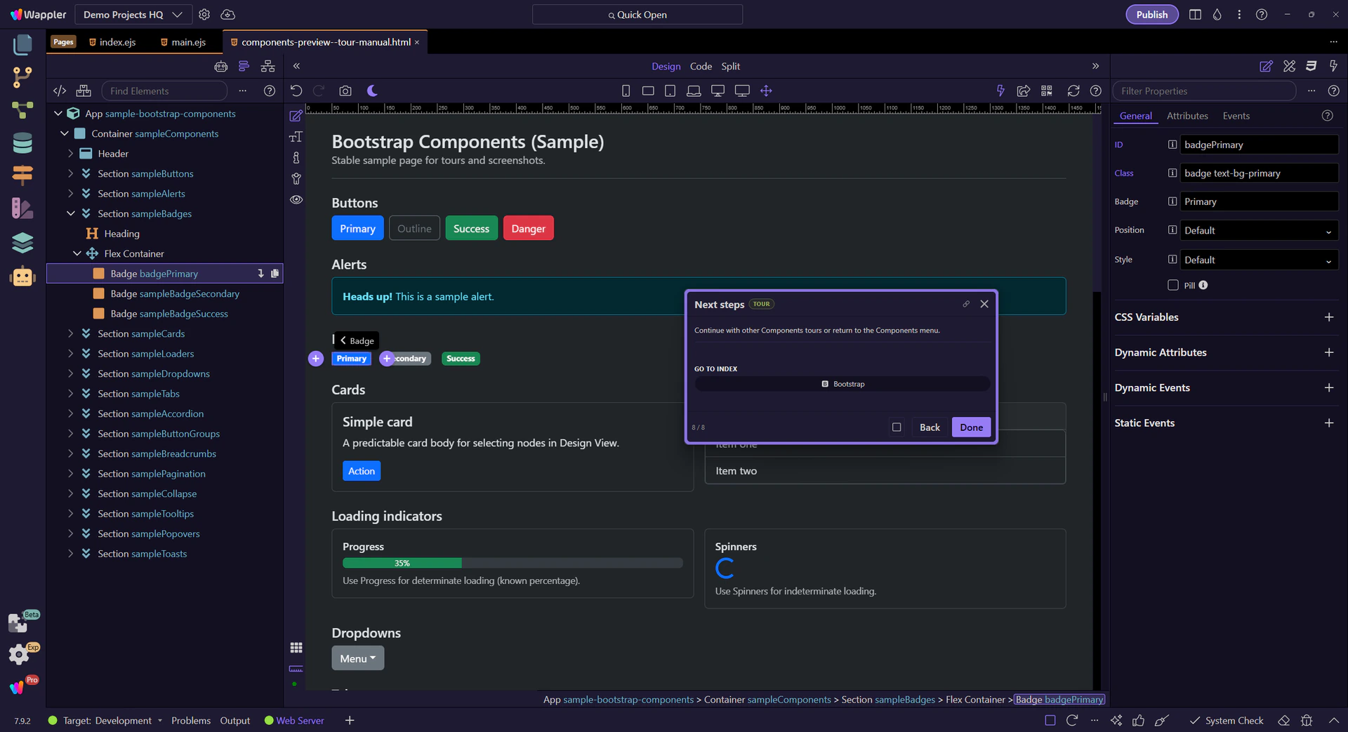
Next steps
Continue with other Components tours or return to the Components menu.