
Dropdowns
Build dropdown menus in Wappler and learn the practical options: alignment, sizing, split buttons, and nav dropdown patterns.
Dropdown structure
Section titled “Dropdown structure”A dropdown is made of a wrapper, a toggle button, and a menu with items. Use dropdowns for short, contextual lists of actions.
Dropdown example
Section titled “Dropdown example”This dropdown example shows more than a button with a menu attached. It demonstrates how Wappler combines a trigger, menu container, and menu items into a compact interaction pattern that is useful for grouped actions, secondary navigation, and actions that should stay hidden until needed.
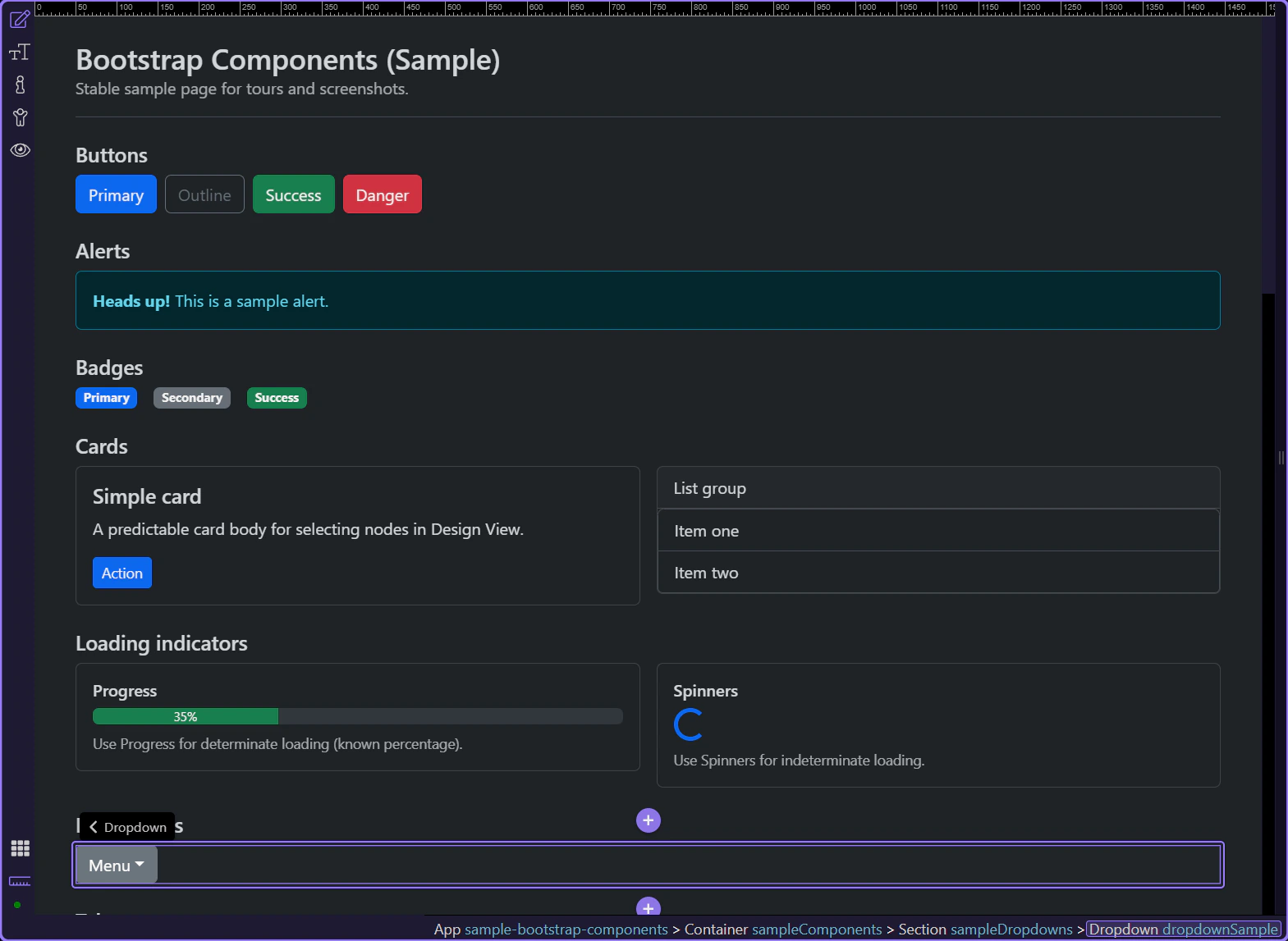
Toggle button
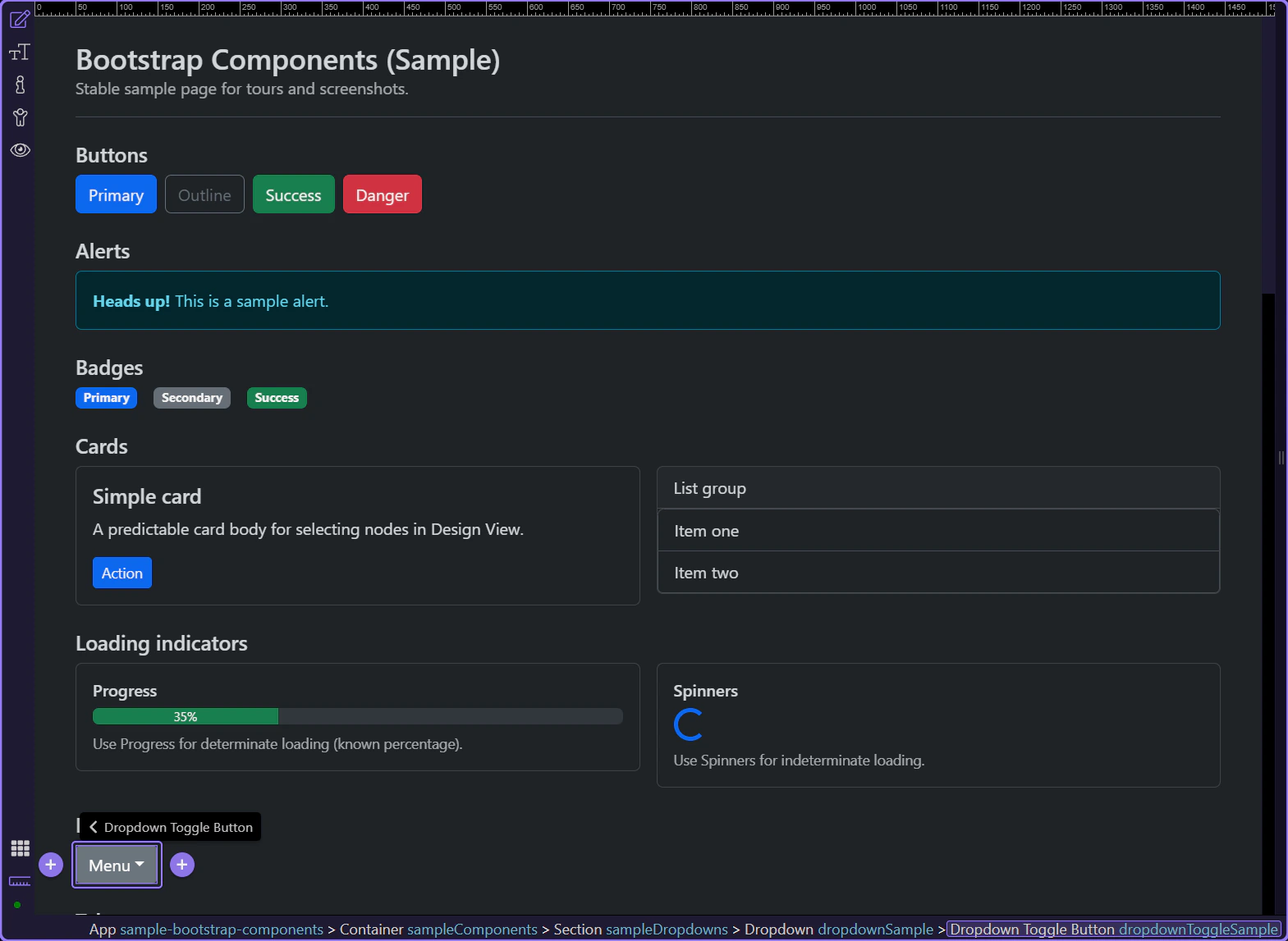
Section titled “Toggle button”The toggle button is the trigger that opens the menu.
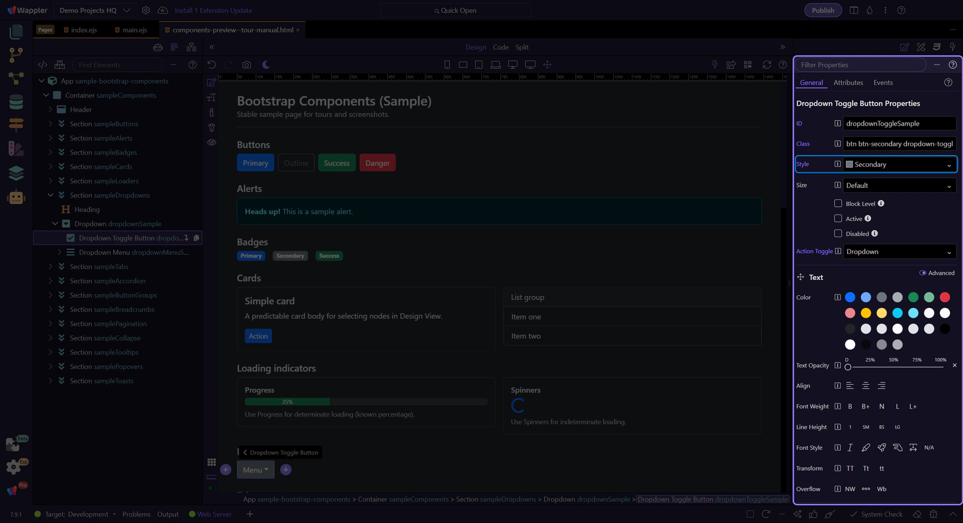
Toggle button: Style
Section titled “Toggle button: Style”Use Style to choose the toggle button’s variant.
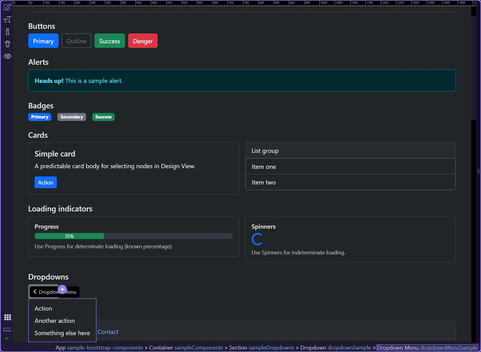
Dropdown menu
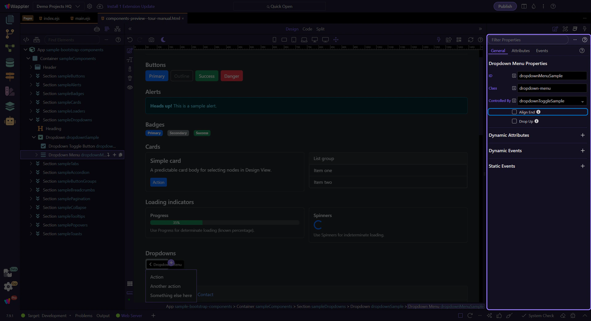
Section titled “Dropdown menu”The menu container holds the list of dropdown items.
Dropdown menu: Align end
Section titled “Dropdown menu: Align end”Enable Align End to align the dropdown menu to the right edge (useful near the right side of the viewport).
Dropdown item
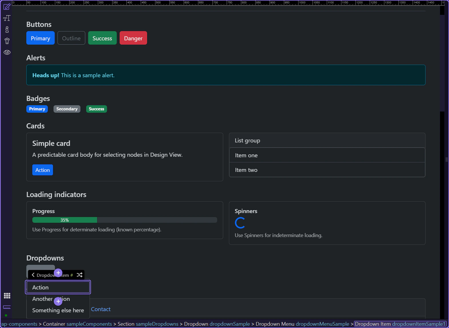
Section titled “Dropdown item”Dropdown items represent the actions and destinations in the menu.
Dropdown item: Disabled
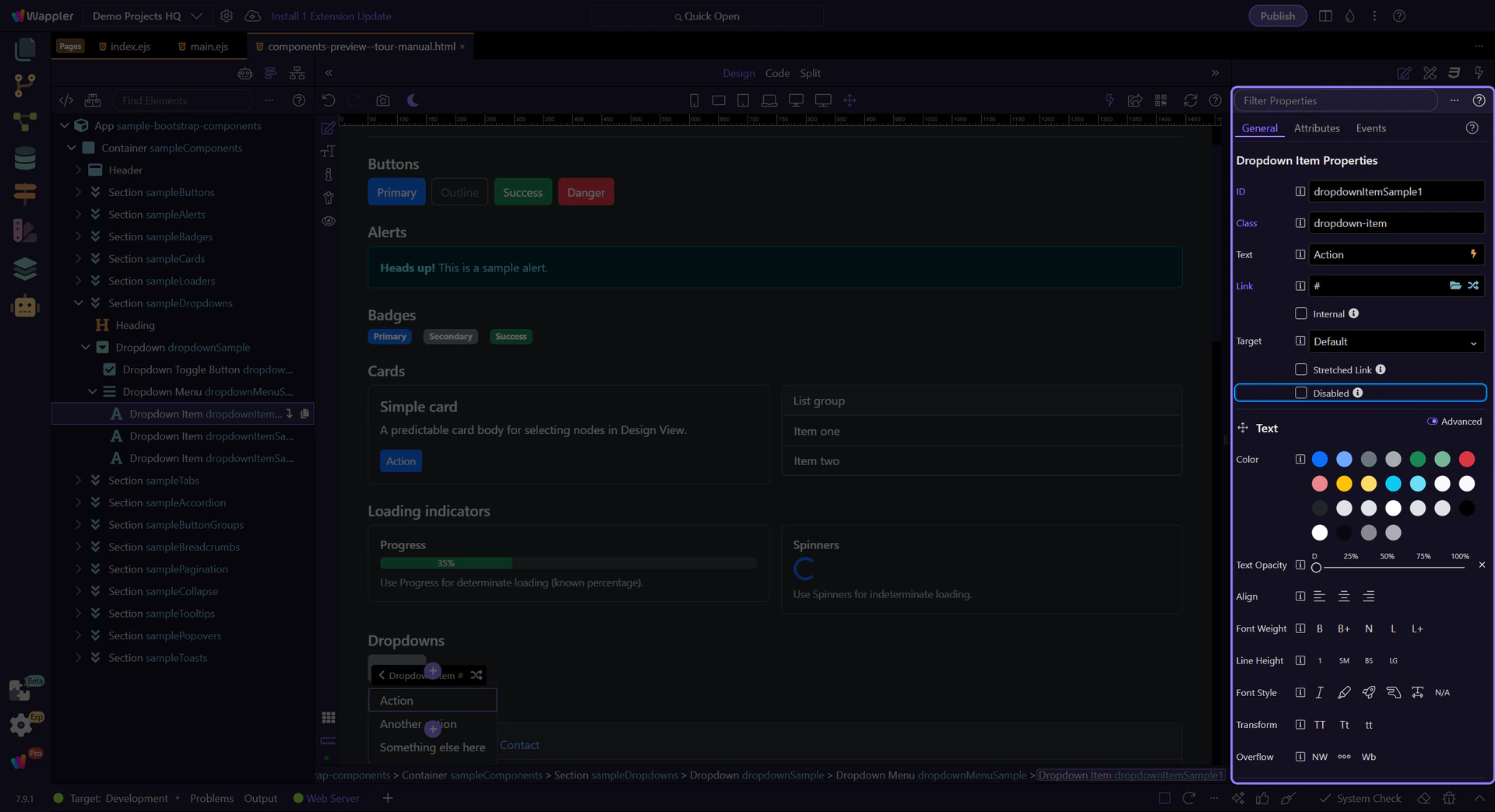
Section titled “Dropdown item: Disabled”Use Disabled for options that aren’t currently available.
Next steps
Section titled “Next steps”Continue with other Components tours or return to the Components menu.