List groups
Use list groups for structured lists, selection states, and grouped content.
List group container
A list group is a container plus one or more items. It’s great for navigation, selectable lists, and simple summaries.
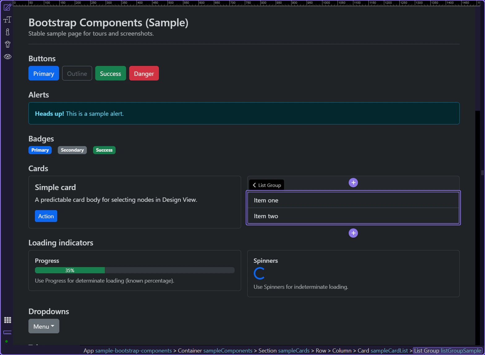
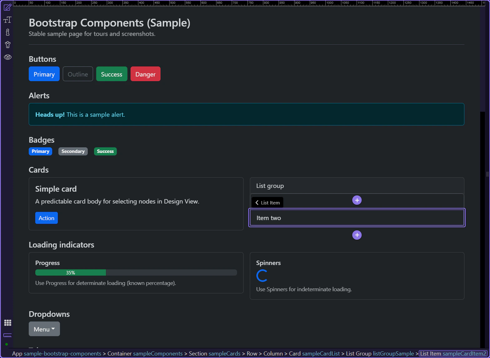
List group example
This list group example shows how Bootstrap can turn a plain stack of items into a clearer, more structured UI pattern. Watch how repeated items share consistent styling, spacing, and emphasis, and why list groups are useful for navigation, summaries, or selectable collections inside a page section.
Orient yourself in Properties panel
Start with the wider context in the Properties panel so the next control makes sense in the full workflow. In the next step, you will focus on List group: Flush and see how it fits into this area.
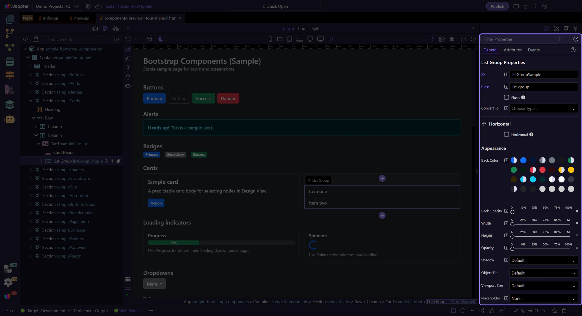
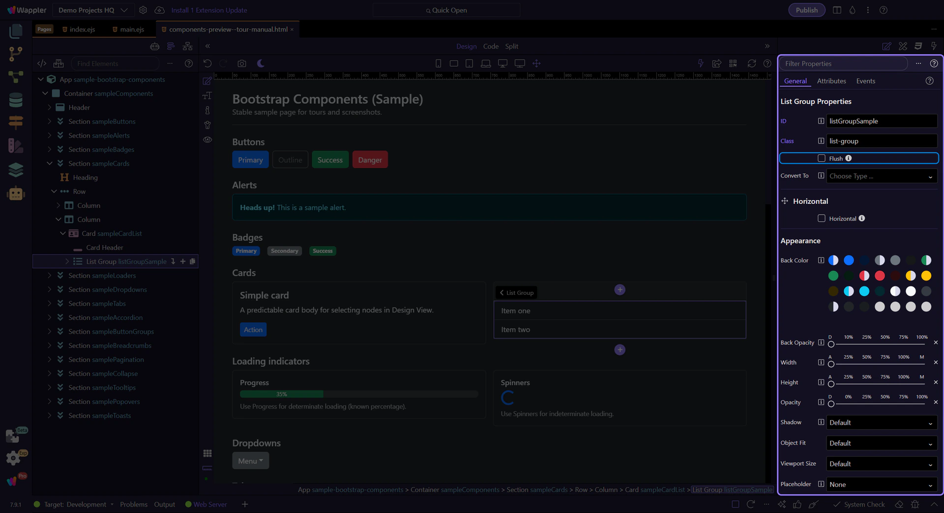
List group: Flush
Enable Flush to remove outer borders and rounded corners (useful inside cards). This step matters because List group: Flush is part of Selection Panels Properties Listgroupflush, and understanding that context makes the next action easier to repeat in your own project.
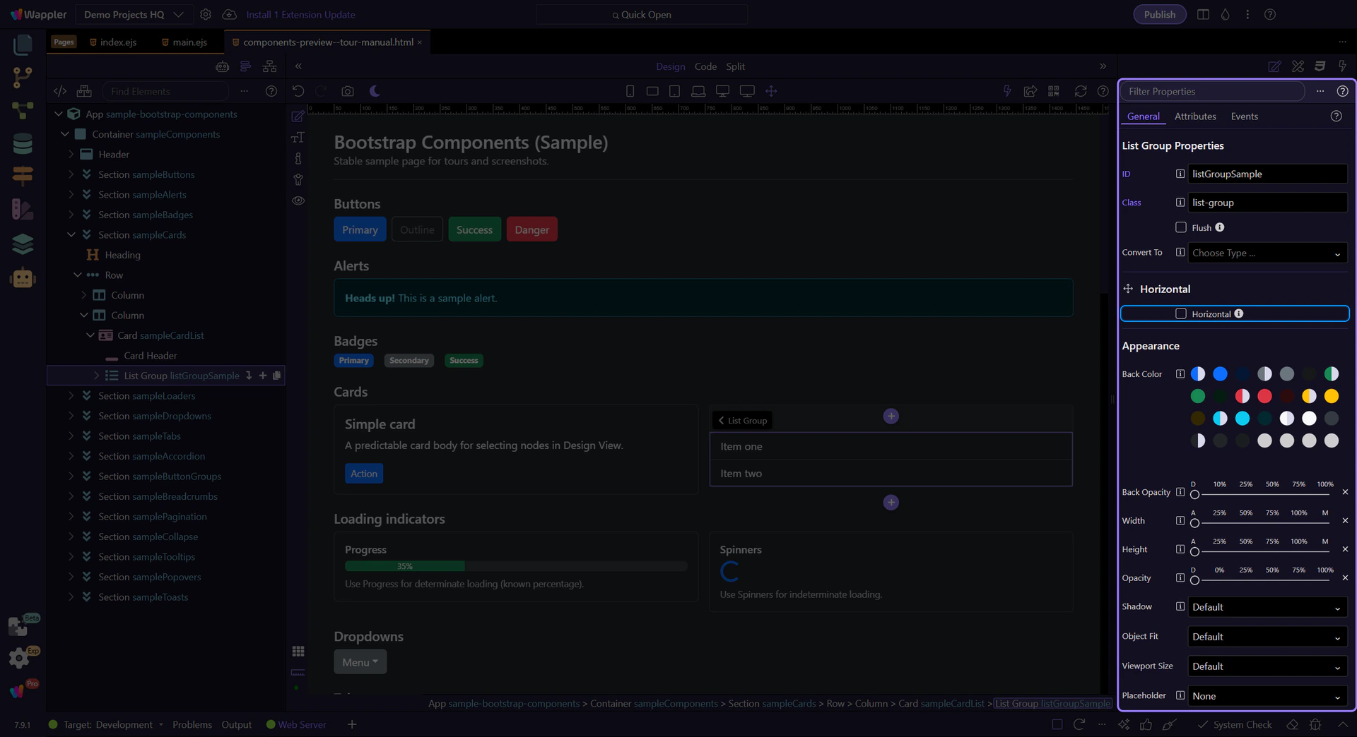
List group: Horizontal
Enable Horizontal to display items side-by-side (responsive variants are available). This step matters because List group: Horizontal is part of Selection Panels Properties Horizontal, and understanding that context makes the next action easier to repeat in your own project.
List items
Select a list item to adjust per-item state.
List group item
List group items can be marked active or disabled to reflect navigation and availability. This step matters because List group item is part of Design View, and understanding that context makes the next action easier to repeat in your own project.
List item: Active
Use Active to highlight the current/selected item. This step matters because List item: Active is part of Selection Panels Properties Listgroupitemactive, and understanding that context makes the next action easier to repeat in your own project.

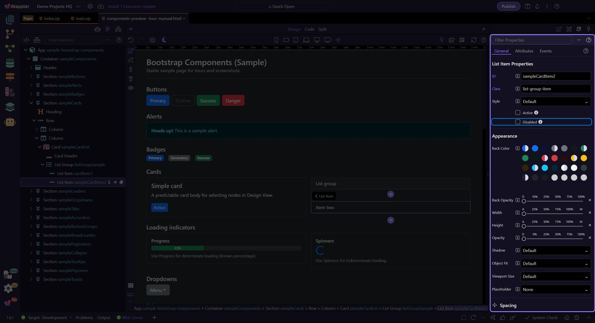
List item: Disabled
Use Disabled when an item is not selectable. This step matters because List item: Disabled is part of Selection Panels Properties Listgroupitemdisabled, and understanding that context makes the next action easier to repeat in your own project.
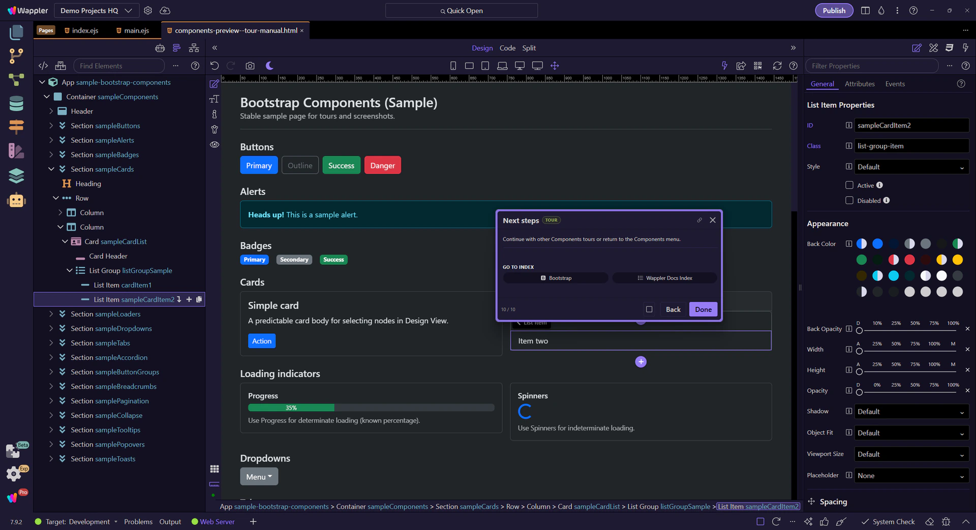
Next steps
Continue with other Components tours or return to the Components menu.