Loading indicators (progress & spinners)
Use spinners and loading indicators to communicate progress and improve perceived performance.
Progress bars
Use progress bars when you know the percentage. A progress bar is made of a container (.progress) and a bar element (.progress-bar).
Progress example
Use progress bars and spinners to indicate loading, processing, or completion. This step matters because Progress example is part of Design View, and understanding that context makes the next action easier to repeat in your own project.

Orient yourself in Properties panel
Start with the wider context in the Properties panel so the next control makes sense in the full workflow. In the next step, you will focus on Progress: Height and see how it fits into this area.
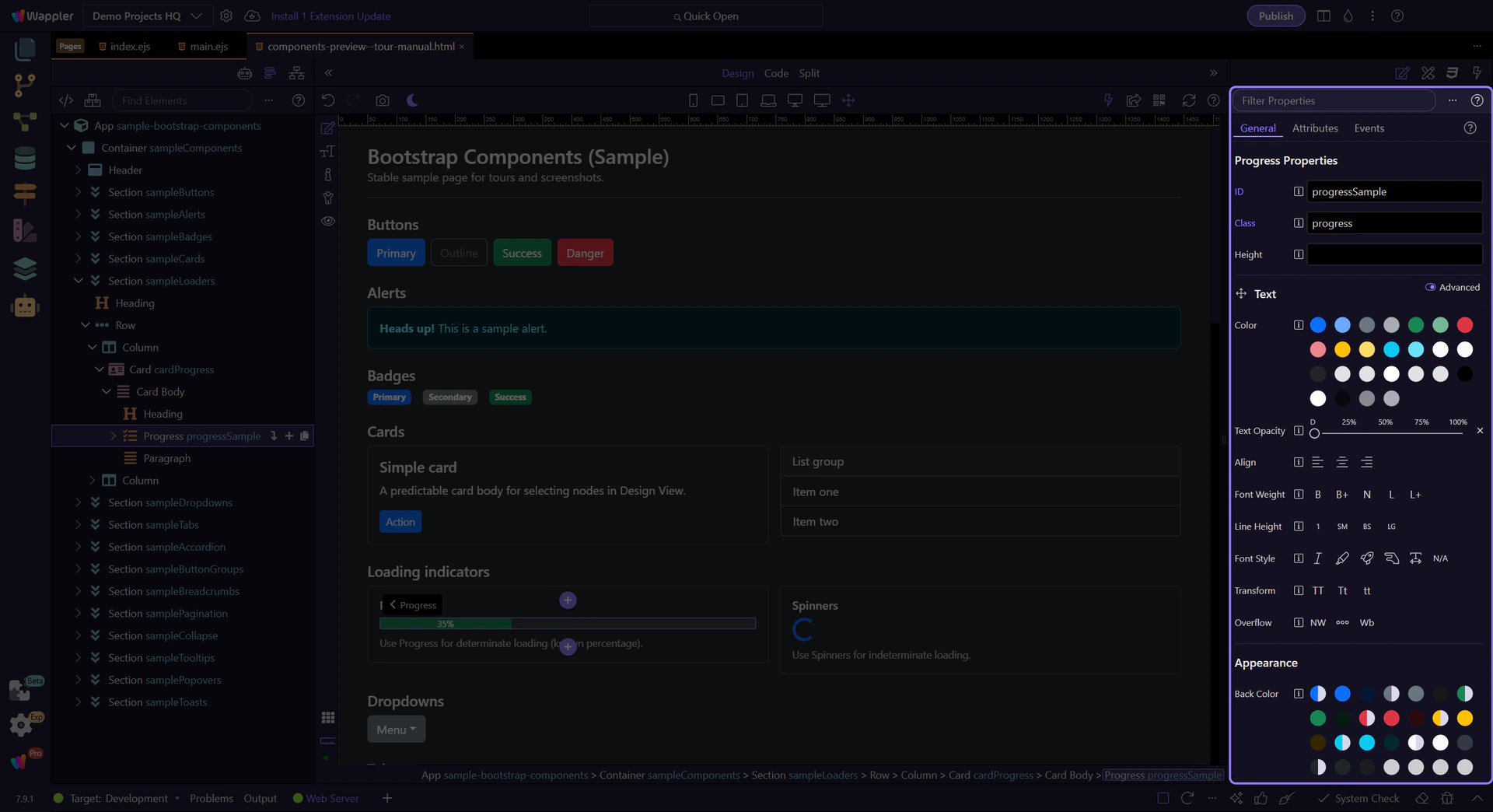
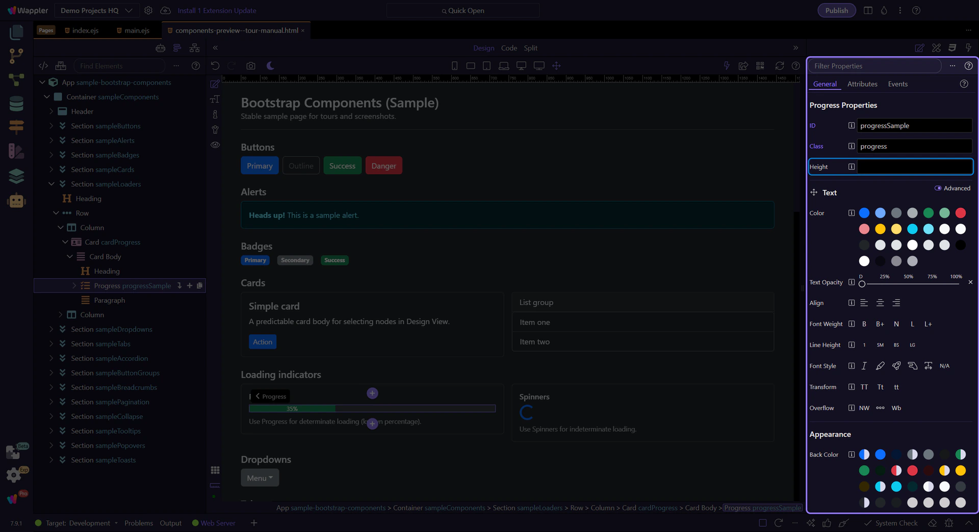
Progress: Height
Use Height to make thicker or thinner progress bars. This step matters because Progress: Height is part of Selection Panels Properties Progressheight, and understanding that context makes the next action easier to repeat in your own project.
Progress bar element
The inner .progress-bar element controls the fill amount and variant styling. This step matters because Progress bar element is part of Design View, and understanding that context makes the next action easier to repeat in your own project.
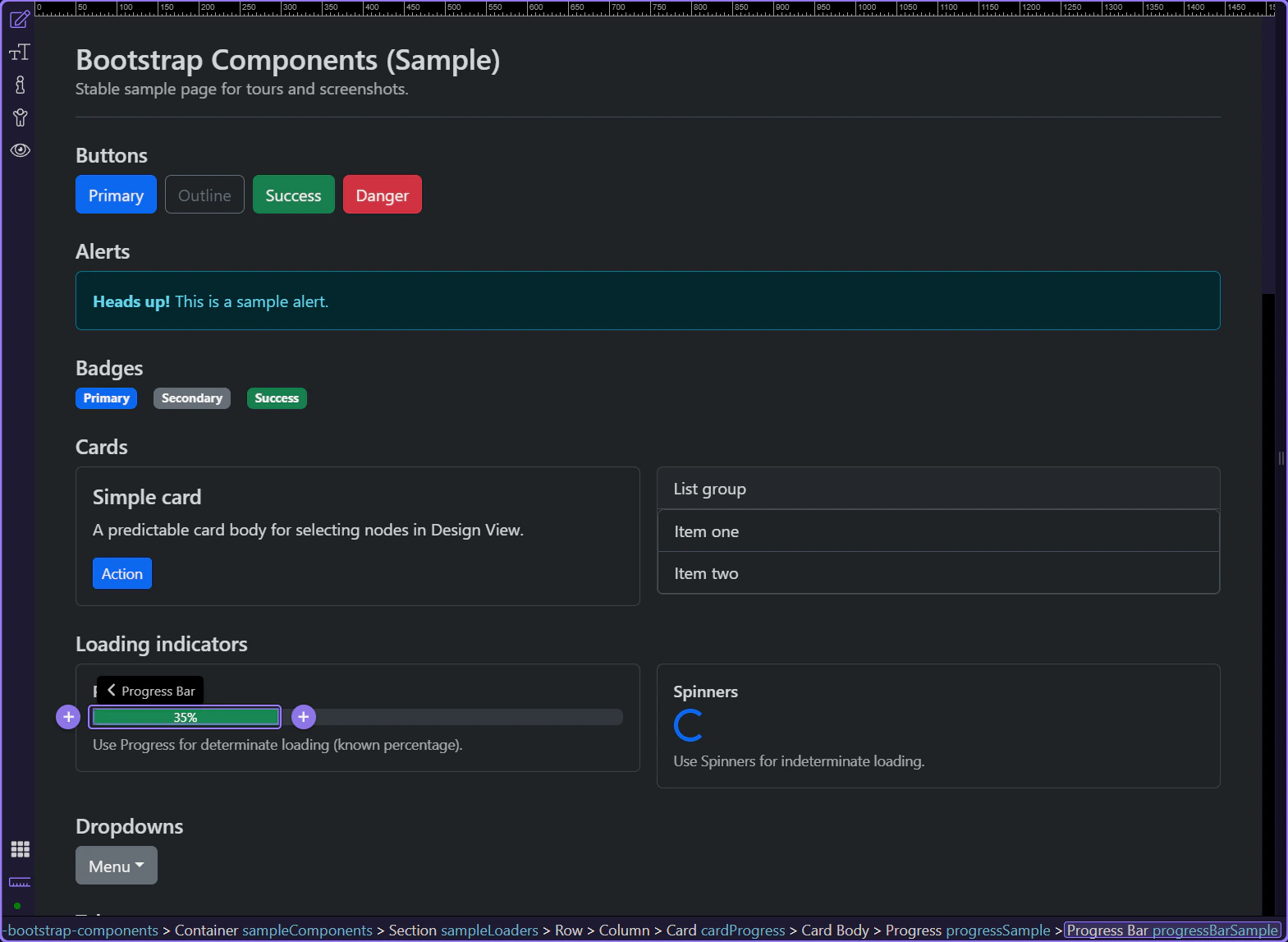
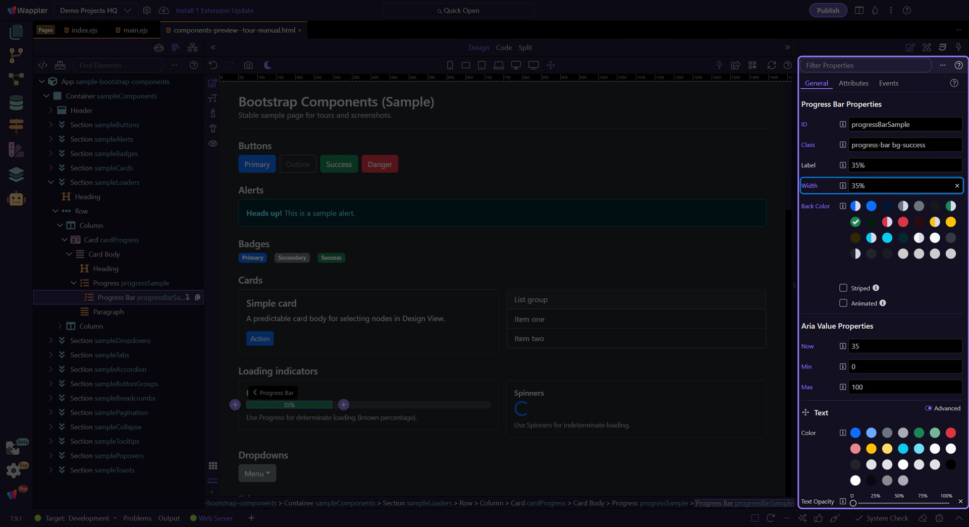
Progress Bar: Width
Set Width to control the percentage fill. In production, you’ll typically bind this to data.
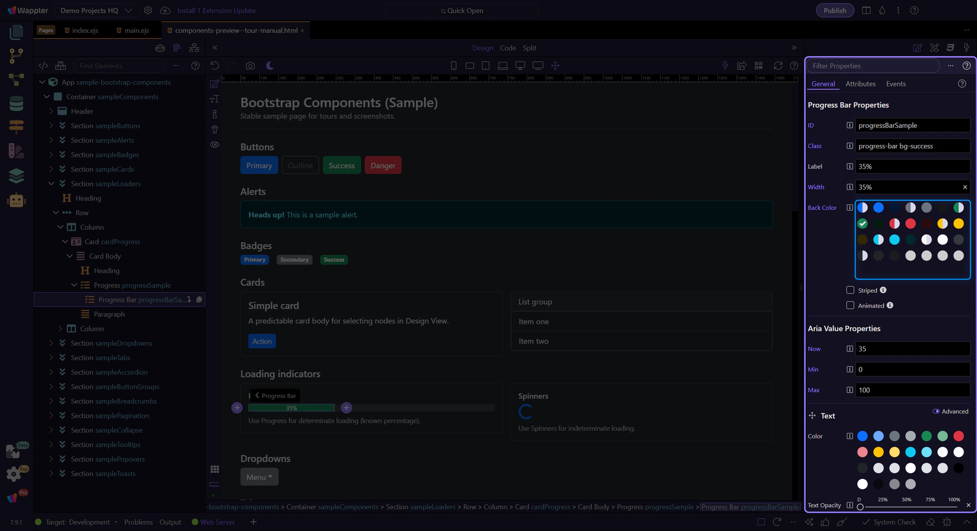
Progress Bar: Background
Use Back Color to set the bar’s color variant. This step matters because Progress Bar: Background is part of Selection Panels Properties Progressbarelementcolor, and understanding that context makes the next action easier to repeat in your own project.
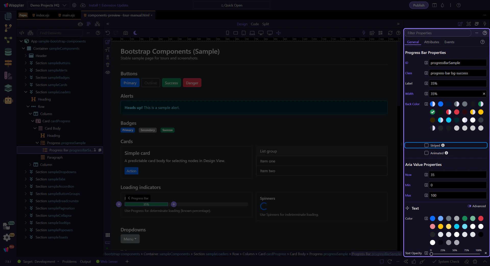
Progress Bar: Striped & animated
Use Striped and Animated for visual emphasis during long operations. This step matters because Progress Bar: Striped & animated is part of Selection Panels Properties Progressbarstriped, and understanding that context makes the next action easier to repeat in your own project.
Spinners
Spinners are best when you don’t know the percentage (indeterminate loading).
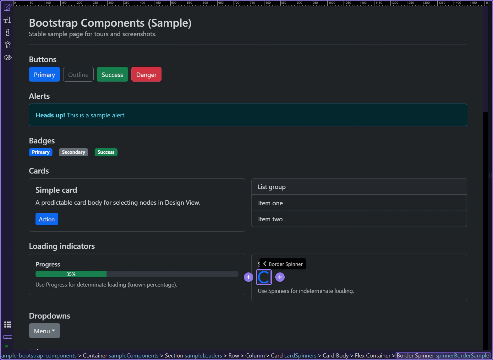
Border spinner
Border spinners are a compact indicator for indeterminate loading. This step matters because Border spinner is part of Design View, and understanding that context makes the next action easier to repeat in your own project.
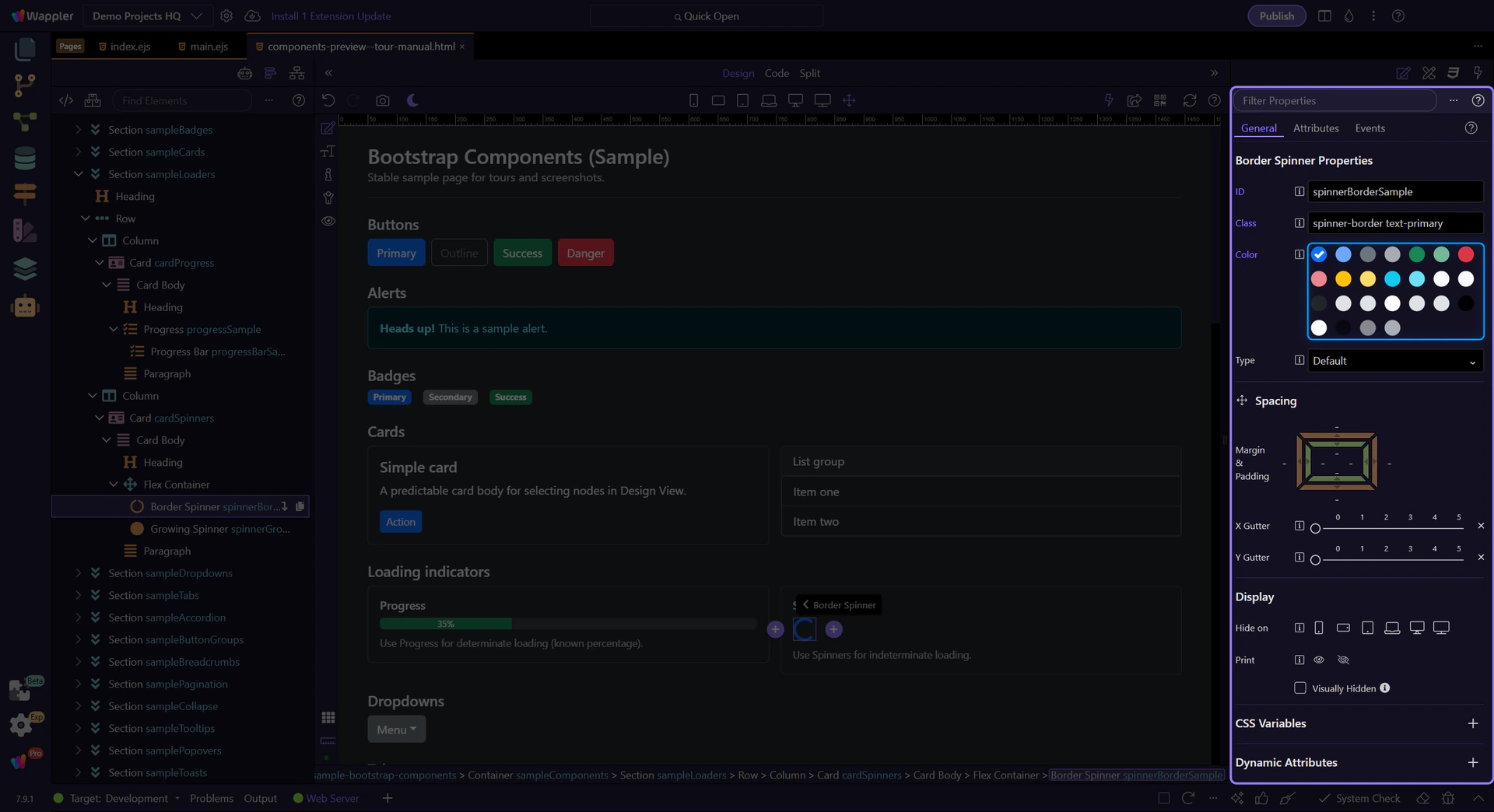
Spinner: Color
Use Color to set the spinner variant. This step matters because Spinner: Color is part of Selection Panels Properties Spinnerelementcolor, and understanding that context makes the next action easier to repeat in your own project.
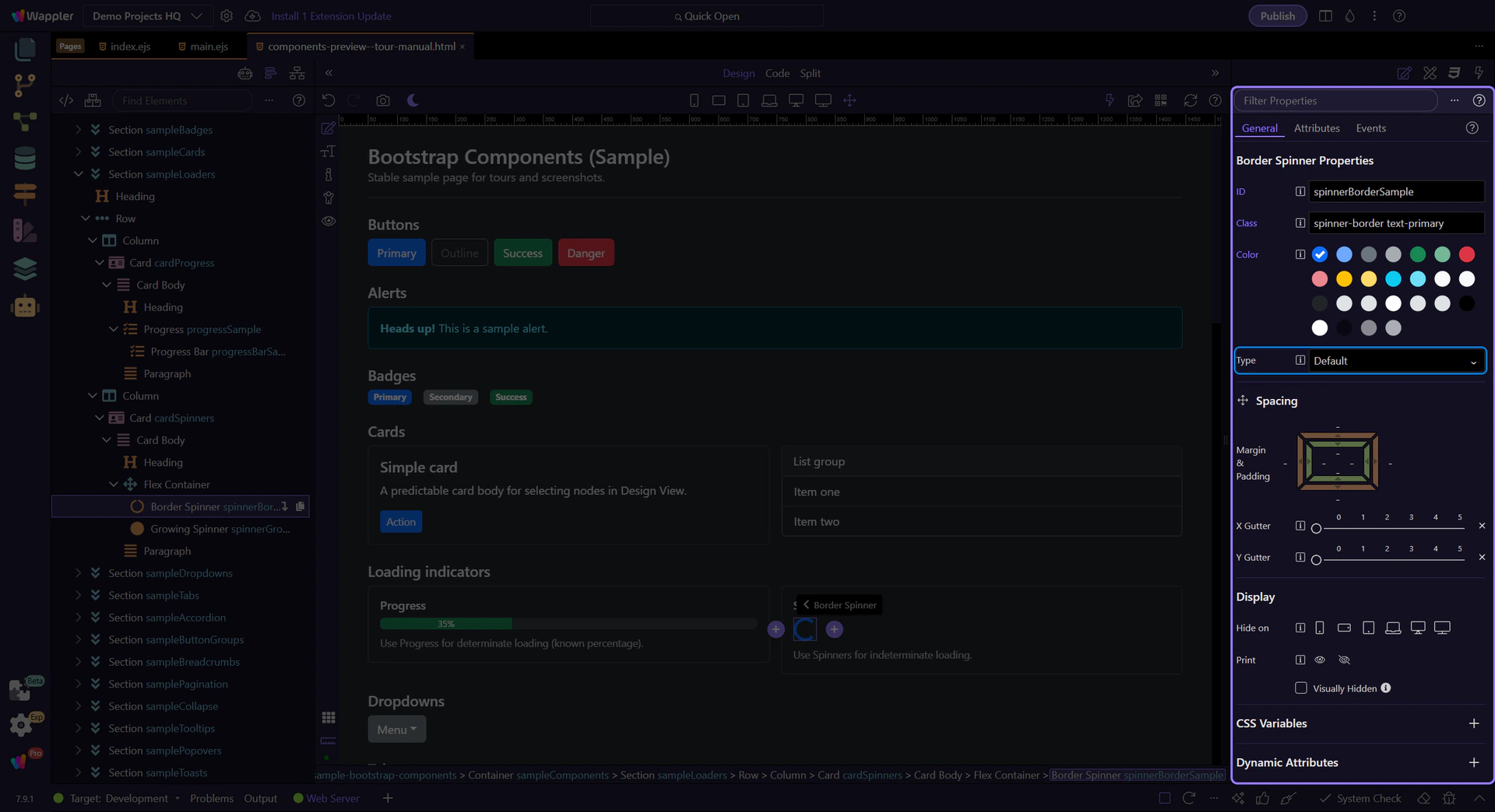
Spinner: Size
Use Type to switch between default and small sizes. This step matters because Spinner: Size is part of Selection Panels Properties Spinnertype, and understanding that context makes the next action easier to repeat in your own project.
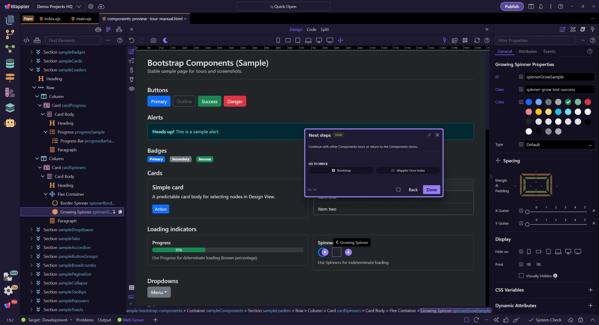
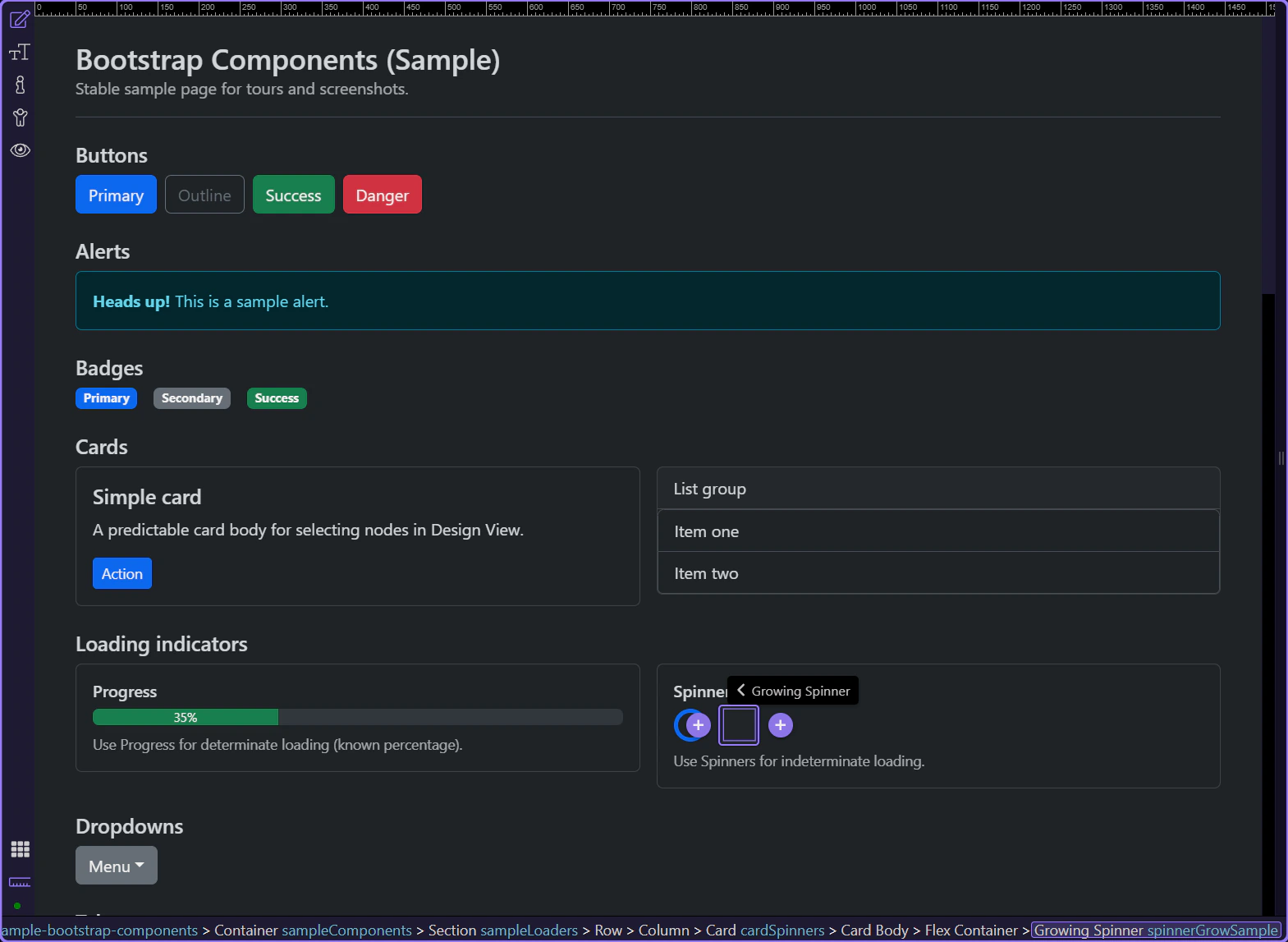
Growing spinner
Growing spinners are a softer, pulsing alternative to border spinners. This step matters because Growing spinner is part of Design View, and understanding that context makes the next action easier to repeat in your own project.
Next steps
Continue with other Components tours or return to the Components menu.