Tabs
Build tabbed navigation and content panes, including active states and accessibility basics.
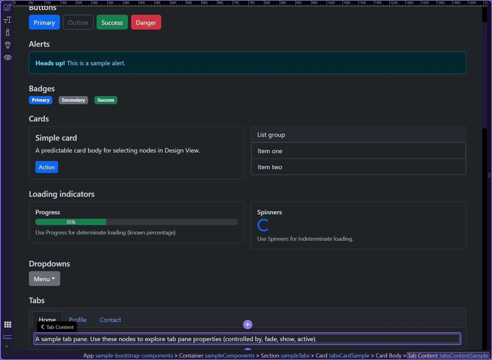
Tab content and panes
A tabbed interface pairs a set of tab buttons with related content panes so users can switch context without leaving the page. In this tour, start by understanding the full relationship between the tab list and the panes, because the later properties only make sense once that shared structure is clear.
Tabs example
Tabs help you switch between related content panes without navigating away. This step matters because Tabs example is part of Design View, and understanding that context makes the next action easier to repeat in your own project.
Active tab pane
Each tab button controls a specific pane. Let’s review the active pane options. This step matters because Active tab pane is part of Design View, and understanding that context makes the next action easier to repeat in your own project.
Orient yourself in Properties panel
Start with the wider context in the Properties panel so the next control makes sense in the full workflow. In the next step, you will focus on Tab pane: Controlled by and see how it fits into this area.
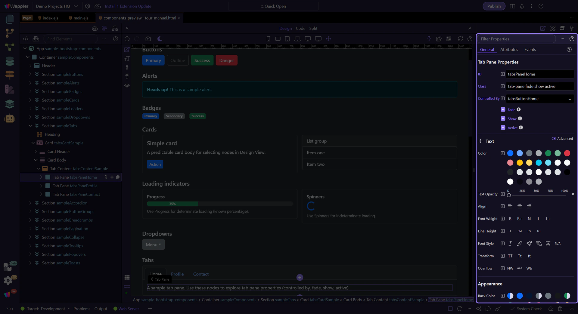
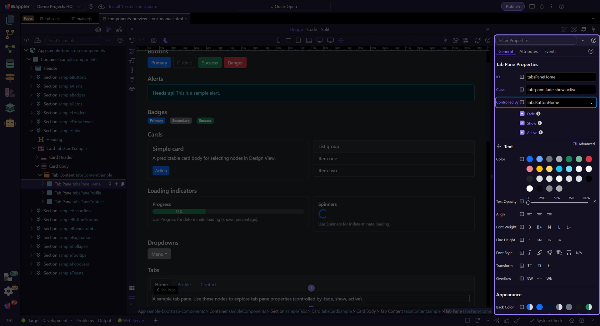
Tab pane: Controlled by
Use Controlled By to link a pane to a specific tab button (by ID). This keeps the ARIA attributes consistent. This step matters because Tab pane: Controlled by is part of Selection Panels Properties Tabpanecontroller, and understanding that context makes the next action easier to repeat in your own project.
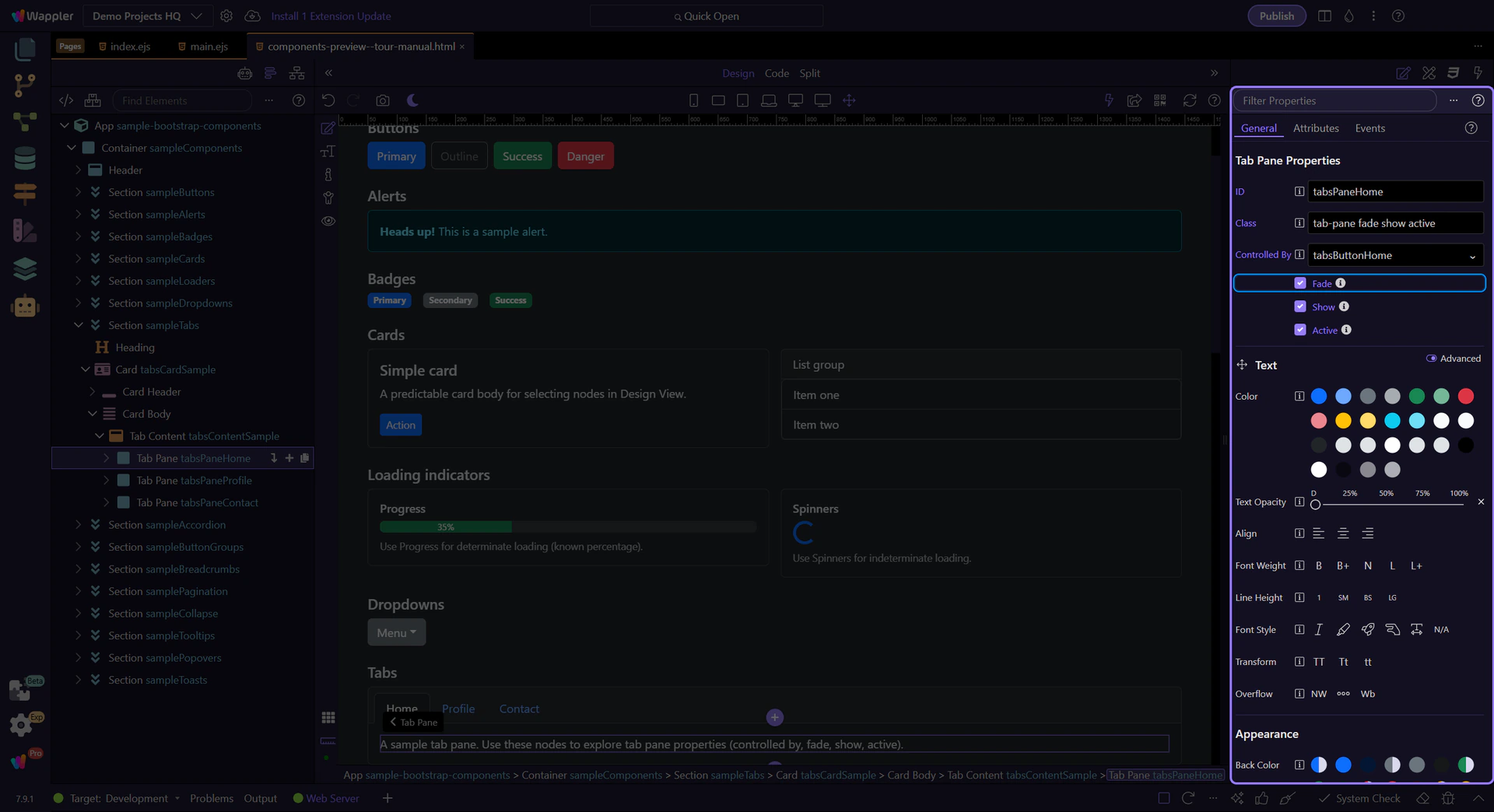
Tab pane: Fade
Enable Fade for a smooth transition effect. This step matters because Tab pane: Fade is part of Selection Panels Properties Tabpanefade, and understanding that context makes the next action easier to repeat in your own project.
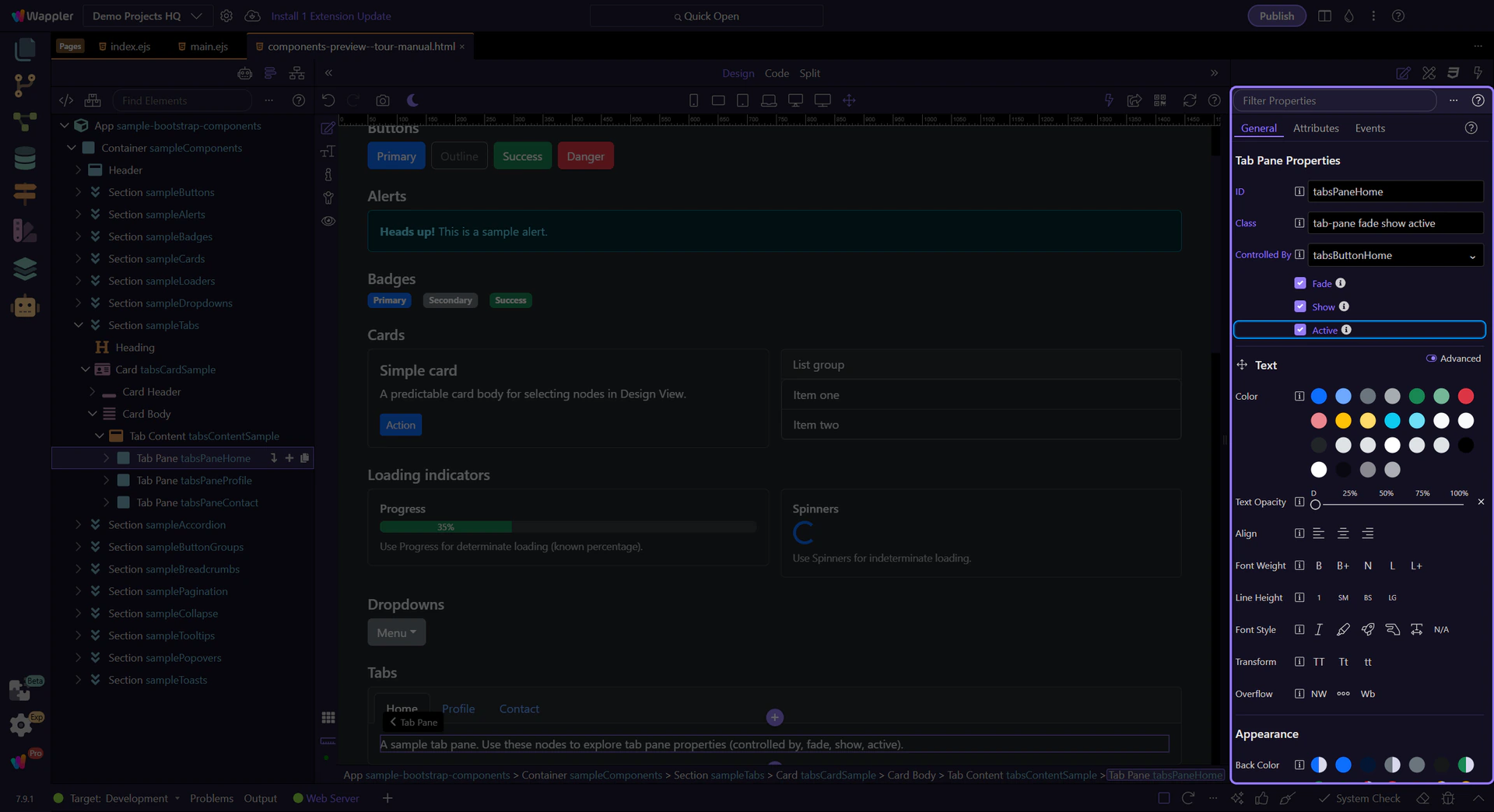
Tab pane: Show and Active
Use Show and Active to control which pane is visible initially. This step matters because Tab pane: Show and Active is part of Selection Panels Properties Tabpaneactive, and understanding that context makes the next action easier to repeat in your own project.
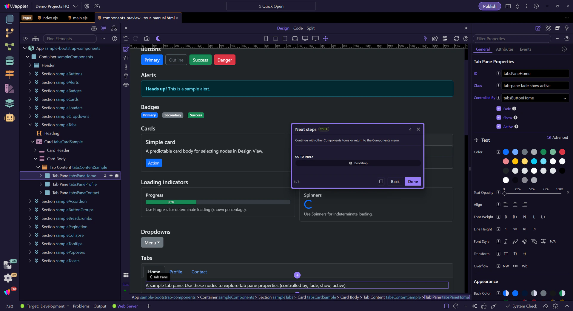
Next steps
Continue with other Components tours or return to the Components menu.