Toasts
Use toasts for non-blocking notifications, including stacking and dismiss behavior.
Toasts container
Toasts are lightweight notifications that appear over the page. In Wappler you usually add a Toasts container once, then trigger toast messages from actions.
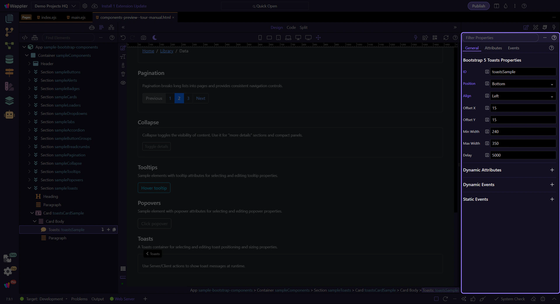
Toasts container
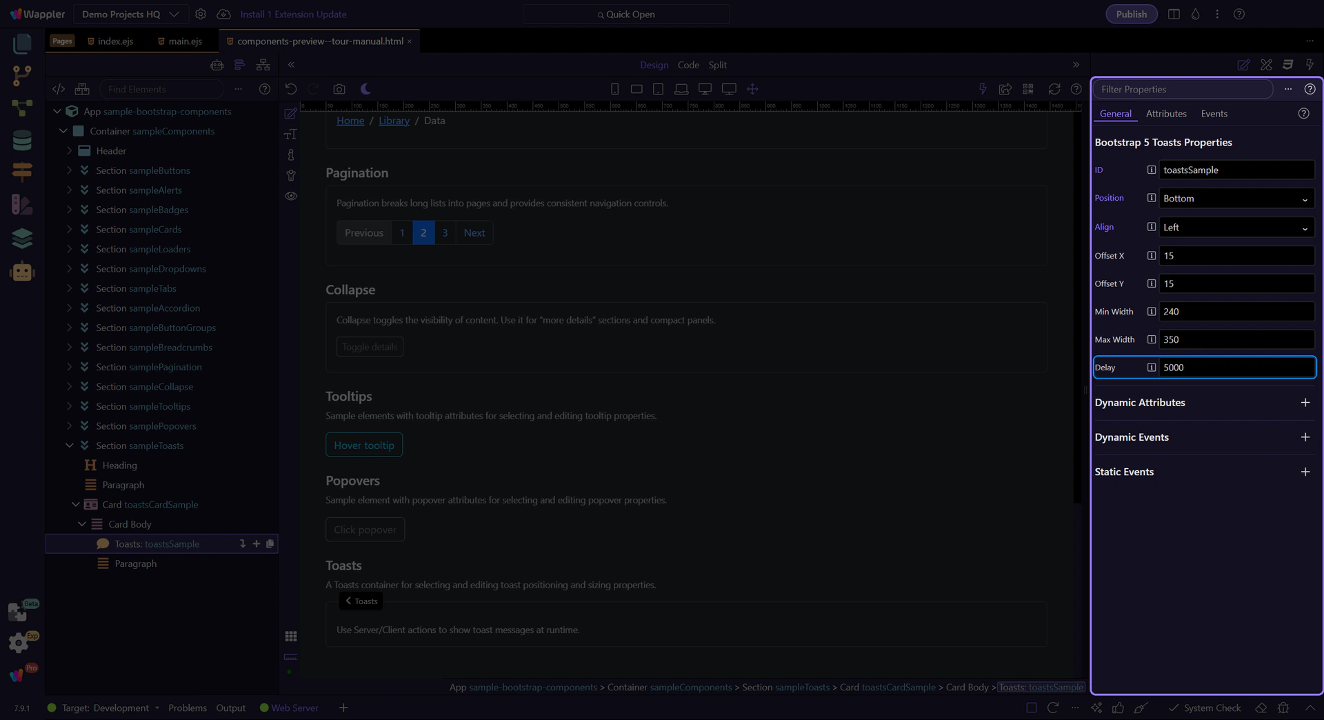
This Toasts container controls where toast messages appear. It is selected so you can review its key properties.
Orient yourself in Properties panel
Start with the wider context in the Properties panel so the next control makes sense in the full workflow. In the next step, you will focus on Toasts: Position and see how it fits into this area.
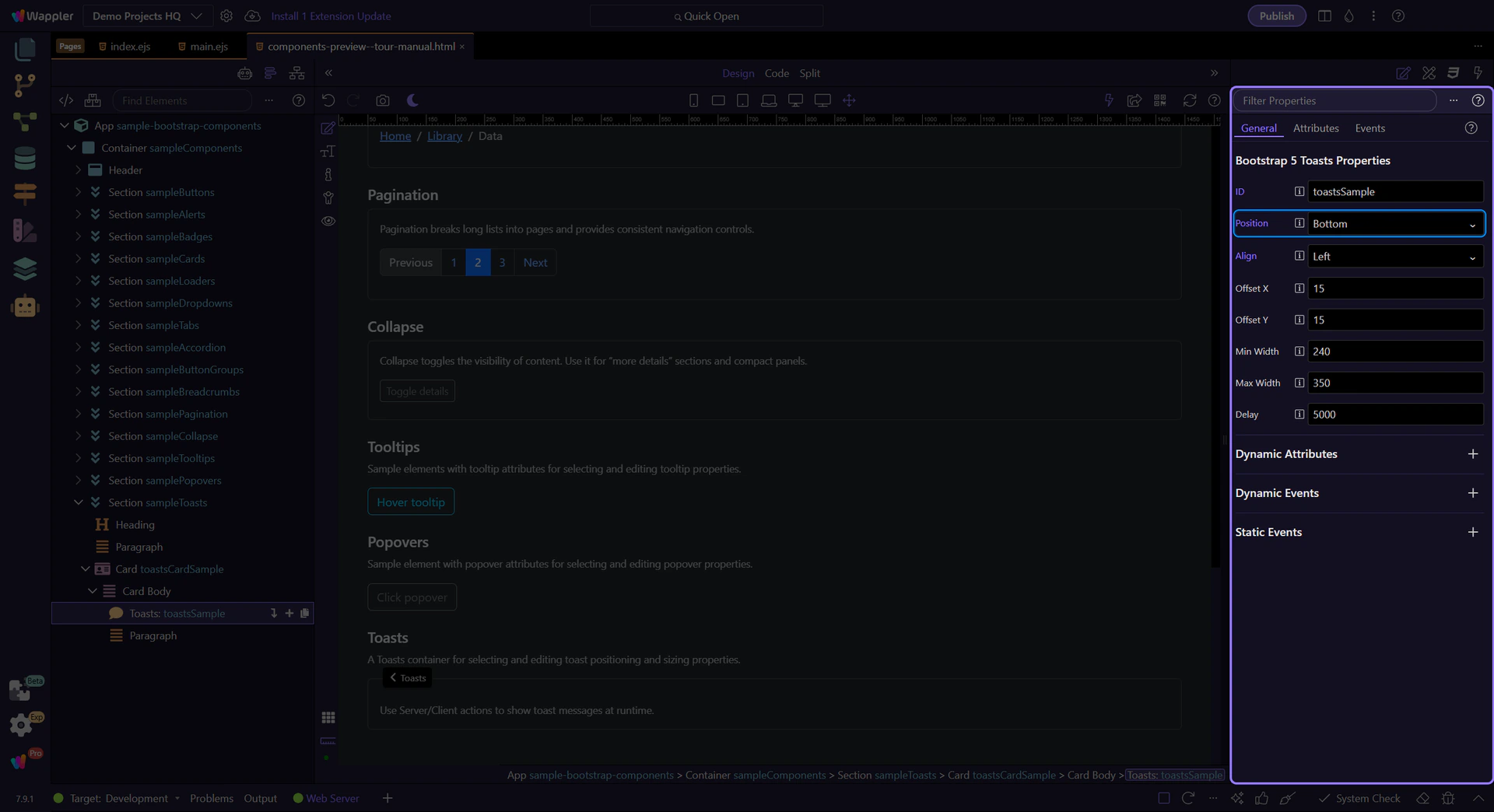
Toasts: Position
Use Position to choose whether toasts appear at the top or bottom edge of the viewport. This step matters because Toasts: Position is part of Selection Panels Properties Toastspos, and understanding that context makes the next action easier to repeat in your own project.
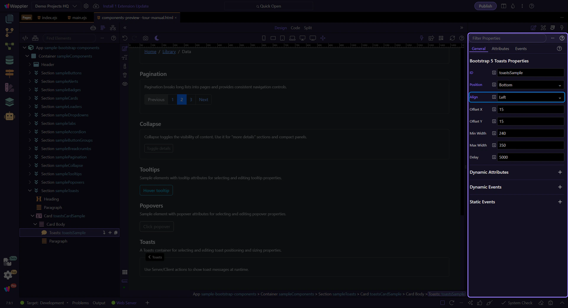
Toasts: Align
Use Align to anchor toasts left or right. This step matters because Toasts: Align is part of Selection Panels Properties Toastsalign, and understanding that context makes the next action easier to repeat in your own project.
Toasts: Offsets
Use Offset X and Offset Y to keep toasts away from the edges (helpful when you have fixed navbars or safe areas). This step matters because Toasts: Offsets is part of Selection Panels Properties Toastsoffsetx, and understanding that context makes the next action easier to repeat in your own project.

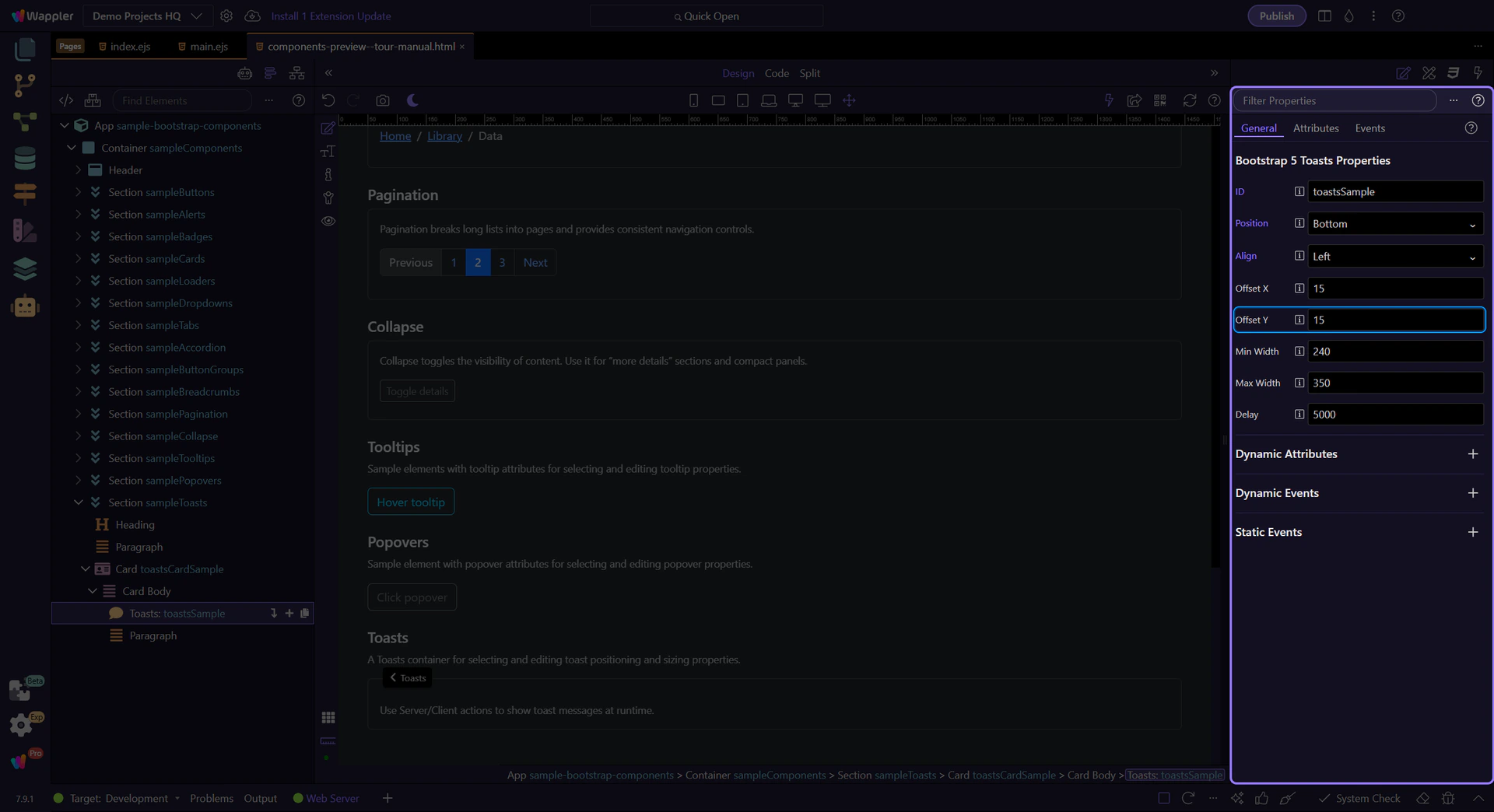
Toasts: Offset Y
Offset Y controls the vertical spacing from the chosen edge. This step matters because Toasts: Offset Y is part of Selection Panels Properties Toastsoffsety, and understanding that context makes the next action easier to repeat in your own project.
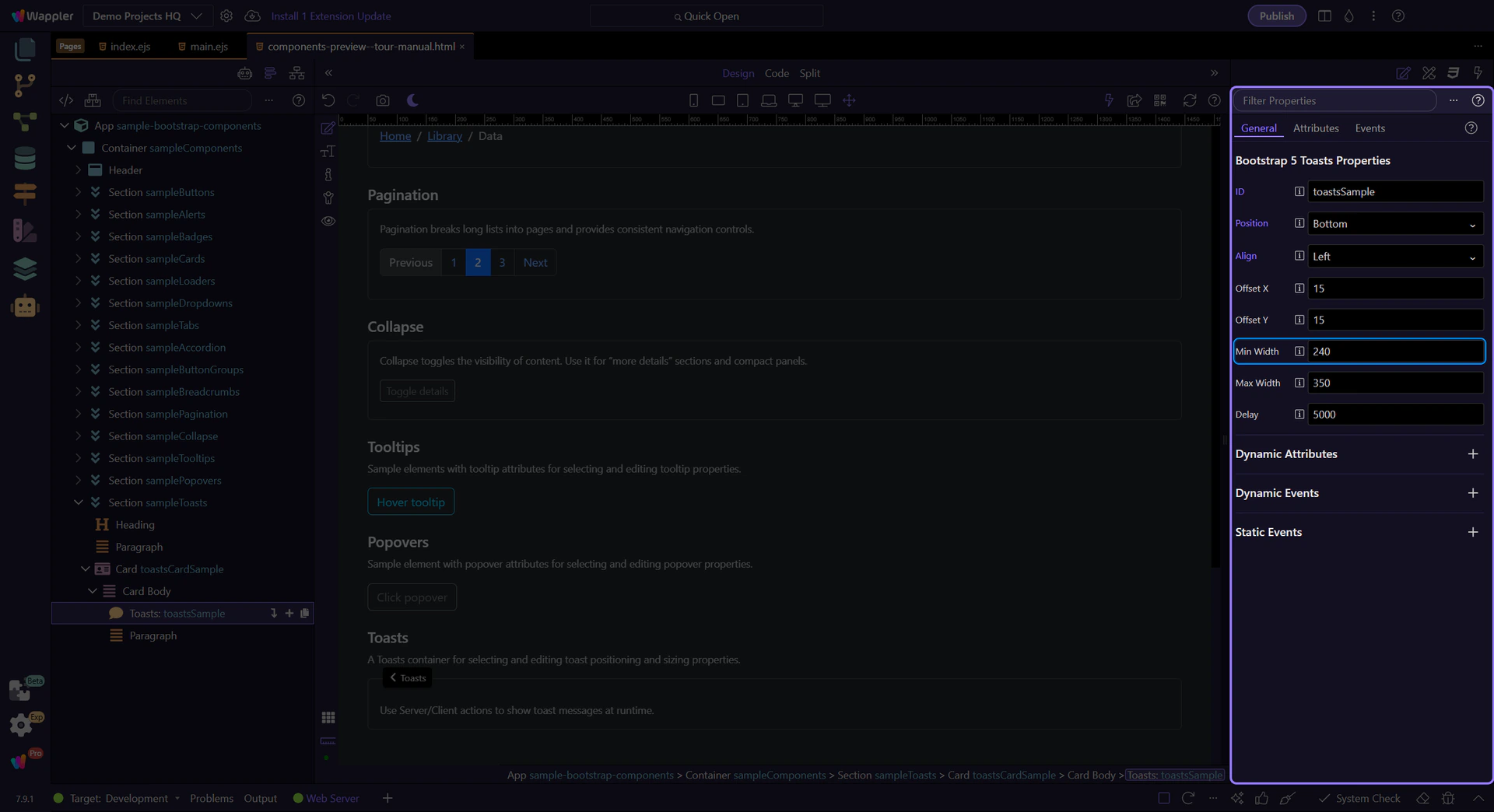
Toasts: Width constraints
Use Min Width and Max Width to keep toast messages readable without covering too much of the UI. This step matters because Toasts: Width constraints is part of Selection Panels Properties Toastsminwidth, and understanding that context makes the next action easier to repeat in your own project.
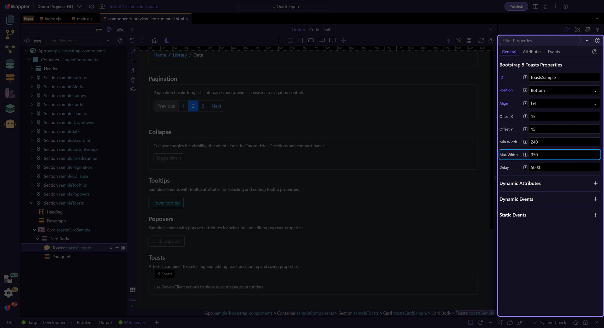
Toasts: Max Width
Max Width caps the toast size for long messages. This step matters because Toasts: Max Width is part of Selection Panels Properties Toastsmaxwidth, and understanding that context makes the next action easier to repeat in your own project.
Toasts: Delay
Use Delay to control how long a toast stays visible (in milliseconds). This is the default when you trigger toasts from actions.
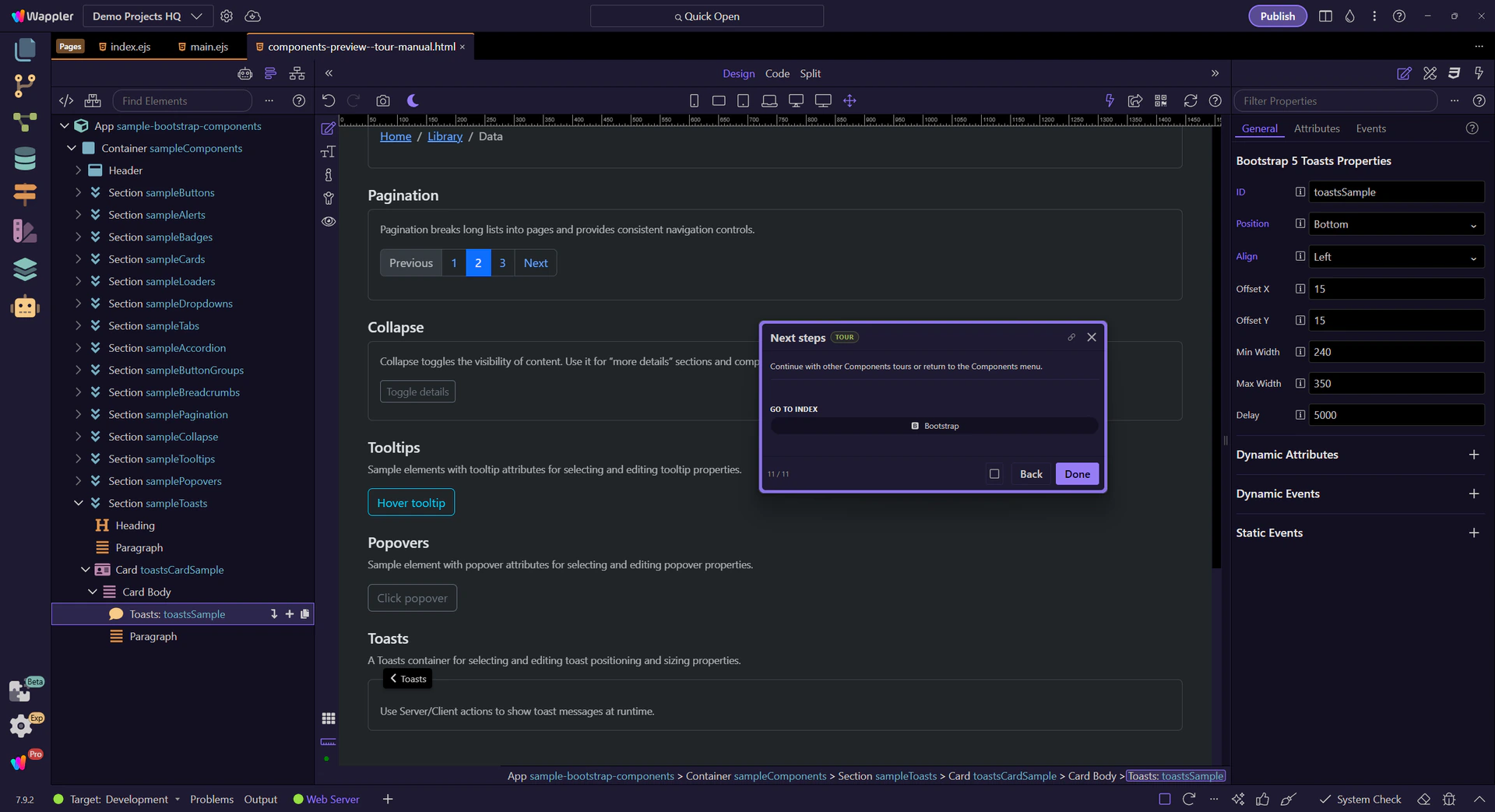
Next steps
Continue with other Components tours or return to the Components menu.