
Tooltips
Tooltips provide compact help text. Learn how to use them in Wappler, including trigger behavior and placement.
Tooltips add short contextual hints. In Wappler you enable a tooltip on an element, then configure its content and behavior from the Properties panel.
Tooltip example
Section titled “Tooltip example”This sample button is selected so you can explore tooltip settings.
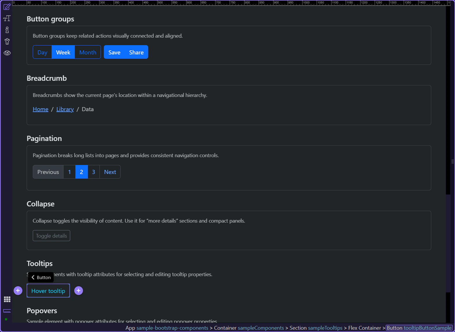
Tooltip: Title
Section titled “Tooltip: Title”Use Title to define what the tooltip shows. It can be plain text or a dynamic data binding.
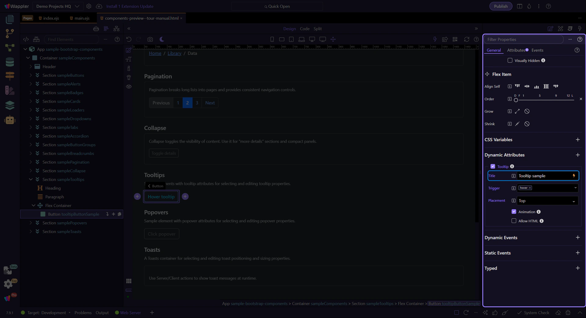
Tooltip: Trigger
Section titled “Tooltip: Trigger”Use Trigger to control when the tooltip appears: hover, click, or focus.
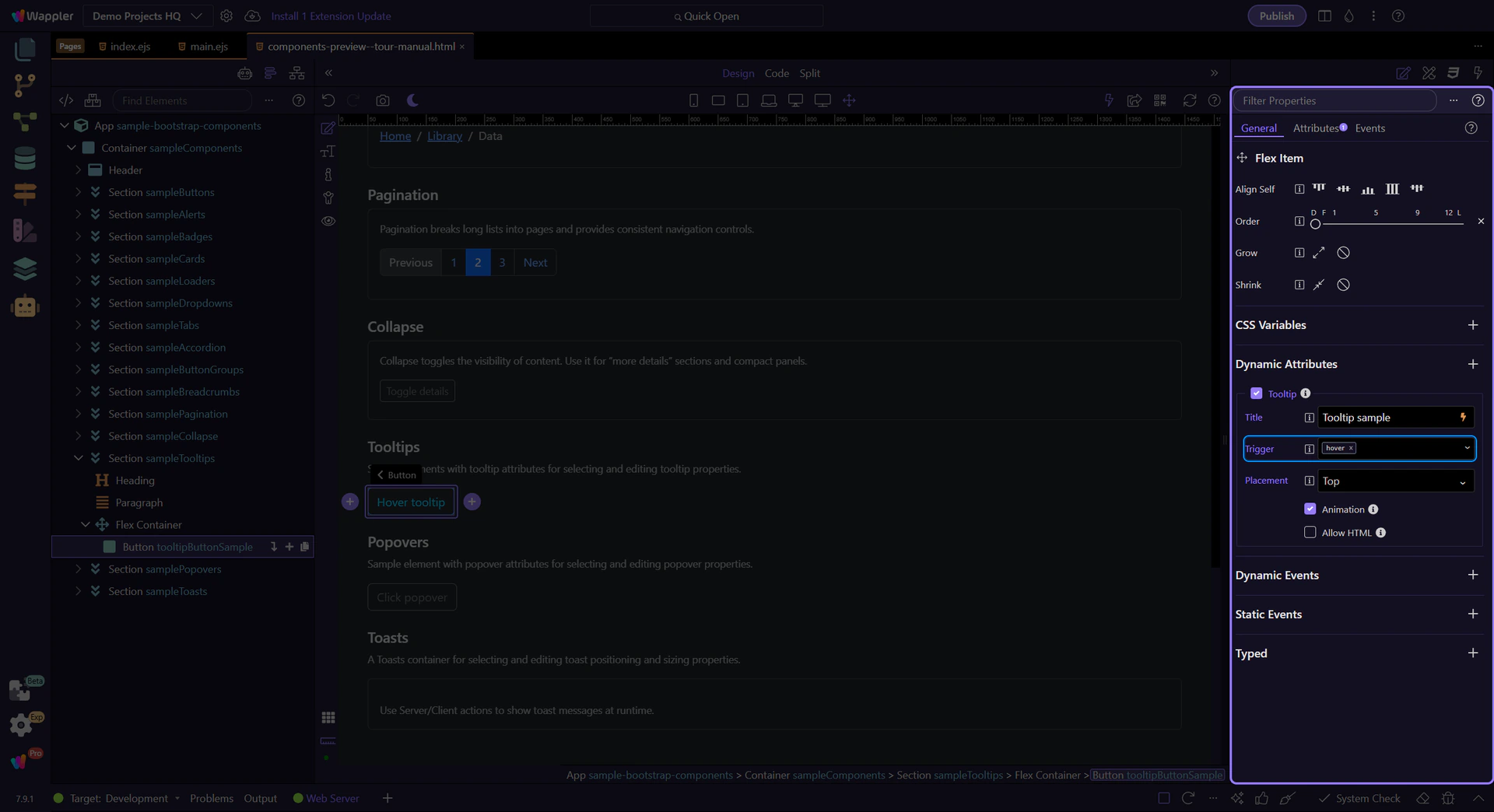
Tooltip: Placement
Section titled “Tooltip: Placement”Use Placement to position the tooltip relative to the element.
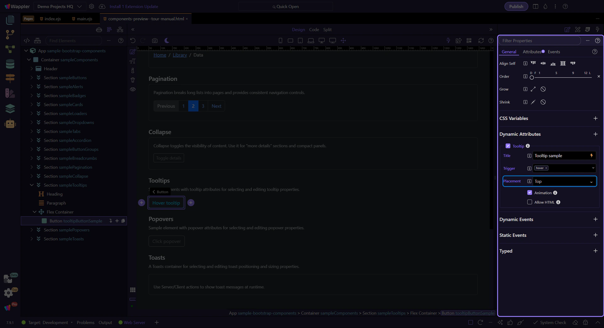
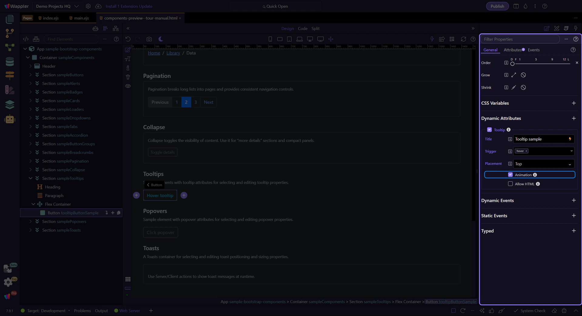
Tooltip: Animation
Section titled “Tooltip: Animation”Use Animation to enable/disable the default Bootstrap animation.
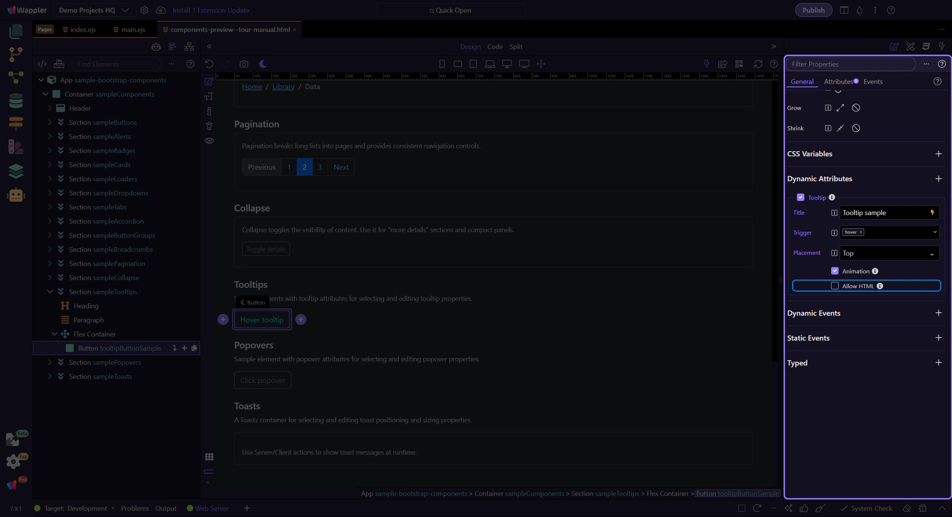
Tooltip: Allow HTML
Section titled “Tooltip: Allow HTML”Use Allow HTML if your tooltip content includes HTML (use carefully; keep it readable).
Next steps
Section titled “Next steps”Continue with other Components tours or return to the Components menu.