
Delay errors until it matters
Show invalid states after interaction (blur/change) or on submit — not immediately on first load.
Build Bootstrap-styled forms with layout helpers and validation feedback, and learn patterns for a smooth form UX.
In this tour we’ll review a few common Bootstrap form controls and the properties you’ll use most often.
Start with the form as a whole instead of jumping straight to individual inputs. This example shows how Bootstrap organizes fields, spacing, and validation-friendly structure, which gives you the context you need before looking at the smaller controls that make the form readable and usable.
tip: Put spacing/layout on the parent container when possible, rather than repeating spacing on every input.
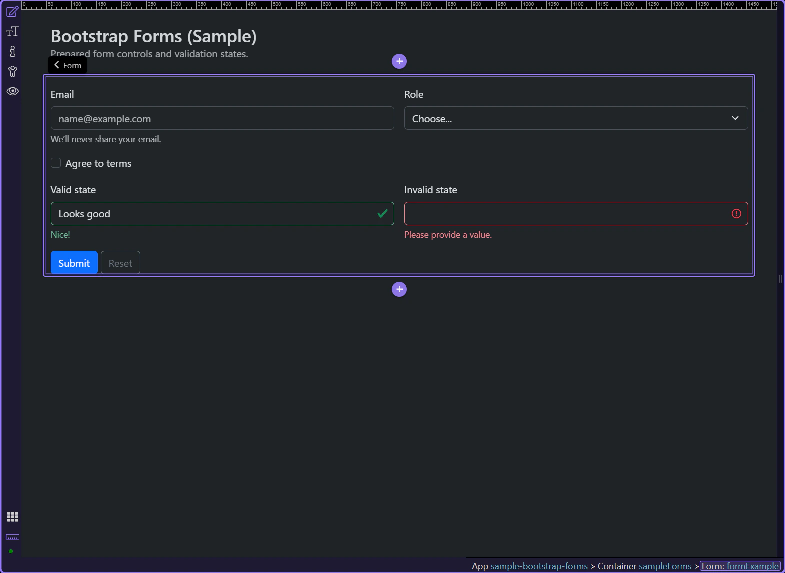
Use the ID input for stable JS hooks and testing.
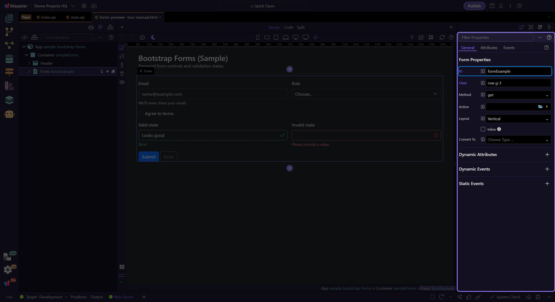
Review Method when you’re doing a classic HTML submit.
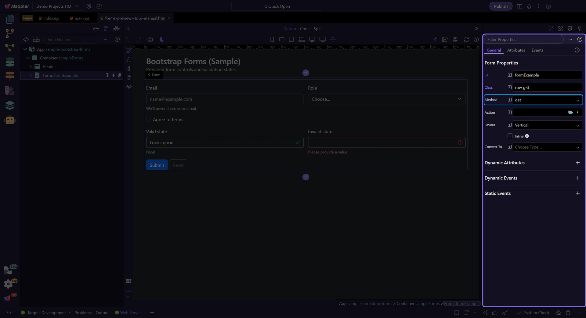
Review Action when you’re submitting to a server endpoint.
Use Layout to switch between vertical, horizontal, and floating labels.
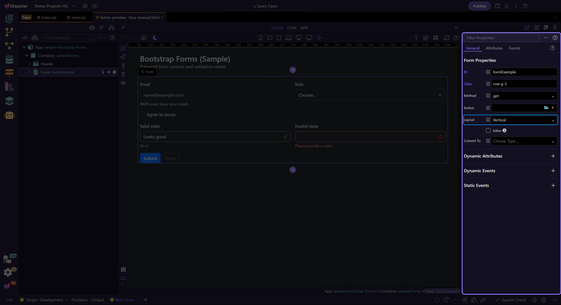
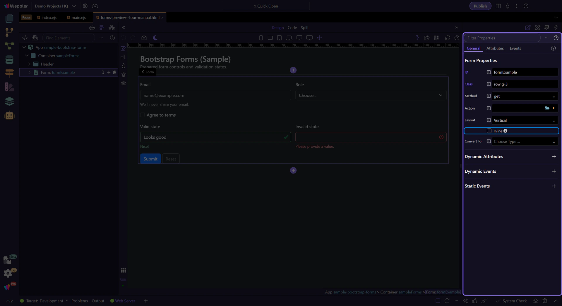
Toggle Inline when you want the form controls to sit on one line.
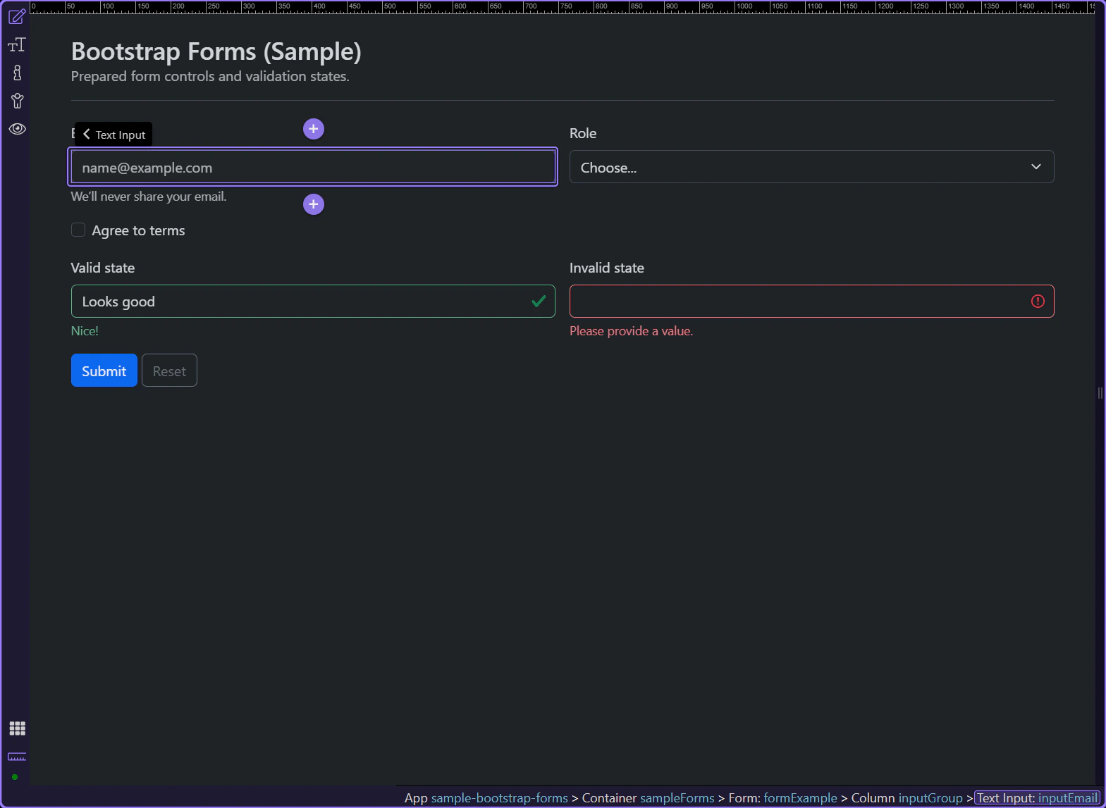
Inputs are primarily configured via attributes (type, placeholder) plus validation settings.
tip: When styling inputs, select the input itself; when adjusting spacing, select the surrounding group/container.
Use ID for stable selection and hooks.
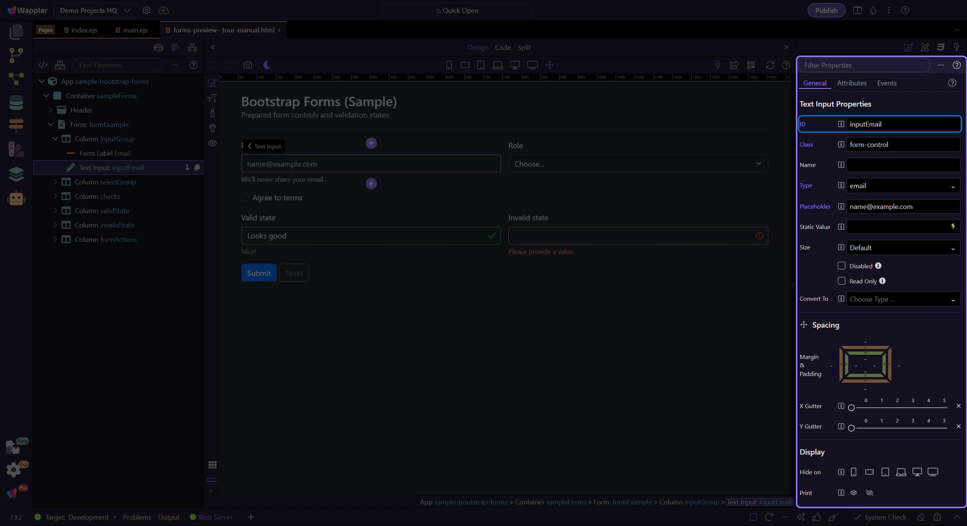
Use Name for form posting and integrations.
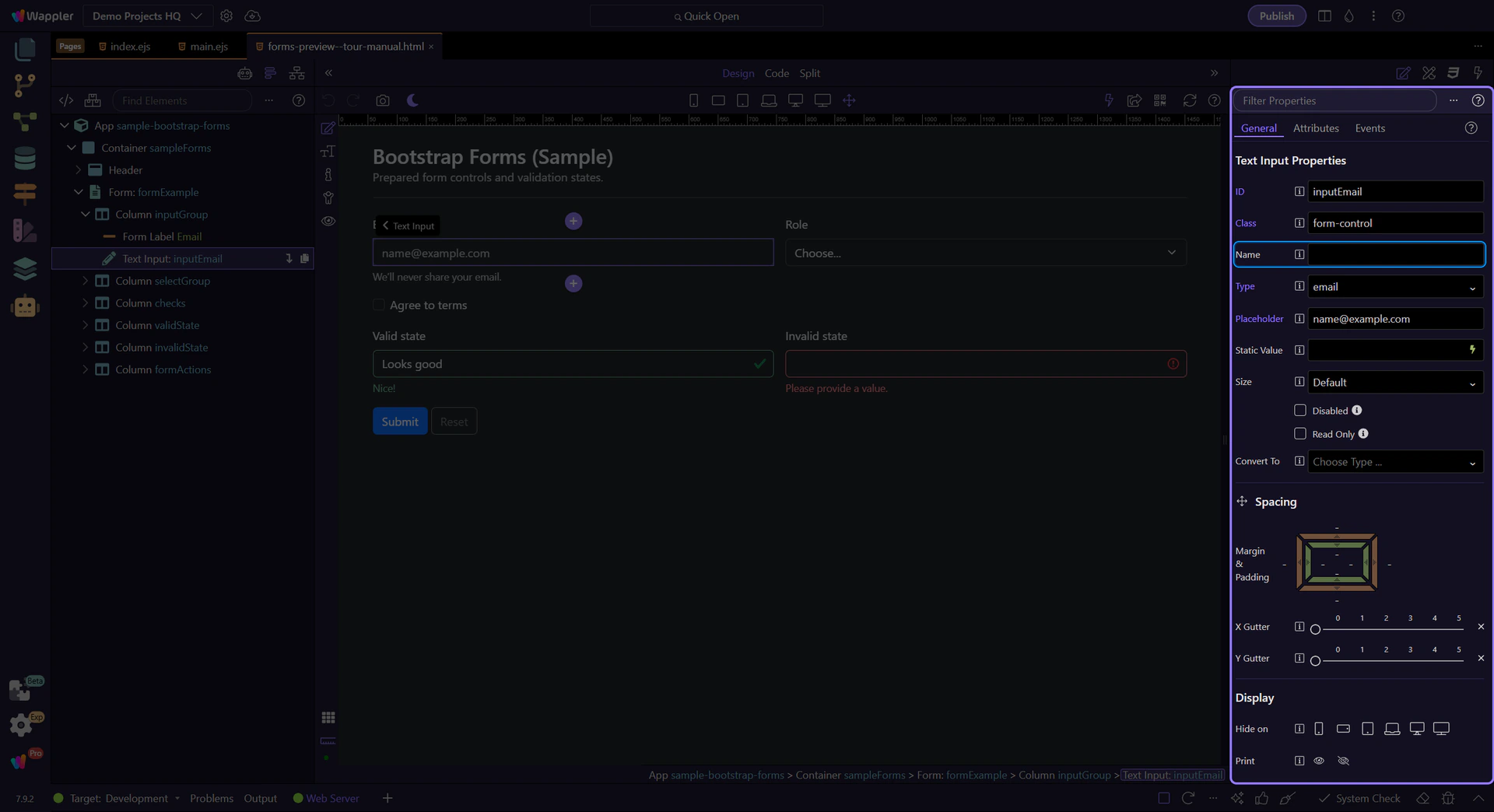
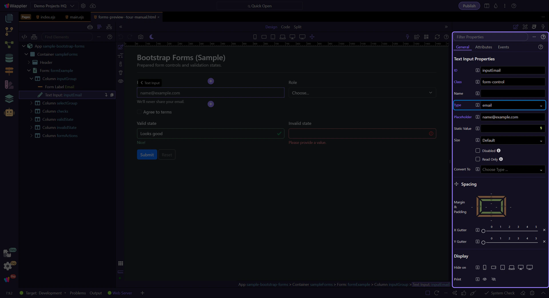
In Properties, set Type (email/password/number/etc).
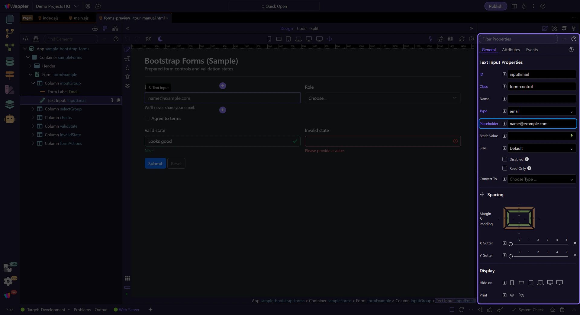
Use Placeholder for hint text.
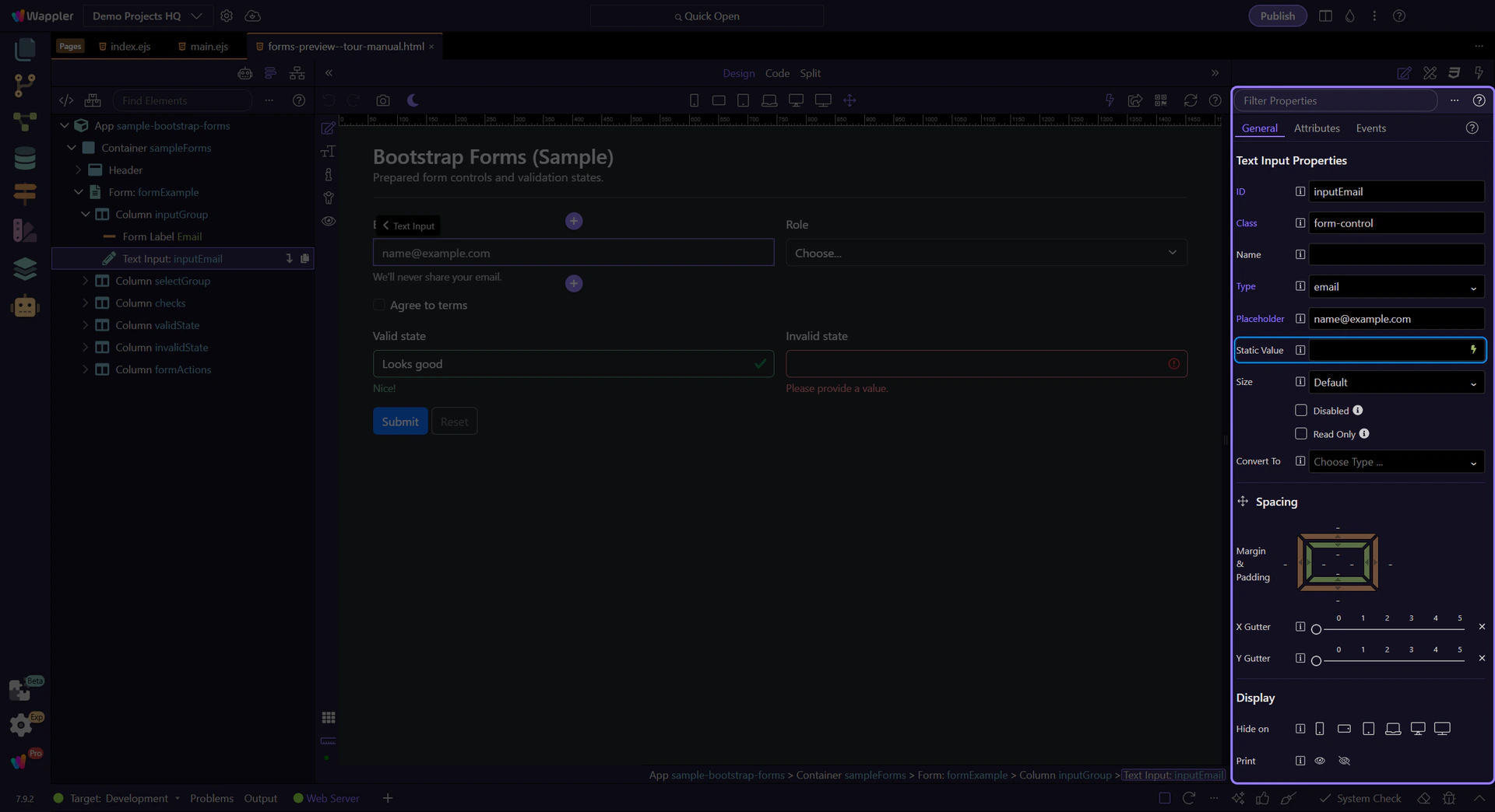
Use Static Value for a default value (when appropriate).
Toggle Disabled when the user shouldn’t be able to edit the field.
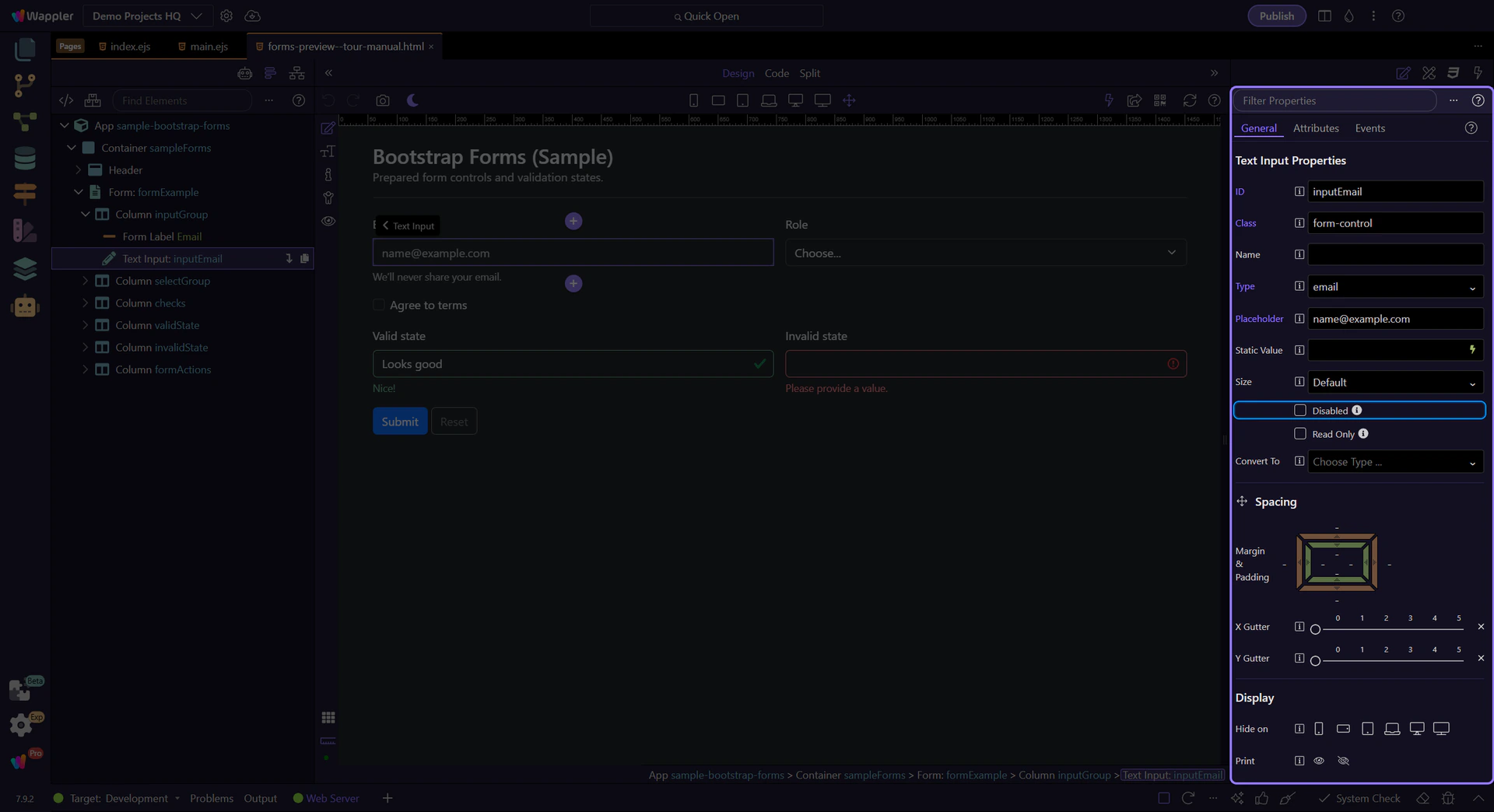
Toggle Read Only when the user can copy but not change the value.
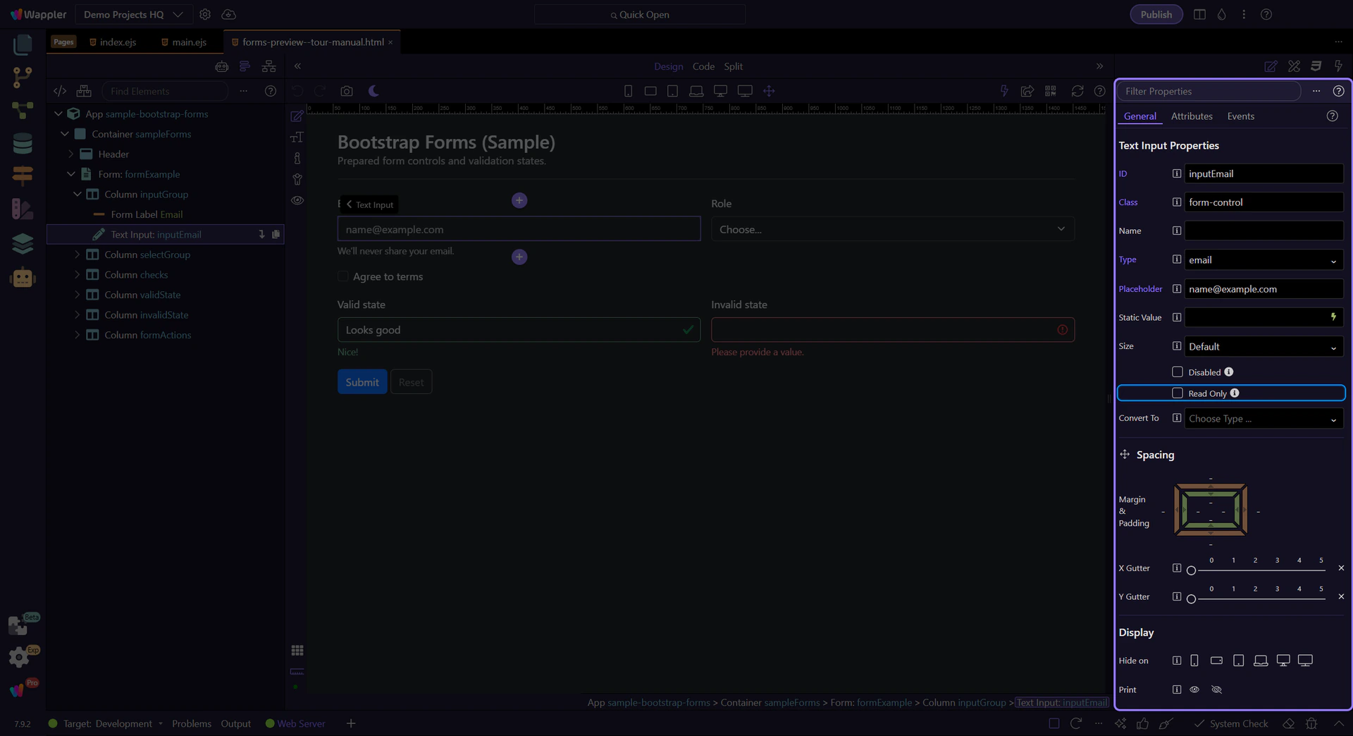
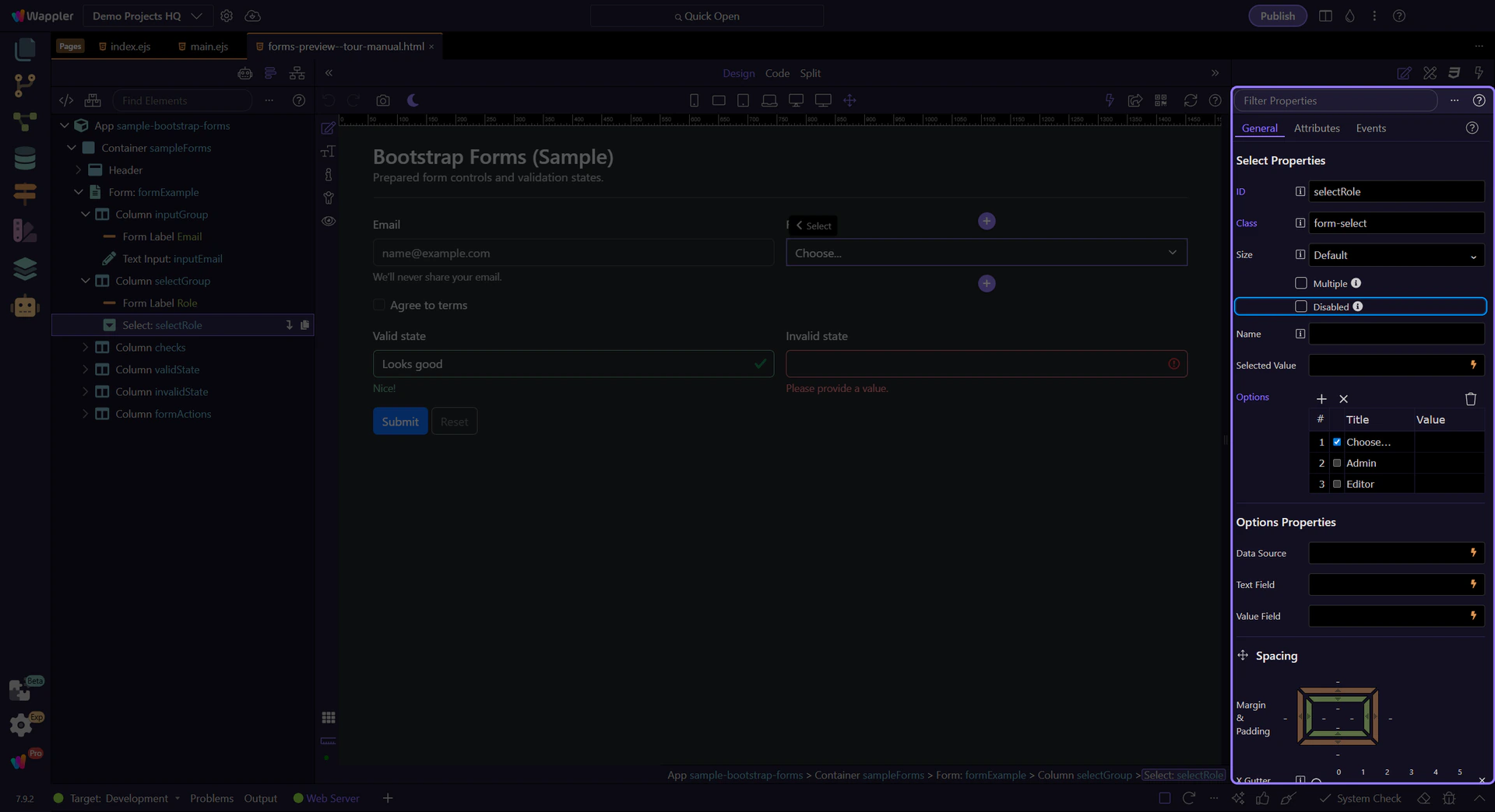
Dropdown (select) controls are great for compact choices. Next, review options like Multiple and Disabled.
tip: Keep option labels clear, and keep option values stable for integrations and testing.
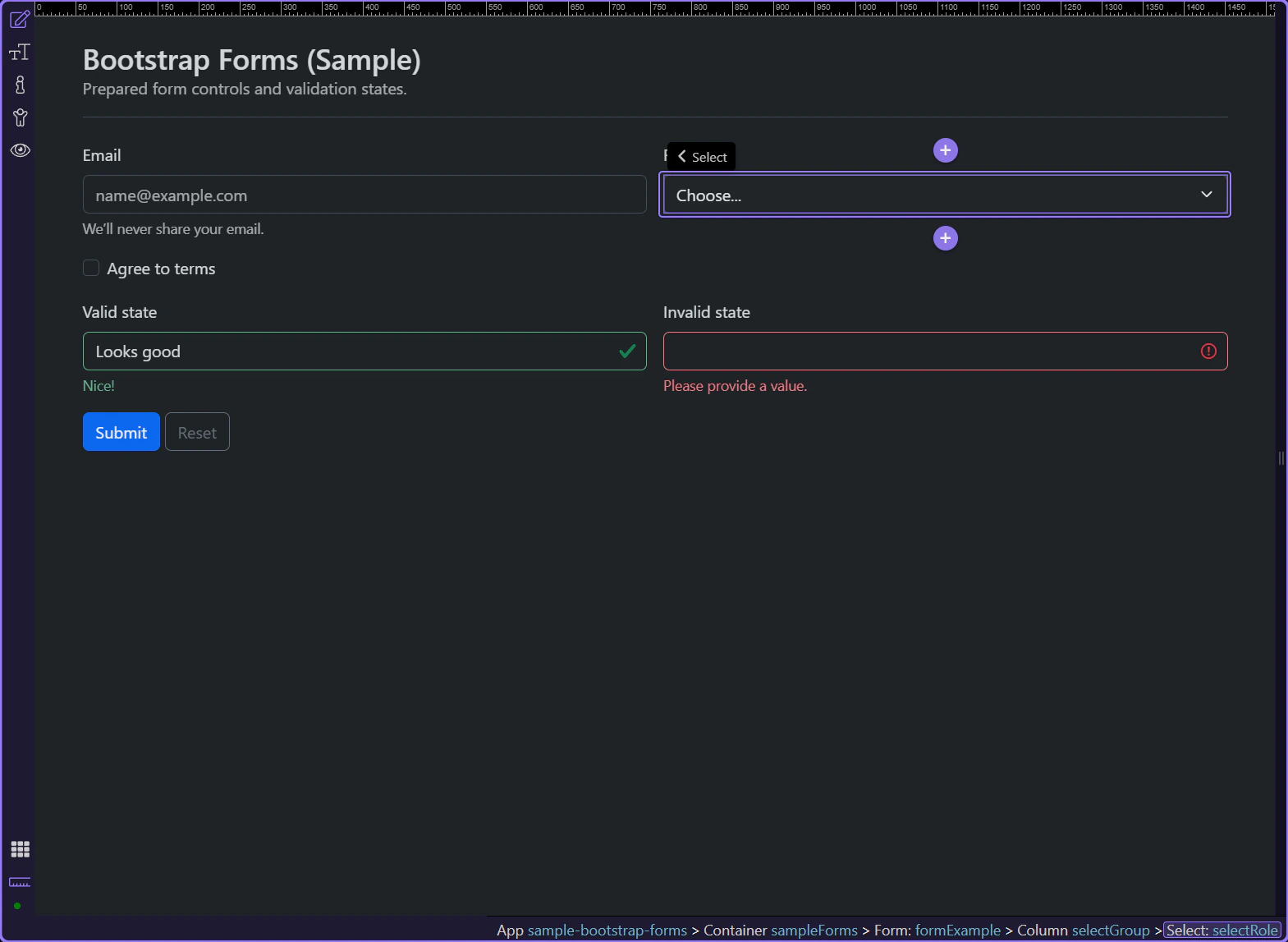
Toggle Multiple when the user should be able to select more than one option.
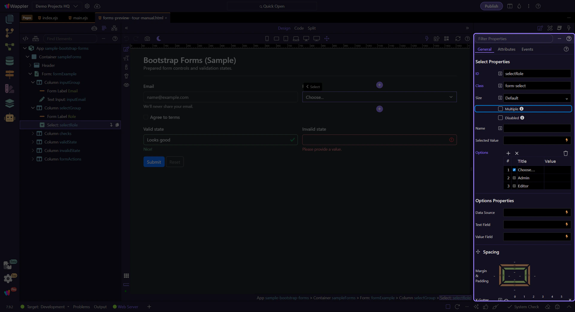
Toggle Disabled to prevent changes.
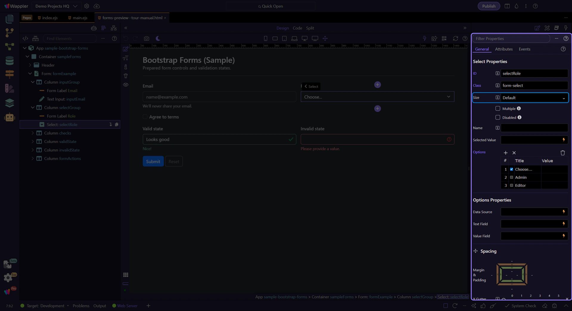
Use Size for a larger/smaller select control.
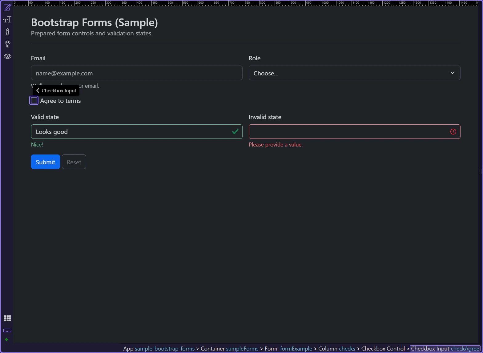
Checkboxes are best for yes/no and independent toggles. Next, review checkbox-specific properties.
Use Name for form posting and integrations.
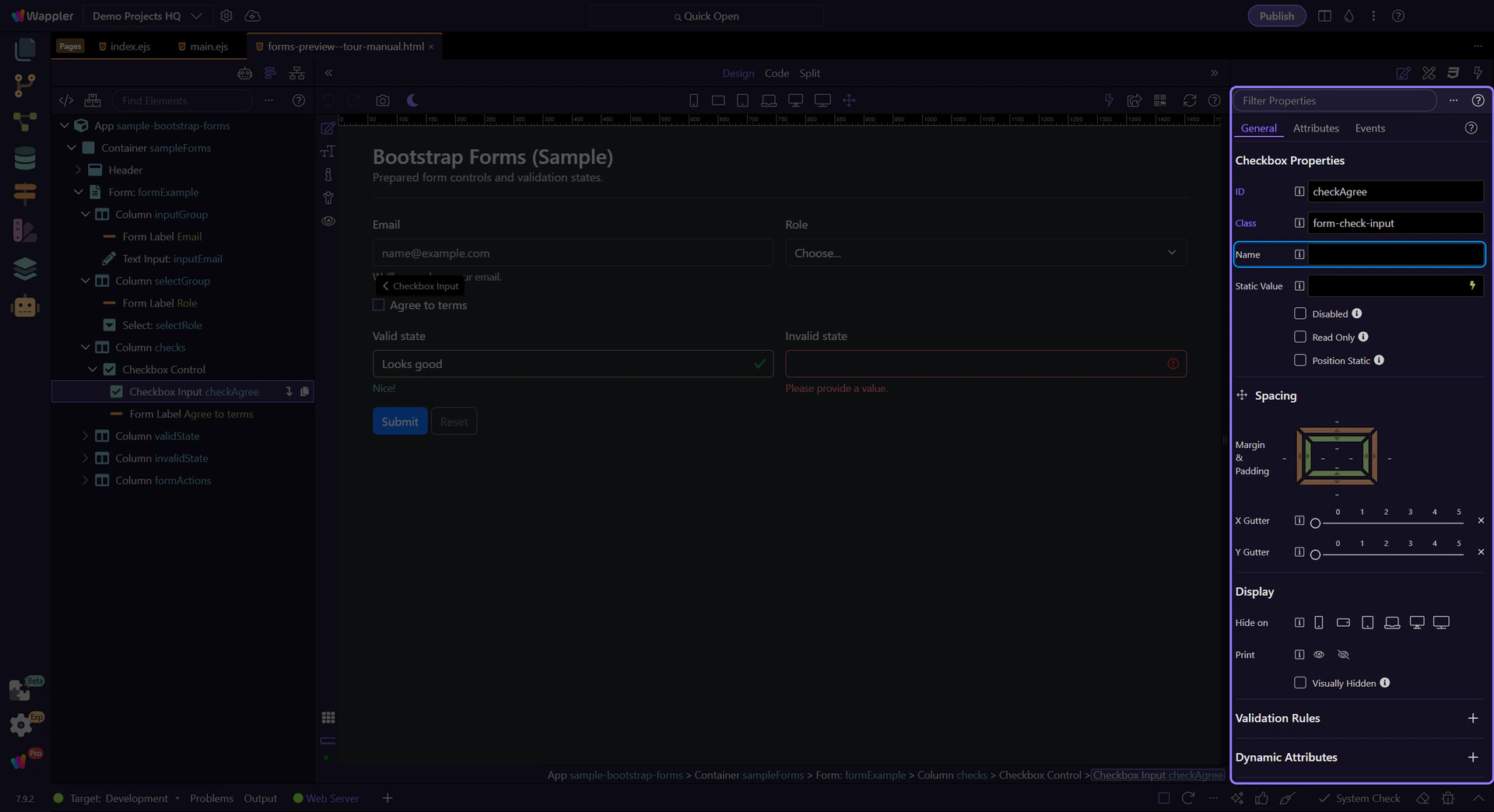
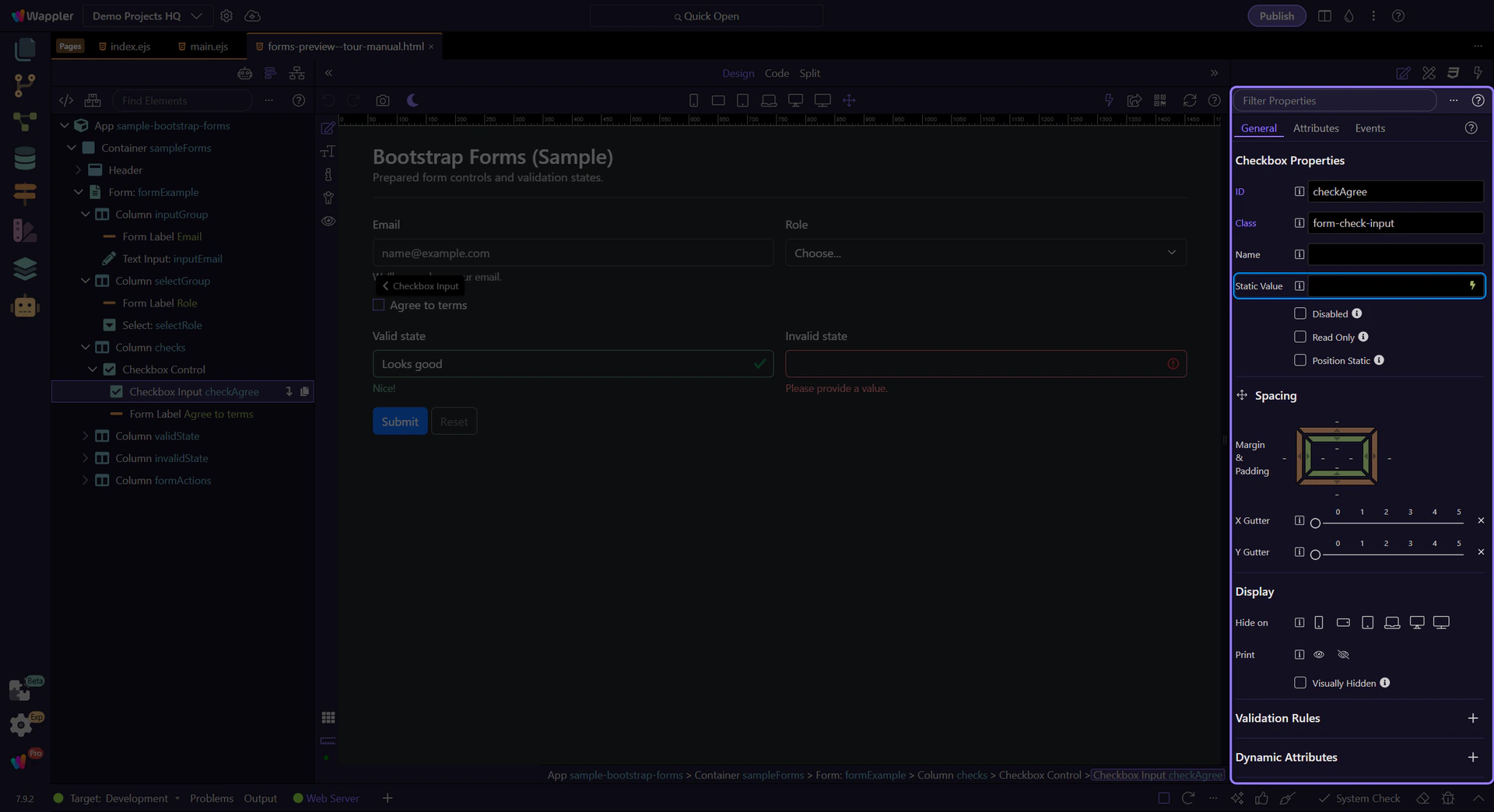
Use Static Value when you need a specific value on submit.
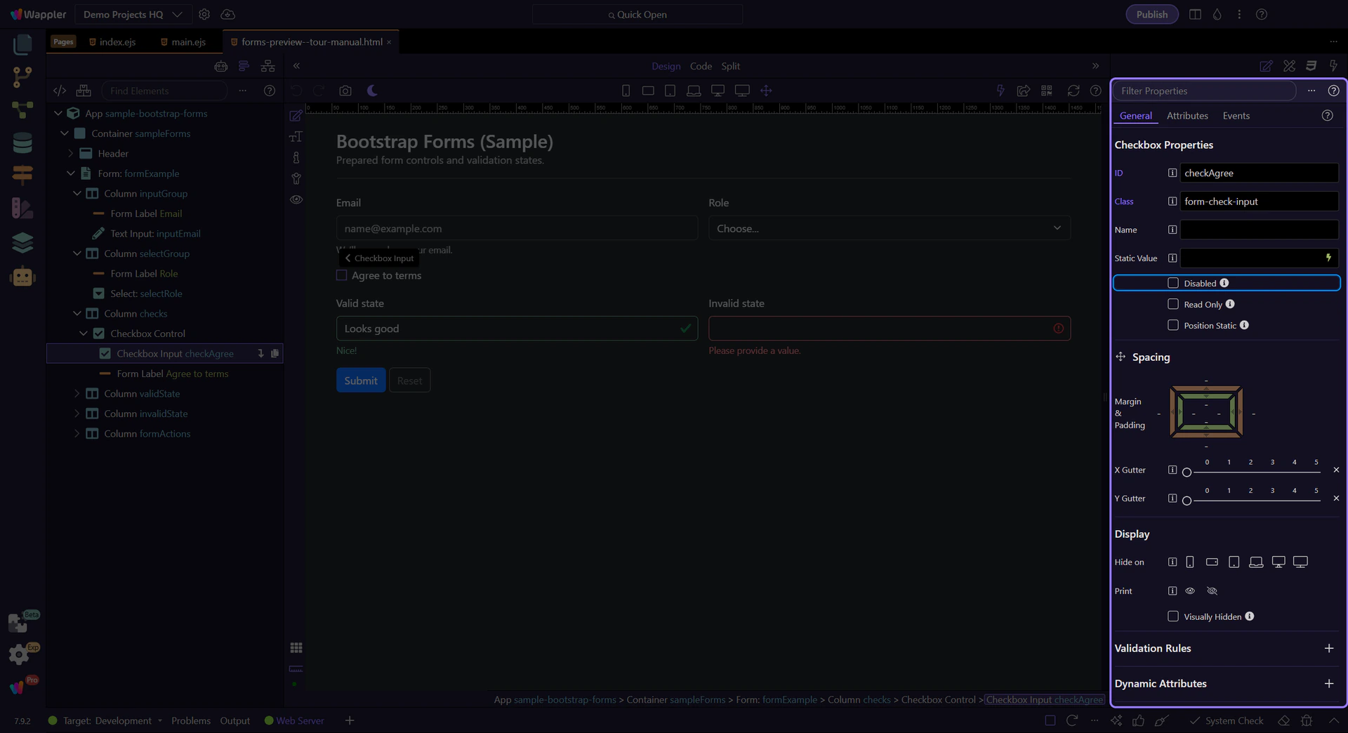
Toggle Disabled to prevent changes.
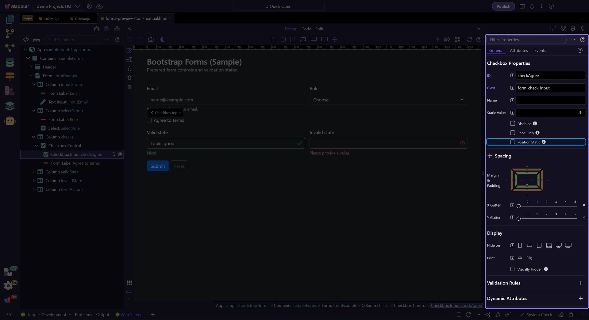
Toggle Position Static when you need the checkbox aligned without absolute positioning.
Bootstrap forms are mostly attributes (type/placeholder) plus a few key classes (form-control, form-select, is-valid/is-invalid).
Bootstrap provides the visual states, but you decide when to show them:
Avoid showing errors immediately on first load.
Continue with a related tour or go back to the Bootstrap tours index.