
Keep modals focused
A modal works best when it’s one clear task with a clear close path (Close button + backdrop).
Use Bootstrap modals: triggers, sizing, scroll behavior, and best practices for reusable, accessible dialogs.
In this tour we’ll build a practical mental model for Bootstrap modals: triggers, modal structure (header/body/footer), and the key Properties you’ll use most.
A modal always starts with the trigger that opens it, so this button is more important than it first appears. It shows how the user enters the modal workflow, how the trigger connects to the dialog itself, and why getting that relationship right makes the rest of the modal behavior predictable.
tip: A trigger is just a regular button/link with modal toggle attributes.
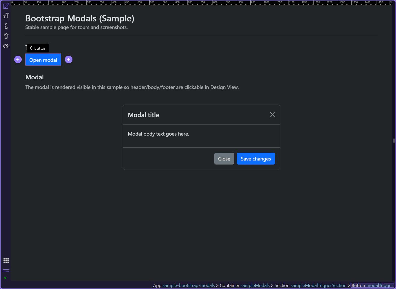
In Properties, set the trigger Toggle type to Modal.
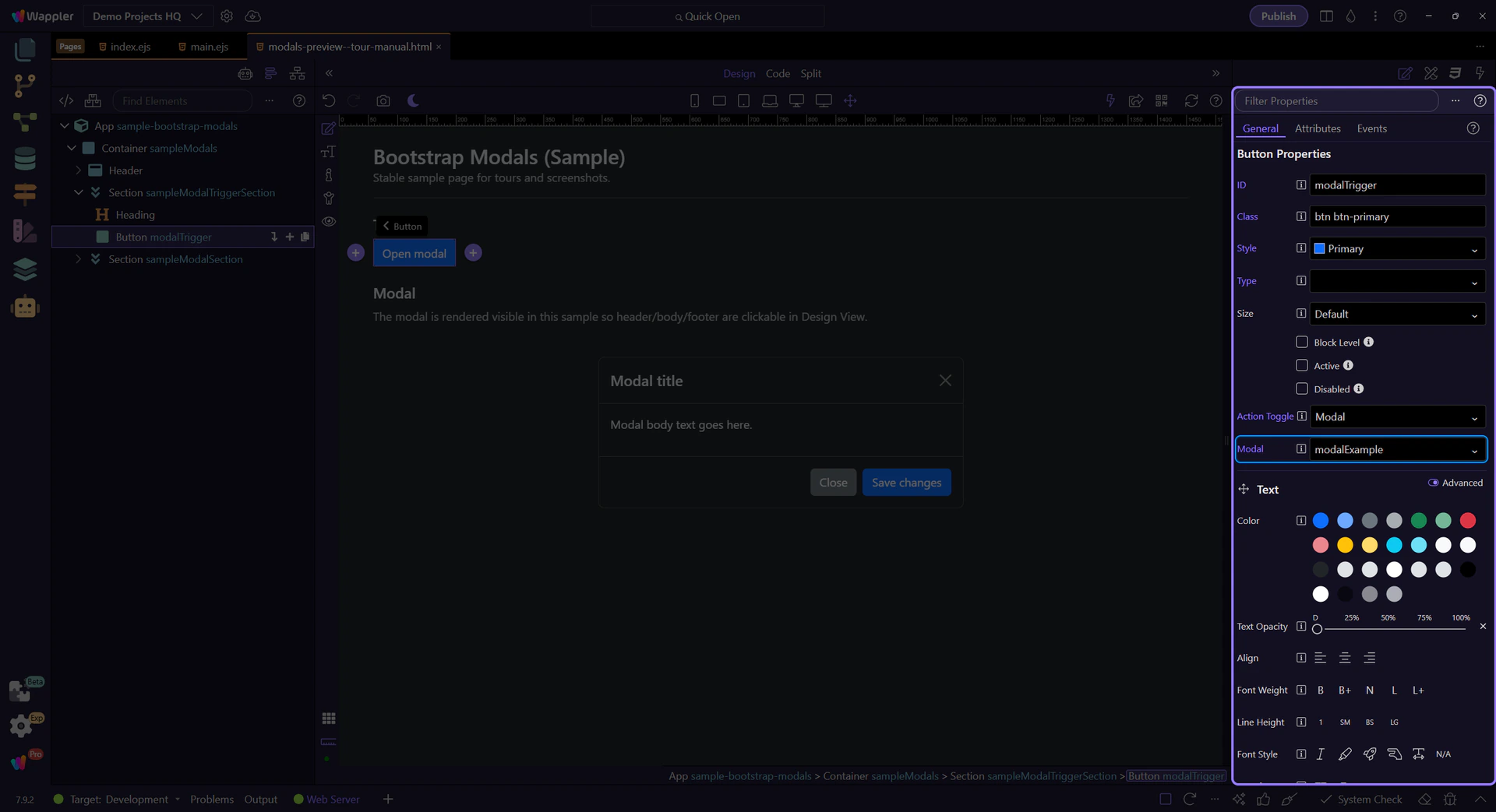
important: Toggle type + target must match the modal id.
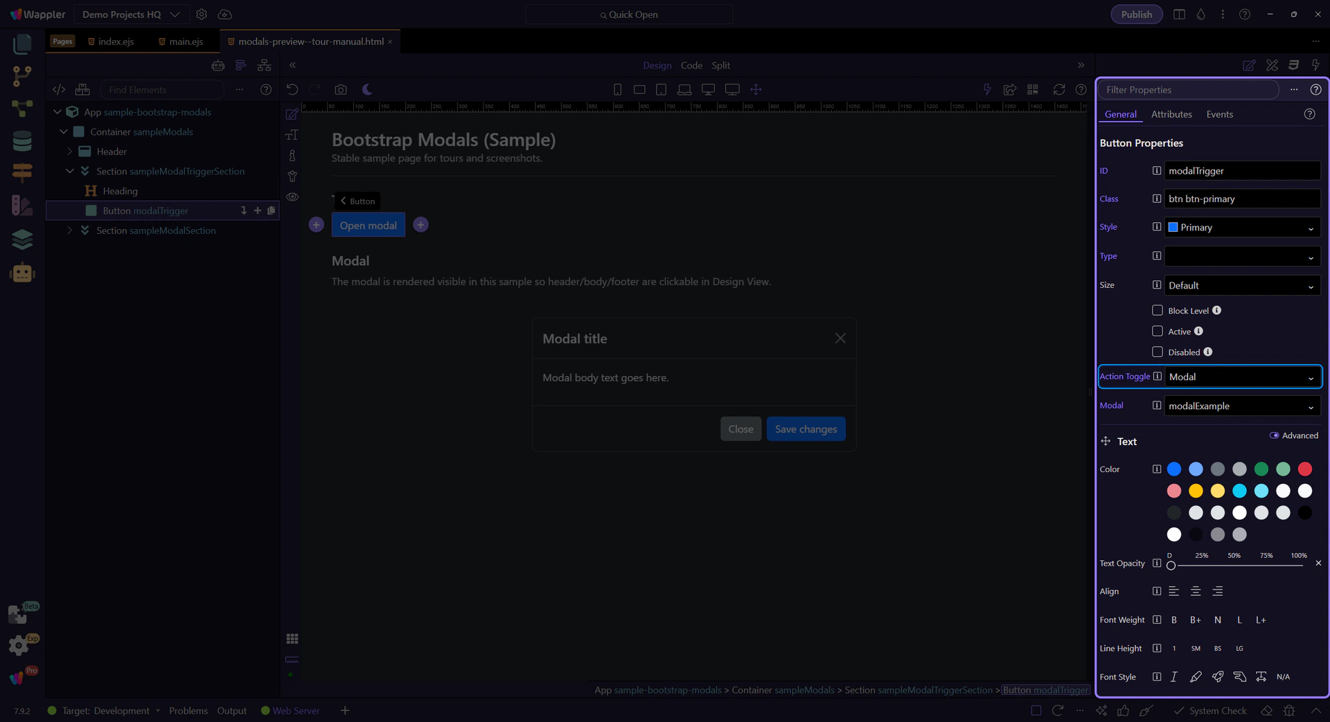
In Properties, set the trigger Target to the modal element id.
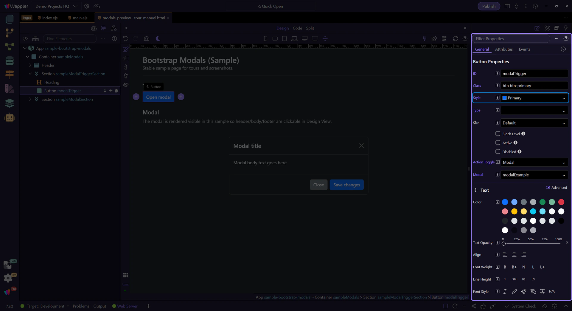
Use Style for button variants (primary/secondary/outline-*, etc.).
The modal element controls sizing and behavior. Let’s review the options that affect how the modal opens and closes.
tip: Keep modal content focused. For long content, prefer scrolling inside the modal body.
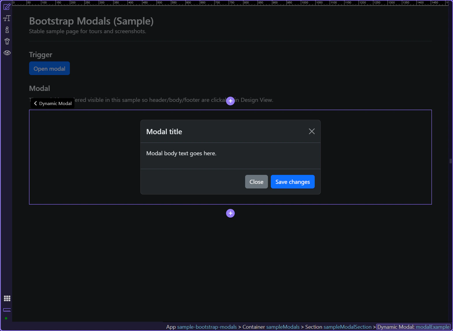
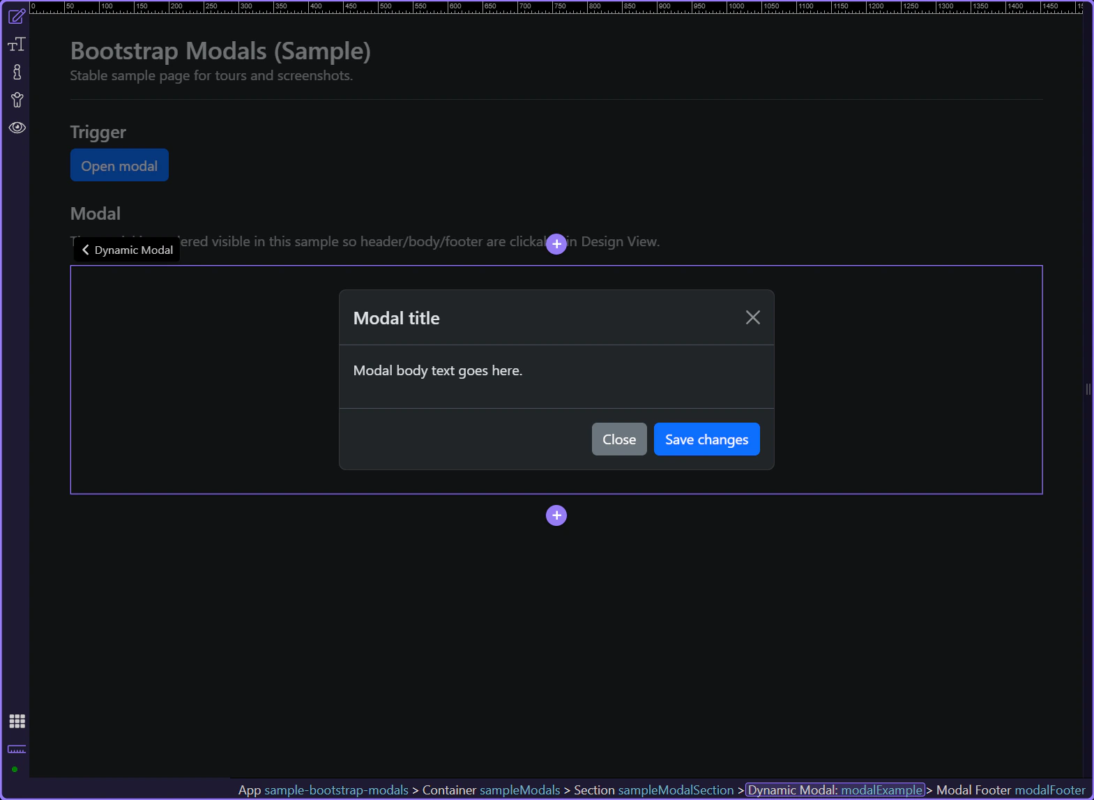
A typical modal structure is:
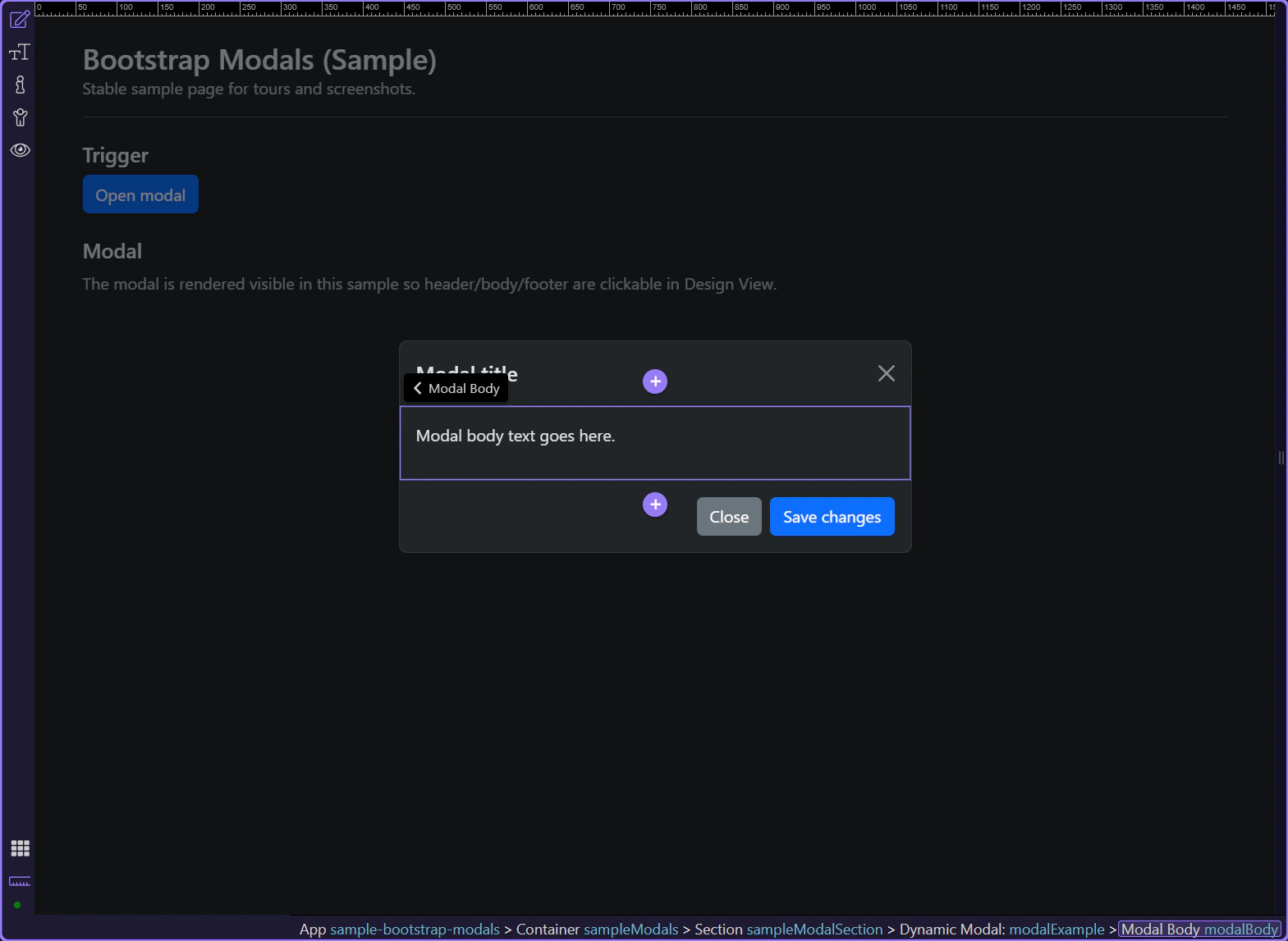
tip: Keep the main content inside modal-body for consistent padding.
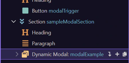
The modal header usually contains the title and the close control.
caution: Keep titles descriptive for accessibility and screen readers.
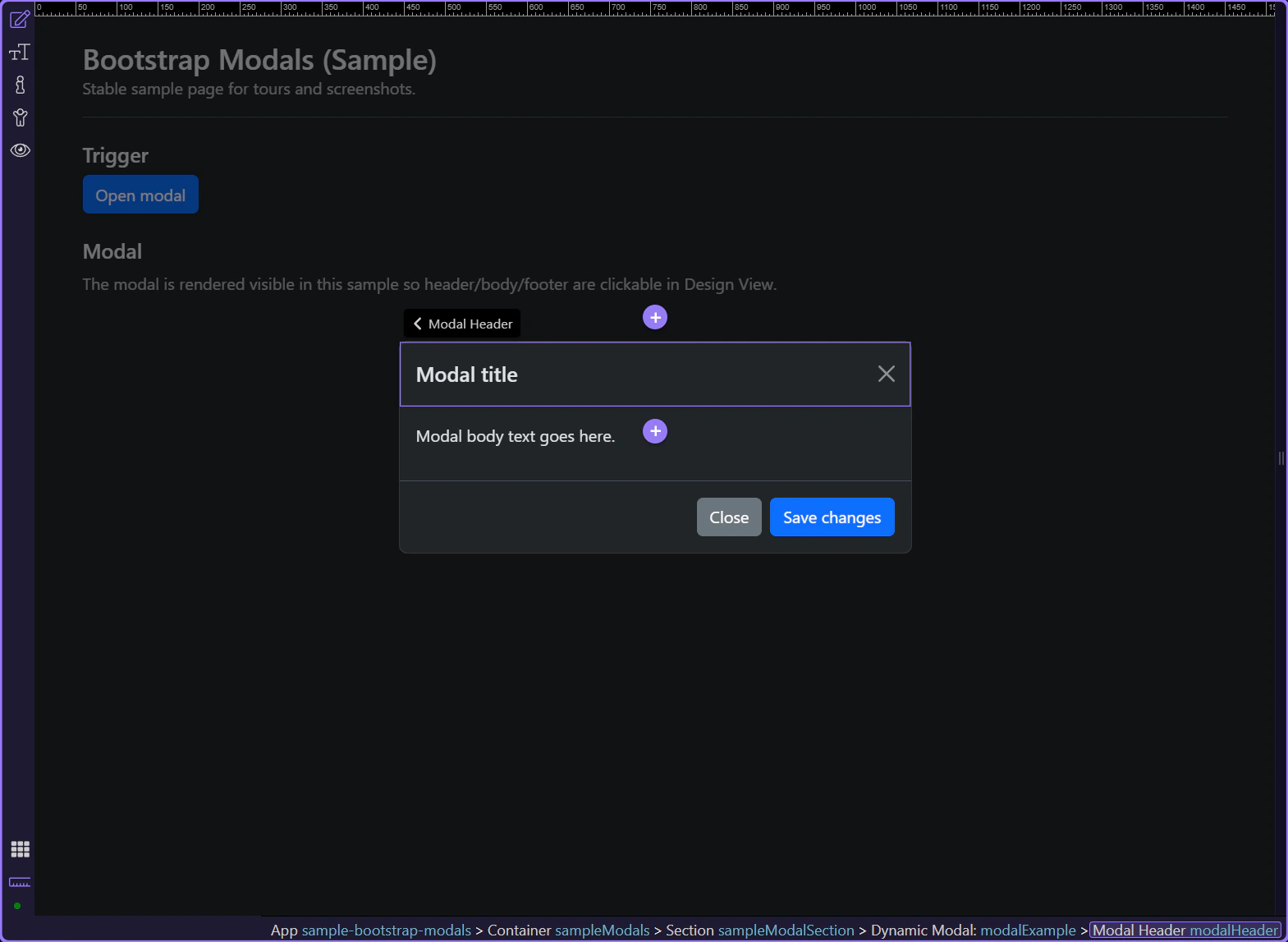
The header typically includes a Close button (.btn-close). It uses data-bs-dismiss="modal" and an aria-label so users can dismiss the modal reliably.
The modal body holds the main content: text, forms, or other components.
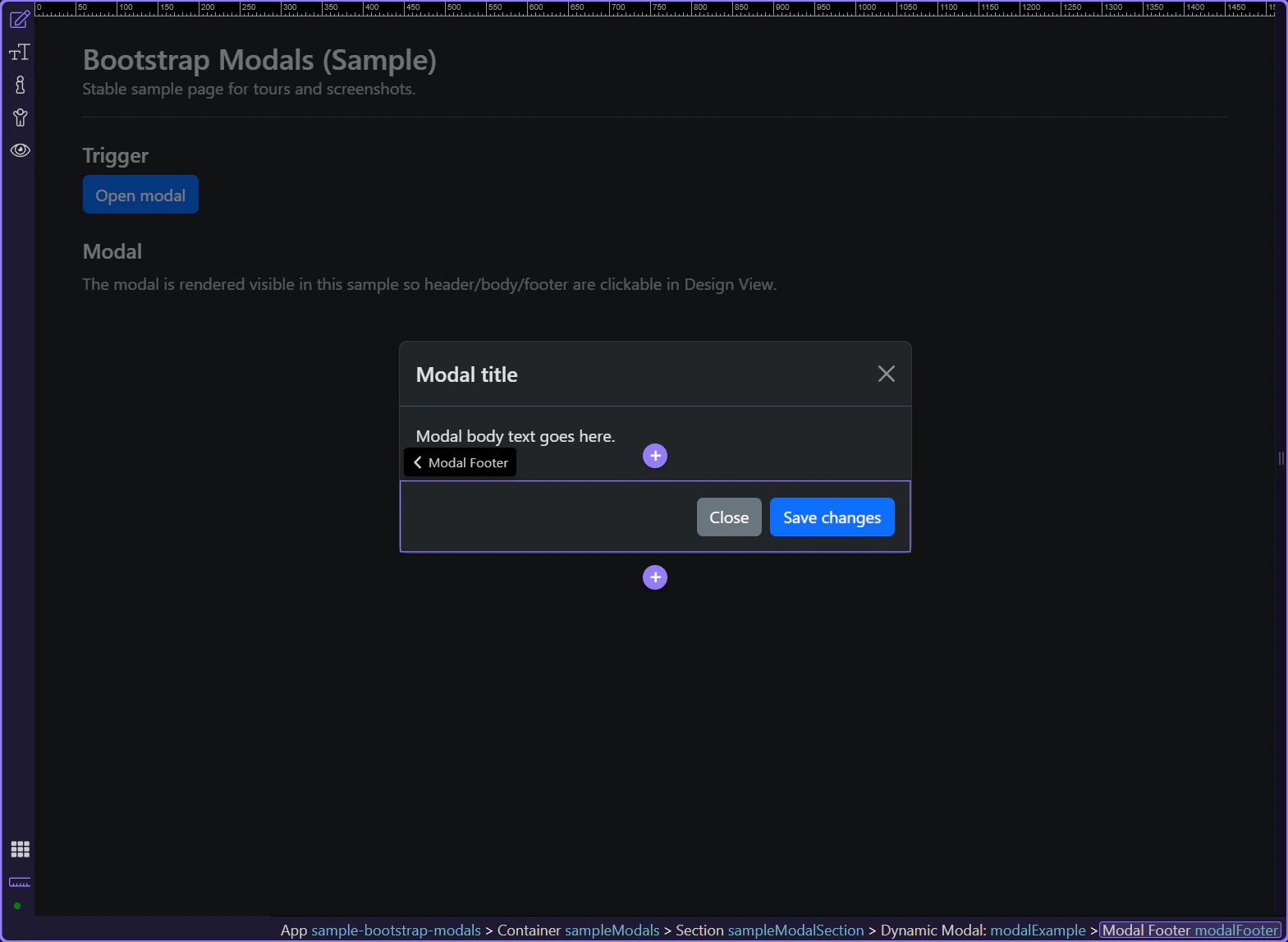
The modal footer is optional, and it’s a good place for action buttons.
tip: Use a secondary “Close” and a primary “Confirm” action as a common pattern.
Next, review key behavior properties. These control how users can dismiss the modal and how it behaves for accessibility.
Return to the modal container to review modal-level properties.
In Properties, use Centered to vertically center the dialog.
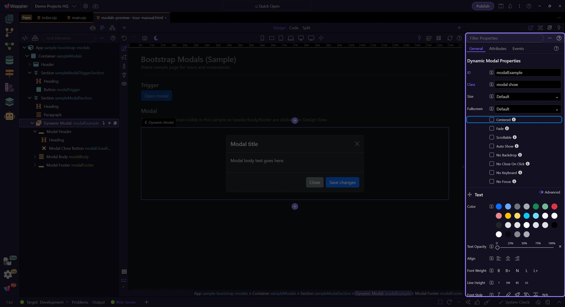
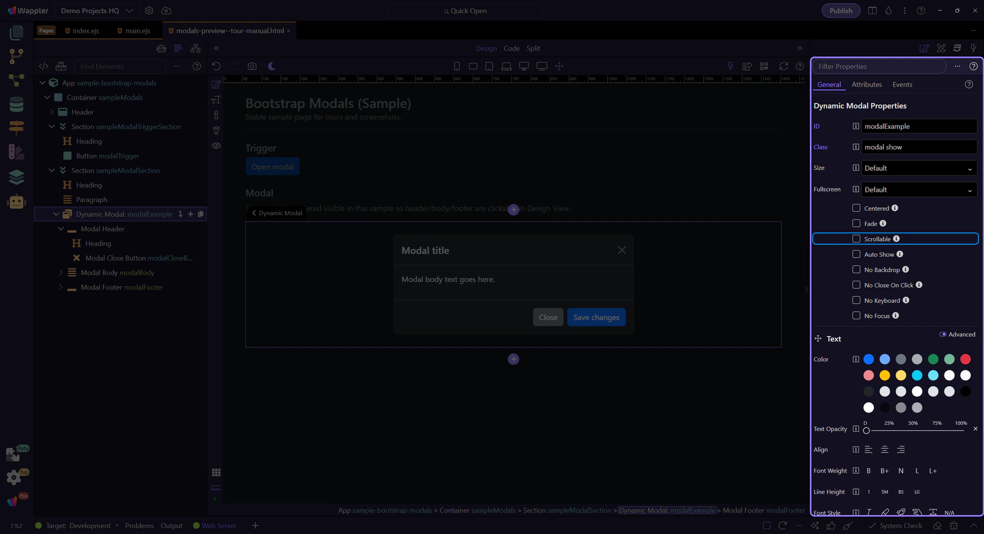
Use Scrollable when your content can exceed the viewport height.
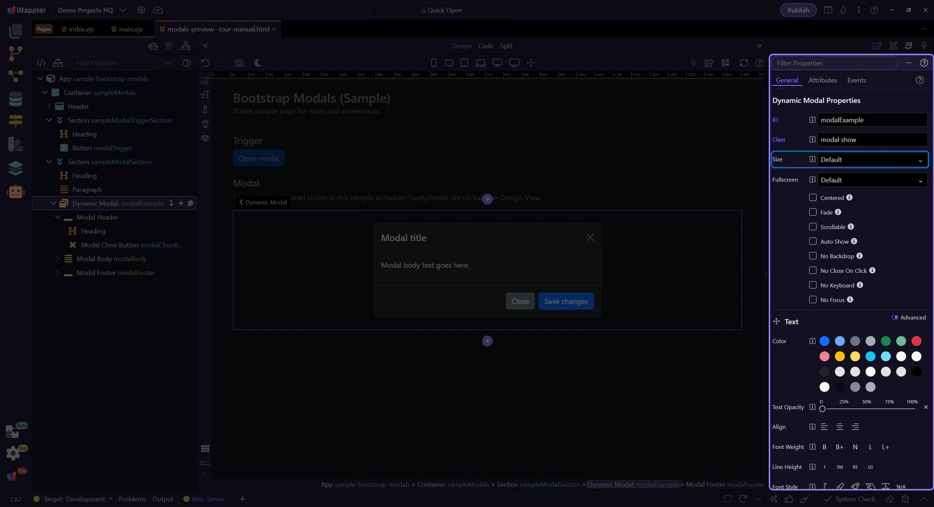
Use Size to change the dialog width (e.g. sm/lg/xl depending on the component).
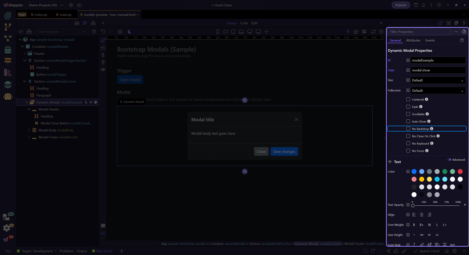
Disable the backdrop only when you have a clear alternative dismissal flow.
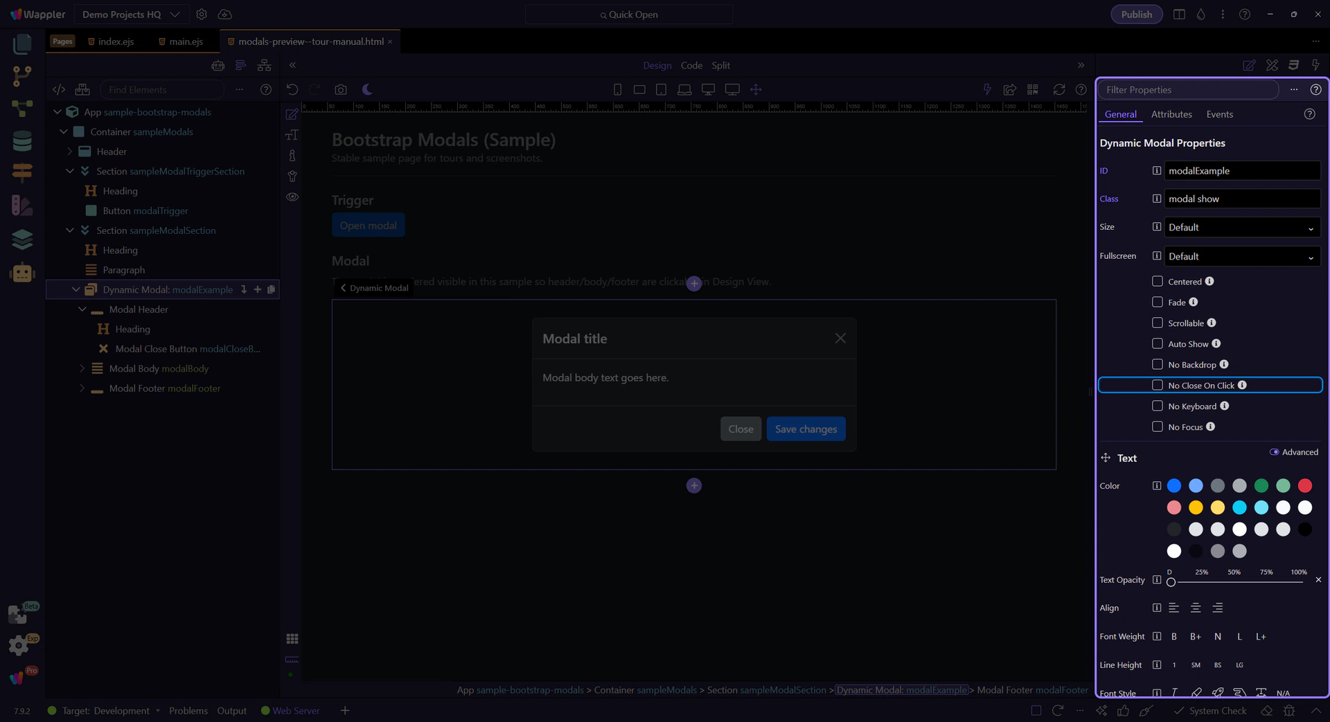
Disable click-outside-to-close only when users still have a clear intentional dismissal.
No Keyboard disables closing with Escape. Only disable this when your UI provides a clear dismissal flow.
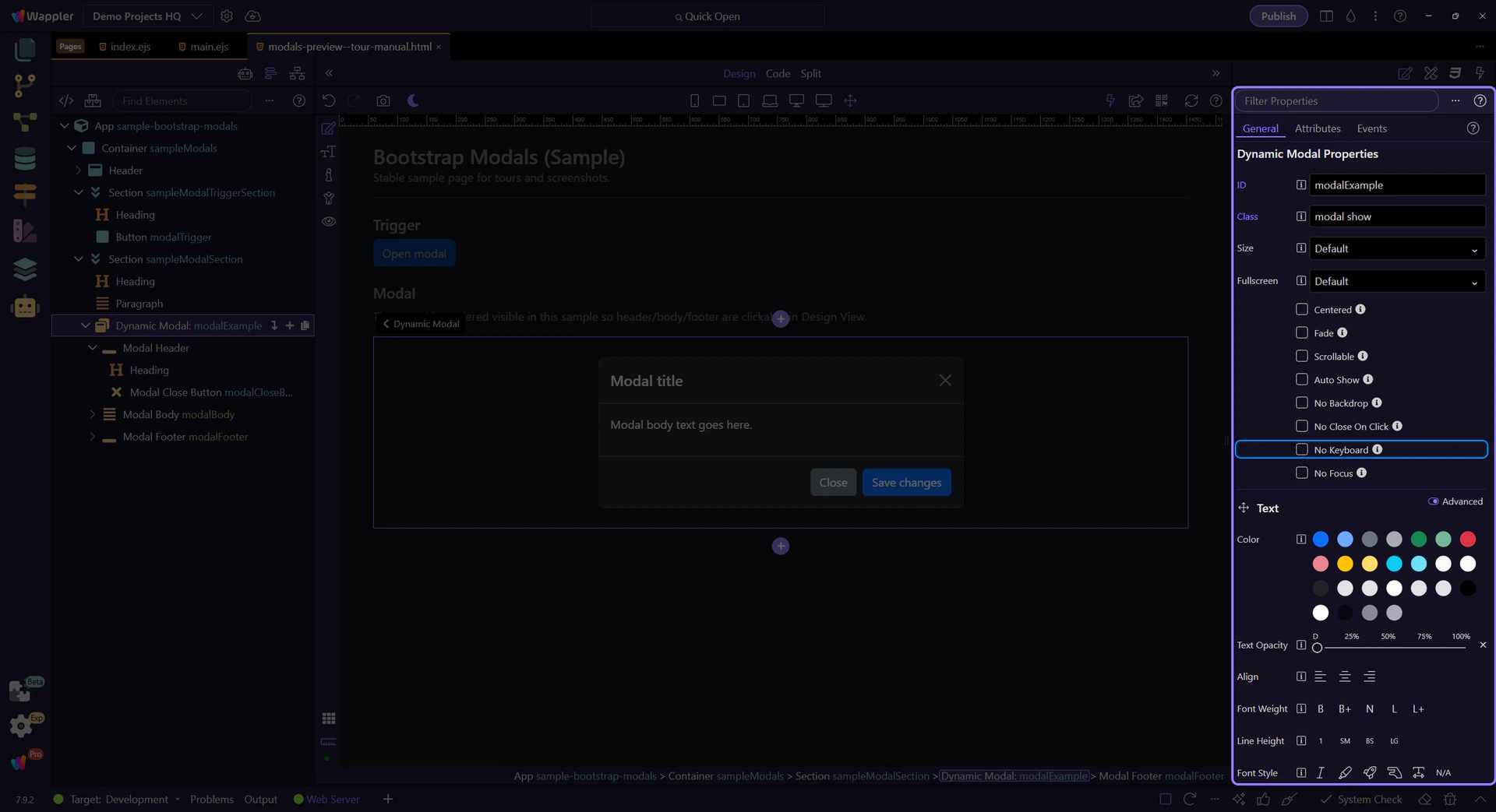
No Focus prevents focusing the modal when initialized. Combine with accessibility best practices for your UI.
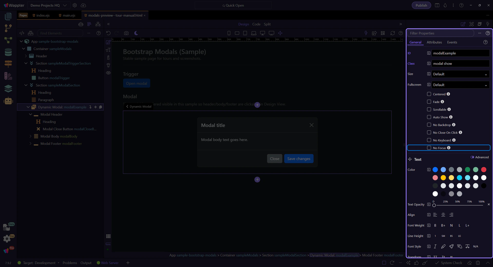
Modals have two key parts: the trigger (toggle type + target) and the modal element (dialog/content/header/body/footer). Keep those in sync.
A few practical tips:
Continue with a related tour or go back to the Bootstrap tours index.