
Placeholders = skeleton UI
Use placeholders for async loading, previews, and preventing layout shift while content arrives.
Use Bootstrap placeholders to show loading states and keep page layout stable while data loads.
In this tour you’ll learn when and how to use Bootstrap placeholders (skeleton UI) to improve perceived performance and reduce layout shift.
Placeholders mimic the structure of content while data loads, keeping layout stable.
tip: Glow is a subtle shimmer that works well for text-heavy content.
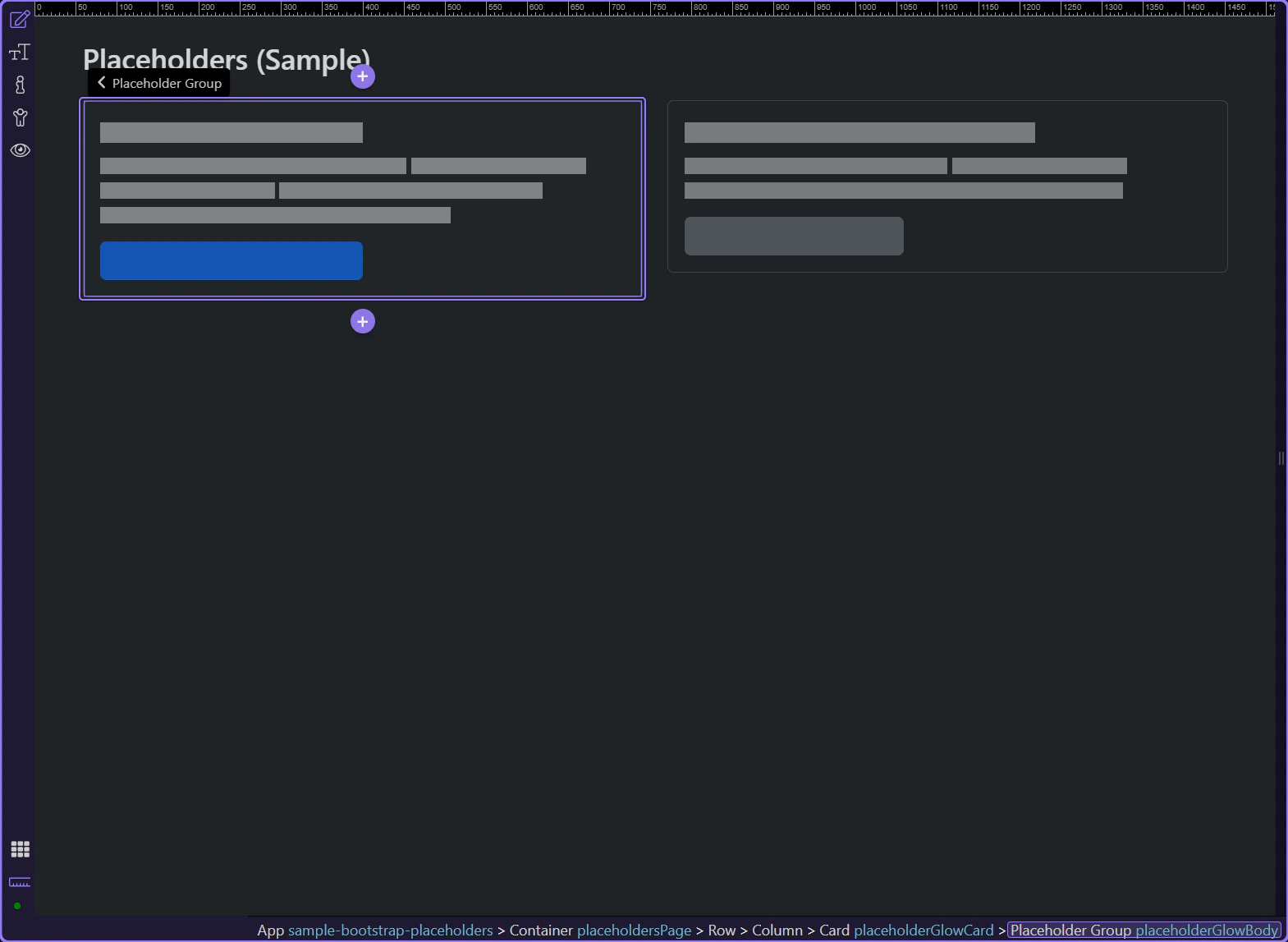
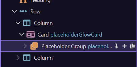
Glow placeholders typically have an outer wrapper that applies the effect, plus inner blocks that represent lines and shapes.
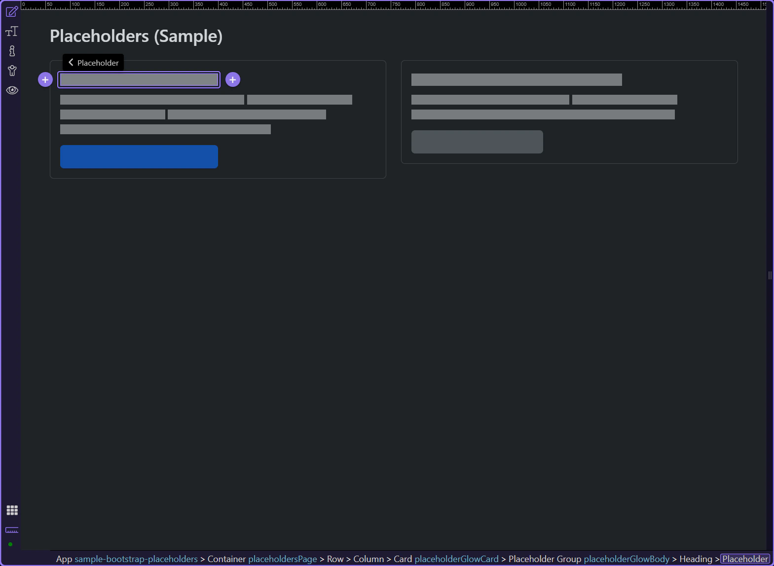
Inner placeholder blocks represent the actual lines/shapes in the skeleton.
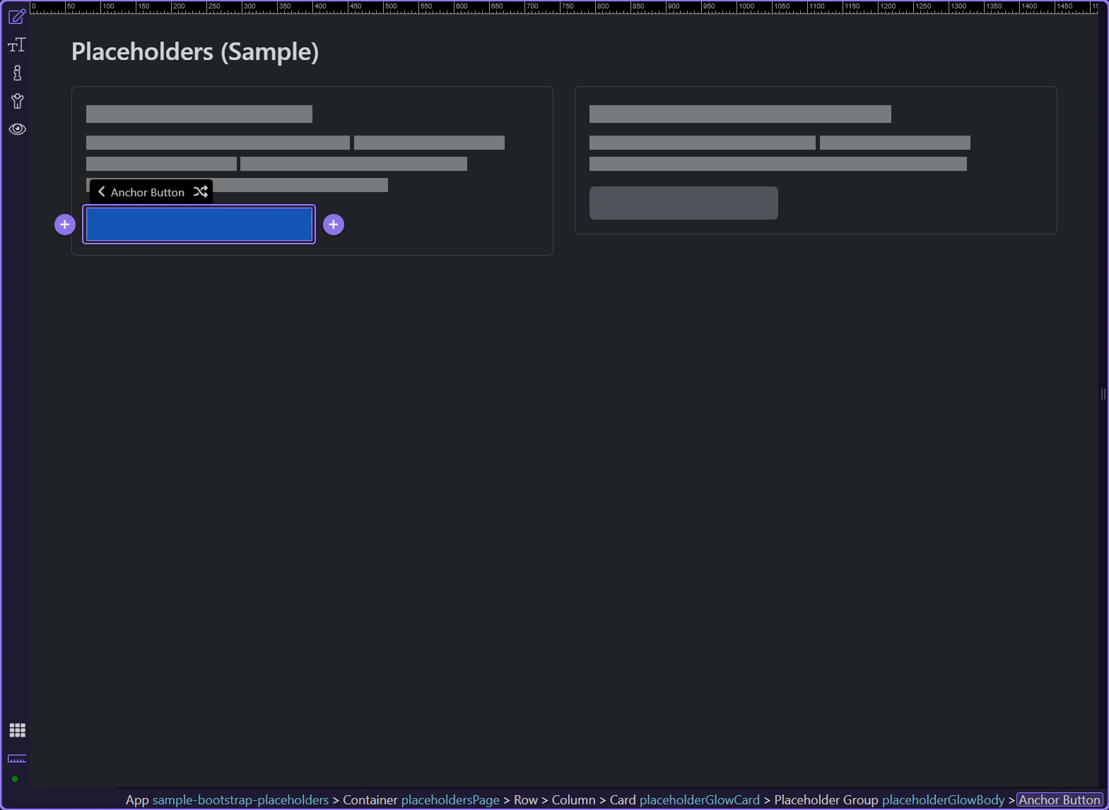
Buttons can also be represented as placeholders to keep layouts stable.
Wave placeholders are more visually noticeable than glow, so use them sparingly.
tip: Pick one placeholder style (glow or wave) and use it consistently across the app.
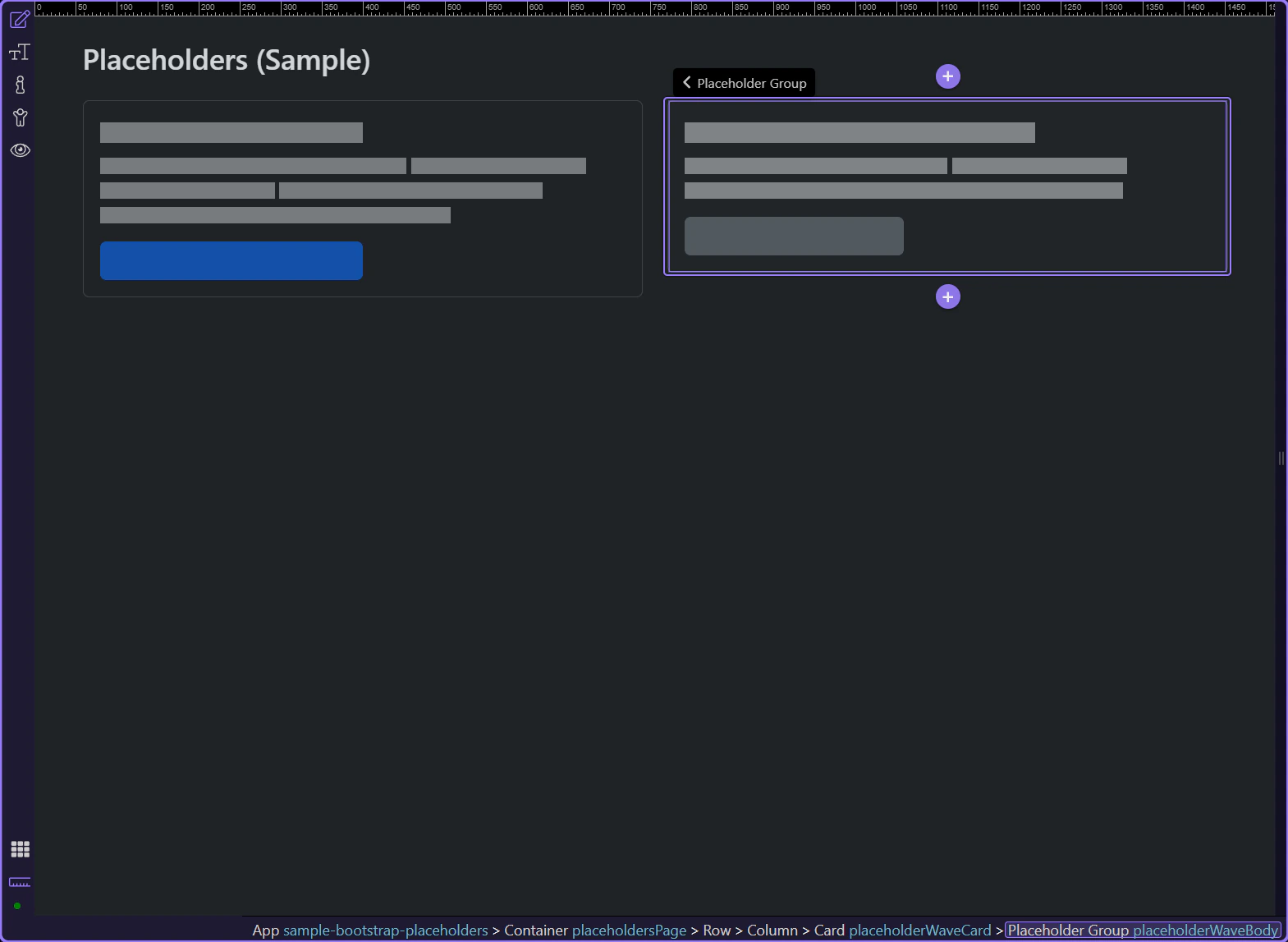
Placeholders are a UX tool: they keep layout stable and communicate loading without jarring shifts. Match placeholder size to the final content.
Use placeholders when:
Use spinners for small, compact waits or single actions.
Continue with a related tour or go back to the Bootstrap tours index.