Borders & rounding
Use border utilities for rounding, borders, and subtle separators in your UI.
Border utilities
Borders are great for subtle separation, emphasis, and shape. Borders & rounding are shared across many Bootstrap components, so you can apply them consistently.
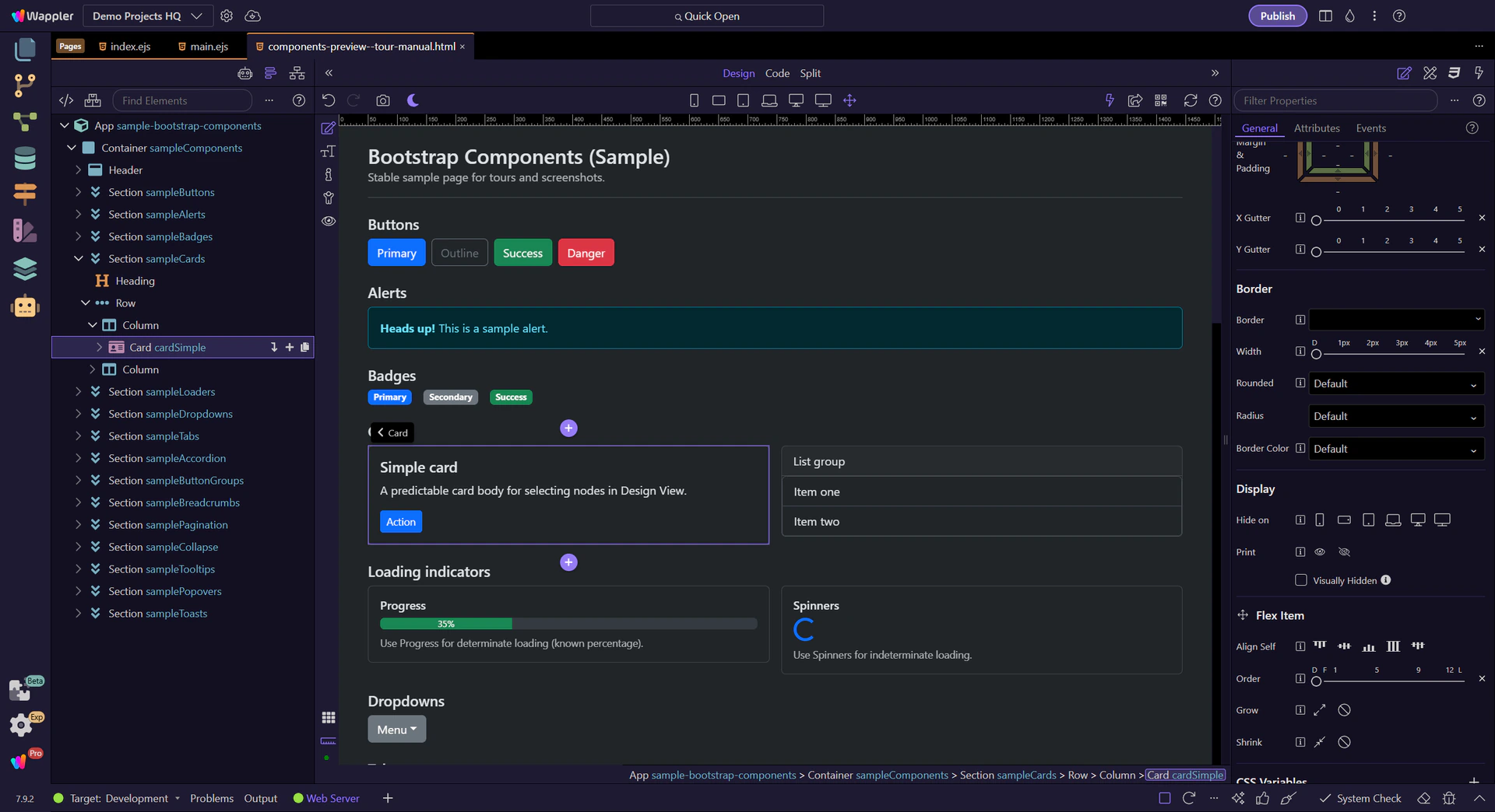
Card example
Cards are a good way to review shared Border and rounding utilities, since they often need subtle separation and shape. The card is selected so Border utilities are visible in Properties.
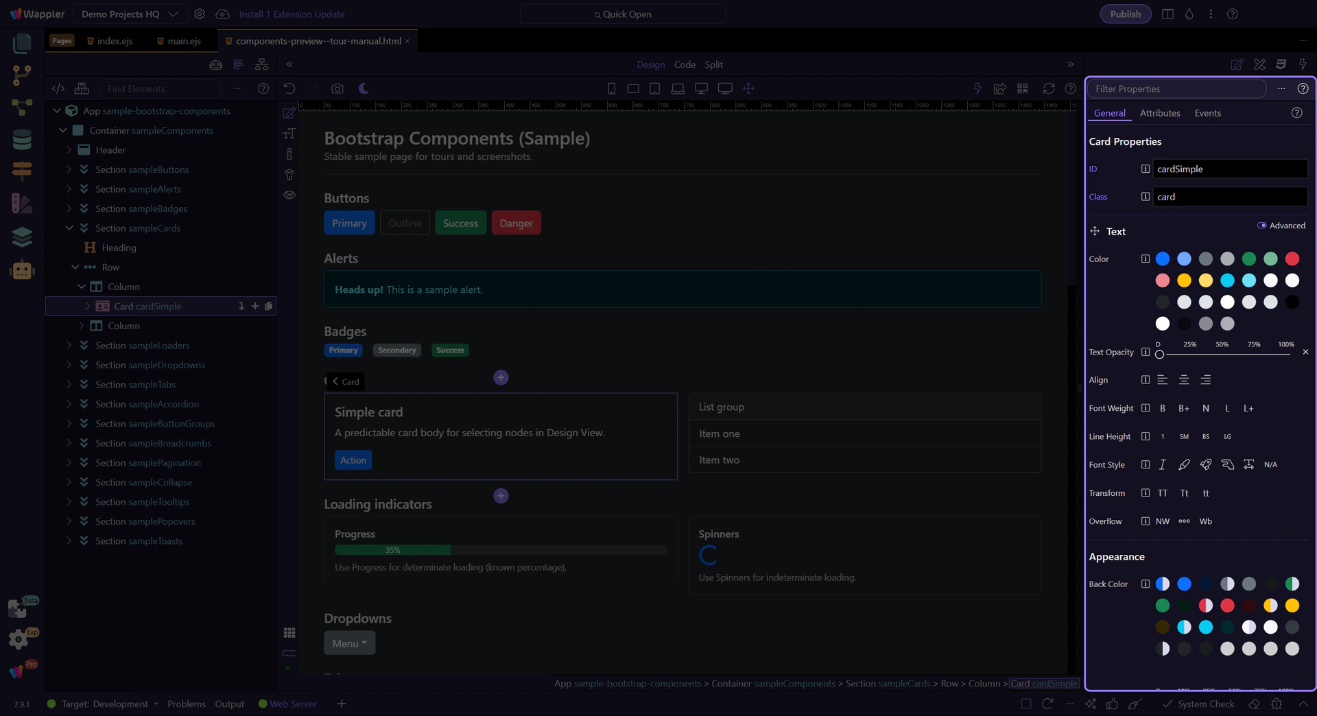
Orient yourself in Properties panel
Start with the wider context in the Properties panel so the next control makes sense in the full workflow. In the next step, you will focus on Border & rounding and see how it fits into this area.
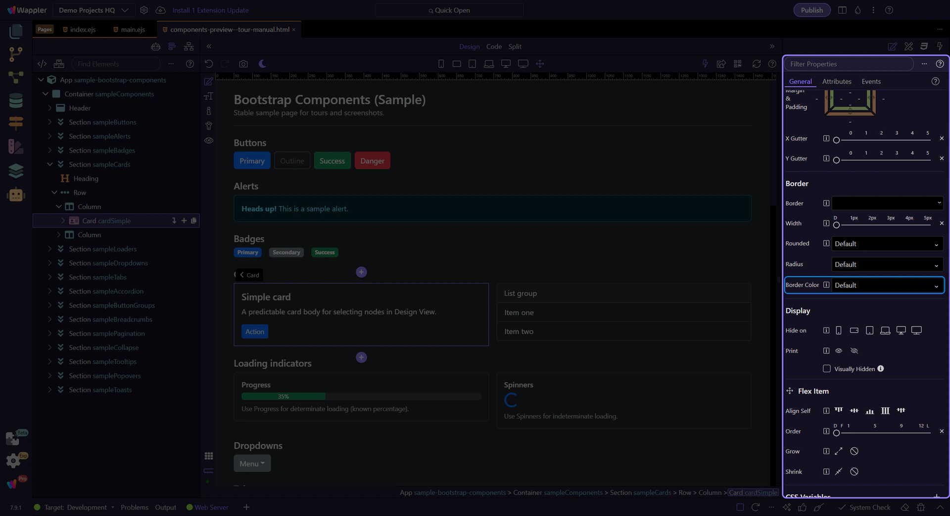
Border & rounding
Use the Border group to toggle borders and choose rounding/radius. Pair this with color and spacing to quickly style components.
tip: This maps to Bootstrap classes like
border,border-0,rounded-*, andborder-*-subtle.
Next steps
Next, learn responsive display and flex item utilities.