
Colors, background & effects
Apply Bootstrap color utilities for text, backgrounds, and emphasis states.
Appearance utilities
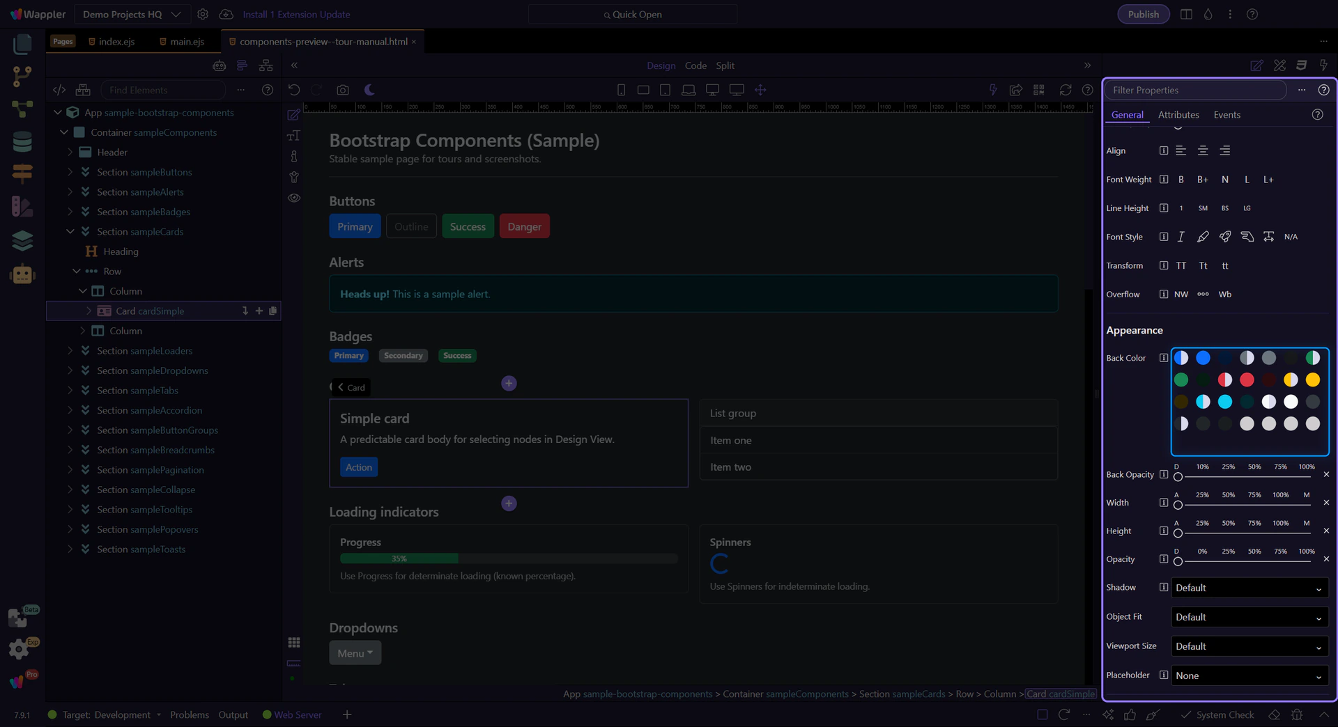
Section titled “Appearance utilities”Color utilities help communicate meaning (status, emphasis) and improve readability. The Appearance group is shared across many Bootstrap components so you can set background, opacity, shadow, and sizing consistently.
Card example
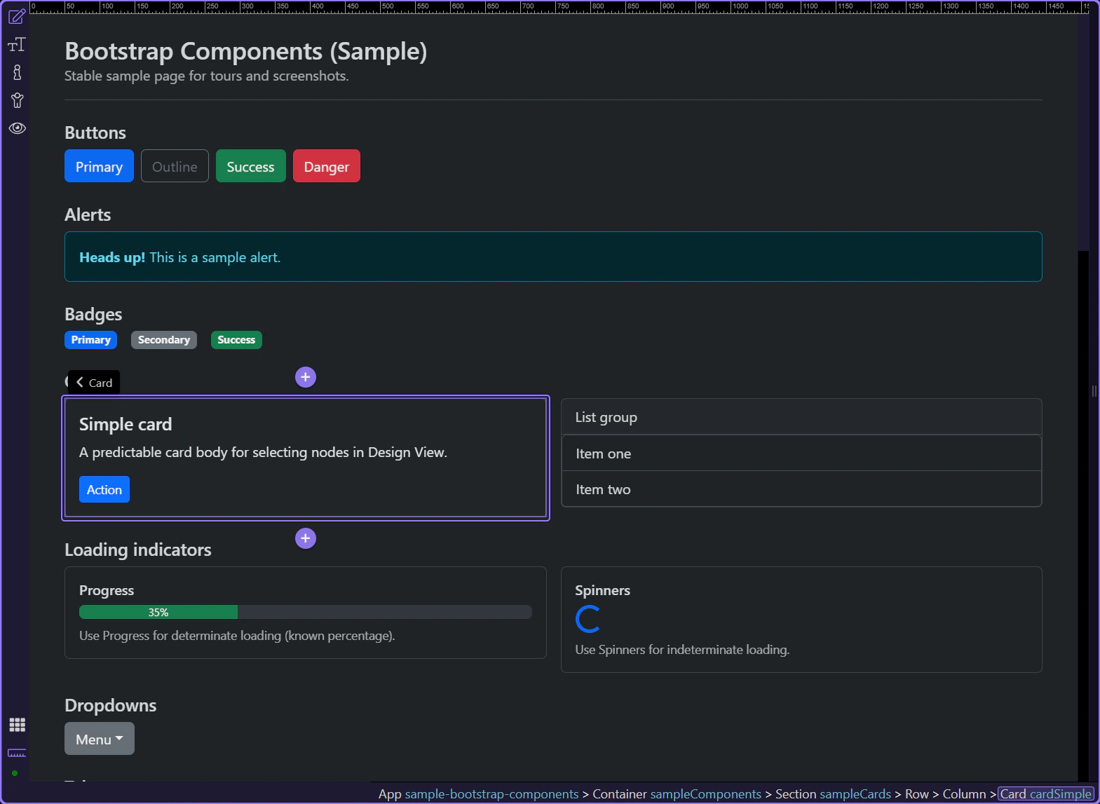
Section titled “Card example”Cards are a useful target for Appearance utilities because they’re common containers used across many layouts. The card is selected so the Appearance group is visible in Properties.
Background color
Section titled “Background color”Use Appearance → Back Color to apply Bootstrap background utility classes (including subtle/background-only variants).
Opacity & shadow
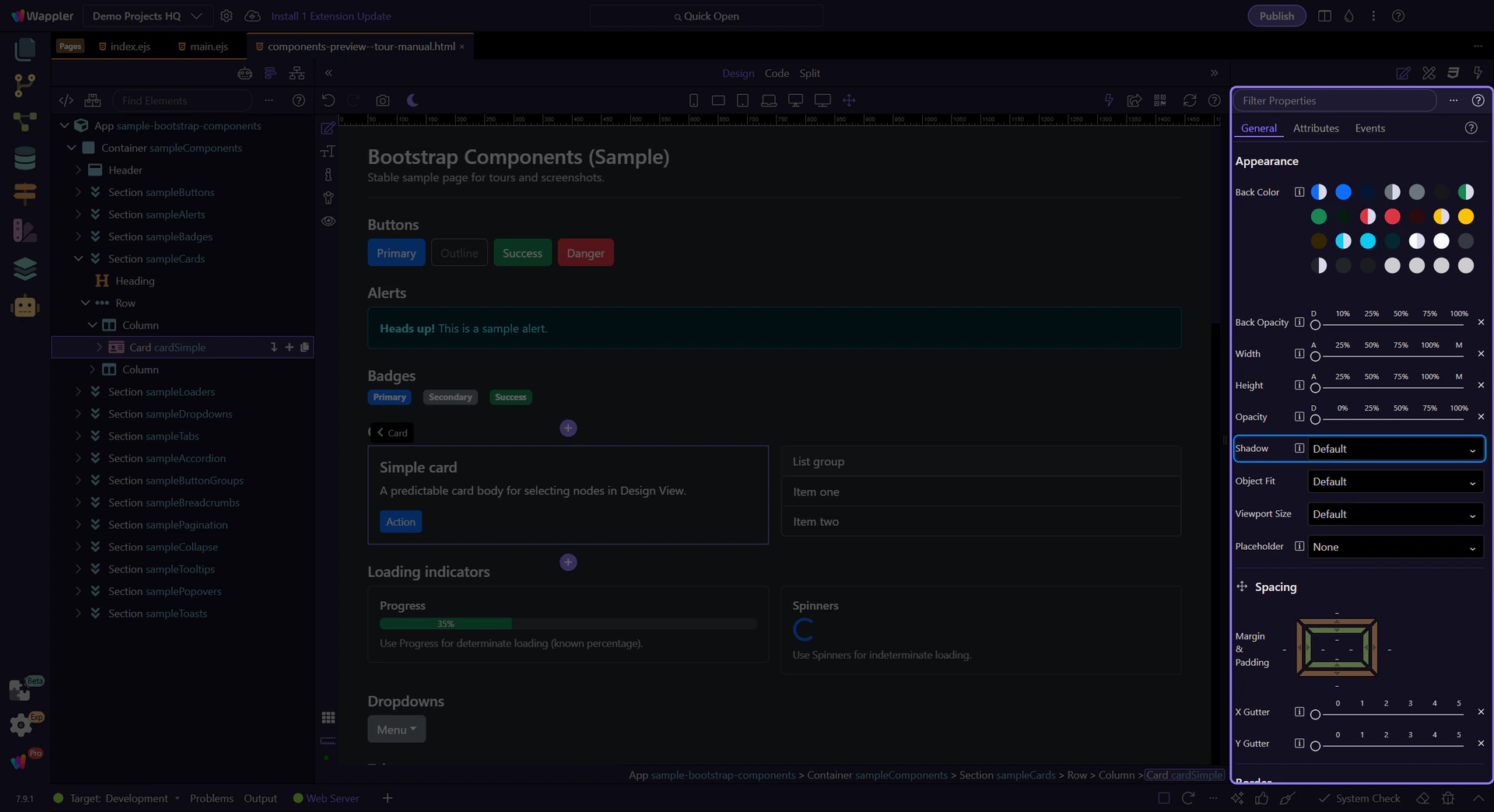
Section titled “Opacity & shadow”Use Back Opacity, Opacity, and Shadow to fine-tune how the element looks without writing custom CSS.
note: These map to Bootstrap utility classes like
bg-opacity-*,opacity-*, andshadow-*.
Width & height
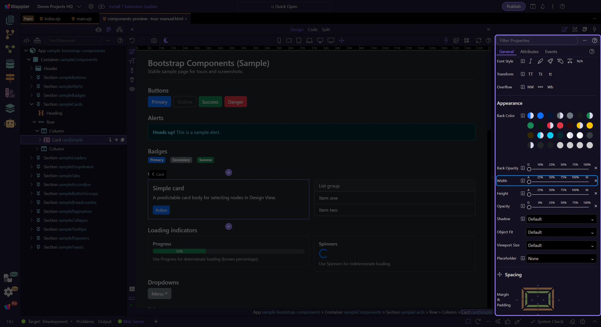
Section titled “Width & height”Use Width and Height to apply sizing utilities like w-* and h-*.
Next steps
Section titled “Next steps”Next, learn borders and responsive display/flex utilities.